#edit again: made text a bit bigger for readability
Text
Tumblr intersex polls without votes from non-intersex people
My project for this evening was to go through past tumblr polls I and others have made for intersex people and re-calculate them to show only the intersex respondents. This is because non-intersex respondents have overwhelmed the results to a point where you can't really see the differences between responses from actually intersex people (sigh). Here are the graphs I got:
Questions About Intersex Journeys
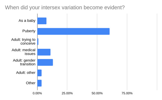
From: when did your intersex variation become evident? (Not same as finding out you were intersex). Puberty was by far the most common, which checks out with the most common intersex variations typically presenting at puberty.

From: when did you find out you were intersex? Here most people figured it out in adulthood but it varied a lot whether there had been signs beforehand. A lot of people figured it out in adolescence which I found heartening!
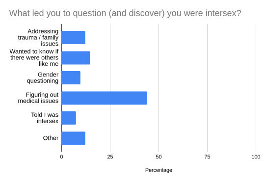
From: what led you to question if you were intersex? Most common reason is medical but a lot of people wrote in that it was a combination of medical, social, and psychological motivations to question.
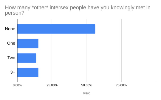
From: how many intersex people have you knowingly met in person? This result was not so heartening, with the plurality of respondents having never knowingly met another intersex person. When we intersex people talk about isolation and invisibility this is the sort of thing we mean; it's a real problem.
:(
Questions About Gender and Intersex

From: how much do you feel being intersex influences your gender identity? (@skelejon) An almost uniform spread from "it is my gender identity" to "not at all", most common response being "a lot".

From: ipsogender poll (@intertrek). Ipsogender refers to intersex people who identify with their gender assigned at birth. From replies seems a lot of people saying "not sure" felt it was up to the individual ipsogender person to decide.
.🌈
Terminology Questions

From: intersex vs DSD? (@our-queer-experience) Overwhelming preference for intersex here.
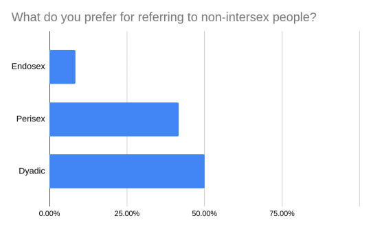
From: term for non-intersex? I don't like dyadic so I honestly gumbled at this but these were the results. This poll I think shifted me towards using perisex more often than endosex but I still kinda mix it up.

From: what term do you use more commonly to describe intersex discrimination/oppression? (@trans-axolotl) Strong consensus here on "intersexism".
If there are any other intersex polls that you want to see re-plotted with only the intersex responses let me know! Thanks to everybody who voted, reblogged, and created these polls! <3
EDIT: I license this post as Creative Commons 4.0 Sharealike.
#intersex#intersex polls#actually intersex#edit: original post had a typo of “knew”/“new”#edit again: made text a bit bigger for readability#edit the third fixed the intersex vs dsd
210 notes
·
View notes
Note
hi lovely!! do you have any tips on making cool fun and sexy typography?
hey joanna!! this made me giggle haha, i'm not quiiiite sure how to answer that, but here are some tips i keep in my when i do typography, and some examples:
FONTS
don't be afraid to "shop" for fonts and try funky fonts you've never used/seen. i often try so many before settling. i almost always use at least 2 different font for gifsets, even 3 sometimes. i think a good font pairing can do a lot for a gif. it's usually something like:
serif + cursive/funky fonts (example)
sans serif + cursive/funky fonts (example)
serif + sans serif fonts (example)
two different cursive/funky fonts (example)
or even simply the same font but all caps + all lowercase (example)
in case you're unsure where too start or want inspiration, here's a great resource: usergif's font pairing guide and its fonts page
BLEND MODES & LAYER STYLES
i think playing around with different blend modes and layer styles will always elevate your typography game, in my opinion. it's usually a bit more dynamic than just an opaque color. tho this minimalist typography can also be really good.
when you double click on a text layer, you get all the layer style options, as well as the blend modes. a very popular layer style is setting the layer's blending option to difference, paired with a color and/or gradient overlay (often set to multiply/color dodge). a drop shadow is also important so the text is more easily readable. we often see a black soft drop shadow, but don't hesitate to be creative with it, for example a thick, hard line, colorful drop shadow.
i feel like this step often takes the most time for me because the possibilities are endless. definitely play around with layer styles, especially drop shadow, color overlay, gradient overlay, stroke. and also try different blending modes for these settings.
as for the layer's blend mode, also definitely play around with them. and keep in mind that the text's color will also give a different result, it doesn't have to be white + blend mode set to difference, even tho this is a classic that works well.
TEXT WRAPING & POSITION
a great feature on photoshop is definitely the text warping tool. to access it, right click on a text layer and go "warp text". from there you'll get a few different styles and setting sliders. my favorites are flag and wave (example). you can always go back to edit these settings once they're done by right clicking again. and you can even keyframe/animate these settings!
typography doesn't always have to be centered and straight, i often prefer it on a side and rotated a little. you can easily rotate typography by selecting the layer(s) and hitting ctrl + T. you can also play with the skew and pespective after hitting ctrl + T by right clicking the canvas and clicking on either. these will give different ways to move your text.
SIZING
i love playing around with different font sizes, it makes the typography more interesting in my opinion, and it's a way to emphasize some words.
so for that reason i usually put each word on a different layer so i can edit each word separately. sometimes i will also put each letter on a different layer, because it can be interesting to offset/rotate some letters sometimes (example) (another example).
i often pair a quite small serif or sans serif font with a much bigger funky font (example). and often that bigger font will also have different sized words (example). i play around a lot with this!
ADDED EFFECTS
there are some things than can be done to enhance typography:
adding a colorful rectangle block behind the text (example)
using text symbols such as quotation marks or backets (example)
using lines around the text (example) (another example)
these can definitely bring typography to a different level
MORE RESOURCES
great font website
usergif's typography tag
my fonts tag
this is all i can think of right now, i hope it helps :D if you have any question on a specific text effect let me know, i can definitely make a tutorial!
#alie replies#silversmists#typography#photoshop#*ps help#resource#completeresources#allresources#resourcemarket#usercats#userabs#userpjo
188 notes
·
View notes
Text
Website Insights for a Site That Attracts More Clients

This week I launched my brand new website: actionplan.club
Over the last 20 years, I’ve designed and launched a total of seven different versions of my site.
In the process, I’ve learned a number of things, made a lot of mistakes and gained some wisdom about how to make a website serve your business and help you attract more clients.
Today, I’d like to share a summary of those insights.
A client-attracting tool
That’s ultimately what a website is. It’s not a monument to your ego or something beautiful to look at (although there’s nothing wrong with a visually attractive website).
For independent professionals, a website needs to explain to your prospective clients why you’re the person to help them with their particular issues and challenges.
A Lead-gathering tool
When someone visits your website, they should be inspired to take some sort of action right on the spot – otherwise, the chances of them ever visiting your site again are immensely low.
And that’s why I believe the most important part of your site is its ability to build an opt-in email list. If you don’t have a list, it’s like having a wonderful car with no gas in the tank.
Virtually all my business over the past 20 years has come from email promotions to those who joined the list on my website. When you don’t have a list, you severely limit your marketing possibilities.
Make opt-ins obvious
I can’t tell you how many clients have shown me their website with a tiny little opt-in box that says, “Please join my list,” or some other tepid appeal. And they wonder why they have a tiny e-list.
Fewer people want to join lists these days. We already have too much email in your in-boxes. But if you give away some substantial value, many will still opt-in to get it and join your e-list in the process.
Your opt-in box should be attractively designed and attention getting. And you should use various two-step opt-ins throughout your site. They are like little ads that say, in effect, “Go here and get my valuable free stuff,” which directs them to your sign-up page. Free Stuff
Simple navigation – in-depth content
The biggest change I made in my new website was to dramatically simplify my navigation. My old site had links to so many pages that it become overwhelming to navigate.
But I still have in-depth pages that describe my services. These are the main pages I want my prospects to visit, that explain in detail how I help my clients. Not everyone will read long copy but serious prospects will read much more than you think. Programs (link)
Publish a Blog
For 20 years, I’ve sent out my email newsletter to thousands of subscribers. With my previous website (since Jan 2011) I took the weekly ezine article and also posted it as a blog. Why? Because blog posts are indexed by Google and after seven years I have 355 blog posts on the web, all pointing back to my site. Blog page.
People ask how I’m able to write a new article every single week. My answer is stupidly simple: I make Mondays the day I write my ezine/blog article and it’s usually the first thing I write Monday mornings, even before I check my email. Now it’s become a habit that comes easily and naturally.
Development Tips
Use Wordpress. It took me a long time to make the transition as I’d invested a huge amount of time and money on the previous site. But you can do almost anything you want on a Wordpress site with easily installable plugins. It’s knocking my socks off!
Hire a designer. The average independent professional is not a terrible writer. But most are hopeless designers. If you design it yourself, you’ll probably love it, but you may be the only one!
It’s worth the relatively small one-time investment to get a design that will make your site look both attractive and professional.
Hire a Wordpress developer. Setting up a Wordpress site is tricky technically. My developer understands every little bit of code that makes it run smoothly. Get someone who says, “no, problem, I can do that!”
By the way, sometimes a designer and developer are one and the same person, but these are very different skill sets and few people can do both well.
Learn Wordpress basics. Once your site has been designed and developed, you need to learn how to edit and adjust it yourself. A short tutorial from your developer will give you what you need. Make sure they build that into the fee for your development.
Design Tips
Larger fonts (typeface). These days, computer monitors are bigger than ever. So, small fonts get buried.
Readable type. Don’t make your type so light that it’s a strain to read. I recently looked at an associate’s website and it was literally unreadable because his small, thin typeface was also light grey. It looked cool, but I couldn’t get through one paragraph.
Color scheme. Keep your font colors to black or dark gray, for readability, and then have two main colors for page headlines and subheads. Too many colors detract from the overall look and feel.
And by the way, reverse type or light-colored type on a dark background, are almost always a no-no. It’s not good for readability.
Also, I highly recommend using text bolding to make your key ideas pop out – but only on first sentences of paragraphs. Too much bolding can make it harder, rather than easier, to read.
White space. Text needs space to breathe. Remember, it’s all about readability. So have ample left and right page margins (about 25% of the total width of your pages), space between paragraphs, and paragraphs no longer than five lines.
Also, side columns that contain other content make your main column of text narrower, hence more readable.
Graphics. Various pictures and photos on a web page not only make it attractive, they increase readability. For instance, I like breaking up text on long sales letters with high-quality photos of independent professionals.
The site of a colleague uses beautiful pictures from nature. It really depends on your business and identity.
Remember, there is no perfect way a website should look. The primary considerations are attractiveness and highly readable text.
Web Content
I’ve written about this extensively in the past and even developed a program on this (the Website Toolkit). Ultimately, this is the most important part of your site – what you say and how you say it.
One of my favorite marketing quotes: “Write when drunk, edit when sober. Marketing is the hangover.”
If not drunk, write with passion and abandon. Then go back and tone it down a bit.
Content Flow. Most of us can write coherent sentences, but what style or approach works best for writing website content?
I use an approach called, “Marketing Syntax,” where I put ideas in a certain order or syntax. This can be used for your Home page, About page, and Services pages (which are the most important pages on your site).
The content flow goes like this:
1. Who – A section on who your ideal clients are.
2. Problem – A section on the problems and challenges your prospective clients are experiencing.
3. Desire – What your clients would like to have if they could resolve their problems and challenge.
4. Solution – The actual results you are able to deliver to your clients that fulfill their desires.
5. Credibility – Why you are uniquely qualified and experienced to help your clients.
6. Call-to-Action – What the prospective client should do next to find out more or to meet with you.
What about the process of what you do? Unfortunately, too many websites go too deeply down the “process rabbit hole” where they explain too much about how they do what they do.
Prospective clients are more interested in the results they get from your services and if you’re the right person to help them. Of course, at the end of sales letters (services pages), you can outline a little of the structure of how you work.
This is hardly an advanced course on writing for websites (the Website Toolkit is), but it’s a reliable and simple framework for writing copy that your prospective clients will relate and respond to.
Finally, I highly recommend you hire a proofreader/editor who will undoubtedly find a number of typos, grammatical mistakes, and poorly expressed ideas. It’s worth it if you are to make a professional impression.
I invite you to visit my new website and you can judge for yourself how well I’ve adhered to all of these website tips I’ve offered today.
Cheers, Robert
Action Plan Marketing helps self-employed people attract more clients through action-oriented marketing strategies that get you in front of prospective clients. Get our free report on how you can attract more of your ideal clients at this link: http://actionplan.club/free-stuff.
0 notes
Text
Portfolio - Website updates and Evaluation
As mentioned in a previous post, the biggest update to occur is I brought a domain for the website which was much needed as the url that had wix in the name wasn’t professional especially if my website will be on the faces of business cards, show reels, CVs ect. My website www,michaelanimations.com which was based loosely of my art Instagram Mike_animations was the only name I could think of, having said that michaelanimations is pretty clear and understandable to the average client.

The homepage features my show reel front and centred with it being uploaded from Vimeo. I did consider if I should upload my show reel straight to the website however upon research many other animators use vimeo instead of the websites default video player which I decided to replicate. The top menu buttons are clearly labelled and sign posted with the buttons being updated from previous feedback. The colour scheme is now a calm white, blue and black instead of the orange, blue and and white it was last year. I believe this is a much better colour and has been the colour scheme I have stuck with. I have placed my social media at the bottom of the show reel. I also finally updated the websites picture of myself as a stop motion puppet. I hope to remake the head after deadline it was just I was somewhat pushed for time when I made the original head If I could change this page I would make it so it feels less empty although having researched it not many stop motion animators have much information on their home screen. I just believe I’m wasting some space by just having the show reel on display.

Clicking on the Portfolio section of the website you are greeted to three sections,, by clicking anywhere in that box or the text you are transported to the various subheadings the portfolio page is meant to represent. I like this feature and I’m glad I took on the feedback on board to make my website clearer. It is clear and concise, with each image representing a different project or model. If I was to add one thing, I would have liked to have added some 2D work I have made, such as the parsnip GIF i made using Steve Kirby’s rig or the Rumpelstiltskin 2D animation we made using after effect. Whilst it wouldn’t feel up much nor would it be the reason people come to the website, it would be nice to demonstrate ways I could do that animation if needed to.

Firstly the sets Page. Whilst I haven’t made as many sets as I would have liked to I have put all the sets I have had a hand in making or made entirely. Once the picture is clicked it takes the user to a subsection of the website describing what the project is and who helped make it but since I can’t show them all I will show the image later in this post. I feel this is nice way to present information that could otherwise be lost on a viewer. By having clear images of the sets to only click on the images and it expands so the full image is present with a small write up only helps gives the impression that this is a career path. If I could change one element I would have it so that there would be more sets on display but since that issue is mainly aimed for me I hope I can update this section as time goes on.

This section is about the animations section, it is laid out much like the sets are with individual boxes however this time it’s animations. Once clicked as mentioned above you are taken to a small write up about the project/animation/set. The animations tarts to play once hovered over. the layout is clear and simple to use with the animations clearly being visible. I like how these are laid out as opposed to other designs on the website. The only element I would change is as I mentioned before I would like a 2D segment however since the BBC project is a mix of styles, one of them being stop motion that I animated it seems to have it’s place there.

Regarding the puppets section I would say this segment has had the most work completed on the website alone. It is laid out much like the previous sections however once clicked on the image of the puppet shows a turn around on the puppet as well as a short bio on who the character is, how it was made and who helped me make it if anyone. Finally the link is a behind the scenes of how I made each individual puppet. Equally the link of the behind the scenes creation is on most of the sets too. I’m quite proud of this section showcasing the best designs I have made whilst at my time at NUA. The turn around are smooth as well as show the puppet off well. To criticise it however the lighting isn’t great with multiple shadows being cast. If I had enough time I would cut around each characters and place them against a white back ground to make up for lack of the pure white background. Having said that it’s not bad as people will mainly be interested in the puppet that is animated being turned around.

The contact page seems to be a little bit basic but I had a similar problem with this page as I did with the home screen with that I wasn't to sure what else I could put. I have my email address clear and present as well as my social medias again on this page. In an earlier version I did have my CV on the website but I wouldn’t want people finding out my phone number through that way which I believe is the right choice. I wasn’t to sure what to place on this page and if I could do those page differently I would of made a paper air plane with my character holding it instead of the 2D version I designed last year to re-emphasise that I am a stop motion animator and puppet fabricator. However due to time I am unable to make these changes now however I plan to after deadline.

Finally the Bio page. This is another page that is one of my favourites. The bio is clear and readable with spelling and grammar edited. the picture is a clear one that also allows for comparison between myself and the puppet. I was also encouraged to put icons of whats software I can use and finally finishing the page by placing past clients at the bottom of the page. Whilst this page seems a little busy with a lot of information I think it’s needed for the about me section. I have tried t remain humble and who I am still with no bragging or big headed. I am trying to promote myself by simply being a kind and honest person which I hope my description reflects that. If I could change one element I would maybe move the past clients onto the “Contact me” page not only to free up the page but to also give the impression that various companies have contact me through this website.
Overall I think this website is much better then my website from last year and whilst there are maybe small tweaks I can make to make a good website even better I will be trying to make these through this week but the bigger changes such as re-filming some turn tables may have to wait for after deadline. I’m proud of what I have accomplished, even looking back through the website and watching past work I believe I am much stronger with my work then before. This website confirms that.
0 notes
Text
QuickPAD Pro
I assume everyone knows all the great things about the NEO. There’s no need to say much about that. The QuickPAD Pro, however, is much less well known. I had a lot of trouble finding out about it. In the end, I just decided to buy one and see for myself what it was all about. I got mine for $80 on Ebay. It was in brand-new condition (other than an institutional number written on it in magic marker.) It came with a complete package: QuickPAD Pro, infrared receiver, very nice carrying case, number keypad, USB cable, serial cable, and keyboard cable.
Like the NEO, the QuickPAD Pro runs on AA batteries. However, it requires 4 batteries, as opposed to 3 for the NEO. I’m not sure about battery life. I’ve read estimates ranging from 50 hours to 100 hours to 200 hours on 4 AA batteries. No matter what it is, it is sure to be much, much less than the NEO’s 700 hours.
To turn the QuickPAD Pro on, you press a tiny power button on the left side. It is up and running in about 3 seconds. The button is recessed, and it takes some effort to push it in. There’s no way that button could be pressed by accident if you were carrying the unit in a carrying case or knapsack. To turn the unit off, you have to exit whatever file you are working on and then press the Power ON/OFF key. (I’m not sure why this key is labeled Power ON/OFF. So far, I’ve only been able to use it to turn the unit off. It does not turn the unit on. Perhaps there is a system setting I have to tweak in order to enable it.)
In terms of width and height, the QuickPAD Pro is technically smaller than the NEO. Here are the specs:
————————Height———————Width
NEO——————9.75 in——————–12.4 in
QuickPAD———–9 in————————-11.3
However, this is comparing the QuickPAD Pro to the NEO at the NEO’s widest and highest points. With its contours and curves, the figures for the NEO are deceptive. It is that high and wide at its highest and widest points, but then it curves in to the corners. So it is smaller than those figures would suggest. The QuickPAD Pro, by contrast, is a solid rectangle at those dimensions, and, as such, it definitely has a bigger look and feel than the NEO.
The QuickPAD Pro is also slightly heavier than the NEO. Mine weighs in at 2.1 pounds with the batteries installed. My NEO weighs in at 1.7 pounds.) That is without any kind of case or covering, of course.) That doesn’t seem like a big difference, but when you’re talking about things that are so light, that difference of .4 pounds is noticeable.
As for thickness, the QuickPAD Pro is 1.25 inches thick at the screen and .75 inches thick at the keyboard. Because of its tilted top, the NEO is pretty much the same thickness as the QuickPAD Pro at the screen. However, it is thinner throughout the keyboard. Overall, the NEO gives the impression of being lighter, smaller, and sleeker. That being said, the QuickPAD Pro is more than light and small enough for a portable word processor.
The QuickPAD Pro’s screen is significantly larger than the NEO’s. As a result, it displays about 2.6 times more text than the NEO at the default settings. Here are the stats for the NEO and the QuickPAD Pro:
——————————Lines———Characters/Line———Tot. Characters
AlphaSmart NEO———–6——————-60————————360
QuickPAD Pro————–16——————60————————960
There is only one other setting that I’m aware of for the QuickPAD Pro. It displays 8 lines of text but with the same 60 characters in each line. Essentially, the letters are stretched so that the lines are taller. At this setting, the QuickPAD Pro screen displays just slightly more text than the NEO – 8 lines as compared to 6 lines, or 1.33 times more. You toggle between the 16-line display and the 8-line display by pressing the Function key + the Menu key.
There’s no question, though, that the NEO’s screen is superior to that of the QuickPAD Pro in terms of readability. The font on the NEO is much nicer and the contrast is much greater. The screen on the QuickPAD Pro does not provide as much contrast. It’s lighter and it is more difficult to read the text because of that, especially when viewing it at an angle. The contrast is adjustable, but at no setting does it achieve the crispness and readability of the NEO’s screen. The font is also very clunky and unattractive.
However, I should say that over the couple of weeks that I’ve been using the QuickPAD Pro, I’ve gotten used to the screen and the font. Sitting high in a chair and looking straight down at the QuickPAD Pro’s screen, the text is quite readable. As soon as you start to slouch and view the screen from an angle, however, the text gets less readable quickly. You can adjust the contrast with the Function key on the keyboard. Function + up-arrow increases the contrast. Function + down-arrow decreases the contrast.
In addition to changing contrast, it’s possible to alter the basic appearance of the screen on the QuickPAD Pro. For example, you can increase or decrease left, right, top, and bottom borders. There is also an editing menu that can be visible or not. You can also put a border around the text to set it off. This border is just a box made of a thin line. Without the border/box, the text goes right to the edge of the screen margin on all sides. Pressing F10 calls up a simple menu that allows you to make all the above changes.
The keyboard on the QuickPAD Pro is full-size, like the NEO’s. The keys have a slightly softer feeling and action as compared to the NEO’s. The NEO’s keyboard is very crisp and responsive. The QuickPAD Pro’s keyboard is also very good, but different. I don’t think it’s really possible to say that one is better than the other. When I first used the QuickPAD Pro’s keyboard, I was used to the crispness of the NEO’s, and the QuickPAD Pro’s felt a bit mushy and slow. However, I quickly got used to it, and then the NEO’s keyboard felt kind of clacky and harsh. Both are good keyboards.
There are, however, some differences in the keys themselves. The QuickPAD Pro is more like a standard PC keyboard. It has ten function keys across the top (F1 to F10). And some of these are assigned in the same way. F1, for example, calls up a Help menu. The keys across the top of the NEO’s keyboard are assigned to the various files. The QuickPAD Pro has ctrl and alt keys and page-up and page-down keys. The NEO does not require these keys for any of its operations, so it doesn’t have them. Finally, key placement on the QuickPAD Pro is more like a standard PC keyboard. The ESC key, for example, is on the top left. On the NEO, it is on the bottom next to the space bar.
Some of the important keys on the QuickPAD Pro are, unfortunately, undersized. The space bar, enter key, shift keys, and caps-lock key are all smaller than on the NEO and on standard keyboards. This may cause problems for people who can’t adjust. They might find themselves hitting the wrong keys and making other mistakes.
The keyboard on the QuickPAD pro sticks up from the body of the unit and then the keys themselves stick up a little bit after that. It’s not a big deal, but I like how the NEO’s keys are perfectly flush with the edges and surface of the unit. Nothing sticks up at all. This makes it more convenient for sliding it into and out of its neoprene case and in and out of knapsacks.
One big difference (for me, the key difference) between the QuickPAD Pro and the NEO is the QuickPAD Pro’s memory card slot. It is a compact flash card slot. I read that it could handle cards up to 128 megabytes in size. I purchased a 128-megabyte card, but it won’t work in my unit. I happened to have a 32-megabyte card lying around, and when I tested that, it worked fine. I haven’t had a chance to try a 64-megabyte card, but I’m pretty sure it will work. Many people have used one with success.
Using the compact flash card is very simple. You simply push it into the slot. You can do this at any time – when the unit is off or on, when you have a file open or not. This makes no difference. The memory card slot is treated as a separate drive. By default, the QuickPAD Pro saves files to its internal memory. To save a file to the memory card instead, you simply press “X” when in the menu. This stands for “Exchange drive.” If there is a memory card in the slot, the QuickPAD Pro will simply switch to the card. If there is no card present, you will get a message saying that it is unavailable.
Note that the memory card does not, unfortunately, go all the way into the QuickPAD Pro’s body. It sticks out quite a long way. This means that you can’t keep a memory card in place when you put the QuickPAD Pro into a carrying case or knapsack. You have to remove the card each time and then insert it again when you need it. There is no ejection or “umounting” process. You simply pull the card out. Still, it would have been much better to be able to put the card all the way into the QuickPAD Pro. Then you could just leave it there and forget about it until you want to copy and paste files to and from a computer.
By using a compact flash memory card, memory on the QuickPAD Pro essentially becomes unlimited. You can store tens of thousands of pages of text on each card and use as many cards as you like (21,000 pages on one 64mb card by my calculations). The number of files is also unlimited. You choose an 8-character name for each file yourself, and you can have as many files as your cards will hold. The QuickPAD Pro adds a txt extension to each file.
One “gotcha” that I encountered is that even though memory is unlimited using a compact flash card, file size IS limited. It is limited by the unit’s memory buffer, ie, the amount of text that can be loaded into memory at a time. My rough calculations tell me that the limit is about 20 pages (10,000 words). That means that if you had a 100-page document, it would have to be divided into five 20-page files. You can’t load 100 pages into memory at once.
I’m not entirely clear about the QuickPAD Pro’s internal memory yet. However, I believe it can contain between 600 and 700 pages of text (300,000 to 360,000 words). (I’ll update this info when I get the chance to do a test.) That’s a lot of memory, which means that for most people, the internal memory will be more than sufficient. However, you can still use the memory card for backup of all those files. You can go into File Manager and copy all of your files to the compact flash card for a backup.
You can also use a compact flash memory card to simply transfer files back and forth from a PC. You simply save the file (or copy it) to the memory card. It is saved as a standard txt file. You then pop the card into a memory card reader on your computer and copy the file. You can then open it in whatever program you wish. It will, however, have to be resaved as a txt file for the QuickPAD Pro to be able to retrieve it and read it.
You can also go the other way quite easily. You can copy any txt file on your computer to the memory card and then open it on your QuickPAD Pro. Note that it is also possible to transfer files to a PC via the infrared receiver. The QuickPAD Pro comes with an infrared pod that you plug into any computer. You aim the QuickPAD Pro at that receiver and press “send.” The NEO has this same functionality, of course.
Finally, the QuickPAD Pro can also “send” a file to a computer via a USB cable. Just as with the NEO, you attach the QuickPAD Pro to any computer with the provided USB cable. Then you open any kind of text window on the computer. This can be in Microsoft Word, Notepad, Wordpad, an email program, your blog, a comment window on Flickr, essentially any window in which text can be entered. Then you press “send” and the QuickPAD Pro “types” the entire file into that open window on your computer. The QuickPAD Pro is essentially functioning as a keyboard emulator, just as the NEO does.
I haven’t done an official test, but the QuickPAD Pro seems to retype files at a much faster pace than the NEO. As the NEO “sends” the file to a computer, I can read along as it types and keep up with it. I can’t keep up with the QuickPAD Pro. It types too fast. That would be an advantage when transferring files to dodgy computers in Internet cafes around the world.
When you connect the QuickPAD Pro to a computer using the USB cable (to “send” a file through the keyboard emulator), it connects to the computer automatically. There is no need to install any kind of program. Therefore, it can be used with any computer. The NEO also does not require any kind of program to be installed. I’ve attached the NEO to a wide range of computers and never had a problem. It always worked flawlessly. So far, the QuickPAD Pro works well with my home computer, but I haven’t used it with any other computer.
A very interesting aspect of the QuickPAD Pro is that it basically operates in a DOS environment. The word processing program, spreadsheet program, contact list, and file manager all operate as programs running on top of DOS. As such, using the QuickPAD Pro is more like using a standard computer. To start writing, you have to select “Word Processor” and then open a file or create a new file. If you create a file, you have to give that new file a name (with the standard DOS 8-character limit). Changes are also not saved automatically. You are prompted to save the file (and thus save your changes) when you exit the file. You can also press Ctrl-s to save the file at any point while you are writing.
All the standard text-editing keyboard commands are available on the QuickPAD Pro: Ctrl-A (select all) Ctrl-C (copy) Ctrl-X (cut) Ctrl-V (paste) Home (go to start of line), End (go to end of line), Ctrl-Home (go to start of file), Ctrl-End (go to end of file), Find/Search, etc. Just like a computer, when something goes badly wrong, the unit can hang. You can then reboot it with Ctrl-Alt-Del. This has never happened to me when using the QuickPAD Pro normally. The one time I had problems was when inserting the 128-megabyte compact flash card. For whatever reason, the QuickPAD Pro couldn’t locate it, and it froze. I had to use Ctrl-Alt-Del to reset it. After resetting, the unit was back to normal and presented me with the top-level menu of programs as usual.
It’s possible to exit the top-level program and go directly to DOS. You do this by pressing Ctrl-Enter. Then you get a standard DOS prompt. One difference, however, is that there is no blinking cursor. For someone used to DOS from the old days, it’s weird to see a DOS prompt without a blinking cursor. I understand that it’s possible, though, to track down a program that will give you a blinking cursor. There are four drives on the QuickPAD Pro: A: B: C: and D: The A: drive is a ROM drive of 1.4 megabytes. All the system programs are stored here. The B: drive is a flash drive of 1.9 megabytes. All the files you create are stored here. The C: drive is a RAM drive of 256 kilobytes. The unit stores open files here, including, I assume any txt files you are working on. The D: drive is mapped to the compact flash memory card slot. (To those unfamiliar with this terminology, this might sound very scary, but you don’t need to know any of this or even be aware of it to use the QuickPAD Pro. All this happens behind the scenes. To use the QuickPAD Pro, you simply turn it on, choose a file, and start typing.)
When you press Ctrl-Enter and get the DOS prompt, you can use DOS commands, such as Format D: to format the memory card in the memory card slot. You can also copy and delete files, make and delete directories, and view contents of directories using standard DOS commands. You can also modify system files, and work with batch (bat) files and config.sys files, etc. Of course, it’s best not to if you don’t know what you’re doing. These are the files running the QuickPAD Pro and its programs, and if you modify them or delete them, the QuickPAD Pro’s program might just stop working.
Posted by Doug Nienhuis on 2011-03-08 00:51:33
Tagged:
The post QuickPAD Pro appeared first on Good Info.
0 notes
Link
Hi r/Entrepreneur I'm Sabba, co-founder of VEED.IOWe have grown our startup from 0 to 50,000 MAU in a really short period of time so I wanted to share with you exactly how we did it, so you can do the same.When Tim and I started VEED like many others, we felt competent at building and designing a product, but had no experience of growing a product and no budget to do so.Now we have thousands of monthly users, growing 40% month over month and almost reached profitability, the holy grail of a self-funded startup.We often get asked for advice on growth and we like helping others so we normally say yes, but after many hour-long calls we decided to put this post together. In this post, I am going to show you how we grew to 50,000 MAU in just 6 months without spending a single penny.The truth is that it was hard... really bloody hard. We had to learn a lot of new skills and you will too if you are committed to growing your product. I have never passed English exams in high school and now I have written articles read by tens of thousands of people. Trust me, when I say I can do it, then you, dear reader, most definitely can do it too!Right now I work full time on growth and my co-founder Tim works full time on the product. I love building, coding and designing products, I have done it all my life. But someone has to get this growth shit done! Naturally, one person has to peel off from the product and start getting the fire burning and get users coming to your site.Why is growth so important for a startup?When bad man PG said Startup = Growth he was not messing around. It is way more impressive to have 10,000 users with an MVP product, than 0 users with a polished app no one is using. Trust us, we have been there before...Our product, VEED, is an online video editing app. It is far from polished, in fact you can't even add two videos together with it. This sounds like a pretty shit video editor right? Yet, we have hundreds of paid users who find value in using it. Here are the key benefits we have noticed from focusing so heavily on growth:We get lots of feedback from usersOur roadmap is better informed by our usersThe team are eager to meet our users’ needsThe traffic makes us more productiveWe have a bigger funnel of users we can chargeThere are many more points I would like to cover in this introduction but I assume you just want to get to the nitty-gritty so here we go!How does your competition acquire users?This is not necessary, but I think this is a good place to start after you launch. You have to always remember that the primary acquisition channel for every business is different. For us at VEED, organic search is key. By looking at other video editors, they all have pretty much the same traffic breakdown with more than 50% of the traffic coming from search. Yet for companies like BuzzFeed, the majority of traffic comes from social and sharing. Working this out early on will give you a good indication of where you should focus your efforts. Take this with a pinch of salt and but be careful not to miss out on an opportunity just because your competition has.The Technical Setup for SEO & Google indexingThe first thing you should do Is set google webmasters and make sure Google can read your web pages properly. This is not always working out of the box for single-page applications so make sure it can be indexed. The benefit of having google webmasters set up is that it tells google you are a website and that your pages need indexing.I also recommend getting Google Analytics, Mixpanel and Drift set up so you can learn more about your users and where traffic comes from overtime.Landing pagesLanding pages are great and have been a key strategy for us to acquire users at scale. Each landing page ranks with google so if someone needs to add subtitles to a video, they land on our subtitle page. Back in October last year we made over 20+ pages for every feature in our video editor, for example:Subtitle video onlineAdd text to video onlineCrop video onlineTrim video onlineOver the space of 4 months, these pages went from 0 hits to over 20,000 collectively. I would recommend getting them started asap as you will benefit from the traffic later. It will take about 3-5 months for effects to fully kick in.We also used Ubersuggest as a way to work out exactly what keywords we should target, for example, "add image to video" gets way more searches than "add photo to video". But, you know what, just make both. Why not try and rank for both these keywords, right?Now when it comes to links, notice how all the links are clear and readable. We use a simple routing convention, for example /subtitle-video-online. This is an added confirmation to Google that the page really is about adding subtitles to a video. Finally, make sure your landing page content is good. We have spent a lot of time making original content for each page as well as creating little video tutorials to go alongside them too! This also helps to avoid ‘Duplicate content’ google SEO issues which can negatively affect your ranking...You first 100 UsersNow you are all set up, it time to start driving your first few visitors to your website. Getting your first users to your site takes time, but don’t worry about the velocity at which you will acquire new users ramps up over time. For us, we managed to get our product off the ground by launching on product hunt and also heading over to Quora and owning over 100 video editing questions related to our website. At the bottom of each answer I write, I leave a link to our product. Quora still brings over 100 people to our website every month and I still work on it now! This is obviously not scalable with we are in the millions of users, but a great way to get started.It is also important to note that on average users coming from Quora are more likely to convert to using your product since they were so interested in finding the solution in the first place.But besides that, you should also share your product on Facebook, Twitter, LinkedIn, discord, slack groups… I personally felt extremely self-conscious doing this, but over time it just becomes second nature.Blogging and contentThis is something we are getting better at, but not yet great at. Our blog posts have brought about 40,000 visitors to our site over the last 3 months.We set up the blogs with Ghost, it took 5 mins to install and it's a great open-source project too! We originally used gatsby but it was just taking too much time to style, edit, deploy. With Ghost, everything is ready out of the box, so we can focus on making good content! Ghost is also really well optimized for SEO and social media. Definitely give it a try.Make and write content your users actually care about and also things they might search for. Here is a good example - we rank really well for "Social Media video aspect ratios 2019". This is genuinely something our target audience might search for. Figuring out what is good content to make will involve a little bit of trial and error, but you will get there eventually. This is one of those instances where solving your problem or writing about the topic you care so much about really helps. We make the content we care about, just like this blog post you are reading right now.We feel fortunate to be in such a giving community and have pretty much learned everything for free online. Therefore we want to give something back too. Some of these posts do really well and hit the top of hacker news, others get taken down or just get negative comments.I like to think about content marketing similar to fishing on a boat. Your content is your bait, the more lines and bait you throw over the side of your boat the more chance you have at catching a fish..Content FormatsWhen thinking about what content you want to make, it is a good idea to think about format. Popular game shows on TV can go on for years because it is a good format that is easy to reproduce over and over again. For example, a few years ago, I have experimented with making videos for youtube. I wanted to make travel videos, but that was difficult since I only traveled 3 times per year. I quickly realized that I needed a format that I could get better at quicker and reproduce again and again. I have learned that making fun how-to videos worked much better for me. I could make them in just a day.Sharing ContentFinally, when you create a post, you need to share it. If you spend half a day making content, you should spend half a day promoting it.There is a fine line between spam and good content, so you need to know how your users talk, where they hang out and how you should fit in. I like to hang out in Facebook groups related to video editing and marketing. This gives me a good insight into what makes this industry tick. I even have a Trello board full of popular posts I have seen in some communities so I can take inspiration from the sentiment of their posts.With all my content I hit forums such as Reddit, Hacker News, Quora, email list, Facebook groups, Slack groups. Any relevant place I know where this type of content will be well received. Get to know how these communities work, think and talk as you need to fit in as best as possible. Over time you will get better at titles and making your links more clickable. When posting try and be as authentic as possible.BacklinksNow that you have good content and a great product it is time to get backlinks!Backlinks are the most important metric for Google’s ranking factor. The basic idea behind backlinks is inspired by how academic papers are structured and written. At the end of an academic paper, you reference the other papers you have quoted, building a network of trust between different subjects. The simple idea is if you have a good paper others will link to it, then if you have an AMAZING groundbreaking piece, everyone will link to it.Many startups find getting backlinks hard as this is the one SEO parts that is out of their control. We have found strategies that have worked well for us.1. DirectoriesSignup to all startup directories such as betalist, startup ranking, Crunchbase, Launching Next, Indie hackers… It is pretty easy and helps get things started.2. Build free toolsBuilding free tools is a great way to start sending traffic to your site. The best thing about free tools is that they get shared a lot more than paid tools. We have built VYOO. A website full of free vertical stock videos and launched it on product hunt. As It is directly related to our product and most people that are looking for free stock videos, might also be interested in editing those videos too. It has been really popular and has found its way onto a lot of other blogs and websites.In the early days, we were still finding our feet and made a joke service called "Send a message attached to a pigeon" Yep sounds a little mad I know, it basically allows you to send a message stuck to a pigeon. Crazy I know, but to be fair, we have sold $600 worth of pigeons since it's been live and generated some BUZZ about us on social media. Here was out the little demo video.3. Use your networkWe asked our old universities if we can do a blog post for them, they gladly accepted as it inspires prospective and current students. I have also asked past contracting clients if I can do blog posts for them and they were more than happy too! You may need to write about topics that are not directly related to you, but you can always add a link to your product in your bio.4. Blog posts like thisAlthough, blog posts are better for awareness and social it is also great to write interesting posts like this. Hopefully, others will link to this post and also share the content with friends, giving us more of a boost.5. Keep launchingLaunching your product is not something that happens just once, it should happen again and again. You can see from my product hunt that we have launched many times with new features and versions. The guys over at drift hit product hunt every other week driving thousands of new users every month for free! From these launches, we have ended up with a bunch of backlinks for other website!Final thoughtsSo in this post, we have covered (in brief)How to understand your acquisition channelHow to build landing pagesHow to get your first 100 usersBlogging and contentGrowth takes time and is more of a mindset you need to adopt, but once you get the wheels turning, the results are exhilarating! If you think others would find this article useful please do share it with them and if you have not already check out our online video editing tool VEED.IO
0 notes
Text
August 10th-August 16th, 2019 Creator Babble Archive
The archive for the Creator Babble chat that occurred from August 10th, 2019 to August 16th, 2019. The chat focused on the following question:
What is your process for planning out the paneling/layout of each comic page?
kayotics
I’ve finally gotten my process down to a process that works for me. For Ingress Adventuring Company https://www.ingress-comic.com/ I start with scripting the whole chapter out. Step two is thumbnailing the whole chapter out, so I can figure out pacing and paneling. I started to do thumbnailing on sheets of printer paper, which has been easier to figure out my drawings and to see how the comic flows on paper. Once that’s done it’s pretty straight forward. Panel borders in pencils > rough sketch & balloon placement > letters and tight sketch in pencils > ink letters > ink bubbles and borders > ink the rest of the page. Then I scan it and do the colors. With the thumbnail process I kind of do the chapter twice in pencils but it ended up being way easier in the long run, since I hate doing panel layouts and doing that work in the beginning is way easier.
Steph (@grandpaseawitch)
Afraid there's no scripting for https://oldmanandtheseawitch.tumblr.com/. It's all pretty much in my head but I go over it literally every day, and I have a few roleplays archived to keep things on the right track, but that's about it. Thumbnails are done in big batches. Last batch was about 20+ pages done at once. Thumbnailing is also where I figure out composition and such. Just detailed enough to give me the idea of what I want, with enough leeway to do as I please on the page itself. Thumbnails done, I make a batch of empty pages, and go in and make all the panels for the 20+ pages. Since I already know the composition from the thumbnails and I have digital guides set up on each page, that's super easy. With all of those done, then I just go back in, do rough sketches for each page. Cleaner than the thumbnails but not too clean yet. Once the rough sketches are done, this is actually where I'll add text and balloons, so that I know what the bubbles will be hiding and don't have to waste extra time. After that, I do as much in large batches as I can, usually cleanup sketches, then inks, maybe flat colors. But after that point, I just have to sit down to work on individual pages until they're done. And voila!
authorloremipsum
http://signsofthreecomic.webcomic.ws/comics/ For Signs of Three, I always start with the script, get the basic idea of what I'm going for in the page. Then panel layout and gesture sketches of people and the environment. THEN! BEFORE I START DETAIL SKETCHING! I LAY IN THE SPEECH BUBBLES. Seriously speech bubbles are critical to controlling how readable your page is and so so many people don't seem to see that. They must lead from one bubble and panel to the next in an easy to understand way or your reader will get lost and confused. So I always make sure to put bubbles in during thumbnailing. After that it's just basic refining the sketch, lining, coloring, and shading.
AntiBunny
Typically in AntiBunny http://antibunny.net/ I thumbnail a page first to decide what needs to happen. After that I look at those event and decide panel layout based on how best to depict them, factoring in what needs to fit, who needs to be there, and how time will pass. I'd say time is the most important aspect, followed by emphasis, and then content. Typically bigger panels depict more time passing, but that's not a concrete rule. A big panel can depict a very short moment in time. The amount of population has a big play in that as well. A lot of action in a big panel can be a short moment in time that's just heavily emphasized. A big panel with very little movement depicted is great for dwelling on a single moment, which is great for slowing down the pace of reading.
heroesofcrash
I used to not have a script at all, but now I tend to write out scripts in advance. I keep a four-panel format in mind (2x2) when I write a strip, but I'll sometimes combine or split panels depending on the flow of the story. (I'll place some sample strips below, showing a "default" 2x2 strip, and a few that combine or split panels based on that structure) I then draw guidelines in Manga Studio (I have the CD, not the digital version that became Clip Studio Paint) for where each panel will be. I put the dialogue in each panel, sometimes editing for space or to fit it nicer in a speech bubble. I can usually visualize how a speech bubble will generally fit in a scene; it's easier for me to draw around the bubble than to draw first and add the words later. After I sketch out the panels, I may move the words around to fit in the scene a little better. I may even tweak it a little when I draw the speech bubble around the text, if I don't like how the text fits in the bubble or how the bubble fits in the scene. As I mentioned earlier, here's two strips. One has four panels (which is the most common for me), the other has six. The latter is made by splitting the upper right panel into two skinny panels, and breaking the bottom half into three panels rather than two. Not only does it give me enough panels to do a complicated visual gag, but having panels with a similar layout next to each other makes the action easier to follow, and thus makes the gag flow better.
Desnik
For http://ask-a-warlock.tumblr.com/, I make tiny thumbnails to quickly go through layouts. I tend to have a few different ideas and doing small/quick is a lot easier on the revisions
LadyLazuli
For Phantomarine (http://www.phantomarine.com/) I've gotten into the habit of thumbnailing each chapter extremely roughly in a sketchbook, then bringing the pages into Photoshop and shifting the panels around to improve the flow throughout the chapter. I put in rough dialogue bits to anticipate balloons, then I get going on rough sketches and color placement in Procreate, then clean up and paint the sketches, then bring them back into Photoshop to finalize the page. It's honestly really haphazard, just because I tend to change details and dialogue around a lot, depending on what I feel is working/failing - but that core chapter flow doesn't change too much, just so I don't get caught needing more pages in one part. So... I keep the roughs very rough, but I adhere to them quite strongly? The details are where things get experimental (edited)
JUNK
I am a fool who hasn't been doing thumbnails lately, so my process is the typical script>sketch>inks>tone.
MJ Massey
I start with my storyboards, which are just skethcy first drafts of the pages in a sketchbook. I have a vague genreal story outline, but this is where I really figure things out--both the layouts and the script.
In my head, I tend to see things as if they were an animation, so I am usually trying to catch that sense of movement in the comic panels. I try to keep things interesting and thinking outside the typical grid layout, usually resulting in some pretty crazy stuff. It's easier with action scenes, but I try to mix up everything. I do my final pages on 9x12 bristol (I used to work on 11x14 but that was...too big for markers), but there are many times where I will scrap the storyboard and do something totally different for the final page, or add or take away things. But it's good to have that first draft down as an idea, it's easier to adjust from there if I need to
FeatherNotes
@LadyLazulii love your process ahhh!!!
LadyLazuli
@FeatherNotes MERCIIII
Nutty (Court of Roses)
For Court of Roses http://courtofroses.thecomicseries.com/ I mostly sketch out thumbnails, scan them in, and lineart/color. Like most of y'all, I have a general story outline, and specific scenes get more detail as I work closer to them. If there's a scene that has emotional hits and I want the right dialogue for it, I'll script it. If there's lots of exposition and detail, I'll script it. Just, largely winging it on my end!
Tuyetnhi
I usually work from loose script dialogue for a chapter, to get the feel for the page, then start thumbnailing. After thumbnailing tho, I redraw the thumbnails on csp, sketch, then change/define panel layout or render till finish. Often, my thumbnails don't give me enough info till I start the page. And that's good for me since it's still under a set guideline but I don't feel rigid on "Oh gotta make it exactly like this" or some sorts. Same goes with dialogue/scripts too since I tend to go back and correct panel layout if i don't think it was strong enough on the first go. Idk, I treat it more of a fluid process that I can go back and fix due to how I digitally paint/render things. Still the process depends on the page i'm working on, how strong the thumbnails are, dialogue, and color scheme theme I had with certain pages. Most of it is 40% gut feeling tho. Images shown here how I got OIYD! Ch. 2 - Page 15 to be to its finished form. [thumbnail-> Rough sketch -> add with color -> final render with dialogue]
ErinPtah (Leif & Thorn | BICP)
I took scans/notes about each step of the BICP page-making process back during chapter 5: http://www.bicatperson.com/comic/step-by-step/ ...and then again, seven years later, during chapter 28: http://www.bicatperson.com/comic/the-webcomic-page-making-process/ The art has gotten better, but the actual workflow...basically hasn't changed. (If it ain't broke...)
snuffysam
First I have the script for the entire book, which I'll have finished ahead of time. At the start of each chapter, I'll divide the upcoming script into pages based on how I want the comic to be paced - e.g. making sure the setup and punchline to a joke aren't on different pages, making sure there's not too much dialogue to read on a single page, etc. Then, when it comes time to do the page, I'll split things up into panels. That's pretty easy - I generally want to keep things to one line of spoken dialogue per panel, or one "action" per panel. Sometimes there'll be beat panels, sometimes two people will talk in one panel, but that's the general rule. Next I... put together the panels. I don't really use thumbnails to work this stuff out - important panels or panels with more dialogue are bigger, less important panels or ones with less dialogue are smaller. I try to make sure panels don't intrude on each others' vertical space, because i've always found that complicates things in a web medium - but that just means there's less for me to worry about. I make sure the panel layout is different from the previous page, and if there's an action I need to emphasize I'll do something weirder than just a rectangle. If there's not enough space on one page for the panel sizes I want, I'll make it a double-length or triple-length page. As for the actual artwork - I try to make sure the reader's eye line is led along the page. So panels on the left would have the characters generally facing to the right, and panels on the right would have the characters generally facing downward and to the left. I try to leave enough space for word bubbles - and in general, the characters on right panels will be placed lower than characters on left panels, because i want the speech bubbles to move downward as you read across a row. And, well, that's basically it!(edited)
authorloremipsum
finally someone who considers the eyeflow (am joking, mostly)(edited)
snuffysam
i didn't always, but a reviewer once told me how one specific action scene was really difficult for him to parse because the eye flow was just completely in the wrong direction, nearly every panel. so since then i've been making a conscious effort about it :p it's tough when there's two characters up against a wall and you need the page to flow the other direction from how they're standing though, lol.
#ctparchive#comics#webcomics#indie comics#comic chat#comic discussion#creator interview#comic creator interview#creator babble#comic tea party#ctp
0 notes
Text
Foundation Portfolio Pt. iii - Magazine Double Spread
Starting with the third and the final part of the foundation portfolio, I was a bit nervous since I had never done it before and it seemed intimidating at the time. Nonetheless, I initiated the production of the final piece to my foundation portfolio.
Step 1:
Opening up Photoshop, I clicked on ‘New’ from the drop-down File Menu on the left hand side of the horizontal bar at the top from where the following pop-up menu appeared. Since it was the double spread i.e., two pages instead of one, the height needed to remain the same while the width was doubled.

I was told that many had made the mistake of doubling both the height and width only to realize their mistake later on. Needless to say some of my classmates did not fail to disappoint much to my teacher’s dismay/amusement.
Seeing as though, I had kept the resolution to 150 pixels/inch for the content page and the cover page, I decided to stick with it for the double spread seeing as though it would otherwise be considerably heavy for my system. Moreover, I repeated this for Colour Mode as well by using standard RGB colours and a 8 bit depth. Once all this was sent and the background colour was set to white, I pressed ‘enter’ to create the base layer.
Step 2:
Once the base layer was made, I pressed Ctrl ‘R’ to activate the Ruler tool. Since I had two column layout for each page, I started by first dragging a vertical ruler to the center of the base layer, followed by dividing each page into halves to give a rough sketch to the placement. Then I placed vertical rulers ad a horizontal ruler (bottom) on the edges of the base layer to make sure that I would not accidentally write something beyond the line as it would get missed out in the print and would not look professional.
Since I had been called away for the Student Council meeting during my class, me and my co-rep were not aware that you had to make the lines differently i.e., for each line/ruler you also place one additional ruler on each side of the line to act as margin for the text. Nonetheless no harm was done either way and thankfully so, it did not hinder my project in anyway.
Step 3:
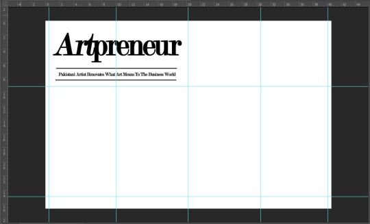
For the title and the stand-first, I followed my planned layout. Using the Type tool from the left vertical toolbar, I clicked near the top left of the base layer and typed the title ‘Artpreneur’ using Modern No. 20 serif font. The reason why I used this font was because I loved the elegance in its presentation and additionally to maintain house style to make audiences familiar.
I italicized ‘prenuer’ to match the title on the cover page and content page to create familiarity and to immediately catch reader’s attention.
For the placement of the stand-first, I had kept it conventional i.e., below the title of the editorial because it keeps the readability easily and does not create disturb the continuity of the editorial. To make the sub heading stand out I used the Line tool to create two vertical dividers to separate and highlight the stand-first, keeping a suitable margin so that the stand-first did not seem too conjuested
I changed the stand-first from ‘Pakistani Artist Renovates What Art Means To The Business World’ to ‘Business Major Sana Atta-Ullah, turned artist-entrepreneur, shows how vital it is to bridge the gap between art and business’ since that was what I had originally written as the description for the final article of the double spread and had mistakenly wrote it at first.
Step 4:
Next came the body copy i.e., the main text of my editorial. This was something that I had struggled with the most since I was not a hundred percent confident with the layout. However, after trying and failing to like any I chose to go with my mock up sketch for the double spread.
Since I needed paragraphs for the body copy, I selected the Type tool and instead of clicking to open the text box, this time I dragged to form a text box, giving it the dimensions I needed. This allows the typed text to be neatly arranged along the margins making the body copy’s appearance more sophisticated.
The typeface for:
Title/Heading/Caption: Modern No. 20
Stand-first/Sub-heading: Modern No. 20
Body Copy: Baskerville Old Face
Quotation: SF Kingston
Credits: Baskerville Old Face
Footer: Exodus
All of which are serif fonts to help maintain house style of the magazine.
Colour palette also was that of the cover page of the magazine. This makes the article unique and hence draws reader’s attention.
When I had copied and arranged all the text, it appeared messy and lacked the usual alignment that a magazine has. Therefore, I inquired from my teacher and from the Character icon on the right side of the screen, second last on the vertical bar, I opened up Character and selected ‘Paragraph’ from where I changes the text alignment from left align text to justify last left. This immediately changes the appearance of the double spread.
For the quotations, I again used the same procedure with the Type tool and used SF Kingston serif font. The different and bigger typeface makes the quotes stand out and also help to make the article more captivating and eye-catching. Which is why I had included one on both pages. Moreover I had used two additional type boxes so that I could overlay quotation marks for decorative purposes. I used the same hue of yellow as on the cover page to create an aesthetic look and to make it easier for readers to identify the cover story.
After I had written my body copy I used the Polygon tool to create the end of proof, or Q.E.D. mark "∎" to denote to my readers that they have reached the end of the article.
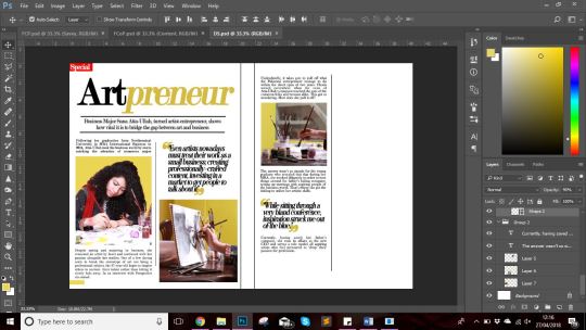
I had added the ‘Special’ in the left corner of the double spread seeing as though it would catch the attention of the readers even when the magazine closed, prompting the readers’s curiosity and hence captivating their attention. Additionally, it also helped fill up the negative space above the title and helped relate the article to the cover itself. The bright red of the rectangle immediately stands out against the muted tones of the magazine house style.
Step 5:
With body copy done, I added the photographs after editing them in Photoshop to match the colour scheme of my article. For the first anchoring picture, I used one that was quite similar to the cover page as sort of an introductory photograph before moving on to the passage itself.
The second and third image I used as a sort of iconography and to add to the aesthetic of the double spread. This was also to show the side of the model that I had not shown on the cover page i.e., her artistic side.
The last image i used as part of the content box to short of develop a direct relation to the audience and to make it feel as if the model herself was delivering her message to the reader.
Step 6:
Since I had an entire column left on the right side of the right page, I decided that it was time to officially panic before realizing that I could utilize the space for a content box. Hence, I slightly deviated from my mock-up sketch considering that I initially had no plans for making one.
Regardless, I decided to make the content box more of a direct message/life advice related. For this I used the Rectangle tool to make a black rectangle (clearly differentiating it from the rest of the body copy) and used a blend of Modern No. 20 and Baskerville Old Face for the typography.
Step 7:
For the footer of the double spread, I followed conventions and placed the masthead on the left page in its house font and placed the page number on the right page, for repetition to create familiarity and for ease of navigation respectively.
Again I used the Line tool to create a line as the decorative along the footer to add to the visuals of the double spread while easily drawing the reader’s attention to it.
I also added a drop-cap later on to draw the attention of the readers towards the beginning of the passage and to help them navigate. For this I had to rearrange the text by creating a text box of a custom shape.

All that was left now was the refined version of each part of my foundation portfolio.
0 notes
Text
Creating a good lyric video for less than $10
How to make a lyric video for your song (without using Motion or After Effects)
Lyric video: a video that shows your song lyrics while the music plays. [Pretty self-explanatory.]
Not only are lyric videos a great and manageable way to keep your video content coming in between bigger projects that involve more complicated production, but I’ve found they can actually be a lot of fun to make.
Below I’m going to talk about how I created six different lyric videos along with info on some of the FREE tools I used.
A few things to keep in mind:
I’m not a video guy. Every time I make one of my own lyric videos it’s a process of trial and error. A pro could probably create something twice as good in half the time, but I enjoy playing around to find solutions on my own. Plus, video budget? (Pshaw).
You can make really cool lyric videos with programs like Motion and After Effects. I didn��t. For one, those programs cost money (see pshaw above). But diving into one of those programs would mean I have yet another learning curve to climb. I’m interested in exploring Motion at some point, but in between family, work, and everything else, I’d rather use what time is leftover to make music and bang out some videos, not hunker down in the lab for days on end. Maybe those programs are easier to use than I’m imagining, and I’m missing out (let me know in the comments), but for the sake of this article, let’s just refer back to the zero-budget appeal of making lyric videos WITHOUT Motion or After Effects.
That leaves you with free video editing software like iMovie or Windows Movie Maker. Pros might scoff at these intro-level video production tools, but when you combine them with a few other tricks, plus some creativity, I think you can create compelling lyric videos with little more than what comes loaded on most desktops, tablets, or smartphones. [Full disclosure: I used Final Cut Pro X on some of the videos below, but I’d worked in iMovie for long enough before that to know most of the things I’m doing in FCPX can be done in iMovie.]
Beginner tips for making lyric videos
Open your movie-making software and set your new project’s aspect ratio to 16:9.
Import your song and any other media (like video clips, still images, logos, etc.) that you plan to use.
Move your first clip or background image to the project pane. If you plan to use one static background image the whole time, you can click and drag to adjust the duration that it appears so it’s long enough to display during your whole song.
Place your song into the project pane. If you want it to start playing right away, drag it all the way to the left. If you have a title page or some other introductory elements, you can leave a little room before the song starts.
Use “titles” to place the lyrics on the video at the appropriate time during the song, matching with the vocals.
Use a font size and style that’s readable (or that looks cool at the very least).
Position your titles on the video (again, by dragging) so they appear in a place that’s legible. For instance, if you’re using a still image of a sandy beach below a light gray sky, you don’t want white font to appear over that sky. Better to drag it down so it appears with starker contrast over the dark sand.
Make adjustments to the length of the titles (you can do this by clicking and dragging) to smooth out the transition from line to line.
Watch your whole video a few times through and make any needed fixes.
Export your video file and upload it to YouTube, Facebook, Vimeo, etc.
Some tricks to spice up your lyric videos
youtube
This is the lyric video for my single “Collapsing Star” — a long fade-out kind of song about devotion in the face of aging — so I thought the visuals should do exactly what the music and lyrics do: fade, shrink, collapse.
The creation of this video involved some really basic elements:
Still images of space that slowly evolve — I wanted there to be a extraterrestrial time-lapse effect, so I used some super hi-res photos from Unsplash, applied a very long cross-fade between each transition, and also used just an imperceptible touch of “Ken Burns” (an effect that creates some motion using a still image).
A shrinking sun — Scientifically speaking, I know stars don’t collapse in this way; they usually get big and bright before dwindling into white dwarfs or black holes. But I thought a slowly shrinking star would paint the lyrics in a haunting way, so I used Canva to create dozens of colored circles, each one small than the next. I then placed them on the timeline with overlap so that each one could (like the space images) fade into the next and depict shrinking. With the addition of some blur and some “stencil” effects, I was able to hint at dark sun spots and the rippling surface of a star, as well as the halo around a star.
The twinkle of space — Because I was using static images, I needed to add some other light effects that made for a kind of twinkle or oscillation in the background stars. The main one I relied on was the “sketch” effect in FCPX.
youtube
This is the lyric video to my song “Irretrievable Beauty.” To create it I followed all the basic steps mentioned above, but here are a few of the bonus elements I added for (hopefully) extra impact:
Additional text — No one ever said a lyric video should contain ONLY your lyrics. So I wrote a bunch of other text (a letter from the 22nd-Century) and placed my lyrics within it. Check out the video and what I’m describing will make more sense.
Color contrast of text — The actual lyrics of the song needed to be easily readable, so they’re all in black against a lighter background. The rest of the words are white, and it’s fine if they roll by without anyone being able to read them all. I intended to create the feeling of being flooded by text, so lots of it is supposed to wash over you.
Public domain image — I found a super hi-res image from 1905 to use for the background of the video (and my cover artwork too), and slowly zoomed in throughout the whole video.
youtube
Above is the lyric video for my song “1+1+1=3.” Some of the things I did to make this video:
Slow fade between different versions of the same photo — The background image for this video is the same as the cover artwork, a photo I took of arithmetic on a chalkboard. I then applied different filters to the photo to create three separate versions. While editing the video, I started by laying the three images out in a repeating pattern and then cross fading them all so it looks like there’s some kind of slow transformation happening.
More extra text — The additional text in this video is nowhere near as crazy as in “Irretrievable Beauty,” but I wanted to add a few bits here and there. You’ll spot ’em.
Directly reference the subject matter — The song is called “1+1+1=3.” Yes, it’s about love, but the math element was a fun visual reference point. Arithmetic on a chalkboard. Strange equations in the text. Etc. What’s the visual reference in your song?
youtube
Above is the lyric video for my song “Silently.” Some things I did to create this one:
Hyperlapse sunset — One afternoon when I was visiting Oregon, I ran up to the top of Mt. Tabor (an extinct volcano in the heart of Southeast Portland) and found a good spot to film the changing sky as dusk fell. I made sure to be out of the way of anyone who might walk in front of the camera and ruin the looooooong time-lapse shot. Hyperlapse is a free app from Instagram, and it makes it easy to shoot long videos and then speed them up at various rates. I think my 4-minute music video required about 45 minutes of footage.
Intro titles from Word Swag — If you read this blog frequently, you probably know I love Word Swag, a free app that lets you add cool fonts to images. I used Word Swag to create both the circle logo at the beginning with my name in it, and also the “Silently” title. You could use this app to create text for every single lyric, but that’d get time consuming so I just ended up using it for those two elements at the beginning. For this purpose, within Word Swag you’ll usually want to lay the font over a transparent background so you can fly it into whatever video you’re creating without disrupting the moving footage. [Note: I used Word Swag to create the intro text for all the lyric videos below.]
Sketch effect — I then added some built-in effects, including a color saturation effect and two doses of a sketch illustration effect, to make the video look grainy and lo-fi. Like I said above, this wasn’t premeditated. Just playing around with effects to see what looked promising. On that note…
Earthquake wobble effect — I used the earthquake effect because I thought it kind of made the text look like it was on a transparent slide overlay that was out of focus for a second.
Alternating pacing of lyric appearances — Sometimes the lyrics appear and disappear with the vocal. Sometimes certain lines linger. I just went by feel, and payed more attention to how the titles looked laid out across the screen than anything particularly musical.
Alternating the color of the text — This is another obvious way to add some variation if you feel like your lyric video is too much of the same thing: change the colors of the lyrics!
youtube
Here’s a video for a song called “Morning Edition” which I posted right before the election in 2016. The recording is actually just a super lo-fi Garageband demo, but I only had two weeks until election day, and I figured if I’m going to make some kind of statement, there’s no time to wait to get my band into a proper studio. So, a few notes about this lyric video:
A lyric video can still have live action — I’ve never really liked the distinction between “music video” and “lyric video,” as if one is more legit and exciting than the other. As someone who listens to lyrics just as much as the music, I love good lyric videos, and I think there can be an interesting hybrid between these two approaches. For “Morning Edition” I lip-synced to my song, 10 seconds at a time, while using the Face-Swap tool in Snapchat to graft a certain someone’s mug onto mine. Then I edited all those takes together and applied a sharp contrast filter to blend the background of the Snapchat clips with the large black borders on both sides of the clips.
Did I say the lyrics have to be legible? — Well sure, it’s good to have legible lyrics, but I don’t think they need to be HUGE if that means you’re ruining the aesthetic of the video. For this one I figured I’d keep the text in a thin minimalist font at the top of the screen, out of the way of my face, and anyone who really wanted to read along could watch the video in full-screen mode.
youtube
Here’s the lyric video for my song “Veterans Day.” By complete accident — again, lots of playing around with built-in options — it ended up with a kind of Zen art aesthetic. Here’s how:
Stock video — I looked through tons of stock video sites to find an affordable, hi-res clip that could be used as the background for the whole video. I ended up buying (for less than $10) a short video of milk being poured into a clear glass of water with a black background. But 6 seconds of video wasn’t going to cut it for a 5 minute song, so I…
Slowed the clip WAY down — I stretched the clip as long as it could go and still only had about 2.5 minutes’ worth. So then I…
Reversed the clip — By duplicating the clip I had 2.5 minutes of forward motion, and 2.5 minutes of backwards motion. So the result is like a palindrome, or like that famous bass solo on “Call Me Al.” Halfway through, the whole thing turns around and the milk goes back into the bottle by the end. Another accident that I ended up enjoying.
Color inversion — I used the built-in tools to invert the colors so the white milk became like black ink, and the black background turned to a light gray.
B&W — I then took that video and turned it to black and white, which ended up darkening the whole thing in a nice way.
Scrolling text — One of the built-in title options on many video software programs allows you to scroll text vertically, like the end credits of a film. I used this effect separately for each verse and chorus of the song. Then I did another layer of scrolling text with just a bunch of randomly spaced letters and symbols, with a high transparency on the font so it appears as a graphic element, and I think it gives the whole video a kind a translucent papery feel.
youtube
Here’s a few things you might be able to learn from the lyric video to my song “Premiere:”
Still photos are your friend — Check out royalty-free photo sites such as Unsplash. I made the entire video for “Premiere” using photos I found on that site. The one risk you run is that other artists use the same photos in their work, but you can always tweak the images so they’re barely recognizable as I did with the milk video in “Veterans Day.”
Don’t be afraid of Ken Burns — He has a built-in video effect named after him for a reason; that technique of zooming in and out on still photos can be really effective for creating mood. Dynamics! Don’t go crazy or anything with the motion, but a little Ken Burns here and there can make flat photos come to life.
Mix and match fonts — I used a bunch of different kinds of fonts on “Premiere,” giving each section of the song its own feel.
Apply effects and transitions to the titles (text) too — Don’t forget that many of the same effects you can use on pictures and video will work to give your lyrics an interesting look as well.
Don’t publish your video until you’ve proofread it a dozen times! — If you watched my lyric video for “Premiere” you might’ve found a typo. Whoops. I didn’t catch it until it’d been posted for over a week, and by then… oh well. Staring at text while you’re editing gets tiring. Your brain tricks you. While you’re in the process of creating, you might not catch something that seems glaringly incorrect later on. So get some bandmates and friends to watch the video a few times to make sure you don’t have any spelling or grammar issues on your lyrics (I mean, besides the usual grammar or syntactical issues that ALL lyrics have). Another way to limit errors is to…
Write your lyrics out in Word and then paste them into your titles — When you type your lyrics in Word first, you get the benefit of the program’s spellcheck system. Some of the popular video editing software doesn’t have spellcheck, so paste those lyrics in after you’ve vetted them in the external doc.
Okay, those are some of the tricks I’ve used to make my lyric videos more interesting than just white font on a black background, all without paying for extra software or expensive stock footage and images. Hopefully they’re helpful as you create your next video.
Do you have any advice to add? I’d love to hear it. Holler in the comments below and be sure to post a link to your best lyric videos on YouTube!
The post Creating a good lyric video for less than $10 appeared first on DIY Musician Blog.
0 notes
Text
Creating a good lyric video for less than $10
How to make a lyric video for your song (without using Motion or After Effects)
Lyric video: a video that shows your song lyrics while the music plays. [Pretty self-explanatory.]
Not only are lyric videos a great and manageable way to keep your video content coming in between bigger projects that involve more complicated production, but I’ve found they can actually be a lot of fun to make.
Below I’m going to talk about how I created six different lyric videos along with info on some of the FREE tools I used.
A few things to keep in mind:
I’m not a video guy. Every time I make one of my own lyric videos it’s a process of trial and error. A pro could probably create something twice as good in half the time, but I enjoy playing around to find solutions on my own. Plus, video budget? (Pshaw).
You can make really cool lyric videos with programs like Motion and After Effects. I didn’t. For one, those programs cost money (see pshaw above). But diving into one of those programs would mean I have yet another learning curve to climb. I’m interested in exploring Motion at some point, but in between family, work, and everything else, I’d rather use what time is leftover to make music and bang out some videos, not hunker down in the lab for days on end. Maybe those programs are easier to use than I’m imagining, and I’m missing out (let me know in the comments), but for the sake of this article, let’s just refer back to the zero-budget appeal of making lyric videos WITHOUT Motion or After Effects.
That leaves you with free video editing software like iMovie or Windows Movie Maker. Pros might scoff at these intro-level video production tools, but when you combine them with a few other tricks, plus some creativity, I think you can create compelling lyric videos with little more than what comes loaded on most desktops, tablets, or smartphones. [Full disclosure: I used Final Cut Pro X on three out of the four videos below, but I’d worked in iMovie for long enough before that to know most of the things I’m doing in FCPX can be done in iMovie.]
Beginner tips for making lyric videos
Open your movie-making software and set your new project’s aspect ratio to 16:9.
Import your song and any other media (like video clips, still images, logos, etc.) that you plan to use.
Move your first clip or background image to the project pane. If you plan to use one static background image the whole time, you can click and drag to adjust the duration that it appears so it’s long enough to display during your whole song.
Place your song into the project pane. If you want it to start playing right away, drag it all the way to the left. If you have a title page or some other introductory elements, you can leave a little room before the song starts.
Use “titles” to place the lyrics on the video at the appropriate time during the song, matching with the vocals.
Use a font size and style that’s readable (or that looks cool at the very least).
Position your titles on the video (again, by dragging) so they appear in a place that’s legible. For instance, if you’re using a still image of a sandy beach below a light gray sky, you don’t want white font to appear over that sky. Better to drag it down so it appears with starker contrast over the dark sand.
Make adjustments to the length of the titles (you can do this by clicking and dragging) to smooth out the transition from line to line.
Watch your whole video a few times through and make any needed fixes.
Export your video file and upload it to YouTube, Facebook, Vimeo, etc.
Some tricks to spice up your lyric videos
youtube
This is the lyric video to my song “Irretrievable Beauty.” To create it I followed all the basic steps mentioned above, but here are a few of the bonus elements I added for (hopefully) extra impact:
Additional text — No one ever said a lyric video should contain ONLY your lyrics. So I wrote a bunch of other text (a letter from the 22nd-Century) and placed my lyrics within it. Check out the video and what I’m describing will make more sense.
Color contrast of text — The actual lyrics of the song needed to be easily readable, so they’re all in black against a lighter background. The rest of the words are white, and it’s fine if they roll by without anyone being able to read them all. I intended to create the feeling of being flooded by text, so lots of it is supposed to wash over you.
Public domain image — I found a super hi-res image from 1905 to use for the background of the video (and my cover artwork too), and slowly zoomed in throughout the whole video.
youtube
Above is the lyric video for my song “1+1+1=3.” Some of the things I did to make this video:
Slow fade between different versions of the same photo — The background image for this video is the same as the cover artwork, a photo I took of arithmetic on a chalkboard. I then applied different filters to the photo to create three separate versions. While editing the video, I started by laying the three images out in a repeating pattern and then cross fading them all so it looks like there’s some kind of slow transformation happening.
More extra text — The additional text in this video is nowhere near as crazy as in “Irretrievable Beauty,” but I wanted to add a few bits here and there. You’ll spot ’em.
Directly reference the subject matter — The song is called “1+1+1=3.” Yes, it’s about love, but the math element was a fun visual reference point. Arithmetic on a chalkboard. Strange equations in the text. Etc. What’s the visual reference in your song?
youtube
Above is the lyric video for my song “Silently.” Some things I did to create this one:
Hyperlapse sunset — One afternoon when I was visiting Oregon, I ran up to the top of Mt. Tabor (an extinct volcano in the heart of Southeast Portland) and found a good spot to film the changing sky as dusk fell. I made sure to be out of the way of anyone who might walk in front of the camera and ruin the looooooong time-lapse shot. Hyperlapse is a free app from Instagram, and it makes it easy to shoot long videos and then speed them up at various rates. I think my 4-minute music video required about 45 minutes of footage.
Intro titles from Word Swag — If you read this blog frequently, you probably know I love Word Swag, a free app that lets you add cool fonts to images. I used Word Swag to create both the circle logo at the beginning with my name in it, and also the “Silently” title. You could use this app to create text for every single lyric, but that’d get time consuming so I just ended up using it for those two elements at the beginning. For this purpose, within Word Swag you’ll usually want to lay the font over a transparent background so you can fly it into whatever video you’re creating without disrupting the moving footage. [Note: I used Word Swag to create the intro text for all the lyric videos below.]
Sketch effect — I then added some built-in effects, including a color saturation effect and two doses of a sketch illustration effect, to make the video look grainy and lo-fi. Like I said above, this wasn’t premeditated. Just playing around with effects to see what looked promising. On that note…
Earthquake wobble effect — I used the earthquake effect because I thought it kind of made the text look like it was on a transparent slide overlay that was out of focus for a second.
Alternating pacing of lyric appearances — Sometimes the lyrics appear and disappear with the vocal. Sometimes certain lines linger. I just went by feel, and payed more attention to how the titles looked laid out across the screen than anything particularly musical.
Alternating the color of the text — This is another obvious way to add some variation if you feel like your lyric video is too much of the same thing: change the colors of the lyrics!
youtube
Here’s a video for a song called “Morning Edition” which I posted right before the election in 2016. The recording is actually just a super lo-fi Garageband demo, but I only had two weeks until election day, and I figured if I’m going to make some kind of statement, there’s no time to wait to get my band into a proper studio. So, a few notes about this lyric video:
A lyric video can still have live action — I’ve never really liked the distinction between “music video” and “lyric video,” as if one is more legit and exciting than the other. As someone who listens to lyrics just as much as the music, I love good lyric videos, and I think there can be an interesting hybrid between these two approaches. For “Morning Edition” I lip-synced to my song, 10 seconds at a time, while using the Face-Swap tool in Snapchat to graft a certain someone’s mug onto mine. Then I edited all those takes together and applied a sharp contrast filter to blend the background of the Snapchat clips with the large black borders on both sides of the clips.
Did I say the lyrics have to be legible? — Well sure, it’s good to have legible lyrics, but I don’t think they need to be HUGE if that means you’re ruining the aesthetic of the video. For this one I figured I’d keep the text in a thin minimalist font at the top of the screen, out of the way of my face, and anyone who really wanted to read along could watch the video in full-screen mode.
youtube
Here’s the lyric video for my song “Veterans Day.” By complete accident — again, lots of playing around with built-in options — it ended up with a kind of Zen art aesthetic. Here’s how:
Stock video — I looked through tons of stock video sites to find an affordable, hi-res clip that could be used as the background for the whole video. I ended up buying (for less than $10) a short video of milk being poured into a clear glass of water with a black background. But 6 seconds of video wasn’t going to cut it for a 5 minute song, so I…
Slowed the clip WAY down — I stretched the clip as long as it could go and still only had about 2.5 minutes’ worth. So then I…
Reversed the clip — By duplicating the clip I had 2.5 minutes of forward motion, and 2.5 minutes of backwards motion. So the result is like a palindrome, or like that famous bass solo on “Call Me Al.” Halfway through, the whole thing turns around and the milk goes back into the bottle by the end. Another accident that I ended up enjoying.
Color inversion — I used the built-in tools to invert the colors so the white milk became like black ink, and the black background turned to a light gray.
B&W — I then took that video and turned it to black and white, which ended up darkening the whole thing in a nice way.
Scrolling text — One of the built-in title options on many video software programs allows you to scroll text vertically, like the end credits of a film. I used this effect separately for each verse and chorus of the song. Then I did another layer of scrolling text with just a bunch of randomly spaced letters and symbols, with a high transparency on the font so it appears as a graphic element, and I think it gives the whole video a kind a translucent papery feel.
youtube
Here’s a few things you might be able to learn from the lyric video to my song “Premiere:”
Still photos are your friend — Check out royalty-free photo sites such as Unsplash. I made the entire video for “Premiere” using photos I found on that site. The one risk you run is that other artists use the same photos in their work, but you can always tweak the images so they’re barely recognizable as I did with the milk video in “Veterans Day.”
Don’t be afraid of Ken Burns — He has a built-in video effect named after him for a reason; that technique of zooming in and out on still photos can be really effective for creating mood. Dynamics! Don’t go crazy or anything with the motion, but a little Ken Burns here and there can make flat photos come to life.
Mix and match fonts — I used a bunch of different kinds of fonts on “Premiere,” giving each section of the song its own feel.
Apply effects and transitions to the titles (text) too — Don’t forget that many of the same effects you can use on pictures and video will work to give your lyrics an interesting look as well.
Don’t publish your video until you’ve proofread it a dozen times! — If you watched my lyric video for “Premiere” you might’ve found a typo. Whoops. I didn’t catch it until it’d been posted for over a week, and by then… oh well. Staring at text while you’re editing gets tiring. Your brain tricks you. While you’re in the process of creating, you might not catch something that seems glaringly incorrect later on. So get some bandmates and friends to watch the video a few times to make sure you don’t have any spelling or grammar issues on your lyrics (I mean, besides the usual grammar or syntactical issues that ALL lyrics have). Another way to limit errors is to…
Write your lyrics out in Word and then paste them into your titles — When you type your lyrics in Word first, you get the benefit of the program’s spellcheck system. Some of the popular video editing software doesn’t have spellcheck, so paste those lyrics in after you’ve vetted them in the external doc.
Okay, those are some of the tricks I’ve used to make my lyric videos more interesting than just white font on a black background, all without paying for extra software or expensive stock footage and images. Hopefully they’re helpful as you create your next video.
Do you have any advice to add? I’d love to hear it. Holler in the comments below and be sure to post a link to your best lyric videos on YouTube!
The post Creating a good lyric video for less than $10 appeared first on DIY Musician Blog.
0 notes
Last Seen Blogs

kaze-art
Kaze 阿風

not-simple-and-confused
Confusione: la mia casa

brianmaysleftclog
-⭐️Queen⭐️-

keeplovingparamore
keeplovingparamore

annie-sviridova-blog
Annie Sviridova