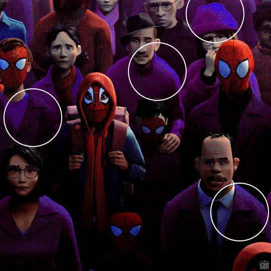
#featuring lots and lots and lots of photoshop lol
Text

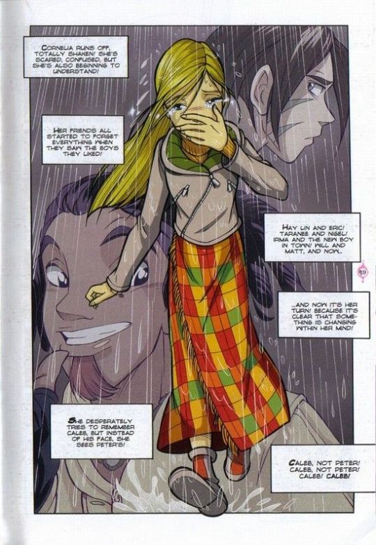
Elaena Targaryen
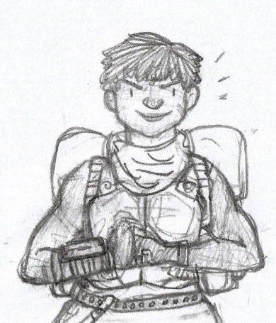
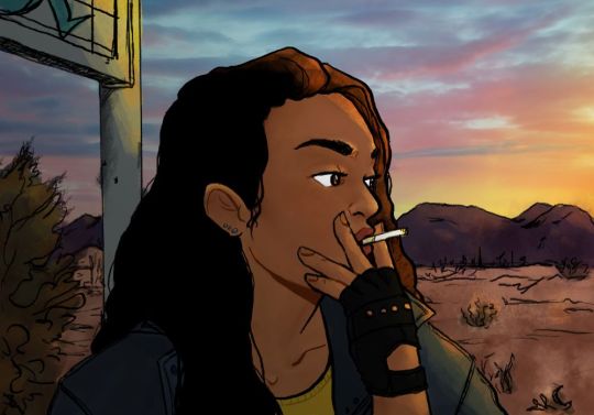
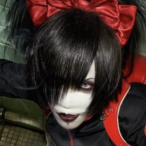
Princess Elaena was only eleven when locked away in the Maidenvault. At that age she was a skinny thing, the runt of the litter, but she had more than a little of her sister Daena's wilfullness even then, as she would prove when she grew older. She liked to dress in black as a girl, because her big sister Daena had done it. Her eyes were a soft lilac, her mouth thin-lipped and often angry. Her hair was a platinum white with a bright golden streak down the middle, an unusual color even for the Targaryens. She wore it long, pulled back, and braided, and was always being told it was her crowning beauty. Elaena's most cherished possession was a dragon's egg whose stony shell showed the same colors as her hair. [x]
#elaena targaryen#asoiaf#asoiaf art#a song of ice and fire#valyrianscrolls#house targaryen#dragon eggs#targaryensource#westeros history#so spake martin#there aren't enough artworks of baby elaena and i do love her so#but this was basically an experiment to see if i could do it#featuring lots and lots and lots of photoshop lol#i have too much time on my hands
505 notes
·
View notes
Text
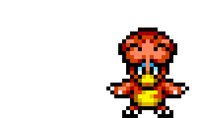
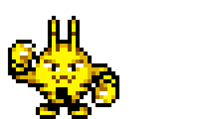
magby + elekid team request!
#elekid#magby#sprites#sprite rqs#up#my apologies for how long this took#tysm for your patience#tbh my photoshop subscription died and i’m learning a new program for this LOL 💀#it’s missing a lot of helpful features ps has BUT it’s doable and i will get to every request i promise!
24 notes
·
View notes
Photo
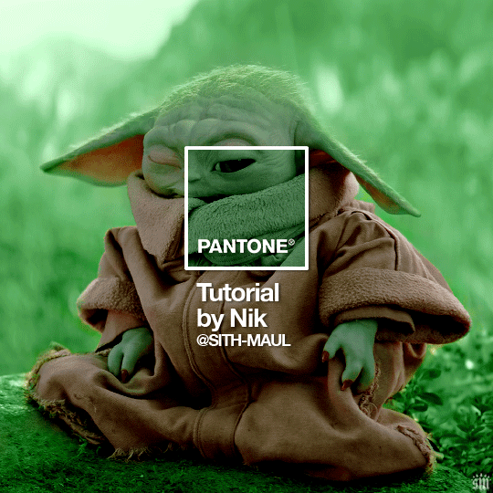
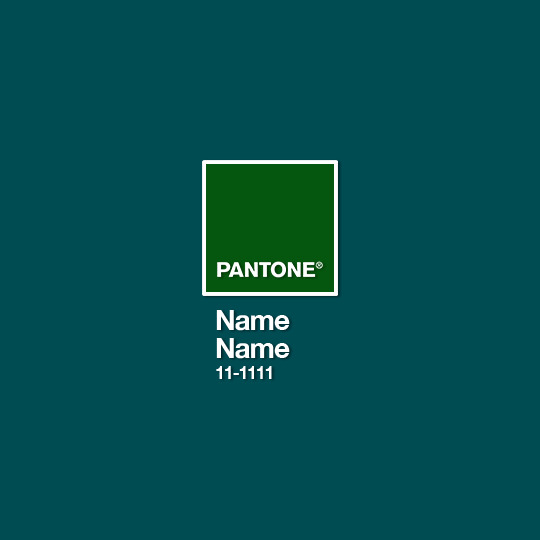
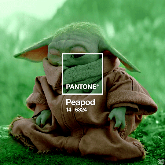
HOW TO: Make a Pantone “Color of the Year” Gif
A few people have asked about my Pantone sets which use the “Color of the Year” swatch design. So, here’s a full tutorial with a downloadable template of my exact overlay! Disclaimer: This tutorial assumes you have a basic understanding of gif-making in Photoshop.
PHASE 1: PICKING A SCENE + PANTONE COLOR(S)
I’m starting with this because it’s crucial for planning your gifset as well as making sure the execution is smooth sailing. The steps in this phase won’t necessarily be literal steps but some tips for how I usually go about making a Pantone set:
1.1 – Picking a scene.
Scene selection is everything. To make things easy on yourself, I suggest choosing scenes where the background is mainly ONE color — for example, a scene where the subject has a clear blue sky behind them. To make things even easier, choose a color that isn’t the same color as the subject of your gif. Like, if your subject is a human, I’d avoid using a gif with a red or yellow background unless you want to do a lot more work to mask their skin.
Rip me using a scene of green lil Grogu in green grass lmao. But I guess that goes to show you could really do this with any scene (I just did lots of masking and keyframe animations to perfect this green shade). BUT selecting your scenes wisely = a lot less work.
1.2 – Picking Pantone colors.
People often ask me how I choose my colors and there are a few methods which I’ll go over below.
But note that not all Pantone colors have a cute name, or any name (fun fact: only Pantone textiles have official names and they end with TCX, TPX, or TPG).
METHOD A: Google Search “Pantone [Color]”
Source: Google
Easy but not always fruitful, all you do for this method is open Google and type “Pantone [insert color here].” For example, when searching for teal colors, I searched several things including: Pantone Teal, Pantone Turquoise, Pantone Blue, Pantone Green, Pantone Blue Green, etc. Then, just sift through the Google results and click on whatever comes up from the official Pantone website! Since Pantone’s site blocks some info behind a paywall, you won’t be able to get a hex code from them. But you can just screenshot the swatch from their site, put it in Photoshop, and use the eyedropper tool to figure out the color.
METHOD B: Color-Name Site
Source: https://www.color-name.com/
This handy website lets you search by colors using the upper navigation bar. Or you can just type something like "magenta" or "blue pantone" or even “frog” and see what comes up lol. Color-name can put together palettes too! I like that this site also tells you the hex code of a color, which is really helpful for getting the right code to put in my overlay. Note: Not every color on this site is a Pantone textile, so not all of these names are Pantone-official names. You can tell it’s official if, in the Pantone row of the Color Codes table on the middle of the page, it has a code that’s 2 numbers, a dash, 4 numbers, and either TCX, TPX, or TPG.
METHOD C: User-Made Pantone Colors Archive
Source: https://margaret2.github.io/pantone-colors/
For my Wednesday characters as Pantone colors set, it was all about matching the color name to the character’s vibe. So, before looking at the actual colors themselves, I wanted to find the perfect color names. I stumbled upon this page. The pros = it lists pretty much all of the current official Pantone names. The cons = it’s not convenient since there’s no filtering tool. You can do Command+F and search for keywords, but that’s it. I literally scrolled through this whole page for my Wednesday set and read every single name, which... I think means... something’s wrong with me /lh /hj
METHOD D: Official Pantone Color Finder
Source: https://www.pantone.com/pantone-connect
This is last on my list because I don’t actually recommend it. Unless you already have access to this resource from your school or work or something, I would never pay for it and it is a paid feature only. Boooo 👎 But there is a free trial (which I’ve never used), so if you want to see what it’s about, you can definitely go for it.
PHASE 2: MAKING THE BASE GIF
Again, just some super quick tips for making a gif that, I think, looks best with this kind of set — but if you’re still learning how to gif, I do have a basic gif-making tutorial here for extra guidance!
2.1 – Uncheck “Delete Cropped Pixels” before cropping your gif. When you use the crop tool, this checkbox appears in the top toolbar. Unchecking it allows you to move the positioning of your gif later on, which is handy in this case when you want to choose which part of your gif will be underneath the Pantone swatch. You can read more about this tip in my basic gif-making tutorial (linked above; Step 1.5 – Tip B).

2.2 – Make your gif 540px width. My gifs for these sets are usually 540x540px but I think 540x500px will also look good. I think it’s more impactful though to make a big gif to show off your coloring.
PHASE 3: ADDING THE PANTONE OVERLAY
3.1 – Download my template
I made this template myself, so all I ask is that you don’t claim it as your own and that you give me proper insp or template credit in your caption if you decide to use it! Get the PSD with the transparent background here!
3.2 – Download the font Helvetica Neue Bold
The font I use (and I’m pretty sure it’s the same font Pantone uses) is Helvetica Neue Bold, with some very specific letter spacing (which I determined by studying Pantone’s official Color of the Year Very Peri design). It’s already set in my .psd but here are specs in case: color name spacing = -40, color code spacing = -75 (sometimes I’ll do -25 for the numbers after the dash if I don’t like how tightly they’re packed together).
I uploaded Helvetica Neue Bold to my dropbox here!
3.3 – Import my overlay
You can either drag the whole folder onto your gif from tab to tab or right-click the folder, select Duplicate Group, and select your gif as the destination document. Just make sure this overlay group is above your base gif!
3.4 – Fill the color swatch
In my .psd, on the layer labeled “Pantone Swatch,” just grab the hex code of your chosen Pantone color and fill that layer using the Paint Bucket tool! I’ve already put a layer mask on the layer for you so it fits perfectly inside the square outline.
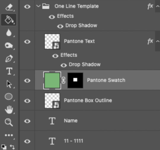
If you’re using my .psd, all the blend mode settings are already in place! I usually set the colored square behind the Pantone logo to the Color blend mode, but sometimes, I prefer the way Hue looks. It’s up to you!
You can also adjust the drop shadow settings to make your text more visible as needed. The layers are arranged in this order so the drop shadows don’t interfere with the semi-transparent part of the colored swatch.
3.5 – Insert the color name and code
My .psd has two versions to choose from: (1) a color name that fits on one line and (2) a color name that requires two lines. Use the one that applies to your color name and simply type that and color code into the corresponding text layers!
Note 1: Pantone doesn’t keep their font size uniform for every color of the year. They’ll sometimes shrink the text to fit longer names, but I like being consistent. So, I use this one font size for all my colors.
Note 2: My template has all the text left-justified and matching the starting point of the P in Pantone. BUT, sometimes the gif looks better if you nudge the text a bit so it looks more centered. Use your discretion when aligning the text!
Note 3: Btw, you definitely don’t have to use the TCX/TPG codes like me. (I’m a nut and there’s no way I’ll ever do a Pantone set and not use those types of codes to maintain uniformity across this series lol.) I’ve seen others do sets inspired by mine using different color codes or even just the hex code itself!
PHASE 4: COLORING THE BASE GIF
The key here is to make a majority of your gif feature your chosen Pantone swatch. If you’re really smart with your scene selections, this should be a breeze! If you’re stubborn like me and want to use specific scenes with the opposite color of your chosen Pantone swatch, there will be a bit more color manipulation involved... However, this isn’t a coloring tutorial, so again, I’m going to give some tips and resources that will hopefully help you out!
4.1 – Color matching.
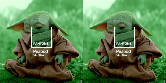
Now that you have the Pantone swatch on your gif, you should be able to reference that center square set to Color/Hue to match the rest of your gif to that color. Feel free to paint a little blob of your color onto another layer anywhere on your gif so you can refer to it closer over a specific part of your gif. For example, I put a little circle over Grogu’s head to see how closely I matched Pantone’s Peapod color, then I tweaked my adjustment layers a bit more until the colors matched near perfectly and I couldn’t tell where that blob begins or ends. The left is the solid color and the right is set to the blending mode Color (like the square):
4.2 – Moving the base gif.
This isn’t really about coloring... but remember when I said to uncheck “Delete Cropped Pixels” in Step 2.1? Well, here’s your chance to adjust your canvas and move the gif around so the exact part you want under the color swatch is in the right position. I personally think these kinds of sets are more impactful when you put a differently colored part of your gif under the swatch so you can see through it and the difference is clearer. In my example, I put Grogu in the center so the green box would cover some of his brown potato sack robe.
4.3 – Color manipulation.
Color manipulation is when you transform your media’s original color grading into a completely different color. The Grogu gif isn’t a great example because the original scene was already a green-yellow color:
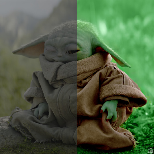
I mean, the difference is still pretty drastic but that’s mostly because my file was HDR and washed out as a result.
So, here’s an example I made using a gif from my first Pantone set for ITSV (I’m not doing this demo to the Grogu gif because it’d be too much work to manipulate a green background with a green subject. This ITSV scene is perfect bc the majority of it is blue while the subjects are mostly red.)
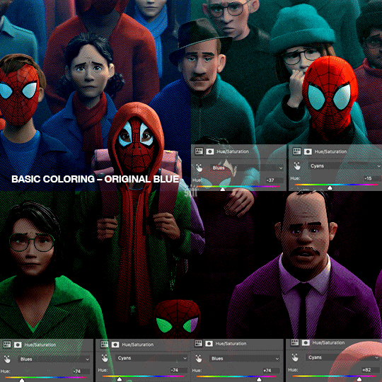
For the “basic coloring,” I did everything as I normally would: mostly levels and selective color layers.
For color manipulation, my fav adjustment layer is Hue/Saturation (those are the screenshots that are on the gif above). When you’re smart with your scene selection, it’s pretty easy to manipulate colors with one Hue/Sat layer because you usually only need to tamper with 1-2 colors and, hopefully, they shouldn’t interfere with skin tones (obviously you’ll do other layers to further enhance your gif’s brightness, contrast, etc. — but I just mean the heavy lifting usually only takes me one layer with a good scene choice).
All you have to do is figure out what color the majority of your gif is, toggle to that color’s channel, and fiddle with the hue slider. In the gif above, you can see that I played with both the Blue and Cyan channels. Here’s why:
If I only adjust the Blue hue slider, I get those speckles of cyan peaking through in the gif above. Unless you’re working with completely flat colors — like 2D animation with zero shading/highlights — a color is never just one, solid color. Blue isn’t just blue, it may have some cyan. Purple isn’t just purple, I often have to toggle the Blue channel too. So, yeah, be mindful of that!
I’ll sometimes go in with the brush tool and paint over some areas of my gif to really smooth out the color and make it uniform. When I do that, I just set that painted layer to the Color blend mode. Some of the resources below go into that technique a bit more!
4.4 – Coloring resources.
While not all of these tutorials cover the same type of color manipulation I did in my gifs, I think the principles are similar and would be helpful to anyone who’s a beginner:
– color manipulation tutorial by usergif/me: I go a bit more in depth here (I think lol)
– how to change the background of any gif by usergif/fionagallaqher: a great tutorial for using keyframes so you can manipulate the background of a gif with lots of motion
– bea’s color isolation gif tutorial by nina-zcnik: this tutorial has more tips about hue/saturation layers as well as masking your subject
– elio’s colouring tutorial by djarin: this tutorial shows a lot of examples of first manipulating the colors then brushing over the gif with a matching color for extra coverage
And just one last note on coloring, I always try to appreciate gifs with the mentality that “good” coloring is 100% subjective. One of the only things I would classify as “bad” coloring is when you whitewash or [color]wash someone’s skin tone. So, as long as you keep the integrity of your subjects’ natural skin — especially if they’re a POC — you should feel good about your coloring, because it’s yours and you worked hard! <3
PHASE 4: EXPORT
That’s it!! If you work in Video Timeline like me, just convert from Timeline back to Frames, export your gif, and voila!
Easy PEAsy. 🥁
If you have specific questions about this tutorial, my ask box is open <3
Also, check out these other Pantone-inspired sets by my friends @nobodynocrime (Mulan set) and @wakandasforever (Ponyo set)! There are so many ways to use Pantone colors in your set, so I hope this inspires you to create something beautifully colorful <3
#gif tutorial#completeresources#usershreyu#useryoshi#userelio#userannalise#userzaynab#userives#usermarsy#usertreena#usercim#userrobin#userkosmos#usersalty#usermills#userhella#alielook#resource*#gfx*#pantone*
954 notes
·
View notes
Text
holy shit this year marks 10 years of this blog and moz!! i can't remember the exact date i started posting here - my archive says i have one post from november 2013 but let's disregard that - but i do remember it was around late 2014/early 2015 :)
^ one of the very first moz art pieces i ever drew, for fallout week 2015!!
memories and art through the years under a read more bc it got long
2014 → baby's first rpg!! i started playing fnv on my cousin's jailbroken xbox late 2013 and finished mid 2014 and i loved every minute of it. i remember waking up at 8am and playing almost nonstop until 2am the next day haha!
i didn't play moz on my first playthrough - but i did start creating a character that would eventually become her: a shorthaired ex-boxer who punched her way through obstacles when diplomacy failed. i remember she spent a lot of time with boone. i liked him then, because he saved my ass more times than i can count. but i digress. this is draft 1 moz essentially
2015 → this is the year that i was doing my thesis so i could graduate but i was so depressed and stressed about it that i distracted myself by replaying fnv on pc, where i played through the dlcs for the first time. i fell in love with the dlcs' oversarching story; particularly ulysses, who i became obssessed with, especially since i couldn't find any content of him at the time. in the game, i played as moz; i had most of her personality and choices down, but her backstory was still up in the air.
fun fact: this was an existing sideblog that i remade to be a fallout blog so i could look for ulysses content, and when i couldn't find any, i made some myself, featuring moz as my main courier six. originally, i didn't ship them, but eventually i ended the year as a courier/ulysses otp shipper.
this was the year i started drawing digitally - my uncle let me borrow a drawing tablet and i used an old copy of photoshop i pirated hehe
2016 → i graduated this year!! and promptly fell deeper into my depression. this was the year that it got so bad that i had to be medicated. through it all, this blog and moz and ulysses and my fandom friends were with me. and for that i am truly grateful :) this was the year i figured out how to lock transparent pixels so that i could color my lineart lol
2017 → i started hammering out moz's backstory this year i think. there's a lot of sketches of her and her family in my files. i experimented with shading and backgrounds here but that experimentation was pretty short-lived
2018 → i started using references seriously!!!! i did a lot of oc on oc kissing this year, featuring mostly moz and many friend ocs haha

2019 → didn't draw much this year. actually this year was a blur and i can't remember much from it except from it being the year of my terrible no good bad copywriting jobs... anyway i did manage to continue my courier/ulysses brainrot and make this piece, which i'm still proud of
2020 → pandemic time. i spent a lot of time asleep at home and i think this was also the year i started doing commissions?? shoutout to anyone who has ever commissioned me - thank you so much, i truly appreciate it!!

2021 → i switched from my old-ass pirated photoshop to clip studio paint and never looked back. also i did a bunch of commissions for my grandmother's surgery, which failed, and i distracted myself from the sadness by drawing my ocs over and over and playing disco elysium

2022 → by this year, i've got moz down pat and have started vaguely developing other ocs instead. but she's still always at the back of my mind

2023 → i bought new brushes from true grit texture supply and immediately found new favorites that i started using for everything. i tentatively started incorporating background elements in some pieces!
2024 → while it's still too early to say where this year will lead me art-wise, i will say that i started experimenting in realistic paint studio (which i bought in 2021, the same time as clip studio paint) a few days ago and i'm liking the results so far. we'll see!

all in all, these last 10 years have been quite a ride, but i'm glad i stuck around and i'm glad you guys stuck around too!! much much love 💖💖💖
#shh peri shhh#god. look at that old art... i took the ones that i still kinda liked but the rest...#well i don't hate them. but they're old and of their time and i wish i could redo them lmao#my art#moz
83 notes
·
View notes
Note
There are older video interviews (2022 and older) of AB where you can clearly she has wrinkles and lines on her face. She looks her age. She is not old she is in her late twenties so yes, of course she looks “young.” But she’s not 12 years old and now that she clearly has had Botox and work done (nothing wrong with that) and photoshops her own photos, it’s easy for people to say she looks like a teenager while CE looks old. But I really hate when they do that.
He is older. Lol. That’s the whole point. But don’t age her down and make her out to be this innocent victim when she is not. The same people on here that want to age him up but keep saying she’s 25 or 16, that’s because they want to make this whole thing a bigger deal than it is.
If AB had been around his age or somewhere in her 30s when they got together, I doubt any of this would be happening. Yes, the fans would most likely still hate her and the whole racist friends and nudes still would have happened, but it would be a lot less worse for him and much worse for her because now she’s a 30s plus aged person posting nudes on IG and racist friends who are fully grown still doing childish nonsense.
She’s lucky she’s in her 20s and she can be “given a pass” because she’s “young and inexperienced.”
They showed up on the red carpet together and he looked awkward but more or less seemed catering or humoring of her. I see the fans getting so riled up over this and I’m like, ok so you don’t like seeing them together but he didn’t act any which way towards her. The worst part of it was the color scheme of his outfit.
The footage caught and passed around on tumblr really made me think of a guy who was just humoring someone who he had been assigned to for the night. I know that’s weird of me to say for a married couple, but their “kiss” was a peck where he’s standing a foot back just like the other video of him leaning over to “peck” while also standing a foot back hands at his sides. The one photo from their vday dump is a car kiss photo where their bodies are once again not touching.
It’s interesting to see the few times they’re “kissing” in public this is what you get. A grown ass man has to kiss his wife where cameras are around and suddenly he looks like he’s being put through a fear factor contest.
Something just isn’t right or natural here and I stand by that.
The teenage bride comments always make me laugh because she's not a teenager. She's a woman of legal age by all accounts. There's so much more to discuss than a physical feature she can't change.
I do find it interesting that his fandom gets upset he is in the vicinity of her when that's what has been presented since this sideshow started. Once you can take emotion out of it, it's a lot funnier than it should be.
23 notes
·
View notes
Text

i didn't have a tutorial yet... so i made one lol. its longer than i wanted it to be, but i wanted to make sure it's easy to follow for people who've never made cc or have no experience with photo editing software, and fully explain my process. it's by no means hard at all though lol, i guarantee you making skin details is the easiest thing aside from recolors and if you want to learn this is a good place to start :-)
for people who are more experienced than that, and want to know specific things-- i've sectioned everything so it should be easy to skim through until you find what you need!
requirements.
this tutorial will only require sims 4 studio (free) and photoshop (not free) or gimp (free). i pirated photoshop 2022 myself. any version will do but i think 2022 just has nice new features for making content! if you don't want to buy or pirate, gimp is a similar alternative.

1.1 how to find skins to use as a base.
in case you don't have (a) skin(s) in mind to use for your skinblend, my tip is to download as much random ones as you can find. this way you have a lot to choose from and it's easier to get an idea of what you want.
go-to creators for maxis match skins: heihu, madmono, pyxiidis, faaeish, miikocc, emmibouquet and stretchskeleton.
creators for maxis mix/alpha skins: sims3melancholic, obscurus, ddarkstonee and pralinesims.
creators for maxis mix/alpha skins that only allow editing for private use: northernsiberiawinds, remussirrion and thisisthem.
go into cas and try them all out. if you like a part of a skin, write down which skin it is and what part(s) you want to use of it from which swatch if it has multiple.
for example, i almost always use one or two skins for just the nose shape, one for the eyebags, one to three for the lips and one for the basic shading of the face. don't be afraid to use the opposite style skins of what you're going for, you can always add or erase details.
1.2 exporting the skins.
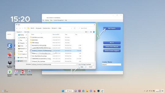
now we're gonna export the skins with sims 4 studio. click on "my projects" (1) and navigate to whereever you have the skins you want to use, and select one and click "open" (2).
the colored little boxes in the top right are the swatches. click whichever swatch you wanted to use something from (1), then click the "export" button (2). you'll get a window to save the exported skin now.
tip: i highly recommend making an organized folder for your skinblend, to have all your files together and easy to find. if you haven't made it already you can easily do so within this window.
i put mine in a folder called "resources" in a folder named "unnamed skin" for example.
name the exported skin file (3) and make sure the "save as type" is set to .png (4).
after saving the file, you can just click "cancel" on the bottom right to go back to sims4studio's starting screen. if you have multiple skins you want to use, repeat the above process for all the other skins to export them too.

2.1 opening the exported files in photoshop/gimp.
open your program of choice and click on "file" from the top bar (1) and then "open..." and navigate to the skin files. you can left click and hold down your CTRL key to select multiple at once to open.
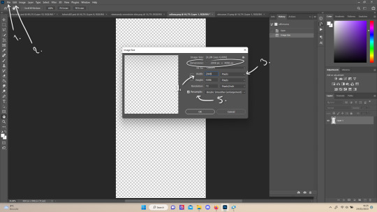
we have to layer them all in one file, but before we do that we have to check if they're all the same size.
note: some skindetails might be 2048x4096, others may be 1024x2048. unless you want your skin to be compatible with the HQ mod, you should just opt for 1024x2048, as without the mod both resolutions look identical. the bigger one will just make your fize unnecessarily large.
click "image" at the top bar (2), then "image size". it'll say the size at dimensions. if it's at the size you want it to be at, just exit the window.
if you need to edit it, select "pixels" from the dropdown menu (3), and put in 1024 for width and 2048 for height OR 2048 for width and 4096 for height. if you're sizing up select "bicubic smoother (enlargement)" under resample (5).
repeat this for every skin you opened.
2.2 layering the skins together.

copy and paste all the skins individually onto one by selecting them with CTRL + A and CTRL + C on your keyboard, and pasting them into one of the other opened skins with CTRL + SHIFT + V. you can then close all the other tabs.
the file now has multiple layers. you can rename them by double clicking the layer name. this makes it easier to keep track of whats what. you can reorder them as well by dragging them with your mouse. put the skin you want to use as base (for the general facial shading, highlighting) at the bottom.
tip: i recommend making all white and all black background layers to see the skins better. you can do so by pressing D, then CTRL + SHIFT + N. for the white layer then press CTRL + BACKSPACE and for the black layer repeat the first two steps and then press ALT + BACKSPACE. now there should be two new layers in black and white. drag them to the bottom of the list. i prefer using white so i put black last.
2.3 changing the opacity in parts of the base skin layer.
to make ea's preset details (cheek/nose bridge sharpness, dimples) come through your skinblend, you need to change the opacity of the base skin sometimes. alpha skins tend to be fully opaque but maxis match skins are usually already transparant enough.
hide all the layers aside from this base layer by clicking the eye icon next to the layer names. you can see the transparancy with the visibility of the grey-white blocks or if you find it easier you can also unhide the black background to see it instead.
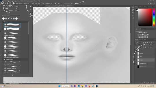
to change the opacity, you can either edit the entire layer's opacity (1) or use the eraser tool (E key) to add transparancy at specific parts.
if you have photoshop 2022, turn on vertical symmetry (+). if you don't have it, you can choose to edit only one side of the skin and mirror it later or do both sides and embrace some asymmetry.
i selected the eraser (2) and set the brush size to about 200px and 0% hardness. the opacity of the brush i set to about 10% (3). i used the eraser on the lower cheeks, the nose bridge and tip and the bottom of the chin. i also erase the upper eyelid 100%, cause i prefer to have eyelid freedom :p. it then looks like the above! this will very subtly let through details, if you want more you should make it more transparant.
2.4 optionally: editing out freckles, pores and/or eyelashes.
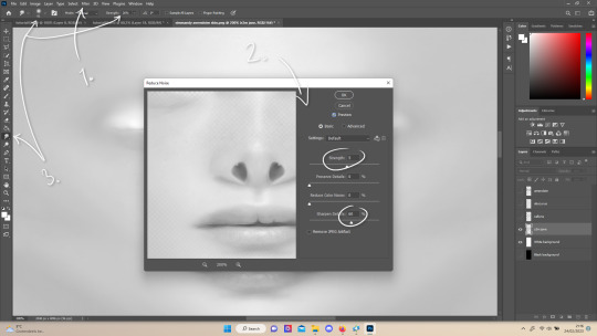
your base may have pores, freckles or moles you want to get rid of. to smoothen everything at once, click "filter" at the top bar (1), "noise" and then "reduce noise". i only edit the strength and sharpen details setting (2), this setting erased the pores and most of the freckles for me while keeping the details looking sharp, but you likely have to adjust it a little cause it depends on how large/fine the details are.
the remaining freckles, pores and eyelashes i remove by using the smudge tool, with 0% brush hardness and at 25% strength. (3) brush size depends on the size of the details. i just go over it in circular motions until the freckle or whatever it is has been blended away without pixelation.

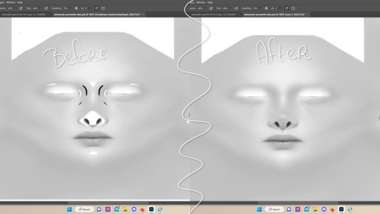
for this part i'm going to only show how i do the nose as an example, however it works the same for editing in eyebags, lips, jaw lines or whatever you want to add in too.

unhide the layer of the skin you want to use a part of, and hide the base layer.
if you are going to use multiple parts of that skin (for example, you want both the nose and the lips of that skin), duplicate the layer by right clicking the layer name and choosing "duplicate layer...". then hide the duplicated layer. it's easier to edit one part at a time.
use the selection tool (M) to select the part. press CTRL + SHIFT + I and then DELETE. press CTRL + D to unselect. should look something like the above.
use the eraser tool (E) at a moderately small size like 30px~ with about 30% hardness and 100% opacity to erase around "hard lines", like the nostrils in this case and the bottom of the nose. the nose bridge has "soft lines", so if you were to use a hard brush for that, the shading of the nose bridge would look far too harsh and unblended.
for the soft lines, set the eraser tool at a bigger size like 100px~ with 0% hardness and a lowered opacity between 15-45%. erase soft lines "gradually", so the shadows blend in with the layers underneath it. should look something like the picture above.
always look at the newly added part with both a black and white background to see if there's anything you need to erase more. then look if it blends in properly with the layers underneath. if it's too dark or light, you can click on "image" on the top bar, then "adjustments" and "brightness/contrast", and lower or raise the brightness until it blends in better.
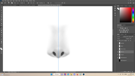
i'm using two separate skins to make the nose, so i've repeated the process above for the second nose skin, then used the method of step 2.3 to erase certain parts and make other parts more transparant / blended in. as you can see above, it's now the perfect offspring between the two noses i used.
note: for a maxis match nose, you'll want to avoid a completely opaque nose, mainly at the nose bridge it should be more transparant. i always make sure the lips and eyebags are fully opaque though, unless you're going for a vanilla type of skin it doesn't look good transparant.

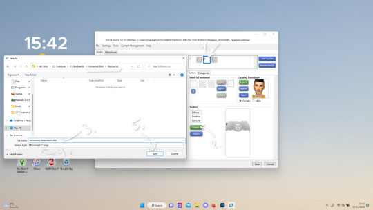
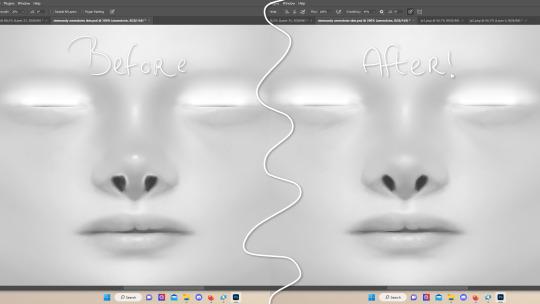
at this point, i like to save the file with the white background layer on and see what it looks like in sims 4 studio. this gives you a better idea of what it looks like on sims and what you may want to change or add. press CTRL + SHIFT + S and name your file, and set the file type to .png.
open any skin or skin detail cc file just like in step 1.2, and instead of exporting anything, click "import". now navigate to the file you just saved, and open it. the sim model now displays what your skin looks like. should look something like the above! you can click cancel after you've looked enough, so you don't have to worry about ruining the original cc file.

maybe you're happy with the skins current state... but in case you want to add or change some things, here's a step by step how i do it.
5.1 drawing shadows & highlights.
as you probably have noticed, everything needs to be done in greyscale, so select black (for shadows) or white (for highlights) in the top right colored box. make a new layer (CTRL + SHIFT + N). select the brush tool (B) and set the brush at about 0px with 100% opacity. draw the shape of the shadow or highlight where you want it. make sure to make a new layer for every shadow and highlight!
now you can either use the smudge tool to blend it out, but i prefer using "filter" from the top bar, "blur" > "gaussian blur". i just play around with the radius until it's blended out but still has some shape to it. it depends on how small or wide and blended you want it to be.
then i use the eraser to shape the shadow/highlight further. for example, i want the shadow in this case more blended out towards the eye, but harder towards the forehead and nose, so i use the eraser on that side. lastly i change the layer opacity to make the shadow/highlight less dark/light. my preference lays with subtle details, but of course you can make it as contrasted as you like!
5.2 drawing small details.
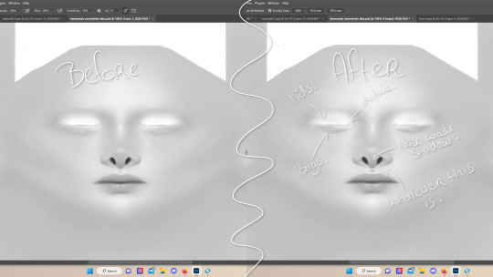
to draw your own details, use the brush in 1-3px brush size, 100% opacity in black. i can't help you here cause it's just drawing where you want and then blending it out with the smudging or blurring tool where needed, and using the eraser at lower opacity to blend it in.
to give you some ideas, i usually draw some details on the nose like sharper nostrils or a nose wall, some texture on the lips and the eyebags. i like using reference pictures of real peoples skins to see where and how to draw things. before and after pictured above! (i'm so proud of these eyebags yall T-T)
5.3 adding other creators cc skin details.
if you don't like drawing things yourself or know just the right cc skin detail your skin needs, you can also use other creators' skin details on yours.
maxis match + mix details: pyxidis about face, miikocc face kits, okruee face details, sammi-xox face details, lamingtonsims face details.
maxis mix + alpha details: detail overlays by obscurus-sims, ddarkstonee & sims3melancholic
like in step 1.2, just open the file in s4s and export whatever swatches you want to use. remember to make sure the resolution of the file is the same as your skin's before copy and pasting it on your skinblend! and remember you can lower the opacity layer for these too.
5.4 mirroring your skin.
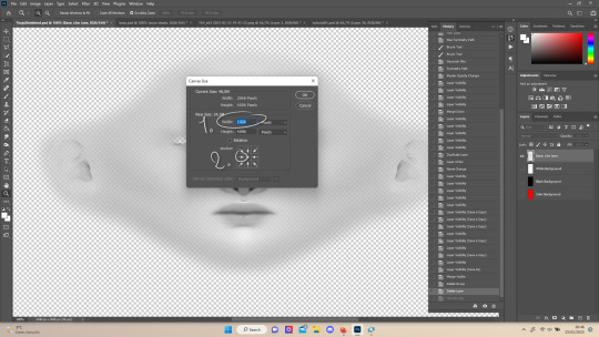
if your skin isn't mirrored/symmetrical yet, save your file as a .psd and then right click the layers, click "merge visible", press CTRL + ALT + C, and set the canvas width to half what it is now (either 1024 or 512). (1) click the arrow in the left middle if you want to mirror the left side, or the arrow on the right middle for the right side. (2) press "ok".
press CTRL + A, then CTRL + X, then CTRL + SHIFT + V. delete the layer beneath the active one (it's empty). then press CTRL + ALT + C again, and put the canvas width back to the original (2048 or 1024). select the same arrow you selected before, and click "ok".
press CTRL + A again, then CTRL + C. now click "image" from the top bar, "image rotation" and then "flip canvas horizontal". now press CTRL + SHIFT + V .... and voila, your skin should now be mirrored.
note: ik there's a ridiculous amount of steps for such a simple thing so i feel like there's probably a much faster way to do this, but i hate following tutorials and guides (the irony) so this is just the way i taught myself lmao
5.5 last test & optional last touches.
at this point, i'm done with the skin. i erase everything aside from the face if the skin still has a full body texture cause i prefer face-only skinoverlays. i always save as .psd and .png, .psd is to edit it later on if need be. once again import your skin into s4s like in step 4, and see if you're happy with the skin. if not, just keep editing whatever you need!
i also like to add alternate versions of the skin lastly here. some examples: a soft nose or hard nose bridge (justice for flat soft noses, simblr loves to erase them lol), different eyebags, lighter or darker lip option, version with eyelid overlay or without.

6.1 creating the package file.

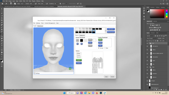
to make the package file for your skinblend, open s4s and select "create cas standalone" and then click "cas". (2) now select "skin detail forehead" from part type (3), click the most left forehead wrinkle and click "next" (4). name the skin file whatever you want, you can always change it later!
click "import" and open your skin file. and voila! you're pretty much done!
6.2 editing the age, gender & occult flags and category.
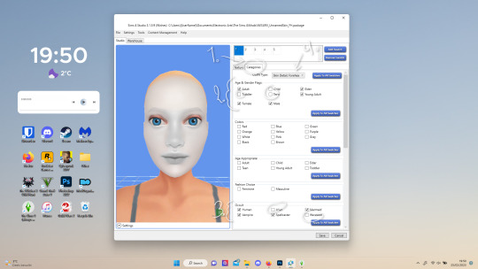
right now your skinblend is only available for young adult to elder sims, and not for aliens and werewolves, so you probably want to change this. go to "categories" (1) and check the boxes you want under "age & gender flags" and "occult" (2). you don't need to change any of the other things.
if you wish to change the skin detail slot it's in, you can change it at "outfit type". most people use either forehead or mouth crease, but you can use any of the ones that start with 'skindetail'.
6.3 adding swatch colors, thumbnails or additional swatches.
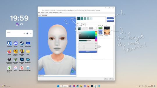
if you want, you can add multiple swatches (1). you can also edit the color of the swatches (2) and upload a custom thumbail with 104x148px resolution (3), make sure to upload for both male and female frames.
6.4 editing the sorting layer.
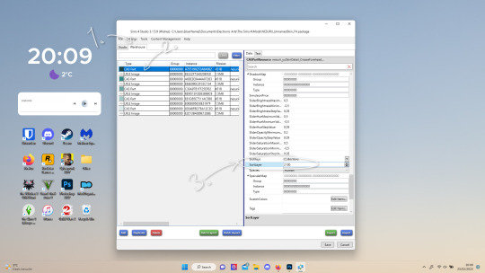
it's not the end of the world if you don't do this, but you may run into some skin details or freckles/moles that won't display on top of your skinblend if you don't edit it :).
click on the "warehouse" tab (1), select the first "cas part" (2). scroll down on the right to find "sort layer" (3) and put in 2100. you're gonna want to change this for each cas part individually.
now just save your file... and try it out in game!
if you need any help or have any questions please comment below <3 feel free to tag me in the end result if you want too.
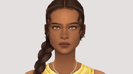
(my end result)
233 notes
·
View notes
Note
Seeing your art on my dash literally nakes my month oh my god so beautiful and stylish!!!
Idk if you've discussed this, but how do you find such cohesive and vibrant color palettes for big pieces?
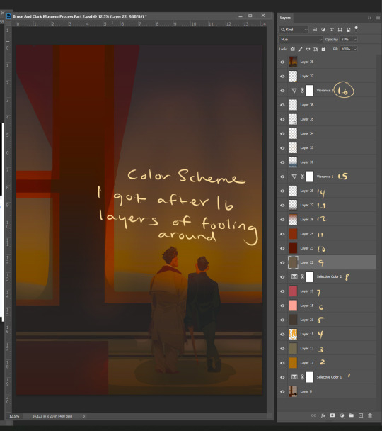
Oh wow got to ask the hard questions huh. Lol I don't think I've talking about this. Becuase it's hard to articulate. A lot of what I do in art is just trial and error. I don't have a set formula or pretext color palettes for each mood or setting (tho I really should would save me a lot of time)
I mainly mess around with a ton of color layers in Photoshop on various blending modes at various opacity levels add in adjustment layers (mostly Selective Color) and play around with the values of the file and I let my artist intuition lead me to the atmosphere I'm trying to portray.
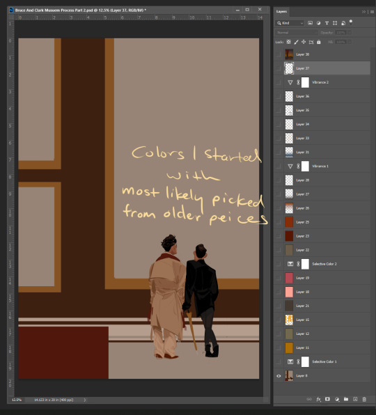
Here's a snapshot of just how many I used to get to the base color scheme for my Mueasume picture. ( and I used more later on in the piece.)
But I know that doesn't help you so here are some tips.
Know your mood and your setting for your piece (Time, Weather, Indoor Outdoor, Sad, Happy, Angry, etc.)
Learn the color language for each mood and setting Pintrest is great for this. Make some boards.
If your colors are not cohesive and you working digitally make a new layer Fill that layer with whatever color is the main mood of your piece (red for anger blue for sad etc.) and set that layer to like 50% opacity and then just go down the list of your layer options until you find something you like.
You can repeat this step with other layers and become the basket case like me and also have 20+ layers in your file lol.
You could add a color fill layer set it to Hue, flatten the image, then cut that whole image revert back to before you made the color fill layer paste your monochrome picture on top of your original piece, and then play with the monochrome layer on different layer settings and opacity
And if you have the option to use Selective Color do it and play with the sliders. The ability to tone down a hue in each value is a game changer.
You can also use Hue and Saturation tho you need a light hand if you're going to play with this setting.
I hope some of this help and I'm sorry if it wasn't clear feel free to send me another ask or message me through the chat feature and I can try to clarify.
71 notes
·
View notes
Note
'Ello, I just wanted to come on here to say how much I LOVE your brush-work (is that a word lol?)
Crayon or Pencil-like lines that aren't always opaque all the way and are a little more sketchy sometimes are probably some of my favourite :D
Also, your style is just really cool and nice anyway, but I wanted to give a shout out specifically to your based brush choice!
yessss i love traditional textures in digital art, thank you :> i use kyle t webster's brushes for photoshop and I've never found brushes that better emulate certain real-life textures. man's a wizard, i dunno how he does it. i use his tiltiriffic 2015 brush for basically everything short of merch and anything i want to have really thick lines, it's a delightful brush and it feels so natural to work with.
i heard advice somewhere that people tend to resonate more with art that looks like it was hand drawn, you want small imperfections in your coloring and lineart, you don't want everything to be perfect. i really resonate with that, i think there's a certain element to sketchy pencil lines and messy paint and kraft paper textures that you could call, appropriately... cozy :)c
anyway if anyone would like to know what brushes i use and what i use them for they are under the cut with examples 👍
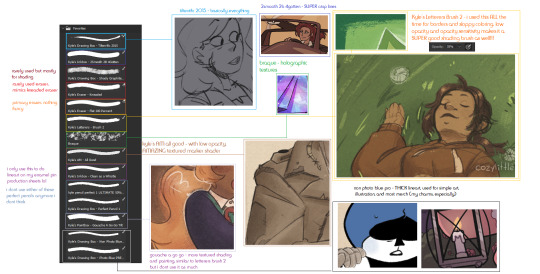
hopefully this image can be blown up if you click on it :') the only brushes that aren't featured are the ones i got from the free sample pack from true grit texture supply, i use their craft paper textures for most things as well and one of their building grain shader brushes for like, noise gradients. if any of y'all have a photoshop subscription you can download his brushes for free, i highly recommend checking them out! they are THE coolest brushes i've ever used (And boy I've gone through a lot of brushes in my time). if your drawing tablet does not have pressure or tilt sensitivity though your mileage will vary, tilteriffic did not work on my brothers tablet because it couldn't pick up what angle my stylus was at.
#ask#chill-vibes-but-rainbow-panic#art#brushes#photoshop#kyle t webster#though i do love some super clean bright artwork as well. my style in 2020 was suuuper clean and refined#it was hard to do though because that takes so much more management and effort and it took energy i didn't always have#if art is hard for you. try to figure out what's easy and develop that#you dont have to be like everyone else or do it the ''right'' way just do it in a way thats fun for You#at this point things being a little sketchy a little off model is very much part of my style whjbsdfhbgjdfg
21 notes
·
View notes
Text
9 People You'd Like To Get To Know Better
I've been up since like 3 am because of jetlag so I thought I might as well answer one of the thingies I've been tagged in, thank you @airenyah ✨️
3 ships
1) Scallisaac - Scott, Allison and Isaac (Teen Wolf)

A perfect triad that first opened my eyes to poly ships and triads in particular! I gotta rec this one fic here that's been percolating in my brain for, oh, just- you know, a decade 🙂
2) River/Doctor - River Song and the 11th doctor (Doctor Who), or as I used to tag them- OTP: Whoney I'm home :D
They were arguably my first major OTP after I first learned what that means lol I love a flirty dynamic, bickering, tragic fated lovers, and time travel! My time in the Doctor Who fandom was when I first taught myself how to gif and use photoshop (back when I still had it...) so there's a bunch of gifsets and edits still on my blog from around then, at least one of which I remember featuring this ship!
3) To no one's surprise, I gotta nod along to one of @airenyah 's choices: Destiel - Dean and Castiel (Supernatural)

The amount of fics I read...! I even still have a 9 year old inactive sideblog that I made, posted a lot on, and then abandoned all within the span of one year lmao
First ship
I honestly don't remember but since one of my earliest fandoms was W.i.t.c.h., I'm just gonna say it was one of the canon relationships, like Will x Matt or either of Cornelia's romances
Last song
Spotify tells me it's Blooming Just For You (꽃이 피는데 필요한 몇 가지) by NuNew and Paul Kim but that's kind of cheating since I've been using it as an alarm recently lol
So, checking my recently played, the next one down is จังหวะตกหลุมรัก (Magic Moment) by DIDIxDADA ✨️
Currently reading
I'm still reading เจ้าชายน้อย /jao chaai naawy/, The Little Prince in Thai, because I tend to read a chapter while marking unfamiliar words as I go but then the looking up of them all afterwards takes me forever so I'm kinda lazy about reading it 😂
Last movie
The Lost Lotteries, or in Thai: ปฏิบัติการกู้หวย (/bpa dti bat gaan guu huay/ = Operation Recovering Lotteries)
It's a Thai comedy from 2022 that's basically about a heist but since I know folks here love First Kanaphan, here's my tumblr pitch: he stars as a spoiled rich kid, has a neck tattoo, and is in all of two scenes lol Also- not related to First anymore but- the characters are all nicely color-coded 🌈
Currently craving
Sleep 🤓 No but for real, jetlag is a bitch and it always only hits me after traveling back west which, like- usually people find it to be worse when traveling east so what the fuck is up with my inner clock hm????
No pressure tags: @zimmbzon @thegalwhorants @twig-tea @rocketturtle4 @sunshinechay @khaostache @slayerkitty @bruisingknees @berestweys - if y'all've already played this tag, please do point me towards it 💕
#bella and the blorbos#tag game#if you're wondering why i'm so slow to react to notifs- hi! i'm on vacation!
15 notes
·
View notes
Note
Hey You!
Ok I was just infatuated with your sneak peak for GC Ch. 25 omg. I had to look at it over and over again since yesterday. Really I love your AI art for this series. This is exactly how I picture the boys in my head. Sirius' hair I'm dying. I've already spent my time using AI to create portraits of them, and it was just rubbish. Maybe I'm not advanced enough to use it properly. But I just had a look at you last art again and I just have to ask you! I have so many questions. Which tools do you use to create it? Do you rework the pics with other software like Photoshop or something? And most important, and propably the most improper question: what do you tell the AI to do exactly? You don't have to answer this one. I don't want to steal your style or anything, I'd just like to know how you get them pictured so accurate you know? And how much time do you spend in average to be satisfied with a picture to publish it for GC?
Yeah I hope I'm not rude asking you this, but I'm a big fan of your work 😭
Have a nice week! 🤍
I find it hilarious I got this question just when I was fighting with AI to do what I wanted it to do lol.
There are a lot of questions, so I'll try to be as detailed as possible. I talked about the AIs I used on this post. But basically, I recommend Bing's Image Creator that's powered by Dall-e 3.
I do rework the pics, not always, but AI always seems to confuse hair colours, gives Sirius a sandy brown and Remus black, so I do find myself switching that often (I use things like picsart, facelab, procreate and makeup+ for this). I have also done some face altering things here and there, especially when the faces don't look exactly like I want them to, for example in this one:

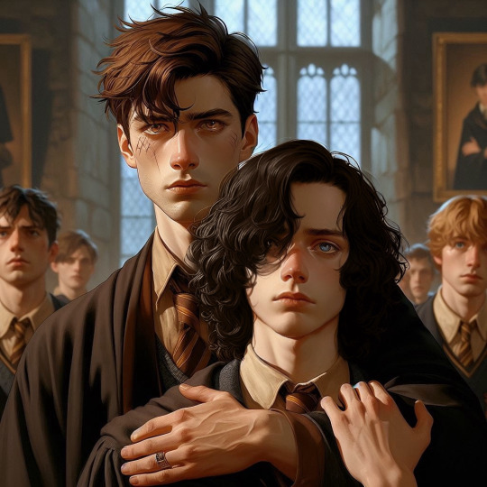
I wasn't quite satisfied with Sirius' face so I altered the features a little more so that they looked exactly like they looked in my head. This minor alterations I find myself doing rather often on the pictures that will be the official ones.
Now the time I spend until I'm satisfied varies, sometimes the AI image is perfect and I use it straight, sometimes I have try a few times over and over until I get the exact result I want, and that takes much more time. Maybe like 30-40 minutes to get the image and the side (aesthetic) pics I add to the sides.
Now, the most important question, what do I say? Again it varies, sometimes I find myself tweaking and altering things arounf until I get exactly what I want. For this image in particular I said something like this:
16 year old Remus Lupin (sandy blond hair, golden-brown eyes, scars on his face, handsome)holding back a 16 Sirius Black 16 year old Sirius black (long curly hair, delicate & soft features, pretty and handosme, grey-blue eyes). Remus has his hand in Sirius shoulder, they both look tense, like they want to stop a fight.
Defense against the dark arts classroom. realistic art.
I remember I changed it later, to Hogwarts classroom and students standing behind but, once I get the basics of the composition I tweak things around until I have exactly what I want.
Now I find AI has some issues with side profiles, maybe I haven't cracked it yet, but I spent all my energy on Bing trying to get the right composition for an image for next week's episode and it was not cooperating with me.
I asked for this:
16 year old Remus Lupin (sandy brown hair, golden-brown eyes, scars on his face, handsome) and young Sirius black (long curly hair, delicate & soft features, pretty and handosme, grey-blue eyes, gryffindor). Remus covers Sirius mouth with his hand and he is pressing his chest onto Sirius’, they’re front to front (we see their profiles), foreheads almost touching . Restricted section of the library. they’re hiding from someone. realistic art.
And kept getting Remus standing behind Sirius:


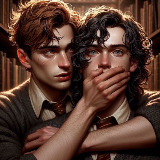
Don't get me wrong, I loved most of this, they look amazing! But it wasn't exactly my vision. Even wasted $15 usd on DALL·E hoping it would make it better but I was very disappointed (Bing is so much better and FREE).
Eventually, I got one image that did exactly what I wanted and I'm currently reworking it to make it exactly what I want, we'll see how it goes in the end.


But yeah, I've spent almost all day working on this (using my free time at work), and only one out of all worked, so time spent on it really, really varies.
Hope you find this helpful darling, and if you managed to get the image I've struggling with to work, it'd be really cool if you shared it with me.
Read Gilded Constellations
#ask lilly#lilly talks#marauders era#marauders x reader#marauders x y/n#moony#padfoot#prongs#sirius black#sirius x reader#sirius black fluff#sirius x you#sirius x y/n#remus x y/n#remus x you#remus x reader#remus one shot#sirius black one shot#poly!marauders x reader#poly!marauders#wolfstar x reader#wolfstar x y/n#wolfstar x you#sirius black x fem!reader#remus lupin x fem!reader#moony x reader#moony x padfoot#moony x you
23 notes
·
View notes
Note
Do you think the Ferrari/tempo has ruined Charles' looks? I think people who say that must have a high standard of beauty
ohh anon. first of all don't let people who say that bother you <3. if we start comparing people's best looking moments from 3 years ago to what they look like day to day now then we might as well say everybody's look has been ruined by this or that. comparisons like that are meaningless imo. and i think the 1 or 2 ppl who said that were a lil mean :)
secondly as someone who spends a lot of time making ppl look pretty in photoshop (lol) i think charles now has even more good angles than younger charles. to be fair he's basically perfect either way but if we have to pick on something, purely from an aesthetic viewpoint, i think one of the most distinct differences is that charles now has a squarer/more matured jawline which is very suited for his full & well-balanced upper face, whereas younger charles' lower face was slimmer/shorter in comparison (left). the best angles for a younger charles were almost always angles that made his jaw look more pronounced, ie somewhat from beneath up. the gif set that i think prompted your ask had exactly that. and imo charles' facial structure now (right) is very ideal.
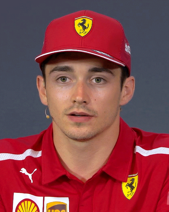

thirdly (sorry lol) beauty standard is really very artificial. we equate youth-related features to beauty bc of evolution (youth -> reproductiveness). and in order to maximize survival as a species societies (historically) promote this beauty standard the same way they promote heterosexuality, aka to encourage female-male reproduction at reproductive age. this is not to say ppl who prefer/pursue young-looking features are shallow or whatever. understanding the artificiality of this concept doesn't mean we are no longer influenced by it. but it does bring perspective to topics such as beauty, glow-ups/glow-downs, and aging <3
pic on right: @countingstars-17
26 notes
·
View notes
Text
KIMI'S FAQs

INTRO
hi ♡ i'm kimi
gemini & a filipina (yikes) ...
i'm in preschool teaching and specializing in children's special needs ! my favourite colour is pink but lilac is a close second . i love matcha . i have 11 piercings but no tattoos . summer is my favourite season but fall feels more romantic . i love picnics . i have a cat named loki . yoongi is my bias but i write more jungkook fics . sue me !

Q&A
what app do you use for your social media fics?
for my smau fics, i use the app social dummy. i've been using the app for almost 3 years now and it comes with formats for twt, insta, lock screen, facetime, imsg, youtube, news, etc. i've made a few one-time payments for the app to unlock specific features like unlimited msging and profiles.
for more recent social media features like insta dm's "replied to your story" formats, i use my own insta accounts and photoshop them into my msg edits. for the most part, i am using picsart, pinterst, or make-shifting the edits on my own.
with all that being said, i have been told that social dummy is no longer available on the app store. there are a few alternatives i've been looking into but ultimately have not been satisfied with the way the edits turn out. i will update this faq if and when i find something new and available for all.
what's your update schedule?
currently, i’m living the kdrama life of the poor full-time student girl with with 2 jobs. as much as i want to commit to updating on a regular schedule,, i can not. my work is usually a tba kind of vibe lol. for the most part, i update when i can and when i want.
what is your content style? what is the kimiverse?
a lot of my fics follow simple storylines imo. i think i end up writing a lot of college/uni au's because that's where my current state in life is so it's a lot easier to relate and gain fic inspo.
kimiverse sums up my fics & characters . it’s more known for the connection between fics like your universe & nonsense ,, casual & sour candy kisses ,, and paraluman & chaebol!jk
my fics are heavily influenced by ariana grande songs and tiktok edits lol
why do you content dump?
haha.
i go through impulsive moments of jus wanting to update. it usually happens when i'm avoiding school work.
how do i get added to your permanent taglist? fic taglist?
to be added to my permanent taglist, send in an ASK. the cut off of my 2024 permanent taglist will be may 1, 2024. i will reset sometime next year!
to be added to my fic taglist, send in an ASK with the fic name.
i will not be adding anyone who comments on the posts / series m.list. i feel more organized when the taglist inquires are all in my inbox and i can answer with a tag like #fic taglist: aao jk.
the alternative is to turn on my notifications!
what are your favourite fics?
my all time favourite fics are linked here.
@munirecs is my fic rec page where i reblog my current reads or my reading list.
why is your anon off?
anon is off so i can keep my blog as lighthearted as possible. i had it on for a while now but after a few asks that made me feel meh, i figured this is the best way to set my boundaries. let’s keep the asks kind!
if you want to send in but don’t feel comfortable with me posting my reply, you can send me a msg.
which order am i supposed to read the series if there are extras with the chapter numbers?
read the series parts first. the extras can be read after. i usually put a note in the beginning of the extras to state the time placement for the fic.
why are there so many typos?
it is what it is!
as much as i’d love to edit my work into perfection, i can’t. after i post a texting au, i’d recommend waiting 15 mins because i’m usually doing last minute edits. after i post a written, i’d recommend waiting 1 day because i’m usually re-read it again and again and again and making tweaks. no matter how much i reread or re-edit, i’m always going to be finding little things to change. so, for my own peace of mind.. i give myself the 15 mins or the 1 day before letting it be what it is.
can i critique your work?
no thank you.
i write because i like to write. i write and post content that serves my creative drive and growth as a content creator. i love positive feedback and getting to hear your opinions on characters, but i’d simply like to have my work remain as it is. i worked hard and spent time writing / making the content so jus enjoy it!
i’ll fix my grammar, my wordy sentance, and mis-punctuation when i get paid for writing fanfics… which will be ???
this is art! … and it’s literally fiction.
my main thing has and will always be to write something that makes people feel. if i’ve done that and you’d like to express it kindly, i await your words!
NOTE
— minors are denied from all of my content !
— i do not allow reposts, revisions, or translations of my work on any other platform or any other account ! if my work is being posted elsewhere, please let me know ><
— requests are closed !
— consider sending an ask / interaction for more updates and consistent activity !
© 2024 muniimyg on tumblr
8 notes
·
View notes
Note
this is kind of weird so sorry if you don't know how to answer but out of everyone i follow you seem like you might know. i've noticed a trend in a lot of vkei (maybe mostly older groups but maybe it still exists) to cover the nose with a wide bandage? do you know how this originated or what the purpose is/what it represents? i've never seen it in any other subcultures and i'm really curious? again sorry if you don't know fhsgdj
Hi, I'm afraid I have no no concrete answer to this question, so I'll tell you what I can off hand
Face coverings are quite common across the scene for various reasons- some do it for anonymity, others because of insecurities about their appearance, or simply for aesthetics/personal expression. It varies case to case, which is why you'll see some people wear it occasionally, while others adopt it as more of a signature look.
To talk a little more in depth, I'll mention that this style seems to originate within iryou kei & eroguro kei scenes, which are prevalent subgenres that utilize medical & grotesque imagery, where blood stained bandages are a staple in the fashion.
ex. Mercuro / late 90s-

La Mule / late 90s-

I'd also like mention: early cali≠gari, mucc, Dir en grey- these bands are considered iconic & said to be pioneers in the eroguro subgenre, at their most macabre you'll see them wearing all sorts from eyepatches to gasmasks to surgical masks.
Now, probably the most Iconic example of what anon mentions is Reita of The Gazette - late 90's up until recently

I've heard all different backstories to why he wears his nose bandage, 'to look mysterious' & 'he's insecure about a broken/large nose' etc.. lol. I'm unsure what the truth is/if he's ever given a concrete explanation.
I'm unsure where to fit this in so I'll just mention it now- but we've seen this style reemerging within the menhera subgenre , which focuses on themes of wavering mental health & self harm. various bandages are used as a way to portray extreme mental instability. I instantly think of AvelCain Karma
Various examples-
Kyohei // Kebyo - menhera
Uru // Kane to juusei - menhera
Mitsuki of Kiryu

Speaking of, iirc, Takemasa from Kiryu wears a permanent face covering because he has a CHIN on him, & unfortunately in a scene where visuals are very important, I can understand why people would feel the need to hide 'unconventional' features. There's something to be said about the culture here. Maybe they were born from lack of excessive facetune & the sexless photoshopped faces we see pushed so much today.
I hope it was a little helpful!
#A classic case of bands plagiarizing eachother#I'd recommend doing further research into the history of subcultures if it interests you
30 notes
·
View notes
Text
BTTF: The Animated Series, s01ep02, "A Family Vacation" Review and Commentary
Previous episodes will get linked HERE. (top of page)
I didn't mention in my last post, but I have seen the first season before--about 2 years ago. I have basically no memory of it (I guess my brain was like, "yeah, no, we don't need this" and just dumped it), so this is a lot like watching again for the first time. Never seen the second season, so that'll be all new to me.
In this episode: We travel to England, Doc duels with one of Biff's ancestors, and we meet Marty's goofy relative Harold McFly.
Ok, let's jump in.
Interesting. I thought all these episodes began with Real Doc in his lab, but this one seems to skip that part and goes straight to animation. Christopher Lloyd is narrating, though, which is nice, I suppose. Still not as good as getting to actually see him. Automatic points deducted from this episode for not immediately showing me Doc's face. More Real Doc, less cartoon, please. Thanks.
I am thrilled to announce that we have found Clara! (she did not appear at all in episode 1) She's voiced by none other than Clara herself, Mary Steenburgen.
As you may be able to tell, she's shed her 1885 attire in favor of modern clothes. And right away, we learn that she's become super tech-savvy as well. The Brown house has many futuristic features to it (either from Doc's travels or his own inventions) and Clara is using two of them here. The device on her leg allows her to work out without actually having to move, and the thing on her finger has some sort of laser feature that allows her to grade school papers on a screen across the room. And I can only wonder how it is that Clara has managed to get a job teaching in a modern school—not so much because of any gaps in knowledge she may have (Clara's super smart, I'm sure she could catch up) but because I'm wondering about the interview process. Surely she must have had to show identification and fill out forms. I can only assume that Doc has gotten forged documentation somehow for his entire family with made up birth years, medical records, etc.
I would have liked an episode about that. Kids would've enjoyed an episode all about Doc creating fake birth records for his wife and kids, right? Right??
Elsewhere in the house, Jules and Verne are busy playing with remote control cars and an elaborate model train set. Hmm...seems like this episode is setting up lots of scenes with technology in preparation to give us the ol' "too much tech is bad for you" lesson.
Our good buddy Doc is even in on the tech craze. He's busy building robot arms that will turn newspaper pages for him so he doesn't have to do it himself, lol. Unfortunately, this causes a power surge, and all the lights in the house go off. The family is not happy. Doc comes to the realization that they've all become spoiled by technology. He declares that they all need to take a vacation to a time without electricity and ushers them to the DeLorean.
As the car flies off into the sky, Marty and Jennifer are walking down the street.
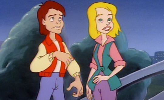
Um. That's—that's Jennifer. Yeah. I don't know what happened there. Her design upsets me. Marty is still in his silly letterman jacket. I'm thisclose to photoshopping a denim jacket onto him. Why is he wearing high-waisted jeans?
As they watch the car, Marty tells Jennifer, "I don't guess we'll be borrowing the car tonight." So, apparently, he's allowed to take the DeLorean through time all willy-nilly whenever he wants? That sounds like an absolutely horrible idea.
Doc takes the fam to England in 1367 because I guess he figures a good dose of dysentery will help put things in perspective for them? Anyway, he uses this high-tech camera thing to "change" all their clothes into Medieval ones. He says it's only an illusion that lasts a few hours, though. Idk, don't think about it too hard. To ensure the family all stays put and "enjoys" the trip, he programs the DeLorean to fly away, back to present day, and return later on to pick them up. There is no way that can possibly go wrong.
Clara is not happy with her husband.
"Of all the pig-headed, insensitive, macho things you've ever done, this takes the cake," she says. And. Can we just talk about how un-Doc-like those descriptors are? Insensitive? Macho?? OUR DOC? Cartoon Clara and Doc have a weird dynamic in this so far. I don't like the exasperated wife with a bumbling, inconsiderate husband trope.
We soon meet Lord Biffingham, Earl of Tannenshire. If you read my episode 1 review, you know that Thomas F. Wilson voices all Tannens in the show. He's really a bright spot in this series because the guy can do so many fun voices. We'll meet many more Tannen relatives in the show—Biff evidently has family roots all over the globe. Lord Biffingham orders Clara to be kidnapped by his cronies. Uh oh. Doc is also kidnapped. Double uh oh! It's up to Jules and Verne to save the day now.
They soon meet one of Marty's relatives! Harold McFly of the Sussex McFlys. Here they are all hanging upside down in a tree because they got caught in rope traps.
Those are traps Harold set, btw. He caught himself in his own trap. I love him already. Harold tells the boys that he's vowed revenge against Biffingham for stealing away "his lady" Jennivere (assumed to be one of Jennifer's relatives due to the name and fact she is literally just the Jennifer character from the earlier scene but in Medieval clothing). They team up to try to sneak into Biffingham's castle to rescue Doc, Clara, and Jennivere.
Meanwhile, Lord Biffingham asks Clara to marry him. First, though, he has to kill Doc. Yep. So far, we've had a Civil War episode featuring guns being pointed at Jules and Verne, and now a murder plot. Very fun.
Doc, however, isn't too concerned with his predicament. He's locked in a dungeon, having a grand ol' time identifying various bugs and rodents by their scientific names. And while I can't see Real Doc being quite so calm in such a time of crisis, I can see him taking breaks from his panic to be like, "Oooh, rattus norvegicus." (That's literally just a Brown Rat, btw. Doc is fascinated at seeing it.)
We go back to Marty Harold, Jules, and Verne, who are enacting their plot to infiltrate the castle. Harold sings and says some things to the guards, but I can only understand like a third of the words coming out his mouth because of his exaggerated accent. Harold what are you saying.
Lord Biffingham prepares for a jousting tournament against Doc, during which he plans to "eliminate" Doc. Biffingham has this massive horse, tons of fancy armor, and a huge sword thing. Doc has this:
I mean. I dunno, I believe in you, Doc.
Jules and Verne show up just in time to rig Doc's pathetic little "horse" with their motorized car that they snuck on the trip, which makes it go super fast. He's able to avoid Biffingham's attacks for a while, but eventually gets captured. Biffingham orders Doc, Jules, Verne, Harold, and even poor Einstein to be executed.
Doc makes a joke about himself and the boys being the first people to ever die before they were born and I just. I feel like this isn't the time for jokes, Doc? Your children are about to die and also—ALSO!—one of Marty's relatives, thus causing him to never be born in the future. Your vacation is destroying entire family lineages, Doc. This show belongs in the horror genre.
It's Clara who ends up saving the guys just in time! She and Jennivere use a ton of fabric to somehow make a hot air balloon, and they throw ropes down and fly the gang away.
With everyone free, Harold and Jennivere are reunited! He says it isn't safe for them to stay in England but he doesn't know where they can go. Doc suggests *drum roll* Ireland! And there are several things that come to my mind here.
One of Marty's relatives and one of Jennifer's relatives got married in the 1300s, moved to Ireland, and had kids—establishing the McFly family line in Ireland.
According to this, Doc is the one who caused the McFlys to even go there in the first place. So. How did they end up there originally? I guess Harold and Jennivere eventually decided on Ireland as well on their own.
It's Clara who helps to free Jennivere from the castle. Who got her out in the original timeline? Maybe Harold?
Shhh, Nikki, it's a cartoon
Anyway, Harold and Jennivere fly off to Ireland right that very moment in the hot air balloon.
Byeee! Goodbye Harold and Jennivere! Enjoy life in Ireland, you crazy kids.
I miss Seamus. I wish he was in this cartoon. That would make it better, I think.
Wait, wait. I just got sidetracked looking at the Animated Series wiki, and it turns out the opening live-action segment of Doc from this episode was cut from the DVDs, which is where I'm watching this on. It was apparently of him flying above Hill Valley in a hot air balloon. Why was this stolen from me?
Let's wrap this up. We finally get to see Real Doc! We also get one of my absolute favorite gags in all of media. And that is: when a character falls from a big height or is getting dragged or spun around and it's very obviously a fake, stuffed dummy. I cannot describe how much this gag amuses me. It is the peak of comedy, and more shows and movies should use it. Look.
It is hysterical. I watched this gif loop upwards of 15 times.
Based on the context I now have regarding the removed opening segment, it appears that Doc fell from his hot air balloon. He recovered from the lethal plummet like a champ. Must be due to the medical overhaul in 2015.
Bill Nye then shows us how to make our own hot air balloon using a plastic bag and hair dryer. That's basically the end of the episode.
Overall, I'd rank this episode as being better than the previous one. I did miss Marty, though; he was only in those 10 seconds at the beginning. But Harold was a fun guy. I like that they're keeping with the "all of Marty's relatives look just like him" thing. (Except for Arthur and George, of course)
Join me next time to see dinosaurs wearing clothes.
28 notes
·
View notes
Note
Hello. May I please ask, how did you get the sprites for tabimatsu?
I saved the images using AR mode in the app and then cleaned the sprites online so that they're transparent.
The exact process is a bit long so I'll put it under the cut if you're curious!!
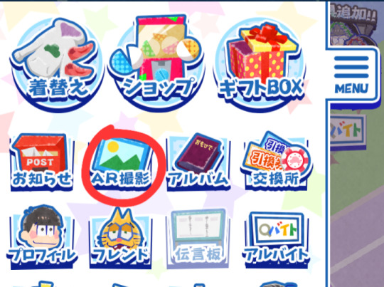
First, go to AR mode in the Tabi game. This feature let's your take photos with character sprites using your phone camera.
You will then enter this screen:

Click a box, then select a character you want to take photos with. There is a lot of options to choose! You unlock more character outfits by completing the event stories too.
This is what the character selection box looks like:

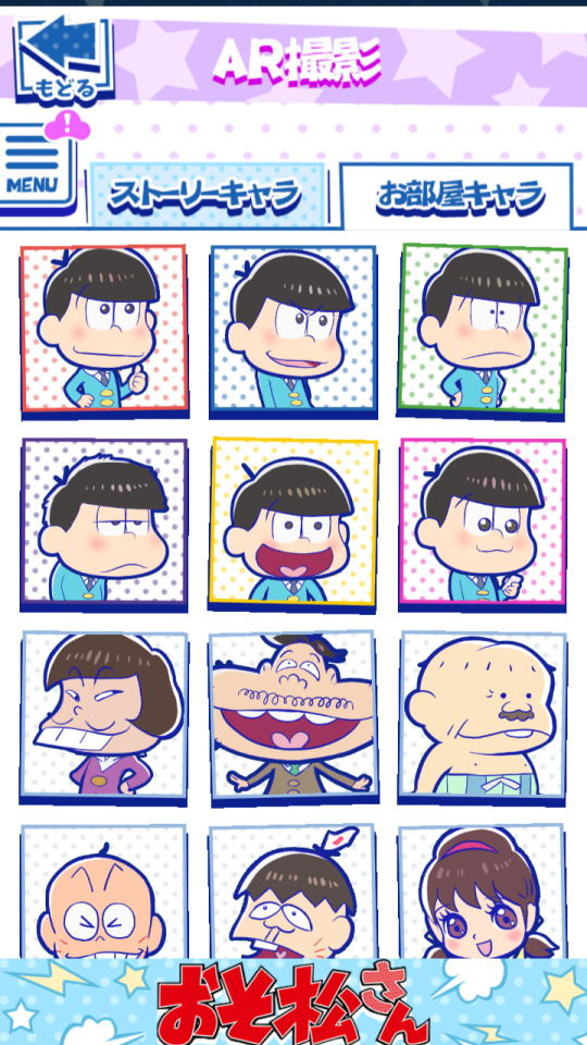
Basically choose any character here, then select an outfit you like of them.
For this example I'm choosing a Full-Size Oso, then bunny-hat ver. Osomatsu!!
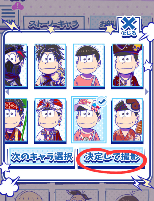
Once you choose an outfit, CLICK the next button to finally enter AR mode with your chosen character.
(Note: You can have more than one sprite in AR mode, but I recommend doing only-one-character-at-a-time if you want to save/edit the sprite for later use.)
This is AR mode:

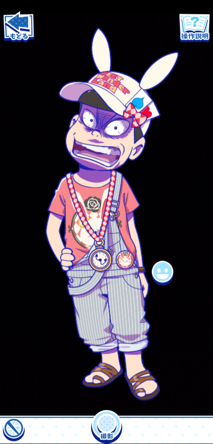
Click the smiley face to change the character's expressions. There are a lot of options!!
From this screen, this is what I do:
Enlarge the sprite as much as possible so it takes up the whole screen.
Block the camera's vision so the sprite's background becomes a pure black.
Save the photo.
To save the photo, click the circle at the bottom. Then click the arrow in the pop-up screen so the image is saved into your device's gallery.

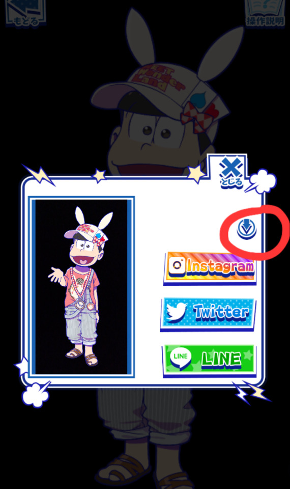
And there! You should have the sprite saved into your device. The next part is pretty easy depending on the sprite:
I open the image in an online editor (GIMP, clip studio, photoshop, etc)
I remove the black background using the magic wand tool
Now I have a transparent Tabi sprite! Remember to save it as a PNG so it stays transparent.
Ofc of the edit wasn't done cleanly with the magic wand, I would further edit the sprite so its quality is better. Otherwise, this is the gist of what I do lol
#ask#anonymous#tabimatsu#long post#imo most sprites in tabi are easy to get and then clean them up a little#others are.. difficult.. lol
13 notes
·
View notes
Note
Hello! Your art is breathtaking and I wanted to ask if you'll share your rendering process. Your other art advices were very helpful. :3
Hi there (and sorry for the late reply)!
Sure, I'm gonna share what I've recently learned that really helped polish my arstyle!
First off, I mostly draw in Photoshop these days. So most of my advice will consist of PS features.
1 - There is this neat trick in PS where you can open your file in a separate window and even flip it while your main file remains "unflipped". This really helps me when correcting anatomy or perspective issues.
Go to "Window" -> "Arrange" -> file name should appear at the very bottom of the drop down menu
With that file in a new separate window, go to "View" -> "Flip horizontal"
2 - I really cut down on brushes recently, I actually happen to only use one brush for everything atm, which can also be found in my brush pack named "Sketch". I like to emphasize harder shapes and an angular brush helps with creating edges.
3 - Here's just a rough breakdown of how I approach a new painting:
● Super messy sketch, I try to not fix or correct much here, I really aim for dynamic lines, paintings get more rigid the more you render imho.
● Next: a more defined sketch, still no color, I'm deciding here where the light source should be and where the harder shadows are cast
● Followed by laying down flat colors/mid tones and ambient occlusion
● Now I'll use the method I mentioned before by opening my canvas in a separate file and flipping it horizontally to correct mistakes
● Rendering is mostly building up colors with the correct value in mind, I'm still learning a lot about color theory! I lay down most of the hard shapes with my square brush and from there on, I'll add more shapes and colors, correcting mistakes with "Liquify" or the "Lasso" tool

● I rarely use the eraser tool, since it's easier to fix your mistake by having it still visible for you and just adding a new layer and compare which shape fits better (hope that makes sense lol)
● Further down the rendering process, I use effect layers such as "Gradient Map" or "Curves" with the blending mode set to "Darken" and mostly low opacity on effect layers

● Finishing up, I'd like to enhance the edges in my artworks with "Smart Sharpen" and a little noise (Add Noise). Both can be found in the dropdown menu named "Filter".


Hope this helps! Feel free to ask questions to any specific things that might need a little more explaining than I was able to provide here!
76 notes
·
View notes
Last Seen Blogs
wabisabi4u
WabiSabi

hanaonikumu
Untitled
generalac-blog
Roll One ENT.
visualrbxvortex
Visual Vortex
alexfordrus
АСТРОНОМИЯ и PHOTOSHOP