#flexbox image gallery
Explore tagged Tumblr posts
Visit Tumblr Blog
Explore Tumblr blogs with no restrictions, modern design and the best experience.
Last Seen Tumblr Blogs


Fun Fact
The KCSC sent more than 20K requests to delete posts related to prostitution and porn to Tumblr from January to June 2017.
Text

Responsive Flexbox Image Gallery
#flexbox image gallery#responsive image gallery#image gallery html css#css#html#frontend#html css#codingflicks#webdesign#css3#frontenddevelopment#code#neduzone
7 notes
·
View notes
Text

Image Gallery Using Flexbox
#css image gallery#responsive image gallery#css flexbox examples#html css#divinector#code#frontenddevelopment#css#html#css3#learn to code#css tricks#responsive web design
1 note
·
View note
Text
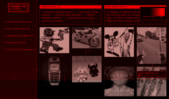
[bloodrain.exe]- digital bloodbath//(bask in the digital downpour) html neocities theme
FEATURES:
animations
dynamic content
image gallery
flexbox
LIVE PREVIEW
DOWNLOAD HERE
#old web graphics#css#html#cybercore#html css#web graphics#htmlcoding#neocities#web resources#neocities template#themes#blog theme#neocities resources#blinkies#indie web#neocities theme#neocities themes#htmltutorial#javascript#code#f2u graphics#f2u#f2u resources#html theme#old internet#blog resources#editing resources
22 notes
·
View notes
Text
I've been making an image wall engine
I'd like to start posting a bit more about my dev/programming projects on here because that'd be cool and I don't feel like making an entirely new blog for it.
Anyway, for the past couple of months, I've been building an image gallery engine with all of the features you would need to organise and display a large collection of images in a tiling masonry-esque wall: a tag/extag system, dedicated image management/upload and tag management forms (for those who don't want to edit the config files directly) with automatic thumbnail generation, and pagination if needed. Naturally I've been using my Offshore art collection as the testing ground for this.


Masonry.js (the standard solution to generating tiling UIs in HTML documents, like so) was made pre-flexbox and I don't know if they've updated it but...yeah I didn't like Masonry.js so I reinvented the wheel and wrote my own masonry generator.
I'm mostly done with it (including starting a fresh copy and ironing out initialisation) so I'll be turning it into a Github repo at some point, because one friend saw it and said they wished they had a tool like this... Which, that's reason enough, I think.
3 notes
·
View notes
Text

💡 Webflow Tip of the Day: Use CSS Grid for Precise Control Over Layouts
If you're still relying heavily on Flexbox for layout structures, it's time to level up with CSS Grid inside Webflow.
🎯 Why Use CSS Grid?
Offers 2D layout control (rows + columns simultaneously)
Perfect for complex layouts (e.g., image galleries, dashboards, content-heavy sections)
Cleaner and more flexible than nesting multiple Flexbox divs
🛠 How To Use It in Webflow:
Select a div block → go to Display → choose Grid
Define rows & columns directly in the Webflow Designer
Drag & drop child elements into grid cells
Use Span settings to make elements cover multiple columns or rows
Adjust responsiveness easily by changing grid layouts per breakpoint
🌟 Example Use Case:
Create a 3-column portfolio grid that collapses into a 1-column layout on mobile without writing custom code.
🔗 See It in Action:
🌐 Portfolio: https://webflowwork.com
🎯 Upwork: https://bit.ly/4iu6AKd
🎯 Fiverr: https://bit.ly/3EzQxNd
💼 LinkedIn: https://www.linkedin.com/in/vishal-solanki-1aa7a9a2/
#webflow#freelancewebdeveloper#web design#web development#webflowdesign#webflowlandingpage#webflowexperts#website#nocode#ui ux design#webflowcms#uidesign#web desgin company#fiverr gigs#fiverr#freelance#startup#upwork
0 notes
Text
4 Practical Use Cases for CSS Grids in Modern Web Design
CSS Grid is a powerful layout system that has transformed the way web designers structure and style websites. It provides a flexible, two-dimensional grid-based approach, making it easier to create complex layouts without the need for excessive code or tricky workarounds.

Download Infographic
Building Stunning Image Galleries

Image galleries are a staple in modern web design, and CSS Grid is an ideal tool for creating them. Unlike traditional layout methods, CSS Grid allows you to define precise rows and columns, making it easy to align images without breaking the overall design.
Why Use CSS Grid for Image Galleries?
Flexible Layouts: Easily control the number of columns and rows based on screen size.
Gap Control: Use the grid-gap or gap property for perfect spacing.
Responsive Design: Adjust column sizes and row heights without breaking the layout.
Layering and Positioning: Position images in creative ways, including overlapping elements.
Basic Image Gallery Example
<div class=”gallery”> <img src=”image1.jpg” alt=”Image 1″> <img src=”image2.jpg” alt=”Image 2″> <img src=”image3.jpg” alt=”Image 3″> <img src=”image4.jpg” alt=”Image 4″> <img src=”image5.jpg” alt=”Image 5″> </div>
.gallery { display: grid; grid-template-columns: repeat(auto-fill, minmax(200px, 1fr)); gap: 16px; } .gallery img { width: 100%; display: block; border-radius: 8px;
Advanced Image Gallery Layouts
Experienced web designers can also create more intricate layouts by spanning images across multiple rows or columns using the grid-column and grid-row properties, giving your galleries a more dynamic and polished look.
In this infographic blog post, we’ll explore four practical use cases for CSS Grids that can elevate your web design projects.
Try CSS Grid Generator
Creating Main Website Layouts

CSS Grid shines when it comes to designing the main structure of a website. Whether you’re building a blog, portfolio, or business website, grids provide the framework for responsive and organised layouts.
Why Use CSS Grid for Main Layouts?
Clear Structure: Define headers, sidebars, content areas, and footers precisely.
Responsive Design: Create layouts that adapt effortlessly to different screen sizes.
Efficient Code: Reduce the need for excessive wrapper divs and floats.
Complex Designs: Easily create overlapping sections and layered effects.
Basic Main Layout Example
<div class=”main-layout”> <header>Header</header> <nav>Navigation</nav> <main>Main Content</main> <aside>Sidebar</aside> <footer>Footer</footer> </div>
.main-layout { display: grid; grid-template-areas: “header header header” “nav main sidebar” “footer footer footer”; grid-template-columns: 1fr 2fr 1fr; gap: 20px; } header { grid-area: header; } nav { grid-area: nav; } main { grid-area: main; } aside { grid-area: sidebar; } footer { grid-area: footer; }
Advanced Main Layouts
For more complex designs, consider using CSS Grid in combination with Flexbox for greater flexibility and control over nested elements.
Designing Attention-Grabbing Banners

Banners are crucial for grabbing user attention, and CSS Grid makes it easy to create stunning, multi-layered designs without relying on complex positioning hacks.
Why Use CSS Grid for Banners?
Flexible Positioning: Easily place text, images, and buttons exactly where you want them.
Responsive Design: Maintain structure across different devices.
Layer Control: Use grid layers to create engaging, multi-dimensional designs.
Basic Banner Example
<div class=”banner”> <div class=”overlay”></div> <h1>Welcome to Our Website</h1> <p>Discover our range of services.</p> <button>Learn More</button> </div>
.banner { display: grid; grid-template-areas: “overlay”; position: relative; background-image: url(‘banner.jpg’); background-size: cover; background-position: center; height: 300px; color: #fff; text-align: center; } .overlay { grid-area: overlay; background-color: rgba(0, 0, 0, 0.6); position: absolute; top: 0; left: 0; right: 0; bottom: 0; z-index: 1; } .banner h1, .banner p, .banner button { position: relative; z-index: 2; }
Perfectly Centring Items

Centred layouts are a common design choice, and CSS Grid provides a simple way to centre content without relying on margin hacks or flexbox tricks.
Why Use CSS Grid for Centring?
Simplicity: One line of code can achieve perfect centring.
Cross-Browser Support: Reliable centring across all major browsers.
Versatility: Works for both single items and entire sections.
Basic Centring Example
<div class=”centre”> <h2>Centred Content</h2> </div>
.centre { display: grid; place-items: center; height: 300px; background-color: #f4f4f4; }
Conclusion
CSS Grid is an incredibly versatile tool that can streamline your web design workflow, reduce code complexity, and enhance the overall user experience.
Whether you’re building image galleries, main layouts, banners, or perfectly centred designs, CSS Grid offers a flexible and powerful solution.
Experiment with these practical use cases to unlock the full potential of CSS Grid in your projects.
0 notes
Text
Common Mistakes to Avoid in Architecture Website Design

In today's digital landscape, your website is the blueprint of your brand. For architecture firms, Architecture Website Design is more than just aesthetics — it's about communicating expertise, attracting leads, and standing out in a competitive market. Yet, many firms fall into common design traps that can cost them credibility and conversions. In this blog, we explore the most frequent architecture website design mistakes and how to avoid them with practical, technical insights.
1. Overloading the Website with Visuals
Architecture is a visual industry — and while high-quality images are essential, overloading your website with large, unoptimized visuals can backfire. Many firms try to showcase every project, resulting in cluttered layouts and painfully slow load times.
This not only frustrates users but also harms SEO rankings and mobile performance. According to Google, 53% of mobile users abandon a site that takes more than three seconds to load.
How to fix it:
Use next-gen formats like WebP for images.
Compress and lazy-load media files.
Limit portfolio items per page and link to full case studies.
Balanced visual storytelling is the key to effective architecture website design — show just enough to entice without overwhelming.
2. Ignoring Mobile Responsiveness
With over 60% of global web traffic now coming from mobile devices, a desktop-only approach to design is outdated and risky. Architecture websites often suffer from oversized galleries or awkward layouts that don’t translate well to smaller screens.
Responsive design isn’t optional anymore.
Technical tips:
Use flexible grids (CSS Grid or Flexbox).
Set breakpoints for multiple screen sizes.
Implement mobile-first design in frameworks like Bootstrap or Tailwind.
A responsive architecture website design ensures accessibility and a positive user experience for every device.
3. Poor Navigation and User Experience (UX)
Visitors to architecture websites are often clients or collaborators looking for quick answers: Who are you? What have you done? How can they contact you?
Clunky menus, broken links, or buried content can drive them away.
UX best practices:
Use a clear top menu with categories like "About," "Portfolio," "Services," and "Contact."
Implement sticky navigation bars for easy access.
Highlight CTAs like “Book a Consultation” or “Download Portfolio.”
Great UX in architecture website design helps users discover your value fast — and keeps them engaged longer.
4. Lack of Project-Focused Portfolio Structure
An unstructured portfolio is a major red flag. Visitors want to explore your past projects, but many architecture sites either show too much or too little, with no way to filter or drill down.
Fix this with:
Categorized portfolio pages (e.g., Residential, Commercial, Urban). -
Filters for project type, location, or size.
Detailed case studies with challenges, solutions, and visuals.
Smart portfolio presentation sets the tone for your capability and professionalism, enhancing the impact of your architecture website design.
5. Neglecting SEO and Site Performance
A beautiful website that no one finds is a wasted investment. Architecture firms often neglect the foundational elements of SEO — like proper tagging, clean code, and content strategy — which limits their visibility.
Key SEO & performance practices:
Add relevant meta titles and descriptions.
Use schema markup for projects and team profiles.
Optimize for Core Web Vitals using tools like Google PageSpeed Insights.
Host on fast, reliable servers and use a CDN for image delivery.
Platforms like WordPress combined with plugins like Yoast SEO and WP Rocket can streamline performance and SEO for your architecture website design.
6. Inconsistent Branding and Aesthetic
Architecture is about precision and design integrity — your website should reflect that. Yet many firms suffer from branding inconsistency: mismatched fonts, erratic color schemes, and uneven design patterns.
Establish a cohesive identity with:
A defined color palette and typography hierarchy.
Consistent use of logos and visual styles.
A style guide or design system.
Strong branding makes your firm instantly recognizable and sets the tone for trust — a crucial goal of any architecture website design.
7. Not Integrating Contact or Lead Generation Tools
Some websites make it surprisingly hard to reach the company. Others fail to include forms, live chat, or even clickable phone numbers — turning potential clients away.
Conversion-focused design tips:
Include visible CTAs on every page.
Use sticky “Contact” or “Schedule a Call” buttons.
Integrate tools like Calendly, HubSpot, or Mailchimp for leads and automation.
Seamless lead capture transforms your architecture website design from a digital brochure into a business asset.
Conclusion
A well-executed architecture website design should function as a showcase, a sales funnel, and a statement of your firm's identity — all in one. Avoiding the mistakes we’ve covered — from poor mobile optimization to missed SEO opportunities — will help position your brand at the forefront of the industry.
0 notes
Text
Mastering CSS Grid and Flexbox: A Designer’s Guide

Mastering CSS Grid and Flexbox: A Designer’s Guide CSS Grid and Flexbox are two powerful layout systems in modern web design, enabling designers to create responsive, flexible, and visually appealing layouts with ease.
Here’s a guide to mastering them:
Understanding CSS Flexbox What It Is:
Flexbox (short for Flexible Box Layout) is a one-dimensional layout system used for aligning items in a row or column.
Key Concepts:
Flex Container: The parent element where Flexbox rules apply. Flex Items: The child elements inside the container.
Axis Control: Layout is managed along the main axis (row/column) and cross-axis (perpendicular to the main axis).
Common Properties: display:
flex: Enables Flexbox on the container. justify-content: Aligns items along the main axis (e.g., flex-start, center).
align-items: Aligns items along the cross-axis.
flex-grow and flex-shrink: Control how items grow or shrink.
Use Cases:
Centering elements, creating navigation bars, and handling dynamic content layouts.
2. Understanding CSS Grid What It Is: CSS Grid is a two-dimensional layout system designed for managing both rows and columns.
Key Concepts: Grid Container:
The parent element where grid rules apply.
Grid Items: The child elements placed inside the container.
Tracks: Rows and columns that define the layout. Grid Lines: Invisible lines separating tracks.
Common Properties:
display: grid:
Enables Grid on the container. grid-template-rows and grid-template-
columns: Define the structure of rows and columns.
gap: Adds spacing between grid items. grid-area: Specifies item placement within the grid.
Use Cases: Complex layouts like dashboards, image galleries, and multi-column designs.
3. Flexbox vs. Grid:
When to Use What Flexbox: Ideal for simpler, one-dimensional layouts (e.g., nav bars, menus).
Grid: Best for two-dimensional layouts with intricate designs (e.g., page layouts, responsive grids).
Combined Use: Both can be used together for maximum flexibility.
4. Tips for Mastery Start Simple:
Experiment with small layouts to understand core properties.
Practice Responsiveness:
Use media queries with grid-template-areas or flex-wrap to build responsive designs.
Learn Naming Conventions:
Use meaningful class names to keep layouts organized. Explore Browser
Dev Tools:
Inspect grid and flex layouts visually using browser tools.
5. Tools and Resources Practice Tools:
CodePen, JSFiddle for live experimentation. Learning Resources: MDN Web Docs, CSS-Tricks tutorials.
Grid Generators:
Tools like CSS Grid Generator and Flexbox Froggy (game-based learning).
Conclusion
Mastering CSS Grid and Flexbox empowers designers to create visually stunning and responsive layouts efficiently.
By understanding their capabilities and knowing when to use each system, designers can craft modern websites that offer both functionality and aesthetic appeal.

0 notes
Text
in my dreams.............i see my perfect neocities........ with beautiful sorted image galleries of funny dbz images......... indexing of old geocities dbz sites/blogs.............annoying, low res, tiled background with poor contrast to text color........no flexboxing...............someday. i miss it already
2 notes
·
View notes
Text
coding the website gallery wasnt the seven headed beast i thought itd be tbh. i was originally gonna make every image sortable through tags like gift art, trades, etc (which i think could still be added in post probably) which was gonna complicate stuff quite a bit.
its coming out great so far. flexbox is gonna make this quite handy though i need to test it more with images in different aspect ratios

0 notes
Text
Discover 10+ CSS Horizontal Accordions

Welcome to CSS Monster, your go-to destination for exploring a carefully curated collection of CSS horizontal accordions! We've handpicked these examples from various resources, including CodePen, GitHub, and others. As of August 2023, we're thrilled to announce that our collection has been updated, now featuring 2 new and innovative horizontal accordion items for you to discover and integrate into your web projects. CSS horizontal accordions represent a versatile display widget commonly utilized in website navigation. They excel in efficiently organizing content within limited space, allowing users to access different sections by clicking on respective headers. Opting for CSS in crafting horizontal accordions brings forth several advantages. Customizability is a key highlight, allowing you to easily adjust the size, color, and other properties of the accordions to seamlessly align with your website's unique design. The scalability of CSS accordions ensures they adapt gracefully to various screen sizes, making them an ideal choice for responsive web design. Additionally, as part of the code, CSS horizontal accordions load faster than their image-based counterparts, optimizing performance for a smoother user experience. Our collection boasts a diverse array of creative and visually appealing horizontal accordions. Whether you lean towards a minimalist design or seek something more intricate, our selection caters to a variety of preferences. We invite you to explore this collection and leverage these horizontal accordions for your web development projects. Each accordion comes equipped with its HTML and CSS code example, simplifying the process of incorporation into your project. Enhance your website's navigation and content organization with these expressive horizontal accordions. We hope you find this collection valuable for creating engaging and user-friendly web experiences. Happy coding! Author Doniyor11 August 30, 2020 Links Just Get The Demo Link How To Download - Article How To Download - Video Made with HTML / CSS About a code RESPONSIVE ACCORDION SLIDER Compatible browsers:Chrome, Edge, Firefox, Opera, Safari Responsive:yes Author @keyframers August 21, 2019 Links Just Get The Demo Link How To Download - Article How To Download - Video Made with HTML / CSS (SCSS) About a code CSS-ONLY LINE BAR NAVIGATION Compatible browsers:Chrome, Edge, Firefox, Opera, Safari Responsive:yes Dependencies:- Author Mert Cukuren March 7, 2019 Links Just Get The Demo Link How To Download - Article How To Download - Video Made with HTML / CSS (SCSS) About a code IMAGE HOVER EFFECT Compatible browsers:Chrome, Edge, Firefox, Opera, Safari Responsive:yes Dependencies:- Author Daniel Subat January 23, 2019 Links Just Get The Demo Link How To Download - Article How To Download - Video Made with HTML / CSS (SCSS) About a code ACCORDION GALLERY Compatible browsers:Chrome, Edge, Firefox, Opera, Safari Responsive:yes Dependencies:-

Author Ivan Bogachev June 6, 2018 Links Just Get The Demo Link How To Download - Article How To Download - Video Made with HTML (Pug) / CSS (Less) About a code PURE CSS ACCORDION

Author Stefan C. January 11, 2018 Links Just Get The Demo Link How To Download - Article How To Download - Video Made with HTML / CSS About a code ACCORDION IMAGE GALLERY

Author fox_hover November 27, 2017 Links Just Get The Demo Link How To Download - Article How To Download - Video Made with HTML About a code CSS3 ACCORDION SLIDER WITH TRANSITIONS AND FLEXBOX Author Eduardo Moreno November 21, 2016 Links Just Get The Demo Link How To Download - Article How To Download - Video Made with HTML / CSS (SCSS) About a code PURE CSS ACCORDION Compatible browsers:Chrome, Edge, Firefox, Opera, Safari Responsive:yes Dependencies:-

Author Miles Manners July 19, 2016 Links Just Get The Demo Link How To Download - Article How To Download - Video Made with HTML (Pug) / CSS (SCSS) About a code HORIZONTAL ACCORDION Author Michael Ferry March 22, 2015 Links Just Get The Demo Link How To Download - Article How To Download - Video Made with HTML / CSS (SCSS) About a code RESPONSIVE ACCORDION (BACKGROUND IMAGES) Compatible browsers:Chrome, Edge, Firefox, Opera, Safari Responsive:no Dependencies:-
FAQs
1. What are CSS horizontal accordions? CSS horizontal accordions are versatile display widgets used in website navigation. They efficiently organize content within limited space, allowing users to access different sections by clicking on respective headers. 2. Where can I find CSS horizontal accordion examples? Our collection includes carefully selected examples from platforms like CodePen, GitHub, and other online resources. Explore CSS Monster to discover and integrate these creative and functional horizontal accordions into your projects. 3. How can CSS horizontal accordions be customized? CSS horizontal accordions offer easy customization, allowing adjustments to size, color, and other properties to match your website's design seamlessly. 4. Are CSS horizontal accordions suitable for responsive web design? Absolutely! CSS accordions scale without losing quality, making them ideal for responsive web design. They adapt well to various screen sizes for a consistent user experience. 5. Why choose CSS horizontal accordions over image-based accordions? CSS horizontal accordions, being part of the code, load faster than image-based accordions, optimizing performance and contributing to a smoother user experience. 6. How often is the horizontal accordion collection updated? Our collection is regularly updated with the latest and most creative CSS horizontal accordions. Check back for new additions and stay on top of the latest trends in web design. 7. Can I use these horizontal accordions in my web development projects? Certainly! Each horizontal accordion in our collection comes with its HTML and CSS code example, making it easy for you to incorporate them into your projects. Feel free to explore and integrate these accordions into your web development endeavors.
Conclusion
In conclusion, CSS Monster is your destination for discovering and integrating 10+ CSS horizontal accordions into your web projects. With advantages like customizability, scalability, and improved performance, these accordions add a dynamic and visually appealing touch to website navigation. Explore our collection, stay updated with the latest additions, and elevate your web design with expressive horizontal accordions. Happy coding! Read the full article
0 notes
Text

CSS Flexbox Image Gallery Get Code from divinectorweb website
#css image gallery#responsive image gallery#css tricks#css effects#css animation examples#html css#learn to code#code#divinectorweb#frontenddevelopment#css#css3#html
0 notes
Text
Exploring 10 Sophisticated CSS Properties with Webtutor

In the ever-evolving landscape of web design, CSS (Cascading Style Sheets) stands as a cornerstone for creating stunning and visually captivating websites. As a web designer or developer, having a firm grasp of CSS properties is crucial to craft unique user experiences and bring your creative vision to life. In this blog post, we will delve into advanced CSS properties that can elevate your design game to new heights. Plus, we will introduce you to WebTutor, the ultimate online platform for mastering code and unleashing your web design potential.
Flexbox (display: flex)
Gone are the days of complex float-based layouts. With the 'display: flex' property, Flexbox simplifies the way you structure layouts, align content, and distribute space within a container. Designers can create responsive and dynamic designs, making it easier to build everything from navigation bars to complete page layouts.
Grid Layout (display: grid)
For those craving even more control over layouts, the 'display: grid' property offers a powerful solution. Grid Layout divides a web page into rows and columns, allowing designers to arrange content in a grid format. This approach grants unparalleled control over alignment, spacing, and responsiveness.
CSS Variables (custom properties)
CSS Variables, also known as custom properties, enable designers to define reusable values within stylesheets. This advancement allows for easier theming, dynamic theming, and quicker updates across an entire website. By centralizing key values, designers can swiftly adjust colors, fonts, and other design elements across the site.
Transitions and Animations (transition, animation)
Creating engaging user experiences often involves smooth transitions and animations. With the 'transition' and 'animation' properties, designers can add eye-catching effects to various elements, enhancing user engagement and guiding their attention to important content.
Box Shadow (box-shadow)
Box shadows add depth and dimension to design elements, making them stand out from the page. This property enables designers to create subtle or bold shadows that can make buttons, cards, and other elements pop, adding a touch of elegance to the overall design.
Background Blend Mode (background-blend-mode)
Background images can play a significant role in design aesthetics. The 'background-blend-mode' property lets designers blend background images with background colors in creative ways, resulting in captivating visual effects and unique design elements.
Transform (transform)
The 'transform' property opens up a world of possibilities for manipulating elements in 2D and 3D space. Designers can rotate, scale, skew, and translate elements to achieve striking visual effects that captivate users' attention and create a sense of interactivity.
Custom Fonts (font-face)
Typography is a cornerstone of web design, and the 'font-face' property allows designers to use custom fonts that might not be available on users' devices. This property ensures consistent typography across different platforms, enhancing the website's visual identity.
Gradients (linear-gradient, radial-gradient)
Gradients are versatile tools for adding depth and visual interest to backgrounds, buttons, and other design elements. With 'linear-gradient' and 'radial-gradient' properties, designers can experiment with color blends, creating stunning visual effects that catch the eye.
Scroll Snap (scroll-snap-type)
Enhancing user experience is paramount in modern web design. The 'scroll-snap-type' property assists in creating smoother scrolling experiences by snapping to predefined points on a page. This is particularly useful for websites with sections or galleries that need precise alignment during scrolling.
Introducing WebTutor: Your Pathway to Mastery
Now that you've discovered the power of these 10 advanced CSS properties, it's time to turn your knowledge into skills. Meet WebTutor, the ultimate online platform for learning code. With WebTutor, you'll embark on a transformative learning journey, guided by industry experts who are passionate about helping you master web design, development, and more.
Why Choose WebTutor?
Comprehensive Curriculum: WebTutor offers a curated curriculum that covers everything from the basics to advanced topics, ensuring you have a strong foundation for your journey into web design.
Interactive Learning
Dive into hands-on coding exercises and real-world projects that give you the practical experience needed to excel in the field.
Expert Instructors
Learn from experienced professionals who are dedicated to your success. WebTutor's instructors are there to answer your questions, provide guidance, and share industry insights.
Flexible Learning
Whether you're a full-time student or a working professional, WebTutor's flexible learning options allow you to study at your own pace, making it convenient to achieve your goals.
Community Support
Join a vibrant community of learners, collaborate on projects, share ideas, and celebrate your milestones together.
Conclusion
Mastering CSS properties opens the door to a world of creative possibilities in web design. As you explore these advanced properties, remember that practice makes perfect. And there is no better way to practice than through WebTutor, where you'll gain the skills and confidence to build beautiful, responsive, and user-friendly websites. Start your journey with WebTutor today and take your web design skills to new heights!
Learn more with WebTutor
Ultimate Guide to CSS Animations
Latest CSS Tricks and Features
Latest CSS Trends
Create Stunning Websites with CSS for Beginners
#Css Tutorials#Learn online CSS#learn the basics of CSS#Basics of CSS Syntax#learn CSS Selectors online#mastering the syntax of CSS#important aspect of CSS#learn CSS colors#online CSS colors#Learn Online CSS#Online CSS Tutorial#Introduction to CSS
0 notes
Video
youtube
Flexbox #4 - Work on image gallery section
1 note
·
View note
Photo

Responsive Image Gallery using CSS Flexbox Grid
#css flexbox#css flex layout#css flexbox grid#flex#flexbox#flexbox tutorial#flexbox examples#learn to code#coding#codingisfun#codingdays#frontendfriday#frontend#frontenddeveloper#webdesign#css#html#html css#html5#css3#codingflicks#css beginners
1 note
·
View note
Video
tumblr
49 CSS Galleries. HTML and CSS responsive image/photo gallery: flexbox, grid, lightbox, with thumbnails, etc. Update of March 2019 collection. 10 new examples. - https://freefrontend.com/css-gallery/
3 notes
·
View notes