#flexbox tricks
Explore tagged Tumblr posts
Visit Tumblr Blog
Explore Tumblr blogs with no restrictions, modern design and the best experience.
Last Seen Tumblr Blogs


Fun Fact
BuzzFeed published a report claiming that Tumblr was utilized as a distribution channel for Russian agents to influence American voting habits during the 2016 presidential election in Feb 2018.
Text

Flexbox Navigation Menu
#navigation menu#css menu#html css menu#css flexbox layout#html css#learn to code#code#frontend#css#html#css3#css layout#frontenddevelopment#css tricks#navigation bar
6 notes
·
View notes
Text
The Mistakes of CSS
New Post has been published on https://thedigitalinsider.com/the-mistakes-of-css/
The Mistakes of CSS
Surely you have seen a CSS property and thought “Why?” For example:
Why doesn’t z-index work on all elements, and why is it “-index” anyways?
Or:
Why do we need interpolate-size to animate to auto?
You are not alone. CSS was born in 1996 (it can legally order a beer, you know!) and was initially considered a way to style documents; I don’t think anyone imagined everything CSS would be expected to do nearly 30 years later. If we had a time machine, many things would be done differently to match conventions or to make more sense. Heck, even the CSS Working Group admits to wanting a time-traveling contraption… in the specifications!
NOTE: If we had a time machine, this property wouldn’t need to exist.
CSS Values and Units Module Level 5, Section 10.4
If by some stroke of opportunity, I was given free rein to rename some things in CSS, a couple of ideas come to mind, but if you want more, you can find an ongoing list of mistakes made in CSS… by the CSS Working Group! Take, for example, background-repeat:
Not quite a mistake, because it was a reasonable default for the 90s, but it would be more helpful since then if background-repeat defaulted to no-repeat.
Right now, people are questioning if CSS Flexbox and CSS Grid should share more syntax in light of the upcoming CSS Masonry layout specifications.
Why not fix them? Sadly, it isn’t as easy as fixing something. People already built their websites with these quirks in mind, and changing them would break those sites. Consider it technical debt.
This is why I think the CSS Working Group deserves an onslaught of praise. Designing new features that are immutable once shipped has to be a nerve-wracking experience that involves inexact science. It’s not that we haven’t seen the specifications change or evolve in the past — they most certainly have — but the value of getting things right the first time is a beast of burden.
Direct Link →
#background#Born#change#CSS#CSS Flexbox#CSS Grid#css-tricks#csswg#digitalocean#easy#Features#grid#Ideas#immutable#it#layout#Light#Link#links#list#masonry#mind#module#newsletter#Science#specifications#stroke#syntax#technical debt#time
0 notes
Text

Image Gallery Using Flexbox
#css image gallery#responsive image gallery#css flexbox examples#html css#divinector#code#frontenddevelopment#css#html#css3#learn to code#css tricks#responsive web design
1 note
·
View note
Note
it seems like my ask from a few days ago didn’t get sent 😭 argh stupid tumblr
i was basically asking there what resources you would recommend for everything that could be useful for neocities,, like html, css,,(and you mentioned java script i think?) especially beginner-beginner stuff and then maybe for intermediate 👉👈 i know you probably have all those on your blog already but you know me in a bit 😵💫
also yes i’d love to work on ours together, even if we didn’t make them match! cause you know you have millions of brilliant ideas :33 🌻🌻💛
Hiya,
These are the stuff I used / still use, hope it's useful:
W3Schools
Mozilla Developer Network (MDN)
Codecademy
freeCodeCamp
Khan Academy HTML/CSS Course
Shay Howe's HTML and CSS tutorial
HTML Dog
CSS-Tricks
CSS Layout
Flexbox Froggy
Grid Garden
CSS Zen Garden
CSS Animation
Try them out and see what works best for you! 👍🏾
#my asks#resources#coding#codeblr#progblr#programming#studyblr#studying#comp sci#computer science#programmer#html css#html#css
357 notes
·
View notes
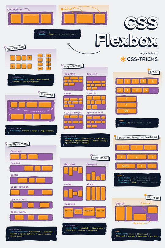
Text
Helpful Poster Guide from CSS-Tricks for CSS Flexbox
#codeblr#coding#studyblr#studying#programmer#coder#programming#progblr#study#code blog#code#css#flexbox
312 notes
·
View notes
Video
youtube
YouTube Intro Splash Screen Animation Using Only HTML & CSS | No JavaScript
🔥 Recreate YouTube's iconic intro animation using only HTML and CSS — no JavaScript required! In this quick and easy tutorial, you'll learn how to build a stunning, smooth animation just like the YouTube app splash screen.
👨💻 Whether you're a beginner or a pro, this CSS animation trick will level up your UI game!
✅ What You’ll Learn: • How to animate elements with keyframes • How to center and style elements with flexbox • How to create a triangle play icon using clip-path • How to mimic professional splash screens
2 notes
·
View notes
Text
good websites to practice CSS
Here are a few good websites to practice CSS:
CSS Diner (https://flukeout.github.io/) - Interactive game that teaches CSS selectors in a fun way.
CSS Grid Garden (https://cssgridgarden.com/) - Game for learning CSS grid layout.
Flexbox Froggy (https://flexboxfroggy.com/) - Game for learning flexbox.
CSS Battle (https://cssbattle.dev/) - Challenge to recreate small layouts using CSS.
CodePen (https://codepen.io/) - Frontend web dev playground where you can create pens and practice CSS.
FreeCodeCamp (https://www.freecodecamp.org/learn/) - Interactive coding challenges including CSS sections.
CSS Tricks (https://css-tricks.com/) - Blog with CSS tutorials and examples.
Scrimba (https://scrimba.com/) - Interactive screencasts for learning web development including CSS courses.
I'd recommend starting with CSS Diner, Grid Garden and Flexbox Froggy as they provide a very hands-on way to get familiar with CSS selectors and layout concepts. CodePen is also great for quickly testing out CSS ideas. FreeCodeCamp, CSS Tricks and Scrimba offer more in-depth learning content and challenges.
12 notes
·
View notes
Text
Our lord and saviour, the css-tricks flexbox guide
4 notes
·
View notes
Text

Become a CSS Wizard: Style Like a Pro!
Ready to take your web design skills to the next level? In this CSS tutorial, you’ll learn everything you need to become a CSS wizard — from styling basics to advanced techniques like Flexbox, Grid, animations, and more. Whether you’re a beginner or looking to sharpen your skills, this guide is packed with tips, tricks, and real-world examples. Style like a pro and transform your websites into stunning masterpieces. Let’s dive into the magic of CSS!
0 notes
Text
Beginner's Guide to Responsive Web Design
Websites are the storefronts of the digital world. Everyone wants a sleek, stylish, and easy-to-use web design in Sydney. However, not everyone knows how to make one that works on all devices. That is where responsive web design comes in. It is not just a trend—it is the new normal. If your web design in Sydney is not responsive, you are already behind. But don’t worry, this guide will help you catch up.
What is Responsive Web Design?
Responsive web design means a website adjusts to any screen size. You don’t need to zoom in. You don’t need to scroll side to side. Everything lines up. Everything flows. It feels natural.
So, the goal is simple: Make your web design in Sydney readable and usable, no matter the device. No matter the screen resolution.
Why Should You Care?
People use all kinds of gadgets today. Laptops, tablets, smartphones, smart TVs, and so on. Some websites look perfect on a laptop, but try the same site on your phone. It’s a mess. The text is tiny. Buttons are hard to click. Images get cut off. All this chaos makes your visitors leave in frustration.
Google loves responsive websites and gives them better rankings. This leads to more visitors and better visibility. Thus, a responsive site is not a luxury but a necessity.
The Key Ingredients of Responsive Design
1. Fluid Grids
A fluid grid uses percentages instead of fixed pixels. That way, elements grow or shrink depending on the screen size. For example, imagine a picture might be 50% wide. It stretches on a big screen, while on a small screen, it shrinks. The layout stays balanced. The structure remains intact.
2. Flexible Images
Images are tricky. If not sized properly, they break layouts. So, responsive design always uses flexible images that are easy to scale and adjust. No overflow. No broken sections. Just smooth visuals. You can use CSS to control this. A common trick is to set the image width to 100%. That way, it always fills the space.
3. Media Queries
This is the secret sauce. Media queries are CSS rules. They tell the browser how to style the page based on screen size.
When the screen is 600 pixels wide or smaller, the background turns light blue. You can:
Change fonts
Rearrange sections
Hide or show content
In short, media queries give you control and make your design smart.
Mobile-First Design: Start Small
Design for the smallest screen first. That is mobile-first design. It makes you focus. It helps you prioritise. You start with what really matters. To put it in order:
Build a layout for phones.
Then scale it up for tablets.
Then expand it for desktops.
This approach saves time while reducing clutter. It also ensures a clean and clear user experience.
Tools to Help You Get Started
Bootstrap
This is a popular framework with pre-made grid systems. It includes responsive components, from buttons to forms to navigation bars. You can build fast. You can customise easily.
CSS Flexbox
Flexbox helps you align items in rows or columns. It adapts quickly and is ideal for one-dimensional layouts. Want a row of cards that wraps on small screens? Flexbox does that.
CSS Grid
Grid is perfect for complex layouts. You can place items wherever you want—rows, columns, or overlapping elements. It gives you full control.
Chrome DevTools
Test your design right in your browser.
Open Chrome.
Press F12.
You’ll see the Developer Tools.
Switch to mobile view.
Resize the window.
See how your site responds.
Adjust and fix issues on the spot.
Tips for Better Responsive Web Design in Sydney
Keep Navigation Simple
Big menus do not work well on phones. Use icons or collapsible menus, and keep it clean. More importantly, keep it user-friendly.
Avoid Fixed Widths
Fixed widths can break your layout. Stick to percentages. Embrace fluidity.
Use Viewport Meta Tag
Add this to your HTML:
```html
<meta name="viewport" content="width=device-width, initial-scale=1.0">
```
This tells the browser how to scale the page. Without it, your design might look weird on mobile.
Test on Real Devices
Simulators help, but nothing beats the real thing. Open your site on different phones. Try it on tablets. Check how it looks. Check how it feels.
Optimise Loading Time
Mobile users want speed. Compress your images. Minify your CSS and JavaScript. Use lazy loading. Keep things light.
Real World Example
Let’s take a basic layout. A homepage with a header, a main section, a sidebar, and a footer.
On desktop:
– The header stretches across the top.
– The main section sits on the left.
– The sidebar is on the right.
– The footer is at the bottom.
On mobile:
– The header still sits on top.
– The sidebar moves below the main section.
– Everything stacks vertically.
Same content. Different layout. That’s the beauty of responsive design.
Common Mistakes to Avoid
Even the best designers mess up. Let’s make sure you don’t.
– Don’t forget the viewport meta tag.
– Don’t use large fixed images.
– Don’t hide important content on mobile.
– Don’t ignore load speed.
– Don’t test only on one screen size.
Each screen is a new experience. Each visitor deserves a smooth journey.
Final Thoughts: The Future is Flexible
The internet will keep changing. New devices will appear and new screen sizes will emerge. So, your fully responsive website must be ready. It keeps your site future-proof. To get started with your responsive web design in Sydney - https://www.makemywebsite.com.au/web-design/sydney/ , connect with Make My Website.
Web design is not just about looking pretty. It’s about function. It’s about flow. It’s about flexibility. Responsive design gives your website a fighting chance.
0 notes
Text
Mastering CSS Grid and Flexbox: A Designer’s Guide

Mastering CSS Grid and Flexbox: A Designer’s Guide CSS Grid and Flexbox are two powerful layout systems in modern web design, enabling designers to create responsive, flexible, and visually appealing layouts with ease.
Here’s a guide to mastering them:
Understanding CSS Flexbox What It Is:
Flexbox (short for Flexible Box Layout) is a one-dimensional layout system used for aligning items in a row or column.
Key Concepts:
Flex Container: The parent element where Flexbox rules apply. Flex Items: The child elements inside the container.
Axis Control: Layout is managed along the main axis (row/column) and cross-axis (perpendicular to the main axis).
Common Properties: display:
flex: Enables Flexbox on the container. justify-content: Aligns items along the main axis (e.g., flex-start, center).
align-items: Aligns items along the cross-axis.
flex-grow and flex-shrink: Control how items grow or shrink.
Use Cases:
Centering elements, creating navigation bars, and handling dynamic content layouts.
2. Understanding CSS Grid What It Is: CSS Grid is a two-dimensional layout system designed for managing both rows and columns.
Key Concepts: Grid Container:
The parent element where grid rules apply.
Grid Items: The child elements placed inside the container.
Tracks: Rows and columns that define the layout. Grid Lines: Invisible lines separating tracks.
Common Properties:
display: grid:
Enables Grid on the container. grid-template-rows and grid-template-
columns: Define the structure of rows and columns.
gap: Adds spacing between grid items. grid-area: Specifies item placement within the grid.
Use Cases: Complex layouts like dashboards, image galleries, and multi-column designs.
3. Flexbox vs. Grid:
When to Use What Flexbox: Ideal for simpler, one-dimensional layouts (e.g., nav bars, menus).
Grid: Best for two-dimensional layouts with intricate designs (e.g., page layouts, responsive grids).
Combined Use: Both can be used together for maximum flexibility.
4. Tips for Mastery Start Simple:
Experiment with small layouts to understand core properties.
Practice Responsiveness:
Use media queries with grid-template-areas or flex-wrap to build responsive designs.
Learn Naming Conventions:
Use meaningful class names to keep layouts organized. Explore Browser
Dev Tools:
Inspect grid and flex layouts visually using browser tools.
5. Tools and Resources Practice Tools:
CodePen, JSFiddle for live experimentation. Learning Resources: MDN Web Docs, CSS-Tricks tutorials.
Grid Generators:
Tools like CSS Grid Generator and Flexbox Froggy (game-based learning).
Conclusion
Mastering CSS Grid and Flexbox empowers designers to create visually stunning and responsive layouts efficiently.
By understanding their capabilities and knowing when to use each system, designers can craft modern websites that offer both functionality and aesthetic appeal.

0 notes
Text

CSS Flexbox Responsive Footer
#css flexbox layout#css flexbox footer#codingflicks#html css#frontend#css#html#css3#frontenddevelopment#code#css tricks#responsive footer design#webdesign
0 notes
Text
Tailwind’s @apply Feature is Better Than it Sounds
New Post has been published on https://thedigitalinsider.com/tailwinds-apply-feature-is-better-than-it-sounds/
Tailwind’s @apply Feature is Better Than it Sounds

By this point, it’s not a secret to most people that I like Tailwind.
But, unknown to many people (who often jump to conclusions when you mention Tailwind), I don’t like vanilla Tailwind. In fact, I find most of it horrible and I shall refrain from saying further unkind words about it.
But I recognize and see that Tailwind’s methodology has merits — lots of them, in fact — and they go a long way to making your styles more maintainable and performant.
Today, I want to explore one of these merit-producing features that has been severely undersold — Tailwind’s @apply feature.
What @apply does
Tailwind’s @apply features lets you “apply” (or simply put, copy-and-paste) a Tailwind utility into your CSS.
Most of the time, people showcase Tailwind’s @apply feature with one of Tailwind’s single-property utilities (which changes a single CSS declaration). When showcased this way, @apply doesn’t sound promising at all. It sounds downright stupid. So obviously, nobody wants to use it.
/* Input */ .selector @apply p-4; /* Output */ .selector padding: 1rem;
To make it worse, Adam Wathan recommends against using @apply, so the uptake couldn’t be worse.
Confession: The `apply` feature in Tailwind basically only exists to trick people who are put off by long lists of classes into trying the framework.
You should almost never use it 😬
Reuse your utility-littered HTML instead.https://t.co/x6y4ksDwrt
— Adam Wathan (@adamwathan) February 9, 2020
Personally, I think Tailwind’s @apply feature is better than described.
Tailwind’s @apply is like Sass’s @includes
If you have been around during the time where Sass is the dominant CSS processing tool, you’ve probably heard of Sass mixins. They are blocks of code that you can make — in advance — to copy-paste into the rest of your code.
To create a mixin, you use @mixin
To use a mixin, you use @includes
// Defining the mixin @mixin some-mixin() color: red; background: blue; // Using the mixin .selector @include some-mixin(); /* Output */ .selector color: red; background: blue;
Tailwind’s @apply feature works the same way. You can define Tailwind utilities in advance and use them later in your code.
/* Defining the utility */ @utility some-utility color: red; background: blue; /* Applying the utility */ .selector @apply some-utility; /* Output */ .selector color: red; background: blue;
Tailwind utilities are much better than Sass mixins
Tailwind’s utilities can be used directly in the HTML, so you don’t have to write a CSS rule for it to work.
@utility some-utility color: red; background: blue;
<div class="some-utility">...</div>
On the contrary, for Sass mixins, you need to create an extra selector to house your @includes before using them in the HTML. That’s one extra step. Many of these extra steps add up to a lot.
@mixin some-mixin() color: red; background: blue; .selector @include some-mixin(); /* Output */ .selector color: red; background: blue;
<div class="selector">...</div>
Tailwind’s utilities can also be used with their responsive variants. This unlocks media queries straight in the HTML and can be a superpower for creating responsive layouts.
<div class="utility1 md:utility2">…</div>
A simple and practical example
One of my favorite — and most easily understood — examples of all time is a combination of two utilities that I’ve built for Splendid Layouts (a part of Splendid Labz):
vertical: makes a vertical layout
horizontal: makes a horizontal layout
Defining these two utilities is easy.
For vertical, we can use flexbox with flex-direction set to column.
For horizontal, we use flexbox with flex-direction set to row.
@utility horizontal display: flex; flex-direction: row; gap: 1rem; @utility vertical display: flex; flex-direction: column; gap: 1rem;
After defining these utilities, we can use them directly inside the HTML. So, if we want to create a vertical layout on mobile and a horizontal one on tablet or desktop, we can use the following classes:
<div class="vertical sm:horizontal">...</div>
For those who are new to Tailwind, sm: here is a breakpoint variant that tells Tailwind to activate a class when it goes beyond a certain breakpoint. By default, sm is set to 640px, so the above HTML produces a vertical layout on mobile, then switches to a horizontal layout at 640px.
If you prefer traditional CSS over composing classes like the example above, you can treat @apply like Sass @includes and use them directly in your CSS.
<div class="your-layout">...</div>
.your-layout @apply vertical; @media (width >= 640px) @apply horizontal;
The beautiful part about both of these approaches is you can immediately see what’s happening with your layout — in plain English — without parsing code through a CSS lens. This means faster recognition and more maintainable code in the long run.
Tailwind’s utilities are a little less powerful compared to Sass mixins
Sass mixins are more powerful than Tailwind utilities because:
They let you use multiple variables.
They let you use other Sass features like @if and @for loops.
@mixin avatar($size, $circle: false) width: $size; height: $size; @if $circle border-radius: math.div($size, 2);
On the other hand, Tailwind utilities don’t have these powers. At the very maximum, Tailwind can let you take in one variable through their functional utilities.
/* Tailwind Functional Utility */ @utility tab-* tab-size: --value(--tab-size-*);
Fortunately, we’re not affected by this “lack of power” much because we can take advantage of all modern CSS improvements — including CSS variables. This gives you a ton of room to create very useful utilities.
Let’s go through another example
A second example I often like to showcase is the grid-simple utility that lets you create grids with CSS Grid easily.
We can declare a simple example here:
@utility grid-simple display: grid; grid-template-columns: repeat(var(--cols), minmax(0, 1fr)); gap: var(--gap, 1rem);
By doing this, we have effectively created a reusable CSS grid (and we no longer have to manually declare minmax everywhere).
After we have defined this utility, we can use Tailwind’s arbitrary properties to adjust the number of columns on the fly.
<div class="grid-simple [--cols:3]"> <div class="item">...</div> <div class="item">...</div> <div class="item">...</div> </div>
To make the grid responsive, we can add Tailwind’s responsive variants with arbitrary properties so we only set --cols:3 on a larger breakpoint.
<div class="grid-simple sm:[--cols:3]"> <div class="item">...</div> <div class="item">...</div> <div class="item">...</div> </div>
This makes your layouts very declarative. You can immediately tell what’s going on when you read the HTML.
Now, on the other hand, if you’re uncomfortable with too much Tailwind magic, you can always use @apply to copy-paste the utility into your CSS. This way, you don’t have to bother writing repeat and minmax declarations every time you need a grid that grid-simple can create.
.your-layout @apply grid-simple; @media (width >= 640px) --cols: 3;
<div class="your-layout"> ... </div>
By the way, using @apply this way is surprisingly useful for creating complex layouts! But that seems out of scope for this article so I’ll be happy to show you an example another day.
Wrapping up
Tailwind’s utilities are very powerful by themselves, but they’re even more powerful if you allow yourself to use @apply (and allow yourself to detach from traditional Tailwind advice). By doing this, you gain access to Tailwind as a tool instead of it being a dogmatic approach.
To make Tailwind’s utilities even more powerful, you might want to consider building utilities that can help you create layouts and nice visual effects quickly and easily.
I’ve built a handful of these utilities for Splendid Labz and I’m happy to share them with you if you’re interested! Just check out Splendid Layouts to see a subset of the utilities I’ve prepared.
By the way, the utilities I showed you above are watered-down versions of the actual ones I’m using in Splendid Labz.
One more note: When writing this, Splendid Layouts work with Tailwind 3, not Tailwind 4. I’m working on a release soon, so sign up for updates if you’re interested!
#ADD#Advice#approach#Article#Articles#avatar#background#Blue#border#border-radius#Building#classes#code#Color#columns#CSS#CSS Grid#css preprocessors#desktop#direction#display#easy#effects#English#Features#framework#gap#grid#grid-template-columns#grids
0 notes
Text

Responsive Product Card Join Telegram
#responsive product card#html css cards#css cards#responsive web design#html css#learn to code#code#css#divinectorweb#css3#html#frontenddevelopment#product cards#css flexbox layout#css tricks
0 notes
Text
CSS Flexbox Guide
This CSS flexbox guide from CSS-Tricks is super helpful, so I'm just posting this here for anyone that maybe interested and wants to check it out.
Happy Coding!
#codeblr#coding#studyblr#studying#programmer#coder#programming#progblr#study#css#flexbox#code blog#code
65 notes
·
View notes
Text
Tips and Tricks for Mastering Front-End Development
The face of modern IT solutions and services is front-end development, which is vital for creating more interactive, user-friendly websites and applications. Selecting the best IT solutions provider is also largely dependent on front-end development, which is the face of the web application and requires expertise in coding languages like HTML, CSS, and JavaScript. Gaining proficiency in front-end development is a lifelong process that requires constant learning and improvement, regardless of experience level. These pointers will help you improve your knowledge of front-end development.
1. Keep abreast of emerging trends and technologies:
Front-end development is a rapidly evolving field that adapts to new frameworks, tools, and best practices as they become available. Therefore, it is crucial to stay current to be effective and competitive in the field.
Follow Industry Leaders: You can learn a lot about the most recent advancements from the majority of the industry leaders who have blogs, social media profiles, and forums.
Attend Conferences and Meetups: You can network with other professionals in your field of work and gain exposure to new tools and techniques by attending local meetups and conferences on web development.
Online tutorials and courses: These provide new frameworks, libraries, and best practices to learn about.
2. Get the Fundamentals Right:
It is necessary to have a sufficient understanding of HTML, CSS, and JavaScript before learning a more complex framework or library.
HTML: Gain an understanding of the elements, attributes, and semantic HTML5 tags, as well as the structure of HTML documents.
CSS: Learn more about animations, flexbox, grid, box model, selectors, and responsive design concepts.
Learn the fundamentals of JavaScript, including loops, events, variables, and functions. Examine some of the more recent additions to JavaScript, like promises, async/await, and ES6+ syntax.
3. Learn about responsive design:
Since mobile devices are now used by the majority of Richardlinux users to browse websites, responsive designs—those that work flawlessly on large monitors as well as tiny screens—are essential.
Media Queries: To apply different styles based on screen size, use CSS media queries.
Flexible Grids and Layouts: When designing a fluid structure that can accommodate various screen sizes, use flexible grid systems and layouts.
Design Using the Mobile-First Method: Design ought to begin on the smallest screen and progress to larger screens.
4. Enhance Efficiency:
It suggests that the website's operation is optimized for a quick user experience. It guarantees that a website with a slow loading speed will have a high bounce rate and low user satisfaction.
Reduce the Number of HTTP Requests: In addition to using CSS sprites for images, you can reduce the number of HTTP requests by minifying and combining CSS and JavaScript files.
Image optimization is the process of using next-generation image formats, such as WebP, to compress images without sacrificing quality or maintaining quality.
Lazy loading can be applied to images as well as other resources, allowing content to load only when needed.
A content delivery network (CDN) reduces latency and speeds up loading times by distributing the content among several servers.
Conclusion
Mastering front-end development is crucial for creating visually appealing and user-friendly websites. From understanding the basics of HTML, CSS, and JavaScript to mastering advanced frameworks like React and Angular, the right approach can make all the difference. Softieons, an IT company that specializes in front-end development services, offers expert guidance to help you navigate this ever-evolving field. With their innovative solutions and deep industry knowledge, Softieons ensures that your front-end projects are not only functional but also highly engaging and responsive, delivering a seamless user experience.
1 note
·
View note