#for some examples: a canvas size that is square and is in a multiple of 100
Explore tagged Tumblr posts
Visit Tumblr Blog
Explore Tumblr blogs with no restrictions, modern design and the best experience.
Last Seen Tumblr Blogs


Fun Fact
28.6 is the average number of monthly visits per US mobile user.
Note
Hiiii ! Hope this blog isn’t dead — I just wanted to ask what the differences were between posts that are tagged Oekaki and Not Oekaki — does it depend on the forum it was posted on, or the art style? It’s a little confusing to me since I haven’t heard this term before. ^^
Hi, the tags "oekaki" or "not oekaki" are how we categorize which pieces were drawn on an oekaki using the java applet drawing programs. Oekakis were online message boards that provided onsite drawing programs for you to draw on, which was often the next most accessible drawing program at the time next to MS Paint.
For the time period we focused on, the only available java applet drawing programs on oekakis were OekakiBBS (basically superceded by PaintBBS), PaintBBS, and ShiPainter. They all had little their little quirks and techniques that are visible on finished drawings drawn on an oekaki. If we can tell from these quirks that the drawing was likely drawn in an oekaki applet, we tag it as Oekaki.
Cy
#asks#for some examples: a canvas size that is square and is in a multiple of 100#most oekakis default canvas sizes were 300x300#and most people would only make it bigger if they planned ahead#other tips off are the font because they only had one font available#colors that values are all multiples of 5 because fine grained color choice was annoying to do#writing out the RGB values of a color instead of hex because oekaki applets cant color pick and we have to remake the colors in applet#lots of dithering because oekakis had their own dithering tool#1 pixel thick biezer lines having extra pixels instead of being smooth b/c its implemented differently than MS paint or other programs#a lack of anti aliased lines because pixel was easier and the programs smoother options were very streaky and hard to use#this is just off the top of my head#no pen pressure for 99% unless you were the weirdo who used shipainter AND had the plugin that allowed pen pressure
16 notes
·
View notes
Text
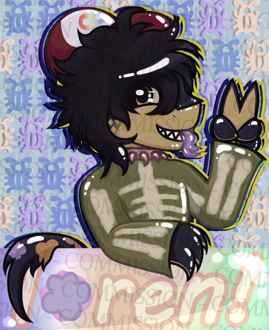
EMERGENCY COMMISSIONS
good morning tumblr! i am in hell.
my family received a foreclosure notice this morning and we are now at a high risk of losing our house. i want to try and help them out as much as i possibly can so that we don't lose this, so i am opening emergency commissions to make what money i can to help them pay for everything.
it's going to make a small dent in what we owe, but i'm still willing to do whatever i can. below is the primary commissions that i am offering. there are n/s/f/w variants of these comms but i'm not open to doing those right now.
please do bear in mind that some of these feature an old artstyle.
all the prices are in USD. i only accept payments through paypal or cashapp, and they are paid half up-front and half during the second half of the process.
please view my TOS before send in a commission form.
HALFBODY


30$ Sketch - 40$ Coloured Sketch - 50$ Flat Colour - 80$+ Shaded
1000x1000 up to 3000x3000 px.
5$-10$ extra for multiple characters
Transparent or flat colour backgrounds available
15$ fee for landscape backgrounds
Can have messy or clean lineart, up to the client
FULLBODY


50$ Sketch - 60$ Coloured Sketch - 80$ Flat Colour - 100$+ Shaded
3000x3000 px.+ guaranteed for highest quality
5$-15$ fee for multiple characters (Price is character complexity dependent)
Transparent or flat colour backgrounds available (15$ fee for landscape backgrounds)
Can have messy or clean lineart, up to the client
Capped at 5 characters per 1 image
HEADSHOT / BUST


20$ Sketch - 25$ Coloured Sketch - 40$ Flat Colour - 50$+ Shaded
Single Character
Mid-torso and up or above shoulders ONLY, may include hands/paws
2000x2000 px.+
Can have messy or clean lineart, up to the client
Can make square or circular backgrounds (or both)
Background must be flat colour or pattern, landscape not available
SOCIAL MEDIA ICONS
15$ Pixel Art - 20$ Sketch - 30$ Coloured Sketch - 40$ Flat Colour - 50$ Shaded
Single Character ONLY
Mid-torso and up or above shoulders ONLY, may include hands/paws
2000x2000 px.+, resized to 500x500 px. for display purposes
Pixel art typically 32x32 px. resized to 635x635 px.
Pixel art limited to SIMPLE CHARACTERS ONLY due to canvas size
Can have messy or clean lineart, up to the client
Can make square or circular backgrounds (or both)
Background must be flat colour or pattern, landscape not available
MLP BASE CUSTOM REF SHEET


50$ Flat Colour
Fullbody Single Character
2500x2500 - 3000x3000+ px guaranteed
Transparent background with circular PNG Backdrop
Accessories Optional (Glasses, piercings, legwear, jewelry, clothing, etc.)
Base is picked by client or up to artist (I can make a custom made base for the commission on request)
Easy pick colour palette & showcase of cutie mark + identities (+ Magic for Unicorns/Alicorns)
Will come with a separate PNG file for a high quality Cutie Mark vector (3000+ pixels)
Custom bases (if requested) will be given as a separate file to the client as well
HALFBODY VEADOTUBE PNGTUBER
60$ Flat Colour - 80$ Shaded
Fullbody can be requested with a 20$ fee
Fullbody PNGtuber upwards of 8000x8000 px.
Regular Halfbody 3000x3000+ px. up to 4000x4000+ px.
Neutral expression (Can be decided by client)
Extra expressions come with 10$ fee each
Extra expressions capped at 9 (For a total of 10)
Front facing or 3/4 angle (Can be decided by client)
Multiple outfits come with 15$ fee per outfit (25$ for Fullbody PNGTubers)
WRITTEN STORIES / BOOKS

7.50$ per 500 words
Minimum of 3.5k words (52.50$), Maximum of 80k words (1200$)
Stories will be provided as .docx files for E-Book uploads
WIPs will be sent halfway through, or in quarters (if the story is longer than 20k words)
Can ghostwrite for an extra 50$ licensing fee
See ToS for genres I write stories in (will not write outside them)
Will write under 3.5k words in special situations (will require more information)
View my AO3 & Fimfiction for more story examples
anything at all is going to help us in the long run, even if it's a small amount, so i'd really appreciate even a consideration. just boosting this alone will help ease some of the stress for me, so even if you can't/don't want to buy my commissions, spreading the world will help me a lot.
ART PROGRESS EXAMPLES


#emergency#please boost#art commissions#commissions open#open commissions#art#commissions#emergency commissions#emergency comms open#emergency comms
23 notes
·
View notes
Text
How to Use YouTube Banners for Your Social Media Campaigns
Whether you’re promoting a brand, running a social media campaign, or engaging with your audience, your visuals play an essential role in capturing attention and delivering your message. One of the most underutilized yet highly effective visual assets is the YouTube banner.
YouTube banners, which are often seen at the top of channels, can be repurposed for various social media campaigns to boost your brand's identity and increase engagement. In this article, we’ll guide you through the benefits of using YouTube banners and how you can effectively incorporate them into your social media strategies.

Why Use YouTube Banners for Social Media Campaigns?
A YouTube banner is one of the first things visitors see when they land on a YouTube channel. It represents the branding, message, and tone of the creator or brand. These banners are large, eye-catching, and designed to stand out, making them a perfect asset for social media campaigns. Here are some reasons why using YouTube banners for social media campaigns is a great idea:
High-Quality Visuals: YouTube banners are designed with attention to detail, ensuring that they’re visually appealing and high quality. This makes them ideal for use in other platforms like Instagram, Facebook, and Twitter, where quality visuals matter.
Brand Consistency: If you’re managing a YouTube channel and running a social media campaign, using the same banner across different platforms creates consistency in your branding. It reinforces your identity and helps your audience recognize you more easily.
Versatile Designs: The large size of YouTube banners provides a unique opportunity to create bold, creative visuals. These banners can often be resized or adjusted to fit other platforms while maintaining their visual impact.
Customizable for Campaigns: You can tailor YouTube banners to suit different marketing campaigns. Whether you’re launching a product, promoting a special event, or announcing a giveaway, banners are flexible enough to carry any message you want to convey.
How to Use YouTube Banners for Social Media Campaigns
Now that we understand the benefits, let’s walk through the practical steps of using YouTube banners for your social media campaigns.
1. Repurpose the Banner for Multiple Platforms
One of the easiest ways to use YouTube banners in your social media campaigns is to repurpose them for various platforms. Although YouTube banners are designed for large screens, you can resize them for use on other channels. You may need to adjust the dimensions to fit each platform’s specific requirements.
Instagram: Instagram posts require square images (1080px by 1080px) and Instagram Stories require vertical images (1080px by 1920px). Use an image editor like Canva or Photoshop to resize your YouTube banner while keeping the key design elements intact.
Facebook: Facebook’s cover photo dimensions are 820px by 312px, but you can also use the banner for Facebook ads. Resize it to fit Facebook’s specific requirements for ads, which are usually 1200px by 628px.
Twitter: Twitter header images have a recommended size of 1500px by 500px. Resizing your YouTube banner to fit this format will help you maintain consistency across platforms.
LinkedIn: LinkedIn background images are 1584px by 396px. Resize your YouTube banner to fit these dimensions for a polished and consistent look.
Use a tool like Canva or Fotor to quickly resize the banner for these platforms without losing its visual appeal.
2. Use the Banner to Announce Campaigns
YouTube banners are perfect for announcing upcoming campaigns. Create a banner that highlights your campaign’s key message or theme. Whether it’s a product launch, an event, or a limited-time promotion, your banner can serve as a visual teaser to build anticipation. For example:
Product Launches: Create a banner that features your new product alongside a catchy message like “Coming Soon!” or “Now Available!”.
Event Promotion: Use your banner to promote a webinar, live stream, or in-person event. Include the event’s date, time, and registration details.
Special Offers: If you’re running a discount, sale, or giveaway, the YouTube banner can feature the promotion and direct your audience to where they can participate.
3. Boost Your Branding Consistency
Social media campaigns are often more successful when there’s a sense of cohesion in branding. By using YouTube banners in your campaigns, you maintain a unified brand identity across all platforms. Your banner should feature your brand logo, colors, and tagline to ensure it resonates with your target audience. Consistency builds trust, and when people see your logo or design elements across multiple platforms, they’re more likely to engage with your content.
4. Create Attention-Grabbing Ads
YouTube banners are designed to grab attention, so why not use them as eye-catching ads? For paid social media campaigns, use a well-designed YouTube banner to advertise your product or service. Make sure the banner includes a call-to-action (CTA) like “Shop Now,” “Learn More,” or “Sign Up” to guide potential customers toward taking action.
You can also test multiple versions of your YouTube banner to see which one performs best across various social media platforms. A/B testing can help you determine which design or message resonates most with your audience, maximizing the effectiveness of your campaign.
5. Feature Testimonials or User-Generated Content
Another great way to leverage YouTube banners in social media campaigns is to feature customer testimonials or user-generated content (UGC). If you’ve received positive feedback or if customers have shared photos or videos of your products, you can create a banner showcasing these reviews. Social proof like this helps build credibility and encourages potential customers to engage with your brand.
Final Thoughts
Using YouTube banners for your social media campaigns is a simple yet effective way to elevate your brand’s visuals and message. With their bold designs, high-quality visuals, and versatility, YouTube banners can be repurposed across various platforms to keep your social media campaigns consistent and impactful.
Whether you're announcing a new product, running a sale, or promoting a special event, YouTube banners downloader can help you create engaging content that catches the eye of your audience. By customizing these banners and adapting them for different platforms, you’ll be able to increase brand visibility and boost engagement across your social media campaigns.
0 notes
Text
A wonderful way to commemorate our four-legged friends when they leave us
Pet portraits are a wonderful way to commemorate our four-legged friends when they leave us.
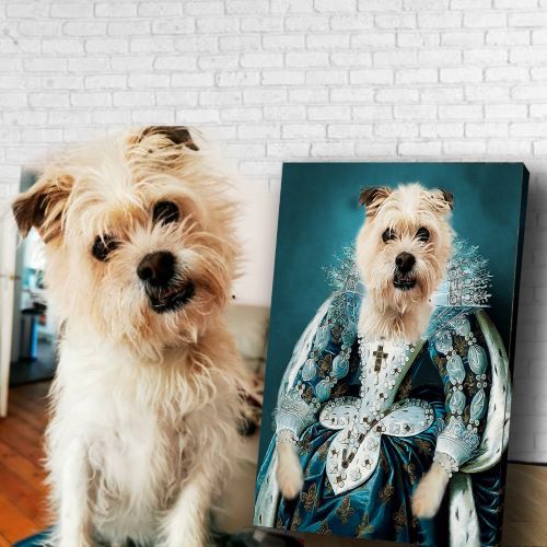
Pet portraits are a wonderful way to commemorate our four-legged friends when they leave us. I have had many pets over the years, some who have been with me for only a short time and others who have been around for years.
I would love to be able to remember each of them with a portrait of them looking their best.
The photographs will remind you of all their good qualities and can also be used in memory boxes or frames around the house as well as being displayed on tabletops or hung on walls in your home.
A popular way to remember your pet is through a photo or painting, which can create a very clear and accurate likeness of your pet.
A popular way to remember your pet is through a photo or painting, which can create a very clear and accurate likeness of your pet.
A pet portrait can be made from a photograph, or from observing the animal directly. It's important to choose the medium you want for your portrait carefully because each will give you different results:
A photo is easy to take, but it may not be possible to capture all of your pet's features clearly in one image (for example, their whiskers).
A painting is more detailed and can show their personality more accurately than a photograph would allow (for example by showing how they react when they're angry).
Pet portrait painters can spend anywhere from 20-40 hours on your painting, depending on the size, or detail level you choose.
The amount of time it takes to paint a pet portrait is dependent on the complexity of the painting. A smaller portrait with few details will take less time than a large, detailed piece with multiple animals in it. A good rule of thumb is to double the number of hours for each additional animal included in your portrait. For example, if you want two dogs painted on canvas and one cat painted on paper (three animals total), you can expect your artist to spend at least 40 hours on this project!
If you are interested in learning more about how our pet portraits are priced or ordering one for yourself, please visit us at https://portrait-my-pet.com or email us at [email protected]
Pet photograph costs range from $50+ for a simple studio shoot, to $250+ for out door shoots that include props.
The cost of pet photographs ranges from $50+ for a simple studio shoot, to $250+ for out door shoots that include props. This is not a bad price considering how much time and effort goes into making sure your pet looks great for their portrait session.
The average cost of professional studio photography is about $50-100. For example, if you are looking at getting the basic 8×10 print with no collar or leash, then it will be closer to the lower end of this range ($50). If instead you want an 11x14 canvas wrap that has your dog wearing his favorite sweater (and maybe even his beloved Frisbee), then it will most likely be closer to the higher end ($100).
Once again, remember that these prices do not include any other services such as travel expenses which can add an additional $10-$25 per hour depending on where you live within the United States.
Pet portrait artists charge by the hours spent on the painting. The cost will also depend on the size of the painting desired.
The cost of pet portraits is typically determined by two factors: the number of hours spent on the painting, and its size. Most portrait artists charge $30-45 per hour of work, though some charge by the square inch or piece. The average cost for a 16 x 20 inch painting is around $600 USD, but prices vary depending on painter style, and what type of painting you choose. Some artists may be able to complete your pet portrait in 10-20 hours; others might take 40+ hours to finish!
An average cost for a 16 x 20 inch (40 x 50 cm) painting is around $600 (around £450).
The cost of pet portraits depends on the size, or detail level you choose. Pet portrait painters can spend anywhere from 20-40 hours on your painting. An average cost for a 16 x 20 inch (40 x 50 cm) painting is around $600 (around £450).
If you want to get started with the process of having your own pet portrait painted, check out our [website](https://www.y-artstudio.com/contact/) to find an artist near you who specializes in pet portraits!
If you know someone who has recently lost a beloved pet and you want to do something nice for them, consider paying for their portrait.
If you know someone who has recently lost a beloved pet and you want to do something nice for them, consider paying for their portrait.
If someone you know recently got a new pet, consider buying them a gift in the form of their portrait.
Prints and paintings of pets are great gifts for pet owners, friends and family members who have recently lost their pets.
If you have recently lost a pet and would like to memorialize them in some way, then getting a portrait of your pet is an excellent choice for you. Pet portraits are also great gifts for friends and family members who have recently lost their pets as well. Pet portraits aren't just limited to still images either - many artists will also paint works of art using the image of your pet.
Pet portraits are great ways to remember your cherished friend or family member who has passed on. Many people find that they cannot bear to look at pictures of their deceased animal because it hurts too much or they see no point in having them around anymore since they're gone. Getting a painting or print made from those photos helps remove some of these emotions by turning those memories into something beautiful and permanent instead (and something fun if you choose).
A pet portrait is a lovely gift to pay tribute to your pet and remind others of how much they meant to you.
If you want to give a gift to someone who has lost their pet, you can pay for their portrait. It is a wonderful way to honor your pet and remember them.
If you are looking for the best place to get a pet portrait done, check out Portrait My Pet. They have been doing this for years and have some great options available at reasonable prices.
0 notes
Text
A BEGINNER’S GUIDE TO ICON MAKING ( part one: making base icons )
in this tutorial, i’ll be demonstrating how to make base icons! i’ll follow this tutorial up with how to edit these base icons into more highly edited roleplay icons.
this tutorial includes how to pick an icon size, picking screencaps and batch exporting.
WHAT YOU’LL NEED !
- adobe photoshop (i use ps2022) / editing softwhere with similar functionality
- screencaps
WHAT TO DO !
1 ) decide what size icons you want to make
i use 75x75 px icons when i’m making my own. some people prefer smaller icons and some people like larger ones. i’ll be putting a comparison between different icon common sizes here so you can see how they look!
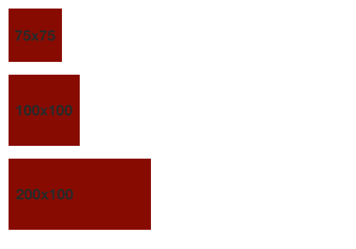
for this tutorial i’ll be making 100x100 icons (since i’ll be using icons i’m making for an icon pack as an example)
in photoshop you’ll want to create a canvas in order to start making your icons. to do this you’ll go to new file and you’ll get a pop up window that will look something like this!
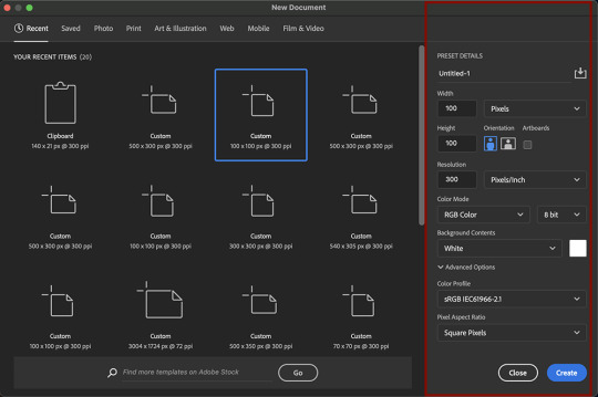
on the right you’ll see i put a red box around the settings i use.
[ image description: width: 100 pixels, height: 100 pixels, resolution: 300 pixels/inch, color mode: rgb color 8 bit, color profile: srgb iec61966-2.1, pixel aspect ratio: square pixels]
when you’re ready, click create!
2) start uploading your screencaps !
when it comes to choosing which screencaps to turn into icons, it’s best to pick the ones that show a clear expression on your faceclaim’s face with minimal evidence of movement (by evidence of movement i mean fuzziness, whether or not your fc is mid blink ect)
i like to select multiple at once to load into ps and resize them all and pick the best ones.
when it comes to picking screencaps to icon, i try and get a variety of expressions and positions. i don’t tend to icon full body scenes. midshots and close ups are the best for icons especially since icons tend to be pretty small so you want details to be as clear as possible. i also tend to brighten dark scenes just while i’m uploading them to see whether they’d even be salvageable as an icon in future editing. if they look too grainy or distorted than the scene is too dark and i tend to skip the entire scene.
i had to resize the life out of this gif to get it to upload, but this is generally how i pick screencaps to icon.
ones i know won’t work, i don’t usually resize just so i remember to delete them and i examine the icons as i go.
i tend to upload my screencaps in bursts (one or two rows at a time, sometimes less than that rather than all at once just so my brain and computer can keep up)
3) sharpening, resizing again if needed ect !
i’ll then go through and sharpen all the icons with a sharpening action! i didn’t do that in the gif in the previous step just to make showing the process of picking screencaps to use easier, but if you squint you can see my actions panel at the top there waiting for me.
at this point i’ll also adjust positioning and resize anything if needed.
4) repeat steps two and three until you’ve iconned all you want to icon!
i do the whole episode i’m iconning before i export, but when i’m iconning movies i’ll export them in two or three batches.
5) batch export your icons!
go to file –> export –> layers to files
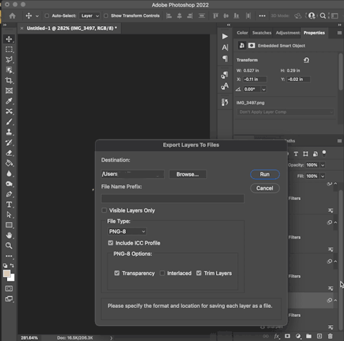
[ image description: destination: folder name here, a button that says browse, file name prefix: blank, visible layers only is not selected, file type: png-8, include icc profile is selected, png-8 options: transparency is selected, interlaced is not selected and trim layers is selected, the cursor hovers over a button that reads ‘run’ in order to demonstrate clicking it ]
where it says destination and then browse you’ll make a folder for your icons to be in.
go to browse –> (choose/create your folder for the icons to export into) –> open –> run
i leave file name prefix blank
your files will now export and a notification will pop up when the exporting process is done!
#base icon tutorial#editing tutorial#photoshop resources#icon tutorial#rp icon tutorial#*[ editing tutorials ]
88 notes
·
View notes
Text
A Complete Guide to Using Punching Bag at Home
Training with a punching bag is an excellent way to lower stress. On the other hand, hitting the punching bag keeps your cardiovascular health in check. For every home gym enthusiast, punching bags have found their way.
Here, we highlight the advantage, types and some helpful tips about buying punching bag.
The Benefits of Punching Bags
The benefits of punching bags are numerous and include:
Improves strength and coordination. Punching a bag is an excellent way to burn calories, increase muscle tone and build endurance. As you continue to punch the bag, your arms will get stronger while your core becomes more defined.
Increases focus and concentration. Punching a bag requires intense focus on the movements involved in striking it correctly so that you don't injure yourself or break anything else around you (like windows). This can help improve both mental acuity as well as physical strength over time by forcing you into situations where only one thing matters--hitting that sucker!
Types of Punching Bags
There are a few different types of punching bags, each with its own purpose.
Hanging bags are suspended from the ceiling and can be adjusted to different heights. They're great for practicing punches and kicks, as well as developing balance and coordination.
Freestanding bags are designed to stand on their own without being attached to any other equipment or surfaces. These can be used for cardio workouts or strength training exercises such as squats or lunges--and they're also great for shadowboxing!
Speed bags are small targets that require fast reflexes (and lots of stamina) when you hit them with your fists or feet. It's important not only how quickly you hit them but also how accurately: You'll want each strike to land squarely in order for this type of exercise to work its magic!
Choosing the Right Punching Bag
There are a few things to consider when buying a punching bag. The first is size, which should be determined by your height and weight. The second is material--you want something that can take the punishment you'll be dishing out. Quality and price are also important factors, but they're less critical than the other two considerations. If you're looking for a heavy bag that won't move around much when you hit it, go with something made of leather or canvas; these materials are durable enough to withstand repeated blows without breaking down too quickly (although leather does require some maintenance). If cost is more important than durability for your needs, synthetic materials like vinyl may be better suited for your needs since they tend not last quite as long as real leather or canvas but still offer plenty of protection against impact damage
Getting Started with Punching Bags
Find a suitable location. You'll want to pick a spot that's free from clutter and other hazards, so it's best to choose an area that has plenty of room around it.
Choose the right gloves. If you're going to be using your punching bag regularly, it's worth investing in some high-quality boxing gloves that provide protection for both hands while still allowing for proper form when striking the bag (you can find these at most sporting goods stores).
Warm up and stretch before starting--this will help prevent injury while getting ready for practice!
Start slowly by practicing basic punches: jabbing straight forward with either hand; cross punching with one arm while simultaneously blocking with another; hooking punches (curving inward toward the body) using either hand; uppercuts (lifting arms upward into position before striking).
Advanced Punching Bag Training
Advanced Punching Bag Training As you become more experienced with your punching bag, you can begin to incorporate more advanced techniques into your routine. Here are some examples:
Combination punches - These involve throwing multiple punches in quick succession. They're great for building speed and power, as well as improving coordination between both hands. Some common combinations include: left jab-right cross; right hook-left uppercut; left hook-right uppercut (also called "the four knuckle shuffle").
Power punches - These are aimed at landing one powerful strike on an opponent rather than several quick ones like combination punches do. They're useful for building strength in specific muscles needed for fighting situations such as boxing matches or street fights where there isn't time for multiple strikes before moving on to another target area on an opponent's body (such as their face). Examples include: straight right hands; overhand rights; hooks from either side of the body (left or right).
Safety Tips for Punching Bags
To ensure a safe and effective workout, follow these tips:
Wear the right gear. Make sure that you're wearing gloves and wraps on your hands before hitting the bag.
Use proper form. Punching bags are designed to absorb impact, so make sure that each punch lands squarely in the center of its target area (usually around chest level). If you're having trouble with accuracy or power output, try focusing on footwork instead of just throwing punches wildly at random angles--this will help improve both accuracy and speed over time!
Don't overdo it! If you feel any pain in your joints during training sessions with punching bags then stop immediately; this could indicate an injury such as tendonitis or bursitis which can be serious if not treated properly by a doctor immediately after diagnosis occurs."
Benefits of Punching Bags for Self-Defense
One of the most important benefits of punching bags is that they improve reflexes. As you practice your moves, your body will learn to respond quickly and efficiently. This can be especially helpful if you're ever attacked in real life; if you've practiced enough, the movements will come naturally to you when it comes time to defend yourself or someone else. Another benefit of punching bags is that they increase confidence by helping people feel more powerful than before they started training with them--and there's nothing like hitting something hard enough for it to move backward! As an added bonus, this feeling may also translate into other areas of life: if someone feels confident enough after working out at home with a heavy bag (or even just swinging around some light ones), then maybe he'll feel more confident about taking on new challenges outside his comfort zone as well?
Tips for Improving Your Punching Bag Workouts
Punching bags are a great way to improve your punching technique and build muscle strength. However, if you want to get the most out of your workouts, there are some things that you should keep in mind:
Vary your routine. Punching bags can be used for a wide variety of different exercises including kicks and punches from various angles as well as combinations. It's important to vary these types of movements so that each punch is performed correctly with proper form and technique.
Focus on technique over speed when working out with a bag because this will help ensure that each hit lands properly without causing injury or pain on either side (yours or theirs).
Increase resistance by adding weight plates around their base or hanging them higher off the ground if possible - this will increase both strength building ability while also forcing greater focus during training sessions due to increased difficulty levels!
Common Mistakes with Punching Bags
There are a few common mistakes that people make with punching bags.
Incorrect form: You should be using the proper technique when you punch, otherwise it will be hard to get any benefit from your workout. If you're not sure how to do this, ask a trainer or watch some videos online.
Not wearing gloves: You should always wear gloves when working out with punching bags because they help protect your hands and prevent injuries like calluses or blisters that can make it difficult for you later on down the road if left untreated.
Not warming up: Warming up before working out is very important because it helps loosen up muscles so they don't get injured during exercise (which would mean no more boxing!). Make sure not only that you stretch but also perform some light cardio exercises like jumping jacks or running in place for 5 minutes before starting anything else! This helps get blood flowing through those tissues so they're ready for action when needed later on down the road too.
Punching bags are a great way to improve your strength, coordination and endurance. They can also help you develop self-defense skills. With the right equipment and proper technique, punching bags can help you reach your fitness goals.
3 notes
·
View notes
Text
some tips for writing blogs, especially those who are just starting out. these are some things that works for me and may or may not work for others.
how to add a read more link on mobile
type :readmore: on a free space, then hit the enter or return button
personally i think they’re very helpful because it lessens the space you take up in your dash, and might encourage more people to rb
+ you can also add this on a spot where it gives a sort of cliffhanger, essentially making people want to ‘read more’
headers, banners, and dividers
though not necessary, it’s good to have a title for your work. make sure it’s bold and doesn’t blend in with your notes (aka pairing, warnings, etc.). this also helps when someone wants to look up one of your works in your search bar
i don’t really make banners or covers for my works. but some good apps that i know of would be picsart and canva. if you’re looking for ideas, i definitely recommend going into canva
wondering how to make those really small, thin dividers? you can make them using picsart! to make a divider hit tools > free crop > brush > size (adjust it to your preference > then draw a line along the edge of your photo > save
using the divider you just saved, go back to picsart and edit it again > draw option > hit rainbow square at the bottom left corner > hit suction/droplet symbol right below the check mark > color in the white spots bc for some reason picsart glitches and makes dividers look white-ish
new blog? just opened an account?
this is gonna sound really frustrating. but... tumblr needs to check if you’re a bot or not. what does this mean? it’s likely that your first few posts won’t show up on the search bar. you may not even get to edit your header/pfp yet ://
this happened to me and there was no visibility on my account at ALL. what helped me get ‘verified’ is that i followed a LOT of accounts, liked a bunch of posts, made some posts here and there. now that lets tumblr know you’re not a bot
visibility
the tumblr tagging system usually only allows the first 5 tags in your post to show up. so, what can do you about this? only use FIVE or less tags in your post. wait about 15 minutes or more until you can add some more tags in your post, and they usually all show up like that
another important thing about using tags is not to generalize! especially if you’re using a popular tag. but also don’t specify it too much where barely anyone looks it up. for example, if you’re writing a gn piece about oikawa, i recommend you use the tags such as: oikawa x reader, haikyuu x reader, oikawa x gn!reader, haikyuu headcanons, etc
a good rule of thumb is to use character x reader tags first, then leave the full name or fandom tag last
FOR NSFW: tumblr doesn’t let any tags with nsfw show up. so, give your nsfw works another tag. maybe #namegetspicy idk, you figure it out
FOR WARNINGS: especially if you’re a dark content creator, i highly encourage you to add tw:xyz tags. if you already have a warning note at the top then that’s great. but even better for readers who prefer to actually block these tags that way they never get to see it
another important thing to note is that people have different timezones. it helps if you rb your work at a different time of the day, in case people missed it! (icymi) i’ve noticed that reblogging helps to make your post show up in the tags
interaction + feedback
first and foremost, you are not obligated to write for your followers, and neither are your followers obligated to interact with you. remember that everyone has their own individual lives, and they have their own things to do— so do you, too.
make friends! become mutuals with other writers, visit their ask box. i know it can be daunting having to initiate these things, but you might just turn out to have fun! you can’t expect people to interact with you if you’re not interacting (back). it’s... kind of a two way thing yk? no need to be afraid to interact with other writers. oh, and rb other writers works!
pspsps join tag games or do ask games. it’s fun and very interactive
it never hurts to ask for feedback. i usually do this in a more subtle way because i don’t really expect a full on analysis on my works. maybe a little, is this okay? or feedback appreciated. sometimes it takes a little bit of coaxing for the silent readers
formatting your posts and blog
i generally put in the title at the top in big, bold letters
then comes the header/divider. helps to make the post more... visually appealing ig?
it’s important to add warnings (if any) and the pairing. the audience is not all female, and it might be a little frustrating for male readers having to find out its an x fem reader piece like halfway through your fic
if you have multiple works posted, it’s really really helpful to have a navigation page!
you can organize the posts you make with tags! for example, if you’re shitposting, you can use a specific tag for that. if you have a nsfw related post (ESPECIALLY when your blog is open to the general audience) please make a tag for it
themes + colors
if you have a color in mind but don’t know which direction to go from there, i recommend looking up color + aesthetic
looking to use the same color? download a name color app that’ll give you a hex code for any color you want to use. then, you can type in that hex code for when you’re choosing a color for your tumblr bio
wondering how to make your header image small like mine? just choose a photo for your header and turn off the stretch image option
want to use a different text color that tumblr doesn’t offer? it’s not as complicated as you think. you’ll have to go on a desktop to do this and do some html (but trust me, it’s not very difficult). look up “HTML noob but trying my best - how to use colored text on desktop”
^^ i don’t have the link for the color text tutorial so you can try looking it up
how to make an aesthetic navi and masterlist
step 1: decide a theme! if you’re stuck, think about a character + color/season/mood or look up “[insert] aesthetic” to find some inspiration. or you can try looking at other blogs too
step 2: find a color scheme! it’s easier if you choose fewer colors. if you want to use the same color for both divider and text, download a color name app in order to get the hex code of that color.
step 3: add categories to your navi! most navigation pages include a link to masterlist, about/byi, and rules. your navi should have a title that indicates that it’s... a navigation page. you can add thin colored dividers with the same color to make it easier for followers to navigate
step 4: you can choose to create a ‘cover’ or a picture for your navigation and masterlist! again, i recommend you use the canva app as a starting point
extra: search up emoticon symbols to spice up your titles!
reminder for you as a writer
you’re not obligated to do any of these things. i’ve noticed that we tend to build pressure on ourselves when it comes to content and interaction. remember, this !! is !! for !! fun !! when you realize that it’s no longer fun, then know that it’s time to take a break. and there’s nothing wrong with a bit of self care.
^^ c/p from this post lol
at the end of the day, follower count and interaction doesn’t define you. again for the love of beings, you’re here on your own accord.
will be adding more if needed/asked.
1K notes
·
View notes
Photo

Requested by @tennant!
For this tutorial you will need:
Some basic gif-making knowledge (see my last tutorial!)
I’ll be using CC 2017 to do this, but as long as you have the timeline option, this will work for you! 🥰
So, in a sort of part two to my other gif tutorial, (https://luke-patterson.tumblr.com/post/636980573506813952/) this is a slightly more advanced part of gif-making. But I promise it’s easy when you know how!
Assuming you followed the last one, you’ll already know how to make your gifs into a smart object, so we’ll start there!
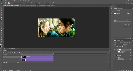
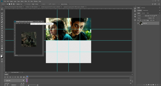
PART ONE: BLENDING
Drag both of your gifs into the same file. For this to work, your gifs have to be the same number of frames, or at least cropped to the same length in the timeline window, otherwise one will loop before the other, and it will mess up the loop of the gif. (For when we get to the multiple gif part, I recommend having between 60-80 frames, so it stays under tumblr’s 10 MB limit.) As this tutorial uses smart layers, they can both be sharpened as well.
(I made this gif 540 px by 268 px, because I’m going to add more to it later. But we’ll cover that further down in part two!)
Honestly, I find it so much easier to put my colouring on top of both/all the gifs, and then clip individual layers down onto a specific gif, if that one needs more of its own colouring. That way, the extra layers don’t interfere with the other gif(s). It’s so much less confusing visually for me than having lots of groups with their own colourings, and it makes moving the gifs around simpler.

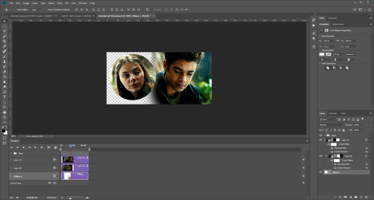
Position them side by side, one on top of the other. Obviously, you can play around with the positioning: this may be easier to do once they are blended, especially as some gifs may be smaller and you need to try them in different places. For example, this is a screenshot of a Lyra/Will set I made in the past, with three blended gifs of different sizes:
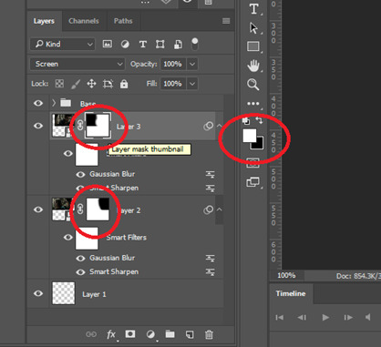
Add a layer mask to both of your gifs. You might not need to edit both, but I usually do, as I like to balance how much one gif blends into another! Using the brush tool (set to black, when you’ve clicked on the layer mask), we want the brush to be very big, and very soft.
The bigger the brush, the more seamless the blending will be! By painting parts of the top gif away, the other gif will start to appear underneath. It’s not always necessary, but I usually like to set my top gif to ‘screen’ as well. This helps the gifs merge into one another even more, especially if you have one gif which is darker than the other!
As you can see, by setting it to screen, the top gif has already started to look blended. Then, you can start to paint. As the brush is so big, you might end up painting away too much of the gifs, like so:
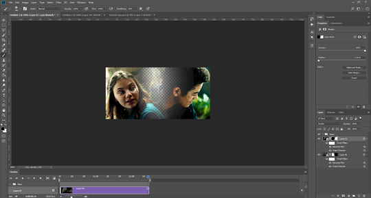
I usually go back and forth, switching between black to remove parts of the gif, and white to add it back (always painting on the layer masks). Sometimes, you might need to make the brush slightly smaller, just to fill in tiny gaps.
Another thing you can do is to add a solid black colour underneath all your gifs, just to fill in any spaces. (Sometimes, I do this on top of gifs too, to create spaces where I want blended gifs to go, like in my current header!):

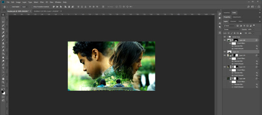
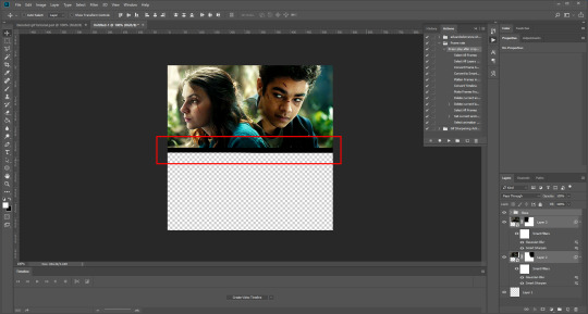
Anyway, back to the original gif. My blended gif is now pretty much how I want it to be, except Lyra is quite far to the left, and Will is taking up a lot of the screen:
So I’m going to see how they look at the start of the gif, to determine how far right I need to move them both to get them mostly in the middle:

And that’s it! Now you can export them [file > export > save for web (legacy)] and you’ll have to change the timing back to 0.05, or use the action I introduced to do this in my last tutorial.
PART TWO: MULTIPLE GIFS
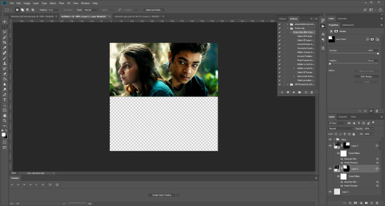
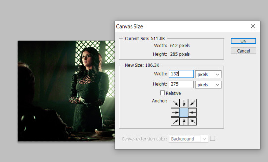
To put more gifs underneath this one I’ve made, I expanded my canvas. Go to image > canvas size. Make sure you click the little ball to the top in the anchor section, so the canvas expands underneath your gif. If you leave it in the centre, it will simply expand from the middle, or the left, right, etc.
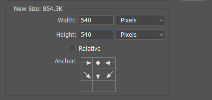
Next, we need to remove the black line at the bottom of the gif.
You want to select the space for cropping using the rectangular marquee tool, so in this case, 540 px by 268 px. The tumblr spacing is 4px between each gif in a set, so however many gifs you want, you have to account for 4px less pixels inside your one gif, to give the illusion there are multiple (unless you want them to touch).
For example, (there’s a little maths here: forgive me!) two gifs of equal size, placed side by side, must be 268px in width or length, because (268 x 2) + 4 = 540. (There is one 4px gap in between). For four gifs, it would be (132 x 4) + 12 = 540. (For the three, 4px gaps). For three gifs of equal size, it’s a bit different. These must be 177px, 178px, and 177px, to ensure there is 8px of space left over (two gaps).

Then, make sure the colour white is the primary colour selected on the paint pad (this is vital) and (in this case), the layer mask from before when we blended, is selected. Press ctrl (command on mac), shift, and i to invert your highlighted area (or select > inverse) and then simply delete the excess line, (either using the delete button on windows, or fn + delete on mac, I think!) Then, do this again for the other gif.
And voilà! It’s gone. You can also paint it out (using the black colour as the primary colour to erase), but I would still recommend highlighting the outline of the area you want to erase, using the marquee tool, so that you can paint it out in a straight line, and don’t paint into your gif and erase parts of that by accident.

Now to add in the other gifs! To do this, I use guides, but you can also use lines at a size of 4px, to map out the spaces in between gifs. If you go with lines, just make sure you delete the shapes after. With guides, they are not actually ‘in’ your gif, so you don’t have to remove them before you save. However, guides only work for straight lines, so gifs with other shapes will need to be made using lines, (but I will touch on that at the end!)
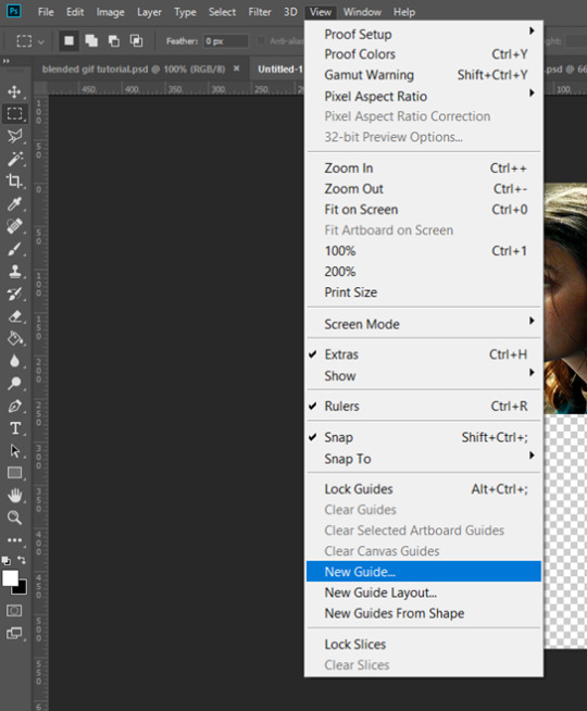
I actually have a few psds saved with guides already on, so that I don’t have to draw them out every time. If I was making a set with three gifs in a row, this would be different, but I usually stick to two or four (or three with one big square/rectangle, and two little squares), so this is my most used psd. The guides are set at: 132 px & 136 px, 268 px & 272 px, and 404 px & 408 px, both horizontally and vertically!
I have a red colour underneath just because I find it easier to see the lines between gifs this way - if you do the same, just remember to turn it off before you save your gif, otherwise it will have the colour red instead of mimicking the transparency between gifs.
Now, make a second gif! I decided to have a square in the middle as you can see in the title, and then two rectangles either side.
Then you want to resize it, in this case to 268 px by 268 px, and drag it across into your main file, or go to layer > duplicate layer, and move it that way. Don’t worry, when you move it, it will show the whole gif as if you haven’t cropped it. The reason I crop and resize it beforehand, is so that I can ensure it will be the correct size when I remove the excess parts of the gifs I don’t want, (rather than making it 268px including the black line for example, which would be wrong.)
Then, as before, position the gif where you want it to go, and highlight the area you want to be in the gif. Whilst this is selected, (again ensure white is the primary colour on your paint pad), click the layer mask:
Then the excess around the gif should be gone! (Making a gif of a gif tutorial... meta, lmao.) This way, if you decide you want to change the shape of the gif, or move it slightly, you can just paint parts in and out, or delete the layer mask, move the gif, and reapply it!
You can then sharpen and adjust your colouring to the gif as needed! Next, go ahead and repeat this process for your other gifs. Selecting the area, adding a mask, and sharpening. By the end, you should have something that looks like this:
PART THREE: OTHER SHAPES
If you want to use other shapes (which I haven’t tried myself until now, but I can talk you through some thoughts!) You can use the line tool. So, for example you could make a layer with the lines at 4px, merge it, and then at the end delete it from your gif to leave the gaps transparent:
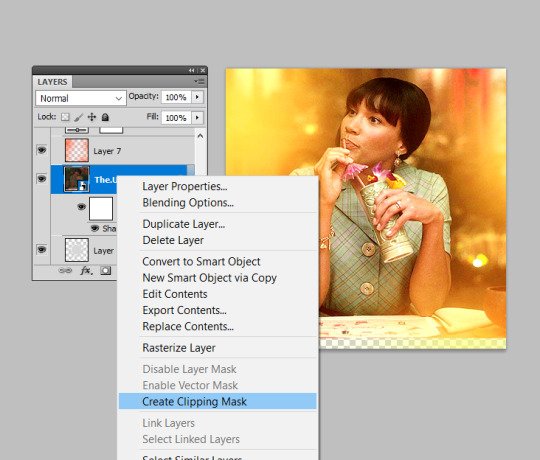
To make a gif any shape you want, choose a shape (either use the shape tool, or get a png of it), and using a clipping mask. Make sure your gif is above the shape layer, then right-click the gif layer, and select create clipping mask to clip it down:
OR you could use a circle, and then delete the circle to make it look transparent:
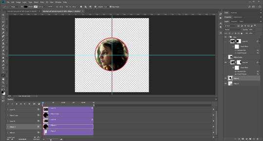
The best way to select items which are not rectangular, (so you can’t use the marquee tool), is to use the pen tool. Click around your gif so that it’s got a border of what you want selected. Once you have outlined your gif, right-click and choose make selection:
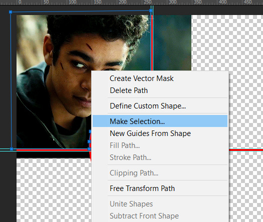
Then set the feather radius to 0, and then the area you want should be highlighted in the same way as with the marquee tool above, so you can add a layer mask, etc. However, as the pen tool is not always that accurate, there is a little white gap here where it’s not a perfect circle.
A way to overcome this could be to make all the gifs you want, and then simply add one on top with a white 4px border, so it gives the illusion of being transparent! (As I have done above, but save it as white rather than red!)
If I find a better way to do this in the future, I will update this tutorial. I hope this is helpful, and thank you for reading 🥰💖
#gif tutorial#tutorial*#completeresources#yeahps#chaoticresources#allresources#mikesmom#usertom#usersmile#heavensentnetwork#if there's any mistakes pls let me know#i am so tired rn fjghfjhgfjgh
718 notes
·
View notes
Note
📝 ok how do you add more than one gif/moment in one gif? like in some of your veronica in every episode gifsets or when you do the outfits one? i can't find a good tutorial also if you have a tutorial to how you did the side bar, that would be awesome. i am trying not to send you a 10000000 things bc you are so talented and i love you sfm!
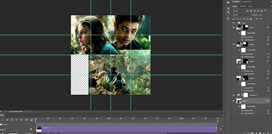
okay, i’m going to do a little tutorial on how i use layer masks and clipping masks to get ‘multiple gifs in one’ and i hope that will answer your questions!
we’ll start with the basics of getting several smaller gifs together to make one:
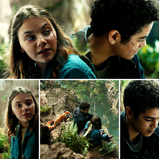
and then i shall build from that and explain how i use clipping masks in sets too to create something like this:
SEVERAL GIFS IN ONE:
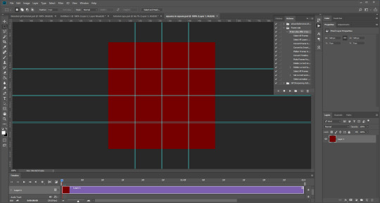
so we’re going to use layer masks to create the four-in-one gif. you can apply this method for any square/rectangular gifs, so for example if you want to put five gifs in a line instead you can adjust the sizing and make that work.
the most important thing is to first work out what size you want each gif to be. i like to map it out with black rectangles first so i know exactly what size i’m using and that the spacing between each one still works (tumblr has a spacing of 4px so i just maintain that throughout my mapping). so these are a size of 132x275px:

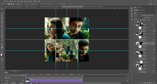
now i know exactly what size i’m using, i can get started! first you’re just going to make your gif as you usually would with your usual colouring:
i’m then going to go to image > canvas size and resize this to the 132x275px size i decided on earlier:
that’s then given me the size that i want! you can move this gif layer around to then sit nicely in your new canvas so it’s centred nicely, and then i put all of my layers into one single folder on the layers panel.
i’m then going to select the canvas using the rectangular marquee tool so that the entire canvas shape is selected (this is really important or the area you want to mask will not be defined), and then add a layer mask as so:
this will effectively ‘set’ your gif at those exact dimensions. i’m then going to go back to my image > canvas size and alter the canvas to the size i want the final gif to be at, for this one i’ll alter the width to 540px as that’s tumblr’s ideal width size:
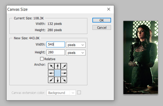
you can now move this gif along to place it where you’d like on this canvas, so i just repositioned this to the very left hand side so it’s the first gif in the row:
you can then repeat this for all your other gifs! top tip: make all your gifs the same length of caps for ease. it is possible to adjust your gif length using the timeline on the animation window if need be, but it’s a lot easier if you just make all your gifs the same number of frames. when all the other gifs are done, we get this:
as you can see, i didn’t make all these gifs the same number of caps so i’ve just dragged the time bar at the top along to the place where my shortest gif runs out when i press play. then i can save and ta-da, all done!
USING OTHER SHAPES:
unfortunately the above technique only works when using rectangles/squares as other shapes do not have the exact sizes to enter in. so i’m going to introduce you to how i use other shapes to create several gifs in one, say hi to clipping masks!
i’m going to make my gif once again and colour it as i usually would:
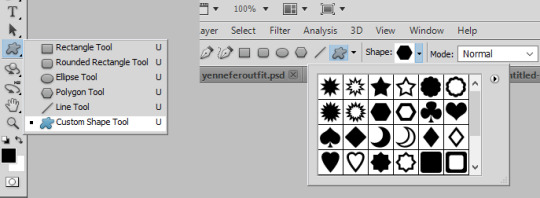
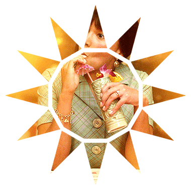
then i’m going to insert a shape. now, there are two ways to do this! firstly, photoshop has custom shapes you can use under the ‘custom shape tool’ window, then going to shape and choosing from the options. you can then drag this onto your gif to insert the shape you want at the size you want:
the other option is you can generally find good geometric shapes available for free use on the web. searching for ‘geometric sun’ for example brings up a lot of great shapes to play with, make sure you add ‘clear background .png’ to your search and it brings you to a lot of resource sharing sites that will allow you to save these shapes as cut-outs.
here i found the cut-out i wanted, re-sized it and pasted it on top of my gif like so:
now for the fun part! you need to reposition this shape layer so that it goes at the very bottom of all your layers. make sure you have absolutely nothing within a folder as well (this is important for speedy clipping masks!).
once it’s at the bottom of everything, i’m going to right-click on the gif layer and then select ‘create clipping mask’ on the drop-down menu:
and this will clip your gif to the shape! you then need to select all your colouring layers (just control shift and click on the very bottom layer then very most top layer) and then also right-click and select ‘create clipping mask’ to clip it in the same way. this will not work if any of them are in folders, so remove any layers from folders first! you can then continue to make edits to these colouring layers (just double check any new ones you insert are clipped!) until you are happy with your shaped gif like so:
i then drag and dropped this gif on top of another gif i’d made (similarly to how i’ve outlined in the several gifs in one section) to create the shape as a statement on the gif:
to create gifs like my sidebar, i’ve just repeated this shaping several times over and dropped them onto a ‘background gif’ to create the overall pattern i wanted. it is really helpful to just have a play around with just plain shapes to get your layout sorted before you make them into gifs. for example, i made a template for my sidebar gif first so that the size and layout of all the triangles were exactly as i wanted before i giffed anything! you can then just copy and paste these shapes to use as your clipping masks.
THE END
i hope this makes sense and is helpful, layer masks and clipping masks can seem like complete wizardry when you first start using them but you’ll soon learn how to get your head around them and experiment. if you have any further questions as always, please do let me know :)
#katiectalksalot#fyeahps#completeresources#itsphotoshop#gif tutorial#tutorial#tutorials#(bc i can't remember if my tag is plural or not)#ps help#i feel like i ramble on for ten million years with these cos i'm really worried i'll just be that person#who's like 'you know the thing!' and everyone's like '... but what thing?'#but i hope this helps you out lovely!#*15k
936 notes
·
View notes
Text
Hanging Wall Art
The very first step in hanging wall art is choosing the proper placement for each piece. But when you’ve got a very large abstract canvas, or an odd-numbered stack of petite nautical prints, choosing where to hang what is often the most daunting task.
So there you stare at a blank wall . . . Now what?
We’ll show you how to hang your artwork and make the process a little bit easier, and, we think, even fun!
Hanging
Wall Art
Quick Reference Guide 1. A fireplace is always the focal point of a room
Display a painting in that space above the mantle to tell your own design story.
Make the art grouping about the same size as the fireplace opening.
Use one large piece or several small pieces that appear as one unit.
2. Remember you are decorating a wall
Choose smaller pieces for narrow walls and larger canvas wall art pieces for big walls.
For Small Spaces:
A tightly-grouped even number of pieces in a small area, such as a stair landing, is perfect and gives a window effect. Light colors enhance this effect.
For Large Spaces:
A tightly-grouped even number of pieces works great to balance out a large space or a high wall. Note that large spaces can handle slightly larger spacing than small spaces.
3. Arrange pictures on a wall before putting hammer to nail
Lay everything out on a table or on the floor
Move the pieces around until you have an arrangement that you like
Lay the pieces out on a large piece of kraft paper or wrapping paper and then trace around each piece
Mark the hanging points from the back of the art onto the kraft paper
Then, tape the paper to the wall and hammer in the nails
Remove the paper, and voila!
4. Hang artwork at eye level
For hanging art height, think of groupings as a single, whole piece. To hang a group of 4 pictures for example, consider hanging it as one entire square.
Then place pictures so that the center point of the piece or grouping is at approximately eye level.
NOTE: A dining room wall decoration arrangement is best slightly lower, to enjoy looking at it most while you are sitting down.
5. Picture Placement on a wall — size matters
Art hung over a piece of furniture should not be wider than the width of the furniture, a general principle being that the art should be about 50-75% the width of the furniture.
Wall Décor Ideas
Symmetrical Placement of your wall art
Great for pieces that are similar in size, shape, and subject matter, this method allows you to create a grouping that has visual balance and is perfect over large furniture collections or fireplace mantles.
How to hang art in even numbers
To hang 4 pictures in a square, for example, keep spacing even between them, and keep them fairly tight.
Tight spacing = 1-2” Normal spacing = 4-6”
How to hang 3 pictures in a row
How to hang art in three’s? Go vertical. Our hugely popular Birch Tree paintings do this well.
Perfect for a hallway or sofa wall, hanging tall or narrow art allows you to achieve some volume without appearing crowded. For this scenario, an odd number of pieces is more attractive to the eye and is visually balanced. A normal spacing of 4-6 inches between each frame is recommended.
Tip: Use your hand, fingers closed, to determine spacing in this scenario.
Asymmetrical Balance
This is a great solution when you have a group of prints that aren’t necessarily the same but share at least one similar element, such as subject matter or color scheme. You can asymmetrically arrange the pieces so that they still achieve a nice ‘organic’ balance.
Hanging two pictures staggered? This is optimal with larger pieces. Try staggering them by hanging one lower than the other, so that top and bottom don’t match.
Grouping larger and smaller pieces asymmetrically helps to create interest and energy. The same is true for vertical and horizontal pieces in the same grouping.
How to hang multiple pictures on wall by Vertical Line
Group four or more pieces, of varying sizes and in a non-symmetrical pattern, by anchoring them on an imaginary vertical line.
The art should be visually balanced on both sides of the imaginary vertical line.
Too much ‘weight’ on one side or the other will make the group seem awkward and unbalanced.
Make sure the art on both sides of the vertical is similar either in color scheme, frame style, or subject matter.
Best way to hang pictures on drywall
Most walls are actually hollow, with relatively soft plaster or drywall covering their sturdy lumber framework. The boards, or studs, behind such a wall provide adequate support for any object that is hung on the wall, but they can be difficult to locate and may not be spaced where you want them.
So for surfaces other than wood, an ordinary nail or screw is usually inadequate.
Hardware hangers which we’ve listed below, specially designed for hollow walls, readily solve the problem of surfaces too weak to hold a nail or screw. Most hardware stores stock them in various sizes.
How to hang pictures on a concrete wall
For concrete block or brick walls, use lead wall plugs, available at most building supply stores, to support a hanging screw.
Use a power drill with a carbide tipped bit to create a hole for the plug.
Tap the plug into place and insert the screw.
Hardware dealers can recommend the correct screw and bit sizes.
How to hang things on Paneling
Wood is the ideal surface for hanging almost anything. Hanging hardware in this case is most often a supply of wood screws. With their pointed ends and sharp grooves, wood screws are easy to install with just a screwdriver.
Lots of home offices have paneled walls, and they are perfect surfaces to hang pictures like our inconsolable puppy print, to remind you that someone special is waiting for you when all the work is done.
Best hardware for hanging picturesPicture Hanger
All you’ll need is a small hammer. The configuration of a picture hanger’s angled nail and metal hook will provide adequate support for most framed pictures. Check the package for weight limit your hanger will hold. For larger frames, it is often advisable to use a pair of hangers.
Recommended for smaller plaques and average-sized picture frames.
Wall Anchor
Made of plastic or nylon, wall anchors function as sleeves into which a screw can be tightened. Refer to the product’s packaging instructions for the correct size of pilot hole to drill.
Once you have drilled a hole, tap the anchor in with a hammer until it is flush with the wall. Place your object or bracket on the wall, insert the screw, and tighten. Tightening the screw causes the anchor to expand inside the wall, anchoring your bracket to the wall.
Recommended for drapery rod brackets and other lightweight brackets on drywall or plaster.
“Molly” Bolt
If you do not have a drill, you may want to look for an expansion bolt (sometimes called a “molly bolt”), which can be hammered into the wall.
Once the sheathed bolt is in the wall, turn it clockwise with a flat-head screwdriver. When it will not turn any more, turn it counter-clockwise to secure its collar against the inside of the wall. If necessary, the bolt can be removed to put it through the object or bracket you’re hanging.
When attaching a two-holed bracket to the wall, you may want to use an expansion bolt for the top hole, but a wood screw will suffice in the lower hole.
Recommended for mirrors, shelf units, brackets, and other heavy objects on drywall or plaster.
Toggle Bolt
As with wall anchors, toggle bolt installation begins with drilling a pilot hole and then lightly tapping the toggle bolt into position. Good for heavier jobs, toggle bolts have spring-activated “wings” that fold out once inside the hollow wall.
As you tighten the bolt with a screwdriver, the wings expand and are drawn against the wall.
Note: Once installed, removing the bolt from the wall will cause the wings to detach and fall behind the wall.
#design#decor#idea#art deco#home decor#canvas#canas#canvasn#Canva Design#wall#wallart#wallet#like4like#living#likeforfollow#like#likeforlikes#likeback
1 note
·
View note
Text
Digital Abstract Typography


I have created two of my own digital abstract typography, using new techniques that I've learnt on illustrator. These would be perfect for a poster or flyer, to spread a message and gain interest from others to join a movement. This is because it's super eye-catching and intriguing so any viewer would at least take time to look at it, and because it's simple it could be even better as part of a collection e.g. postcards, gifs, posters.
These outcomes came out better than I expected so I am really pleased, and even though the text alone was good, I think it's all the other elements that really brought it together. For example I found that the splodges of paint filled places that text couldn't, and when I incorporated colours the text really stood out. Overall I think I've created two really appealing and intriguing typography artworks, and experimenting with a new style was really fun. I've never been a fan of grunge art nor have I wanted to make this style of art, but during this task I really enjoyed messing around with paint splats and illegible writing.

I started off with a 3x3 grid of squares and wrote out the word 'individuality' with the type tool, I chose this work because it relates to all equality. We should all feel confident to be our own unique individual, and celebrate the individualities of other people, especially the minorities. To type the word out I made sure to use a bold font and in all caps, this made for better collaging and clearer shapes.
With this I created outlines for the type and ungrouped the object, this removed the fact it was a type face and left me able to edit/move each letter individually.

Next I selected a couple letters and duplicated them over to one of the squares, it was important to duplicate the letters and not just drag over so I could select them again if I wanted to. With these I resized them large and placed what I wanted to keep within the square, meaning some can be left outside the box.
I then sent the letters behind the square and selected both together, this allowed me to make a clipping mask which cropped the letter to just be seen if it was in the box. At the same time the box line cannot be seen where the text doesn't cover it, so you're usually left with an interesting shape of letters. I repeated this process to fill every square, experimenting with different sizes, numbers of letters and rotations. This in itself could be an outcome like an unfinished puzzle, except the pieces don't fit and there's plenty of space.

With these cropped letters I began to collage them together, building a larger shape to base the piece around. I did this simply by duplicating them over to a blank canvas, rotating and resizing them to create an appealing collection of these letters. However my first attempt didn't go so well, I attempted to make it so you can easily recognise the word but it still be distorted. Although I could see the word, the whole collage looked unbalanced and not very interesting.

My second attempt was a lot more successful, and I think it's because I let go of boundaries and went for it. I wasn't thinking about how legible it was, I was simply focused on the overall look of the collage. I've also shown an example of how I've used the digital advantaged of precision, where I've zoomed in close to parts where I want to line a letter perfectly with another. In the end I was pleased with how it looked, but there were still a few spots to fill and it in general looked unfinished. You may also notice how all the angles are either 0, 90 or 180°, this decision was inspired by Neville Brody and I think it worked out perfectly and made it easier to collage together.

Next I incorporated dripping splodges of paint/ink, of which helped fill the gaps that I couldn't fill with text because it didn't fit. To add them I copied it from the template and pasted it over, I then played around with the size and placement of the drips to find fitting combinations. Once I'd completed adding the splodges and drips, I felt the piece was much fuller and looked complete. I made sure not to over do it too, otherwise you would lose its effect from being too busy/messy.

Finally I added distressed halftone patterns and colour blocks, this finished off the design and made it really stand out. After downloading the patterns template they automatically appeared on my swatches, therefore all I had to do was select the pattern on my swatches and draw a shape with it as the fill. I then created a new shape but this time filled with a colour, the idea is to have the colour behind the pattern and type. Therefore I sent it to back, then because I changed the pattern from black halftone to white, I also had to send the pattern back. So rather than sending backwards many times, I selected the two rectangles together and send them to the back. I repeated this process multiple times, using different halftones patterns, shapes and colours.

To create the other piece I used the same process, but of course using a different layout, colours, patterns, shapes etc. However something I hadn't incorporated in the first piece was a dirt/dust texture, so for this one I coloured it as white and layer over the whole collage. This added a subtle detail of white specks, giving the black text some texture.
1 note
·
View note
Text
Week 8
Andrew Simpson Video -
The model making process is shown in the video as an invaluable way to explore multiple different avenues of product development. Andrew mentions how different ways of modelling can be used to test different factors, for example 3d printed models may show size, scale and the feel in hand in regard to shape but are not accurate for weight and grip. 3d models are however very easy to do as they just require the 3d computer model. This means that model making allows for such an array of different testing when done thoroughly through different methods.
The mention of low fidelity vs high fidelity is the difference between investment into the model. For general shape a quick model from foam may be able to be used as weight and texture may not matter, making it low fidelity. This would be good for quick checks of ideas and drawings. A high fidelity model would be far more developed and usually later on in the design process, it requires more investment but would give more detailed feedback for things such as grip, weight and true hand feel in regard to the razor handle.

Image 0.5
I was lucky to have a symmetrical (in most senses) and square bottle. This meant to take the photos I used my cutting mat and lined up the bottle along the lines and used a grid on the camera up which I then also lined up with the cutting mat grid, the bottle sat at the centre point.
For a more complex design a jig likely would have suited best.
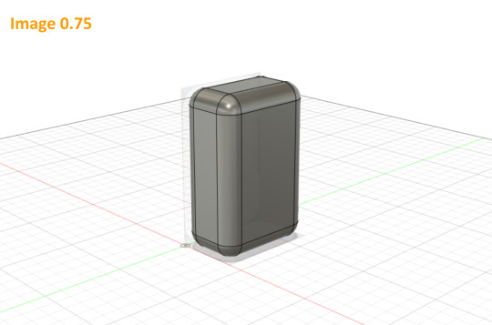
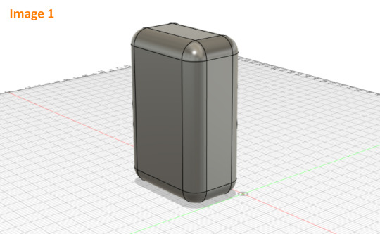
Image 0.75 + 1
Although the method of tracing shown in the video seemed to work quite well for that style of bottle, I decided instead to use the canvas as a reference for how to chamfer my corners. All of my chamfers I wanted to be matching around the bulk of the bottle so I only had to use the top view and ended up with a 10mm fillet which I then extruded up to match the full height.
I then filleted the remaining edges and used the second canvas I had as a check. Being symmetrical I realised the third view would have done the same job as this one.
I enjoyed this process of matching the design to the canvas in a 3d program as you can both tweak it in a reductive way as well as a constructive way, something that is much harder in the physical realm of model making.

Image 2
I created my cut-out for the bottle by making it as a separate piece and putting it in place and used the combine tool to cut it out of the body of the bottle. The canvases again came in helpful here as a reference however I used the measurements off my physical model also. Its helpful having different references to use as the static canvases are quick and easy to either show, hide and trace but the physical model allows for measurements to be taken and plotted straight into fusion.
I also added a slight chamfer to an edge which I had in my initial drawings but was too fine to do well on the foam model.

Image 3
I added an extruded circle to create a cylindrical neck and followed the instructions plus some extra googling on forums to create a thread, a task that would be very time consuming for a physical model.

Image 4
The lid I created did not match the week 5 lid as I wanted to take measurements from my foam model and create a lid with some subtle chamfers to make it slightly more separated from the bottle. I used the hole tool and thread tool to create a matching female thread. Whilst research further on creating matching threads I came across many mentions of providing tolerances also, something that many videos didn’t elaborate on but something id like to further explore.
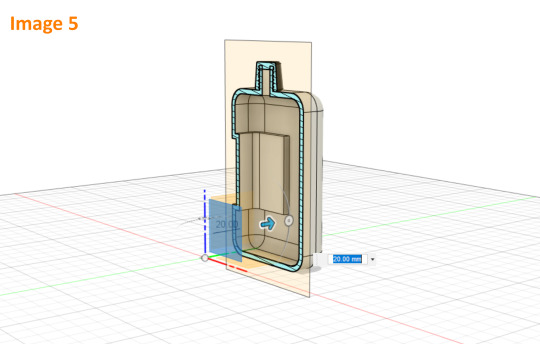

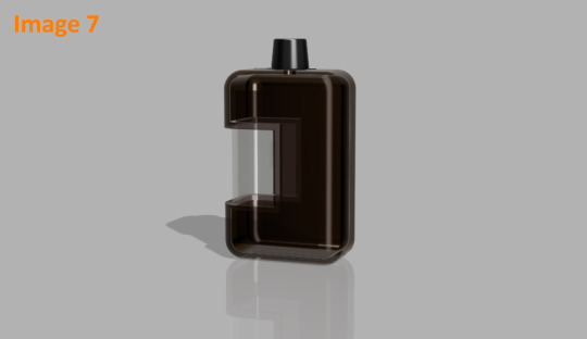
Image 5 + 6 + 7
The final model im quite happy with. After I shelled the model (near impossible to do with a foam model), I rendered it in a translucent brown plastic with a clear window as I had more envisioned it originally. I also included a version in solid white plastic both with and without the lid as well as a section view to show it off in different ways.
I enjoyed this 3d modelling process as it allows for flexibility. Being able to try something out and simply go back or delete a part if it doesn’t turn out is something that I find relaxing in comparison to physical reduction methods. Having the physical model on hand however was extremely helpful as a reference as well as of course having it in the program as a canvas. It did have frustrating moments but the overall process was somewhat of a relaxing puzzle.
There were two main negatives I had with this process. The first being that the program can only be as good as I am at using it. As im quite new to 3d modelling and to this program it meant my speed at it was slowed and my ability to even search or ask questions is limited by the knowledge I have and by my ability to describe an issue. The other thing I found which will likely not be an issue as I progress is that when I created the clear window for the render it left some clear artefacts showing through from certain angles. The only way I could find to fix this was really to start the model again and create the window as a separate component. Something which is possible but quite time consuming. It also only became an issue in the final stages and so it made me realise that for this process we are at the mercy of the technologies capabilities also, some of these limits are hard to notice until too late in the process.
Overall im looking forward to progressing my skills at 3d modelling both the physical forms and digital.
**forgot 2 screenshots hence 0.5 and 0.75**
8 notes
·
View notes
Text
Key Tips For Your Canvas Prints
Here are 4 tips and deceives to recollect when considering changing your extraordinary photos into dynamite canvas prints:
youtube
1. Cot bars or MDF squares?
This is a decision that you will be confronted with while thinking about which canvas prints organization to work with. Some will offer the last while others will offer the previous. Nonetheless, in practically all cases it is undoubtedly desirable over select cot bars or layered pine bars in light of the fact that these are ensured not to twist, curve, scratch or blur - even after numerous long periods of utilization. Canvas prints on cot bars have been tried by being set in the clothes washer on full cycle multiple times in succession, and have come out similarly as energetic as before with no shading change to the unaided eye. Conversely, MDF squares are altogether heavier and the texture is stuck to them instead of the shading being inset profound inside the canvas. The distinction in cost isn't as extensive as you would might suspect, and it is unquestionably better to go for really ageless canvas prints than those that will curve or break inside a couple of years.
2. Away from of the photo
This is a significant thought on the grounds that, to accomplish the most extreme visual effect, it is fitting to utilize photos with an unmistakable and characterized subject that is generally integral to your image. Notwithstanding, this progressions impressively relying upon the style of photo you wish to utilize. It is essential that you remember the way that exhibition wrap or any wrapping style that you select will wrap a portion of the fundamental body of the image around and onto the sides of the print. Subsequently it is presumably best not to utilize a fix of which a significant element is found in a corner or at an edge, except if you might want 'no wrap'.
3. Consider conveyance costs
This by and by relies upon the size of the canvases you wish to buy, however it is significant to perceive that the measurements are legitimately corresponding to the conveyance costs. For example, small canvas prints will cost almost no regarding conveyance charges, while mammoth all encompassing canvas prints to be extended right over your parlor divider will cost significantly more. Do remember this as you pick the correct sizes and shapes for your canvas prints.
4. Get a Proof
Most expert online canvas organizations will have the option to offer you a proof of your montage or canvas prints before you focus on the last request. This is basic as at times an originator's understanding of your images onto canvas can be somewhat unique to the first photo, and now and again strangely molded photos that don't fit precisely the elements of the canvas can be divergent. The evidence is in every case free and is unquestionably worth a brisk check, just to guarantee that your canvas prints are similarly as breathtaking as you had trusted.
1 note
·
View note
Note
Hey, may I ask how you make your icons (which are really cute btw)? I would love to give it a try myself but I dont really know where to start vor what size they woud need to be. Do you use a specific program? Thank you in advance ❤
Hi again my love!!! ❤
First of all, thankyou so much!! That’s so kind of you to say and I’m honoured that you’d come tome for advice!!! I’m going to put this under a read more because it might getvery long, I hope that’s okay! Also want to say I am by no means an expert - myicon making stems from a lot of trial and error, hahah!
There’s soooo manydifferent ways to make icons! I have seen and read a thousand tutorials, butthe first thing I have to say is it’s got to be what you’re comfortable with.Whatever works best for you is the best way!
When I first started to make icons, I used paint.net, which is free todownload and such a good program! I still haveit because you can download free ‘plugins’ (like added extra features)that people make and they’re so handy!!!! I used to make coloured backgrounds using the gradient feature, and zoom in very closely and use the rubber tool toerase the background of the characters/people I wanted for the icon, whichworks great if you have a lot of time and patience!
Now however, I use photoshop CS5, which I got from here (no idea if the link stillworks but I hope it does!!!) which I find a lot easier now that I know how touse it! For sizing, as long as the canvas is a perfect square you’re generallygood - I usually go for 150px x 150px, but I know a lot of people use 100px x100px or 200px x 200px!
Here are some tutorials that you might find useful to start you off in explaining how to use PS if you’re not familiar with it!! (x) (x)
Once you’ve got that down, usually you want to cut the people/charactersout from the background. There are soooo many ways to do this but I prefer touse the pen tool to draw around them and then erase the background, a tutorialfor that that I like is this one!
For background, I make my own gradients. Generally, you want to pick acolour you like and then find the lighter version of it, so to do that I pick acolour (for example this is a good list of different colours I referto) and then I use the hex code of that specificcolour to find the lighter version of it - so when you click on it, or searchfor it, it gives you the lighter and darker codes for the colours, which youcan put into Photoshop and then use to make gradients! alternatively you cansearch on places like itsphotoshop and find them,which is coincidentally where I get my textures from that I sometimes put onthe background of icons.
The textures are downloaded, and then once you’ve got them, uploaded into PS and usually set to soft light or overlay (I prefer soft light, but it depends on the colours you’re using I think!) in the drop-down menu on the right side of PS, where there’s different tabs (this one is found directly underneath layers!). It looks like this and put it above my colours to get cool effects in the background :-)

For the shapes part, I actually only learnt this really recently (although I’m going to do a demo of how I did my latest icon further down) and this is the method I used to get the shape!!!! Although I didn’t apply it to the icon in the same way that they did, I found an easier way for me!! Haha.
Something a lot of people also do is change the colours of people’s clothes! This is a great tutorial for that and one that I’ve used for my edits, although still learning with icons!
Okay so I think the easiest way to try and tell you how I make icons is just to show you! So, first things first, you’ve got to get your cap - it’s nice if it’s good quality, but it’s not the end of the world if it’s not!
I decided to use this one from the ITV hub, haha:
Once you’ve got that, I usually crop it so there’s not as much of the background, but that’s just personal preference. Then, with my pen tool, I go around it and outline the bits of them I want for the icon! (I’ve circled the pen tool on the left just for clarity!)

You’ll also notice the boys look a bit brighter and more defined in the above screenshot - I’ve added a PSD to them, which I’ve made myself. I have an ‘emmerdale psd’ that works quite well forall the characters so I use that as a base and adjust it depending on thescene! But there’s plenty of places to download PSDs too!
Once I’ve got the outline, I join up the dots to the first dot to make a solid line around the boys. Then, right click on the picture and choose ‘make selection’.

Then you get a pop up box saying if you’d like a little blurring around them - sometimes I do 1px, sometimes I have none, like in this case, depends on the quality of the photo (and sometimes how well you’ve cut out their hair hahah). Once you’re happy, click okay and you’ll get the solid line around them flashing now.

I’m not sure how to do this on a mac, so really sorry if you have one, but you’ve got to invert this line to select the background instead of them, by pressing Ctrl, shift and i at the same time. Once you’ve done that, you can then click the delete button and the background will disappear! Yay! You should get something that looks like this:

After this, you want to go to the menu at the top that says image and click image size, which will present you with a text box like this:

Change the pixel dimensions’ width and height to whatever your icon size is, so in this case 150px - don’t worry if the height isn’t equal to the width, it’s better that the icon is the full width if its not a person’s full body, as you don’t want the picture to take up the full height of the icon anyways! Like this:
And voila! They are to size. Now, since I’ve made icons before, I have backgrounds already made, so I would drag them onto them. I suggest you make the backgrounds in a separate window and save them for later use (using the gradients for example), meaning you can drag new people onto the backgrounds which will save you time! Once you’ve done that, you’ll get something like this:

Now, you could just leave it there! If you were to do that (I save them with multiple colours for variety!) You might want to go to filter > sharpen > smart sharpen and play around with it until they look more defined, but not overly so!
(Also please don’t judge me - it’s good practice to name your layers informational names but as you can see mine are pretty all over the place, oops.)
For the shape part of the icon, please refer to the link I added above to add a custom shape to your gallery. Once you’ve done that, this is how I added it to my icons!
For now, zoom into your icon and place the shape above the icon and use ctrl and t to make it the size you want, making sure to hold down shift when you’re dragging the sides so it’s in proportion. Once you’re happy with this, press enter to confirm it (its usually best to leave a few pixels between the shape and the edge for the ‘transparent effect’.)
Then, drag the layer down in the bar on the right so it’s underneath whatever colours you want to use for your icon. In this case, I’ve just done a few as an example:
You can see the sort of outline of the shape on them, as well as the background colour. Now, you want to move the boys into the position you want them for the icon, and use something called a ‘clipping mask’.
Right click on the layers at the side and choose ‘create clipping mask’ - the background will then fill into the shape and so will the people once you click it. At this stage, you probably want to use the little eye symbol on each layer to make it visible or invisible, so you can see if this is working or not!
As you can see, there’s a blank bit at the bottom of the icon since I cropped the boys’ bodies there. Luckily as they’re wearing dark colours, I can just paint over this on their layer to fill it in, but you could also resize the original image down to 150px and use a clipping mask on it too! (You can also merge the layers to make sure they’re one layer, by right clicking and using ‘merge down’ which isn’t available in the above screenshot but usually would be!)
Then zoom out, and you should have something that looks like this! (I’ve gone back to the file I made the actual icons on for this screenshot.) Make sure you save the image as .png, not .jpg! Files saved as .jpg can’t read transparency and the edges around the icon will show up as black or white, rather than transparent!

I hope this has been helpful, and that it makes sense, and gives you a good idea of what to do?? If you have anymore questions don’t hesitate to ask❤❤❤
21 notes
·
View notes
Text
Spinzign SELL Visual Content For Massive Profits!
Built-in Automated Re-Designer with Auto-Restyling, Resizing, and Formatting Create Over 5 Million Irresistible Designs With Limitless and Easy Customization 1-Click Automated Resizing To The 18 Most Popular Sizes Auto-Scheduling & Posting To The Biggest Social Media Platforms Beginner Friendly Graphic Design System So Easy a 9-Year-Old Can Do It FREE Commercial License Create 3.5 Million Irresistible Designs and Even Sell Your Plans For $99 - $997 Each
FREE Business Permit Included To SELL Visual Substance For Huge Benefits!
ACCESS SPINZIGN RIGHT NOW!
No-Hazard | Unconditional promise
Our Clients Love Spinzign!
What they have to say is as follows:
5 Million+ Amazing New Designs for You and Your Customers in Three Easy Steps!
Step 1: Choose a template that will be done for you or start designing with blank canvas. Step 2: Add visual elements and customize everything. Step 3: Spin to create multiple new stunning AI-designs in one click Here are some examples of what Spinzign can create for you in a matter of seconds: Instagram Square Post YouTube Cover Twitter Ads and Headers LinkedIn Profile & Life Snapchat Vertical Story Pinterest Ads Blog Post Banner Ads Facebook Ads & Covers Tumblr Banners Etsy Covers Business Cards
X WITHOUT locating, employing, and becoming dissatisfied with graphic designers who in some way never succeed.
X WITHOUT requiring years of training in the use of complex design tools in order to produce average designs.
X WITHOUT the time-consuming process of conceptualizing, designing, and redesigning the graphic designs until you are satisfied with them.
X WITHOUT the anxiety of having to redo each design in order to make it work with the various sizes and formats required by various platforms.
X WITHOUT helplessly watching as your customers flock to your rivals for superior graphic designs.
X WITHOUT discharging your pockets and investing more cash every energy you really want to make new plans.
STRIKING VISUALS Create and share striking visuals to attract attention and make money from your own done-for-you graphic design agency while creating irresistible content in a matter of seconds. Professionally designed, each template and visual element is pixel-perfect.
Everyone will have the impression that you've been in the design industry for a long time, and you'll look like a pro from the start.
Since they can't help but click the "buy" button every time, you can both impress your current customers and attract new ones!
A.I. Computerization
This A.I. device consequently plans, styles, designs and resizes pennants, show promotions, online entertainment posts, blog entries thus significantly more in only 1-click.
Automated creation of unlimited new versions of any graphic design takes just one click.
The "smart" redesigning feature is similar to having a full-time design team, but it's faster, cheaper, and better!
Grow Your Company Give your blog, website, and social media a fresh look. or even start from scratch with a brand new and design everything you need in one place.
These platforms can have an impact, inspire trust, and, most importantly, bring in business for you.
Charge customers to create all branding or redesign, as well as all marketing graphics.
Profit from clients Spinzign is like having your own complete design team with the click of a button, so there is no limit to how many clients you can get, how much you can charge them, and how much you can make! This is in addition to the insane amount of money you will make using these designs for your business itself. You can also make insane amounts of money by selling these designs to other businesses around the world, and you get to keep 100% of the profits.
Well Until Now, You Had 3 Choices To Begin a Visual computerization Organization
Employ A Plan Group
You generally have the choice of looking for architects that you like that fit your financial plan… However are you prepared to:
Have vast battles with them to cause them to grasp your vision
Work on their timetables, temperaments and accommodation
Squander weeks going this way and that with updates
Invest more energy and cash adjusting your plan to fit different social stages
DIY
The dissatisfaction with employing can push you to accept you can improve yourself… You can attempt yet let us caution you ahead of time, you must:
Burn through a huge number of dollars buying an extravagant plan programming preparing program
Goes through years attempting to dominate the convoluted instruments inside this product
Attempt to foster a 'plan eye' with practically no abilities or experience
Battle with posting your plans via virtual entertainment asking why you got zero likes and offers.
Putting your mental health at risk by becoming depressed each time one of your customers switches to a competitor
If you publish images that were only acceptable in the 19th century, you will lose credibility.
Buy Expensive Outsourced Designs If you have a lot of money saved, you can go with this option, which has more issues than it solves:
Each set of designs costs a fortune, and getting them resized costs even more.
In the hope that customers won't mind waiting, you wait weeks to get designs delivered.
Hope your clients actually like the designs you give them or risk spending more than you make on getting revisions. CLICK FOR INSTANT ACCESS ONE-TIME SECURE PAYMENT, NO RECURRING FEES But now there is also Option #4 (The Best Option Among Them All) What if you could create jaw-dropping designs in minutes with 100s of done-for-you gorgeous professional templates? This will allow you to add some profit margin to your costs and actually make money instead of losing
Imagine being able to automatically transform one design into more than 5 million distinct, equally stunning designs.
Imagine a scenario where YOU could be in FULL control and have content intended for you in all sizes with practically no plan abilities.
Consider the possibility that YOU could watch your thoughts show signs of life and effectively convert them into numerous organizations in a Solitary Snap.
If you could create high-quality, one-of-a-kind visuals at lightning-fast speeds that always result in conversions, what if you never had to deal with a designer again and still received thousands of stunning visual masterpieces?
Introducing…
Spinzign
The World's #1 A. I. Controlled Computerized Visual depiction and Visual Substance Maker
Spinzign thinks outside the box of cloud-based visual fashioners since Shrewd programming really makes plans FOR YOU.
Any remaining plan devices out there experience the ill effects of a similar issue. Regardless of whether they have incredible layouts, YOU actually need to accomplish the work to tweak and make plans.
In any case, so except if you have frantic abilities and a characteristic eye, you end up with weak designs. Forever, Spinzign solves that issue for you.
Make Staggering New Plans and Content
For Yourself as well as Your Clients In 3 Simple tasks!
Choose from hundreds of pre-made templates or start with a blank canvas. You can either create your own design from scratch or choose one of our stunning pre-made templates.
There are hundreds of pre-made templates for each of the most popular sub-categories. Simply click to load the design onto the canvas, and you'll have a ready-to-use, extremely professional design.
Do you feel creative? Begin without any preparation with a fresh start and add every one of the components you like from the implicit visual components library. Spinzign is where you can get all of your design tools in one place.
Tweak TO GIVE YOUR Plan THE Specific LOOK and FEEL YOU Need
When you have your base plan, peruse our underlying Spinzign library for limitless admittance to a large number of never-seen-prior to striking visual components.
In addition to a selection of more than 100 designer fonts, you get more than 1,000 backgrounds, photos, artwork, masks, buttons, stickers, and accents.
Select, redo and utilize these components to add that additional zest to your plan. Have your own elements or logo? Simply transfer in 1 snap to add to your plan.
Mess with the basic drag-n-drop connection point and it's so natural to configuration staggering illustrations very much like an expert plan organization. Effortlessly match the vision you have in your head!
Use our built-in Spin Technology to create new unique designs—it's like having your own complete design team in a box! Spin and watch the AI automatically create new designs for you!
Select which elements to redesign—or even all of them—and then, with just one click, Spinzign will redesign for you and produce numerous new versions in a matter of seconds.
Turn and overhaul however much you like to consequently make basically Limitless office quality illustrations and visuals. Use them yourself or sell them to customers to make a lot of money!
Check Out How Spinzign Works:
Re-imagine: Automatically and in a single click, create new, distinctive designs!
FEATURE #1 BEGINNER-FRIENDLY CONTROLS Spinzign's user-friendly interface enables you to be a creative genius with zero technical skills, HTML knowledge, or design background. RESIZE Transform Any Design Into 18 Popular Sizes In Just One Click. Start Your Own 6-Figure Graphic Design Agency With Spinzign.
Powered by artificial intelligence, this software enables you to construct a mesmerizing design by dragging and dropping components. Yes, you only need to point, click, and create!
With little effort, you can create designs that are powerful and beautiful. At absolutely no point ever run out of motivation in the future!
Second feature: jaw-dropping visual creations You can now create ads and posts like professionals.
Spinzign's drag-and-drop interface and outstanding design templates make it simple to create visuals immediately.
In the event that you're not imaginative or don't have an eye for configuration, let the A.I. fashioner produce proficient level creatives FOR YOU.
Get designs that are so eye-catching and click-magnetizing that you'll get more shares, traffic, and sales!
FEATURE NO. 3: THE ONE-CLICK DESIGN RESIZER With just one click, you can make your design available in the 18 most common sizes and formats.
Spinzign will resize it for any platform you need it for. Now you can improve your results in any channel and always get the attention you deserve!
Highlight #4
SET-N-Neglect Showcasing
Immediately advance your deals producing visuals all over virtual entertainment.
Advantageously draw in your crowd with dazzling substance on autopilot and timetable weeks or long periods of posts sans hands.
automated marketing for all 365 days!
FEATURE #5: 100% CUSTOMIZATION CONTROL Extremely simple customization to match your designs with your brand's guidelines. Change the colors, edit the elements, and add your branding and logo.
Ensure that each design is flawless to achieve the desired appearance. Absolutely adore your designs. FEATURE #6: SOCIAL MEDIA AUTOMATION You don't have to spend the entire day glued to your social media platforms. Simply schedule your posts in advance to save time, money, and stress!
365 days of hands-free, set-and-forget automation for all of your social media marketing. FEATURE #7: UNLIMITED DESIGNS You won't even be able to think of how many different designs and combinations you can make with this one tool.
You can create anything because you have access to graphics in any shape or size.
Additionally, the profits you can make from creating them for customers are unrestricted.
FEATURE NO. 8: UNLIMITED PROMOTIONS IN MANY NICHES Spinzign's designs are suitable for a variety of today's most popular markets.
For these niches, create stunning designs that help you instantly connect with your intended audience.
Include #9
Expertly Planned Formats
Our expert layouts have gone through lots of plan and overhaul to guarantee it's totally wonderful to use for you.
On the off chance that you are not happy beginning with a fresh start, basically peruse and choose one of these dazzling done-for-you plans, that you can tweak effectively to match your image plan.
FEATURE #10 AUTOMATED SCHEDULING AND POSTING There is no need to log in each time you want to post. You can go backpacking across Europe while Spinzign posts all of your visual content according to schedule.
You can quickly reach millions of people by scheduling your content to be broadcast around the clock to Facebook Groups, Facebook Pages, Twitter, LinkedIn, Flickr, Imgur, and Pinterest.
Include #11
CLOUD ACCESS
Work online without downloading or introducing anything. Ever! Our cloud software stores all of your designs and is available to you at any time, day or night, seven days a week!
Appreciate great availability, limitless information stockpiling and complete security of every one of your documents.
FEATURE NO. 12: PROFIT-MAKING MACHINE Spinzign excels at producing designs that generate sales, leads, and clicks.
Get in front of those eyes for free with stunning visuals. This indicates year-round profit.
Turn into THE BEST Visual depiction Organization
WITHOUT Expecting TO Plan A THING!
FEATURE NO. 13: A.I. MASS DESIGNER This futuristic artificial intelligence makes use of the most recent design trends to increase customer engagement. In addition to pre-made templates, you can easily convert one design into 18 sizes with just one click!
FEATURE #14: DONE-FOR-YOU TEMPLATES Trendy, expert-level templates with stunning effects and visuals that are all free to use and don't cost anything extra. There are hundreds of pre-made templates for all the most popular niches.
FEATURE #15: DRAG-N-DROP EDITOR A simple method for making your own design Begin without any preparation or alter A.I. prepared format plans by relocating components to make your show-stopper!
FEATURE #16: VISUAL ENHANCERS Experiment with a wide variety of fonts, shapes, icons, backgrounds, graphics, and transparent overlays to improve your vision beyond your wildest expectations!
Include #17
ADD YOUR OWN Components
Effectively transfer your logo, marking, pictures, photographs, and some other visual components you need to add to your plans. 1 snap transfer and 1 snap to add to your plan.
FEATURE #18: MARKETING & SALES Post your click-crazy designs every day for 365 days of viral traffic and 24-hour coverage, even when you're asleep or on vacation. Post and benefit however much you need!
Highlight #19
NEW Clients
Plans that hold existing clients and draw in new clients. By going viral, you can increase your views, sales, and profits tremendously.
Highlight #20
Normal Distributing
Post your plans whenever, anyplace just inside the dashboard or download and utilize them on your blog, site, Web based business store, PPC missions and then some.
FEATURE #21: STEP-BY-STEP TRAINING Step-by-step, over-the-shoulder walkthroughs to help you get the most out of this software quickly! We show you everything and take the guesswork out of it.
FEATURE 22: UNLIMITED SALES AND PROFITS There are no usage restrictions and no hidden fees. You can keep all of the money you make. Increase your profits immediately by rapidly expanding your social media marketing and online advertising campaigns.
FEATURE #23: SUPER EASY SETUP: Access your Spinzign account in a matter of seconds through your browser. No download or establishment required. We'll demonstrate how. You won't be able to stop once you start!
Include #24
Intended FOR Fledglings
Initiate your benefit machine with practically no plan abilities or specialized insight. When all of their customers flock to you, your rivals will be taken aback!
Furthermore, You Additionally Get These 6 Genius Level Elements As Special Rewards When You Get Spinzign Today!
Reward Ace Component #1
Robotized Plan SPINNER
Change ONE plan into Different elective plans with the snap of a finger.
Your design will be updated in multiple ways with each click. You can use the entire set or just the best one; it's up to you. There is no longer any need to start from scratch.
Select the parts you want to change, click "SPIN," and watch Spinzign grow into the most cost-effective and quick graphic design team you've ever seen!
0 notes
Text
GD 260
Identifying contrast in graphic design in everyday life. Below you can find a collection of photos from my life.
Image 1: Granola

At first glance, this packaging seems mundane but, after searching for contrasting design elements I noticed intentionally contrasting design choices throughout. One of the most noticeable to my eye is the variety of different font types and sizes. For example, the word "Protein" is bolded in a sans serif font printed with a white patchy/textured appearance. This draws customers' attention to that label most compared to the other smaller less emphasized words on the packaging like the nutritional information in the bottom left corner.
Image 2: Pillow

Dry brushing is a popular technique used in painting to create interesting textures. This technique can be imitated outside of the canvas and in other designs which I noticed on one of my pillows in my bedroom. There are "imperfections" in the design on the pillow because of the scattered random lines and dots. However, these elements all combine together to make something pleasing to the eye to view. Dry brushing pushes the boundaries of rhythm and balance to create an interesting contrast.
Image 3: Plinko
Another example of how much scale can change a design can be seen below. At tabling events for my job we have a plinko prize board. Our graphic designer created the artwork along the backing of the board and it has many contrasting elements. Other than the contrasting colors in multiple elements players can see images all with different sizes, rhythm, and shapes (i.e., square TV + house VS rounded plate + hands). Each work together to draw passerbys attention and entice would-be-players eye to stop by our table!
Image 4: Wolves

My roommate bought this shirt from FiveBelow and something about it, other than its hilarity, stood out to me. Both the scale and texture of the design are interesting and varied. There are some trees and wolves that are larger than others drawing attention to them. Additionally, the blur into the background color of the shirt provides the viewer with an interesting textural contrast. Moreover the random number of wolves and trees in the design also speaks to the "imbalance" of the design disrupting a natural rythm in the design.
Image 5: Dishtowel

Even in the very ordinary, there are ways designs utilize simple changes to introduce contrast. For example, on this dish towel, there are multiple sizes of paw print in the pattern. Other than their color this provides an excellent contrast to repeating the shape multiple times without the design turning out plain. By using scale the design is able to contrast.
0 notes