#four color print
Text
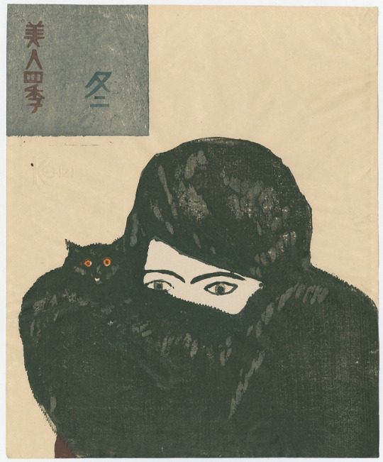
Onchi Koshiro, From The Four Seasons, 1927
full set here
#koshiro onchi#onchi koshiro#japanese art#woodblock print#ukiyoe#color woodblock#japanese#woodcut#the four seasons#cats
512 notes
·
View notes
Text
If anyone who hasn't read House of Leaves wants to know what reading House of Leaves is like my book has some yellow text in it and I was wondering what the ~~~~deep symbolic meaning~~~~ of it was and then it turns out the text is supposed to be purple and my book's just misprinted
#house of leaves#outdesign posts things#I did find one reddit post stating the same thing but that's all I've found which makes me wonder how many misprints there are#for the record this is presumably because CYMK printing uses four colors and mixes them#and so the yellow that's used to make the purple got printed but none of the other colors did
56 notes
·
View notes
Text
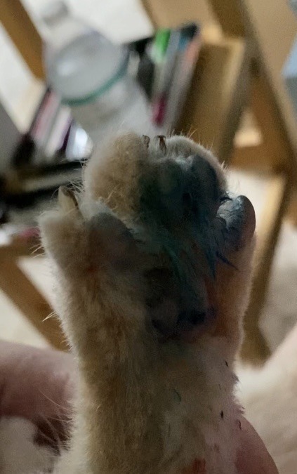
*he spilled my cup of paint water all over everything idk why I said he spilled watercolors I just woke up girls
I literally walked away for two minutes tops to make coffee and came back to his ass sitting on this water color palette and my painting open after spilling my watercolor water all over it
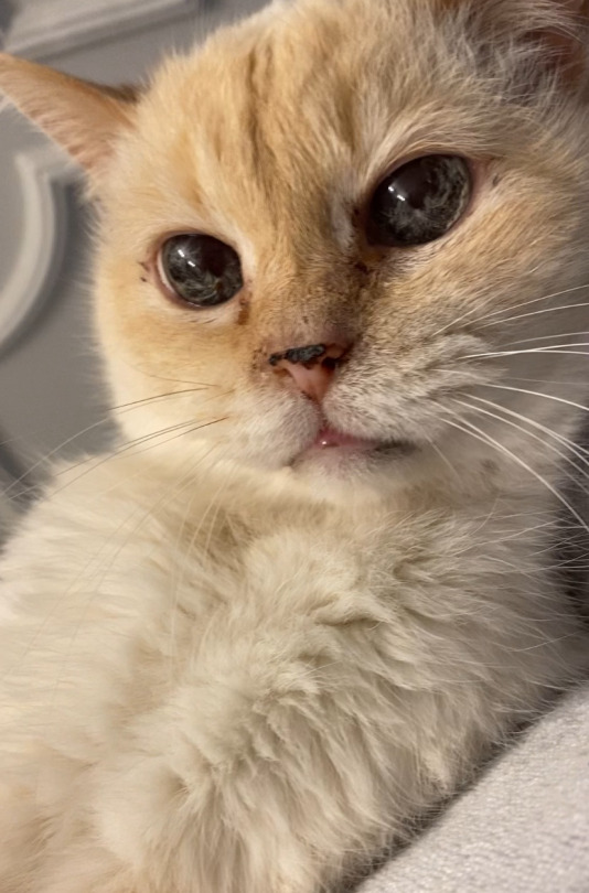
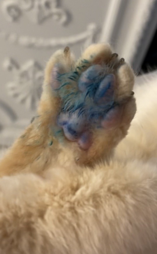
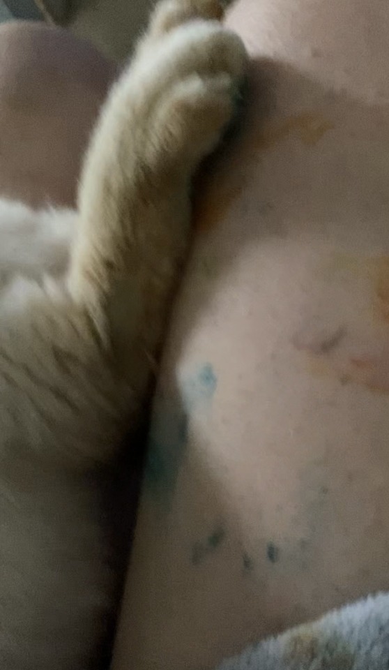
Look at that face. He knows he did something wrong hahahha
#I really wish I had a pic of him just sitting on the watercolors bc it was hilarious#like he looked so innocent and cute and I just knew his was was covered in various colors hashahwhwha#but i was more concerned with the toxicity so my immediate reaction was to try to clean his paws the best I could#and research#it won’t cause any skin or gastrointestinal issues so we’re good thankfully#he will be fine don’t worry lmao it’s water based watercolors#gonna watch him close just in case#grabbed him asap and a wash cloth and took him to the sink#but yes to reiterate it’s NOT TOXIC AND HE IS FINE I PROMISE#also thank goodness I grabbed him immediately before he started prancing around on the white carpet bc I would be yelled at for weeks#u have four bloody scratches on my face but there are not rainbow foot prints all over the house and he is safe so I am fine with that#i**#they’re ^#the way cats attack you and think they’re being punished when you’re literally potentially trying to just save their life#or help them#like unhooking their claw from somethin their stuck too#and like I give a fuck about clothes as much as my cat but there’s paint all over my favorite robe too now hahah#legit thiught the red streaks on my face were watercolor hahahaha so I was like oh shit that blood#I’m not mad#after I found out it wasn’t toxic and that he didn’t step all over the wet carpets and that he was okay i laughed for like 15 minutes#I’m still laughing like… y’all ☠️#please excuse my voice I’m a little sick and I sound like a southerner ew#like why do i sound like someone’s Christian Baptist mother offering someone cookies#Queso#my cats#lmao
11 notes
·
View notes
Photo


two parts of a gift for @shadowsplice that i’m two months late to post — i made a print copy of his fic Graveyard Shift and wanted to include a surprise illustration of shiloh with it. i am still very pleased with how both came out and ridiculously glad to have had the chance in the first place, these are some of the most elaborate projects i’ve done to date :]
#splatoon#splatoon art#splatoon oc#inkling#salmon run#splatoon 3#i am so fuckign unwell over these squid.#there are#two copies of the prints (one for me & one for him)#my copy's stitched w silver thread & his w gold because spencer's silver & shiloh's gold#the covers are two pieces of cardstock taped together w the colors inverted— again spencer is blue on the outside anf green on the interior#while shiloh's is green on the exterior & blue on the inside#i spent Hours w a ruler on the tape making the lines lettering & gutters were as even as i could make them#many of the colors are layered marker+colored pencil &each of the badges/stickers are emblematic of shiloh and/or an inside joke#thou art mine#i had to get the print redone like four times cuz the place couldn't get it right#i did this over CHRISTMAS#like?hello. there is no point to this ramble these are just labors of love and i'm damn glad of it
36 notes
·
View notes
Text
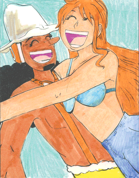
: D
#usopp#nami#one piece#i printed this out and colored it four times for no reason other than for fun#fanart#art
13 notes
·
View notes
Text
Got these today from two different people at a local artists market. They a make a perfect pair, I should've bought 20
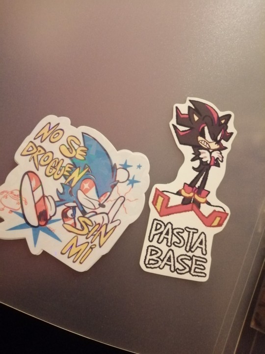
#💀💀💀#dije que no iba a gastar plata pero no pude evitarlo y compré una cachá de weas 😭😭😭😭#Tengo otro sticker unas cuatro chapitas y un pin acrílico y dos posters muy bonitos todos de Sonic lol#el print sonadow es tan cute.... soy débil. Soy tan débil#artista que tenía los peluchitos de ambos sentaditos juntos en su mesa thank you for your service#Every time I go to these events I expect to find nothing if not the bare minimum of something related to my interests#so today at the very least I can pretend that wasn't the case for a change (four artists fed me but one of them did the heavy lifting tbh)#Por supuesto que me llevé un montón de otras cosas. O mi bolsillo me dolería menos si solo fuesen furros chiquitos de colores#god dammit#shutupcaguay
6 notes
·
View notes
Text
i don't usually share wips,,, but 'm pretty happy with how it's coming out so far,,, plus it's also killing my hand so i might as well share a sneak peek since 'm not continuing this tonight,,, dkjdkemwkjssk. anyway have i told you guys how much i like the fic vagabonds
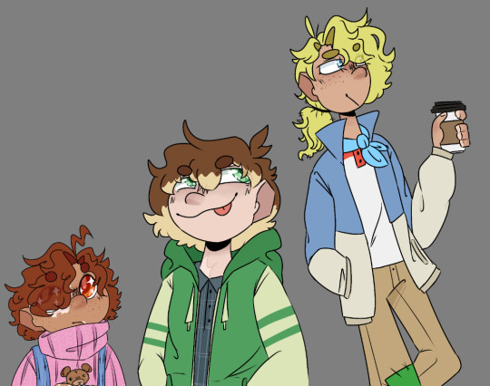
#my art#my sketches#<- i guess that's my wip tag?#dsmp#<- for blacklist#anyway i am dying 👍 <- dramatic#michael and tommy have freckles bc i do what i want /lh#<- same reason for tubbo have blonde undersides even tho he definitely doesn't have 'em in the fic#i'd say i can't wait for chapter four but honestly i can and i have been dkdnsonsks#still- 'm excited !!!!!!! been thinking 'bout this fic constantly#i need to eat the words#i need to print out this fic; prepare it on a plate with some condiments; and eat the words right off of the fic#<- things a normal person would say. (scorpio if you see this no you don't)#had no clue what to give as an outfit for tubbo so i just went with old reliable;; hoodie + collared shirt#i should really try and venture out more for him; but. ¯\_(ツ)_/¯#as for colors i just kinda. idk man i just slapped some green onto the hoodie and then figured it out from there#and i drew michael's and tommy's outfits before;; they're pretty much my standard designs for their fic characters#added that lil blue scarf-thing for tommy recently; tho#supposed to be like that thing that one dog wears in that one movie;; disney's oliver and co. why? bc i wanted to that's why#also my usual tubbo eye color is grey but due to Reasons i don't think that's vagabonds!tubbo's eye color;; so i just went with green
2 notes
·
View notes
Text
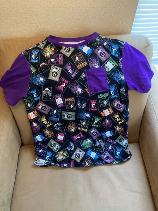
Finished a foray into practical clothes! I’d been procrastinating the collar on this for ages but ended up being able to use the one from the shirt I used for sleeve fabric
Also it glows in the dark:
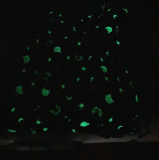
#sewing#mine#because of last summer’s projects I had quite an assortment of solid colored shirt parts#and at least four of them coordinated well with the print#but i liked the purple best
2 notes
·
View notes
Text
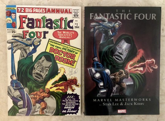
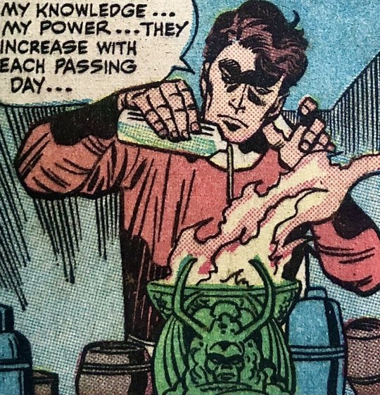
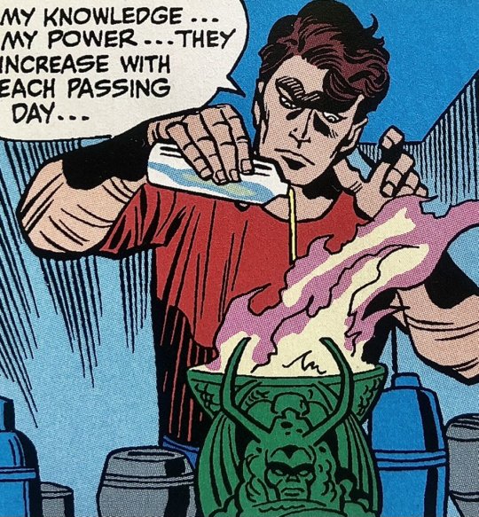
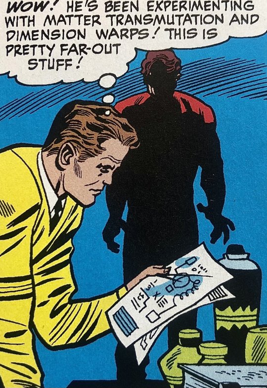
Marvel Masterworks Fantastic Four vs The Fantastic Four Annual #2
Side by Side, Part 1
Side by Side, Part 2
As I continue, I should point out: with these comparisons, I have to take into account the condition of my copy of the FF Annual 2, and also the lighting. Through these panels I did minor color correction to compensate for the ambient warm lighting, as well as some sharpening to increase detail.
Anywho. Is it my imagination or does Victor look high in the restored panel?! Note the detail of his brown lovely locks in the original, drawn out with Kirby's broad, expressive strokes.
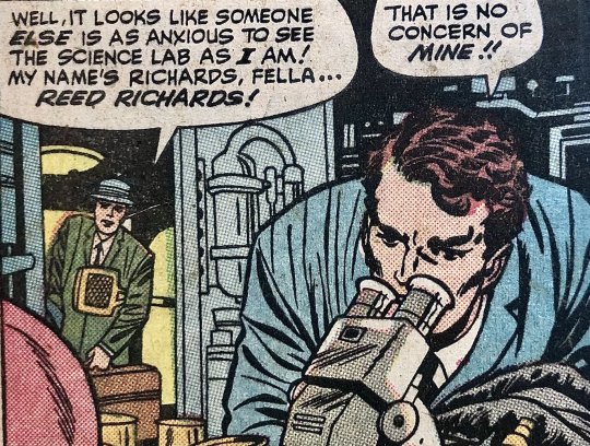
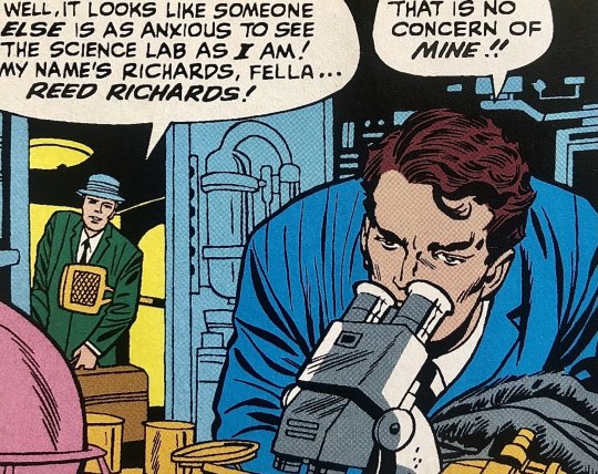
If you’re an average Doctor Doom enjoyer such as myself, chances are high that you’ve seen all these iconic origin story panels before, but which versions have you seen? (Note: in this case, the original has a little blurring because it’s so close to the spine, hard to photograph 😭)
Another example...which do you think has more atmosphere?
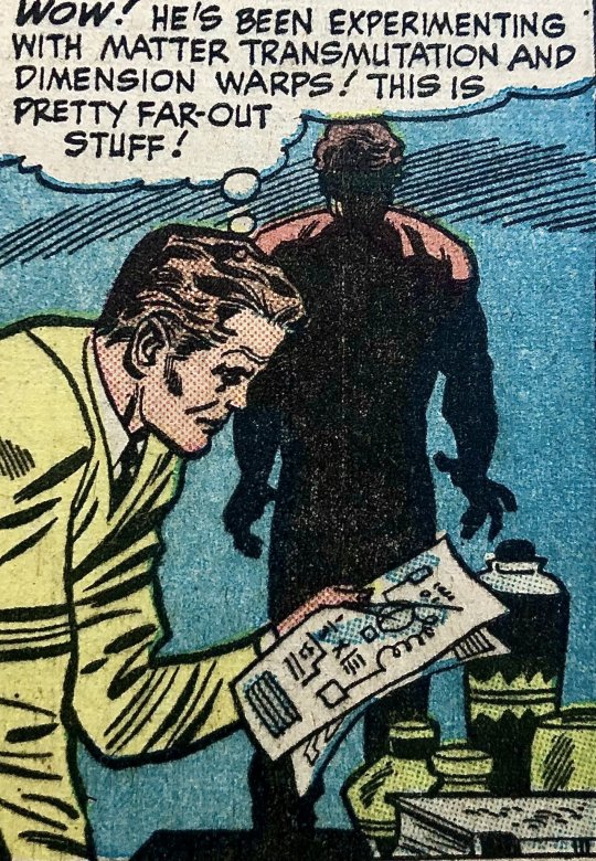
Such a difference, especially when the background is a solid color. Note the vast flatness of the background. Meanwhile, in the original: the lines appear stronger, with more character. It works with the potential inconsistencies of plate/roller pressure, and registration. The lines have been rendered more uniform in the restored version, which become downright anemic when placed on glaringly bright color, it can't compete with it.
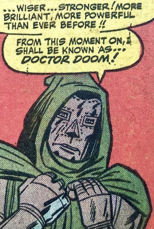
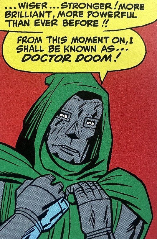
(Part 3, coming up soon!!)
#comics#doctor doom#fantastic four#marvel#comics history#printing history#color process#long winded post
17 notes
·
View notes
Text
the problem with reading DC vs. vampires as my first introduction to anything DC is that now i will never trust hal jordan ever for as long as I live
#hal jordan#DC#me watching hal jordan talk to literally anyone for any reason: GET A JOB!!! STAY AWAY FROM HER!!!#dc vs. vampires#my employer's opinions#when i was 4 i was obsessed with lion king.#it was my favorite movie and i watched it every day for like a year.#but whenever i would watch it i would become consumed with such an absolute and burning hatred for scar that i'd want to#physically crawl into the TV and murder him with my bare hands#i was furious. i was incensed. i was beside myself with rage. i was four.#i've never felt /that/ level of abject loathing towards a character since scar until hal goddamn jordan in dc vs. vampires#i know he's just lines and color but i want to see him perish!#and i want it to be by mine own sword!#maybe i'll just print out a picture of him and then tear it up maybe that would fix me
9 notes
·
View notes
Text
Feelin' Lucky!
I am feeling so lucky and blessed to be able to spend time with my husband this week. We are celebrating 22 years together! This four leaf clover is the perfect shamrock for home or office. A great good luck charm for your walls!
GET IT HERE!

View On WordPress
#art#botanical art#clover#Colorful Art#daisies#daisy art#daisy decor#daisy flowers#floral art#flower art#four leaf clover#four leafed clover#green clover#Irish#luck#luck of the Irish#lucky#lucky charm#prints#purple and green#purple daisy#purple flower#saint patrick&039;s day#shamrock#sharon cummings#sharon cummings art#st patricks day
0 notes
Text
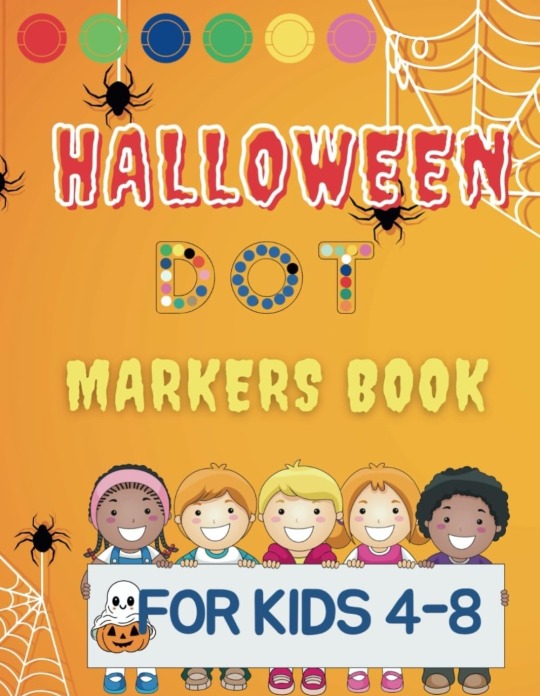
Halloween DOT Markers Book For Kids 4-8: Unlock a World of Colorful Halloween Adventures! Countdown To Halloween. https://a.co/d/fZrD1v7
🎃 **Embark on a Spooktacular Artistic Journey!** 🎃
Unveil the mysteries of Halloween with our enchanting **Halloween Dot Marker Book**! Perfectly crafted for little ghouls and boys aged 4-8, this book is a treasure trove of over 80 thrilling pages, each brimming with excitement and a dash of spooky charm! With dimensions of 8.5x11 inches, it’s a vast canvas for young artists to unleash their creativity and bring the unseen to life! 🌙
👻 **Unique & Charming Illustrations!**
Each page is a gateway to a world filled with friendly ghosts, dancing skeletons, and smiling pumpkins, waiting to be adorned with vibrant colors! It’s not just a coloring book; it’s a journey through haunted houses and enchanted forests, where every stroke reveals a new Halloween secret! 🧙♀️
🎨 **Develop Skills While Having Fun!**
This bewitching book is not only about fun; it’s a magical tool to develop motor skills and hand-eye coordination. Suitable for dot markers, crayons, paints, and more, it offers a versatile palette for little hands to explore and create miniature masterpieces! 🖌️
🍁 **Ideal for Autumn Evenings!**
It’s the quintessential companion for long, crisp autumn evenings, promising hours of imaginative play, relaxation, and anticipation for the scariest, most exciting holiday of the year! Let the whispers of the wind and the flickering candlelight guide your child in this unforgettable Halloween adventure! 🕯️
**Highlight Features:**
- 🌟 Over 80 Pages of Fun!
- 🌟 Spacious 8.5x11 inches!
- 🌟 Variety of Halloween Illustrations!
- 🌟 Develops Artistic Skills!
- 🌟 Hours of Entertainment!
Dive into the magical world of Halloween and let the spirits of creativity and joy dance on the pages of this extraordinary Halloween Dot Marker Book! It’s more than a book; it’s a Halloween celebration waiting to be discovered! 🎉
#zbigartco#halloween#spooktober#spooky#coloring book#pumpkin funny#witchcraft#print-on-demand#inspiration#relaxation#kids#love#ghost#book four#amazon#john zibi kojak#amazon kdp#spooky season
0 notes
Note
So why do you hate the advertising industry?
Hokay so.
Let me preface this with some personal history. It's not relevant to the sins of the advertising industry perse but it illustrates how I started to grow to hate it.
I wanted to be a veterinarian growing up, but to be a vet you basically have to be good enough to get into medical school. I do not have the math chops or discipline to make it in medical school. I went into art instead, and in a desperate attempt to find some commercial viability that didn't involve moving to California, I went into graphic design.
I've been a graphic designer for about seven or eight years now and I've worn a lot of hats. One of them was working in a print shop. Now, the print shop had a lot of corporate customers who had various ad campaigns. One of them was Gate City Bank, which had a bigass stack of postcards ordered every couple months to mail to their customers.
Now, paper comes from Dakota Paper, and they make their paper the usual way. Somewhere far, far from our treeless plain there is a forest of tall trees. These trees are cut down and put on big fossil fuel burning trucks and hauled to a paper mill that turns them into pulp while spewing the most fowl odors imaginable over the neighboring town and loads the pulp up with bleach to give it a nice white color.
Then the paper is put on yet another big truck and hauled off to the local paper depot, then put on another big truck and delivered to my print shop, where I turned the paper into postcards telling people to go even deeper into debt to buy a boat because it's almost summer. The inks used are a type of nasty heat sensitive plastic that is melted to the surface of the paper with heat. Then the postcards are put on yet ANOTHER truck and sent to the bank, which puts them on ANOTHER truck and finally into the hands of their customers, who open their mail and take one look at the post card and immediately discard it.
Heaps and heaps and literal hundreds of pounds of literal garbage created at the whim of the marketing team several times a year. And thats just one bank in one city.
I came to realize very quickly that graphic design was the delicate art of turning trees into junk mail.
And wouldn't you know it there are a TON of companies that basically only do junk mail. Many of them operate under the guise of a "charity," sending you pictures of suffering children or animals and begging for handouts and when they get those handouts the executives take a nice fat cut, give some small token amount to whatever cause they pay lip service to, and then put the rest of the cash right back into making more mailers. "Direct mail marketing" they call it.
Oh but maybe it's not so bad, you can advertise online after all. Now that there's decent ad blocker out there and better anti-virus ads usually don't destroy your computer anymore just by existing.
Except now when I search for the exact business I want on Google it's buried under three or four different "promoted search items" tricking me into clicking on them only to shoot themselves in the foot because I searched for the specific result I wanted for a reason and couldn't use those other websites even if I felt like it.
And now we have advertising on YouTube and on every streaming service, forcing more and more eyes onto the ad for the brand new Buick Envision that parks itself because you're too stupid to do it on your own.
Oh thats ok maybe I'll get Spotify premium and go ad free and listen to some podcasts- SIKE we have the hosts of your show doing the song and dance now. Are you depressed and paranoid from listening to my true crime podcast about murdered and mutilated teenagers? That's ok, my sponsor Better Help can keep you sane enough to stay alive and spend more money.
It's gotten so terrible that now you have content farms, huge hubs of shell companies that crank out video after video to get more and more precious clicks. Which if the videos were innocuous maybe that wouldn't be so awful except now you have cooking hacks that can actually burn your house down and craft hacks that can electrocute you being flung into your eyes at the speed of mach fuck so some slimy internet clickbait jockey doesn't need to get a real job.
It of course goes without saying that animals are also relentlessly exploited by clickbait companies that will put them in compromising situations on purpose to create a fake fishing hack video or even just straight up killing them for sport by feeding small animals to a pufferfish that rips them apart for the camera.
And all of this, ALL of this doesn't even touch how adveritising is the death of art in general. Queer topics, any kind of interesting art, any kind of sex or substance use topics are scrubbed clean and hidden at the behest of advertisers.
Sex education, a nude statue, topics such as racism or sexism or bigotry in general have tags purged or hidden from search, even life saving information about SDTs or drug use, because if someone saw that and complained then Verizon might sell fewer tablets and we can't fucking have that.
Conservative talking heads often bitch and moan that they're being censored on social media. The stupid part is, they're right! They are being censored! But it's not by a woke mob, it's by ATT and Coca Cola not wanting their adspace sharing screen time with their stupid fucking opinions.
However, they won't ever figure that out, because the talking heads they get their marching orders from like Tucker and Jones ALSO rely on the sweet milk flowing from the sponsorship teat and they aren't about to turn on their meal ticket so they have to come up with even stupider shit to say for the train to continue rolling.
I managed to rant this far without even getting into the ads I see for the beauty industry. The other day a botox ad described wrinkles as "moderate to severe crows feet" as if wrinkles are a symptom of a fucking serious disease! Like having a flaw in your skin is a medical problem that you need thousands of dollars of literal botulism toxin to fix! I was incandescent with anger.
Advertising is a polluting, censoring, anti educational and anti art industry at it's very core. It destroys human connections, suppresses human thought and makes us hate our own bodies. It ads no value, actively detracts from value, and serves no real purpose and I believe it should be almost if not entirely banned.
23K notes
·
View notes
Text

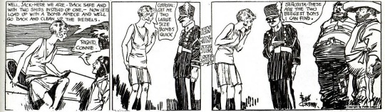


“Connie” newspaper strips by Frank Godwin, published from September 24th to October 4th of 1929
#I had been reading the Connie strips that were reprinted in Famous Funnies by the Eastern Color Printing Company#but I stopped when I learned that it was possible for me to start the strip from the very beginning#or at least a lot earlier on- this doesn’t seem like it’s the very beginning of the strip#strange that at the beginning of this she seems to be working in foreign military affairs#and then starts a new job as a interior decorator#though that does seem to be leading her down the path of investigative work#at the beginning of the strips I was reading reprinting in Famous Funnies she worked at a detective agency#then the stories focused more on her social life as a wealthy socialite#and then depicted her as a reporter#and I started reading this strip because I saw a page of it reprinted in a history book and thought the art was pretty#and that page depicted it as a science fiction strip with Connie and others discussing a time machine#it seems that the strip went through a lot of evolutions#also the strips in Famous Funnies were four rows on panels and were in color#this is one row per panel and in black and white#and the reprinted page in the history book was a full page splash page#also it’s cool that Jack is in the second strip here#since in the Famous Funnies material I’ve read he works with her at the detective agency#and then becomes not-quite-fully-committed-but-basically her boyfriend#connie by frank godwin#my posts#comic panels
1 note
·
View note
Text


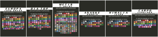
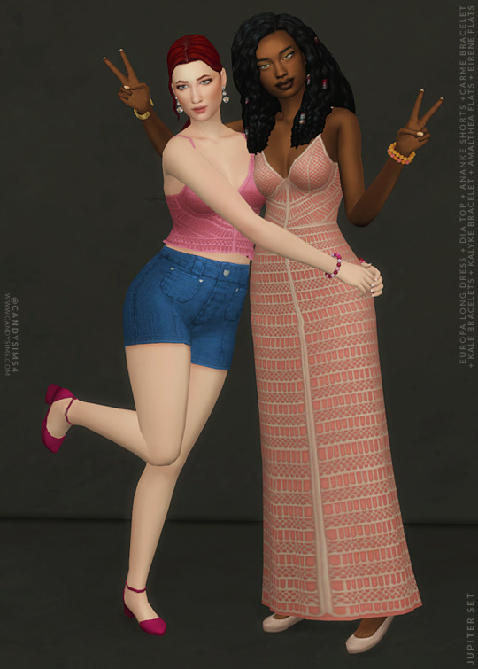
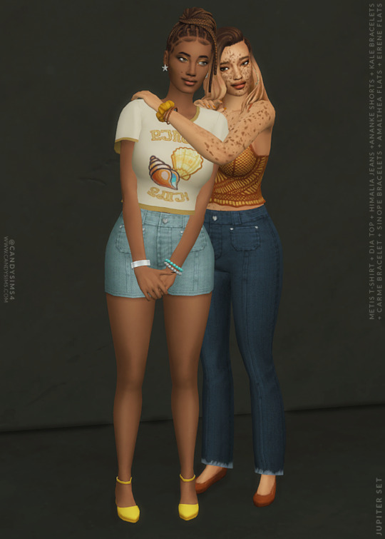
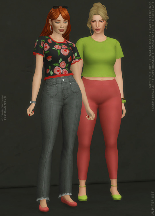
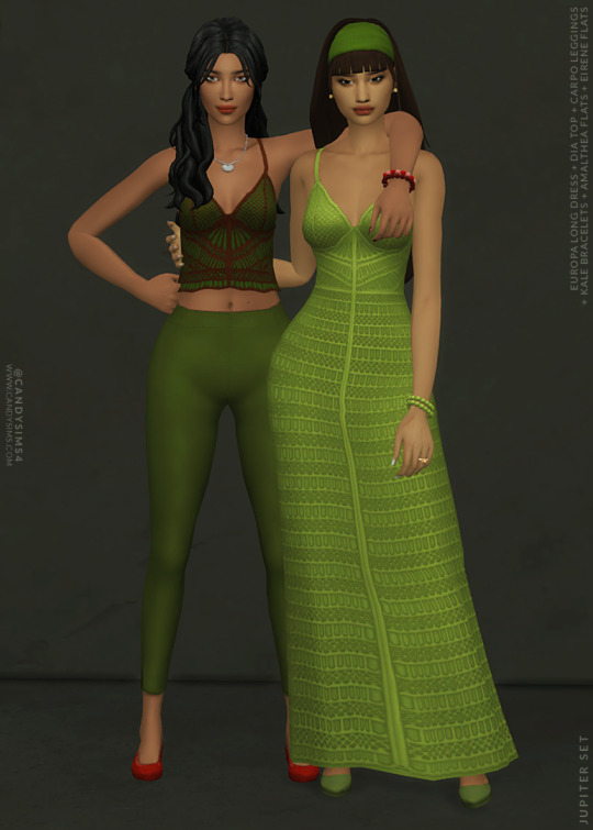
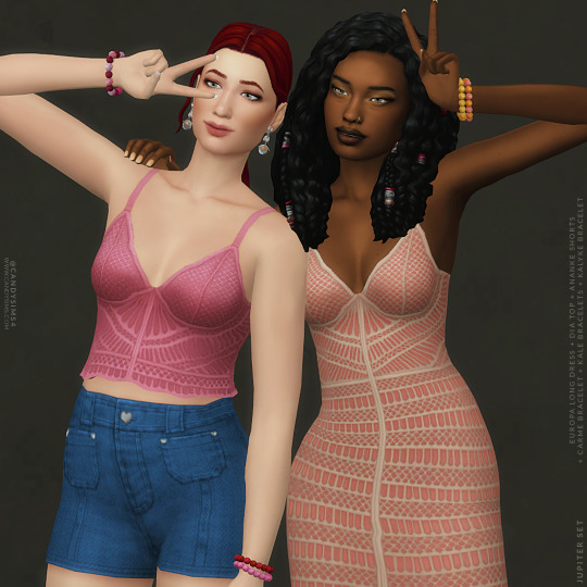
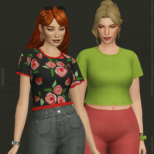
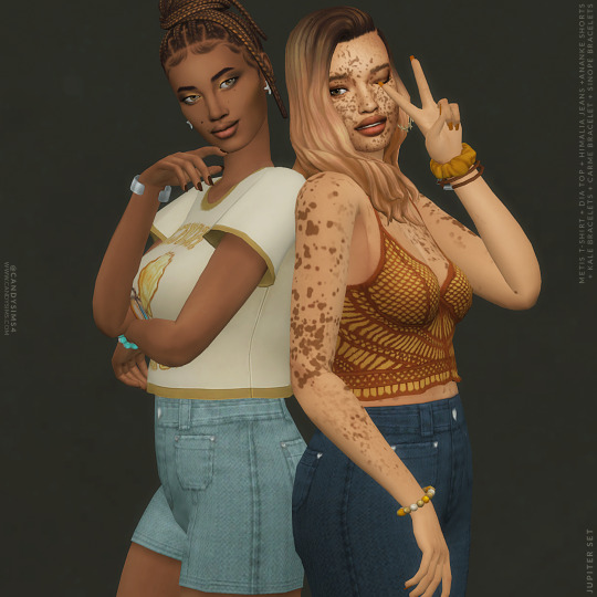
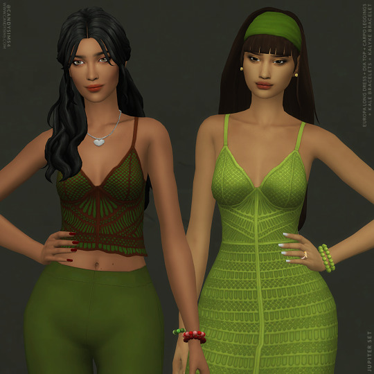
JUPITER SET | PART 2
I'm so excited to share with you the release of this set!
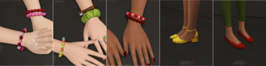
On it, you'll find 12 new items for CAS, including a dress, two tops, one short, two pants, four bracelets, and two flats.
I named everything after Jupiter's moons, as the first part of the set. Even though there are only 17 moons out of 95, it's already a big set!
As it's too much text, I'll leave the description of each item plus the creator's notes below the cut.

ALL ITEMS ARE:
TEEN TO ELDER
BASE GAME COMPATIBLE
MADE FOR FEMALE FRAME
DISALLOWED FOR RANDOM
THUMBNAILS (HOSTED IN IMGUR)

MY SITE (NO AD.FLY): EUROPA LONG DRESS | DIA TOP | METIS T-SHIRT | ANANKE SHORTS | HIMALIA JEANS | CARPO LEGGINGS | KALYKE BRACELET | KALE BRACELETS | CARME BRACELET | SINOPE BRACELETS | AMALTHEA FLATS | EIRENE FLATS
Free release on 13th August 2023 on my site.
PATREON EARLY ACCESS + MERGED OPTIONS

TERMS OF USE | SEND YOUR FEEDBACK | REPORT AN ISSUE
Thanks to all the cc creators that I used in the pic. And thanks to @maxismatchccworld, @simblrcollective, @s4library, @wewantmods, and everybody who reblog this post!
If you’re a cc finds and want to be tagged when I post, please, let me know. You can send me an ask or in DM.
With your help, more people can know about my work! 💖 Love you all, XOXO <3
DESCRIPTION OF EACH ITEM:
EUROPA LONG DRESS
4.324 POLYGONS
95 SWATCH COLORS
- 55 plain colors
- 40 color combinations
YOU WILL FIND IN FULL BODY/LONG DRESS
DIA TOP
3.890 POLYGONS
98 SWATCH COLORS
- 55 plain colors
- 43 color combinations
YOU WILL FIND IN TOP/TANK TOP
METIS T-SHIRT
3.660 POLYGONS
150 SWATCH COLORS
- 55 plain colors
- 53 patterned
- 42 prints
YOU WILL FIND IN TOP/T-SHIRT
ANANKE SHORTS
1.100 POLYGONS
44 SWATCH COLORS
- All plain colors
YOU WILL FIND IN BOTTOM/SHORTS
HIMALIA JEANS
1.102 POLYGONS
44 SWATCH COLORS
- All plain colors
YOU WILL FIND IN BOTTOM/JEANS
CARPO LEGGINGS
1.066 POLYGONS
55 SWATCH COLORS
- All plain colors
YOU WILL FIND IN BOTTOM/LEGGINGS OR/AND ACCESSORIES/TIGHTS
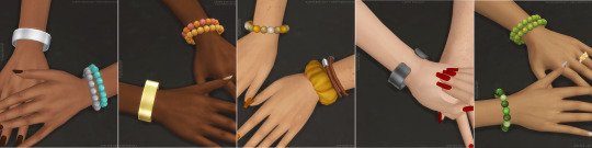
KALYKE BRACELET
1.868 POLYGONS
50 SWATCH COLORS
- 15 single colors
- 35 color combinations
YOU WILL FIND IN ACCESSORIES/WRIST (RIGHT)
KALE BRACELETS
2.246 POLYGONS
65 SWATCH COLORS
- 15 single colors
- 50 color combinations
YOU WILL FIND IN ACCESSORIES/WRIST (LEFT)
CARME BRACELET
228 POLYGONS
10 SWATCH COLORS
- All plain colors
YOU WILL FIND IN ACCESSORIES/WRIST (RIGHT)
SINOPE BRACELETS
912 POLYGONS
48 SWATCH COLORS
- All color combinations
YOU WILL FIND IN ACCESSORIES/WRIST (LEFT)
AMALTHEA FLATS
778 POLYGONS
55 SWATCH COLORS
- All plain colors
YOU WILL FIND IN SHOES/FLATS
EIRENE FLATS
510 POLYGONS
55 SWATCH COLORS
- All plain colors
YOU WILL FIND IN SHOES/FLATS
CREATOR'S NOTES:
This set really is something I'm very proud of. Each piece in this set is special to me, and I can't wait to see how you all style them in your Sims.
I'm anxious to add them to as many of my Sims as possible. You will see them in future previews and photos. haha
Now let's talk about the items, starting with the Europa Long Dress and Dia Top, the most challenging pieces to create. Still, I'm so happy with how they turned out. The crochet texture and colors are simply stunning!
My idea for them was to make it very casual for summer or hot days, as charming and detailed as possible.
The Metis T-Shirt is the most versatile piece! You can get it in plain colors, patterns, and prints; note that all prints are in Simlish or Sims-Themed.
I love them all, not only because I have designed some of them, and they turned out exactly as I wanted! But seriously, this top is perfect for many occasions and outfits.
I tried my best to make the swatches diverse to make it possible to use them in various Sims/outfits without repeating or only fitting better in more styles/occasions.
The Himalia Jeans and Ananke Shorts are both so cute!!!
I especially love the heart buttons and metal pieces. These bad boys were tricky to draw as they're pixel art, and I'm the worst at it. But luckily, they look adorable at the end.
I usually don't do pants/shorts with pockets, and maybe now I'll start to do more often as I really enjoyed these four pockets on both.
The Carpo Leggings are super easy to style! They're perfect for so many different occasions and outfits. I liked them especially in everyday and athletic outfits.
Plus, there's a second version of them in the tights category for even more styling options.
The Kale Bracelets and Kalyke Bracelets are inspired by the beaded bracelets from the 2000s. They're simple yet beautiful and come in various color combinations. They can really make any outfit stand out!
The Carme Bracelet is the most elegant piece but also easy to use in casual outfits. Comes in ten metallic colors and a minimalist design, making it a versatile accessory to match any outfit.
The Sinope Bracelets are so practical and versatile! They're perfect for dressing up a casual or athletic outfit or even a pajama outfit. The scrunchie and hair ties combination is convenient and trendy at the same time.
The Amalthea Flats and Eirene Flats are both comfortable and easy to wear. They're perfect for adding a touch of style to any outfit.
Yet, creating this set took a lot of time and effort. I wanted everything to be perfect and had to redraw some components multiple times to achieve it.
Plus, I'm used to releasing less content at once.
It made me realize I'm not fast enough to do 12 items in one week, but with more practice may be possible in the future.
Perhaps if I don't do too many swatches per item could be possible.
Metis T-Shirt, for example, has 150 .dds files, and it took a lot of time to do that I could have used to make another shirt or cc. But it's a choice of mine, as I enjoy many options for each item for more variety. I like to always try adding as many as possible.
Even not having as many as I wanted, I'm still thrilled with the result and worthed any second I have spent on it, not only in this shirt but the whole set.
I am thinking of doing a poll to see what you guys prefer, more items with fewer swatches or, as it's right now, as many swatches as possible and fewer items.
I'm sorry it took me a little longer to release this new cc. I hope you'll like this set, and it was worth the wait! XOXO
#s4cc#ts4cc#s4mm#s4female#ts4mm#s4 cc#ts4 custom content#s4 custom content#sims 4 cc#maxis match#s4 cas#ts4 cas#the sims 4#sims 4#ts4#s4clothes#ts4clothes#s4 clothes#ts4 clothes#s4 downlad#ts4 download#s4download#s4acc#ts4acc#s4shoes#ts4shoes#s4 acc#ts4 acc#s4 shoes#ts4 shoes
3K notes
·
View notes
Text
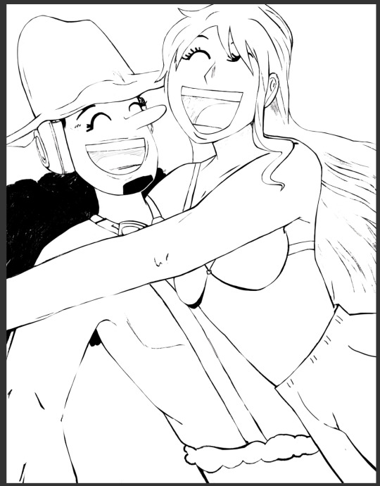
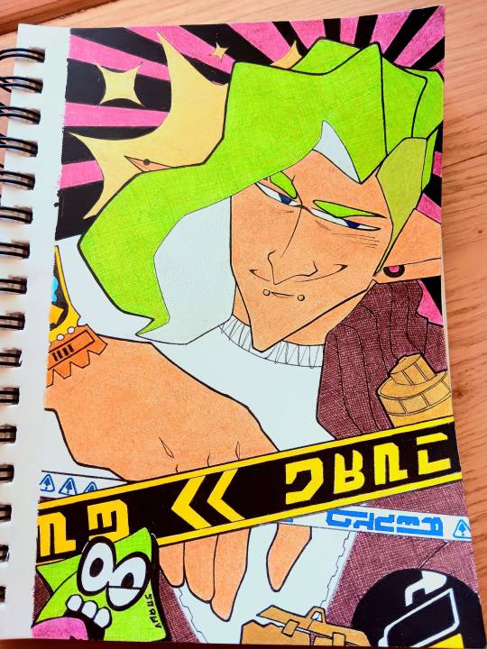
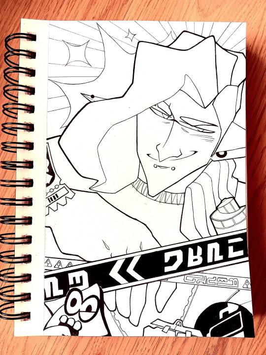
i never make this much effort in lineart because i hate it but we're onto something with this one
#one piece#fanart#wip#compare it to the one i posted last night it's different i promise#i'm about to print out four of these and color them separately and then scan then and reupload them as a gif
5 notes
·
View notes
Last Seen Blogs
urjopgu8
팔팔정 구매

clothingparadise330
CLOTHING PARADISE

stopserbophilia
Untitled

bestislamicstudio-blog
Untitled

7egzo
7egzo