#french typography art
Photo
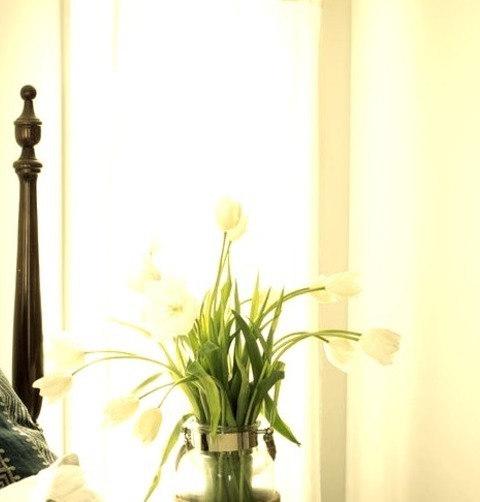
Beach Style Bedroom - Bedroom
Example of a medium-sized beach-style master bedroom with a dark wood floor and a brown floor, beige walls, and no fireplace.
0 notes
Text
Beach Style Bedroom New York

Example of a mid-sized beach style master dark wood floor and brown floor bedroom design with beige walls and no fireplace
#navy accent pillow#wood bedframe#dark hardwood floor#dark ceiling fan#french typography art#sheer white curtains#dark wood floor
0 notes
Text


Coralie Fargeat’s ‘The Substance’ (2024).
#poster#poster design#posters#key art#movie poster#movie posters#poster designer#film poster#film#film posters#coralie fargeat#the substance#demi moore#margaret qualley#dennis quaid#animation#french#france#frenche movie#type#typography#graphic design
40 notes
·
View notes
Text


“THE HOUR IS DEVOTED TO REVENGE”
LOUISE BOURGEOIS // 1999
[letterpress and lithograph in colours,
on 2 sheets of wove arches | 24 × 17"]
111 notes
·
View notes
Text
For #InternationalFlamingoDay here's a fun Art Nouveau A-Z alphabet fashioned out of flamingos!
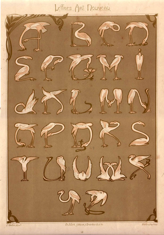
Flamingo Alphabet, typography designed by Étienne Mulier and published in Lettres et Enseignes Art Nouveau (Paris, 1901).
#flamingo#flamingos#animal holiday#International Flamingo Day#Art Nouveau#typography#1900s#20th century art#French art#European art#book art#book plate#lithograph#Étienne Mulier#Lettres et Enseignes Art Nouveau#alphabet#A-Z#animals in art
132 notes
·
View notes
Text


MÉ天ÉO(Japanese-French Poem)
MÉTÉO = 天(天気), weather
SOLEIL = 日, sun
NUAGE = 曇, cloud
PLUIE = 雨, rain
NEIGE = 雪, snow
#詩#現代詩#poem#poetry#文学#visual poetry#japanese#実験詩#視覚詩#concrete poetry#Nihongo#kanji#French#français#japonais#poésie visuelle#poésie#typography#typographie#typographic art#typografie#artists on tumblr#design#designinspo#design ideas#concrete poem#vispo#具体詩#コンクリート・ポエトリー#日本語
14 notes
·
View notes
Text

Picasso Classique
#pablo picasso#picasso#art#artist#painting#painter#french typography#design#historic typography#typography
5 notes
·
View notes
Text

#french fries#fries#chicken#florida#restaurant#lol#fashion#art#diy#food#landscape#illustration#vintage#design#typography
7 notes
·
View notes
Video

flickr
DENIS, Maurice. La Dépêche, Grand Format, 1898. by Halloween HJB
#Maurice Denis#La Dépêche#vintage newspaper advertising#vintage advertising posters#crowd#large format#vintage typography#French language#Belle Époque#Art Nouveau#flickr
2 notes
·
View notes
Text
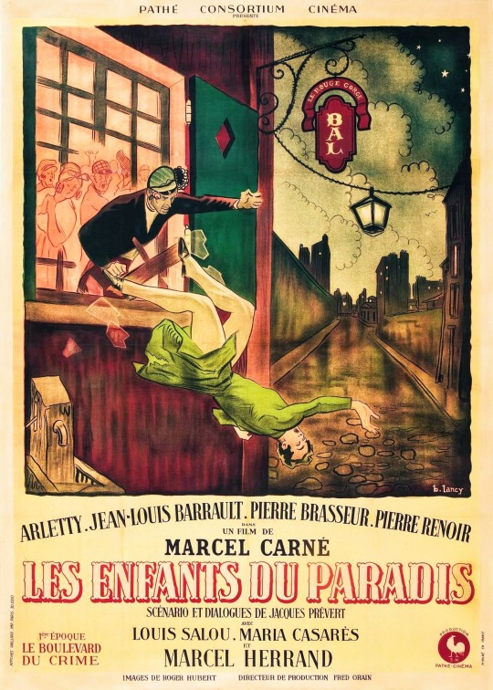
Marcel Carné's Les Enfants du Paradis (1945); poster art by Bernard Lancy.
#movie#1940s#marcel carné#art#poster#children of paradise#film#vintage#illustration#advertising#movies#culture#graphic design#cinema#bernard lancy#artwork#typography#french#design#retro#arletty#🎨
20 notes
·
View notes
Photo
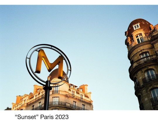
Order prints and see more pics: danieletedeschi.tumblr. com #paris #reportage #underground #metro #typography #stilllife #streetart #french #architecture #art #streetlife #sunset #light #empty #city #35mm #analog @leicacamerafrance @kodak #color #film #photography #fisheyelemag #sombresociety #somewheremagazine #myspc #lensculturestreets #streets_storytelling #love #life #dreamcatcher https://www.instagram.com/p/CpU0XwetqoB/?igshid=NGJjMDIxMWI=
#paris#reportage#underground#metro#typography#stilllife#streetart#french#architecture#art#streetlife#sunset#light#empty#city#35mm#analog#color#film#photography#fisheyelemag#sombresociety#somewheremagazine#myspc#lensculturestreets#streets_storytelling#love#life#dreamcatcher
2 notes
·
View notes
Text
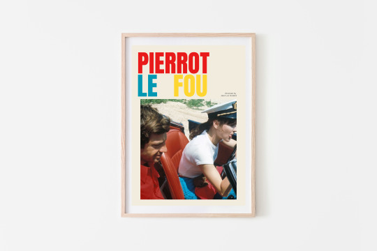
Pierrot Le Fou Jean Luc Godard film poster
#jean luc godard#pierrot le fou#godard poster#film poster#typography#Anna Karina#french#french actress#french girl#picasso#Jean Luc Godard#Pierrot Le Fou#60s#60s film#60s Fashion#love#art#classic cinema
1 note
·
View note
Text
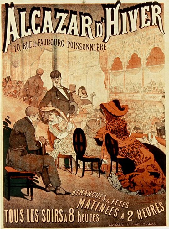
Léon Choubrac - Alcazar d'Hiver - 1882
Léon Choubrac (17 November 1847 – 5 April 1885), who sometimes signed his drawings with Hope, was a French poster designer and illustrator based in Paris.
With his younger brother Alfred Choubrac, Léon was trained as a classical artist with the painters Charles Doërr and Isidore Pils at the École des Beaux Arts. The Choubrac brothers came very soon to the poster, practicing since 1875 the modern treatment of colors and typography, associated with images thanks to chromolithography.
In the early 1870s, the Choubrac brothers and Jules Chéret (known as "the father of the modern poster") reduced the cost of colour lithography introducing technical advances. Additionally, in 1881 restrictions on bill-posting (affichage) were lifted and eased state control of the media in France. In 1884, the Paris city council started to rent out surfaces belonging to the municipality, paving the way for a rapid increase in the production and distribution of advertising posters. Posters with clear colours and dashing images appeared all over town during the vibrant spirit of the Belle Époque.
Léon Choubrac drew some posters that higher authorities seized or torn down, amongst others one that showed a woman tortured in the presence of the Pope. Another poster, The secret loves of Pius IX, showed the portrait of Pope Pius IX below a series of portraits with heads of young women. The censor made him add a beard to the head of the Pope to disguise it. The poster nevertheless caused a scandal and was torn down by order of the French Minister of the Interior François Allain-Targé.
Léon and Alfred created the Ateliers Choubrac. As an illustrator, he sometimes collaborated with his brother in Gil Blas or the satirical weekly Le Courrier français, among others. Choubrac illustrated several works by Emile Zola. Although Leon died young (1885), his brother Alfred went on to produce an impressive number of posters for Parisian entertainers, theatres, businesses and various commercial products.
The poster collector Ernest Maindron, who wrote the first essay about the illustrated poster in the Gazette des Beaux-Arts in 1884, and later published the first book on the subject (Les Affiches Illustrees) in 1886, mentioned the Choubrac brothers, along with and Chéret, among the pioneers of the illustrated poster.
30 notes
·
View notes
Text
I'm pretty sure there's meant to be an embargo on press discussing Ripley until the 4th, but this Danish reviewer appears to have jumped the gun a bit.
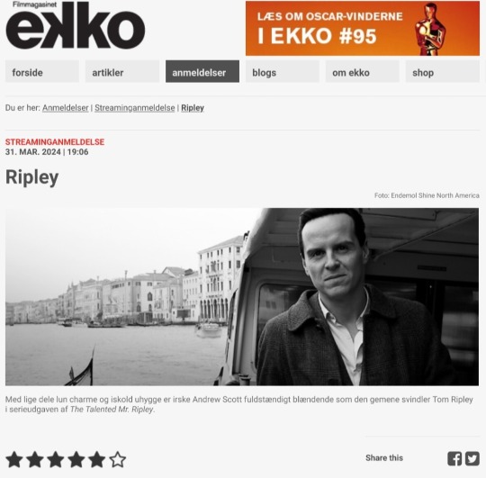
Aesthetically pleasing series with chilling Andrew Scott is a welcome alternative to the summer vacation-ready movie adaptation of Highsmith's thriller.
(English translation below the cut)
By Kristian Ditlev Jensen
Ripley is the title of Steven Zaillian's adaptation of Patricia Highsmith's recurring character Tom Ripley, who is the protagonist in five of her psychological thrillers.
The first book is the magnum opus The Talented Mr. Ripley, which has been adapted into several films. Most famously, the 1999 version starred Matt Damon and Jude Law.
The story is about a young conman, Tom Ripley, who hustles his way through life, but one day gets mistaken for someone else. He seizes the opportunity and gets the offer of a lifetime from Mr. Greenleaf, an elderly shipyard owner.
"Go to the stunning Amalfi Coast in Italy and find my son Richard Greenleaf. Persuade him to come home!"
In Italy, Tom quickly finds Dickie, as he is simply called. But instead of bringing him home, he murders the man and assumes his identity.
In a formidable double-cross, he fools everyone by pretending to be both Tom and Dickie when it suits him. All goes well until a police inspector from Rome starts to smell a rat. And soon the hunt is on for the perpetrator.
The journey takes them via Sanremo, Palermo in Sicily, Rome and Venice. But the the criminal is always gone, even though the policeman is actually sitting and talking to him!
Anthony Minghella's feature film is good, but it's also a legitimately summer-holiday-ready, box office-targeted take on the story of a con artist and low-life con man. Now this version finally gets competition from a far more uncompromising, over-aestheticized and visually astonishingly harmonious work, starring Andrew Scott (All of Us Strangers) with warm charm and icy creepiness.
It's not every day you see such a well-designed series, where everything from the dramatic choice to shoot in black and white, to the typography, to the production design of interiors and costumes is thought out down to the last detail.
"The light. Always the light."
The line comes from a Catholic priest standing just behind Tom Ripley, who is looking at a Caravaggio painting.
Michelangelo Merisi, as the Italian painter was originally known, took his artist name from the village of Caravaggio near Bergamo. And it was he who coined the art term chiaroscuro - or clairobscur in French - in the years around 1600.
The term refers to a painting technique where dark and light are contrasted so that the images almost appear as black and white paintings.
Steven Zaillan - who wrote the screenplays for Schindler's List, Awakenings and Gangs of New York - has just modeled Ripley on the painter Caravaggio, who lived a dramatic life to say the least.
In 1606, Caravaggio stabbed pimp Ranuccio Tomassoni in the thigh with a small sword, causing him to die from the blood loss. The painter lived on the run for years before being pardoned by the Pope, but died immediately afterwards of a fever at the age of 38.
This story is on every level behind the series.
Ripley is shot in black and white, i.e. modern clairobscur, just like Caravaggio's own works. It's also about a criminal on the run and a murderer.
The story goes on and on.
In a key scene, there is a cross-cut between the historical Caravaggio sitting at a table with the murder weapon, a short dagger, and Tom Ripley sitting with a fountain pen in front of him.
In the twentieth century, you could kill with a pen. Today, you'd probably do it over the internet.
The whole analog universe that Steven Zaillian revels in - the series is set in the 1960s, while the novel was published in 1955 - is a stroke of genius. It allows him to work sensually with a wide range of things that seem to have disappeared today.
There are phone booths and people write notes to each other with pens. The typography is almost a tribute to the printed media in the form of newspapers, books, writings, signs, stamps, letterheads, patches of text, forms, checks and so on.
Similarly, shoes are a little story in themselves. And drinks. And ashtrays. At the same time, the declaration of love for the Amalfi Coast is so authentic it makes you dizzy.
The fact that the series is shot as something of an homage to the black-and-white king of them all, director Orson Welles, doesn't make it any less impressive. With a wealth of indirect and direct quotes from, for example, The Third Man, where the play of light and shadows on the walls of the stairwells play a major role.
Ripley is a rare true work of art on Netflix.
11 notes
·
View notes
Text
Tumblr green flags:
Knight themed icon or header
Custom theme
Title is a shitpost and/or has very little bio info
The color green
Stole shoelaces from the president at least once
Posts 30x a day about the most obnoxious ships known to man
Alternatively, a niche interest like the history of typography or translating arthuriana from old French
Doesn't have a dni, or it is very minimal
Reblogs art
Tagging system
Goes insane every Nov. 5
Tumblr red flags
Constant rb bait posts
Wishes there was "a better algorithm"
Finds any other social media habitable
Does not have any blocked tags/does not know how to block things
Has a tumblr
8 notes
·
View notes
Photo
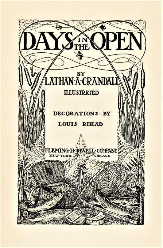


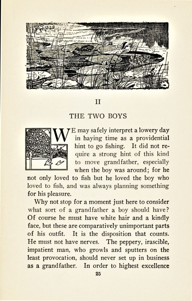


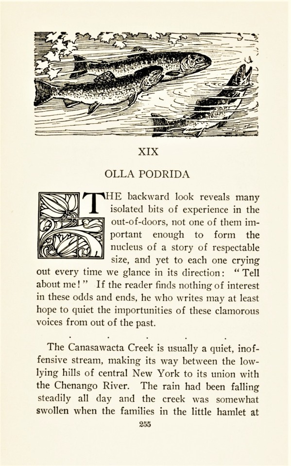
Typography Tuesday
Last week, as part of a gift, we received a 1914 copy of Days in the Open by American clergyman and angler Lathan A. Crandall with decorations by the English-born American illustrator Louis Rhead, published in New York and Chicago by the Christian publishing firm Fleming H. Revell Company. We were taken not only by Rhead’s Art Nouveau decorations and illustrations for this volume, but also by how he turned ordinary chapter-opening initial letters into Art Nouveau historiated initials through the use of five different cuts combined with the letters.
Louis Rhead was a prolific designer and illustrator who came from a family of prominent English potters and artists. He was initially trained in art by his father and then in Paris by the neoclassical French artist Gustave Boulanger. When he emigrated to the US at the age of 24, however, he became deeply influenced by the work of Swiss Art Nouveau decorative artist Eugène Grasset. In America, Rhead also became an avid angler, and much of his work after 1900 often involved angling art, as in this publication. Rhead even died in the pursuit of his avocation, dying of a heart attack soon after hooking and then struggling to remove a 30-pound turtle that had been devastating his trout ponds. Now, that’s devotion!
View more posts with historiated initials.
View more Typography Tuesday posts.
#Typography Tuesday#typetuesday#Typography Tuesday#historiated initials#Louis Rhead#Art Nouveau#angling#fly fishing#designers#illustrators#Days in the Open#Lathan A. Crandall#Fleming H Revell Company
81 notes
·
View notes
Last Seen Blogs

cockroachjoe-official
joe-chan official

from-dre
From Dre

lookatthatoldgrizzlybear-blog
Slow Club

tricktreat
Trick or Treat

godneylegendspears
And Then We Kiss