#fun photoshop tutorials
Text
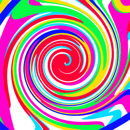
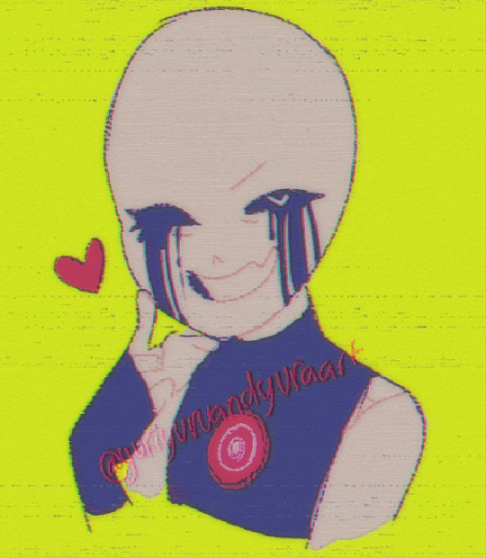
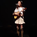
How To Gif: Glass Shatter Effect
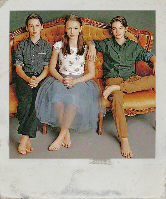
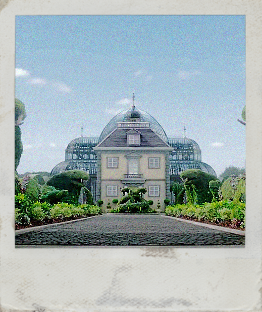
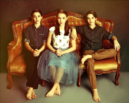
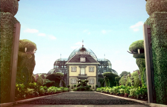
By popular demand (ie, 7 people who voted in this poll), here is a tutorial on how to do the glass shatter effect I used to create the first gif in this set.
I use Photoshop CC 2015 (yes I know it's old) for my gifmaking, but you should be able to apply everything to newer versions of Photoshop. For this tutorial I'll be assuming you know the gifmaking basics, but if not, I would recommend this tutorial, which is the process I use to make gifs. Note that this particular process involves saving all of the frames, importing those frames into Photoshop, and then using an action to convert to a smart object.
Keep reading below the cut to learn how to do this effect!
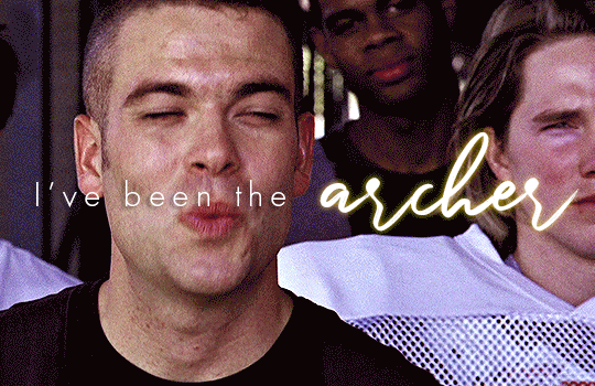
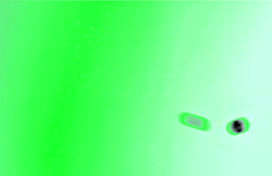
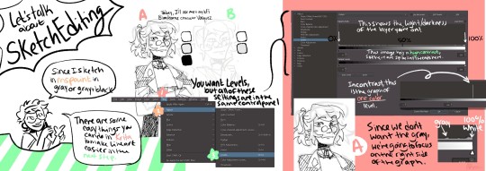
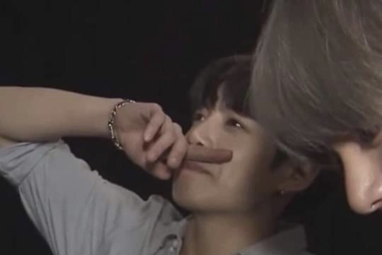
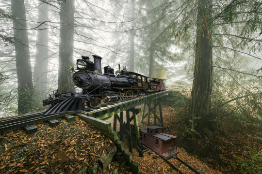
Before I could start making this gif, I needed three things; the two scenes that I wanted to use, and a video of the glass shattering effect. I already knew the scenes I wanted, so then I took to YouTube to find a video which I can't for the life of me find again, but it looked like this:
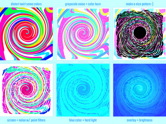
Something like this is what you want. Ideally the green part would be entirely white, but as long as there are two clearly different colours you can usually work with it.
This looks a lot slower than the gif that I made, but that's not because of the frame rate - which is exactly the same above as in the final gif - it's just because there are extra frames in this slower one that I cut out. In the video I used, the glass shattering happened very slowly. I didn't want that, so I ended up skipping several frames when I loaded the frames into Photoshop before using my gifmaking action. I just did this by manually selecting one frame, skipping the next several before selecting another frame, and repeating this until I had selected 60 frames.
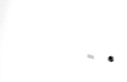
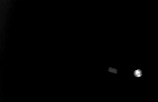
After using my gif action, I had a smart object of the glass shatter effect that looked like this:
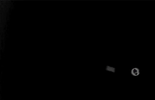
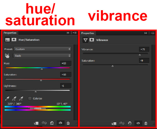
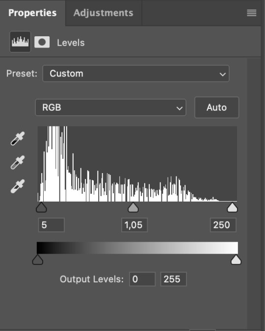
That's a much better speed! It still wasn't quite where I needed it to be though. I needed this in black and white, so I slapped a hue/saturation adjustment on the smart object and set the saturation all the way down to -100.
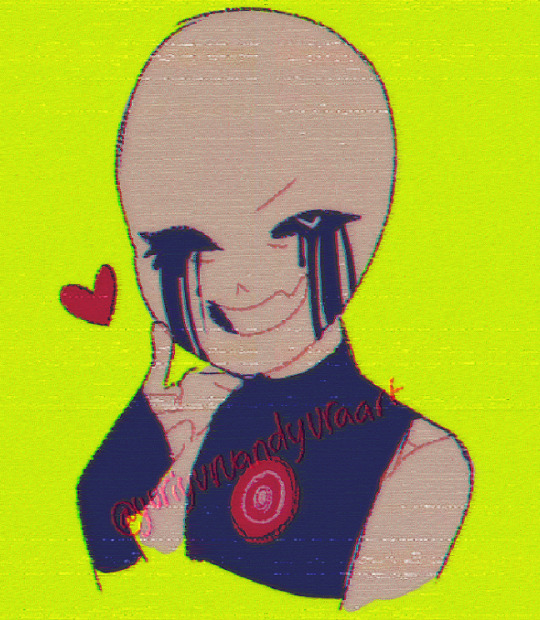
Okay great, I could start putting the gif together now.
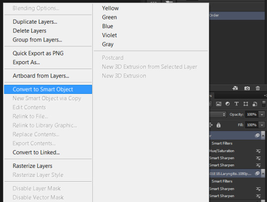
First, I made a copy of the glass shatter smart object, because I'll need that later. Then, I pulled in frames from the scene that I wanted to appear in the hole after the glass shatters, and I used those to create a new smart object with my gif action (we'll call it Scene-bg). I pulled Scene-bg into the same window as the glass shatter objects. Then I created a new smart object by combining one of the glass shatter objects with Scene-bg, which I did by selecting both layers right clicking, and selecting "Convert to Smart Object".
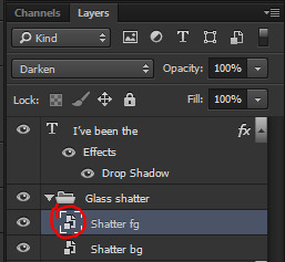
I renamed this smart object to Shatter-fg. I opened it by clicking on the little icon next to the layer name in the layers window here:
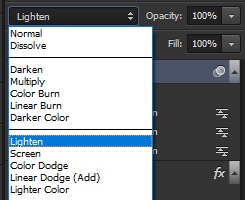
The most important thing here is that the shatter effect object should be the top layer, and I set the mode to "lighten". This will make sure that the lightest colour of either this layer and the layer behind it is displayed; that means that anywhere that's white in our shatter animation will still show up, but anywhere that's black we'll see what's in the layer(s) behind it.
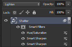
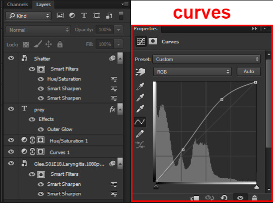
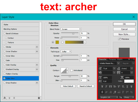
Then I threw some adjustment layers between them to get the colouring I wanted. I used a curves layer, a hue/saturation layer, and I also added text with an outer glow layer effect. Here's what the layer order looked like and the settings I used for each layer:
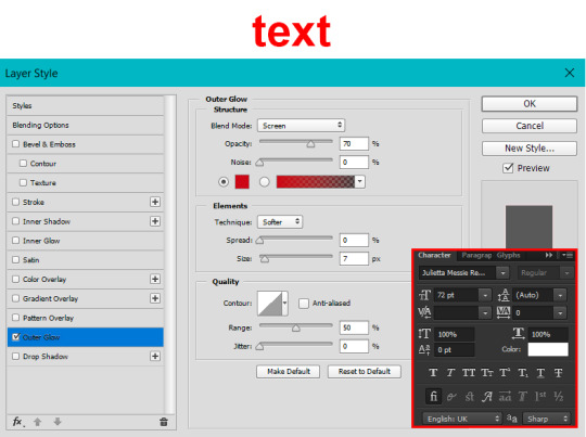
After this process, Shatter-fg looked like this:

Okay nice, this is starting to look like something! I saved this and went back to the main file with the other glass shatter object.
I needed to invert that other glass shatter object. There's a weird quirk with the version of Photoshop that I use where it doesn't like it when I apply specifically an invert adjustment to a smart object (it appears correctly when editing, but not on export) so I did this by creating a new smart object which included a separate invert layer, but if you have a newer version of Photoshop you can probably just apply the invert adjustment directly. Just note that you'll need to do one of these options; it won't work if you add a separate adjustment layer in the main file, it needs to be applied specifically to the smart object (which we'll now be calling Shatter-bg). It looked like this after I inverted it:
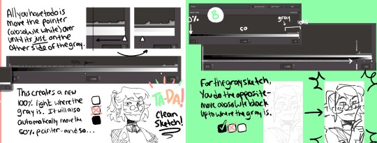
Once that's done, I made sure Shatter-fg was the layer directly above Shatter-bg, and set the mode of Shatter-fg to "darken" and Shatter-bg to "lighten". Since Shatter-fg is set to darken, it will be visible only when it is darker than the layer behind it. By setting Shatter-bg to lighten, I've guaranteed that the layer behind it will always be lighter (ie, white) in the places we want Shatter-fg to be visible, and will be black otherwise. Once I update those settings, this is what the gif looked like:
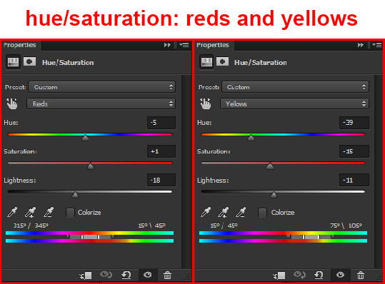
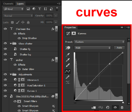
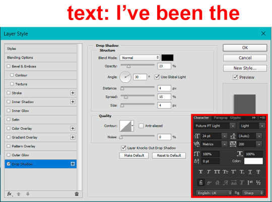
This is all there is to the glass shatter effect itself. Next I pulled in frames from the second scene to fill in the black areas. This layer needed to go below both glass shatter layers, so that it only shows through where the black. Then I added adjustment layers and some text. I used curves, hue/saturation, and vibrance adjustment layers, and I also added the "archer" text below the glass shatter layers so that it would be hidden to reveal the "prey" text. The other text I added above all of the layers, since I wanted this to be visible all the time. Here is the layer order and all of the settings I used for each of the layers:
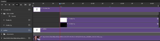
I also grouped Shatter-bg and Shatter-fg and shifted them on the timeline so there would be some time to see the background gif before the shatter effect starts.
And that's all! Then it''s just a matter of exporting the finished product:
This is the first gifmaking tutorial I've ever made, so I hope I was able to be reasonably coherent and helpful! I'd love to hear if you make anything by following these steps, or even if you just feel like you've learned something reading through this. And if you have any outstanding questions, feel free to reply or send me an ask and I'd be happy to answer!
#gifmaking#tutorials#gifmaking tutorial#gif tutorial#photoshop#photoshop tutorial#usergif#gleesource#my tutorials#mine#how to gif#tw mark salling#mark salling tw#not tagging as glee because it's not actually about that but wanted the tw tags just in case#this was so much more effort to put together than I thought it would be lmao#I was like oh yeah I've already made the whole gif I just need to go back and explain how I did that...#it took A WHILE#anywayyyy it was fun though so I'm glad I did it#would love to know if anyone finds this helpful or interesting or tries out the effect or something similar!#you can also just grab the black/white gif I included above if you want to do the effect since I can't find the video... sorry lol#but yeah you have my permission to steal the black/white gifs for gifmaking purposes if you would like#just don't like. post your own tutorial claiming you made it or something?? but like you don't need to credit me or anything obviously.#ANYWAYYYY#I feel like... a LITTLE pretentious thinking I'm good enough at making gifs to be qualified to make a tutorial#but like it's fineeee everything is fine#gonna finally post this now enjoy byeeee
99 notes
·
View notes
Text
a small process for my recent underwater illustration
sorry if it's very random, but each step looks cool enough to be its own thing so I wanted to put it out somewhere haha
#skipped some minor tweaks#but the main idea of which blending modes got used is here#not sure if this is going to be of use for anyone#but the least it can do is inspire someone to play around with this stuff themselves#it's fun and cool and you should try it too#art#my art#artists on tumblr#art process#art tutorial#sort of?#digital illustration#digital art#digital painting#photoshop#blending modes#illustration#drawing#process gif#artist process#drawing reference#drawing resource#gif#flash warning#flashing gif#cw: flashing
62 notes
·
View notes
Text
“You will see to it that they conduct themselves at all times with the utmost orderliness and decorum; I’m placing you in command.”
aka another spider-verse crossover edit that no one asked for
#the sound of music#mary poppins#tsomedit#marypoppinsedit#filmedit#fanvid#mine: vid#julie andrews#what a babe#idk if i went overboard with the half tones i was not about to dive back in and try to fix it after working on this for 1.5 months lol#fun with fusion! and resolve!#aka taking tutorials for after effects and photoshop and converting them over to fusion#mine#listen i called this the chaos-verse because they absolutely bring harmony through chaos i will not elaborate further
14 notes
·
View notes
Note
,,,,how do u get that fuzzy fuzz feel on ur art pieces,, is it just by usin’ noise? (As in static, I think)
oh! i experiment a lot with colors and effects (most of which i don't even remember the name SOB) but i can give you a summarized version of my steb by step on how i art
first of all, the colors!
here's the og, and you can probably see that in most of my art i tend to use grays and soft colors a lot and that's because it's easier for me to pick a 'theme' if you will? like 1 bright color that pops and the rest is a lot less harsh and that's what helps me define the contrary color and base my editing on that!
like here is where i usually choose my colors! but you can pick something darker and more saturated too idk i don't think it'll affect the end result- at least as long as you can change contrast and lighting in your program. i know color theory but not enough to explain it hhh :'D <333
so now use the wind tool on photoshop (there's some free editing versions online that will work just the same) and if you don't have or wanna use Ps, firealpaca and medibang have similar enough options- use motion blur, then the curves tool to make it look liiike
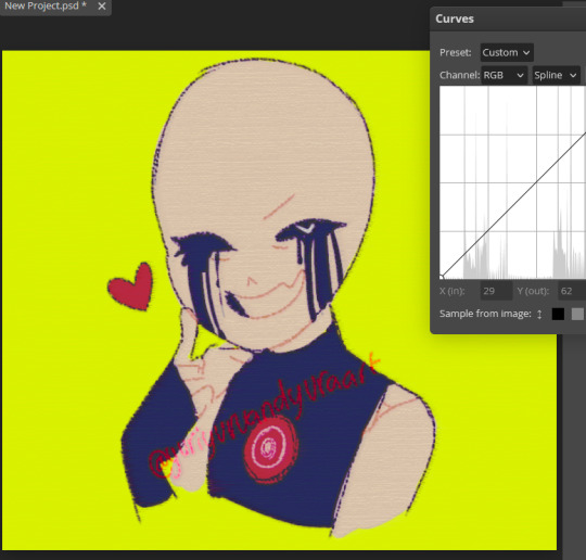
this! now blur the piece from a 5 to 10 range depending on how big your piece is, then you'll have that soft fuzzy outline! put some random static on top (very low opacity) then sharpen the whole thing if your art is very small like mine here so you can see details xD
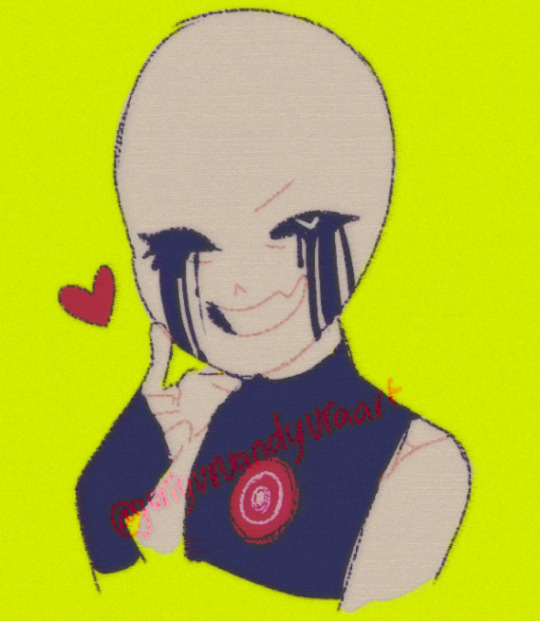
use the lighten mode on your next layer and add a blue tint to the character (and leave the pop color untouched: here the yellow bg)
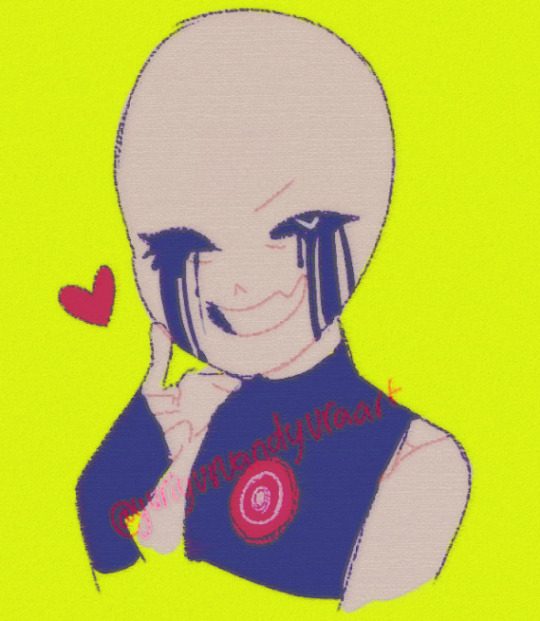
if you want a vhs look! and add more line-like static (just google static images and mess with colors/edit them yourself if you can't find any good options on your art program) and change up the hues and tints/contrast if you really wanna lean into the vhs asthetic like:
these! and add a 3D effect (or chromatic aberration? i think that's what the translation is cause my settings are in french xD do look it up if you can't find it on ibispaint, clip studio or whatever program you're using!)
i really suck at explaining so i don't consider this a tutorial, but mostly me rambling about effects and editing hhh but honestly? best advice i can give you is try every single effect you can and see how it looks with hues and color changers added on top of it!
stumble upon new effects and learn how to replicate them without needing to rely on special layers or tools if you're looking to improve your coloring!! >:Dc i only use these because my version of sai doesn't have a blur tool cause i pick the colors myself in most cases now :') but as i said i'm bad at explaining so hope it kinda sorta helped? a little? hhh<3333
#ask#tutorial#sorta?#my art#utmv#killer#killer sans#killer!sans#all these versions you see? that's how many i end up with when i finish editing my art- and i have to pick a favorite to post :'(((#i like them all but i can't really tell if this is actually useful HHH#sorry i'm skipping through some steps but also i deleted a whole paragraph cause gosh there's too many words and it's almost 2am where i am#so i can't proofread at all xD thank you so so much for passing by!!#glad you're interested in effects cause i love playing around with editing softwares and photoshop variants! try it out guys it's so fun<33
23 notes
·
View notes
Photo
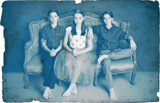
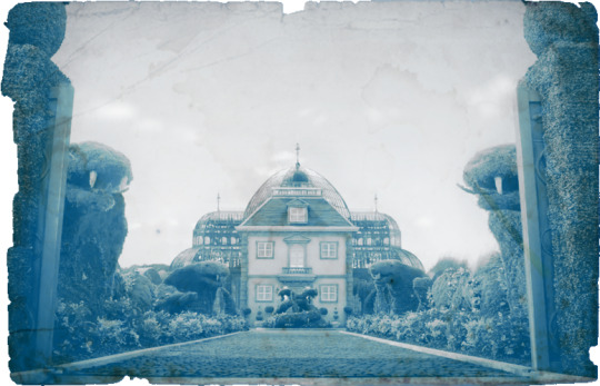
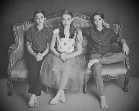
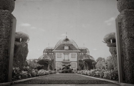
Used some shots from asoue to experiment with making faux-vintage photos. From top to bottom: daguerreotype, cyanotype, early/mid 20th c., polaroid, mid/late 20th century
23 notes
·
View notes
Photo
hello tutorial 3(?)
#quarterdraws#art tutorial#photo editing#FUN FACT THIS WAS THE ONLY THING I EVER USED PHOTOSHOP FOR#BEFORE I REALIZED THAT KRITA DID THE SAME SHIT FOR FREE#KRITA SUPREMACY
7 notes
·
View notes
Photo
made something serious in photoshop for once
#photoshop is saur difficult like there's so many things to learn like woah#but anyways#this lil tutorial was fun shoutout to the british man who made it#i lowkey dont like that white circle i put near tyler's feet but i didnt know which layer it was to delete it so whatever#tyler adams#brenden aaronson#leeds united
4 notes
·
View notes
Note
Hello! Do you know how to make these kinds of gifs? I wanted to start making gifs but photoshops ruins the quality so much, this looks like something that could hide that? :/ https://twitter.com/peachyguk/status/1534201125116661760?t=qfHzFt3E5A0tfMR53gma9A&s=19
Hey!! So in order to get some quality stuff out of Photoshop, it’s good to know how make stuff look less grainy. But, in this case, you’re right! Adding some graininess to the gif hides the grain we don’t normally wanna see. How is this done? Noise.
📝 Noise is a Filter, along with Blur and Sharpen and lots of other things.
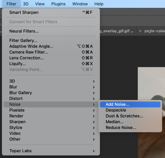
It’s a good option when you want certain vibes to a look, or a quick way to “hide grain” since it’s gonna be fuzzy anyway.
🖥️ Here’s two examples of a gif without Noise and a gif with Noise.

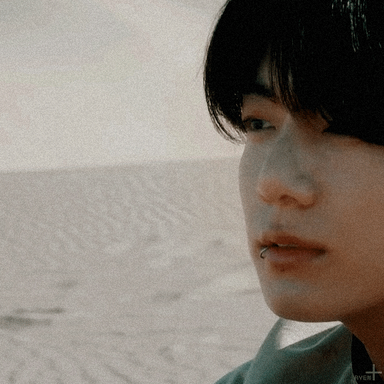
Notice how the Noise filter hides what’s happening on his skin? It makes movements look more uniform.
🎥 This filter is also a nice touch to anything you wanna make nostalgic or old school film-like (which makes sense, I guess, since people worked with less pixels back then anyway? idk.) I use it as a bandaid for really old, lower-quality video or photos lol but yeah! This is how I think the gif you linked is done.
📝 Note: The file size limit for tumblr is 10MB, while the limit for Twitter is 5MB on mobile, and 15MB (!!) on web. Noise increases the file size a ton, so keep that in mind if you wanna post on here instead of Twitter.
And that’s that! Have fun on your content creation journey :D
#and there you go!#have fun and try things!#anon#photoshop#*ryengfxtalk#*tutorials#*resources#this is her graphics consultant jeon jungkook#tutorials#resources#long post
1 note
·
View note
Text
what graphics should I make next...
#i was making a marc one last Sunday morning because my soul itself was convinced he was gonna win but god said no u already made sprint one#id love recommandations/ requests 🙏#like rider + something you want (like color#idk ive seen many people do this in f1 but idk how well it will do here but it will be fun#og#also tbf i am still new to Photoshop so i cant guarantee theyll be good or made in time because im looking up tutorials for everything 😭#but hiii send me an ask if you want 🙏#goodnight goodnight 😽
0 notes
Text
🥂Photoshop Tutorial #5 🥂
What is red eye, and how do you correct it in Photoshop? Red eye is an effect that occurs when a camera flash is reflected in a person’s eyes in an image. You would use the Red Eye tool, editing Pupil Size and Darken Amount, to fix this.
Why might some parts of the Photoshop workspace become inaccessible or hidden, such as the Color and Layers panels? And how do you return to the normal workspace? If standard panels can’t be opened, you are probably working in a dedicated workspace that provides options only for a specific task, such as applying Liquify or Blur Gallery effects. Many menu commands and panels aren’t available in a dedicated workspace. To exit a dedicated workspace and keep the edits you made in it, look for an OK button and click it. (When not in a dedicated workspace, panels can be opened and hidden using the Window menu or by a preset on the Window > Workspace menu.)
How can you create a panorama from multiple images? Choose the Automate button under the File tab, then click Photomerge, choosing the images you want to combine using Shift-click.
Which common camera lens flaws can the Lens Correction filter fix? It fixes barrel and pincushion distortion, in which straight lines bow out toward the edges of the image (barrel) or bend inward (pincushion); chromatic aberration, where a color fringe appears along the edges of image
#finally done#adobe photoshop#photoshop tutorial#need sleep and coffee#need matcha too#learning this was fun tbh#adobe creative cloud#class assignment
1 note
·
View note
Text
some graphic design resources cause im bored and itching to write something but i cant write anything i'm happy with--- anywayssss
unsplash for lots of royalty free pics
heres a cool site to learn how to pair fonts together
heres another site to learn kerning [spacing]
in fact heres a bunch of games to help u get better at graphic design stuff
some free online video editors x x x
color accessibility resources :]
savee.it - like pinterest but for designers!! unfortunately it has a save limit for free users but u should still be able to browse it for inspo i think?
some free fonts
aside from coolors i really love adobe color!! it has color palette generator [triads, monochrome, complementary, etc.], accessibility tools, palettes+gradients extractors, and color palettes inspired by trends within diff industries.
make moodboards online for freeee i miss u polyvore
spline and womp for web based 3d design! + blender of course [go make that donut!]
we all know and love them: photopea [photoshop but free and on a browser?!] and canva [no introduction needed im sure]
upscale the resolution / quality of pics it says anime but it works really well with most stuff like video game screenshots [gets rid of hard edges/pixels]
typography inspo
more color palette generators [already meets accessibility guidelines]
filmgrab - a curation of movie scenes 💕
here's another one but for color palettes from films
more inspo and tutorials
cargo - for web design stuffs
an archive of BRANDING GUIDES
free online zine hosting
milanote - very very useful for organizing creative projects :D kinda like a mix of notion and pinterest ? [its basically notion but more visual]
a collection of free luts
lots of pngs for editing
freepik - lots and lots of free design assets.
flaticon - lots of flat icons / vectors. i haven't used this in a while, but it was free last i checked
in case u need more help pairing fonts go here and here
idk ilu all have fun!!!!
2K notes
·
View notes
Text
how to make cool blobby turing patterns in photoshop
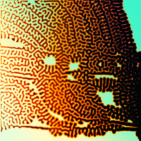
i'll preface with i learned the basic loop from skimming a tutorial on youtube, but as someone who prefers written tutorials i'm sure many would appreciate one! also, the second part of this is some of the visual effects i figured out on my own using blending modes and stuff.
i'm using photoshop CS4 on a mac so some buttons and stuff might be in different places on windows and newer photoshop versions but all the actions are the same. my canvas is 1000x1000 pixels.
UPDATES (i'm hoping these'll show up whenever you open the readmore?)
it's possible to do something similar in krita using this plugin, made by the love @arcaedex
it's also possible to do this in photopea, a free browser alternative to photoshop! the results are pretty much identical.
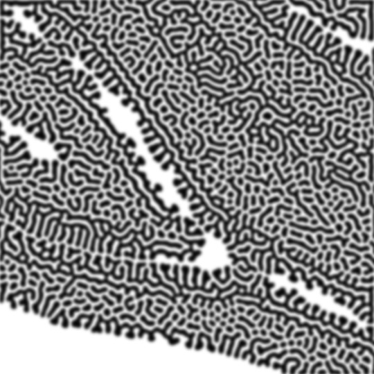
FIRST off you wanna get or make a black and white image of some kind. it has to be one layer. can be noise, a photo, a bunch of lines, whatever. here's mine, just some quick airbrush lines:

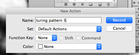
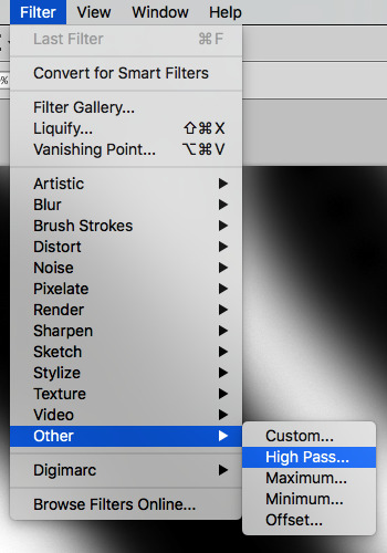
now find the actions tab. idk what it looks like in newer versions of photoshop but you probably won't need to dig!
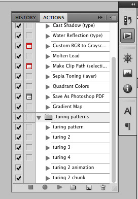
hit the little page thingy to make a new pattern. once you hit 'record', it'll record everything you do. the little square 'stop' icon will end it.
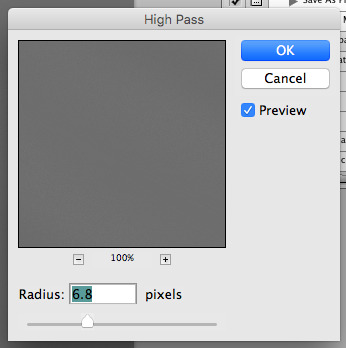
now you want to do a high pass filter. you can mess around with the radius to change the size of your squiggles, but the tutorial had it set to 6. experiment!
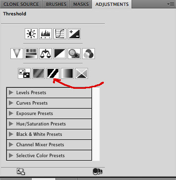
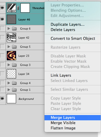
now add the 'threshold' adjustment layer. i use the adjustments tab but i think there's also a dropdown menu somewhere. keep it at the default, 128. merge it down. (control or command + E or you can right click it like some kind of weirdo)
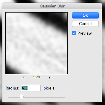
and finally, the gaussian blur! the radius of this affects the shape and size of your squiggles as well. i like to keep it around 4.5 but you can mess around with that too.
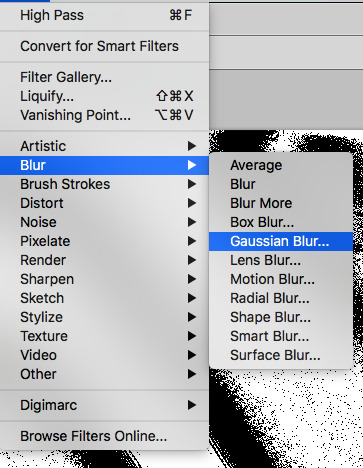
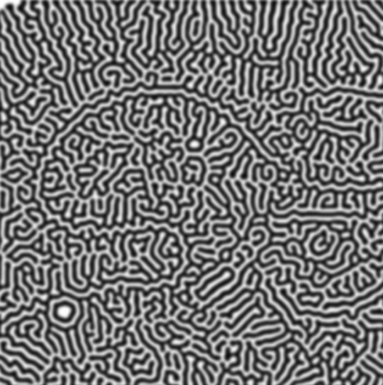
after that, hit 'stop' on the action you're recording, and then repeat it a bunch of times using the 'play' button, until you have something you like, like this:
WOW!! that was fun!! and only a little tedious thanks to the power of macros. anyway, here's some fun layer blending stuff i like to do. it's with a different pattern cause i made this bit first.
anyway, using a black and white gradient (or a grey base that you do black and white airbrush on), make a layer with the vivid light. this will make the blobs look thicker or thinner.


then, for cool colors, do a gradient map adjustment layer over that:

and finally, my best friend, the overlay layer. just using a gradient here bc i'm lazy, but feel free to experiment with brushes, colors, and blending modes!

NOW GO. MAKE COOL SHIT WITH THE POWER OF MATH. AND SEND IT TO ME
also these are not hard and fast rules PLEASE mess around with them to see what kind of weird shit you can make. here's a gif. as you can see i added some random airblush blobs in the middle of it, for fun.
924 notes
·
View notes
Text

Advice on how to achieve aesthetically pleasing gameplay photos!
UPDATED: 4/22/2024
I made this post earlier today and people were interested in the comments! Which made me more excited to make this post~
this is just some advice from me! this isnt a tutorial or anything of that sort, but I will be linking some things that could be helpful for editing gameplay! :D
First things first, I want to say that I use a graphics overhaul, lighting mods check my resources page for what reshade i use if ur interested.
I use these lighting mods & graphics override specifically:
sunblind
graphics overhaul
Lotharihoe's ootd* curseforge download :)
Northern siberia winds in-game better lighting mod (bright base)
these are some other lighting mods you can try out as well!
Luumia's NoBlu & NoGlo
these are some other lighting mods like sunblind
how to install lighting mod
I just wanted to add these things in since we're talking screenshots + I wanted to share for the no reshade ppl <3
Now we can move on to the advice!

I love the simple style of gameplay editing so much, but for me I love creating an ambience with my posts and put the audience inside of my gameplay. I also enjoy storytelling with gameplay more than just the "usual" gameplay post (when it comes to me). I am currently playing the globetrotter challenge with my sim Daichi. I really went all out with the editing for that gameplay. For this one its very much a virtual collage of my sim doing things. Trying new things and getting inspired by others is always fun and cool! Remember when u do take inspo: link to the inspiration and @ the simmer that inspired u!!

In my other save (my cozy save) I also take creative liberties there.


its more of a cozy vibe & silent story-telling (storytelling w/o the dialogue). for my cozy save i take inspiration from @/stellarfalls. er gameplay really helped me find my niche thing in the way i play the game tbh!
Angles/Screenshots
When you're taking your screenshots, angles are important. Depending on the shot, you're putting emphasis on a specific thing. This post is very helpful and talks about different types of angles/shots and what they mean. Check it out especially if you want to play around with the way you take screenshots!
Here’s some editing tips from @stellarfalls !!
simmingstars editing tips
Reshade
If I want to create a moody or dreamy ambience I can use reshade. Looking for a reshade that will fit the overall vibe is a must or you can make your own~
i know not everyone is able to use reshade because they're not on windows. I highly recommend using photoshop actions to create that ambience you're looking for.
*These can be used in photopea, but it cant read topaz clean. If you want to achieve topaz clean in photopea, check this post out! just something i'd like to add in case people are new to all of this + dont use photoshop. Lastly, I want to say if you decide to edit photos on photopea, it does tend to crash if you upload a big number of photos and slows down. I usually upload like 6 or 8 and then save and repeat the process. Its kinda annoying, but ive been using photopea for a while now so im used to it. My mac users, use early-grapes butter action if you want things to look cleaner and less harsh!! + the other ps actions down below. I used these a lot when I was a mac user. Of course, that comes with extra steps, but I feel its worth it in the end.
I like these photoshop action packs bc theres tons of stuff in here that can help create a reshade like look:
intramoon's ps action dump
wooldawn's ps acton dump
smubuh's photoshop actions
early-grape's butter action
hazelminesims's ps actions
Templates!
I loveeeeeee templates so much!! theres so many out there to use for gameplay. It really adds more to gameplay posts! This can be dust/dirt, film burn, that cute camera template etc etc. templates are really fun to use and play around with~
I usually go on deviantart to find templates to use! if you want to check out my deviantart account you can find it here! I favorite a lot of things I can use for gameplay screenies.
Gifs
making gifs is cool because it brings the gameplay "to life" ~
EZgif is a free website that converts videos to gifs. You'll need a recording program like OBS (which is also free).
i like making gifs when i want to capture a (cute) moment (kisses, hugs, cooking etc etc). Its also cool to capture the weather in game like when its snowing or raining.
Little details
Some people really go all out on editing gameplay posts like adding hair strands and adding more details to sims faces (catchlights, tears, blushing, etc). You dont really have to do this, but I want to mention it anyways! I want to try doing this at some point because I enjoy editing my gameplay posts/photos in general and adding tiny details is fun to me lol. It adds realism to posts, but it isnt necessary!
Procreate is a really good program that you can get if you have an ipad. its 10$ and thats, that. You dont have to make any payments. You can also animate on procreate too if you're down for that!
Find inspiration in other simmers!
the sims community on tumblr is filled with such talented people! Theres lots of gameplay simmers who dont do your typical gameplay posts that you can check out and learn from!!! Ive always struggled with getting the right angles when taking screenies. I looked at other simmers and how they take screenshots & it was really helpful for me since I noticed I would take too many over the shoulder photos on my sims lol.
I think thats all the advice I have! I hope this was helpful and if you have any questions please send me an ask or dm! :D
313 notes
·
View notes
Text

Thank you @cobbbvanth for asking me for this; I’ve never been more flattered! ☺️ I’ve only been making gifs for a little more than 2 years, so I’m really still only figuring Photoshop out, and my colouring owes everything to other people’s tutorials (some of which can be found here). To be honest, I was only asked some tips, but I have no clue what to include and what to leave out; so, here’s my complete (if random) colouring process.
NOTE: This is a colouring tutorial, not a gif-making one. The tutorial that taught me everything I know about that (and to which I am eternally grateful) is this one by @hayaosmiyazaki.
I. SHARPENING
My standard sharpening settings are:
One Smart Sharpen filter set to Amount: 500 | Radius: 0,4
A second Smart Sharpen filter set to Amount: 10 | Radius: 10
One Gaussian Blur filter set to Radius: 1,0 and Opacity: 30%
One Add Noise filter set to Amount 0,5 | Distribution: Gaussian
II. BASIC COLOURING
This is the part where I add most of the adjustment layers available and just play around with them. Obviously different settings work for different scenes, but I do have some standard ones.
Brightness/Contrast
I usually up the Brightness to +10-30, and the Contrast to about +10.
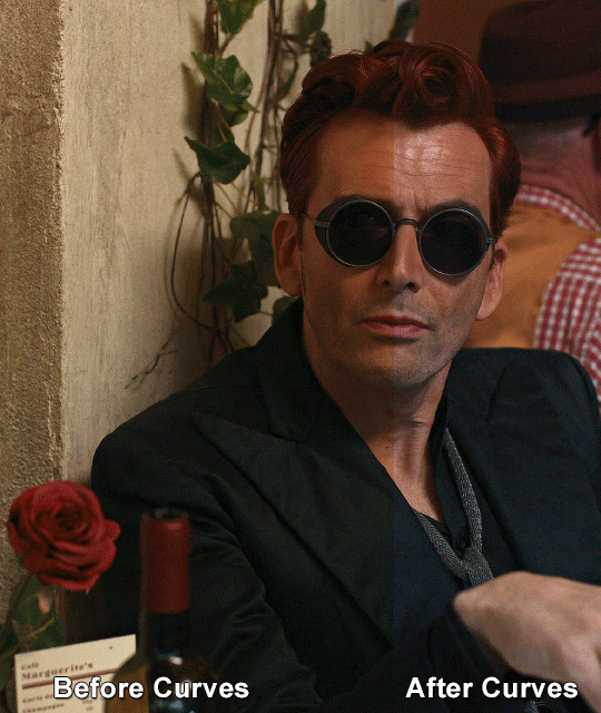
Curves
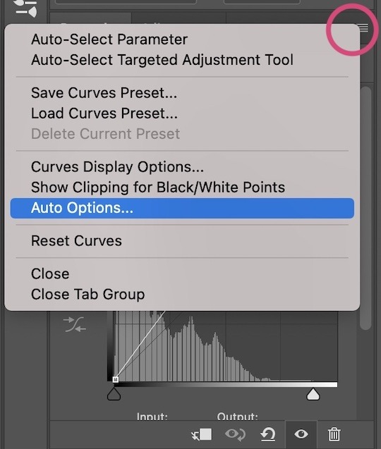
For the first Curves layer I go to Auto Options > Enhance Brightness and Contrast, and then adjust the opacity until I’m happy.
I might repeat the above step if the gif still looks too dark to me.
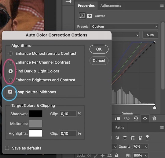
I add another Curves layer, I go to Auto Options and this time I pick either Find Dark & Light Colors or Enhance Per Channel Contrast, and check or uncheck the Snap Neutral Midtones option, until I see something I like. I will then adjust the opacity.
Levels
I add a Levels layer that usually looks something like this:
Exposure
I add an Exposure layer, where I usually set the Offset to around -0,0010.
Selective Color
To make the faces look okay, I create a Selective Color layer, select the Reds and usually add some Cyan (+10-20%) and play around a little (±5%) with Magenta and Yellow too. I might also add another layer, select the Yellows and make slight tweaks there too.
III. FUN COLOURING
About colour manipulation: PiXimperfect just uploaded a tutorial that explains everything so much better than I ever could, so I highly recommend you go watch it. It’s made for static images though, and things are more complicated with moving images, so I also recommend @elizascarlets’s tutorial.
The reason I usually go for a softer colouring is that a more vivid one requires a lot of patience and precision, and I honestly can’t be bothered. Instead, I try to tweak the colous only a little, so that the edges can be a little rough without it looking too wrong.
One thing to remember is that each gif is different, and there isn’t one foolproof way to do this, so you will need to use a different technique depending on the gif you’re working with.
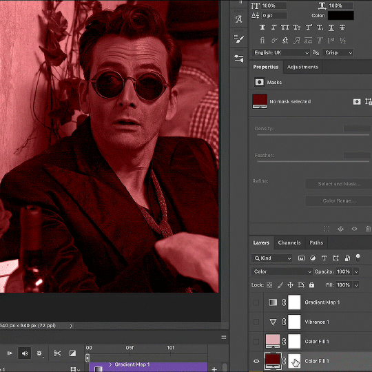
Okay, so, after I’ve decided what colour I want my background to be:
1. I create a Hue/Saturation layer and change the greens, cyans, blues and magentas to that colour. That’s easy enough, since it doesn’t mess with the face colour. I then set the blending mode to Color. If your background doesn’t include any yellow or red, you might be done here, like in the case bellow:
2. To change the yellows and reds, I create a new Hue/Saturation layer, select the yellows/reds, move Saturation to 100 (temporarily) and then play around with the sliders until the face colour isn’t affected. I then change it to whatever I’ve chosen and change the blending mode to Color.
3. If for whatever reason step 3 doesn’t work (the background is white or black for example, or just too red), I might create a Solid Color layer set to whatever colour I want, set the blending mode to Color and then select the layer mask and carefully paint with a soft, black brush over the people’s faces/bodies. I will then lower the Opacity, to whatever looks smooth enough. If there’s a lot of movement in your gif, you might have to use keyframes (see elizascarlets’s tutorial linked above). However, my main goal is to avoid using those; that’s why I try my hardest to tweak around as many Hue/Saturation layers as needed and not have to create a solid color layer.
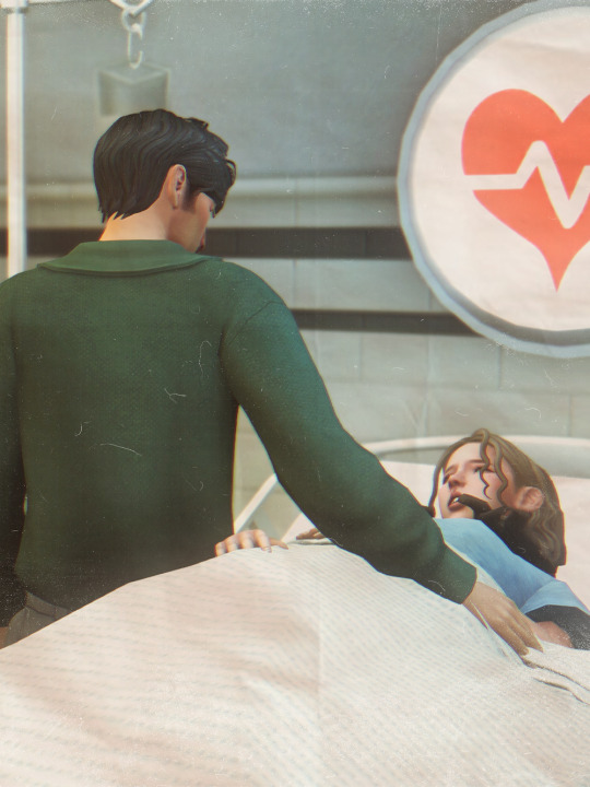
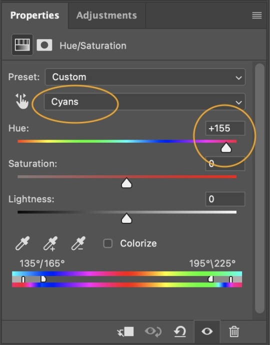
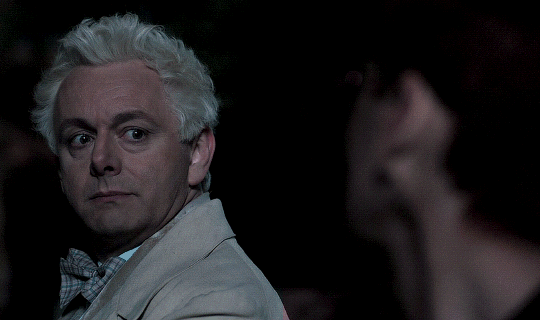
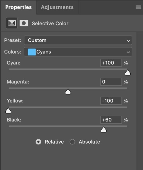
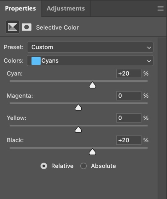
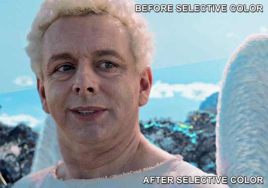
4. Once my background looks the colour I want it, I might add a Selective Color layer that matches my background color and then try to make it look more vibrant. For this Aziraphale gif below for example, I’ve selected the Cyans and then set Cyan to +100%, Yellow to -100% and Black to +60, then created another one, selected the Cyans again and then set Cyan to +20 and Black to +20.
5. If the gif has a white area, I create a Solid Color layer with a colour that matches the rest of the background and then set the Opacity low. I might also create a Selective Color layer, increase the Black and then play around with the colours.
IV. FINISHING TOUCHES
I create a Vibrance layer and set the Vibrance to around +30 and the Saturation to about +5.
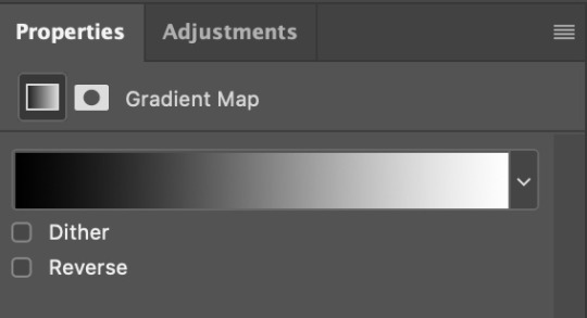
I create a black and white Gradient Map layer (with black on the left end of the spectrum and white on the right), set the blending to Luminosity and the Opacity to about 20-30%.
AAAND that’s about it I think! This ended up way too long and perhaps a little incoherent. I tried to make it as general as possible, so you might have to mix and match for best results. Feel free to ask me for further explanations about any one of these steps, and please tell me if you want me to go through the colouring of a specific gifset (although, as I said, I'm by no means an expert). Happy gifmaking!
#gif tutorial#allresources#completeresources#dailyresources#photoshop tutorial#chaoticresources#uservivaldi#userdanahscott#usersanshou#userfanni#userbuckleys#userrobin#tuserjen#userdavid#userzaynab#tusermimi#thingschanged#tuserju#usertj#userhallie#tutorial#minee
271 notes
·
View notes
Text
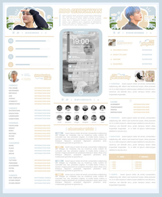
* ( ❀ ˆ꒳ˆ˵ ) ♡ Ꮺ 𝗧𝗜𝗡𝗬𝗧𝗢𝗪𝗡𝗦 — 𝟩𝖯𝖬 ੭

— introducing 7pm , the latest original google doc from tinytowns ! this document is designed to display the basics of a single - muse in one page &. captures a fun & youthful vibe with the inclusion of simplistic yet busy design , bright colours &. doodles ! features statistics , a playlist , basic info section along with character trivia & personality info ❀ the contacts section can be used as an exclusives section if desired ! space is left at the end of the doc so you can adjust easily & not have any of those annoying blank pages but it would be wise to take note of image positions as they are prone to moving. this doc can be considered moderate to difficult to edit due to the amount of edits that you will need to make in photoshop or photopea - but if you don't mind that then the document should be relatively simple to edit ❀ you can find the document link in the source code or under the cut , along with a known position issue + how to fix it , psd temps provided for this document , a video tutorial for adding your gif into a circle &. icon credits ! ( ˘͈ ᵕ ˘͈ ♡) ~
❀ PSD DOWNLOADS ( REQUIRED ! )
GIF CIRCLE - HERE
PHONE TEMPLATE - HERE
TOP IMAGES - HERE
♡ note : you will need to download the title cards to change the color , but if you don't mind the color then you don't need to - also , for full transparency on my end , i did need to touch up a few of the pngs after saving because the top text overlapped with the bottom text. be aware of that ! fonts used are poppins &. sant joan despi !
NAME TITLE - HERE
TRIVIA TITLE - HERE
INTRO TITLE - HERE
PLAYLIST TITLE - HERE
PERSONALITY TITLE - HERE
♡ note : you must change the color via layer style -> stroke for the title cards &. then save as png after deleting the background layer .
❀ KNOWN ISSUES
01. as a gdocs creator i use an external add-on called page resizer which is helpful for customizing the sizing of my canvas , as docs limits us with pre - set sizes. while this is nice to use , i'm aware that it can specifically cause an issue when you change the color of your background page. to fix this you must actually download the page resizer add-on through extensions -> add-ons -> get add-ons &. you should search for page sizer & download the one by nat burns. then you can access the sizer through extensions -> page sizer -> set page size &. what should be set for this document is a width of 9 &. a height of 12 !
this should fix the document , but i also know that sometimes , for what ever reason , the height &. width will flip. if that happens just make the height &. width opposite; so instead of a width of 9 , put 12 & for height , put 9 instead of 12.
02. i cropped the title cards in the document so that you wouldn't be trying to click something &. accidentally click on the titles ! however this means that when you replace image on the title cards they might go off center &. crop halfway through the word. just double click the title card that's bugging out & drag it to about the center of the black box. then it's fixed !
❀ DOCUMENT DOWNLOAD
7PM - HERE !
do not remove the credit , redistribute or profit off of my work.
❀ TUTORIAL
#01. go to file -> make a copy , in order to edit .
#02. to change the top two images double click on them &. a window should appear - in there you're going to click on it once &. hit replace image. the psd for this has been provided so it should be sized correctly !
#03. to change the title cards ( ex. boo seungkwan , my playlist , introducing me etc. ) you just need to click on them once &. hit replace image - please refer to #2 in the known issues section above this if you're going to do this though !! many thanks.
#04. to change the phone you're going to download the psd provided above &. when you've finished editing it you will click on the phone in the doc one time &. hit replace image !
#05. to change the thin color lines around seungkwan's name card you will press them once &. click edit - from there a window should open up &. you will click on it again & find the bucket tool which has a small yellow ( or blue if you clicked the long one ) line under it. that is where you change the color !
#06. the statistics represent intelligence , empathy , friendliness &. fighting skill ; to adjust the levels or colour you're going to double click &. a window will appear. from there you can either change colors with the bucket &. pencil tool ( pencil = outline color ) or you can shift the bars by clicking on the coloured parts of them and literally just dragging them.
#07. to change the playlist cover &. title you'll double click &. adjust inside the window by replacing image &. renaming things. the actual songs on the playlist can be typed normally !
#08. to change the gif circle , personality , &. contact images you again just double click &. replace image inside those windows. for the gif circle you must use the psd.
#09. to change the little bulletpoints beside the gif circle you will double click &. edit the text inside the window.
❀ VIDEO TUTORIAL 4 GIF CIRCLE
watch the tutorial right HERE !
make sure your timeline is checked ( the first thing i showed )
ignore the mistake i made while trying to show you where to end your gif LMFAOOO . . . im clumsy <3
to highlight all of your layers / frames click on the first one , then press shift + click on the last layer.
to bring up the list of options ( when i click convert into smart object ) you just right click.
❀ CREDITS
brain icon - Brain icons created by Vitaly Gorbachev - Flaticon
heart icon - Heart icons created by Chanut - Flaticon
support icon - Sport team icons created by Freepik - Flaticon
boxing icon - Boxing icons created by Freepik - Flaticon
plant png - josh ca.la.brese on unsplash
battery icon - Battery icons created by Stockio - Flaticon
wifi icon - Wifi icons created by Uniconlabs - Flaticon
signal icon - Signal icons created by Freepik - Flaticon
speech icon - Comment icons created by Freepik - Flaticon
close icon - Close icons created by ariefstudio - Flaticon
instagram icon - Instagram icons created by Prosymbols Premium - Flaticon
camera icon - Photo camera icons created by Kiranshastry - Flaticon
torch icon - Ui icons created by yaicon - Flaticon
#google docs#template#supportcontentcreators#gdocs#rph#google docs template#oc template#rpc#free rph#free rpc#docs#roleplay template#oc sheet#rp template#free#muse template#tinytowns#m: gdocs#m: original
1K notes
·
View notes
Text
Gonna rant a bit. I saw one set of beautiful anthro arts on another website. Sadly they were done in AI. I did left a comment, complimenting how beautiful these arts were but how sad it made me that they were AI arts.
The artist themselves was kind and polite, telling they use AI because they want to learn and be able to make game arts one day (but they too, apparently, with AI so...)
But then there was another user, AI "artist" too who replied to me that there's absolutely NO ARTIST who can draw anthros with detailed fur, goat like arm, lights, colors etc without editing or photoshopping. On the whole planet, absolutely none! This person clearly don't believe in people's skills when it comes on arts. Heck, I followed one artist on DA who drew ALL her arts traditionally and she drew, and still does, SUPER DETAILED FURRY ANTHROS! No photoshop, editing, nothing digital. Just her hands, paper and a set of color pencils.
Also, if people's art skills wouldn't had been amazing back in the days through mankind, we wouldn't have cave paintings, old amazing paintings or sculptures, ALL DONE BY HANDS IN TRADITIONAL WAY. NO AI, NO PHOTOSHOP OR EDITING.
Humans can learn amazing skills if they only want to. AI artists, maybe not all, just wants to take the easiest way / be lazy (and get lots of likes - like that other person who straight forward said it. That he uses AI to create furry arts to get hundreds of likes).
They also mocked my style / arts, saying they are not good enough to be used in AI arts - yet.
Like what the actual fuck?! I am pissed! I don't even want my arts to be used in AI arts by some lazy idiot (or at all). At least I draw EVERYTHING in my arts, from first sketch line to the last shade / light. Surely my skills are not as good as they could be. After all I'm self-taught, not gone in art school like some have. Not to mention I draw for fun, I draw to bring joy to my watchers, I draw therapy arts to myself, I like to keep my style easy and simple. My arts are a hobby, not professional thing or to fish a lot of likes. If my arts can make someone's day a bit better, then I've done my job! I never haven't taken my arts or skills too seriously, trying to improve them to the top.
Is there times when I wish I would put more effort to my arts, learn and study more, becoming better? Absolutely! But do I bother? Not really. Like I said, this is a hobby. I know I would burnout myself if I would start to force and pressure myself to do better, to learn more, to improve my skills. I mean I struggle to draw even now!
I do have some saved tutorials on Pinterest what I would like to try, yes, but still not in a way like if I would have a fire under my ass.
#Text#rant#AI#AI art#I'm honestly so fucking pissed right now#Been feeling pissed overall the last few days#And now this to fuel that anger#I need to calm down and do something#Because I don't want to bake my birthday cake for tomorrow while feeling like smashing someone's skull with a hammer#Sorry for the rant guys but I honestly need to let out some steam#Not to mention you guys are my friends#Only ones who I can talk to#Delete later
568 notes
·
View notes
Last Seen Blogs
mrbootycatcha
MrBootyCatcha
egoistars
lyn
bimbododie
💞💞dodieee💞💞
starmyu-coffesions
Starmyu Confessions