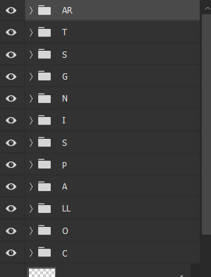
#i don't save PSDs because of space
Text
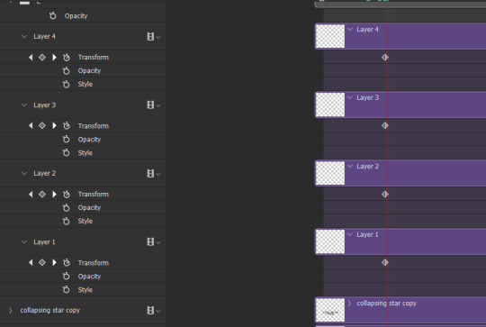
Before/After Gif Coloring Challenge.
Thank you for tagging me @safedistancefrombeingsmart and @a-victorian-girl (SB)! 🤗
I´m doing a post apart bc i was extending myself too much and kinda felt like i was hijacking the other thread 😳, so...
These are some colorings i did to the Doctor Strange movie for the ongoing Giftober event. ☺️


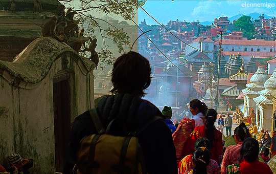
1. having fun with the colors, to highlight the greens.
2. turning the lights on in Wong's library 😬
3. taking out the criminal yellow filter 🤦♀️.
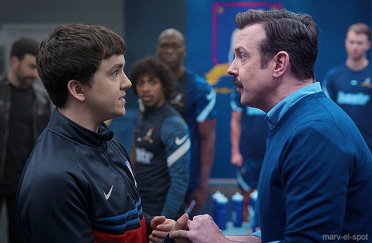
And a couple from my side blog (@marv-el-spot) 😃

Now, since I think this is also a way to show appreciation to gifmakers and the work we do, I'll tag some creators who are currently participating in @giftober 2023. (no pressure to do it tho)
Fortunately there are lots of ppl participating so i can't tag everyone but here are just a few ☺️
@scottxlogan @lastencoregraphics @ijustthinkevilunoisneat @hidengifs @t-u-i-t-c @sylkithecat @trapezequeen @walnutmistjamie @walterkov @spookylum @swanthief @gifsfrommydvds @marvels-universe
Everyone not tagged can do it too, of course!
:))
#gif coloring challenge#gif challenge#gifmakers#gifmakers on Tumblr#i usually do a different coloring for each set#i don't save PSDs because of space#but luckily i still had these ones in my folders#tag games
31 notes
·
View notes
Text
question for digital artists because i started wondering about this while moving my 40,000 art files between hard drives.
i really want to know because for 99% of my art, I keep the csp file of the finished drawing, plus a PNG version of the art. and I'm realizing how much space that takes up because I have doubles of Literally Everything in every folder. so now I'm wondering if people do it differently or the same way.
(it might obviously be drastically different based on different art programs and ways to do art. The layer thing for one isn't relevant at all for a program with no layers.)
435 notes
·
View notes
Text
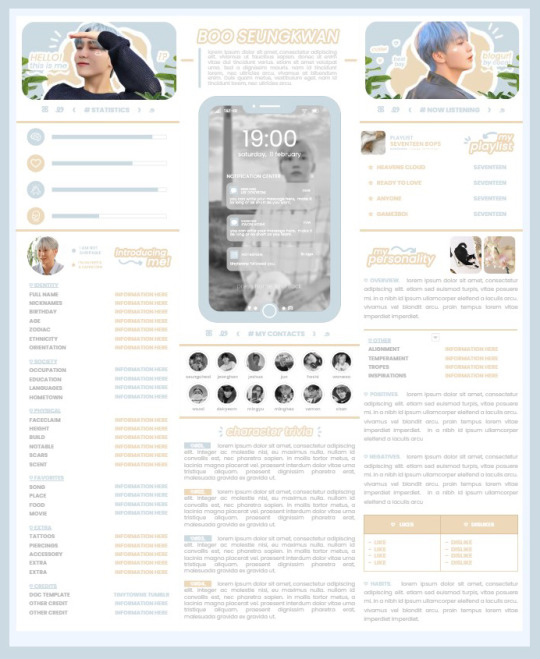
* ( ❀ ˆ꒳ˆ˵ ) ♡ Ꮺ 𝗧𝗜𝗡𝗬𝗧𝗢𝗪𝗡𝗦 — 𝟩𝖯𝖬 ੭

— introducing 7pm , the latest original google doc from tinytowns ! this document is designed to display the basics of a single - muse in one page &. captures a fun & youthful vibe with the inclusion of simplistic yet busy design , bright colours &. doodles ! features statistics , a playlist , basic info section along with character trivia & personality info ❀ the contacts section can be used as an exclusives section if desired ! space is left at the end of the doc so you can adjust easily & not have any of those annoying blank pages but it would be wise to take note of image positions as they are prone to moving. this doc can be considered moderate to difficult to edit due to the amount of edits that you will need to make in photoshop or photopea - but if you don't mind that then the document should be relatively simple to edit ❀ you can find the document link in the source code or under the cut , along with a known position issue + how to fix it , psd temps provided for this document , a video tutorial for adding your gif into a circle &. icon credits ! ( ˘͈ ᵕ ˘͈ ♡) ~
❀ PSD DOWNLOADS ( REQUIRED ! )
GIF CIRCLE - HERE
PHONE TEMPLATE - HERE
TOP IMAGES - HERE
♡ note : you will need to download the title cards to change the color , but if you don't mind the color then you don't need to - also , for full transparency on my end , i did need to touch up a few of the pngs after saving because the top text overlapped with the bottom text. be aware of that ! fonts used are poppins &. sant joan despi !
NAME TITLE - HERE
TRIVIA TITLE - HERE
INTRO TITLE - HERE
PLAYLIST TITLE - HERE
PERSONALITY TITLE - HERE
♡ note : you must change the color via layer style -> stroke for the title cards &. then save as png after deleting the background layer .
❀ KNOWN ISSUES
01. as a gdocs creator i use an external add-on called page resizer which is helpful for customizing the sizing of my canvas , as docs limits us with pre - set sizes. while this is nice to use , i'm aware that it can specifically cause an issue when you change the color of your background page. to fix this you must actually download the page resizer add-on through extensions -> add-ons -> get add-ons &. you should search for page sizer & download the one by nat burns. then you can access the sizer through extensions -> page sizer -> set page size &. what should be set for this document is a width of 9 &. a height of 12 !
this should fix the document , but i also know that sometimes , for what ever reason , the height &. width will flip. if that happens just make the height &. width opposite; so instead of a width of 9 , put 12 & for height , put 9 instead of 12.
02. i cropped the title cards in the document so that you wouldn't be trying to click something &. accidentally click on the titles ! however this means that when you replace image on the title cards they might go off center &. crop halfway through the word. just double click the title card that's bugging out & drag it to about the center of the black box. then it's fixed !
❀ DOCUMENT DOWNLOAD
7PM - HERE !
do not remove the credit , redistribute or profit off of my work.
❀ TUTORIAL
#01. go to file -> make a copy , in order to edit .
#02. to change the top two images double click on them &. a window should appear - in there you're going to click on it once &. hit replace image. the psd for this has been provided so it should be sized correctly !
#03. to change the title cards ( ex. boo seungkwan , my playlist , introducing me etc. ) you just need to click on them once &. hit replace image - please refer to #2 in the known issues section above this if you're going to do this though !! many thanks.
#04. to change the phone you're going to download the psd provided above &. when you've finished editing it you will click on the phone in the doc one time &. hit replace image !
#05. to change the thin color lines around seungkwan's name card you will press them once &. click edit - from there a window should open up &. you will click on it again & find the bucket tool which has a small yellow ( or blue if you clicked the long one ) line under it. that is where you change the color !
#06. the statistics represent intelligence , empathy , friendliness &. fighting skill ; to adjust the levels or colour you're going to double click &. a window will appear. from there you can either change colors with the bucket &. pencil tool ( pencil = outline color ) or you can shift the bars by clicking on the coloured parts of them and literally just dragging them.
#07. to change the playlist cover &. title you'll double click &. adjust inside the window by replacing image &. renaming things. the actual songs on the playlist can be typed normally !
#08. to change the gif circle , personality , &. contact images you again just double click &. replace image inside those windows. for the gif circle you must use the psd.
#09. to change the little bulletpoints beside the gif circle you will double click &. edit the text inside the window.
❀ VIDEO TUTORIAL 4 GIF CIRCLE
watch the tutorial right HERE !
make sure your timeline is checked ( the first thing i showed )
ignore the mistake i made while trying to show you where to end your gif LMFAOOO . . . im clumsy <3
to highlight all of your layers / frames click on the first one , then press shift + click on the last layer.
to bring up the list of options ( when i click convert into smart object ) you just right click.
❀ CREDITS
brain icon - Brain icons created by Vitaly Gorbachev - Flaticon
heart icon - Heart icons created by Chanut - Flaticon
support icon - Sport team icons created by Freepik - Flaticon
boxing icon - Boxing icons created by Freepik - Flaticon
plant png - josh ca.la.brese on unsplash
battery icon - Battery icons created by Stockio - Flaticon
wifi icon - Wifi icons created by Uniconlabs - Flaticon
signal icon - Signal icons created by Freepik - Flaticon
speech icon - Comment icons created by Freepik - Flaticon
close icon - Close icons created by ariefstudio - Flaticon
instagram icon - Instagram icons created by Prosymbols Premium - Flaticon
camera icon - Photo camera icons created by Kiranshastry - Flaticon
torch icon - Ui icons created by yaicon - Flaticon
#google docs#template#supportcontentcreators#gdocs#rph#google docs template#oc template#rpc#free rph#free rpc#docs#roleplay template#oc sheet#rp template#free#muse template#tinytowns#m: gdocs#m: original
1K notes
·
View notes
Text
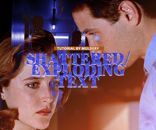
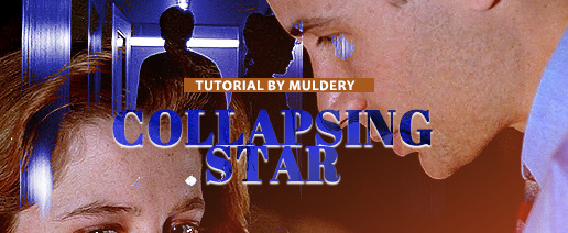
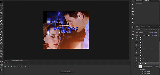
SHATTERED/EXPLODING TEXT tutorial
hiyaa! @krystaljungs asked me for a tutorial on how i made the shattering/exploding animation of the text in this gifset and so i figured i would make it and post it here, like i did with the tutorial for "falling" text.
i must warn you, this one is really tedious and requires a lot of time and patience. honestly maybe there is an easier way to do this but i didn't find any tutorials for when i needed it so i just went off my ps knowledge and did it myself.
note: you will need photoshop with a timeline!
STEP ONE: create your base gif! be mindful of number of frames in your gif. the number of frames doesn’t really matter here, but if your gif is bigger than 10mb and you have to go back to adjust it all again after you have to delete some layers....you might lose the will to live 😂
STEP TWO: make your text the way you want it to look. this effect is basically the last step of your gif making process. (i will be using the typography from my set as an example as i already have that psd saved)
this is what my typography looks like now.
STEP THREE: now, you will create a new file (with background) and transfer the text you want to "shatter" in it.

here is when things get tedious.......
tip: zoom in the document, it will be easier for you.
select polygonal lasso tool aka this
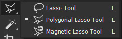
STEP FOUR: before you start, you need to rasterize type layer. then you will have to "shatter" every letter into smaller pieces. using polygonal lasso tool, select a smaller part of your first letter.

then you will click on that part with the right click of the mouse and selct layer via cut.
now you need to make sure that your new layer is selected and using the move tool move that part of the letter somewhere away.

you will have to do this for every part of the letter and every letter. also move every new layer on top of other layers because they will line up better later like that. then create a new folder with every layer of said layers and rename it after the letter you're shattering. see below. (idk why my screenrecord didn't catch me making layers via cut but you should do that after the use of polygonal lasso tool, as stated above)
note: feel free to şelect parts of other letters as you get one letter, for an even better effect.
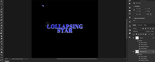
this is what i have after "shattering" every letter. the lineup doesn't have to be perfect as you will arrange these parts in your main document. (click on images for full view)

STEP FIVE: go back to your main document and make sure the visibility of your text is turned on.

what you will do now is open the shattered text in the new window and transfer letter by letter (letter folders) to your main document. BUT after you transfer every folder, you need to rasterize EVERY layer and convert it to a smart object. i made an action for this part to make it easier. download here.

(okay i really don't know why my screenrecord doesn't show "pop-up" windows but i was moving the C folder from the document where i shattered the text and then used my action on every layer)
after you transfer the folder to your main document and rasterize and convert to smart object, select the folder and use Free Transform to move it so it aligns with the letter from your complete typography. then you will select each layer and align it with the typography. see below. (click on the gif, i made it bigger so you can see better)

i did this one hastily so the recording wouldn't be too long but i'm hoping you can see what i'm doing.
now, do this for every letter.
after that is done, make the original typography layer invisible, and you should have something like this

STEP SIX: another really tedious part BUT it's time to animate the text.
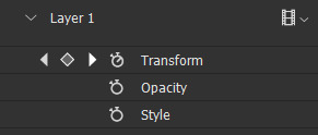
make your timeline space bigger so it's easier for you to work with it. then select the first layer and click on the arrow next to it (in timeline) so Transform is revealed to you.
now, you don't want the animation to start from the very beginning of the gif, but a bit later so the text is readable before it shatters.
for example, i did mine like this, but that is your personal preference.
note: make sure that all animations start at the same time.
tip: do this for all layers in one folder before you transform them, as it will go faster.
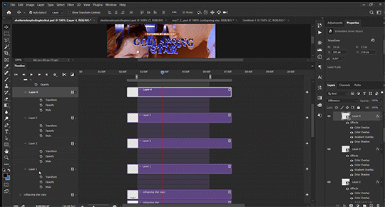
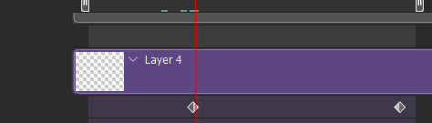
STEP SEVEN: bring the playhead (blue arrow with the red line) to the end of your gif and select one layer in timeline.
now it's time to transform it. use Free Transform (windows shortcut ctrl+T) and drag the part a bit away and rotate it. press enter.

okay ignore the way my text moved upwards, i used the text i used in my edit and i did that animation in the upper part of the gif and i was too lazy to redo the whole animation lmaoo but i hope you can see what i'm doing with the letter C.
do this for every letter. play around with placing and rotation. then save your gif. when you're done, you should have something like this.

again, i was too lazy to redo the whole thing on this new gif so i'm using the one from my gifset i linked in the beginning.
i hope this was understandable and helpful. if you have ANY questions, don't hesitate to shoot me an ask or dm me! i'm always here to help <33
#usergif#completeresources#allresources#gif tutorial#ps help#userkimchi#uservivaldi#userraffa#tusermona#userelio#usercats#tuserheidi#usershreyu#userhallie#userroza#userdean#userisaiah#thingschanged#tusercasey#usertj#userwwz
259 notes
·
View notes
Text
making gifs - where to start
first up - source material and software downloads:
I recently got new versions of the twilight saga movies from Pahe, I went for the Bluray 2160p or 1080p whenever I could.
Use KMPlayer 64x to play and cap the movies.
You can get software like Photoshop from the various guides and websites suggested in this beautiful subreddit. This website is probably most user friendly.
1. how to make gifs?
This video tutorial is your most basic, bare-bone starting point. Grab a video you like, download KM player and get started.
2. adding a coloring
A coloring is what you add to your gifs to either color-correct them and make them look normal (looking at you - twilight blue tint) or to change the color palette for personal taste/visual effects.
Colorings usually come in the form of PSDs, as a pack of adjustment layers that has been saved in .psd format and uploaded for other people to download and use. Seldom, they come in the form of ACTIONs, as pre-recorded steps which will replicate on your project once you open the action in your Photoshop and activate it by hitting the "play" button.
Basic gif and coloring skills are all you need for your first gifs.
3. sharpening
Once you know your way around photoshop you can try your hand at sharpening. This is a tutorial on how to sharpen all layers at once "by hand". And some more advanced sharpening methods.
Nowadays, most people just record their usual sharpening steps and save them as actions. Or they use other people's actions. Here is a tutorial on how to use a sharpening action you've downloaded.
Here are a few more sharpening action sets you can use: x - x
4. adding text to gifs
This is my giffing arch nemesis so I'll just drop this tutorial here with zero explanation, y'all enjoy.
5. having fun with colors
This isn't something I do often so again, I'm just dropping this tutorial here with no explanation. But tldr gradient fill in combination with the right layer blending mode is your best friend whenever you want to add gradients, colors, colorful text, color changing text, aka all the fun stuff.
6. having fun with shapes
Now this is my bestie because where I struggle with colors and text I find messing with shapes comparatively easy. You can come across "gif templates" on tumblr fairly easily or make up your own shapes if you feel like it. Just make sure to keep it at a width of 540px total (each space between each gif should be 4px) and a height of I believe 750px total (but don't quote me on that last number).
This is a basic tutorial on how to plop two gifs into one canvas. The most important thing here is that you make sure that the number of frames or the lenght of the smart object is the same. Other than that you can go wild with this.
7. gif saving settings
@anue here on tumblr had THE BEST explanation for the different gif saving settings but went private and I'll legit never stop mourning that 💔
here are some other tutorials that attempt to explain the saving settings: one - two - three - four
most people roll with these settings but you're always welcome to adjust them for different gif sets and source videos. not every source video will like the same save settings (anime vs. disney vs. marvel action movie vs. snail documentary).
#tumblr#gif#gifs#gif tutorial#gif tutorials#*#I hope whoever comes across this finds it useful#tutorial
34 notes
·
View notes
Note
Hi there! I saw the screen recording you did for the Aemond gifset (superb work, by the way) and I was wondering if you would be open into doing a step-by-step tutorial on how you played with the colors (what was the graph on the right side of the window?) and how you manipulated the color palette when saving the gifs? No pressure! Was just curious :) Thank you!
Hi there, nonny! Step by step below the cut here.
I don't keep the psd files of my gifs, mostly because I don't have the storage space to do that, so I've made a different gifset of the same scene, so it should be much the same, if not better.
I believe this:

is the graph you were asking about? This is the histogram. I don't believe it has any practical usage in gifmaking. If any other gifmaker here has a different opinion, please share it. (I'm doing a photography degree, photoshop is my next unit so I'll know more about it soon)
Right, step by step. Hold your horses, this is long:
Step 1: get the clip. Some gifmakers use screen caps to make gifs. I do not know how to make them or how to use them and I find my own method works. If another gifmaker could add on how you make your screen caps, and if it is better than my own method, please add it. 😊
Where you get the clip from is a question. YouTube, somewhere else... as long as it's saved as a MP4 file on you computer/laptop, it doesn't matter. What does matter is the quality of your clips. A lot of people use 4K (super high quality) clips. I find those to be slow and arduous and may have been responsible for the fall of my old, decrepit laptop. HD or UHD are likely enough for some decent quality.
Step 2: Get the clip in the software (I use Adobe Photoshop. For some softwares, you might have to clip the clip i.e. make it shorter before just dumping it in) In Photoshop go to File > Import > Video Frames to Layers and a window will come up. Move the sliders until you have approximately what you want (don't worry about being exact. Just as long as you have what you need.) (Don't forget to click Limit to every 2 frames)
Step 3: Once the clip has opened and your ready to start, crop out any black/white edges. Then cut out the frames you don't want

Step 4: We are now ready to begin editing!! 🥳🥳🥳 Editing tends to just be a huge pile of trial and error. I have an order to things, but I often have to go back and adjust my first layers later.
I like to start with the Brightness/Contrast, for obvious reasons (I like to SEE what I'm doing *cough cough* HBO *cough cough*
The I adjust the Hue/Saturation, where I reduce the saturation of each individual colour. That reduction tends to be useful when I make further adjustments in effort to 'fix' as much of the shit colour grading as I can.
The next step is a combination of a Photo Filter (set to the default warming filter) and a Vibrance adjustment layer.
Next the where most of the magic happens. The Colour Balance allows me to adjust the colours in the shadows, midtones and highlights. The aim of this is to attempt to restore some colour. It can look a little weird when editing.
Finally is the Levels. This is a final brightness edit where I add most of my contrast.
Video featuring both sets here. Pause as needed to see the adjustments
Then, change the frame delay to 0.1, or whatever suits your fancy, but 0.1 is the most natural. Then, Click the button in the bottom left corner of the timeline which Converts to Video Timeline, then select all the layers, right click and Convert for Smart Filters.
After this is sharpening, cropping and then exporting. Either File > Export > Save for Web (Legacy) or Alt + Shift + Ctrl + S
Here I change the size. (Usually adjust the height to 540px. Width depends on how I've cropped it. I my source clip excluding black edges was in the ratio 16:9, 540px is usually half that)
If you are uploading gifs to Tumblr, keep an eye of the file size. Tumblr doesn't allow for file sizes about 10MB, although for me it's always been more like 9.5MB. If that number is too high and you have made the gif as short as possible (no more the 50 frames if possible) and you have reduced the size (my limit tends to be about 480px height dependant on my crop ratio), then you change the number of the colours from 256 to NO LESS THAN 200. (lower than this may considerably reduce your quality)
Then you press Undo or Ctrl + Z a few times until you have all of your frames again and then repeat.
And all that can take half an hour or more. Hope this answers the question as well.
14 notes
·
View notes
Note
hii would you be kind enough to share how you edit your gameplay posts? :) also stupid question… what did you mean by keyboard shortcuts? is it like Ctrl C & Ctrl V thing??? or am I just dumb
ok so long post but here is how i edit! With visuals, some of my settings, and other tips
This may seem like a really long process at first glance but the shortcuts really cut down half the time.
I edit in rows of my screenshots, typically grouping them by post or multiple small posts.
The first thing I do is crop. My crop ratios for my posts are 7:5 for landscape and 4:4.5 for portraits.
The next thing I do is run topaz clean. I could set up a keyboard shortcut for topaz clean but I'd have to pick my preset anyways. Now for the rest of the photos I have open, I can use my most recent filter with Ctrl+Alt+F, instead of opening topaz clean and the preset every time. It will automatically use the last topaz clean preset instead.
Here are my topaz clean settings. Shout-out to the other simblrs' topaz clean settings I stared at to understand and find a starting point of what I should use for sims screenshots (mostly @sojutrait <3)
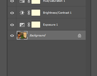
Next is my adjustment layers. I typically use brightness, exposure, and saturation. There isn't a set formula for it but here's my general method. I don't use shortcuts for adjustment layers because I'll being selecting my settings in the same space anyways.
if the screenshot isn't that bright from the get-go I'll use brightness first. If it is well lit, I will only use exposure.
I use exposure rather than brightness to brighten images and to improve highlights, add a glow-y effect, add vibrancy, and also add a little saturation.
It's pretty easy for me to tell what is too much but I suggest picking how much you want and doing a little less. The amount varies a lot per image (+0.11-0.67)
I only use a little saturation (+1-8) since I already get a lot from my gshade. Or I just don't use it
If a screenshot starts off too saturated I'll adjust the curve or lower the contrast a tiny bit instead of lowering saturation.
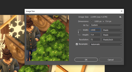
Then I resize the image to 1000px using the shortcut Ctrl+Alt+I. I don't resize the portrait crops because they are already at about 900px from the crop anyways. The purpose of resizing is so tumblr does not slightly blur the preview images as it does with pictures of a large size. You don't need to click on the field for width it will automatically select it. Just enter your amount and press enter.
If I am adding in a speech bubble, psd, notif, etc. I will do it AFTER I resize. Placing it on the smaller image will keep it sharper. I like to put my psds and such underneath my adjustment layers but if they are too overexposed I'll put them at the top and make a clipping layer (left click on the layer for the drop-down) for the overlay to match the brightness of the image.
Next part is important for my process. Before I move on to the next image in the row I will make sure I select the background layer (it makes sense later)
I don't save the image at this point!
I repeat the process for the rest of the images that I've opened and then I go back to the first image.

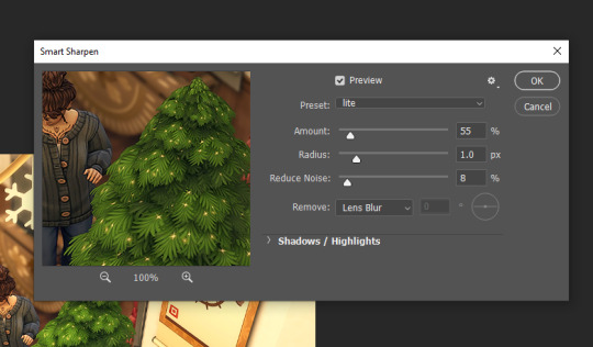
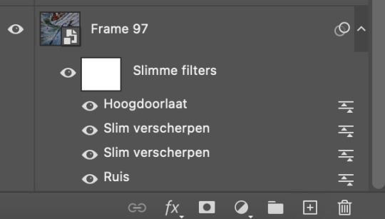
This time I use the smart sharpen filter. Here's my presets settings. I won't use smart sharpen on zoomed out exterior shots sometimes because it makes it a little crunchy. I made sure I selected the background layer before so the smart sharpen goes on the actual image and not any of the adjustment/overlay layers.
Then I save as with Ctrl+Alt+S. I'll talk about saving more further down and why I don't use quicksave.
So now I can just quickly go through every image opened using Ctrl+Alt+F (filter) and then Ctrl+Alt+S (save as). The reason I do it this way is so I can use the recent filter shortcut instead of switching back and forth between filters for every image. Again you could make a shortcut for your filters, but you will then have the filter's settings open every time. It also gives me a chance to take another look at the edits and see if there is anything I want to change after seeing it again.
After that I'll choose close all, select a new row of images, and repeat the process.
Other info
Why save as and not quick save? If you don't know, you can assign a keyboard shortcut to quick export as png. I don't use this because it doesn't follow the "save as to original folder" setting being toggled off. So you'll have to select the folder you want to save to everytime.
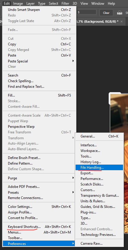
So I toggle off the "save as to original folder" and use the save as shortcut. After your first save to the folder you want, it will remember the folder you just saved to and that you saved as a png. Then you can just quickly press enter twice through the save as and png format option prompts. The original folder setting is in file handling (where to find file handling is under the next question)
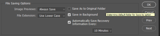
Making a keyboard shortcut? You can view all shortcuts by menu and insert your own shortcuts for ones that don't have one or for preference. Just make sure you don't overwrite another shortcut you care about. You can also just see the shortcuts displayed in the drop-down menus next to the option.
please leave any questions in my ask box and not in the replies!
71 notes
·
View notes
Note
Hi!! Can you please tell me what you added to your jaws gifset? Like any filters or anything added at all?
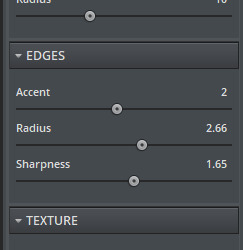
Hi! I didn't add any special filter like colorings, just basic curves, levels, and exposure- but I did do my sharpening differently than normal as the file size I have of the movie isn't bigger than 3GB and it's an older movie. So let's call this
TIPS ON HOW TO SHARPEN YOUR GIF WHEN YOUR ORIGINAL FILE IS A BIT meh.
more under the cut ↓↓
Okay, I'm going to jump right in.
When I have everything on the timeline, resized, and ready to go, I start off by adding grain. (Ruis) My program is in dutch as I am dutch so I'm not going to explain all the technical stuff, as it will get lost in translation, but I'll just do a quick rundown of what I did with this set. (I use Photoshop2022) I'm not an expert whatsoever, I studied art/media design but that was 4+ years ago and while photoshop was used heavily, gif making is not something that ever came up lol.

Add the grain. Filter tab -> grain -> grain. 0,6 or 0,7 will do. Tick Gaussian and Monochromatic. Next, sharpening. Filter tab -> sharpen -> smart sharpen. I use this filter twice with two different settings as follows:

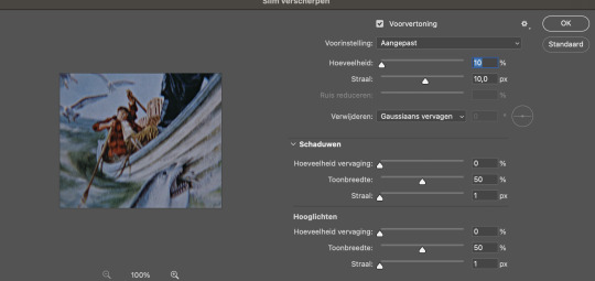
These are basic sharpening settings a lot of other creators use, so nothing special there. Next, to make it even sharper, I add high pass. You can find this under the filter tab above, at the bottom of the list. Filter tab -> other -> high pass.
Select it.
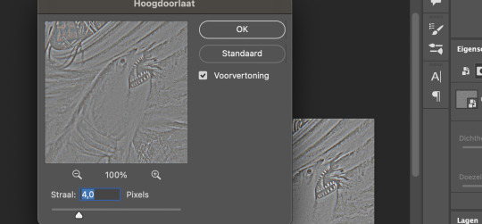
Keep it at 4,0. You can play around with this, but I like to keep it at 4,0. Now it looks a little weird so we have to make some changes. Go to the blending option of the filter you just applied (the high pass) and change it to 'soft light' on 70%.

Again, you can play around with this. I also use high pass on gifs that are darker. I used it in this set to let our babe Ryan stand a bit more out.
Okay to really show the difference between not adding the grain + sharpening + high pass vs grain + sharpening + high pass, here you go:


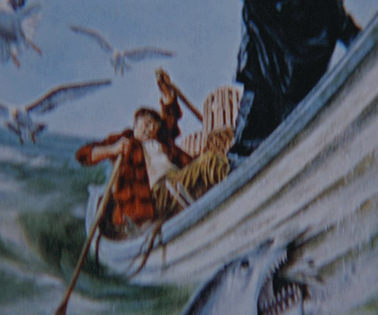
I remade this one real quick, as I didn't have the psd anymore but you can see the difference better than the one with the shark illustration gif. I didn't add any other filters, only the grain + sharpening + high pass. When you add the filters and increase the lightning/contrast, it will look even sharper. Sadly I don't have the file anymore, so I can't exactly recreate it, but I just used the filters mentioned; curves, levels, and exposure.
Funny thing is, not all the shots in my copy were grainy. It's just a few that have unruly pixels because the file has been compressed. Like our dear Hooper here, that part of the movie was just a little blegh. And not everyone has the space or the money or other resources to get the deluxe Bluray whatever, so you gotta do what you've gotta do I guess. Of course you want your file to be HD, preferably 1080 or above, but well, shit happens. With the grain added, it just looks better in my opinion. The grain fills in the annoying pixels. You can also add grain after sharpening, but it just looks better, again my opinion, when you add it before sharpening. Plus I found out my gifs looked better on mobile if I added grain before sharpening rather than after. If this is something you worry about, I would add the grain before sharpening.
Do note though, adding grain increases the file size of your gif!
Okay, next up, the other filters I've applied. I added curves. The numbers at Input (Invoer) and Output (Uitvoer) are for the two dots in the middle.
Lower dot: input 15 and output 11
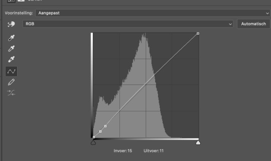
Higher dot: input 27 and output 25

Not much, just a little tick. The next filter I used is levels.
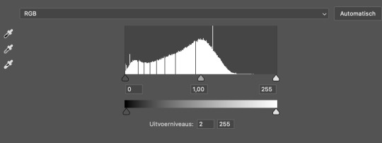
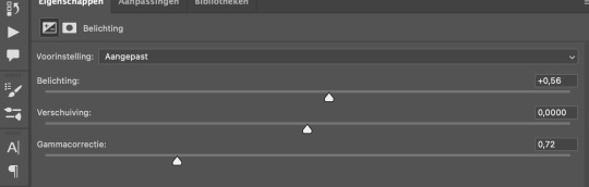
The only thing I changed is the Outputlevels (Uitvoerniveaus) to 2. This is something I do with all my gifs, sometimes a bit more at 4 or 6. I just like how it looks I guess haha. Next I added exposure.
exposure: +0,56. offset: 0,0000. gamma correction: 0,72.
And we're done with Photoshop! Because my MacBook is really old and kind of past its time, I just save the file as a gif without cutting any frames and open it again in Ezgif. It all runs smoothly until I have to convert a gif multiple times and this just saves me a lot of time. Ezgif is a free website where you can make and edit gifs. I use it to cut the frames, add some contrast if necessary and decrease file size (another tip!) so it's under 10mb and tumblr will accept it.
Gif before adding all the filters:
Gif after grain + sharpening + high pass + the other filters:

Gif after running it through Ezgif and adding some contrast (5) to decrease the size of the file:

I hope this answers your question! If you're really stuck on something, you can always send me a private message! I didn't do much, just the grain and the sharpening and the high pass. I think it adds a little edge to the gifs as well. Thank you for the ask and have a nice day!! 💜 💜
Edit: the brightening filter is called EXPOSURE, not brightening. I re-checked it but as I thought, I made a little mistake during translating. Here you can find a whole list of filters translated from Dutch to English.
#asked and answered#photoshop#ps tutorial#ps things#gif sharpening#supportcontentcreators#completeresources
84 notes
·
View notes
Text
Trying to set up my character page again.
The character pics might be a bit shitty though. Definitely not as high quality as I want them to be. But I've given up trying to improve them after working on this shit for weeks.
Also trying to include Luke and Eleanor on the page seeing as they might play a bigger role in the end than I initially thought. Not 100% sure yet but it might be good to have them on there.
And I'm removing Oswald for now seeing as I kinda don't have a space for him in Volatile at the moment.
(most people probably don't even know the characters in question here but I thought I'd mention it anyway.)
It's a fucking pain though. I keep noticing how fucked some of my character's skin files are which makes it difficult and frankly not fun to take proper pics of them without having to edit the shit out of every picture. Luke is a prime example seeing as I used a throwaway skin I made thinking he'd just be an extra but his character grew on me too much.
Problem is I also don't have much room to edit the skin files at this point because I never save my skins as psd files for some reason and editing the dds file causes quality loss.
Generally don't have much energy to invest into skin making or fixing the mess that is my game at the moment.
Idk, Sims 3 is frustrating me like hell, but I'll try to make the best out of it.
#My organising skills are non existent#I think that's prevalent at this point#Just makes a lot of shit harder and more frustrating for me than it probably should be#Nonsims#saviorhide
5 notes
·
View notes
Note
5 11 and 15 for the graphic maker ask game!
5. Link your first ever graphic (or earliest you can remember)
Already answered!
11. Do you save all your PSDs and keep them in folders? If yes, screenshot your folder(s). If no, explain why not.
I'm on mobile, but I don't tend to save PSDs to my laptop, because it's only a laptop and I do photography as well so saving big PSD files is uncommon for me. I do however save PSDs to my Google drive, but I delete them eventually after a bit to save up space for edited art, because I reuse art occasionally! I probably ought to save more, but it's a lot of file space I don't have on my poor laptop, but I do have most of my final edits as PNG or JPEG's on my laptop so I'll probably collect those all in a file at some point :)
15. Name 2 pros and 2 cons of the program you use to make your graphics
Pros of Photopea; it is free, and it is almost a perfect alternative to Photoshop, and is only missing a few aspects like mixer brush but for the most part is probably the best direct alternative! Cons; you have to save directly to your Google drive if you don't have a cloud account, and occasionally it won't save and you'll have to save the file as a PSD, refresh and try saving again, but that's a small price to pay imo, photoshop was hardly perfect itself.
Graphic Maker asks
2 notes
·
View notes
Note
Hello, and first of all thank you for the hard work 🤩 I was looking at your PSDs and tried to download the Character PSD #009 - M I L E Y because it looks amazing but the megaupload link doesn't link to the content any longer... I was wondering if you could make it available again? Thanks a lot <3
for some reason I wasn't notified of this ask, thank you tumblr. I wasn't aware that the link broke and I searched my whole ass pc, but I could find basically any character psd except for this one💀
so naturally I tried to remake it ha ha ha ha
it looks slightly different? but I had most of the assets still saved on my pc so the gifs are the same. the action is probably in space with the template, so I had to remake that too. I tried to make it as similar to the original as possible but it's been 8 years and I have not actually done a lot of rph stuff in a while so hopefully it's still to your liking hhh

here's the download links to the PSD and the png action!
notes:
- make sure to delete the existing png layers (png, png copy + png copy 2) before using the action !!
- leave the 'your png goes here' layer and don't edit the name, just paste your png into it and adjust the size, then use the action
- if you use this for multiple graphics i suggest reloading the original psd file, unless you want to just delete the png layers and add your own 'your png goes here' layer (the action focuses on that layer name so that's why you should keep the name in there)
- the font is still the same (Orator Std)
please let me know if anything isn't working properly, I have not done anything like this in a good while ;;;;
(also here is the old version for comparison)
2 notes
·
View notes
Note
hey, i was wondering if you could help me please? how do you put multiple gifs into one gif like you did with this gifset and how do you make sure that the psd from one of the gifs doesn't affect the other gif? thank you! :) /post/707290497438416896/words-can-break-someone-into-a-million-pieces-but
Hi! Sure
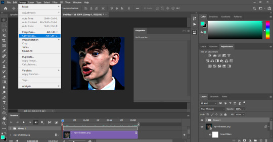
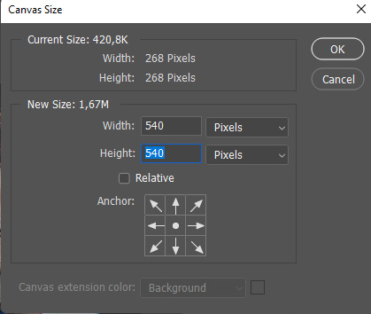
So first things, first you have to decide on the dimensions of your template (here are some good ones). Just keep in mind there should be a spacing of at least 2px- 4px between each gif. After calculating the dimensions of your template, you can start making the gifs for the set. Just make them as you usually do (make sure they all have the same number of frames though), and after you've finished, pick any of the gifs you've made and go to image > canva size
And then change the canva size to the size you've decided:
after that just rearrange the gif on the canvas as you wish, before that make sure all of your layers are selected:
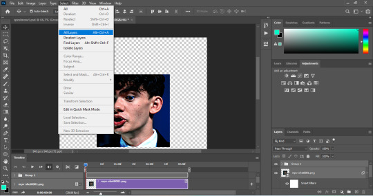
and then select the move tool and move your gif as you wish, and then put it in a group:
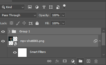
After putting your gif and the adjustment layers in a group, change the blending mode of the group layer from pass through to normal:
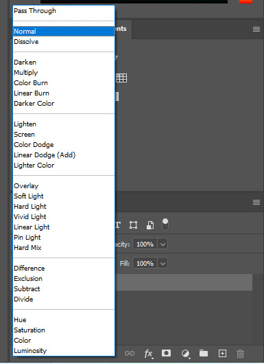
It's necessary to do this for each gif you add to the canvas, so that way the coloring of 1 gif won't affect the other gifs. Now you can add other gifs. Make sure your layers are all selected and then drag the gifs (using the move tool) and drop them on the canvas:
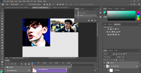
Put the new gif on a group layer and change the blend mode to normal (as demonstrated above) because if you leave it as it is, the other gifs will look too bright. Repeat the process as many times as necessary until you've placed every gif on the canvas, and convert back to frame animation (if you don't know know how to do this, feel free to send another ask, and I'll explain how) to fix the speed and you can finally save your gif. Hope this helps and if you have any questions, feel free to ask!
2 notes
·
View notes
Note
slam dunks in ur askbox 11, 19, 8, 29, 36, 43
omg shania lore time.
also im laughing at your answer to my question about drafts because i have 1,300 things in drafts. you're braver than me
11. What is that one set you made that just won’t die? Well, I keep getting horny comments on this star wars gifset LMAO. Also this gifset I made for indiegamesource has the most notes out of ANY gifset I have EVER made.
19. What is your gifting process like? I usually watch a show or play a game and then find a scene that I like or a character I want to represent. Then I steal the scene from youtube or torrent it (or record it if its a game that i own). After that I shorten the scenes I want using the screen record on VLC media player. Then I rip the frames into photoshop, colour/sharpen, convert into gif. At this point I usually leave the post in my drafts because I like to post things between noon and 3pm so the gifset will wait until the next day. Then I pray the gif goes into the tags lmao
8. What gif trend do you hate? I haven't seen it in a long time, but I used to REALLY hate the ones that are super super dark to the point where I can barely see what is actually in the fucking gif lmao. I also don't particularly care for gifsets that use lyrics from songs in the gifs themselves, but i just don't interact with those posts. it's none of my business if people want to use their fave songs in their edits
29. Have you ever posted a set, realized you made a mistake later but it was already too late? I've had a few where I realized I didn't move my watermark to the corner so its covering someones like face or some shit LMAO but ive posted them anyway since I don't save my PSDs and I'm not remaking the whole set for one hoochie mama. I've also had a few where I noticed that things were oversharpened by accident
36. Do you gif with something specific in mind or do you just wing it? I typically have something in mind but that'll mostly just be a very specific scene for example one that made me laugh or sad. It'll also typically be like I want to gif a set showing off a character (for example, my recent Aqua from Kingdom Hearts gifset for gamingladies or my romanced Isabela from Dragon Age gifset). It's VERY rare for me to plan it down to colours or angles. I've had a few gifmaking friends who will specifically hunt down colourschemes like pastels only or they'll do only specific angles like faceless gifs. I don't get that detailed. I'm jealous of people with the patience for that though lol
43. Do you keep videos forever or delete them once you’re done giffing? I delete them LOL. I only have 2 terabytes on my laptop and I want to use that space for viddy gam.
3 notes
·
View notes
Note
Hi! I want to recolour your Petrichor Eyes. But I am struggling with Heterochromia. I noticed that in Heterochromia dds, eye is smaller than a normal one. So recoloured Heterochromia eye becomes bigger than a normal one, and it's visibly noticeable. I don't think it will cause any discomfort in game, thought. But I wanted to ask if you have a psd for Heterochromia? So my recolours will match your originals. I also wanted to ask a psd for Cats and Dogs, please, if you have one. Thank you! 💜
Heya! Ooooh, I'm so excited at the prospect of more colours for these eyes! :D I'll do what I can to help!
As far as the Heterochromia file goes, I used Aveira's Felicity Eyes Heterochromia package as a base for them. All of their caveats about them taking up the bracelet UV space apply.
So I actually don't have a working PSD file for the Heterochromia swatches. What I did was export a heterochromia swatch from S4S, then used that as a template. I copied and pasted a swatch from the Petrichor Eyes .psd onto the template, then moved and resized them to fit the template and saved them. I ended up making a Photoshop action for it to make it easier to do all the swatches and get them all in the same place. I don't think I saved the action, though, so you'll have to make your own. Just know that there wasn't any special trick to it. ^^;
The reason why the heterochromia swatch looks a teensy bit bigger than the originals is because there's actually a mesh that overlays the eyeball by a tiny amount; so it's technically a fraction larger than the original eye, hence the larger looking swatch. So, yeah, you'll have to alter the size of the swatch a little if you want to mitigate that size difference.
I've gone ahead and uploaded the PETSrichor eyes .psds too! Gosh, I need to have better layer organization discipline… trying to decipher what the heck I was doing all those months ago with all my unnamed layers was a trip. XD
You can download them here: SimFileShare
Be aware that the pets eyes are tricky; you have to make separate package files for both Large and Small dogs, and separate heterochromia files for each.
So you'll have:
Cats Eyes (Base)
Cats Eyes (Heterochromia)
Large Dog Eyes (Base)
Large Dog Eyes (Heterochromia)
Small Dog Eyes (Base)
Small Dog Eyes (Heterochromia)
That's six package files in total.
I then merged all those separate package files together to get the single PETSrichor Default Replacement package.
Let me know if you have any trouble or need anything else! I'm so looking forward to seeing what you make. ^^
5 notes
·
View notes
Text
i just noticed i fucked up a layer in one of my gifs AND. AND. because i don't save psds anymore because they take up a fuckton of space. I CANNOT FIX IT without remaking the whole gif from scratch. MISERY
1 note
·
View note
Note
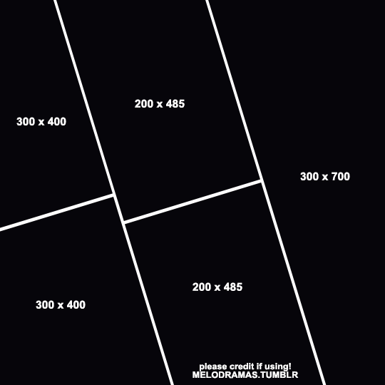
you’re gifsets are always so thought-out and gorgeous!! im awestruck every time i come across them on my dash. if it’s not too much trouble, would you mind sharing what dimension sizes you used for individual gifs on the 3rd panel on this gifset? /post/677829404733390848/1-year-celebration-top-5-albums-as-voted-by-my
it’s so unique and i’m deeply inspired to try it out on ps myself (if u don’t mind sharing ofc💕)
thanks so much!
i don't have the original psd saved but when i tried to recreate a similar layout in photoshop this is what i came up with. i created the rectangles first and then rotated the canvas by -17 degrees. the widths are larger than they would be on a regular 3 column gifset just because of how it looks when it's rotated, and the larger heights make sure that there's no blank space in the canvas. the 4px gutters should also be preserved.
i uploaded the psd to mediafire if anyone else wants to use it, but please credit me for inspo if you use or save it!
48 notes
·
View notes
Last Seen Blogs
bluekibou
Mars

gw2calendar
Guild Wars 2 Event Calendar
thoughtkick
Deeplife Quotes

admpublik
Adm Pubik

deancrazy1985-blog
DEANCRAZY