#i had this at 600dpi
Text
this has drained me of my will to live
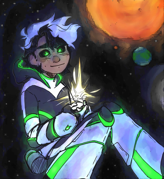
#if the quality gets crunched im gonna be going ghost myself dude#i had this at 600dpi#my art#danny phantom#danny phantom fanart#danny fenton#dp fanart#this took me sO LONG#im so proud of it but watch me despise it in about an hour#lancteu back at it with yet another danny phantom design#let my boy be happy#let my boy be an astronaut PLEASE#i was gonna do glowy freckles but i already was dying with just this i could not be bothered#love flooding my own tags#if you couldn't tell#if you're actually reading these then hi :)
3K notes
·
View notes
Text

The still images! I had to lower the resolution a little cause the original file is 600dpi and more than 13000 pixels wide :>
#myart#the bad batch#tbb#star wars#sw#tcw#clone trooper tech#clone trooper wrecker#clone trooper crosshair#sargeant hunter#arc trooper echo#tbb trailer#tbb s3#tbb omega#lula tbb#I really REALLY worked very hard on this#lol
678 notes
·
View notes
Text
THE GHOST OF PICS: MECHS PAST
And with THAT tortured pun, December's Patreon-backed @tfwiki picture batch is all stuff we've kinda needed forever, all stuff from the prior century, and all stuff from outside the US market!
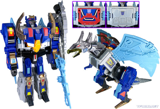

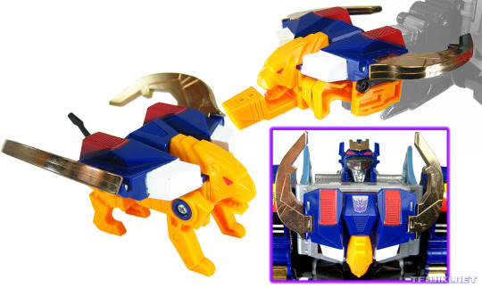
We start with Takara's original DEATHSAURUS, Decepticon leader in 1989's Victory, who just had his Legacy Haslab toy start showing up on doorsteps. And of course, new separate pics for his Breast Animal partners EAGLEBREAST and TIGERBREAST (yes, get them giggles out, go ahead).

Let's jump back a year to 1988's Super-God Masterforce, and the Godmaster RANGER. This mold is the only one of the three Powermaster Autobot cars to get recolored for its Takara release. Sadly, the MIB copy I bought back in 1996 was missing its gun, thus my general reluctance to add a pic to the wiki. But lord, that tiny, crunchy book scan we were using suuuucked. Made Ranger look white when he's a very light stony blue. Still using the scan though, just now in an inset panel to show off the gun I don't have.

And now we bounce ahead to 1990's Zone, and the Micro Transformer base SKY HYPER, piloted by Deadwheeler. I took these pics forever ago at some BotCon, and have long lost the notes as to who owned this piece a few hard drives back. This sample was also missing the three ramps, thus both the length of time it took for me to get comfy going ahead and adding these to the wiki, and the new book-scan inset to show the missing ramps.

Let's shift over to the European market, with 1992's THUNDER CLASH, the leader of the Autobot Turbmasters. His gravity-feed missile launcher was, like all the Turbomaster and Predator launchers, very much not US choke-gate compliant.
Fun fact: Thunder actually did get a Japanese release! He and Skyquake were straight imported to Japanese stores in Hasbro packaging, with just some necessary legal info changed to Japanese on the boxes. This was the Operation: Combination year, where Takara released the small Turbomasters and Predators in 2-packs.
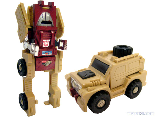
And now we're going much further back, and much further south. No, that's not Brawn, that's OUTBACK, the 1987 Mexican version by IGA. Apparently, IGA was unwilling or unable to pay for the new '86 Mini Vehicle molds, thus they made their own versions by simply recoloring the '84 originals and slapping them on new cards for the '86 characters. Sometimes with alternate decos to boot!
Sadly, I don't own this toy, and like Sky Hyper, this was a BotCon pic taken with original owner info lost to time. (I always try and credit the toy owner when they let me take pics.)


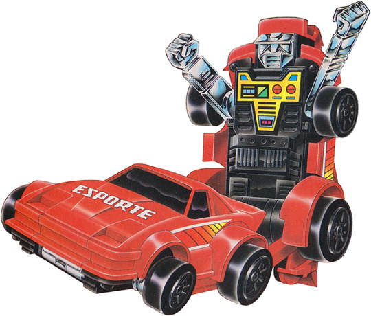
Now here's the ones I'm super-happy about. These are two of the three Eletrix, ESPORTE and PORSCHE, exclusive to Estrela's 1985 Brazilian Transformers line! These toys transform and walk/roll forward via remote control, attached by a wire over 4 feet long. I'm keeping an eye out for the third one, Jipe.
None of the '85 Brazilian toys have any faction markings, but the Autobot-style packaging leads one to assume "all good guys". As do the bios of many of the toys in the line... but the Eletrix lack bios, sadly. Which is weird, as Estrela made up new bios for some toys in the line, and just straight-translated others from their Hasbro bios.
These molds were released in the US, but as the "Pow-R-Bots" in Village Toys' TF-wannabe line Convert-A-Bots. Like Estrela, Village licensed them from Japan's Yonezawa Toys, where they were the Remote Change Robo Series. All of these releases use the same plastic colors, but give them new stickers for branding and language.
I bought these two MISB (cellophane still there!) earlier this year, but was a little gunshy about opening them, worried the electronics might have somehow rotted. Schrodinger's Electronics. But no, since they didn't come with batteries, no corrosion, and they work as well as a 1984-mold cheap electric gear-powered toy can (that is to say, loudly).
And of course, since I got the boxes, I took the opportunity to take 600dpi scans of the box art unique to Estrela's packaging!

Man, I love going through these older, not-US corners of TFdom, and hope you learned something new about the vast TF universe. And if you'd like to help make that just a little bit easier and get more pics out a month, consider joining my Patreon! "gregstfwikipics" there, every little bit helps, plus at higher pledge levels you can pick a theme for the month!

#transformers#transformers victory#haslab#deathsaurus#thunder clash#thunderclash#takara#hasbro#tfwiki#masterforce#super-god masterforce#transformers zone#micromasters#robots in disguise
35 notes
·
View notes
Note
May I ask how you made the shaker charms? I've been wanting to do that a while but no clue how to.
aight so I'mma go into this with a lil assumption that there's some prior knowledge about making digital art but if you have any questions about anything, you can definitely ask!
so first step is finding a place that can make you the shaker charms. I use vograce - it's a lil more expensive than other places but I like the customer service and low minimum order amount. they have a specific tab just for shaker charms that breaks them down into what options you can pick, sizes, what the art files need to be like, etc that you can take a looksie just to see how they're made. I like to see in the comments at the bottom too to see what neat things people have made.
and this is what my art looks like (minus the background). I made the main shaker with plenty o' room to shake around the bits inside. and then the pieces to the right. the gate itself is around 1300px wide, 600dpi (which is tbh a lot, 300dpi is fine) — big enough so when it's shrunk to charm size it doesn't lose too much quality. save them out as transparent pngs separately (the main shaker + pieces). most places prefer CMYK color profiles but I'm a scrub that doesn't use that so I go with RGB and it works just fine. if you have the ability to preview color profiles, I go with CMYK: Japan Color 2001 Coated to help me adjust my colors for print.
then I made a draft of what I wanted it to look like when finished, specifically showing how the text should not flip the wrong way on the reverse side. I also put the bits inside but the manufacturer should be able to figure it out anyway lol. the dots atop the charms are where I want the hole to be for the chain. I send this to the manufacturer too just to make sure we're on the same page.

send the files to whoever is making the charm and that's about it. the hardest part really is making the art assets. there's no real rule to anything, I just eyeballed it all tbh.
the most important part imo is making sure everything's big enough (1000px, 300dpi or larger for the main shaker part imo) and making sure your colors are okay because what you see on screen can be pretty different in actual print. that requires a lil research like purple for example sometimes shows up like ass when printed.
as for sizing, that's very much up to you. sometimes making paper models to hold irl can help you decide how big you want things. I went thru 3? iterations of just this charm alone cuz I wasn't happy with the sizing or colors so I had to make a few adjustments. I often ask manufacturers for previews of my charms before they actually make them just to be sure they followed my draft.

this is the final version (ignore the scratches, that's just the film you gotta peel off). I also requested for sequins to be put in. the inside bits may come out a tad smaller than compared to my draft, just due to compensating for the outside border around the bits but more or less it's what I drew 👍
44 notes
·
View notes
Text

Art vs artist 2023!
In terms of comics, this was my most productive year ever, which also meant that in terms of money and social media presence (two things entirely unrelated to each other for me), it was my worst year in recent memory, haha.
That's what happens when 90% of your work is for projects that aren't released yet. (And, income-wise, when you're doing more comics and less product design. But I really needed to make that shift...)
Here's some of what happened in 2023!
I finished 23 pages of DOTU
I finished 26 pages of Into the Smoke
I thumbed/penciled/inked/flatted an additional 45 ITS pages (meaning they're each about 2 hours away from being done)
I scripted chapters 2 and 3 of Into the Smoke (150-200 pages)
I sold a graphic novel to a publisher! 🎉
I scripted 260 pages of that graphic novel
I offloaded a HUGE amount of dead weight from my chest :D
I lost soooooooo much muscle :( (post-op restrictions)
But now I'm finally starting to gain it back!
I had to say goodbye to 3 elderly pets ;_; The worst
Oh and also there was freelance, though I took a lot less this year
Since I've been working on pages assembly-line style, I'm a little annoyed that my "finished" count of total comic pages is only 50 despite having nearly finished 95 pages. But that means that in January or February 2024, I'll get to magically say "I finished 45 full-color, shaded, 600dpi comic pages this month." XD
Part of me is happy with these numbers because they're better than any previous year. But they're also lower than I *want.* I'm at an age now where I'm calculating how many healthy years I have left to make these epic-length comics, and it's... not a great thought. I know that the only way to work faster is to simplify my style or hire help, but I have mixed feelings about both of those things.
Also, as someone who was a prose author first, I'll just always be frustrated by how much slower and more labor intensive comics are for the same amount of story.
I also have to occasionally remind myself that I lost some time this year to pet hospice care, pet grief, and a major surgery...
Also, I'm happy I got so much comics work done, but I'm sad that I didn't write any prose this year. But hopefully now that I'm so far ahead on the *writing* portion of my active comics, I'll have more steam to pick up Merritt's Story book 3 next year...
#art vs artist#artvsartist2023#art vs artist 2023#artists on tumblr#dotu#demon of the underground#into the smoke#into the smoke comic
24 notes
·
View notes
Text
introduction sc1 new scanning method. Chloe came up with this method to give the animation more stability. A brief description of how this worked:
First each sheet of frames was rescanned at 600dpi but this time as a whole sheet. The sheet had to be pushed right into the corner.
Once all are scanned, the first image is imported into After Effects, the frames are manually lined up with the composition screen, and keyframes are made for each frame.
This is then exported as png sequence.
Next, the next sheet is imported with the replace footage button, and the sequence is moved along to the next 16 frames, and so is the view selection.
The previous export setting is duplicated with the title and exported.
Repeat for all sheets.
This new method took a similar amount of time as the first one, but did make the animation a lot smoother but still with a printed stop motion style. One main thing to note is that I messed up the sequence slightly which meant when it came to importing it all as an image sequence it didn't work properly This is something to note for the other scenes. I do think this is a better method so big thanks to Chloe for figuring this out for me and frankie.
2 notes
·
View notes
Text
Monthly Satellite Times update
apologies for a whole lot of nothing lately, despite having obtained 12/13 of the LaserDiscs, my project momentum kind of hit a brick wall bc depression been kicking my ass lately.
Good News Though:
-Stage 1 is nearly complete, it's fully scanned and stitched, currently working on the cleanup for page 3, which is the last one that needs cleanup. It's taking a long time bc this one was a bit tougher to extract the background from due to the sketchier artwork in the settei on the Production Preview pages and I'm very nitpicky when it comes to cleaning things up, haha. Also had to rescan and restitch this entire insert due to my scanner software having automatically sharpened all the scans, which causes issue on the cleanup process. These were my first scans done on my new pc so I had not realized that option was on by default on my software and simply forgot to check, oopsie. but yea i am about 1/3 done cleaning page 3. hopefully can have it done this week
-I managed to get to the library and try their large format scanner, which was large enough to scan the LD sleeve & obi strip I brought to try as well as whole pages of the entire Monthly Satellite Times, which means no stitching will be needed! the scanner is also much faster at 600dpi than mine is, so I'm going to try to get the rest of the inserts scanned that way to save me the stitching trouble as well as get all the LD sleeves & obi strips. the computer has a 1hr time limit for use but i was able to get everything i needed from the 1 LD in about 30 minutes so it will be multiple trips to get everything but hey it'll get me out of the house right ? haha
The Not Good News:
-I have been misattributing the Vash the Gallery artists, which I hadn't realized--the artist credits are for the artist featured in the previous volume! this was described on the Stage 1 insert (using google lens for translation) and due to my inability to read the language I had not figured this out sooner. oops. once the proper artists are figured out I will go edit the original posts featuring those detail scans. I know they have been reblogged many times already some of them and i feel bad for spreading misinfo....something i am trying to do the opposite of... I'm sorry !!!!!!
-I am still missing Stage 12 and on the lookout for a copy, preferably the LaserDisc but I'd take a tape if it has the insert included...idk just lmk if by chance you find any listings for Stage 12 !!!! i've been poking around a bit and have yet to find one..... also lmk if any listings for a complete LD Box 2 shows up, I am unhinged enough about this series to buy duplicates of 6/7 of the LDs I already have just to get 1 missing one + a cool box to match the LD Box 1 I do have, and also hopefully get the Stage 8 obi strip (which is the only obi I am missing)
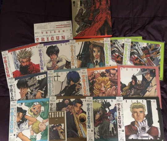
And to end off, here's my entire Trigun original Japanese home media release collection at the moment, tehe (i forgot if i posted this pic already so sorry if it's repeat).
(I am planning on reselling one of my Stage 4 LDs, and any other potential duplicates I may end up with should I manage to get my hands on a LD Box 2)
2 notes
·
View notes
Photo

Colonial Williamsburg ad - “88-inch hips”
archived from my flickr account
Smithsonian Magazine, sometime in 2001? The outer edge (right side) of this page was folded to fit into a plastic page sleeve, since Smithsonian Magazine's pages are wider than the usual format.
Got some old magazine pages scanned at 600dpi, but I had to resize them to get under the 20mb size limit for files.
Now that I know more about fashion history, this concept is just extra-silly. Regardless, it’s eye-catching and memorable.
#vintage advertising#is 2001 vintage now?#colonial williamsburg#smithsonian magazine#historic costume#flickr purge#clearing drafts#queued post is queued
9 notes
·
View notes
Note
How do you get your pencil sketches to look so crisp in pictures? Do you scan your sketchbooks? If so how?
Yes, I scan them! I use the Canon LiDE 220 Scanner, I can scan up to 600dpi in TIFF file. Even if you don't need to zoom in on the pics later once you have posted them, it's good to scan them at highest quality possible, so that when correcting the contrast or other stuff of the scanned image, it won't lose too much quality. So I also scan them in TIFF which compared to JPG can hold more information, but as soon as I'm done correcting in Photoshop, I simply save them as JPG files^^ At least if I'm not planning to print them or such. I can really recoomend the scanner though. I also scanned all my illustrations for my illustrated book that I had printed for a uni project, and the quality was really good.
9 notes
·
View notes

Text
FMP Scanned Images
Wednesday 22nd March 2023
Going through the items that were given to me after my Grans passing also included shifting through many many photographs. Growing up, I was always aware of a few photo albums my Grandparents put together as they did it for all of my siblings. However, I wasn't aware of the huge collection of photographs that didn't make the cut. I have an extra four albums of childhood photographs that didn't make the official album cut, however, these images are ones I've never seen before or even knew existed. It was pretty emotional for me to see these extra photographs, but it also reminded me of my Grampy and how he'd always have his camera on him, capturing every moment he seemed appropriate. It was great seeing these images of me as a child again, but also seeing my life through my Grampy.
Scanning these images took a while, I originally had scanned half but soon realized that the images were scanned in 75dpi, so annoyingly I had to go back and rescan them all at 600dpi, a lesson learned for scanning in the future!

0 notes
Text
Default manage folders for picasa 3.9

Default manage folders for picasa 3.9 install#
Default manage folders for picasa 3.9 install#
And if you install the latest version of Picasa (3.9) under WINE ( instructions), a problem occurs when bringing all the photos into Picasa. It works as described with Picasa, but it is old. If you install the last version of Picasa made for Linux, it is significantly out-of-date. So the photo files are where F-Spot put them, and, irrespective of how Picasa organises them in its own “virtual” folders, changes made to the photo in Picasa alter the original photo in its F-spot location. This should be manageable given that Picasa can work on existing files, without having to separately import them to a different place on the file system. want any changes to also be the same in F-spot.Some people want to use F-Spot and Picasa together – F-spot to import and tag photos and Picasa to do minor editing ready for printing. ImageMagick crashes on large images Posted in Graphics, Open Source, Programming, Ubuntu F-spot vanished in Ubuntu 15.04 (Vivid) ImageMagick: convert quits after some pages It looks like these changes are all about security concerns with the intention of preventing malicious resource starvation. One other note – settings in policy.xml cannot be loosened through arguments supplied to the convert program via the CLI – they can only be tightened. Hmmm – now I change the disk setting back and I am still able to make the higher-resolution images, even after rebooting. It seems the following was set too low:Īnd it would successfully create high-resolution PNGs even if it took a long time. The reason was the policy.xml settings in /etc/ImageMagick-6/. Interestingly, the problem only occurred on Ubuntu 17.04 and not 16.10. This happened on a range of fast and slow machines and the amount of RAM seemed irrelevant. The second issue was the error message about cache resources exhausted. So the slowdown was because I had shifted from a fast desktop to a (more convenient but slower) laptop. And creating a 1200 dpi image might take 0.5 minutes on an i7 and 18.5 minutes on an i5. What takes 4 seconds on an i7 can take 71 seconds on an i5. Seemingly modest differences in CPU specs can create massive differences in the time required to convert PDFs to PNGs. I finally worked out what was going on by running the same tests on different machines. They wouldn’t handle high resolutions (600dpi seemed to be the limit for the images I was handling) and it took a very long time to complete. Recently, commands like this stopped working properly on my development machine. The sort of command run under the hood was:Ĭonvert -density 1200 -borderColor "#ff0000" -border 1x1 -fuzz 1% -trim "/home/g/projects/sofastats_proj/storage/img_processing/pdf2img_testing/KEEPME/raw_pdf.pdf" "/home/g/projects/sofastats_proj/storage/img_processing/pdf2img_testing/density_1200_fuzz_on_#ff0000.png" My sofastatistics application relies on ImageMagick to convert PDFs to PNGs.
0 notes
Text
unstoppable force: me wanting to do more trueforms
immovable object: thesis work and the fact that my pens ran out of ink and they’re not for sale anymore and the mall doesn’t have other ones that will do for this so i gotta go look through small stores that sell office supplies but i hardly ever leave the house and even if i do i can only go to the city on certain days and-
#this is a post just to say i haven't forgotten all about that series just bc i havent posted a new one in ages#and the same goes for the prints. sigh.#i've given up on doing the prints myself but even for an online store i need good scans#and that's proving ridiculously hard to get#for a recap: my scanner won't do. the scanner at the municipal library won't do even though it did when i scanned other things 2 years ago#the scanners at any of the divisions of the big printing center in my uni town aren't good enough either#or rather they are but nobody working there knows how to use them and i don't either#there's a printing studio that does good enough scans but their prints aren't so good and i'd have to do both. i can't do just the scans#asked a photographer friend of the family and he said only in lisbon or porto. which is ridiculous bc that's a 4h bus ride#there has to be somewhere closer. it's a 600dpi scan how fucking hard can it be#i wanna look in The Big District Capital which is 1h away#but bc of family stuff the soonest i can go there is nov 6#i had the utopian idea of having the store up on nov 5 so that feels like the universe mocking me#a lot of this could have been handled sooner but. again. i hardly ever leave the house. and transportation. logistics#can't even get fucking black pens in this town#but i just wanna say i'm trying!!!#that minimalist destiel pins thing i asked was bc i feel bad about not having the prints yet after so long#so i wanted to Do something#anyways this is a long tag rant i'll shut up#carolina talks
7 notes
·
View notes
Note
Hello! I was just wondering what size/dpi canvas do you generally work for regular art pieces? for an example your recent piece with your oc and his bf-
apologies if you've asked this question before, I had a look at your faq but didn't see anything related to canvas sizing.
thank you :D
i usually draw on a letter size (8.5x11”) canvas at 300dpi, sometimes up to 600dpi if im feeling spicy. i know i should work bigger but i dont rly sell prints that much and also… i don wanna
honestly i get this question every few months and im always confused bc i don’t think it really matters. work at whatever size feels good to you.
40 notes
·
View notes
Note
Heya Cranberry, Love your Work I've been following your art for quite a while now on DeviantArt and I'm about to start working on comic paneling on an OCT I'm in and im a lil rusty on comic makin, I notice you use CSP as I do but I was curious about the resolution you were using in your SCOCT rounds (im using 600dpi I think and I was unsure if that was an appropriate amount to use at 800x10k) as well as if you were using the G-pen for your line art bc i really like how smooth your linework was!
Hiya! Thank you!
Usually one would use 600dpi for black and white comics for smoother lines and tones (and especially if you later want to print it, bw needs higher than colour for some reason I’ve heard),
but for my SCOCT stuff I have been using 350 or 300 because I want to keep the file size smaller and load/save times fast! It helps me not focus too much on small details when theres no time for that during OCTs, as well.
Another thing to note is that at 600dpi, some of your more textured brushes tend to lose a lot of their textured look!! (And brush sizes become naturally smaller looking on the canvas). It can be weird to get used to compared to other resolutions you may be used to.
To line I have been using this Trisketched ink brush [ https://trisketched.gumroad.com/l/MMuOF ] , and all I’ve changed is just customising the settings a bit to suit the way I hold/move my pen. The lines probably appear smooth because I resize my pages down after they are finished, but close up they are a little rough haha.
As a final note, I did put a lot of effort into my lines, but I cannot recommend always doing that during such short OCT deadlines. I hurt my wrist/shoulders doing that in my last round bc I had a lot of pages. (Luckily the break between rounds, and results to matchups, was long enough for me to recover)
The OCT I’m in doesn’t actually require you to have polished work (i just got carried away), so next time I’m going to try be more sensible and find a balanced way to have readable sketches. Remember to put your health first, even though its easy to get super excited during any projects like this! It isn’t worth inadvertently getting injured!
I hope this answer helped some! Im a little sleepy so hopefully I covered everything haha! And have fun making comics!!!
8 notes
·
View notes
Photo


evergrace comic scanning process
i used the kic scanners that our school has at the library. this involved about 2 hours of transit round trip
they’re great because they’re bookedge scanners, so i can be sure to scan to the edge of pages... the best i can.
to actually get the best scan requires scanning the page and then some, then having to press the page down to avoid gu**er sh**ow (got me banned on twitter so)
and even then the scanners are not perfect. they can autocrop and idk why it does it. so at times i slip a white sheet of paper underneath to register extra space
the program is finicky too. it crashes occasionally at 600dpi so scans were in 300 dpi/greyscale
then back to photoshop and doing basic cropping, noise removal (very very subtle b/c didn’t wanna remove too much detail), level adjusting (though i am certainly no pro at that...), plus content aware fill to get rid of extra content + giving myself extra space around the edges when i go to straightening
on to firealpaca
this page specifically had an afterimage from the other side (you see in the top left?), because newsprint fucks my ass. that was removed to the best of my ability in firealpaca using a white rectangle + blur + add blending effect
dust removal, text removal, all that is done in firealpaca too.
i basically made a list of what to do. some of these were automated with photoshop actions
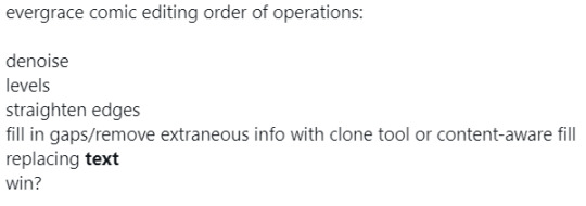
oy and text removal is not fucking easy when it comes to overlaid text. this one page killed me man
i think everyone’s process is different but here’s mine

and for speech bubbles, it’s pretty simple.
i don’t just erase the text but make the whole bubble pure white, because i am not fucking with levels and it makes my life easier.
i eventually did the same with the white page margins because fuck dust make everything white (didn’t do the same with black as it has some screentone and texture)
as for the dialogue
i transcribed it to japanese first
kept a tone guide up top (half of it is taken from agetec’s localization, especially that of ruyan’s, but i did take liberties with sharline and faeana, hee hee. look sugawara didn’t even make faeana anything like her game counterpart. more than anything it sticks more to my novel characterization)
gave it my best shot...
cargodin saved my butt a lot + taught me grammar + gave another point of view as fellow evergrace fans so when i say thank you in that special thanks i mean it

text orientation, spacing, and graphic quality were quality checked by my friends and boyfriend, all artists so i know their advice is top notch.
and that’s how it was done!
4 notes
·
View notes
Last Seen Blogs
taehyungfirst
taehyung defender
peppermintkitty10
WELCOME!!!!

fajdalmak
Szeretném újra élni százszor..

kerplonki-blog
kerplonki
aussieswiftieallthetime
Are We In The Clear?