#i have to practice with a more watercolor-y style to get it to look how i want tho
Text

petal pink and raven's wings
#okay first off!! i knowwww the symbol on her wrist is a mage specialization!#i tried to come up with something for her ket heritage and they were. bad#i've conveniently hidden the scars on her hands#shoh#aelyn wildegarde#shepherds of haven#my art#her arm tattoo actually starts on the back of her shoulder and wraps around to her arm#i have to practice with a more watercolor-y style to get it to look how i want tho#im also probs going to put something on her other bicep. something that wraps?#since ive put florals on her arm i think the ink on her leg is going to be more in line with stereotypical sailor stuff
73 notes
·
View notes
Text

Woo first (successful) watercolor portrait
Sketch and a little back story under the cut

So I've got a project I want to do involving drawing aegon, so I wanted to practice with a couple of standard portraits because I realized though I've probably done at least in the low hundreds of portraits with charcoal, And a few with colored pencil or marker, but I've never actually painted one. Most of my art is still of people, but usually full bodies and very small so I don't really have to worry about facial details all that much. Anyway, I tried last night to paint aegon

It started off well, I liked the sketch a lot (even the nose looks good), the line art was fine (I even gave him an earring because I saw that Tom glynn carney has one irl) but oh god it went badly fast, the shadows were too dark, I brought in the green way too soon so the whole thing had a weird undertone, the expression looked weird, I was getting impatient so the colors were smudging together. I tried to fix it with a little bit of gouache and that made it SO MUCH WORSE

He looks insane hungover. His eyebags (which i considered key in capturing his 'ive been drunk for the last 23 hours' essense) we making him look 50 years older than he was supposed to. I just decided to scrap it, didn't even peel the tape off, didn't bother doing cross hatching on top and went to bed. I decided to give it another shot tonight and I'm very happy that I did because I LOVE how the second attempt came out. It was also honestly pretty fun to paint, kinda wanna do more, haven't done portraits in a while so it might be fun to get back into it. I'd love to do one in my more impressionist-y style or one fully with gouache or with weird or interesting color pallettes idk
Point is, glad I didn't give up because now I have one more painting that I like
#aegon the second#aegon ii targaryen#hotd#game of thrones#asoiaf#art#a song of ice and fire#my art#fanart#king aegon ii targaryen#king aegon#house of the dragon#hotd fanart#watercolor brown fineliner and white ink on watercolor c#watercolor#artists on tumblr#traditional art#house targaryen#targs#team green
53 notes
·
View notes
Text
Show and Tell

Word Count: 1326
Pairing: Matt Murdock x Reader
Summary: You show matt your new tattoo and there are some unexpected side effects.
Warnings: literally nothing I just craved fluff lmao
Author’s Note: This is probably one of the more self indulgent fics i’ve ever written because the idea of getting tattoos for people is something I actually do? I currently have four that are just straight up tattoos of handwriting and doodles from people I love with plans to get 3 more in that style.
❀✿❀✿ ❀✿❀✿ ❀✿❀✿ ❀✿❀✿ ❀✿❀✿ ❀✿❀✿
It had never been a secret in your relationship with Matt that you loved tattoos. You'd been dotted with designs longer than you'd known the lawyer and you had never shied away from the conversation that came about from each one. One of the first things that you had done when you started dating was guide his fingers around the shapes of different tattoos and explain the stories that they represented, or told him what the handwriting was referencing. Recently, you had wondered if he knew your scrapbook better than you with the way that he so mindlessly traced shapes as you lay together.
All of which was why his slightly gob smacked expression was nothing short of endearing.
"You got a tattoo for me?" His voice is quiet in the apartment, disbelieving as if Matt expected you to break into laughter at any moment. There's a small part of you that feels bad for keeping it as a surprise but you knew that if you told the people in your life you were getting tattoos before you did they often tried to pitch in their opinions. You still shudder thinking of the argument you had gotten into with your best friend about wanting her actual handwriting and not some calligraphy font when she started trying to perfect the loops of her perpetually crooked cursive J. You hadn't wanted to fight with him, or to listen to Matt tell you that it was a bad idea. You had just wanted to memorialize this chapter of your life with him.
"Yeah, of course I did. I love you," You never tired of saying it, you weren't sure you ever could when you could see the way that his face changed. Matt wasn't the most chatty of partners, often reserved until given a reason not to be but you didn't mind. Not when you could read the micro expressions of his face like an open book. There was something about the way that he would breathe in, deep and slow, like he was smelling for rain, and his tilted grin would make his features look so much softer. He looked like all the horrible things you knew knocked at the door of his mind had been turned away for a moment, or maybe that was just you projecting how he made you feel when he said it back.
"What did you get?" Matt asked and you watched the way his fingers twitched in his lap. You didn't laugh, afraid to discourage his interest when all you really wanted was to memorize the way he leaned in towards you but didn't touch. Not when you hadn't invited him to.
"Oh, you know, something tasteful." You teased. "A nice watercolor of your ass surrounded by quotes off of practice bar exams."
"(Y/n)," Matt laughed, shattering any attempt at sounding annoyed with you.
"Here, give me your hand," He does and you pause just long enough to give it a gentle of squeeze before guiding it to your forearm. Yur heart beats fast in your chest, a thousand hummingbirds desperate to get out as you think about his reaction. You don't regret the design. Your ink is for you, but you can't deny how vulnerable you feel in these moments just before you explain them.
"Is it a flower?" You can't stop grinning as he speaks, low and contemplative as you finish guiding him over the first flower and move to the next. It had taken ages for your artist to get the right shade of red to stick to the delicate petals and you were in no hurry to move him along the finished piece.
"It's several technically, but they're all the same flower. I got three of them because it's been three years," Part of you wants to leave it at the flowers and keep the quote beneath it to yourself. You won't, you can't trust that Foggy or Karen won't ask about it and then you'll have to explain that you were worried it was too sentimental even for you, but watching him try to decode what flower it is made it hard.
"Well it's not a sunflower," You do laugh this time, but you don't feel bad because you're not the only one.
"It's a red spider lily," The words are slow and your mouth feels dry as you try to organize your thoughts. "It's also known as the Devils crown on occasion and also simultaneously a flower of the heavens. I thought it was fitting for you."
There's a careful stillness for just a moment in his form, fingers frozen on your arm as you push forwards with your explanation.
'It's not the only reason I got it though, just a fun little coincidence. I mostly got it because it's used to mark a time to celebration in some cultures, some Buddhist records even claim that they fall from the sky like snow." You're sure that he's following you now, even as he's silent. Matt was good about letting you ramble when you were nervous to calm yourself down. You can't bring yourself to look anywhere but him when you speak, too afraid to miss something in his expression and equally as afraid of not being heard in all your sentimental glory.
"I would have thought you would go for mistletoe," he says after a minute, voice not quite hesitant but something just to the left of it. You can still picture him now, barely bundled up against the cold weather, snow falling to land in his hair and melting on his hands. You must have sounded like a wreck, caught on a bad night, but he just sat there with you and listened while you watched them light the Rockefeller tree.
"I like the complicated ones, what can I say?" The smile returns and he does that deep breath again. You can't read his mind but sometimes you wish you could just to make sure he picked up on everything you weren't saying. That you liked him not in spite of his multitudes but because of them, that you weren't going anywhere just because things got hard or dangerous, that for all his self hatred and anger you can only look at him and see someone bursting at the seam with virtues. your boyfriend says nothing though, lost in his own thoughts as you continue with your presentation.
"This part isn't going to be nearly as interesting for you, sorry, but I still want you to know it's here." Matt's brow furrows, lips opened ever so slightly as you guide him back and forth across the same patch of skin. "When we first met you gave me your business card. It's not really your handwriting but I didn't know how to get that from you without raising suspicions so I just had them tattoo the braille instead. It's probably better that way though, more you."
"You put my name underneath a flower called 'Devil's Crown'?"
"No, I put 'if you need help' underneath a flower of the heavens. You may not think much of yourself Matt, but I do. I always have." The color comes back slowly and then all at once, from sheet white to a beautiful shade of pink. You bring the hand not guiding him along the words to interlock your fingers with his.
The brunette in front of you has been so quiet for so long that the anxiety has started to creep back in. The only thing that kept you from beginning to loose yourself within it is that his fingers are still tracing the flowers and words on your arm, your hand warm in his.
"What are you thinking?" You ask finally, despite the fear of what he might say. Matt opens his mouth instantly, for once not thinking about the words coming out of his mouth.
"I think when this is is over I want to get married."
#matt murdock x gender neutral reader#matt murdock x you#matt murdock x reader#matt murdock imagines#matt murdock imagine#Matt Murdock fluff
418 notes
·
View notes
Photo
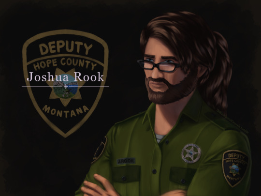
IT IS FINISHED no seriously, this took ages. First couple of days were fine and motoring along with progress, then I was laid out for a week-ish with health problems. Then once I was well enough again I was back to being fixated on finishing this piece of my lad Joshua here for another handful of days, so I’m super glad this is done now.
More talk about the painting, details and process under the cut:
Art Entry 01, Joshua Rook, Junior Deputy of Hope County. Regarding the painting’s execution, stylistic choices, practiced methods, and speculation on further experimentation for skill and stylization.
_____________________________
Honestly I thought that the uniform’s large swatches of green fabric would be more difficult than it actually was. Turns out that was the easier part compared to the shoulder patch and metal badge. x’D The metal badge design is based off of and inspired by a custom-ordered cosplay badge design I found while looking for references, in this post here (link,) from v-i-d-e-n-o-i-r’s blog and Far Cry 5 cosplay. There are some differences in the painting’s rendition above, namely I flattened the middle section and made it all concentric polished metal instead of painted and the great seal rendition in the middle doesn’t have silver lineart either. Those choices are as much for aesthetic reasons of eliminating the blue ring so it was all a fairly simple mono-material-looking surface as it was for simplifying having to forego painting the foreshortening that a spherical dome might entail. Also just because the rest of the metal turned out looking good enough that an additional bit of shiny metal seemed like it’d fit right in for this. That being said, the badge design that inspired this one is rad and awesome looking—and I totally didn’t realize it wasn’t quite like the badges from in-game assets until after I’d painted it. x’D So, I decided to stick with this one since it’s simpler and has cleaner lines, and less engraving to pick out highlights on. Metal is very hit or miss for me to get right, so I’m very pleased with how this one came out! :D I think I did well on that one.
The shoulder patch originally I was looking at real world references and ended up changing the shape once I actually looked at in-game references on Staci and Joey—who I discovered have slightly different details on their uniforms, like the font for their name tags—Staci’s has an old-timey-looking-font with serifs, Joey’s is a non-serif more modern-style font. Some pictures have them having different buttons on their uniforms either in color or shape (the former being exported assets, the latter being in-game gifs/screenies/etc.) This is also how I learned that the little landscape with the shovel, pickaxe and plough/plow are part of the great seal of Montana. I had no flipping idea that was what it was, looking at the patches in-game. The cosplay community does some great work for that, for which I’m grateful. I ended up looking up references of what the state seal’s design was so as to see the smaller details, and to find out what the motto meant ”Oro y Plata,” meant, leading to etymology googling adventures from there, as usual. All important details to paint though I think here, since Joshua’s deputy uniform is symbolically significant to him and will remain so throughout his story as part of his internal conflict for a couple of reasons.
One thing I knew I should’ve done from the start, and reminded myself to do, was the fact that I should paint all skin sections at the same time, so as to ensure they all came out the same shades. I did not do this. x’D I’ll have to actually try to do that next time honestly. Same with the hair sections, while I like how they came out, I do feel the differences between the three major segments in terms of brushwork is not as coherent as I’d like, even if beard hair is not necessarily similar in how it lays to scalp hair, particularly with length and such taken into consideration. Still, not bad. Could’ve used more refs for the backlighting and figuring out how the highlights would fit best on the ponytail, but I think the hair curves turned out nice there in particular. Overall, Joshua’s hair ended up messier than I’d thought with how the locks all end up looping this way and that across his head, but it does actually fit him well as a character for his hairstyle to be messy and loosely held together, but functional. It did end up longer than I’d intended, so we have him likely ending up with a nerdy Jesus hairstyle when it’s down. x’D (Thanks to @undead-gearhead for that mental imagery, I shall take great amusement in that should I get around to drawing Joshua with his hair down.)
Aside from that, I think I’m slowly improving on figuring out how to paint glasses, though I’m thinking in the future I should test more layered reflective light on them or something where the frames are in contact or close to skin, particularly around the glasses’ bridge across the nose and such.
Then there are the other deviation details added—like using dark green instead of the black for the uniform accents. The faded black looks great in-game, but I do think the buttons pop more against dark green instead for this painting. I’m a little bit surprised how well the button-placket section came out, Clip Studio Paint crashed when I painted the first rendition of it, sadly losing all that work. I thought it’d be okay but turns out it didn’t quite get to auto-save that recently enough, but the second go around turned out quite well I think, possibly better. I was originally planning to try to put more textured brushwork across the flat sections of the uniform material, but decided to skip it for speed—I’ll test that elsewhere perhaps, though I think it came out well with the watercolor brushes layered on top of one another like that as is. Among the other smaller details, there’s some tweaks and such for how Joshua’s eye shape, eyebrows, nose shape, hairline etc came out compared to references of Greg Bryk in his role as Joseph Seed. I think Joshua did come out looking like he’s obviously related to the Seeds as I was hoping for, but I’m kind of on the fence that people would look at him and automatically assume it’s Joseph specifically that he’s descended from. I hope so, but either way, that’s how he’s written in-fic. x’D
Overall, I would consider this painting a success, though as usual I do wish it’d been faster to finish. I do think this was good practice for detail work, and metal shading, also: buttons. Still haven’t figured out how to paint lips with more pink or red tones, I don’t like the way they look when painted sadly, unless it’s lipstick. That may end up being a stylistic element perhaps, along with how I paint the lines for fingernails and other such details. Fun fact: I have to leave the shading on the eyes for last, or else my brain goes “The eyes are done! We’re done! Call it a day.” I’m not sure why, but so far, leaving them as flats until the end seems to work a treat for keeping me focused on finishing the rest of the work with less mental dissonance.
Now if only I could figure out why despite knowing I should do all the exposed skin portions at the same time, I don’t follow through on that naturally as far as inclinations go. Maybe it’s a layer organization thing and perception of wanting, say, the cloth to be done first before working “down” to the hands and such in the sense of working from the head down? I’ll have to think on that some more and test things in the next painting. Perhaps color coding the order of layers to paint will help? CSP does have a nice layer-icon-color function that I’ve dabbled with here and there. There are so many brushes, I really do need to test out more of them, I use, what, four or five total, but primarily somewhere around two or three. Hm, but what to do with texture, and how to utilize it so?
Hmmm, as far as personal appeal for methodology goes, I might prefer to use textures in select pieces for more emotional emphasis? If I can figure out how to do that in a messier speed-paint style of things. Rougher textures for conflict, for example. That sounds like an interesting idea to explore, I’ll have to remember that for a later piece. Maybe more heavily textured brushes will also help with the mental itch to refine things to a cleaner-level of refining instead of leaving it in a more organically rough state. Hm, maybe it’s a “mental texture” aversion or something, as far as an interplay between the brush’s texture and the flow of the linework/brushstroke. Perhaps more uneven brushes echo that in a complimentary fashion to better allow less mental discomfort for me personally when trying to paint in a faster, looser fashion?
Honestly, very tempting to go try that out sooner rather than later on some art ideas I have, but I’ve been missing my writing very much of late with two time-demanding paintings back to back. So, ideas for a later time to experiment with.
#Far Cry 5#FC 5#Far Cry 5 AU#FC 5 AU#deputy joshua rook#my art#ofravensandgenesis's art#art talk#chatter#writing about art#writing about fanart#queue
23 notes
·
View notes
Text
It was a lazy summer afternoon. Joker was helping out behind the counter today, but he had time to spare for a new friend. Especially one who was going to teach him a new skill he could use as a Phantom Thief. At first glance, learning how to divine through tarot cards didn't seem like a particularly useful skill. But the point was to hone his supernatural abilities through a known occult focus. Besides, Arisato was a more experienced Persona-user, and a fellow wildcard on top of it. She was bound to have some sort of useful experience to pass along to a young up-and-coming thief like him, right?
The deck she slid over to him looked rather pretty, he had to admit. The backs were a purple, starry field. In the center was a stylized sun, surrounded by a ring of heavily stylized animals. He could recognize a bird and a turtle, and the third looked vaguely like a dragon? Much more of a western-style dragon than an eastern one. Were they meant to represent the four heavenly beasts? Because the fourth one looked more like a fox than a tiger.
He picked up the deck and flipped it over, revealing the front of the cards. He thumbed through it, admiring the vibrant colors and the ethereal, watercolor-y feel of the images. Each image had this flow to it, drawing the eye exactly where it needed to go. Or, at least, that's how Joker felt.
A particular image caught his eye as he flipped through them. An individual in a pointed, birdlike mask, sporting black wings and a bestial lower half and carrying a sword. Crows circled around them, and a big white swan stood above, wings spread wide and its back facing the figure crouched on the ground.
"They're really pretty, aren't they?" the girl sitting at the counter commented. She leaned forward a bit to see which card he was lingering on, and let out a soft laugh. "Seven of Swords, huh? Well, the booklet does compare that one to a thief. So it'd make sense that you'd find it interesting."
She flashed him a cheeky grin as he huffed at her. The only reason you're getting away with that is because there's no one else around. He's supposed to be sneaky. It's hard to do that when everyone keeps outing your status as a Phantom Thief. He frowned as he kept flipping through the cards, mostly as an excuse to ignore her giggling. He stopped again on another card. Five of Pentacles. A figure sat hunched over in a corner, curled in on themself. Their face was hidden from view, their only companions a butterfly floating in front of them and a vaguely attentive lizard on another platform. The image gave off an uncomfortable feeling of loneliness, of isolation. Of losing something you can never truly get back.
He saw her lean forward to see what caught his attention this time. Before she could get a good look, he stacked the deck back together and slid it over to her, leaning over the counter and pulling up his phone. She couldn't speak sign, unfortunately, so he'd have to make due with note-passing.
"So, where do we start?" She glanced at the phone and smiled, picking up the deck and tapping it on the counter.
"Well, obviously, the first thing you do is shuffle all the cards." She slid the deck back towards him. "It's better if you have the person asking the question shuffle the cards. I guess it gives them a feel for the question-asker or something?"
Joker shrugged and picked up the deck again. He split the deck and tried to do that trick where you leaf the cards together. If you do it right, you should release the cards one at a time in turn, one from each side of the deck. Unfortunately for Joker, it did not turn out quite so neatly. It was more like a few chunks of cards came out at a time, smacking against the counter rather ungracefully. Arisato offered him a sympathetic smile.
"Yeah, I'm still not the greatest at shuffling them, either. But it's okay, just give it a couple tries to make sure it's shuffled enough for you."
His other attempts were not much more successful, but at least he was fairly sure the cards were properly mixed up at this point. He slid the deck back over to her. "Now what?"
"Now, there's a lot of different kinds of spreads you can use, depending on the question and what you want to know. Let's start with a really, really simple one: the single-card spread. You ask a question, then draw a card and see what turns up. It can be any question! Like... 'will I do well on the next exam,' or 'what should I do with my time today,' or 'what should I get my friend for their birthday?'"
Joker hummed thoughtfully, leaning his elbows against the counter as he stared at the deck. Any question, huh? Well... there were a million serious questions he could ask. The exam question was certainly very tempting, but he had a feeling that would be an obvious answer. "Study hard or perish."
A smirk tugged at the corners of his mouth as a cheeky question flitted across his mind. He picked up his phone and typed it in. "Will I find love?"
Arisato smiled and gave him a nod. "Okay, that works! Now, since this one is easy enough, why don't you draw the card and set it down right here?"
She pointed next to the deck, so Joker dutifully drew a card from the top of the deck and laid it out on the counter in front of him.
And blinked.
It was the Lovers.
Arisato took one look at the card and burst out laughing. "Well, if that isn't the most succinct 'yes' I've ever seen!"
Joker's face felt hot as he sank against the counter. He wasn't expecting such a straightforward response. Honestly he'd been expecting something random, like that five of pentacles. Arisato continued to giggle at his expense for a moment. Once she regained some composure, she reached over and gently tapped the card.
"To be fair, the Lovers card represents more than just, well, lovers," she explained. "It represents a union—of hearts, minds, passions, stuff like that—but it also represents a choice. Pursuing a career versus pursuing love, something old versus something new, excitement versus routine, stuff like that." She flipped the card around towards herself, pursing her lips as she studied it. "It won't be an easy choice. You'll question your values and what you hold most dear. But in the end, you'll come to an understanding—of yourself or the other person, or maybe both. But it'll be an understanding nonetheless."
Joker watched her for a moment, noticing the distant, thoughtful look in her eye. For a moment, he forgot she was only a year older than him. He reached for his bangs and twirled a lock of hair between his fingers, pondering what to say next.
"You sound like you have some experience."
He slid the phone closer to her, sneaking it into her view to catch her attention. She jumped and blinked at the screen, before letting out a self-conscious chuckle.
"You could say that," she said. She glanced back at the card for a moment, sighed, and turned it back to face him. "Ann's the Lovers for you, isn't she? So you've probably already seen a little of it for yourself."
Joker grunted and played with his bangs again. True, he had spent some time getting to know Ann. And spending time with her did seem to involve her having to make some big choices. But... maybe it's just how Ann was, but the choices she made never really seemed too difficult for her. The decision to strengthen her heart never seemed to give her much trouble outside of practical concerns. It didn't seem like any sort of ethical dilemma, or something that made her question everything she thought she knew.
Then again, Ann never struck him as the type for long-winded introspection. Her intuition always seemed to serve as her guide, leading seamlessly from one idea to the next even as she jumped around between them. It was interesting to watch her thought process sometimes.
"So, what did you think of that?" Arisato's question brought him out of his thoughts. He tilted his head and gave her a curious look. "Of the reading, I mean. It was a really basic reading, but does how it works make sense?"
Joker nodded, leaning against the counter again and pulling the phone back towards him. "It seems straightforward enough."
"The larger spreads get more complicated and require a bit more thinking. The one and three card spreads are the easiest and most straightforward. Though most answers probably aren't going to be as blatant as that!"
Joker chuckled. "I wasn't expecting it to be, in all honesty. At least it wasn't something ominous, like Death."
Arisato hummed thoughtfully. "Well, Death in that context might be a little ominous, but not because it means someone is fated to die or something."
Joker gave her another curious look and she continued. "Death isn't about dying, it's about transitions and change. While it signifies the end of one thing, it also signifies the beginning of something else. So, in the context of your question..." She trailed off as she thought, idly tapping the deck. "It might mean whatever relationship you're currently in is going to end, but it'll open you up to a new one. Or, you'll only find love after something else in your life ends. Like, maybe you'll have to wait until the end of the year, or until you graduate high school."
Joker sighed dramatically. "But I hate waiting!"
Arisato laughed. "So I've noticed." She shot a meaningful glance towards his bandaged neck. "I guess it's a good thing you didn't end up with the Death card then, huh?"
"Lovers sounds much more hopeful, anyway," Joker typed.
"It does." She gathered up her cards and shuffled the Lovers card back into the deck. "You can keep playing around with them if you want."
Joker shook his head. "I should get back to work. A customer could come in any moment, you know."
"That's true. I won't bother you, then. If you want another lesson, though, just give me a shout!"
Joker nodded, typing a quick thank you before he busied himself with cleaning out the coffee machines. That one lesson did give him a lot to think about, at the very least.
At the back of his mind, a voice whispered the formation of a new bond: an alternate Death arcana. Oh, this should prove to be very interesting indeed.
5 notes
·
View notes
Text
The One and Only Ms.Mercury pt 2
Rami x reader (Freddie’s daughter)
Author’s note: Let’s do this guys!
Vocab words: Take away- delivery food. (In the Uk you can get more than pizza delivered)
Also for future reference: Dad refers to Freddie, Papa refers to Jim.
Ps: This one seemed short, but it also seemed natural to stop it there.
Thought you guys might enjoy this.
@queen-irl-af
@kiillerqueeen
@rami-malek-trash
*I guess I’ll use the same gif because the other gifs aren’t loading.
Y/n kicks off her shoes near the front door and goes up the stairs to her room. She flops onto her bed and picks up her sketchbook from the night stand. Grabbing a pencil she sketches a simple drawing of her dad’s, based off a picture inside a little pink frame that’s laying on her desk. Y/n is sitting on Freddie’s lap. Both of them are wearing plastic tiaras and feather boas,eating cake. It’s from her second birthday.
Her art style has varied during her four years on YouTube but it typically stays within a cartoon like style, roundish characters with thick outlines. Many of her professors hated the style but she never really cared what they said, as most of the artwork that they preferred were sad people, or too pretentious for Y/n’s liking. She didn’t really show many people her artwork offline in “real life” due to many of their “criticisms”.
Y/n sets down her sketchbook, and walks over to her cabinet of art supplies, mostly gifted to her by the companies for reviewing it, or from art subscription boxes. She pulls out two watercolor palettes one for the skin tones, and another for bright metallic neons. Y/n tosses some fine liner markers onto her bed followed by the pallet.
She drops herself onto the bed and starts erasing the lines lightly so she can line them with the markers. Rolling the kneaded eraser in her hands, Y/n starts thinking: This movie is going to change things. The only reason I’m not hounded by reporters is because I stay in and stay out of the spotlight. Me helping on this movie, thrusts me into some spotlight. I’m also a woman so there’s that added pressure.
Y/n puts down her eraser and closes her sketchbook. She walks to the bathroom and stares into the mirror. She rubs the bottom of her chin, bumpy due to the acne that wanted to stick around and takes the pony-tail holder out of her hair. Spotlight, do I need an esthetician, or a glam squad when I leave the house? Am I British Kardashian? I mean I have the ass of one, and that’s from take-away. Are people going to expect me to dress like my dad?
Y/n shakes her head of all the crazy thoughts and started the water for a nice soothing bath. She finds the four bath bubblers from Lush and crumbles them under the faucet. The bubbles and foam threaten to overfill the tub. Y/n strips off her jumper and jeans. She carefully sinks into the bath. Her phone rings to the custom ring meaning that her Uncle John is calling. Y/n carefully stands up and grabs her phone.
“How was the business dinner?” John asks once Y/n picks up.
“You knew.” Y/n says exasperated shaking her head.
“You didn’t?” John adds.
“Nope, disguised it like a family dinner. There’s gonna be a Queen movie, by the way.” Y/n adds.
“Are you going to be on set?” John asks.
“No I’m just gonna let them fuck my dad’s image up the arse.” Y/n sasses her uncle.
“Language Y/n, who the fuck taught you those words.” John sasses back.
“Did you just want to sass your niece or is there a reason for this lovely phone call?” Y/n asks
“Luke said you seemed upset after the dinner, and I wanted to check up on you.” John says.
“Uncle John, you’re getting sappy.” Y/n teases.
“Let a grouchy old man care about his niece, who needs to visit him more.” John replies.
“I’m sensing you also want me to visit because I made chocolate cake and brought it the last time.” Y/n muses.
“Call it a consolation prize.” John offers.
“Are you saying that you were suffering because my presence was not there.” Y/n says dramatically.
“Severely.” John sasses her with his dramatics.
“I’ll come by more.” Y/n adds, “ With cake.”
The typical goodbyes are said and Y/n hangs up the phone to enjoy the rest of her bubble bath.
She carefully gets out and grabs a towel to dry off, then puts on a fluffy purple robe.
I need to edit, record a voice over, and then go back to the drawing.
Y/n walks over to her desk and sits down ready to edit. The video she filmed yesterday is a review of a subscription box and using the art supplies in it. The sketch went well but as she went on to color it, something seemed off and it looked better in black and white. This sometimes happened when she worked with a supply she wasn’t familiar with like makers. She speed up the sketching and erasing portion of the video and shortened the thirty minutes of drawing down to fifteen minutes, including the initial opening and swatching of the materials. Y/n takes a sip of water and plugs in her microphone to record her commentary.
She begins introducing the video and its main contents being the box and the challenge of using all the materials in it to make something. Y/n during the swatching section says the colors of markers: a mustard yellow, olive green, and a cranberry red might be a little difficult to use together, and that she isn’t very comfortable with markers but she’ll make the best of it. The first idea for her challenge is to draw a person but every practice attempt was erased because she didn’t like the head, or the proportions.
Y/n finally decided on drawing a badger wearing a yellow bobble-hat, sitting on a moss covered log, eating berries. Her commentary ranged from artistic decisions, to wonder what badgers actually eat, or if a badger could comprehend the color yellow and all it’s majesticness. Most people that watch her videos enjoy her ramblings in the background as they see a piece go from a brainstorm to a finished project, because she seems so genuine and a little odd. Y/n signs off from her video in the traditional way with “ Stay weird, Stay Mad, and always draw with Mercury.”
She chose the name Drawing With Mercury, for two reasons: one, Y/n’s favorite Disney movie has always been Alice in Wonderland, especially for the character, Mad Hatter, and two, she wanted to use her last name since, it’s a pretty cool last name, and you only live once. She uploaded her first video and received a warm welcome from her subscribers. In the beginning there were a few mean comments but they weren’t about her appearance as she only showed her hands in her videos.
Y/n splices the audio with the video and rewatches herself draw, erase, draw again, ink, then color her drawing. She uploads the video and waits for it to be complete which for this video and with her wifi connection it would take around an hour. She opens her sketchbook back to the drawing of her birthday with Dad and takes out her water color pallet. Dipping her water brush pen into the paint, a small tear dripped from her eyes, fell from her cheek and onto the corner of the page.
“I miss you, Dad.” Y/n says to no one as she fills in his face with color.
There was no copying the photograph perfectly. Freddie in the pictures, looking down at his messy daughter with chocolate cake on her face, his face shows nothing but adoration and pure happiness. It was his idea for a princess party, since every Sunday the three of them would have tea parties and Y/n always loved dressing up. Y/n looking up at her dad with same look in her eyes as his.
Y/n rubs her eyes and continues painting the party outfits, even the feather boas and tiaras. She puts the sketchbook on her dresser letting the paint dry and falls onto her bed. She opens her small jewelry box on her nightstand and takes out her silver heart locket with a smaller heart diamond on the front. Y/n opens the locket looking at the small picture of her Dad and Papa.
“I miss you, Papa.” She says again, to no one.
She lightly kisses the locket and puts it back in the box, and puts it in the first drawer of the night stand. Y/n pulls the covers tightly around herself and slowly falls asleep to the rain hitting the roof.
42 notes
·
View notes
Text
an artist friend of mine was talking to me today and i just
guys art is just shapes. learn to think in 3d and to recognize shapes in the world.
that horse?? Box triangle triangle box oval box box box box
a computer?? LOADS OF BOXES BRO
a human body? shape it out my man, start big as u can get smaller, ending with idk fingers n ears maybe?
also??? my dudes until you know how you draw things, give yourself s p a c e and start going as light as u can w/ your pencil/pen/marker/what ever you happen to be using.
can i draw smth that looks good thats as small as my thumb? yes! could i have done it without knowing what goes where when i do it big first? HELL NO
some other tips:
just. really go ham with tutorials. not the kinds that are like. step by step but the kind that teaches you TECHNIQUES
tutorial blogs are awesome for nearly constant tips and tricks to art, as well as artist youtubers. You can learn a lot from both speedpaints and draw with me’s/vlogish style videos. Also artist streamers are good, picartio and twitch are the ones i mainly use. (make sure the ones you learn the most from have a style similar to what you want to do yourself. how they draw their art is how they get it to look like theirs. Diversifiying is always great too, like you like how x does hair but y’s shading? hot damn! basically, dont just copy ONE persons style, be inspired)
if you are in the middle of smth and go “uhhh how do i do this next bit” youtube is your best friend. “how to [shade, add texture, crosshatch, watercolor, ect)” or “[x] tutorial” will bring at least one good video for you
ACTUALLY PRACTICE THE STUFF YOU LEARN. reading and looking is all good but you need to gain the muscle memory for when you need it
You dont need the best supplies to do your best art. can it help? yes. but you need the skills to do good first. the best art ive done this week has been on note cards that i got for like 2 dollars max and a pencil i found on the bus
Always learn big before you simplify. Are my chibis cute? yes. are they 100% accurate to anatomy? no. do i still use the guidelines ive learned? YES
everyone hates it but you will have more “failed” drawings then successes. But even when you fail you win, cause you learn smth. oh the eyes are too close together, ohhh the nose is bad, aaaaa the head is WAY too big. You Will See It And You WILL Learn
also! in general, be positive! it could be hard at first but its worth it, everything is better when you can see the good easier as well as the bad.
#optimism is not blind.. it sees the bad. it just focuses on the positive#art tips#idk what to tag this as it turned huge whe it was gonna be a little rant but uh take it
4 notes
·
View notes
Text
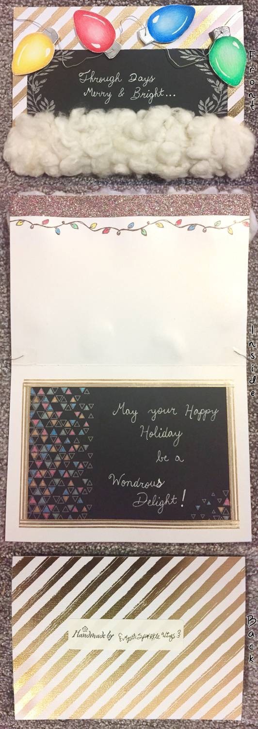
Holiday Card Project 2019
Oh would you look at that; I’m participating in the deviantArt Holiday Card Project again this year!
Just like last year, my crafty efforts aren’t really done proper justice by scans or photos, so I’ll be uploading a short video...somewhere (probably Instagram but we’ll see) and then link back to it to hopefully show it off a bit more.
It’s funny though, I’d almost forgotten about HCP until I got the notification that it had opened for this year. And yet I was so concerned about having it in the mail on time that I got this one done pretty much in one day. I think last year's card took me closer to 2 days and I was pushing my luck that it would get there in time.
My process for this year went as follows:
I browsed around on Pinterest for a while, as I hadn’t the foggiest idea what to do. During that process, I latched onto a concept I saw a few times; Christmas lights and the phrase “merry and bright,” and so I went with that.
Already I had the idea of the lights being across the top of the card, with a real piece of thread (which would later be changed to wire as the idea occurred to me while I was digging for some other supplies) connecting them. After some thought, I decided I wanted to add some cotton to the bottom to add a little more pizzazz. Because if last year’s HCP taught me anything, it’s that I like to go big or go home for the occasion.
And I knew where I could get some too; the fields next to the house have already been picked for this year, but there was still a good amount of cotton leftover on the stalks near the edges.
Let me tell you, I have a newfound appreciation for whoever invented a mechanical way to take the seeds out of cotton, because gosh darn it if that process is not far more tiresome than you’d think! I think I finally did manage to get them all out, but now I know why it’s probably just easier to buy cotton or polyester fiberfill. XD
Anyway. With my mind made up and a handle full of cotton at the ready, I started on the actual card part.
In the past, for my card needs I’ve usually used some of the pre-folded & cut cards my mom has on hand, but this time I didn’t feel like bothering her about it. So instead I grabbed a piece of my gold-shimmer cardstock and cut it down so that once I folded it I’d have a 5” x 7” card. (As that’s what Google told me was a fairly common size for greeting cards and would fit comfortably in most standard envelopes.) Then I used my trick from my book-making endeavors of using the edge of scissors to “score” the folding line on one side of the card to make that process easier.
In trying to make some stamps I didn’t end up using magically appear from whoever they were hiding, I found some metallic gold stripey paper in my stash and had the idea to cover the outside of the card with it, maybe. At the time I was a little bit skeptical if I wanted to do that, but I pulled it out and set it on the desk anyway so I could have the option if I wanted it. And as you can see, I ended up deciding to go for it, though at this point in the process I simply measured out and cut it as needed; I wouldn’t attach it until later.
Then I paused and used the scrap cardstock pieces to test some pens and such, only to find I was only minimally (at best) interested in using any of them.
I had some ideas to incorporate certain things but they were things I couldn’t really try out until I had more of the card finished, and some things I couldn’t figure out solutions for until then either.
So I swatched out some marker colors and started practicing on some print outs of the Christmas light shape—which is fortunately had the foresight to do the said printing out before I got into the thick of everything else—only to find that I just really was not happy with the blends I was getting. I think the main problem is that I just didn’t have certain colors I needed, but the glowing/fade effect I was trying to get was also totally new territory for me and I seemed to only get worse the more times I tried it.
In the end, I picked out a “base” shade for each Christmas light color from the markers and then selected a dark, a “true color” and a highlight from my Prismacolor pencils to do the shading instead. There were still challenges to be had, but this system worked a lot better for me.
Benefits of being a mixed media artist: if one medium just isn’t doing it for you, you can bring in others to level the playing field
The lights then got bright shine spots courtesy of my white Gelly roll pen and their little silver bits I did with a silver Art Philosophy watercolor. Even though I was already anticipating the silver getting kind of lost against the gold in the background.
I had a vision and I was sticking to it.
In addition to that vision, once the lights were safe to handle I glued them to a piece of foam and then left them alone to dry, figuring it would be easier and simpler to cut them out if I only had to do it once. As such, the edges aren’t super smooth, but otherwise, I think that was the right call.
While they dried, I then attached the gold-stripe paper to the card surface and started thinking about where and how I would implement the text parts of the card. (And at some point I took a break to figure out the full inside and outside please, as originally all I was going on was “merry and bright,” though I don’t remember when exactly in the process that was.) Here, I had the idea that black paper might look cool.
The only black paper I have is a pad of Crayola stuff that I think is actually for practicing calligraphy or hand lettering or something? My original plan was to take one of the pages out and use the blank back, but as I filled through I saw some of the cut out frame-y things and took a look to see if any of them would work for what I wanted/needed, and you can see the two I picked out. Though the one on the inside of the card had only the black and gray/silver originally; the colors I added by hand with my gel pens since it felt like it really needed it.
The black paper on the inside also needed a little more attention than the one on the outside. I didn’t cut either of them perfectly straight, but there were a lot more distracting elements that were going to be on the outside, so it was far less noticeable there. On the inside, I ended up going around the edge with some gold and white washi tape that when well with the outside of the card to camouflage the uneven edges.
By the time I had all the various papers properly attached to each other and the top edge inside of the card decorated with a strip of glitter tape and a repeating stamp of Christmas lights to tie in with the outside, I felt the lights were dry enough to cut out, so I did. And that meant that the /real/ card assembly could begin.
I punched little holes in the tops of the lights for the wire I’d add in later and then fiddled with their placement for a bit before gluing them down...which I then I had to wait for about twenty minutes before I could proceed if I wanted things to dry mostly flat.
So while that took its sweet time to dry I went back to the Crayola black paper pad to one of the pages with a grid on it to practice writing out the words for both the outside and inside of the card. In doing so, I discovered that the uni-ball Signo white pen, while bolder and brighter than the Gelly roll, made my cursive almost illegible by virtue of having a thicker tip. Which is why I went with the Gelly roll instead. Just printed handwriting didn’t feel right; I really wanted the fancier look of the cursive. However, I also wanted whoever gets the card to actually be able to read it too.
Eventually, the lights, while not fully dry, were dry enough that I could comfortably move on with the assembly.
And hindsight, perhaps I should’ve tried stringing the lights onto the wire before gluing them down. The main issue I had was that once I got the wire poked through the hole, it’d bump into the card on the other side and then not want to go anywhere at all. I had to play with it each time to get the wire to come all the way through so I could pull it to the next one.
Or maybe that would’ve made the gluing process more difficult than it was worth? We’ll never know.
And then I got to attach the cotton.
That actually ended up being a much smoother process than I anticipated, as the cotton doesn’t really separate from itself unless you pull it apart, so once I had parts of a clump glued down they were pretty stationary.
This was also the first time I dared use my crafting heat gun since I purchased it (which was a while ago; after reading the warnings the first time I’ve been too chicken to use it for fear of catching something on fire by accident ) as I originally thought I’d need more glue and I’d need to glue some clumps on, dry them, and then glue some more.
Fortunately, I seemingly put my big girl panties on for nothing as, after the initial layer of glue, I really only needed to glue a couple of other clumps down separately, and as I mentioned the cotton stick to the wet glue well enough on its own. But I had psyched myself up and gotten the thing set up, so once all the cotton was glued down I used the heat gun to dry the glue faster anyway.
I was amped up the whole time but I, fortunately, did not burn anything in the process!
I did end up going back and adding some blue gel pen to the black paper on the inside, as that was the only color not there and it felt sorely lacking, giving the lights elsewhere on the card. But other than that, once the cotton was all squared away, the card was done.
And I’ll be honest; I still like the card I made last year, but I think I’ve really outdone myself this time. There’s just something about the style of this card I enjoy so much more.
It’s equally over-the-top (as is my crafting specialty ) but it’s more refined, somehow, I think.
Either way, all that’s left to do now is mail it off and hope that the recipient is as pleased with the card as I am.
I can’t believe I’ve actually finished with it this early though! That’s so unlike me; I’m usually the one sneaking things in right on top of the deadline. But hey that means now I have one less thing on my to-do list so I can focus on other things...which may or may not include a holiday-themed kitty drawing in the works...
____
Artwork © me, MysticSparkleWings
____
Where to find me & my artwork:
My Website | Commission Info + Prices | Ko-Fi | dA Print Shop | RedBubble | Twitter | Tumblr | Instagram
2 notes
·
View notes
Text
Free Falling (kth)
characters : kim taehyung x you (guest appearances by the mochi, park jimin)
genre : fluff, romance, au
description: a story of how kim taehyung continues to fall in love with you throughout the years
author’s notes : this marks my official debut into this writing business, and though this isn’t my first time writing, it is one of my first works launched on tumblr ( was an avid aff writer once upon a blue moon ). ending is a little rushed, but i’ve been fixing and rewriting so many moments here that i realized i should just let this go and move on to one of my many other plot bunnies. neverthless, i hope you enjoy and i apologize in advance for the plethora of writing styles mashed into one here since i’ve been writing this in bits and pieces, and every day launches a different style / approach to convey what i want for this. should also warn you that this isn’t proofread so there may be typos / weird sentences here and there, oops!
word count : 3065
Five.
That’s the age Kim Taehyung claims to have fallen in love you, or so he says while retelling what he also perceives as the greatest love story of all time since Romeo and Juliet. You have to remind Taehyung then, that the Shakespeare classic is more of a tragedy than an epic romance, and that knowing the real definition of love at that young of an age is highly implausible. But once Taehyung’s mind is set on something it’s hard to change his mind, so despite your protests and eye rolls, Taehyung remains firm that it is five when you first make his heart skip a beat.
It begins with snack time at kindergarten, and today the teachers are passing out everyone’s beloved chocolate pudding. Because Kim Taehyung is an obedient kid (at this moment, you let out an un-lady like snort), he is the last in line because he had to put away all the blocks he was playing with into the cubbies. By the time it reaches his turn, there is exactly one cup left and just as his small fingers are about to clasp onto the delicacy, another grubby hand comes into view and snatches the pudding right from his eyes.
Taehyung’s eyes widen and his mouth pops open into a small ‘o’ as he turns his head upwards to meet the eyes of no other than his childhood nemesis, Park Hyunjoong.
Hyunjoong’s lips are curled into an evil simper as he stares down Taehyung, daring the latter boy to say something and when Taehyung doesn’t attempt to do anything, Hyunjoong lets out a loud chuckle. Taehyung’s been conditioned to let Hyunjoong have anything he wants, since the bully was bigger and also had a posse of other boys that followed Hyunjoong’s actions suit. From running over Taehyung’s sandcastles to smearing black paint over Taehyung’s masterpieces, Kim Hyunjoong was a force that Taehyun could not reckon with, and so with great reluctance, Taehyung swallows down his disappointment and pride, ready to let Hyunjoong take his snack.
But that’s when you come into view, marching in without a single fear in the world as you jab a finger into Hyunjoong’s side, causing the boy to jump up and simultaneously let go of the pudding cup. You catch it easily and step towards Taehyung, shoving it into his chest as he fumbles to get a good grip.
“Don��t you have better things to do than to steal other people’s food?” You turn your heel back to face Hyunjoong, who is still flabbergasted at the series of events. He releases a huff and something along the lines of “my parents told me not to fight with girls” before storming away, obviously a little shaken that someone had come in to defend Taehyung.
“T-Thanks,” Taehyung clutches the chocolate now with all his might, and when you turn around and flash him the sweetest smile he has ever seen in his life, his heart starts up a drumroll that quickens with each passing second.
“You’re welcome.” You say and after a moment’s thought, you reach out and interlock your fingers with Taehyung’s, giving him a slight tug forwards, “Come on. Let’s build a sandcastle."
You two have been inseparable ever since, much to the young boy’s delight.
><><><><><><><><><><><><><><><><
Twelve.
Taehyung is the newest addition to the community center’s junior soccer team and it’s either the best decision his parents had ever made, or it’s the worst. The sport helps wear off the seemingly endless bundle of energy Taehyung always carries, but it also paints his skin with purpling bruises and temporary scars. Still, Taehyung’s youthful passion for soccer helps keep him enrolled, and this is why he’s continuing to spend his Thursday evenings running around the grass field, kicking the black and white ball back in forth to his new friend (who will also eventually become one of this closest), Park Jimin.
You on the other hand, spent Thursday evenings learning how to draw and paint at the same community center’s art class. You get out an hour earlier before Taehyung, but given that you are attending the same place as Taehyung, his parents and yours worked out a carpooling arrangement. So, every Thursday after you finish packing all your colored pencils or watercolor paints, you make your way to the field and sit on the bleachers, watching Taehyung’s practice for the remaining time.
This particular Thursday is no different. The sun’s in the process of beginning to set when you make your way towards the bleachers, carefully climbing your way up the steps, before sitting down on the metallic benches. You pull out the short novel your class is assigned to read and open it up to the bookmarked page, skimming through while occasionally looking up to see Taehyung wave frantically at you or to see him exchanging high-fives with Jimin. You smile every time you two make eye contact, and after several minutes you decide that you can’t focus on the reading. So, you put the book back into your knapsack, pulling the zipper all the way around to securely enclose all your school supplies. Satisfied, you lean back against the higher set of benches, charcoal colored locks spilling over the seats as you drink in the sight before you.
Taehyung has moved onto goal and defense practice now, which consists of alternating the boys into goalie and scorer spots. You watch as Taehyung throws a bright, boxy grin at you before turning frontwards, top teeth sunken into his bottom lip in unmistakable determination as he focuses in on all the possible blind spots of Jimin, who is the current goalie. Inhaling a deep breath of air, he takes a few steps back before charging at the ball until the sole of his bright blue soccer cleats make contact with the ball, sending it flying in a diagonal direction of the post.
Jimin is fooled for a mere second, but the second has taken its toll, and despite earnestly lurching towards the ball, he fails to catch it, and the team erupts into cheers.
Taehyung wastes no time to jog up to his friend, who flashes him a good-natured smile in return, and runs out of the goalie spot, in which Taehyung fills in.
Another teammate whom you don’t recognize is the next one up, and he too, like Taehyung wears the expression of pure conviction. That is perhaps the reason why he sends the ball flying with two much force, in a crooked angle that somehow winds up being the same direction as Taehyung’s face.
The time slows as you watch in horror as the soccer ball makes contact with the goalie’s face, and he’s knocked back, landing on the soft patch of grass.
You hastily run down the bleachers, towards the forming circle. When Jimin spots you, he makes room for you to wiggle in as well.
Their coach has already arrived and is inspecting Taehyung carefully, brows knit together in worry. Taehyung on the other hand, remains motionless for a few more seconds before emitting a low hiss of pain. You feel your eyes beginning to water in worry and empathy, and you’re just a half step away from crying when Taehyung opens his eyes, and looks at you.
His nose is bleeding, right eye in process of becoming a black one, but he still manages to crack a grin at you.
You let out a soft sob as you dash the remaining small distance to your friend, hands gripping onto one of his.
"A-Are you okay?” You choke out and Taehyung wants to say yes, but he is in pain, so all he can do is let out another groan.
You free your left hand, reaching into the pocket of your jeans to pull out a clean tissue and begin pinching his nose, just the way your mother taught you when a bloody nose was happening.
“I-It’s okay, y-you don’t have to s-say anything.” You sniffle as you start dabbing at the mess under the bridge of his nose, “Y-You’re going to be okay.”
And Taehyung knows it is, because you’re here, taking care of him just as if you were his guardian angel.
><><><><><><><><><><><><><><><><
Eighteen.
It’s the night of your graduation, but instead of celebrating it, you’re flooding Taehyung’s chest with warm tears. Your first boyfriend, first love, Park Jinyoung, had just broken up with you after going out for about nine months.
Distance. Different paths. Dreams.
He had tried to explain the reasoning to you with the three different d’s, but all that resonated in your ear was, “Y/N, I think we should end this.”
You feel Taehyung’s hand rhythmically patting your back, his chin on top of your head as he feels every tremor, every vibration that is sent down your spine because of your loud sobs. Taehyung has never liked that sparkly-eyed boyfriend, wait, ex-boyfriend of yours for some “unexplainable” reason , and if he’s disliked him then, he’s hating him now, for bringing you tears instead of laughter, for breaking your heart, which simultaneously breaks his.
Who, in their sane mind, would break up with you?
Your bed shakes with another shake that’s not your own. It’s Taehyung’s phone which lays haphazardly next to him.
A message from Jimin (whom you’ve also become good friends with) saying that he just wrapped his graduation dinner with his parents and was on his way over to your house with chocolate chip cookie dough ice cream. Taehyung quickly texts back an okay and smiley face before tossing the device down again, returning to soothing you.
"I-It’s n-not l-like I didn’t expect t-this.“ You croak out, momentarily pulling away from Taehyung’s warmth. Your lashes are wet, voice is hoarse, looking so small that Taehyung just wants to pocket you and shield you from all the pain in the world.
"H-He’s b-been hinting at it s-since we turned in app-applications.” You continue, wiping your eyes with the back of your hand. From the corner of your eye, you spot Taehyung wordlessly reach for the box of Kleenex on your nightstand. “I j-just d-didn’t expect him to end it be-before trying it out.”
Taehyung remains silent as he carefully dabs at your eye with the soft cloth, much like the way you wiped away his injury almost six years ago.
“Am I j-just not good enough for h-him to want to try?”
Taehyung, who has been quietly supporting you for the past hour and a half, looks up at you, shell-shocked that you would even imply such absurdity.
And he voices it too.
“Where the f*ck is that coming from, Y/N?” He demands, almost shouts, because that sort of implication is just ludicrous and he wants to clean out any speck of insecurity from you.
You shrug, “Why else would he break up without even trying?"
"Because he’s an idiot.” Taehyung replies without missing a beat, “And as cliché as it sounds, you’ll find someone better. Someone that will fight through thick and thin with you. Besides, he’s not even that great. His face looks like a girl’s, and all he does is whine about how bad cafeteria food is, and he makes you wait for him after his classes instead of the other way around, and —”
“Stop it, Tae.” You cut off Taehyung’s long list of complaints of Jinyoung, “I don’t want to be that kind of ex."
At Taehyung’s confusion, you explain, "You know, the kind that just has negative things to say about her past boyfriend. I don’t want to be that kind of girl. He’s a nice guy despite everything and I wish nothing but the best for him.”
Taehyung wants to melt at the spot, because you are truly an angel. He feels the quenching of his heart them; it’s a bittersweet feeling because as much as he feels the pain with you, he feels blessed to know an angel like you — to love an angel like you.
Love.
It’s at that moment when you finally get up from the bed, ready to box up any items that remind you of Jinyoung, that everything clicks.
Taehyung loves you … has been loving you.
><><><><><><><><><><><><><><><><
Twenty-one.
It’s sloppy and rough, but you shouldn’t expect anything more from a product consisting of intoxicated minds and unspoken feelings.
It begins with a sudden feat that started a few weeks ago, when butterflies began swarming in flocks whenever your certain childhood friend happened to be near you. You realize then that he was no longer the chubby toddler who needed saving from playground bullies, no longer the clumsy athlete who always got injured someway somehow, no longer the sibling like figure because your recent thoughts of him were highly inappropriate for a brother.
No, you liked-liked him, possibly even more because the way you felt about crushes was nowhere near the intensity of this.
On the other hand, despite his composed facial features when you pull away from him for air, he’s a train wreck.
His feelings had been locked in a chest, key thrown out into the seven seas, yet you had managed to find a way to unlock all these hidden feelings.
Your lips are swollen, lipstick smudged, bangs matted against your forehead, and even though to others you look like a mess, to Taehyung you couldn’t be more beautiful.
He loves you even more now that his lips had been atop of yours.
He loves you even more now that his arms had wrapped around your waist.
He loves you even more now that you were flushed and red-faced, and that it’s mostly due to him than the cheap soju you had taken shots of hours ago.
And he loves you even more now that he has heard all your hidden feelings, coming out in a flurry because you’re scared and nervous.
He stops you with a finger pressed against your lips, his brows furrowed.
“Shh.” He hushes you and you feel your stomach drop because he obviously doesn’t share the same feelings and now you just ruined your greatest friendship of all time, but he responds to your change in facial expressions with an amused look.
“What are you thinking about?” He says softly, hooking a finger under your chin to tilt it upwards, “I just wanted to be the one who confessed first since I obviously have loved you longer.”
You’re at a loss for word at his outspokenness, but your mind turns blank once more when he slams his lips against yours.
><><><><><><><><><><><><><><><><
Twenty six.
If Park Jimin was a mean person, he would shut off his phone, flush it down the toilet, or something along the lines so he could never be reached again. His mobile phone began to tremor approximately an hour ago, but now it’s in a full blown out seizure, no thanks to a certain Kim Taehyung, who Jimin know regrets calling a close friend.
But Jimin is not a mean person, so he leaves his phone on, lets the Kakoatalk messages arrive in a frenzy because Taehyung isn’t patient enough to send everything in a long block, and tries to be even more understanding than he already is.
Taehyung is currently having a panic attack because nothing he had planned is going through.
He originally had a reservation at your favorite Italian restaurant, but for some reason the booking never got marked. You two had arrived there decked in semi-formal clothing, only to be turned away because the restaurant is always full and despite Taehyung’s pleads, the effort is futile.
Which is why you two are currently strolling down a busy street, pausing every now and then to pick something up from the multitude of food carts stationed in this area. You don’t seem to mind, but Taehyung is crushed that he couldn’t provide a romantic setting.
Hence the nonstop complaints sent to Jimin’s way, interrupting the older boy’s peaceful night of League.
Jimin lets out an annoyed yelp when his champion dies in the middle of a team fight because his phone had set off at an unexpected time, causing him to flash and burn all his abilities in the wrong order. There’s curses and swears sent his way from his teammates because his death ultimately leads to an “aced” for the other team, but Jimin still remains cordial when he unlocks his phone to read Taehyung’s crisis, which currently involves the younger boy spilling fish cake soup all over his white dress shirt and now he looks like a mess and he couldn’t possibly propose to you this way.
Propose.
Yes, that’s what Taehyung intended to do on this particular day because he can’t imagine a life without you and can’t wait to set a new milestone in your two’s life together.
But he’s having second thoughts about this, that is until his phone lets out a soft chime, indicating Jimin’s response.
jimin: she’s seen you in your boxers that has holes in it and you think a little stain is bad? man up and get this over with so you can let me climb to plat in peace.
Taehyung locks his phone with a gulp, swallowing down hard as he peers nervously at you who is currently collecting more napkins to dry Taehyung’s shirt.
“Ever the klutz.” You chuckle as you wipe at the wet spots, and Taehyung is panicking so hard that he lets it all slip.
“Marry me.” He squeaks and you pause momentarily in your actions to look up at him, making sure that you heard right.
Did he just propose while you were cleaning his shirt?
“I-I love you so much.” He stammers, “Loved you since I was five, and every day with you I continue to fall in love with you more and more."
Your heart is ramming against the chest at this point, and it only threatens to escape your chest when he drops down on one knee in old fashion.
"So, will you make me the luckiest man, Y/N, and allow me to love you more and more through the years?”
…
Jimin dies again, when his phone excitedly buzzes again, alerting him that he is now a best man and that he probably should just stop playing video games for the night because this is probably the first of many text messages from a very animated Taehyung.
#taehyung scenarios#taehyung x reader#bts scenarios#kim taehyung#taehyung x you#taehyung fluff#divnitae
62 notes
·
View notes
Note
Hello ! I am a 14-years-old artist and since you're young as well, I would like to know if you have any advice to young artists who are trying to get a little noticed like me ? Also, any digital art tips ? Ty if you answer !!
Hey there anon! Thank you for asking! ♥ That is a subjetc I really like talking about cause it’s something that, honestly, is not very easy and can be very different for different people. Getting your art noticed at first can seem like an impossible mission, especially if, like me, you’re still climbing your way towards “essential” improvement, and by essential I mean the fundamentals of art, like anatomy, composition and other theorical stuff. As an artist that is still in the middle of this process, I feel so honored to know someone wants my advice to get through steps I’ve gone through, that means I’m progressing well, so thank you for that ♥ But anyhow, I’ll try to sum up what I feel like are very very VERY important tips for young artists, based on what I’ve learned/self taught myself throughout the years. c:1) Don’t do it to get noticed; do it for fun. Of course, feels so good to get a fantastic feedback from followers and other dear mutuals, it’s just amazing! But it’s a human being fact: when we turn fun into work, it becomes boring and stressful. When I started the blog, I pushed myself to post every single day. I thought that if I was very active, I’d be noticed more quickly. At first it was okay, I learned a lot of stuff really quickly trying and trying repeatedly. But it soon started feeling like another source of pressure in my life. So I went back to how I did before, drawing for fun, doing it cause I love it, cause it’s my passion, working to improve, and it all got so much better. Being noticed should not be your main fuel, love should. And all the rest comes as a consequence of how much love you put in what you do. Not only in art, but everything in life.2) Practice. Practice a lot. Never stop.Right after having fun, improving myself as much as I can is the second main thing I focus. There’s a quote that I like that goes: “May you be pleased with your work, but never satisfied”. Keep on practicing, constantly. I recommend keeping a sketchbook with you, and trying to make yourself draw some sketches on it every single day. But keep in mind: It doesn’t have to be perfect! It shouldn’t be! Make gesture drawings, scribbles, doodles, sketches. Draw from life or from your mind. If you like drawing faces, draw many different faces, experiment shapes and styles. Challenge yourself to draw something you’re not good at. No need to push yourself to make it perfect on your first tries, keeping on trying is the key for any young and specially self-taught artist. If your art achieves what the viewers looks for in quality, it’ll be noticed sooner or later.3) When it comes to getting your art more noticed, focusing on fanarts might make it easier.Okay that might sound weird, but it’s true. Starting out and gaining some popularity as an OC artist is DAAAAAMN HARD. At first, my blog was gonna be OC focused. I kinda gave up cause 1) I noticed I didn’t really wanna draw OCs anymore for a while :’) and 2) As we know, fanarts are much more likely to get noticed than original characters arts. Luckly for me, I love the AoT fandom so much and it was quite easy for me to feel like an active part in it when I started trying. It’s a really nice fandom overall in my opinion, which accepts all kinds of art pretty well, so it’s a good starting point for you. Of course, if your original art is good and innovating it’ll gain popularity with certain ease as well, but it’s not that common for young and begginer artists like us to expect that from ourselves right off the bat so I guess that’s worth saying.4) Find mutuals/fellow artists/your inspirations!Before creating my blog, I’d never been in touch with other artists that produced the same kind of content I do; I did it all just for the sake of doing without really showing anyone and without any critique, just keeping it all for me. Tumblr really changed it for me. I made fantastic friends here, some of which are EXCELLENT artists that I look up to so so so much. Being in touch with other artists, along with making it much more fun to be a creator of content, helps you learn much more about what you need to improve by constantly noticing how they draw certain thing, what kind of style they use and having someone close to you that likes the same stuff you do and might like your art as well!I could go for hours talking about stuff I think are very important on improving your art and bringing people to notice it more, but I think it’d get too long and something like a “lesson” and I don’t think art is something that can be taught to someone in that way. You can teach the fundamentals I mentioned before, but art is something that should come from each individual in my opinion, and growing with it is a different experience for each different person. :3About digital art, I’m still a begginer in that and my traditional art is much better than my digital art in many aspects (except coloring, cause I don’t practice coloring with pencils much and don’t have watercolors yet ;-; ), but from what I’ve learned these past few months, the three most important things are: 1) Get to know the program you use, whatever it is. As a begginer, I’d definetly recommend using Paint Tool SAI. It has some great tools, just enough to start out and make some good art, and it’s not too hard to use. By getting to know your program and it’s settings and tools, you’ll eventually know by heart just which tool to use everytime and how to make things look more natural and flow better. Also, I believe moving to Photoshop or whatever other program that has more tools after getting used to SAI is much easier than picking it up straight away. There’s also the pen tablet of course which is essential in my opinion (I ain’t got time, patience and skill to draw with a damn mouse :^) ). There are some good ones that are not very expensive and do their job pretty well! 2) Don’t get stressed out if your art is not as clean and well done as it usually is on paper. For me personally, learning how to draw digitally has been almost like learning how to draw all over again. It’s not as easy to transfer the ideas from my mind to the computer screen as it is on my sketchbook. I have a messy drawing style by nature, so things like linework and coloring digitally were very tough for me at first, and it took some practice to get to the point I am, in which I still need A LOT of practice and improvement. But my point is, try and try and try again until you get to a point in which it looks cleaner and it flows better, like it does on paper. Play around with different brushes and textures, perhaps you’ll find one that matches your style better.3) PRACTICE! That sounds cliche, but it’s true. It’s the only way to improve. There’s not much to say about it overall, but what I like to do to practice is take some random reference photos and “trace” over them, not like, literal tracing, but turning the body into blocks so I can understand better how joints work, for example, and how they look when bent like this or like that, so when I draw it by myself I’ll remember that and it’ll look much better. There are also many sites in which you can challenge yourself to draw based on certain reference photos in a strict time that you can choose, I’ll link you two of them: x y So, these are some of my tips for you as a young artist to improve your art and therefore get it noticed sooner or later, I hope this was helpful in some way! If you have any more questions, please feel free to PM me, I’d be glad to give you some more advice that I couldn’t put here so it’d be too long (and my “Keep Reading” thing doesn’t work for some reason :^) ) and give some more in depth tips in digital art! Kisses and hugs and good luck! ♥
#ask#answered#sorry for the huge text#anon#I love writing long texts tho#even though it took long to write this one
7 notes
·
View notes
Text
My name is Kenley Jones and I am originally from Coastal North Carolina, currently residing in Central Pennsylvania. If you were to ask me, even just two years ago what I thought about the watercolor medium, my response would have been mixed. I knew what it was, but art was just not happening in my life at the time.
Here is a preface to the now. I grew up loving art, and drawing, even at an early age. My favorite subject to draw were airplanes. My dad was in the United States Marine Corps, and worked on them. The A-4 Skyhawk to be exact. He would take me on base to his shop and give me some GI computer paper, and GI Mechanical Skilcraft pencil. I would sit and draw airplanes for hours. As I got older, I drew more things.
I remember Christmas would net me drawing pencils, drawing pads, and sometimes, a whole Art kit. In high school, I took Art class all four years. We would have to turn in one good sketch every week. My main passion was just drawing. I did do a couple paintings with acrylic which were very abstract (One actually won 3rd place and ended up hanging up in the local Holiday Inn for some time).
After high school, I never really thought about art much, or drawing. That was over 20 years ago. Until, my first son was born. My wife had asked me to do some nursery wall art for the room in a nautical theme. She knew I knew how to draw. I had this big prismacolor set in the basement that I never used. So, at the end of 2015, my first attempt at Art was a top side view of a Blue Crab, in colored pencil. I was actually pretty surprised at how well it turned out. I never did this good in high school, 20 years ago. I went on to do some more sea creatures in colored pencil. I liked colored pencil, but man, it took a long time.
Now, before I get to the good part, watercolor, I will explain the title of this post. It has been over 20 years since I have sketched, or did anything artistic. I do think that you can get better with practice, but I didn’t practice. I think that being older, and having life experiences, has the answer to the question of how I am better now, than way back when. As age defines a person for what they become, new perspectives take shape as well. But most of all, I just think that it is a gift from God, despite all other opinions.
In the beginning of 2016, I was at the point of wanting to try something new. I thought “watercolor”! I always see these coastal themes and seascapes, and think, man if I could do something like this! So, I go to the store (you know the one), and buy a set of watercolors, some brushes, and watercolor paper. I want to keep it simple so I opt for more sea creatures on a white background. I love the simplicity of it.
I love how the water and pigment goes on the paper. I love the crispness of it. Being from the coast, I really love doing these type of paintings with tuna, mahi mahi, pelicans, etc.. My favorite paper that I use most often is Arches 140lb cold press.
How I paint
I simply start with a sketch of the subject using 2h to 5h pencil. Though, I might start using a 2b in the future. Then I decide what colors I want on my palette (I use a new palette each time with new paint). After my sketch is done, I go in with the watercolor. At first, it was hard to wait for the paper to dry, but I don’t mind it now. I don’t use a hair dryer (yet). I often go from light to dark colors as I paint.
My style now, is that my watercolor is sort of tight and detailed. One of my most treasured pieces is the “Blue Crab on a Pier”. The outcome was what I was striving for, and all of the stippling was well worth it. I love trying out new techniques that I learn. I am still in the beginning stages of a watercolor artist, so I love learning new things. And anything that I learn, I love to pass on as well.
One of the most important things I have learned is to allow mistakes. Sometimes, these mistakes can add something, and they can teach you something. As I move forward, I want to try new things, new subjects, and perhaps, get a little more relaxed with a loose style. I am on a mission to learn and to reign in on my new perspectives.
I never, before, would have seen myself in love with this medium, but I do love it, and the elegance of it as well. I look forward to seeing the art here on Doodlewash, and to meet other people in the same art medium.
One golden nugget that I have to offer is this. Support your local art store. You will not only be in the midst of awesome products, but in a bank of knowledge from people that are more than willing to give, especially if you buy even one of those Tombow Drawing pencils (which is what I use), or not. ASK for a discount! They are not blind to the fact that you might have a 50% off coupon saved on your phone’s image storage for another big box store down the street. The place I often go to gives me a, get this, “Professional Artist Discount”. Whether or not I consider myself a professional artist, they do, and they respect my business.
Kenley Jones
Instagram
Etsy
Doodlewash
#WorldWatercolorGroup - GUEST ARTIST: "A Long Break Brings A New Perspective" by Kenley Jones My name is Kenley Jones and I am originally from Coastal North Carolina, currently residing in Central Pennsylvania.
#WorldWatercolorGroup#animals#doodlewash#featured#illustration#painting#sketching#watercolor#watercolour
1 note
·
View note
Text
An open letter to Hamilton (etc) fan artists, Re:whitewashing
Hello. Time for another ill-constructed rant on probably already well-tread ground. Specifically whitewashing in fan art (even more specifically Hamilton art though this could be applied to any fandom) and when it is ok. lol jk it’s never ok.
PLEASE NOTE: I am an (amateur) artist. I am not ragging on artists because I “don’t understand how hard making art is,” “how hard artists work,” or what have you. These are legitimate problems of representation in fanart (that I have witnessed firsthand) and this is my earnest attempt to elucidate these issues. Feel free to interact with this post as you see fit. I am always free for debate if you disagree, would like clarification, or have anything to add.
+Look out for those embedded hyperlinks for more content
Preface: I am a member of far too many fb Hamilton groups. Sometimes people post their art, apparently forgetting that when you post things online you open yourself to critique. Hilarity ensues.
I often see Hamilton characters (generally portrayed as original Broadway cast members - Lin-Manuel Miranda, Okieriete Onaodowan, Anthony Ramos, etc.) who have been horrifically whitewashed - complete with lightened skin, bizarrely red or light brown hair, lightened eyes, and so forth. The most common defenses for this misstep, from both artists and fans, are personal style and apparent inability to approximate accurate skin tone (“I tried but skin color is hard”). Here’s why both of those excuses are utter bullshit.
1. Personal Style:
A lot of things in life are open to interpretation and all art is inherently interpretive. But the racial and cultural identity of a real life person is not one of these interpretive things. [PAUSE: before anyone says that this is precisely what Hamilton is doing with its casting, don’t.]
First of all, I get it, personal style is important to art. Some people trend toward realism while others prefer more abbreviated, abstracted, and/or cartoony styles and part of that is selecting stylized color palettes, interpreting color in new and inventive ways, and playing with light, value, line, form, etc. This is NOT what I am talking about. It is entirely possible to honor a person’s background using relative or approximated shading/tone/coloration and to create beautiful art in the process [example: Chris Vision’s color series]. This little rant is specifically directed at people who "attempt" to depict Hamilton (etc) actors/characters using realistic/semi-realistic color palettes (as in, how they appear irl, accounting for abstraction, drawing style, etc) but fall short when it comes to depicting the actors, particularly in regards to racial background. You can find excellent examples of what I mean at Calling Out Whitewashed Hamilton Art and I’m positive you can find far too many examples in this and many other fandoms simply by scrolling through the tags on Tumblr and Instagram.
So without further ado, lightening a person/character’s skin in fanart is racist. There’s really no ifs, ands, or buts about it. Foremost, the practice of editing a person of color to appear more European (skin, hair, eyes, even facial features) intentionally erases the cultural, racial, and ethnic background of the person in question. This is incredibly disrespectful to the actors who portray these characters and works to undermine what Hamilton as a whole is trying to build. If Hamilton is trying to reclaim American history for People of Color, stripping the racial, ethnic, and cultural backgrounds from the actors represents a rejection of conceit and, perhaps, even a form of appropriation. It is as though “fans” are saying that they want the art that is made by and for POC while simultaneously rejecting the distinctly racialized aspects of that art. When artists depict Lin!Hamilton as white, they are rejecting the Nuyorican background which Lin brings to the character in both writing and performance and projecting faux whiteness upon the character. In doing so, whether consciously or not, they are rejecting the actor’s race as well. Lin is beloved because of the art that he makes which allows many fans to look past his racial and cultural identity rather than accept it as an intrinsic aspect of both the man and his art.
Moreover, the ubiquity of this whitewashed art also reveals a lot about what “fans” find visually appealing and acceptable - e.g., the Eurocentric standard of beauty. Whitewashing in art represents not only a rejection of POC’s culture but, obviously, their physical attributes as well. Dark skin is lightened and or whitened, hair is often straightened and/or lightened to a light brown or red hue (with the exception of Laurens, whose features, hair in particular, are often feminized as a form a queer fetishization but that is a rant for another day), and features are changed to appear more European. Often, depictions of characters are changed so much it is nearly impossible to tell that the art is based on any particular actor. In addition to being, again, extremely disrespectful to the actors, this further perpetuates the extremely harmful notion that beauty only exists in European features and sends a direct message to POC fans that their appearance is neither beautiful not accepted by the fanbase of a piece of media that was made by other POC specifically to appeal to them. This seems especially true of dark skinned black individuals who are often completely stripped of the melanin in fan art, further driving home notions of ingrained cultural colorism and anti-blackness.
With Hamilton in particular, it is fine to “change” a character’s race if and only if you are depicting a character as a different actor. For instance, while Lin!Hamilton is Latino, Michael!Hamilton is a black man and depicting Hamilton as such, while uncommon among fan communities, is better than fine [*the lack of art of dark skinned actors is another point of contention. Not only are dark skinned actors frequently whitewashed, many are ignored altogether]. Depicting Michael!Hamilton as light skinned or white, however, is obviously not fine.
Having established that lightening a character’s skin or depicting them with more European features is inherently racist, the claim that whitewashing is a stylistic choice is invalid. If you make the “stylistic choice” to depict a POC as white, you are racist. End of story.
And if you want to do better but find yourself wanting to draw Lin!Hamilton as white, remember that this guy existed and just draw him instead. It’s not that hard.
2. Technical Difficulties:
One of the most unfortunately common excuses for whitewashing in fanart seems to be that, for some reason or another, artists have difficulty accurately approximating actors’ skin color so they presumedly just make something up, This results in Lin!Hamilton and Phillipa!Eliza looking a bit like Snow White, Oak!Mulligan looking a little tan, and so forth. As an artist, I understand that approximating realistic skintones can be rather hard, especially with traditional mediums, but it is glaringly obvious when artists don’t put in any effort.
With traditional mediums such as paint, markers, or color pencils, artists can blend to create the colors which accurately (or as accurately as possible given the limitations of certain mediums like watercolors) approximate actors’ skin tones. If the colors dry lighter than intended, the artist generally layer and blend more to achieve a better approximation. If they then scan their image, they can use a photo editor to fix or correct any mistakes. It might not be the easiest to find good matches (speaking from experience, there aren’t a ton of good warm brown toned markers and thus a lot of blending is sometimes required) but, as previously stated, it’s generally easy to tell when someone at least tried to get close to a correct skin tone.
With digital art, it’s even easier. Fact: Nearly all art programs have a nifty eyedropper tool which can be used to pull color swatches directly from a reference picture. Even MSpaint has this function. By pulling multiple swatches from a variety of reference images (to account for different lighting conditions), an artist can build a relatively accurate gradiented palette for skin tone. It’s really that simple! And if an artist notices that the color isn’t quite right, it’s nothing a few tweaks to hue and saturation can’t fix!
If my tone seemed a bit sarcastic/passive aggressive in that last paragraph, it’s because it totally was. I see this excuse so much more often than I see any other excuse for whitewashed fan art and it is incredibly frustrating but also, as an (extraordinarily mediocre) artist myself, it rings incredibly inaccurate, especially for digital art. I completely understand that it sometimes takes a lot of time to get used to a medium but when an artist’s color palette is literally limitless, there is absolutely no reason (aside from personal, possibly subconscious/implicit but no less real, biases) for an actor/character to be depicted as white/light skinned when they are not. As previously discussed, that is disrespectful and harmful, and really only serves to make the artist (and those that support work) look like a jackass.
And look, if you find yourself making whitewashed art, it’s not as though it is impossible to change. When someone criticizes your whitewash-y art, don’t get defensive. Don’t claim that it’s your style or that you don’t know how to color POC. It looks and sounds really fucking ridiculous. Instead, evaluate your art and place it into a cultural context. Take it as an opportunity to improve. And maybe also take the opportunity to learn a little about yourself and your biases.
This wasn’t meant to be a call out post and I’d like to end this on a positive note so here are a few wonderful Hamilton fan artists who are worth a look:
terror-in-a-dream
zzzoehsu
linmanwhydididothis
mikiprice
thegentlehoneybee
dorothywonderland
maeng
#hamilton#lin-manuel miranda#fanart#fan art#whitewashing#racism#longpost#rant#daveed diggs#Okieriete Onaodowan#phillipa soo#alexander hamilton#anthony ramos#lams#discourse#Renee Elise Goldsberry#john laurens#michael luwoye#jasmine cephas jones
8 notes
·
View notes
Text
Watercolors (epilogue)
☔️Read the first part here!
Pairing: Kyungsoo/Reader
Genre: Fluff (artist! au)
“...and then, I have nature and art and poetry, and if that is not enough, what is enough?”

You swing open the door and step into your shabby apartment. The yellow-stained walls and peeling paint don’t exactly scream ‘welcome home’. Well, it’s not like you made an effort to pretty up the place anyway. You only have essential furniture, and nothing decorative-- no houseplants, no carpets, no pictures, no paintings…
The uneven wooden tiles seesaw back and forth as you walk across the room. You toss your bag at the leg of the coffee table, and only watch with a neutral expression as all your sketches pour out. You throw yourself onto the couch and a satisfied sigh escapes you. You lay still, staring up at the cracked ceiling. The setting sun pours in from your balcony, coloring the room an orange tint.
It’s been about a year and a half since you moved to Paris. Luckily you’re quite fluent in French, after taking it for eight years straight. But the transition was hard, no doubt. New country, new people, and new job. And… no Kyungsoo.
The first encounter with your boss wasn’t so hot. The meeting was literally the day you landed in Paris, and you had to show up with your eyes all swollen from a whole flight of tears. It took several months for you to adjust to your new lifestyle. Your life used to revolve around Kyungsoo; he was all that you knew. But you made a choice. A choice that you have to follow through.
So you buried yourself in your job, trying to take your mind off everything. For the first month, you practically lived in your office, surrounded by loads of papers and fabrics. You lost count of how many pieces of clothing you designed that month, and worked to the point of exhaustion.
Now, more than a year in, you’ve settled down in the apartment and office. You have a couple of good friends, your job is going smoothly, and there’s even a cute guy that constantly asks you out for coffee. But you’ve never once said yes. You keep telling yourself it’s because you want to focus on your work, but deep down you know that’s not the reason why.
A loud ping awakens you from your mini nap. You grumble as you rub your eyes, looking around for your phone. The sun has completely set by now, and only the only source of light in the room is from the streetlamp right outside the window. You feel around the floor for your phone, and finally locate it under some loose papers. There’s a single text from your boss.
“Y/N, can you drop off the portfolio at this client’s house from this morning? I’m a bit tight on time right now so let me know if you’re free.”
“Yeah, sure thing, I don’t mind.” You have nothing to do, so you figure you’d take this evening stroll. The weather isn’t too bad.
“Thanks a bunch! You’re a great help. I’ll send you the address right away.”
The house was actually pretty close to yours, but just in the opposite direction that you’ve never been to. You’ve only walked left to the office and that’s about it.
On the way back to your apartment, you decide to wander around the neighborhood a bit. The wind has picked up quite a bit, and you tuck your hands into your loose sweater. The streets are fairly quiet, and dimly lit by the lamps on the sides of the houses.
Then, you notice a blinding white light up ahead that clearly looks out of place. As you walk closer towards it, you see that it’s coming from a tall glass building at the corner of the street. You squint slightly as you peek in. It’s a white lobby, covered with paintings on the walls. You stare through the window, intrigued at all the different types of art.
Your curiosity gets the better of you, as you find yourself inside the front entrance. The receptionist greets you with a light bow and a smile.
“Good evening, are you here for lessons?” she says, starting to pull up something on the computer.
“Oh! No, no! I’m just um... looking around,” you mumble, motioning towards the paintings on the wall. You give her a nervous smile and lower your head slightly.
“Ah, of course! Don’t be shy,” she reassures you with a kind voice. “Here, come follow me.” She steps out from the counter and leads you into a room in the back. You gape at the bright room with rows of paintings hung up.
“Take your time! I’ll be right here if you need anything.” The receptionist stands at the end of the room, and you find yourself browsing through the images on the walls.
It’s been so long since you’ve even looked properly at paintings. You’ve always avoided it because it would only remind you of Kyungsoo. But it’s about time you get over it. You examine the artworks closely, remembering everything Kyungsoo had taught you. You knew every style of painting, every technique it involves, and all the craft behind it.
“Are all of these by... the students who go here?” you ask across the room, assuming this is an art school of some sort.
“Most of these are, yes. These are our best.”
She’s right. They’re all amazing. Hard to believe that these are done by students... You scan down to the other side of the room, and you had to do a double take. From afar, you see a painting of the backside of a girl, her hair fluttering in the blue sky. You skip the paintings to your right, and you’re drawn to the one at the end of the room... as if by magic.
You’re entranced by the piece, and a wave of nostalgia washes over you. The colors in the background blend so perfectly, the blue and white shades come together so naturally. Each strokes is so familiar, and the whole painting feels like home.
You blink once, and suddenly, you’re back in Kyungsoo’s sunlit studio. You stare at the unfinished canvas that he was working on, just a month before your departure. Your pupils dilate and your hearts starts to race, as you watch the base layer of the blues and whites that you loved so much, turn into the beautiful painting right before your eyes.
You hold your breath as you walk closer, and slowly shift your eyes to the label next to the frame.
Do Kyungsoo
The Light of my Life, 2017
Watercolor
Your heart almost jumps out of your chest. You take a deep, sharp breath after forgetting to breathe for a while. You can only gaze back at the painting, frozen in place. It takes you a long time to process everything.
You whirl around and run towards the receptionist, and she jumps back in surprise. “T-that painting,” you pant, pointing in the direction you just came from, “was by someone here?”
“Um y-yes! It’s actually by one of our new teachers,” she replies, staring at your distraught expression. “Actually, he’s here right now if you want to meet him. And ah, that painting is my favo-”
“Where? Where is he?!” you gasp, grabbing her by the arm.
“H-his studio is on the second flo-” You run off towards the stairs before she can even finish her sentence. You climb the steps like your life depended on it, your breaths short and heart racing. Your mind is a vortex of emotions and questions.
Could it really be him? But how?
What should you do if you really see him? It’s been over a year. We both have our own lives... Does he have a new girlfriend now? But you too, you’ve moved on... right?
You reach the top of the stairs, and are greeted by the light coming from a room with no door. From there, you can already smell the paint tubes mixed with the smell of pastels. You take small steps, and stop yourself at the edge of the entrance. You take a long, deep breath and close your eyes.
You gather up the courage, and look inside.
And there he is. That perfect backside that you walked away from, his chestnut hair that’s still trimmed to the same length, and the way he holds the brush so naturally in his hand-- it’s at this moment that you realize you’ve never once forgotten him. You stiffen up at the entrance, at a loss for words. Is this... a dream?
Your bag slides off your shoulders and drops to the floor. Kyungsoo spins his head towards the direction of the sound, startled. His doe-like eyes stare right back at yours, and you feel your face start to quiver.
It’s Kyungsoo. It’s really him. He’s here... But why?
Kyungsoo blinks quickly a few times, before setting his brush down. He gets up slowly and walks towards you with an unreadable expression.
He lifts his hand up, and combs out your tangled hair with his fingers. The same time you feel his touch, your tears overflow. He gives you a soft, yet pained smile before holding you tight against warm chest. He has the same citrus scent, one whiff and you feel like you’re home.
“Took you long enough...”
A/N: I have a thing for ambiguity, if it hasn’t been obvious🙆🏻🙆🏻 I’ll leave the rest to your imaginations, but it’s a happy ending :^) Thanks for reading these two parts and I hope it was an enjoyable emotional rollercoaster!~
( @baehuns here hana, have your fill of fluffy ksoo 💖)
#watercolors#kyungsoo#kyungsoo fanfic#kyungsoo x reader#kyungsoo fluff#kyungsoo au#kyungsoo scenarios#kyungsoo imagines
202 notes
·
View notes
Text
“No great artist ever sees things as they really are. If he did, he would cease to be an artist.”
– Oscar Wilde
My name is Virgil Carter, and I’m a watercolor painter, teacher, workshop leader and Internet commentator. I live in Boerne, Texas and paint in the Texas Hill Country, as well as from my global travels.
I paint and teach a variety of watercolor subjects, but especially enjoy painting landscapes and town/urban scapes. I am concerned with telling stories in paint which share a personal and expressive idea, emotion or feeling about my subjects. Color and light figure strongly in all of my work.
I am fortunate to be a signature member of the Baltimore Watercolor Society, Pennsylvania Watercolor Society and the Philadelphia Watercolor Society. I’m also a member of the Boerne Art League and the Guadalupe Watercolor Group. I’m a retired architect and past Head of the School of Architecture, Oklahoma State University.As a watercolor painter, teacher and workshop leader, I’m used to hearing students ask, “How can I find my painting style? How can I find my own personal expression?” It’s an important question for every serious painter. A quick answer is “Paint 100 paintings and your style will find you! You won’t have to worry about finding it!” In other words, put mileage on your brushes, and practice, practice, practice! But there are some ways to approach painting which make it easier and enjoyable to find your own personal expression.
Painting Loosely and Colorfully
I approach painting and teaching watercolor by urging students to strive to paint “loosely and colorfully”. What does that mean? For one thing, it means forgetting most of the more conventional watercolor “rules” about painting realistically what one’s eyes see. Instead, I suggest painting what your heart feels about a subject. Edgar Degas said, “Art is not what you see, but what you make others see!”
Painting “loosely” is really just about paintings which appear spontaneous and look like they were fun to create. Loose paintings never appear labored or overworked, and details are often minimized or ignored.
“Hill Country Morning Breaks, No. 2”, is an original watercolor 15” X 11”, one of a series, on 300-pound Kilimanjaro cold press paper using American Journey and Davinci paints. The painting is loose and colorful exploration of the transformation of the beautiful Texas Hill Country by the color of the very early morning sun. Painting in a series is an excellent way to explore a wide range of “loose and colorful” ideas in paint!
“Hill country Last Light, No. 1”, is an original watercolor 15” X11”, one of a series, on 300-pound Kilimanjaro cold press paper using American Journey and Davinci paints. The painting explores the colorful change in emotions and feelings of the subject through the use of last light and a loose, colorful approach.
Strong and memorable paintings often tell stories, suggest ideas, or convey feelings or emotions. Painting loosely and colorfully opens the doors and frees painters to tell their stories about almost every possible subject. Approaching a painting loosely and colorfully encourages sharing ideas, feelings and emotions one has for a subject in highly personal and expressive ways, i.e., one’s personal expression.
Figuring Out Your Story
Watercolor painting is both a thinking exercise and a technical exercise of mixing and applying paint. It’s usually a good idea for a painter to figure out the story they want to tell before picking up a brush! Sargent said, “Watercolor is making the best of an emergency!”, meaning that the water, paint and gravity frequently have a will of their own, so in most cases painters would do well to have their intent for the painting clearly understood before picking up the brush and applying the first paint passage.
“To paint a successful watercolor it seems one must know what the finished result will look like before the first stroke of a blossoming color is applied to the paper.”
– Dianne Middleton
Fortunately, there’s a secret weapon available for painters which enables exploring their story and deciding the best approach for telling it. The secret weapon is a sketchbook, aided by a soft pencil!
A series of sketchbook studies for “Cypress Creek Sunrise, No. 1 and No. 4”, and other work.
The sketchbook is the perfect place to explore one’s ideas for a subject using small, quick thumbnail sketches. These sketches allow the exploration of design, composition and value structures quickly and easily. A series of thumbnail sketches also serves to familiarize the painter with the subject, and eliminate the hesitancy for a subject when painting is underway. Said differently, a sketchbook is a painter’s GPS and gets the painter past the first ten minutes of a painting.
“Cypress Creek Sunrise, No. 1” an original watercolor, 30” X 11” on 300-pound Kilimanjaro cold press paper using American Journey and Davinci paints. The painting explores the beauty of the small, meandering Cypress Creek in Comfort, TX and the special quality of the early morning light.
“Cypress Creek Sunrise, No 4”, is an original watercolor, 15” X 22” on 300-pound Kilimanjaro cold press paper using American Journey and Davinci paints. The painting, part of a series, takes a closer look at Cypress Creek in the very early morning light. The two paintings illustrate how design and composition can transform the same or similar subject.
Secrets for Painting Loosely and Colorfully
“I found I could say things with color and shapes that I couldn’t say any other way… things I had no words for.”
– Georgia O’Keeffe
I paint and teach using three “secrets” to make it easy and fun to paint loosely and colorfully. Here are the secrets:
1. Learn to see, design and paint using simple, but visually interesting shapes
“North Woods, No. 6” is an original watercolor, 30” X 11” on 300-pound Kilimanjaro cold press paper using American Journey and Davinci paints. The painting uses a combination of large and interconnected shapes to tell the story of the beauty of the southeast coast of Maine. Without the large shapes, there would be no story!
Design your painting, and tell your story, using several large dominant, interconnected and interesting shapes. Don’t worry about visual realism or local accuracy. Let your imagination run free with personal and expressive shapes. Viewers of your work are intelligent and they will quickly identify what you are painting. Importantly, if your paintings aren’t composed of large and visually interesting shapes, no amount of small detail will save the painting.
2. Energize your painting through the use of a wide variety of edges
“Through the Hole in the Trees”, is an original watercolor 11” X 15” on 300-pound Kilimanjaro cold press paper using American Journey and Davinci paints. The painting employs a wide variety of edges to create movement in the painting and to bring the viewer’s eye to the story and focal point—the hole in the trees!
“Little Joshua Creek, No. 3”, is an original watercolor 15” X 22” on 300-pound Kilimanjaro cold press paper using American Journey and D. Smith granulating paints. The painting uses simple but strong shapes and a variety of edges to move the viewer’s eye into the painting from the bottom and to the distant view between the trees in upper left third of the painting.
Shapes are defined by their edges. A variety of edges throughout a painting will create visual movement, hold the viewer’s attention longer and make clear to viewers what is truly important in the painting, and what is secondary. Not everything in a painting can be equally important! There are at least three types of edges which every “loose and colorful” painter should use:
Hard edges
Hard edges are created by wet applications of paint on dry paper. These edges always attract and hold the viewer’s eye. They tend to be best reserved for the truly important elements in a painting—the focal point or area of interest, for example. Be very cautious about making every shape in your painting a hard-edged shape.
Soft edges
Soft edges can be created in a variety of ways: wet into wet; wet on dry, followed by gently lifting to create a soft edge; etc. The eye is attracted briefly to these edges, but moves on after a brief gaze. Soft edges are complementary and supportive of hard edges, and best used for secondary and intermediate passages in a painting.
Lost edges
Lost edges are a bit more challenging to create and usually require adjacent passages of similar hue and/or similar value, or both. The viewer’s eye is not attracted to lost edges and does not pause, but keeps moving to other parts of the painting. Thus, lost edges are wonderful for encouraging movement to the more important parts of a painting. In addition, soft edges are wonderful for suggesting distance , depth and space in a painting.
3. Be bold and imaginative with color
“Hill Country Abstract, No. 6”, is an original watercolor 11” X 15” on 300-pound Kilimanjaro cold press paper using American Journey and D. Smith granulating paints. The painting is a highly personal and expressive exploration of the wonderful Texas Hill Country where I live and paint. The last vestiges and color of light, combined with deliberate representational and abstract shapes and the marvelous texture of granulating paints, help convey the emotion of this painting.
“Hill Country Abstract, No. 8”, is an original watercolor 11” X 15” on 300-pound Kilimanjaro cold press paper using American Journey and D. Smith granulating paints. This “color poem” explores a “what if” approach to color to help create a uniquely personal and expressive story about the Texas Hill Country.
For a painting to be “colorful”, one simply must use rich, bold color in energetic and personal ways. Paint-water ratios must be paint rich, and each brush application must be made with a fully loaded brush. Here’s another secret for colorful paintings: change the color every two inches! Sound childish, but it works!
Rather than be locked into local color, there are many other, more creative approaches to make one’s work personally expressive. For example, consider colors which suggest strong emotions; exaggerated colors; “what if” color approaches; climatic/environmental/lighting colors such as sunrise and sunset; and outrageous/outside-the-box colors. The range of approaches for color, beyond local color, is so broad and expansive that it’s almost impossible to describe them all!
For best watercolor effect, the colors may be introduced directly into the painting and allowed to mix together on the paper and left alone. Mixing colors on one’s palette often “homogenizes” the mixture and doesn’t allow the marvelous blending of colors on the paper which is the hallmark of watercolors. Never, ever, overwork or be fussy about paint and color applications. Get in and get out—here’s where minimal strokes are important!
Why Paint Loosely and Colorfully?
Thinking about and painting loosely and colorfully is a “freeing” exercise in paint! It frees one from attempting to realistically render a subject, and frees one from the worry of local design, composition and colors. It frees one to be personally expressive and tell one’s story in a unique manner.
“Round the Bend, No. 2”, is an original watercolor, 18” X 24” on 140-pound Arches cold press paper using American Journey and Davinci paints. The painting is another personal and expressive exploration of the rolling hills, small back roads, iconic trees, big sky and distant views which characterize the Texas Hill Country.
“Twilight Time, No. 2”, is an original watercolor, 18” X 24” on 140-pound Arches cold press paper using American Journey and Davinci paints. The painting explores the warm pinky-oranges colors of early evening and how they embrace and transform the landscape of the Texas Hill Country.
Painting loosely and colorfully can lead to highly expressive works which, over time and with experience, become truly recognizable as unique personal expressions by individual artists.
“Painting is self-discovery. Every good artist paints what he is.” – Jackson Pollock
Remember, finding one’s direction—one’s own, unique personal expression in painting—is the goal of serious painting. I wish you a happy journey as you seek to find your own personal direction and expression. Comments and critique welcome!
Virgil Carter
Website
Fine Art America
Doodlewash Gallery
#WorldWatercolorMonth GUEST ARTIST: "Finding Your Own Personal Expression" by Virgil Carter “No great artist ever sees things as they really are. If he did, he would cease to be an artist.”
#WorldWatercolorGroup#WorldWatercolorMonth#abstract#artist#featured#inspiration#Landscape#painting#plein air#teaching#watercolor#watercolour#World Watercolor Month
2 notes
·
View notes
Text
My name is Jenny Kroik. I was born in Russia, grew up in Israel, and now live in New York City. I started painting very young. I always felt that painting was a great tool to communicate my point of view with the world. I think the biggest struggle I had (and still have) is to find a meaning or purpose in what I do. When I was younger, I felt that you should only do things if they benefit society in some large, heroic and long-lasting way. That idea brought a lot of aggravation into my work.
It also took the joy out of it to some extent, because no matter how I looked at it, my paintings seemed smallish in the great scheme of things. I went to grad school hoping to resolve some of these conflicts relating to my work, but even though my degree was in Painting, I found that I was making art that I didn’t like to please others. Lately, I’ve found that, ironically, as an illustrator, I was making art that was more pleasing to me, and felt more like it was for myself (even though there is a clear “client” and “market” involved). It was an important re-discovery, and I became more confident about the things that I produce now.
I started to take painting lessons when I was about 13, and I started with watercolors (because my mom deemed all other paints too toxic). I’ve used watercolors a lot, and it is still my go-to medium. I think that as a kid, I felt that the watercolors were missing a bit of solidity to them, so when I tried gouache paint years later, it all clicked. With gouache, I could use the paint in the watery-style that I am used to, while adding opaque tones and solid layers. I think it fits how I feel now, that I’d like the painting to be more like a statement rather than a suggestion, or something in between those two.
I use Yarka St. Petersburg for watercolors. This was the first set I used, and my mom actually brought it with her from St. Petersburg. Sometimes, when I run out of a color in my set, I squeeze some M. Graham watercolors or Winsor & Newton, whatever I happen to have around. The most important colors for me to have are sepia, cad orange and ultramarine blue. Besides all the basic colors, these complete my color palette and I have trouble painting without these.
For gouache paints, I use Holbein, they are my favorite. Their colors are very solid. I found with some other brands, when you open the tube for the first time and squeeze out the paint, lots of liquid comes out, this doesn’t happen with Holbein. If you pre-mix them in little tubes with a few spritzes of water (like I was taught by my art mentor) then they last for a long time.
I like to use brushes that are on the cheaper side, because they are usually stiffer. They are not quite as stiff as acrylic brushes, but not as soft as the nicer watercolor brushes. The softer ones are not as precise for me. Maybe I used crappy brushes for so long that I got used to them, and when I paint with a fancy sable I just don’t like it.
I can’t really name any particular brand of brush. I used to love these Princeton Art Advantage brushes that I would always get at the $2 bin at the university bookstore in Oregon, but I haven’t been able to find a good substitute yet, I’ll let you know when I do.
My current favorite for paper is Fluid 100 paper, hot press, 140lb. I also use Arches hot press paper a lot, and sometimes Arches cold press for portraits and quicker paintings. (the cold press absorbs too much, and for longer paintings it just eats all my paint).
I also like to use “mystery paper”- I have a stack of paper I’ve collected throughout the years, and I have no idea where it’s from or what it does. some of it is for printmaking, some for markers, some of it rice paper.I pick a sheet from the stack and paint on it, and see what happens. It’s always most stressful when it works out really great, because then I don’t know what this paper was and where to find it again. But it’s good to be a little bit stressed about your art sometimes.
I use palette paper (any brand) and the paint tub with two sides – one with a scrubby side. That is perfect for cleaning the brush and avoiding running to the sink every 4 minutes. Also, a cotton rag is crucial. If I forget my rag I feel lost. Paper towels absorb too much and I don’t like to pollute the planet.
I used to use a lot of waterproof pens, like the Winsor & Newton pens or Microns for sketching and doing a wash on top, but I haven’t been working with line in a while. Maybe I should go back to it a bit. I also like Pentalic sketchbooks.
Learning meditation really helped me and my work as well. It’s similar in many ways to the artistic process, and learning and reading about mindful meditation helped put into words the things I was always struggling with at the studio. For instance: how can I sit down every day and make painting after painting, and still find new possibilities in the work? Or how can I reconcile the painting I planned to make with what actually came out (including spills and dirty fingerprints)? And one of the hardest things: how can I sit down to paint when my mind is constantly filled with noise, judging voices, criticisms, endless comparisons to other artists and their successes, and just random static?
Meditation definitely made my time in the studio not only less torturous, but also more productive: It gave me the framework to study unpleasant emotions like an objective observer, and I find many treasures in the icky moments that I would normally try to push away.
After moving around a lot in my life, I now live in New York City. This is probably the favorite place I’ve lived in so far, and also the least comfortable, dirtiest, cramped with jerks, and most aggravating at times. But I feel most comfortable in the city, and I feel like being around so much creativity and energy has really given me an artistic push. I can let my inner jerkness out and be pushy and demanding. Things that were absolutely not allowed in Oregon, where I lived for 8 years.
Oregon was quite the opposite of New York. it was quiet and calm on the outside. There was one museum in the town I lived in, and the art scene was fairly small. I developed a practice of mining for inspiration in daily life. Going out and looking for interesting things, applying a “filter” on the world, trying to see everything as an interesting or funny painting. Instead of museums, I roamed around thrift stores and antique shops, sketching what I saw. Finding visual interest in an army of white older ladies that all wore the same khaki pants and Patagonia fleeces. Going back to the same place or person, and painting them over and over again.
Oregon was maybe a quiet, and lets face it, boring place, but it was an awesome place to really figure out what I’m into as an artist. It’s a great place in general where one can fall apart and reconstruct oneself. (If you’re looking for such a place, I recommend it.)
The way I developed my practice came from all the time I spent thinking about what “inspiration” is. It started from this damaging idea I had that inspiration is something that comes to you like a vision from outer-space: I had a vague memory from some time in my past, maybe high school or when I was working on my BFA, that art ideas would just float into my life like a religious experience, and I would see the painting in its entirety in my mind, accompanied by a strong emotion that made it feel like it’s going to be the most important painting that ever existed.
This was my idea of what inspiration is, and I had no way to go back to this magical past memory and confirm or deny that this is actually what I felt, but I was left with a strong belief that, at one point, I was inspired, and painting was easy, and now I’m all tapped out. It was a very upsetting feeling. There’s nothing more damaging to your practice than to become convinced that once upon a time you had a sack of magic art beans, and now that they’re gone, you have to live out the rest of your life being uninspired.
Finally I’ve decided that, even if I did have magnificent magic art beans and now they are gone forever, then those beans were bullshit, and I didn’t need them anyway. They were crap scam beans. Instead I’m going to develop a sustainable practice that won’t fail me. It’s going to be with me on good days and bad days, when my art is pretty and loved, and when it’s just an undefinable mess. When I’m in the middle of New York surrounded by hordes of amazing drawable people, or if I’m in a deserted industrial truck-depot.
And, honestly, without such a practice, I wouldn’t have known what to do with all the amazing visuals I encounter. I probably would have “saved them for later”, too intimidated to approach them.
My practice consists of doing something hands-on, art related on a daily basis. Ideally, I would paint/draw at least an hour a day. It could be anything from sketching or doodling from life, drawing silly cartoons, mixing colors, cutting papers into little compositions (I haven’t done that in a while, that sounds like fun right about now!) .
Sometimes on an unproductive kind of day, I count collecting imagery as part of my daily practice, but I don’t think it exercises the same parts of my brain that keep it playful. Taking photos or looking for reference material online is important to plan a solid illustration and keep concepts sophisticated and fresh, but this process can become too mechanical if you make that your only prep work before a painting.
Doodling and playing with actual materials brings the lightness and fun into my work for sure. That said, I work from photos and think it’s very important for my paintings to have a variety of really solid photo reference. Sometimes, one blurry photo is all I have, so then I have to supplement it with studies of my own anatomy, or search for pictures online of someone holding a certain pose, a material, a detail, a machine or animal I don’t quite know how to paint, etc.
While working from photos, the biggest challenge is to stop it from becoming flat, or just a copy. There should be a point to why this is better as a painting, something that you’re trying to show with it. A lot of it is about editing and color. I want to stop the world, remove everything that isn’t important, and shine a spotlight on a little moment, a beautiful expression, a funny juxtaposition, or something that tickled me in the right way, but I’m not sure why.
The painting process for me is definitely a way to reexamine a fast-moving life and slow down time in order for me to think about my experiences, but do it in a form of indirect conversation with whoever looks at my work.
I think I have been slowly bringing together all my styles and interest, and distilling them. All my interest: abstraction, figurative art, concept, color and a journal-style practice, where I draw very fast what I see that day, I have been cooking these down into a nice reduction of all the sauces of my previous practices. The test of what a “successful” painting is to me is that I actually love looking back at my work over and over, and I feel like it’s “me”.
In this past year of living in New York City, I realized that painting people was something I really love doing more that other subjects. A big part of my work has been loitering around town. This is a practice I revived back form when I lived alone in Boston when I was working on my BFA.
I used to spend a lot of time walking around thinking about what I should paint. Now that I’m older and bolder, and also shameless, I incorporate into these walks taking pictures of strangers and also sketching them, when I can.
One of the things I felt most deprived of in Oregon are museums. I made it a point to go to all of the museums in New York City. (So far I haven’t even seen half! There are so many!) One thing that I discovered is that museums are a great place to look at people. Not only do they walk slowly, they are also usually well-lit.
I can sketch and photograph them, and if I miss a cool person, I can snake around the displays and catch up with them in the next gallery! (I’m not creepy at all). There are also a ton of tourists in museums who take a thousand pictures of everything, so I blend it well.
There are a few museums that I found people dress up for more than others, for instance the MOMA. I love it when people dress up for a museum, it makes me hopeful that art means something to people. It’s almost like the artists themselves were there, and people want to honor them with their best clothes. The recent fashion exhibit at the MET (Rei Kawakubo/ Comme des Garcons: art of the in-between) brought out the most amazing people. My head almost exploded trying to capture everyone I saw. So many interesting people!
I still have a huge backlog of ideas for paintings on my to-do list. Since moving to NYC I probably shot about a Terabyte of photos. I probably did about 70 paintings of people in museums so far. I really enjoy it, so I hope that people aren’t sick of seeing them! This is a fun project, and maybe it will evolve into something more in the future.
In the next step in my art, I would love to continue evolving my composition style, making it more sophisticated, and also developing concept further in my work. I would also love to work in animation again.
Jenny Kroik
Website
Instagram
Facebook
Twitter
Society6 Store
EDITOR’S NOTE: This is the second feature from Jenny Kroik who was one of the very first guest artists on Doodlewash back in August 2015. The format has changed a lot since that time. If you’re a former guest and would like to share your latest story with the community, please contact me!
Don’t Miss World Watercolor Month In July!
GUEST ARTIST: Aimless Strolling, Kind Trolling by Jenny Kroik - #WorldWatercolorGroup @jkroik My name is Jenny Kroik. I was born in Russia, grew up in Israel, and now live in New York City.
#WorldWatercolorGroup#conceptual#doodlewash#featured#gouache#illustration#museum#New York#painting#watercolor#watercolour
1 note
·
View note
Text
My story is not typical of many of the artists who have been featured here. I came to art late in the game. I didn’t draw and doodle much as a child. I didn’t study art in school or college. My path was very different.
I grew up in rural northern Indiana. I love the rural Midwest landscape, especially trees and fields. I went to college in Utah, where I learned to appreciate the desert landscape and mountains. I graduated and came back to Indiana and earned a Ph.D. in linguistics from Indiana University, where I taught for 26 years. During that time, we moved to forty very rural acres in Solsberry, Indiana. We had two children, made a beautiful garden, and I learned to weave and dye.
In due time, I started a side business selling hand-dyed yarn and handwovens. In 2011, I started blogging about our rural life and all the crazy things that happen out here. Those disparate activities taught me a lot of important things. As an academic, I learned to study and ask questions. To be a better dyer, I learned everything I could about color theory and color mixing. To be a better blogger, I learned photography and composition.
One day in 2014 on Facebook, I was tagged in one of those memes where you have to answer 20 questions about yourself and one of the questions was: If I had the time I would _____________. I found myself answering: If I had the time I would study painting. I had recently turned 50 years old and it had always been a secret dream of mine to be a painter.
I thought about that for a long time and then decided that just studying painting was a great way to start. I still study all the time: many different artists, styles and mediums. I study color. I study composition. That Christmas I got myself a little ‘how to watercolor’ book and did a few of the exercises. I let myself paint a lot and didn’t worry if it was bad. I painted the same scenes again and again. I took a few online Craftsy classes in watercolor and got a lot of encouragement. I took a watercolor class offered through the local community college and again got a lot of encouragement. The instructor invited me to join the local watercolor society, which I did.
I kept painting and painting and sharing my work with others. Someone suggested that I submit one of my pieces to the juried member show of the Watercolor Society of Indiana and it was accepted. At that point I got serious about watercolor. I took multi-day workshops with nationally known artists. I painted and painted.
What I like best about watercolor is also what is most challenging about watercolor. It’s unruly. The truth is, a lot of my life is that way. Our forty acres are big and messy and vulnerable to the caprices of nature. I spent years photographing and blogging about our life out here but I could never quite express the feeling of all that sky meeting all those trees meeting all the rest of rural Indiana until I started painting it. I love it when folks look at one of my landscapes and say, ‘Oh, that reminds me of home!’ I try to put as much home as possible in every painting. Things may not be tidy out here, but they sure are interesting. That’s what I paint.
The one thing that has made the biggest difference in my art has been my choice to be confident in my approach. Sometimes this means I paint confident garbage, but mostly it means that I am painting more and more good things. Using professional quality materials is a big confidence booster. I paint on Arches 140lb cold press paper. I use tube paint from Winsor & Newton, Daniel Smith, Mission, M. Graham and Sennelier. A single color can differ from maker to maker. It’s OK to experiment and try several different makers. Right now I really love how M. Graham and Sennelier have such intense colors and easily wetting paint – they are both made with honey and won’t dry on your palette. (As a beekeeper myself, I love that!)
Those are my beehives and I really do paint them bright colors like that!
My process is to gather several reference photos and then start putting together thumbnail sketches of the basic large shapes in my composition. I don’t try to make my painting match any photo. I might do a notan. Then I decide what colors to use. I might do a color harmony swatch or two. Or five. Then I dive right in on a 10 x 14 inch piece of paper and do the first draft.
This first draft is just that: a DRAFT. It’s not going to be perfect. I adjust colors. I take things out. I put things in. I pencil in possible corrections to the composition. I get a lot of feedback. In the end, this draft is usually a mess.
Getting feedback from multiple sources is really important to the process. It’s necessary if you want to find out whether or not you’re communicating what you think you are in your painting. It’s easy to get really focused on something and forget what else might be there. Feedback helps remind you about the whole painting. If they all say, ‘What’s that blob?’, then perhaps you need to work on it. But if one says, ‘Oh, I love that red shed’ and another says, ‘I don’t like that red shed’, then you know it’s fine, it’s just a matter of taste.
Feedback also tells you about the person giving the feedback. I once had someone spend 15 minutes telling me why a ½ square inch of my painting ruined the whole thing for her. It was a reflection of where she was in her life, her own issues and insecurities. I listened politely and she left feeling happy that she had set me on a better path with that piece. I did not make the change she suggested.
A great way to get feedback is to start a critique group. You can meet in person or start an online group. Find people who are interested in improving their art, not just getting positive feedback on any attempt. It doesn’t have to be watercolor – all art deals with color, shapes, value and composition. Find people who can give and take suggestions with grace and tact. Learn how to give suggestions with grace and tact. A good way to suggest a possible change is, ‘What if…’ or ‘Have you considered….’ Often, when I post a piece to my crit group, I do have an idea of what I’m unsure of in the piece and I come right out and say it. That helps focus the feedback on exactly the areas I want to work on.
Once I get some feedback, I make whatever changes I need to and start the next draft. As I work, I take the time to sit and look at the piece. See how it looks from 10 feet away. If your studio space is too small for that, then snap a pic, pull it up on your computer and take a look. If the painting works SMALL, it will work BIG.
Once a piece is finished, I set it aside and move on to something else. Then I come back to it after a few days/weeks to see if something jumps out at me. I make any changes and sign it, photograph it and frame it. Framing is an important step for me. It’s a way to give the piece some polish, to send it out into world, best foot forward. I use conservation quality mats and frame myself using ‘Best Practice’ techniques that I glean from professional framers and museums. Once the piece is framed, it is ready for immediate sale, shipping or exhibition. That saves a lot of last-minute fussing later.
My personal challenges these days are around color (always) and brushes. I try to take regular, everyday type rural scenes and paint them in an innovative way using unusual colors. I’m trying to work larger and that is forcing me to try new brushes and larger ones. My favorite brushes are the Princeton Long rounds, but I just got a size 30 round Mimik and I have to say I’m loving it for the big work. Every once in a while I try a piece using only a 2 inch flat brush. That’s a real challenge for me.
I will continue to study and paint and see where the art takes me. I hope my story has given you confidence to pick up a brush or pencil and just start. Wonderful things will happen, even late in the game. There are many paths to becoming an artist. I hope you find yours. And when you do, I’d love to hear about it!
Robin Edmundson
Website
Blog
Facebook
Instagram
Pinterest
Google +
Twitter
Etsy shop (hand-dyed yarn)
#WorldWatercolorGroup - GUEST ARTIST: "Many Paths Lead To Art" by Robin Edmundson -#doodlewash My story is not typical of many of the artists who have been featured here. I came to art late in the game.
#WorldWatercolorGroup#aquarelle#art#artist#farm#featured#inspiration#painting#rural#watercolor#watercolour
0 notes
Last Seen Blogs

reverse-vampires
reverse-vampires
light-and-spirit
A side blog dedicated to FFXIV

oneclickfarm
Untitled
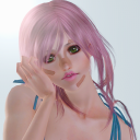
sideshowsnob
Sideshow_Snob

distributorkopi
Distributor kopi