#i like the color palette when you add the gold in particular !
Note
I see from your about that you're a gyre main, any tips on fashion for her cause mine kinda sucks lol
Of course, my dear friend! Brace yourself--
Welcome to Prin's Gyre Fashion Guide!
To start, I'll share my usual look, plus a couple of seasonal ones.

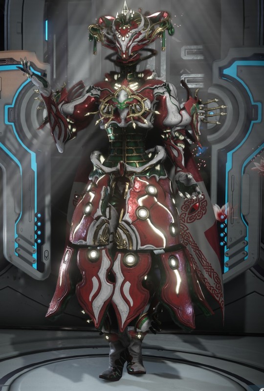

There are a few personal rules I stick to when fashioning her, which I'll explain below. Let's start with her default palette.
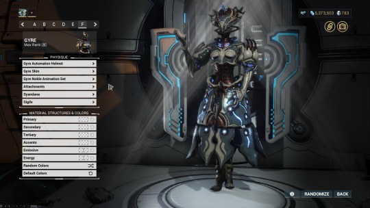
You'll notice that I use the Automaton helmet exclusively. This is to balance out her off silhouette (body shape). Her default helmet is nice, but comes off as too small when put in proportion with her skirt.
Now, to colors! We're going to go in reverse (Accents first), because I always start with a color I'm sure of, and I'm always sure of her metallic accents!
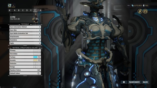
For Accents, I will usually use a soft metallic (gold, silver, copper etc) color, as high saturated colors can often be a bit much. Of course, this depends on the look you're going for.
Moving on to Tertiary (also seen above), I enjoy showing off that beautiful texture with a bold, saturated color. Darker colors also work here if you don't want to bring attention to that area.

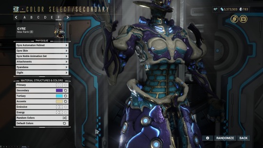
For her Secondary, you can either go with a dark or bright, saturated color. I want this particular look to stand out, so I'm going to go with the brighter purple.

Her Primary color shows the details in her 'face', so I'll often use a color that is easy on the eyes. In my experience, using darker colors tends to make her face and details unreadable.
I will usually use only minimal Armor, if any at all. Gyre's arms are bulky and legs are often hidden, and there isn't much point to using armor unless you have a particular look you're going for!
For Ephemeras, I will avoid anything that covers her frame's design. She is already highly detailed, and busy Ephemeras can often add visual noise. This takes away from the look as a whole!
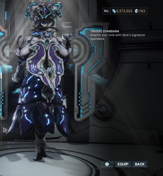
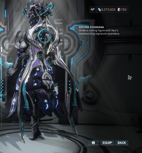
Gyre has a big, bulky skirt that will snag just about any Syandana (including her signature..) that falls below her waist. You'll want to choose something that isn't going to get caught, and I try to find ones with circular themes to fit the rest of her design.


For the final touch, I'll add Mag's Heirloom Signa. This is completely optional as not everyone has it, but I just like how it plays with her helmet.

And there you have it!! One fresh Gyre fashion, fresh out of the oven!

Of course, the main thing is experimenting what works for you, but I hope that I could at least point you in the right direction.
Happy Fashionframing, Tenno!
#warframe#gyre#wf gyre#fashionframe#this was fun! thanks for sending it through!!#hope it helps a little!
17 notes
·
View notes
Note
I saw your Pokémon character designs and was so curious, do you have a particular way you go about outfit design? Your outfits are so varied and they just really jive with the characters, you have a great eye for it!
Aaaa thank you!! I'm not sure if I can give an answer that's actually helpful but for me the most important part of the character design process by far and away is establishing a silhouette and what kind of space they are going to take up in a frame.

While I am not an animator I do try to take an animator's approach to my designs, in that I keep them mostly simple and easily replicable with cohesive shapes that distinguish each character in shorthand, and color palettes under ten colors, oftentimes with outfit details sharing a color with hair and eyes.
Like if you are going to be drawing something a lot I cannot emphasize how important replicability and silhouette are.
As far as the actual design choices go, that's a little harder to describe. D&D characters interpreted into Pokemon were a great exercise because it's a setting where characters wear flamboyant costumes that often have blatant themes, so it's easy to add in little in-universe details that tell a bit about the character or reflect something from their original selves.

Using Tibalt the DMPC as an example, in the game he is a level 20 wizard headmaster of a seaside adventurer's school who resides in a lighthouse tower. He is known to have access to Wish, his favorite animal is the seagull, and his school banner colors are black, gold, and teal.
The obvious translation to Pokemon was that of a regional professor, the closest thing Pokemon has to a network of dubious archwizards. His robe becomes a coat, something between a labcoat and a sailor's peacoat patterned so that when closed it forms a starburst, functionally turning him into a beacon.
The fact that the best choices for his Pokemon just happened to match his established color scheme was uhhhhh serendipitous. Some of the others (Sid.....) were not so lucky.
I think my next point of study for outfit design needs to be on actual structure. seams, buckles, rivets, tooling, the stuff that really sells it.
Thank you for the ask!
38 notes
·
View notes
Text
·˚ HEADCANON: APPEARANCE.

this is a quick roundup of headcanons that focus primarily on tingyun's appearance. tidbits of headcanons on foxians as a whole will be sprinkled in here as well but i have plans to write a foxian worldbuilding meta to lay out all canonical details of their race + society and add onto what we know with my own inferences.
canonical, but worth mentioning since this is a running theme throughout these headcanons: a large interest of her's is cosmetics. her interest began from a place of self care and confidence building and eventually evolved into another tool in her area of work.
tingyun was born the equivalent of a runt by foxian standards, so she's a bit smaller than the majority of foxians her age. the real life fox breed i'd equate her appearance to would be a fennec fox due to how MASSIVE her ears and tail are in comparison to everybody else, even yukong.
tingyun maintains a simple aesthetic throughout her wardrobe and makeup choices. her everyday clothing fits the trends of the xianzhou and she tends to lean into warm neutrals like brown and off whites. red is her usual accent color (but she's picky about what type of red she wears), and her metal preference in any accessories is gold.
the only outlier in her color palette is her jade abacus- while being extremely important in foxian culture and essentially being a type of smart watch, it also never gets taken off. it is intentionally small enough to never come off of her wrist unless it is broken, similar to the real life practice of wearing jade bracelets.
scent preference time ! tingyun has a variety of perfumes that have become essentially decor on her vanity because she always sticks to the same scent profile. she likes light florals with hints of citrus and water. her soap, body wash, shampoo, conditioner, etc. is all coordinated with similar scent profiles. she's the type of person that walks by and you turn your head like damn who smells so good??
she takes care of her health and appearance as a whole, but there's a heavy focus on her hair and fur- tail in particular. a big source of insecurity in her youth was in her appearance and that was largely equated to how large and fluffy her ears and tail are. it sounds silly, but foxian culture has largely been war based so looking as unthreatening as she does- along with her inherently passive nature- makes her a prime target for scrutiny. her pride in how meticulously she takes care of her hair & fur is largely in part to her trying to embrace what she can't change. she is very consistent with washing, conditioning, brushing, & maintaining it. the hair on her head and tail are treated almost exactly the same so they are both very soft.
smaller note on her hair- she has the tips of her hair and tail dyed a subtle, darker red. it is not natural and she redyes it every month or two.
i'll expand on this in a biology specific headcanon, but tingyun has all of the standard (...in my canon) features of a foxian including fox ears, a tail, sturdy & semi-retractable claws, longer canines & incisors (& overall sharper teeth), a longer & flatter tongue, and a naturally darker pigmentation around her eyes.
as for her claws, they grow quicker than human nails and they're on the thicker side. they naturally grow sharp, but she manicures them regularly and files them into more of an almond shape. they're usually a light, translucent nude-pink. she does it herself in her down time during her self assigned "self care days."
when visiting other planets for her work as a trade amicassador, tingyun will do her research to be familiar with their fashion standards and dress to match as best she can. if there is not enough information on this before she arrives, she will take time to people watch and mimick from there. her intentions are not to blend in or pretend to be one of them, but to show from the beginning that she is here to talk things through and respect their culture. as somebody who avoids conflict to the point of not having a weapon on her, i imagine her voyages are meticulously planned down to these little details. it is worth noting that during formal events or meetings, she will sometimes opt for xianzhou's fashion to show that she is representing them.
9 notes
·
View notes
Text
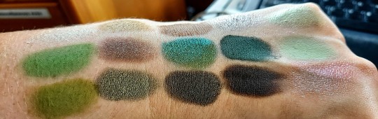
Mint Chocolate Chip, but Make It Grunge.
Hello there! I’m back with a new BYOP, and this one is pretty straightforward. Green and brown is such an underrated color combination in makeup. I love doing a brown eye with a green lip, or vice versa, or doing a neutral eye with a bright green eyeliner in my waterline. Hell, sometimes I’ll even bronze up my face (something I don’t do very often) and then swipe some green highlighter on the high points of my face.
So, having said that, sometimes I get the urge to build myself a green and brown eyeshadow palette to play with. I originally wanted to go more minty with the greens (as the title of this post suggests, I was originally planning more of a mint chocolate chip inspired palette), but as I was swatching and deciding what to put in the palette, I found myself more drawn to the grungier greens. Even still, I did want some brightness from the greens, so I did a mixture of brighter greens and grungier, brownish greens.
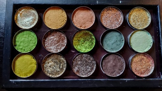
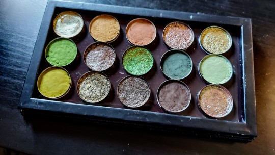
The pictures of the palette were taken in natural light, which washed out the colors a bit but I tried to edit them in such a way that you’d get a more accurate representation of the color story. This was also only supposed to be a 9-pan palette, but I got carried away.
I started off by picking my browns because I knew I wanted a really rich, dark, cool-toned brown, and I ended up choosing two finishes for this particular color, one matte and one metallic. I also wanted a matte taupe, and ended up picking a really foiled metallic taupe to accompany that, as well. As I sifted through my browns, Lithium was calling out to me, so I added it to my group. It’s a bit warmer than my other browns, but it has some green/blue glitter in the finish and thought it would make an interesting addition to the final palette.
The greens are where I got carried away. Green is one of my favorite colors, but especially in eyeshadow, and I have such a lovely, diverse collection of greens that I felt compelled to add a few different shades to the palette. As I wrote earlier, I intended to go in more of a minty green direction but decided to go with more plant-like greens to start with. I will also take any excuse to include Chantilly (bottom row, second shade) in a BYOP, so that was the first shadow I picked. It’s got a brownish/greyish base color with a foiled olive green finish, so it tends to play really well with browns.
This is when I decided not to go the mint route, although I added a touch of minty green with Hint (middle row, last shade). I added that particular shade after pulling in Untamed (middle row, fourth shade), which is the most cool-toned green in the palette. It works well with the warmer, more yellow greens in the palette, but I also wanted a way to blend it while maintaining its coolness.
I followed that up by picking a more leaf green matte, a chartreuse matte, and a green-undertone light brown. It was then that I decided to make this a 15-pan palette because I couldn’t bring myself to whittle the palette down. This left me with four spots to fill, so I opted for some metallics.
My first choice was the multichrome in the center of the palette, called June Bug from Chaos Makeup. It shifts from orange, gold, green, and a bit of teal. I’m not sure how well it will work with the entire palette but I couldn’t help myself and added it in. Marvel (top row, last shade) was also calling out to me, and I think it pairs really well with the entire palette, so I was happy to include it. Finally, I pulled my two favorite green duochromes. One is more of a tan base—although on me, it matches my skin tone pretty well—with a bright green shift and the other is a soft reddish brown base with more of a blue-green shift.
All in all, I really like how this one turned out! The greens feel a bit eclectic, but I think the browns really ground (no pun intended) the color story and bring a cohesiveness to it all. I’ll leave you with some swatches and a list of the shade names, as well as which brand and palette they’re from.
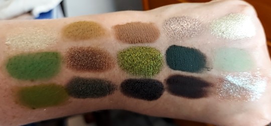
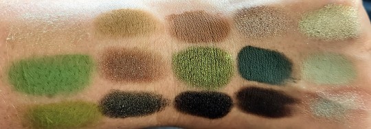
List of eyeshadows in the palette (left to right):
Top row:
Ray - Beauty Bay Wilderness palette
Figure - Blend Bunny The Dollhouse palette
Twig - Anastasia Beverly Hills Sultry palette
Trance - Tarte Make Believe in Yourself palette
Marvel - Tarte Make Believe in Yourself palette
Middle row:
Alive - Blend Bunny Surge palette
Lithium - Urban Decay Moondust palette
June Bug - Chaos Makeup multichrome
Untamed - Anastasia Beverly Hills Subculture palette
Hint - Blend Bunny Surge palette
Bottom row:
Leaf - Beauty Bay Wilderness palette
Chantilly - Blend Bunny The Dollhouse palette
Coconut - Beauty Bay Sunset Horizons palette
Madame - Blend Bunny The Dollhouse palette
Crystal - Beauty Bay Book of Magic palette
Thanks for reading! If you’re interested, I also have a YouTube channel where I do lots of low-buy/no-buy content, BYOPs, and other makeup-related videos. Here’s the link, and thank you in advance, if you check it out!
My channel Under the Ash Tree:
0 notes
Text
Live In Colors : Most Colorful Houses Of All Times
How wonderfully colors accentuate the interiors of our spaces. Adding to the visual appeal, it levels up the peppiness and chirpiness instantly. Living in colors is one the amazing feeling that’s why plenty of designers are hooked to colorful spaces.
To make it simpler, we have prepared a list of the most colorful houses around the world made by some of the famous designers. After reading that either you will dare yourself for living in colorful houses or you will add more colors to your space. There is no going back, once you are exposed to colors.
1) Rainbow flashing interiors- Lizzy Higham
The rainbow lover who can never get enough of rainbow colors- Lizzy Higham. We quoted her saying, “It has been said that I was born with rainbows in my blood and I express this in every inch of my home,”. She is known for color, eclectic style, and pattern clashing.
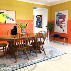
Image Credits- Apartment Therapy
2) DIY Colorful Florida House- Lilly Garcia
Lilly Garcia is a believer in creating happy spaces. She lives in Florida with her husband Israel, and their dogs. For her, spaces need to have a personalized touch and be full of life. She says, “Don’t miss out on those funky colors that make your heart happy. Don’t try to fit into colorless aesthetics when you are not afraid of color or vibrancy.”
Image Credits- Pinterest
She adheres to her thoughts and made inspiring and lively interiors all by herself. “Our style is pretty much a combination of thrift and marketplace finds. I stalk websites and visit my neighborhood thrift shops looking for specific pieces to add or replace,” she stated for her spaces.
3) Right colors sparkling the rental apartment- Anna Jacobs
Entitled as the “UK Homeware designer of the year 2021”, Anna Jacob is a very famous artist who started her colorful homeware line in 2015. For her, colors add an expression to spaces. Therefore, she has used colors in her rental apartment at their best.
Her biggest color secrets that she shared in an interview, “I think the MOST important thing is to work out how you want to FEEL in the room you’re decorating and then work out which colors make YOU feel like that,”

Image Credits- Daily Mail
She applied the same ideology in her rental apartment shared by her kids. Understanding the essence of kid spaces, she ensured to create a playful habitat embracing colors and patterns like a fantasy.
4) Adding Versace Scarf Like Feel In A Phoenix House- MilesWilles McDermott
MilesWilles McDermott is a multidisciplinary designer dealer based in Pheonix. His house features a color palette consisting of black, yellow, white, and gold. He shares his space with his girlfriend a dog and roommate.
Redesigning this particular space, his vision was clear that the space should remind him of a Greco-Asian speakeasy with a punch of minimalism.

Image Credits- Pinterest
While explaining, he added, “It’s a dichotomy of huge minimalist black-and-white graphics and opulent gold antiques–like a vintage Versace scarf come to life.”
5) Transformed Rental Space Without Renovation- Katherine Thewlis
Katherine offers Edegisn, Airbnb to revamp the interiors. Her rental apartment was shared by his husband, daughter, and dogs. After a lot of brainstorming, she changed the interiors without changing the interiors. It was all about colors and chic Etsy finds, that made space into their welcoming home space.
Image Credits- Glitter Glide
6) Boston Boho Rainbow Brite- Tara Bellucci
The renowned News & Cultural Editor of Apartment’s Therapy, Tara Bellucci renovated her small Boston apartment with hues of her choice. She feels welcoming and nostalgic after the renovation. “From my first post-college pad to now, my design style has grown and changed, and this place feels like a perfect manifestation of me,” she explains in gratitude.

Image Credits- Instagram
Let us know which one you like the most or resonated the most with? If you are also keen on switching colors of your spaces that express your personality, behavior, or identity. Then connect with our color consultants today and create the right color palette for your spaces.
1 note
·
View note
Text
ferragamo belt 11
No Results For Ferragamo Belts
This classic and chic gold plated Salvatore Ferragamo waist belt is always timeless. Krizia 1980's metallic copper bra with leather-based straps and snap closure Amazing piece of trend historical past. It is the father or mother firm of the Ferragamo Group which employs about four,000 individuals and maintains a community of over 654 mono-brand stores, and it runs operations in Italy and worldwide. According to the civil rights lawsuit, the 19-year-old was requested 'how a younger black man such as himself might afford to purchase such an expensive belt'.
First showing as a purse clasp, the ‘Gancini’ or ‘Gancino’ is now celebrated throughout the brand – changing into some of the recognized logos in fashion. Ferragamo believes that a person’s feeling is finest expressed with style. replica ferragamo belts Their designs will match each temper and suit any occasion. Switch box accommodates the finest high quality leather-based with twin textures.
At his demise, his wife Wanda and later their six kids ran the company. The firm flourished after World War II, increasing the workforce to 700 craftsmen producing 350 pairs of handmade footwear a day. After Salvatore's dying in 1960, his widow, Wanda, took over the running of the enterprise and expanded its operations to include eyewear, fragrance, belts, scarves, luggage, watches and a able to put on clothing line. Named after the designer’s notorious Ridgway, Colorado “RRL” ranch, the road is basically replica military and traditional Americana with fashionable manufacturing techniques and a Southwestern aptitude. While finest recognized for its denim, not far behind is its artisanal treatment of nice leather-based, most of which is sourced directly from the Southwest.
Explore the Library 1M+ words written for thousands of items in lots of of guides. Video Library of Guides Prefer to study through videos? [newline]They are typically hard to remove however I feel like it could additionally imply that it's holding the leather-based piece in fairly securely. The supple leather and durable hardware are both extremely well-made and can final for years to come. Add one other dimension to ensure you get the right one. Products on sale cannot be reserved throughout the Try at residence service. Our free Try at Home service is reserved for our registered customers.
The platform sandal was designed for American singer and actress Judy Garland. The shoe was a tribute to Garland's signature song "Over the Rainbow" carried out in The Wizard of Oz function movie. The shoe was crafted using shaped slabs of cork lined in suede with gold kidskin straps. wikipedia handbags His was inspired to experiment with new materials to search out materials not rationed during World War II. After spending thirteen years within the US, Ferragamo returned to Italy in 1927, settling in Florence.
The zippers also needs to slide smoothly, and have a Ferragamo brand etched on them. The Salvatore Ferragamo Gancini is also available in the form of a baggage piece. Made in Italy, the semi-rigid small luggage is made in a tonal monogram Gancini sample ultra-light technical materials with luxurious calfskin leather-based particulars.
The Double Gancini silhouette is a traditional, however what makes this version so edgy is that it has an all-black color palette. Both the strap and the buckle are a rich shade of black, and this belt is one that may take you from the workplace to a gala or perhaps a weekend on the inexperienced. Black truly does go with everything, and so would this belt. The simple method to shorten a belt is simply to chop it off at the finish with the holes, however what when you like the tail because it is?
The outcome was daring, daring and surprisingly colorful, with pieces ranging from bubble-gum blue leather-based pants to blood purple officer’s coats. Of course this being Bottega, leather—particularly the house’s proprietary woven leather technique—was a spotlight and what Lee has managed to conjure up using the signature intrecciato is marvelous, belts included. Though Lee’s aesthetic—and value point—is certainly not for everyone, the new Bottega Veneta leather intrecciato belt is an incredible entry level.
#fake ferragamo belt#ferragamo replica belts#ferragamo replica#ferragamo replica belt#replica ferragamo belt
0 notes
Text
Eyes lit
notes: Artist Keigo is something I did not know I needed until I made my own dumb paintings lol. Title credit from Crimewave by Crystal Castles
characters: Hawks/Keigo Takami
warnings: 18+, artist!Hawks, drug use, minor choking
summary:
You see swirls of purples and greens forming spirals that you’ve never thought of before, dancing like glitter being blown in the wind and then suddenly you see white. You’re thinking in tones of purples and pinks, they pulse and shine against a wall of white and now you’re thinking of Valentine’s day.
The blanket is pulled from over your head and you look up into golden honey eyes, they look even brighter and you swear that they glow as you look up into them. “You having fun under there babe?”
I’m not an artist, I don’t know how to paint. You told him, intimidated initially when you walked into his apartment and saw a box of paints along with two small easels. The only painting you’ve done was just with your fingers back in elementary school when you were a child, how were you supposed to paint alongside someone who’s a fucking art major who’s got a whole portfolio to backup his experience? But Keigo eased your worries, told you that there’s no need to be intimidated at all.
“You don’t have to worry at all about being good or anything like that dove. The trip will tell you what to paint.”
“It’s gonna look like shit when the trip is over Keigo.”
“Don’t say that dove, art is subjective. Trust me, when you’re on you won’t care as much.” He touches the small of your back and leads you towards the dinner table, “And besides, you might really like what you make in the end.”
“I don’t know what I want to paint.”
“The trip will tell you what to paint, you’ll see.”
Keigo has you sit down to eat first, just takeout pizza from a nearby restaurant along with some breadsticks. Barbecue chicken with a side of ranch, he doesn’t like pepperoni pizza at all. His first choice was fried chicken or wings but that’s damn near what you eat with him almost all the time so this is his compromise. He’s got a little basket of snacks and candy on his kitchen countertop, prepared ahead of time for tonight along with a plastic container of red and green grapes already washed.
“I don’t like grapes Keigo.”
“Trust me, you’ll be grateful to those grapes when you’re on dove.”
He brought out a plastic baggie from his fridge and set out the contents of it onto a wooden chopping board, watching as he broke up the small pieces carefully with a knife. You heard that acid comes in forms of little blotter paper or that people put a drop of it into sugar cubes and dissolve it in water to micro dose someone. Keigo cuts two pieces of what look like little window panes, very small fragments and when you inspect them closer, it almost looks as if there’s little gold flakes inside the gelatin.
“When will I know it’s kicking in?” you ask him, looking down at the tiny piece that sits in the palm of your hand. Such a small little thing that’s apparently a strong hallucinogenic, Keigo’s told you before that he’s felt his sensations cross over like hearing colors or seeing sounds. You had no idea what he spoke of but the best way to find out is to give it a try. “How long will it take?”
Keigo’s fixing up the easels in front of the couch, has blankets ready and is putting a video playlist up on his television. “Depends on the person but most of the time it tends to kick in after half an hour or so. You’ll know when you’re on, you’ll see it.” he explains.
You look around Keigo’s apartment, paintings he made himself hung up on the walls of his home. Most of his paintings were done sober but he’s got a few framed up that he’s particularly proud of that he made when he went on acid trips. He’s already such an amazing artist, certain pictures on his walls capturing your attention and invoking particular emotions from you. You’ve seen Keigo color match your sweater in just a mere manner of seconds, sampling little bits of paints and combining them until the hues matched exactly what you were wearing. And there’s you, just a mere amateur when it came to the arts. But Keigo assures you again that it’s not about making something ‘good’, it’s just there for you to have fun with it. He’s got canvases of all shapes and sizes for you to work with and that even though he’ll be on too, he’s definitely going to take care of you for your first trip.
You trust Keigo, it’s just the canvases and the paints that make you nervous.
He stands in front of you, smiling gently before leaning down to kiss you. His lips are soft, just a hint of vanilla you taste off his mouth because you let him borrow your chapstick earlier, and it’s so tender the way he holds your cheek in his hand that your heart flutters in your chest and butterflies tickle the inside of your tummy. You feel a little flustered when he pulls back, blonde hair swept back stylishly and a lazy grin on his face as he holds his own tab in between his fingertips.
“Cheers!”
The little tab goes underneath your tongue and you’re just supposed to wait for it to dissolve.
So Keigo puts on the playlist and the two of you talk for a little bit before moving to the art stations. “Choose whatever colors you want dove, choose the colors that you think will speak to you.”
You squeeze certain colors you think you want to work with into your little plastic palette, making sure to shake the bottles first and filling all the little spaces that’s meant to hold the paint. Keigo easily chooses the paints he knows he’s going to work with to start himself off and sets himself in front of his easel. He wears a simple red hoodie and gray sweats, comfortable loungewear for the next few hours and you’d be lying if you said that you didn’t notice the print of his cock sometimes when he swiveled his hips a certain way. You wear pajamas pants and one of your soft sweaters, a gentle shade of lilac, perfect for keeping you warm on this rainy night.
You know you’ll be exhausted by the end of it, deciding to take acid for the first time overnight but at least you’ll have the next two days to recover.
And you’ll have Keigo as well.
He makes easy conversation with you, talking about how his week was and in turn asking how yours was. You look down at the paints in your palette as you talk back and forth with him, forcing yourself to not wonder how much time has passed. Your phone is by the kitchen table, placed face down so that you don’t obsess over the time so you try to measure the amount of time has passed based on the time of the videos playing on the television. Yet you start to care less about the time as you actually start to get caught up in the paints in front of you, experimenting and pleasantly surprised with how you came up with such a pretty violet color. You point it out to Keigo, stupidly excited over it but he smiles and agrees with you. “Such a pretty color dove, but not as pretty as you.”
His words make the butterflies flutter in your stomach again but you say nothing, turning back to your canvas and picking up a brush. For a few minutes you just stare back and forth between the paint and the white canvas, wondering how you should start off. Keigo obviously sees you concentrating too hard and reminds you, “Don’t think about it too hard, just paint and see what happens.”
Okay... so in other words, just do it.
So you take a deep breath, dip your brush in the paint, and make a single stripe at the very top edge of the canvas.
“See? Not so scary.”
“Y-Yeah, it’s not!” You squeak out, still embarrassed but a little less intimidated now that you actually started it. You’re not exactly sure what you’ll do with it but there’s no harm in just winging it.
Hm... wings...
You glance over to Keigo, one of his sleeves rolled up and his tattoo visible on his forearm. It’s a detailed wing on his forearm inked in only black, the very tip of it extended towards his elbow and he’s got a matching one on his other forearm as well. You remember the first time you saw them and how Keigo let you run your fingers over his tattoo, watching in amusement over how fascinated you were.
Back to your canvas, you see the sheen of the fresh paint on the white canvas and decide to add more to it. Maybe you’ll get inspired the more you add to it, thinking what colors compliment violet and what exactly you could create. Over the next few minutes you just continue painting the violet further onto the surface of the canvas, looking down briefly at the black paint that’s also in your palette and wonder if you could try painting a mountain. You recall plenty of times looking up at the sky when you were done hiking and just in awe of the colors of the sunset, hues of purples and reds and orange that invoked a certain feeling in your chest.
A sunset... a sunset!
Easy enough yeah?
You just have to add red, orange, yellow, probably a touch of blue... some clouds would be nice too.
So you spread more of the purple across the canvas, concentrating hard at first before realizing something. “Keigo?”
“Yes dove?”
“I think my painting is breathing.”
Keigo laughs from his side and you feel his hand ruffle your hair affectionately.
You look hard at your canvas and swear that you can see the paint inhale and exhale, the veins of the paint pulse in the painting. Wait... veins? You don’t remember painting anything like that, all you did was just cover part of the canvas to get you started. The longer you stare at the canvas, you swear that you can see the paint drip down slightly, the canvas inflating and deflating, and hidden designs on the untouched parts of the white canvas.
The acid had finally hit.
“Keigo... I think I’m on.” you say as you dip your brush into the water cup to wash off the violet, this time into the yellow paint and haphazardly brushing it onto the canvas before switching over to the bright red without washing off the yellow. You think how powerful the color red is, how strong and overpowering it is on the canvas and you tell Keigo, “I think you’d look gorgeous with red wings Keigo.”
Keigo is concentrated on his own canvas but he does glance over to you and smiles how you’re suddenly so into painting when you were so reluctant at first when you walked into his studio. He watches you blend the red into the yellow, wondering what exactly is inspiring you and what your finished product will be. “Ah how interesting dove, you comparing me to an angel?”
“Angel wings are white, I said your wings would be red.”
“Why red?”
You shrug your shoulders as you brush some blue onto the violet on the top of the canvas, blending the blue and violet together. “I don’t know, just suits you a lot... I wore wings last year, I was an angel last year for Halloween.”
“You dressed like an angel last year for Halloween, you certainly didn’t act like one.”
Suddenly the memory of last year’s Halloween comes rushing to the front of your memory and you begin to giggle, needing to set your brush down and have your little giggle fit; he was very right, drunk shenanigans in your angelic costume while holding White Russians with your friends surfacing to your mind. You don’t know why you’re so amused but you are, leaning back against the couch and curling yourself into a ball. You pull the blanket over your shoulders, pulling the bottom corners into your lap and you look down in awe. You swear that even though you’re sitting still, the blanket looks like it’s pulsing as well and you can see the small fibers of it sticking out from the surface. You can’t help but pick at one and hold it in between your fingertips, staring for a few seconds before releasing it.
Moving to lie on your side, you press your cheek into the couch cushion and stare at the painting you just started. It looks weird right now, purple on top with yellow and red in the middle but you’re determined that you’re going to paint that sunset!
You look over towards Keigo, seeing that he started off his canvas a golden yellow at first and is brushing a crimson red on top of it as well. It sort of reminds you of fire and you wonder what he’s seeing. You pull the blanket over your head, sheltering you from the bright lights of the room and you stare at your own hands right in front of your face. Every line and wrinkle is moving, like they’re switching places on you and you ‘ooh’ quietly. When you shut your eyes, it’s not a straight darkness you see like when you close your eyes and go to bed. You see swirls of purples and greens forming spirals that you’ve never thought of before, dancing like glitter being blown in the wind and then suddenly you see white. You’re thinking in tones of purples and pinks, they pulse and shine against a wall of white and now you’re thinking of Valentine’s day.
The blanket is pulled from over your head and you look up into golden honey eyes, they look even brighter and you swear that they glow as you look up into them. “You having fun under there babe?” Keigo asks you, clearly amused to have looked back and saw you as just a lump under his blanket. “Yeah, looks like you’re having fun.”
“Hehehe... yeah.” you smile up at him, pushing some of your hair back from your face. You look as he presents a single red grape to you, drops of water still on it to let you know that it had just been washed and while grapes weren’t your favorite fruit to eat, somehow they looked so appetizing in that moment. You open your mouth and Keigo places the fruit into your mouth, chomping down and it’s so juicy and firm and crunches so loud in your head that you moan as you chew.
Delicious, it’s delicious!
Keigo feeds you grapes every so often, whether you’re sitting in front of your canvas to continue painting, looking at the television and the visuals presented along with the music, get up to look at his other paintings that you think are whispering or waving to you, or when you decide to just stare at the tapestry he hung up in front of his balcony. You understand why tie dye is so appealing to look at now, you know for sure it’s not the wind making the tapestry move, the colors waving at you and you try to reach into the tapestry, your fingertips just barely grasping the colors in front of you.
“How long has it been Keigo?” you ask as you continue to look at the tapestry.
“It’s almost eleven, so it’s been three hours since we took it.”
Wow, three hours...
You’re not sure how the passage of time is feeling for you, everything is looking warped and you suppose that your sense of time is included in that as well.
You feel hands under your armpits and your lifted up to your feet, leaning back and touching the arms that hold you securely. The tattooed wings on Keigo’s forearm, the feathers look as if they’re rustled, they look like they need to be preened. It’s important for birds to preen their feathers so that their wings look presentable. “Okay dove, time for a bathroom break. Think you’ll need my help?”
No, you’re a big girl, of course you can go to the bathroom yourself.
Though you do have to ask Keigo to hold your hand, looking down at the floor and not trusting your own feet. It’s like you’re looking through a fish eye lens, like the floor seems so much wider and closer to you. Keigo says something to you when he drops you off at the bathroom but you don’t hear him, humming absently and you close the door. You do your business and wash your hands, using the nearby hand towel to dry off your hands and then you look up at the mirror.
You lean forward and inspect your pupils, they’re blown up and you think you can see shifting colors in your iris. You really are on, pulling back and inspecting your reflection. Now you feel like you’re caught, not sure if you recognize the person who’s looking back at you and... and... is the shower curtain moving towards you? Is that really you in the mirror? Your hair is never this mussed up and the color of your shirt you always liked before but why did it look so weird on you now?
“Dove, I’m coming in.” Keigo announces and slowly pushes open the door so that he doesn’t catch you in any indecent state. But he sees you just staring intently at your reflection and just comes up behind you, pressing his front to your back and tilting your head back to look at him. “Ah got caught looking at yourself in the mirror huh? S’alright, the first time I did acid apparently I spent a half hour just looking at my own reflection too.”
His eyes are the color of honey and you think you can suddenly taste it in your mouth, you imagine it. “Your eyes are pretty.”
“You’re pretty.”
But you shake your head at the compliment and ask, “Did I always look so weird Keigo?” you ask him, reaching one hand up and brushing the tips of your fingers along his stubble.
“No you never look weird, you’re always so cute.” he reassures you, pressing a kiss to the tip of your nose. “Go back to the living room, lemme have my bathroom break and I’ll join you in a hot minute.”
“Don’t fall in the mirror.” you say absently as you walk out the bathroom and shut the door. You hold onto anything you can to help balance you, the floorboards beneath your feet look as if they’re trying to trip you up but you manage on your own to make your way back to your spot on the couch, staring at your unfinished painting.
What... what was I making again?
Violet, blue, red, yellow... oh yeah, the sunset.
Keigo really was right when he said that trip would decide what you would paint.
You don’t hear the bathroom door open but you look up as Keigo comes into your vision and ask, “How do I make clouds?”
“How do you mean? Like how clouds are made in the sky? Well you see clouds are made of water droplets that are so small that they’re able to stay in the air. You see the water vapor-” Keigo starts on what you know is a very educational lecture on clouds but you stop him with a whine, pointing to your canvas. “Oh... oh! You want to know how to paint clouds. Haha, sorry dove!”
Keigo makes himself comfortable right behind you, your bodies once again pressed to one another as he hands you the palette of paint and picks up a different paint brush has you hold it in your own hand but he covers it with his own; you’ll hold the brush while he controls your movements. So he dips the paint brush in the white paint, also adding in a touch of red that almost makes it pink and you gasp. It’s not gonna go together! you think but Keigo hushes you, tells you to just trust him. And although you’re watching how he dabs the paintbrush onto your canvas, you’re not really perceiving the process. One minute it’s a messy slate of purple, yellow and red and then boom suddenly there are clouds that actually create a picture. “Ah you were trying to make a sunset, I can see why you wanted to paint clouds. Very creative, I’m proud of you!”
“I did that?”
“You did!”
He praises you as if you were a child doing it for the first time... though you actually are painting for the first time and honestly it actually is coming out pretty nice, though it’s only thanks to the help of Keigo. So you look back at him, pressing your lips against briefly and whisper out, “Thank you.”
Returning back to his canvas, you decide that you can continue painting on your own. You close your eyes and try to remember any memory that contains a sunset, whether it was through your own eyes or perhaps looking at images on the internet. You try your hardest, your mind producing more interesting shapes and patterns of colors that almost distract you but you’re going to pain that sunset damn it! So you blend the colors on the canvas, adding in more tones of violet and purple towards the bottom to cover up the blank spots. You thought about adding in a mountain or some trees but you feel that’s much too advanced for you to attempt, though you know that you can ask Keigo again but he already helped you once. Now you were determined to do another by yourself.
You ask if you can have another canvas and Keigo gets up to the little pile of untouched ones. When he hands you one and ask if it’s a good size, it’s a question you can really answer because the way he holds it out to you makes it seem to long. And realizing that your perception is altering the way you look at the canvas, he holds it upright for you and you ask for something a little bigger.
Carefully setting aside the sunset painting... whoa it’s like the clouds are really moving!
Focus.
You set up the new blank canvas in front of you, wondering what to make next.
“Ah I almost forgot, I got this for you too while I was at the craft store.” Keigo tells you as he brings up the box paints, holding out a tube of-
“Ooooh... glitter.” you awe at the opalescent colors, holding it against the light to see sheens of white and pink and purple. You’re not sure if it’s the acid or not but it looks extra pretty and you shake the little tube in your hand.
“Have fun with it just uh... make sure to not get too messy.”
You could imagine such pretty colors like the stars and them falling into your eyes... oh, you could make a starry night for your next painting. So you enthusiastically brush more violet and blue onto the new canvas along with a touch of black to make a dark sky. The canvas breathes at you and you think that the more color you add to it, you think you can hear it sigh in relief. You blend it all together and wonder what else you could add to it. You drift to the palette and zero in on the white paint, exchanging your current paint brush for a smaller one, dipping it into the white paint and just making little dots here and there to represent the stars. Then you open the tube of fine glitter and you’re particularly giddy; your painting is going to be amazing, it’s going to look exactly like the night sky... no even better! It’ll be like the cosmos!
You must have been a little overzealous with the glitter on your painting because Keigo nudges a towel just right underneath your easel and you feel him pat down your feet.
Careful with the edges of the painting since it’s still wet, you gently shake off any of the excess glitter and then lean back to really inspect it. In the moment it really looks like a beautiful starry sky and you think that you can literally see shooting stars in it, so sparkly and pretty in the moment. You pull the blanket back over your body and crawl your way to Keigo’s side of the couch, sitting behind him and perching your chin atop his shoulder. Weird, you could have sworn that when he first started painting he started off with yellow and red, he’s painting over it with blue and green now. “Keigo, what are you painting?”
“I don’t know. I started off thinking about fire at first and then all of a sudden I just started putting green and blue together... I think I might have been either thinking about the ocean or the forest... I forget.” Keigo explains, still not stopping his paint brush over the surface. You guess that even artists start off sometimes nonsensical too and that they don’t always have a clear idea how their end product might come out. But you still admire it anyway, reaching your hand out and loosely holding onto his wrist. His arms look even longer from where you’re looking and yet he’s sitting so close to his painting at the same time.
Perception sure is a strange thing when you’re on.
He smells nice, pressing your nose into his neck and breathing in his cologne, humming in delight and pressing yourself even closer to him.
Now you’re not exactly the bold type, every once in a while you’ve decided to make the first move but most of the time you let others give you the signal first before you flirt back. Already you and Keigo have been seeing each other for a few weeks, a few dates here and there but you’ve yet to progress anything spicier than a few make outs and maybe some teasing touches. So it comes as a surprise to him when you drag a hand down from his chest and let it rest in between his spread legs, groaning when you lick the shell of his ear and nibble on it. “B-Babe... we’re supposed to be... to be...”
“Painting? That canvas isn’t the only thing you can paint Keigo.” you whisper in his ear, feeling for his cock in his gray sweats and pleased that you can feel that he’s getting hard. You form your hand over his cock and stroke it through the sweats while your other hand drags over his arm, still stretched out towards the painting but now his arm is tense. “For example... you can paint me with your cum. Inside or out, I’ll let the artist decide.”
Keigo sets down his paint brush and his palette before tugging you to his bed.
It’s dark in his room when he shuts the door but you’re quickly put on the surface of his bed. You can hear him fiddling around somewhere in the corner of the room and then red light fills the room, it’s pretty basic of him to own those strip lights seeing as you’ve had more than a few friends decorate their room with it too but now isn’t the time to critique the mood lighting. You do have to wonder why the color red, why not just put on the regular ceiling lights?
He’s on you once the lights are on, pulling off your pajama bottoms and setting them to the side for the time being. Spreading your legs open, Keigo starts off with kissing the inside of your thighs and slowly goes up higher. Your panties are still on but you moan softly when he kisses your pussy through the cotton, then it’s up to your belly button, pushing your sweater up along with the soft bra you decided to wear tonight as stops to pay attention to your breasts, nipples perked up to the cold air along with the way Keigo flicks his tongue over them. While he sucks hickies onto your breasts, you run your hand through his hair and look up at the ceiling, you think you can hear the flap of a bird’s wings and think something flutters from the corner of your eye. “K-Keigo... is it okay for us to do this while we’re on?”
“You’re safe babe, I’m here.” he assures you as he helps tug off your sweater over your head. “Just focus on me, I’ve done this before.”
Oh great, he didn’t just allude that he’s fucked other people on acid before did he?
Keigo seems to catch his choice of words and grinds his clothed cock against your panties and gives you an apologetic smile. “Sorry, I shouldn’t have said that. I just mean that sometimes sex on acid can be a precarious thing to engage in, I just wanna let you know that I got you.” he presses the pad of his thumb where he guesses your clit is. “You trust me yeah?”
Yeah, I do.
“How about a little art lesson for ya? That’ll help get you in the mood and you’ll learn something interesting.” Keigo takes off his sweats and his underwear, leaving you the only one who’s almost naked in the room. The music still plays from the living room, smooth guitar and easy beats still reach your ears. “You wanna know why I made the lights red? Red provokes the strongest emotion and is considered the warmest and most contradictory of the colors. Can you tell me some things you think of when you think of the color red?”
Apples, firetrucks, blood.
“Red is one of the most visible colors in the spectrum, its the kind of color that’s an attention grabber which is why it’s used to warn people of danger. Red can convey a sense of danger,” Keigo explains this while he pets you through your panties, it’s almost leisurely the way he does it but he can see how you quiver underneath his touch. “but it’s also associated with excitement, that even sometimes just being exposed to the color can cause elevated blood pressure and heart rate.”
Your heart rate is certainly up right now and it’s not just because of the acid.
You feel Keigo pull your panties to the side and easily glide a finger in but he wants something in return as well, “Spit in your hand and stroke my cock.”
As you stroke Keigo and he gently fingers you, he continues on about his lesson on the color red. “So along with danger, excitement, there’s also aggression and dominance. There’s not exactly a clear reason why red is associated with dominance, maybe it just goes hand in hand with feeling aggressive, perhaps also representing power as well.”
“K-Kei... please get to the point!” you whine, sitting up with one hand braced on the bed while the other continues to stroke him. He’s added another finger and you notice that he’s put a little bit more vigor in his actions. “Please won’t you just-”
“Most of all though, my little bird,” Keigo continues over you but you can take a guess where this ‘art lesson’ is going by the way his lips quirk up and how is voice drops. “red is also linked to passion, love, and desire, that it’s apparently a very attractive color. You remember what color you wore the first time we met?”
“You... you saying that you only liked me ‘cause I was wearing red?” you ask, a breathy laugh leaving your lips but then whine as Keigo strokes your g-spot and you almost dropped back onto the bed but he’s quick to catch you. He quickly pulls his fingers out of you and winds it around your waist to pull you flush against him and settles you in his lap, your hand trapped between your bodies but you continue to jerk his cock despite the limited space.
Keigo chuckles along with you, leaning down to press a kiss to your neck and give you a gentle bite. “Aha I’m just teasing you dove, it was your cute face I saw first and besides, you weren’t wearing a red shirt when we first met... You were wearing red panties, I remember seeing them when you bent over in that short little black dress.”
“You’re embarrassing.” you mumble, adjusting yourself so that you hover over his cock, slapping the head of it against your clit. “And that wasn’t an art lesson, that was more like color psychology.”
“You still learned something, did you not?”
You cup Keigo’s cheeks in your hands, kissing him briefly and pull back to tell him, “I’m not looking to learn anything except how your cock feels inside me.”
So you brace your arms around Keigo’s shoulders, sighing as he eases himself into you slowly. His hands hold your ass, gently lifting you off his cock and then easing you down again to take him further, repeating the process until his girth was sheathed all the way inside you. You gasp together, you at his size and him at your tightness, hands all over each other and you’re wondering where his body begins and yours ends. Whatever other cocks you had inside you before, they’ve never felt like this when they first entered you.
And then the two of you are moving in sync with one another, holding each other’s gaze, just barely able to see the reflection of each other in your blown out pupils. You can’t really see the honey gold of his eyes thanks to the lights but you you think you can taste it still, every time you just taste that sweet nectar when you look into Keigo’s eyes. It must mean how sweet he is, that must be why his eyes are colored like that.
He’s sweet like honey.
Again, you hear the flap of a bird’s wings even though you know the bedroom window isn’t open.
It’s slow and sensual at first, sex on acid is something more heightened, something indescribable behind the sensations as you lean back slightly to roll your hips while you meet Keigo’s thrusts. Your hands locked behind his neck and your head lolling back, a sensual sigh from you when you feel a hand go to your throat. A breathy ‘yes’ spills from your lips as the pads of the fingers carefully press at the sides of your neck; feels good, feels so good...
Suddenly you’re pushed onto your back, gasping in surprise at first and then uninhibited moans as he viciously fucks you. And what can you do but take it, take all of it, peering at him through the haze of pleasure and the peak of your high when you see it.
Bright red wings spreading from Keigo’s back, brighter than the lights, the feathers ruffle and seem to groan alongside him, he’s losing himself in this carnal moment, bracing himself over you and the wings coming forward as well. You feel floaty, almost as if the wings are carrying you themselves, you think you can feel feathers tickle your skin while Keigo’s hands have your hands pinned above your head, your ankles locking just right above his buttocks.
It feels like the sex is lasting forever, that as fast and hard Keigo pumps into you it feels never ending. In truth you don’t know how much time has actually passed, just that the passage of time seems longer. But it feels good, you feel one with Keigo and even just the slightest clench of your fingers intertwined with his feels even more intimate. His panting, your whimpers, the music, the lights, the flapping of the wings, and you crying out his name.
Even as you clench your eyes shut, swirling patterns of hues of red dance behind your eyelids. They seem to move in time with Keigo’s tempo, every slap of his hips connecting with your body, they respond accordingly. You feel one of his hands drawn down from your neck, past your breasts, giggling when he goes over your belly button, and groan when he plays with your clit.
He praises you, tells you how good you’re doing even though you’re just lying there and taking it, you try to participate by rolling your hips up to meet his but his power is just too overwhelming. “Kei... Kei... go, it feels so good...!”
You wriggle your other hand free from his and pull him down, practically hugging him and bringing him even closer, eyes shut hard as he goes into double time. His face is pushed into your neck, breathing hard into it and you think you can hear his wings flapping even harder. His hands hold your waist, just lifting you up slightly so that your back slightly arches.
Soft skin against rough hands.
“Where you going to paint your cum Keigo?” you ask, your lips just barely brushing against the shell of his ear. “All over my face? My tits? Maybe... even turn me around and blow it all over my back?”
“Fuck! Keep talking like that! ’M gonna cum dove... I’m gon’a cum!”
You push him back just enough and once again cup his face in your hands, “Look at me when you cum.”
Jittery nods of his head, he’ll absolutely obey anything you want as long as you don’t let him leave inside of you. All over your face would be so nice, your tits even nicer, he hasn’t pulled out to cum on someone’s back in months but fuck when you mention it, it’s so fucking enticing. But nothing beats when it’s oozing out, like ice cream melting on a hot day as it drips so he has to ask you if it’s okay. “Babe... can I paint you inside babe?”
Does an artist even have to ask permission to paint their canvas?
“Yeah... paint me white inside.”
And that’s all permission he needs, a few harsh thrusts and he cums with you, his cum shooting inside you while you gush around him, almost like it’s trying to push him out. But he stays inside you, his visit isn’t over quite yet, he doesn’t want to leave, not when he feels so connected with you.
You catch your breath, blinking your bleary eyes and see all of those red feathers slowly leave Keigo’s back. You don’t know how many there are, maybe two hundred or something like that, but you watch them leave one by one, almost as if they’re each being controlled individually. You think Keigo is the one that’s dismissing the feathers and you reach out towards them; you never got the chance to touch them.
Hands sliding down his back, you express a mild disgust over how sweaty Keigo is, “Ew... take a shower.”
“Only if you come with me.” Keigo chuckles pushing himself off you but wiping at your forehead as well. Geez, you hadn’t even realized you sweated too.
So the two of you stand under the warm shower spray, he lathers his shampoo and conditioner into your hair first, washing it out for you before you return the favor for him. You note how even more intimate this is compared to the sex before, looking up into his eyes and you give each other an endearing smile. The peak has been passed and now the acid will ease off, already things look a little less distorted and the intense distortions don’t feel like they used to when you first started.
“How are my eyes dove? Getting lost in them?” Keigo chuckles but he doesn’t give you a chance to answer, choosing to kiss you instead. “Did you mind that our first time was on acid?”
“No, it was good.” you tell him as you draw a single line on his collarbone with the tip of your finger. “I can’t wait to have regular, sober sex with you.”
“Hehe, I hope it compares well to my first performance.”
“I don’t know,” you singsong to him, “maybe you set the bar too high having first time on acid.”
“Well don’t say that now.”
The two of you laugh together, he playfully pushes your head but pulls you back in for another kiss. The water runs down both of your bodies and you pull back, looking down at the ground. Keigo thinks that you’re looking down at his cock and that you might be up for another round but you look back up at him and ask, “My feet are like a million miles away... have I always been this tall?”
You dry up together and change into clean clothes, returning to the easels and you’re surprised that the television still is playing music from the playlist. After so long without having your phone, you check the time to see that it’s well into two in the morning and it’s no wonder that you feel tired, not just from the sex but how late it was as well.
You curl up onto the couch while Keigo still works on his painting, the last thing you see were your sunset painting alongside the starry night one, the clouds shifting on one and the other still sparkles with shooting stars.
━━━━✧
“Ugh, I told you that they’d look like shit when the trip is over.”
“Don’t say that, they look fantastic.”
You hold up both of their canvases and each hand, looking deadpan at him with tired eyes. “This one looks like I just puked glitter on it and the only part of this one that is good are the clouds that you helped me paint!” you sigh out and look down at each of the paintings. You knew it, you weren’t an artist after all and you had thought that you did such a good job last night.
Keigo takes your starry night painting and brings it over to the sink, banging the edge of it gently a few times to shake off any glitter that didn’t dry on the paint before handing it back to you. “See, now it looks a little less like glitter puke and I have to tell you this dove, but you painted those clouds yourself.”
Huffing at him, you set down the starry night painting and look down at your sunset painting. “Keigo, I know I was on last night but you for sure helped me paint the clouds. I remember that part pretty clearly, don’t try to treat me like I’m a kid and say some bullshit to make me feel better.”
“I helped you get started but I saw that you picked it up on your own and you painted the rest of it yourself, I swear.”
“Keigo-”
He stops you with a soft call of your name and even though the two of you are tired as hell and feel disassociated from your own bodies and personalities, something tugs in your heart that way he says your name. “I’m serious, I helped you start making the clouds but you actually got the hang of it and watched you do it yourself. I told you the trip would tell you what to paint and you did it!”
You still look disbelieving at him, swearing that you thought you felt his hand help you paint last night. But then again, you also thought you saw one of his paintings of a balloon flying away too so maybe he might be telling the truth. It’s a little hard to discern what were your actions that actually happened versus what was in your mind. Much like the wings you thought he sprouted when the two of you had sex.
“Can you just show me yours? I fell asleep before I could see what you made.” He hands you his own canvas and you stare hard at it, looking back and forth between him and the painting in your hands. “Did you make another one last night?”
“Nope, I used that one canvas the entire night.”
“Didn’t you start off painting it with yellow and red? How did you end up with,” you turn the painting around to show him, “painting this?”
Delicate pinks and purples dotted just right to look like wisteria flowers and a big tree trunk in the very center of it. It just wasn’t fair that he was so good at conceptualizing these kinds of things. You have to wonder if he just had a natural talent for it or if it was something he honed over time. Either way, you know he didn’t get that art degree for nothing.
Keigo chuckles and sets aside his painting. “I looked at your sweater last night and thought I saw wisteria flowers sprouting out, I got my inspiration from you. Also you seemed really into the color purple last night so that helped too. Although you did also give me an idea last night too.” he takes your hand in his, pulling you close to him and reaches one hand underneath your shirt, his palm resting on the small of your back. “That whole ‘paint me thing’ you said yesterday... I was wondering if one day you’d let me paint on you?”
You tilt your head to the side, “What do you mean?”
“Like... just let me paint on your body one day. I can get those body friendly paints and just make a picture on you.” Keigo explains with a sheepish smile coming onto his face despite how tired he looks. “It kinda turned on me on last night when you said you wanted me to paint you inside and I just thought ‘well what if I actually did?’ But not with my cum I mean, though I wouldn’t mind that either.“
The thought of laying down for Keigo while he does such a thing, it sounds quite intimate. You look into his eyes, his pupils still a little wide but it’s only a few more hours for the acid to exit your bodies. It was intense last night but you were glad to have done it with Keigo and even though you think the art you did last night is sort of crap now, you can’t deny that it was sort of fun to do it still.
Your paintings lay to the side, his own stupidly good wisteria painting sitting alongside your glittered starry night and sunset painting. Strange how your eyes perceived everything last night from elongated lengths, the dynamically changing colors you saw when you shut your eyes, you felt everything alive around rather than thinking of the furniture as mere static objects, the red wings and feather you swore you felt against your skin when Keigo fucked his cock into you, everything was beautiful and you couldn’t have asked for a better first time.
You’d like to do it again.
“Can I dove? Can I paint on you one day?”
“... Yeah, I’d like that.”
155 notes
·
View notes
Note
i would love to hear abt how you came up with ash’s design if you’re up for it :0 i think she looks SO cool -catgirlblaze
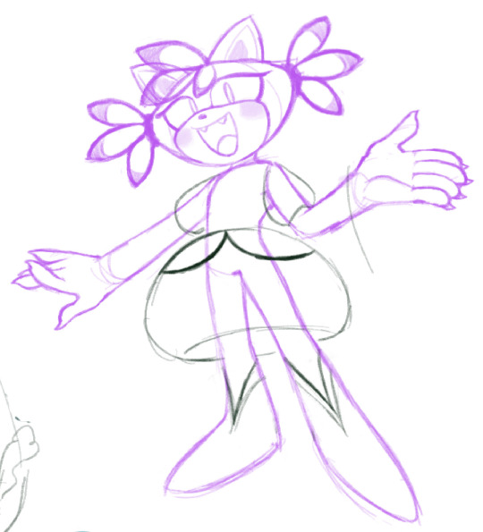
OMG okokok well first off, here's the pic of her final-ish design
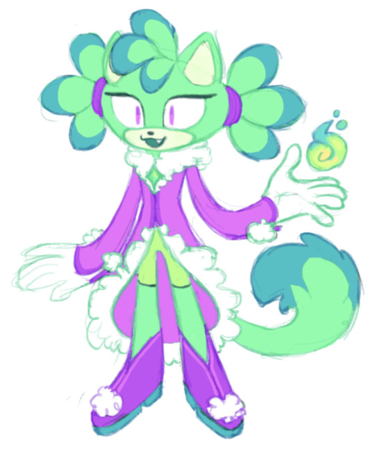
for context: this is ash, the anti-blaze, meant to be an "evil" version / funhouse mirror version of her from a different dimension akin to the characters hailing from moebius in the archie comics.
she actually was a lot more trouble for me to design than gold was!!! her outfit in particular went through a LOT of iterations.
the first thing i actually made was her color palette! it ended up having to be tweaked so that the blue wasn't so bright and out of place.
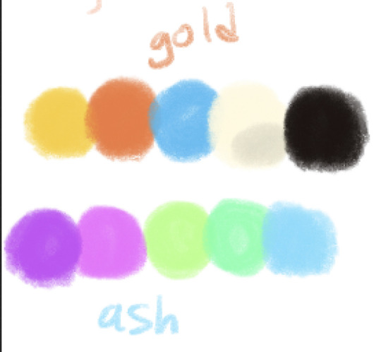
i wanted her fur color in particular to be the complimentary color of blaze's violet. directly complimentary colors tend to clash in a palette though, so i went with a split complimentary palette
i also realized that i probably shouldn't JUST make her cyan, so i wanted to include the original purples from blaze to retain recognizability while discarding the pinks. i LOVE blaze but the shades of pink and purple her design uses just clash so hard
then i thought about blaze's very distinctly lemon-shaped head and the fact that she seems to tie her hair back. initially i wanted ash's hair to be all down to represent that her personality is WAY more lax, but that quickly prove to be Very Ugly when combined with the lemon head, which i wanted to retain in some way. so i ended up compromising with myself, letting her keep some bangs to cover her forehead gem (as a representation of her deliberately ignoring her equivalent to the sol emeralds, theyre called the moonstones because this whole thing is pretty cheeky) and giving her pigtails to show that she is much, much less mature than blaze. pigtails evoke youth, at least to me, while the almost scene-esque bangs still reflect that she's 14 and not like 5
her outfit in particular was where i was challenged. here's some misc unfinished sketches from the iteration phase

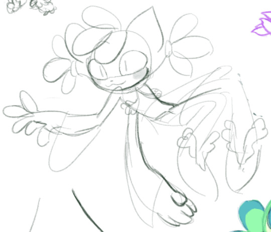
initially i wanted to give ash an Entirely New Outfit, something youthful and silly and generally just out there. not pictured are ideas i had but didnt draw of giving her a romper or a tutu, which just felt like it leaned WAY too far into baby territory. i also considered giving her a tailcoat with the fluffy arm and leg warmers to make it clear that shes capricious, but it felt divorced from who blaze is, and this character is supposed to be a reflection of blaze. i also toyed with some princessy aesthetics/silhouettes because i find that kind of flouncy fru fru girly stuff very cute (and blaze is a tomboy so would in a way be fitting for her funhouse mirror counterpart), and i thought it might portray how recent her abandonment of the "princess" role really is. but she already HAS abandoned the princess role, so for her outfit to still be super princessy felt out of place
i also realized after some iteration that i was really missing the fur elements of blaze's outfit - they made her feel regal, but friendly. the shapes of the furred cuffs on her design evoke almost flamelike shapes. i generally just really like drawing and designing fur coats. so i started to add furry fringe to places that blaze didn't have furry fringe (the neck and hemline of her coat specifically) and that really clicked for me. i also added puffballs on the sleeves and shoes to make things feel more balanced/unified and also because i thought it was cute. the triangle shapes are both meant to contrast the boxy shape of blaze's outfit and compliment the triangular shapes on gold's shoes and hands.
i eventually arrived at this sketch, which i colored both to test out the color palette and to see if this was It. and i liked it, but a few parts still needed changing
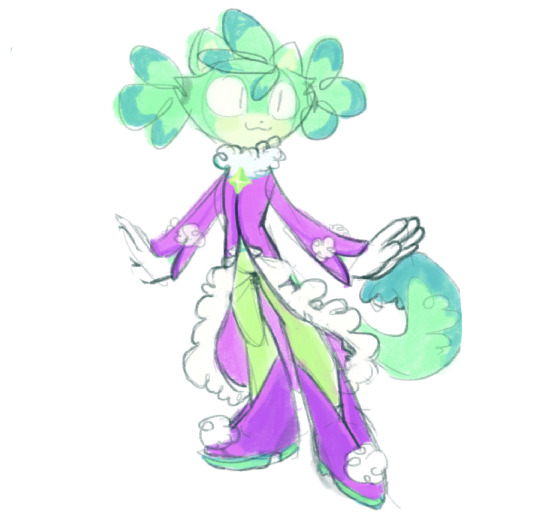
for example, there are more (admittedly faint) decorations on the shoes that just muddy the ideas i had, and the full-length slightly off-green pants just made it look like she had miscolored mutant legs. i tried to add a bit of her actual fur color on the midriff, but having her midriff showing didnt click with me
so then i did the final iteration and its the one i liked the most tee hee. i hit the image limit but its up there at the top
other notes include me flattening out her shoes, no more high heels! they still have some semblance of a "heel" but that's to add visual interest to the thick soles of her shoes, necessary for grip while shes frolicking around and setting things on fire. her fire powers are green instead of red because of fun with opposite colors and such! the "radioactive" nature of her colors is purposeful, to evoke an unsettling otherworldly feeling when you look at her very unnatural-seeming colors AND to bring scourge to mind
her tail is put thru a hole in the back of her jacket instead of poking out from underneath for clarity of silhouette, the gem on her chest is a purely aesthetic part of a closure on her jacket, and her forehead gem is turquoise underneath her bangs
the end!!! i hope that was interesting!!!!!
5 notes
·
View notes
Text
Beyond Blue and White: a Jewish Holiday Resource for Artists
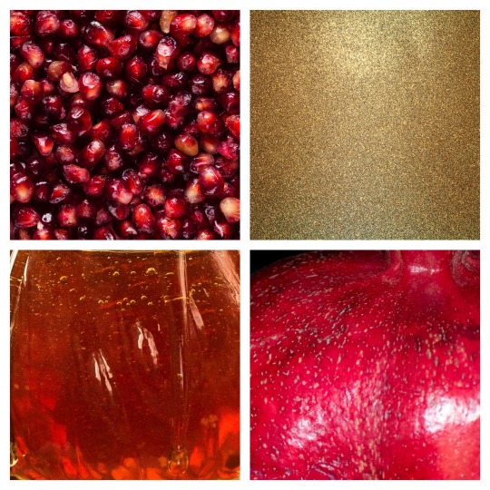
If I show you this color palette, you know exactly what holiday it refers to, right?
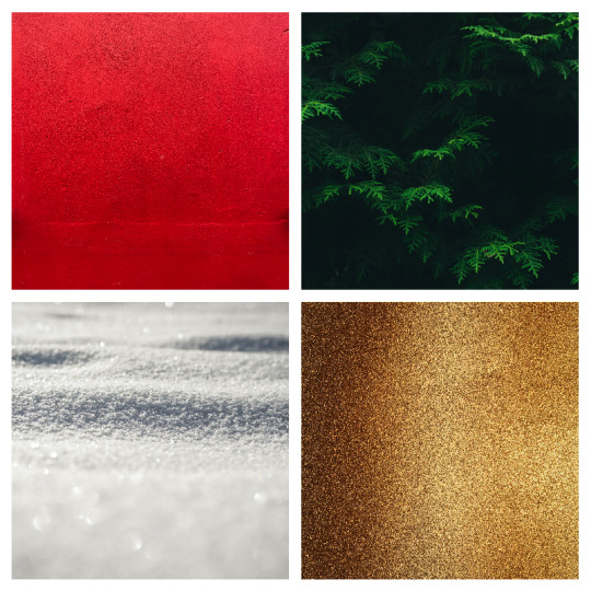
Image: a palette of red, green, gold, and white.
How about these?
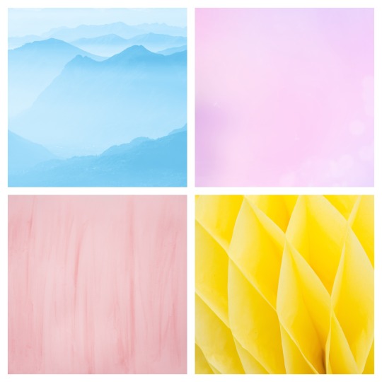
Image: a palette of pastel blue, purple, pink, and bright yellow.
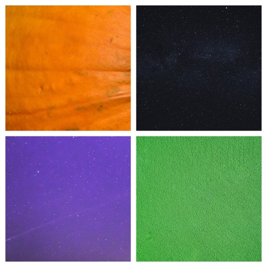
Image: a palette of orange, black, purple, and green.
American? Try these:
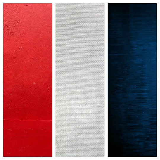
Palette: red, white, and blue
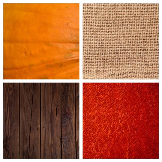
Palette: orange, tan, red, and brown
Now, I was thinking about this a lot this year, at various times. It came up when I tried to decorate my dining room for Rosh Hashanah but couldn’t find anything I like that really fit. It was still on my mind when the jack-o’-lanterns and bats appeared and then disappeared again under an onslaught of red and green. And then the Chanukah sections.
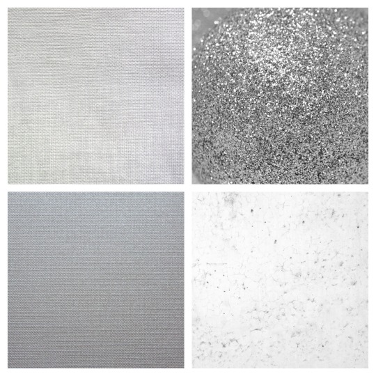
Palette: four shades of blue.
The Chanukah sections.
Palette: nine shades of blue.
The Chanukah.
Palette: nine shades of blue.
Sections.
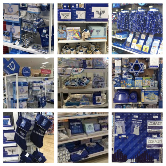
Image: photos of the Chanukah displays from nine stores. They are entirely royal blue with white accents, and occasional baby blue or silver.
Seriously, people. I can’t even. And that’s what the war-on-Christmas crowd is mad about? That’s what we get, and they’re mad about it? Some of those items are just Christmas things in blue, with “Hanukkah” written on them. And they’re mad about it?
Of course, Chanukah, despite being a minor holiday on our calendar, is one of only two holidays that get dedicated displays: Chanukah because it falls near Christmas, and Passover because supermarkets did eventually figure out the astounding scale of food we buy, and learn to plan accordingly. And most of the food in the passover displays is, well, food. But don’t worry, supermarket marketing designers know what color to use!

Image: photos of the Passover displays in six grocery stores. The signs defining the displays are the same range of blues as the Chanukah displays above.
Yeah, that last one just put the flag of Israel near some grape juice and called it a day, but we’re just going to John Mulaney on past it right now, because this is a post about a different topic.
Now, I only started being active on Tumblr recently, and I’ve never been much involved in fan works, so maybe it’s like this every year, but in the lead-up to the winter holiday season I saw a lot of posts calling for artists--for fan artists in particular--to not reduce Jewish characters and Jewish imagery to Chanukah in opposition to Christmas, to remember our other holidays exist, to remember we exist outside of the shadow of Christmastime. And they’re right. But if you mean well but aren’t immersed in Jewish culture, how is that to be accomplished? How, practically, do you do that? What do Jewish holidays look like?
For me at least, most Jewish holidays have aesthetic palettes as distinctive as any of the ones above. My taste may not be universal, but in this post I would like to share some very basic color palettes for a few of the most significant Jewish holidays, a few notes on activities people might expect to take part in (including whether or not we are prohibited to work on that day), and some basic visual symbols to use as well.
As is common with posts of this type I would like to specify that while I welcome non-Jews to use this post to enrich your depictions of Jewish characters and occasions, you are not invited to use this in a Christian context, in a Messianic “Jewish” context (so-called Messianic “Judaism” is a culturally-appropriative Christian missionary movement, and is viewed by the Jewish community in general as predatory and offensive), in a context that assigns Jewish observance to Christian characters in the name of Christian practice, or in a context that ascribes contemporary Jewish practice to a divine Jesus. It is not appropriate to use contemporary Jewish symbols or practice to “deepen your relationship with Jesus” or to add Jewish “flavor” to your Christian practice. Thank you for respecting this request.
That said, let’s get to it. Presented in order of the Jewish year:
Rosh Hashanah
Jewish New Year. Two days, in early autumn. Since the Jewish calendar is not synced to the secular calendar, this can fall anywhere from the last days of August to early October. Yes, we have our own calendar, and we do follow it. Rosh Hashanah may move around September, but it always falls on the first day of Tishrei. It’s also worth noting that on the Jewish calendar the new date begins at sunset, not midnight.
This is one of our holidays on which working is prohibited. It is also the first of what are known as the High Holidays. Many of us spend a large portion of the day in services at a synagogue--including many who are not regular attendees year-round--but this is also a major occasion for hosting large festive meals and get-togethers with family and friends.
This is not a good day to schedule parent-teacher conferences.
Palette: red and gold, honey tones.
Relevant symbols include: the shofar, which is sounded during the holiday; apples and honey, eaten “for a sweet new year;” a whole fish, eaten “to be like the head and not like the tail;” round challah loaves to acknowledge the cyclical nature of the calendar; crown imagery, to acknowledge God’s sovereignty; pomegranates, which echo the crown theme and are said to have as many seeds as there are commandments in the torah (613). Books, both prayer books called Machzorim (singular Machzor) which we use during the holiday service, and the Book fo Life, in which God is said to be writing out the next year’s fates during this time.
Yom Kippur
Ten days after Rosh Hashanah, Yom Kippur is often called the Day of Repentance in English, but the Hebrew name of the holiday translates better as “Day of absolution.” Judaism doesn’t have the same relationship to the concept of “sin” that Christianity has: while Christianity revolves around an idea that humans are inherently sinful and only the death of their human god guy can fix this innate state of being, Judaism did not adopt this view and continues to believe that humans are essentially good, but sometimes make mistakes. In the days between Rosh Hashanah and Yom Kippur, we are expected to apologize sincerely and try to make restitution to anyone we might have hurt in the past year.
On Yom Kippur, Jewish adults (who are medically/psychologically able to do so without harm) do not eat or drink from sunset to sunset. We wear white, often including a kittel, the same plain white robe that Jews are buried and often married in, and including our tallitot, prayer shawls, which are otherwise only worn during morning services. We avoid wearing leather shoes (some also avoid wearing leather belts or carrying leather purses). The prohibition on working on this day is observed even by many Jews who aren’t strict about it at other times. This is the other holiday that comprises the High Holidays.
It is not a good day to schedule a Little League game.
During this solemn time we spend most of the day in the synagogue. The service notably includes a communal confession: we do not confess our personal wrongdoings as individuals, but instead recite an acrostic poem of deeds that one of us might have committed, somewhere in the worldwide Jewish community. In this moment, we accept that all of us are one community, those who have killed or assaulted, those who have embezzled and perjured, those who have polluted or discriminated, those who have refused to donate what they could have to causes of justice, those who have hurt others’ feelings, who have caused social drama, who have cheated on partners or on quizzes or at Candyland. Communally, in unison, in centuries-old poetry, we ask for clemency and commit to doing better.
Palette: White and silver.
Relevant symbols include: Shofars and Machzors, as with Rosh Hashanah; crowns, likewise; white, to symbolize both purity and humility; the Book of Life, in which God is said to be sealing our fate for the year after spending the past week considering it; imagery of closing gates, as the last service of the day invokes the image of getting your last prayers in before the gates of Heaven are shut, taking one last chance to change God’s mind about your fate.
Sukkot and Shmini Atzeret
Sukkot is an eight-day holiday which begins five days after Yom Kippur. It’s a harvest festival, and is one of the three major holidays, along with Passover and Shavuot, on which Jews in ancient times made pilgrimages to the Temple in Jerusalem. We are prohibited from working on the first two days, and the last day, which is known as Shmini Atzeret (”the Eighth Day of Stopping,” or “We’re all sick of holidays right now, hang in there”). In modern times, schools and workplaces are often unwilling to offer any further time off (and Jews are often pressured out of demanding it), so despite Sukkot’s status as a major holiday, some Jews are not able to engage in the more time-consuming or spoon-demanding practices.
The first, second, seventh, and eighth day are not good times to schedule an all-staff meeting. Go ahead and schedule it in between though.
Notable practices of Sukkot involve building temporary outdoor shelters called sukkot (singular: sukkah) and spending as much time in there as weather and practicality will allow, and shaking the lulav and etrog, a collection of plants (palm, willow, myrtle, and citron, for the curious) in all directions in what is likely the remnant of an ancient rain dance.
For those who are able to build their own sukkot at home, it’s a great time to host friends and family who might not have one. Synagogues build a communal sukkah as well, and congregants are welcome to stop by and eat their lunches in the sukkah throughout the week.
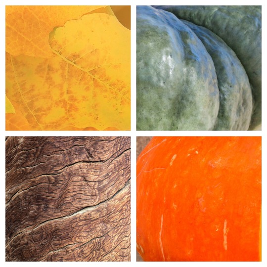
Palette: autumnal green, yellow, orange, and brown.
Notable symbols are the sukkah and the lulav and etrog, but there’s often a lot of autumnal flavor going on here. For a Jewish in-joke, add bees. Bees are always getting into the sukkah.
Simchat Torah
The day after Shmini Atzeret is still a holiday (except in the Reform movement, which combines them into one day). Jewish custom is to read one section of Torah every week, paced so that we read the entire thing in one year. Simchat Torah is the day that we reach the end of the Torah and start again from the beginning.
By “read,” we do not mean in the Protestant sense of just opening an English translation and reading to yourself the words printed inside, though we may also do that on our own time if we wish. The Hebrew words are chanted according to a centuries-old system of musical notation, out of a hand-lettered parchment scroll. The scrolls are treated respectfully: when not in use, they are dressed in rich fabric covers, and often decorated with silver crowns, breastplates, and pointers, and kept in a decorated ark placed prominently at the front (usually east) wall of a synagogue. When the Torah scrolls are removed from and returned to the ark before and after being read, they are carried in procession through the congregation. On any other occasion, one to two scrolls are taken out (a congregation may own several), and three to seven people might be honored with an aliyah (plural, aliyot), the opportunity to speak the blessings before and after the reading.
On Simchat Torah, that procession escalates into seven rounds of dancing. Congregants will take turns holding the scrolls and dancing if they feel able to do so, while the majority of the congregation dances around them in a circle. This can get kind of wild, and in many places adults are also drinking while this is going on. Some synagogues have impromptu (and I’ve even seen professionally staffed) open bars going on. Rather than a few people being honored with aliyot, every Jewish adult present may have an aliyah, and there is a group aliyah for all present children as well. How this worked in the communities where I grew up was that all but one of the torah scrolls would be rolled to the last column and laid out on tables around the room. Six or seven different people would learn the reading and be stationed at the tables, and would read the final few aliyot over and over and over, until everyone had had their aliyah. The remaining torah scroll is rolled to Genesis, and when everyone has heard the last words of the Torah, someone is honored with the aliyah that begins the torah again.
Many synagogues, particularly in the Reform movement, have a tradition of unrolling the torah scroll, either on central tables or held by congregants stationed around the room, and having knowledgeable people such as the rabbi or educated lay people in the community walk along the scroll pointing out familiar points in the story or interesting facts about the text.
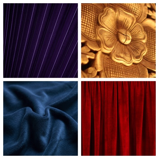
Palette: rich, royal shades of purple, blue, red, and gold.
The main visual symbol is the torah scrolls themselves, either dressed in their covers or open to show the words inside, or images of people holding and dancing with the torah.
Simchat Torah is the last of the holidays that fall in the month of Tishrei. The next month is Cheshvan, and there are no holidays or even minor observances that fall during that calendar month.
Image: a tee shirt that reads, “Rabbis heart Cheshvan”
Chanukah
Since Chanukah is the most publicized of Jewish holidays, I won’t enumerate the traditions of the holiday. That’s information you can find in other posts. I will note that it’s an eight-day holiday in the month of Kislev (Late November or December) that carries no prohibition on work and is not considered a major holiday in the Jewish calendar. It is not related to Christmas in any way other than occurring at or around around the same time of the year. It is not a holiday about unity, brotherhood, kindness, or gift-giving. It is a defiant and anti-assimilationist holiday commemorating a time when we were threatened with violence unless we gave up our cultural identity and assimilated fully with the majority, a time when the authorities occupied and desecrated our central place of worship and outlawed our customs, and instead of accepting it we rose up and fought, defeating a larger and better-equipped army through guerilla tactics and sheer refusal to give up.
The story of the miracle of the oil was inserted later, when the next people to take over and occupy us wanted to know what we were celebrating. “Oh, don’t worry about it, it’s not about a time when we had a very successful rebellion and ousted a powerful empire, it’s just this one time there was olive oil that...lasted a very long time? Yeah, that sounds good.”
When we light our Chanukah candles, we are encouraged to light them in windows or outside, because this holiday is about reminding everyone else that we’re here, we exist, we will not be made invisible, and we are not going to go away.
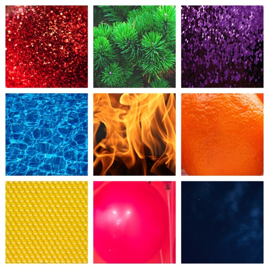
Palette: a rainbow of bright or glittery colors, plus fire.
When people depict Chanukah in the context of Christmas, setting blue in opposition to red makes a certain kind of sense. When I think of Chanukah, though, I think of a rainbow of bright, colorful candles, set in menorahs that can be silver or gold but also ceramic, stone, enamel, rhinestones, glass. Picking out the colors for my own menorah was a nightly joy during Chanukah from the time I was old enough to do my own. Every synagogue and probably every home has just a ton of colorful plastic dreidels that no one ever seems to buy, they just appear. Besides menorahs and dreidels, other symbols are latkes and sufganiyot. That American bakeries haven’t heard of sufganiyot is a heckin’ missed seasonal opportunity for them.
Tu B’Shvat
Tu B’Shvat is another minor holiday with no prohibition on doing work, so feel free to schedule that meeting. It’s referred to as the Birthday of the Trees, but it has taken on a variety of conflicting interpretations throughout history, including a celebration of the Seven Species of agricultural products native to the Middle East, an “earth day” style appreciation of the natural world, and a celebration of the changing of seasons from winter to spring.
This isn’t likely to be anyone’s big get-together-with-the-family holiday; there are often community activities featuring the Seven Species or four cups of wine (usually juice to be honest) where the first is white, the second is white with a drop of red, the third is red with a drop of white, and the last is red. The sequence is intended to acknowledge the coming of spring.
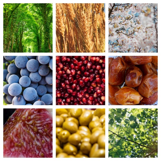
Palette: shades of green, red, purple, brown, and pale pink.
I tried to combine several different takes on the holiday into one palette: green leaves, the Seven Species, and the flowering almond trees mentioned in the best-known song about the holiday. Visual symbols center around trees, especially the flowering almond tree, or the Seven Species.
Purim
People compare Purim to Halloween sometimes, but it probably has more in common with Mardi Gras or Carnival. Falling somewhere in March or April, the holiday commemorates the events of the Book of Esther (Megillat Esther, often simply referred to as The Megillah), in which a modest and beautiful Jewish girl, chosen to be queen in a beauty contest while hiding her culture of origin, must summon the courage to confront her incompetent husband and get him to reverse his anti-semitic vizier’s genocidal decree. Between the theme of hiding her identity and intent, the “topsy-turvy” reversal of fortune at the end of the tale, and the sheer wild absurdity of the story as a whole, the holiday is a festival of silliness and absurdity.
Purim does not carry a prohibition on work, but if you can avoid scheduling something special on that day your Jewish employees or students will be grateful, because Purim festivities at a synagogue are a sad thing to miss out on. The main custom of Purim is to hear the Megillah read aloud. It is read similarly to how the Torah is read: readers chant it out loud according to the ancient musical notation, often switching off at the chapter breaks so that no one person has to learn the whole thing. On Purim, readers will often do funny voices for the characters or give the words hilariously dramatic emphasis--without sacrificing accuracy or melody. At the name of the central villain of the story, listeners shout, stamp, and wave noisemakers to drown out his name.
Additional customs include wearing costumes, alcohol consumption, eating hamantaschen, which are triangular cookies filled with like literally whatever, giving gifts of little snack bags to friends, and giving gifts of money or practical supplies to those in need. To give money is the traditional requirement, but one year my class made a project of doing a toiletries drive ahead of the holiday and packaging their donations into bags to bring to a local shelter. By doing this we were able to bring the shelter something they described as their biggest non-money need, and the kids were able to conceptualize the impact of their giving in a more concrete and hands-on way that will hopefully push them to keep doing good later in life. It’s a project I’d like to do again when I get the chance.
Another tradition is putting on a Purim Shpil, a play that retells the story of Esther while lampooning the community and its leadership. Many communities also hold a carnival on the nearest Sunday morning where kids can play carnival games, jump in a bounce house, run around in their costumes, dunk or pie the rabbi, and more.
Adar, the month in which Purim falls, is considered a month of increased happiness. It’s also the month we repeat on a leap year (yes, the whole month). When Adar repeats, all notable occasions take place in the second Adar, except for birthdays or yahrzeits where the person was born or died on a leap year during First Adar.
Palette: glittery or bright shades of red, green, purple, and orange.
For me Purim’s palette is reminiscent of Mardi Gras, both because of the masked party atmosphere and because of the royal status of the main characters of the story. Symbols include masks, crowns and scepters and other images of royalty (anacronisms welcome on Purim!), the megillah itself, a narrow scroll wrapped around a wooden holder, hamantaschen, and candy.
Passover
Usually falling in April around the time of public schools’ spring break, Passover is the second of the three pilgrimage holidays. Like Sukkot, it is an eight-day holiday where work is prohibited on days 1, 2, 7, and 8 and allowed in between, but given the scale of this holiday your Jewish employees or students would probably appreciate if important things were scheduled for after the holiday instead of in the middle.
The scale of this holiday is...huge. Essentially, we replace our entire kitchens for a week, hiding normal foods, everyday cooking appliances, utensils, pots and pans, covering the counters with foil or contact paper, and swapping out regular tableware for a set that has never come in contact with bread. We absolutely do not eat bread during Passover. Even Jews who don’t go to those lengths to prepare for the holiday, who don’t keep a spare set of dishes or replace all opened containers of food, will at the very least avoid eating bread for the week of the holiday.
For the more observant, “bread” actually means anything leavened with yeast or that has grain (including flour) as an ingredient, except for matzah. Seriously, Gluten-free cooks, search for Passover recipes when you feel like getting ambitious. My mother makes nut flour cakes that rise with the power of an insane number of beaten egg whites. My father makes a pot roast that can make you forget bread ever existed. My mother makes matzah balls out of smashed, soaked matzahs and egg, and a friend of ours makes a “crepe cake” style dessert out of layers of soaked matzahs and caramel sauce. Last year my wife made an insanely delicious dish that combined matzah and eggs with onions and mushrooms and honestly it was spectacular. But we’re all a little relived when we can put the Passover dishes back in the highest cupboard for a year, put our kitchens back to normal, and have a freaking bagel.
This is the holiday where you are absolutely going to travel if you have to to be with family or friends. In 35 years, I’ve only spent one Passover away from my parents, and it was hard. Some families will get together in a rental house or Jewish camp cabin rather than redo their home kitchens and put one family through the work of hosting, but many families have that one matriarch or patriarch who is determined to keep bringing everyone into their home for as long as they can manage the labor.
My mother goes all out. Not only is the kitchen fully changed over and the dining table extended with all its leaves, there’s a second table pushed up to the end of the first one. The seder starts at sunset and ends around 1 to 2 AM.
A seder is not simply a festive meal, like Thanksgiving Dinner. Before we start eating, we sing, recite blessings, pray, read psalms, drink two cups of wine, tell the story of Exodus in about three different ways, throw plastic frogs (okay, the year I landed one in my dad’s wine glass he decreed that we had to stop throwing them, but I’m hoping he’ll forget), recite more blessings, ask around for creative or academic insights, ask newcomers about themselves and invite non-Jews to ask questions about what they’re seeing, crunch a little parsley in salt water, eat a slice of horseradish and weep about it, sing some more, and THEN we can eat dinner. And because everyone’s having a good time, the dinner section can go until 11, and my wife absolutely bails before dessert and goes to sleep on the pull-out couch. After dessert the kids do a scavenger hunt for another piece of matzah, the winner (okay, and the other kids) get presents, and we all start singing again. Two cups of wine later, we’re opening the door for Elijah, loading the dishwasher, too keyed up to go to sleep. Which is fine, go ahead and sleep in tomorrow, because on the second night we do the whole entire thing again.
Palette: desert sand, leaf green, wine red, and the brown of roasted food.
Passover comes with a wealth of multivalent symbolism (which is why the seder lasts so long), and the colors of the foods echo the references in the text: the sandy color could be matzah, could be horseradish, could be Egypt or the desert or the path across the floor of the Red Sea. Green could be the parsley dipped in salt water, or it could be springtime. The red could be four cups of wine or the blood in the Nile, and the brown could be dinner, or it could be bricks.
Visual symbols for Passover include: the Seder Plate, which is a large, decorated tray or platter with spaces labeled for the six symbolic foods that we refer to or eat during the seder; a goblet of wine (or four, since we drink wine four times during the seder); pyramids, a reference to Egypt, where the story takes place (despite confusion, the Torah does not state that Hebrew slaves built the pyramids; even if every word of torah were to be considered literal historical truth, the pyramids would still predate this story by centuries); frogs (it’s all about keeping the kids engaged); and, of course, matzah.
Yom HaShoah
I decided to include the modern holidays because they are observed by most contemporary American congregations in at least some way, even though some of them relate specifically to the state of Israel. In doing so, I’m describing the holiday and its observance by American Jews in the United States. I am not Israeli myself, and while I’ll touch on how the holiday looks there, I also haven’t lived there as an adult and can’t really speak to it firsthand. I’m aware that just mentioning the existence of Israel at all is inviting abuse, since there seems to be a prevailing opinion on both sides that every mention of Israel must either be unquestioningly pro-Netanyahu or unquestioningly against the existence of the entire country, and that those who believe in that binary will decide for themselves which extreme any mention must belong to and abuse the writer accordingly. I am new to using Tumblr for much, so I don’t know if it’s possible to delete comments, but if I receive abusive comments from anyone I’ll do my best to figure it out.
I’m here to talk about the Jewish calendar, and about color and art.
The first of the modern holidays that fall in late spring isn’t related to the State of Israel: Yom HaShoah is a day of remembrance of the Holocaust. As a modern holiday, it does not carry any work prohibition, so if you have to schedule something for that day go ahead, just like maybe don’t go making any Nazi jokes? I mean, those are baseline unfunny, but today it’s likely to be a little more raw.
Synagogues tend to hold a short service at which memorial candles will likely be lit, and survivors in the community are invited to tell their stories. There may also be a push to get involved with efforts to preserve the stories of survivors before they are gone, or to oppose genocides currently taking place around the world. Depending on the political skew of the congregation, this could mean a variety of things.
Palette: brick red, black, white, and yellow.
Yellow and black for the stars Jews were forced to wear sewn to their clothes so they would be easily identified (despite the insistence that Jews look a certain way). Brick for the places where Jews and others were held, and were killed. White for the reminder that of the generation who lived it, those who are still with us are aging, and what they witnessed will soon only be known of, not remembered.
Tattered yellow stars with the German word “Jude” and images of barbed wire are the dominant symbols of this holiday.
Yom HaZikaron
Israel’s Memorial Day isn’t really observed with much intensity by American Jews. Those who have lost a friend or family member who served in the Israeli armed forces might observe privately, and people who are passionate about Israeli affairs might organize a talk or documentary viewing on that day, but unless it lands on a weekend there’s not likely to be a notable observance. This is again a modern holiday that carries no prohibition on work.
It’s worth mentioning, though, that while in America our Memorial Day is only observed with solemnity by people who have served themselves or were close with a veteran who has passed away, in Israel that is literally everybody. Since service is mandatory for all* young adults, and has been for generations, everyone knows someone who has been lost. The entire region is bathed in blood, and probably always will be.
*there are exemptions, such as for the extreme Ultra-Orthodox, but as I understand it Disabled Israelis do serve, as do many Israeli non-Jews.
Palette: Black, flame orange, white, blue.
For this holiday I combined the blue and white of the Israeli flag with solemn black and orange for the flame of memorial candles. Black isn’t really a mourning color in Judaism (we don’t necessarily wear it to funerals or anything), but to an American eye it definitely speaks of solemnity and loss. To a Jewish eye, the image of a yahrzeit candle gives the same feeling.
Yom Ha’atzma’ut
This. This is the holiday where the palette is actually blue and white. Israel’s Independence Day is the day after Israel’s Memorial Day. The country goes from an atmosphere of sincere mourning to a cathartic party. I haven’t been in Israel during this time except for once as a small child, so I can’t report firsthand on what it’s like, I can only speak to how it goes in American Jewish communities.
This can vary by a lot, depending on the community’s politics and aesthetic. There is again no prohibition on work. Some places will have Israeli folk dance performances or lessons. Some places will serve Middle Eastern food or invite Israeli members of the community to speak. Some places might watch Israeli movies. There’s no real established practice, it’s just a cultural celebration.
Palette: shades of white and blue.
For making this palette I could have just gone with royal blue and pure white, but I picked textured images that speak to the many sides of a very complicated country. One of the white images is a futuristic pattern of plasticky fibers. The other is an elder’s white hair. One of the blues is soft, comfortable fabric, and the other is a choppy sea. Israel is a lot of things simultaneously, and even in making a palette of two colors I couldn’t manage to reduce it to any two ideas. What I’ve noticed about Tumblr is that for some people, it can be a great place to turn over and over the deeper and more difficult facets of a situation with multiple contradictory facts. For others, it can be a forum to angrily battle down the discomfort of uncertainty by declaring anything difficult to be false, and anything challenging to be simple. If you’ve come this far in this post, I hope you choose the former.
Shavuot
The third of the three pilgrimage holidays falls late enough in the year that Hebrew schools often struggle to teach it, since it falls at or after the end of the school year. It commemorates our ancestors receiving the Torah, and traditions include staying up all night the day before to study Torah and Jewish-related subjects, decorating with flowers, and eating dairy products. Blintzes are a traditional food, but cheesecake is ubiquitous, and ice cream makes an appearance at kids’ activities. Most congregations will hold an all-night study session, sometimes together with other local congregations, where clergy and lay leaders will take turns presenting words of Torah through whatever lens fits their expertise.
Work is prohibited on Shavuot: this is not a good day to schedule that professional conference.
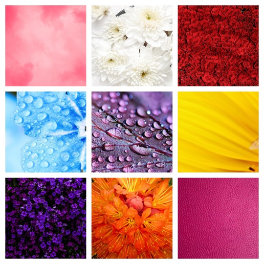
Palette: floral tones of red, blue, pink, purple, white, and orange.
The colors of flowers define the visuals of Shavuot. As a kid we sometimes made flower crowns out of construction paper, and I’d love the chance to lean into this as a craft project for older kids some year combined with words of Torah...when Shavuot next falls within the school year again. Other visual symbols include the Ten Commandments, Mount Sinai, and stalks of wheat, a reference to the Book of Ruth.
Tisha B’Av
Tisha B’Av falls during July-ish and is the designated anniversary of every disaster to befall the Jewish people. It’s the anniversary of the destruction of the central Temple in Jerusalem (both times), but it’s also the anniversary of the first Crusade, of expulsions of the Jews from various European countries in the middle ages, and of various key events of the Holocaust, in modern times. Work is not prohibited on Tisha B’Av, but since Jewish adults who are physically and psychologically able to will be fasting from food and drink that day, it would be kind to avoid scheduling anything strenuous.
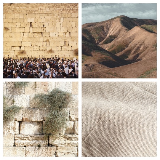
Palette: shades of brown and tan, with hints of green: Jerusalem stone and the scrubby Negev desert.
The iconic image associated with Tisha B’Av is the Western Wall: the destruction of the building that once formed the central focus of our culture, and the associated exile and diaspora, echo throughout the other disasters associated with this day. Even for Jewish communities whose custom is not to hope for a literal rebuilding of the Temple, it speaks to the danger and loss of unity that comes of being outsiders wherever we go, and the longing to return one day to a state of safety and peace.
There are a few minor holidays or holidays only celebrated by certain ethnicities of Jews, which I didn’t create palettes for. If you have suggestions, let me know!
Before ending this post, I’d like to reiterate my request that Christian artists respect that Judaism is not a sect of Christianity. I can’t control what you choose to do with this resource, but if you choose to make Christian or Jesus-related art appropriating Jewish imagery, please be honest: do not claim that you’re doing it out of respect for Jews or Jewish culture, say you’re aware that you’re doing something unwelcome and inappropriate and have chosen to do it anyway.
But if you’ve been wanting to draw Jewish people or characters doing Jewish things beyond just wearing blue to a Christmas party, I hope this post has helped, and I’m happy to field any follow-up questions about Jewish holidays and art.
#Jewishjanuary2020#jewishjanuary#Jewish january#jewish holidays#jewish art#jewish art guide#Meir Makes Stuff#jewish fanart#Rosh Hashanah#Yom Kippur#High Holidays#Sukkot#Simchat Torah#Chanukah#חֲנֻכָּה#Tu Bishvat#Purim#Pesach#Passover#Shavuot#Yom Hashoah#Yom HaZikaron#Yom Haatzmaut#Tisha B'Av#antisemitism mention#Jewish#Judaism#Judaica#Jewish headcanons#Jewish canon characters
2K notes
·
View notes
Text
My makeup basics:
Makeup can really be broken down into four subheadings --
FACE, EYES, LIPS, BROWS
I've found face makeup to be the most important to grownups, because everyone wants flawless-looking, even skin (especially as we age). But personally, I am having the most fun with eye makeup. So, really it's all about what you want to emphasize and what kind of makeup products excite you the most (I have a friend who could care less about eyeshadow but has probably 50 lipsticks -- to each their own!). That said, I think YouTube is still a plethora of amazing information. I've gone on SO many tutorial spirals. I love learning different techniques and seeing how people apply products. It's crazy fun.
MY HOLY GRAIL PRODUCTS: (which, honestly, take or leave all this advice, makeup is totally subjective and whatever works for you might not work for me and vice versa but there are tons of popular products and I use a fair amount of them):
FACE:
— Start with a moisturizer. I use just daily cerave. It’s cheap and helps your skin stay hydrated which is the most important thing before applying makeup!!!
-- Dr. Jart BB cream. I love that it's a buildable coverage, and it comes in two shades (fair/medium and medium/dark), and it really melts into the skin, especially on top of a moisturizer. Shockingly blendable.
-- Armani Luminous Silk Foundation. If you're looking for a splurge foundation -- this is it. I had it once and will never be able to afford it again, but if I could... I'd definitely add it to my regular rotation for full face of makeup.
-- Beauty Blender. I have tried SO many other knock offs. Just regular damn sponges. Nothing blends quite as well as a damp beauty blender. I don't know why or what's so magical about it, but it is.
-- Tarte Shape Tape Concealer. This is another beloved product. I have tried many other concealers and always come back to this one. Apparently the ELF camo concealer is a cheaper dupe but I have yet to try it.
-- Laura Mercier Translucent Setting Powder. Can be loose or compact. But this was a thing I didn't even realize I needed until I started watching tutorials and was like... why does my foundation look gross and theirs look so smooth? It's because they set it with powder. Apparently you HAVE to do that. Nyx has an excellent less expensive one, but this particular one is magic.
-- NARS Blush in ORGASM. This is a universally flattering blush in a sort of peachy gold. My mom said she hated it because it is "too glittery" but when I put it on her she was obsessed with how youthful it made her skin, and how she glowed. I’ve been wearing it for the last decade.
-- Anastasia Beverly Hills Glow Palette. If you're not into highlighter, no worries, but if you're into trying it out... this palette cannot be beat. Four shades of glowy perfection.
-- BRUSHES: A large powder brush, a medium blush brush, a small highlighter brush.
EYES:
-- MAC paint pot in PAINTERLY. This is what I use as my eye primer. I know a lot of people who just use concealer. It basically functions the same. But this stuff makes sure my eyeshadow stays put and doesn't crease, even if I'm out dancing and sweating. I’m a loyalist.
-- Stila Liquid Eyeliner or NYX Liquid Eyeliner. Both are felt tip markers and SUPER easy to learn how to use. I am now a winged liner PRO. If you're more into pencil, nothing beats the Yves Saint Laurent or NARS pencils. Makeup Forever is okay in a bind.
-- My two favorite neutral palettes (which is what everyone should start with) are the Charlotte Tillbury Pillow Talk and Urban Decay Naked Palettes. They have a wide range of colors for all skin tones and blend really well. Both shimmers and mattes.
-- Mascara is buyers preference. I love a thick voluminous lash, while I know others prefer a long lash. For voluminous recs -- Dior Blackout or Benefit Bad Gal Lash are my two faves.
-- BRUSHES: Crease brush, medium application brush, fluffy blending brush, flat liner brush
LIPS:
-- My favorite lipsticks are from NARS, MAC, KVD, and FENTY. I love the way matte lipsticks look, but they're sort of out of fashion now. Satin and gloss have come back into trend.
-- A neutral lip pencil will go well with any lipstick. Except red. Always get a red pencil for a red lip.
-- Don't forget a pencil sharpener!
-- BRUSHES: A lip brush. This is a thing, and it actually makes application so much easier, especially when using matte lipsticks.
BROWS:
-- This is the one thing that evades me. They are a mystery to me.
-- Everyone else's holy grail product is Anastasia Beverly Hills Dip Brow
Believe it or not, that is my bare bare minimum of what I need when I’m doing my makeup. Everything else is just gravy. I use all these products every day when doing my makeup looks. Now that you have your makeup and your tools... how the hell do you apply all this stuff?
This website is a really good place to start for beginners — it’s a solid compilation of some big name YouTube MUAs (Jaclyn Hill, Michelle Pham, Raye Raye, etc) and some beginners basics tutorials. I highly recommend searching for a beauty guru with the same skin tone/hair color as yourself because it’s easier to imagine how colors will look on your own face.
Other resources —
The Makeup Chair https://m.youtube.com/user/TheMakeupChair (they have an especially informative video about finding out what eye shape you have, and it totally changed my eyeshadow application game!)
Sephora https://m.youtube.com/user/sephora/videos (which focuses most on reviewing products but also has helpful tutorials, and I enjoy learning about new makeup trends from the store that carries the biggest brands)
Tati https://m.youtube.com/user/GlamLifeGuru/videos (does a lot of product reviews as well but focuses on drug store brands and lower price point makeup, she’s kind of bitchy but fun to watch)
And then last but def not least. Vogue’s YouTube has an amazing makeup series of celebrities just putting on their own makeup called Beauty Secrets. It is so much fun to watch and I’ve learned so much from just watching people go through their own routines and what they enjoy.
Okay. I think that’s probably MORE than enough to start you off with hahah. Let me know if you have any questions, concerns, thoughts. I’m more than happy to chat makeup products or techniques any time.
Tagging: @bloody-shadow666
21 notes
·
View notes
Text
Fate: The Winx Saga - How Not To Reboot A Beloved Franchise

Okay, I think I speak for everyone here when I say: We saw this coming.
We saw this coming as soon as that godawful trailer dropped on youtube. But because I hate myself and because I wanted to give this pile of shit a chance, I watched it.
All of it.
It sucked and I won’t do it again.
The End.
....
Nah, I’m kidding.
Here’s why Fate: The Winx Saga sucked ass.
(Spoilers under the cut! Pfft, like anyone cares.)
The Story:
I suppose now you’ll expect me to tell you that F:TWS was a generic, boring slog-fest.
That it offered the most clichéd take on a Chosen One-story since Eragon and that it’s half-assed attempts to be scary through bringing in a zombie apocalypse made it even more painfully obvious just how hard the story was trying to be edgy and ‘’’’’’mature’’’’’’’’.
And, yeah, that’s pretty much how it went.
...Oh, I’m sorry, did you expect something fresh and surprising?
So did I when I watched this garbage.
The title says Winx, but honestly the story is more about Bloom than anyone else. At least they were faithful to the source material in one aspect, am I right fellow Winx-fans?
I hope you like Alfea, because you won’t be spending time anywhere else! Gone are the dozen colorful, unique worlds with their own eco-systems and culture.
Now we have The Otherworld, which is just earth, but with magic.
Oh yeah, and remember how each magic and non-magic users had their own, specialized schools to got to?
Cloud Tower, Alfea, Red Fountain?
Yeah, that’s all Alfea now.

Remember how Winx Club juggled great, charismatic villains and everyday teenage-drama in a way that made both seem interesting and neither obnoxious?
Fate fails miserably at that.
The subplot about the zombies- Oh, sorry, The Burned Ones ™ slowly invading Alfea couldn’t be more dry and uninteresting if it tried.
You have hints of political intrigue in the background with the Solarians scheming and taking over in the end, but trust me when I say: You won’t care.
And since the character are either miserable, unlikable or both, you also won’t care about the teenage drama.
Because it’s every single teenage drama plot-line you’ve already seen in edgy reboots like Riverdale, Chilling Adventures of Sabrina, etc.
To add insult to injury, season 1 ends with the villains and antagonists taking over Alfea with Solaria’s help, as if anyone would be baited into a season 2 after you just dragged us through a worse version of The Walking Dead.
I would say this is what you watch to lull you to sleep, but all the incessant whining and belly-aching wouldn’t let you.
And because this is the ‘‘‘‘‘‘mature’‘‘‘‘‘ reboot, there will be no transformations and no bright colors. Just some nice effects for magic and that’s it.
Because, you know.
No one watched Winx Club for those, am I right? /s
And because in modern, edgy reboots women can never just be friends, the Winx Club start out hating each other, until suddenly they’re the best of friends in episode 4, Stella included.
Cool, huh?
The Characters:
I’ll get straight to the point: The main cast is horrible.
Not acting-wise, the actors are doing the best they can with the script, but the way they’re written...
God, the way they’re written.
For starters, Stella is a Karen now. In the very first episode she attempts to get Bloom killed, then runs away to cry into Sky’s shoulder rather than apologize.
Flora was replaced by a white character named Terra, who the writers probably thought would be received well solely because she’s awkward and makes a lot of Strawman-Feminist statements.
Techna got straight-up written out.
Musa was white-washed and is a Mind Fairy instead of a Music Fairy now, because her being the Fairy of Music wasn’t ‘‘‘‘mature’‘‘‘ enough for this reboot.
Bloom is a whiny, spoiled brat who is willing to endanger absolutely everyone around her to get what she wants. And in the end, the plot rewards her for it.
Aisha is the only Winx Club-member who remains likeable, but she’s firmly planted in the supporting character-role.
Most of the Specialists got written out too. No Timmy, no Helia, no Nabu, no Brandon.
Sky is still there, but he serves mainly as a boy toy for Stella and Bloom to fight over, because that needed to be a thing, I guess.
Riven was changed from Jerk with a Heart of Gold who learns to be better to just a one-note jerk who never changes and never learns. He’s also not with Musa in this story. Even though their romance was by far the most engaging one in the original series, aside from maybe Aisha and Nabu.
We get a new character named Dane, but he’s just there to be either a bully-victim or a side-character for others to take advantage of. Did I mention he’s the only black guy in the main cast? Yeah. There’s also this really asinine running gag that he might be gay, to tease a possible relationship with Riven, but nothing ever comes off it.
The teacher-characters are all pretty much the same: Duty-driven, want to protect the ones under their care, but end up alienating them by not being entirely honest with them because they think their students aren’t ready for The Truth, blah blah blah, moving on.
The villains don’t fare much better.
The Trix got fused into one single character named Beatrix (haha, get it?) and she’s just... The Worst. And not in a good way. She’s obviously supposed to be the Charming Bad Girl-type but you’re more likely to laugh your ass off every time she opens her mouth than be intrigued. Whoever wrote her dialogue clearly has no idea how teenagers talk. She hooks up with Riven and Dane for no reason in particular and it’s heavily implied these three are going to be the new Trix. Which is...no. Just no.
The headmistress’ secretary gets killed off in the third episode and doesn’t do much in the first two, so I have nothing to say about him.
Rosalind is a worse, female Darth Sidious who is trying so hard to get Bloom to join the Dark Side and I guarantee you, you will not care. The story also tries to present her as something of a well-intentioned extremist, but forgets to actually let her have a point in her murders and genocides.

Hey, remember when Winx Club characters were different and unique?
The writers of this reboot clearly don’t.
The Aesthetic:
Hey kids!
You know what’s better than bright colors and nice, comforting palettes?
Slapping a dull grey filter on everything and calling it a day!
If I had to list all the reasons why Fate’s lack of style is so heartbreaking and disappointing, we’d be here all day.
So I’m just gonna show you a few screenshots from both the original series and the reboot and let that speak for itself.
The Original:


The Reboot:
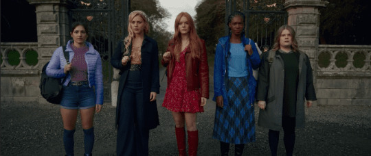


Honestly, what do I even need to say?
The reboot sucked out everything that made Winx Club Winx Club and replaced it with “YA-novel palette #17247845453″.
Thanks, I hate it.
In Conclusion:
Fate: The Winx Saga could have been a new take on Winx Club’s story.
Maybe even introduced new concepts and characters tat could have been just as iconic as the original ones.
It chose to be every reboot ever instead, made everything grimdark and fundamentally misunderstood the meaning of “Gray Morality”.
Do yourself a favor and re-watch the original instead.
It’ll be a much better use of your time.
30 notes
·
View notes
Text
Could Tattoo Ink Be Used to Detect Cancer?
https://sciencespies.com/nature/could-tattoo-ink-be-used-to-detect-cancer/
Could Tattoo Ink Be Used to Detect Cancer?
When amateur artist Cristina Zavaleta signed up to take an illustration class with Pixar animators on character design, she had no idea she’d also be embarking on a new scientific study. At the time, Zavaleta’s work as a post-doctoral biomedical researcher in a molecular imaging lab at Stanford involved evaluating contrasting agents, like dyes, used to detect tumors in animals. During her art class, the researcher was struck by the intensity of the colors of gouache, vibrant water-based paints, that her fellow illustrators were using. “They were bringing back these pieces that were just incredible, really rich colors. And I thought, how do you even achieve that color, visually,” says Zavaleta.
That simple question ultimately led Zavaleta, now an assistant professor of biomedical engineering at the University of Southern California, and her colleagues to create a first-of-its-kind library detailing the optical imaging properties of commonly used pigments and dyes, found in everything from tattoos to food coloring. The researchers hope their study will open the doors for the novel use of everyday colorants as imaging agents in medical tests, that may be more effective at early detection of several kinds of cancers.
Currently, only three dyes with fluorescent properties used as optical imaging contrast agents—methylene blue, indocyanine green and fluorescein—are approved for human use by the U.S. Food and Drug Administration (FDA). In diagnostic medicine and in some surgical procedures, imaging contrast agents are materials used to improve internal body pictures produced by X-rays, computed tomography (CT) scans, magnetic resonance imaging (MRI), and ultrasounds. These materials can be ingested or injected and temporarily color targeted parts of the body, like specific cells, organs, blood vessels and tissues, to help clinicians see differences and abnormalities that may indicate disease. Yet, Zavaleta wondered about the significant catalogue of approved food, drug and cosmetic dyes that people routinely encounter in their everyday lives. Are there other imaging agents hiding in plain sight?
youtube
“As my art brain was thinking about these paints [from class], I thought to myself, what paints are already being used in humans?” says Zavaleta. “And a lightbulb went off.”
Tattoos. High quality pigments used in tattooing are made from mineral salts and metal chelates, which have been isolated from natural sources and used by humans for thousands of years.
Zavaleta’s next step was to do her homework, as any good researcher would. She contacted Adam Sky, a tattoo artist in the Bay Area whose work she admired. Sky was interested in her research, and gave her samples of some of the inks he was using, which Zavaleta collected in a well plate, a tray with multiple divots, or wells, that can be used as test tubes, she’d brought along, just in case.
“I immediately took them to my microscope over at Stanford, and I did all these different tests on them,” Zavaleta says. “I was amazed at what I was seeing.”
In a tattoo ink color palette, each color carries a unique spectral fingerprint that can be used as an imaging barcode to better identify and detect tumors.
(Tattoo and design created by Adam Sky)
She measured two optical elements of the inks, their fluorescence properties and Raman properties. Fluorescence relates to a dye or pigment’s capacity for absorption and emission of light, while Raman indicates how light scatters. Both are commonly used in imaging techniques in the cancer field. Highly fluorescent agents offer sensitivity in imaging; very small amounts are needed for them to illuminate areas very brightly. Raman imaging, on the other hand, offers specificity by allowing multiplexing, or the ability to look at several processes happening inside the human body at once. These can help show whether cells or tissues are expressing multiple genes, for example, or expressing one more highly that may be associated with a particular cancer, like HER2 and breast cancer or EGFR with lung cancer. Each of the targets has different receptors that will be illuminated by different agents, and depending on their optical properties, some agents will be better than others.
In all, the researchers evaluated the optical properties of 30 approved food, drug and cosmetic coloring dyes and tattoo ink pigments using a spectrophotometer, an instrument that measures the intensity of light after it passes through a sample solution. Seven of the colorants displayed fluorescence properties that were comparable to or exceeded the three FDA-approved clinical dyes. The researchers next measured the Raman signatures, to see how high the colors’ unique signatures of light photon peaks were, with high peaks being indicative of usefulness in terms of multiplexing. Finally, they tested the best-performing dyes and pigments by injecting them as imaging agents in mice with cancerous tumors.
The researchers evaluated the optical properties of 30 approved food, drug and cosmetic coloring dyes and tattoo ink pigments.
(Cristina Zavaleta)
Data from Zavaleta and her colleagues’ study showed that FDA-approved Green 8 dyes used in drugs and cosmetics have significant tumor targeting potential in mice with cervical and colon tumors, and the Orange 16 pigment found in tattoo inks also showed, according to the authors, promising fluorescent properties and tumor targeting potential. This is significant because, as they note in the study, “no single imaging modality currently meets all the clinical needs of high sensitivity, high spatial and temporal resolution, high multiplexing capacity, high depth of penetration, low cost, and high throughput.” In other words, no single imaging agent can provide all the information a doctor might need.
The USC lab where Zavaleta and her colleagues conducted the research uses nano-based imaging contrast agents, or tiny spherical vesicles that are loaded with the dyes or pigments. While nano-based agents are approved for use as a medium in human imaging, they have been controversial in the past because of potential toxicity. Metallic-based nanoparticles like those made from gold and silver have been known to stay inside the body for long periods of time after exposure. This is one of the main reasons the team instead uses liposomal nanoparticles, made up of biodegradable materials with fatty skins similar to human body cells, that are already used in other applications, like drug and nutrient delivery.
“You can think of it as us having all these different batches of nanoparticles, and one has a different tattoo ink [or other dye or pigment] inside of it. And that tattoo ink has a very special barcode that’s associated with it; every ink has a unique fingerprint, yellow different from red, red different from purple,” Zavaleta explains. “So, if we have all these different flavors of nanoparticles that we can now target to different receptors on tumors, we can enhance our ability to distinguish between different [cancers].”
One use for such materials could be gathering real-time information during a test, such as a colonoscopy, where physicians are visually searching for certain kinds of polyps. Enhanced imaging agents have the potential to also reduce the invasiveness of disease detection and diagnosis, such as the number and size of biopsies needed, by providing more information from a smaller sample.
Christian Kurtis, who made the career change from biomedical researcher at the National Institutes of Health to tattoo artist in Rockville, Maryland, spent his post-doctoral period in a cancer research lab at the Uniformed Services University of the Health Sciences. Kurtis says the specificity these kinds of dyes could offer for imaging is key to better treatment.
“The unfortunate problem with malignant [tumors] is that they comprise a [variety] of molecular markers that may not be present on all cell types. The increased metabolic activity of malignancy is the signature most commonly exploited in imaging, and is the reason these liposomal techniques are effective,” says Kurtis. In other words, because cancer cells tend to spread quickly, researchers and physicians are able to track their growth with imaging. Having multiple types of agents that bind to the different markers would be even more helpful. “In my opinion, it will be personalized or individualized medicine that will hold the key to meaningful early diagnosis of disease,” he adds.
Jocelyn Rapelyea, the associate director of breast imaging and the program director of the radiology residency program at the George Washington University Cancer Center, adds that while tools like molecular breast imaging have been around for a while and help to identify problematic cells before they grow into lumps, advancing knowledge is always a positive. What works well for one patient may not for another.
“It’s always exciting to have the ability to be able to identify tumors at a potentially early stage. It’s quite interesting how [Zavaleta] came to dyes,” Rapelyea says. “This is obviously a model in mice at this point, but it is promising to see that there could be potential of being able to identify earlier development.”
Zavaleta knows the dyes and pigments her team has catalogued in a library will be subject to the FDA’s rigorous regulatory procedures before they could ever be used as imaging agents in humans. “We’re not suggesting in any way that they’re safe,” she says. “We’re saying, ‘Hey, these are dyes that we’re continuously being exposed to on a day-to-day basis. Let’s have a look at them further.’”
#Nature
5 notes
·
View notes
Text
One of my absolute favourite Makeup Brands is the wonderful, Bésame Cosmetics which was founded by Gabriela Hernandez in 2004 and is primarily devoted to recreating authentic vintage makeup! As a true vintage girl myself, Bésame is basically a dream come true and is such a refreshing and unique concept in a 21st Century world. Also, all Bésame Cosmetics products are cruelty and gluten free as well as being PETA certified, which is very comforting to know.


Not only do Bésame focus on recreating a variety of retro products from the 1910s to the 1970s, they have also collaborated with Disney on a number of Classic Film Collections; starting with Snow White and The Seven Dwarfs (1937) (sadly no longer available!) Mickey Mouse (1919) and Peter Pan’s Mermaid Lagoon (1953). Fast forward to now and the latest collaboration is to celebrate the 60th Anniversary of the eternal Sleeping Beauty (1959) which just so happens to be one of my favourites and features my most loved Disney Princess, (along with Cinderella!)


Each Disney Collection is intricately researched, with Bésame having rare access to the Disney Archives to recreate the famous colours from the film cells and tell the story as authentically as possible. With this particular collaboration, Gabriela incredibly recreated the famous Sleeping Beauty book, which features in the films famous opening sequence!


Although I dream of having all of the products, I sadly had to think with my head and not my heart and therefore purchased the following four items; 1959 Eyeshadow Palette, Locket Cream Rouge, Maleficent Lipstick and Briar Rose Blush Palette.


The 1959 Eyeshadow Palette may quite possibly be the most beautiful one I have ever owned, I didn’t think the Urban Decay Game of Thrones Palette could lose it’s number one spot but, this has definitely taken prized position! Inspired by the Fairy Tale Book in the opening scene of the film, the palette consists of twenty – yes twenty (!) matte eyeshadows. The shades are authentically reproduced from Aurora, Maleficent and the three Fairies’ colour palette that is used in the movie. The product actually includes four real pages inside, which recreate the looks for you to emulate and a mirror is also included!


At £57 this is the most expensive Eyeshadow Palette I’ve ever bought, but I can say with all honesty that if you’re a Disney, Sleeping Beauty, Bésame fan or super makeup lover, it is one hundred percent worth it. The quality is incredible and the time, effort and attention to detail that has gone into making this is truly laudable and does not go unappreciated. This product is without doubt a collectors item and if you were willing to pay an extra £8, you could purchase it with a special display case – however, that option is sadly sold out!


Here are the names of each shade within the palette;
Aurora – Color Call Outs;
Iris, Eyes – Grey Blue 104
Lips with peasant costume – Grey Pink 109
Eyelids – Rose 105
Skin – Coral 102
Legs – Adobe 102
Lips with pink & blue dress – Blush 105
Hair – 89343
Brows – Dust 107
Crown, necklace – 89339
Blouse, peasant costume – White 106
Skirt, peasant costume – White 107
Pink dress – Beet 105
Blue Dress – Royal 106
Maleficant – Color Call Outs;
Lips and nails – 89396
Eyes – 89348
Eye shadow – 89349
Ball on staff – 89350
Pleat of cape and sleeves – Plum 107
Skin – 89352
Staff – 89353
Within the collection their are three lipsticks available; Sleeping Beauty Pink – based on Aurora’s lip shade, Make It Blue Make It Pink – a blue lipstick which applies pink – clearly a nod to Aurora’s colour changing dress and Maleficent – which I purchased.


As a red lipstick wearer I wanted to choose one that was closest to this colour and of course, that was Maleficent. Although most of us Disney fans associate red lipstick with the iconic evil fairy, the film cells actually show that her shade was more of a deep pink with a cool undertone, which I found really interesting! All three lipsticks retail for £20 and come in the stunning Sleeping Beauty pink packaging, as well as the 1940s vintage reproduction gold cases with the 1959 film logo. The finish is a semi matte satin, like all of Bésame’s products, which is faithful to the vintage era – although I would love a true matte, simply because I like my lipstick to not move all day. However, we can’t have it all and I do love the iconic shape of Bésame lipsticks, which helps create perfect precision and again is a nod to the vintage era.


At only £15, the Locket Cream Rouge is a wonderful bargain and a true collectible that once again recreates the stunning Sleeping Beauty Book on the front and features a portrait of Princess Aurora on the back. The product is rose gold plated and features a magnetic closure which when opened, reveals a pink cream rouge. This can be worn on both the cheeks and lips and if you want to use the locket for an actual photo, the rouge can easily be removed. Therefore, not only do you get a stunning necklace like no other, but it also features a unique Sleeping Beauty product – such a must have!


The final item I purchased from the collection was the Briar Rose Blush Palette, which comes with two rouge shades and two highlighters for a total of £29. All four colours are once again thoroughly inspired by the exact colours used in Sleeping Beauty. The two lighter blush and highlight are worn by Aurora in the film and the two darker blush and highlight are Maleficent’s. Therefore, you can create a lighter day look with Princess Aurora and then vamp it up for a dramatic style with Maleficent’s. Or, if you’re feeling creative, you could even mix them all together! The compact also comes with a mirror inside which features forest artwork from the film and adds such beautiful detail, as well as the front image recreating an actual film cell used from the movie.


Overall, it’s safe to say I am without a doubt blown away by this whole Collection and feel extremely fortunate to have been able to purchase four of the items. Furthermore, I also must note how with every special collaboration, Bésame creates their very own, “Bésame Bugle” which is inspired by a vintage newspaper. This particular one features all the behind the scenes information from the Sleeping Beauty film and the makeup products! It’s an absolutely stunning collectible itself and I will treasure it. Lastly, my only hope is as Cinderella’s 70th Anniversary is next year, I pray that a collection is released to celebrate this!
A big thank you to Bésame, Gabriela and Disney for creating such beautiful collectible products for us all!
Follow me at;
BLOGLOVIN
INSTAGRAM
TUMBLR
TWITTER
YOUTUBE
For inquiries or collaborations contact me at;
Bésame Cosmetics Sleeping Beauty Collection. One of my absolute favourite Makeup Brands is the wonderful, Bésame Cosmetics which was founded by Gabriela Hernandez in 2004 and is primarily devoted to recreating authentic vintage makeup!
#1950s#1959#bblogger#bbloggers#bbloggersuk#beauty#besame#besame cosmetics#briar rose#disney#makeup#makeup review#maleficent#princess aurora#sleeping beauty#vintage#walt disney
31 notes
·
View notes
Text
The most precious and expensive marbles, granites and natural stones in the world
Natural stone is a sublime material. When it transpires in its most precious forms it becomes a true icon of excellence and exclusive luxury. Allowing yourself a journey through the most precious marbles, granites and natural stones in the world means being enchanted by unexpected colors, games of light and shadows, veins that seem to be constantly moving and interweave, come together, move on the surface like waves of water.
Carrara Statuario
The White Statuario marble of Carrara is one of the most precious marbles in the world. Few materials, in fact, can compete with its transparent sheen and its incredibly compact structure. Among the main types of this material is the White Statuario Veneto Marble, which has veins in shades of grey of various sizes, and the White Statuario Extra Marble on which the veins are extremely thin and not very visible. Both these qualities are very valuable, even if the second one is truly a unique example of aesthetic perfection and grandeur. Many Italian artists from all times have created real masterpieces with the Statuary: think for example of the “Grazie” and to “Amore e Psiche” by Canova without forgetting Michelangelo’s David, entirely carved in a single block. Today, this material is used to express luxury and magnificence especially for roofing and furnishing elements such as fireplaces, sculptures, and special design creations.
The Calacatta Carrara marble
Calacatta is one of the most precious and appreciated Italian marbles, above all for prestigious projects and extremely refined furnishing elements. Extracted from the Carrara quarries, this marble has been used since the Renaissance in the most exclusive projects for its delicate magnificence and for the ability to transmit with extreme elegance the most refined aesthetic luxury. The base of the Calacatta marble is crystalline white. Depending on the color of the veins, however, we can have various types: the Calacatta Caldia is superb in shades of mint green without forgetting the Calacatta Crema in shades of light beige tending to ivory. Unique, sought-after, and splendid in its enigmatic transparencies and in the brilliance of its surface is then the Calacatta Oro that gives the elegant veins in yellow-gold that literally ‘shine’ on the white surface of the base.
The Sicilian Diaspora is mined from the quarries of the mountains of Custonaci, in the province of Trapani. Its color is unpredictable and alternates various colors ranging from dark red to ocher yellow, with rare white intrusions. The softness of the colors gives a wonderful feeling of warmth and comfort and that is why the Diaspora is mainly used for luxury upholstery and interior decorations. Among the most expensive stones in the world, Diaspora has always been sought after by Princes and rulers who wanted it for their churches, palaces, and mausoleums. It was used in the splendid works of art of the “Opificio Delle Pietre Dure” of Florence, a place founded by Ferdinando I de Medici in 1588 as artistic manufacture for the production of hard stone furniture, second to none for fitness of workmanship and creativity in the use of precious materials.
Brèche du Bénou, pride of France
French marble with important design, the Brèche du Benou has a multicolored gravelly structure in shades of intense yellow and green, up to pink. This is a very precious marble and has always been used for important achievements such as the decorations of the palace of Versailles (especially for the splendid fireplaces) and the interiors of famous historic buildings throughout Europe. Its dynamic polychrome is a true piece of furniture and is transposed with fascination in both traditional and modern settings.
The White Thasos Extra marble of Greece
Bianco Thasos
The White Thasos Extra marble is a particularly precious material that comes from Greece. Its value is to have a very fine grain, which gives it a particular crystalline touch, and an absolute white background that has neither veins nor intrusions. The slabs are usually small and carefully selected according to their more candid color. Given the intrinsical beauty of the material, the most suitable processing is the polishing that makes it incredibly bright and suitable for enhancing any type of construction. Usually, White Thassos Extra marble is used for interiors, decorative objects, and luxury coverings. Its superb whiteness is often enhanced by the combination with other darker marbles such as the Black of Belgium, the Portoro or the Botticino marble.
Absolute chromaticism: the Belgian Black marble
Belgian black
Elegance: This is the most correct and exhaustive definition to describe this marvelous marble that comes from Belgium and that offers an intense black background on which a slight bright white dotting stands out. This detail gives the material an original and unconventional appearance, making it perfect in any declination dedicated to interior design – such as stairs, floors, and countertops – and for the preparation of outdoors. As for the finishes, the polishing is the most recommended treatment since it is particularly suitable to emphasize the aesthetic qualities of this most exclusive natural stone of its kind.
From Italy, Portoro marble or marble of Portovenere
Babylonia
A very precious marble, starting from the few quarries in the province of La Spezia that extract it and then continue with the difficulties related to the protection of the local landscape that requires a particularly complicated extraction. The Black Italian Portoro is a beautiful marble, characterized by an intense and brilliant black with golden veins alternating with whitish areas of variable dimensions. In its palette, there are eight variations ranging from yellow veins for its ‘large stain’ to those ‘fine stain’ up to the Black and White of La Spezia where the white spot is predominant on the grey-black background. Cosimo I de Medici had a great passion for Black Portoro. In the 16th century’s Florence, some of the greatest works of art of the Italian Renaissance were made from this natural stone.
Emotions in natural stone: the Amazonite granite
Amazonite granite
Looking at a slab of Amazonite, very precious granite from Brazil, it seems like you are in front of a contemporary work of art: it’s incredibly moving structure, in fact, creates unexpected suggestions that come to life through the thousand tones of emerald and blue. The Amazonite has the power to enchant those who stop to observe it and its value reinforces the magic. In luxury interior design, this material is mainly used as a coating with an open-book stain finish in small spaces, niches in showers, in particular, to reinforce the en plan air effect. Not being resistant to frost, the Amazonite is unlikely to be used for outdoor installations.
The colors of the sea reproduced by the Blue Sodalite
An extremely rare and precious stone: the blue Sodalite is an intense material that amazes with its variegated colors that range from sky blue to cobalt to reach the shimmering shades of lapis lazuli. Beautiful and very precious are also its blocks of uniform color, devoid of stains or veins, which give a disruptive perfection as magically wrapped in an incredible depth of color. This natural stone has established itself in the design of luxury environments where it has been chosen for interior cladding and highly decorative elements such as fireplaces, niches, and columns. Thanks to its particularly relaxing color, the Blue Sodalite is also very sought after for the creation of wet areas such as baths, spas, and swimming pools.
Add by expert and export team of Bhandari Marble World
1 note
·
View note
Text
Good Stuff’s Best of 2018
WARNING: I just want to say cheers to you for making it through another year. I send you best wishes for next year to be fruitful. Thank you, take care out there, and enjoy.
Dedicated to Stan Lee, Stefán Karl and Stephen Hillenburg, the number ones of children entertainment
Bow Whacka Wow, playas and players. 2018 gave us quite a lot to consume while society continues to fumble like a Tumblr update. While hopefully the chaos has died down for the final weeks of the year, I’m counting down the best cartoons/animations I’ve seen and loved this year in no particular order. Only two rules, no sneak previews of future projects (sorry 101 Dalmatian Street and MP100) and no potential entries from last year’s list (sorry True). With that said, roll it....
10. UNIKITTY!
I love the Lego Movie. I’ll potentially like the sequel. I like Unikitty. She got a show, and it was a great show to start off the year. Upbeat, colorful, off the walls sometimes, perfectly capturing the spirit of the eponymous character. I’m glad the other characters are just as enjoyable, I never get tired of the theme song, every episode had me smilin’ one way or another, it’s just a quality bottle of positivity juice. Don’t know how else to explain it, Unikitty, the show and character, just makes and continues to make me smile.
9. POP TEA-- SIKE!
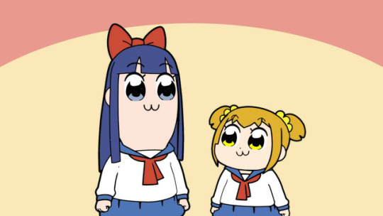
This anime ain’t nothing but unfunny randomness and skits with a forgetful arc in the first and final episode. I don’t get it, never gonna get it, so I don’t want to get it! MORE LIKE POOP TEAM EPIC, ‘nuff said. Which is why the actual number nine is....
9. BOB EPIC TEAM
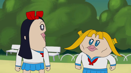
Honestly, there is something endearing about the way Bob Epic Team presents itself. The simplicity and variety of its animation is remarkably good and makes it feel timeless sometimes. The comedy works in a way that gives you a clear grasp on the two characters while letting them do whatever they want. The surrealism of this is fun to think about, showcasing a hedonistic philosophy that rivals that of Epicurus. The duo’s chemistry is what especially got me, as they felt like the best of friends, potentially love birds *wink wink*. This anime was just creative in every sense of the word and, like Unikitty, it was a great anime to start of the year.
8. CRAIG OF THE CREEK
The ska is RAH. I honestly find this to be the loose spiritual successor to Hey Arnold and Recess. Like the playground, the creek is a well fleshed out setting with the many characters that hang there, from the TAZ trio to the loving witches of the creek. Though I will say the best episodes are when we get insight on the main three’s personal lives with their families and when the characters themselves go through a personal trial to understand themselves a little better. The shows thrives in the theme that the creek is a place where you can enjoy getting your hands dirty and work towards something you want, even if it doesn’t add to any concrete long term benefit beyond learning a thing or two about yourself and others. And I say for somebody that relates to Craig as a character, that’s a welcoming thought that the show has yet to perish. And the ska is a welcome choice of music, IMO.
7. THE EPIC TALES OF CAPTAIN UNDERPANTS
It’s funny in how a little over a year of getting a movie, Captain Underpants gets an animated series with not only original stories in lieu of just animating the already printed stories, but puts it all in a format similar to reading a book with a sardonic narrator and separating the plot of the episode into chapters with subtitle cards; one of the first I’ve seen do this. But really, a “Captain Underpants cartoon” is something I can’t say would turn out bad, and I’m right as this is a show that revels in what made CU great in the first place. George, Harold, Melvin, and Mr. Krupp/Captain Underpants are all great characters with the additional supporting cast providing welcome life to the world. Every Incredible Violence Chapter is brilliant in their own right, and while I wasn’t a fan of the ending they had for the season, it’s great that almost every episode is self-contained, boosting its replay value. Honestly, any compliment I have for this was already said in my review of this and the movie, so I’ll just say this too was faithful to its source material and benefited heavily for it.
6. GARY AND HIS DEMONS

Rick and Morty done better. BOOM, send tweet! It is safe to say that this was quite the sleeper hit and I can’t help but say it’s lowkey one of the best adult cartoons this year next to Ballmastrz and Final Space. And while I certainly appreciate the other two *hint hint* this one got a step above on the grounds that it works as a comedy and a solemn tale of a chosen hero that stumbles through years in the office life. It’s improv humor feels natural and it can be as melancholic as Bojack Horseman without making it all too deep like so; has a great balance of both. Main man Gary, unlike Rick for the most part, is a guy that’s both reasonably reprehensible yet pretty relatable. Not to mention, while it was bittersweet, it had a very satisfying finale to where I feel like this was a complete series all together. With a rough art style that compliments it’s tone, this was a series that surprised me in its sharp quality.
5. APPLE & ONION
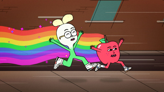
I’ll admit. Initially wasn’t a fan of it as it felt like a knock-off to Regular Show (may it rest). Just had a duo of bros living together, doing mundane labor while coming up with impromptu tunes along the way. Then again, I was gladly proven wrong because the charm of it generally being a simple show, even with every person being food, somehow more regular than Regular Show. Every song they make is upbeat and catchy, all of the characters are endearing, and with only 10 episodes, each one was well paced and had quality writing to the point where I teared up a couple times. It stinks that this and Summer Camp Island have generally been receiving the shaft this year after their premieres, but I'm just glad that they haven’t been truly forgotten by CN and are getting more episodes next year. Plus, I love food and this show is about food. Debate over.
4. LEGEND OF THE THREE CABALLEROS

I was familiar yet never saw The Three Caballeros, ironic since Donald is one of my favorite Disney characters. But then, out of the blue, I found this and I was stunned, amazed, confused, nonetheless invested. It has a bumpy start, but it’s a joyous adventure from that start to end. The look of it is something I’ve rarely seen in animation since... freakin’ Wakfu. I love Xandra and I was glad to see her be an active player on the team. The villains are such a hammy delight. And Jose and Panchito were very lively and entertaining foils to Donald’s cynic nature while all three work as well together like the 3 stooges. Donald himself gets a great arc of his own throughout the season. And the theme, HO MY GOD I LOVE THIS THEME! It’s a damn shame Disney hasn’t released this already (since it’s all online already) because this series is much better than it has any right to be.
3. GOLDEN WIND/VENTO AUREO

I say, the beauty of Jojo’s Bizarre Adventure is that regardless of what part you start from, you’re enthralled into its world and ya feel compelled to dig into it more. Parts 3 was what got me into Jojo, like most I bet, but it was part 5 that got me “Oh yeah, this series [just] works on more than level”. The characters are what keep me hooked, regardless of Crunchyroll refusing to give their stands proper English names [Zipper Man, CR?], Fighting Gold and Freak ‘n You will never get old, and David Productions putting great effort into the small details and giving life and style to the original manga. I’ll just say, as one who’s read and loved the manga, this anime has not ceased to keep me impressed and guessing for more.
2. INTO THE SPIDER-VERSE

Funking superb, you afro having web-slinger. I hate to say it, but 2018 didn’t have the most impressive line-up of western animated features. Most were average, entertaining sure, but nothing felt like 110% was given. Until Spidah-Man came on the scene and I was like “WIG...

The only major problem I have with this film, besides a bit of slow pacing, is more of a missed opportunity where the stakes of getting the Spidermen back to their dimensions before dying felt like an afterthought. Then again, that’s ALL I have for problems. It looks fantastic. The action is smooth, coherent, and satisfying to see. The tiny details and comic book aesthetic of it was a blessed touch. I loved almost every character here. Nick Cage and John Mulaney. The fact that it has so much yet was able to juggle it all blew my mind. Even the post credits scene made this such a love letter to the wall-crawler. This film was refreshing to say the least and the central theme behind the idea of Spider-Man made this as great of a superhero movie as Infinity War and Lego Batman. Just saying, this better make its budget back and THEN SOME. It deserves it.
1. HILDA
Netflix, we’re not on good terms mind you, but ya done did it again. This is honestly one of the few shows that I genuinely took my time with as opposed to binging it, because binge watching is a devil in itself. Like the Spider-verse movie, it got the style of its source material down to cozy colored T with its autumn color palette and etched lining in the characters. Like the Captain Underpants series, while having a grounded arc of Hilda journeying through the city life and her colliding wildlife, each episode can be generally be enjoyed on their own. Like Gary and His Demons, it felt like a complete season and the fact it’s getting a season two made things all the better. But above all, it was a generally peaceful yet captivating fantasy cartoon to watch with incredible animation, an endearing main character, amazing looking folk creatures of all sizes and powers, and a cuddly deerfox for a pet. I say this is to the fall what Harvey Beaks was to the spring, and if I can compare a show to Harvey Beaks you know you’ve achieved greatness. Like True and the Rainbow Kingdom, gives you a moment of honest bliss and happiness that can influence your outlook on looking forward to better things because like Hilda herself, you push forward and have some fun exploring.
Just saying, I cannot stress this enough this is NOT my number one favorite show of the year, hell of all time. THAT goes to....
1. 👏TEEN 👏TITANS 👏GO, BABEEEEEEY!!
ONCE AGAIN, Teen Titans GO reigns supre-- Huh, what’s that? Oh my god, you’re serious?! The Number One is

TOTAL DRAMARAMA OUT OF NOWHERE! IT IS NOW CARTOON NETWORK’S ‘NEW FAVORITE SHOW’.

THE STREAK *DING DING DING* IS OVER
#best of 2018#cartoons#anime#animation#Good Stuff#cartoon network#disney#reviews#long post#unikitty#pop team epic#bob epic team#cotc#craig of the creek#the epic tales of captain underpants#captain underpants#gary and his demons#apple and onion#legend of the three caballeros#the three cabarellos#into the spider verse#golden wind#vento aureo#Hilda#hilda the series#hildafolk#TTG#total dramarama#awesome#ye
411 notes
·
View notes
Photo
Fly By Moon
I guess I'm a painter now?
I've been kind of on a roll with the painting stuff in general lately, but in particular diligent Sparklers of mine may remember I recently posted Starfall Mountains, where I tried out some super cheap acrylic paints after the "Acrylic Paint Itch" started up in my brain.
After that experience, I was pretty eager to find some better quality paints and hopefully have a much better time with it.
I ultimately ended up with a set of Liquitex Basics paints, after having an internal turmoil between getting those or the Arteza Acrylic paints. (Since for my purposes and circumstances both sets would've worked out to about the same price.) Ultimately, I went with Liquitex because I've seen a lot of people say that the Arteza acrylics dry really quickly, even for acrylic paint which is known for drying fast anyway. So in order to use them, I would've most likely needed to also purchase a blending medium to mix with them so I'd have more time to blend things properly, and at the time I was making the paint purchase I didn't really feel like making the additional investment when I could just get another set of paints that I could, in theory, use straight out of the tube.
And admittedly when going to purchase a set of "beginner" but since nice quality acrylics, I was already a little biased towards the Liquitex Basics line because I've heard it recommended by a couple of art Youtubers that I follow that have greater knowledge of acrylic painting than I.
Either way, I may still end up with the Arteza acrylics at some point yet since I unexpectedly ended up getting both a bottle of blending medium and an airtight/keep-your-paints-wet-longer palette anyway so them drying quickly now wouldn't be the problem it originally would've been. (And if my experiences with their products have taught me anything it's that sometimes you just have to test them out yourself to see if they're going to work for you or not, regardless of what everyone else is saying) But we'll see.
But back to the here and now.
Shortly after I got the paints, we were visited by a Luna Moth, and overnight she attracted a mate. They stayed together for a day, and then the next morning he was gone but she was not. Another night and she had laid her eggs, and then she was gone. It is a simple story, but I thought it was cute. And it gave me some references photos to use for my first painting!
I've had some 8"x10" canvases laying around waiting to be used for the last half of forever, and so I grabbed one of those and got to work.
Originally I had to figure out what I was going to do as far as a few logistics go; For one thing, acrylics are much easier to work with if you do the background first and work your way forward so that you can blend the bigger areas without having to work around your subject. So I had to figure out what I was going to do for transfer paper to get my sketch of Mrs. Luna Moth on top of A. Canvas and B. mostly Black paint. In the end, I ended up using some graph paper with a pale green Faber Castell gelato scribbled on the back of it, which actually worked really well, so if you have some gelatos and thin paper but not proper transfer paper, that might be something worth trying sometime.
I did the background with a mixture of the two blacks in the set (Mars black which is more opaque and Lamp black which is more transparent), a light purple color, and a muted yellow kind of color. I was trying to go for the illusion of texture without having to actually commit to painting out individual sections of the black tarp the moth was sitting on in my reference photo. I wanted to get to the fun part of painting the moth, not spend an eternity trying to get a semi-realistic tarp background texture when it's not even the main focus.
And to some extent, I think that's one of my bigger problems with acrylics paints, in general, is that you often have to commit way more time to small details or normally less important features like the background and textures and stuff because at this point it's more or less expected of the medium. And it's just that it's highly uncommon to do a subject on canvas and leave the background largely blank, unlike more traditional paper or digital drawings. Acrylic painting, by comparison, is a much bigger commitment as to how far you're willing to go to flesh out the piece and bring up to "acrylic painting standards." And I'm usually really not into that idea.
But I can ponder with myself on that issue and potential ways to remedy it later.
Anyway, once I was mostly satisfied with what I'd accomplished with the background, which consisted of a lot of "put paint on, cover it up, blend it out," repeated several times over (and yes I know this is not a very tarp-like end result but I was tired of messing with it), I used my faux-transfer paper to get my moth lines up there and then began the more satisfying part of the painting.
In this instance, I was able to use the more transparent qualities of certain colors to my advantage, since when you really study the reference photo I was using, it's clear that the Luna Moth's wings aren't fully opaque, especially over the black. So I went in with varying mixtures of this pale bright green color, white, and using some of the light purple I'd used in the background to make a very pale gray color for some dimension on the wings. I also used some water to keep the paint fluid and to thin it out to be more transparent on occasion when I needed to.
My process for most areas was to decide on what the base color seemed to be in the photo, get that down and some of the larger/more notable areas of shading, and then go back and start to fill in the shading on top. Which I feel like is the standard way of working with acrylics, but I could be wrong.
The hardest part (minus the background, which I did end up touching up a bit after the moth herself was finished) was actually the little eyelets on her wings, mostly just because of how much tiny detail there is to them in comparison to the rest of the painting. But with a very thin paintbrush, much patience, and a few back-and-forth layers of certain colors, I did mostly manage it. The shapes for the top wing eyelets are a little wonky, though even in my reference photo (because of the angle) they are noticeably asymmetrical from each other. Also, the partial eyelet on the bottom I tried to add a bit of shading to, but it's such a small space I'm sure it's still not quite right.
I blocked out her top wings and did them and her body peaking between the wings first, then waited for that to dry down some before moving to her bottom wings, then went back to do some details and shading on the top. While they were drying, I did her head and that rust-colored bar along the top of her wings. Then I did the shading and details on her bottom wings, then shading and details on the wing bar & head. I saved the eyelets for last and mostly covered up their original placement markings in the process since I knew that was going to be a lot of tiny detail I didn't want to have to try and work around so I wouldn't mess them up.
And at the very end, I added the faint yellowish lines near the edges of her wings with the metallic gold that came in the set, as the metallics are all a little on the transparent side and that seemed like a better, more subtle choice than trying layer on or mix exactly the right color with the non-metallic paints. Plus, it adds a nice little bit of interest when you move the painting in the light; and I added a thin layer to her antennae since they're roughly the same color as the pure gold anyway.
I tried my best in both sketch and paint to stay true to my little moth friend's form, but her bottom wings did come out a little short both times and some details either had to be adjusted or lost due to my inexperience with acrylics (for example, I did the best I could with the shape of her antennae since I only had a paintbrush so small to work with and it still wasn't quite small enough for the teeny tiny fluffy bits). Despite that, I still think she came out really nicely. She's not super realistic, but she's not super cartoony either, and I think I like that look.
Also if you decide to look really closely there may be spots of not-great canvas coverage of places where the canvas texture sticks out too much or something; This would be because I couldn't find it in me to wait until I could get a bottle of gesso (especially because gesso is often some expensive stuff), I couldn't find my bigger bottle of cheap white acrylic to do a stand-in base coat with that, and my internet research turned up no good alternatives I already had on hand. So I just forgoed the priming and went right to painting, which allegedly from what I've seen is a viable option, at least for acrylics and better quality level paints. It seems to be the priming is more "necessary" for oils and/or really cheap paints that may not have great consistency in the first place. (Although I've mentioned before that even then I've seen a lot of stuff that presents the idea of priming with gesso as more optional when you're working on canvas anyway, so...)
I will also say that these Liquitex paints seemed to dry slower than I expected on the canvas; I didn't have to use one single drop of that blending medium I mentioned earlier, or spray the canvas with water to slow it down. I actually spent more time than I thought I would waiting around for layers to dry because I've been too chicken to bother with a hairdryer or heat gun to speed these or my watercolor paints up just yet.
I don't know if I've had a skewed perception of acrylics all this time or the drying time is similar to cheap watercolors so I'm used to it already or if these particular paints just dry a little more slowly or what, but I'm beginning to regret one of my counts against acrylics having perpetually been that they dry too quickly. So far at least, that's seeming to not be that big of a deal. (Also, if oils dry as infinitely more slowly as I've been led to believe then I need to never oil paint because I will be so ridiculously impatient by the end of it from waiting for things to dry!)
I'm not terribly sure how often I'm going to be acrylic painting from now on or even what my next one is going to be, but I have the supplies and intend on getting my money's worth out of them, and I definitely want to experience more with acrylics in general after these new experiences and realizations I've had with them. So we'll see how that turns out in the long-run for me in due time, I suppose.
____
Artwork © me, MysticSparkleWings
____
Where to find me & my artwork:
My Website | Commission Info + Prices | Ko-Fi | dA Print Shop | RedBubble | Twitter | Tumblr | Instagram
2 notes
·
View notes
Last Seen Blogs

phpmentors
PHP Mentors

nycfengshui
Nyc Feng Shui

ripley7216
Captain Hunter

kjvb
Pontifications and Ruminations

kyberled
MAKE THEM REMEMBER US