#i should make tutorials
Text
wanna be put in a room with craft stuff for 10 years
#i cant focus on anything rn but the stuff i wanna make and its turning my brain into mush#the weird brainfucked fear that if i dont get these things started Soon ill forget it#my memory is so fucking borked man and my brain runs too fucking fast to hold on to anything#i make so much that i went and made my own hell lol#the two jobs thing i think is probably the crux rn cause ive got even less time than i used to and my time blindness gives me troubles#ill get adjusted to it#sometimes with all my fucked up processing issues makes me feel like im kind of stuck in a weird bubble#like i have no idea whats happening or whos around me or what people are saying and i just have to stumble through it yknow#shouldve been born as a tiktokers pet snail#not tryna be complainy or in a bad mood or nuffin im fine i literally just want to be making stuff rn#even though works like a big Thing its also been understimulating the past week because theres nothing to do i just gotta Be Here#i need to be put under pressure i need squeezed i need smushed and i aint getting that#if i ever make something for u plz hound me about it#so i can explain in excruciating detail what step im on and how im doing it and what still needs done and how ill do THAT#i should make tutorials#i feel like im way too stream of consciousness to make anything actually helpful#idk i want a toast chee
9 notes
·
View notes
Text
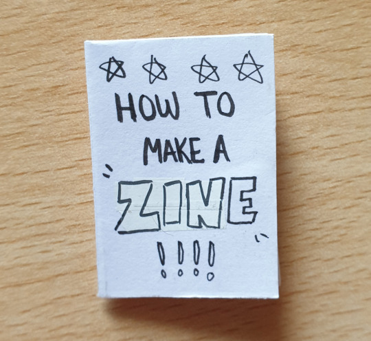
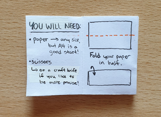
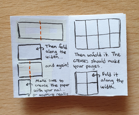
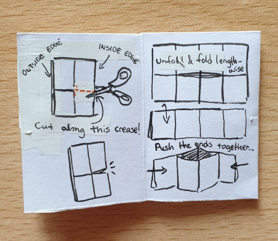

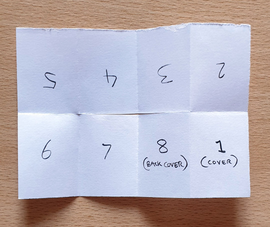


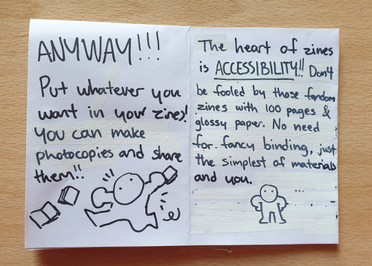
some people have asked about making zines, and i've seen a lot of people in the tags talk about wanting to make some but don't know how... so here is a zine (technically two) about making zines! wowza! pardon the handwriting lol
there are other methods of making zines that require a stapler or sewing, but this one-page zine is the simplest form of it.
i hope this makes sense, feel free to ask if anything is unclear :]
#i seriously think everyone should make zines. i think they're one of the best means of self expression#zinemaking#zine#mini zine#illustration#analogue art#tutorial#i don't know why the tail of my Y in that final “you” is so short.... it looks like uou 💀#nonfandom
10K notes
·
View notes
Text
'So, there's been something I've been meaning to tell you...'
Some progress pics under the cut for fun.

Blockout / Shapework and a Little Rendering / Lighting Solidfication to Bring it Closer to Original Sketch / Details and Grade
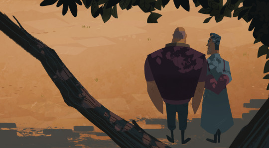
#tf2#tf2 fanart#tf2 medic#team fortress 2#tf2 heavy#heavymedic#red oktoberfest#whoops i didn't take very good in progress pics but hopefully vaguely interesting to see#can studios pay me to draw trees again...i will happily draw trees for the rest of my life#you cant make me draw hands i wont i cant#where's that artist meme of hides the hands#i show where the hands should be but just dont draw them lmao#tutorial
2K notes
·
View notes
Note
I'd love if you'd do a breakdown for Cyclonus! He's one of my favorite characters and I think his design is really cool.
I actually think it’s the first time I’m drawing him haha
Enjoy my highly elaborate and very precise research


#maccadam#transformers#should I make a separate tag for these cursed tutorials?#eh maybe#mtmte#Cyclonus#me breaking down my brain and your blorbo
766 notes
·
View notes
Note
Hey hey! Factual! First off, I love your art it's so good. Oh my god, amazing! Second. I use firealphaca too, and I was wondering how you make pixel art in firealpaca, i've tried, but it never looks that good...
Thank you! :DD And allow me to do my best to explain..
So to start, you need a tiny canvas. Like 100-100 or even 50-50. Just reaaaaly tiny. That, or you can just zoom really far into the canvas-
Then, you can use this little pixel brush on your side bar. You can change the size of it too!

That's the tool I normally use in my pixel art. Though when it comes to my bigger pixel projects I use the regular brushes.
How I do this is I simply disable anti-aliasing. This makes the brushed all pixelated!

And don't forget that you can use this little do-dad here to erase in pixel!

That, or you can just disable the Anti-aliasing on the standard eraser and erase that way <XD
Also, the fill tool! Turn off the Anti-aliasing and have the pixel expand set to 0. Boom! You got a pixel fill tool!

Same goes for the select tool as well. Basically, disabling Anti-aliasing just pixelates all your brushes. And most of my/your art skills transfer over to the pixel! I still use sketches and everything :))
I'm not usually the best at explaining things, but I hope this was answered your questions! <:DD
#my response#art tutorial#if you meant how I draw pixel in general?#I'm afraid I don't know how to explain that-#I should really find a way to record my screen and just make a gif of the art process <XDD#pixel art
226 notes
·
View notes
Text
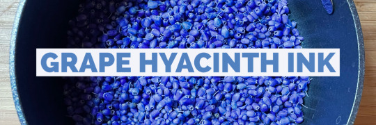
Let’s make some color-changing botanical ink using grape hyacinth (muscari) flowers!
Ingredients:
1 cup grape hyacinth flowers
1 cup water
2 tablespoons vinegar
1 teaspoon salt
2-4 drops gum arabic (not necessary but USEFUL)
2 drops wintergreen oil or 1 whole clove (also not necessary but useful)
Instructions:
Add the flowers and water to a non-reactive pot (stainless steel, ceramic, or enamel-coated). Pots that are aluminum or copper can affect your colors!
Bring to a boil, and add the vinegar and salt. Boil for about five more minutes, then turn down to a simmer, stirring occasionally (again, the spoon should be a non-reactive material like wood or stainless steel).
Simmer for 10 minutes, at which point you can test the color by dipping in a strip of paper to see if you like how it looks.
If it looks good, congrats – you’re done! If you want a more intense color, continue simmering, testing with a paper strip every 15 minutes or so until the color is to your liking (this shouldn’t take more than an hour).
Remove from heat and let the mixture cool to room temp.
Filter the flowers using a fine mesh strainer. I use a stainless steel coffee filter for this purpose and it works great.
Pour your ink into a sterilized glass jar and add 2-4 drops liquid gum arabic, which is a natural binder that will 1) keep the liquid and pigment together and 2) thicken the mixture and make it easier to work with.
Add 2 drops of wintergreen oil or 1 whole clove, which are natural preservatives that will help extend the life of your ink.
Label your jar and store it in the refrigerator if not using right away.
YOU DID IT! Now go forth and have fun with your muscari ink.
** The ink will appear very purple, but when put to paper dries in varying shades of blue. If you want to experiment with color further, add an acid (lemon juice) to produce shades of pink, and a basic (baking soda) to make shades of green.
*** Because of the changing nature of the ink, what your painting/writing looks like will change over time! I have muscari paintings that started bright blue/purple but have faded to almost entirely green. Some have stayed blue. That's the fun of it!!
#plantalones tutorials#wildcraft#botanical ink#muscari#grape hyacinth#flowers#color changing ink#ink making#ALSO only use the pot you use for making ink FOR MAKING INK#this should be obvious but I KNOW YOU GUYS
186 notes
·
View notes
Text
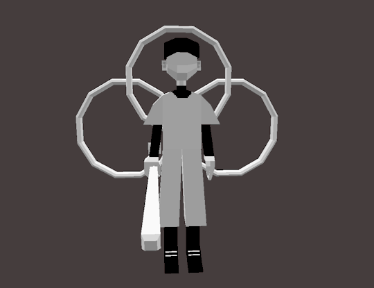
weird guy. peculiar creature even.
#for the 3d model i wanted to do a cool pose BUT I FORGOT TO SPLIT HIS ARMS AND LEGS INTO TWO PARTS#no knee batter </3#he has no elbows aswell#off the batter#off batter#the batter#batter off#off game#low poly#3d model#blockbench#art#artists on tumblr#may have used some parts from ashleys model but thats ok#look making heads is hard#i should probably watch some tutorials#but i am. lazy#if anyone has tips for how to make them posable please help.. i am clueless#i wish you could rig it like a gmod character#that would be nice#scotcharts#scotchdoesthings#<almost forgot my tags
148 notes
·
View notes
Text
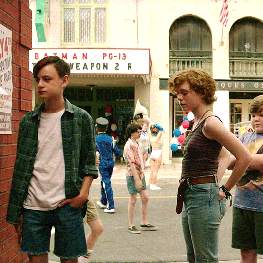

basically they were on a date here
#how the frick do you make it not lose quality#giffing is so maddening bc I'm learning all with trial and error bc i'm lazy i should look up tutorials#it movie#it#reddie#richie tozier#eddie kaspbrak#richie x eddie#it 2017#it 2019
168 notes
·
View notes
Text
I drew a thing!!! You know this one!!!
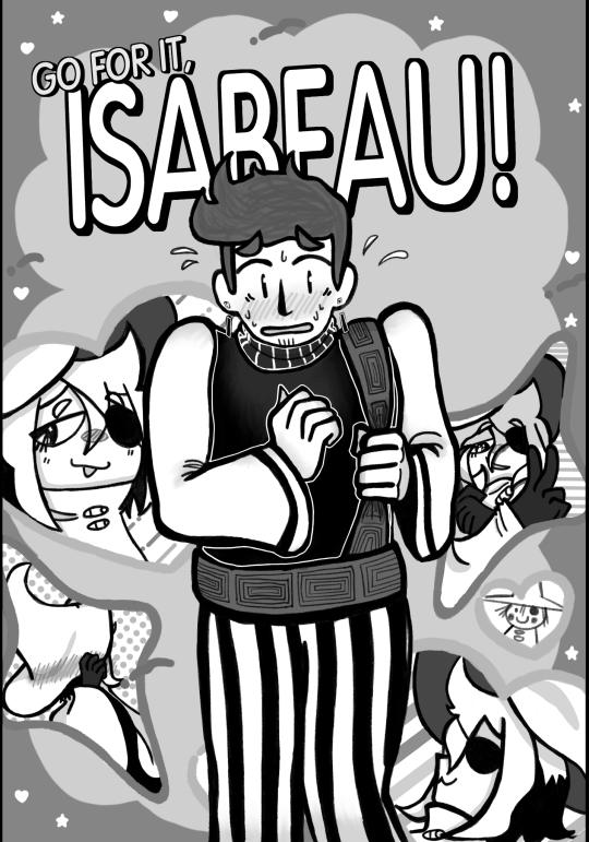
#isat#in stars and time#isat siffrin#isat isabeau#this took like the whole week#it probably wouldn't have if i didn't decide to redraw the template entirely from scartch#but you dont get it#i REALLY wanted the stars to have four points#anyway#im gonna probably do more sketches now#like get back to the sonic ones#or more AA au#if anyone is more familiar with aa case writing hmu because i have no idea what the hell im doing#but i really want to make this fangame#wait i haven't mentioned it before i am kinda working on an aa fangame for isat#but i wanna hold off on doing too much spritework until i have AT LEAST the tutorial case figured out#and i have literally no idea how to write a case that's like not very difficult and makes sense#anyway yeah i should probably stop this rant#OH WAIT ONE LAST THING#i know nothing about the series this art trend is from i just know people draw ships like this and i wanted to do it too#harune draws#I forgot i have to tag my art if i want it to be findable later
194 notes
·
View notes
Text
Don't mind me posting a small Clip Studio Pain tip! (I'll be posting these here time to time as well!)
📝Did you know that you can edit the grid of your mesh transformation tool in Clip Studio?
(this tip is for license version 1 and up!)


---------------------
A FOOTNOTE: I will be ONLY sharing tips for PRO version since this is the version I use 🩷🙏 So you can use these tips in both PRO and EX as well!
I'll be doing my best to add the license version information as well!
#clip studio paint#clip studio tip#mesh transform#small tip#should i make a separate tag for these???#like idk#CSPwithAlma#LMAO#almakrowantip#i migth just stick with the initial one...#but i guess it would mix up the actual tutorials with CSP stuff...#what do you think??
141 notes
·
View notes
Text

nervously holding out & rattling a Little Tip Jar
#entirely voluntary no pressure i appreciate anything including just your presence here#i am gentle nudging the jar out of the door to be ignored or noticed At Your Leisure#that weird guilt is upon me! so! Insert Unnecessary Apology Here#i dont have any 'exclusive' stuff as of right now#in the future... probably! maybe tutorials! or behind the scenes things!#im thinking and ill continue to consider and Muse#suggestions are welcome!#absolutely unprompted#none of it will feature welcome home tho#i dont want to put it in a space where its like... for money#one-off comms are one thing and Allowed! kofi and such is a different beast entirely#ive been hesitant on making a ko-fi#but then i saw a post where someone described it as just a tip jar.#its like street artists leaving out hats or open instrument cases for people to choose to throw a buck into or ignore#and that. took a lot of stress off! more people should have tip jars. we all deserve it i think
145 notes
·
View notes
Text
@sirus-zzz it is! (kinda!)
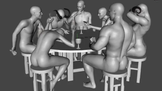
with the power of a four year degree in computer graphics blender, you can also make your projects take 500 times longer than if you just learned to draw!
#i use 3d in most of my work. polygon make brain go brr#its makes for great references and also there's enough programming in there to keep my brain sharp#maybe i should explain how this works? tutorial????
75 notes
·
View notes
Text
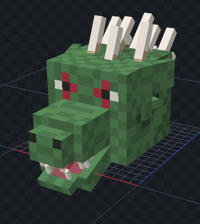
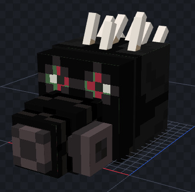
kaiman dorohedoro minecraft model (for a hermitcraft-style custom head item)
if anyone is interested i will provide link + instructions
#sp#drhdr#kaiman#dorohedoro#btw making a minecraft resource pack with no tutorial is HELL ON EARTH#i spent two hours troubleshooting before i found out i needed something called an atlas file#which apparently is what the game comes to when it's looking for something categorized under “blocks”#and the atlas file is what tells it “maybe you should look in the folder called blocks”#literally the stupidest thing i've ever seen
81 notes
·
View notes
Text
A shading with folders hack
that no one asked for~
please google if your art program allows you to use:
folders
set folders to multiply/layer modes
i am using PT SAI but if your art program utilises folders and layer modes, it should work for you as well!

Here is my drawing. The top folder is labelled "shading" and the bottom folder is my art! inside of it is my colouring layers and my lineart. Because I colour my lineart, I need my shading to clip to the lines AND the colour so the lineart doesn't end up too bright or mismatched from the colour after shading.
of course, there's many techniques, but this is my solution to this (and it could be used for a lot of other things~)

In PTS, I can clip folders to layers or other folders, and set the folder to multiply (in other programs it could be called dodge, burn, or shade, etc. you can always use whatever mode you prefer for shading, and mine is multiply!)

inside of my shading folder i pick my base colour for the shading. personally, i start with the darkest, and this layer is for all shaded areas with no direct light. so if you plan on having bounce light, don't do that in this step! (i use an erasing method for my shading so it tends to look pretty dramatic haha)

this layer is my bounce highlights, i use a lighter colour than my base, usually with more saturation to make it look tasty yumyum. the layer is clipped to the shading layer INSIDE the multiply folder. this means it acts as if clipped to the layer below it, but ALSO clipped to the art folder. this way it won't go outside of the layer below it, AND it won't go outside of the folder it's clipped to.

this step i use a third colour that stands out from the other 2, to put on the edges of my base shading layer. i use this cuz it looks cute but also cuz im obsessed with lighting that's reminiscent of sunsets or the like:

i couldn't be bothered to find a better image so you get this very strong example that has a tonne of bouncelight in blue. The orange part here is what i am referring to.

after that you can clip luminosity on top of the multiply folder which is clipped to the art folder, so the lumi layer will be technically clipped to the art folder! (folderception~). whenever you have multiple layers clipped on top of each other, they will always clip to the layer the first one is clipped to.
i know folders can be confusing and it's hard for me to explain, but if you try it out you'll figure it out for sure!! it's very easy to use once you got it, and it makes the possibilities endless~ mostly. hopefully, this explains it well enough!
#my art#long post#tut#tutorial#i dont like calling it that cuz people think if u make a tutorial u should be 100% expert who knows everything ever and it makes me nervous#but also who cares#text
45 notes
·
View notes
Text

the first attempt to animate a sequence. I know nothing about animation I'm just very stubborn 😂. I downloaded an app, signed up for a trial and started doing something. And of course I could have started by animating the classic ball bounce as a sensible beginner would do... apparently I'm not sensible and I'm very much plagued by this menace, this eldritch entity, the nightmare living rent-free in my brain. oh how I hate him (lovingly).
#dreamling#because we all know who he's looking at#dream of the endless#trying new things#i probably didn't go smart about this and should have watched some tutorials but I'm impatient disaster and dived headfirst andblind intoit#also i plan to make a dreamling animatic but that's still far far away#but I'm determined X'DD#mayhem art
486 notes
·
View notes
Note
Did you draw your own pfp? If so, how did you color it? Especially the lineart. It's so pretty!
aww thank you! i'm so glad you noticed! yes, i made the pfp myself :)) it's my favorite character of all times ;w; Allen Walker from D. Gray man! here's the full work!

i colored the lineart and changed the layermode to Multiply, i also duplicated the lineart and set it under the Multiply layer then gave it a layermode of Colorburn! this gives it a crispy color in my case (but you can always play around with colors and different layermodes to get the best effect which different from each drawing, in my case it just happened to be this) I like duplicating line arts and changing their colors/layermodes when i play around :))
i used mostly flat colors but added slight hue variations along with a simple shadowing! I only have one value for the shadows but instead of using a single color, i used different colors with the same value to give it a more colorful and lively look:


for example, when i turn everything into black and white, you can see that the fur has only 1 value in terms of shading but in reality i used different colors that have similar values to make it livelier!
Hope this helps! thank you for noticing Allen in my pfp xD he is my angel crying in the bar over the recent manga update
#should i tag this as d gray man lol#dgm#wip jail#im really glad you like my pfp its an old artwork but it was a starting point for me when i started applying for zines iirc :))#hope this helps and thank you for asking!#inbox replies#protip: you can make an entire layer filled with white and set the layermode into Color so that it can act as a black and white filter!#<- i use that all the time to conveniently check my values when i color!#color and values and very closely related :)) if you want me to make a mini tutorial let me know (i'll try to find time TT)
58 notes
·
View notes
Last Seen Blogs

epicericgame
Epic Eric - Official Game Journal

timeless-mars
enchanting

wiggymythwinter
I'm A Nerd, But Like, A Super Chill Nerd

o-bar
愛 王元 的 大 叔

4srca-z5ykgb
Dieta chetogenica e glioblastoma