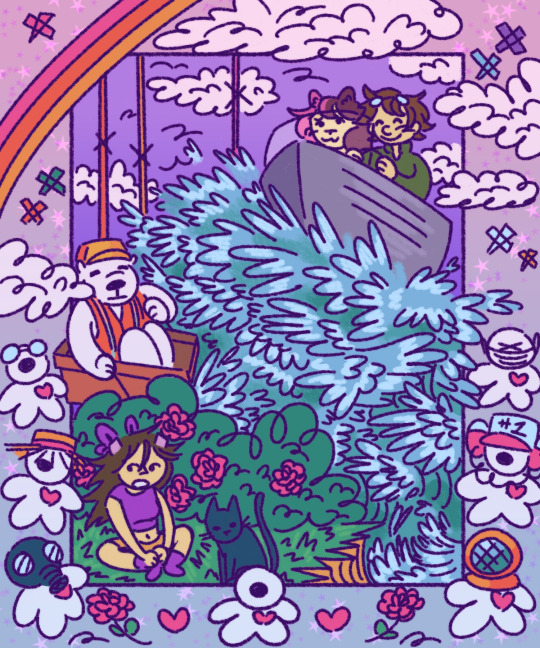
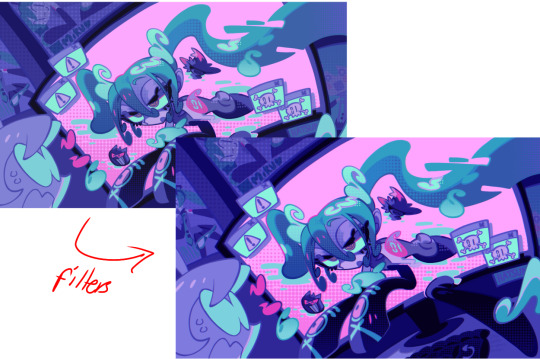
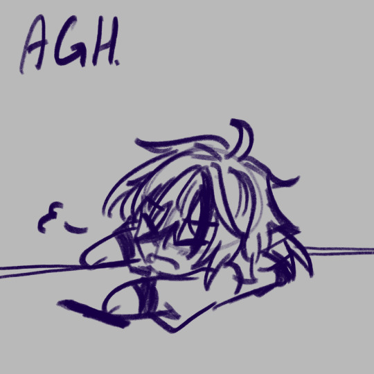
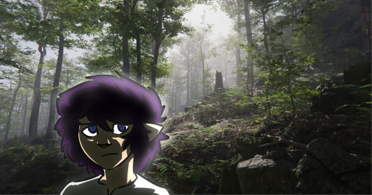
#i think i need to do more stuff in this color pallete because it makes me feel like im a little kid drawing in my lisa frank notebook again
Note


Those are maybe not epic, but I think those are nice moments and maybe you will want to draw it :3
I think these screenshots are great actually I had a lot of fun collaging together a lot of the elements! Thank you!!
#the rainbow pic really carried this drawing its soo pretty#your taste in screenshots is just too good#also all the little x's are supposed to be death markers you see on the map#i think i need to do more stuff in this color pallete because it makes me feel like im a little kid drawing in my lisa frank notebook again#qsmp#qsmp fanart#qsmp art#qsmp purgatory#qsmp team blue#qsmp team soulfire#asmp little buddies#qsmp tina#qsmp tubbo#qsmp niki#qsmp federation workers#qsmp federation#idk if that fed worker that died was given a name#or the cat#im kinda just willy nilly with the tags
123 notes
·
View notes
Text
alright, here it is: ZENO'S COLOR GUIDE 3.0 !
here, i'll have three "chapters" regarding color:
CH1: how i color in illustrations
CH2: color and character design (in zeno's case)
CH3: how zeno makes his colors cooler
CH1: HOW I COLOR IN ILLUSTRATIONS
it must be noted that, as of lately, i heavily use halftones in my art and the way i use them for gradients effects my color choices. of course you don't need to use halftones if you don't want to, as it's just my personal choice, but anything regarding halftones here could (probably) also apply to regular gradients!
when choosing colors in an illustration, i usually have three things in mind: mood, character, and contrast. we'll be using "gloomy bunny naptime" as an example here.
MOOD: what's the vibe of the piece? for example, here in "gloomy bunny naptime", wanted a mellow, sleepy vibe, so purples and pinks seemed like the best choice. these colors also have a dreamy effect due to being common in real-life early mornings/summer nights - basically, i tend to use associative colors in illustrations.
i usually only use a pallete of 3-7 colors, though of course more characters calls for more colors. for multi-character pieces, i would actually make a "rainbow" of colors based on the mood of the piece - essentially, a bank of colors to use for your colorful casts based on the actual rainbow. you can alter this based on the saturation levels you want! hope that makes sense. i'm not the best at this though, so i would heavily recommend looking for guides from artists who are more skilled in that department.
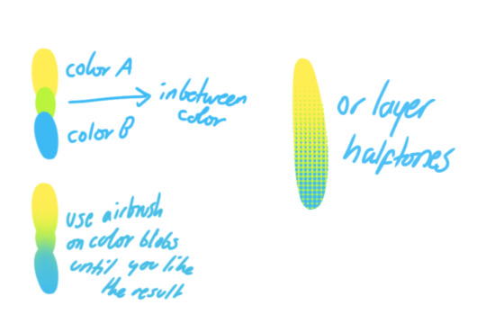
CHARACTER: velvet is the focus of the piece, and as a character her palette is made up of many purples and pinks. of course, it's easier because she and ribbon both have similar designs, but i would still recommend using colors based on/complementary to the focus character's pallete, though this is a rule that can and should be broken if needed. gradients can be used to provide a smooth transition from color-to-color and add depth to the piece, as well as showcase velvet's pallete. when making any gradient, you probably want to have a vibrant middle color. this is difficult to achieve in most art programs, so i'd do it like this:
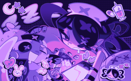
you can use gradients in lots of cool ways to make stuff pop! (i think this collage shows i use too much purple and pink though.)

CONTRAST: the context of the piece also aids the color through contrast. (that's a lot of Cs!)- we see that velvet is just waking up, and the light from her switch is glowing brightly. i wanted to convey something like her switch suddenly turning on in the middle of the night, waking her up - so the console emits "light" in the form of illuminating the contrasting color of pink against the purples. it might seem specific to this piece, but what i'm trying to say is that contrasting colors can lead the eye to the focal point of the piece, that being velvet herself. because a great deal of the rest of the piece is dark, we look at the contrasting switch screen - the brightest thing in frame - and our eyes move around and up to take in the focal point character. at least that's how i wanted it to be ;w; i guess you could convey it as something like this?
CH2: COLOR AND CHARACTER DESIGN (IN ZENO'S CASE)
this is where i start to get annoying, so stand back! when deciding on colors for a cast of characters, there are many factors: time period, variety, personality, and more that i can't think of.
TIME PERIOD: this one is simple. for example, a futuristic time period (such as that in x-calibur) calls for colder colors, such as greens and blues. for characters involved in futuristic professions such as space exploration, this works incredibly well. for modern time periods, less focus can be on colors and more on the shapes of the clothes, but this is not a shapes tutorial! i don't have any ancient times oc stories, but i'd probably use earthy and warm tones.
VARIETY: this is also rather simple. i try to be aware of the palletes that i used, and the similarities they might have with other characters. i try to use similar colors for characters who belong to certain organisations or have a uniform, but of course, it's not like catholic school students adhere their entire look to their uniform, so this is a rule that can be broken yet again. art is all about learning things and breaking them, remember that!!!
color can also be used for symbolism. my absolute fav example for this is vivica and octavia - the amount of red in their designs is supposed to represent the amount of freedom/passion/anger/confidence they have or are allowed to express under their different circumstances. as vivica belongs to a strict organisation, she has far less red in her design, showing her emotions are stifled - meanwhile octavia has it as her main complementary color because of her freedom to express her emotions, though those emotions may be destructive because of her circumstances.
PERSONALITY: what colors are associated with your character's personality? i actually usually refer to magical girl groups to see what's commonly associated with different colors. here's the main trend:
red: hot-headed, passionate, firey
orange/yellow: bright, happy-go-lucky, sunshine personality
green: wise, mellow, kind
blue: serene, graceful, elegant
purple: magical, regal, fancy
pink: usually the main character (though this because magical girl anime tends to be marketed towards young girls), sweet, relatable, determined
of course these are only stereotypes from one genre of anime, and different colors have tons of different meanings. color theory is the best way to learn this! these colors can also express different moods, which ties into ch1. i myself constantly ignore these rules - v-con, a bombastic hyper DJ, is purple (though he does have yellow accents) for example. basically, i just take them as a general rule and try to have them in mind while drawing.
CH3: HOW ZENO MAKES HIS COLORS COOLER
this might be the most important part of this guide. once again, there are a few things to consider here: filters, hue, overlays, and more!
FILTERS: for ibispaint, you can use an adjustment layer on your whole piece to use a filter. i usually only use brightness/contrast here - upping the brightness (or darkening it based on the mood of the piece) and upping the contrast. this helps to better express values and intensify the colors if that's what you want. i often use it in all my pieces to some extent.
hue/saturation/lightness is also helpful in moderation. you can alter the hue - though it usually only helps if you bring it back or forward by just a few points, or the entire pallete will change. saturation is what it sounds like, and slightly over/desaturating the piece can help with atmosphere. lightness is what it sounds like - lightens the colors in the piece. i don't use it at all.
posterize and sharpen mask are some that i've used recently. posterize can add some crazy effects to your art, but i'd probably need to edit it slightly after using it because it can mess with certain colors.
HUE: it's a layer type that can change the overall hue of the piece. i usually use it at a low percentage for atmosphere. kind of like a gradient map but nothing like it? idk
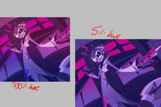
and OVERLAYS: i just use a very saturated blue/purple color over the entire piece at a very low percentage, around 5-10%. it can wash out the piece at too high a percentage.
and that's basically it! sorry it kind of derailed at the end i spent like 2 hours on this and got super tired. goodnight i'm going to sleep please also look at other artists etc etc. bye.
#zeno's art#long post#color tutorial#liar by korn is actually a really catchy song yea the lyrics are weird but its so good tbh#peak drums and bass and guitar and vocals and then the lyrics are hot booty. this is what nu metal's all about people#ask questions if you want#about nu metal or art i dont care
323 notes
·
View notes
Text

I feel pretty down about my art a lot. The common stuff of 'i'm not skilled enough', 'why can't I make things faster', 'everything i make is bad', and 'my color work should be stronger.' All the stuff I know every artist feels, but is still hard to ignore. Because of that I've been hit with some bad art block, preventing me from working on all the projects and ideas I have.
I think the thing I'm the most self-conscious about is my technical skills. Proportions, color, line work etc. And the only way to get better at those is to keep making art and experimenting, but often I find it hard to break out of my comfort zone.
So in an attempt to focus only on my technical skill and not worsen my anxiety about needing my ideas to be good, I did this panel redraw of Zoro. I had seen some other artists do redraws of this before as well, so I thought it would be a fun place to start.
I tried out some new paper with this one, 100% cotton hot press, and used a limited palette. I wanted the mood of the colors to be dark, so I only used indigo, raw umber, hooker's green, and permanent alizarin crimson. The only color not made from those colors was the pop of yellow on the jewelry. I've wanted to try out limited pallets for a while now, and this was my first attempt at it.
I want to do more of these panel redraws, it was comforting to do and helped me engage more with the one piece manga. I'll probably post the others that I make, but I also want to try to take some time off from social media, sooo who knows.
I hope you like the bloody Zoro lol
28 notes
·
View notes
Note
You everr realize that Vivziepop is completely bullshitting when it comes to ethnic casting because of Millie?
Like we are definitely getting imp human disguises for merch reasons so its definitely going to come up.
But like if Millie is black then her family should be played by black VAs but all of them are white VAs. Like I don't think Millie is adopted since she looks like a younger version of her mother.
The best course would then be making Millie white and no we can't use Erica being the original VA as evidence because that was always meant to be a temp casting.
But then this creates an issue in Helluva Boss having no fucking diversity like Vivziepop doesn't have to answer to corporate demands to make the ENTIRE CAST white. She can choose to add diversity.
If she makes Millie black that's also showcasing a huge issue in Helluva's lack of diversity in its main group of characters and Millie could come off as a token. Then you have the fact Morgana and Ed would come under fire for taking POC roles as well as Spindle allowing it unless Vivziepop retcons Millie as adopted or half siblings with Sallie.
Like Into The Spiderverse had half its human cast be POC and it answered to corporate demands. Then Across The Spiderverse without spoiling anything has a MAJORITY of the cast be POC.
Now you can argue Spiderverse is based off existing material unlike Helluva but those existing materials had put effort into adding POC in the first place. And guess what Spiderverse had consulted actual minorities when it came to development of the project.
Vivziepop is latina but she's white passing so she needs to consult people who don't pass to get a better understanding overall on things. Like I'm disconnected from my own culture but just because I'm part of it doesn't mean I have a full picture of it.
Vivziepop also isn't black, asian or indigenous so if she's telling stories that features them she needs to do research and consult people.
She actually consulted Morgana about Sallie May being trans thankfully but... I never hear any talk about other people she talks to which shows poor ass attempts. Like Morgana's insight is valid but she does not speak for all trans people and yes you aren't going to please everybody with representation but just consulting a SINGLE PERSON is insane. We also know Viv according to leaked screenshots has or had some form of transphobia so she absolutely needs to consult more people if she's trying to change and do better especially if she's writing about a trans character.
Like Morgana being a white transwoman will not have the same experience as a black transwoman for example. Like I know that from actively trying to learn about trans people.
Like there's a youtuber UnicornofWar who made a video about how the show RWBY is terrible at handling its racism allegory. Now Unicorn is white but actively went out of their way to consult multiple POC for the video and did a shit ton of research. Now I will say Unicorn in the past has said ignorant things about stuff like white washing (thinking its ok because of art style color pallets back then) in earlier videos but currently denounces that viewpoint (note: Unicorn as far as Im aware has never said anything with vile. I have to clarify so I don't misrepresent their person and people don't assume Unicorn like said a slur) and actually apologizes for their ignorance.
Has Vivziepop ever denounced her old views or behavior? Has she apologized for being ignorant in certain things? Is making a serious effort to change? Has Vivziepop researched throughly and listened to POC insights or concerns?
As far as I'm aware she hasn't.
I have noticed Viv's weird choices for Millie as a black character. I hate to say this but Millie is supposed to be token rep which to me is weird because nobody was pressuring Viv to add rep to her shows. I will say this even in a universe where Viv hired black VAs to voice Millie's family and did do properly research and consulted black people, Millie would still be considered token rep because she is the only the only main character in the show to not have an self-centered EP and has the least amount of screentime.
It makes me wonder if the reason why the IMPs don't have a canon human form yet is because Viv doesn't want to draw POC characters. She has shown she knows the importance of these disguises and they sell well on merch but the only characters who have canon human forms are Stolas and Loona, two white characters who arguably don't even need them. Blitzo is voiced by Brandon Roger who is a mixed Filipino (It's also canon Blitzo looks like Brandon Roger and Blitzo and Brandon Roger are intertwined together so it doesn't make sense for Blitzo to be white), Millie being a black woman, and Moxxie, despite what you might believe is a mixed Latino.
The POC rep we already have isn't good either. In Spring Broken, Verosika and her gang, who the majority are POCs, gets arrested and Verosika makes a joke about sucking police dicks to get out of jail. Having a POC character make a rape joke about police corruption unironically is not funny. Moxxie's mom is obviously supposed to be Latina, falls into the trope of nice POC women who get brutally abused and killed by their white husbands. This actually could have work and wouldn't be as tokenizing if 1. we got to learn about Moxxie's mom as a person and 2. her death wasn't solely use to be angst bait for a male character.
The Spiderverse crew actively puts effort and consulted with POC about characters from their culture. During the early stage of writing for Pavitr Prabhakar, the writing team struggled writing his character and called his VA, Karan Soni to help them write and consult on the character. Thanks to Karan Soni's contribution for Pavitr Prabhakar, he is beloved by desi people alike. Viv doesn't do that and probably will never. She has shown time and time again, she doesn't respect religions, using their symbols as an aesthetic and for monetary gain. Viv's designs for black and other POC characters are terrible, them alway never having POC features and looking racial ambiguous as hell and she ignored the criticism from black and POC people for these POC characters.
44 notes
·
View notes
Note
Your outfit design on the mci is so good!! Do you have any tips for how you put them together, picking colors, ect?
i’ve been putting off answering this because i know id ramble for about a thousand words because designing characters is my favorite part of the character making process + i spent almost a year refining the mci designs. BUT i’ll try to be cohesive and to-the-point about the tips and pointers i held myself to while designing the characters
info starts under the cut just in case ppl don’t care
1: keep the time period and age range of your character(s) in mind.
athazagora, or at least the part where the children originated from, is in 1985. knowing this, i wouldn’t use clothes in my designs that weren’t around/weren’t as popular, as that would make the date and clothes meaningless and out of date.
considering a character’s age is important, too, as styles and the “maturity” (for a lack of a better word) of said styles evolve with the character. for example, gabriel, a 5 year old boy, would not be wearing the more alternative, dark, and overall mature-type clothing that jeremy, a 14 year old punk, would be wearing.
adding on to that, it is also important to consider the personality of your character while designing them. unless you are specifically going for a misdirective character design (like that one bear from toy story. sorry he’s the best example), having characters wear stuff that doesn’t compliment their personality makes them confusing (in my opinion).
2: use a color palette that is easily identifiable and pleasing.
what is pleasing to look at and what is identifiable is subjective, i know, but this entire thing is subjective so…………….//Yeah
anyways. i’d say to always stick to 5 colors at the least, and 10 at the most. over 10 base colors in a design makes it hard to remember, and if you can’t even remember the design of your own character, who will?
secondly, a character’s color palette also has to reflect their personality. sorry. i’m gonna use gabriel and jeremy again because i designed them with a juxtaposition in their traits and designs in mind:
jeremy, a punk kid who is timid and sad, has a color pallete consisting of mostly grayscale and red. these colors, especially when compared to the other colorful cast of characters in athazagora, clearly set him apart as a character that is not like the others.
gabriel, on the other hand, is a bouncy 5 year old who is very happy all the time. this is represented through the minimal use of dark colors in his pallete. he even includes some sun buttons on his overalls, which usually signifies that something is bright and cheerful. this contrasts jeremy’s skull, which usually represents sadness and gloom.
but color palletes are nothing without proper implementation. to really utilize a color pallete, you need to create designs that catch, and keep, somebodys attention. I’ll use gabe as an example AGAIN because he’s my favorite design

on the left is his design from july of last year. it uses mostly the same colors as his current design (the shorter one on the right), but it is oversimplified and unappealing. he looks like a background character in mlp. in the current design, still using the same colors (as stated before), there is more contrast and patterns; the black stripe against the blue, yellow, and white; the horizontal stripes of his shirt against the vertical ones of his overalls; these little details require a viewer to actually look at the design to fully understand it.
3: (the final tip unless i think of any more) design what you like to draw.
there is little to no point in making shit you hate drawing. and i’m not talking tedious, if you genuinely do not like to draw something, don’t. you control your art experience, and you’re just fucking yourself over if you force yourself to make stuff you don’t enjoy.
for example, i really like overalls. i love designing them, customizing them, and that is why they are on most of the missing kids designs. i draw what i like to see.
hope this helps. this is just me yapping basically but there’s some actual coherency if you squint
7 notes
·
View notes
Text
[Update Note: Concept has changed, but enjoy what I've made!]
Okay!!! I got Lupin OCs!!! Here's one!
Be for warned, Long Post!
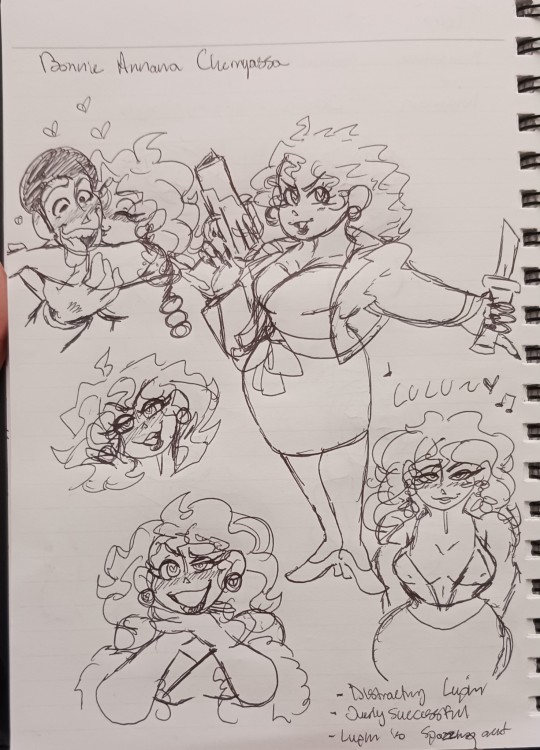
Yes, her name is spelled that way and she changed it to be so! Her actual name is Bonnie Anne (Some last name that relates her to an Infamous Arms Dealer in the black market).
Her whole deal is that, she was at one of Lupin's Heists, a big party where all the Fat Cats are gathered to do business and exchanges the Goods.
When she first saw Lupin making his getaway (goods in hand), she immediately crushes on him!
Her story is a work in progress, and so is her color pallet, but the jist is that, she is trying to discorver True Happiness and to keep far away from her father as much as possible. So when she saw Lupin III himself, she felt something! Not sure what it was, but because of this feeling she devises a plan to capture Lupin - wanting to meet him in person!
Because of Lupin's Successful Heist, she takes the opportunity to steal some money and make a getway of her own with her personal body guard/best friend, Galsan (Nicknamed "Terra").

Now on the run and hiding from her father, she calculates and plans the perfect scheme taking note of the heist she witnessed.
She changes her name slightly to be what it is now and with her trusted connections, she was able to set up a temporary base of operations. It would also be the stage of where she will set the trap for Lupin!
Plan: Challenge Lupin III to steal a lost treasure hidden within the confinds of a tower!
The goal: Entice and Steal Lupin's heart!
Bonnie conducts research by contacting Zenigata as he is the only one rich with Knowledge about the Lupin Gang! Of course, she isn't going to let the Inspector succeed in capturing the infamous theif, but makes him thinks so!
Everything that Zenigata had on the group as well as Fujiko was all she needed! Learning about them esspecially Lupin excited her!
I say the time frame took perhaps almost a year to set up as the setting needed to be as believable as possible! Bonnie then has a stand-in (who is male) to announce the creation of the tower and the prize waiting inside! Make him seem like he's the mastermind when he isn't that way Lupin is more interested!
Details: The Tower is built like a gauntlet. The lower levels are available to the public as a museum for the "Lost Treasure". The treasure is displayed in a bullet proof casing for the public to see. Then when the museum closes, it is elevated to the top of the tower under very heavy security and protection!
Now, I'm not sure what Lupin will do as I do not know how to write spy/theif action stories, I can think up concepts. But I do know he not only does succeed, but gets an unexpected surprise!
Plot twist, the treasure was agreed to be faked by Zenigata and Bonnie, but in actuality, it was real and Bonnie is "wearing" it (she hid it between her boobs [and it was on purpose])!
Bonnie used her connections to get the real thing and makes an offer to him!
Offers in order:
- Let her become part of the Lupin Gang! She will supply them with needed necessities through her trusted connections (though she does have a budget)
- Become her boyfriend! She wants to see who Lupin is in person! Though she was told by Zenigata how shameful and criminal Lupin is, weridly enough that only interested her further.
- I kid you not, this is what she wants: Have Lupin sleep with her! Like no shame whatsoever! She's 28 btw, she's just short, like 5'3 and just as horny!
If anything, Lupin meets his match here - both in terms of skill and romance! I'm thinking their relationship does start off as a mutual agreement. Lupin gets to experience what it's like to be genuinely liked or crushed on as Bonnie would be holding his cheeks and just gushing about how cute and handsome he is! He's still after the treasure of course, but Bonnie will make sure it's a challenge for him! Teasing him, playing around, making him chase her and stuff. She's got tricks up her dress, let me tell ya!
What I want to do basically is like, build up their relationship as I do wanna ship them! OCxCanon is valid and I will die on that hill. I want them to have depth and go into detail about what kind of relationship the two want. I esspecially wanna go over what exactly Lupin and Fujiko's relationship is. How long are they gonna keep playing these games with each other? Will Bonnie understand what it's like to have a relationship? The sacrifices and dedication it takes to maintain one?
Yeah, I wanna explore all that. This is just for fun! Anyway, I'll work on her pallet and share Galsan's stuff!
15 notes
·
View notes
Text
GOD FINALLY HES DONE OH MY G O

i present to you my favoritest time travel boi
extra dumb rants from me utc .
chris ( me ) after watching horror videssays while drawing at midnight
they are so lovely but i do not need to be jumpscared by WHEELS and DOORS AAAA ( kane pixels “the rolling giant” for context ) shakes fists ………
i wouldve got this post out sooner if the art arted better but well . SIGH . i also realized i accidentally kind of made him colored like fucking steve from minecraft and now im . i make bad decisions .
anyways ! heres a thing for whoevers still reading; design choices ! because i actually think sometimes ! woo !
i have all the uh , color pallet stuff (???) of the characters saved and i try to use as much as the colors on those as possible because (1. its a pretty cool challenge , and (2. iiii am horrendous with coming up with my own pallets !! ahaha ! for roman i had it in my heart and in my soul ( for some reason ) that he has wavy/fluffy brown hair . i added the highlight things because . uh . colors . and it looks cool . AND WHY NOT :D i put him in a very simple outfit because he is a prisoner ( /j ) and the gloves are for coolness points and because of ✨THE LAB✨ . safety and all that jazz wAIT I SHOULDVE GIVEN HIM GOGGLES GODAMMIT- ahem , anyways the side doodle is just yknow regular evil time travel bull . i think thats it . i probably wouldve done more if not for my brain being half turned off and the fact ive been procrastinating on this ever since i finished cyril .
i also want to mention how badly i want to make an animatic of the time travel experiment log video . but hell knows id never be able to finish that if i tried .
anyways thanks for reading have a great time !
#reverie audios#you wouldnt believe how long it took for me to get the mesh tool to work with me#i was literally going to take it to the dennys parking lot to beat it in hand to hand combat#but i got it eventually#yay me .#sir reverie audios why do you make your bgs so very difficult to replicate
13 notes
·
View notes
Note
how do you like,,color schemes, or like color pallets? i have ideas for colors but when i put them down it all looks muddled or disjointed or just weird, even when i plan it out, so do you have any advice?
(ik you get a lot of asks so no pressure to answer 😭 also thank you for the advice on dynampic panels! it was rlly helpful and im getting the book you and the commenter reccomended soon.)
That's a tough one. I know a lot of artists really play around with color schemes and color theory, but I never went in for that stuff. All my color palettes were generated initially by drawing the character, coloring them in different ways until I found one I liked (lots of playing with HSB sliders) then saving those colors to the palette for future consistent use.
I think this is a fine way to handle things - some of the pallets have even shifted a little over time as I swap out individual colors for ones I like more. For instance, my pallet for Falst still has a dark brown saved in it from when my design for him had darker hair, before I decided I liked the aesthetic of the lighter, more golden hair.
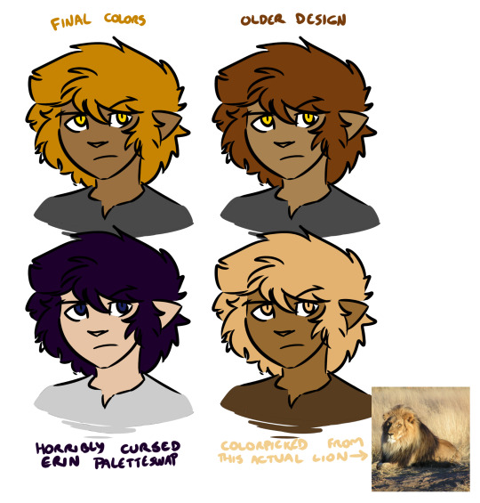
There's no right or wrong answer here (except the cursed paletteswap) and a lot of alt color schemes would look good, but the trick here is that as far as I'm concerned this matters a whole lot less than your shading and lighting.
If the colors look disjointed and weird, it's entirely possible that this is because the figures aren't matching their environment. If we were doing physical art, this would be a huge pain in the ass to fix. Fortunately, because I do digital art, I don't need to worry about all the complexities of paint mixing and underpainting and all that jazz - I can just use layer combine modes.
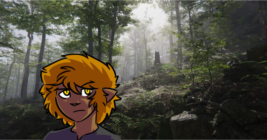
Suppose we want to put a character into this lovely unity asset.

If we just slap our figure on top, this isn't going to look good.

He looks like a desktop icon. We can do better. The light source in this shot is high and centralized in the frame, and it appears to be a dusty blue-white. The shadows it's casting are quite dark and stark. For now let's not worry about the color of the shadow layer - let's just draw in how we would shade this figure given this directional light. I'll use a nice light purple to start with, but we can play with this later. Benefits of digital art! Other benefit: when set on a Multiply layer, a light purple shadow immediately makes our figure look like this.
That already looks a lot better! But part of what's making this figure stand out against the environment is that the darkest points on his design are a lot darker than the background he's standing in front of, and at the same time the shadows on him are much lighter than all the shaded areas we see in the background. This is also one of the telltale visual indicators of bad VFX compositing - the light levels and black levels need to match between the different parts of the image. (there's a late episode of columbo where they use this to catch the killer!)

So, for the easiest first step, let's see what happens if we shade the figure with a dark green colorpicked from the image instead.

Immediate improvement! We've got the shadows lined up and the figure looks like he belongs in the environment. And while we could leave it as-is, I find it also helps to address the highlights as well, especially in dark environments. So I take a mid-tone gray from the light part of the image, I select the negative space of our shading layer, I fill that space on a new layer set to the Add (Glow) combine mode, I use a soft eraser to mellow out the really harsh glow that's farthest from the edges of the figure, and I blend the whole thing by 200 pixels.
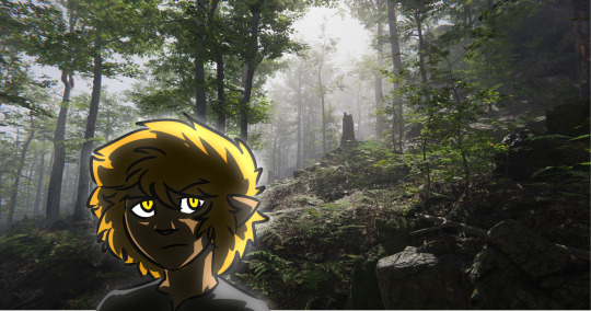
We could keep playing with this, but at this point we have a character who, regardless of underlying palette, looks like he fits in with his environment. Heck, we can even hit him with our cursed paletteswap and he still looks like he fits in the space.
It'll work even if he's a uniform neutral gray.

So while precisely playing with color palettes is very important for certain styles of art, one huge benefit of digital art is you can just use your own freeform aesthetic sense to lock in a very basic starting palette that defines how your characters look under theoretically perfectly neutral conditions, and then you can do all the other hard work of coloring them and matching them to the space by way of shading and highlighting without ever worrying about the underlying base colors. And if you decide some part of the figure is too saturated or dim or weird or whatever, you can play with that one part until it looks good and then just update your palette with the new shade.
171 notes
·
View notes
Note
You know I noticed a detail that made me think why l/umity lost it's spark, but metaphorically so to speak about their color themes.
Luz is purple, Amity was a dilemma because of her track color but everyone kind of agreed with green, purple and green are opposites which fit their dynamic. However you can notice the pallets of purple and pink forced on Amity later, the groom dress and her grudgby uniform. (Not sure if real but there were some official concepts about her originally having a green tuxedo for groom instead of a pink dress and tbh they should've kept that, you can tell the colors were off-putting with the dress)
Green with pink it's a bit chaotic on it's own and it quite reflects on Amity's drastic changes, but the combination with purple just doesn't work.
Then her theme turned to purple as well and well, purple with purple it's boring. You don't even know what heart emoji colors to use for them anymore when in s1 it used to be like this 💜💚, some people resulted to this 🤎💜 but again not working
.
I guess this is why I was so pissed when they started treating anything green related as Odalia's bad influence (which was stupid). And it's like a slap in the face to the fans who were invested in Amity's green era. So what? Me preferring her green hair makes me a supporter of Odalia's abuse now? What about these stylish fanarts of her pulling the green hair with different outfits and styles?
.
Originally I thought she dyed it to impress or get her mom's attention, when Odalia was thought to be a strict perfectionist parent not the dumbster fire of a character they turned her out to be. The point is that it was on Amity's own acord, not mom's. Thrown outta window I suppose.
But in that case I would've preferred Amity growing her natural hair in time as a reference to her becoming her own person, meanwhile having Luz go through a development of her own to change her color theme so they have another contrasting that works. It's kind of hard to imagine Amity in anything other than purple now from her spell circle to her abomination, not to mention her room (heck everything's purple)
In The Power of Love, I actually made it that when Amity was young, the two figured out her hairstyle and dyed it both as a bonding moment and just because yes, Odalia is a bit obsessive. The style was Amity's choice though and she liked how it made her mom feel. You know, because families don't have to be terrible all the time.
As far as the color theory stuff goes, it feels more like Luz's color should have been something besides purple more than Amity needing to stay green. That it either wasn't thought out...
Or seen as a positive. Because it is in line with the rest of Amity's character and even the haircut she has right after dying her hair: She is just in line with Luz. Everything about Amity in S2 is about falling into line with Luz. Has daddy issues? So does Luz! Doesn't like the coven system all of a sudden? So does Luz! Have short, slightly messy hair? So does Luz!
This actually caused a period of time before Amity got her long hair when black and white fanarts would make me pause to figure out who was Amity and who was Luz because they looked so similar. And GOD FORBID they both be in their school uniforms because then you were just screwed back then.
It is all part of the girlfriend-ification of Amity where her priorities and very identity are focused entirely on Luz. It's probably also why people don't seem to do NEARLY as much with her now because, much like losing the contrast in color theory, she lost all flavor and the like. Lost what made her unique. Her methods, morals, priorities, etc. just became the same as everyone else's: Whatever Luz needs.
It is EXTREMELY boring from a narrative standpoint and part of why the arcs in TOH frustrate me so much. You start with an interesting character and then replace them with a bland, template character that fills a role around Luz. Her surrogate mom in Eda, her girlfriend in Amity, her... Lancer? Kind of? In Hunter, her big strong girl with Willow and her smart guy in Gus. Except to even define them this much is awkward because the show doesn't really care about what jokes or the like they're doing with certain characters when outside of shipping moments. This is where you get high society Amity being the biggest clutz on the planet in S3 Ep. 1.
It's all frustrating and it's even more infuriating that you're right: Looking Glass Ruins is when this started in full force with Amity changing her hair to not only match Luz in style but also match closer to Luz's normal colors. And it would only honestly go downhill from there with the very slight exception of Eclipse Lake.
And even then... That's the last time we'd see Amity actually have that sort of drive... And it's only because of Luz. And that kind of sucks when she used to be so much more a distinct person with her own goals and desires.
Instead... She's a lesbian defined mostly by her interest in another girl. I thought that was normally something that annoyed people.
Edit: Just to add: I still like Amity's S1 haircut the most. It's the most distinct visually, is actually a unique design besides 'long hair' or 'short hair with a dye job that went unfinished apparently' and it's just a very cute look in my opinion.
16 notes
·
View notes
Text
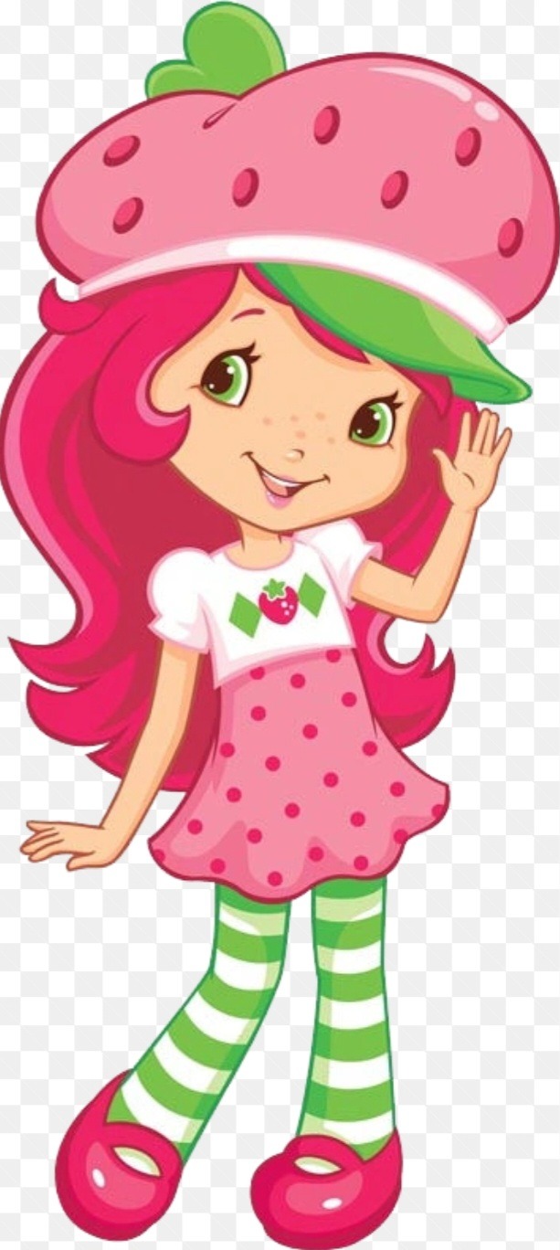
Rating Every Strawberry Shortcake Design*
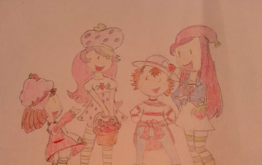
I haven't made this clear on my Tumblr before, but I love Strawberry Shortcake. Something about the tv shows and official artwork always puts me in a good mood. So, because I feel like it, I'm going to talk about the designs she's had over the years and give them the tier list rankings.
Before I do that, I have to lay down a few ground rules.
1. I'm not doing every single design. Even if I limited it to one generation, there'd be so many different versions of Strawberry in dresses and swimsuits and winter clothes to rate that I'd never get it done.
2. What I will include are the base designs from official artwork and the tv-show versions if they have notable differences.
3. I'm judging these by the design alone. The artsyle won't factor into my ratings at all.
4. My opinion doesn't invalidate yours. I'm going to point out a lot of issues with some of these designs, but if you like them anyway that's fine. I'm not here to change anyone's mind, I just want to share my opinions.
5. This is how my tier list ratings work:
S tier is rarely objective. It's usually for designs I really like regardless of quality.
A tier is for great designs with little to no flaws, it's one I try to be really objective on.
B Tier is for good designs that for whatever reason, don't impress me like the ones in A or S tier do.
C Tier is for okay designs. They might be boring or get something wrong, but at the very least, they function.
D Tier is for bad designs. I don't hate them, but I don't think they get much right either.
F Tier is for designs that are straight up terrible or ones that I hate. I tend to have strong feelings about anything in this tier.
With all the boring stuff out of the way, I can begin the rating! Starting off with...

1970's Keller design
This is Strawberry's most iconic design, and it's not just because she was the first one. This version of Strawberry went for a bit of a rag doll look and is clearly a baker. That's one of my favorite things about it since none of her future incarnations make that a part of her design. It's a little disapointing since bakery-esque outfits can be really cute, but if it could only happen once, I'm glad they got it right.
The patterns are a little too much for me, with the stripped stockings and the polka dots and the green diamonds and the row of x's on her apron. The use of color more than makes up for that though. I love that they were able to use green and white as accents without drowning out red as her main color. I kinda wish her hat was closer to red than it was pink, but it works fine as is. My final compliment is that the ragdoll elements(yarn-like hair and fingerless hands) make the design better instead of worse. Ragdolls can look a little creepy in my opinion, but the parts of that look this design borrows makes Strawberry look more childish in a good way. Pretty great design, A tier.
1990's THQ Design

So this one is...weeeird. As far as I know, This era of Strawberry shortcake didn't have a specific theme, it was just cute girls doing cute things. If that was all it needed to do, I'd put it B tier because it does that pretty well. It has a cute color pallete, cute clothes, from that perspective it does what it's supposed to do. But since it's supposed to be a design for Strawberry Shortcake, it unfortunately falls flat because of how disconnected it feels. In her last design, she was clearly meant to look like a baker and the giant hat covered in strawberries added to that. But in this one, the fruit theme is very downplayed and the dessert theme is gone in favor of...balet? Sometimes?(It varies depending on the artwork tbh) The only other notable difference is that her eyes are blue instead of brown, which doesn't change anything in my book. It's a good design, but a bad fit for Strawberry Shortcake as a brand. C Tier.

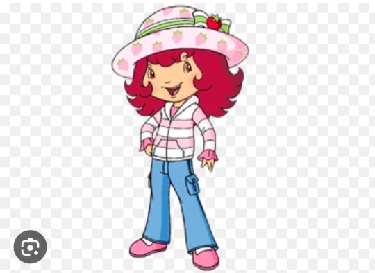
2003 Bandai Design
This version of Strawberry shortcake differs from the original again, this time towards a casual look for kids. The flat mary janes, baggy jeans, and sun hat do a great job pushing that look, and I personally love how she wears the jacket, that's such a kid thing to do!
Aside from the blue in her jeans, Strawberry's color pallete here is pretty close to her 70's design. I think it's a nice way to keep the design familiar without rehashing it, though it does come with some improvements and downgrades. I like that they toned down the patterns, but don't like that red still isn't the prominent color in her design. Baking isn't a big part of Strawberry's character in this generation, so I'm not sure why they didn't add more red(granted, the version used in the TV show does by changing the stripes, but this doesn't do anything for the key art version being judged).
I think this design is solid. It's simple but effective, although I do wish we got to see her wear the jacket. B tier.
2005 Playmates Design

I'm not 100% percent sure if this is her main design from this era or a varient, so take this with a grain of salt.
Either way...this design is AWFUL. This is the 1st time the franchise made Strawberry's main color pink, and I can't stand it. But even if I could, the colors are so saturated it makes the whole fit an eyesore! It's honestly really hard for me to critique this one, but for the sake of you guys I will ignore the excessive use of hot pink to judge the rest of this design.
I also don't like the stripe patterns on Strawberry's shirt. The red stripes only emphazize the bright chunks of yellow and pink, while also blending in with her belt too much. Not surprised if you didn't notice that until now. That's the last of what I dislike...but there isn't anything I like either. I'm pretty neutral on her denim skirt, the sleeve ruffles, and the different hat. This is the only design with, in my opinion, no positive traits. F tier.
2005 Playmates Design, TV Show Version
Feel like I forgot something...oh yeah. This is the same Strawberry Shortcake from 2003, but aged up to make her seem more mature(and to sell more toys but this post isn't about that). Aside from being simpler, this design differs from the last one with different shoes, pants, and a zipped up jacket(that isn't the one from her 2003 design, real shame). Also she's wearing her old hat. It's definitely better than the last design, and it feels like a natural progression from her 2003 design, but it doesn't leave a strong impression.
For one, I don't like pink being her main color and this design does nothing to change that. It changed her hair back to red, but her outfit is still too sparse of it to me. Why did they never try making pink her accent color instead? Still not a fan of the sleeve ruffles either. The idea's cute, but since the rest of her outfit leans toward a casual look, they look out of place. Also the pant lines being under the pant pockets...is a choice. Overall it's fine, C Tier.
2007 Playmates Design
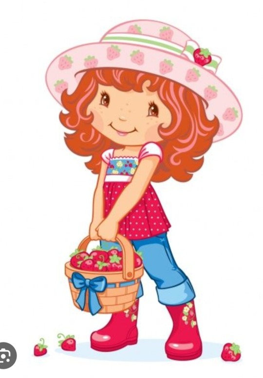
From what I know, this design barely counts since was made for a Strawberry Shortcake video game...but I just love it so much! This design leans into a gardening theme with the boots and denim jeans, but still has a focus on the titular fruit with the color pallette and strawberry patterns. While the actual outfit is pretty cute, it's the color pallette and placement that wins me over. It would've been easier and way worse if they covered her in the bright cherry red. But instead they break it up with softer reds(her hair and hat) or with blue for a nice contrast, while keeping the cherry-red on each part of her design(strawberry clip on top, blouse on middle, and boots on bottom).
I do have a few issues, the polka-dot pattern is a little garish and I wish they put some blue on the top of her design, but those are far from dealbreaking. This is my favorite Strawberry Shortcake design, S Tier.
2009 Hasbro Design
I'm going to be blunt: I do not like most of the designs from this era. They tend to have the same exact issues, so if I make this a series get ready to hear that criticism a LOT. If it's any consolation though, I'd say Strawberry's design is an exception. I like the pastel pink on her clothes and the use of green as an accent color. Making the hat look like a strawberry was a clever way to add the fruit motif into her outfit, and the shirt pattern and is a nice homage to her original design.
I do have some gripes with it though. The biggest one being the lack of red. Why on earth did they ditch the red??? It's even worse here because another character from this era is clearly supposed to have pink as her main color, but they made her share with Strawberry instead of keeping the red from her older designs.
Another small problem is the style of her clothes. They succeed at pushing Strawberry towards a more casual look, but they don't tell us much about her as a character. This generation put a larger emphasis on the characters having their own businesses, but I couldn't tell you what Strawberry's is with her design. One last gripe is the polka dot pattern on her skirt being different from the one on her hat bothers me, but it's not a big deal.
Overall this design is good. It has a nice casual vibe that's complimented with great use of color and color placement. The issues I have with it are small, but they do stop it from being great. B tier, would've been an easy A if her shoes and hair were red.
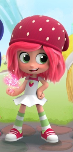
2019 Wild Brain Design
This design never became canon, but it's practically a rough draft for one that is. BIG emphasis on rough. I didn't hate this Strawberry when she was revealed, but I can definitely see why the rest of the internet did.
The real problem with this design in my opinion is the lack of direction. From what we know about this scrapped generation, it was going to take place in a forest and have the characters use magic to some degree...but NONE of that is present in her design. No fairy wings, no magic pendent or anything remotely fantastical. So that's why it's not an S tier design. But what it does go for doesn't work either. The tutu dress and stockings are a decent pair, but they clash with her shoes and beanie hat. Is she trying to dress for summer or winter? I'm also not impressed with her hair or color pallet despite the extra red, it's too generic to comment on.
Overall this design feels like a 1st draft, and that isn't because of the artstyle. Every part is of her look is either generic or clashes with other elements. There are some good ideas in this Strawberries' design, but as an ensemble they all fall flat. D tier. Don't hate it, but definitely don't like it either.

2021 Wild Brain Design #2
Looks like they did make a 2nd draft for that design after all! Yeah that's why I ranked the scrapped design, so many parts of it are present in this one.
Let's get the negatives out of the way, too much pink, no baker themes, yada yada yada.
As for the positives, most of them are unfortunately pretty light. Not enough to land it in D tier though, because this one is actually cohesive. The setting for this version of Strawberry Shortcake is in the city: no nature, no magic, just slice-of-life. So the lack of magical elements isn't a problem. I also like, say it with me, the color placement. The reds and greens are nice accents and the blue jacket pops against the shades of pink and red in her hair. The only thing that really holds this back is that the outfit's too generic to warrent anything higher than a C. So I'm going to put it in C tier.
And that's all of them(as of now anyway)! While I was working on this I had a huge hyperfixation on Strawberry Shortcake, but by now it's definitely gone away. I can't promise when I'll make another design ranking for this series, but there are still some characters I want to talk about.
3 notes
·
View notes
Note
Saw your weathered gogg. It looks really cool!!Do you have a post where you talk about how you weather your gunplas and what materials you usually use? I'd love to get into weathering myself but I'm a little lost. I love the rest of your guys too. Especially the custom painted ones!
Oh my god thank you so much! I don't usually think to take many wip pics but I can give you a rundown! The easiest way that I've found to start weathering and the first thing I did on the gogg was dry brushing. It's a technique where you get a bit of paint on a wide brush (typically old or cheap ones) and then wipe all the paint off on a paper towel. Then you lightly brush over the edges of the model, which leaves small streaks of paint that can look like various types of weathering depending on the paint you use.
To make it look like the paint has been scraped away I use tamiya metallic aluminum and to add dirt or mud I use Vallejo earth brown. The specific brands don't matter, as long as it's the type of color you want. Though I pretty much exclusively use acrylic paints because I don't want to deal with the fumes that enamel paints give off.
There are a lot of great tutorials out there on drybrushing and I think it's really fun because of how immediately the look of the model changes from clean to messed up. For a few years it was the only weathering technique I used and I was happy with the results.
After dry brushing I wanted to add more of a chipped and rusted look, so I used a sponge technique similar to this video:
https://youtu.be/dCFeubADBKg?si=pGq8dhCnd3Jr89wH
I went in with the aluminum. After that, I mixed the Vallejo brown with some red until I got an orange rusty color I was happy with. I tried doing a third layer with black like in that video but I didn't really like how it was working with the layers I had already made. I think I only put it on the feet.
After all of that, I used a tamiya weathering master set with a rust color. I had never used one before, but it's very similar to a makeup pallet. You apply streaks of color with a sponge brush and wipe off the excess. I used a rust color. It unfortunately didn't pop much given the colors of the model itself, but I'm excited to experiment with it in the future.
What I have found to be very good advice for weathering is to think of it as a kind of storytelling. Every scratch, chip, and smear that you add got onto the suit somehow, and thinking about that can help direct where and how you apply weathering. When I'm adding mud I try to think of what parts come into contact with the ground. When I use metallic color to make the paint looked scraped, I try to think of what direction the friction was applied in.
When I was working on the Gogg, I had the idea that it had went out into combat where it used its claws to rip apart an enemy, and then it came back to its hangar that had a pool that opened to the sea. Then that base was destroyed in a surprise attack, and the Gogg sat abandoned next to seawater for several years, rusting in the wet and salty air before being recovered by somebody.
Now that's more thought than I've put into any of my other efforts at weathering, so don't feel like you need to write a short story or anything. But this helped me decide what to do with the model. I dry brused the claws more than the rest to show that they had torn something apart. Then I went ham with the rust to simulate years of neglect.
Weathering was my gateway into doing custom stuff with gunpla and I'd definitely recommend it! I try not to be too strict about following techniques I see online. I think every tutorial that has given me great ideas has also included things I wouldn't want to do myself.
Sorry that I took a while to respond! Your message was so nice and I wanted to make sure I answered your questions as well as I could. I hope this was helpful and I'm glad to answer any follow ups!
4 notes
·
View notes
Note
OK so I'm feeling some guilt I started to draw cartoony like you but I get frustrated because it does bot look perfect like yours it's mostly small stuff like colors and clothes I love making cartoony body's sometimes clothing but I have color picking because I'm still new to art that has colors is my feelings normal or is it wrong of me? And how do I pick colors because it frustrated me to no end and made me stop drawing for months anyway in short summary how do I color the right way like I guess I know skin tones but anything else goes wrong and the other summary is how do you draw clothing because I can't for the life of me get clothing right
don't worry - it's normal to get frustrated when drawing. i know i've literally quit and deleted entire illustrations in the past because i didn't like how the colors came out, and i can spend whole hours just choosing base colors TwT i think the important part about learning art is not to rush. i'm seriously flattered you see me as inspiration, but what worked best for me back when i heavily referenced other artists was "mixing" styles together to create a "new" one - so i'd recommend studying and copying multiple artists you like and trying to blend their styles into one if that makes sense! ^^
hating color picking is completely normal when you're first starting out, and even late into art like i said before - i've been making original digital art on ibispaint for about 5 years now, and it's still difficult. but it's easy to make it fun, and the best way to do that imo is to experiment! i'd recommend studying color theory on a larger scale, and understanding how certain colors might look completely different based on where you put them. or maybe make an illustration and color it in a bunch of alternative ways! also, having "bad" or "awful" color skills starting out is OK - i still think my colors suck sometimes even now lol.
anyway, the best way for me to color pick is to just use that color for whatever the OG artist used for their art. let's use alex ahad as an example because i find his art and color use super interesting -
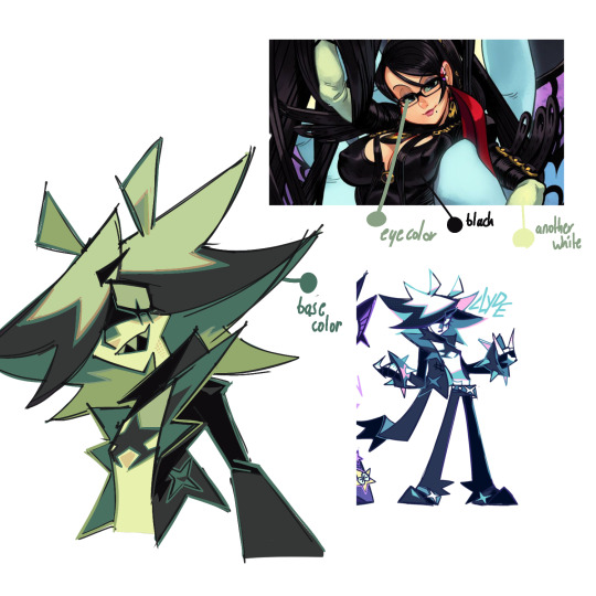
i don't usually color pick, but when i do, i typically start with picking the eye color. then, based off of the eye color, i chose a base color based on the character's color pallete (easier of the eye color is already close to the main color of the character, which for clyde is turquoise).
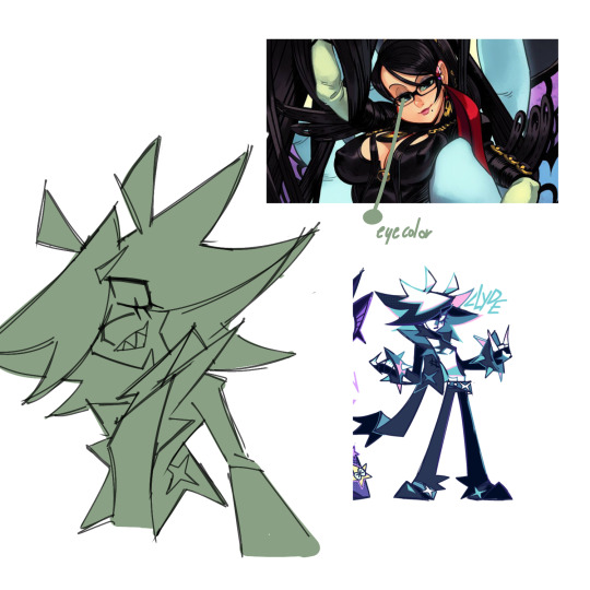
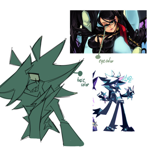
then, i pick more colors directly from the reference, for stuff like skin. at this point i have a good idea of the colors i want to use and stop color picking from the ref, but there's no shame if you still feel you need to.
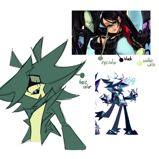
after that, based on the colors i picked, i'll color in the rest of the piece. i usually end up changing the colors that i did take from the reference due to experimenting - for me, i just use color picking as a sort of stepping stone for when i'm not sure how to color a piece the exact way i want.
eventually, you can learn to color pick by eye rather than with the picking tool in your art program, tho that takes a lot of knowledge on color theory.
really there is no "right" way to color, especially for skin imo - don't limit yourself to just peach, tan and brown. clyde's skin is bright white, but i still used a yellowy color here because it was relative to the other colors in the piece. i've also used "alien" tones for human-toned characters in the past before!
and about clothing folds - i can make a full post on that if anybody else is interested OuO
42 notes
·
View notes
Note
4, 6, 7, and lastly 9 on whatever character comes to mind when you read the question!
[questions here]
4. which oc can cook? what’s their favorite thing to cook?
First two people that came to mind were Zane and Roman. Zane will cook almost anything and loves making new things. but especially likes making cheesy dishes. He's got a pretty good homestyle mac and cheese recipe. Roman likes baking more than cooking.
6. which oc prefers to dip someone? to be dipped?
I've heard and used 'dip' in so many contexts it took me a second to realize this was probably about dancing. 😂 mainly cause the #5 question is about slow dances. Uhm, well. Roman had classical dance lessons as a kid, and so did Abe (because Elaine wasn't about to let her kids embarass her if the need arose. which means that Nathan and Lucy also have. Lucy would rather not relive those memories, and Nathan would kill most people on site for even requesting a dance though.)
Abe would probably take the lead position when dancing, just because that's what he was taught and knows best. Roman on the other hand would be dependent on his dance partner is.
Pia would absolutely love dancing with someone and having them twirl and getting a proper dance kiss though. she's a fan of classical romantic stuff like that. (hi hope you wanted a novel about dance styles lmao)
7. which oc has the most cohesive color pallet? the craziest color pallet?
Pia, Abe and Roman were all taught to dress well as children, so that follows. Pia is probably the best at it though.
Pelle's color palette is all over the place (but still not bad, he just likes ALL the things)
9. what is one universe/story an oc would fit in to besides the one they live in?*
hahahahah oh boy. 😂 you may be asking the wrong person I actively just think of fun random AUs whenever. uhm. lets see. Absolutely have thought about a vampire AU with Abe and Roman. As well as a mob AU for Roman as well. may or may not have thought of a villain mode/serial killer/horror au with Nathan as well. 💀 uhm... and in lieu of it being May for the last full month lmao, I feel like Pelle would be really fun in a mermaid AU? idk why. just do.
#answered#arkhelios extras#Pelle Nykvist#Roman Bellamy#Abe Chun#Nathan Chun#Lucy Chun#Pia Rivales#Zane Hydes#Elaine Chun
2 notes
·
View notes
Note
This new prompt sounds really fun and I finally get to be the first (hopefully) to reply to one of these (yay me I guess.XD). So let's see:
Animals:
Bunny - This one's obviously related to the fact that people speculate Niragi is supposed to be the March Hare from Alice in Wonderland, but he do be cute like a bunny (and he probably has a sex drive like one too)
Tiger - Fierce and dangerous, that's for sure, but also majestic
Colors:
Black - Like the darkness of his soul I've noticed that most of his color pallet is black and in a way it suits him, kinda gives you the ominous vibe of mystery and intrigue he's certainly aiming for, but at the same time it's kinda drawing you in (it's hard to explain, but bear with me.XD)
Red - Oh, the color of both anger and fierce passion, this man could embody both really well depending on the context, if not both at the same time too.
Gold - I guess once you dig deep enough you might actually find something special underneath (I keep also on thinking about that line from Gasoline too since the song fits this man like a glove, y'know?)
Places:
You know these old and abandoned scary houses? - I'd say Niragi reminds me of one of those sometimes, since he's marked by many scars left by the harsh past that make him put on a very scary appearance to divert people from coming near him and he'd resigned himself to solitude. But thing is, just like with one of these houses, I feel that with the right amount of care and patience you could restore it to something beautiful. (Ah, I think my writer tendencies are coming back with these deep parallels, you'll have to excuse my old habits.XD)
Flowers (it might be odd to associate flowers with him, but I've got some stuff for this too since I found some prompt list with flower language, so I'mma use that for the meanings):
Red rose - Cause this man pricks you with his sharp thorns until he draws blood, but at the same time makes you love him passionately.
Calla lily - Beauty. This one's obvious: man is gorgeous, enough said.
Red columbine - Anxiety. Niragi surely suffers of some forms of anxiety if not PTSD from his past, since some of the symptoms of those are violent and very aggressive behavior in some cases.
Candytuff - Indifference. I hope it's no surprise to anyone that indifference is a trait that speaks Niragi, since it's easier to keep others away to get rid of any annoying presence.
Oak - Strength. Man is strong from all points of view, period.
Edelweiss - Courage and devotion. Again, I feel that if he were to open up to someone and accept them in his life as a friend or something more, he'd become very devoted to that person since they would have to mean something to him if he views them in that way.
Songs (I'll keep this short since I'm still working on a playlist for him):
I'd add here all the songs from your repertoire for Niragi, Gasoline having to take the lead in this one because the lyrics are deep and fit his complexity (thinking back to his manga version too). A misunderstood recluse. Oh, and also the "Love the way you lie" song fits the dynamic he'd prolly have in a relationship.
I hate everything about you by Three days Grace - He's volcanic, unpredictable and defines himself through hatred, so his love language would be scattered too by a back and forth between love and hate.
Animal by Three days Grace - Kinda self explanatory once you understand the lyrics.
Pain, again by Three days Grace - Relating to the fact he's a freaking masochist who'd rather inflict more hate from others and suffering just to feel alive.
Toxic by Britney Spears - Need I say more?XD
Criminal by Britney Spears - This is for all my fellas who love this man and have at least one ship with him.XD
I'm still here from Treasure Planet - I know, this song is related to parental neglect, but at the same time the lines about others not understanding you and wanting to change you to fit their standards make me think about how much he dislikes being told what to do and being sent "to therapy" by people around him. He just wants to be himself in a world that keeps on rejecting him.
Fifty shades by BoyEpic - Moving into sexy territory, hurah! This one's more for the perspective of a potential lover of his, since I'm sure as heck Niragi would be into some kinky stuff involving some form of hurting his partner.
Dirty mind by BoyEpic - Not much to say, just in relation to the fact I think he's into just enjoying some good sex not involving feelings.
Well, that's all I could remember for now. Phew, this was one heck of a ride.💀 Thanks for taking the patience to go through this!
~ Yours,
The anon who keeps coming back no matter what
WHAT DO YOU ASSOCIATE MY MUSE WITH?
(( You're first and only one to send something in for this prompt/meme I'm not sure what it is to be honest.
If it comes to the animals - sex drive like a bunny is accurate if he has interest in someone, other than that it's just for passing the time and because they want it so bad -, colors and places I can see all of them too. And there are sure triggering things for him and he will always react differently to them. Also I'm not sure for my muse whether he is closer to anxiety or PTSD yet.
As for the songs Gasoline will always be one of my favorite songs for him. Toxic and Criminal by Britney Spears had me love because I think they fit for those that are into him. For the others I can see I why they fit in your eyes because of the vibe and the lyrics. Pain, again by Three days Grace I think I will add straight to my character inspo. Also maybe the Britney Spears ones just for the fun of it. I love the way you lie will stick too. I'm sure I will add more songs as I go. Still hanging on Wildfire a bit. lol But thank you for the other songs I will keep pondering over them.
1 note
·
View note
Text
GD morning parn
This is the special block this is an old way of doing stucco and it's not really how you do it but it's really easy to do down here there's tons of stucco machines and big huge trees it's a great idea to put the block up into stucco it so you can't see it you can't tell what it is and he says use a color code instead of paint and they do that down here and it won't bleed through it's a nice idea and it will cover it up and people can make the block here and they can make them lightweight and they don't have to be huge and they can be interlocking it's not a hard company to start up and people are looking into it the panels are a pain in the ass to move around but with the block you can use a regular truck in a regular pallet drop them off and they handle the rest it's not that tough and the blocks like 8 inches wide and a 16 long and they're virtually indestructible and they make them out of lightweight and they're still strong as hell and the ones down here fuse partially and it's really really strong they're almost impossible to get a part and people are trying to permanent and they're not doing they're trying to get permits and they're not doing well and they may have to just build wood the reason why not to build wood is the fire rating they have a plywood that's fire approved and they don't want to use the cost twice as much and use a lot of plywood it's not really true and it'll be cheaper than the concrete each sheet is about 50 bucks instead of 35 and if you get a wholesale I can get more off that and only 10 bucks more and the wood can be fire treated too it doubles as bug treatment what you need here and they do have a rating and it's a little higher for the bugs and higher for the fire I recommend that people do it and it's a good idea and it came from us a little bit but he had it just now and he said he probably gave it to him but really it is our idea too that would make it a lot better and you can put in extra clips if you're worried about the hurricane and build to a higher standard and her son wouldn't care about that because the hurricane level is pretty high with the wood and you wouldn't have huge things falling on you and if you guys do it it's going to be heavier than it should be and he can survive a woodhouse exploding into splinters you guys probably couldn't but he'd be fine if he was about 7 ft yeah it's a pain in the ass isn't it people want to see that or something but used fire rated plywood and if you buy in bulk it's usually not as expensive
Thor Freya
Olympus
Zues Hera
It has started already and people said the fire rating is part of it the other is the hurricane stuff and he says I can add extra straps and increase the rating and it works and it does work and it's glued together it says no so you can glue the plywood on it makes it massively strong and this is so he says you use the fire rated plywood and you glue it and the fire rated plywood helps people think about the glue and it will snuff it out and suffocated and it's fantastic and he said yeah so people are going to do that
Thor Freya
Olympus
I've seen what he said the plywood rips before the material right in half like paper wood but like a real yellow pages it's very very tough this plywood is impossible to rip in half that way and it does because it's glued to the members and it's because the house was dropped off of a truck and split and I tell you what the glue works it does the job and the house is not going to go anywhere with glue and straps and fire rated plywood and fire rated members because the fire rating add strength to it for some reason he says it's a preservative and preserves the cells and it's true this guy knows what he's talking about and spending the industry only a few years so really
Higher end homes near the dump
yeah he says he's very young and no stuff that's why. No he can't remember the name of the place
Camilla
We're going to go ahead and publish Thor Freya Olympus these are all great ideas Hera
0 notes
Text
Since 2024 is right around the corner I wanted to type out a list of things I wanna do next year since I wasn't able to do most of the things I wanted to do this year because of the accident. I also thought posting em here would help motivate me to actually do them, so here we go!
I wanna get back into traditional art. It used to be my primary way I did art but over the years I kinda went full digital without realizing it so I think it would be a fun challenge for me to get back into the swing of traditional art. I also think it could help me in areas of my art I struggle with such as making interesting color pallets/moods by eye instead of relying on filters and blending modes along with doing poses without refs (note references are very good and very useful tool I ain't knocking em but I feel like I've been relying on them TOO much this year cause of just art block issues)
I want to post art more. I haven't really posted much art to my socials this year cause I haven't really been proud of anything I made and the few things I did post to various social media's never did well so it discouraged me from posting even more, But nothing ever did good cause I didn't post regularly so it was just a really bad cycle of art block and insecurity for me. So I wanna start posting more consistently on all my main socials I like posting art to no matter how good I think the quality is, i wanna build confidence in my art no matter the medium and just build a name for myself online. I don't really care too much about how popular I get I just wanna connect with people who love art just as much as I do and inspire people with my art and stories!
I wanna write more. I actually really like the idea of making my own webcomic/graphic novel so I'll plan these huge projects and get really far into the process but when it's time to actually write the story I just immediately burn out, I wanna get better at writing in general so it doesn't feel like a chore to me. I was thinking of actually making fanfiction again as practice to start off since fanfic communities have always seemed very welcoming to beginner writers like myself so all I really need to do is shake off the shame of my middle school klance fanfic writing days and create something. Honestly the only reason this really got delayed wasn't because I didn't have the time but it was because it was too much strain on me physically, because of the accident it was harder for me to focus on words on a screen/page so not only did I stop writing completely I also stopped reading for the most part too cause it made me really light headed and sick but now that I'm not suffering from the effects of a skull fracture as intensely as I was at the first half of 2023 I feel confident enough to give writing a try again. Also my spelling sucks i wanna fix that.
I wanna get outside more. I actually wanted to get into skateboarding really bad this year but after the accident I basically had to relearn to walk completely so even now that I can be up and about for way longer then I've been able to I still don't feel like my ankle could support me enough to skateboard. BUT I think I would be able to handle roller skating so I wanna get myself some skates and start doing that in my free time, nothing really intense or anything just kinda skating around my neighborhood or at a park or a rink. I've been doing daily walks in the morning but I feel like something more exciting and engaging would really benefit my physical health.
And thats my list for the most part, there's other stuff I left out but I wanted to focus on how to improve myself when it comes to my hobbies and how the accident effected those things, I'm not out here getting too personal on the internet. Ik this won't get seen by anyone but I'm not taking my chances lol
1 note
·
View note
Last Seen Blogs

unknowncorner
Unknown corner
lonnii-renae
gladiator_subbie
89cats
meow.
clarkkentfan
clark kent fanclub member

m-ermaidkisses-starfish-wishes
I Shall Be Free