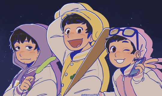
#i've been wanting to draw them in my actual art style for a while so their birthday was a good excuse to do it
Note
I love your artstyle!! Do you have any tips for drawing?
thank you so much! i'm really happy you like it!!💗
as for tips, what i would say would change drastically depending on what kind you're looking for, but some very general ones:
draw what you love and want to see most, regardless of whether anyone else wants to see it. if you don't enjoy what you're drawing it'll never come out as good or genuine as something your whole heart and soul is in. i mean you'd think this would be a no-brainer but sometimes i've had to sit back and ask myself 'if no one was ever going to see this except me, would i actually spend time drawing this?' and i was surprised by the answer
that said, it is also completely valid if your motivation for drawing is to draw for other people! there have been plenty of times where i was too artblocked to draw my own ideas but was still able to draw commissions or gifts and enjoyed it simply because making other people happy with my art makes me happy.
don't get too caught up in having a consistent art style. in my experience this 1000% hinders you
having your sense of anatomy degrade over time without you noticing because you keep drawing the same types of characters is a very real thing! if this is a concern to you be sure to draw a variety
follow a billion artists that you like the art of and you will have endless inspiration injected directly into your brain every time you open social media
my favourite practical tip for those who draw at a desk: keep a small mirror next to you at all times. absolute game changer for quickly referencing hands
if you're drawing digitally, make the canvas huge! in my experience this lets you draw messier/faster and you can't tell at all when you zoom out. if you tend to get stuck spending unnecessary amounts of time micromanaging pixels (me💀) keep it zoomed out while drawing
related to the above point, messy drawings can have far more expressiveness in them than neat and polished drawings. nowadays i never do lineart and go straight from 'barebones stickman pose' to 'varying-levels-of-coherent sketch' and use that as my lineart. sweet freedom from the sketch-looks-better-than-the-lineart phenomenon
if your goal is to improve, then you really do have to scrutinize your art, figure out what you're not satisfied with, and commit the time to focusing on it. 'practice makes perfect' kinda rubs me the wrong way because of how much i've seen it interpreted as 'just draw everyday and you'll magically improve' but genuinely it won't get you very far if you don't actively think hard about what you're trying to improve and take the steps to do it. is this a hot take idk. also hand in hand with this, not every artist is trying to improve and you shouldn't feel bad for this! maybe you just wanna make a little headshot doodle of your fave blorbo and that's your only drawing goal ever. awesome. maybe you know your art has flaws but it's passable enough to convey what you want and you're perfectly satisfied with that. (this is the stage i'm usually at). also awesome!
don't hesitate to draw something because you think it's out of your skill level. the worst that can happen if you draw it is that it comes out terribly but you learned something and can always redraw it better in the future. the worst that WILL happen if you don't draw it is that you'll never draw it. and then it will sit in the back of your brain haunting you for years. it's not like i'm speaking from experience or anything aha
look up 'hand stretches for artists' and do them if you draw a lot unless you wish to summon the wrath of the carpal tunnel demons
of course, these may not necessarily work for you, and most importantly(!) these are coming from the perspective of someone who is primarily a hobbyist. some of this won't be practical for people who need to build an audience, maintain a consistent style for work, etc. these are just things that have personally helped me over many years of drawing :)
69 notes
·
View notes
Text

LET'S HEAR IT FOR OUR NEETS!!
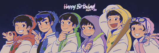
#i'm late but whatever that's fine 😭#i've been wanting to draw them in my actual art style for a while so their birthday was a good excuse to do it#* holds totty's hand * i stg i'll make your season 3 fit work#i hope ya'll like my lil headcanons for how they look#i like giving them small differences in stuff like height#but also some of the brothers sharing traits with each other that not all of them have ( like kara & jyushi's bottom eyelashes )#how old are they old now? 32?? grown ass men.....#OKAY I HAVE WORK IN THE MORNING I NEED TO GO TO BED#osomatsu-san#osmt#osomatsu#osomatsu m#karamatsu#karamatsu ma#choromatsu#choromatsu matsuno#ichimatsu#ichimatsu matsuno#jyushimatsu#jyushimatsu matsuno#todomatsu#todomatsu matsuno#matsuno bros#mj draws
1K notes
·
View notes
Text
excited for their new song ^^
open for better quality | no reposts
#plave#nam yejun#kpop#fanart#myart#doodle#unrelated but i love how my 'getting into an obsession' process is illustrated through my o.rv and plave art#within the duration of a week i go from rough mindless doodle -> chibis -> actual rendered piece#anyway i know they only have a few title tracks out but i love their style so far so i'm looking forward to this early christmas present#i've been watching their lives in mostly reverse chronological order and they make me laugh sm#i wish i could catch them live but timezones are rough... still the vods are nice to have in the bg while drawing or doing chores#and yeah i've gotten to know the members a bit more and they are so dear to me#i've said this so many times already but they're all so skilled and earnest and i want to see them succeed ;u;#outpouring my love for plave (abridged due to character limit) in my tags lol#plave fanart
23 notes
·
View notes
Text

[Click for better quality]
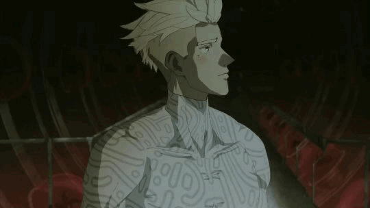
Ok yay I'm back from my vacation yipeeeeeee. I started this drawing of Keiki before I left and I was half considering just giving up on it.... until I did a short study of facial planes and then got motivated to work on this again! I'm glad I didn't give up on it though, as I'm actually really happy with this one!
Artist's Notes;
So as I mentioned in my last post about Touhou 17, I wanted to finish this by the game's five year anniversary but with how progress was going I didn't want to rush this so I decided to take a long break from it. Mainly because of the face. For a while now I was kind of feeling like I was stagnating with my drawings, not really in the clothing but in the bodies. There was something about the way I was rendering them that I just wasn't happy with, and after talking with someone else about this issue, I realized that the reason I felt this way was because the faces were too flat and didn't match the rest of the drawing and that I needed to find a way to make the rendering of the face feel consistent with everything else. So after doing a short study of the plains of the face (I used this 3D head model from art station as a reference for my short study, please go give this person some love as they are a lifesaver) I went back into this drawing and applied what I learned here. It was only after that that I finally became motivated to finish the piece, and while it started off as just a simple character sketch like Saki and Yachie's were, the moment I added in Keiki's little fire dragon I knew I had gotten in too deep and now here we are with a full on background. OK it's not super crazy or anything, but it gets the job done and it's better than there just being an empty void behind her. It's rare moments like this when I use brushes other than the Clip Studio Default Charcoal Brush and use the Clip Studio Default Paint Brushes as well (god bless the oil paint and dry gouache clip studio brushes, they were amazing). I don't know why but painting fire has always been really fun for me, there's something oddly satisfying about it y'know? I do think that another reason for this problem was because I was drawing faces like I would in my more sketchy style that didn't mesh well with my lineless style, so I'm glad I've started remedying that.
After adding in the fire dragon I had an idea to kinda make it feel like splash art in the way the composition works... probably because I have been playing Reverse 1999 again and it has taken over my brain. I do feel like Keiki's tools get a little lost in the composition, and I didn't fully render the metal parts of them mainly because I didn't feel like they needed it, but that's just something for me to improve on later down the line.
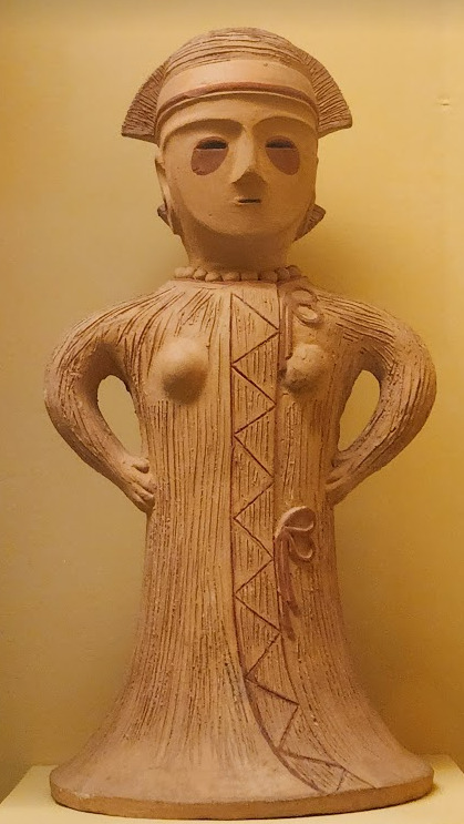
If you guys are wondering where I went for my vacation, I went to New York and got to go to the MET and the Museum of Natural History. In both places I found Kofun period stuff and I was so happy to see it you have no idea. I remember one of the Haniwa I saw had some neat face paint under the eyes that I tried to replicate with the makeup under Keiki's eyes in my drawing, though I think I'll gave to figure out how to draw makeup on characters because this reads more like blush to me than anything. While drawing this I also looked up some references of Kofun period jewelry and really liked the stuff I found, which also meant that now she has proper Kofun earrings instead of earrings shaped like Kofun tombs. I put some of the things I referenced with a closeup of Keiki's face as well down below. I made her outfit more reminiscent of the outfit I gave her at the beginning of the year with the buttons and all, though I do want to try and draw her in some more period accurate clothing like the Haniwa I took a picture of at the Museum of Natural History. I wish I could find a way to make her handercheif look better though as I wish I made it a little bit bigger, though I think I'm saying this because I've looked at this drawing for too long lmao. Once again something to work on for when I next draw her. Also want to get better at rendering hair, as some details (like the little strands in front of her ears) kinda got unreadable due to the similarities in colour lol.


Now you may have also noticed the little cracks I added onto Keiki's face, and that's because I have fallen in love with the idea of Keiki's body being made from ceramic and that she crafted her body herself. While they aren't very visible I also tried to add some doll joints to her body, which is an idea I played around with in the past but never went to far with. I also want to get better at rendering cracks in ceramic, porcelain, etc, as I'm not sure how those read in the drawing. I also have a headcanon where the cracks in Keiki's face show up because of heightened emotions, and while Keiki is aware of this and does her best to make sure her face doesn't break off.... she will still end up with at least a few cracks during any given day, and she can often forget to repair her own body quite frequently so Mayumi has to remind her quite a lot. Mayumi even taught herself some basic sculpting techniques to help repair parts of her body that are so badly damaged to the point where Keiki can't repair them herself, i.e. if both her arms broke off, Mayumi would put them back together for her so Keiki can at least have something to repair herself with rather than nothing. I also like to imagine that if Keiki created her own body, if you took a look at Keiki from the beginning of her life she would look completely different compared to now.
BTW If you guys are wondering what a very very angry Keiki looks like....ok in order for this to make sense have any of you read volume 11 of Land of The Lustrous? Am I bringing back some memories for those of you that have? Ok good, glad we all got that mental image brewing in our minds, I'll probably draw a version of Keiki that is somewhat inspired by that one day as it's an idea I've had for a little while now. And to those who haven't gotten to that volume yet and are confused.... don't worry about it, just keep reading :)
#touhou project#art#fanart#touhou fanart#touhou 17#keiki haniyasushin#wily beast and weakest creature#touhou#東方project#own art
175 notes
·
View notes
Note
HOW DO YOU DRAW FACES??!?! seriously, everything about your art is pure eyecandy, I love it SO MUCH, but faces. YOUR FACES. the faces are perfect. they capture every detail. they feel so human. so expressive. i would love to know how you draw/structure your faces because it's the biggest thing i'd like to improve on with my art!
Art is a translation of how you perceive the world. Art is both extremely watered down and painfully vulnerable with emotions. The artist translates the world, and people translate the art. Lots of art gets lost in translation. My goal is to make people read my art regardless of my language. I want my art to speak louder than my simple cluttered words could.
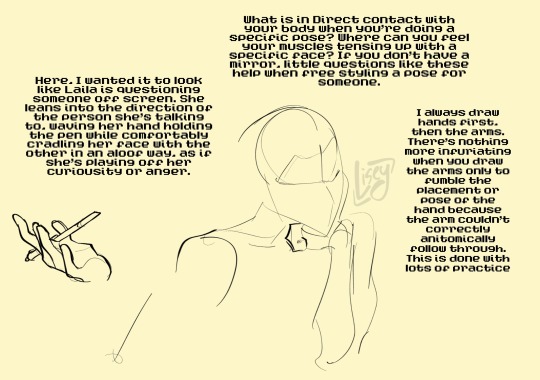
How can you read a face with no words? You have to find your own way to do that, but here’s a very rough way of how I read people and attempt to translate their world into mine.
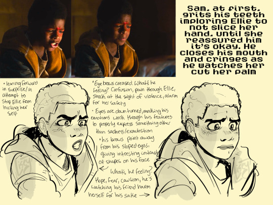

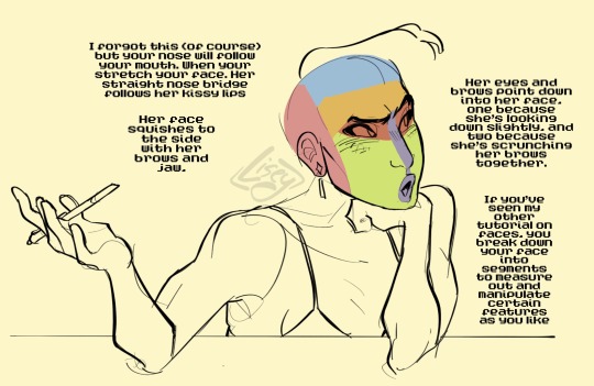
One practice is drawing straight from a reference. I've been watching TLOU, which has some of the best acting ever and is perfect for screenshotting specific moments to recreate. Pulling scenes from episode five, I stretch and amplify the facial features to properly read their emotions in my style, ex, making Ellie and Sam's eyes bigger to amplify their youth, smoothing out facial wrinkles for simplicity, and (my favorite) exaggerating the mouths so they emote louder.
Second method is feeling how your face moves. Ethan Becker on YouTube explains it better (go watch all his videos) of how to feel and observe how your face compresses and works with different features to properly express emotions. Using your own face as a stencil to understand how your muscle and jaw work is both simple, and always accessible for artist reference.
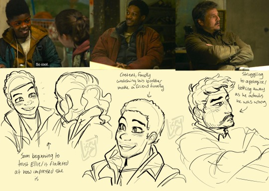
An example of how I break down bits of a chapter into chunks for each panel while still attempting for it to run smoothly like the writing. Honestly, a lot of this part rides on wanting to do the author justice for their fabulous work. You want to show them how much their work affected you and why it’s totally worth it to draw their stories.


Some examples of scenes from media (that almost made me cry) and how I translate and manipulate it into my style. This is why I redraw scenes from movies so often, not only is it fun and easy, but it’s a great way of studying the masters
But, to actually answer your question, I think the reason my drawings are so expressive to you is because I still follow somewhat typical human anatomy while still being cartoony enough to break the uncanny valley and create an aesthetically pleasing style. I’m still practicing and studying everyday to get better. You must work as much as possible to attempt to properly translate the world.
569 notes
·
View notes
Note
Hello! I'm not a furry either so I'm not sure how I stumbled upon your art, but I'm glad I did because I love everything you do for Machete and Vasco and I admire your art and how much effort you put in fleshing them out. They're gorgeous, and your colouring style is very pretty, too! I'd like to ask some things about them, if you don't mind.
1) Are they specific dog breeds? (I remember you said you're inspired by Borzoi fur for Machete's neck fur!)
2) Are dogs your favourite animal to draw?
3) How did you decide on their names?
The question about the names is because, fun fact: Vasco is an extremely popular football team from Rio de Janeiro, and right now they're competing in Brazil's largest football championship to become the country's champion. So I've been imagining Vasco dragging Machete to a football match and being wildly into it while Machete looks lost in the rambunctious crowd lol but also because I'd like to know if you're applying a nationality to them at all. Their clothes have picked my curiosity!
Thanks for sharing your art with us!
Ah, thank you! I'm glad you like my art and little guys.
1. Both of their breeds are fictional.
Vasco is a scenthound type of dog, if you applied Segugio Italiano's colors to Ariégeois/Porcelaine bodytype you'd get very close to what he's supposed to look like.
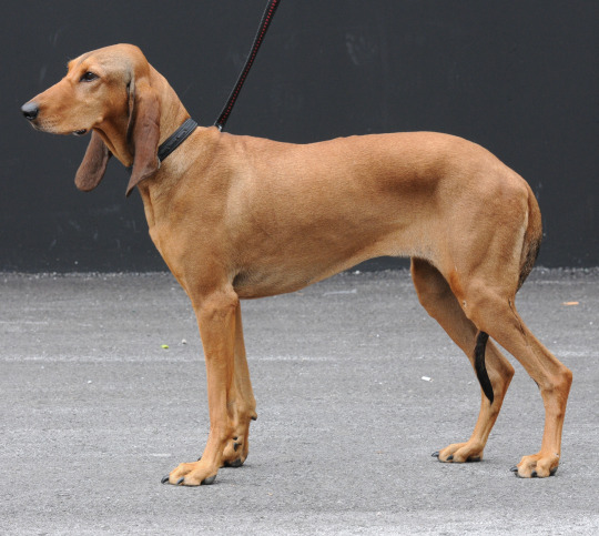
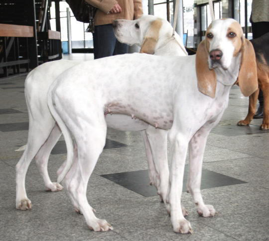
Machete is a sighthound and his closest real life counterpart would be Ibizan hound. He's mostly just a little fluffier here and there.
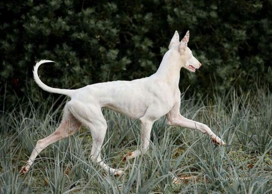
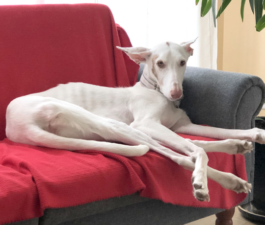
2. Yes, dogs are my favorite thing to draw. Canines in general. Sighthounds in particular.
3. I created Machete almost 16 years ago, I think I was simply reading about weapons and thought the word sounded sharp and had a good rhythm to it. In-universe "Machete" isn't his real name at all, it's something of a mean-spirited epithet/nickname he's acquired from his colleagues (mostly for being efficient at powering through mountains of thankless work, his severe (and increasingly cut-throatish) personality and the fact that he's originally from the part of Italy that was ruled by Spain at the time). His actual name (the one Vasco uses) hasn't been revealed.
I had liked the name Vasco long before I assigned it to this character, to me it sounds friendly and energetic but also noble somehow (but that's just my impression, I don't know any Vascos personally). One of the deciding factors was his color palette, I wanted to aim for shades that would resemble gold. In Finnish, "vaski" is an archaic term for warm colored metals like brass, bronze and copper. It's far fetched in retrospective but when the connection popped in my head I had to go for it.
As for the nationalities, they're both Italian. Vasco is a proud Florentine and Machete is originally Sicilian and now lives in Rome.
I can see how Vasco would be into football, Machete less so.
963 notes
·
View notes
Note
OH GOD THERE'S TWO OF THEM
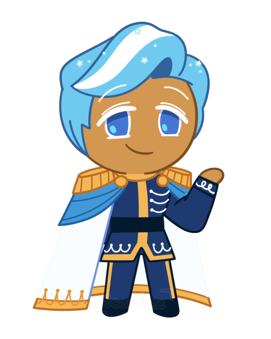
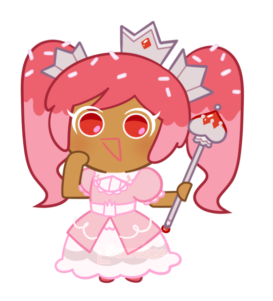
hiiii Brittle, its me, Blue Bird Anon! I come bearing gifts of cookie sprites! Crowned Cupcake Cookie (based on Runebrave's lovely design) and her brother of my own creation, Royal Icing Cookie. I had a lot of fun designing and drawing them so I hope you and everyone enjoy as well! (pssst also my art blog is scarabeeart ;3)
I saw an anon guess that Royal Icing was the pure opposite of his sister, and while that wasn't my original concept for him, I thought the contrast between the two would be a very funny idea hjggffg him being a totally normal, genuinely good guy while his sister is. like that.
But the idea I had for him was a classic prince charming, but with the levels cranked to 11. Brave, chivalrous, humble, generous, rides a white horse, he's got it all! All he wants is to sweep Y/N Cookie off their feet like in a romantic fairy tale and ride into the sunset for their perfect happily ever after together <3 May let the prince charming thing go to his head as he has a secret hero complex and will often put Y/N Cookie into danger purely just so he can heroically swoop in and rescue them. And while his sister is more physical with her use of force to chase away those who get too close to Y/N Cookie, Royal Icing is more manipulative and unhanded. Not above willing to plant fake evidence on other suitors and use it as a way to turn Y/N against them and only trust him. "These Cookies are merely trying to marry you only to claim the throne, they want to usurp you, your adviser is scheming and plotting against you" and all the other fairy tale tropes. Will never fess up to sneaking around because his perfect prince image is incredibly important to him. You trust him, right? He's your fiance! Your prince charming, your knight in shining armor. Of course he wouldn't lie to you <3
(hehe sorry for writing so much! I've been thinking about this for too long hjgfhjgf)
First of all.
That’s some damn incredible work you made here. You are getting a follow from me!
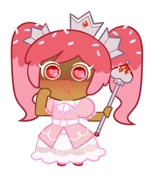
Crowned Cupcake now actually looks like canon compared to my more simple style! She’s even pulling a Cherry Blossom with that triangle mouth there!
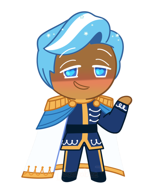
Royal Icing too! He looks just as amazing, definitely the charismatic type that no cookie would doubt has a dark side to him! Both of them are just wonderfully done and I really appreciate you taking the time out of your day to do this!
I did think about Icing being exactly like his sister rather than being a kind soul, with him taking the more psychological approach rather then the brute forcing Crowned would do. He’s willing to play any card in his hand to turn it in his favor, even if it meant falsely accusing other cookies if it meant getting them of the picture.
You would trust him more at first. After all, he hadn’t done anything wrong to warrant any kind of suspicion on him! These liars can’t prove anything against your Prince, so you’ll take his side more often then not.
Overall, this is spectacular and I greatly appreciate the work that was done here!
#brittle answers#cookie run x you#cookie run x reader#cr x reader#cookie run oc#cookie oc#oc cookie#royal icing cookie#crowned cupcake cookie#crowned cupcake cookie x reader
152 notes
·
View notes
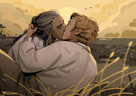
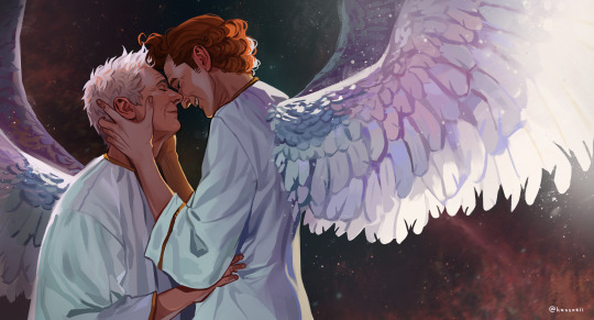
Note
Several things: -LOVE your art, it’s amazing! Especially the one with Crowley and Aziraphale under the umbrella - which software do you use? Your art always look SO gorgeous (cheeky quote from GO right there lol) - how did you get so good at drawing?And thank you for encouraging other people to keep drawing and being so kind as I sometimes can’t help but compare my sketches to others and feel silly, but I guess it’s just a learning curve… Thank you so much for bringing your art to the world!😊
Thank you so much!!
I use Clip Studio Paint for drawing and Photoshop for small adjustments!
2. Haha thanks! Honestly...it's the hyperfixations. I managed to improve a lot in just a year because I've been drawing SO much cos there's so many shows and movies I became obsessed with that I wanted to create art for. So by drawing a lot I just naturally improved. For example these two Illustrations are just a year apart:
I actually didn't actively try to improve, it's been a while since I did proper studies (I just don't really have the time for it between freelancing and art school), it just happened.
But I can absoluetly recommend going on YouTube and look for some art tutorials if you actively want to start improving! There's some channels that helped me so much back then:
moderndayjames
Incredible shape language and super insightful tutorials on all kinds of topics! I learned so much from him.
Ahmed Aldoori
So many awesome tutorials on so many different areas of art. Love it.
Marco Bucci
Incredible tutorials on color theory and understanding how color works in general! Learned SO much from him!
Sinix Design
The OG tutorials I began learning from. I watched his videos religiously as a teen. I adore his painterly style and adopted it in some way, haha.
Ethan Becker
This dude sometimes drops these tiny art tips that just completely blow my mind and that I adopt immedietly. He's super entertaining but also such a great teacher.
And I can also recommend checking out this book by James Gurney if you want to get better at colors!
And for anatomy I highly recommend the Morpho books!
But improvement doesn't only come from drawing a lot. A lot of the time I don't draw for a while and just study the world and artists around me and suddenly I improved when I get back to drawing. Don't ever overwork yourself to the point that you don't enjoy what you do anymore. Take breaks and listen to your body!
I learned to try and not compare myself to other artists, which helped a lot. Through conventions and social media I made so many lovely artist friends and realized how we're all struggling in a very similar way. A lot of us don't even really know what we're doing most of the time, haha. But we help each other out, it's such a wonderful community. I think when you're not actively part of the community it tends to feel like other, more successful artists are some kind of art gods that have perfected the craft and never struggle. But believe me, all the artists you admire go through rough times all. the. time. Sometimes what they do feels easy and natural, other times (more often than not) it feels like you have to try and learn how to walk all over again and you start to doubt your abilities. I personally go through that so many times.
So what I'm trying to say is that instead of comparing yourself to the artists you admire, learn from them instead. Ask questions, befriend fellow artists, study the artists you enjoy and just have fun with it!
And finally I thought it would be fun to share some of my horrendous Johnlock fanart from a decade ago for some motivation:

I hope my answer didn't overwhelm you, but I thoight it would be nice to give a more detailed answer!
Have a wonderful day and keep drawing! :)
468 notes
·
View notes
Note
Imma need pt 2 of how to draw in Hima's art style the hair is killing me
i've been procrastinating about it for a while, especially since i've been trying to find a way to actually explain it. but anyways it's here now, don't worry!
(again i am just a weeb not a professional teacher so some explanations may be vague, confusing, or wrong. feel free to send an ask or comment if youre confused and i'll try to explain to the best of my ability)
himastyle tutorial! (the better one) part 2
(link to part 1 here)

so continuing off from the last post...
HAIR
hair is a little hard to explain because there's simply so many ways you can do it
first off, don't draw hair directly on top of the head! there should be a little bit of space between the head and the hair. but be careful to not make the space between them too wide or else thehair will just look really big.
if you're wondering how wide the space should be, it should be somewhat similar to the photo below.

i noticed that himastyle hair (and tbh himastyle objects in general but we'll get into that later) is comprised of two types of lines

the subtler lines can usually be found in the following areas:
-the ends of the hair
-where a lot of hair is bunched up (tied into a ponytail, etc)
-where hair is slicked back
-the hairline

of course you can bend these rules depending on the character you're drawing but if you want to play it safe just stick to these general guidelines.
also if you want to draw one of hima's characters it might be better to just directly reference their hair from his art.
BONUS HAIR STUFF:
i've seen a lot of fanartists mention germany's hair being hard to draw. honestly.. yeah, i really struggled with slicked-back hairstyles like his back when then. which is why i created this guide that gives him the most 100% perfect hair everytime you draw him, trust, trust!

stay tuned for next time where i cover bodies, clothes, and other stuff! ummm... which will probably be in a few months tbh. sorry, i am very slow with this stuff ;D
138 notes
·
View notes
Note
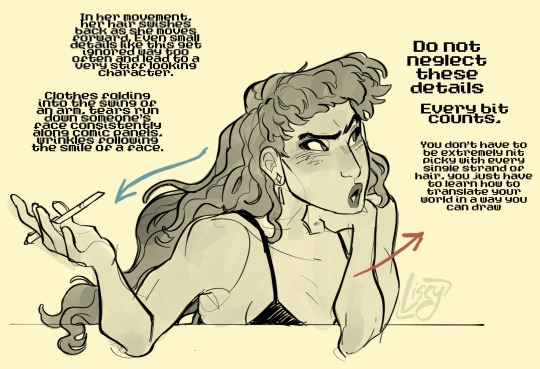
I am in love with your art style. I love all your jjk art, it’s like stitching back the pieces of my shattered heart. Your art is so soothing and has such a warm feel, I love it. Also if you don’t mind me asking what program do you use for your art, and do you have any tips? I strive to someday create art that gives the same feeling of comfort as yours. Thank you <3
Thank you so much for the kind message! I'm actually in the middle of making another jjk piece but it's been a while so I've been trying to remember and consolidate my process. This ask came at a great time hehe
I use photoshop for most of my art pieces but I think there are a lot of cheaper alternatives (procreate on Ipad, clipstudio paint, medibang etc) that would work just as well. As for tips, I have a technical and an emotional one:
My technical tip would be to use references!! Especially if you're just starting out, it's SO IMPORTANT imo for catching mistakes especially with anatomy, lighting and perspective. And by reference I mean real life photos. I think you can be inspired by other artists' work, but there is the danger of picking up their bad habits if you only use their work for reference. I would recommend sticking mainly to real life and looking to other artists only for resolving specific stylistic details once you have a solid grasp of your fundamentals.


I would start with a rough sketch first of whatever you want to draw and then look for refs that match the mood and tone you want to go for. Get the idea down first and draw from the heart. Then the refs come in to help with the specifics (ex. what a window looks like, how someone would hold a cigarette)
The jump from the rough to the clean line version is an amalgamation of all the little things you learn along the way. For example, on one day, I learned that clothing folds usually start at one point and spread out. Then another day, I learned how to do 1 point perspective and so on and so forth. Then all those tidbits slowly add up to help you get better and better.
2. My second tip would be to understand what you want to convey with your artwork. If it's fanart, what about the media that you're interacting with draws you in? It doesn't always need to be a complex answer, sometimes you just want to draw a character because you think they're hot and that's totally valid imo.
I occasionally tutor very young artists and oftentimes, they will tell me that they want to draw like X artist or X painting/piece of media. I always try to encourage them to go deeper. What about that drawing resonates with them and what specifics are occurring in the picture to make them feel that way? For example, I recently realized I love environment heavy drawings not for the background itself but because they ground the characters and seeing them do mundane things makes them feel more real to me.
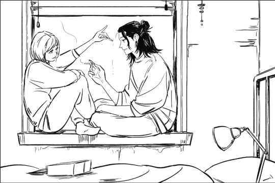
For the example below, the whole set was to explore friendship and mental health. Sometimes just having someone there who listens and is willing to talk with you can make a huge difference.


Once you know the purpose of your art, then I think it makes the decision making for the rest of the process much easier. What type of lighting scenario conveys support and comfort? I went with dusk. Then I started searching up references for dusk lighting. Couldn't find the ref I actually used for colour but a quick google will show you lots of similar options.
What kind of poses feel in character for Shoko vs Geto? What is the focus of the picture? As much as I love details, I think sometimes they can actually take away from the main message. For example, if I had rendered the lamp on the right a lot more, it would've distracted from the main point of the picture so I tried to keep that and the background in general simple (still something I need to improve on haha).
Then those extra technical things (value structure, cool vs warm light, reflective lighting, connotations behind colours) you pick up along the way are all there to help you better communicate what you want to convey with your art.
Okay I lied one more tip, be patient and learn to appreciate the process. Like with any skill, there are a lot of technical aspects that you have to study and practice. I think because the end result is so visual and easily accessible in comparison to other hobbies/jobs, it really cripples beginners. Even with writing, you won't realize a book is good until you learn how to read. With art, you can resonate with a painting without having drawn a single line yourself.
I think beginners and even professionals see a lot of beautiful finished artwork and get enticed by that only to be discouraged when they find their process/finished work didn't end up the way they wanted it to look. Treat it like you would learning how to write. The fundamentals can be tedious and do take time to drill into your head, but learning them will help you SO MUCH with the creative fun parts. You can't write a poem without first taking the time to learn the alphabet, spelling and grammar. You're also probably going to write a bunch of shitty poems before you write that one good one, but that's okay because each piece lets you experiment and exercise your voice. Art is the same thing, don't rush it! Enjoy the process and celebrate your improvements.
#omg i typed way too much but i have a lot to say!!#thank you for the ask this was actually so therapeutic lmao#ask#my last advice...is to be selective about who you take advice from#so you can just ignore all this or cherry pick what resonates with you and your process
38 notes
·
View notes
Note
Genuinely I would give anything to hear your thoughts or read more critical analysis of yours on other webcomics writing (*slides you Marionetta* I like the webtoon but there are some things in the writing that I'd like to see be discussed critically more often but the fandom focuses way too much on shipping. sighs..)
Anyway, you probably have been asked this before but are there any webtoons in particular you would recommend? :D
Oh lord, you don't know how many times a week I get asks in my inbox asking for my opinions on webtoons they're reading. It's really sweet that people wanna hear me talk about other works outside of LO, but unfortunately I just don't have the time to read as much as I used to, even keeping up on LO lately is getting really difficult 😅 I'm definitely keeping a list though of works to check out!
That said, I try not to read series on the basis of criticizing them because frankly I just... don't want to spend time reading something if people are only looking for me to rag on it? 😆 Of course I know that's not the only reason, I know there's also just the element of seeing me talk extensively about other works the way that I do with LO, but it's not really something I can turn on and off like that, I have to get really into a series to want to talk about it to that extent. So it often comes down to just luck of the draw :'0
Right now the series I'm keeping up the most on (or have completed and would absolutely 100% re-read):
Alfie (18+, it's porn with plot but the plot is REALLY GOOD , I SWEAR LMAO the art is gorgeous, the characterization is IMMACULATE, and it ironically tackles the subject of purity culture way better than LO ever has lol)
Theia Mania (the creator is often in my comment section / neck of the woods, she's been working on an Abduction of Persephone retelling for a long while now and has also tackled other myth retellings in her style! I always love seeing new pages of her work in my feed :' ) <3)
Tales from Alderwood (if you like fantasy and comedy, this one's great, the plot's really starting to get interesting and it's just got this really great sense of humor about it)
The Black Parade (this one's REALLY interesting, it's a comic-stylized version of My Chemical Romance's The Black Parade, using the songs as narration and sometimes even dialogue to tell a visual story, it's really cool and the art matches beautifully with the lyrics and style of MCR!)
A Tale of Two Rulers (this is a Legend of Zelda fancomic that poses the question, "What if Zelda and Ganondorf got married to solve their political crisis?" It updates a lot slower than most of the other comics I follow but the art and writing is so worth it <3)
Dogs of Future Past (and p much all of Lynx's Undertale comics which can be found in the link, seriously, THESE are the comics you wanna read if you wanna get into Undertale fanworks, they are PEAK)
Tamberlane (this one's an anthro comic, I normally don't read anthro but this one actually gripped me by the throat, the art is gorgeous and the character arcs so far have been great!)
The Mafia Nanny (okay it's legit so funny that I'm including this one here but I've been reading it the last couple days after seeing it basically beat out LO at the top of the trending tab for a couple days, so I figured I'd give it a shot, at first I was like "great more tropey shit" but the more I read it the more it's actually started to get pretty good, I'm holding out and hoping to god it stays that way LOL it's not especially deep or anything like that, but it's really fun and cute to read and the shipping of the main character within the narrative isn't too self-absorbed which I can always appreciate, I'd honestly be 100% fine with it if it didn't turn into a romance)
City of Blank (I talk about this one a lot here, but it's one of my favorite Originals right now, the art is super polished and the writing has gotten INTENSE, go check it out if you want some fun action / sci-fi storytelling!)
Time and Time Again (a time-travelling vampire and his werewolf boyfriend get into all kinds of misadventures, what more could you ask for?)
Touch of Divinity (like the Mafia Nanny, this is one I just started reading, it's got a very interesting premise so far and I'm looking forward to seeing where it goes!)
#if i ever do read marionetta then y'all will definitely hear about it LOL#ask me anything#ama#anon ask me anything#anon ama#recommendations#reading reccs#reading recommendations
88 notes
·
View notes
Note
Sorry to come out of nowhere but I just wanted to say that your art is so warm and so colorful and so ROUND in all the best ways and your style really captures my favorite things about Kirby! I've always found it really inspirational!
Also, I love the way your line art looks?! I have to ask (you don't have to answer though) is there a specific brush or technique you use to get that soft, multi-layered effect?
Either way, wishing you a wonderful day!
Thank you so much for your nice message, it means a lot!!
I've been wanting to make a small tutorial about how I make my Kirby art, so I guess your question came right on time hehe ^^
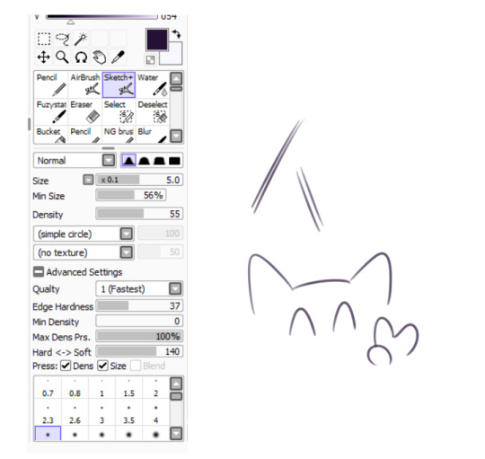
As I'll be explaining all of my process, I'll also answer your question about my line art! Btw my art program is Paint Tool SAI and I'll also be showing the brushes I use as well as their settings (i made up most of them a long time tho).
So first here's the brush that I use for basically anything, whether sketch or lineart!
It took me a while to understand what you meant by multi-layered effect, but no the brush doesn't do that, that's actually my way of doing "lineart" (ig it's not really lineart cus I just do sketches that I clean later on).
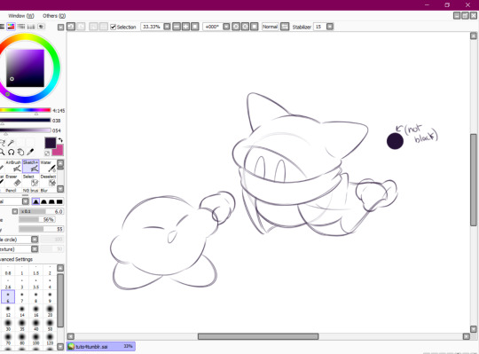
I then clean up everything, add the details and block by using a grey color.
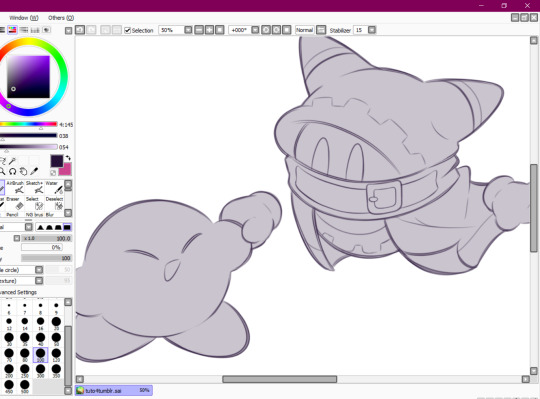
Afterwards I add the flat colors! I already have my own made up color palette, but otherwise I always use a purple color as overlay.
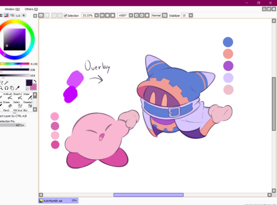
And I also use that same shade to color the lineart!

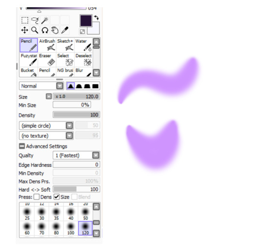
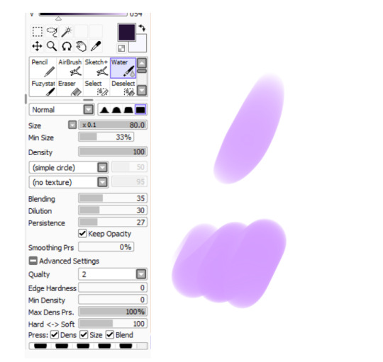
Next comes the fun part, shading! Here's THE brush that gives that soft effect to all of my drawings ^^ It's the same setting as my eraser too!
And yeah I also shade with light purple lol
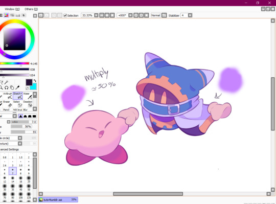
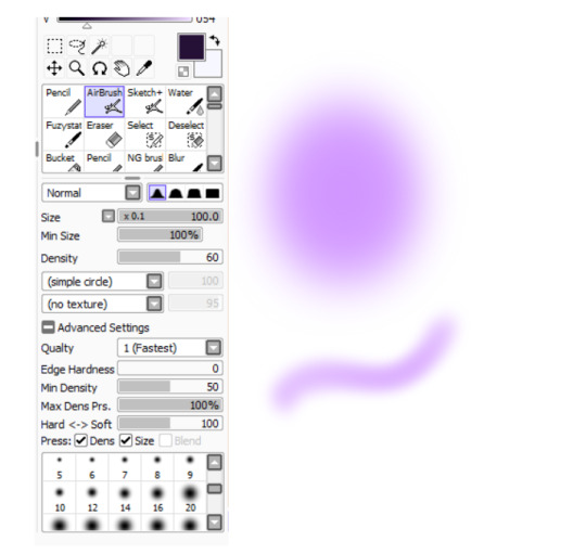
There's also some other brushes that I use for more effects, like the airbrush! (I don't think I've touched the settings that much) I mostly use this one for lighting effects.
And finally the water brush! I sometimes use it for blending or for quick backgrounds,
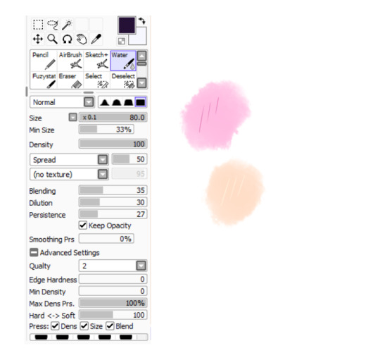
but you can also see that when put it to "Spread" it also becomes the one that I use for my blushes hehe
Aaand I believe that's all of the brushes I use for my art! I do have more, but I only use those for other specific stuff like animation or pixel art.
Adding some details AND VOILÀ!!

Now you know how I make my Kirby art! (but this also applies for all of my art) I sometimes redraw on the contours to give that "pop up effect" a bit like what they did in rtdldx lol ^^
I really hope it was easy for everyone to understand cus this is my first time making a tutorial! And to Desultory Novice, I hope I managed to answer your question too!!
Thanks again and have a great day :D
248 notes
·
View notes
Note
Hello, I'm currently in an art class and I'm taking storyboarding. I noticed that people draw their storyboards in VASTLY different ways. Some people draw it super rough and minimalistic while I've seen others with super fleshed out and cleaned panels that boggle my MIND. I remembered that you're an actual storyboarder in the industry so I wanted to ask which style tends to work better or is more is more popular among studios?
Sorry if this question came out of nowhere :/
(Also I've recently been admiring how you do line art in your art in particular its very thin and clean :]]]]]]]]]]]]]]]]]]]]]]]]]]]]]]]]]]]]]]]]]]]]]]]]] )
It really depends on the project you’re working on. The boards I did at CN were allowed to be a lot more loose than the boards I did at Rough Draft.
In my opinion, boards should lean more on the loose side so as not to stress out the artist, but due to industry trends it seems like cleaner ones are becoming more and more common. Although I do think a lot of the time, the super clean boards you’ll stumble upon on Twitter would probably/ hopefully have gone through layout and revisions to make them look as clean as they do.
Based on what I learned, though, what I think matters most about boarding is clarity. Are the boards legible and is it easy to tell what’s going on, which characters are on screen, who’s talking, where they are, etc? Are things consistent or are you breaking 180 rule too much or trying to do too many complicated things where something simpler would be more efficient or effective? At CNS Academy I was told that I should judge how much time I put into drawings based on how important they are to the scene. (i.e. this close up or establishing shot is important to the tone of the scene and lasts a couple seconds longer than the very quick shot of the character speaking coming up next, so I will put more effort into making the former shot look nicer, because it’s more specific.)
Important to keep in mind no matter how loose or clean your boards are.
175 notes
·
View notes
Note
I just adore your blog! Something about it and your imagines are just so sweet and homey 🥺 Could I please request some headcanons for Vash, Woowoo and Knives with a reader who loves to draw and is really passionate about it? I mostly have general sketching/figure studies in mind but you can do whatever is easiest for you! I hope that you have a good day and your blog continues to prosper <3
Thank you for the compliment 🥺!!! I'm so glad it feels homey. I try to make things like a home here... after all I LIVE HERE... thank you I hope to keep this blog going for a while after trying to revive it like twice before!
I think this request is so cute, I'm an artist too (have been for like, over a decade ^_^) so I've got lots of ideas in that aspect. I tried to keep to general sketching/traditional stylings of art but I think a lot of these can be applied to other art areas too!!
Vash, Wolfwood, and Knives x Reader: Artistry
Content Warnings: None! Reader doesn't have a specified gender, and some parts of the imagines are a little romance-oriented but this could also be interpreted as a strong friendship. Also this is my first mutli x reader so I hope the formatting's alright. No version was in mind for any of these so take them as you will!

Vash

Oh, he is definitely excited about this.
Vash is a bit of an artist, himself. He can do those super-complex technical drawings, and he really likes making art of machinery and stuff like that. There's a lot of diagrams of his arm lost in a notebook somewhere.
He loves to see your style and interpretation of the things around you. Seeing the world through your eyes, even for just a moment, is like heaven to him.
If you ever give him some of your art as a gift, he keeps it hung up on a wall or wherever he can stay for a while. (If he's in a more permanent place, his walls are covered in your art. He just loves it that much.)
The ones that are most special to him, he likes to keep in his pockets, so he can look at them whenever he needs a morale boost. Like, this is what he's fighting for: a world full of love and peace, a world that's able to keep creating beautiful art like this for years to come.
One day, the two of you get to draw each other as a sort of practice. Seeing each other through the others' eyes... again, it feels like a dream. Vash draws all the parts of you that you weren't always confident about with such care that you feel truly loved by him in that moment.
Wolfwood
"Oh, yer an artist? ... Can ya draw me?"
Yes he will absolutely pull that stunt at least once or twice, if only to get a hilarious dirty glare out of you. If you do actually take him up on this, he might let out a nervous "Haha... I mean, ya didn't have ta' do it, but..." He'll be really charmed.
Though his hands are strong and nimble from doing all those flippant tricks with the Punisher, he's entranced with the way you're able to use yours to create, to draw.
He's always sneaking you extra supplies, like pens, pencils, and paper, whenever you least expect it. You never have to ask for any of those things anymore, or even shop for them--they just happen upon your desk whenever you think you're running low.
One day, he takes a piece of your paper and a pen and doesn't let you see what he's doing until he's all done. He's a little dodgy about showing you, eventually he does. It's a crude scribble of the two of you, though you can tell he really put his all into it.
It's your most prized possession, and you give him a big hug for it.
Knives
Much like Vash, he's actually an artist himself--but doesn't really call himself one, rather saying that he's... capable of copying something he's seen part-for-part. So, his drawings are more like pictures or prints. They're exact. Eerily so.
The art that you make gets a half-hearted snort of approval from Knives, which is basically one of the highest praises he can offer in his own sort of language.
Though normally he'd want to give some sort of unwarranted criticism for a drawing looking wonky or off, he saves you from it. He doesn't want to break your passion--but he's not going to admit that outright.
If you do ask for criticism, though, he's very thorough while keeping you on the road to improvement. If you're studying a specific style, he's reading up on it. If you're trying new materials, he's making sure you have all the tools necessary for it.
And speaking of materials, he's able to secure uncommon colors and rare tools for you to use for art. He's making sure that everything you create is of the highest quality.
One day, you drew a portrait of him and presented it to him as a gift. He gave out that little snort of approval and maybe even a a tiny "Thanks..." as he wandered off. He secretly keeps it close to look at it in his private time, tracing his fingers over the ink marks and recalling your movements.
#vash x reader#wolfwood x reader#knives x reader#vash the stampede x reader#nicholas d. wolfwood x reader#millions knives x reader#trigun x reader#galactifics#love mail#Anonymous
193 notes
·
View notes
Text
answering more asks!!
featuring pom wraith, pingo, ocs?!, and older art
check it out (three's some art 💖)↓↓
THANK you!! ohhh i do have old pikmin ocs... i actually revamped my old captain a while back, i can share him:
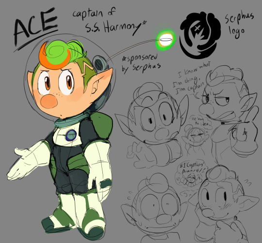
i had a whole crew of pikmin ocs who were a part of the S.S. Harmony, they were gonna be SUCH a nuisance to everyone they ran into...
i thought about making a rescue corps oc for fun. hrmm! maybe...

AHHH thank you!! i've seen a shocking number tags and asks from people saying that I'm apparently the reason they like Dingo now? and i have to say that is so mind boggling to me, because when i first played Pikmin 4 I didn't care about him at all!! he was a nothing sandwich to me... but then i drew him a few times... and started thinking... and then things went downhill and now i REALLY like him...

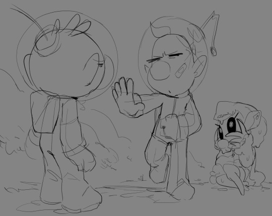
(referring to this post) i think dingo is better when he's withered
(referring to this comic) I HEAR YOU... I HEAR YOU... but if any tear at all would cause oxygen poisoning, i wouldn't be able to draw them all battered and cool :(
i imagine that there's a seal around the neck in case there's a breach in the suit's lining. so as long as their backpack (life-support) works and is connected to their helmets, then they can breathe✨
(referring to this post) Olimar would be horrified because he knows Louie, and if he sees that note there's only one thing it could mean! his coworker tried to eat pom!! if pom hasn't been outed as wraith and Olimar is questioning her, she'd just say Louie bit her and then refuse to answer any follow up questions 💖
Shepherd would be... concerned. she might think they have a weird fling going on and louie's talking about a kiss? she probably wouldn't realize Louie quite literally means he ate something from pom. oops!
that's a really good question... I'll be honest, with a lot of the "when and how did x happen" questions, there's not an official timeline or anything; the pom wraith au is sort of an umbrella with a bunch of different stories and what-ifs underneath it. although there was one story where louie does find out her secret!
louie and pom end up bridging their differences (with the help of olimar), and become good friends while pom is continuing the rescue effort. then there's a very unfortunate incident where pom and louie are away from the base and they're attacked... pom has to reveal herself to defend them and she accidentally hurts louie :(
its fine though, louie doesn't care what pom is. they're both freaks in his mind and that's all that really matters. he does end up having to defend pom from olimar (who's been made vindictive through his trauma with the plasm wraith) sometime later!! here's some older art:

sure
me too! they do NOT get along... louie's kinda pissed at her for chasing him around on PNF404 and beating him in dandori battles when he just wants to stay there and vibe. pom meanwhile doesn't understand him, he pisses her off too! she likes olimar a lot, and as an outsider it looks like louie doesn't appreciate the friendship olimar offers him. to someone who's trying to understand and participate in this whole friendship business, she thinks he's ungrateful and weird. they do not get along!! at the beginning at least...

AHHHH!!! THANK YOU!!! WAHH...🥺💖💖 i'm very glad you enjoy my silly little art style!! i want to make things very squishy so i appreciate that 💖

i don't think that man is going to live!
wait actually if you eat enough maybe you just turn into a wraith. that'd be scary! hopefully olimar's there to stop him
that's a fun thought! he would probably be able to sense that something is off about her. but he'd also probably just think "she's weird like me." honestly, the whole wraith thing doesn't really matter much to him -- the only thing it changes is that pom can now offer her tendrils as a skewer for his cooking at any time and location!

i think i'm gonna call her rose wraith!! and ohh, i didn't know that... i was just gonna call her rose wraith since she has a rose head. i'm creative i promise
(referring to this post i think) AHHH hehe... honestly, when Pom first learns about Dingo's fear of blood, she only tries to keep him from it because it's really annoying dealing with your coworker when they faint. he's like a sack of potatoes when he's knocked out. but yes, as they become actual friends pom will (subtly) do her best to keep blood away from dingo. it's fortunate she doesn't have any!
she might not get phobias, but she understands what its like to have a crippling fear, so she's empathetic!

THANK you. he has sunglasses. he's pretty cool

AHH THANK YOU... i like them a lot... 👉👈

let the marching pikmin give you the energy you need to practice🫡
#modpost#modask#pom wraith au#pingo#thank you for all the asks!!#i have more to get to so i'll make another post...
235 notes
·
View notes
Note
Hiii, do you have any tips for drafting out embroidery patterns? I've got one in mind, but drafting it out and color picking is so nerve-wracking!!
[Hi!!!! this got kinda really long so I'm gonna crop it under a read more. And I honestly don't have any real training/instruction in fiber arts so this is just how I do things, and probably others do them very differently!]
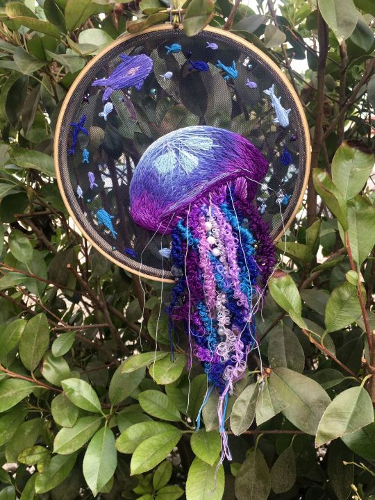
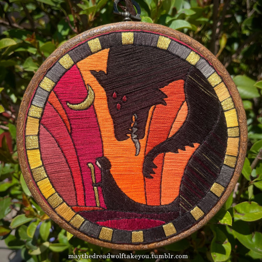
Haha so my fandom embroideries are VERY different from my non-fandom personal pieces in this respect. For non-fandom things i just kind of throw myself in like WAHOO FREEFORM LETS GO and go for a kind of messy colorful approach that ends up as things like this:
Versus my fandom stuff is way more structured and designed to fill space, be very precise, etc. So for those I do go in with a digital mock up of the design I make in photoshop, that I then color in, and then as my last step translate to thread colors.
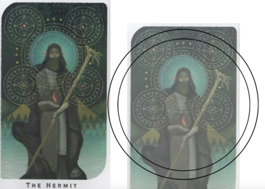
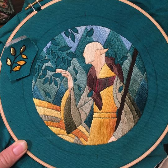
For my Dragon Age series. this has been because I'm specifically trying to mimic the stained-glass style of art you see in parts of the game like the dialogue wheels, some icons, windows, etc. The icons in particular were really easy to copy into embroidery because they already come in handy circles:

This is mostly because I have desperately wanted to pick up stained glass work as a hobby for like 6 years now. As in once every 3-6 months I put everything I'd need to start doing it into an online shopping cart and look at the price total and then sadly close the window because I just don't actually have any space I could do it in (I live in a 2bed apartment so i have no garage or yard or anywhere it wouldn't make everything else a mess or be a hazard). The day after one of those events I impulse bought and completed a floral embroidery kit from the craft store and kinda was like... ok, well, I did this once how hard can it be to use this medium to mimic the hobby I wish I could be doing? Plus, it's only like 60 cents per color! I can afford that! So I took the first design I wanted to do, the romance icon, and basically redrew it sloppily in photoshop, then freehand-copied the design onto fabric and stitched it the next day:

I learned a lot from this piece and changed my approach a little. Here you can see I tried shading in the parallel direction to my thread, which looked messy and added texture, so now I shade horizontally to my thread direction instead.
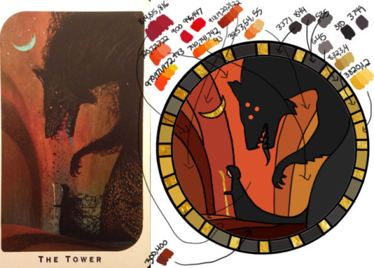
But it gave me a basic approach for turning the Tarot cards or DA Keep tiles (or any other art!) into embroidery patterns, which I couldn't copy as directly into this really smooth stained-glass style. There's a basic process I follow when doing these conversions that generally follows the same order, which I'll go through below.
STEP 1: SHAPES
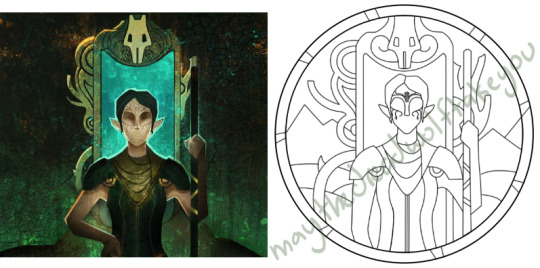
The first thing I do is pick the shape of my display frame which is usually a circle, but could be an oval or rectangle too, since I hang the finished pieces on my wall to have nice way to show them off. I like to fill the whole space so knowing the size and shape of what I want the finished project to look like is a good goal for me. Since I am doing fandom pieces I want to be recognizable, I do stick pretty close to the "original" character design/art, but you can absolutely change as much as you want and freehand draw your own interpretation instead. If you're doing original art just substitute the below composition notes with "sketch out roughly what you want it to look like". I personally do my pattern drafting digitally as I find it easier, but you can do this part by hand too.
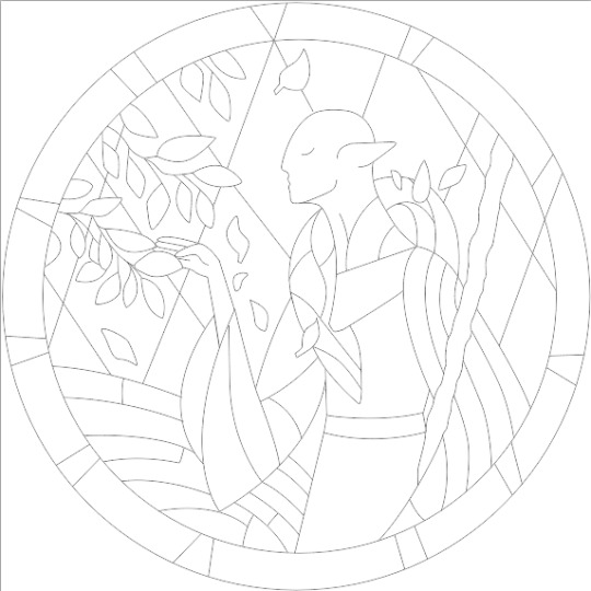
First, I keep the reference image I'm working off of open next to me while I work, and draw in the shape of my frame (here, a circle). If I'm adding in the little border to be fancy, I add a second inner circle. I keep these as their own top layer so I always know I'm working within the final "frame" and don't spend time designing any section that will fall outside it. Then I will take copies of the reference image and knock the layers down to 25-50% opacity, and start moving them around underneath the 'frame' layer until I like the way their positioning looks as a composition. Sometimes elements of a card I want to include don't all fit in, so I'll chop the section out and add an additional layer to throw in (like the background circle things in the Hermit design below). Or I'll just freehand things like adding much bigger diamonds behind Solas in my Hierophant design because I did NOT want to do 1000 tiny ones. Then once I'm satisfied with the general composition, I'll use the plain ol circular brush tool to trace out the major shapes of each element. I try to keep in mind that I can't go too small, and curvy lines are more difficult to fill in than straight ones. I usually do a rough messy version first, make it mostly transparent, and then a cleaner and more precise one over that.


(you can see parts of the rough one on the left and the fully 'cleaned up' on the right for the Hierophant design)
Now: depending on what you are doing next with the pattern, this might be where you stop and start coloring. If you are planning to freehand your design or just trace it onto fabric (or even print it onto fabric here), there's no need to do more than this kind of lineart! However, if you are working digitally and want to create a scalable vector so you can print it at different sizes, you can use the pen tool in photoshop to trace your design and make a "work path" of the lineart. However, another note: THIS PART IS VERY FRUSTRATING AND TEDIOUS BECAUSE THE PEN TOOL WAS CREATED BY THE DEVIL TO TORMENT US. It is so so so easy to accidentally delete a line or even the whole path and not notice later on. Ask me how I know 😭 Anyway I'm not going to include a pen tool tutorial because I don't even know how to use it well and have to google or watch videos every other time I try to use it. But if you can muddle through it gets you some really clean lines that eventually look like this:

With the work path selected, you can select the brush tool/size/color and use the "stroke path" option to create lineart of the vector. Then you can save this as a transparent png file for use at different sizes and for printing and it looks so nice and clean! one of the big benefits to this is that you get really fine lines that are easier to be precise with stitching on. This is extra perfect if you are printing the design directly onto your fabric (which you can do with an at-home inkjet printer for designs under 8inches wide, as long as you stick a piece of stabilizer on the back of your fabric and cut it down to printer sheet size--this is what I do and can make another post about that process if people want haha), or if you are printing onto transfer paper like you can buy at craft stores.
This is where I end the lineart for my designs. After I have this, I move on to the next phase, which is...
STEP 2: COLOR
For interpreting my designs into thread, I start by thinking of it as flat colors first. You can't "shade" as easily with threads as you can with things like paint or brushes in digital art (though you can A Little, which I will get into), so to start color planning I pick the "main" color each section will be in the piece.

For the existing icons this was simple--I kept the same sections as the original designs, so for each I just color picked or eyeballed the color in photoshop and colored it in (but you could do this on paper with pencils, markers, whatever as well--they don't need to match your threads exactly and usually won't, it's just to give you an easy reference to follow as you go). For the tarot cards which were more complicated in coloration, I just did my best and went with what looked good next to each other, even if it was a little off the original art. It will be off more later anyway when you have to pick threads so don't stress it too much honestly. I will often make layers with different color options and turn them on/off for direct comparison to try to determine what I think looks best as well, like below where I was debating between more blue/desaturated for the background or brighter colors.

I do wanna note I have regrets about the color selection, shapes, or shading in EVERY SINGLE ONE of my finished pieces. But no one else ever comments or probably even notices! One aspect of this hobby is just learning to be satisfied with what you've made and using what you learned to get closer to your preferences next time. I'm only going back and redoing some of my designs' colors because I want to make it easier for others to choose on the patterns I sell, more than I care for just for myself. Also since I'm doing this lineart/stained glass looking approach where I go over the distinct shapes with black thread at the end, it means I get these clear delineations between sections you might not necessarily have in your own pieces, and that's ok.
Ok right. Now while shading/coloring in detail is hard with thread, you CAN make whats essentially dithered gradients. "Dithering" in the concept of art means using 2 (or more) colors to give the impression of a third color, or to gently scale between the existing binary rather than a hard line. Think of it like blocky pixel art or gameboy game images. If you're doing needlepainting, you use really small stitches close together to get this effect, which translates to "smaller pixes"--if you look at the jellyfish in my first photos that's a very messy casual version of that. If you want a better example, I recommend looking at @ammocharis 's pieces like these in her pinned post, which are truly amazing! I simply do not have the patience myself 😂 For my stained glass style, I work only in very long straight stitches, so I can only shade in one direction and have to be a little more precise with it.
So for shading, I think about in each section which direction my threads might go. Then perpendicular to that direction I pick which side will be the light one and which the darker one. Sometimes I color this in on my pattern mockup, but sometimes I don't! Or I'll only do it for certain sections to make sure I don't forget. Like for my Tower design I only colored it as flats, and waited until I selected threads to decide how the shading would go. I am currently working on a smaller, simplified version of my Hierophant design and I did add shading digitally for that one just for fun. But it's not as important as having the flat color version you can use to quick-reference how you want your design to go while you're stitching. You might also notice I don't actually color my gold--I just throw in a stock image of gold foil for that layer so I can't confuse it with any of my yellow thread sections.


Here's a close up where you can kind of see what I mean by the "dithered" effect between colors--some are more obvious (like the red on the far left or middle orange) and others pretty subtle (dark grey to dark red on the wolf face):
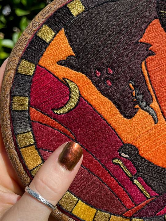
Now, while I use single layers of satin stitches for this, and just alternate thread colors increasing/decreasing as I go, you can accomplish the same thing with short overlapping stitches like with needlepainting, or with clusters of french knots, or whatever else. But in GENERAL you are going to be able to trick people into seeing gradients out of dithering best when you are using the same type of stitch for that whole area. So if I was using multiple stitch types like having french knots, daisy chains, ladder stitching or whatever else for some sections, I would keep those to contrasting areas/colors. A fantastic example of using different layered types of stitching to create more intricate color/texture in an embroidery would be these incredible tarot card depictions by @hattedhedgehog, which I like even better than my own embroideries. Here's his take on the Tower card as well for comparison to mine (I'm so in love with it!!!).
But anyway, at this phase, your design is actually still digital--the above is just to explain how it translates later in the process. The next step is...
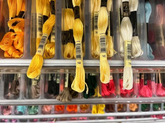
STEP 3: THREAD SELECTION
I will admit here I am not great at this part. I am constantly second guessing my thread colors, and can spend over an entire hour in the thread aisle at the craft store agonizing over choices. Really, I think this is just one of those things that takes practice and you get better at it over time. What I have had the best luck with is actually printing out a reference photo of my design/the original artwork and taking it with me. If you already have threads you can do this part at home too, but DMC alone has over 500 colors and I definitely don't even own half that so I like to torture myself by looking at them all together on the thread racks. Plus Anchor and Artiste and whatever other brands there are out there. One approach is to just sit there and pick out what you want for each section and line it all up together on top of your printout. Or in the case of my Tower I laid a bunch of options out on top of my template in the hoop to guess how they'd look in the frame.
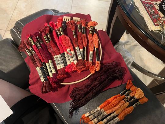
For me since I am also doing this dither shading thing, I also need 2-3 colors per sections depending on its size. Sometimes it's easy and the threads have a color just a little darker or lighter right next to them in the numerical lineup! Other times, there is no good match, or it looks too far away to shade nicely, or I want one to be a warmer or cooler tone than the other... which means a lot of standing and fretting to myself over it. I actually take a lot of photos at this stage because it can be easier to see how they will look in the end from a photo than in person to me? Idk why. Plus then after they get scrambled in my bag I remember wtf order I meant for them to go in later. But as long as you're not preventing other customers from shopping themselves, you can spend as long as you want staring at thread in the embroidery aisle and they won't kick you out unless it's closing time, so take your time.
Now, IN THEORY, you can sort of combine steps 2 and 3 by color-selecting from your threads and using that to color in the design. However I have tried this and it led to mixed success because the photoshop eyedropper brush simply isn't actually that exact (in my experience, it desaturates compared to what we actually see). And because then you have to have the threads on hand while you're coloring... which means you might buy ones you don't end up using if you don't like them. So I prefer to just use this as a refinement step where I pick threads based on the design colors, then will re-color the design a second time to match those threads more closely to be sure I like the effect.
I've even used this as a tool when I needed to adjust my color choices mid-project, by digitally coloring over over my WIP:
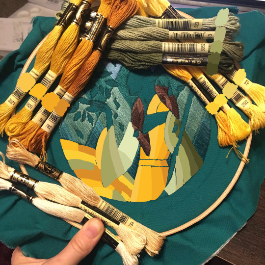
Or here's a design (but I haven't posted the finished piece yet bc it's a gift so shhh) I made with certain color tones initially, but after buying thread I re-did the color mockup to be more vibrant, because I liked those threads better in the store:


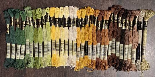
Once you have your thread, you can make yourself a little reference chart with the colors you intend noted on the sections you want them, like below:
(note: i didn't end up sticking to these colors because I ended up dying my own thread for several sections. And then forgot I made this entirely and picked new ones because I put the project down for a year between design and stitching. Sigh).
Or for my Solas pattern I did this in a really detailed way, which i am sorry but i have redacted because... i have it for sale now and don't wanna just give that away haha. But if you buy the pattern from my shop this is one of the files you'd get with it, for ease of reference. I do also include a text-only list of them as well.

Now I don't go to this much trouble for all my designs, just the ones I put up for sale (or plan to). You can also just make a text list of your color plans if you want. Though for fun I also have been using my scrap thread to make these little "color palette" keyrings for my finished pieces, so if I ever remake them or update their patterns I will know what the original colors were, plus I can compare what i used to other threads if I wanna change part of the design up. This step is absolutely not necessary and I'm just doing it because I'm selling the patterns now, but they are kinda fun to look at.
And don't forget.. if you start a section in a certain color and decide you don't like it, you can just cut the threads and pull them out! I did that with my original hierophant piece actually. I had an entirely different color for one row of diamonds i thought just clashed way too much with the others, so I used photoshop to paint over it with some alternate options until I found one I liked better. Then I cut away all the old threads and put in the new color. It can be a little harder to fill a piece the second time since the fabric will have stretched out a little, but as long as you're using a good stabilizer it usually doesn't move too much.
You can also just make test swatches on spare fabric to test before you add them to your real piece. I wish I'd done this for some color transitions that didn't end up looking the way I wanted, but I am simply too lazy most of the time. My exception is usually for metallic, satin, or sparkly threads, because I want to know how they feel while embroidering. But if you're really worried about a certain color or shade it's a good thing to remember you can just do.
SO yep, that's my general process for drafting patterns. I start with the shapes/design, then do my flat color version, then I pick my threads. Makes it sound easy and short when phrased like that :) But I can honestly spend 8-10 hours just on making the lineart and coloring it in. If I was better at art, probably this would be less, but I'm working with what I've got (not much) 😂 I think all aspects of this are also something that gets easier over time, but it will probably never look as bad as you worry when you start out. I think all my pieces look awkward and rough right up until I do the finishing steps and move them to the display frame sometimes.
I hope this was helpful and answered your questions!! Feel free to post/share your WIPs to ask for feedback or advice ever too :) I've only ever had people in the embroidery community on tumblr be encouraging and helpful to me, and I'm happy to answer any questions myself when I can or if parts of this were confusing
#ramblings#my stuff#my embroidery#embroidery#dragon age embroidery#calicostorms#oh god tumblr changed the alignment of all my images so theyre all huge now great#WELL I keep tryign to rearrage them to be on the same line and it is NOT working so. thats how they will look i geuss#this is gonna annoy me all night... thats what i get for expectign a Functional Website though
27 notes
·
View notes
Last Seen Blogs

arsenic11
trying very hard to be chill :)

gillian-anderson-fanclub
Gillian Anderson ✰ Джиллиан Андерсон
old-poptart
ooga boogaaaa 🧟♀️

anzuhirota-gallery
AnzuHirota's Gallery

ritas-rambles
Ramblings Of the Racer