#im thinking about how it could be redesigned though...
Explore tagged Tumblr posts
Visit Tumblr Blog
Explore Tumblr blogs with no restrictions, modern design and the best experience.
Last Seen Tumblr Blogs


Fun Fact
In Q3 of 2020, 31% of US users access the Tumblr app daily.
Text
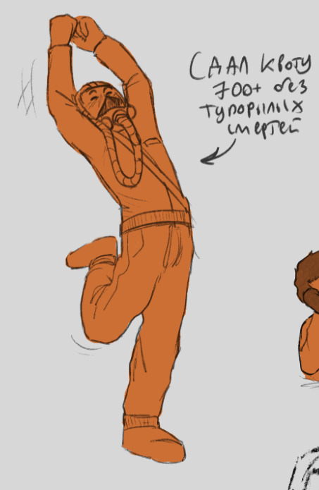
I miss the one-hit obliterator; it had such a cool premise, even if it looked a bit goofy, I think conceptually Link should be able to keep it and only pull it out for emergencies. Like a divine weapon that steals your health to become incomprehensibly powerful is so neat, Kass even mentions that Link looks ill when he's under its influence and also the title of 'the obliterator' is unquestionably sick as hell. I think it should not have been exploded and only used for a small section of DLC.
#just did that part of the dlc for my moms save file because it was stressing her tf out just to watch me do it lol#anyway i think link should look sickly and a little possessed when he's holding it#I think that would look cool#im thinking about how it could be redesigned though...#like as a colorful plasma weapon with the divine beasts as the hilt in an x formation#or as one of those branching swords#idk i think it could've been done differently and i love drawing weapons#but i have to do the mermay one before may is over so... onto the backburner it goes
13 notes
·
View notes
Text

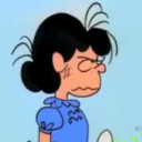
skye, chance, panya
#art tag#TRverse tag#skye tag#chance tag#panya tag#time for MORE OF THESE#all of them redesigns to different degrees#skye is the most faithful to her original Look#baby me might be able to recognize her#i didn't even look up chance's original design. nothing stood out about it. i dropped it entirely.#maybe i should go back and give him freckles. actually hang on post paused#okay im back i like the freckles#how the fuck did he even used to dress. i think i just threw tshirts on him#who knows#i like the brighter colors for him though the actual style may change#like. if i ever draw him again. he's a named character and one of the students in the dorms but he might lean more filler#mostly i wanted to draw him now b/c skye was a Former Serial Killer character in her original canon and chance was another.#so like. sure. stuff 'em in a set together.#panya i remember had medium/short purple hair and wore stripes. that's all i got#i think they were blue stripes but halloween colors felt right somehow#oh shit wait didn't they also wear a bandana around their neck. i could add that back in.#now now i'm done with this. but if they ever come up again.#panya's mostly in the story as Eva's Friend so they've got a chance for Background Imagery In My Mind at least
1 note
·
View note
Note
Could you tell us some lil fun facts about the imposter au, please? It’s genuinely so good I adore it-
i can try to loredump about it real quick!! just off the toppa my head..
just to establish what the au is again: imposter au is an au set in the idw-verse where scourge is a literal clone of sonic created by dr. starline using chaos energy in order to replace sonic! he began to think for himself too well for starline to control at some point and started seeing through his lies and manipulation, and he eventually broke away from him and went to the restoration to help him take starline down as revenge for selfishly creating him and bringing him into the world without an identity of his own..
some little tidbits ive thought up that i wanna explore in some way down the line (i could do fics or mini comics idk. depends on how i feel):
scourge keeps his true identity as a sonic clone a secret from the resistance for as long as he can, telling them his name is scourge from the start--the name he chose for himself after escaping starline--and he doesnt get his identity revealed until starline outs him during a confrontation where scourge helps the restoration bust into one of his bases but starline already knew they were coming so he made it look like scourge led them into a trap as part of a bigger plan :P
scourge and the restoration (convinced by amy) agree to help each other because they both share starline as a common enemy, but scourge is basically assigned a babysitter to watch his every move because they definitely dont feel like they can trust him after everything so far. that babysitter is silver!
silver 100% does not trust scourge for a while at first, but after spending more time with him and getting him to open up a bit more (accidentally..) and i guess kinda seeing him more as a person, they form a sorta bond that is kinda similar to sonic and tails ^^
scourge was meant as a sort of "prototype" for surge and kit! he didnt know this though until he's confronted by them later which is great bc he was already having issues with feeling like he didnt have a place in the world and then surge shows up and further hammers in that he was expendable from the start :P (this actually ties in with a mini comic ive been wanting to do for agesssss i hope im able to get it out eventually..)
shadow actually shows him how to better control his chaos energy and abilities that he's been kind of wild with up to that point! this comes in handy because the first time scourge fights surge she completely wipes the fucking floor with him, but after shadow helps him learn to use his power better (and he discovers the additional power of friendship), he's finally able to best her in battle ^^
over the course of his time with the restoration, scourge kinda learns how to be more of a person as it were :] he unintentionally makes friends and slowly realizes people actually care about him (and that he is able to be cared about in the first place), and eventually, once he finally finds security in his identity apart from being sonic's clone, he decides to stay with them as an ally!
and of course, yes, by the end of it all he does get his cool jacket and shades <3 just. probably a little redesigned lol
genuinely i have brainrot for this au occasionally. it flares up every now and then and i am obsessed w it... i love it a lot
58 notes
·
View notes
Text
(oh hey, we didnt have a long rant in a while, this wasnt supposed to be so long, as per usual with me ... i looked up some refs of the botw sonau ruins since i wanted to see how to combine its design to my sonau design in my totk rewrite- and this happened ... in case this sounds too angry or aggressive, its not meant like that, im not imploding about it, its just frustrating and annoying to me)
i have a problem with pretty much every inch of totk, and theres lots of big problems, and lots of things i find absolutely bafflingly stupid decisions-
one bafflingly weird and stupid decision to me, though there are way more important ones, is the nigh complete seperation from botw sonau (zonai) design aesthetic and totk sonau design aesthetic- its so .. weird and utterly unecessary it will never stop bothering me, its one that has relatively little impact in development but huge impact on the believability of the world
you have these ancient ruins of long gone people (that imo should have stayed a mystery, since that sense of lost history you cannot grasp makes both the world more believable and real feeling and will never let you stop thinking about, if you care about that kind of stuff at least- but i talked about that in length before im sure), but whats left leaves you still with a pretty clear design aesthetic, at least in the buildings that remain (the armor less so bc it really doesnt look like anythign ancient and just doesnt really fit together)
and then you make a game around them- but ... completely redesign their aesthetic .... in a rather big contrast too, for literally NO reason, there is not a single reason to do that, not even the excuse of trying to seperate the two games in their core aesthetic (like in the case of the shiekah- though that too is stupid bc ITS A DIRECT SEQUEL- IF YOU DONT WANT TO MAKE MORE OF THAT DESIGN THEME or leave it in for that matter THATS CORE TO THE PREVIOUS GAME DONT MAKE IT A DIRECT SEQUEL YOU DUM-) can do any work here, the botw sonau ruins werent many, it was background stuff, it wasnt a main theme and it didnt carry any importance in the game itself
like, botw sonau architecture was dark stone with red highlights (a color that usually fades rather quickly, imagine how strong it had to be once, maybe it was even more colorful at some point), bird, boar and dragon carvings, torches in bird shape, alot of swirls and round patterns among the blockier rough shapes, its was pretty detailed with patterns and pictures all over it --
totk sonau? blendingly white stone, all blocky shapes like unfinished blender models, not a swirl to be found, green hologram lights (or cold white light, i dont think there are any totk sonau torches, just those weird candle things- most light sources are lamps in impeccable shape all giving off that cold white light) and gold blocky script, theres rarely alot of detail on them, the pattern most often present beign a scale pattern ... one which i dont remember appearing anywhere on the botw sonau ruins in that way/that often, the only animal motif is a dragon head every now and then and it honestly feels tacked on, like they scrambled to try and connect the two in any way shape or form, white gold and green, theres nothing red anywhere, they neither connect to the botw sonau architecture nor to the one armor set- or its description, totk sonau have nothing to do with the phirone (faron) region (aside from that one quest that could have been placed anywhere), they are weirdly modern and techy, theres nothing "barbaric", not even their clothes are in any way connected (im so sick of all that gold tbh) even their magic isnt really .. magical, it all feels like science fiction type tech stuff (even though they said they wanted it to feel magical, couldnt be further from that tbh) the design of their magic symbols dont line up with their own building aesthetic or anyone elses even, its so messy
if you do the quest to get the fith sage its even more apparent- its the direct contrast between botw and totk sonau, its like a cut into a mod, theres no overlap, you cant argue that its bc the botw ruins where exposed to the elements and thats why the color differs- the totk sonau ruins left to rot both in the underground and in the literal sky are all just as if not more exposed, yet they all remain in rather good shape, all keeping the white and often completely colorless look, most damage being just some clumps of mold (?) or something having fallen over, and if they were protected so their color didnt change? wheres the red? the colors all should be in pristine shape then but its not bc there is no color
their excuse of "uuuh the hylians build those things in honor of the sonau!!" they tried to give doesnt work, like all other excuses, if they did why the hell does it look so different? sonau stuff was all over the place, you have the blueprints right there, WHY even build it? in those regions nonetheless that were of pretty little importance as far as we know, if this were the case they should be on the forgotten plateau or around hyrule castle but they are not- ALSO if the hylians built them for them .. so after they died out .. why then is there some weird mechanism with their actual aesthetic there in the ones in phirone? if they built it while they were still there ... why make it look so different?? ADDITIONALLY hyrules style of architecture is closer to the totk sonau one than the botw sonau so you cant even say it was influenced by their own style bc botws sonau is more different than both of them
it also adds to the .. feeling of something being off about the entire game (like it felt to me even shortly after starting to play), while i dont want to touch on the stupidness of how they handled totk shrines since thats another long rant i already did before, the sudden appearance of totk sonau style stuff literally everywhere (and the disappearance of anything not plot relevant shiekah bc it just went poof according to interviews and neither that nonsensical excuse nor anything in the game making sense- bc in the end they just wanted it gone and didnt care) would seem LESS weird if it was in the style of botw sonau, you know that style, its been here the whole time and more of it appearing would seem much less jarring, even if it doing so in completely non sensical ways- it would at least lessen that weirdness
i do not get why you would do that, did your designers have nothing to do so you made them make an entirely new aesthetic? did you not want your holy perfectly goodest god king to be anything but the most clean and kingly looking so you didnt even go for the barbaric idea from botw?(which i am not a fan of either) bc of course someone supposed to fill the role of perfect example of how to be good king of holy hyrule to zelda couldnt look "primitive"? was that given to the ancient hylians instead? with their designs going, to me, rather close to a mix of native american and ancient greek aesthetic (uh oh)- to contrast them to your superior alien that brought the idiots on earth technology since we didnt have enough tired tropes in here already? thought that design theme was more sellable? simply didnt care? (tbh, most likely in my eyes given the carelesness of the game to connect in any way to botw, much less in a meaningful one)
(those where written like questions but i dont expect anyone to answers for, it just sounds better)
#ganondoodles talks#ganondoodles rants#zelda#totk critical#long post#woah havent used those tags in a bit huh#not to scare off any new followers but yeah im ......... number one totk hater#apologies for that but also not at all#its the one game in the world i utterly hate okay i think its fine to have one piece of media to hate#its not my only personality trait either#its like ... complaining about it sometimes just feels good bc it gets it out of my head for a while#also i got a migraine again so im more prone to being annoyed lamo#lamo? lmao ....#i dont do much of this anymore and focus on the rewrite or other things instead but i can have a little rant sometime .. as a treat
63 notes
·
View notes
Text
Okay so u ppl like the horseformers it seems heres some more designs :D

swindle isn't even rlly in the story tbh but here he is. he should NOT have an insignia because this is moreso a civilian swindle. he's a strong and resiliant little feller but really probably shouldn't carry all that shit around on a battlefield. i just dont feel like going back and fixing it. also! combiner teams uhhh they exist! but i think maybe instead of combining they're just in a herd together like soulmates but its besties u know what im sayin. heavily taking from his wfc design (why he has cloven hooves... i love his silly pedes) since we don't get any CONFIRMED visuals on him in tfone..

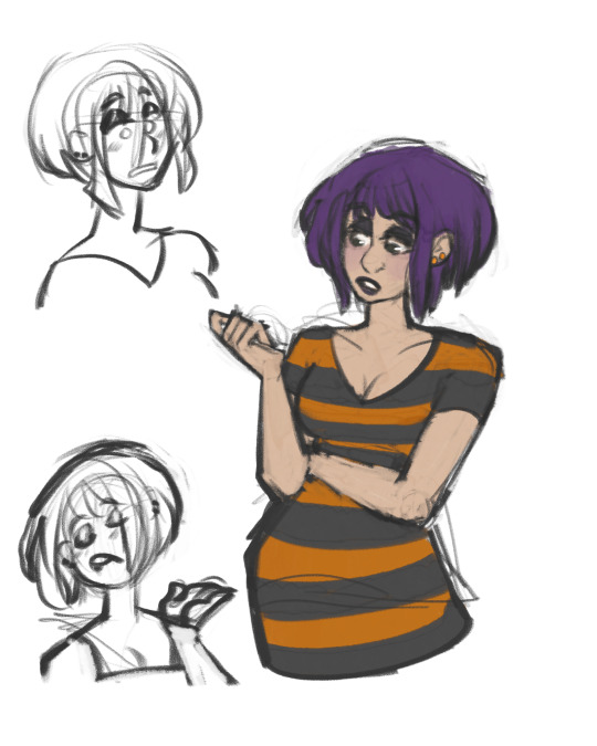
considering changing jet wings to "feather" wings? and making megatronus prime a griffin because the seekers are griffins.. The two chains across the chestplate btw are like a motif in his court. Megatron, Ironhide, and the high guard all fall under his court

and a d-16 :) dont mind why he looks so judgmental.. this was supposed to be a comic. giving arcee the side eye... glad i focused on the designs first i fucking love his shin guards he's so pretty
griffin seeker! specifically starscream here :) there is lore reason why they get a mane and organic wings btw
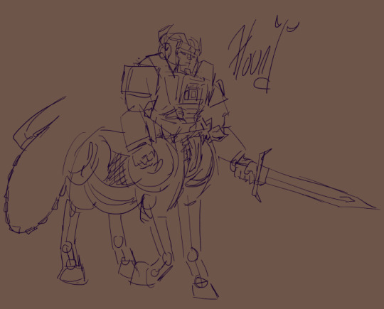
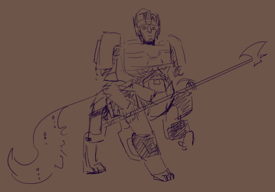
hound! under liege maximo's court, and like megatronus' chains, liege's court has a motif in the horns. again, no cogged form so i had to kinda blend his cogless one design with his idw and foc designs? i really like his funny chestplate in g1. forgot his insignia but he is a decepticon in this one he was one of the first teehee
still going between horse and lion for optimus. heres pax though with victory leo's body as his lower half :) he was born under alpha trion's court and also all the lions in the japanese continuity?? forgot his insignia but maybe this is also civilian era (drops my head on the table and screams) also theres no reason for him to have a halberd he doesn't use one i just.. put it in his hands.
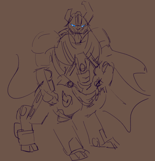
and alpha trion these last two admittedly arent great because i drew them just now when i woke up. way too top heavy but i'll fix it later when i start finalizing everyone's refs (this fool thinks he'll be interested long enough to finalize designs).. forgot hsi fucking autobot insignia too </3 also might give those under his court a cape which would mean i could give orion pax a cape too teehee.
ty everyone for encouraging me btw i was straight up about to redesign them to not be centaurs (cringe) but i kept them as centaurs and i'm figuring out how to make it work in the story (based)
#transformers#transformers one#tf swindle#alpha trion#tfone alpha trion#tfone#tf one#tfone megatron#tfone d-16#tfone megatronus prime#megatronus prime#orion pax#tfone orion pax#tfone optimus prime#tf optimus prime#optimus prime#transformers optimus#transformers hound#tf hound#starscream#tf starscream#tfone starscream#tfone hound#my art#maccadam
49 notes
·
View notes
Text
im gonna start praying
because this post is gonna be a mystery to me myself.
let me start with a simplier stuff
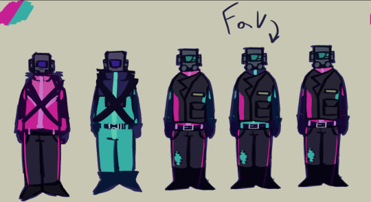
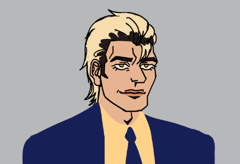
76 has gotten a redesign! the version that is labled as "fav" is now the canon variant. yippiee! love me some 76 content.
the first 2 are his costumes earlier in the timeline

-don't freak out seventy six don't freak out i have definetely read the room correctly it won't be creepy at all yeah he feels it too between the two of us right???? right. yeah. get your shit together c'mon seventy six do it
-well good job and he doesn't seem mad at me. good. i guess i should say something because it's geting real weird oh my god what are you even doing idiot

-hey, Bla-
-what about some wieners with beer
-...sounds good.
so uh. his relationship with Blake is rewriten now. they had a kind of toxic friendship in which Blake constantly created an emotional rollercoaster and just kind of made it all very confusing about the status of their relationship. and 76 being a young adult has believed that Blake saw something in him so uh. funny sutiation haha
okay so enough about familiar characters. let's get into
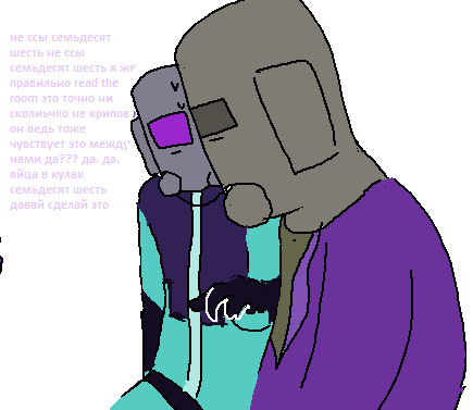
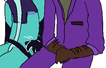
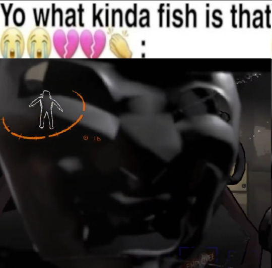
@idleray-av's Terrance and my Chet. oh my fucking god they've been screwing with my mind for the past two months. they've MURDERED all of my humanity do you UNDESTRAEGNF


so uh talknig about Chet. i don't know where to start. he's kind of an asshole that didn't do well in life because well he's got some sadistic and masochistic tendencies. so he went to work for the company and was DELIGHTED that he could murder some stuff. yeap. his favourite planet is Offense how did you guess
he kinda thinks of everyone and everything as of useless garbage and Terrans wasn't an exception in the begining

the only reason Chet didn't kill Terrance was because how PATHETIC he was. imagine seeing a TZP-addict masked huh. imagine the thrill a moron like Chet got from the opportunity to have some fun with a garbage of a creature.
but yeaah they kinda grew closer and Chet hated that in the begining. Being close to anybody emotionaly is not something he's used to

tbh roleplaying as him is one of the greatest joys ever. i get to act like an uninterested asshole. god i hate Chet
god i hate Terra
ns sorry i think i just sliced the word oops
i like this picture a lot. hate the mfs though

the small reference on the right is drawn by @idleray-av too

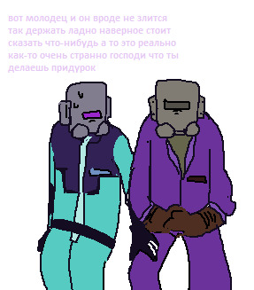
-i don't give a fuck


-it was fun to hide your cruiser


a moment from rp but changed to a better ending. trust me
let me complain about Terrance a bit because this is #vent now.
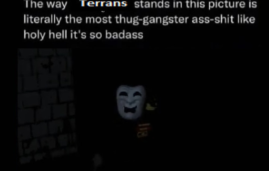

im sorry im gonna cry i hate teeranans.

eveyrbody go say "thank you Austin for creating Terrance" oh my GOD i hate terrans oh my fucking god i cannot do this anymore i hate this post
screw it im posting it right after the previous post
#kepch doodles#oc 76#oc blake harper#oc Chet#others ocs#others oc#oc#oc art#oc fanart#lethal company oc#lethal company#fanart#art#lethal company employee#lethal company mimic#lethal company masked#I CANNOT STAND THEEEEEEEM I CANNOT. I CNANTO BRHEATH
32 notes
·
View notes
Text
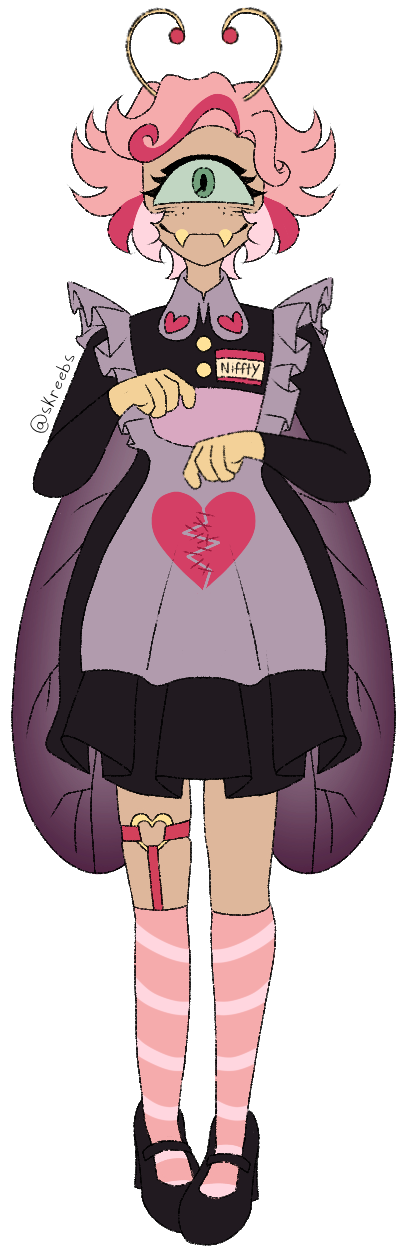
Niffty Redesign! (3/7)
Holy shit was not expecting to finish in the same day much less in like… under 4 hours??? IDK IM HAPPY WITH HER THOUGH!!!!
My biggest inspiration this time was lovebugs and specifically this LPS lovebug
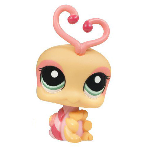
Yes im colour picking Niffty from a littlest pet shop. Who is gonna stop me? Hasbro? They don’t even own LPS anymore!
Im making Niffty a bit tanner because while I see it a lot in other fandoms, I don’t ever see tan asian people in the Hazbin fandom, tbh this place seems like its allergic to melanin in general. There’s also a lot of stigmatisation around POC women in Hazbin like I’ve mentioned before. I plan on having Niffty deal with a decent chunk of stuff later on, a lot of it relating to obessions and romance and learning how to manage feelings like that and keep relationships with other people.
I wanted her socks to be cute but also held up by a garter belt so you can gather she’s got something going on. People seem to stray away from the topic of Niffty and sex or romance because they see her as a child or have infantalised her in some way. Yes ik I talk about this all the time but like GOD it pisses me off.
Her maid dress is actually a much darker shade of hot pink to the point its not really hot pink anymore but it is I promise
Niffty’s main sins are lust, wrath, and envy, seeing as she is a lovebug and also her current backstory is killing a lover out of jealousy. The redder pink parts are supposed to be a mix of lust and wrath so I hope that comes across well?
The same thing can be said about her clothes and all that. With her dress and the reddish hearts it’s supposed to be like “in one sin there’s another” but idk how well I pulled it off. The stitched up heart is also supposed to represent her hopeful/eventually redemption. I’d like to give Niffty more character than just “crazy small lady” so I’ll be trying to balance being somewhat like that with also being a bit sensible. I think it definitely could be done but I have doubts Viv will do much with it.
It really sucks that the POC characters and especially women they just get reduced to one or two traits and then thats it. Viv already is terrible at writing women and I think writing Niffty for her is just boring because, again, she cannot write women. 90% of this rewrite is me saving the women/hj
There will be more indepth Niffty content from me eventually, as of now this is my backbone for her design and overall story. Btw I think her rubber gloves are cute but make really annoying squeaking sounds 24/7. No idea if I’ll pull off another fast design like this, but we shall see!🐐
#hazbin hotel#hazbin critical#hazbin hotel criticism#hazbin hotel critical#hazbin niffty#niffty hazbin hotel#niffty#hazbin nifty#nifty hazbin hotel#nifty#hazbin hotel rework#hazbin hotel rewrite#hazbin hotel redesign#hazbin rework#hazbin rewrite#hazbin redesign#my art#anti vivziepop#anti hazbin#anti hazbin hotel
153 notes
·
View notes
Text


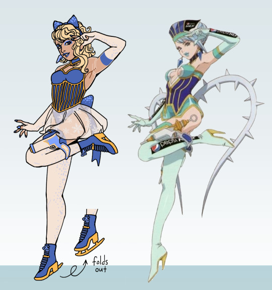
more of my tnb 80s redesigns, this time strongly referencing some relevant celebrities:) more under the cut
alright so, first of all, im doing my part in reducing the amount of pale blonde bright-eyed people in tnb. ryan is a bleach blonde instead of a natural blonde, and karina is blonde (and pale) only as blue rose.
my reasoning for ryan being a bottle blonde is that it fits his aesthetic and vibe and because he is designwise purposefully somewhere between kotetsu (dark hair) and barnaby (natural blonde), he can be the best of both worlds by having him bleach his hair and sometimes have dark roots
anyhow, karinas celebrity reference is brooke shields, who was a sensation as a child and was ridiculously sexualized from a very young age, so you can probably see how this relates to karina and her being blue rose (one of the more normal pictures of her from the 80s below)

also, i referenced some 80s madonna fits and ice skating outfits for her hero suit. like, you know, canonically she is supposed to be a sexy oldtimey nurse... her guns are syringes... shes wearing the nurse bonnet... yeah it doesnt make sense to me either.
tnb never really goes into karinas sexualization due to misogyny but i think about how it Could. i also think, to add to her celebrity disguise and general problems with society, is that she is not only wearing a blonde wig as blue rose but she wears blue contacts and her skin is paler from makeup (and partially from sheer fabric around her arms and legs, like how a real ice skater suit is a fullbody leotard with skin-colour parts).
as for her casual wear, i wanted her to be stylish but also purposefully modest with a lot of layering, to try to assert some control over her own image and body, and to establish a strong contrast between her and blue rose. i wanted to use her original designs colours and vibes but also i really like her turtleneck look as an idea (but the short jacket is a total flop.) and make it all into a cohesive piece.
ryans celebrity reference is young billy idol, with counterculture glam/punk rock energies! he is meant to be both stylish and a little eccentric with a distinct flair, and i feel like his canon design doesnt quite convey it as well as it could.

and ryan is supposed to, again, be somewhere between kotetsu and barnaby with his own special flair, and i designed kotetsu to have a really casual look and barnaby a really polished prep, so i wanted his fit to be both casual and polished, to look like its not too much effort but that clearly there was thought and time put into it.
ryans canon outfit is actually supposed to be a matching fashion piece, like wearing all louis vuitton, but that part doesnt totally come across (if this is the first time ur hearing this, its ok. im a ryan goldsmith folklorist)
i wanted to preserve some of the branding like the logo on his shirt while making his fashion style more coherent (to show he really does read fashion magazines and care about that stuff. canonically), because fashionable people tend to go for a certain Vibe.
i also like to think he can clean up fairly well and look like a totally different person if he really wanted to, like business-like, why not, though i think he generally is more into shocking people with his loud style.
also, like, in canon he disguises himself with a hat, which is funny, but imagine being barnaby and some weird blonde normie shows up at your door and it takes a moment to sink in its ryan without makeup. his inbuilt civilian disguise... (no makeup, cheaper sunglasses and like idk, jeans)
and i think its fun that karina and ryan are both making their own statements with their personal styles, karina with her subdued trendy look and ryan with his "please look at me in these tight leather pants". karinas makeup is nice and cute and ryans is making him the center of attention.
anyhow. this is the pic i drew the first pic on. both of them look like a total fucking mess in it ngl. its two weird bugs

#tiger and bunny#blue golden#karina lyle#ryan goldsmith#blue rose#golden ryan#tnb#gabriels tnb redesigns#gabriels doodles
28 notes
·
View notes
Text
Thoughts on Episode 10 (Jason Route)
Now that I am chill after losing both the illustration and the route and having to watch it somewhere else, I can give my thoughts on this episode! ^^
I wanted to upload this sooner but had no time to finish it lol
beware of spoilers under the cut!
Overall, my main feeling while playing and after finishing was that i was tremendously bored for 90% of the episode. And honestly this makes me sad! I really like filler episodes, i love silly little moments that don't add much to the story itself but that let you see the characters in different situations and learn other tidbits of information about them. For example, I liked going with Brune and Elanda to look for Thomas, seeing them in a situation where they're worried about a friend that could be in serious trouble and how they reacted differently to everything. It adds depth and personality (which these characters desperately need). I have seen Roy's route in this episode too and i liked how it added a bit to his characterization of this very sweet and caring man. I have to say that i also loved seeing Thomas' mom again and im soooo happy that she got a redesign! (even though I wish she looked like an actual 60 year old woman, girlie looks addicted to botox). I would have loved to see Iris too but we got a couple more characters from the MCL games so I'm happy with that. I like seeing that we are, indeed, in the same universe lol.
However, in my opinion anything good or interesting in the episode was completely overshadowed by the sheer *absurdity* of it all.
It's the same issue as always, the "plot" doesn't make sense and unintentionally the characters end up being depicted terribly and (usually) Devon and Thomas suffer the most.
Devon looks like an irresponsible boss that doesn't keep his empoyees in check and lets them do whatever they want even if it harms the job or other emoplyees's work. He postpones the meeting with the town hall (would he even be allowed to do that? i'm sure this would have negative impact on Devenementiel) to look for Thomas, which honestly that's a good friend move so respect for that... but that is a full grown adult, not a child, and you dont even know if something actually happened to him. I'm sorry but here the job should take priority, it makes no sense for everyone to halt their work day and waste time (with a relevant project !! with the town hall !! in their hands !!) cause someone didnt come in.
Sending everyone to just look around the city is... so stupid? how big is Amoris? 1km square? for them to think that they can wander around and magically find him? ????
Now the ending was just... what the actual fuck.
I don't think the writing team is truly aware of how badly Thomas is portrayed. First of all, if you have a motorbike accident that is serious enough to leave the morotbike destroyed like they describe it: you do not walk away like nothing happened! Talking from experience, even a relatively small accident can leave you badly injured. And from what is being described in the episode Thomas should have been hospitalized! It makes no sense. Second of all, who in their right damn mind leaves a demaged vehicle in the middle of the street and walks away to buy a replacement? That is a fine, that is a public safely issue, a general safety hazard and a traffic obstruction, who does that ?! "He is socially unaware!" no, that is being straight up stupid and a jerk.
Y'all are portraying Thomas as an egocentric, careless, and self centered guy that does not care for anything or anyone around him other than himself, an irresponsible person that does not care if his actions are detrimental to his job or colleagues. And if we put this together with episode 8 showing him as someone with zero respect for boundaries or privacy and that will stalk coworkers with no remorse, yeah you're making a wonderful love interest.
And this pisses me off, this feels out of character. Thomas is such a fun and interesting and cute love interest, he could have one of the best romance stories in the game, why would you paint him like this? I'm sure that the intention was a "haha silly guy doesn't understand!" moment but y'all definitely don't know how to write that.
And I don't think this is "reading too much into it", cause you can see it all in plain sight. And also, analyzing shit and "reading too much into something" is fun for me.
This episode could have been so fun. It could have been a silly misunderstanding with some days off that Thomas takes to go to a competition (maybe we initially could think that he had an accident because a similar bike had one that morning! or because he had been complaining about motor issues and being wary of a potential accident!). In his route we could go see him and he could tell us about his hobby, and in other routes we could do something related to the other character's interests. We could get to know more about them, its an appropiate episode topic for the place that we are in in the relationships and its just cute and fun.
But anyway, I unfortunately could not play Jason's route myself and I had to watch it somewhere else instead, which honestly pissed me the fuck off cause i can't afford a replay at all. The special scene was cute, I liked the tone and how Jason sounded like he was trying to play it cool with all the "heh i just did it to show im better" (i can see right through you silly man). Ngl im sad i dont have the scene to replay it u-u
Thomas' illustration was my favorite by far, both him and Ysaline look gorgeous fr fr
43 notes
·
View notes
Text

Children of Malice
Vierna, Maya, Briza Drizzt, Nalfein, Dinin
redraw/redesign of the Do'Urden family (probably will draw Malice, Zak and Rizzen next)
design notes/headcanons under the cut
i usually just have thoughts about the character as im designing so for a few things i was like 'oh thats a thought' also yes i know children of malice is a CR thing too haha
-i wasnt originally gonna draw 'lolths embrace' since these are just my own designs not visual dictionary but like....facial markings are really cool and so i ended up looking up various spider markings (i only used those specific realworld spider designs for dinin, who i also gave darker marking as opposed to lighter) and briza
-i also prefer the idea that its not actually anything to do with lolth, its just a genetic marking that some have and some don't. also the proximity to magic/faezress theory (?) was cool so there's not a huge meaning here; though i guess im guilty bcus I didnt give them to drizzt or vierna
-maybe zak doesnt have them and neither do his kids which sorta spurs on the heretic theory when its actually just a genetic thing that has no actual bearing on lolth's favour
-the women wear more gold and the men more silver, however the men can wear gold; they just have to be wary with standing out more than their sisters. any given day could be too much and cause for a beating
-nalfein likes jewelry and decorations/makeup and is more flashy when he's away at sorcere. his ears are marked up from training with/lessons from zak, who frequently would smack his ears when he was displeased with him. they blend in with lolth's embrace and he will cover them with makeup or a glamour on occasion. i just got the sense he was somewhat insecure given how he kept challenging zak and was written off by his family as mediocre. i think he liked being at sorcere more than at the house
-drizzt takes out his braids whenever he can. he likes his hair loose
-so does dinin. i think a lot of his appearance is meant to attract attention and establish his individuality
-i've always given vierna bangs and a ponytail BUT i love her braids in the comic so I gave her those too. her hair is unruly, like drizzts. she has a couple visible scars as opposed to her sisters because she trained more with zak. he felt bad about it but a bit relived when she didnt make a big deal out of getting a bit marked up. malice was angry
-maya has markings on her ears, so she doesnt pierce them. she wears makeup but forgets its there, and sleeps in it and wipes it off by accident. since her hair is shorter she decorates with little spider gold clips
-i will die on the headpiece hill. og drizzt oldman swag
-compared to my older art of them (first fanart of the series! i knew i was in when i drew all the siblings lol) i think i changed nalfein most to be less ...square....i hit him w a yassification beam and gave him eyebrows
#clare's art#legend of drizzt#dnd#dungeons and dragons#drow#drizzt do'urden#dinin do'urden#vierna do'urden#briza do'urden#maya do'urden#nalfein do'urden
236 notes
·
View notes
Text
Mk finished season 3 of dr and i think overall it was good
Personally you could not make me care about the bug main plot, that was so boring imo. The forbidden five where annoying and badly written imo and didnt even look cool (tho the bug guy was pretty cool I’ll admit) the main plot of the chaos dragon also felt really stupid. i wish ninjago stopped trying to make new “the first evil” enemies, it feels quite sloppy and i dont think anyone would care if you added onto your story ld stuff instead of trying to almost rewrite the lore. Even if you wanted to go this way you could have included the oni in the dragons lore instead of it just being some all evil dragon that came out of nowhere
despite my distaste for the main plot though i really like how they handled their characters this season. For example; the past two seasons i been really disappointed in sora. I loved her at first but the constant self hate and talking down about herself got on my nerves and i started to really not like her, this season changed that. I genuinely love what they did with her and arin and their relationship.
Speaking of arin i love his plot, him learning from ras was so good but i find it even better how he still stuck to his morals. Arin isnt a bad kid, he is just desperate and i love how they didnt just let him fall for ras 100%. I also like how he treats ras like how he treats others, another show of how kind hearted he really is.
Pixels back!! Im so happy for it, i dont mind her redesign im just not a fan of the sleeves but thats just me. I love how “my shayla” zane was until he found her, pixane is so good and im happy they are together and we get to see more pixel again. Morro i already stated in another post i was really happy with him… UNTIL THEY FUCKING KILLED HIM WHAT WAS THAT. unforgivable
Jay…. I dont hate it but he felt kinda weird i like the fact that they brought back how he is an inventor but god this emo phase. The voice changer made him seem more annoying than usual and those goggles where so ugly, THE HAIR REVEAL HAD ME REELING. HOWD THAT FIT UNDER HIS HAT?!? Im glad he is back and i hope they keep him annoying and mean but not emo emo cus im down for angst but idk how i feel about how the writers wrote him
Mk final though, main ninja are iconic, kai is the mvp vincent is a phenomenal actor and his jokes land the most imo. Wyldfire and rodi are so cute/gen i love how they draw selfies and i also love how ready kai was to beat his ass when he thought they broke up. Nya i kinda wish we got more of her but next half ik we will get more cus of the jay arc stuff. Lloyd is lloyd, you got to love him even if his one liners never land for me
Oh and cole just wasnt there :(
#midnight rants#ninjago spoilers#ninjago dragons rising#ninjago dr s3#lego ninjago#ninjago#jay walker#ninjago arin#ninjago sora#lloyd garmadon#nya smith#kai smith#pixel ninjago#zane julien#ninjago morro
21 notes
·
View notes
Text
Gonna be controversial real quick
Mikan Tsumiki is not as bad as the fandom makes her out to be and im tired of pretending she is
(Photo is meant to be silly I promise lmao)
Before I get interrogated or dismissed I'm talking more potential than anything but also the base character and how she was set up and what she could've been
My biggest problem is when people just go "she's just a fan service character!!!!!!" First off... ok she is the main fan service victim... you're not wrong... but I also think reducing her to just that is really reductive
First off I wanna talk about her design. I've seen a LOT of hate towards her design and it's not perfect but also I don't think its bad I'd argue it's a bit above average actually
Can't remember who said it and also it was a while ago but during a redesign they said she'd keep her hair up and away so she's not reminded of her trauma through bullying (Bullies cut her hair hence the uneven hair cuts), and personally I think that's a huge misread of her character. (If anyone knows who I'm referencing this is not shade or hate just the example I think is easiest to use for my character analysis!)
Mikan is an extreme case of a fawning abuse victim. She's been HEAVILY abused like to the point if she was a real person I'd actively go into shock hearing about it. I should also say though I don't think she's fawning in the traditional sense more so in the sense she can not stand to be ignored. Any attention is better than none. During her breakdown in trial 3 she's actively begging for forgiveness and in her panic talk action says "please draw on me" which just shows (to me at least) that shes willing to under go harassment and basically mental torture to keep people from disregarding her. I do think part of it though is traditional fawning.
Anyways that's all to say I don't think a character who has gone through so much and is such a people pleaser to the degree she's actively ASKING people to torment her would go through the trouble of hiding the results of it. Bandages could be a counter point though I'd count that as more of a health issue (probably cigarette burns or something she would give medical attention to since we do know she would treat herself which is how she became so good at nurse work). Out of anything I think Mikan has become almost oblivious to how awful the things she's gone through are since she can actively talk about it in a pretty casual way which is pretty standard for a lot of trauma Survivors although mikan is an extreme case. Which is to say i think she'd look at her burns, chopped hair, etc and kind of just see it like we'd see our closet and not really derive any pain from it (my personal take I do have other ideas but this is long and I can't write a thesis omg)
I don't have enough knowledge on nursing dress code in Japan to comment on her actual clothes though. In the states scrubs are common place but I know different countries have different standards.
A lot of redesigns I've seen also take great lengths to cover up any sort of skin mikan shows which 1. Yikes purity culture and 2. Showing skin is not inherently sexual. I mean. Danganronpa team are freaks for all the CG's they did of her and I get it makes sense for her character but they could've done something way more appropriate since the characters have the minds of when they were teens and it's all weird. (And when I say it makes sense for her character yeah she wants attention and whatever but they did not have to make it THAT. Have her like fall in a mop bucket or something that's embarrassing she's an SA victim too omfg)
Anyways moving on from her design I think dumbing her down to fanservice is also missing what she had the opportunity to be. Because on the face of it sure she went through trauma and is now a meek paranoid timid girl which is a weird trope men like, BUT it doesn't end there because she starts showing a different side to her trauma that I feel like a lot of trauma representation doesn't get to into which is the cycle of abuse. She actively started being a nurse because she wanted to have people rely on her and be weaker than her. She's fawning but underneath it all she wants in a way revenge.
I also think that her arc in trial 3 was an actually really good pitch too. Mikan gaining her memories back and remembering junko remnants blah blah puts the final piece of the puzzle down. Mikan goes from being a door mat and meek and timid with an underlying want to be in control and be the person people have to rely on and to have power over these people, to starting to get more comfortable and sociable, before she's hit by the motive and completely nose dives into her worst self who's exploitative, cruel, and obsessive.
I think she's also the best candidate for the plot point they were revealing (one for what im talking about this paragraph and also just cause it shows how insane their memories must be to turn mikan into her despaie self) because mikan doesn't care about despair to her it's all about love. She finally found someone who "loves her unconditionally" and accepts her and all her flaws etc which we know isn't true based on DR3 but in her brainwashed state it is true. She's hit her lowest point where she's completely succumbed to the abuse and taken it as love and doesn't just have the subconscious want to be in control but is actively feeding that desire (from the small clip we see of her remnant self vs seiko)
Now this isn't to say all of this is explored perfectly or written well enough to give mikan the "good character" badge. I love danganronpa, but i think it kinda writes itself into a corner with having such a large cast. Some characters just don't get the time they should. My take is mostly based on what I see the creators were trying to do with her. That's also why I say she's not just a fan service character because when I look at her in the game I see the building blocks they just didn't finish the project. I think if they really fleshed out the character regression it'd be genuinely really good. I mean danganronpa is not a masterpiece by any means so it's also like would kodaka/team danganronpa be able to write that? Who knows! I also saw what they were trying to do though
Mikan is also id say? Arguably one of the most controversial characters? Which I'm not invalidating she's my favorite danganronpa character but I also play the game and im like.... ok was that necessary. I also just get annoyed at people disregarding her character and calling her just fan service. Which ironically is what creators do with fan service characters lol (I'm also not gonna say anyone's wrong for being uncomfortable with the fanservice they wrote her into tho it makes me uncomfortable)
I think mikan is a really interesting character not as she's shown in game but as a character stufy of trauma which I think is why I'm so drawn to her and all that
Also her execution is ass and I hate it
Toodles!
#mikan tsumiki#sdr2 mikan#mikan#danganronpa#danganronpa mikan#sdr2#danganronpa sdr2#goodbye despair#discussion#analysis
30 notes
·
View notes
Text
I think the reason why I have a tendency to draw new things every few months is bc im Still relatively new to digital art and always wonder how much i improve in months
So mainly it's for my sake because im like Oh wait ive been drawing this character differently recently ?? And then Boom i take my eyes away for one second and theres redesigns


Plus instead of making clothing so complex i decided to go w my heart and base their clothes off of how id characterize them If That Makes Sense ,, i figure kallamars is the most obvious one for him being a tailor for example
Whereas shamura is the (main) undertaker , Leshy and Heket are the two missionary party leaders , and Narinders isnt very obvious but hes considered the gladiator :-3c
Lamb and Goat (Allure & Giuseppe) are the two leaders of the cult!! (Allure main leader, giuseppe co leader) As time went on and giuseppe settled in allure's cult , the name changed from just alluring lamb to the cult of death and wisdom ,,, Ram (aaliyah) isnt a very repetitive person that shows up at the cult since she has her own cult to run (within another universe , a war cult specifically) but she likes to show up every so often just to check in with her brother [giuseppe] :>c
And ofc how could i forget wilt lol- i forgot to add giuseppes cape here Woops ,, But its what giuseppes main clothes r in the other cult

And well i kinda wanted to incorporate the healed designs ,, another thing i wanted to add is that i constantly yap about them all being rlly strong (minus Narinder however- i believe he wouldn't be able to go on crusades or missionaries due to fibromyalgia) but its not too obvious either ,, id def say that leshy and allure are probably the strongest out of everyone else (leshy can summon roots from the ground and uses his body as an advantage, where as to allure their main weapon is withholding a heavy axe ,, but that shit is Not Easy so both leshy and allure are bottom heavy cuz of that- their back muscles and legs carry shit for the both of them HELPP)
Shamura isnt exactly a battlefield person though, they're probably the only bishop to not wanting to fight ?? Those days r Way behind them ,, Kallamar can make himself taller due to Allure reserving some strength left of the blue crown as apart of a compromise they were forced to make with kallamar to stay within the cult-
One thing in common Giuseppe and Narinder have is pacifism ,, narinder is a pacifist because of seeing allure so ill and he didnt actually like seeing people in pain- whereas Giuseppe is pacifist because hes a god of wisdom nd prefers to take things with a lighter approach. The complete opposites of those two are Allure and Aaliyah, theyre both aiming for any type of genocidal route because of what they went through for both the lamb and goat genocides occuring in different worlds of theirs ,, giuseppe doesnt rlly like crusading with allure for that reason 😭 even though aaliyah is Much worse since shes a god of war- its just the way that bloodthirst makes giuseppe incredibly uncomfortable,, to see such a shy lamb act the opposite on their crusades is Lowkey what terrifies him lmao-
Herrmm ,, heket and kallamar are pretty similiar in the stances of not rlly gaf-ing about fighting and crusades ,, heket is good at stealth and kallamar just aims right for the target because shi's just Impatient-
Okay thats all the yapping i have left in me fur now i also have these to share


The only decency here is giuseppe lmaooo 😭🙏
Oh one last thing is heights :-3

(Shamura is 4'7, Ram is 5'1, Lamb is 5'5, Narinder is 6'0, Goat is 6'1, Kallamar is 6'3, Heket is 6'6, and Leshy is 7'2 ,, Idk why i put sozo there but maybe bc its fur my own reference)
#sydneys doodles#cotl#cult of the lamb#mystic pursuit#regretful war & regretful wisdom#Teehee lyndwyrm leshy is Real#narinder#lamb#the lamb#goat#the goat#the ram#ram#shamura#kallamar#heket#leshy#mystic pursuit au refs
45 notes
·
View notes
Text
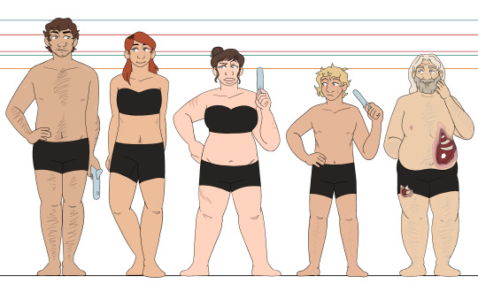
aaand here's deadlands! it didnt take seven months this time, who cheered?
i'll probably do another post grouping all of my line-ups together, but that's gonna wait for when i do the wyrdwood PCs as well :] more thorough design thoughts/smaller details will be under the cut, but im putting this here so that everybody has to know: their eye shines are all different card suits, except for nate, who gets J for the joker card :]
oxventurers guild | the hobby horses
unlike my other designs where i let everyone have individual colors/palettes, i tried to keep colors more consistent across these designs! the oxventurers guild has the fantasy element and theyre all very different, so the wide mishmash of colors are fine, and the hobby horses all have a lot of dark colors so that keeps them looking consistent together. but for these guys, i wanted a more consistent feel, so i tried my best to reuse colors between each design (especially between delacy and nate ^-^)
silas - ough. my boy. i wanted him to be broad with a strong build, and i hope i pulled that off :D i had so much trouble with his hat that i almost just didnt give him one, but eventually i decided it was better to just. give up and rock with it, even if he looks a bit like a mountie hbjgfjhd and he is wearing cowboy boots, theyre just tucked into his pants because he doesnt feel the need to flash them (looking at delacy, lol). he has spurs on his boots, even though he doesnt ride horses, because he likes the way they jangle <3
garnet - people really liked it when i gave garnet dark roots, so i have decided to always give her dark roots. i like how it looks hehehe and i also like to give her freckles!!! i think theyre cute!!! for the vest, i struggled for a while trying to capture the vibe of jane's vest, because its so so strange and specific in a way that makes it impossible for me to picture garnet without it. i'm pretty happy with where i landed with it, especially the pattern, since i've never tried to make a pattern like that before :3 i dont know why ive been loving patterns so much lately LOL but i will keep riding this wave and regret it later when drawing the designs again
edie - definitely the furthest departure from canon outfits, though still in the right wheelhouse. i just don't like drawing multiple layers of ruffled skirt. i didn't like how my sketches kept looking. i wanted to give her a skirt slit, especially after my friend reminded me about her thigh rifle holster. so today, i stared at a bunch of victorian ballgowns and party city costumes, and then completely redesigned her skirt before i lined these XD and i think it was worth it!! i love the layers and the way her rifle peeks out, and it meant i could show off more of her boots and give them a pretty design :]
delacy - my main thought going into drawing delacy was just. "i need to malnourish this boy" LMAO i refuse to believe that he is eating properly, i just know that he is not. otherwise, i mostly just stuck to the campaign art but scuffed up his clothes a bit. as implied on silas's notes, i very purposefully had his boots be Big. he's overcompensating a little bit :] also sorry i did not want to draw rooster so he just gets a generic handgun. i didnt feel like drawing complicated guns, and i wanted it to be a smaller handgun so that he could be poorly copying edie :') he has no trigger discipline but neither does edie so its fine
nate - that's just nate, baby!!! i think, canonically, he's meant to be a bit. emaciated. but i cant help but just picture him being a bigger guy, i think it fits his vibe better and its more fun for me to draw that way. i like having variety in body shapes, and garnet and delacy already have the rail thin thing down for this line-up. let my old man be fat !!! also. he has a weird nipple because he is transgender. heart emoji
#oxventure#oxventure deadlands#silas flint#garnet munro#edie valentine#delacy oxventure#nate janssen#'travis you forgot the buttons on a few of the shirts-' SHHH SHHHHHHHHHH DONT LOOK AT THAT IM TIRED#i just wanna move onto wyrdwood im done with these bhjgfhjdbghjd#i am super happy with how this came out though :3#okay time for sleep i have a friend visiting tomorrow and its past my bedtime
38 notes
·
View notes
Text

playing around with als demon form (and clothing). i rant a bit about character design under the cut
its a little difficult to land on a design i like for alastor in particular because its so difficult to make him look like "himself" if i dont include key elements like the very shape of his silhouette. characters like velvette or charlie can get by with hairstyle changes or clothing swaps but with alastor, i find that its nigh impossible to have him look like himself if i switch out any elements of his silhouette. that and his eyes, as theyre so expressive and basically show how he's feeling where his expression cant i feel like its impossible to change anything about his eyes and make him still feel like *alastor*, at least at my skill level (if i oneday manage to make a version of alastor with a mustache and not immediately after want to kill him and myself i will be able to die happy) also i could take out the monocle but tbh even though it doesnt fit his time period it honestly makes him look better so im making him keep that on.
when i go to redesign things and change them around to my liking theres only a few things i can do: ex, i have to focus more on adding details that should be there instead of trying to subtract ones that shouldn't be (and yeah that includes the wackass bob). i also kind of have my hands tied when it comes to like, trying to actually connect back to both his deer and radio motifs because i swear to god vivziepop was not fucking thinking when she decided to make him the radio demon. his base design has literally NOTHING to do with the radio so i have to be super careful with how i approach all of it when im trying to redesign and work details in otherwise i end up veering off course and creating a whole new guy.
so for this, theres a few things i tampered with. for one, the suit he's wearing is monochromatic and boring (and i wont take shit about it being animation because if lucifer can have 10000 tiny annoying details and his stupid fucking tophat then alastor should be able to wear more than one fucking colour with his clothes) so the first step is to get some more colour in there. red with gold trimmings fits well with the appearance of old cathedral radios, and as a plus, it makes him look like he has a more cohesive outfit (as well as one that fits for the job!) instead of a colour scheme and clothes combo nearly as horrific as denim on denim. and of course the radio in the chest can replace the atrocious attempt at complexity in his outfit (is that a harness or a shirt pattern? who knows, not me!) . pants are a lot simpler but i dont really want to tackle the lower body just yet because i dont really know how i want to approach the animalistic vs non animalistic features sort of thing for his design. oh and i put in a ribcage corset because its a banger idea and it makes him look better honestly
#got the green eyed alastor idea from someone on twitter and its honestly a really good look i think ill probably keep it#anyway it's frustrating to me that despite the fact that viv has a clear problem with same face and body syndrome her characters are so uni#uely recognizable that if i change even one detail too many it becomes obvious theres something 'off' about them#sigh. whatever. ill keep making his teeth yellower and yellower instead of doing anything to correct his haircut#🌗 art tag#hazbin hotel#hazbin alastor#alastor hazbin hotel
52 notes
·
View notes
Text
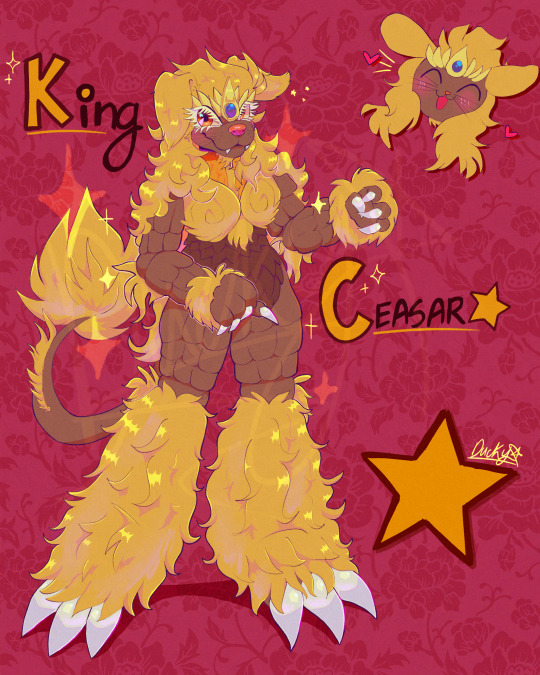
King Caesar Redesign (by me)
Im back to share something real quick. I managed to draw something while also dealing with some other things too. Im trying to keep a balance on that. But i did decide id attempt doing another redesign. More or less based on how i would see them (my own headcanons) those definitely influenced me making this & some design choices. Can’t really say what made me chose King Caesar as the next who’d be redesigned. But maybe could be the headcanons that occurred to me when thinking about them. I have a few of those though some of them are that
He might be the type to take the “king” title more seriously (more than the others & probably when its not supposed to be taken so seriously but of course he chooses to)
A very laid back chill type that loves to do nothing & sleep a lot (aka: being lazy)
Likes to keep well maintained his fur as much as possible. Might even be in a awful mood if his fur were to get messed up somehow (not to mention he spends a lot of time just taking care of it everyday)
Those are just a tiny bit of info to get to know him better. (That & VERY aware of appearances for sure). I for the most part have fun when doing these redesigns. Helps with visualizing my ideas for them better. If i decide to do another one later, id be excited who itd be next ^^
[he’s just a guy honestly lol]
#godzilla#godzilla fanart#kaiju#toho kaiju#kaiju art#redesign#fan design#king caesar#has both a laid back personality & one of constantly wanting to look his best at every given moment#he’s still very active but only when he chooses#he’s on ok terms with Godzilla but definitely not as close as friends or anything like that btw#who would you guys wanna see for a possible redesign in the future ^^#fanart#art#artists on tumblr
40 notes
·
View notes