#jQuery animation methods
Explore tagged Tumblr posts
Visit Tumblr Blog
Explore Tumblr blogs with no restrictions, modern design and the best experience.
Last Seen Tumblr Blogs


Fun Fact
Women make up for the other 50% of Tumblr’s audience.
Text
#jQuery animate#Animation effects jQuery#jQuery animation methods#jQuery easing options#jQuery animate examples
0 notes
Note
Hi again. So I meant like in a passage I write "Hello, world." and "Bye, world."
On a larger screen, I want them side by side so "Hello, world. Bye, world."
On smaller screens I would want:
Hello, world.
Bye, world.
I'm not sure how to make it different based on the size of the screen and I was wondering if I could put code in the passage to differentiate the two... Sorry if this sounds dumb I'm very new to coding ;-;
Hi again Anon,
I needed a bit to research first, because it's not something you can do with only the base SugarCube code. For what you are trying to achieve, you need some jQuery* (a special JavaScript library, included by default with SugarCube). *using jQuery is considered to be a pretty advanced method to handle display of element/animation.
You can check the height and width of a screen/browser window with:
$(window).height() $(window).width()
and to include it in a conditional statement:
<<if $(window).[type]() [operator] [value]>> text/code <</if>> <<if $(window).width() lte 320>>Hello world. Bye world. <<else>>Hello world. Bye World.<</if>>
The documentation has a whole list of operators, and the value should always be numerical (the pixel size).
Please note: While it is doable, I really really don't recommend messing with this, because there are so many sizes of screen, resolution, and orientations, whether it be mobile or just a browser window not being full screen, that it can take one unconventional device to mess how thing are displayed. And this sentiment is shared by the SG creator btw...
I would recommend instead wrapping the text in a div or a span, set a class, and change the size of the font/width of the element in smaller screen with the @ media rule, to force the second sentence to appear on a new line (at least for this example). See the Formating for Different Screen Size chapter in my SugarCube guide.
Or better yet: keep the formatting of the text consistent between screen sizes (either with the line break or on one line). Requires no extra coding, no extra testing, no despair, no hassle.
#coding support#coding with twine#sugarcube#jQuery is great#but requires a shit ton of testing to make sure it works the way you want to#sometimes the easy way is best
4 notes
·
View notes
Link
[ad_1] In this tutorial, Blake Lundquist walks us through two methods of creating the “moving-highlight” navigation pattern using only plain JavaScript and CSS. The first technique uses the getBoundingClientRect method to explicitly animate the border between navigation bar items when they are clicked. The second approach achieves the same functionality using the new View Transition API.I recently came across an old jQuery tutorial demonstrating a “moving highlight” navigation bar and decided the concept was due for a modern upgrade. With this pattern, the border around the active navigation item animates directly from one element to another as the user clicks on menu items. In 2025, we have much better tools to manipulate the DOM via vanilla JavaScript. New features like the View Transition API make progressive enhancement more easily achievable and handle a lot of the animation minutiae.(Large preview)In this tutorial, I will demonstrate two methods of creating the “moving highlight” navigation bar using plain JavaScript and CSS. The first example uses the getBoundingClientRect method to explicitly animate the border between navigation bar items when they are clicked. The second example achieves the same functionality using the new View Transition API.The Initial MarkupLet’s assume that we have a single-page application where content changes without the page being reloaded. The starting HTML and CSS are your standard navigation bar with an additional div element containing an id of #highlight. We give the first navigation item a class of .active.See the Pen [Moving Highlight Navbar Starting Markup [forked]]( by Blake Lundquist.See the Pen Moving Highlight Navbar Starting Markup [forked] by Blake Lundquist.For this version, we will position the #highlight element around the element with the .active class to create a border. We can utilize absolute positioning and animate the element across the navigation bar to create the desired effect. We’ll hide it off-screen initially by adding left: -200px and include transition styles for all properties so that any changes in the position and size of the element will happen gradually.#highlight z-index: 0; position: absolute; height: 100%; width: 100px; left: -200px; border: 2px solid green; box-sizing: border-box; transition: all 0.2s ease; Add A Boilerplate Event Handler For Click InteractionsWe want the highlight element to animate when a user changes the .active navigation item. Let’s add a click event handler to the nav element, then filter for events caused only by elements matching our desired selector. In this case, we only want to change the .active nav item if the user clicks on a link that does not already have the .active class.Initially, we can call console.log to ensure the handler fires only when expected:const navbar = document.querySelector('nav'); navbar.addEventListener('click', function (event) // return if the clicked element doesn't have the correct selector if (!event.target.matches('nav a:not(active)')) return; console.log('click'); ); Open your browser console and try clicking different items in the navigation bar. You should only see "click" being logged when you select a new item in the navigation bar.Now that we know our event handler is working on the correct elements let’s add code to move the .active class to the navigation item that was clicked. We can use the object passed into the event handler to find the element that initialized the event and give that element a class of .active after removing it from the previously active item.const navbar = document.querySelector('nav'); navbar.addEventListener('click', function (event) // return if the clicked element doesn't have the correct selector if (!event.target.matches('nav a:not(active)')) return; - console.log('click'); + document.querySelector('nav a.active').classList.remove('active'); + event.target.classList.add('active'); ); Our #highlight element needs to move across the navigation bar and position itself around the active item. Let’s write a function to calculate a new position and width. Since the #highlight selector has transition styles applied, it will move gradually when its position changes.Using getBoundingClientRect, we can get information about the position and size of an element. We calculate the width of the active navigation item and its offset from the left boundary of the parent element. Then, we assign styles to the highlight element so that its size and position match.// handler for moving the highlight const moveHighlight = () => const activeNavItem = document.querySelector('a.active'); const highlighterElement = document.querySelector('#highlight'); const width = activeNavItem.offsetWidth; const itemPos = activeNavItem.getBoundingClientRect(); const navbarPos = navbar.getBoundingClientRect() const relativePosX = itemPos.left - navbarPos.left; const styles = left: `$relativePosXpx`, width: `$widthpx`, ; Object.assign(highlighterElement.style, styles); Let’s call our new function when the click event fires:navbar.addEventListener('click', function (event) // return if the clicked element doesn't have the correct selector if (!event.target.matches('nav a:not(active)')) return; document.querySelector('nav a.active').classList.remove('active'); event.target.classList.add('active'); + moveHighlight(); ); Finally, let’s also call the function immediately so that the border moves behind our initial active item when the page first loads:// handler for moving the highlight const moveHighlight = () => // ... // display the highlight when the page loads moveHighlight(); Now, the border moves across the navigation bar when a new item is selected. Try clicking the different navigation links to animate the navigation bar.See the Pen [Moving Highlight Navbar [forked]]( by Blake Lundquist.See the Pen Moving Highlight Navbar [forked] by Blake Lundquist.That only took a few lines of vanilla JavaScript and could easily be extended to account for other interactions, like mouseover events. In the next section, we will explore refactoring this feature using the View Transition API.Using The View Transition APIThe View Transition API provides functionality to create animated transitions between website views. Under the hood, the API creates snapshots of “before” and “after” views and then handles transitioning between them. View transitions are useful for creating animations between documents, providing the native-app-like user experience featured in frameworks like Astro. However, the API also provides handlers meant for SPA-style applications. We will use it to reduce the JavaScript needed in our implementation and more easily create fallback functionality.For this approach, we no longer need a separate #highlight element. Instead, we can style the .active navigation item directly using pseudo-selectors and let the View Transition API handle the animation between the before-and-after UI states when a new navigation item is clicked.We’ll start by getting rid of the #highlight element and its associated CSS and replacing it with styles for the nav a::after pseudo-selector: - Home Services About Contact - #highlight - z-index: 0; - position: absolute; - height: 100%; - width: 0; - left: 0; - box-sizing: border-box; - transition: all 0.2s ease; - + nav a::after + content: " "; + position: absolute; + left: 0; + top: 0; + width: 100%; + height: 100%; + border: none; + box-sizing: border-box; + For the .active class, we include the view-transition-name property, thus unlocking the magic of the View Transition API. Once we trigger the view transition and change the location of the .active navigation item in the DOM, “before” and “after” snapshots will be taken, and the browser will animate the border across the bar. We’ll give our view transition the name of highlight, but we could theoretically give it any name.nav a.active::after border: 2px solid green; view-transition-name: highlight; Once we have a selector that contains a view-transition-name property, the only remaining step is to trigger the transition using the startViewTransition method and pass in a callback function.const navbar = document.querySelector('nav'); // Change the active nav item on click navbar.addEventListener('click', async function (event) if (!event.target.matches('nav a:not(.active)')) return; document.startViewTransition(() => document.querySelector('nav a.active').classList.remove('active'); event.target.classList.add('active'); ); ); Above is a revised version of the click handler. Instead of doing all the calculations for the size and position of the moving border ourselves, the View Transition API handles all of it for us. We only need to call document.startViewTransition and pass in a callback function to change the item that has the .active class!Adjusting The View TransitionAt this point, when clicking on a navigation link, you’ll notice that the transition works, but some strange sizing issues are visible.(Large preview)This sizing inconsistency is caused by aspect ratio changes during the course of the view transition. We won’t go into detail here, but Jake Archibald has a detailed explanation you can read for more information. In short, to ensure the height of the border stays uniform throughout the transition, we need to declare an explicit height for the ::view-transition-old and ::view-transition-new pseudo-selectors representing a static snapshot of the old and new view, respectively.::view-transition-old(highlight) height: 100%; ::view-transition-new(highlight) height: 100%; Let’s do some final refactoring to tidy up our code by moving the callback to a separate function and adding a fallback for when view transitions aren’t supported:const navbar = document.querySelector('nav'); // change the item that has the .active class applied const setActiveElement = (elem) => document.querySelector('nav a.active').classList.remove('active'); elem.classList.add('active'); // Start view transition and pass in a callback on click navbar.addEventListener('click', async function (event) if (!event.target.matches('nav a:not(.active)')) return; // Fallback for browsers that don't support View Transitions: if (!document.startViewTransition) setActiveElement(event.target); return; document.startViewTransition(() => setActiveElement(event.target)); ); Here’s our view transition-powered navigation bar! Observe the smooth transition when you click on the different links.See the Pen [Moving Highlight Navbar with View Transition [forked]]( by Blake Lundquist.See the Pen Moving Highlight Navbar with View Transition [forked] by Blake Lundquist.ConclusionAnimations and transitions between website UI states used to require many kilobytes of external libraries, along with verbose, confusing, and error-prone code, but vanilla JavaScript and CSS have since incorporated features to achieve native-app-like interactions without breaking the bank. We demonstrated this by implementing the “moving highlight” navigation pattern using two approaches: CSS transitions combined with the getBoundingClientRect() method and the View Transition API.Resources (gg, yk) [ad_2] Source link
0 notes
Text
How to Add JavaScript to WordPress: A Simple Guide for Beginners
JavaScript is a powerful scripting language meant for bringing life into WordPress websites. JavaScript takes away all the staticness from your site and turns it into an interesting user experience with interactive forms, content that updates dynamically, and smooth animations. The newbie in WordPress finds it quite confusing as a matter of fact: how, really, does one typically add JavaScript to a WordPress site?

Worry not- including JavaScript in WordPress is far from the daunting task one might think. In this very guide, we present several easy methods to include JavaScript on your site, some best practices to keep the exercise smooth, and a few tips on avoiding common pitfalls.
Why Add JavaScript to Your WordPress Site?
Before diving in, here is a quick review of the importance of adding JavaScript:
Enhances User Experience: Makes the website interactive and engaging.
Dynamic Content: Updates content without loading the page.
Form Validation: Validates forms and instantly gives feedback.
Animations: Adds sliders, fades, or even hover effects.
Third-party Tools: JavaScript is required by many third-party services such as chatbots or tracking software.
Now that you know why it’s beneficial, let’s see how you can add it to your WordPress site.
Method 1: Using the Theme Customizer (Small Scripts)
If your script is just one small snippet (say, a tracking code), then the WordPress customizer can be used.
+ Step 1: Go to Your WordPress Dashboard
Log in and navigate to Appearance > Customize.
+ Step 2: Find Additional CSS/JS or Additional Code
Some themes and plugins offer the ability to add small code snippets (labeled Custom JavaScript or something to that effect).
+ Step 3: Enter Your Script
Paste the JavaScript code between the <script></script> tags.
+ Step 4: Publish
Click Publish to make the changes live.
Example:
<script>
console.log("Hello, this is my custom JS!");
</script>
Note: This method works great for short snippets, but anything bigger will require the use of a child theme or plugin.
Method 2: Using the “Header and Footer” Plugin (Easiest for Non-Coders)
For the average user, installing this plugin is probably the easiest method.
Installation of Plugin
Navigate to Plugins > Add New and search for “Insert Headers and Footers.” Install and activate it.
Access to the Plugin
Navigate to Settings > Insert Headers and Footers.
Provide Your JavaScript
Insert your JavaScript code in the appropriate box (Header, Body, or Footer).
Save
Save, and you're done!
Advantages of this method:
- No editing is done in the theme files.
- Compatible with most themes.
- Safe and plugin-managed.
Method 3: Adding JS to a Child Theme (For More Control)
If you’re comfortable with a bit of coding, using the child theme is a serious way to introduce JavaScript.
Why would one want to use a child theme?
Because editing those core theme files directly can cause your site to break during a theme update. The child theme keeps your modifications out of harm’s way.
The steps are:
Create a Child Theme
If you haven't yet, create a child theme with a style.css file and a functions.php file.
Enqueue JavaScript
Open your child theme's functions.php and insert this code to enqueue your JavaScript file:
function my_custom_scripts() {
wp_enqueue_script('my-custom-js', get_stylesheet_directory_uri() . '/js/custom.js', array('jquery'), null, true);
}
add_action('wp_enqueue_scripts', 'my_custom_scripts');
What it does:
- tells WP to load your JavaScript file custom.js;
- and, of course, this file should lie in the /js/ folder inside your child theme.
Create the JavaScript File
Create a new file named custom.js in the /js/ folder inside your child theme.
Write Your JavaScript
Put in your code in custom.js.
document.addEventListener("DOMContentLoaded", function() {
console.log("Custom JavaScript loaded!");
Clear Cache
Clear your browser and site cache to see the changes.
Method 4: Through WordPress Block Editor (Individual Posts/Pages)
If you want the JavaScript only on a very particular page or post, you can add the code to it right in the Block Editor (Gutenberg).
Edit Your Page/Post
Open the page or post inside the editor.
Add a “Custom HTML” Block
Search for a block named "Custom HTML" and insert that.
Add Your Script
Paste the script inside the block.
<script>
alert("Hello! This is a page-specific script.");
</script>
Preview and Publish
Preview it to test and publish!
Best Practices for Adding JavaScript to WordPress
Enqueue Scripts Properly
Make use of wp_enqueue_script() instead of manually editing header.php or footer.php so that compatibility is ensured.
Avoid Inline Scripts for Large Code
Large inline scripts tend to slow down a website. Instead, keep the JavaScript in external files.
Use a Child Theme
Never keep directly editing the parent theme so that your changes don't get wiped out upon update.
Minify and Combine
Consider minifying JavaScript files and combining them for better performance (using plugins like Autoptimize).
Test Before Publishing
Tests should always be done for your JavaScript in a staging environment prior to pushing it to a live site.

Troubleshooting Common Issues
Script Not Loading?
Check to see if the file paths are indeed correct and if all caches have been cleared.
JavaScript Errors?
Look into your browser's console for any errors; trace those errors back and resolve them.
Plugin Conflicts?
Plugins might sometimes load conflicting scripts. Disable the plugins one at a time to find the culprits.
Adding JavaScript to the WordPress site is a complete game-changer in the high-level interactions and engagements of users. The path may be simple if you are using a simple plugin, editing a child theme, or injecting snippets into the editor. Key Takeaways for You:
• Plugins like Insert Headers and footers should be used for quick and easy jobs.
• Use a child theme and enqueue scripts for more involved use.
• Lastly, try to test always and follow the best performance and security practices.
This guide can help you kick-start some dynamic and interactive stuff for your WordPress site! Looking to make the switch? Talk to a Digital Marketing Company in Chandigarh that knows exactly how to take you from the street corner to the top of Google.
0 notes
Text
JQuery is open-source software which was first released in January 2006 and it is used most of the top visited websites. There are several books offered online which can be used by JQuery programmers to effectively use the features of the language and create plug-ins for JavaScript library. It is very easy to learn jQuery and to be proficient in the language using some of the acclaimed JQuery books. These books can also be used as a reference for advanced jQuery projects. Some of the most widely used JQuery books are listed below. (including free ebooks at the end of the post) JavaScript & jQuery: The Missing Manual The book provides a reference to create animated interactive WebPages having visual effects for web designing and collecting data from web pages in a simple way, which not only provides great information but saves a lot of our effort and time. Moreover, the language is so simple that even a nonprogrammer can understand it. The book teaches some basic ways of development in JavaScript and JQuery. The initial two parts are about JQuery and JavaScript. The third part informs about the images and navigations, and the fourth is on AJAX. In the end, the tips and tricks have been added. jQuery in Action, Second Edition The book provides expert guidance and minute details related to writing code of JQuery and JavaScript. At the outset, a number of downloadable learning tools have been added. This is a book for both novice and experienced programmers. However, there are certain JQuery codes for which the book does not provide a straightforward explanation. There are many variations of examples in AJAX. What’s more, the book helps to transverse HTML documents, render animations and handle events. jQuery Pocket Reference The book is a great help designed for the purpose of write-less-do-more. The chapters are backed by highly interesting explanations which serve as a great reference in JQuery development. It is a powerful reference book which eases the developmental process as well. It is portable, has a convenient size and provides an easy understanding of JQuery code. Additionally, it provides many examples to support the information. Developers who want to learn the language from the ground level can get all information from this book, as it provides all fundamental information related to jQuery. jQuery Cookbook: Solutions & Examples for jQuery Developers (Animal Guide) The book provides in-depth guidance about the rich web-fonts in an easy manner, providing learning patterns of 19 leading developers in jQuery to ensure convenient and high-performance UI development for websites, component development, and application development. The book is also a good source of information for newcomers in jQuery. Furthermore, it provides numerous examples which can be used for developmental purpose mainly for entry-level developers. The chapters start from the basics and cover large projects at the end. jQuery UI 1.8: The User Interface Library for jQuery The book has 14 chapters and 400 pages on JQuery. It gives easy methods of development and helps to speed up writing in JavaScript. It is highly helpful to people working in web development projects in JQuery, CSS, and JavaScript as it provides a step-by-step guide for the implementation and customization of library components, and the related resources to help the readers to learn a lot about JQuery. The example code in UI widgets section is backed by screenshots and visual help as well. The method given to design the user interface, questions related to the widgets and styling is highly revealing too. jQuery: Novice to Ninja The book offers downloadable source code from a website and there are around 200 examples of creating CSS, JS, and HTML codes. These are short files which provide information from the basics to cover the higher levels. The book offers you a few free chapters as well, providing a sneak peek into the contents of the book. +3 Bonus Free jQuery eBooks
Essential JavaScript And jQuery Design Patterns It is amazing that users can even get free books on JQuery. This book provides fantastic literature about the design pattern and it can be downloaded in ePub format and PDF formats; what’s more, the link provides you free download of this book! jQuery Fundamentals The book offers a number of chapters and code examples for the front-end developer. It gives an overview of jQuery JavaScript library and there are several code examples from basic to higher levels. There are eleven chapters in all and the examples help to strengthen your jQuery fundamentals. You can download the free book from the above link. Official jQuery Documentation The official jQuery documentation is a good starting point for you to learn jQuery. It also contains a lot of reference links for you to get to speed and find community help. The above-given list of JQuery books is some of the most widely used reference books which are designed with the purpose to make the lives of developers easy through a range of code examples and references. Check out More Recommended Books for reading Most Influential Software Books Agile Development Books Web Design Books Good HTML5 Books Recommended jQuery Books Awesome JavaScript Books
0 notes
Text
Web Development Course
In modern web development, technologies like PHP and MySQL form the backbone of dynamic websites, enabling server-side scripting and efficient database management. CodeIgniter, a lightweight PHP framework, simplifies development using the MVC (Model-View-Controller) structure, making code more organized and scalable. WordPress, built on PHP and MySQL, is a popular CMS used to create blogs, business sites, and e-commerce platforms with ease. On the front end, JavaScript enhances interactivity, while jQuery, a JavaScript library, streamlines common tasks such as event handling and animations. Ajax allows web pages to communicate with servers without reloading, enabling smooth, real-time user experiences. Finally, RESTful APIs are essential for connecting front-end interfaces with back-end services, using standard HTTP methods to exchange data efficiently between systems.
PHP and MySQL are commonly used together for building dynamic, data-driven websites. CodeIgniter is a fast PHP framework that uses the MVC pattern to streamline web development. WordPress, built on PHP and MySQL, is a widely-used CMS for creating customizable websites. On the front end, JavaScript adds interactivity, while jQuery simplifies JavaScript tasks. Ajax allows data to be fetched from the server without page reloads, improving user experience. RESTful APIs enable communication between the front end and back end using standard web protocols.
📞 Phone Number: +91 9511803947
📧 Email Address: [email protected]

0 notes
Text
Best Web Designing Institute In Delhi

Best Web Designing Institute In Delhi
web design has become a fundamental element of every business’s online presence. Whether it’s for creating a visually appealing website, ensuring smooth user navigation, or optimizing user experience, a well-designed website is essential for standing out in the crowded digital marketplace. As more businesses shift towards the digital world, the demand for skilled web designers continues to rise across various industries, from e-commerce to entertainment, education, and beyond.
In this thriving environment, it’s crucial for aspiring web designers to gain practical, up-to-date knowledge and hands-on experience to stay ahead of the competition. This is where Modulation Institute comes in. Established in 2021, Modulation Institute has quickly earned its reputation as one of the leading web designing institutes in Delhi, offering comprehensive and industry-oriented courses. With expert trainers, modern infrastructure, and a curriculum tailored to meet the demands of today’s digital economy, the institute provides a gateway for students to embark on a successful career in web design.
About Modulation Institute:
Modulation Institute, established in 2021, has quickly emerged as one of the most trusted names in web designing education in Delhi. The institute’s commitment to providing a high-quality learning experience is evident in its comprehensive web designing courses that cover everything from the fundamentals to advanced design techniques. With a focus on practical learning, students not only acquire theoretical knowledge but also gain valuable hands-on experience by working on real-time projects. This practical approach ensures that they are well-
At Modulation Institute, students benefit from the guidance of experienced faculty who bring years of industry expertise to the classroom. The trainers adopt modern teaching methods, combining interactive lessons with project-based learning, which helps foster a deep understanding of web design concepts and techniques.
Course Structure and Curriculum:
Modulation Institute offers a well-rounded, comprehensive web designing course that caters to both beginners and advanced learners. The curriculum is designed to take students from the foundational concepts to advanced web design techniques, ensuring they develop the skills necessary to excel in the dynamic digital world.
1. Basic to Advanced Web Designing Concepts:
Introduction to Web Design: Understanding the importance of web design in the digital age, basic web structures, and design principles.
HTML & CSS: Learning the building blocks of the web—how to create, structure, and style web pages.
JavaScript & jQuery: Introduction to interactivity and dynamic content, enhancing the user experience through scripts and animations.
Advanced Techniques: Responsive web design, multi-device compatibility, and modern web design practices such as mobile-first design and accessibility standards.
2. Tools and Software:
Students gain proficiency in the latest web design tools, enabling them to create visually appealing, functional, and user-friendly websites.
Adobe XD: Used for wireframing, prototyping, and designing user interfaces. Students will learn how to design and prototype web and mobile app layouts.
WordPress: Mastery of this popular content management system (CMS), enabling students to build and maintain websites without writing extensive code.
Photoshop: Learn how to use Adobe Photoshop for designing graphics, editing images, and creating web-friendly visuals.
Figma/Sketch: (Optional, depending on the course track) Advanced design tools that help create interactive prototypes and high-fidelity designs.
3. Responsive Web Design Techniques & UI/UX Principles:
Responsive Design: Students will learn how to design websites that automatically adapt to various screen sizes and devices, ensuring a seamless user experience on desktops, tablets, and smartphones.
UI/UX Principles: Focus on user interface (UI) and user experience (UX) design principles, ensuring that students design websites that are not only beautiful but also intuitive, functional, and user-friendly.
User journey mapping, wireframes, and prototypes.
Understanding user personas and designing with empathy for the end user.
4. Flexibility of the Course:
To accommodate the diverse needs of students, Modulation Institute offers flexible course options:
Full-time Course: An intensive, immersive learning experience designed for students who want to focus entirely on web design.
Part-time Course: Ideal for working professionals or students, this option allows learners to balance work/study commitments while pursuing their web design education.
Online Course: Flexible learning from anywhere, allowing students to access lessons, assignments, and live sessions remotely.
About Modulation Institute:
Founded in 2021, Modulation Institute has rapidly established itself as a premier destination for web design education in Delhi. The institute is committed to providing students with comprehensive, industry-relevant courses that cater to the growing demand for skilled web designers in today’s digital economy. By blending theoretical knowledge with practical, real-world experience, Modulation Institute ensures its students are not only equipped with technical skills but are also ready to take on real-world challenges in web development.
Practical Learning & Real-Time Projects:
At Modulation Institute, students are immersed in a hands-on learning environment that emphasizes practical training. The institute’s curriculum is designed to provide students with extensive opportunities to work on real-time projects, building portfolios that showcase their abilities to potential employers. This practical approach ensures that students are well-prepared to apply their skills in live, client-driven scenarios, making them highly competitive in the job market.
Industry-Relevant Skills:
The courses offered at Modulation Institute are meticulously designed to cover the latest trends and technologies in web design. Students learn key skills such as HTML, CSS, JavaScript, Adobe XD, WordPress, and responsive design techniques, all of which are essential in the ever-evolving digital landscape. Additionally, the institute integrates cutting-edge topics like UI/UX design principles, SEO, and digital marketing basics into its curriculum, ensuring graduates are well-rounded and industry-ready.
Experienced Faculty & Modern Teaching Methods:
Modulation Institute boasts a team of experienced instructors who are experts in their respective fields. They bring real-world experience to the classroom, bridging the gap between academic learning and practical application. The institute utilizes modern teaching methods that combine theoretical lessons with project-based learning, ensuring students not only grasp technical concepts but also develop a problem-solving mindset. This dynamic approach to teaching has helped students stay ahead in an increasingly competitive industry.
Hands-on Training & Projects:
At Modulation Institute, we strongly believe that the key to mastering web design is through practical, project-based learning. While theoretical knowledge forms the foundation, it’s the real-world experience that truly empowers students to develop their skills and stand out in the competitive job market. This philosophy is woven into every aspect of the institute's curriculum, ensuring that students are not just learning concepts but actively applying them in dynamic, real-world contexts.
Real-Time Projects to Build Strong Portfolios:
Students at Modulation Institute are given the opportunity to work on live projects that simulate real industry challenges. These projects allow students to put their learning into action, from designing websites to implementing responsive features, creating wireframes, and developing interactive elements. By working on real-time tasks, students not only build a strong portfolio but also gain invaluable problem-solving experience, giving them an edge when seeking employment after graduation.
Internship & Job Placement Support:
Modulation Institute recognizes that securing practical experience is essential for launching a successful career in web design. To bridge the gap between education and industry, the institute offers internship opportunities where students can work alongside professionals in established companies, gaining exposure to the latest design trends, tools, and workflows. These internships are invaluable in building professional networks and enhancing students' resumes.
In addition to internships, Modulation Institute provides job placement support to help students kickstart their careers after completing their courses. The institute has established strong connections with companies across various industries, ensuring students have access to job openings and placement opportunities. Career guidance, interview preparation, and portfolio reviews are also part of the placement support to ensure that students are fully prepared for the job market.
Student Testimonials & Success Stories:
One of the greatest strengths of Modulation Institute lies in the success and satisfaction of its students. Over the years, many learners from different backgrounds have completed the web designing course and gone on to build rewarding careers—whether in top companies, as freelancers, or as entrepreneurs. Their journeys are a true reflection of the institute’s commitment to delivering quality education and career-focused training.
Student Feedback:
Students consistently highlight the practical approach, supportive trainers, and career-oriented teaching style at Modulation Institute. Here’s what some of them had to say:
"Before joining Modulation Institute, I had no idea how websites were even built. The trainers made it so easy to learn, and I loved working on real projects. Now I work as a junior web designer at a digital agency in Gurgaon!"— Ritika Sharma, Web Designing Batch 2022
"Roshan Sir’s sessions on digital marketing really opened my eyes to how web design connects with business goals. Thanks to the internship support, I got placed right after completing the course!"— Amit Verma, Web & Digital Marketing Combo Course, 2023
Successful Alumni:
Many of Modulation Institute’s alumni are now working with leading companies across India, such as TCS, Wipro, Infosys, and local digital agencies in Delhi NCR. Others have chosen the freelance route, building their own brand as web design specialists for startups, influencers, and small businesses.
Priya Nanda, Class of 2021, is currently a UI/UX designer at a tech startup in Noida and has led projects for e-commerce brands.
Mohit Chauhan, after completing the course, began freelancing and now runs his own web design studio, working with clients from India, Canada, and the UK.
Sakshi Jain, who enrolled in the online batch, landed a remote position as a front-end developer for an international firm, thanks to her strong portfolio.
Conclusion:
Choosing the right institute for web designing is a crucial step toward building a successful career in the digital world. With the demand for creative, skilled web designers constantly growing, it's important to learn from a place that not only teaches the technical skills but also prepares you for real-world challenges through hands-on training, expert guidance, and career support.
Modulation Institute stands out as the best web designing institute in Delhi because of its comprehensive curriculum, experienced faculty, focus on live projects, and dedication to student success. Whether you’re a beginner or looking to upgrade your skills, the institute offers the right mix of knowledge, tools, and practical exposure to help you grow.
0 notes
Text
Spent like 2 days trying to figure out why my css/jquery wan't working. The only way to animate this thing was with css.
I used several different stackoverflow answers and jsfiddles and whatnot for reference. I swore to god i was doing the exact same thing they were doing.
The method was to set a size to go from and transition to with the classes and toggle those classes on click. I was using the flexgrow property for a flex box.
After looking at it again and inspecting it in the developer tools, I found out that the flex grow of that class was the same as the flex grow i was transitioning to.
So, I set the default to grow to the same size as the default.
Absolutely, 100% everything else was done right.
0 notes
Text
Best Class to learn web design Course in Ahmedabad

If you're looking for the best web design course in Ahmedabad, TCCI (Tririd Computer Coaching Institute) is a great option. They offer comprehensive courses that cover a wide range of topics in web design, including HTML, CSS, JavaScript, and frameworks like Bootstrap. Their courses are designed to cater to both beginners and those looking to enhance their existing skills. With experienced faculty and flexible timings, TCCI provides a strong foundation in web design, ensuring you gain practical knowledge and hands-on experience.
TCCI (Tririd Computer Coaching Institute) offers a well-structured web design course in Ahmedabad designed to equip students with the necessary skills to create modern, responsive, and user-friendly websites. Here’s an overview of what the course typically covers:
Course Modules:
HTML & HTML5:
Understanding the structure of a webpage
Semantic HTML
Forms and validation
Integrating multimedia (audio, video)
CSS & CSS3:
Styling web pages
CSS Box Model
Responsive design with Flexbox and Grid
CSS animations and transitions
JavaScript:
Introduction to JavaScript programming
DOM manipulation
Event handling
Basic JavaScript frameworks (like jQuery)
Bootstrap:
Overview of Bootstrap framework
Building responsive, mobile-first websites
Using Bootstrap components and utilities
Customizing Bootstrap with Sass
Web Design Principles:
Color theory, typography, and layout design
UX/UI design fundamentals
Designing for accessibility
Wireframing and prototyping
Project Work:
Hands-on projects to apply learned skills
Portfolio development
Real-world scenarios and problem-solving
Course Duration:
The duration can vary based on the course level (basic or advanced) and the student's pace, typically ranging from a few weeks to a few months.
Mode of Learning:
Classroom Training: In-person classes with direct interaction with the instructor.
Online Training: Flexible online sessions for remote learners.
Certification:
Upon successful completion, students receive a certificate from TCCI, which can enhance their job prospects in web design.
Why Choose TCCI?
Experienced faculty with industry knowledge.
Practical, hands-on learning approach.
Flexible class timings to suit students' schedules.
Comprehensive study material and resources.
Support in project work and portfolio development.
TCCI Computer classes provide the best training in all computer courses online and offline through different learning methods/media located in Bopal Ahmedabad and ISCON Ambli Road in Ahmedabad.
For More Information:
Call us @ +91 98256 18292
Visit us @ http://tccicomputercoaching.com/
#TCCI COMPUTER COACHING INSTITUTE#BEST COMPUTER CLASS IN ISCON-AMBLI ROAD AHMEDABAD#BEST COMPUTER CLASS IN BOPAL AHMEDABAD#BEST WEB DESIGN INSTITUTE IN SANAND AHMEDABAD#BEST JAVASCRIPT COMPUTER CLASS IN SHELA AHMEDABAD
0 notes
Text
The Evolution of Web Development: From HTML to AI-Powered Interfaces
Web development has experienced revolutionary changes over time, from straightforward HTML to mobile-compatible and AI driven intelligent interfaces of this day. The evolution process has been walking the bridge of raging waters of technology, which is now a way of communication with the internet and it has changed the way the digital world functions. Let's embark on a journey into the wonderful evolution of web design and discover how it has made web travels a smooth ride. Introduction Website development is a general term used to indicate the set of the procedures of creating and keeping the availability of websites and web applications. It enforces the capacity of a company and individuals in splitting their Online foundation, talking directly with their audience and stick out their entertaining content and products. The web development field is under constant modification as the internet keeps on changing and new technologies arise and also the users' criterion of the web. The First Years of Creative and Innovative Web Technology. In the early years of the Internet, 'writing website' was a slang either HTML (Hypertext Markup Language). The markup language was remarkable as it gave one the ability to use a very simple and yet powerful method of creating static webpages where users made unidirectional navigation of interrelated documents through hyperlinks. These absolutely static websites were the first ones from which the World Wide Web emerged open to everyone for the exchange of information not only in your country but also all over the world.
Advancements in Web Development The use of Cascading Style Sheets (CSS) and JavaScript drove the whole engineering of web design to a whole new level, providing web developers with the ability to refine the visual appearance and add complexity to web pages.CSS enabled designers to style HTML elements, while JavaScript empowered developers to add dynamic behavior to web pages, such as interactive forms and animated effects. The 1990s - saw them on the dynamic websites which were supported by the server-side scripting languages that were included PHP ASP and the like. Thus, there emerged the possibility of unique and personalized content delivery as well as the data processing. Frameworks and Libraries The advent of frameworks and libraries such as jQuery, AngularJS, and React further accelerated the pace of web development. These tools allowed developers to work with predefined assembling pieces and efficiently build apps which in their turn had remarkable rich content that delivered smooth user experience.Frameworks like React and Angular enabled developers to build complex web applications with ease, thanks to their component-based architecture and declarative syntax. Indeed, responsive design and mobile optimization are plus factors nowadays. With the proliferation of mobile devices, responsive design principles became paramount in web development. Instead of standalone devices the screens are becoming highly interactive, fully aware and responsive to various size and devices in order to provide consistent user experience.Responsive design techniques such as fluid grids, flexible images, and media queries became standard practices, enabling websites to scale gracefully from desktops to smartphones. Incorporation of AI in Web Construction In recent years, the integration of artificial intelligence (AI) has reshaped the landscape of web development. AI-enabled dialog interfaces, like a chatbox, digital assistant, or recommendation system, is playing a major role in boosting user experience as well as individualized user connections web sites and applications.These AI-driven technologies leverage machine learning algorithms to analyze user data, predict user behavior, and deliver tailored experiences in real-time.
AdxVenture is a leading web development company based in Dehradun, India, specializing in creating innovative and user-friendly web solutions. AdxVenture, a team of experienced web developers has paved the way for web development of the modern age. This web studio offers advanced websites and applications, superseding client expectations.From responsive designs to AI-powered interfaces, AdxVenture offers a comprehensive range of services tailored to meet the diverse needs of its clients. Given our emphasis on Quality, Innovation and Client Satisfaction, AdxVenture is faithfully committed to continuous dedication to the delivery of cutting edge web development services. Conclusion The evolution of web development has been characterized by continuous innovation and adaptation to emerging technologies. It is actually through the history of HTML to the AI-powered interfaces that web developers have traveled different roads to study the evolving cyber environment.As we look to the future, one thing remains certain – the field of web development will continue to evolve, driven by advancements in technology and the evolving needs of users.
Web Development Company in Dehradun
0 notes
Text
Web design that incorporates motion graphics and animation
In Web Design, Animation In web design, animation gives static pages movement and interest, which increases user engagement. Animation uses everything from subtle hover effects to smooth transitions to guide readers through the content and highlight important elements. Animation may improve navigation, bolster branding, and convey information when done properly. However, it's imperative to make sure that animations improve usability rather than worsen it. When implemented properly, animation enhances a website's visual appeal, usefulness, and capacity to captivate and stick in the minds of visitors.
Animation Types: GIFs, JavaScript, SVG, and CSS Web designers employ a variety of animation techniques to improve user experience and aesthetic appeal. Keyframe animations and seamless transitions are made possible using CSS animations right within the browser. JavaScript offers sophisticated control over animations, enabling intricate interactions with the help of frameworks like GSAP and jQuery. Vector images are used in SVG animations to create scalable, high-quality effects. GIFs are a simple way to add brief, recurring animations to webpages. Designers of Digital Marketing strategies select the best method based on performance factors and intended outcomes.

Using Micro Interactions to Improve UX By incorporating minor interactions throughout a website or application, micro interactions significantly improve user experience (UX). Instant feedback is provided by these little animations or feedback systems, which improves the intuitiveness and interest of interactions. Micro interactions help to increase usability by providing guidance to users, such as a loading animation that shows progress or a button that changes color when under hover. By paying attention to these little things, designers make the user experience more enjoyable and smooth, which increases user loyalty and retention.
Guidelines for Effective Animation Good animation guidelines guarantee that animations are intuitive, have definite functions, and are consistent in timing and action. They should be optimized for performance on all platforms and blend in with the brand's overall design look and identity. These rules aid designers in producing captivating animations that improve user experience and accomplish design objectives.
Using Motion Graphics to Establish Brand Identity Motion graphics provide a dynamic way to show brand identity in web design. To create a cohesive user experience, designers combine text, animated components, brand colors, and logos. Consistency across several platforms improves brand recognition, and integrating motion graphics with advertising builds emotional connections with viewers. When all is said and done, motion graphics are a powerful tool for strengthening brand identification online.
Increasing the Performance of Animation Optimizing animation performance is crucial in Web Design to provide smooth user experiences. This entails prioritizing simpler CSS animations over options that need a lot of resources, such JavaScript-based animations. Limiting the number of animations that run simultaneously and optimizing hardware acceleration are other essential steps. By using these strategies, designers may strike a balance between visual appeal and performance to build experiences that are fluid across devices and network conditions.
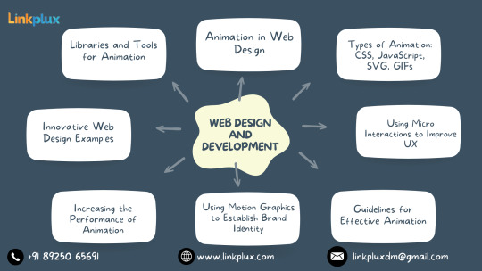
Innovative Web Design Examples Innovative methods for enthralling users are demonstrated in creative web design examples. With their unique navigation and engaging multimedia experiences, these websites push the envelope and establish new benchmarks for design brilliance. Designers may broaden their skill set and keep on top of the ever-changing web design scene by taking inspiration from these examples.
Animation Tools and Libraries Animation tools and libraries are essential resources for web designers aiming to create dynamic and engaging animations. These resources offer a variety of functionalities, from simple CSS animations to complex JavaScript animations. Popular libraries like GSAP and Anime.js provide pre-built animations and easy-to-use APIs, while design software such as Adobe After Effects allows for the creation of intricate animations. With these tools, designers can streamline their workflow, save time, and produce stunning animations that enhance the user experience.
Upcoming Developments in Web Animation Future developments in online animation will change how users interact with new tools and methods of design. Among these are WebGL and WebGPU-enabled 3D animations for enhanced realism and depth. Smooth and easy browsing is provided by motion-based navigation and micro interactions. AI-powered animations promise tailored experiences that raise user interest. All things considered, web animation has a lot of potential to produce engaging, dynamic, and user-focused digital experiences.
0 notes
Text
The Significance of jQuery in Website Development

jQuery is a versatile and powerful JavaScript library that has revolutionized website development. In this article, we'll explore why jQuery is essential for modern web development and how a jQuery Online Compiler can be a valuable tool for learning and using this library effectively.
1. Streamlined Interactivity
jQuery simplifies complex JavaScript operations, making it easier to add interactivity to web pages. With a concise syntax and a wealth of built-in functions, it's an excellent choice for enhancing user experiences with features like interactive forms, dynamic content, and animations.
2. Cross-Browser Compatibility
One of jQuery's most significant advantages is its ability to handle cross-browser compatibility issues. It abstracts the underlying differences between browsers, ensuring that your code works consistently across various platforms and versions. This saves developers time and headaches.
3. DOM Manipulation
jQuery excels in Document Object Model (DOM) manipulation. It allows developers to select, traverse, and manipulate elements in a web page effortlessly. This capability is essential for creating responsive and dynamic content without the need for complex code.
4. Animation and Effects
Creating engaging animations and effects in web development can be challenging, but jQuery simplifies this process. With its animation methods and effects, you can easily add transitions, slide-ins, fade-outs, and more to captivate your website visitors.
5. AJAX Functionality
jQuery offers robust AJAX functionality, allowing websites to retrieve and send data without requiring a full page refresh. This feature is vital for creating dynamic and responsive web applications, such as live chat, real-time updates, and interactive forms.
6. Extensive Plugin Ecosystem
The jQuery ecosystem is enriched by a vast library of plugins. These plugins extend the library's functionality and simplify the integration of features like image galleries, sliders, and interactive maps into your website. Leveraging plugins can save developers significant development time.
The Role of a jQuery Online Compiler
For those eager to master jQuery, a jQuery Online Compiler is a valuable resource. These online platforms provide an interactive coding environment that allows learners to experiment with jQuery code in real-time. They offer immediate feedback, making it easier to understand jQuery's concepts and troubleshoot issues promptly. jQuery Online Compilers are especially helpful for beginners, as they eliminate the need for complex setups and installations, making learning jQuery accessible and engaging.
Conclusion
jQuery's importance in website development is evident in its ability to simplify complex tasks, ensure cross-browser compatibility, and enhance user experiences through interactivity, animations, and AJAX functionality. With a rich ecosystem of plugins, jQuery allows developers to extend their websites' functionality with ease. For those embarking on a journey into jQuery, a jQuery Online Compiler can be a game-changer, offering a hands-on and interactive learning experience that facilitates the mastery of this essential library. In the ever-evolving world of web development, jQuery remains a crucial tool for creating dynamic and user-friendly websites.
0 notes
Text
Exploring jQuery: Your Gateway to Smooth Web Development on Webtutor.dev

In the vast landscape of web development, staying up-to-date with the latest technologies is essential to create dynamic and interactive websites. One such technology that has significantly influenced the way developers approach client-side scripting is jQuery. In this blog post, we'll delve into the world of jQuery, its features, benefits, and how it can make your web development journey smoother. And as a bonus, we'll introduce you to a fantastic learning resource, Webtutor.dev, that can help you master jQuery and other web development skills.
What is jQuery?
jQuery is a fast, small, and feature-rich JavaScript library that simplifies the process of adding interactivity and dynamism to web pages. It was created by John Resig in 2006 and has since become one of the most widely used libraries for front-end development. jQuery abstracts many complex tasks, allowing developers to achieve more with fewer lines of code.
Key Features of jQuery
DOM Manipulation: One of jQuery's primary strengths is its ability to manipulate the Document Object Model (DOM) effortlessly. Selecting, traversing, and modifying HTML elements becomes much more intuitive using jQuery's selectors and methods.
Event Handling: jQuery simplifies event handling by providing an easy-to-use interface to attach event listeners to elements. This allows developers to create interactive features like form validation, animations, and more, with less coding effort.
Ajax Support: Asynchronous requests are a fundamental part of modern web applications. jQuery's Ajax functions make it easier to fetch data from the server and update the web page without requiring a full refresh.
Animations and Effects: jQuery provides a range of built-in animation and effect functions that can be applied to elements. This includes fading, sliding, and other dynamic visual effects that enhance user experience.
Cross-browser Compatibility: One of jQuery's initial motivations was to simplify cross-browser scripting. It provides a consistent API across different browsers, making it easier to write code that works everywhere.
Plugin Ecosystem: jQuery boasts a massive collection of plugins created by the community, covering a wide range of functionalities. These plugins can save developers a considerable amount of time by providing pre-built solutions.
Read More: Step Up Your Coding Game with jQuery Benefits of Using jQuery
Saves Time: With its concise syntax and simplified APIs, jQuery reduces the time and effort required to accomplish common tasks.
Enhanced User Experience: jQuery's animations and interactive features can greatly improve the user experience of a website, making it more engaging and user-friendly.
Code Efficiency: Writing shorter, more readable code results in faster development cycles and easier maintenance.
Cross-browser Compatibility: jQuery takes care of browser-specific quirks, ensuring that your code works consistently across various browsers.
Community and Resources: Being one of the most widely adopted JavaScript libraries, jQuery has a massive community. This translates to a wealth of resources, tutorials, and plugins available for developers.
Learning jQuery with Webtutor.dev
If you're excited to learn jQuery and explore its capabilities, Webtutor.dev is your go-to resource. Webtutor.dev offers a comprehensive and interactive jQuery course that covers everything from the basics to advanced techniques. The course is designed to help you grasp concepts quickly through hands-on examples and practical projects.
Here's what you can expect from the Webtutor.dev jQuery course
Step-by-step Learning: The course takes you from the fundamentals of jQuery, gradually building your skills through real-world examples.
Interactive Coding: Interactive coding exercises ensure that you're actively engaged and can immediately apply what you've learned.
Projects: Practical projects help solidify your understanding and provide you with portfolio-worthy work to showcase your skills.
Supportive Community: Webtutor.dev fosters a community of learners where you can ask questions, share your progress, and learn from others.
Self-paced Learning: Learn at your own pace, fitting the course around your schedule.
Conclusion
jQuery remains a powerful tool in the toolkit of web developers, enabling them to create dynamic and interactive websites with ease. Its simplicity, cross-browser compatibility, and vibrant community make it an ideal choice for both beginners and experienced developers. To master jQuery and embark on an exciting web development journey, check out the jQuery course on Webtutor.dev and unlock your full potential as a web developer.
Visit Webtutor.dev to start your jQuery learning adventure today! Happy coding!
#JQuery Tutorials#Learn online JQuery#learn the basics of JQuery#Basics of JQuery Syntax#Learn Online jQuery#Online jQuery Tutorial#Introduction to jQuery
0 notes
Text

Most popular web design training institute in Kerala is TechnoMaster.in. We are providing, Professional Online & Offline Web Designing Courses and Advanced Level Web Design Courses in Kochi, Kerala, India. In our Web Design Courses, we cover, HTML, CSS and BOOTSTRAP in detail by Expert Web Professionals. In addition to Web design courses, we are providing, Web Development Courses for beginners and Expert level Web Development Courses in Kochi, Kerala, India. You can find the best Graphic Designing Courses, and WordPress Training Course in Kochi or Ernakulam, here. Our Web Development Courses includes detailed training in PHP, MySQL, JavaScript, JQuery etc. Expert level web professionals working in the industry, handles the classes for students. In short, this is what we are.
Best web design training in Kerala
We have started this educational institution, TechnoMaster.in, with an ample experience of more than 20+ years working in the Graphic and Web industry. In this long span of our career, we have developed more than 600 websites, hundreds of brouchers and other advertising materials, TV commercials, multimedia presentations, 3D walkthrough animations, Electronic Brouchers and so on.
We are proud to say that, we have supported or trained many leading designers and developers to attain their dream to be the part of this multi-million turnover industry. Now it’s you who, we are looking upon.
100% Placement is our target. For attaining it, quality education & systematic training methods are practiced in the Institute. We help our students to prepare resume, interview training and intimation of job vacancies are done on priority basis. We regularly check with companies for job vacancies and as per their requirement we send students for interviews & tests. Guidance given to our students to apply online for job vacancies.
0 notes
Text
A Time To Transition: Hybrid Apps And React Native?
Like musicians, all professionals must often question their methodologies and spot what other options exist. If one method become previously the pleasant, that doesn't suggest it stays the first-rate. Then again, many established strategies had been the exceptional for many years and might by no means be surpassed. The critical aspect is that one is willing to don't forget opportunity techniques and isn't too heavily biased toward the one they may be most familiar with. This evaluation is frequently more hard in software improvement because new frameworks and technology emerge nearly as quickly as they die off.
This article will observe this analysis to hybrid cell apps and present why I without a doubt agree with that React Native is in many ways a advanced solution for apps developed in 2017, although it introduces some temporary pains even as you’re getting acclimated. To do this, we are able to revisit why hybrid apps have been created initially and discover how we got to this point. Then, inside this context, we’ll talk how React Native stacks up and provide an explanation for why it is the better technique in maximum cases.
An Origin Story
It’s 2010. Your business enterprise has a pretty awesome net utility that uses jQuery (or, if you’re hip, some sort of
AngularJS
and React precursor like Mustache). You have a team of builders in a position in HTML, CSS and JavaScript. All of a sudden, cell apps are taking over. Everyone has one. Mobile apps are the new Tickle Me Elmo! You frantically studies a way to make your own mobile app and right away run into a host of issues. Your team is ill-prepared for the task. You don’t have Java or Objective-C developers. You can’t have the funds for to develop, check and deploy two separate apps! Not to worry. The
hybrid
cellular app is your silver bullet. This brilliant new technology lets in you to quick and (in theory) easily reuse what you have (code and builders) on your lustrous new cell app. So, you choose a framework (Cordova, PhoneGap, etc.) and get to work building or porting your first cellular app! For many organizations and builders, their troubles have been solved. They should now make their very own cellular apps.
Problems Arise
Ever due to the fact that 2010, developer forums, blogs and message boards were complete of arguments approximately the efficacy of hybrid apps. Despite the excellent promise and flexibility described within the preceding paragraphs, hybrid apps have had and maintain to face a completely actual collection of challenges and shortcomings. Here are a few of the maximum outstanding problems
USER-EXPERIENCE SHORTCOMINGS
Over the beyond couple of years, the bar for UX in cellular apps has risen dramatically. Most smartphone proprietors spend the majority in their time using most effective a handful of premiere apps. They, perhaps unfairly, count on any new app they try to be as polished as Facebook, MLB TV, YouTube and Uber. With this very high bar, it is quite difficult for hybrid apps to measure up. Issues such as sluggish or restrained animations, keyboard misbehavior and frequent lack of platform-precise gesture recognition all add as much as a clunkier experience, which makes hybrid apps second-magnificence citizens. Compounding this issue is hybrid apps’ reliance at the open-source community to write wrappers for local functionality. Here is a screenshot from an app that highlights all of these issues. This app was decided on from Ionic’s show off and was created with the aid of Morgan Stanley.
A few things ought to be at once apparent. This app has a totally low rating (2.5 stars). It does not look like a cell app and is simply a port of a cell internet app. Clear giveaways are the non-native segmented control, font size, textual content density and non-native tab bar. The app does no longer support features which can be greater effortlessly implemented when constructing natively. Most importantly, customers are noticing all of these troubles and are summarizing their feelings as “feels outdated.”
USER INTERFACE CHALLENGES
The majority of users are very short to uninstall or forget new apps. It is vital that your app makes a wonderful first impact and is without problems understood with the aid of customers. A large part of this is about looking sharp and being familiar. Hybrid apps can look awesome, but they do have a tendency to be greater platform-agnostic in their UI (if they appear to be a web app) or foreign (if they appear like an iOS app on Android or vice versa). Before even installing an app, many would-be clients will review photos within the app store. If those screenshots are unappealing or off-putting, the app won't be downloaded at all. Here is an instance app observed at the Ionic showcase. This app changed into created by Nationwide, and, as you could tell, each apps look just like a mobile-pleasant website, instead of a cellular app.
It is obvious from the app save reviews (3 stars on both platforms) that this app has numerous issues, however it is not likely that any app with this UI might attract new customers. It is clearly best used by existing customers who think they might as well strive it out.
PERFORMANCE ISSUES
The most not unusual complaints approximately hybrid apps cite terrible performance, insects and crashes. Of course, any app could have these troubles, however performance issues have long plagued hybrid apps. Additionally, hybrid apps frequently have less offline support, can take longer to open and perform worse in negative network conditions. Any developer has heard any of the above called a “bug” and has had their app publicly penalized as a result.
OVERALL LACK OF PREMIER APPS
All of these troubles have added up to the great majority of most useful apps being written natively. A quick have a look at each PhoneGap’s and Ionic’s showcases exhibit a considerable shortcoming in greatest apps. One of the most relatively touted hybrid apps is Untappd, which notwithstanding being a pretty brilliant platform, has fewer than 5 million downloads. This might appear like a massive number, however it puts it pretty a long way down the list of maximum used apps. Additionally, there may be a lengthy list of apps that have migrated from hybrid to local. That list includes Facebook, TripAdvisor, Uber, Instagram and many others. It would be quite challenging to find a listing of high-cease apps which have moved from local to hybrid.
FINAL DEFENCE OF HYBRID APPS
The point of this section isn't to be overly essential of hybrid apps, however to show that there's room for an alternative method. Hybrid apps were a very vital technology and have been used successfully in lots of cases. Returning to the Ionic showcase, there are numerous apps that look higher than those above. Baskin Robbins, Pacifica and Sworkit are three recent examples. For the past four years, hybrid app builders and frameworks were working tough to enhance their apps, and they have completed an admirable job. However, underlying troubles and foundational shortcomings remain, and ultimately better options can be determined if you’re constructing a new app in 2017.
Another Approach
Although it is clear that hybrid apps do no longer quite stack up towards native apps, their benefits and achievement can’t be ignored. They assist resolve very real resource, time and talents issues. If there was another method that solved these equal troubles, while additionally eliminating the shortcomings of hybrid apps, that could be extraordinarily appealing. React Native might just be the answer.
OVERVIEW AND ADVANTAGES
React Native is a cross-platform mobile application development framework that builds at the popular React web development framework. Like React, React Native is an open-source assignment maintained largely by builders at Facebook and Instagram. This framework is used to create Android and iOS applications with a shared JavaScript code base. When growing React Native apps, all of your commercial enterprise good judgment, API calls and kingdom management live in JavaScript. The UI elements and their styling are genericized to your code however are rendered because the native views. This allows you to get a high diploma of code reuse and now have a UI that follows each platform’s style guide and quality practices. React Native additionally permits you to write platform-particular code, common sense and styling as needed. This could be as easy as having platform-precise React components or as superior as using a platform-specific C library on your React Native app.
SIMILARITIES TO HYBRID APPS
Like hybrid app frameworks, React Native allows actual cross-platform development. Instagram has shared that it is seeing between eighty five and 99% code reuse for its React Native projects. Additionally, React Native is built using technologies (JavaScript and React) that many web developers will be acquainted with. In the event that a developer is not familiar with React, it's far a dramatically less complicated to analyze if they're acquainted with AngularJS, jQuery or vanilla JavaScript than it would be to examine Objective-C or Java. Additionally, debugging React Native apps need to additionally be a acquainted manner for web developers. This is because it's far exceptionally clean to use Chrome’s debugging gear to monitor a code’s behavior. Chrome tools can be used whilst viewing apps in an emulator or on actual devices. As an brought bonus, developers also can use more native debuggers as needed. The major takeaway here is that React Native solves the equal core issues that hybrid app frameworks set out to remedy.
FURTHER IMPROVEMENTS OVER HYBRID APPS
Unlike hybrid apps, React Native apps run natively, instead of within a web view. This means they are no longer confined to web-based UI factors, which may be slow when paired with a poor JavaScript interpreter. Because React Native renders local UI factors, apps right now feel more at home on the platform and make the user greater snug on first use. Additionally, developer fine of life can be progressed with React Native through more whole use of local tooling and profiling utilities. Below is screenshots of a recently launched React Native app. These pictures highlight the platform-unique interface that may be achieved the usage of this framework. As you may see, each app uses its local map and has callouts that follow every platform’s design guidelines. On Android, the callout is a card that rises from the lowest of the map. On iOS, the callout connects to the selected detail on the map. The equal actions may be completed in both apps, and most of the code is shared, but that extra bit of platform-particular polish definitely enables with standard usability. HOW Would YOU DO?
Below is a sample feature called React Native. It displays some specific elements that make up React Native apps and highlights areas web developers may already learn about. The code snippet is followed by a description of what each section does.
Much of the code above ought to be acquainted to maximum web developers. The massive majority of the code is simply JavaScript. Much of the rendering logic will be new, but the migration from HTML to the React Native views is quite straightforward. Additionally, the style attributes are quite similar to CSS. Let’s stroll through some of this code: kingdom
State is an object that carries the various values that our issue MovieList needs to function. When nation properties are changed (the usage of this.SetState()), the entire aspect is re-rendered to reflect the ones changes.
ComponentWillMount
ComponentWillMount is a lifestyle characteristic that is known as prior to the thing being rendered. Initial network requests often belong in this function.
_fetchMovies
This feature makes a community request that returns an array of film objects. After it successfully completes, it updates country with the listing and sets loading to false. Note that it also units the preliminary filteredMovies to the returned list.
_applyFilter
This function is referred to as by our imported SearchBar element. For simplicity’s sake, assume that this function is known as (probable with some debounce) every time the value typed into the SearchBar factor is changed. This feature just carries some JavaScript that filters the filteredMovies listing to the applicable titles.
_renderTitleRow
This function outputs the view for a unmarried movie. It incorporates a few good judgment to make sure our output is uniform and renders a basic text thing.
Render()
This function outputs the view for the factor. It conditionally renders the listing of movies or a loading animation, relying at the loading fee stored inside the kingdom object.
WHO IS DOING THIS?
When deciding a way to build your personal application, it is crucial to learn from enterprise leaders. Other companies and developers would possibly have wasted years and millions of dollars building applications, and in minutes you may research from their errors and experiences. Here is a quick list of some huge businesses which can be using React Native in their apps: Facebook, Instagram, Airbnb, Baidu, Discord, Tencent, Uber and Twitter. Many of those apps were at the beginning written using other approaches however have transitioned fully to React Native or are now the use of React Native to enhance their present local applications. There is a extraordinary fashion of many most appropriate apps being moved to React Native as a cross-platform solution, whereas, previously, most generation shifts amongst this magnificence of apps were from cross-platform to platform-specific. This change genuinely can’t be ignored.
What Should You Do Now?
Just just like the musician who has to rethink their method to progress, so too must cell app developers reconsider their technologies. It is vital that we make decisions based at the high-quality options to be had and no longer rely totally on our familiarities. Even if the transition is uncomfortable initially, our industry and the app marketplace are highly competitive and demand that we preserve to progress. React Native is a highly attractive generation that mixes the reusability and cost-effectiveness of hybrid apps with the polish and performance of local apps. It is seeing fast adoption and must be considered as an alternative technique for any upcoming would-be hybrid apps. As a reputed Software Solutions Developer we have expertise in providing dedicated remote and outsourced technical resources for software services at very nominal cost. Besides experts in full stacks We also build web solutions, mobile apps and work on system integration, performance enhancement, cloud migrations and big data analytics. Don’t hesitate to
get in touch with us!
1 note
·
View note
Text
Animate Box Shadows With jQuery - Shadow Animation
Shadow Animation is a simple to use jQuery shadow animation plugin that allows you to animate the shadows of any block element using jQuery's animate() method.
Demo
Download

3 notes
·
View notes