#lars müller publishers
Text
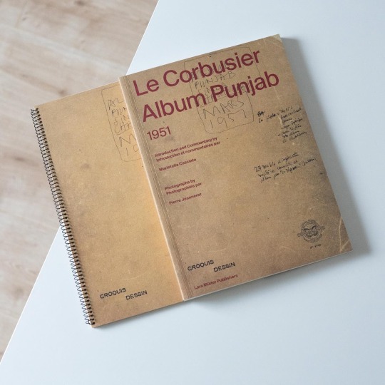

In 1951 Le Corbusier embarked on his „aventure indienne“, his Indian adventure, to design and build Chandigarh, the new capital of the Punjab. On February 20 he boarded a flight to Bombay together with his cousin Pierre Jeanneret and on February 23 the two met up with the players to be involved in the project: Maxwell Fry, engineer P.L. Varma as well as government official P.N. Thapar. At the time of their arrival at the designated site of the future capital it was a wide plain dotted with numerous villages and lush vegetation. On the same day Le Corbusier began writing and drawing in his so-called „Album Punjab“, a notebook he would continue to fill until March 11 and which today represents a unique source to the events, ideas and impressions preceding the design and construction of Chandigarh.
The „Album Punjab“ has recently been published for the first time as a facsimile by Lars Müller Publishers and is accompanied by a volume written by Maristella Casciato providing additional context to LC’s commission, unpublished photographs taken by Pierre Jeanneret during the trip and a day-by-day synopsis of the notebook.
Already the first entry tells of Corbusier’s deep interest in the existing landscape and villages, their scale and density as well as the daily life going on. At the same time he also began to search for solutions regarding water supply, spatial approaches to climate control and air circulation in residential buildings as well as he sketched a road system for the future capital and its capitol complex. Consecutively Le Corbusier elaborated these initial impressions and sketches and delved into the local architecture, the spatial organization of traditional houses and already drew planimetric arrangements of low-cost housing units. In terms of the overall urban planning LC harked back to the Pilot Plan he developed for Bogotá together with José Luis Sert. A pressing issue that also came up during the trip were construction costs and the high cost of wood which made the use of concrete even more appealing.
In view of the far-reaching insights the book provides it is an important addition to the literature on Le Corbusier and highly recommended!
#le corbusier#chandigarh#architectural drawings#architecture book#architectural history#book#modern architecture#lars müller publishers
55 notes
·
View notes
Text
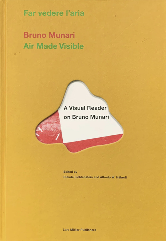
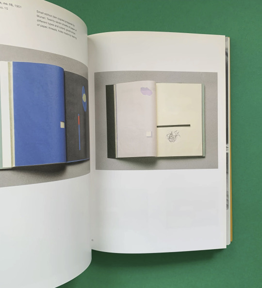
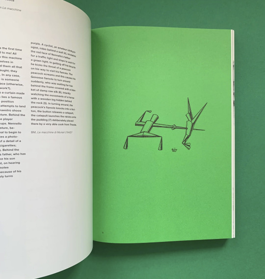
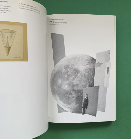
Far vedere l'aria / Air Made Visible. A Visual Reader on Bruno Munari, Edited by Claude Lichtenstein and Alfredo W. Häberli, Museum für Gestaltung Zürich, Lars Müller Publishers, Zürich, (1995-)2000 [The Print Arkive]


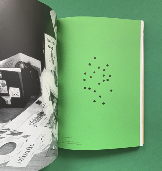
#graphic design#art#design#art education#book#cover#book cover#bruno munari#claude lichtenstein#alfredo w häberli#museum für gestaltung zürich#lars müller publishers#1990s#2000s
26 notes
·
View notes
Text
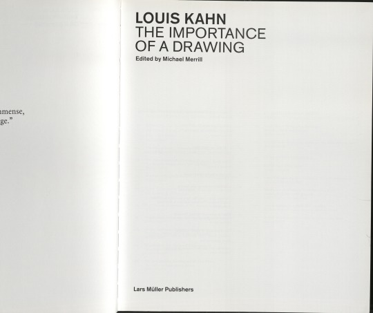
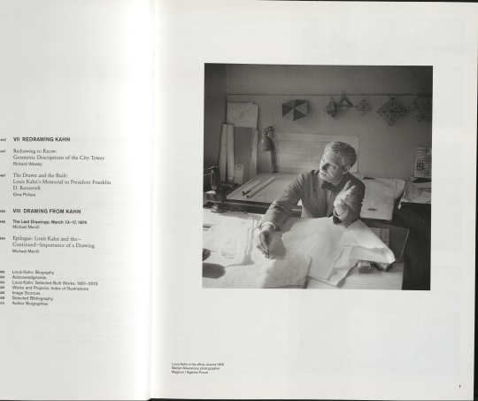

#louis kahn#the importance of a drawing#lars müller publishers#michael merill#zürich#2021#books#architecture#research#boring postcards 2#bauhaus schleef wittenau
1 note
·
View note
Text

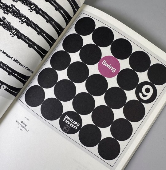

A5/02 Philips – Twen: Realism is the Score
Between 1961 and 1968, the magazine Twen produced a series of LP recordings in collaboration with the Philips record label. During this period, all editions of Twen were accompanied by LPs drawn from the realms of jazz, classical music, radio plays, world music, or pop. For the designs of his record covers, art director Willy Fleckhaus used Concrete Art by Karl Gerstner, Max Bill, and other dedicated graphic designers such as Heinz Edelmann and Günther Kieser. This now-forgotten series, comprising around 70 discs, is a masterful instance of the conjunction of music and graphic design. In collaboration with music archives and private collections, this rare series is reunited in its entirety and documented in this publication.
This volume is part of the Lars Müller A5 series, intended as a growing archive of graphic design. Each volume introduces outstanding personalities and important themes from the history of international graphic design, with numerous illustrations, essays, and interviews. A5 is a cooperation between the labor visuell in the design department at the Fachhochschule Düsseldorf and Lars Müller Publishers.
Designed by Jens Müller
Published by Lars Müller Publishers, 2009
In German and English
Softcover, 96 pages, full color, 5.75 × 8.25 inches
ISBN 978-3-03778-180-7
#graphic design and music#Twen magazine#graphic design books#Lars Muller A5#jazz and graphic design#mid-century modern graphic design#typography books#graphic design history
12 notes
·
View notes
Text
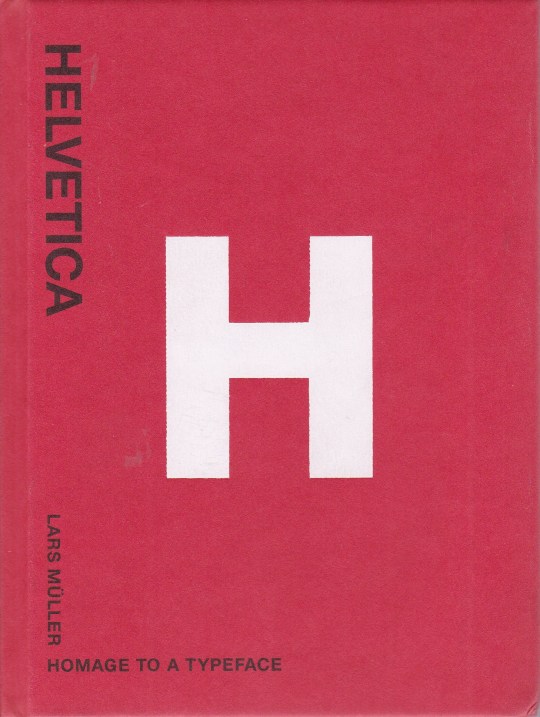


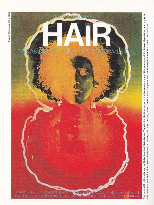
Helvetica
Homage to a Typeface
Lars Müller
Lars Müller Publishers, Zürich 2001, 128 pages, 400 illustrations, hardcover, 12,5 x 16,5 cm , ISBN 9783907044872
euro 40,00
email if you want to buy [email protected]
In 1957, Swiss typographer Max Miedinger came up with “Haas Grotesk”. Renamed Helvetica after 1960, this typeface went on to become one of the world’s most used typefaces ever. It embodies the myth of Sachlichkeit, propagated at the time by Swiss Typography. This book sings the praises of this shift-worker and solo entertainer of typefaces, of its forgotten creator and all those who have contributed to its unparalleled international march of triumph over the past forty years. The designs gathered together here in honour of Helvetica have been created by superb designers and anonymous amateurs from all over the world. They present a unique panoply of this icon of modern design. Superb applications are juxtaposed with an anonymous collection of ugly, ingenious, charming, and hair-raising samples of its use. Helvetica is not only the preferred typeface of leading professionals, it is also an all-time favourite among the multitude of codes and signals and commands that enliven urban life.
25/05/23
orders to: [email protected]
ordini a: [email protected]
twitter: fashionbooksmilano
instagram: fashionbooksmilano, designbooksmilano tumblr: fashionbooksmilano, designbooksmilano
#Helvetica#Typeface#Max Miedinger#modern design#swiss typography#design books#designbooksmilano#MC#fashionbooksmilano
30 notes
·
View notes
Photo
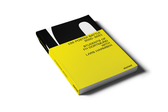
100 Poster Battle 2020–2021
By Students of FH Dortmund with Lars Harmsen
Sober: A poster should invite, communicate, inform, convince, and also provoke. If a viewer feels addressed, a poster is able to influence his or her decisions through text and images.
Emotional: @100posterbattle—one poster a day, for a hundred days, the span of a semester. Inspired by daily events from politics and current affairs. With the aim to try out different techniques, beyond the limits of conventional tools.
In the end, 100 days of poster design reads like a diary. 2020/21 was marked by the pandemic and its consequences for culture, society, and education, the scary tweets of Trump and the upcoming US-elections, BLM, LGBTQ, Söder and Laschet in the power struggle, pro-democracy demos in Thailand, climate goals 2030, and fun-facts like the height of Mt. Everest which has shrunk by 86 cm, the eruption of the Sakurajima volcano in Japan, Elon Musk has become the richest man in the world as well as the boom of sextoys …
100 Poster Battle 2020–2021
Editor: Dortmund University of Applied Sciences
Publisher: Slanted Publishers
Release: September 2021
Supervision and Text: Prof. Lars Harmsen
Design: Chantal Dübel, Claudia Müller, Nina Kallerhoff, Janine Krause, Saeeda Shabbir, Sinan Akpinar
Volume: 244 pages
Format: 180 × 240 mm
ISBN: 978-3-948440-29-9
Price: € 30.–
Buy
10 notes
·
View notes
Text


Common Module - AY23.24 CTS B Question 1:
CTS B class has given me many opportunities to interact with other aspects of Art, through searching, exchanging, practising and criticising activities as well as useful individual and group activities. , has helped me clearly understand myself and the paths and goals I want to aim for.
Week 9's activity let me know that I want to become someone who works with design and art through our group work photo. And when I do the manifesto group, I want it to not be a whiteboard with all the right things available and written in order. I think it's like a travel diary about understanding yourself and others with art. This is a colour palette that is combined and shared by each person. I do not wish to change anything about this palette. “MAKE smART choice in YOUR LIFE” Like weeks 1 and 3, we learned the connection between life and society and art, as well as how we see ourselves when creating.“NO RULE to CREATIVE” is like the way I studied and worked in week 9 without limits and constraints without denying the most basic knowledge of art principles. “Fine magic in the mess” I choose the things that popped into my head immediately when looking at our board. The cohesion and working together is the magic of teamwork, reminds me of the 3rd week of school when we It's really important to understand and communicate from different people to different pieces of the puzzle and create something new.Just as there are no rules for creativity and each person's characteristics are unique. To agree with a groupmate about "we design useful thing" when understanding that using people as the centre of society is the environment in which art develops like User-centred design prioritises the needs and experiences of the end user. This manifesto advocates empathy, usability testing, and iterative design. Above all, self-reflection.As well as I try to expand my research and learn more (Norman, Donald A. "The Design of Everyday Things." Basic Books, 2013.) and the last thing is Design manifesto that focuses on graphic design. It emphasises the importance of simplicity, order, and timelessness in design. Principles cover typography, grids, and colour, making it a valuable resource for graphic designers.The most basic things are always reminded a lot by teachers. However, I recommend reading Vignelli, Massimo. "The Vignelli Canon." Lars Müller Publishers, 2009.
I thought I was very good until I started to change. It seemed difficult, but learning, developing and absorbing in the CTSB class really formed new, strong and solid values within me. During the path where I was confused and confused with the question "Who am I, and what do I want to do?" I had the answer.
(456 words)
reference MLA style :
Deifel, Nicolas, et al. "The Open Design Definition." Open Design Alliance, 2010.
Gropius, Walter. "The Theory and Organization of the Bauhaus." Harvard University Press, 1968.
Vignelli, Massimo. "The Vignelli Canon." Lars Müller Publishers, 2009.
Norman, Donald A. "The Design of Everyday Things." Basic Books, 2013.
0 notes
Text
Research - Lars Muller
Lars Müller was born in Oslo in 1955 and has been based in Switzerland since 1963. After becoming a graphic designer in Zurich and extended travels, he started a one-year assistant position with designer Wim Crouwel in Amsterdam. Having founded his own studio, Integral Lars Müller, in Baden (Switzerland) in 1982, Müller established a long-lasting friendship with his mentor Josef Müller-Brockmann. In 1983, Müller published his first book and, as Lars Müller Publishers, has produced some 600 titles to date.
Lars Müller is a passionate educator and has taught at various universities in Switzerland, Europe, the USA and Japan. In 2019, he taught as the Regents’ Professor at UCLA. Müller frequently serves on academic and competition juries. From 2009 to 2015 he was a member of the jury of Design Preis Schweiz and from 2013 to 2015 the international president of AGI Alliance Graphique Internationale.
https://www.lars-mueller-publishers.com/publisher
At AGI open, they had a library with discounted books for those who attended. I purchased 2 of Lars' books called "WHY WE DESIGN" and "Swiss Design". These books have inspired me to learn more about Swiss design as it has been something I am interested in. The minimalistic style of Swiss design is something I have always been drawn to. The way that people are able to communicate in a very basic yet very visually appealing ad aesthetic way.
His books give deeper meanings behind Swiss design and design in general. They show images of successful posters while also explaining the purpose and process of the designs.
0 notes
Video
vimeo
Niklaus Troxler Motion Tribute — side by side from Dase Boogie on Vimeo.
A journey through Niklaus Troxler’s jazz posters universe.
A 56 posters motion tribute over almost 2 minutes.
All original poster designs belong to Niklaus Troxler.
I manually traced all of them in Illustrator and animated in After Effects.
Total ~175 hours of work including research, trace, font digging and animation.
Music and sound design - Soul Supreme
From Niklaus Troxler Poster Collection book (Lars Müller Publishers):
“Few contemporary designers devote themselves to the poster medium with such perseverance as Niklaus Troxler. His extensive oeuvre includes the design of CD, album, and book covers, logos, interior and exterior graphics, as well as free illustrative and artistic works. However, the poster-and especially the jazz poster-is his passion.
Troxler organized the first jazz concert in Willisau in 1966, and in 1975 he founded a festival there that has since brought established and lesser-known names in Swiss and international jazz to the stage on an annual basis. He directed the event and was responsible for the design of the concert and festival posters until 2009, at which time he handed both over to a younger generation.”
0 notes
Text


„A house is a work of art“ is one of three theses Kazuo Shinohara (1925-2006) formulated in the early 1960s which also entailed the conclusion that the expression of a modern townscape must be found in the beauty of chaos rather than harmony. Between these poles Shinohara sounded out the relationship between the house and the city, a process that resulted in truly fascinating and poetic constructions. Shinohara, who had started out studying mathematics before ultimately settling for architecture, first experimented with variations of the square as e.g. exemplified by his Umbrella House (recently reassembled on the Vitra Campus) before designing more complex structures. What connects all of Shinohara’s works is a decided lucidity that he at times even developed into a beautiful ephemerality.
In the third volume of their ongoing series of books dealing with Japanese postwar architects the Harvard GSD and Lars Müller Publishers in 2020 took to Shinohara and with „Kazuo Shinohara: Traversing the House and the City“ provide a thorough study of Shinohara’s domestic architecture.
Editor Seng Kuan identified four stylistic periods in Shinohara’s oeuvre that form the backbone of the book: each period is represented by several houses that are extensively documented in photos, drawings and plans. Around these theoretical excursions, interviews and archival material build up a second layer of insights into Shinohara’s work, most notably through photographs the architect took of buildings all around the world which demonstrate his deep interest in understanding architecture and urbanism way beyond Japan.
Shinohara’s curiosity and ingenuity actually traverses the entire book and which opens up a unique architectural cosmos. By virtue of the juxtaposition of theoretical elaborations, interviews, built and unbuilt works as well as material from Shinohara’s archive the book is an exciting read and a highly recommended deep drilling into a fascinating oeuvre!
#kazuo shinohara#japanese architecture#architecture book#architecture#japan#monograph#lars muller publishers
46 notes
·
View notes
Photo


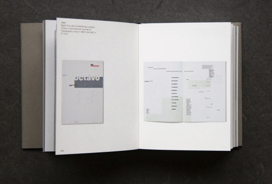
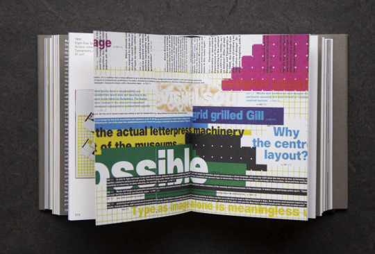

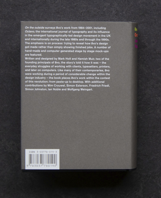
8vo: 'On the outside', Written, edited and designed by Mark Holt and Hamish Muir, With contributions by Wim Crouwel, Simon Esterson, Friedrich Friedl, Simon Johnston, Ian Noble, and Wolfgang Weingart, Lars Müller Publishers, Zürich, 2005 [Leporello photobooks et al., Roma]
#graphic design#typography#magazine#poster#catalogue#catalog#cover#mark holt#hamish muir#wim crouwel#simon esterson#friedrich friedl#simon johnston#ian noble#wolfgang weingart#lars müller publishers#2000s
16 notes
·
View notes
Text
Räume sind narrative Reiche. [...]
Viele Erzählungen sind in ihnen verborgen. [...].
Fakten gehören zu ihnen genauso wie Vorstellungen, Phantasien.
Atmosphäre. Hypothesen zum Prozess der räumlichen Wahrnehmung.
Elisabeth Blum, Lars Müller Publishers, 2010, 14.
1 note
·
View note
Photo

Low Pad / 1999
— A moulded-leather or fabric upholstered lounge chair with a satin stainless-steel base.
— Low Pad began with a thought to do a comfortable low chair with as little volume as possible. I have always admired Poul Kjaerholm’s PK22 chair for its reduction of materials and the elegance of its concept, but having lived with it for a few years I was aware that an element of comfort was missing. The prototypes of our first drawings were not particularly exciting, consisting of more or less traditional upholstery on a wire frame base. After some refinement I still wasn’t sure it really had anything going for it, but on my way back to London I noticed the profile of an airport bench, and that, combined with a memory of having seen some moulded leather forms, gave me the concept. After that it was easy. Cappellini found a company making car seats who could press leather and most kinds of fabric; I played around with various shapes for the back; and finally a plywood panel was moulded to the required profile, cut to shape and the upholstery stitched over it. The design owes much to Cappellini’s upholstery skills, because if it hadn’t been done perfectly, it wouldn’t have been any good at all.
Extract from Everything But the Walls by Jasper Morrison (Lars Müller Publishers, 2006)
Produced by Cappellini, Italy
https://jaspermorrison.com/projects/chairs/low-pad
1 note
·
View note
Photo
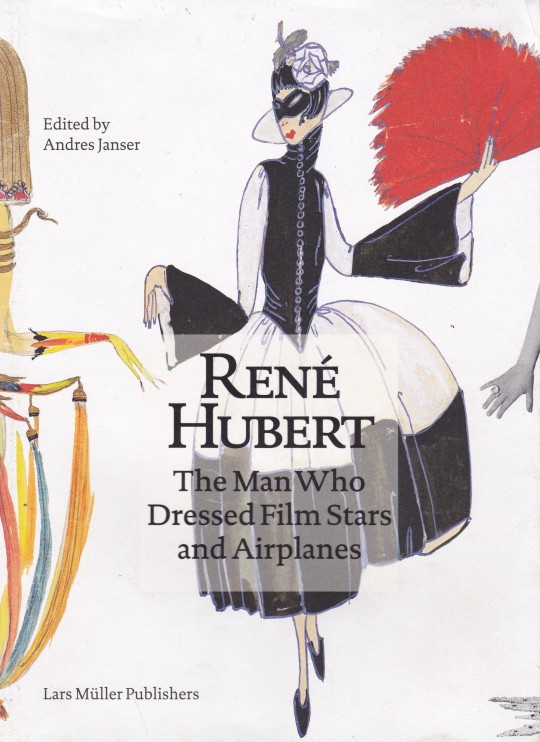
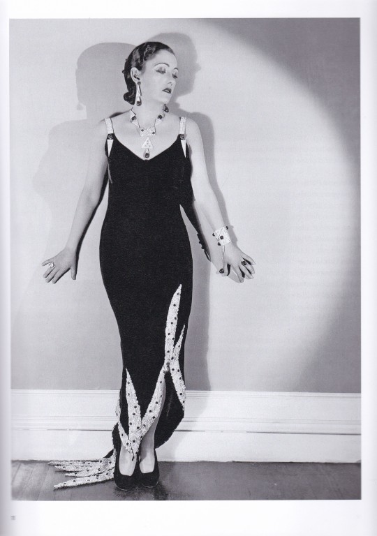
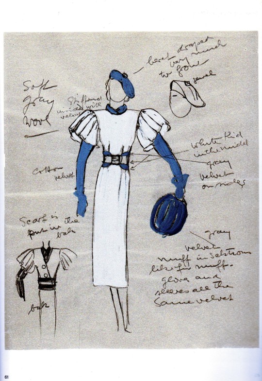

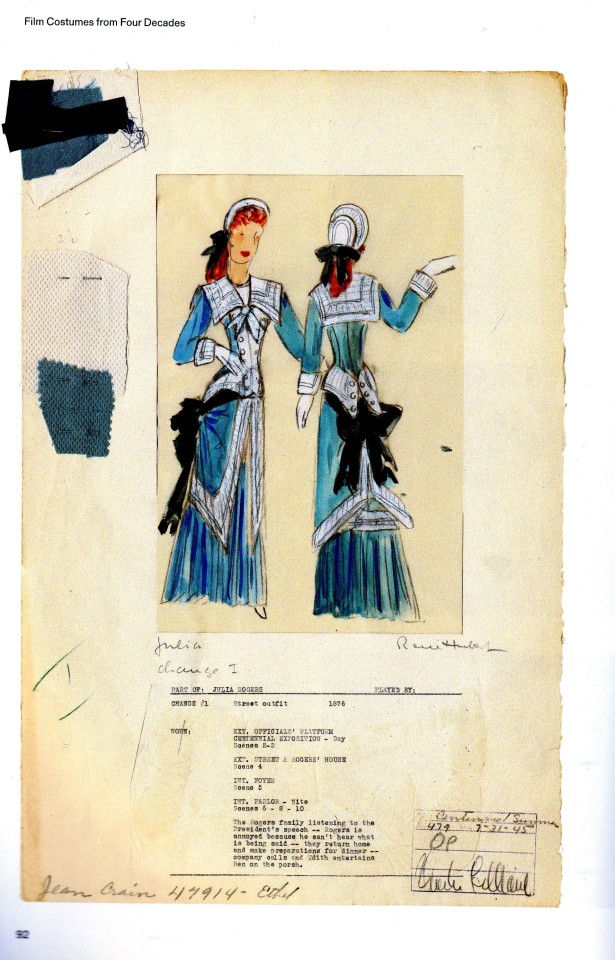
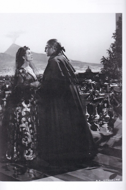

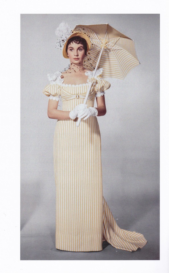


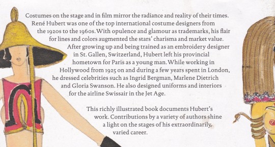
René Hubert
The Man Who Dressed Film Stars and Airplanes
Edited by Andreas Janser
With essays by Elisabeth Bronfen, Roland Fischer-Briand, Andres Janser, Angelo Luerti, Deborah Nadoolman Landis, Amy Sargeant, Katharina Tietze
Lars Müller Publishers, Zürich 2023, 248 pages, 275 illustrations, paperback, ISBN 978-3-03778-700-7
euro 60,00
email if you want to buy [email protected]
What are movie stars without costumes? From the 1920s to the 1960s, René Hubert belonged to the the crème de la crème of costume designers. His trademarks were opulence and glamor and a distinct flair for colors and lines. As a young man, the trained embroidery draftsman left his native St. Gallen for Paris. The emigrant's courage was soon rewarded: In Hollywood, Hubert dressed film stars such as Ingrid Bergman, Marlene Dietrich and Gloria Swanson. His international reputation helped him to win commissions in his native Switzerland, most notably for the Swiss National Exhibition in 1939, for Swissair uniforms and aircraft interiors, and for various theaters and textile companies.
This richly illustrated publication compiles sketches, costume photography, stage photos and film stills of Hubert’s work. Experts from both sides of the Atlantic reflect on his multifaceted oeuvre at his numerous workplaces in Switzerland, Europe and the US. Excerpts from René Hubert’s unpublished memoirs provide a personal view of his life and the glamor of the era.
03/05/23
orders to: [email protected]
ordini a: [email protected]
twitter: fashionbooksmilano
instagram: fashionbooksmilano, designbooksmilano tumblr: fashionbooksmilano, designbooksmilano
#René Hubert#costume designer#1920-1960#opulence & glamour#stars'charisma#Ingrid Bergman#Marlene Dietrich#Gloria Swanson#Swissair interiors#fashion books#fashionbooksmilano
23 notes
·
View notes
Text
Editorial Artist Study: Astrid Stavro

Stavro’s wide-ranging expertise encompasses the design of brand identities, books, magazines, exhibitions, way finding systems and packaging for clients including Phaidon, Camper, Jijibaba (Jasper Morrison and Jaime Hayon’s fashion brand), The National Portrait Gallery, Laurence King, Elephant magazine, the Reina Sofía Museum, the Miró Foundation, Lars Müller Publishers and the Barcelona Design Museum.
https://www.pentagram.com/news/astrid-stavro-joins-pentagrams-london-office-as-partner


0 notes
Photo
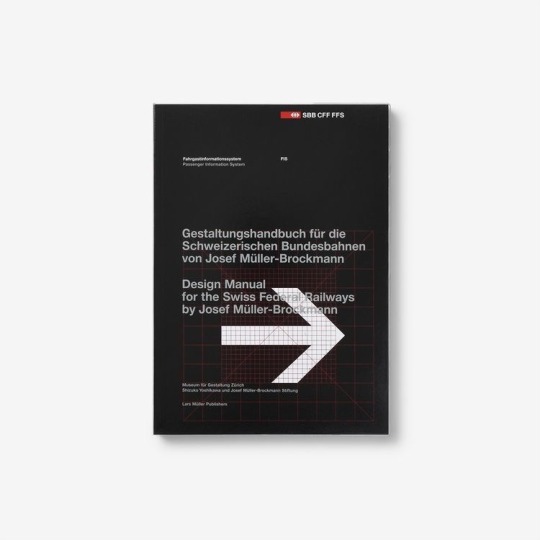
Lars Müller Publishers / Design Manual for the Swiss Federal Railways by Josef Müller-Brockmann / Book / 2019
#lars müller publishers#design manual for the swiss federal railways#josef müller brockmann#book#2019#arrow#cover#printed matter#typography
22 notes
·
View notes
Last Seen Blogs
kierofoxen
✧ .𓋼𓍊 𓆏 𓍊𓋼𓍊. ✧
sophistideau
PRETTYMOTHERFUCKV

bui-mog
ayashimi

escapingdragons
Escaping dragons
paranomum
paranomum