#layer effect tutorial
Explore tagged Tumblr posts
Visit Tumblr Blog
Explore Tumblr blogs with no restrictions, modern design and the best experience.
Last Seen Tumblr Blogs


Fun Fact
China blocked Tumblr because of pornography and censorship problems in 2013.
Note
How do you pick colors for the gore rendering? I'm mesmerized withe the vibrant yet mildly sickly tone of colors you use, that along with the paint marker way of shading is amazing, I love it
thanks!! admittedly I've been meaning to do more studies and such bc I'm missing out on a lot of things imo but here's my lazy guy method where I put varying reds down regardless of lighting....
i generally go between dark reds and lighter pinks/oranges, and then have some "blue(grey or just Less Red Reds" and green/yellow. green and red are just fun to work with so I think a lot of my drawings have that. Pinks and greys can be fun too so I'm trying to do more w those..... bleh. I'm very much not an expert at drawing or anatomy so. You know how it is. Here's a picture i tried to explain with a while ago

#not a tutorial but more of how i think abt it....#kind of like a tube#to be honest i#need to get back onto studies bc i want to do more stuff with like. membranes and shit but this is my Easy Quick Mindless method of doing i#i usually paint all on one layer too so my layers are like#basecolor to clipping mask on -> all shading -> lines -> a little bonus stuff sometimes#and i generally dont use layer effects. feels weird to me idk#rbs Off because its not really a tutorial. just me thinking#cw gore#iguess?
75 notes
·
View notes
Text
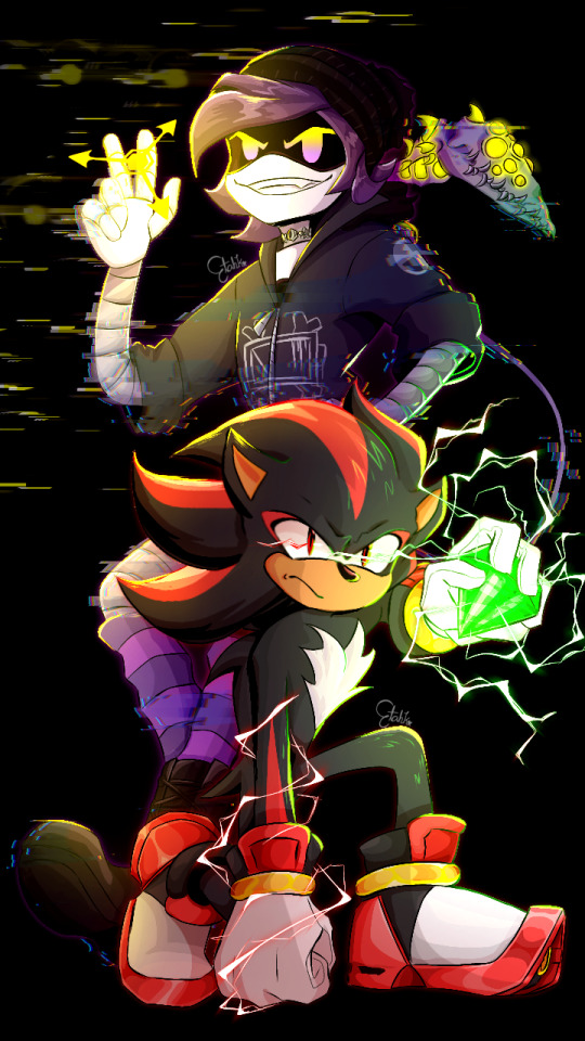
Whenever someone mentions hot topic I think of these two
#shadow the hedgehog#uzi doorman#murder drones uzi#crossover#sonic the hedgehog#back in my crossover shi-#If they look weird#It's cause it's my first time drawing them on digital#Especially shadow#There was a lot of first times in this drawing#Like rendering in one layer at some point-#and doing lightning effects which I had no knowledge of#Until I searched for a tutorial#yeah enough ramblinh#etahk arts
30 notes
·
View notes
Text
got the ableton live free trial and i am Living
#my music#musicians on tumblr#synthwave#just a little tryout but man this daw is so cool and theres so many resources and tutorials to work with#and i get to use my midi keyboard its very fun i love it#And its a one time license instead of monthly so this is going on my christmas/bday list#this is what most of my stuff looks like in the daw btw its the same thing but just building up and layering#why make it complicated when simple sounds great#though im definitely still learning and gonna try more complex stuff like this already has automations and effects but i want more#who knows maybe i can work with this and itll be on my next ep whenever that happens
7 notes
·
View notes
Text

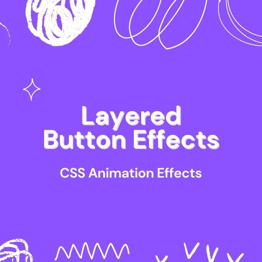
CSS Hover Layer Animation
#css hover layer animation#css animation tutorial#css animation examples#html css#divinector#frontenddevelopment#webdesign#css#html#css3#css effects#cool css animation#cool css effects
3 notes
·
View notes
Note
Trying? Trying??? By learning. By succeeding!
(about this and my text under the cut)
this is very nice actually thank you so much <3 <3 and like, i probably do need to give myself more credit in general but also i am still very much learning and stumbling and figuring digital art out (and for the most part it is so fun)
I’m gonna ramble about this a bit so bear with me and also i apologize lol, but that art was done after a month of getting increasingly more frustrated with everything turning out so badly and eventually realizing that I was trying to 1. copy a certain look/style that i’ve internalized is what fanart and digital art should look like and is very far away from my style/comfort zone 2. i was trying to do everything digital allows without being comfortable with it or understanding it
so (and this took me a month to realize ? ??) i did what i already knew from doing acrylic and oil painting in the past and could somewhat easily transfer to digital without having to know more than the basics, like i didn’t use a lot of the things digital provides or allows for. i used layers for my own peace of mind but without actually needing them and did some color adjusting (honestly, the color adjusting digital lets you do is such a blessing to me) but the only fancy way i really utilized the medium was making it a gif (which is so fun and a lot easier than i would have thought, like honestly watch me make any future art into gifs too) but there are so many things you can do with the medium with settings/effects, different brushes, tools to use in the process etc that i just do not understand what they are or how to implement them so i am very slowly learning digital art as a whole new medium rather than just being able to use it to adapt what i already know
#sorry you just wanted to say a quick thing and i went on a whole rant (welcome to my blog tbh)#like i'll watch tutorials and they'll be like 'and i just did an overlay and then a multiply layer in a good color (:' and im like ??? wdym#'a good color' what color is a good color? like i can put those effects on my work but that's just me clicking a button without knowing wha#will happen really and like i watch speed paints and see them do stuff and im just ? HUH? what was that and why?#i also do not understand a lot of these concepts with traditional art tbh like people will talk about under paintings and im like yeah sure#i hear you however i also do not- i just place a color where it should be and that's that which i know is why my colors often don't feel#cohesive which is also something i need to learn which is blah- im basically just saying i actually do not know any theory or technique#even with traditional it is all just vibes and hoping for the best which in the long run just makes me very confused about what i am#actually doing and not confident at all i'll be able to do it again so u know#we're out here literally just raw dogging art without any thought#but it's also just i do not need to do all those fancy things but i would like to understand them and i am excited to see my progress now#i just really had a shitty month of making ugly things up until now okay so i was a little fragile when i posted that#but people have been so so nice about it and ive been crying for two days straight#also people have been so lovely about the colors and colors are deadass the hardest part about digital like with paint you often buy a set#that already match and then mix them if needed and they'll look nice together but with digital you're just on your own- no training wheels#ask#anon
7 notes
·
View notes
Text
Fuck yeah I nosied in my drawing files from when I started this new style and I've rediscovered how to get the depth without a million fiddly layer effects
#It's a black and white filter dragged to as dark as possible [at least on my app] set to colour layer effect#If it's to dark lighten the background and boom#Might make a mini tutorial if just for my sake#The drawing has to be monochrome of a midtoned value and must use transparency to build layering
0 notes
Text
How to make drop shadow not effect every layer?
Introduction
Drop shadows can create a design with a sense of dimension Now you know how different shadows could be and their cut through behavior with layers to advance up your visualizations. You can create shadow layers separately or play with the settings to have a control over how effective your shadows will be, and most design tools allow you to simply remove or edit it entirely. By mastering these techniques you start to have better design skills and make your compositions look polished and more effective.
What is drop shadow?
The shadow of the drop (drop shadow) is a tool used in the field of graphic design and photo editing that adds shadows to light make-up, often appearing as if from . It casts a shadow toward one side that makes the object look as if it is floating above its background. Drop Shadow: This effect is typically used to emphasize objects, create depth and shadows or make text stand-out against a different background line.

Credit: communityadove
Common features of a drop shadow include:
Offset: The distance and direction the shadow appears from the object.
Blur: The softness or sharpness of the shadow’s edges.
Opacity: The transparency of the shadow, affecting how dark or light it appears.
Color: Typically black or gray, but any color can be used.
How many types of drop shadows are there and what are they?
There are several types of drop shadows, and they vary based on how they are applied and their specific visual effects. Here are the main types:
1. Simple Drop Shadow
Description: This is the most basic form of a drop shadow where a shadow is cast behind an object with uniform direction, distance, and blur.
Use: Commonly used in web design, text, and images to create a slight depth effect.
2. Soft Drop Shadow
Description: Drop Shadow (Soft blurred edge) Blurred makes the shadow look more soft and subtle.
Use: Ideal for creating a smooth, less aggressive shadow effect, often used in photography and logo design.
3. Hard Drop Shadow
Description: A shadow with sharp, defined edges. There’s little or no blur, making the shadow look crisp and bold.
Use: Suitable for retro or stylistic designs where sharp contrasts are desired.
4. Long Shadow
Description: In many cases a (especially far) long shadow of an stylised material that appears in only one or two directions and creates effect.
Use: Popular in flat design trends, especially in icons, app design, and typography.
5. Inner Shadow
Description: A shadow applied inside the boundaries of an object, giving the illusion of depth or a cut-out effect.
Use: Common in button design and to create recessed effects in UI/UX design.
6. Perspective Drop Shadow
Description: A shadow that changes shape and direction to mimic the effect of a light source at an angle, giving a more realistic 3D effect.
Use: Used to create dynamic and realistic scenes where objects need to appear to be lifted from the surface.
7. Multiple Drop Shadows
Description: Multiple shadow layers are applied to the same object, often varying in size, opacity, or direction.
Use: Used to create complex, layered effects for a more dramatic and visually striking look.
How do we make a drop shadow separate layers?
To create a separate layer for a drop shadow in an image editor like Photoshop or GIMP, Below are a few steps to separate the drop shadow:

Credit: orelly.com
In Photoshop:
1. Select the Layer: Choose the layer to which you want to apply a shadow.
2. Apply Drop Shadow: Go to the Layer menu and select Layer Style > Drop Shadow. Adjust the shadow properties (angle, distance, spread, and size) until you're satisfied.
3. Create a Separate Layer: In the Layer Styles dialog, right-click the Drop Shadow name on the left side and select Create Layer. This will separate the drop shadow into its own layer below the original layer.
4.Move or Edit the Shadow: Now, you can move, transform, or apply further edits to the drop shadow independently of the original object.
In GIMP:
1. Select the Layer: Choose the layer that will cast the shadow.
2. Apply Drop Shadow: Go to Filters > Light and Shadow > Drop Shadow. Adjust the settings and click OK.
3. Separate the Shadow: The shadow will be added to a new layer automatically. You can now move or edit this layer separately from the object layer.
Benefits of a Separate Shadow Layer:
Allows greater control over the shadow (e.g., positioning, blurring, or changing color).
Makes complex compositions easier since the shadow is independent.
To make a drop shadow separate from other layers in most graphic design software, you'll want to follow these general steps:
Step 1. In Adobe Photoshop:
1. Select the Layer: Choose the layer you want to apply the shadow to.
2.Apply Drop Shadow: Go to the Layer menu and select Layer Style > Drop Shadow.
Adjust the shadow settings (angle, distance, spread, and size) as needed.
3.Create a Separate Shadow Layer: In the Layer Styles dialog, right-click on the Drop Shadow option and select Create Layer.This action separates the drop shadow into its own layer below the original layer.
4.Edit the Shadow: You can now move, transform, or adjust the shadow layer independently of the original layer
.
Step 2. In Adobe Illustrator:
1. Select the Object: Choose the object you want to add a drop shadow to.
2. Apply Drop Shadow: Go to Effect > Stylize > Drop Shadow.
Adjust the shadow settings (opacity, X offset, Y offset, blur, and color) as needed and click OK.
3. Separate the Shadow: Illustrator does not have a direct option to separate drop shadows into their own layer like Photoshop. To work around this:
4. Rasterize the Shadow: Select the object with the shadow, go to Object > Rasterize, and then choose the desired resolution.
5. Move Shadow to a New Layer: After rasterizing, use the Image Trace or Live Trace function (if needed) to convert the raster shadow back into vector format, then move it to a new layer.
Step 3. In Other Graphic Design Tools:
Different tools have varying methods, but the general approach is similar:
1. Apply Drop Shadow: Use the tool’s shadow effect option, typically found under effects or layer styles.
2. Separate the Shadow: If the tool supports layer effects, look for an option to convert the effect into a new layer. If not directly supported, consider duplicating the layer, rasterizing it, and manually creating the shadow on a separate layer.
When a drop shadow on one layer effects another layer in Photoshop?
When a drop shadow on one layer effects another layer in Photoshop, it usually means that the shadow’s impact extends beyond its intended layer boundaries. This can happen for a few reasons: you using under 6 steps.

Credit: communityadove.com
Understanding the Issue
A drop shadow is essentially a visual effect that simulates a shadow cast by the layer onto layers below it. If a shadow appears to affect or overlap another layer, it's because the shadow’s opacity or spread extends into that layer.
How to Manage or Avoid This Issue
1. Layer Order: Check Layer Stack: Make sure the layer with the drop shadow is above the layer that is being affected. Shadows will appear on layers that are underneath the layer with the effect.
2. Shadow Settings: Adjust Drop Shadow Settings: Adjust Drop Shadow Settings: Double-click the layer with the drop shadow to open the Layer Style dialog. Use those Distance, Spread and Size knob to make the shadow further (Distance), wider (Spread) or larger(Box Shadow). Lowering these values will have less of an effect on other layers since it makes the shadow smaller.
3. Layer Mask: Use a Layer Mask: Add a layer mask to the layer with the drop shadow. Paint with black on the mask where you don’t want the shadow to appear. This technique helps limit the shadow effect to specific areas.
4. Duplicate and Isolate:
Duplicate the Layer: If the shadow is affecting other layers in an undesirable way, you can duplicate the original layer, apply the drop shadow to the duplicate, and then position or mask it as needed.
Move to New Layer: After applying the drop shadow, right-click the drop shadow effect in the Layers panel and select Create Layer. This process will split the shadow effect into a distinct layer, giving you the freedom to adjust its placement independently.
Layer Blending Options: Adjust Blending Options: In the Layer Style dialog, experiment with the Blend Mode and Opacity settings of the drop shadow to control how it blends with layers beneath it.
Smart Objects: Convert to Smart Object: If you’re using a Smart Object, double-clicking it will open it in a new document. Apply the drop shadow there, which might help isolate the effect from other layers.
Example Workflow
1. Apply Drop Shadow: Select the layer to which you want to add a drop shadow. Go to Layer > Layer Style > Drop Shadow.
2. Create a Separate Shadow Layer: In the Layer Style dialog, right-click on Drop Shadow and select Create Layer. This converts the shadow into its own layer.
3. Adjust Position: Use the Move Tool to reposition the shadow layer if needed.
4. Use Layer Mask: Select the shadow layer and add a layer mask. Paint on the mask with black to hide portions of the shadow where it shouldn’t appear.
How do we get rid of the drop shadow effect?
To remove a drop shadow effect, the steps will depend on the software you're using. Here’s how to do it in some common programs: Easy steps

Credit: illustratorhow.com
Method 1: Using the Layer Styles Panel
Select the Layer: Click on the layer with the drop shadow effect in the Layers panel.
Open Layer Styles: Double-click the layer to open the Layer Style dialog, or right-click the layer and select Blending Options.
Remove Drop Shadow: In the Layer Style dialog, uncheck the Drop Shadow option in the list on the left side. This will disable the drop shadow effect without deleting it, allowing you to re-enable it later if needed.
Apply Changes:Click OK to apply the changes and close the dialog.
Method 2: Removing the Effect Completely
Select the Layer: Click on the layer with the drop shadow effect.
Open Layer Styles: Double-click the layer to open the Layer Style dialog, or right-click and select Blending Options.
Remove Drop Shadow Layer: If you want to completely remove the drop shadow effect (not just disable it), right-click on the Drop Shadow effect name in the Layer Style panel and select Clear Layer Style. This will remove all layer styles, including the drop shadow.
Apply Changes:Click OK to finalize the changes.
Method 3: Removing Drop Shadow Layer (If Shadow Is on Its Own Layer)
Locate Shadow Layer: If you have created a separate layer for the shadow (e.g., by right-clicking on the drop shadow effect and choosing Create Layer), locate this shadow layer in the Layers panel.
Remove Shadow Layer: Highlight the shadow layer and press Delete or right click on it and choose Remove Layer.
Faq:
1. How do I only have a drop shadow on a layer below in Photoshop?
To apply a drop shadow to a layer but have it only affect layers below it, you can follow these steps:
1. Select the Layer: Click on the layer to which you want to add the drop shadow.
2. Apply Drop Shadow: Go to Layer > Layer Style > Drop Shadow. Adjust the shadow settings as needed (angle, distance, spread, and size).
3. Ensure Layer Order: Make sure the layer with the drop shadow is above the layers that you want the shadow to affect. Shadows will naturally affect layers beneath them in the stack.
4. Clip the Shadow: If the shadow is affecting layers above it, you might need to use a clipping mask. Place the shadow on a separate layer and use a clipping mask (Alt + Ctrl + G / Option + Command + G) to restrict the shadow effect to the layer you want.
2. How do I remove an effect from a layer in After Effects?
To remove an effect from a layer in Adobe After Effects:
Select the Layer: Click on the layer from which you want to remove the effect.
Open Effects Panel: Go to the Effect Controls panel, where you’ll see a list of all effects applied to the selected layer.
Take Away An Effect : Right-click on a click and elect to remove it or go through the take icon in-the-loop.
3. How do I remove effects from multiple layers in Photoshop?
To remove effects from multiple layers in Photoshop:
Select Layers:Hold down the Shift key (for contiguous layers) or Ctrl / Command key (for non-contiguous layers) and click on the layers you want to modify in the Layers panel.
Open Layer Styles:Right-click on one of the selected layers and choose Clear Layer Style from the context menu. This will remove all layer styles (including effects) from the selected layers.
Conclusion
Drop shadows help a design period pop by creating that sense of dimension. Can adjust your visuals precisely by means of understanding the types of shadows and how it interacts with layers. If you are pressing shadow, then allow it to capture and make use of separate layers or edit them. Not only that but most design tools allow you to remove or adjust your shadows if they are just added later. Applying these techniques in your design practice will strengthen your skills and enable you to develop and present more advanced, well-designed works.
1 note
·
View note
Text
Layered Button Hover Animation
#layered button hover#css button hover#button hover effects#css animation#css animation tutorial#html css animation#css animation examples#html css#codenewbies#css#html5 css3#pure css animation
1 note
·
View note
Note
I’m obsessed with the Lackadaisy comics way of shading/colouring! Could you please give a tutorial of how you do that and what brushes you use?
Here's a sample I used for the Lackadaisy Essentials art book. About 98% of the time, I'm not using specialized brushes - just basic soft and hard-round brushes, with various opacities.


Digital scan of the establishing shot pencil drawing - I added some some grid lines on top to double check the 1-point perspective. I didn’t include the characters here because I knew I’d be using the art as a background for more than one panel in the comic.
Initial lighting pass - This was done almost entirely by burning shadow directly into the pencil art scan. This way, I preserve a lot of my pencil lines (rather than painting over them) and the grain of the paper remains in play. This helps retain a sort of aged, natural media look despite the largely digital nature of it.
Contrast and brightness adjustments - Here I hand-painted more minute details into the rug, decor and fixtures with small diameter round brushes. I drew a wallpaper pattern on a separate canvas, then applied it as an overlay layer here too. And, of course, the characters arrived as raw pencils on new layers.
Character compositing and color wash - I didn't want to go fully monochrome with the colors, but I also didn't want to treat this like a full color digital painting. Instead, I opted for something resembling a warm-to- cool wash, achieved with a color layer on top of the grayscale base. Young Mordecai and Rose were toned to match the scene with a combination of burning, dodging and painting.
Lighting effects and atmosphere - Overlay layers can be used to push warm values into a much more saturated, vibrant place than a color layer alone can manage, and that's what I did here to create the streaming sunlight. I used a screen layer to include overexposure on bright colored elements as well. Floating dust motes in the light were added for atmosphere, and I polished the characters up with their own color and overlay layers to match the scene.
There's another, older process breakdown here on the Lackadaisy web site too, if you want more information.
1K notes
·
View notes
Text
youtube
Mastering Animation in Green Screen by DoInk Tutorial
Welcome to an exciting journey into the world of animation with Green Screen by DoInk! In this step-by-step tutorial, we'll guide you through the art of animating in the app, unlocking the creative possibilities to make your projects come alive.
#Green Screen by DoInk#Animation Tutorial#Animated Drawings#Keyframing Techniques#Layered Animation#Creative Animation Tips#Dynamic Video Effects#Elevate Your Video Projects#Visual Storytelling with Animation#Green Screen Animation Mastery#doink#do ink#greenscreen#green screen#doinktutorials#green screen tips#video editing apps#Youtube
0 notes
Text
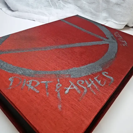
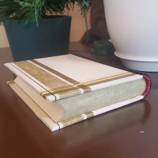
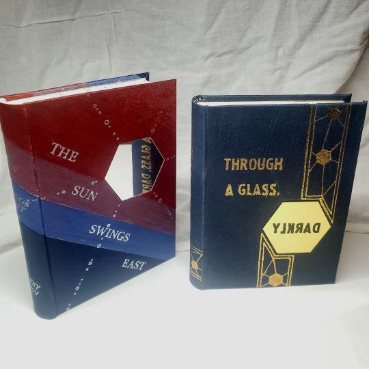
Book Decoration: AKA All The Ways I Don't Use a Cricut
(this post is for people who don't want to buy an expensive cutting tool, or for those that do have an expensive cutting tool that would like to mix things up a little)
1. Print That Shit
If you're already printing your own textblocks, an easy step for titles is to print them. Above is a title printed onto an "obi" of decorative paper. I measured out where I wanted things on the finished book and laid it out in Affinity, then printed it on a full sheet & trimmed it down to wrap around the book. A more simple method is to print & glue on the label into a slight indent in the cover (to protect it). A third option is to do the spine in bookcloth, while you print on paper for the cover and then glue that paper onto the boards (this usually looks even better when it is a three-piece bradel bind).
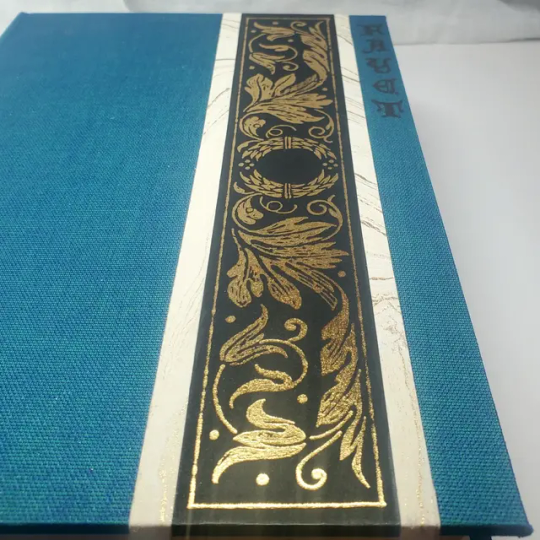
2. Foil Quill / Heat Pens
The heat pen is one of my go-to tools, but it can be a bit touchy about materials. The most popular version is the We R Memory Keepers' Foil Quill (which is one of the most ergonomic), but other pens exist that can get you to a higher heat temp, finer lines, or more consistent foil. For example, I have a pen created by a local Japanese bookbinding studio that fares way better on leathers than the WRMK quill & with a finer tip, but it's hell to control. Best results in general are on paper or smooth bookcloth (starched linen, arrestox, colibri - even duo will work but its less solid). The fuzzier a bookcloth is, the less your foil quill wants to deal with it. This means the heat n bond method of making bookcloth does not play nice with a heat pen usually, but there are two solutions: 1) use this tutorial on paste + acrylic medium coated bookcloth instead that will get you a perfect surface for the heat pen, or 2) use the pen on paper & then glue onto the cloth. I did a video tutorial for both foil quill use and this type of homemade bookcloth for @renegadeguild Binderary in 2023.
You get the most consistent results by tracing through a printed template that is taped in place, as I do in the video above.
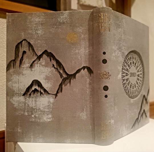
3. Paint That Shit
Acrylic paints will do you fine! The above is free-handed with a circle template, because I wanted that vibe. If you need straight lines that won't seep, lay them down with tape first & then paint over it first with a clear Acrylic medium, then your color. Same goes for stencils. Two more examples of painted bookcloth:
4. IT'S GOT LAYERS
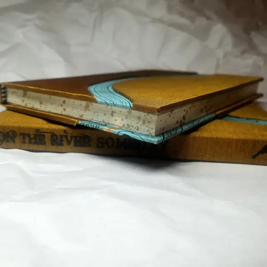
By using layers of thinner boards, you can create interesting depths & contrasts on your cover. You can also make cutouts that peep through to the decorative paper behind. The most important part to this technique is the order in which each edge is wrapped. To get a good wrapped inside edge, you will split the turn in into tabs to get them to conform to a curve. You can also layer multiple colors of bookcloth without multiple layers of board, as seen below left, so long as you mind your cut edges for fraying.
5. Inlaid... anything
Mirrors! Marbled paper! I saw someone do a pretty metal bookmark once! The key is creating a little home for it to live in, which is pretty similar to the above layering method. On one layer you cut the shape, & glue that layer onto the bottom solid board before covering. You can do the top layer as an entire 1 mm board (like I did for the mirrors) or a sheet of cardstock, like I would use for inlaid paper.
6. Decorative Paper
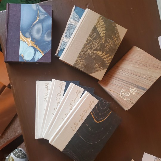
Decorative paper is always helpful & adds to the paper hoard... & its effects can be layers with other techniques, as below. Marbles, chiyogami, momi, or prints & maps of all kinds can be great additions. Some papers may need a protective coating (such as wax or a sealer).
7. Stamps (with optional linocut)
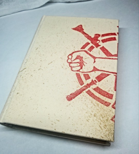
While I've not used many more regular rubber stamps, I do know some who have, successfully! And I've used one once or twice with embossing powder (see photo 3 up, the gold anchor on the little pamphlet bind). What also works is to carve your own linocut or stamp, & then use block printing ink to ink it onto your fabric (as i did above). A bit time intensive, but it was nice how easily reproducible it was, and I liked the effect I got for this particular bind.
These methods are not exhaustive, just ones I've used, and there are of course many others. I haven't gone too into detail on any of these for the sake of length (& post photo limits) but feel free to ask about more specifics. Usually I'm using them in combination with other options.
#fanbinding#bookbinding#celestial sphere press#ficbinding#in progress review#bookbinding how to#i am not particularly anti-cricut or anything#it's just a very expensive tool#and its prevalence sometimes makes new binders think they HAVE to get one#when they absolutely do not#you can make pretty books without it
1K notes
·
View notes
Text
Bynine Art Rendering Tutorial
i've gotten about eight billion asks about how i render my art, so here's a full-scale tutorial! (this consolidates a lot of smaller past tutorials, so my apologies if this is old news to you lol...)
Step 1 - sketch! I draw multiple iterations in my real-life sketchpad first until I'm happy with the concept, then I either scan it or reference it for the digital sketch.

Step 2 - Lineart! I use a pixelated brush in Paint Tool SAI, as I find it makes the final result look nicer.

Step 3 - Flat colors! Good ol' paint bucket is all I need for this
Step 4 - Shading! What I'll do is copy the flat color layer and set it to pure white as an overlay. Then I'll shade this new layer with black so the original colors can peek through.

Step 5 - Noise! Switching over to paint.net, I apply a noise effect to add texture to the art.

Step 6 - Blur! A slight blur changes the feel from digital to traditional, or at least like scanned art.
Step 7 - Color correction! I bring out the yellow in the highlights and the blue-purple in the shadows, using paint.net's Curves tool.
There we go! I hope that's helpful. Let me know if you have any other questions!!
604 notes
·
View notes
Note
how does one make graphics (i need to . improve)

Well, the Princess' methods are very simple! She would be glad to teach you.
A bit long graphic tutorial under cut ^_^ (all art by Iinquint on twitter)

First, we import the frame or mask you will use. You can find these by searching "rentry frame".

Then, we will import our picture and erase any excess outside of the frame.

Then we usually add a chibi, You can do this by finding chibi art and erasing the background.

And now we will add any PNGs to the graphic. We chose circle laces for this.

Now we will duplicate the layer of our chibi.

We then use the Stroke Outer filter to find dots that weren't erased, we will go to the top original later and erase where all the exposed dots are.

After that, we delete the layer & reduplicate it. Then we use stroke outer for a white outline, and then a black one. If the chibi or whatever you are using is white or very light already, feel free to reverse the white & black.

Then we add glow outer (usually around 1-2px)

Continue this process for everything

Save it

And then we will import it into a new canvas through 'import picture' & then use the grayscale.

Now, We do not always use a gradient map. But feel free to try out gradients to see if it looks nice on the graphic. Either of the 2 top sites work.

Find a gradient that looks nice. If none fit your vision, feel free to skip it.


Now, import the new image and then add textures. Play around with blending modes & opacity until it looks right.

Boom! You've made your very own graphic.
Now for animated graphics...
(No visuals) If you'd like one where the small chibi moves, move it to be angle -5, save it, and then angle 5 and save it. (Also adjust angles if the 5 looks weird.)
Import the images into ezgif gif maker and turn on "Don't stack frames" and adjust delay time. (I usually use 80ish)
--
Animated graphics 2

Import your graphic into capcut. Add a green background or whatever color is not present on your graphic at all. Add the gif you want on the graphic. Adjust for all the images to go on for equal times so it works.


Ezgif > Mp4 to gif > Remove Background > Select hex code of background > "Replace hex with transparency" > Adjust Fuzz > Optimize

And voila, your graphic is completed! Feel free to adjust in ezgif effects if needed.

#ᛝ a chat with the lady spawn .ᐟ#rentry decor#rentry inspo#rentry resources#rentry#rentry stuff#rentry graphics#rentry banner#rentry coloring#ibis paint colorings#graphic tutorial#rentry tutorial#editblr#pr3typriincess#pr3ttypriincess forsaken#pretty princess forsaken#forsaken roblox#roblox forsaken#roblox#forsaken rentry
437 notes
·
View notes
Text
Long awaited Hera's mask tutorial (no cat base, low budget)
example of the masks I've made, here:
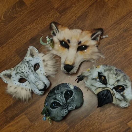
Author note: I have a 3 year experience, and I got used to making gear like this, so if you are trying masks for the first time, you might find some difficulties.
also, the whole thing Is REALLY "trust the process"... Anyway here we go!
You need: Cardboard, paper(optional), hot glue gun, felt/something to fur it/any material is okay if it works, foam (optional), basic tools like scizzors
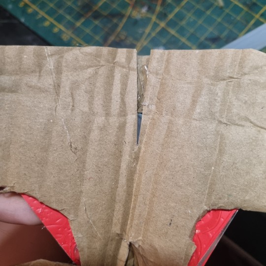
1. Cardboard forming
You need a piece of cardboard that's kinda a little bigger shape than your face, and measure where the eyes should be, so you can see well.
you can make the mask symmetrical by bending it in half, but it's optional
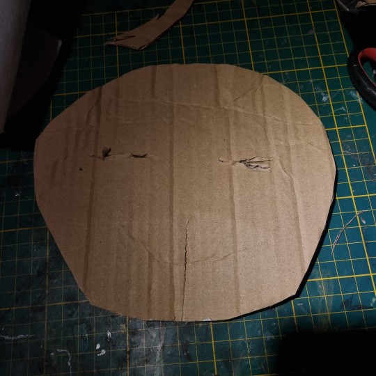
the first picture down there shows the back of the mask, don't be scared to pull it in and out, I'd say, you need to form the mask shape with your fingers VERY GOOD.
it really depends on what species you wanna make, I'm making a snow leopard rn!
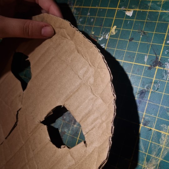
you can even cut it almost in half, and shape it to your liking
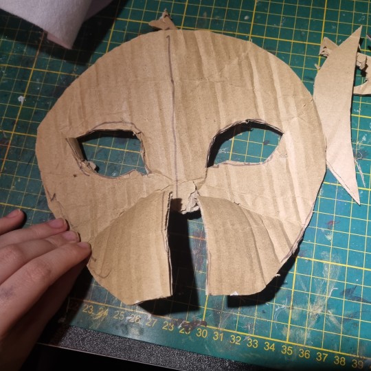
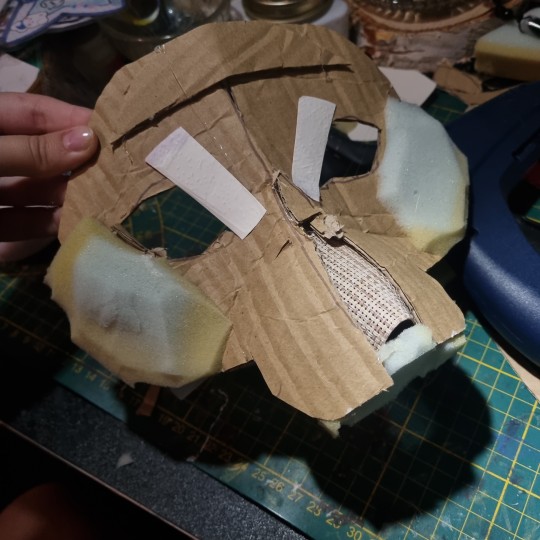
2. Texture
for this part, when you have your BaseOfTheBase ready, you need to make it more 3d, so it doesn't seem flat. small pieces are a key.
u can use various materials to recreate the real look, for example - foam that is easy to work with, and maybe more cardboard pieces layered on eachother. also you can use the pieces to glue the whole thing down together so it's sturdy.
I smooth it out with paper too, so the fleece/felt/fur sticks better to the mask and doesn't leave unnecessary bumps..
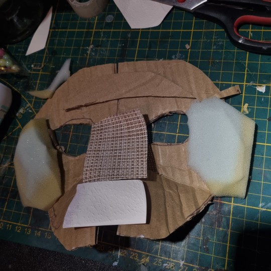
you use the bends like that to create a 3d effect, and expand the mask a little.
That's what I came up with! I added alot of paper pieces to smooth it down ^^
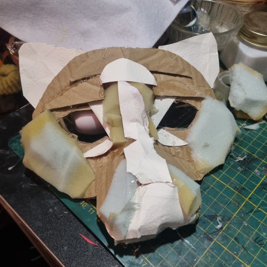
3. furring/felting, and the final touches
this part may be kinda tricky, so i reccomend you to watch various of felting tutorials on cat masks, cause this works basically the same!
I didint take any more photos rly, but here's the final product, and only felted one. (the nose is made out of hot glue)
I don't really want to elaborate on how to do the patterns, since you're the one who's customising the mask, but I like to use alcohol-based markers to make them! acrylic paint is also okay ^^
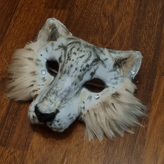
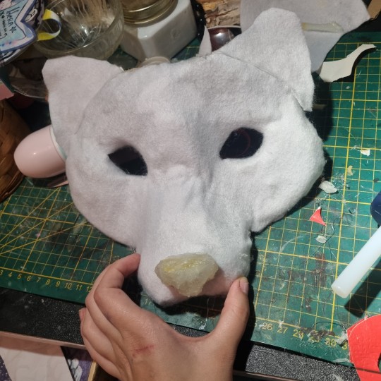
I hope I helped in some way !
If you have any questions, feel free to ask <3
#alterhuman#therian#nonhuman#bird therian#therian gear#snow leopard#art#therian art#tutorial#aviankin#birdkin#therian mask#mask making#otherkin
912 notes
·
View notes
Text
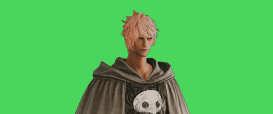
FF14 Battle Portrait Tutorial
For the past few weeks I was trying to find a way to recreate the battle portrait from FF14 as there was a few characters that I want to see in that style but don't officially have one yet. I think I got it down more or less (see image below) so I thought it's a good time to share what I did.

First of all, I made a few files that would help make life a little easier. They can be grabbed here .
Note: I did use Reshade to do a bit of work at the screenshot stage to help speed up the process but the same effect can be recreated in Photoshop with a vanilla screenshot. There are a lot of tutorials on how to do comic/cartoon effect in photoshop and those would make good bases to work off of.
Step 1: Take the screenshot with the PortraitBase Shader on. I usually take two screenshots. One with "Comic" on and one with it turned off. This is so that I have more to work with if needed.

Step 2: Drag all the screenshots into photoshop and remove the background. In photoshop, arrange the layer so that the screenshot with the Comic lines visible is on top of the one with the effect off.
Step 3: Duplicate the the layer with the "comic" effect and apply Blur->Gaussian blur (radius 0.5)
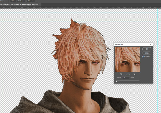
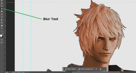
Step 4: Take a look at the hair. In Eric's case, It still doesn't look blur enough to me so I used the blur tool and blurred it a bit more
Step 5: Create a new layer above the layer in the previous step and use the brush tool to start outlining the edges. Where to outline is up to you but the idea is to make edges defined so that it looks more like a drawing.

Step 6: Duplicate the outline layer and then hide that layer. Step 7: Merge everything under the outline layer. Step 8: Drag and drop the "Texture.png" into the project and Clip it to your character layer. Set the blending of the texture to "soft light". Step 9: Drag and drop the "stroke Texture.png" into the project and Clip it to your character layer. Adjust the size till you are happy then set the blending to "overlay". Step 10: Adjust the opacity settings of both texture layers until it looks good to you.
Step 11: Click on your character layer and go to image->Adjustments->Hue/Saturation (note: you will see I dragged in the official Hades portrait as a point of reference to work off of). Adjust the saturation till you are happy.
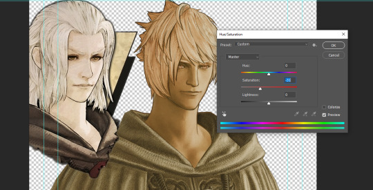
Step 12: Go to image->Adjustments->Color Balance and adjust the color till you are happy. In this example, since Eric is also wearing the Sophist robe, I tried to match that color to Hades' Sophist robe color.
Step 13: Once you are happy, drag the "Template.png" into the project and scale that to the size you want. Make sure it is completely covering the character. If it's not, you can just use paint more of it with the brush tool to extend it till it covers everything.

Step 14: Hide the "template.png" layer and select your character layer. Use the magic wand tool to select the outside of the character.
Step 15: With the selection still selected, click on the "Template.png" layer and press delete on your keyboard. You should now be left with a blank in the shape of your character.

Step 16: Drag the"Template.png" layer to be below your character layer. Then click on your character layer and clip it.
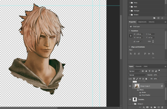
Step 17: Click on the "Template.png" layer and add a 2px stroke and shadow to it.
Step 18: Drag "Back_Deco.png" into the project and place it behind your character. Scale it till you are happy with it.
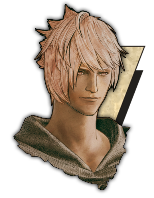
And that's it! Now you can recreate portraits for any NPCs that you want (in theory). A lot of it is also fine tuning to what you want but this should at least give you a decent base to work off of :)
2K notes
·
View notes
Text
Art style breakdown /tutorial(??)

Some friends asked so here we go : disclaimer im bad at explaining (so feel free to send an ask or smth)
Final art (long read so theres a timelapse at the end)


If its not for something important (commissions), i dont usually make a lineart for a drawing but just clean up the sketch , it wont be used anyway

I usually separate them by colors , mostly so i can Alpha lock them and not worry about coloring over parts
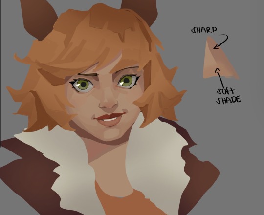
When coloring i use a soft airbrush to have gradients within the shading , so its not one solid color . How i shade is very blocky , lots of triangles lol (if im using CSP i love using the lasso fill tool ) but there are parts especially in the skin where I keep it smooth and blended, usually nose and cheek area . Using an asaro head is usually a good start to learning how to shade faces with planes in mind

Depends on the character, but I like adding shadows on the lashes/brows itself , make it look solid and 3d , it makes the eyes pop more imo

Using multiply layer to make the shadows darker for more contrast
At some point I’d merge everything together so i can just paint in one layer, easier to fix things with liquify too ; if im in CSP i keep the separate layers in one folder just in case i need em later but i cant really do that in Procreate cos of layer limits

This is the part where i make the shading more painterly .,To make the shading look sharper , i like adding lines on the edges .
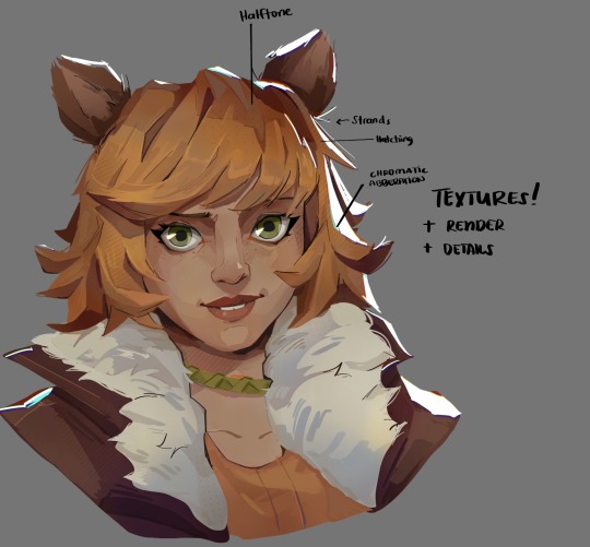
The fun part : adding the ✨
This is the part where I add textures , either from texture images or with screentone/hatching brushes. This is also around the part where i add the character’s accessories and stuff like scars and freckles (its just easier to add smaller things near the end than having them accidentally painted over at the start)
Whenever I feel like the drawing looks too much of a similar shade / temperature , I use a gradient map+layer effects (masked) on parts to give it variety . Technically you can do this by just having a layer effect on and manually adding colors but gradient maps make me go “ooooh didnt think of that color there “
CSP also has a posterization filter that i like using when i feel like some part looks too smooth to me.
I sometimes add in sketchy lines , and seeing how cool it looks in Marvel Rivals art ive been adding it more lol
Artists that influenced me are : Nesskain, Toni Infante , Valorant’s 2d art(their main artist is Suke) ,Arcane , Spiderverse and the most recent one ive been obsessing over is Marvel Rivals ( its got everything i want my art to be when it grows older lmao )
593 notes
·
View notes