#learn your histogram
Explore tagged Tumblr posts
Visit Tumblr Blog
Explore Tumblr blogs with no restrictions, modern design and the best experience.
Last Seen Tumblr Blogs


Fun Fact
Tumblr was attacked by a cross-site scripting worm deployed by the Internet troll group GNAA on Dec 3, 2012.
Text

This is how photography works and don’t let anyone tell you otherwise
12 notes
·
View notes
Text
A guide to chromosomal variations
Over at Instagram Melly the Science Geek has published a mind blowing video about how chromosome decide (or do not the decide) the sex of a person.
The world is a a very complicated place, indeed.
And at this point we have not even begun to talk about gender identity.
The Science Vet on XX, XY and all the other variations
Melly's video reminds us of the very popular twitter thread made by the Science Vet back in 2018.
We take the liberty of republishing that thread here:
So. Hi new people! Apparently, we're gonna talk about sex. Like physical sex! Because... there's some confusion.
First, sex defined: We're talking physical sex here, not gender. Body parts, hormones, and genetics (and more).
BLUF: BIOLOGICAL sex is a spectrum
Ok, everyone's super familiar with the XX/XY dichotomy, right? Yeah, what we all learned in like... 4th grade? And that's great, it gives you a starting point. But it's... well it's only the very starting point.
The IDEA is, XX is girl, XY is boy, right?
Welllll... that's not totally right. There are XY people, who have ovaries! And give birth! AH! And XX people who have male bodies and functional sperm! Double AH!
These are usually written off as "abnormalities" and indeed, some cases have medical issues. But many don't (like the XY woman giving birth). And this is really only the very very tip of the iceberg of "wait, that doesn't fit into our M or F box unless we make it bigger"
There's a WHOLE HOST of things that can cause all sorts of "weird" things to happen, ranging from genetic (XXY, XYY, Y, X, XX with translocation, XY with deletion) to hormonal (Androgen Insensitivity, Estradiol failure), and disruptors like dioxins
So, you're a scientist, and you want to research stuff, right? Which means you have to categorize stuff. Without categories, data is hard! So you take allll these people, including the "weird" ones and you plot them on a graph. Logical!
You use all the differences there are, different genetics, different responses to hormones, different effectiveness in signalling pathways, different sizes in Aanteroventral periventricular nucleus (AVPV) (yeah that's a thing) and give everything numbers, add them up.
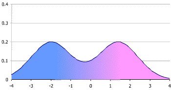
You get what's called a bimodal distribution (mostly, we'll get to that later) Which looks like this. Those two big peaks are what we call "male" and "female" (even conveniently colored pink for boys and blue for girls - we are using victorian gender colors right?)
/8
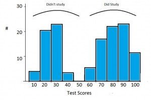
Now, when you're trying to look at data, we often group stuff. When we do that with a plot like this, it's called a "histogram." Basically we're breaking down a curved line into discrete "bins." Like this (image stolen from the web).
/9
Traditionally, we've used REALLY BIG bins for this when talking about sex. Basically you either group everything vaguely near a peak into the peak, or you just pretend there's nothing else but the biggest peaks. This makes it super easy, because 2 is simple to do data with.
However, as we've gotten to know more and more about signaling and brains and hormones and started to pay more attention to the outliers where standard stuff just didn't seem to work, we discovered that this isn't a great model to use.
Now I'm not talking feelings here. I'm talking about data. As you start to look at anything interesting, like say the effects of 2,3,7,8-Tetrachlorodibenzo-P-dioxin on animals, you start to realize that a 2 bin model doesn't predict your results well.
At first you say, "Well it was just weird." So you redo it, and it still doesn't work. So you look at your model and you say, "Well ok, what if the model's wrong?"
But the model sort of... almost predicts a lot of things, and it worked for years, so...
Some enterprising soul says, "Hey, remember that histogram where we said we'll just model using the peaks?" And everyone goes, "Uh, yeah?" And they say, "What if we... USED that data?" And everyone groans, because complicated data is hard.
But someone sits down and does the work, and lo, wow the model starts to work again. Where TCDD was "randomly" turning some boys into girls but then some girls into boys, now you can see there's a subgroup of what you'd called "female" that responds like the "male"
What's important here is that you haven't MISLABELED males as females. These are functional "females" who can do all the usual "female" things like gestate babies. But they respond to this one endocrine disruptor in a "male" way.
So you add another two categories, call them "Male2" and "Female2" and go on, happy that your model works! You've got 4 sexes now, but you don't really have to tell anyone that, right?
Exceeeept then you remember you've got those XY people that gestate babies. So you add "Intersex1" And then the XX people with penes... and ovaries? Ok, "Intersex2" because all these groups respond differently with signalling and brains when you get into the weeds
And the more you look, the more we LEARN, the more we're able to separate out those fine differences. Depending on what we're doing, we may not care. If a doc is giving you aspirin, it probably isn't a big deal.
But if they're using a steroid on you? Or treating dioxin poisoning? THAT SHIT COULD BE IMPORTANT. It's like saying, "the light's off so the power must not be flowing." It really matters if the light's off because the bulb blew.
If we go back to that histogram plot, we can keep breaking down your biological sex into smaller and smaller differences in brain areas, hormone levels, signalling differences, genetic variances. There's nothing stopping us from binning EVERY INDIVIDUAL into their own bin.
Technically, this wouldn't be "infinite sexes" but 7.4 billion sexes is functionally close for our brains. Now, our medicine isn't advanced enough for THAT level of detail to make any difference. BUT IT MIGHT BE in the future. Individualized medicine!
The thing to remember is that this isn't "new." We're not 'inventing sexes' here. Sex has ALWAYS been this curve. We were just using REALLY BIG bins. And now we're realizing that that's not representative of biology, it's inhibiting understanding of medicine and biology
In case anyone's curious, this isn't ideology. This is because I had to figure out why my data didn't match the prediction. Those rats I mentioned? Yeah, my lab. And lab rats are a really pure genetic monoculture, and they STILL don't fit the two peak model well.
So, since it's come up, an addendum!
Yes, we looked at other things we could do to make our data fit the existing model, that's how science works! The ONLY way the data fit was if we let "sex" be more than just those two narrow peaks.
Models purpose in science is to predict. If they don't predict correctly, first we check if we've measured the data correctly, and repeat the experiment a couple more times. If it still doesn't fit, we have to look at the model.
Intersex! Because I didn't specifically mention this.
"Intersex" is a grouping bin used for a lot of the "middle ground" of the spectrum between the "male" and "female" peaks. Any situation where easily assigning the person to one of those two peaks is challenging.
Intersex! Because I didn't specifically mention this above.
"Intersex" is a term used to collectively speak of the "middle ground" of biology where people can't easily be binned into those two big "male" and "female" peaks. It can include a large range of biology
It is worth noting that I never talk about transgender in this thread. Intersex is not the same as transgender. You can be one without the other, or be both.
For people who think this is just "outliers"
Current estimates are that the intersex population is at least 2%. We know that's low because there are a lot of "invisibly intersex" people. That means AT LEAST 150 million people in the world.
I apologize for the failure to use the word "intersex" higher up in the discussion. Many people in the middle ground (including the XY person who can carry a child, for example) use this term. I cannot go back and edit the thread, and apologize for my overly clinical description.
Part of the purpose of the thread, which may have failed, was to point out that "intersex" is not a condition, it is not a disease. It's natural with a bimodal distribution. Science not only supports this, it suggests that ignoring intersex people makes your conclusions wrong
References at the end of this page.
68 notes
·
View notes
Text
Making Gifs Part 2: Photopea
This is part 2 of my own personal gifmaking guide. Please read Part 1 to learn about how I capture the sequential screencaps to make my gifs.
Once you have your screencaps, open Photopea. They have a very simple guide on how to make animations in their help guide. I will be going into much more detail.
Note: ***Tumblr has a limit of 10mb for the filesize of each gif, and recommends no wider than 540 pixels. If your gif is wider than 540 pixels Tumblr will resize it, and it will cause the quality to be reduced, and also take much longer for the gif to load in your post.***
1. RENAME CAPS:
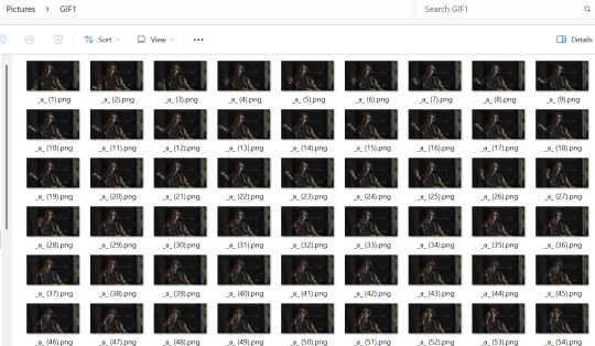
First things first. Rename all of your caps that you will be using for a gif to have the prefix _a_ on your computer. Select all and right-click on the FIRST file and select Rename (windows) and type _a_. Windows will add the numbers.
For most gifs, try not to have more than 60 frames as it will make the gif too large to upload to Tumblr. I usually aim for 45-50 frames max for most of my gifs.
2. IMPORT FRAME #1:
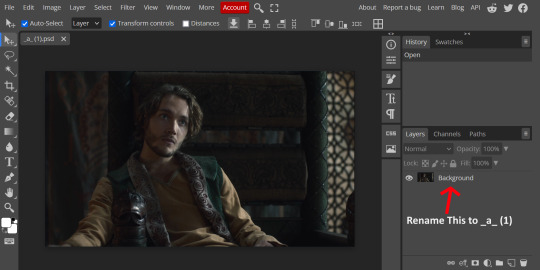
Drag and Drop _a_ (1).png into Photopea. Rename the layer from Background to _a_ (1)
3. IMPORT IMAGES:
Select all the rest of your images from the folder on your computer, and drag and drop ON TOP OF the image (not the layers section). Make sure the file you grab to drag/drop is the next one in the sequence (so _a_ (2).png in this case. Otherwise they will be out of order. If you do it right, you will see the layers section on the right get populated with your caps in reverse order, with 1 at the bottom and the last one at the top.

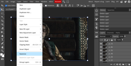
4. RASTERIZE:
Next, select all of the layers (on the right, by holding CTRL and clicking on each layer), go to Layer > Rasterize. They are currently Smart Layers, and if you keep them this way the sharpening will not apply (for some reason, I have no idea why that is)
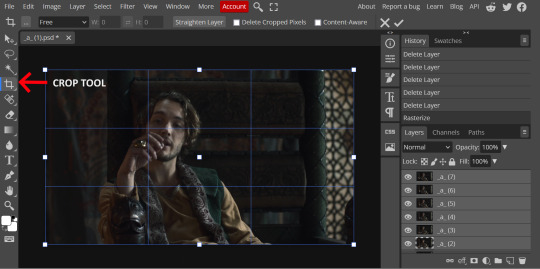
5. CROP:
Next, crop your gif. This tool is on the left menu. You do not have to have all the layers selected for this, it will crop all layers together. Move the blue lines at the edges until the frame is cropped how you like. Be mindful of the character moving in other frames; you may want to check your other layers to make sure nothing important gets cropped off in another frame. Once the blue lines are where you want them, click the checkmark at the top right to finish the crop.
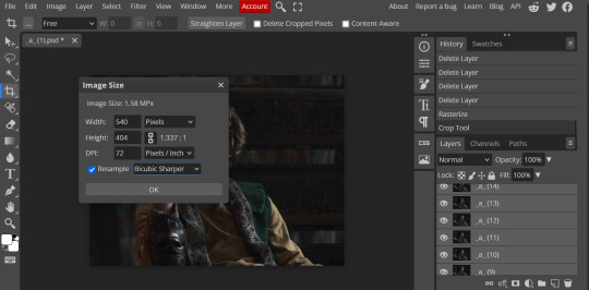
6. RESIZE:
Resize your gif so that it is 540 pixels wide. Go to Image > Image Size in the top menu. Make sure you choose "Bicubic Sharper" as the resample mode. Once this is done, you will see your image is tiny, so go to the Zoom tool (on the left menu, the magnifying glass near the bottom) and select Fit the Area at the top of the screen so you can see what you are doing.
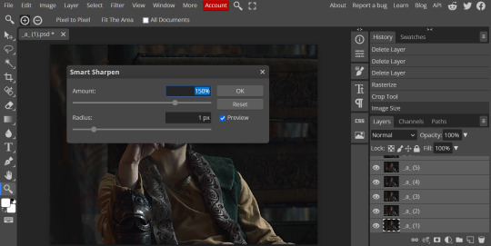
7. SHARPEN:
Next is sharpen. Select all your layers again (on the right), then go to the top menu: Filter > Sharpen > Smart Sharpen. The default settings here are for 150%, and that is good for most things.
8. ADJUSTMENTS
This is the tricky part. You now need to adjust the brightness, contrast, exposure, color balance, and saturation. This will vary from gif to gif how much to adjust these values. I will show how I adjusted this one and you can apply that to whatever gif you are making.
For starters, since this show is SO DARK, you will need to brighten it. There are many ways to do this, but I found the method that works best for me is adjusting the Levels.
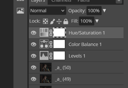
First off, in order to make adjustments, make sure you scroll all the way to the top of your Layers panel and make sure only the TOP LAYER is selected. Otherwise the adjustments will only be applied to whatever is BELOW the selected layer. You want all of them.
8a. ADJUST LEVELS
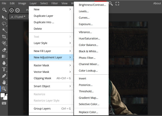
Next, go to Layer > New Adjustment Layer to pull up all your adjustments. For this first example we will use Levels, which is the second from the top.
You will see a histogram like this one:
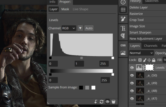
This is a lot of information about the image, but pay attention to where the curve starts and stops. On the left, you see a "0". That is your dark point. This image is slightly washed out so I need to move that adjustment to the right so that the little square is just below where the curve starts. The third number is "255" and this is your bright point. The images are very dark so most of the graph is shifted to the left (dark) so in order to brighten, move the third square (the white one) so that the second square (grey one) is just at the edge of where the curve drops off on the right.
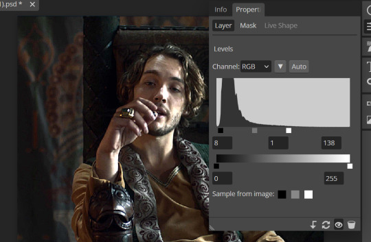
You can now see the numbers changed. Moving the first dark square will enhance your contrast, and moving the THIRD square will enhance your brightness. It is usually not necessary to move the second square, but you can experiment with this by moving things around and seeing how it affects your image. After this, it may be necessary to also increase the Exposure and Brightness if it is still not bright enough, but most of that can be done here.
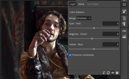
8b. ADJUST COLOR BALANCE
Again go to your Layer > New Adjustment Layer > Color Balance to get this tool. This is a neat one with A LOT of variables, so play around with it to get the colors to look how you want. A lot of the raw video tends to have a bluish or greenish cast to it, so you just move the sliders to get rid of the cast and make the colors look how they are SUPPOSED to.
In this case there is a very slight greenish cast to the pictures so I will adjust that slider to compensate. The Range (at the top) you can select Shadows, Midtones, or Highlights, depending on where the color cast is located. Usually I stick to Shadows but sometimes will use Midtones if the color cast is really bad. Make sure Preserve Luminosity is checked.
8c: ADJUST SATURATION
Layer > New Adjustment Layer > Hue/Saturation. This will brighten up your colors. This tool is VERY COOL in that you can select color families to selectively increase or decrease the saturation of. Under Range you can choose Master, which is all colors, or choose only Red, Yellow, Green, Cyan, Blue or Magenta. The slider at the very bottom (when a single color is selected) allows you to set the range of colors to. I chose Master and increased the saturation of all colors, but be careful as this can make skintones look VERY orange. So select other colors in the Range to adjust single colors only.
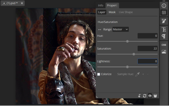
With this tool you can also change the HUE (which is changing the overall colors to a different color, like shifting all the reds to orange) and Lightness (which may or may not be necessary if you did the Levels correctly)
If you need to go back and change something in your adjustment layers, you can do so by clicking on the white box in the Layers section next to whatever you need to adjust.
There are many other Adjustment Layers you can play with, so have fun and experiment!
9. ADD YOUR WATERMARK AND TEXT
Next, you can add a watermark if you have a premade file, by dragging and dropping it on the image. Then move it around to where you want it, resize it if needed, and change the opacity if it is too bright. Make sure this layer is the TOP layer.

To add text (for subtitles or effects) simply click on the Text icon in the left menu (the T) and click anywhere on the image and start typing. You can change the font, color, size, and style in the menu on the top. Move the text around by using the Select tool (arrow on the left) Again make sure this is the TOP LAYER so that it will be present over the entire gif.

10: EXPORT YOUR GIF
File > Export as > GIF
A pop up dialog will appear and you can change some settings here if you want. I usually don't. Pay close attention to the filesize (at the bottom) and make sure it is under 10mb. Keep the quality at 100%. And most importantly MAKE SURE DITHER is checked! This will prevent compression artifacts from ruining your gif.

Save the file to your computer and VIOLA! Gif!

Have fun!
#gifmaking#gifs#gif makers#gif making resource#gifmakers#gif making#gif#gifmaking resources#gif making resources#my guides#giffing tutorial#gif making tutorial#photopea#photopea tutorial#photopea resources#photopeablr#photopea gifs#long post
65 notes
·
View notes
Text
Python Libraries to Learn Before Tackling Data Analysis
To tackle data analysis effectively in Python, it's crucial to become familiar with several libraries that streamline the process of data manipulation, exploration, and visualization. Here's a breakdown of the essential libraries:
1. NumPy
- Purpose: Numerical computing.
- Why Learn It: NumPy provides support for large multi-dimensional arrays and matrices, along with a collection of mathematical functions to operate on these arrays efficiently.
- Key Features:
- Fast array processing.
- Mathematical operations on arrays (e.g., sum, mean, standard deviation).
- Linear algebra operations.
2. Pandas
- Purpose: Data manipulation and analysis.
- Why Learn It: Pandas offers data structures like DataFrames, making it easier to handle and analyze structured data.
- Key Features:
- Reading/writing data from CSV, Excel, SQL databases, and more.
- Handling missing data.
- Powerful group-by operations.
- Data filtering and transformation.
3. Matplotlib
- Purpose: Data visualization.
- Why Learn It: Matplotlib is one of the most widely used plotting libraries in Python, allowing for a wide range of static, animated, and interactive plots.
- Key Features:
- Line plots, bar charts, histograms, scatter plots.
- Customizable charts (labels, colors, legends).
- Integration with Pandas for quick plotting.
4. Seaborn
- Purpose: Statistical data visualization.
- Why Learn It: Built on top of Matplotlib, Seaborn simplifies the creation of attractive and informative statistical graphics.
- Key Features:
- High-level interface for drawing attractive statistical graphics.
- Easier to use for complex visualizations like heatmaps, pair plots, etc.
- Visualizations based on categorical data.
5. SciPy
- Purpose: Scientific and technical computing.
- Why Learn It: SciPy builds on NumPy and provides additional functionality for complex mathematical operations and scientific computing.
- Key Features:
- Optimized algorithms for numerical integration, optimization, and more.
- Statistics, signal processing, and linear algebra modules.
6. Scikit-learn
- Purpose: Machine learning and statistical modeling.
- Why Learn It: Scikit-learn provides simple and efficient tools for data mining, analysis, and machine learning.
- Key Features:
- Classification, regression, and clustering algorithms.
- Dimensionality reduction, model selection, and preprocessing utilities.
7. Statsmodels
- Purpose: Statistical analysis.
- Why Learn It: Statsmodels allows users to explore data, estimate statistical models, and perform tests.
- Key Features:
- Linear regression, logistic regression, time series analysis.
- Statistical tests and models for descriptive statistics.
8. Plotly
- Purpose: Interactive data visualization.
- Why Learn It: Plotly allows for the creation of interactive and web-based visualizations, making it ideal for dashboards and presentations.
- Key Features:
- Interactive plots like scatter, line, bar, and 3D plots.
- Easy integration with web frameworks.
- Dashboards and web applications with Dash.
9. TensorFlow/PyTorch (Optional)
- Purpose: Machine learning and deep learning.
- Why Learn It: If your data analysis involves machine learning, these libraries will help in building, training, and deploying deep learning models.
- Key Features:
- Tensor processing and automatic differentiation.
- Building neural networks.
10. Dask (Optional)
- Purpose: Parallel computing for data analysis.
- Why Learn It: Dask enables scalable data manipulation by parallelizing Pandas operations, making it ideal for big datasets.
- Key Features:
- Works with NumPy, Pandas, and Scikit-learn.
- Handles large data and parallel computations easily.
Focusing on NumPy, Pandas, Matplotlib, and Seaborn will set a strong foundation for basic data analysis.
8 notes
·
View notes
Text
So you are a traditional artist
Or: how to prepare a traditional sketch for posting online.

(I didn't draw that, I wish I did. This is a sketch by Rainbow Arowana, used with permission)
You just put your heart and soul in a sketch. You love it. Time to post it on your favorite social network and... oh no.

It's washed out and all the details are lost! Fret not, we can fix this*.
STEP 1.
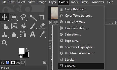
Get your favorite image manipulation program. GIMP, Photoshop, Photopea, your digital drawing app, doesn't matter. I use GIMP, because it's free. It's also very hard to learn, so just use whatever you are used to.
STEP 2.
Locate the "color curve" option. In GIMP it's under the "color" options, labelled "curves". If you can't find it, google it, it should exist in your favorite program too.
STEP 3.
Don't panic. Look at me. DON'T PANIC. It looks scary, but really, it's fine. Ignore all the options I crossed out for now, you can learn them later. Plus, GIMP looks complicated, your is probably simpler.
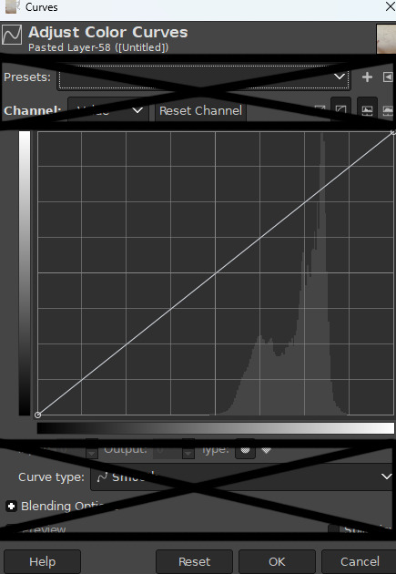
What is important here is the graphic. It's just a histogram, showing you the number of pixels for each level of lightness. From super dark to super white. Here we only have light-ish pixels, with almost no contrast between the darkest and the lightest. That tracks.
STEP 4.
Grab the little diagonal line, and move it around. See how it affect your drawing? Basically what we want to do is tell the computer "make the lightest stuff white and the darkest stuff black", so the diagonal should look something like that.
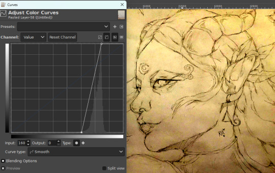
The drawing looks very yellow now but we can fix it.
STEP 5.
Desaturate. Black and white the shit out of it. In GIMP it's under "color->desaturate->desaturate". You probably know the option for your favorite program. Else just google it, it's fine.

Ew. It's all grey. Do an other curve manipulation to even that out.

Rinse and repeat until satisfaction. You can add a hint of a yellow tint back on a second layer if you wish to have a more natural paper feel.

*CAVEAT
This method works by amplifying the subtle color difference. You need a good quality scan, or at the very least a photo free of absolutely any shadows. Else... well. There is a reason I cropped the picture for this tutorial.

Yeah. Sorry, we can't really fix that. But as long as the lighting is perfectly uniform, you'll be fine.
2 notes
·
View notes
Text
Titanic Passenger List
Survival EDA Report
Introduction:
The sinking of the Titanic is one of the most infamous shipwrecks in history.
On April 15, 1912, during her maiden voyage, the widely considered “unsinkable” RMS Titanic sank after colliding with an iceberg. Unfortunately, there weren’t enough lifeboats for everyone onboard, resulting in the death of 1502 out of 2224 passengers and crew.
While there was some element of luck involved in surviving, it seems some groups of people were more likely to survive than others.
About Dataset:
Dataset Overview:
The dataset contains 891 rows and 12 columns.
The columns include passenger information such as ID, survival status, class, name, sex, age, family information (SibSp, Parch), ticket details, fare, cabin, and embarkation point.
Missing Data:
Age has 177 missing values (19.9% of the data).
Cabin has 687 missing values (77.1% of the data).
Embarked has 2 missing values (0.2% of the data).
Survival Rate:
The overall survival rate is approximately 38.4% (mean of the 'Survived' column).
Passenger Class Distribution:
The mean of 'Pclass' is 2.31, indicating that there are more passengers in the lower classes (2nd and 3rd) than in the 1st class.
Age Distribution:
The average age of passengers is about 29.7 years, with a standard deviation of 14 years.
Fare Distribution:
The average fare is 32.2, with a large standard deviation of 49.7, suggesting a wide range of ticket prices.
Observations
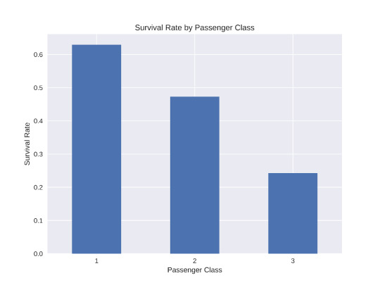
This bar plot clearly shows that passengers in higher classes had a better chance of survival:
1st class passengers had the highest survival rate, around 63%.
2nd class passengers had a survival rate of about 47%.
3rd class passengers had the lowest survival rate, approximately 24%.
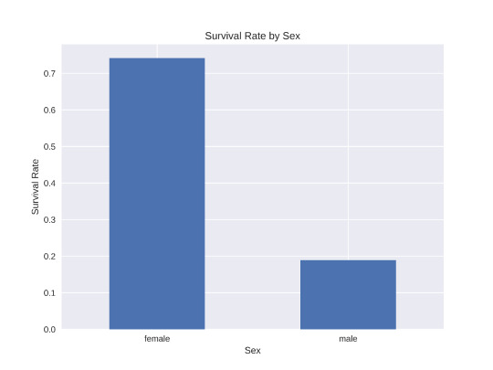
This visualization reveals a stark difference in survival rates between males and females:
Females had a much higher survival rate, around 74%.
Males had a significantly lower survival rate, about 19%.
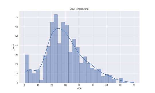
3.The histogram of age distribution shows:
The majority of passengers were between 20 and 40 years old.
There's a noticeable peak around age 30.
There were fewer children and elderly passengers compared to young and middle-aged adults.
Conclusion:
These visualizations provide valuable insights into the factors that influenced survival on the Titanic. The passenger's class, sex, and to some extent, age, all played roles in determining their chances of survival. This information could be useful for further analysis or building predictive models.
2 notes
·
View notes
Text
Python for Data Science: Libraries You Must Know
Python has become the go-to programming language for data science professionals due to its readability, extensive community support, and a rich ecosystem of libraries. Whether you're analyzing data, building machine learning models, or creating stunning visualizations, Python has the right tools to get the job done. If you're looking to start a career in this field, enrolling in the best Python training in Hyderabad can give you a competitive edge and help you master these crucial libraries.
1. NumPy – The Foundation of Numerical Computing
NumPy is the backbone of scientific computing with Python. It offers efficient storage and manipulation of large numerical arrays, which makes it indispensable for high-performance data analysis. NumPy arrays are faster and more compact than traditional Python lists and serve as the foundation for other data science libraries.
2. Pandas – Data Wrangling Made Simple
Pandas is essential for handling structured data. Data structures such as Series and DataFrame make it easy to clean, transform, and explore data. With Pandas, tasks like filtering rows, merging datasets, and grouping values become effortless, saving time and effort in data preprocessing.
3. Matplotlib and Seaborn – Data Visualization Powerhouses
Matplotlib is the standard library for creating basic to advanced data visualizations. From bar graphs to histograms and line charts, Matplotlib covers it all. For more visually appealing and statistically rich plots, Seaborn is an excellent choice. It simplifies the process of creating complex plots and provides a more aesthetically pleasing design.
4. Scikit-learn – Machine Learning Made Easy
In Python, Scikit-learn is one of the most widely used libraries for implementing machine learning algorithms. It provides easy-to-use functions for classification, regression, clustering, and model evaluation, making it ideal for both beginners and experts.
5. TensorFlow and PyTorch – Deep Learning Frameworks
For those diving into artificial intelligence and deep learning, TensorFlow and PyTorch are essential. These frameworks allow developers to create, train, and deploy neural networks for applications such as image recognition, speech processing, and natural language understanding.
Begin Your Data Science Journey with Expert Training
Mastering these libraries opens the door to countless opportunities in the data science field. To gain hands-on experience and real-world skills, enroll in SSSIT Computer Education, where our expert trainers provide industry-relevant, practical Python training tailored for aspiring data scientists in Hyderabad.
#best python training in hyderabad#best python training in kukatpally#best python training in KPHB#Kukatpally & KPHB
0 notes
Text
Master Data Like a Pro: Enroll in the 2025 R Programming Bootcamp for Absolute Beginners!!

Are you curious about how companies turn numbers into real-world decisions? Have you ever looked at graphs or reports and wondered how people make sense of so much data?
If that sounds like you, then you’re about to discover something that could completely change the way you think about numbers — and your career. Introducing the 2025 R Programming Bootcamp for Absolute Beginners: your all-in-one launchpad into the exciting world of data science and analytics.
This isn’t just another course. It’s a bootcamp built from the ground up to help beginners like you master R programming — the language trusted by data scientists, statisticians, and analysts across the world.
Let’s break it down and see what makes this course the go-to starting point for your R journey in 2025.
Why Learn R Programming in 2025?
Before we dive into the bootcamp itself, let’s answer the big question: Why R?
Here’s what makes R worth learning in 2025:
Data is the new oil — and R is your refinery.
It’s free and open-source, meaning no costly software licenses.
R is purpose-built for data analysis, unlike general-purpose languages.
It’s widely used in academia, government, and corporate settings.
With the rise of AI, data literacy is no longer optional — it’s essential.
In short: R is not going anywhere. In fact, it’s only growing in demand.
Whether you want to become a data scientist, automate your reports, analyze customer trends, or even enter into machine learning, R is one of the best tools you can have under your belt.
What Makes This R Bootcamp a Perfect Fit for Beginners?
There are plenty of R programming tutorials out there. So why should you choose the 2025 R Programming Bootcamp for Absolute Beginners?
Because this bootcamp is built with you in mind — the total beginner.
✅ No coding experience? No problem. This course assumes zero background in programming. It starts from the very basics and gradually builds your skills.
✅ Hands-on learning. You won’t just be watching videos. You’ll be coding along with real exercises and practical projects.
✅ Step-by-step explanations. Every topic is broken down into easy-to-understand segments so you’re never lost or overwhelmed.
✅ Real-world applications. From day one, you’ll work with real data and solve meaningful problems — just like a real data analyst would.
✅ Lifetime access & updates. Once you enroll, you get lifetime access to the course, including any future updates or new content added in 2025 and beyond.
Here's What You'll Learn in This R Bootcamp
Let’s take a sneak peek at what you’ll walk away with:
1. The Foundations of R
Installing R and RStudio
Understanding variables, data types, and basic operators
Writing your first R script
2. Data Structures in R
Vectors, matrices, lists, and data frames
Indexing and subsetting data
Data importing and exporting (CSV, Excel, JSON, etc.)
3. Data Manipulation Made Easy
Using dplyr to filter, select, arrange, and group data
Transforming messy datasets into clean, analysis-ready formats
4. Data Visualization with ggplot2
Creating stunning bar plots, line charts, histograms, and more
Customizing themes, labels, and layouts
Communicating insights visually
5. Exploratory Data Analysis (EDA)
Finding patterns and trends
Generating summary statistics
Building intuition from data
6. Basic Statistics & Data Modeling
Mean, median, standard deviation, correlation
Simple linear regression
Introduction to classification models
7. Bonus Projects
Build dashboards
Analyze customer behavior
Create a mini machine-learning pipeline
And don’t worry — everything is taught in plain English with real-world examples and analogies. This is not just learning to code; it’s learning to think like a data professional.
Who Should Take This Course?
If you’re still wondering whether this bootcamp is right for you, let’s settle that.
You should definitely sign up if you are:
✅ A student looking to boost your resume with data skills ✅ A career switcher wanting to break into analytics or data science ✅ A marketer or business professional aiming to make data-driven decisions ✅ A freelancer wanting to add analytics to your skill set ✅ Or just someone who loves to learn and try something new
In short: if you’re a curious beginner who wants to learn R the right way — this course was made for you.
Real Success Stories from Learners Like You
Don’t just take our word for it. Thousands of beginners just like you have taken this course and found incredible value.
"I had zero background in programming or data analysis, but this course made everything click. The instructor was clear, patient, and made even the complicated stuff feel simple. Highly recommend!" — ★★★★★ "I used this bootcamp to prepare for my first data internship, and guess what? I landed the role! The hands-on projects made all the difference." — ★★★★★
How R Programming Can Transform Your Career in 2025
Here’s where things get really exciting.
With R under your belt, here are just a few of the opportunities that open up for you:
Data Analyst (average salary: $65K–$85K)
Business Intelligence Analyst
Market Researcher
Healthcare Data Specialist
Machine Learning Assistant or Intern
And here’s the kicker: even if you don’t want a full-time data job, just knowing how to work with data makes you more valuable in almost any field.
In 2025 and beyond, data skills are the new power skills.
Why Choose This Bootcamp Over Others?
It’s easy to get lost in a sea of online courses. But the 2025 R Programming Bootcamp for Absolute Beginners stands out for a few key reasons:
Updated content for 2025 standards and tools
Beginner-first mindset — no jargon, no skipping steps
Interactive practice with feedback
Community support and Q&A access
Certificate of completion to boost your resume or LinkedIn profile
This isn’t just a video series — it’s a true bootcamp experience, minus the high cost.
Common Myths About Learning R (and Why They’re Wrong)
Let’s bust some myths, shall we?
Myth #1: R is too hard for beginners. Truth: This bootcamp breaks everything down step by step. If you can use Excel, you can learn R.
Myth #2: You need a math background. Truth: While math helps, the course teaches everything you need to know without expecting you to be a math whiz.
Myth #3: It takes months to learn R. Truth: With the right structure (like this bootcamp), you can go from beginner to confident in just a few weeks of part-time study.
Myth #4: Python is better than R. Truth: R excels in statistics, visualization, and reporting — especially in academia and research.
Learning on Your Own Terms
Another great thing about this course?
You can learn at your own pace.
Pause, rewind, or skip ahead — it’s your journey.
No deadlines, no pressure.
Plus, you’ll gain access to downloadable resources, cheat sheets, and quizzes to reinforce your learning.
Whether you have 20 minutes a day or 2 hours, the course fits into your schedule — not the other way around.
Final Thoughts: The Best Time to Start Is Now
If you’ve been waiting for a sign to start learning data skills — this is it.
The 2025 R Programming Bootcamp for Absolute Beginners is not just a course. It’s a launchpad for your data journey, your career, and your confidence.
You don’t need a background in coding. You don’t need to be a math genius. You just need curiosity, commitment, and a little bit of time.
So go ahead — take that first step. Because in a world where data rules everything, learning R might just be the smartest move you make this year.
0 notes
Text
mt4 indicator does not repaint
Introduction
https://secretindicator.com/product/powerful-true-mt4-scalping-indicator/
Telegram Channel
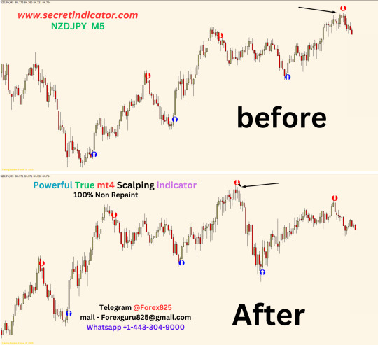
In the world of forex trading, accuracy and timing are critical. Many traders rely on indicators to make informed decisions, especially on platforms like MetaTrader 4 (MT4). However, one frustrating issue traders often encounter is "repainting"—when an indicator changes its past signals, giving a misleading appearance of high accuracy. That’s where non-repainting indicators come into play. These tools maintain the integrity of historical data and offer more reliable signals.
In this guide, you’ll learn:
What non-repainting indicators are
The dangers of repainting indicators
Benefits of non-repainting tools
The best non-repaint MT4 indicators
How to install and use them
Strategy examples
Tips to avoid scams
Frequently asked questions
Let’s dive deep into the power of non-repainting indicators on MT4.
Chapter 1: Understanding Repainting in MT4
What Is Repainting?
Repainting occurs when a technical indicator changes its previously plotted values based on future price action. For example, a buy signal shown at one candle might disappear or shift to another candle after new price data comes in. This makes the indicator look perfect in hindsight, but unreliable in real-time trading.
Why Is Repainting Dangerous?
False Confidence: Traders may believe an indicator is highly accurate.
Late Entries: By the time the signal stabilizes, the best entry point may have passed.
Overfitting: Repainting indicators often fit past data but fail in live markets.
Chapter 2: What Are Non-Repainting Indicators?
Definition
A non-repainting indicator is one that does not change past signals or values after the bar closes. What you see during a live trade is what you'll see in the history. This makes them ideal for real-time strategy building and backtesting.
Key Features
Signals stay the same once generated
Reliable for both scalping and swing trading
Great for automation (e.g., Expert Advisors)
Enhanced transparency and trust
Chapter 3: Benefits of Non-Repainting Indicators
1. Trustworthy Signals
Once a buy or sell signal appears, it doesn't vanish or change. Traders can act on these signals confidently.
2. Improved Strategy Development
Backtesting becomes reliable, allowing for data-driven decisions.
3. Automation Friendly
Many traders use Expert Advisors (EAs) to automate trading. Non-repainting indicators are compatible with most EAs.
4. Reduced Emotional Trading
When signals are clear and stable, traders avoid impulsive decisions based on "signal changes."
Chapter 4: Top Non-Repainting Indicators for MT4
Below are some of the best and most popular non-repaint indicators available for MetaTrader 4:
1. RSI + MA Crossover
Combines Relative Strength Index with Moving Average crossovers for early trend detection. Once a crossover is confirmed, the signal remains unchanged.
Usage: Great for trend-following strategies.
2. Super Trend Non-Repaint
Shows buy/sell signals based on volatility and trend. It is famous for its smooth entries.
Usage: Swing trading and intraday scalping.
3. BB Alert Arrows (Bollinger Band-Based)
Provides entry signals when price touches extreme Bollinger Band levels and confirms with momentum.
Usage: Volatility breakout and reversal signals.
4. MACD True
A customized MACD indicator that gives crossovers with accurate histogram momentum. No repainting ensures signals remain consistent.
Usage: Trend-following and momentum confirmation.
5. Buy Sell Magic Indicator
Offers clear arrows for buy and sell based on historical volatility, price action, and filters to avoid whipsaws.
Usage: Perfect for beginners.
Chapter 5: How to Install Non-Repaint Indicators on MT4
Step-by-Step Guide
Download the .ex4 or .mq4 file of the indicator
Open your MT4 platform
Click on File > Open Data Folder
Navigate to MQL4 > Indicators
Paste the downloaded file
Restart MT4
Drag the indicator from Navigator > Custom Indicators onto your chart
That’s it! Your non-repaint indicator is now active.
Chapter 6: Strategy Examples Using Non-Repainting Indicators
1. Scalping Strategy with Super Trend
Timeframe: M1 or M5
Indicator: Super Trend Non-Repaint
Entry: Buy when green arrow appears; sell on red
Exit: 5–10 pips target or opposite signal
Stop Loss: Recent swing high/low
2. Swing Strategy with MACD True + RSI
Timeframe: H1 or H4
Indicators: MACD True, RSI
Entry: Buy when MACD line crosses above signal + RSI > 50
Exit: Opposite crossover
Stop Loss: 30–50 pips depending on volatility
3. Bollinger Reversal Strategy
Timeframe: M15 or M30
Indicators: BB Alert Arrows + RSI
Entry: When price touches BB edge with RSI < 30 or > 70
Exit: 1:2 Risk/Reward or TP of 20 pips
Stop Loss: 10 pips
Chapter 7: Real-World Tips for Using Non-Repaint Indicators
1. Combine with Price Action
Always validate indicator signals with support/resistance or candlestick patterns.
2. Use in Confluence
No indicator is perfect. Combine 2–3 non-repaint tools to strengthen your strategy.
3. Avoid Overloading Charts
Too many indicators can clutter decision-making. Keep it clean and simple.
4. Don’t Chase Signals
Wait for confirmation candles to close. Acting too early can cost you.
Chapter 8: How to Identify a Fake Non-Repaint Indicator
Unfortunately, many online indicators claim to be non-repaint but aren't. Here’s how to avoid fakes:
Check live vs. historical behavior: Apply it to live chart and check if old signals shift.
Use Bar Replay: If available in MT5 or tradingview, simulate candle-by-candle development.
Look for Source Code Transparency: .mq4 files are editable. If only .ex4 is provided, be cautious.
Backtest with a strategy tester: MT4's Strategy Tester can expose repainting behaviors.
Read community reviews: Trusted forex forums often expose fake tools.
Chapter 9: Where to Find Free Non-Repainting Indicators
ForexFactory.com – Active community and free indicator uploads
MQL5 Market – Official marketplace; check reviews for non-repaint claims
TradingView (via MT4 ports) – Many open-source scripts
YouTube Forex Channels – Look for live testing videos
Telegram and Discord Forex Groups – Some groups share indicators for free
Important: Always scan files with antivirus tools before use.
Chapter 10: Frequently Asked Questions (FAQ)
1. Are all non-repainting indicators 100% accurate?
No. Non-repainting means the signal doesn’t change after it's printed, not that it's always right. Always use good risk management.
2. Can I use non-repaint indicators on a mobile version of MT4?
Not directly. Indicators can only be added to desktop versions. But you can receive trade alerts and monitor signals via mobile after setup.
3. Are paid non-repaint indicators better than free ones?
Not always. Some free indicators outperform expensive ones. It depends on the strategy and usage.
4. Can I automate non-repaint indicators in Expert Advisors (EAs)?
Yes. Non-repainting logic works well in automation, making it safer for bots and auto-trading scripts.
5. Do moving averages repaint?
Simple and Exponential Moving Averages do not repaint if they are based on closed candles. However, signals based on future prices or unclosed bars can appear to "repaint."
Conclusion
In forex trading, every pip matters. Using non-repainting indicators on MT4 is a game-changer for traders who value signal integrity, transparency, and strategy reliability. These indicators remove the illusion of perfect backtests and allow you to trade based on real data and solid setups.
Whether you're a scalper, swing trader, or algo enthusiast, choosing the right non-repaint tools can enhance your edge in the market. Remember, no tool is magic, but when used wisely, non-repainting indicators can become a core part of your profitable trading system.
https://secretindicator.com/product/powerful-true-mt4-scalping-indicator/
#forex factory#forex market#forex news#forex online trading#crypto#forex ea#forex broker#forex#forex indicators#forex education
0 notes
Text
Mastering Technical Indicators in Share Market Trading: A Practical Guide
Understanding market movements is essential for turning analysis into profit. Technical indicators offer quantifiable insights into price trends, momentum, and market sentiment key tools in the arsenal of any serious trader. In this guide, Wealth Note walks you through the most impactful indicators and shows you how to integrate them into your strategy for smarter, data-driven decisions.
1. Why Technical Indicators Matter
Technical indicators translate raw price and volume data into actionable signals. Unlike fundamental analysis, which examines company health and macroeconomic factors, these tools focus purely on market behavior. Used correctly, they help you:
Identify trend direction and strength
Pinpoint optimal entry and exit points
Gauge overbought or oversold conditions
Confirm breakout or reversal patterns
By complementing chart patterns with indicator-based validation, traders can reduce emotional bias and stick to a systematic plan.
2. Core Indicators to Know
a. Moving Averages (MA)
Simple Moving Averages (SMA) and Exponential Moving Averages (EMA) smooth out price fluctuations to reveal underlying trends. A common approach is the “golden cross” (short-term MA crossing above long-term MA) as a bullish signal, or the “death cross” for bearish momentum.
b. Relative Strength Index (RSI)
The RSI measures the speed and change of price movements on a 0–100 scale. Readings above 70 suggest overbought conditions, while those below 30 hint at oversold territory. Many Wealth Note students use RSI divergences — where price moves counter to the indicator — to spot potential reversals.
c. Moving Average Convergence Divergence (MACD)
MACD calculates the difference between two EMAs and plots a signal line (its own EMA). Crossovers between the MACD line and signal line often precede shifts in momentum. Histogram bars visualize the distance between these lines, helping traders anticipate accelerating or decelerating trends.
d. Bollinger Bands
Comprising a middle-band SMA and two standard-deviation bands, Bollinger Bands expand and contract based on volatility. Prices touching or breaching the bands can signal overextended moves, while “squeezes” foreshadow volatility breakouts.
3. Implementing Indicators in Your Routine
Achieving proficiency with indicators requires practice and context. Follow these steps to integrate them effectively:
Select a Clear Timeframe: Indicators behave differently across intraday, swing, and positional horizons. Align your indicator settings (e.g., 14-day RSI vs. 6-period RSI) with your trading timeframe.
Use Multiple Indicators Judiciously: Combining trend-following tools (like MA) with momentum indicators (like RSI) provides cross-confirmation. Avoid “analysis paralysis” by limiting yourself to two or three complementary indicators.
Backtest Your Strategy: Before risking real capital, apply indicator rules to historical charts. Wealth Note’s simulated trading platform lets you refine entry and exit criteria under diverse market conditions.
Adjust for Market Regimes: Trending markets favor moving averages, while range-bound environments suit oscillators like Stochastic. Learn to switch indicator emphasis as volatility and trend direction shift.
4. Advanced Indicator Techniques
Divergence Trading: When price makes a new high but an oscillator (RSI or MACD) fails to confirm, it hints at waning momentum and possible reversal.
Volume-Weighted Average Price (VWAP): Especially useful for intraday traders, VWAP shows the average price weighted by volume. Trading above VWAP indicates institutional buying, while below suggests selling pressure.
Custom Scripting: Many platforms allow you to tweak indicator parameters or create hybrid tools ideal for traders seeking an edge beyond standard formulas.
5. Pitfalls to Avoid
Overreliance on Signals: No indicator is infallible. Always consider broader market context, news events, and support/resistance zones.
Chasing Alerts: Impulsive reactions to every crossover or band touch can erode profits. Discipline is key — wait for confirmation and alignment across your chosen indicators.
Ignoring Risk Management: Even the best signals fail occasionally. Always define stop-loss levels and position sizes before entering a trade.
By mastering technical indicators, you bring structure and clarity to your Share Market Trading approach. Remember to choose tools that align with your trading style, backtest thoroughly, and adjust as market conditions evolve. Whether you’re refining intraday tactics or building long-term strategies, Wealth Note’s expert-led courses and hands-on support will help you harness the full power of indicators transforming data into consistent, profitable outcomes in the markets.
0 notes
Text
Match Data Pro LLC: Powering Precision with Smarter Data Operations
In the digital era, data is the new currency—but not all data is created equal. Inaccurate, inconsistent, and incomplete data can derail decision-making, inflate costs, and compromise customer experiences. That’s where Match Data Pro LLC steps in—offering advanced data scrubbing software, a powerful data integration platform, and tools designed for data operations optimization.
If your organization is ready to streamline data workflows, boost reliability, and maximize efficiency, Match Data Pro LLC delivers the solution.
Why Data Quality is the Backbone of Business Success
Every business process—whether it’s marketing, sales, finance, or logistics—depends on data. However, raw data from disparate sources often contains issues like:
Duplicate records
Inconsistent formatting
Outdated or missing values
Mismatched data types
Without thorough cleansing and integration, this “dirty data” leads to poor insights, failed automation, and reduced customer trust. Match Data Pro LLC combats these challenges with a robust, AI-powered data scrubbing software that cleanses data at scale, turning disorder into accuracy.
Data Scrubbing Software: Clean Data, Clear Decisions
Match Data Pro’s data scrubbing software automates the process of cleaning and standardizing your data. It identifies and corrects inaccuracies, removes duplicates, fills gaps, and ensures consistency across systems.
Key capabilities include:
Duplicate detection and merge logic
Address and contact normalization
Email and phone number validation
Anomaly detection based on rules or machine learning
Custom data transformation pipelines
Whether you’re working with customer databases, supplier lists, financial records, or product catalogs, our scrubbing tool ensures the information you rely on is trustworthy and actionable.
Unified Data through a Powerful Data Integration Platform
Organizations often face a common challenge: data exists across multiple applications, platforms, and departments. Pulling it all together in a meaningful, efficient way is the key to gaining a full 360-degree view of your operations.
That’s where our data integration platform becomes essential.
Match Data Pro LLC provides a flexible and scalable platform that unifies data from various sources—CRMs, ERPs, marketing tools, cloud storage, SQL databases, and more—into a single, coherent system.
What our data integration platform delivers:
Real-time and batch data syncing
Connectors for major SaaS apps and legacy systems
Drag-and-drop interface for non-technical users
Error handling and audit trails for compliance
Secure APIs for custom integrations
This unified view empowers your teams to make smarter, faster decisions based on reliable, up-to-date data from every corner of the business.
Data Operations Optimization: Smart Workflows, Streamlined Processes
Too often, teams waste hours manually cleaning, merging, uploading, and validating data. Match Data Pro LLC’s solution is to automate those steps with data operations optimization.
We help organizations:
Automate recurring tasks with scheduled workflows
Apply standard cleaning and validation rules at scale
Monitor changes and get alerts on anomalies
Track data health over time
Empower collaboration across departments with access controls and logs
With optimized operations, your team can spend less time fixing data—and more time using it to innovate, plan, and grow.
Data Profiling Metrics: Know Your Data Before You Use It
One of the most powerful features of Match Data Pro’s platform is its ability to perform in-depth data profiling metrics. Before any cleaning or integration begins, our platform analyzes your datasets to uncover hidden issues and provide insight into their structure and quality.
Data profiling metrics include:
Frequency and uniqueness analysis
Null and missing value reports
Pattern recognition (e.g., phone numbers, postal codes)
Value distribution histograms
Outlier detection
These metrics give you the visibility you need to understand your data’s current state, assess risks, and plan better transformation strategies.
Real-World Example: Retail Chain Cleans 5M+ Records
A national retail chain with over 5 million customer records faced issues with duplicate data, inconsistent formatting, and inaccurate contact information. Using Match Data Pro LLC’s data scrubbing software and integration platform, they were able to:
Deduplicate and clean 98% of their data in under 72 hours
Integrate customer data from five separate CRMs into one unified system
Automate weekly cleansing jobs going forward
Improve campaign open rates by 25% and reduce churn
This success story illustrates the power of clean, connected data in action.
The Match Data Pro Advantage
When it comes to enterprise-level data solutions, Match Data Pro LLC stands out for its:
All-in-one platform combining cleaning, integration, profiling, and automation
User-friendly interface designed for technical and non-technical users
Scalable architecture suitable for both small businesses and global enterprises
Advanced security protocols to protect sensitive information
Dedicated support from onboarding to scaling and customization
We don’t just clean data—we transform how your business interacts with it.
Final Thoughts: Make Data Your Competitive Edge
Inconsistent, disconnected, and unreliable data holds businesses back. Match Data Pro LLC helps you flip the script—with precision, speed, and scale.
From smart data scrubbing software to a robust data integration platform, insightful data profiling metrics, and comprehensive data operations optimization, we give you the tools to unlock your data’s true potential.
Ready to bring order to your data chaos? Get in touch with Match Data Pro LLC today and let’s build the foundation for smarter, cleaner, and more connected business intelligence.
0 notes
Text
Comprehensive SAS Tutorial: Master Procedures, Reporting, and Data Visualization
SAS is one of the leading software tools for data analysis, known for its ability to handle large datasets, provide deep statistical analysis, and generate comprehensive reports. A SAS tutorial can help you gain the knowledge and skills needed to master SAS programming, enabling you to use its powerful procedures and capabilities effectively. Whether you're just starting or looking to enhance your SAS skills, this comprehensive tutorial will guide you through key concepts in SAS programming, reporting, and data visualization.
Getting Started with SAS Programming
SAS programming may seem intimidating at first, but it is highly structured, and with the right foundation, anyone can become proficient. The first step in mastering SAS is to familiarize yourself with its basic concepts and syntax. The SAS environment consists of four main components: the Data Step, Procedures (PROCs), Macros, and the Output Delivery System (ODS).
The Data Step is where you create and modify datasets. This is where you load raw data and apply transformations such as cleaning, merging, or summarizing. Procedures (PROCs) are pre-built SAS functions used for various tasks such as statistical analysis, data manipulation, and reporting.
A SAS tutorial for beginners typically starts by explaining these components and guiding you through the basics of data input, variable assignment, and dataset management.
Mastering SAS Procedures
One of the key aspects of SAS programming is learning how to effectively use its procedures (PROCs). Procedures are predefined commands that allow you to perform a wide variety of tasks, from basic data manipulation to complex statistical analysis. Here are some key PROCs you will encounter in your SAS tutorial:
PROC SORT: Used to sort datasets based on specified variables.
PROC MEANS: Used for summarizing data, calculating mean, median, standard deviation, etc.
PROC FREQ: Used to calculate the frequency of categorical variables.
PROC REG: Used for performing regression analysis.
Mastering these basic procedures will help you quickly get results and insights from your data. As you become more proficient, you can explore more advanced procedures for statistical analysis, machine learning, and data modeling.
Reporting and Output Delivery
Reporting is another essential aspect of SAS programming. With SAS’s Output Delivery System (ODS), you can generate high-quality reports and customize the layout of your results. ODS allows you to produce reports in various formats, such as HTML, PDF, and Excel.
Using SAS tutorial resources, you will learn how to customize the appearance of your reports, filter the output, and even create multi-page reports. This is particularly useful for presenting results to stakeholders in an easy-to-understand format.
youtube
Data Visualization with SAS
Data visualization is crucial in turning complex data into a clear and engaging story. SAS offers a variety of tools for creating high-quality graphs and charts. The SGPLOT procedure is one of the most commonly used SAS procedures for creating visualizations.
In this SAS tutorial, you'll learn how to create bar charts, line plots, histograms, and scatter plots, all of which help you identify patterns and trends in your data. SAS also allows for more advanced visualizations like interactive graphs and dashboards.
Conclusion
By following a SAS tutorial, you can build a solid foundation in SAS programming, from basic data manipulation to advanced statistical analysis and reporting. With the power of SAS procedures and visualization tools, you’ll be equipped to tackle even the most complex datasets and deliver actionable insights for your organization. Whether you’re a beginner or an experienced user, mastering these skills will ensure that you can make the most out of SAS's powerful analytics capabilities.
#sas tutorial#sas programming tutorial#sas tutorial for beginners#data visualization#visualization tools#Youtube
0 notes
Text
BIOSTATISTICS 2 NOTES ABOUT DATA: 2019 BRFSS SPSS Data File.sav These data are from the Behavioral Risk Factor Surveillance System (BRFSS). The BRFSS collects state data about U.S. residents regarding their health-related risk behaviors, chronic health conditions, and use of preventive services. Be sure to read the Background section of the 2019 BRFSS Overview for more details so you get a little better idea of the BRFSS and how the data are used. Investigators all over the country use these data to conduct research about many different characteristics and how they affect health outcomes. The data file for this project is not the complete data set. There are over 250 variables in the complete data set. I narrowed it down to the few variables I want you to use for this project and simplified coding for the sake of your sanity and to best demonstrate your learning of concepts. INSTRUCTIONS: (Please read each question thoroughly) You are a statistician who is tasked with helping a researcher who is interested in determining what characteristics influence a person to report poor health. Using the BRFSS, the researcher find that there are a few variables that can help her answer that question. She first asks if you can conduct some analyses to determine what characteristics predict someone reporting that they had at least one day in the last day where they reported poor physical health (PHYSHLTH_YES_NO) in the last 30 days. In addition, for those who reported at least one day of poor physical health, she is also interested in determining what influences the reported number of days of poor physical health (PHYSHLTH_DAYS). Among other characteristics, the investigator is primarily interested in determining whether veteran status (variable name: VETERAN), and adverse childhood experiences (ACES) (variable name: ACES_Score) influence these two dependent variables. Because there are a range of confounding variables to consider, the researcher also collected data about sex, health insurance, marital status, education, home ownership, income, age, smoking, alcohol use, and exercise, among others. Your job is to help the researcher answer her research questions. 1. Using the graphing options in SPSS, choose two appropriate graphical display options to describe PHYSHLTH_DAYS. You should be able to describe whether this variable is normally distributed, and whether there are outliers in the data using the two display options you choose. Copy and paste your graphs/charts below and for each, provide an interpretation of the graph, and explain why you chose that option. The selected graphical options are the histogram with normality curve and dot plot. The Histogram with Normality Curve Figure 1.1 above shows a histogram with a normal distribution curve. The histogram was selected because it provides a view of the central tendency, spread, and shape of the data set, including the presence of outliers. By showing the shape of the dataset, the histogram will provide an at-a-glance view of whether or not the dataset presents a normal distribution. The dataset presents a normal distribution as evidenced by the single-peaked bell-shaped normality curve, with observations spread out symmetrically around the mean. No outliers are evident from the distribution. Figure 1.1 The Dot Plot Figure 2.1 above presents a dot plot. The dot plot, like the histogram, presents a view of the frequency distributions of the different data points in the dataset. However, the dot plot provides information on the frequency of individual values, and not a range of values like the histogram. The dots appear as complete bars due to the large number of values attached to each data point. Longer bars represent higher frequencies. Thus, since it focuses on individual data points, the dot plot provides a more effective way of assessing whether outliers exist in the data set than the histogram. Outliers are data points that can be termed either extremely high or extremely low as compared to the rest of the data point or the nearest data point. The dot plot shows that there are no outliers in the data set. Figure 2.1 2. The variable PHYSHLTH_YES_NO is a categorical, binary, nominal variable (Either people report poor physical health (Yes=1), or they do not (No=0)). Based on this categorical variable, use the appropriate statistical test to determine if there is a difference in ACES_Score, and ALCOHOL between the groups who report poor physical health. You will be doing two hypothesis testsone for ACES_Score, and one for ALCOHOL. For each test, conduct a formal hypothesis test to answer this question (choose the appropriate statistical test, explain why you chose it, write out your null and alternative hypotheses, run the test, and interpret the results). Include appropriate output from SPSS to show what you did. To test whether there is a difference in ACES score between the two groups: YES and NO, the independent samples t-test will be used. The independent samples t-test will answer this question by comparing the means of the two independent groups in regard to the ACES score to determine whether the ACES mean score for the group that reports YES (poor physical health) differs significantly from that which reports NO (good physical health). The independent samples t-test is appropriate because the data meets the following requirements: i) The dependent variable ACES score is a continuous ratio variable, ii) the independent variable PHYSHLTH_YES_NO is a categorical variable with only two categories (Yes and No), and iii) the groups or categories are independent and hence, a participant cannot be in both groups. The null and alternative hypotheses for the independent samples t-test are: H0: ACES SCOREYES ACES SCORENO = 0 (the difference of the means is equal to 0) H1: ACES SCOREYES ACES SCORENO ? 0 (the difference of the means is not equal to 0) Before running the t-test it is advisable to run a comparison box plot to obtain an idea of what to expect in the test. The box plot is as presented below. If the means/variances of the two groups or categories in regard to ACES score were equal, the box plots would have equal lengths. Figure 2.1 From the box plots in figure 2.1, it is evident that the variances for the two categories are quite different as the spread of observations for the YES category is greater than that of the NO category. This suggests that the two groups or categories differ by ACES score. The next step is to run the independent samples t-test to check whether the difference between the groups is significant. Results of the t-test are presented in tables 2.1 and 2.2 below: Table 2.1 Group Statistics Did you have any days in the last month when your physical health was not good? N Mean Std. Deviation Std. Error Mean Total Adverse Childhood Experiences Score (ACES) No 58968 1.4565 1.96211 .00808 Yes 37273 2.1046 2.40083 .01244 Table 2.2 Independent Samples Test Levene's Test for Equality of Variances t-test for Equality of Means F Sig. t df Sig. (2-tailed) Mean Difference Std. Error Difference 95% Confidence Interval of the Difference Lower Upper Total Adverse Childhood Experiences Score (ACES) Equal variances assumed 1954.881 .000 -45.707 96239 .000 -.64807 .01418 -.67586 -.62028 Equal variances not assumed -43.700 67753.523 .000 -.64807 .01483 -.67714 -.61900 From the group statistics table 2.1, 58,968 participants reported good health, while 37,273 reported poor physical health. The mean ACES score for the YES (poor physical health) group is 2.10, while that of the NO group is 1.46. Table 2.2 presents the results of the t-test. The Levenes test for equality of variances yields a significant p value of p < 0.01. Hence, we reject the null of the Levenes test and conclude that the variance in ACES score for the group that reports poor physical health (YES) is significantly different from that which reports good physical health. This implies that we need to consider the Equal Variances Not Assumed row in interpreting the t-test results. The negative t-value of 43.7 indicates that the mean ACES score for the first group (NO good physical health) is lower than that of the second group (YES- poor physical health). The associated p-value (p Read the full article
0 notes
Text
Make Your Minitab Assignment Easier With Minitab Assignment Help

Minitab is a statistical tool that helps in analyzing data. This statistical tool is widely used in industries where precise evaluation is required. It offers a range of statistical equipment and effective solutions for intricate data sets. Students in various disciplines are required to learn the practical use of Minitab software. They are given several academic projects based on relevant problems in Minitab. Solving the Minitab project might be difficult for students. It requires a solid understanding of statistical concepts and practical use of operating Minitab software. Many students face problems in writing academic papers due to a lack of knowledge and expertise. If you are facing difficulty in solving the Minitab project, you can get Minitab Assignment Help from experts in the USA.
What is Minitab?
Minitab is statistical software that allows users to analyze data using Six Sigma techniques. Minitab helps to generate a single photograph of a large amount of data in the forms of a bar graph, pie chart, histogram, etc. It is specially designed for research data catering to the needs of businesses of all sizes. It ensures accuracy and valuable interaction that provides fast and effective solutions.
Benefits of Using Minitab in Statistical Analysis
Minitab is a complete package of statistical analysis.
It provides accurate and efficient solutions in fast mode
Minitab is user-friendly and makes it easy to use for everyone.
It offers a powerful tool for data analysis that allows users to generate visual representations of data.
Users can easily customize the tool according to their needs which makes it more versatile.
Gaining practical knowledge of using Minitab software through the academic project allows students to excel in the field. However, solving the Minitab project is not easy for everyone. Here professional services assist students in the best way to complete projects excellently.
How Professional Assurance is Useful in Solving Minitab Project
Professional services offer several features and advantages for the Minitab project.
Guidance From Subject Experts
Professional services have a team of experts who are highly trained and experienced in dealing with complex projects. They offer personalized support to students in solving the academic project. By getting support from experts, students can easily tackle complex projects and finish them efficiently.
Exceptional Quality Content
Professional experts provide detailed insight into the topic for your Minitab project. They provide in-depth research material in an organized way using the right methodology. They make the content more presentable using graphs and charts. It helps the reader to understand the material easily.
Stress-Free Deadline
Professional services provide fast delivery of paper. When you are running out of time to meet a deadline, experts will help you to finish the paper timely. It helps students to meet deadlines and manage busy schedules.
Unique and Accurate Solution
When working on a Minitab project there is no room for mistakes. Professional experts are well-versed in creating unique solutions for academic papers. They provide unlimited revision, proofreading, and editing support. It helps to submit plagiarism-free and accurate solutions for the Minitab project.
24 Hours Support
Students may have several doubts about the topic when working on the Minitab project. Minitab Assignment Help Online services provide 24-hour support to students for their projects. It allows students to get their support at any time for solving problems.
Conclusion
Minitab is a useful tool for statistical analysis. By getting support from experts, you can complete papers efficiently and maximize learning in the field.
0 notes
Text
MACD Indicator: Spotting Buy and Sell Signals in Trading
Timing the market is one of the most challenging yet rewarding aspects of trading. Whether you are involved in stocks, forex, or cryptocurrency, knowing when to buy and when to sell is crucial for maximizing profits and minimizing losses. One of the most widely used tools to help with this is the MACD indicator, short for Moving Average Convergence Divergence.
The MACD is a popular momentum and trend-following indicator in technical analysis. It was developed by Gerald Appel in the late 1970s and has since become a key part of many traders’ toolkits. It helps you identify changes in the strength, direction, momentum, and duration of a trend in a stock or asset’s price.
In this article, we will explore how the MACD works, how to interpret its signals, and how you can use it in your trading strategy with confidence.
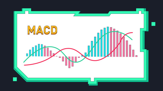
What Is the MACD Indicator and How Is It Calculated?
The Moving Average Convergence Divergence (MACD) is a trend-following momentum indicator that shows the relationship between two moving averages of a security’s price. At its core, MACD helps traders understand whether momentum is increasing or decreasing, which is useful for spotting buy or sell signals before the market makes a big move.
The MACD consists of three components:
1. MACD Line: This is calculated by subtracting the 26-period Exponential Moving Average (EMA) from the 12-period EMA. This line fluctuates above and below zero and reflects the difference between the short-term and long-term momentum.
2. Signal Line: This is a 9-period EMA of the MACD Line. It acts as a trigger for buy and sell signals. When the MACD Line crosses above the Signal Line, it can indicate a potential upward move. Conversely, when the MACD Line crosses below the Signal Line, it may suggest a downward move.
3. Histogram: The histogram represents the difference between the MACD Line and the Signal Line. When the histogram bars grow taller, the momentum is strengthening in the direction of the trend. When they shrink, the momentum is weakening.
These three elements work together to provide a visual representation of price momentum and possible trend reversals. Unlike some other indicators that lag significantly behind the price, the MACD attempts to provide early signals with a balance between responsiveness and stability.
Understanding MACD Crossovers and What They Mean
One of the most important things to learn when using MACD is how to recognize crossovers. These occur when the MACD Line and the Signal Line intersect. This intersection can be interpreted as a signal that the trend may be changing.
A bullish crossover happens when the MACD Line crosses above the Signal Line. This often suggests that upward momentum is building and that it could be a good time to consider buying the asset. It doesn’t guarantee profits, but it can be a strong signal in a broader bullish trend.
A bearish crossover occurs when the MACD Line crosses below the Signal Line. This is often seen as a warning that downward momentum is gaining strength, and it may be time to sell or at least be cautious about new long positions.
For example, let’s say you are analyzing a trading pair like SHIBUSDT. You might notice that the MACD Line has crossed above the Signal Line on the daily chart. Combined with a rising histogram, this could be interpreted as a sign that SHIB’s price is gaining upward momentum and that there may be an opportunity to enter a position.
Crossovers are among the most common MACD signals, but they work best when confirmed by other indicators or when used in combination with price action patterns.
The Importance of the MACD Histogram in Identifying Momentum
The histogram is an often overlooked but incredibly useful part of the MACD. It provides a clear, visual indication of how strong or weak the momentum is behind a trend.
When the bars on the histogram are growing in height, it means the MACD Line is moving further away from the Signal Line. This suggests that momentum in the current trend is increasing. If the histogram bars are above the zero line and growing, it often confirms a strong bullish trend. If they’re below zero and growing in size, it usually confirms a strong bearish trend.
On the other hand, if the histogram bars start to shrink, it signals that momentum is beginning to fade. Even if the trend has not yet reversed, this could be an early warning that a change is coming.
For instance, if you are monitoring SHIB/USDT and the histogram has been shrinking for several days while the price remains flat or starts to decline, this could indicate that buyers are losing strength. It doesn’t necessarily mean an immediate drop is coming, but it’s a sign to be more cautious and potentially tighten risk controls.
Using MACD Divergence to Spot Potential Trend Reversals
Another powerful feature of the MACD is divergence analysis. Divergence occurs when the price of an asset and the MACD indicator move in opposite directions. This is often a strong clue that the current trend may be weakening or about to reverse.
There are two main types of divergence:
1. Bullish Divergence: This happens when the price makes lower lows, but the MACD makes higher lows. It suggests that while the price is still declining, the selling momentum is weakening, and a reversal to the upside could be near.
2. Bearish Divergence: This occurs when the price makes higher highs, but the MACD makes lower highs. It indicates that the upward momentum is fading and that a downward reversal might follow.
Divergence is particularly useful when confirmed with other indicators like RSI or support and resistance zones. It is also more significant on higher timeframes (e.g., daily or weekly charts), where price movements carry more weight.
Imagine you are watching SHIB/USDT again. The price may be rising, forming new local highs, but the MACD is starting to slope downward. This bearish divergence could be your cue to start preparing for a potential retracement or reversal.
How to Use MACD in Your Trading Strategy
The MACD can be incredibly useful, but it should not be used in isolation. To build a well-rounded strategy, consider the following steps:
Start by identifying the overall trend using longer timeframes. If the trend is up and the MACD gives a bullish signal on a shorter timeframe, that’s a stronger setup.
Use MACD crossovers as entry or exit signals, but wait for confirmation. This could be a candlestick pattern, a break of a support or resistance level, or alignment with another indicator like RSI or Bollinger Bands.
Always manage your risk carefully. MACD, like all indicators, can give false signals—especially during periods of low volatility or sideways markets.
Backtest the MACD in your preferred market and timeframe. Some assets, like SHIB/USDT, may respond better to MACD signals on 4-hour or daily charts, depending on market conditions.
Common Pitfalls to Avoid When Using MACD
While MACD is a powerful tool, traders should be aware of its limitations. It is a lagging indicator, meaning it is based on past price data. As a result, it may signal a trade after a trend has already started or ended.
MACD also tends to perform poorly in range-bound or sideways markets, where price movements are small and inconsistent. In such environments, crossovers and histogram shifts can be misleading and lead to whipsaws.
Another common mistake is to treat MACD as a one-size-fits-all solution. Remember that each asset behaves differently. A strategy that works well on SHIB/USDT might not be as effective on Bitcoin or traditional stocks. Always adapt your use of MACD to the asset and market conditions you are trading.
Conclusion
The MACD indicator is one of the most reliable tools in a trader’s arsenal for analyzing momentum and identifying potential entry and exit points. By learning how to read MACD crossovers, histograms, and divergences, you can gain valuable insights into the strength and direction of market trends.
However, like any technical indicator, MACD should be used as part of a broader strategy that includes other forms of analysis and proper risk management. When used correctly, MACD can help you make more informed decisions and improve your overall trading performance.
0 notes
Text
Transform Your Skills in 2025: Master Data Visualization with Tableau & Python (2 Courses in 1!)

When it comes to storytelling with data in 2025, two names continue to dominate the landscape: Tableau and Python. If you’re looking to build powerful dashboards, tell data-driven stories, and break into one of the most in-demand fields today, this is your chance.
But instead of bouncing between platforms and tutorials, what if you could master both tools in a single, streamlined journey?
That’s exactly what the 2025 Data Visualization in Tableau & Python (2 Courses in 1!) offers—an all-in-one course designed to take you from data novice to confident visual storyteller.
Let’s dive into why this course is creating buzz, how it’s structured, and why learning Tableau and Python together is a smart move in today’s data-first world.
Why Data Visualization Is a Must-Have Skill in 2025
We’re drowning in data—from social media metrics and customer feedback to financial reports and operational stats. But raw data means nothing unless you can make sense of it.
That’s where data visualization steps in. It’s not just about charts and graphs—it’s about revealing patterns, trends, and outliers that inform smarter decisions.
Whether you're working in marketing, finance, logistics, healthcare, or even education, communicating data clearly is no longer optional. It’s expected.
And if you can master both Tableau—a drag-and-drop analytics platform—and Python—a powerhouse for automation and advanced analysis—you’re giving yourself a massive career edge.
Meet the 2-in-1 Power Course: Tableau + Python
The 2025 Data Visualization in Tableau & Python (2 Courses in 1!) is exactly what it sounds like: a double-feature course that delivers hands-on training in two of the most important tools in data science today.
Instead of paying for two separate learning paths (which could cost you more time and money), you’ll:
Learn Tableau from scratch and create interactive dashboards
Dive into Python programming for data visualization
Understand how to tell compelling data stories using both tools
Build real-world projects that you can show off to employers or clients
All in one single course.
Who Should Take This Course?
This course is ideal for:
Beginners who want a solid foundation in both Tableau and Python
Data enthusiasts who want to transition into analytics roles
Marketing and business professionals who need to understand KPIs visually
Freelancers and consultants looking to offer data services
Students and job seekers trying to build a strong data portfolio
No prior coding or Tableau experience? No problem. Everything is taught step-by-step with real-world examples.
What You'll Learn: Inside the Course
Let’s break down what you’ll actually get inside this 2-in-1 course:
✅ Tableau Module Highlights:
Tableau installation and dashboard interface
Connecting to various data sources (Excel, CSV, SQL)
Creating bar charts, pie charts, line charts, maps, and more
Advanced dashboard design techniques
Parameters, filters, calculations, and forecasting
Publishing and sharing interactive dashboards
By the end of this section, you’ll be comfortable using Tableau to tell stories that executives understand and act on.
✅ Python Visualization Module Highlights:
Python basics: data types, loops, functions
Data analysis with Pandas and NumPy
Visualization libraries like Matplotlib and Seaborn
Building statistical plots, heatmaps, scatterplots, and histograms
Customizing charts with color, labels, legends, and annotations
Automating visual reports
Even if you’ve never coded before, you’ll walk away confident enough to build beautiful, programmatically-generated visualizations with Python.
The Real-World Value: Why This Course Stands Out
We all know there’s no shortage of online courses today. But what makes this one worth your time?
🌟 1. Two for the Price of One
Most courses focus on either Tableau or Python. This one merges the best of both worlds, giving you more for your time and money.
🌟 2. Hands-On Learning
You won’t just be watching slides or lectures—you’ll be working with real data sets, solving real problems, and building real projects.
🌟 3. Resume-Boosting Portfolio
From the Tableau dashboards to the Python charts, everything you build can be used to show potential employers what you’re capable of.
🌟 4. Taught by Experts
This course is created by instructors who understand both tools deeply and can explain things clearly—no confusing jargon, no filler.
🌟 5. Constantly Updated
As Tableau and Python evolve, so does this course. That means you’re always learning the latest and greatest features, not outdated content.
Why Learn Both Tableau and Python?
Some people ask, “Isn’t one enough?”
Here’s the thing: they serve different purposes, but together, they’re unstoppable.
Tableau is for quick, intuitive dashboarding.
Drag-and-drop interface
Ideal for business users
Great for presentations and client reporting
Python is for flexibility and scale.
You can clean, manipulate, and transform data
Build custom visuals not possible in Tableau
Automate workflows and scale up for big data
By learning both, you cover all your bases. You’re not limited to just visuals—you become a full-spectrum data storyteller.
Data Careers in 2025: What This Course Prepares You For
The demand for data professionals continues to skyrocket. Here’s how this course sets you up for success in various career paths: RoleHow This Course HelpsData AnalystBuild dashboards, analyze trends, present insightsBusiness Intelligence AnalystCombine data from multiple sources, visualize it for execsData Scientist (Junior)Analyze data with Python, visualize with TableauMarketing AnalystUse Tableau for campaign reporting, Python for A/B analysisFreelancer/ConsultantOffer complete data storytelling services to clients
This course can be a launchpad—whether you want to get hired, switch careers, or start your own analytics agency.
Real Projects = Real Confidence
What sets this course apart is the project-based learning approach. You'll create:
Sales dashboards
Market trend analysis charts
Customer segmentation visuals
Time-series forecasts
Custom visual stories using Python
Each project is more than just a tutorial—it mimics real-world scenarios you’ll face on the job.
Flexible, Affordable, and Beginner-Friendly
Best part? You can learn at your own pace. No deadlines, no pressure.
You don’t need to buy expensive software. Tableau Public is free, and Python tools like Jupyter, Pandas, and Matplotlib are open-source.
Plus, with lifetime access, you can revisit any lesson whenever you want—even years down the road.
And all of this is available at a price that’s far less than a bootcamp or university course.
Still Not Sure? Here's What Past Learners Say
“I had zero experience with Tableau or Python. After this course, I built my own dashboard and presented it to my team. They were blown away!” – Rajiv, Product Analyst
“Perfect combo of theory and practice. Python sections were especially helpful for automating reports I used to make manually.” – Sarah, Marketing Manager
“Loved how everything was explained so simply. Highly recommend to anyone trying to upskill in data.” – Alex, Freelancer
Final Thoughts: Your Data Career Starts Now
You don’t need to be a programmer or a math wizard to master data visualization. You just need the right guidance, a solid roadmap, and the willingness to practice.
With the 2025 Data Visualization in Tableau & Python (2 Courses in 1!), you’re getting all of that—and more.
This is your chance to stand out in a crowded job market, speak the language of data confidently, and unlock doors in tech, business, healthcare, finance, and beyond.
Don’t let the data wave pass you by—ride it with the skills that matter in 2025 and beyond.
0 notes