#like their designs have very little contrast and are essentially just different hues of a same color
Note
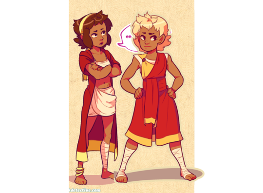
Hi!! I don't know if anyone has drawn this before (sorry if they have!! I couldn't find any evidence of it) but I have recently been plagued with the question of "what if Machete and Vasco were in Bluey?"
Well. Now we know.
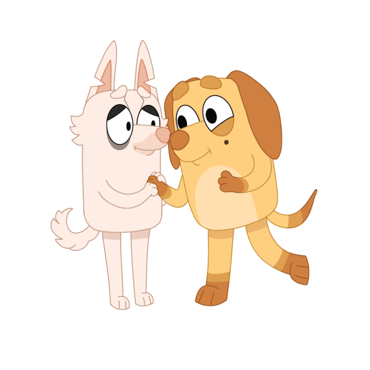
To my knowledge, the only Bluey dogs who wear clothes are the ones in uniforms. TECHNICALLY Machete's outfit could count, but I left it out because it's not typical of a main character. He must be naked 😔
.
#oh GEEZ they're so cute uaugh#no you're the first to make this crossover!#once someone told me that my dogs and Bluey could exist in the same universe#and even though I'm getting my Bluey lore from second hand sources I think that might be correct and feasible#so you know#take that and eat it with your breakfast#it's great how it's almost justified to let Machete keep his outfit but in the end he must be naked 😔#while everyone is on board with Vasco wearing only a smile#like yeah that tracks he doesn't seem to mind#I like how you managed to translate Vasco's gradients to a form that works with the art style#including the lighter chest/abdomen#also maybe this is an odd thing to say but I suddenly realized how monochrome they are#like their designs have very little contrast and are essentially just different hues of a same color#weird moment to notice that#thank you! this was so sweet#they're adorable#gift art#stafell#own characters#Machete#Vasco#I had sort of a rough day so this cheered me up a lot#cw needles#I had to go get blood tests done and this specific lab person had been really heavyhanded with me before so I asked her to be gentle#and she jabbed the needle into a nerve and I full on screamed in pain and sweated and shook and passed out for a couple of seconds#worst medical experience this far I never knew routine stuff like that could potentially hurt so immensely#I've never been scared of needles before and that has been sort of a point of pride for me#like at least I can do this one unpleasant thing effortlessly#but now I'm just terrified of that happening again#been feeling really weird/exhausted/nauseous all day and the arm still feels weak and tingly so I'm going to bed early tonight
856 notes
·
View notes
Text
Methods Concerning How To Repair Your Home's Inside
Are you currently thinking about learning how to layout your home? Properly when you design the inner of your residence then you will have the advantages of making it look how you would like it to, in contrast to hiring another person to accomplish it to suit your needs. Keep reading to acquire more information.
Prior to starting your interior design venture, consider your finances. There are many different techniques of going about doing one particular task, and once you learn your financial budget, you will find a greater idea about how to start. Look at the expense of materials and labor, after which build a finances which fits your life-style.
In a family room, make an effort to prepare your household furniture into locations. Use a centre focused on watching television, a heart dedicated to looking at plus a middle focused on discussion with loved ones. This is a wonderful way to breakup your furnishings, supply the room look and feel and make the room user friendly as well.
The hue scheme is essential when beginning a project over a area at home. Your living area can look stylish and well-balanced if you choose colors which go well jointly. Maintain daring colours separated, you shouldn't use a couple of or two in a single area or it is going to get as well busy seeking.
Seek out innovative methods to add storage and business to your property. You may use attractive baskets to set up papers and items that often invade every single area of the home. It is sometimes complicated to unwind in the home that may be disorderly. A highly-organized residence provides you with a sense of peacefulness once you loosen up right after a tough working day.
Possess a detailed deal with the interior designer brand if you decide to engage a specialist. This will benefit the the two of you and make sure you might be about the same webpage, without having shocks or charge overruns. A good interior developer will want a binding agreement anyways, so it will be a sensible way to establish that they are a respected businessperson.
Prepare your furnishings smartly. Go walking about your spaces and consider different paths: are you able to very easily change from one room on the other? Household furniture should not be with your way, nevertheless some goods ought to be produced key should you wish to develop a style or perhaps a coloration style based on some household furniture.
It can be difficult to decorate a basement simply because you are not able to perhaps envision what you could do in this darker and gloomy spot. If you are using some happier colours and materials, you are able to change your darker, damp, sad cellar into a location where by you will want to go out with your household.
Make sure that you decide the style of your own living room area before you begin the project. You are able to choose to experience a extremely lively living room having an enjoyment system and games for those who have youngsters or perhaps a tranquil family room having a fire place in case you are a newly married few.
When dangling https://thietkenoithat.com/ , make an effort to class like subject areas and support frames jointly. The assortment should be the focal point from the area and organized throughout the bounds of your imaginary larger frame incorporating each piece inside with the objective of matching one other as well as them employed in imaginative harmony.
When employing a specialist internal developer, be sure you view a collection initially. This will let you know whether or not you, as well as the designer brand have the identical preferences. A talented designer can perform a lot of things, but should you not like her or his fashion, you might need to search for one more appropriate for you.
As time goes on so that as you discover more about home design you ought to truly feel a little bit more and at ease with making decisions that are going to effect the style of your own home. Take advantage of the information and facts that you just learned in this article today and see what you are able use for your residence.
0 notes
Text
Taylor Swift: Fearless (Taylor’s Version) review – old wounds take on new resonances
4/5 STARTS
After her masters were sold to an old foe, Swift’s re-recording project starts with her 2008 opus on the teen-girl experience – an apposite contrast to venal male industry executives
Alexis Petridis
In 2012, Def Leppard announced in robust style that they would be rerecording their biggest hits. It was provoked by a dispute with their former record label, designed to “punch them in the bollocks”, said frontman Joe Elliott. “We fucking built that company. We built their penthouse sushi bar, wherever it may be, and they just treated us like shit.”
This is a sentiment with which Taylor Swift may empathise. She hasn’t actually threatened harm to the testicles of her former label boss Scott Borchetta – and Scooter Braun, the manager who bought the master rights to her first six albums, then sold them to an investment fund for an estimated $300m – but if an album ever seemed like a musical equivalent of a painful knee to the groin then Fearless (Taylor’s Version) is it.
It is the opening salvo in Swift’s plan to rerecord all of her material that was sold without her consent, and she clearly means everything: it contains not just Fearless, but extra tracks from the original album’s deluxe edition, a contemporaneous track from a film soundtrack and six previously unreleased songs from the era. It’s the best part of two hours of music. Her fans will no doubt support the rerecordings, and the wider market doesn’t seem to care whether or not they’re listening to the definite article – for instance, Take That’s “reimagined” greatest hits album Odyssey went platinum, a compilation of rerecorded ELO hits made the Top 10. Moreover, Swift still owns the publishing rights to her songs and can block owners of the original recordings from using them in films, TV shows or ads.
Her decision to start the rerecording process not with her debut, but its 2008 successor seems telling. Her debut went seven-times platinum in the US, but her songwriting came into sharp focus on Fearless, revealing an 18-year-old who could not only knock out indelible melodies and choruses with the efficiency of a Nordic pop factory – a facility that, if anything, seems more remarkable listening to the rerecordings 13 years on – but who also wrote lyrics that spoke directly to a teenage audience. Fearless deals in wistful reminiscence about female adolescence: “When you’re 15, feeling like there’s nothing to figure out … this is life before you know who you’re going to be,” as one of its most celebrated songs puts it. You could raise an eyebrow at the worldly-wise tone emanating from a woman at the ripe old age of 18, but that was the point.
The best writing on Fearless offers a brilliant fixing of the understandable teenage impulse to mythologise the recent past, to carry on as if it’s ancient history, because teenage lives are in constant flux and forward motion, packed with events that invite nostalgia because they can only happen once: no one has a second first kiss or loses their virginity twice. As a result, Fearless is the kind of album in which fans have a genuine emotional investment. If you want to construct a narrative of a beloved female artist pouring her heart and soul into work that resonated with her audience – writing the songs that saved your life, as the Smiths put it – versus the dead-eyed male music-industry operatives interested in nothing but money, it’s a very smart place to start.
It is tempting to suggest that the lyrics on Fearless might take on a different hue sung by a woman now in her 30s, but the new recordings militate against it. Backed by her touring band, her voice sounding essentially the same as it did in 2008, Swift has resisted any temptation to alter the songs’ pop-country arrangements or lyrics, even when the latter could have used a nip and tuck. (Perhaps the more experienced songwriter might have shied away from mentioning kissing in the rain with such alarming regularity.) Attempting to compare these new recordings and the originals is vexing. Is the production slightly brighter? Is her vocal a little more forward in the mix? But obviously that close similarity was the objective.
he six “new” songs aren’t blockbusters – there’s nothing here to challenge Love Story’s superb Springsteen-in-a-prom-dress saga of romance and escape for the title of the best thing Swift had written by that point, a song that could have appeared on any of her subsequent albums – but there’s fun to be had speculating on why Swift plucked them from unreleased obscurity now. Take Mr Perfectly Fine, a story of a blithe former squeeze that seems to take on new resonances given the backstory of her rerecordings project and the singer’s description of Scooter Braun as “the definition of toxic male privilege”: “Hello Mr Casually Cruel, Mr Everything Revolves Around You … he goes about his day, forgets he even heard my name.” She sings it with a certain relish, like someone whose anger is mitigated by the knowledge that she’s successfully put one over on her nemesis.
63 notes
·
View notes
Text
Modern Dragon Designs - Where they came from
Your regularly scheduled werewolf facts will return soon. For now, we provide this special, because you may not realize this, but I love dragons. There’s a reason one of my protagonists is basically obsessed with dragons.
Once upon a time, there was a movie - I don’t see anyone talk about it, I’m not even sure how many people are familiar with it...
It’s called Reign of Fire.

This movie shaped the modern Hollywoodian concept of dragons. Seriously, it did. Hear me out.
Released in 2002, Reign of Fire was a movie about - essentially - dragons as that age-old trope of “let’s take one monster and turn them into an overpopulated zombie plague so we can use them to tell a story about humans and make the monster just this brainless evil locust swarm backdrop.” This has happened to a lot of monsters by now.
But wait, these dragons aren’t like the dragons you might be used to: these dragons were completely redesigned from the ground up by the filmmaker(s) in order to make a more “realistic” and “animalistic” dragon that was acceptable by Hollywood, who generally views “dragon movies” (like so many other fantasy things...) as cheesy and silly. Market your movie as a film about dragons and you probably won’t get a deal. Well, turns out, coming up with your own gritty dragon designs worked!
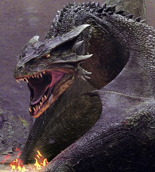
Doesn’t this remind you of every other dragon you’ve seen in a movie for the last, you know, 18 years? Although it actually looks quite a bit cooler than those other ones that came after it
Please note that while I may sound sarcastic, jaded, and often maybe a bit scathing, I mean nothing against the creators of Reign of Fire or director Rob Bowman. I watched the movie in theaters when it released. I applaud Bowman for coming up with unique and interesting dragon designs, in order to have a different take on the creatures, so that they fit the story he wanted to tell, instead of doing what so many people do and completely co-opting concepts without trying to alter them to fit anything and... yeah... okay, I’m not going to talk about werewolf things in this post. Getting back on track:
What I don’t applaud is everyone ripping off Reign of Fire for their own dragons, doubly so because most of these people didn’t even take into account the reasons why it was designed that way. They should have left his dragons alone and come up with their own thing, but at least I guess Bowman can go down in history as the man who designed every Hollywood dragon for over a decade to come - with no signs of stopping - even down to the tail shape.
On Vice, you can find an article and interview with Rob Bowman, the director of Reign of Fire, discussing how he came up with this dragon design and how influential it has become. I highly recommend giving it a read.
Please note the Vice article is clearly written with the bias of someone who “can’t take dragons seriously,” so it’s also a good look at the Hollywood mindset about dragons and how much Hollywood treats fantasy in general like garbage (jerks).
It’s impossible to pretend this movie didn’t basically reshape modern dragons. Let’s get to the details...
Animalistic Design

Dragons in popular culture are generally - or at least they were generally - assumed to be powerful, intelligent creatures, often of a higher nature than humans and other mere mortals. They may be good or evil, but one can’t understate that traditional fantasy dragons are regal and majestic either way.
Reign of Fire wanted to usurp the majestic, intelligent dragon image, creating a smaller, hunched, knuckle-dragging sort of dragon that looks more like an animal - like a pteranodon. This is because the dragons in Reign of Fire are not exceptionally intelligent, noble beings that speak and hoard gold and have the wisdom of the ages. They are brutal hunters that set things on fire and eat everything smaller than them. So this design choice was a conscious one and a smart one.
The dragons in Reign of Fire are meant to be more scientific, more plausible, and also simpler, in a manner of speaking. They are not colorful, magical, ancient fantasy dragons...
Trouble is, everyone took cues from this design for their talking wise noble fantasy dragons, and it... doesn’t really work, at least if you ask me.
The dragon design in Reign of Fire looks like an ancestral throwback, an evolutionary ancestor to the intelligent, talking fantasy dragon, although they are smaller. They’re hunched, they haven’t evolved forelegs independent of their wings... you get the idea. Take a look at the “proto-drakes” in World of Warcraft versus the ordinary drakes, which have tiny dangly T-rex forelegs that haven’t fully developed yet, so they walk like the Reign of Fire dragons.
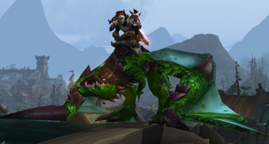
A proto-drake in World of Warcraft - also say hi to my worgen warrior
So many things taking this design for their intelligent, “higher being” dragons seems kind of... odd to me, to say the least. Unfortunately, Hollywood decided that’s the only way moviegoers can “take dragons seriously,” so here we are.
“Wyvern” - Two Legs vs Four

Municipal arms of Stjørdal, Norway
In medieval heraldry, there came to be a creature called a wyvern. Now, the etymology on the term “wyvern” is a little shaky. It originally didn’t specifically refer to a “two-legged dragon.” It is thought to mean/be derived from words meaning anything ranging from “asp” to “light javelin,” and essentially boils down to a flying serpent. It is noteworthy, of course, that the word “dragon” basically just means “serpent” too.
In heraldry, though, “wyvern” came to refer to a two-legged dragon - at least, if you ask the English, Scottish, and Irish; elsewhere in Europe, they may not be so picky. And now, in modern pop culture (such as Dungeons and Dragons), we often use it in the same sense.
Wyverns weren’t really a “thing” in folklore, just as dragons in folklore didn’t look like our modern idea of a dragon. It’s debatable whether the father of our modern concept of dragons, Fafnir (from whom Tolkien drew inspiration for Smaug), even had wings at all; he was essentially a serpent, perhaps with legs. Point is, wyverns come from heraldry, especially the specificity of two legs versus four.
So now you know why you might see a lot of people (myself included) referring to this design as a “wyvern design” for a dragon.
Dull Coloration - Grey and Brown over Red, Blue, Green...
There’s something else - something very important - that Hollywood took from Reign of Fire... the concept that dragons aren’t pretty colors and are, in fact, various hues of grey and brown, and any more contrasting colors are just vague indications instead of bright red scales.
Now, Reign of Fire obviously did this because - again - they were going for the more animalistic, natural look as opposed to the mysterious majestic magical being look. Okay, that’s fine. But then Hollywood decided that fantasy, too, has to be devoid of dragons with bright colors.

The green dragon in Game of Thrones
There are countless examples of this in modern media. Any dragon that was previously brightly colored has been dulled pretty much to an extreme. Sometimes you might catch a fleeting glimpse of them looking like a brighter shade, but it was probably just a trick of the light. Why? Because all dragons are desaturated to the point of being almost indistinguishable by color.
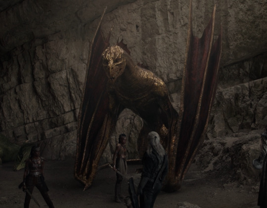
The golden dragon in The Witcher Netflix series
This is also why you see so many mods on the Skyrim Nexus called things like “true red dragon.”
There are plenty more examples of this - I’m sure you can see the difference when you look at those dragons and other modern film dragons over, say, something like this...
Red dragon in D&D
And now we move on to...
The Fire Breathing - Chemicals, not Magic
Bowman insisted on ditching traditional fire breathing (you don't want the audience wondering whether the dragon's mouth is being burnt up with every flame) and again looked to the animal kingdom for inspiration. The king cobra, once again, was a great starting point. It doesn't spray fire, but it can spit its venom. Even more useful was the bombardier beetle, which shoots two chemicals from its abdomen that, once mixed, create a hot, burning spray. Bowman used these real-world examples to inspire his own dragons. They don't breathe fire exactly, but rather spit chemicals from two different sacks in their mouths that, when combined, ignite. "That's anatomy. That's already been designed, so we're going to draw from there," he said.
(quoted from the Vice article linked to earlier in this post)
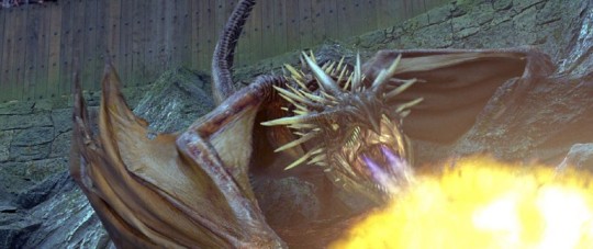
The Hungarian Horntail in Harry Potter and the Goblet of Fire - fire is streaming from two separate organs in the mouth, but they aren’t chemicals mixing together like in Reign of Fire...
The director of Reign of Fire wanted his dragons to be more natural in that they breathe fire through organic means, based on chemical reactions, instead of the usual dragon magic. But lots of people loved this “mouth flap”/”mouth organ” design with “streams” of fire coming from the mouth instead of fire flowing directly from the dragon’s throat, so now you see it pretty dang often.
Horns? Brow Ridges!
Another thing that is basically out now in dragon designs is the real horns of many traditional dragons, like Spyro, and like the dragons in Dungeons & Dragons used to have.
These days, it’s all about brow ridges and big spiny scales that aren’t separate horns, they’re just big pointed scales or piles of scales or bone ridges - and they aren’t a different color than the dragon’s scales, either, pretty often. And, in general, dragon’s horns have become much smaller and far more numerous, and more like spines/ridges, as opposed to the great, sweeping horns of classical dragons.
Firkraag, the red dragon, in the D&D video game Baldur’s Gate II, from 2000
Firkraag is a very traditional dragon. Now, while Dungeons & Dragons has generally kept more traditional dragons (yay!), they did fall into the brow ridge horn thing - although they, thankfully, didn’t make the horns smaller and subtler and more numerous little spikes, like so many other modern dragon designs. They also went with the brow ridge horns for tieflings (once humans with demon blood, then some weird thing in 4E, and now I think they’re humans with demon blood again), as opposed to the ordinary horns of the tieflings in previous editions of D&D.
Skyrim dragon head concept art
The Desolation of Smaug(’s design)
Here is... a big one. Here, we’ll talk some about the production of The Hobbit films over time, so we’re going behind the scenes.
Alright, so we all know Smaug, probably, by pop culture osmosis if nothing else. He is the quintessential dragon. He’s basically the founder of all Western dragon concepts: he’s big, he’s red, he hoards gold, he’s extremely intelligent and talks, etc. You get the picture. Every dragon that we have borrowed at least something from Smaug. And, in turn, he was inspired by Fafnir, the father of all our dragon concepts, from Norse mythology - but Tolkien took it all a step further and created the concept of dragons that we have today. Or, well, the not Reign of Fire ones. The fantasy ones.
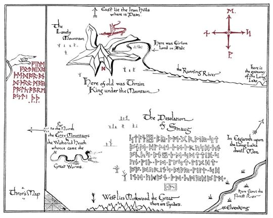
A map drawn by Tolkien: notice the winged, four-legged Smaug over his mountain
During the first Hobbit movie, An Unexpected Journey, we see Smaug attack the Lonely Mountain...
In this clip, you can plainly see that Smaug has four legs. This was actually edited slightly for later editions of the movie, or so I’ve heard (I haven’t watched any later editions).
I can tell you for certain that when I saw the theatrical release, it was like this, too. It is apparent throughout the scene that Smaug has four legs and wings, separately. I know because I was paying very, very close attention, because I was going to be very upset if Hollywood turned Smaug into a wyvern.
Well, they did - later.
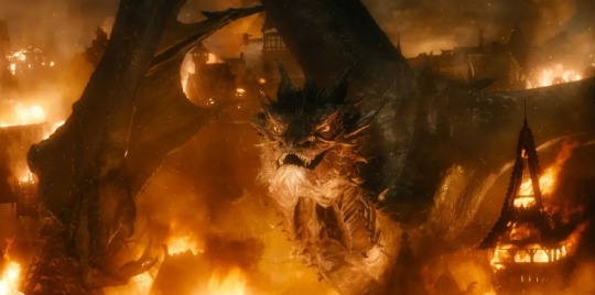
Smaug the wyvern looking like just another slightly different take on the bog-standard Hollywood dragon
Apparently, some studio exec decided that having a traditional fantasy dragon, even if this dragon happens to be frelling Smaug himself, would not be okay in this modern Hollywood world. So we ended up with a dull reddish spiney hunching knuckle-dragging wyvern with an angler mouth (I’m sorry; I really am sorry if you like the design, that’s totally fine, it’s a fine design, I am glad you enjoyed it, but Smaug shouldn’t have looked that way IMO and forgive me but I am still in pain over it) in place of a more traditional dragon that held more to things like, I dunno, how Tolkien himself drew Smaug. Smaug’s movie design flies right in the face of that and destroyed our chance to finally see a proper traditional dragon done justice on the big screen.

Tolkien’s art of Smaug - note the position of the forelegs, separate from the wings, like in the earlier map
This is all just one big example why we should be thankful that The Lord of the Rings films were all shot in one go, so no one could alter important things like the design of the fantasy genre’s father of all dragons, in the middle of production. Of course, the production on The Hobbit movies was a nightmare at best, as you can read about in assorted other articles, and Peter Jackson was very unhappy with what the studio had him do to the series. All of that is just another story, I suppose.
Dragons Redesigned by Reign of Fire: Example List
Now that we’ve gone over just a few of the talking points about Reign of Fire’s dragon designs (although I didn’t even get into the flat, spaded tail look in detail), here’s an undoubtedly incomplete list of several examples that have either entirely taken the design and/or were massively influenced by it...
(please note that not everything in this list held entirely to Reign of Fire’s design, obviously; some have the fire, some don’t; some have horns, some have head/brow ridges; but all of them are wyverns and most are darkly-colored)
Skyrim - Obvious influence with the general design, skin/scales and ridges design, as well as coloration; however, it is noteworthy that the Elder Scrolls has had dragons with no forelegs since at least 1998, in the game Redguard - though that dragon was also very brightly-colored (also of note: Peryite, while technically a Daedric prince and not a dragon, had four legs at least as far back as Daggerfall in 1996)
The Hobbit films, specifically The Desolation of Smaug onward - as mentioned before
Harry Potter movies - Wholesale. Two streams of fire from mouth flaps in Goblet of Fire, generally dull greyish and/or brownish colorations, no forelegs, short/simple horns that are mostly ridges...
Gods of Egypt - The giant fire-breathing cobras have the mouth flaps
Game of Thrones - This one’s pretty obvious too.
Disney’s Maleficent - In the new live action Disney movie(s), the dragon falls right into this design (though the fire doesn’t come from mouth flaps)
Netflix Witcher series - Villentretenmerth is very much a wyvern design and a dull shade, and he in fact has no horns at all, even though dragons weren’t portrayed this way in any previous Witcher adaptations
Stargate SG1 (season 10) - In the episode series “The Quest,” a dragon appears and... well, it looks just like all those other dragons, though the fire does come from its throat.
Beowulf (2008) - I try not to ever talk about or think about this film, but I have to just throw out there that the dragon is very much Reign of Fire, especially with that wyvern design.
Seventh Son - If you can call Malkin a dragon - she was called one, I think - she definitely also has the same kind of dull-colored wyvern design.
Sucker Punch (movie)
Lots and lots of B-movies and direct to DVD/streaming films - Dawn of the Dragonslayer, Dragon (2006), Dragon Crusaders...
Something to note, also, is that cartoons, anime, and other non-film media is mostly - but not entirely - free from this influence. Cartoons especially are free from it, partially because they aren’t influenced by Hollywood producers who want “serious” and “realistic” dragons. Cartoons are allowed to have magical, colorful, four-legged dragons. Unfortunately, we are deprived of those in live action film and television, by and large.
There are still other exceptions - most notably things that were created before this influence, like Dragonheart and its spinoffs and sequels, which have thankfully kept their dragon designs consistent instead of erasing their forelegs.
Of course, why dragons are depicted as four-legged and winged in the first place - and when this depiction arose - is another topic entirely. I’m not going into that right now, seeing as how this post is already preposterously long.
Long story short, I was rewatching the movie Gods of Egypt and, when I saw the giant cobra monsters breathe fire, I was possessed to write this article. Because Reign of Fire’s influence is something I have always noticed ever since its release, and something my brother and I talk about a lot (and everyone who knows me has surely heard me talk about it, too) - because, frankly, it’s always bothered me. My favorite dragons are traditional dragons: four legs, bright colors, wings, horns, breathing fire, the works.
So, although the original creator of these design ideas did something cool and different because he wanted to do his own take on dragons, Hollywood decided that these design cues should be taken to dumb down all dragons forever, the same way that Hollywood has dumbed down so many monster designs so that the only acceptable ones just a bunch of near-replicas of each other, including werewolves.
I think it’s very sad that film producers think you can’t take something like dragons or werewolves seriously unless they are dull, nontraditional, and ugly. And I say ugly in the sense of these are not pretty, majestic fantasy designs - they are, many of them, intended to be ugly. Though I personally also hold the opinion that most of them are ugly regardless of if they are intended to be ugly.
So - now you know! If you haven’t seen Reign of Fire, go check it out to meet the father of modern dragon designs, from the color of their hides to the shape of their bodies, the smaller horns, and - sometimes - even their tails.
(Special thanks to everyone on my discord who helped me compile this list, as well as of course my brother and all our ranting at/with each other on this topic over many years)
If you like this post, maybe you’ll enjoy the rest of my blog, where I post a lot about folklore and all kinds of monsters (especially werewolves)!
Werewolf Facts --- Patreon
#dragons#pop culture#dragon#reign of fire#creature design#folklore#wyvern#wyverns#game of thrones#skyrim#harry potter#the desolation of smaug#the hobbit#movies#film#hollywood#long post#EXTREMELY LONG post
73 notes
·
View notes
Text
MARBLE BY BHANDARI MARBLE WORLD
MARBLE IS HIGHLY DESIRABLE MATERIAL
Marble is a highly desirable material ubiquitous throughout the fields of sculpture, architecture, and design. It is a natural stone available in numerous colors and styles with connotations to antiquity and luxury. Here we explore its history both geologically and within the arts. We shed light on the famous region of Carrara, its quarries and workforce, and highlight exemplary uses within the 20th century and contemporary design.
All marble is a type of limestone, however, the term is somewhat broad and describes a group of rocks with varying petrographic aspects. In its most refined form – the famous white statuary marble of Carrara – it contains 98% calcite. This type was created over 200 million years ago from the skeletal remains of tiny calciferous sea creatures, which formed deep sediment on the ocean bed. As the earth’s tectonic plates shifted this sediment was subjected to enormous heat and pressure causing the calcium carbonate to crystallize. Over millions of more years this was slowly pushed to the surface and now forms the area we know as the Apuan Alps in Tuscany, Italy.
The Class of Carrara Bianco marble
On the opposite end of the spectrum to Carrara Bianco, there are marbles that display a riot of rich colours and patterns. These are also sedimentary limestones but are usually from detrital (formed of other rocks) or chemical (formed from precipitation of calcium carbonate from seawater) origin and are colored.
The attraction of Statuario Marble
People like marble primarily for its beauty. It has an elusive quality of softness not normally found in stone, and the delicate patina it develops over time conveys an elegant and sophisticated look. However, even though marble is softer than granite, it is still a very durable material, suitable for use a bathroom and kitchen countertops.
Most people recognize marble from the veining. Marble stone has a wider range of colors than most people know, but whether it is white or black marble, the veins are there. The color of the visible veins ranges in color from white to gray, depending on the color of the base stone and the type of impurities in the stone.
MARBLE BY BHANDARI MARBLE GROUP.
It has been quarried since 500BC. Through the centuries Sivec was used for many building and reconstruction sites throughout the world. Its popularity derives from its classy white color used in large scale projects.
General Facts about Marble Countertops
People have been using marble slabs for many things for many centuries. These range from monuments to chessboards, but the most recognizable use for it is for sculptures.
Artists like to use marble because it is relatively soft and only looks better with age. They use only pure white marble, which is quite rare, as these have very little veining. On the other hand, architects like to use marble of other colors with rich veining for its esthetic features.
Using marble for kitchen countertops and bathroom vanities are a recent development, at least among ordinary folk. Marble as a dimension stone was very expensive, and only the very rich and privileged had it in their residences.
What You Need to Know Before You Install Marble Countertops
If you are aiming to install polished marble bathroom countertops, it is best to stop for a moment and read this article to learn more about the benefits and gripes about manufactured marble countertops.
The best marble countertops out there is an exceptional candidate for making a statement in your residential and commercial renovation. The exquisite and exotic aesthetics of marble exudes a pristine appeal in your kitchen and bathroom. Before making that call to hire our professionals, we are going to share with you some of the essential properties of natural marble slabs.
What is Marble?
Marble stone is naturally made from limestone which has undergone extreme heat and pressure. The overall impact of this process is the unique veining patterns and specks of colors around the slabs’ background.
Because it is mostly made from carbonate compounds, marble readily reacts with acidic solutions and causes etching. This is something pretty natural for marble, but if you want to get rid of this, you can go for our engineered marble countertops.
What Are the Colors Available?
In our factory showroom, we have a substantial collection of different types of marble countertops. Some of the common colors of marble slabs include white, black, pink, red, beige, green-yellow, brown, beige, purple, blue, Choosing the best color depends on your preference, but if you are having a difficult time, you can lean on our professionals to select the most suitable design and hue for your remodeling.
When it comes to modern themes, our stark white marble countertops is a winner. Most customers choose this one because it amplifies the brightness and sophisticated appeal in their kitchen and bathroom. This hue pairs well with earth-tone colors for your accessories, furniture, and cabinetry.
In contrast, other popular marble colors include black, beige, and green. Black marble countertops make a good contrast and focal point when paired with your white or pale-colored cabinetry. Likewise, stainless steel finish from fixtures and accessories blends well with black marble.
What Marble Finish Suits You?
Well, we offer many finishes for your marble countertops, that is, polished and matte. Choosing which finish best suits you entails a few considerations and it must blend well with the existing theme in your kitchen and bathroom.
Finishes
Marble Stone Finishes
An important as it is to choose a material that suits the function of a particular project, it’s equally important to select the appropriate finish for the material. When it comes to marble stone, the surface finish helps to dictate the functional characteristics of the material. For example, a honed surface will provide slip-resistance, whereas a polished surface will be highly reflective. The finish can also go a long way in affecting the color of natural stone. Some finishes will intensify the color while others will soften it.
Here is a primer reviewing the three basic categories of natural stone finishes: polished, honed, and textured.
Polished
Polishing a natural stone finish involves grinding, sanding, and buffing the stone to a high-gloss, mirror-like surface. It can only be done on crystallized marble stones, such as marble and granite for example, and it’s a very popular selection for marble stone finishing. A polished finish is very smooth and reflective.
Polished surfaces are commonly found used as interior and exterior wall cladding, fireplace surrounds, and kitchen and bath countertops. It’s a good rule of thumb to avoid placing polished finishes in areas with high foot traffic, as its reflective nature makes it more prone to scratches. On the other hand, the polish that coats the marble does offer some stain resistance. But it can get extremely slippery when it’s wet, so think twice before using polished stone on areas like the bathroom floor.
Honed
Honed finishes still involve grinding and sanding, but not to the point of a glossy finish. Unlike polished finishes, they’re not reflective. Rather, honed finishes are a satin-smooth surface that reflects very little light. Honed finishes have been popular throughout Europe for some time. But we’re really just now beginning to see this style of finish more here in the U.S.
Honing creates a more natural look that appeals to those who prefer an aged patina or a look that’s less formal than a polished finish. Honed surfaces are best for high-traffic areas such as flooring, interior wall covering, exterior finishes, fireplace surrounds, plus counter- and table-tops—and for good reasons. They’re typically a bit easier to maintain.
Depending on the level of grit used for the honing process, the surface may be easier to care for than polished surfaces. Since color is the result of light reflection, and polished surfaces provide more reflection, a honed countertop likely appears duller in color, with a less dramatic variation. It’s a great choice for homeowners who desire a subtle vein movement to their stone rather than dramatic color changes. Another good reason to choose a honed surface is that etching isn’t as noticeable as it is on a polished surface.
Black Honed marble
A beautiful honed black granite hearth by our expert and export team.
Textured
There are several types of finishes that offer texture. In general, a textured finish is one that’s rough or uneven. One definite pro of choosing a textured stone is to create slip resistance. It’s also a great way to add a distinctive personality to a project. Here are but a few of the most common types of textured finishes:
Brushed
This finish is obtained by brushing the marble stone with a coarse rotary-type wire brush.
Flamed
The marble stone is subjected to the high temperatures of a flame or torch, burning off most of the carbon content. What’s left behind is textured quartzite with very gentle colorations. Flamed finishes are popular for outdoor use where slip resistance is an issue.
Chiseled
Looking somewhat like the texture of linen, chiseling creates fine grooves positioned closely together and parallel to the edges.
Bush Hammered
To achieve this industrial-styled look, a hydraulic bush is hammered into the surface of the stone. It creates a large number of close and small indents. The result is an evenly textured surface that’s ideal for non-slip characteristics in high-traffic applications.
Tumbled
Commonly used for marble stone tiles, tumbling involves placing stones in a solution of sand, water, and mild acid, which creates an old-world look that’s weathered and warm.
Polished Marble Countertops
When you want a sophisticated and expensive look in your kitchen and bathroom, then going for a glossy marble finish is an excellent choice. The mirror-like appearance of its surface reflects light inside your kitchen and bath.
With proper care and maintenance, you can effortlessly keep the shiny and exuberant appearance of your marble bathroom and kitchen countertops. Moreover, we recommend a glossy finish for areas where there are low-traffic and exposure with acidic spills.
Honed or Matte Marble Countertops
If you have a high-traffic kitchen countertop, then getting a honed finish marble is a good choice. With this, you are able to hide the minor scratch and dents caused by sharp objects and acidic liquids in your countertop.
A hone marble floor is also suitable for bathrooms and other high-traffic areas in your house because it prevents slipping. For skimpy bathrooms, we advise our clients to use large marble tiles or slabs to give an impression.
Add by Marble stone expert and export team of Bhandari marble group,
India,
Rajasthan,
Kishangarh-305801
Contact us
+91 9672941111
+91 9829040013
1 note
·
View note
Text
The 17 Most Misunderstood Facts About Stamped Concrete Patio
The concrete could be stained to virtually any colour it is possible to visualize by blending various pigments with each other up until finally they reach the required tone. If you have an organization or you want a big concrete mural with your entrance, you may get enormous concrete stamped murals. The concrete organization will definitely pour the concrete and employ a big rubber imprint to stamp on patterns of all-natural items which include wood, brick and stone.
Accentuate your spaces! See how decorative concrete stands up versus choice hardscape and flooring choices!
Give your lawn a charm and rework it into a much more inviting entryway with this concrete pavers with lava rocks walkway. Just surround your concrete pavers in a very Slice-out mattress with purple lava rocks, and your walkway will surely make an announcement.
youtube
Borders can be produced with distinct components like brick, stone, and even more. Even so, when stamped concrete is utilized for forming the area in the walkway, the border is usually created with the same content with a contrasting colour.
We do not cost a dime! Our estimate services is 100% no cost. We do not ask for ANY economic information and facts and you will use us as repeatedly as you like. You do not have any obligations. We find you experienced concrete execs that ideal satisfy the needs of the undertaking, but when You aren't thoroughly contented with the estimates provided, you are not obligated to move forward. We get the job done with many concrete businesses to supply top rated services... The Masonry Pros in our community specialise in every kind of concrete tasks like Basis, patio, driveway, pathway, and many other household renovation and home improvement tasks.
The early power from the concrete may very well be larger if it is held moist throughout the curing method.
For anyone who is making or transforming and possess specified concrete Forged stone, halt and Re-examine. Why on the planet would any person opt for concrete over lovely, solid hand-carved marble?
Commonly stamped concrete pads & sidewalks vary from $twelve - $fifteen for each square foot. The costs depend upon different factors such as reinforcing prerequisites, demo essential, recent or current base/aggregates down below, and entry (can it be comprehensive using gear or can it be within a fenced in compound with minimum access).

Due to its distinctive textures and variants, stamped concrete delivers a lot more ornate design and style possibilities that give it a “wow” element. As well as this, there are various other Gains which make it appealing to homeowners, together with:
This enables for almost any repairs to possess a seamless appear. If a place have been to lift or reduce as a result of shifting, earthquakes, or significant loads, the gravel and/or sand underneath Every stone may be modified to carry the surface again to the degree System.
Even though the foundation of every stone is meant to flex with any ground movement, the stones can continue to shift or crack after a while.
This web site uses practical cookies and exterior scripts to improve your knowledge. Which cookies and scripts are utilized And exactly how they affect your go to is specified around the still left. You may alter your settings Anytime. Your alternatives will likely not impression your take a look at.
Yet another advantage is usually that, if you should ever need to get entry to underground utilities or correct a leaking drain-line, you are able to do so relatively effortlessly. The stones may be removed, the issue region can then be tackled, and then the pavers can be replaced without even understanding there was an issue.
Stamped concrete is among the most popular patio and deck supplies around the globe. It really is a little bit cheaper than pavers and features various hues and patterns. Due to the fact stamped concrete is actually concrete, it can crack at some time. Installers will endeavor to overcome this difficulty by positioning Management joints every few toes. The “stamped” glance of the product or service is achieved by stamping the concrete after it's been poured and in advance of it starts to harden.
1 note
·
View note
Note
How hard is it to choose colours for your (and my favourite) art style?
Eheh, well I canonly speak for myself, not for whoever you’re flattering by callingyour favorite, so I’ll stick to that! ;)
I suppose theliteral answer is “Usually not too hard?” but that’s boring solets see what I can ramble about color choice and such! Also I’ll put some links to James Gurney’s stuff because he is amazing and I cannot recommend his books enough!
(This’ll be in 3 sections - Color schemes, Contrast and leading the eye, and picking colors for shadows~ from longest to shortest too)
Part 1: COLOR SCHEMES
So I used to bereally bad at this until I got really into pixel art where I learneda few important lessons. First, the entire color palette workingtogether is what’s most important, not any single color, and second,colors work together in surprising ways COMPLETELY dependent on what’s around them!
For example, this isthe color palette for the Commedore 64 from back in the day. All whopping 16 colors the system could possibly display:
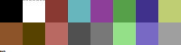
Individually thosecolors look pretty muddy, muted, and dull. But when you put them alltogether in an image they actually work pretty well together, because none of them completely break from the others. Usingmy own stuff as an example, I used the C64 palette to challengemyself with remaking a very colorful, very saturated screenshot from the Nintendo 64game Mischief Makers (because I love that game and both systems have“64” in the name so why not~)
So I turned this: (Nintendo 64 version, with waaay more colors available)
Into this:

Now, there’s clearly a BIG difference in the colors used, but I feel like everything still looks fine on its own. The muddy colors look a lot more harmonious when seen in an image than individually, with the brighter colors, such as the gems, even popping quite a bit.
For that second point I mentioned about colors working differently based on the colors around them, look at the character’s green hair, the green gem, and the green on the top of the blocks. They are all the exact same color. The green gem and hair, though, are shaded with a deeper, more saturated green and contrasted with a bright white, making it appear more saturated than the exact same green on the platforms, because the platforms’ green is surrounded by duller colors.
So it’s important to keep in mind that not only is each color important in the context of the whole, but also that what’s immediately around a color will massively impact how they appear, even when they are the exact same!
Important things to consider when picking colors is how close/far they are to each other in hue (the color itself, represented by the outer wheel in the image below), the saturation (how much gray is in the color, which effects how vibrant it is, which is the left->right in the box) and value (how much black is in the color, which is the top->bottom in the box).

Essentially the further away two colors are from the each other in any of these 3 directions the more they will stand out from each other. I’m not much of a teacher for color theory in general, so the best advice I can give is just to practice and to check out limited palettes other people have made and see how they handle it. In general, though, I try to keep most of the colors relatively close to each other in saturation and warm/cool colors, and then use one accent color that stands out in small amounts to make certain bits pop~
Links time!
Gurney’s post/video on Color Gamut, or manually limiting colors and how surrounding colors alters our perception of them (check out what appears as yellow in the cool colored image as opposed to the warm)
Gurney’s post on color in context and how many colors still register as bright yellow
Fun little tidbit about old cartoons made with limited palettes
Part 2: Contrast, and leading the eye!
Okay, so these other two might be a bit shorter. Basically, when you’re picking colors you want some to stand out and some to fall back. If everything is competing for attention it can be really hard to look at and the eye doesn’t know what’s important! One of the main things to look out for with this is contrast, as the eye is easily drawn to areas that are different than their surroundings.
Let me use two designs I’d had for my character Caelia - the left is her old color scheme and outfit and the right the new one:
Now, aside from minor differences in saturation, they’re actually pretty similar, but the one on the right I think works a lot better. In both of them the yellow acts as a strong accent color that can pull the eye, but on the old design on the left it pulls your eye in two directions - towards the headband and the coat trim, neither of which are actually important. Almost the entire rest of the design lacks that yellow so your eyes are actually drawn -away- from the character’s face and body. Imagine the coat being blown behind her as she’s doing an action pose and, yeah, the accent color doesn’t actually help anything.
The new design, I think, fixes that. Even though it remains an accent color the yellow now appears throughout the design. Her hair is now a lighter shade of yellow which is distinguished from the yellow on the clothing while also framing her face. Her torso now has a yellow accent on it so it draws the eye and, combined with the hair, has a strong distinction between her upper half (which is more yellow) and her lower half (which is mostly red). And finally what was the coat now wraps around her with an additional little strip on a waist sash. Now the yellow trim can easily allow the eye to figure out how her legs are positioned by how they wrap around them, instead of just hanging behind them.
It’s also important to point out that the hair is less saturated along with being lighter than the rest of the yellow - it both looks a bit more natural, blends with her skin color more, and also doesn’t compete with the high saturation in the clothing.
None of this is to say the left one is necessarily a bad design or conveys information poorly, just that the right one is a more unified design that is easier to understand at a glance. It’s something to keep in mind, but not a hard rule or anything. But remember that if EVERYTHING tries to stand out you’ll just end up with a mess.
LINKS!
Gurney on leading the eye with contrast and why what everything I just said might be bunk but might not be and also I think what I said applies better to simplified, cartoon forms as opposed to realism, since lines and blocks of color read differently than natural forms and lighting.
Spokewheeling - a composition technique that can be applied to character design as well.
Shapewhelding - another composition technique to think about, and can be important to AVOID at times (happens a lot in pixel art - dont want things melding together accidentally)
Gurney on why all of that might be bunk for general art composition anyway but might not be, but again I believe is still important for more stylized art
Part 3: SHADOWS!
Okay, so it’s nearing 1am as I write this and I’ll be honest I have the absolute least technical knowledge on this part, so I’ll tell you how I go about it but I STRONGLY suggest reading Gurney’s information on it (Again, seriously, I love his books, and “Color and Light” in particular is amazing and contains many of these posts and more)
When it comes to shading I have a pretty quick and dirty way to figure out what to do:

in case the text isn’t legible:
Choose a color for all shadows to move towards (usually a purple or blue)
Grab the base color for the thing I’m adding shadow to
Shift the color towards the direction of the shadow color I chose, and then make it darker and more saturated
And I do the exact opposite for highlights - I move away from the shadow color and then make it lighter and less saturated
Usually, anyway. And this method works best on the kind of color wheel I have there, but it can be adapted to most anything. And how far you move towards the shadow color and how dark/saturated you make the shadows will change the mood of the piece a lot. The colors in the screenshots are for a pretty light colored, low contrast piece.
I would go on more about it but I don’t actually have solid reasoning behind it other than it tends to look alright and I don’t want to spread incorrect thinking. Just… for the love of all that is colorful, DONT just shift the color towards black or white. It looks muddy and gross. Please. I beg you~
ON THE PLUS SIDE, Here’s a slew of awesome links!
Gurney and Chromatic Shadows Part 1!
Chromatic Shadows Part 2!
Relative color on skin tones!
Complementary shadows!
Induced colors! (or how our eyes can make highlights appear as different colors)
And I cant stress enough how great Gurney’s Color and Light book is for this stuff. I just can’t explain much ‘cuz I’m bad at actually studying this stuff well enough to talk about it!
Anyway, that about does it for my waaay longer than I thought and hella reply to a single sentence question! Hope that helped you, or SOMEONE at least! It was fun to ramble on about regardless~ (oh geeze yeah maybe rambling after midnight was a bad plan? Hopefuly this actually makes sense lol. If anyone needs any clarification just let me know!)
Cheers! (ノ◕ヮ◕)ノ*:・゚✧
132 notes
·
View notes
Text
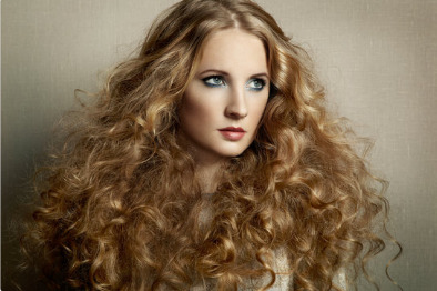
Long Blonde Hair Ideas
Golden blonde swirls always look enchanting and also cute. Simply visualize all those clusters of the passers-by, wondering what a fairy tale you have actually left! You will certainly develop an incredible impression with your appearance anywhere, even when you go with a walk with your pet. If you are trying to find the picture of a cutie, this long wavy hairstyle could become your top. Make some loose thick curls all over the length, put the upper part into a reduced braid and twist it a few times. Leave some complimentary falling curls on both sides, and also here you go-- the cute hairstyle is ready!
It seems to be that blonde girls have obtained a light, ethereal, tender appearance. They are even contrasted to angels as a result of their ease and also unearthly appearance. Whether you have dark blonde you are an embodiment of feminines and lightness in the eyes of males. With just the appropriate colour of blonde shade, you can absolutely alter your appearance and become a princess.
Blonde women always rock on any type of occasion, as well as you can be one of them. Marilyn Monroe, Madonna, Scarlett Johansson, and lots of various other well-known stars have the blonde colour of hair. And also confirm that this shade is one of the most gorgeous.
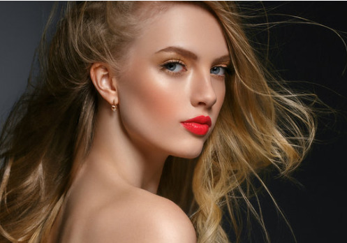
All the blonde colors get incredibly prominent this year, so we have actually determined to speak a little bit regarding them. Also the essential changes of appearance. If you are a lady with a black or brownish hair, such a colour transforming might be laborious. Due to the fact that you will certainly need either to function a lot to gain some loan for an actual expert of shade blending. Either make a massive looking for the appropriate directions of how to get that terrific blonde tone.
If you currently have the valuable blonde hair and you desire the drink of your appearance, look into some fantastic stylish hairstyles for long hair. We make sure that you will certainly love them beforehand and hope that these charming hairstyles ideas will certainly make you the queen of every celebration and also occasion! Let your blonde hair excite everybody around!
Charming Hairstyles for Long Blonde Hair
Blonde looks the most effective on medium as well as long hair. Long blonde hair is a reborn trend from the past, from the 70s. When the fashion world was ruled by boho-chic. Natural blonde nude sparkles like a ruby on long hair; it glares and also twinkles.
It can not constantly coincide, it brings the individuality to any female. Each lady gets her own blonde colour. To obtain a truly special as well as natural look simultaneously, call a professional in a hair salon. And also the result will exceed your assumptions.

Additionally, long hair allows you to have fun with different hairstyles. You can crinkle your long locks with a thin iron or intertwine your hair waterfall. Yet make the fishtail as opposed to the common as well as monotonous tail. Decor can make your day-to-day appearances uncommon. As an example, the floral decor will certainly highlight your womanly look. Such a hairstyle may be your normal day-to-day hairstyle or a periodic one-- every little thing depends on you.
A hair tinting in brilliant shades that are made properly creates the photo of a one-of-a-kind glamour chic and elegance. As well as additionally highlights the paleness of the skin as well as the illumination of the eyes. As well as there is barely a male whose eyes would not have stopped on a beautiful blonde. The only point that you should wait is a lot of gazes: you will obtain a genuine wave that would certainly knock you off. If you do not like to be in the centre of everybody's interest, take care with tinting your hair blonde.
Amazing Haircuts for Long Straight Blonde Hair
Ash-blonde looks great on both, long and short haircuts. This magnetically lovely colour brings in the eyes of anyone, who sees it. Nevertheless, only a very seasoned colourist can give you an absolutely stunning design. That is so hard to achieve. So how can you obtain clean, great, ash-coloured hair?
First of all, you need to lighten the hair effectively, attempting to protect its wellness. As well as then do tinting in the ash-blonde design. The modern technology of coloring needs to be selected by the hair-stylist. Independently, depending on the initial color, type, and condition of the hair. Sometimes, especially when a client desires the improvement to be a cold ash blonde, being a redhead. It may be required to do a long, multi-step treatment of passing away, utilizing a mild innovation without damage to the hair.

By maintaining the hairstyle simple, you can achieve an astonishing outcome. The long sleek straight hairstyle that represents an ash-blonde shade in all its charm. It can conveniently choose any kind of outfit and fit any celebration. Prepare to catch admiring glimpses while you are strolling on the road.
Hairstyles for Long Blonde Hair with Bangs
Many Hollywood starlets and amazing leading models have actually already picked a blonde shade. We assume there is no shock: this fantastically beautiful shade gives a woman with such a hair tone. Both elegance and also elegance. It will fit the feminine ladies that prefer a charming as well as an airy picture. And also will be especially great for brown-eyed girls with distinctive face attributes.
These rich tones of blonde will certainly make you a genuine femme fatal. If you enhance them with the ideal make-up as well as style. To make a full appearance that will shine with full harmony is a hard task. So if you are a new person to the style globe, you can ask a stylist for help.
They generally state that a cold variety of hair colours look the best with the very same colours in clothes & lipstick. You may surf the Net and find some lovely examples of appearances that will comply with the ideas and also tricks of the style enthusiasts. As for hairstyles, long blonde hair combined with bangs provides its owner some room for imagination. Ponytails, half braids, buns, pigtails, to call a few.
The Best Long Size Hairstyles for Blonds
Absolutely nothing functions better than cost-free falling blonde curly locks. These photos with magnificent blonde shades reveal beauty as well as charm. You can be sure that your daily picture will certainly be great, as it is supplemented by your long light coloured hair that shines with its golden highlights. In addition, you can ignore the complicated hairstyles and do not trouble on your own with those hard-to-do and advanced pigtails or buns. Feel in one's bones that you will certainly look magnificent wearing a basic long length hairstyle of blonde shade.

Trendy light blonde hue and its shiny highlights will certainly offer any woman an extravagant deep glow that will draw in the eyes of any kind of passer-by. This is an exceptionally attractive, delicate colour with a golden shade that can go flawlessly with any kind of body skin tone, eyes form, as well as wardrobe.
Additionally, this trend obtains a whole lot of interest from the young people, since of its brilliant as well as unique message. This is the idea that any kind of teenager wants to send out to the globe-- he/she is one-of-a-kind and also unbelievably rather! Long blonde hairstyles that shine intensely like the diamonds highlight this suggestion the most effective.
Split Hairstyles for Females with Long Blonde Hair
If you are tired of straight hair, the split hairstyle will end up being the area of light for you at night world of boringness. Layered hairs that mix with each other look softly, stylish, as well as they will constantly be trendy. By the method, women long hairstyles have actually constantly drawn in males, as this is the picture of feminines. Some people claim that long hair is a treasure of a woman, yet it demands a whole lot of interest. So a girl whose hair is long must prepare to spend a great deal of time styling her hairstyle.
Girls with blonde hair colour have a distinct mild appeal as well as remind attractive fairies from fairy stories as well as legends. The image of a magic fairy ought to be matched by the proper style of garments, certainly. Long blonde hair with unpleasant and light layers will certainly look incredibly beautiful with garments of grey, black and also other contrasting colours, which will highlight the hair colour elegantly, without creating a shading conflict.
If you are most likely to persuade a person to do something, try to be either a fairy, tackling your favoured gown of light shade, or pick a two-piece suit, that will certainly turn you right into an attractive lady-boss with a bit casual beauty. Believe us, this will knock off your dialogist, regardless of the individual or organization partnerships you have with him.
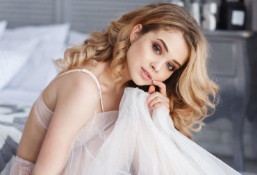
Long Wavy Blonde Hair Ideas
Golden blonde swirls always look enchanting and also cute. Simply visualize all those clusters of the passers-by, wondering what a fairy tale you have actually left! You will certainly develop an incredible impression with your appearance anywhere, even when you go with a walk with your pet. If you are trying to find the picture of a cutie, this long wavy hairstyle could become your top. Make some loose thick curls all over the length, put the upper part into a reduced braid and twist it a few times. Leave some complimentary falling curls on both sides, and also here you go-- the cute hairstyle is ready!

Hairstyles with volume are the ones which make a woman appear like a queen. They are elegant as well as appealing and function well on every occasion. When you have long blonde hair, as well as you remain in search of some amazing hairstyle ideas, you are conserved due to the fact that this is precisely what you require. Long crinkled locks that are pinned on the crown and embellished with white roses will impress every male around you.
Attractive Hairstyles for Women with Long Blonde Hair
Below we would love to reveal you among the best blonde variation-- smokey blonde. One-toned hair looks uninteresting as well as level. Smokey blonde is an actual rescue for the style maniacs, who are tired to see that average yellow hair! Smokey blonde represents light hair with darker roots, unlike ombre, where the focus is placed on the hair pointers. Specialists note that the transition of colour from the origins to the suggestions of hair can be performed within 2 or three tones, that will create the all-natural result of regrown hair after typical hair colouring.
The smokey blonde can be made in a much more contrastive style, where the primary colour is a light blonde, as well as the roots, are coloured brown and even black. This variation of blonde is except everybody however, as it highlights any type of facial blemishes due to the comparison. Only actually strong girls would try such a hairstyle on her long locks, however, if you are a fan of uncommon colour decisions-- this option may be for you!
New-fashioned colouring for long blonde hair
It deserves noting that this new-fashioned colouring allows a specialist to play with colours, creating attractive highlights and making the appearance soft as well as Honorable. Likewise, the major benefit of the smokey blonde is its flexibility as well as the possibility to use a fantastic selection of shades that may offer a whole lot of entirely various photos. Furthermore, the toughness of this colour mix is extraordinary! Some professionals recommend to forget tinting for the next three and even five months, and the impact will be just increased!
Stylish Long Blonde Hairstyles for Ladies
If your hair is healthy and balanced as well as all set for the colouring, you might try a platinum blonde, which is very trendy nowadays! It belongs primarily to the classification of the hairstyles for catwalks, yet many trendy stylists successfully execute this tinting technique on the hair of their clients, who like developments and also are not terrified of experiments. One can say that chilly shades match only the Nordic beauties, but this reality is already negated-- you may wear every little thing that you like!
A platinum blonde that is made by a knowledgeable master can be unquestionably compared with the piece of art. Certainly, such tinting in many cases requires a completely discoloured base, yet modern-day tinting modern technologies permit to do this with marginal damage to the wellness of the hair. Nonetheless, it is still not recommended for girls with thin, broken and also compromised hair. If you determine to get this colour, get hydrating masks and also nourishing oils too: they will certainly recover your long hair after tinting. You must also use items for coloured hair frequently, particularly coloured shampoos, which will certainly assist to maintain colour and avoid showing up yellow shade after a number of hair washings. As well as, try to ignore hair dryers and curling irons, because hair needs only mindful mindset after such colouring.
Braided Hairstyles for Long Blonde Hair
Every person recognizes that when it pertains to feminine appearance, absolutely nothing can be far better than braids. Braided hairstyles are extremely girlish, exclusively lovely as well as gorgeous. To obtain such a womanly outlook within a number of straightforward actions, divide your hair into two straight parts, make some slim pigtails from the top part and also weave them into the sidelong waterfall pigtail.
Long Blonde Hair For Laid-Back Clothing
This kind of hairstyle will fit laid-back clothing much better than the main ones; nevertheless, the modern-day fashion enables us to do nearly whatever with our hair for job as well as wear whatever you desire. Your manager can admit every little thing with the exception of the negligent attitude to the working process and also completely careless perspective to your look. Well, he might see absolutely nothing negative in the second aspect, yet.
You can not forgive on your own if looking negative! Some creative ladies have created the braided hairstyles for any kind of proprietor of long hair to resemble a princess with just a number of actions! Look just how lovely blonde braids look, and also you may get motivated!
In case you are a fan of uncommon looks as well as intricate hairstyles, and you have a long time in the early morning to make them, right here it is-- your fairy tale intertwined hairstyle. With all these pigtails perfectly blended into each other, you will obtain your appealing "the elf princess" look. Such appearances reveal the simplicity and also softness of female's character. Blonde curled locks that are intertwined and also twisted develop an attractive structure with some decor if you would put it in your hairstyle.
We wish that our gallery influenced you to tint your hair blonde or at the very least offer you some visual delight. Return for the new section of inspiration, please!
#long blonde hair#hairstyles for long hair#easy hairstyles#haircut#easy long hairstyles#easy medium hairstyles#easy short hairstyles#updo hairstyles#updostyles#updos hairstyles
1 note
·
View note
Text
Job Interview - The Best Way to Dress
Job selection interviews are important for both you and the actual employer, making sure there is a mutually beneficial match for both participants. The business has reviewed your own cv and has already assessed you possess skills for the job. The interview therefore acts to allow for more expansive debate and clarification upon any details. The personality and cultural fit of the potential employee are key decision factors in the job interview. If you need to interview with a recruiting agency or perhaps the corporation's HR team first, do know that their thoughts are essential. Be sure your outfit works well together. Possessing all of the correct wardrobe pieces is all well and good, but if they don't coordinate, they are basically worthless. Stick with basic clothing as an alternative to fashion items. You will definitely get a lot more use from particular garments that will partner well together with basically anything and everything. Far more trendy and fashionable things are generally more challenging to couple with other clothing collection items. You might want to choose to wear a formal suit to interviews. A darkly-coloured suit along with a light coloured shirt is your best choice. Be sure that your suit fits and is not causing agony if it's much too restrictive, or else it'll be distracting for you. Some outlets supply cost-free alterations when you purchase a formal suit, otherwise you may choose to find a tailor to alter a suit that you currently own.A sports blazer is a practical substitute should you not possess a formal suit. That said, it ought to be basic and even subtle. Don it along with black, gray, navy or perhaps tan slacks plus a white or maybe blue dress shirt and a neck tie. As just stated, make certain every little thing fits effectively. If it fits well, you are likely to look impeccable and function your very best. It's the difference between donning some sort of suit with confidence, and trying to fit oneself into the same suit that you dressed in for your graduation. Pick your favorite suit inside your current wardrobe. Make sure it's tailored. Solid hues or perhaps pinstripes, and in sound condition. Skirt suits really should be knee-length and never too tight. Classic ties tend to be most appropriate. Absolutely nothing much too flamboyant or far too vivid, although I am a fan of a gorgeous printed neck tie. Save loud neckties for immediately after the interview. A white colored shirt or perhaps mild blue shirt which in turn contrasts with the suit should really be chosen. Long sleeved shirts tend to be preferable. Bare arms is regarded a lot less professional. Combine your formal suit with a button down long sleeve dress shirt ideally If patterns aren't too daring, chances are they usually are acceptable. White colored is definitely the go-to shirt color, however light blue works well. If you select white along with fine pin-stripes or just plain white, you are aware that you don't face the chance of offending the interviewer's personal taste. Your belt really should match ones boots or shoes. Don't end up being perplexed questioning what colour shoe to combine with the navy blue formal suit. Some sort of darkish brown or preferably black color natural leather shoe ought to be put on. A good general guideline is that the footwear colour should really be more dark than the formal suit. Pick the right shoes or boots for the role. First and foremost, when it comes to men's leather shoes for a job interview, choose mens black oxford shoes. You'll find out a little more about men's leather shoes here. Business formal positions all require high quality footwear, typically made from leather (or similar high-quality materials). Men should always put on formal shoes, often from the brogue or oxford type. Lace-up is more classic. All things being said, you can put on a leather loafer to great effect within a formal setting. Adhere to black footwear or dark brown if you need to. Low-heeled footwear is suitable for a girl.Choose to wear longer socks. Reasonable colours are usually black color, dark greyish as well as dark blue, ordinarily.
youtube
Keep accessories modest and simple. For your professional look, women of all ages should remain faithful to simply a smattering of makeup and just modest and also uncomplicated necklaces. Absolutely be sure to clean teeth before the interview, and stay away from cigarette smoking as well as drinking coffee drinks immediately before. Shower or bath the actual morning of your job interview. Stick with subdued scent, if any at all. never overpower the actual interviewer by using powerful or offending cologne. Be cautious and steer clear of fragrances totally. Make sure your hair is definitely tidy and cut. And be sure you shave. Facial hair wearers ought to make sure their particular face is at the very least really clean. Remember to brush nice hair and check in between your pearly whites. For fine measure, maintain a compact grooming kit in your pocket for almost any last minute scenarios. Be sure that your finger nails are neat and cut on the actual early morning of your interview. Fingernails and shoes tend to be the first things that people begin judging you on. If the job role is actually professional, continue to keep tattoo designs covered. Remove piercings as well. In the employment interview, don't just concentrate on the interviewer. Eye contact is key with everybody. Body language is paramount. Have good posture even if you aren't conversing and make use of understated gestures to show that you are being attentive and also attentive through the job interview. Don't forget however that you're also deciding if you'd like to work for the firm. You are together signing a legal contract of understanding. You ought to ask sufficient questions for you to understand if the business is a great fit for you or otherwise not. Do not invariably rely on the headhunter to give you this info. It truly is acceptable to ask such questions in the interview.
1 note
·
View note
Photo


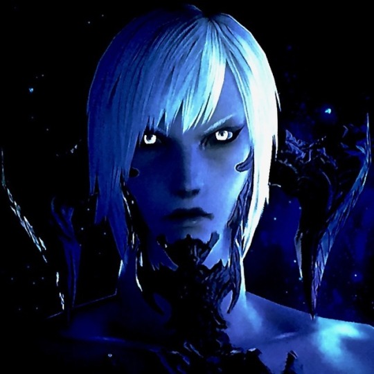

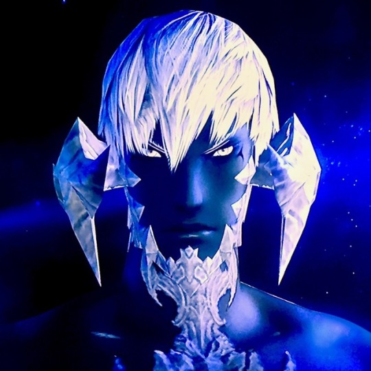
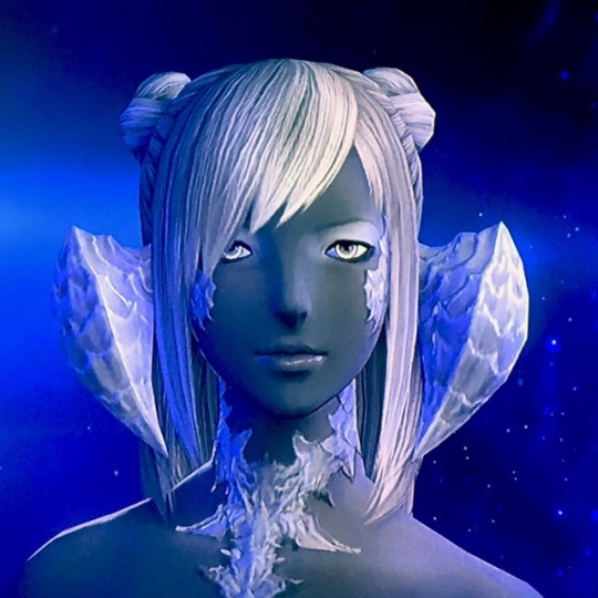


Discussion of Au Ra design fun under the cut!
Au Ra are a good time imo, no idea why I don't play them more often.
What I've noticed in practice is that if I do encounter Au Ra in-game, like player characters, they tend to be toned back into more natural colors. In terms of how people have critiqued them, I've heard two main camps. First is that they're essentially the same as Miqo'te: Hyurs with a few animal features pasted on. Here it means horns and tails and a couple of odd scales scattered around. I've also heard people get terribly upset that the Au Ra females weren't closer to their concept art--more Amazonian and dangerous looking as opposed to the cute version we got with extreme sexual dimorphism. Additionally, there have been some laments about how the concepts were more demonic looking as opposed to draconic.
Like I talked about in a past post I don't know for sure, but if I had to guess my suspicion is that the sexual dimorphism came from testing audience reactions for Au Ra, Viera, and possibly Lupins. I think what probably happened was that Au Ra were more popular than other options but that there was a lot of demand for cute bunny people alongside the Au Ra. At that stage I think there wasn't certainty if another race would be added following Au Ra so there were attempts to maximize popularity and stack all the most popular results into Au Ra.
In terms of Au Ra being just Hyurs with extra features, I actually want to point out--female Au Ra faces are significantly softer, have larger eyes, and more narrow/upturned noses overall compared to Hyur counterparts. The male Au Ra are overall more proportional than Elezen and offer a male body type that combines height and lean muscle. Male Au Ra are also the only race so far that for height can match male Roegadyn with some consistency. Male elezen can on a good day, but Au Ra have a better shot.
Overall, while it might be a little unclear in a couple of panels because of lighting, I made a rule for myself that I could not do drow coloring this time. I like how dramatic that approach is, but I've done it a lot. This time needed to try something else to make impact, and Au Ra have insane color options to take advantage of.
I personally find that space where horns connect to the head somewhat awkward, so I picked hairstyles that would help disguise that space. First set of Raens I tried to play into red coloration that would give different impressions of heat while feeling unified with the white scales. The first two Xaela are absolutely desaturated to give the impression of being cast in silver or moonlight.
The second set, both Raen have green skin against variations of gold and white. I did this frankly because green is one of the last colors I'll think to use reflexively while being a very reptilian color. Seemed like a good way to step outside my comfort zone. The bottom two Xaela both use blue in different ways. Part of why I made the female Xaela so dark is because the noses for that face default tend to get odd pixelation that shows up in lighter shades. I wanted to make the male Xaela feel a bit Middle Eastern since the features for that face preset are more angular. Sometimes the upper lip got odd pixelation for that preset, so I tried to pick hues carefully to hide that as much as possible.
For female Au Ra, while height and overall softness is just how it goes I do want to mention that depending on how features are arranged it is COMPLETELY possible to make an edgy or scary looking female Au Ra. Mainly I think having dark eyes contrasted with a very bright liminal ring, small irises, and black eyeshadow to give a sunken impression goes a long way toward removing the cute factor in favor of spooky. If you give the impression that one pupil is larger than the other that can be unsettling too.
7 notes
·
View notes
Text
Finding interior designers in Sherborne
Searching for an interior designers or interior decorator can be overpowering on the off chance that you don't know which planner you requirement for the extension or your task. Is it true that you are assembling, remodeling or moving and require proficient guidance? Is it true that you are wanting to pitch your property and not certain how to prepare for the primary examination?
This archive gives you replies to habitually made inquiries with respect to interior plan, interior enhancing, shading counseling and property styling.
It will help you finding the correct planner for your interior structure and beautifying ventures and in the end make your individual style in your home.
What is the contrast between an interior planner and an interior beautician?
You may have made this inquiry as of now when confronting a building or redesign venture. Do I require an interior originator, an interior decorator, a shading specialist or an interior beautician?
The appropriate response is that it relies upon the extent of the venture.
An interior architect is a talented expert who is planning interior conditions as per your instructions. The interior planner either changes what as of now exists (redesign) or gives a completely new structure to a space (new form). For this situation the interior planner works intimately with the designer and comes in at a beginning time of the undertaking. interior designerss work either along a group in configuration firm or all alone.
What is the activity of an interior beautician? An interior beautician is a designers or advisor in a field subject to changes in style, particularly design or interior improvement. An interior beautician develops or keeps up a specific style and by and large beautician are discoverers, managers and gatherers of excellent articles.
The interior beautician can help you finding your very own style, making lovely interiors that are one of a kind and significant. This can be accomplished with the most straightforward things and does not need to be costly. The main thing you have to do is keep your eyes open to excellent things in nature, engineering, structure, historical centers, workmanship, shows, books, materials and travel. There is just a single standard: Only gather or purchase things that mean something to you!
How does a shading counsel function?
The shading counsel centers around making a shading plan for a particular room or space or the entire house as per your instructions. A certified shading specialist can assist you with interior and outside shading plans.
Preceding planning a shading plan for you the shading advisor ought to dependably converse with you about the disposition and air you might want to accomplish in your space. He will disclose to you the contrasts between the paint organizations and their items and pick the correct item for your requirements. In the wake of structuring the shading plan you will get a composed suggestion including a particular sheet and brushouts prepared for your painter to begin.
For what reason is it essential to look for counsel from an originator while picking hues?
Shading is the most integral asset with regards to non-verbal correspondence and the plan component that makes a space wake up. Shading gets uniqueness a space and it is a standout amongst the most valuable devices to ace when finding your own style.
Leatrice Eiseman, Executive Director of the Pantone Color Institute, says in her book Pantone Guide to Communicating with Color: "Among different utilizations, shading invigorates and works synergistically with the majority of the faculties, symbolizes conceptual ideas and musings, communicates dream or wish satisfaction, reviews some other time or place and creates a tasteful or enthusiastic reaction."
While picking a shading for a room or house it is essential to consider the temperament and air you might want to accomplish. Is it a dim room or overwhelmed with regular light? In which course is the room confronting? How are the extents? Do you live in a little loft or a contemporary recently fabricated house with open arrangement living territories? This should be viewed as while picking hues for a space.
On the off chance that you are overpowered by the selection of hues accessible - indeed, there are thousands available - how might you begin finding your own shading plan?
For a few people it is a more drawn out adventure, for other people, it comes all the more normally. The most imperative thing is to take some time, open your eyes, stroll around your home and assimilate the shading mixes you see. At that point begin assembling every one of the pieces you cherish. This can be anything from old porcelain, travel trinkets, photos, work of art, garments, tear sheets from magazines, texture swatches, stationary, an accumulation of stones, quills or glass objects.
Also, bear in mind nature as motivation for a shading plan (interior or outside). In the event that you live close to the sea, shades of blues and greens can be utilized to connect your interior with its environment. Blossoms, butterflies, stones, shells, driftwood are awesome motivations for shading plans.
When you have assembled all your adored fortunes in a single spot, play around with the pieces, amass them by hues and you will see a shading palette rise. This "moodboard" is an extraordinary beginning stage for your interior fashioner, interior beautician or shading advisor to help you making an individual and individual space, a home that reflects your identity and a place that you adore getting back home to.
Beautician's tip: Before you begin painting dependably purchase a test pot and paint a substantial sheet of paper or cardboard (one square meter) with your shading. Tape it to the dividers in your room and study it for two or three days. Take a gander at it in sunshine and counterfeit light. This is critical as hues change contingent upon the light, the introduction of the room, different hues in the room and spatial components like furnishings and work of art for instance.
What is the distinction between a shading and a styling meeting?
The shading meeting centers around making a shading plan for a particular room or space or the entire house as indicated by your preparation. A certified shading advisor can assist you with interior and outside shading plans.
The styling discussion centers around making a certain (Your) style in your home or essentially on noting every one of your inquiries concerning hues, style, furniture sourcing and arrangement, workmanship sourcing and situation, showcases of your accumulations, frill, extents in a space, lighting and so forth.
Again it is crucial that the fashioner tunes in to what you might want to accomplish (preparation) and ensures that he comprehended what you need (questioning). Try not to give the interior architect or interior beautician a chance to talk you into something you don't care for!
How would I expand the yield of my styling discussion?
It is safe to say that you are wanting to shading, redesign or revamp, yet don't realize where to begin? Do you have bunches of inquiries concerning shading plans, furniture situation, how to show your accumulations, books or other adored things? It is safe to say that you are uncertain about whether to rearrange with your old furnishings and embellishments or to revamp and make another look? Do you require motivations where to source furniture and adornments, second hand pieces or collectibles?
On the off chance that you set up your first counsel with your beautician appropriately, you will find solutions to every one of the inquiries you have. Here are my tips how to boost the yield from your styling or shading conference:
• Be clear what you might want the result of the interview to be.
• Decide which room or space you might want to concentrate on. Is it just a single room or the entire house?
• Prepare yourself with tear sheets from interior structure magazines like Real Living, interior Out, Belle or Vogue Living. There are bounty available so pick the one that addresses you most and begin gathering pages of all that you like: shading plans, furniture, frill, room designs, mats, flooring, backdrop, beautiful things and everything that addresses you. On the off chance that you do this for a long time you will plainly observe what you like and locate your very own style.
• Keep your eyes open to the delightful things around you: nature, engineering, plan, historical centers, craftsmanship, presentations, books, materials and travel.
• Make beyond any doubt that your beautician is tuning in and disclose what you need to accomplish with your styling venture, what you might want a space to improve the situation you and what inclination you might want to make in your space.
Lastly a standout amongst the most essential things: Don't give the beautician a chance to talk you into something you don't care for! You need to live in the space and you have to feel good and at home! It is tied in with making your home with your own touch.
How would I locate my very own style?
The appropriate response is as basic as this: investigate your general surroundings and welcome the magnificence that exists in all that you find!
Keep your eyes open and your mind energized! Find and value the excellence that encompasses you consistently! Discover motivation in nature, structures, shops, shows, exhibition halls, workmanship, occasions, markets, magazines and obviously books.
1 note
·
View note
Text
5 Ways to have a Bathroom Interior that You Desire
Get a new look to your Bathroom Interior Designs with the best splendid layouts. A little twist or change can modernize your personal space and could make it look decent and fresh. Also, a fresh lick of well-chosen paints could add just more to your interiors. Sometimes, the details can make a difference in the livability of modern Bathroom Interior Designs In Mumbai. With some helpful tricks, you will get to have the best interiors:
The mats
One can easily smarten up your bathroom with mats. In the rest of the Residential Interior Designs you can put any type of doormats but when it comes to Bathroom Interior Designs don't go for the most boring bath mat in the online store. As well as being functional, mats can make a real design statement, whether it is with bold colors, a quirky pattern, or an unusual shape. As per one of the best-known Residential Interior Designers in Mumbai your space is relatively neutral, opt for a vibrant pattern. Also, by putting one or two contrasting designs for an eclectic feel.
The accessories
The simple palette and accessories can make Residential Interior Designs in Mumbai feel more modern, and luxurious. To create a streamlined and coordinated look without splashing out, bring in matching bathroom accessories in a contrasting hue to your existing decor. Elevate these staples into a statement in their own right by opting for a fun motif to tie the whole scheme of bathroom interior decor together. Here, shell-shaped dispensers add a quirky touch that mirrored across the patterned towels. Opt for the best Bathroom Interior Design Company Mumbai as they will share the in-trend style of soap dispensers, toothbrush holders, and storage jars and match them with towels in the same shade.
Classy wallpapers
Remember that it can make your space outshine, and also, it can be easily replaced with tiles. Today the market has a plethora of options starting from type to style that could suit your statement. When you consult -Homely Interior Design in Mumbai the best Bathroom Interior Design Company in Mumbai you will see for yourself how impactful the interiors turn out to be. Here, our advice is to go for a bright patterned feature wall with a brush of color.
Note: - If you like the classic style, try out a budget-friendly stone or brick-effect design to add the illusion of texture.
Wood panels works
Wood panels make both characterful and often cheaper alternatives to wall tiles of your bathroom interior designs. Make sure that you ask your Residential Interior Designers in Mumbai to have water-resistant paints with an oil-based touch in the end.
No storage waste
If you are tight on space in your bathroom, installing a multi-tasking shelving unit is a great-saving hack. The Bathroom Interior Design Company Mumbai suggests that this unit feature hooks to hang bathrobes, towels, toiletry bags, and many more. While a handy shelf over the top offers a valuable extra place to store washroom essentials.
SUMMARY
When you wish to renovate your residential interior designs and need expert supervision- Homely Design Studio in Mumbai falls in the most preferable stop for the very type of interior designs. With a forte in architecture, interior design, branding, and experiential graphic, we have taken into account from redesigning to come up with splendid interior designs for your space with the best possible of everything.
Please Visit Our More Blog: - https://interi0rdesignershub.blogspot.com/2022/03/5-ways-to-have-bathroom-interior-that.html
#Residential Interior Designers Mumbai#Residential Interior Design in Mumbai#Residential Interior Design Company#Residential Interior Design Company Mumbai#trendy bathroom interior design mumbai#Bathroom interior designers mumbai#Bathroom Interior Design Company Mumbai#bathroom designers in mumbai
0 notes
Text
Traditional Chinese clothing
As a fundamental piece of Chinese human progress, conventional garments assumes an essential part in the nation's history and culture. Their essential highlights are cross-neckline, folding the correct lapel around the left, tying with a scarf and a type of shirt in addition to skirt or long outfit. These highlights have been safeguarded for a great many years till the season of the Republic of China (1912 – 1949AD) when Chinese Tunic Suit (Mao Suit) and cheongsam won. These days, be that as it may, most Chinese wear present day garments in their day by day lives, very little contrast from their western partners. Conventional clothing types are just worn amid specific celebrations, functions or religious events. Be that as it may, they are frequently found in Chinese TV serials and motion pictures. A significant number of the nation's ethnic minorities additionally wear their conventional outfits in their everyday lives and they assumed a critical part in the customary Chinese attire.
History
In view of chronicled revelations, Chinese garments go back to the later period of the Paleolithic Times (1.7 million years prior - the 21st century BC). Materials utilized were of creature skins and improvements were of little stones and creature teeth. The "genuine" garments were not created until around 5,000 years prior by the Yellow Emperor. By the Shang Dynasty (seventeenth century BC - 1046 BC), the fundamental highlights of customary Chinese Dress were made, and additionally the general example of the shirt in addition to the skirt. Afterward, the long outfit showed up amid the Zhou Dynasty (1046 - 256 BC) and it coincided with the pullover skirt blends for a great many years, enhancing further as time passed. At that point, an extraordinary change happened with the development of the Republic of China when Mao Suit wound up prevalent among the guys and cheongsam among the females. In the early time of the People's Republic of China, Mao Suit remained famous among guys, as well as females. Later in the 1970's, the point at which the nation executed change and opening approach, the majority bit by bit swung to western-style clothing.
Highlights
Notwithstanding the essential highlights and examples, customary Chinese Dress types have numerous different highlights like appearance, cutting, improvement, shading and outline, and so on, all of which changed over the different administrations. For instance, dark is the most stately shading in the Xia Dynasty (21st - seventeenth century BC), white in the Shang Dynasty and red in the Zhou Dynasty. They likewise differ in view of one's political position, economic wellbeing, occupation and sexual orientation, and so forth. For example, winged serpent weavings and brilliant yellow must be utilized by sovereigns more often than not; in the Tang Dynasty (618 - 907 AD), purple authority outfits are for the fifth or higher rank authorities; in the Qing Dynasty (1644 - 1911 AD), the higher a man's social status or the more extravagant one was, the more weavings and fringes there were on his clothing types.
Surely understood Fashion
Cheongsam Although the form incline changes after some time, there are a few sorts that are mainstream till today both at home and abroad.
Conventional Han Chinese Dress (Han Fu): It alludes to the clothing worn by the Han individuals from the enthronement of the Yellow Emperor (around 2698 BC) till the late Ming Dynasty (1368 - 1644 AD). It wound up known as the Han ("fu" signifies "garments" in Chinese) in light of the fact that the mold was enhanced and promoted amid the Han Dynasty. It is generally as long outfit, cross neckline, folding the correct lapel around the left, free wide sleeves and no catches yet a scarf. Albeit basic in outline, it gives distinctive sentiments to various wearers.
Chinese Suit (Tang Zhuang): It is a blend of the Manchu male coat of the Qing Dynasty and the western style suit. It is normally straight nabbed, with looped catches down the front. Its shading and configuration are in customary Chinese style however fitting is western.
Cheongsam (Qi Pao): Originated from the Manchu female garments, it developed by converging with western examples that hotshot the excellence of a female body. Its highlights are straight neckline, the strain on the midsection, wound catches and openings on the two sides of the dress. Materials utilized are normally silk, cotton, and cloth. Cheongsam is the most well known Chinese Dress on the planet today.
Chinese Tunic Suit (Zhongshan Zhuang): Also called the Yat-sen Suit, it is composed by Dr. Sun Yat-sen by joining the Western-style suit and Chinese Dress. It has a turn-down neckline and four pockets with folds. As Chairman Mao Zedong worn it much of the time, it is likewise called the Mao Suit by westerners. It is the primary clothing from the establishing of the People's Republic of China in 1949 until the 1980's. The nation's pioneers still wear it today when going to critical events, for example, military motorcades.
Different Types
Conventional Manchu Clothing: It is the customary dress of the Manchu ethnic nationality, for the most part as long outfit and in some cases with a coat or petticoat outside. Since Manchu is the main class of the Qing Dynasty and their dresses were emphatically advanced, this sort of garments was exceptionally prominent in that period. The attributes are round or straight neckline, secure with catches from the correct neckline and a scarf on the midsection, two or four openings, and tight sleeves with sleeves formed like steed feet.
Customary Clothing of the Other Ethnic Minorities: notwithstanding Manchu, the nation has 54 ethnic minorities and every one of them has their own particular one of kind ensembles. Dissimilar to the customary Han Chinese outfits, these ensembles are still generally worn today. Essentially, they can be isolated into two kinds: in length outfit and short coat with jeans or a skirt. They more often than not wear long outfits with caps and boots; others favor short coat and for the most part, wrap their head with material and wear shoes. Individuals wearing a similar kind of garments can be additionally recognized by the outfit points of interest like the structure, specialty and style, and so on. Take the long outfit for example. The Mongolian and Tu nationalities incline toward high caught outfit with catches down the front; the Tibet and Monba bunches wear the collarless outfit with catches on one side and the Uygur love those with catches on the right.
Winged serpent Robe: It is so named in view of the weaved mythical beasts on it. It must be worn by the sovereign, who was viewed as a mythical serpent from paradise in the antiquated circumstances. Different attributes of a mythical serpent robe are round neckline, catches on the privilege and more often than not in brilliant yellow.
Authorities' Uniform: Unlike present-day China, a wide range of authorities in antiquated circumstances had regalia. They are entirely recognized by hues, weaved examples and caps, and so on. For example, in the Ming Dynasty, the weaved design on a first rank common officer's uniform was a crane, second rank a brilliant bird, third rank a peacock, fourth rank a wild goose, fifth rank a silver fowl, 6th rank an egret, seventh rank a "purple mandarin duck", eighth rank an Oriole and ninth rank a quail.
Customary Wedding Costumes: Chinese conventional wedding ensembles shift in various lines and eras. Be that as it may, they are red more often than not as red is viewed as fortunate, glad and propitious in the nation's way of life. The most understood are red chaplet and authority robes, which are still generally worn today by recently married in customary style wedding functions or for taking wedding photographs.
2 notes
·
View notes
Text
Significance of Colours: A Design Energist's perspective
Have you ever wondered why certain spaces make you feel happy and some don't? Did you ever think that there is a connection between you and the colours in your space?
Well, there is. Our mental and emotional state is strongly affected by the spaces we live in and the colours that it withholds.
“Colours are a reflection of our feelings and emotions.”
Our space holds imprints of memories from our situations, creating positive and negative feelings & emotions. These feelings and emotions get absorbed in the space where these experiences have occurred, in the form of energy. As a result, this energy reflects in our choices of likes and dislikes.
We shape our lives through the thoughts constructed in our mind which reverberates affecting us mentally, physically, emotionally and spiritually. Colours affect emotions, emotions affect our choices.
Also Read: Photographer and podcaster Sreenag partners with Design Dekko
Colour plays a very significant role in our lives. Colour is a source of pleasure to everybody. Colours can change the moods, reduce or increase tensions, cause excitement and sometimes have a soothing effect on a tired person. Just as every yin needs a yang, every positive needs a negative, likewise everything that is white needs a black to have a sense of dichotomy and to feel complete. While colours breathe life into our lives, black and white brings a sense of tranquility; it's inanimate yet so full of life.
Did you know black and white are not colours?
What are achromatic colours?
An achromatic colour is one that lacks hues such as white, grey and black, And it means - free of any colour. Why is achromatic colour important? If there would be no achromatic colours then it wouldn't be possible to create a shade, tone, tint or colour.
Colours basically behave in three ways. They can be active, passive or neutral. Neutrals include black, grey, white and brown and these colours are often used to establish balance in a decor that includes both active and passive shades.
How Black speaks
Black is the only colour that ABSORBS, which results in the other colours getting diluted in it. Black is required for all other colours to have depth and variation of hue.
The black colour is the absence of colour. Black is a mysterious colour that is typically associated with the unknown or the negative. It represents strength, seriousness, power, and authority. The colour black can evoke strong emotions and too much black can be overwhelming.
The colour black can represent both the positive and the negative. And that’s because different people perceive colours differently. How you perceive a certain colour may have a lot to do with your personal preference, experiences in the past, cultural differences, gender differences, and so on.
Use of black in interiors
A lot of times people tend to think decorating with black is dark and depressing. But this isn't the case. The reality is that at least a little bit of black is essential in every room. It's dramatic, stylish, and provides a grounding effect that is necessary for every interior space.
Also Read: A Country House in the colonial tourist town in Mexico by Ar. Diego Yturbe Verea
You don't need to have a lot of black, just enough to tie things together to create balance. A few black picture frames on a wall, a black coffee table, black trim on the walls, or even something as simple as a little ribbon detail on a lampshade or pillow.
Tips to wisely use black in space:
Use an accent colour in a black room to punch it up and keep it from being too stark. Add a bold pink or orange for excitement, blue or green for softness, or try gold or silver for glamorous sophistication to soften the blackness of black.
Use black outlines as it's a classy and instant way to highlight something fantastic in a space.
If the dominant colour of your space is black then use white or grey colour in the form of sofa, desk, vases, throw blankets, art and lighting to calm it down.
What does white say?
White is symbolic for, and is linked to cleanliness, purity and freshness. It is also linked to fresh starts, slate clean, an open mind, new beginnings, possibilities and opportunities for creation.
No matter what your colour preferences are, bold or subtle, colour balance is the most important secret in achieving your desired interior designed effect. It is also the most difficult to describe as it comes down to how your eye perceives the space around you.
White is the most commonly used colour in interior design. It gives us the impression of cleanliness and good hygiene, that’s the reason why we like to use white in a bathroom and kitchen, if there is any dirt, you see it and it gets cleaned up. White reflects all light so it makes spaces appear larger and that is why it is used on ceilings. It looks stunning when teamed with black, black and white checkered floor tiles.
Also Read: Working from home? Use these Vastu tips to run a successful business from home!
Yellow and white create a crisp fresh feel, red and white suggest a nautical theme, Blue and white gives a timeless look, and it teams up with any colour beautifully and subtly. That is why it is so popular.
White is very useful when starting out in interior decorating or design. Start with white wallsparound it to create the ideal space you are desiring for.
Tips wisely use white in space
Carefully pick the right shade of white. It is important to incorporate a mixture of natural elements along with white (cut flowers, indoor trees, greenery of all types) with rich textures (soft throws, interesting rugs, down-filled pillows).
Introduce bright colours carefully.
Accent the space well to avoid it looking white blank.
The classic combination Black and white.
What comes to your mind when you hear the words ‘Black’ and ‘White’? A tendency to think in extremes: I am a brilliant success, or I am an utter failure. Black and white are two halves that together complete wholeness.
A black and white used in any interior space turns out to be spectacular. A coloured furniture item, wall, floor, upholstery, or any other piece in your home, is sure to become an attention magnet wherever it is positioned. This contrast adds a dash of sophistication to the room and also makes it a lot more elegant.
Read More full article here
0 notes
Last Seen Blogs

inmirova
turn from the ruin

otra-chica-suicida457
No hay razón
matchandelure
doodle boop boop
dogblossom
PISS BBY
abhishekravat
Abhishek Ravat's Official Blog