#like with color and shading. with background and stuffs
Explore tagged Tumblr posts
Visit Tumblr Blog
Explore Tumblr blogs with no restrictions, modern design and the best experience.
Last Seen Tumblr Blogs


Fun Fact
Tumblr has a 66 index score for customer satisfaction in the US.
Text
progress pics, stuff related and yapfest under the cut!
good fucking morning
first of all. i know i said i would record and post speedpaints but i am very fucking stupid and only remembered that i promised that when i already layed out the flat colors. at this point this was still a doodle? thing? and i didn't think i would polish it so i just went yeah whatever no ones gonna watch that anyway. well guess fucking what i did polish it. oh well... sorry guys...

okay so this is the first progress pic i took - right after i realised that i should have hit record. i started with a black silhouette for this which is why morros face and sword of sanctuary where still dark. oh yeah this piece was meant to have the sword of sanctuary in it! i really liked the shape i went with at first but i will later remove it for reasons i will talk about later.
the thing i struggled here with the most wasnt actually the perspective or the proportions or anatomy (weirdly enough) but... his gi... yeah... my current morro design is a mix of his old gi and his new gi, so drawing his much simplier possesion suit was kinda weird to me. i wasnt sure what colors to use? i always gave him muddy and washed out greens but his s5 appearance has a lot of saturated dark greens. i made his legs (and just ghostly body in general if you look closely) very bright, and i wanted it to stand out, and i thought that those saturated dark greens wouldnt fit here. i got the shape of the gi right first try (which again is very weird), but i could not figure out how to color it.
i always make his clothes old and worn out and with many patches where they are missing fabric/where new fabric was sawn in. but i didn't know how large to make them here and how obvious they should be. ofc in the final piece you can see the big piece of fabric on his side, but his sleeves are two different colors too.

cape time!
i knew i wanted to draw him with his minifigure cape to fill out the empty space that his outstretched arm created between it and his body. but oh i was struggling...
here you might have noticed that i played around with the saturation of the colors on his gi (will elaborate later) and began to shade it where the light from his ghostly legs would hit. and i still hadnt touched that hand and forsaken sword of sanctuary LOL
idk if its obvious, i assume it is, i have never before drawn a cape. ever. especially flowing in the wind. this was a struggle. i had no idea what shape i really wanted because his lego cape lowkey sucks ass. like what is that. i also had no idea where i should put patches and holes in it, so this just looked super akward and i didn't know if i should make it seen between his legs if that makes sense? like. it just looked bad no matter what i did... and then my wonderful friend blessed me with his superhero autism and helped me with it. shoutout to szkicu i know you won't see this but you are my hero. he showed me examples of hero capes, send me tutorials and examples and gave me tips... without him this piece wouldnt be possible... he's da goat....


changed the background color slightly and took down the cape for a little bit so i could focus on other stuff. that other stuff being the saturation and texture of his gi. idk if you can see it but if you squint and look really closely at the final piece there is, in fact, some texture! i played with a random color tool in krita based off starlingstalk's (hi tilda if youre reading this!) tutorial that's on her profile. but like. loosely based i mostly did my own thing cuz im lazy. on the left its no saturation and texture and on the right 75% saturation and texture. at the end i landed with like 30% saturation and texture that you can barely see but it makes the colors of morros gi stand out more and makes them less muddy (i made them too washed out on accident but whatever) , also began to color and fix the lineart in some places! and still hadnt touched that forsaken sword of sanctuary.

at this point this doodle also appeared on my canvas. that i posted and it got 40 notes. what fuck guys stop liking that

anyways yeah this is the final piece! i finally removed the sword of sanctuary. oh my goddd it gave me suuuch a headacheeee. i could NOT figure out the hand placement and how to render the metal on that damn blade. whatever i did it always looked too bright and drew too much attention to itself. and the hand was terrible too... so i just deleted it LOL i had the change the current hand a few times but im happy with it.
i said this piece is weird to me because im actually very happy with it. i winged the proportions and the anatomy, i did not look at a single reference for the body, i somehow made the colors awesome? what the fuck?????
anyway as i was scheduling this piece i posted it in the ninblr discord server and asked what kind of emo poetic thought provoking description should i add to it and my friend cable (hi cable if you're reading this!) suggested "dad said its my turn with the realm hopping gem" which to me is perfect comedy but i already closed out of tumblr and was too lazy to log back in so i just doodled this in paint

ok. that is all. thank you for reading my total fucking nonsense

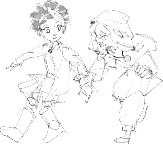
i have never drawn him without pants before and lately i've been seeing some older morro fanart where he is in his possesion form (famously, without pants) so i decided to draw him
#hellz talkz#hellz doodlez#morro wu#im too lazy to tag this properly bye#also if you saw the firts post. no you didnt#tumblr glitched and instead of saving this to my drafts it posted it. fml
356 notes
·
View notes
Text
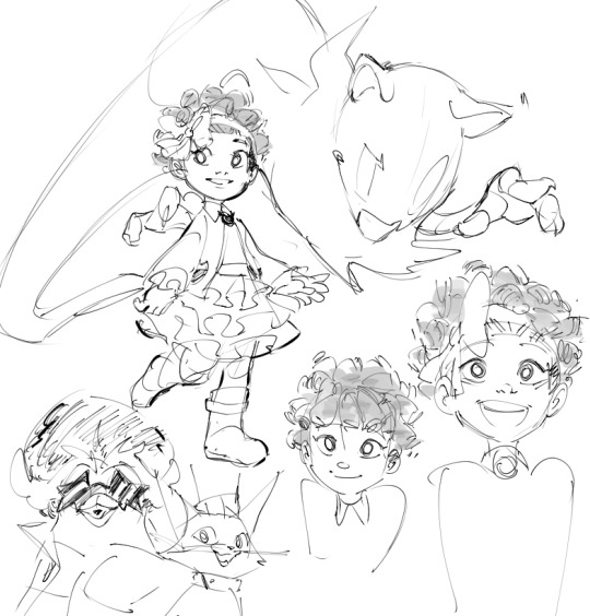
sometimes i think about them
#ahit#a hat in time#KArts#i just want to draw st#would be nice to make a proper art piece#like with color and shading. with background and stuffs#i wonder how ahit fandom nowadays is like
336 notes
·
View notes
Text
bird counseling

the crow is the counselor btw
#hyoma beyblade#mfb#metal fight beyblade#i was working on the background but then I just didn't#i love hyoma he's so chill his bey is probably my favorite in the entire series#just drew this now that I have some sort of free time before I decend into homework hell#was gonna draw rock aries but I forgot to lol#but it's okay this was meant to be a quick coloring practice im trying to develop a more colorful coloring/shading style#so if you have experience with stuff like that.... let a guy know let me in on your secrets
127 notes
·
View notes
Text
They're Double Trouble!!!


My girlssss, I haven't drawn them in so long, I'm so proud of this <333
(Art reference is under the cut also if you like my art then please reblog it)

#not gonna lie this is my first jatp fanart in almost a year#genuienly i'm so proud of this one!!!!#i started this in december last year and now i finally finished it#i was struggling with it for A While#cause i just couldn't figure out how to render and shade it#and i think i spent like 2 hours just playing around with the colors for the background and the text today#which was fun <3#no joke i think i might go and print one of these as a poster to hang up in my room#i made it to look like a poster so yeah#tbh i love drawing poster stuff like this with the cool poses and the lettering and fun colors <333#i'll have to do that more#it was also very fun to make that spatort poster in january and i especially loved how that also Looked like a poster#yk like when the whole drawing is filled up and it's all very fun and colorful and pretty#yeah i like drawing that <333#anyways#my girlsss my girlsssss <333 !#they are so cool and pretty i LOVE THEM <333#lyxchen's art#jatp#julie and the phantoms#julie molina#flynn taylor#flynn jatp#wow me posting at two days in a row#look how much art i can make if i just go and finished my wips instead of always starting new stuff fjdvdjfhefa#double trouble#anybody new following me hello i looooove julie and the phantoms please go watch it it is a phenomenal show!!!!!#are any of my jatp besties still here? <3
43 notes
·
View notes
Text


@cris-as-in-crisis
I think I'm incapable of being normal about this idea
shortly following this is, of course, Voidy trying to use Void on Kayne and Kayne laughing at how it tickles, then the conversation you posed.
#this was supposed to be a sketch. an outline with purple and red and grey background and then suddenly it was full color and mostly#shaded and stuff and what#And Kayne suddenly had fancy speech bubbles with static and blood and huh?? this was supposed to be a doodle???#I was going to draw the whole conversation and this took an hour and so. tada?#also I forgot Void's canonically said “someone's bold.” I was like “heh. void would totally say that.” and then after I wrote it#I remembered that he did in fact say that.#(also void's supposed to be annoyed/angry in that last panel. not sure how well that came across)#my art#comic aurora#void dragon#erin ruunaser#(I mean it's his body that's there)#kayne malevolent#malevolent
19 notes
·
View notes
Text

exploring the woods with some little buddies!!🌿
#churro art#my art#illustration#digital art#tloz#the legend of zelda#tears of the kingdom#totk#legend of zelda#zelda#CAN U TELL I HAVENT BEEN ABLE TO PLAY THE GAME YET.... BHDHSHDD#ive been trying to stay a bit spoiler free so like#clearly this is drawn from the perspective of someone who doesnt know how the game works yet LOL#anyways i mostly wanted to experiment and play with colors and shading! ive been superrr busy lately but i still wanna draw HAHA#I like the coloring but im conflicted on the bg#i didnt want a blank bg again but i didnt envision this as a fully background rendered piece#so i just kinda made it foggy and pastel-ish so the focus can still be on link LOL#to be honest theres stuff i wanna fix but i was stressed out at the end of this drawing#like for example the koroks being too small but i cant fix it now T_T#i couldnt save the file ; had to move the file around tol make sure i wouldnt lose it ; other stuff frustrating me and stressing me out HAH#but anyways i like how his face looks! im proud of the nose hehe#before hobie and atsv i realized i kinda fell into chronic sameface with my bigger pieces#im always tryig tomake my stuff the best it can be so ill def be working on changing that aghhhh
438 notes
·
View notes
Note
how long does it take you to draw your sketches/doodles? also do you have any tips to draw faster? 🙇♀️
I generally take 30 - 60 minutes a sketch,,,, but honestly really depends on how detailed it is.
Like a Chibi will be done in 20 - 25 minutes (Counting in the extra time I spend on minute details like a perfectionist 😭)
I for some reason really like spending egregious amounts of time on random objects too??? Unless it’s the in the background, I’ll spend 40 minutes refining it.
Random characters that are fully colored and rendered with take like 80 minutes.
The comics take usually take an hour or two per page. (If I decide to cross hatch it, my entire day will be gone with 4 pages… so I’ve been trying to find shortcuts. But not without sacrificing the quality for time lol)
I don’t think there’s any trick or magic to drawing faster. It’s really about weaponizing your artistic knowledge, and finding what’s comfortable or convenient for you!
There was a period of time where I would spend 11 or 12 hours on an illustration, and it wASS UGLYYYYY. (Some of these artworks are still available on my tumblr,,, but it’s SO LONG AGO, AND IT WAS MY 1ST OR 2ND YEAR GETTING INTO DIGITAL ART)
Overtime I learned what worked best for me, and practiced till I felt more comfortable with what I was drawing. Eventually I managed to shorten the time to 4 hours or less! Ambition was my biggest enemy but at the same time my biggest motivator. (And it still is LMFAO) 😭
EDIT (bit more to my way too long tangent): ALSO??? BRO DON’T BE AFRAID TO USE YOUR MESSY SKETCH AS LINEART OR DRAW ON TOP OF IT. I’VE DONE IT FOR YEARS NOW AND IT ADDS SUCH A GOOD EXTRA BIT OF TEXTURE,, AT THIS POINT I DON’T EVEN USE LINE-ART ANY MORE UNLESS IT’S A COMMISSION,, (IT’LL ADD LIKE AN 2-4 HOURS TO MY WORK)

#mushyrt#asks#that word minute bothers me so much#I look at it and want to refer to it as the time minute#this sketch took about 3 minutes when it should’ve been 1 minute#BUT I WAS SO HYPERFIXATED ON THE EYESSS#i say these pretty words#but THE REAL TIP IS HONESTLY THE LASSO TOOL#LASSO TOOL IS THE BEST#IT’S MY FAVORITE TOOL FOR MAKING BACKGROUNDS OR QUICK SHADING OR COLORING#OR ALSO THE MASK TOOL#TAKE ADVANTAGE OF THEM#THEY’RE SO GOOD#Procreate mask tool kinda sucksss#SO USE ALPHA LOCK IF YOU ARE A CONFIDENT PERSON#OR NOT AFRAID TO F**K UP#Bro I sometimes draw on 1 layer and use alpha lock and my friends look at me like I’m a menace#BUT IT!S USEFULLLL AND SO EASY#This little tangent definitely should’ve been my answer for the ‘how much do you draw’ question#but I’ve been thinking about it for a long time#AND I’M A MANIAC WHEN IT COMES TO DRAWING 😭😭#even if you rob me of a paper or pencil I WILL FIND A WAY TO DRAW#I WILL SCRATCH INTO YOUR SHIRT AND ROCKS AND MAKE AN ARTWORK OUT OF WATER OR CAT FUR#YOU WILL NOT DEPRIVE ME OF MY CREATIVE ENDEAVORS#This didn’t stick out to me until one of my friends said ‘omg ofc she’s drawing’ under her breath#like I spend every second of free time I have drawing unless I find something else interesting#The only time I’m not drawing is when I’m on the toilet or doing random everyday stuff#I forgot to talk about this but greyscale to color is insanely useful too; it teaches you different values while also being super fast#i tend to use greyscale to color when I do a BW sketch I end up liking#TL;DR - Lasso Tool + Layer Mask + Alpha Lock + Sketch as lineart
60 notes
·
View notes
Text

The aforementioned Forgotten Land cutscene redraw, which I ended up overpainting (for the first time in over three years) to make it all nice since I’m using it as my desktop background!
#art#digital#Kirby#fecto elfilis#kirby gijinka#had to do a lot of listening to stuff this weekend so I figured it was as good a time as any to get around to this piece#the painting part was somehow both more and less painful that I expected it to be?#flats took like four hours though lol#could definitely stand to streamline my process but what else is new#also could stand to use csp to make color adjustment and the stars easier but I’m too stubborn as usual#like the Forgo pic I like how the colors/shading turned out on this better than my Magolor stuff because I put the background in first#though admittedly the coloring on this one is not as accurate as it could be because it made me too sad to muddy up the cape
154 notes
·
View notes
Text
im really normal about them <- lie
#ace attorney#mia fey#diego armando#miego#lorillee.png#THATS RIGHT BABY. AFTER -um . hold on. *checks notes* - SIX MONTHS. LORILLEE IS BACK WITH PHOTOSHOP ART 💥💥💥💥💥💥💥💥💥💥💥💥💥💥💥💥#every now and again i like to put effort into something just to remind everybody that i can actually draw#well i say that but to be honest i put a lot of effort into those ms paint ''diego fey REAL'' doodles#but half of that is just because humans are a . something. to draw. and urban backgrounds are my worst nemesis#and also trying to work with ms paint to like slightly transform things is an incredible pain in the behind#anyways. yeagh 😎👍 behold the power of miego. getting me to actually finish something in photoshop for the first time in months#anyways. ive discovered the secret to getting me to draw stuff on photoshop. prepare yourselves accordingly#what i need to do is sketch & line something in ms paint. and then directly trace it over into photoshop#and then i can go ham#see because the reason i never did this before was because i would sketch things in ms paint#and try to line them in photoshop and it simply Wouldnt Work.#so i had assumed that if i wanted to draw in photoshop id have to sketch in it first. yknow. which i cannot do for some reason#something about the way the pen feels and the . its like the smoothing setting is on even when its on 0 percent. you know. anyways#but with this one i drew mia in ms paint as per usual . and i wanted to mess around with color & light#and i triedddd to do it in ms paint but unfortunately as you can probably imagine. doing stuff like this without layer filters#can get a little difficult. if you know what youre doing its obviously going to be easier but that being said i do not#when i pick colors i am literlaly just wildly guessing 😭🙏 which is fine for more straightforward coloring/shading#but not quite here. which is why i wanted to take a stab at it in the first place#so anyways i was like FINE WHATEVER and tried tracing the lineart in photoshop so i could take a stab at coloring in there#and i was . enlightened. (no pun intended). it WORKS#so anyways . you may actually be able to expect. some photoshop art from me#well ok thats a lie never expect art from me. but we can all dream together#anyways they really are the star-crossed doomed by the narrative romance ever. everything to me
188 notes
·
View notes
Text
My part of the gift exchange event, for @unfortunate-development !
#eek had a lot of fun with this one -w-#havent drawn an objects guy in a While .. & decided to use this as an opportunity to get silly with stuff.#like shading . colors. & background -w- !#hope u enjoy !!#my art
16 notes
·
View notes
Text
Well ok I made an artfight account, remains to be seen how much I'll be participating. Started thinking about character ref sheets and it has me considering previously unheard-of questions such as "what does Ander, my favorite oc whom I've been developing for 6+ years, actually wear"
#i also had a quick look at the about section and FAQs and stuff and tbh the amount of options is a little intimidating#like what do you mean “frame by frame animation‚ full body‚ lined and colored and fully shaded‚ with background to match” is an option#people do that??? girl id die#yeah yeah i know nobodys asking me to do smth like that its all optional to each his own etc#im just impressed and slightly intimidated by the amount of time and effort some ppl put into it + the skill level....#oh and also id have to finally do a real complete drawing of each character for the ref sheet and idk if i can meet my own expectations lol#oh well im gonna try to not take it too seriously and we'll see where that takes me
4 notes
·
View notes
Text
Over 5 hours and for what 💀
For it to not even be done agsgshdnns but honestly? I can go with the hair the way it is so a win is a win
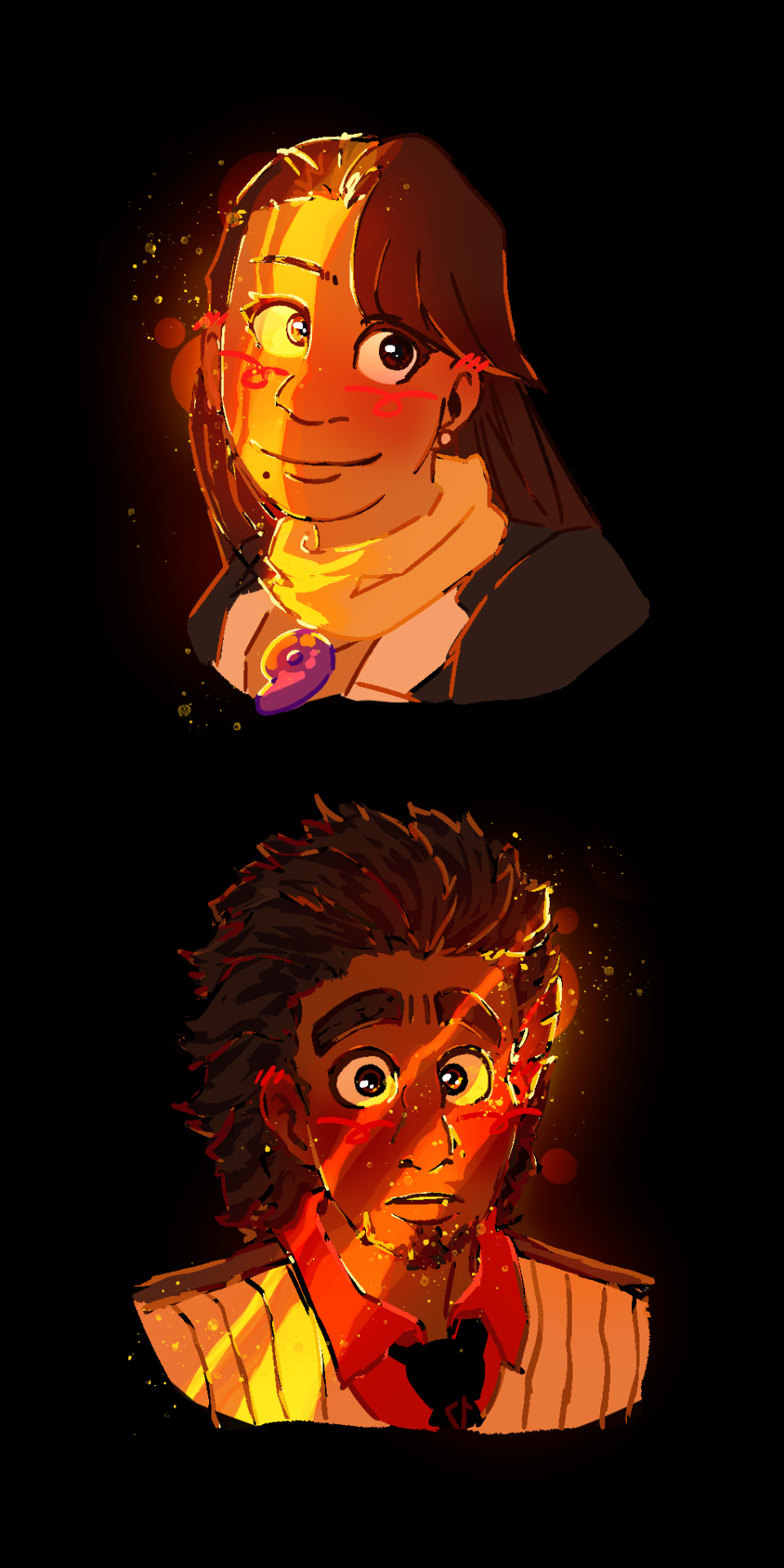
#This is roughly how it should look??? Now I need to redo it so I can do it properly#I do not and never understood how shading works agshshsj#If is not obvious I'm working on a Attack on Titan x Stardew Valley thingy lol. Already have the background for each character#And the places where they do live and stuff#God knows who's the farmer tho#Anyway doing Eren was a pain in the ass and I had Elliott to model over 💀#What have I signed myself into???#Anyway it looks nicer than I expected. Color wise I mean#I was going to do the manbun Eren at first but ummmm that's too complicated for me haha homeless Eren it is#this is just for fun#Like I'm not doing any mod for the game or anything. Just a little project to pass the time#I don't know why I feel like he would randomly punch me in the face#Watching him now I'm annoyed I didn't think to make him live in the tent in Linus's place#Missed opportunity. Mikasa and Armin would totally sneak some food to him#I forgot about Linus's tent#this annoys me so much#... I guess I didn't add Porco... He could live in the tent if he wants
4 notes
·
View notes
Note
For the longest time my library would order an absurd number of copies of the newest James Patterson book, like 7-10 copies for my branch alone, plus all the ones for the other branches so we'd have at least 20 copies in the whole system sometimes more (we're also connected to two other counties catalogs so there's EVEN MORE). It would circulate like crazy for a month or two cause it was the latest release and the excess copies meant holds got filled faster, and then once everyone who wanted to read it finished it, they'd just sit there on the New shelf for months until we could justify whittling it down to 5 copies, then 3, then finally 1. We managed to convince the people doing the ordering to Stop Doing That and we get significantly fewer copies to start out now
He takes up almost two whole shelving units. When I do the picklist in the mornings I like to play a game to see if I have to pull any Pattersons that day and if they're not requested I win. I don't win very often.
Why do librarians hate James Patterson?
OH I ACTUALLY KNOW THIS or at least I know from what my friends with library/bookselling experience have said, what I've heard is that it's because he writes (or has his name slapped on books written by ghost writers whatever the case may be) So Many God Damn Books that shelving them all is a nightmare
I personally hate him because I read 80% of the Maximum Ride series as a preteen and boy do those books go down the toilet-
#i think the ghostwriter thing is he writes a detailed outline of a story and then the coauthor actually writes the rest of the book#so yeah doesn't even write most of his stuff anymore#and it's a personal pet peeve of mine that the other author is always credited in one of 3 ways#1) their names in a much smaller font sizes while JAMES PATTERSON takes up like half the cover#2) their name is usually at the bottom of the page while again janes patterson takes up most of the cover#and/or 3) and this one pisses me off the most#the authors name will be almost THE SAME COLOR JUST A FEW SHADES OFF from the BACKGROUND of the cover#further erasing their work put into the final product for patterson to take all the credit for#also yes he did say some stupid shit about how ''white men face racism'' in publishing nowadays#sorry for ranting about james patterson but fuck that guy
465 notes
·
View notes
Text
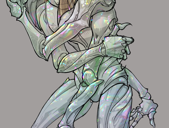
gonna show u guys a little opalescent highlight hack i threw together today
rainbow gradient above your main figure (i usually have all my main figure folders/layers in one big folder, so i can clip gradient maps + adjustments to it!). liquify tool to push the colors around a bit. STAY WITH ME I KNOW IT LOOKS STUPID RN I'M GOING SOMEWHERE WITH THIS
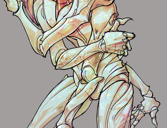
THEN: set it to add/glow (or the equivalent in ur drawing program), lower the opacity a bit, and apply a layer mask. then u can edit the mask with whatever tools you like to create rainbow highlights!!
in this case i'm mostly using the lasso fill tool to chip out little facets, but i've also done some soft airbrushing to bring in larger rainbow swirls in some areas. it's pretty subtle here, but you can see it better when i remove the gradient map that's above everything, since below i'm working in greyscale:
more granular rambling beneath the cut!
u could also just do this with a brush that has color jitter, but what i like about using layer masks for highlight/shading layers is how simple and reversible it makes everything. i can use whatever brushes i want, and erasing/redoing things is super low stakes, which is great when i often approach this stuff with a super trial-and-error approach.
example: have u ever thrown a gradient w multiple colors over an entire piece, set it to multiply etc, and then tried to erase it away to carve out shadows/highlights? it's super frustrating, bc it looks really good, but if u erase something and then change ur mind later, u basically would have to like. recreate the gradient in the area u want to cover up again. that's how i used to do things before figuring out layer masks!! but masking basically creates a version of this with INFINITE undo bc u can erase/re-place the base layer whenever u want.
anyway, back to rambling about this specific method:
i actually have TWO of these layers on this piece (one with the liquified swirls shown above, and another that's just a normal concentric circle gradient with much broader stripes) so i can vary the highlights easily as needed.
since i've basically hidden the rainbow pattern from myself, the colors in each brushstroke i make will kind of be a surprise, which isn't always great -- but easily fixable! for example, if i carve out a highlight and it turns out the rainbow pattern in that area is way too stripey, i can just switch from editing the mask to editing the main layer and blur that spot a bit.
also, this isn't a full explanation of the overall transparency effect in these screencaps! there's other layer stuff happening below the rainbow highlights, but the short version is i have all this character's body parts in different folders, each with their own lineart and background fill, and then the fill opacity is lowered and there's multiply layers clipped to that -- blah blah it's a whole thing. maybe i'll have a whole rundown on this on patreon later. uhhh i think that's it tho! i hope u get something useful out of this extremely specific thing i did lmao
12K notes
·
View notes
Text
Goosebumps Books 1-10
Can't believe that it took me nearly two years to just do 10 covers for the books. Will be posting more Goosebumps in the future, along with other stuff.
Read more to know my personal opinions and critiques on my fanart for each book:
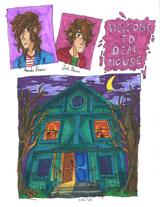
Welcome to Dead House: I wanted to make the house look alive like Monster House, so I gave it more human characteristics (ie: the people in the windows to form eyes, or the finger-like branches.) Also paid homage to a horror film by styling it after The Amityville Horror house.
The Benson children themselves look a bit depressed, that's because the first book is actually more scarier than the rest of the series, so they're a bit angsty.
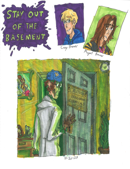
Stay Out of the Basement: This one killed a lot of my green markers lol. I tried to make Dr. Brewer as menacing as possible while still showing that he is a father with the photos, There were going to be more plants reaching out, but I decided that the leaves hidden on him would be enough.
Though I have to admit my disappointment with the lighting. It still looks a bit too bright, and not dark enough. That's just my own critique.
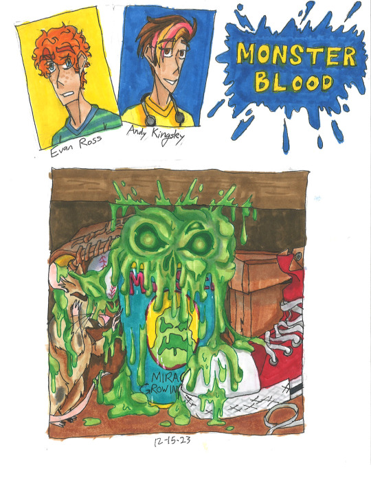
Monster Blood: Honestly, pretty mixed about this one. While I'm proud of the bubbling ooze that looks like a skull, which is outlined by one of my colored pens. I'm not proud that everything else is so muted with brown. Almost all of Jacobus' works are vibrant and saturated, so it being dull in colors feels like a disservice to him.
Also, Andy's last name was made up by me, she apparently just doesn't have one. It's inspired by Stephen King. Btw, hope you love banana and strawberry dyed hair, you'll see more of it soon in future batches.
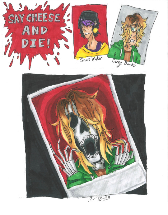
Say Cheese and Die!: One of my favorite books, and of course it gets the best fanart imo. The screaming skeleton form of Greg Banks with red bg in the polaroid, contrasting with the dark background is just super cool, coolest shit I've ever done. Though I might be biased, I really like skeletons. Like Curly.
I actually made concept art for a Say Cheese and Die! graphic novel, which includes drawings of the photos and Spidey! Let me know if you're curious.
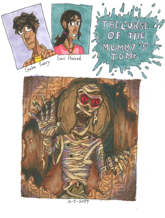
The Curse of The Mummy's Tomb: Not much to this one honestly. Just a mummy casually busting down a wall filled with hieroglyphics. Though I will say, I was experimenting with shading with purple and blues like Jacobus. As you can see, didn't stick for long.
This is also the book that I discovered that if the protag doesn't have a last name, then there is an official one either in the Presents novels, the mobile app, comics or other.
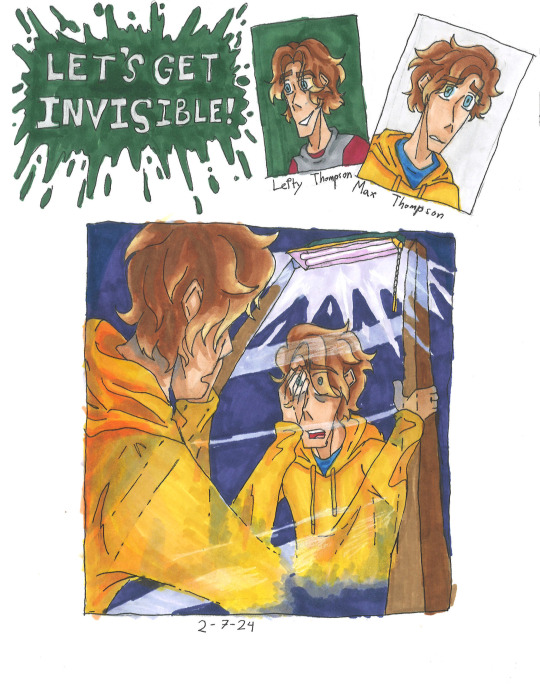
Let's Get Invisible!: This was pretty tricky to draw. Drawing someone turning invisible maybe easy in Photoshop or Procreate, but this was traditional art. Sure Jacobus did it with airbrushes, but I all had were pens and markers. But I somehow managed to pull it off, which is insane that I even managed that in the first place.
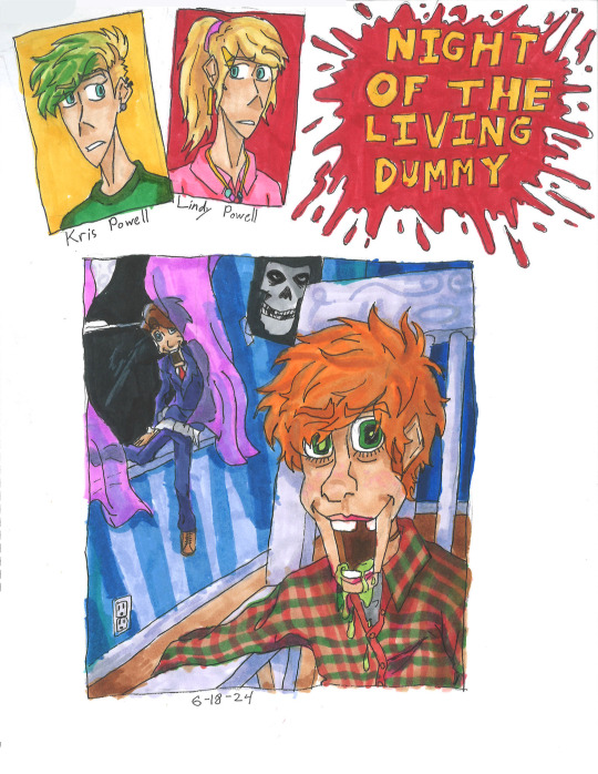
Night of the Living Dummy: Ah, the infamous Pamela Vorhees book, where the main antagonist isn't the mascot, but instead some other puppet lol. I've seen a lot of fanart of Slappy, but never of Mr. Wood. So I wanted to do justice for Wood while still showcasing Slappy. While I am proud for how it mostly turned out, there are two things that bother me. 1. This is the night sky that is black, the rest are either blue or purple. 2. I forgot to add the lines that make the jaw on Mr. Wood, whoops.
Aside from that, I hope guys like that Misfits poster in the background and Kris's cool hair cut. The green was inspired by the comic adaption not 2015 Jacksepticeye.
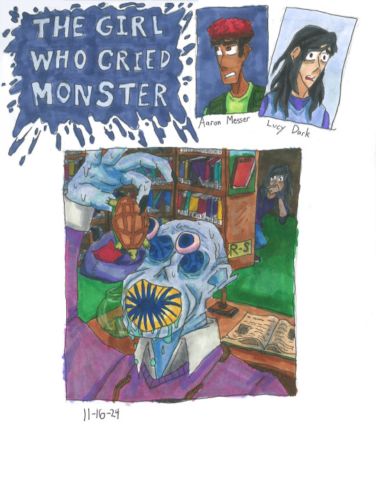
The Girl Who Cried Monster: Please forgive me for the small thumbnail, I wasn't using a ruler at the time. The design for Mr. Mortman wasn't much of a challenge. I loosely based it off of the French rendition of the cover and gave him a large leech-like mouth.
In my headcannon, the teeth spin like a garbage disposal, making easy work of the turtles.
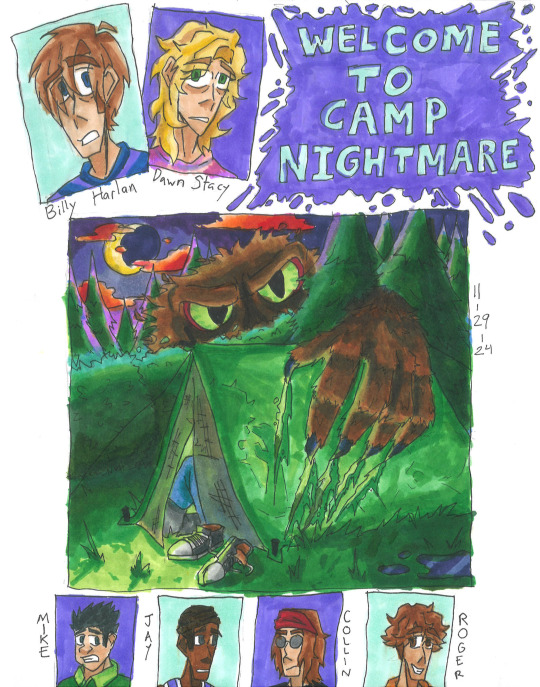
Welcome to Camp Nightmare: Another one of my favorites, and I think I did a decent enough job, too. The lighting is perfect, the clouds look alien enough, and you can just barely see the screaming campers inside the tent. I do have one issue though, and that is the size of the monster, Sabre. In the original sketch I did, he was supposed to blend in like a bush, but instead he looks like Sasquatch Sr. Oh well.
While they did give Billy a last name in the Presents books, I had to make up one for Dawn. Just based it off Gwen Stacy lol. Also, hope you enjoy the little bonus pictures down below.
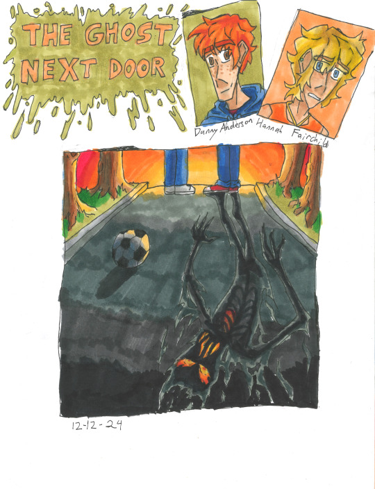
The Ghost Next Door: The original Jacobus art was perfectly vague enough to keep the twist there but not spoil anything. Of course to do the same thing, but with a twist of my own. The "ghost" shadow that you see in the street is the Dark Figure that follows Hannah around or when Danny is near. I wanted it to look like it was constantly on fire, since SPOILERS: someone in the book does die in a fire.
Another headcannon is that the Dark Figure isn't actually a ghost or whatever, but instead the embodiment of Misery.
#goosebumps#goosebumps fanart#welcome to dead house#stay out of the basement#monster blood#say cheese and die#the curse of the mummys tomb#lets get invisble#night of the living dummy#the girl who cried monster#welcome to camp nightmare#the ghost next door#horror#nostalgia#90s nostalgia#amanda benson#josh benson#magret brewer#casey brewer#dr brewer#evan ross#andy kingsley#greg banks#shari walker#gabe sabry#sari hassad#max thompson#lefty thompson#kris powell#lindy powell
850 notes
·
View notes
Text

Dont you think the background is a little too much there ._.)
Well as i said i Cant really make background
And i think i cant be able to make another fanart like this lol unless I really in mood
So yeah here we go, sorry for the messy
Wow i cant believe i can color stuff like this
Edit: godamn i forgot to shade the pant line
Whatever
#undertale au#sans#undertale#outertale#art#undertale alternate universe#sans undertale#outer sans#undertale fanart
3K notes
·
View notes