#looking good on a budget
Text
The ultimate guide: How to look good on a budget
How to Look Good on the Cheap
Look Good on a Budget
Are you looking to look good without breaking the bank? It can be difficult to stay fashionable while still within your budget, but it is possible. Here are some tips on how to look good on a budget that will help you save money while still looking your best.
First of all, shop around and compare prices. As with anything else, researching…

View On WordPress
#dress well on a budget#dressing well#guide to looking good#how to dress stylish#how to dress well#how to dress well on a budget#look expensive on a budget#look good#look stylish on a budget#looking good on a budget
2 notes
·
View notes
Text
The ultimate guide: How to look good on a budget
The ultimate guide: How to look good on a budget
How to Look Good on the Cheap
Look Good on a Budget
Are you looking to look good without breaking the bank? It can be difficult to stay fashionable while still within your budget, but it is possible. Here are some tips on how to look good on a budget that will help you save money while still looking your best.
First of all, shop around and compare prices. As with anything else, researching…

View On WordPress
#dress well on a budget#dressing well#guide to looking good#how to dress stylish#how to dress well#how to dress well on a budget#look expensive on a budget#look good#look stylish on a budget#looking good on a budget
0 notes
Text
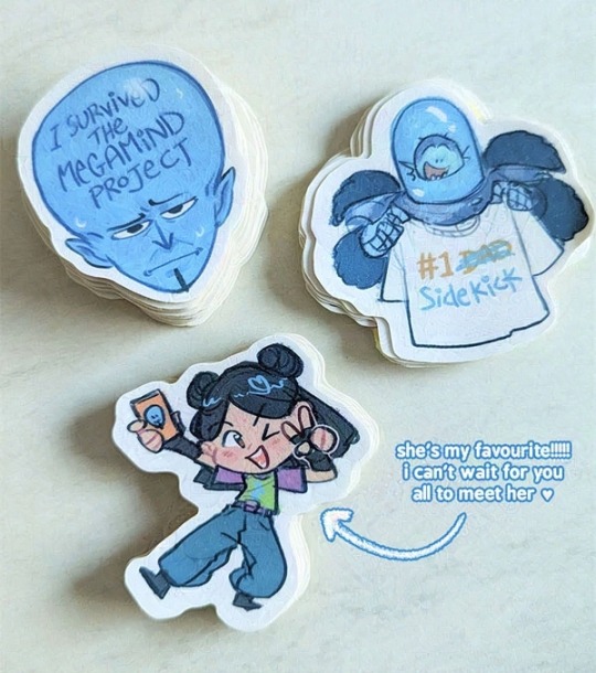
happy megamind sequel release day!!!!
here's a bunch of stickers i made as crew gifts for the wrap-up party last night 😊
#megamind#i worked as the lead board revisionist 👍#pls dont be mean about how the show looks DW was literally paying us in pennies with a gun to our heads :')#its a movie!! made on tv budget!!!!! of course it doesnt look as good as the 2010 film#my art#sry the pic is so crunchy i ran webglaze over it but small res files gets really fucked up when u do that LMAO
218 notes
·
View notes
Text

Just watched episode 1100 how we all feeling?
#OH MY GOOOOOODDDD THEY DID SO GOOD#i knew it was gonna be a high budget episode#demonic and crazed looking gear 5 luffy my beloved#one piece#op 1100#one piece 1100
163 notes
·
View notes
Text

#we've found our next distraction point#slasher gallery set best set she's ever filmed in#a project with a budget of two pennies and some maple syrup has no business looking so good#katie mcgrath#sarah bennett#slasher
288 notes
·
View notes
Photo


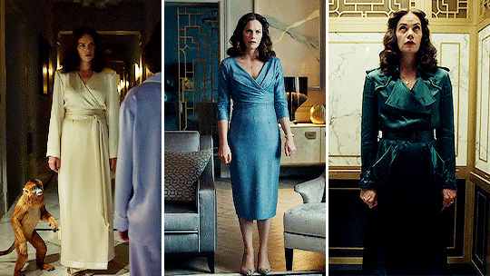
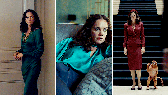
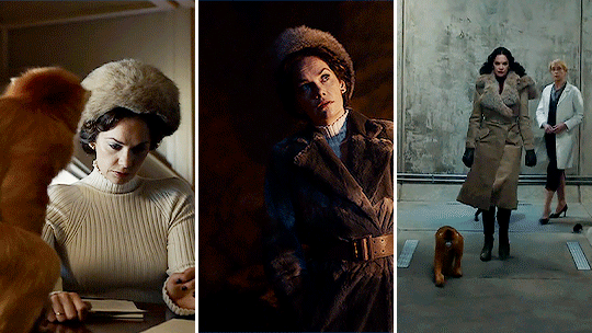
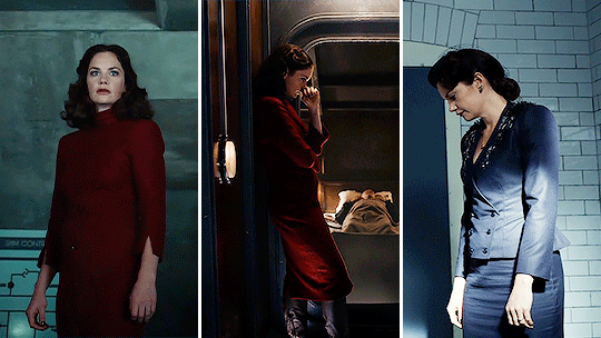


Every Marisa Coulter Outfit in His Dark Materials (2019 - 2022)
#marisa coulter#his dark materials#ruth wilson#hdmedit#hdmsource#mrs coulter#adaptationsdaily#maya edits#used up their entire outfit budget in the first two episodes and then went oh no and just had her rewear the same 3 things#someone smarter than me analyze the color palette shift or whatever#also i know i forgot the pajamas from 3x04 but (a) i couldn't find a good angle and (b) they look the same as the ones from 1x02#and (c) it would've ruined the layout
1K notes
·
View notes
Text
for the record i've been talking to my friends about Captain Underpants for 4 days straight but i haven't even drawn him a single time yet somehow
#sorry he's such a pure and distilled presentation of Tropes that i Enjoy it's like looking at jokes i would've written but#supported by a whole movie budget. it's beautiful#i mean most of my jokes involve ''why am i soaked in blood'' but ''why am i soaked in water'' is good too#for the record number 2 yes i watched the movie when it first came out and i did enjoy it because i'm predictable as fuck
78 notes
·
View notes
Text
now that my friend pointed it out i cant stop thinking about the design of the tardis in the tv movie because 1) it was gorgeous but 2) that was a home. that was his home. he had a chair to lounge in and a record player. seeing the tardis in the tv show, that one huge console room, bigger on the inside and yeah, it’s impressive but it’s functional. (i’m assuming this is a budget thing, because it would probably be extremely impractical to have the kind of set they put together for the tv movie for every episode of an actual show lmao.)
there’s just something so. i think it’s the first time i’ve really looked at the doctor in the tardis and thought, right, he lives in there. rather than it just being his car. it is very funny to think of the doctor as a guy living out of his shitty van, but no, the tardis can be a home. it can be warm and comfy and full of knick-knacks.
#doctor who tv movie tardis set i LOVE you. its so pretty#can we talk about the set design in that movie actually its so fucking good#like i know its haha movie bad but fun. but holy shit that set was actually gorgeous. who made that. i need to kiss them.#im kind of miffed now that the show got a bigger budget and used it to make the console room even bigger but even more sterile looking#i think this is another reason i like twelve too. twelve’s just got shit in there. chairs and blackboards and his guitar. it still feels#like he’s living in his van rather than a proper house but it *does* feel like he’s living in it#anyway. let fifteen put some knick-knacks in his console room.#doctor who
94 notes
·
View notes
Text
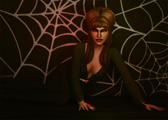

EIGHTIES, Part II
Requested by @moonwoodhollow
Featuring Grace Anansi
Continuing the goth trend (because I couldn't seem to find inspiration in anything else) by paying homage to the Mistress of the Dark.
#sims 4#simblr#ts4#the zhaoverse#grace anansi#this one stumped me good 😭#i tried putting her in a more everyday '80s outfit but it just was not happening#it's giving amateur halloween costume and budget mall photo shoot but you know what?#she looks hot and that's all that matters
76 notes
·
View notes
Text
everytime I see someone bitch and moan about “the animation in invincible sucks” “they should treat the animators the same way MAPPA does”
i just ,,,,,

maybe we should sit YOU down in front of the computer and id like to see YOU animate smoothly and cleanly at 12-24 fps since y’all want that so bad !
#I’m so so fucking tired bro#YES I KNOW INVINCIBLE HAS LITTLE MOMENTS IN THE ANIMATION#I’m not saying it doesn’t#but anime does this shit all the time and no one complains about it !#i personally think invincible’s little animation quirks are kinda cute#yes I would like to see more fights like the atom eve special bridge fight ! but I’m not gonna say the animation is bad#bc it objectively isn’t!#i just want more of the budget to go to animation instead of high profile voice actors !#even tho they’re all great va’s I think no one would mind it if they used less expensive talent so the animation could be more flashy#i just want the artists to get paid well whenever they do do very action heavy shit that looks good!#ok bye#cris rant#invincible#invincible show#text post
102 notes
·
View notes
Text
Your show about 80’s movies isn’t shot on film
#i think ive made a post about this before but i was just thinking about this again#although there is a certain charm that the digital look creates in season one specifically#but like… this is netflixs most successful show and they cant get a film camera???? okay…#like not everyone has an hbo budget but i see what you pay your actors#season 5 shot on film would literally so good…#tv posting#stranger things
259 notes
·
View notes
Text
The ultimate guide: How to look good on a budget
The ultimate guide: How to look good on a budget
How to Look Good on the Cheap
Look Good on a Budget
Are you looking to look good without breaking the bank? It can be difficult to stay fashionable while still within your budget, but it is possible. Here are some tips on how to look good on a budget that will help you save money while still looking your best.
First of all, shop around and compare prices. As with anything else, researching…

View On WordPress
#dress well on a budget#dressing well#guide to looking good#how to dress stylish#how to dress well#how to dress well on a budget#look expensive on a budget#look good#look stylish on a budget#looking good on a budget
0 notes
Text
genuinely admire those who were optimistic for dishonored 3 but in this videogame industry climate and [insert a 4hr video essay about arkane's recent history here], honestly, not getting dh3 is good news
#dishonored#arkane studios#i know its silly to meme when the take is nuanced#and i admit that blade is one hell of an aesthetic. but i'm sitting out of this#somewhat being a hater yes. but that is because i am a lover#i dont think its pointless hater-ing though to be critical of something i wish i could love more#my takeaway from arkane is that its better to be not a fan of a company. a company does not make games#a company's staff does. and those staff need to be treated well and given budget and breathing room to make good things#and i have my doubts about that at the moment. very well documented and supported doubts#if arkane is given AAA budget to make a game. it probs wont be another dh. except maybe a remake bc those are 'safe' bets.#ie. dh1 remastered would sell#judging by doto and even dh2 (which i loved even tho its flawed). i dont think arkane really 'get' why dh1 was magical#so im not sure that a third in the series could necessarily recapture it#especially as theyve confirmed they're closing the drawer on the current overarching plotline#this is the hater corner celebration! i am pouring you a drink! [pres why does this look like blood?] we like themes n motifs here!#pres rants in tags#anyway mutuals lets make a fan edition of dh3 for shits n gigs
86 notes
·
View notes
Text
So it was more of a homoerotic murder Roadtrip than a gay forest sex party 😄
72 notes
·
View notes
Photo
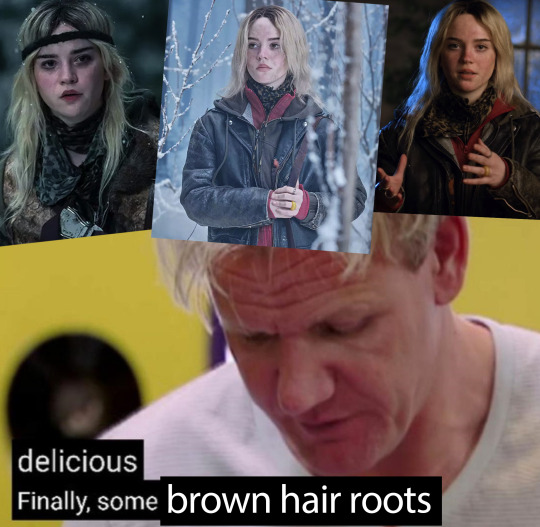
give it up for natural brunettes!!!
#the makeup team must've gotten a huge budget increase because everyone looks so good#and by that I mean bad like they finally look like they've been living in the woods for six months#their hair is dull and crusty their faces are dirty and bruised their clothes are worn and everything is right in the world#anyways if natalie doesn't leave this island with completely brown hair what's the point#yellowjackets#natalie scatorccio#.txt
260 notes
·
View notes
Text
Books! The ongoing project I've had half-finished since March continues to thwart me, so I want to show off a project from May that turned out incredibly well. I'm extremely proud of these!
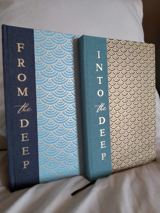
Ta-da! Look at my creations! Are they not beautiful?? This is a set of two related works, From the Deep and Into the Deep. They are by the same author, @worse0mens, and they share a lot of worldbuilding but are not a series and can be read independently. They are siren AUs with very solid characterization, both for everyone's favorite main characters (three guesses who I mean; this is a Good Omens work) and for the secondaries as well (Eve in Into the Deep is a particular favorite for me). The worldbuilding is another star; I would read non-fanwork originals in this universe and that's not something I usually say.
More photos and process talk under the cut! I had to make a lot of adjustments to the design while it was a work in progress, so this post got even longer than usual.
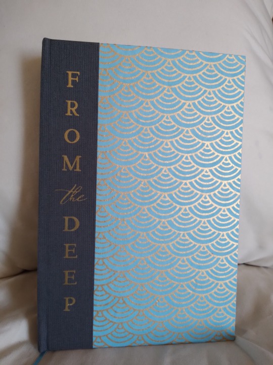
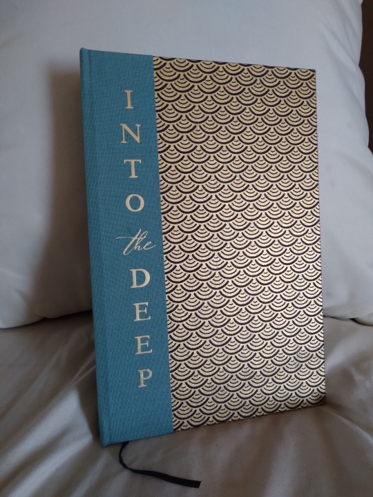

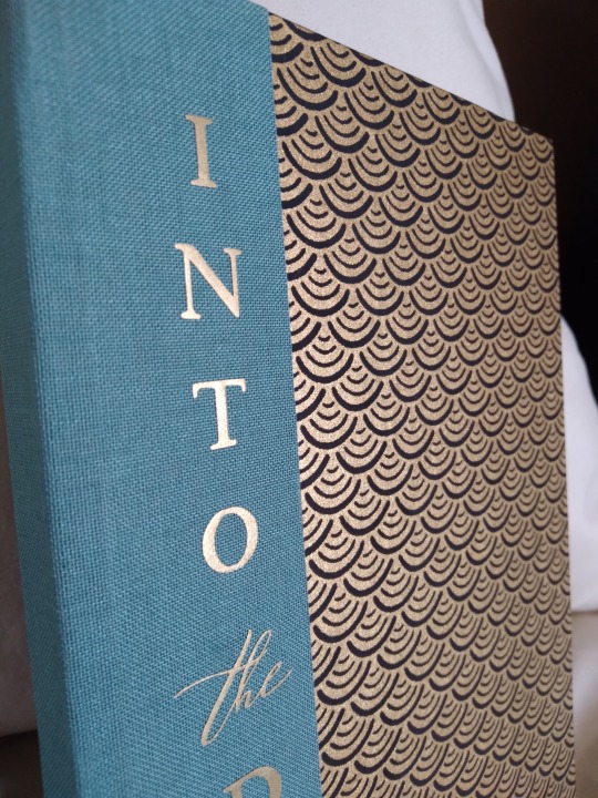
Since these are so closely related even without being a series I really wanted to make them look like a set, and I honestly think I nailed that. I found the pale blue scale-patterned paper on ChibiJay before I even started the typeset and knew it would be perfect if I could match it in black, given that those colors are so heavily associated with our two viewpoint characters. The original plan was to have one in all blue and one in all black, but that blue paper was kind of a nightmare for color-matching. It clashed horribly with the blue book cloth, so I switched that to the black book, and then it also clashed with the black cloth I had chosen. So it got charcoal in the end, and it ended up coming together quite well. The titles are HTV, first time using that on cloth, and that also did not go well. It very much did not want to stick, took more than twice as long as it should have to press, and I still ended up with some wrinkling. Further experiments are needed, I think. It was worth it in the end, though--colors and fonts are perfect, and I like the vertical orientation even more than I thought I would.

Endpapers are solid brown on both books. Another nightmare of color matching. Black is easy! Everything looks good! But that blue was really stubborn about what I could match it to, and this was the only paper that I could find that looked good with both. It's ludicrously thick and was hard to trim even with my plow. Endbands and bookmark are solid black and solid blue respectively, the only easy match in the entire project. Even then, I had originally wanted a gold bookmark on both, to match the gold lines on the covers, but I couldn't find one that was thin enough. Everything in the right colors was wider than the spines. I was very glad to find that blue ribbon, and it was an exact match for some endbands I got ages ago as part of a variety pack. Stroke of luck, there.
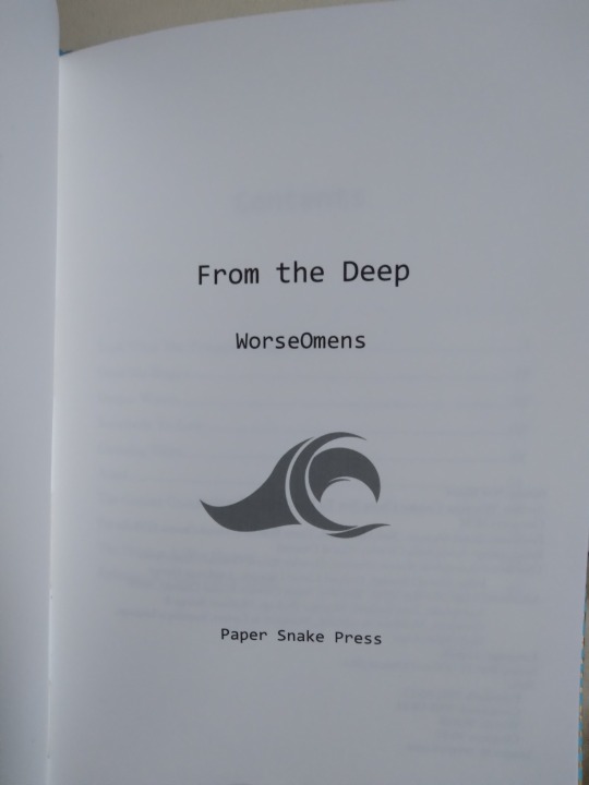
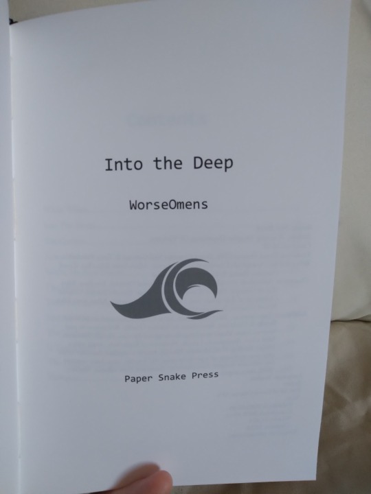
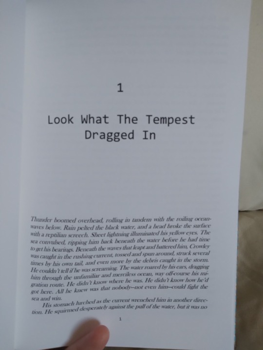
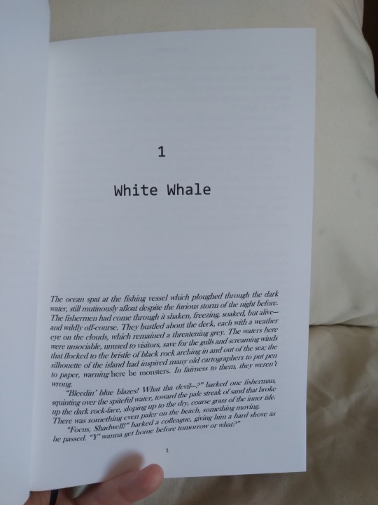
Interiors. As I said above, I wanted them to look like a set, so the same fonts, sizing, and text ornaments are used throughout both copies. All the images came from rawpixel, all I did was resize them and I think adjust the color. I was originally planning a much simpler look for these, and the typeset reflects that sort of stripped-down look; there are fewer text ornaments than I normally use, and the title fonts are less curly and ornate than my usual. The plain endpapers were also chosen with that thought in mind, but the covers turned out way more ornate than I thought when I first pictured them in my head. I don't think the insides match the outsides terribly well, but both came out so nicely that I don't mind. I could never regret those covers, they are too gorgeous for that.
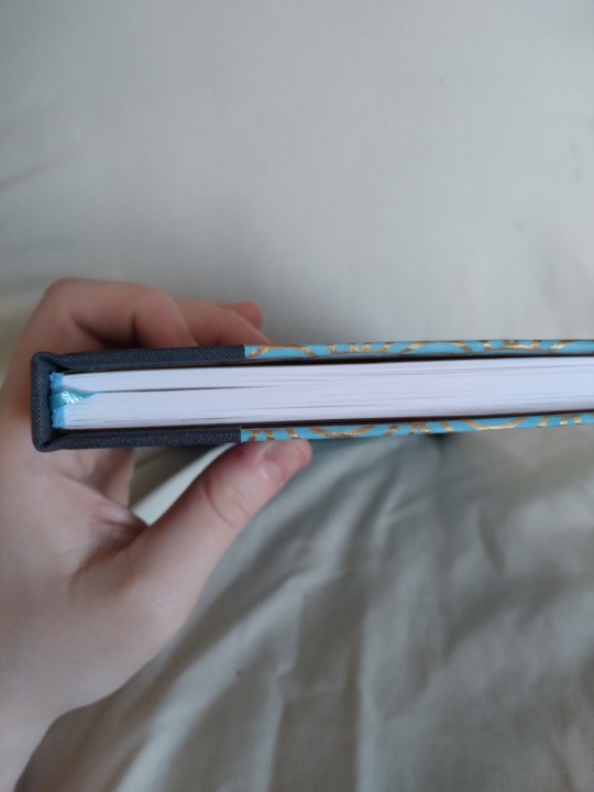
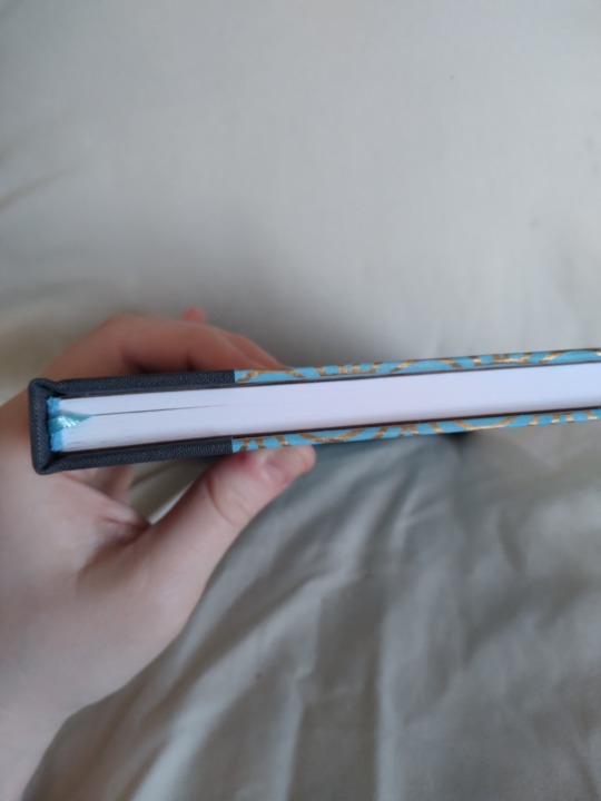
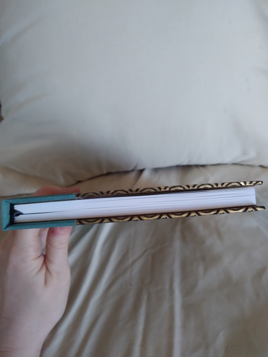
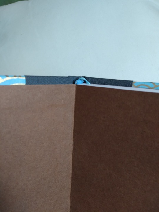
Top view on both books. I had some issues with the boards warping on this project, which you can see in the first two pictures. The one on the left is how it looks normally, and you can see that the boards curve away from the text block in the middle, leaving a gap. If you squeeze the book (middle image) this gap goes away. It's present in both books, though more visible on the blue one. I think I made an error with the grain direction, possibly in the endpapers. Or the very heavy endpapers just have more pull to them than the much lighter chiyogami on the outside, and it can't compensate. Hopefully it won't lead to any structural issues further down the line. It's just less than ideal, is all.
I've toyed with the idea of making a slipcase for these. They're already a set, but they could be a BOXED set. Very fancy. I've never done boxes before though, so I'm a bit intimidated. I may revisit them someday to do that.
#bookbinding#fanbinding#snek makes books#good omens#fic rec#i am so in love with these omg#they look like if i found them in a bookstore they would be out of my budget#but they're NOT because I MADE THEM#to one degree or another i feel that about all the books i make#it just surfaces more easily sometimes#and now is one of those times#that's a me thing though#if i bound your fic in the past i felt that way about it too#it is just not always easy to say
84 notes
·
View notes
Last Seen Blogs