#most of my lineart is the sketch these days
Text
Updated my description, feeling silly
I'll make a pinned post I swear... eventually........
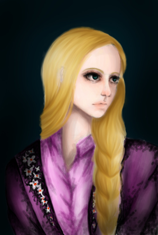
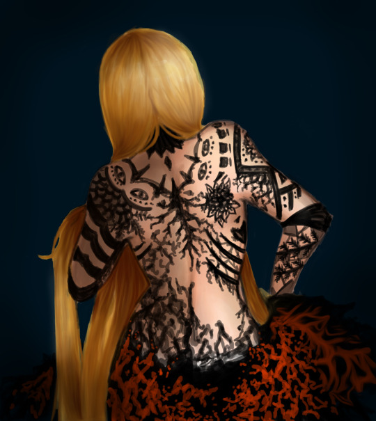
Anyways have some kind of old kenny art but blood tw!!


2 lighting levels cuz I can't decide sighhh
#tw blood#kenny mccormick#south park#stitch art#:3#art#digital art#ibispaint art#im so eepy#sighh#its like kind of a colored doodle btw#most of my lineart is the sketch these days#im js not bothered enough to do full lineart and keep it as the sketch#broken heart emoji
2 notes
·
View notes
Text


Day 5 - Lazy...
cozy hours.... u////u) ♥ ♥ ♥
(+ bonus undercut)
@sansxyouweek

without the front stuff bc i subtly worked for that sans booty//////
#undertale#sans#undertale sans#sansxyouweek2023#han#han x skellie#oc#oc x canon#collab#you didn't think just cuz i was busy with the poll I wouldn't post anything for sans x you week did you?#WRONG#this is one my favourite and most anticipated day >///<) ♥ ♥#bc of this drawing specifically!!!////#remember a while ago i said i collabed with my friend... yeah... this drawing was actually done last week#my friend (who doesn't want to be mentioned or credited :'DD) did the sketch and I edited it linearted colored and made the bg!!#i put all of my heart into it bc I love it sm >///////<#it's incredibly rare for me to work on a proper han x skellie drawing like this >///>#so.... aaaaaaaahhh >///< ♥ ♥#my heart is going to burst!!!!
654 notes
·
View notes
Text
First commission out of the list! @yellowplumfruit's MC and Baxter relaxing♪
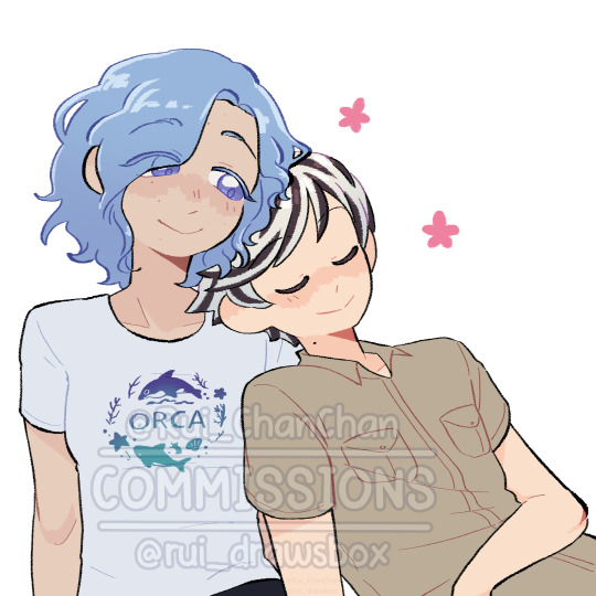
#rui draw smth#if i control my schedule right i might be able to send most commissions the next days♪#4 hours at morning working on linearts and colors and 4 hours at afternoon starting new sketches (arguably the part that takes most time)#and sometimes 1 or 2 hours after dinner to do random stuff before i go to bed#our life#our life: beginnings & always#our life mc#olba#olba mc#art commisions#commission#rui chambea#baxter ward
146 notes
·
View notes
Text
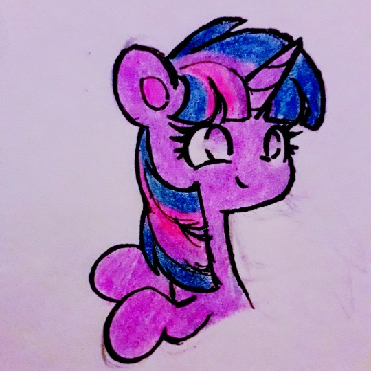

twilight sparkle drawings! 🌟💜🌟💜🌟

#i have been feeling absolutely horrible recently which makes drawing is harder than usual but i managed to make these at least :)#maybe i need to just relax and colour more often cause colouring is the most fun part of drawing for me 🖍🌈#but sometimes i don't have the energy or motivation to sketch and do lineart so colouring books are great for those days 😄💖#my art! ☆#mlp#mlp fim#twilight sparkle#aaaa i misspelled a tag again#whatever i can't be bothered fixing it 😝#my pony art ☆
315 notes
·
View notes
Text
he has 72 mental illnesses and is banned from most public spaces

tboy swag!!!!!
#i think itd be really funny if he couldve easily powered the noise blaster any other way and just really hated piano#that shit was targetted#its ok he was having a bad day#noisemaster#cucumber quest#i hate that this is now the art piece ive spent.the most time on.#like 5hrs#most of it was lineart because i kept scrapping shit#i didnt actually use a sketch for any of these i just drew whatever#no references either#hes really surprisingly easy to draw without references actually!!! or maybe i just have his design memorized#never ask me for a tutorial on lighting because not even i know dude i just blot colors wherever it looks nice#i feel it in my balls ( i dont have balls )#sterotypical art tag
71 notes
·
View notes
Text

atsunuri practice
#art study#kind of?#i drew a character from nemuwo channel on youtube bc their atsunuri speedpaints inspired me to try atsunuri#coloured directly on the sketch so i dont have to do lineart which is the most painful process for me LOL#but now the lines are thicker im not sure which i prefer#hope to practice more atsunuri and get better at it maybe one day i can fit it into my art style#anyway!! nemuwo has such nice art go check them out ;w;
6 notes
·
View notes
Text

I swear I was gonna draw him with a shirt but things happened
#impulsesv#hermitcraft#cw suggestive#clip of impulse meowing (on stream?) lives rent free in my brain#occultdraws#sketch that probably will be barely cleaned up for lineart if I were to color it#like most of my art these days lol
18 notes
·
View notes
Text
Today is Dungeons & Daddies’s 5th Anniversary!

I haven’t been listening for nearly that long but the podcast and all its characters means a lot to me. Happy Anniversary!!!
Throwing the cropped sections under the cut because there’s a lot of stuff going on and I know Tumblr likes to throw half the pixel quality out the window. And also so I can ramble a bit about this piece!!!
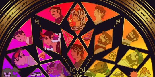
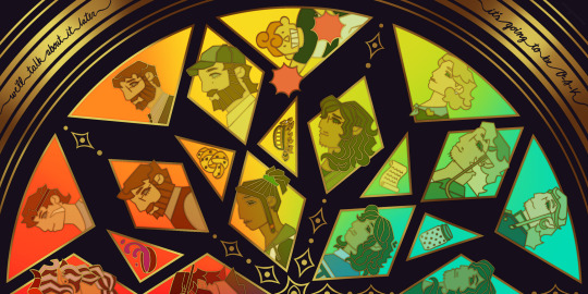
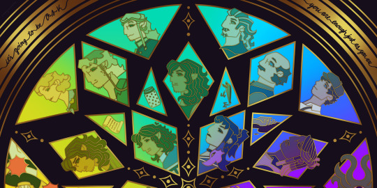
This piece has been months in the making, possibly an entire year. And by that I mean I’ve had a sketch of the comp scribbled on my whiteboard for ages because I wanted to save this specifically for 5th anni art. Now onto design stuff!
(First off a random thought: I really love how the garlic knot came out, I kind of want it as an enamel pin.)
I knew I wanted to make this a stained glass piece since the beginning, but I was also going to add flowers at one point but quickly dropped the idea. It felt like too much and I also didn’t want to fuss over flower language assignments for everyone. I was also going to add Doodler tentacles, but also dropped that idea pretty early. Kind of on accident, right at the end, I figured out how to make it even more stained glass-like but taking a duplicated lineart underneath the regular layer and turning the brightness all the way down, then setting it to overlay and adding a guassian blur. It’s very subtle but it adds that tiny bit of depth that makes it look more real. As for shading on the lineart/gold, I tried adding more highlight on the characters who died but once I evened everything out it wasn’t as noticeable anymore so I’m throwing that thought here so the attempt at least known lol.
The order of characters only changed a little bit from my original comp, I flipped the Wilsons and the Oaks so the rainbow could work. As for the anchors, specifically in season 2, I lined them up to the teens since the season 1 anchors lined up with each dad:
Tony —> Scary: his death was the beginning of Scary’s betrayal arc and also Willy killed him.
Guitar Pick —> Taylor: it’s not really aligned with Taylor at all, but the anchor was with Glenn so I put it next to his blunt.
Scroll —> Normal: was only because it was the last left to give him, but there’s the whole scene of him and Hermie in the Green Room so it still works!
Garlic Knot —> Link: one of two that he broke, but the more significant of the two with him telling Grant he never wants to see him again.
Small notes on the season 1 anchors: I put the layer of mold in the overnight oats but you can’t really tell with the overlay. And to make the supper bowl more interesting I added the fantasy sodas mix they dumped into it. The lure of actually drawn before so I just traced my own art lol.
As for the other smaller triangles, it took me a bit to figure out what I wanted to put there. I didn’t even think of adding the vehicles until two days ago but I’m so glad I did. I don’t really have my own take on the mascot version of the Doodler (yet?) so I borrowed the design from one of the stickers in their merch shop. Teeny was terrifying as just a front facing head so I made him cute again.
In the outer circles, I put what I felt was the most significant quotes for each family. I really wanted to use “It’s okay to be angry, it’s not okay to be cruel” but it was just a little too long.
That’s all I can think of! If you read all the way through, thank you for indulging me in my excitement to gush over this piece.
#dndads#dungeons and daddies#dndads fanart#dndads s1#dndads s2#dndads glenn close#darryl wilson#henry oak#ron stampler#jodie foster dndads#nick close#nicholas foster#nicky swift#grant wilson#sparrow oak#lark oak#terry jr#taylor swift dndads#lincoln li wilson#normal oak#scary marlowe#hermie unworthy#bill close#paeden bennetts#barry oak#willy stampler#meryl streep dndads#robert wilson#hildy russet#stud stampler
2K notes
·
View notes
Text
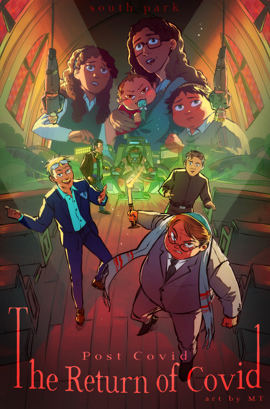
THE RETURN OF COVID
Horror/thriller movie style!! I don't think I could find enough words to express how much I love doing those posters............
For this one, I felt like the cast of "antagonists" of the movie would make for a pretty awesome composition and mood, and paired with the church setting I think I got something pretty interesting, haha.
More below!
As it happens, a fandom friend asked if I could maybe some day record my process, and therefore I did! (and went the extra mile adding goofy horror songs to it...) Check it out if you're interested :)
youtube
I've detailed it in the YT vid description as well, but my process is rather straightforward. I tend to be a "lazy person" in that I like to, ideally, spend the least time possible on anything, and so far this process is how I've best achieved that while still managing some rather complex pieces.
I like to be extremely rough with my sketches and prioritize dynamism and composition, and I usually take my time repositioning the characters until I'm satisfied before I go any further. I don't have the best mental visualization so I usually try to have a very rough idea of what I want before I directly jump to sketching and mostly ideate there.
The lineart is very straightforward as well. I come back later to adjust line thickness here and there but otherwise I just "trust my brush". The fake fisheye perspective is entirely wrong and made up so I needed some custom perspective lines to know roughly how to position the background elements.
I do come back with composition guides after I'm done with the lineart, just to check how the illustration is doing. I prefer not to use them at first because it tends to "constrain" me a bit too much, and I like to remain very free as to maintain a feeling of spontaneity, which is why I will only fix the composition afterwards (when I do).
Coloring is then fairly streamlined, with background colors/atmosphere guiding the overall color scheme followed by character coloring and additional details. The most fun part comes with the post-processing, where I go wild with additional fog and light shaft layers to add depth to the entire thing. I use a bunch of additional tone curve layers to adjust the colors and make it more uniform, as well as one blurred, flattened copy of the illustration with strengthened contrasts, in overlay mode, to add some vibrance, and a noise layer for texture.
That's it! Thanks for watching, for those interested :))
#south park#sp post covid#eric cartman#butters stotch#yentl cartman#scott malkinson#clyde donovan#sp kevin stoley#tweek tweak#craig tucker#moisha cartman#menorah cartman#hackelm cartman#Youtube
410 notes
·
View notes
Note
the one of the Byami story and Taesoo art is me so choose whatever you want
OH dw about it !! it's just doodles so i dont mind doing both :]
#answers#henriettamiss#i'll prob just do flat colors with lineart/a messy sketch or draw in a chibi style !#most of my art usually only takes a few hours to finish anyway unless i procrastinate it enough to stretch it out over days#as u can tell my artstyle is not very clean or detailed jsfhshfhdsj
1 note
·
View note
Text
YAAAAAYYYY ITS FINALLY HERE!!! ty guys sm again for 5k i rly appreciate it <3
rules and guidelines under the cut!
rules and due date (i've never done this before so bear w me ok!!):
-due date will be march 1st! i will accept entries a few days late dw i'm nor ur professor or smth BUT I WOULD RLY PREFER IF U GET IT DONE BY THEN (just dm me if u need more time)
-pls tag ur finished piece under #lotuspear5kdtiys and dont forget to mention my user @lotus-pear! if i neglect to reblog ur piece then pls lmk even though that probably won't happen bc i'll be checking that tag every day for new entries👹
-pls don't trace the art.. i'll be really sad if u do that :(((( if u need help at all w the posing or hands then shoot me an ask or weed ur way into my dms bc ik this is kind of a complicated piece
-anyone can participate!! u don't have to be following me or anything and it's fine if we've never interacted before
-colors and expression are completely flexible and i'd even encourage playing around w it since the final product isn't meant to mimic my style. if u can then pls try to keep the pose relatively similar although i don't mind if it's changed a little bit. whatever is most comfortable to u as the artist.
-if u guys want to see the piece without any shading or rendering then pls dm me, ik it might be easier for some ppl to just see the bare sketch or the lineart w base colors
prizes🤩 (ik this is what u guys are rly after /j):
-alr so ik everybody's all like "well what's in this for me🤨" oh my god if u would just let me explain 😐 i'll be choosing three winners and two honorable mentions amongst all the contestants
-the top three winners get a follow (yea ok kinda sucky but wtv) AND they get to commission a fully rendered piece from me of a single character of their choice for free >:) (i'll discuss the details w the winners in two months)
-the two runner ups will also get a follow from me AND they get to commission a sketch of a single character from me (again, i'll discuss what this entails in further detail when the honorable mentions are selected in two months)
————
ermmm yea i think thats it for now i'll come back and edit the post if i feel the need to add anything.. HAVE FUN GUYS I CANT WAIT TO SEE WHAT U GUYS DO🫶🏼🫶🏼
1K notes
·
View notes
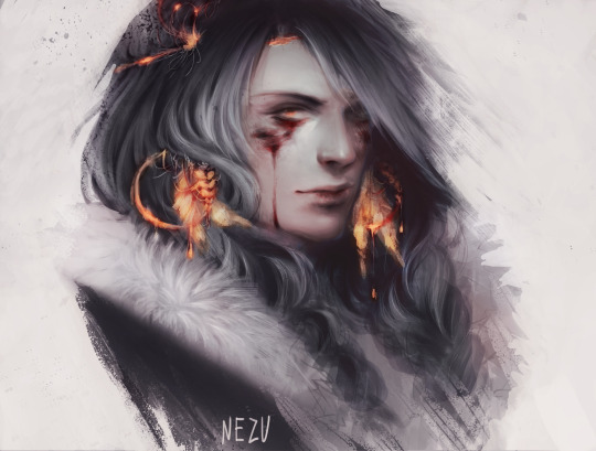
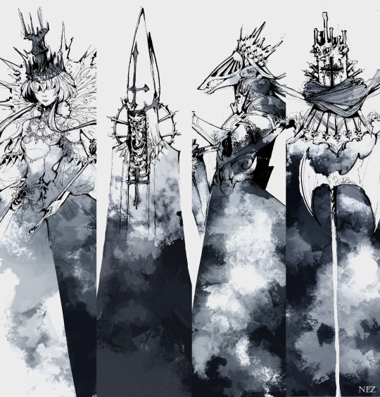
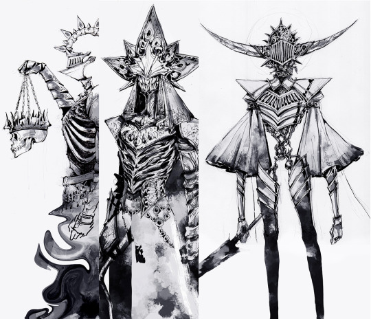
Note
I don’t really have a lot to ask I just want to say I love your art style! It kind of reminds me of like Eldritch Horror meets Celestial Divinity type of thing so with that said I was wondering on how you came to this type of art style you do and how long did it take you to experiment until you found the style that you wanted? Sorry if that sounds kinda confusing 😅 thanks for taking the time to read this and have a good rest of your day!
Thank you! I did not found my artstyle, my artstyle found me. Here is a timeline of my digital art/illustration journey
2014 - The beginning
I finally took my tablet and bit the bullet that was digital art. I remember specifically forcing myself to draw (because it was not fun) because I wanted to learn digital art no matter what it took.
2016 - Experimental
Boldness seems to have dominated this phase, not because of the themes but because I rendered without any under sketch (example above of how the first draft looked like vs the end)
2017 - The breakthrough
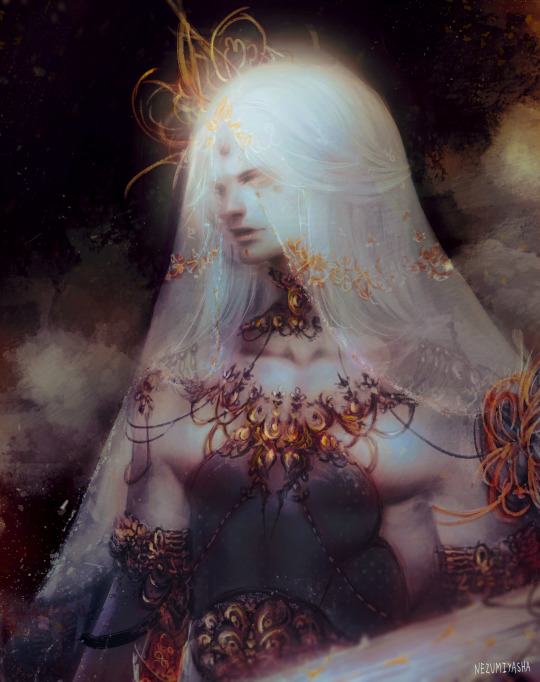
It was only from here that digital art began feeling RIGHT. The most important things I've learned were how to render texture variation (especially softer things like hair and fur) and how to color a drawing from greyscale. I was slowly settling onto my desired artstyle
2019 - Happy accident
We were tasked to design characters based on chess pieces during college. 1 week deadline. With the mindset that no one will see my designs except my teacher and I, I did things boldly and rendered them (trad ink plus digital shading) to emphasize shape and design, rather than texture variation.
I began mixing traditional lineart with digital rendering.
2020 - Fallen from heaven
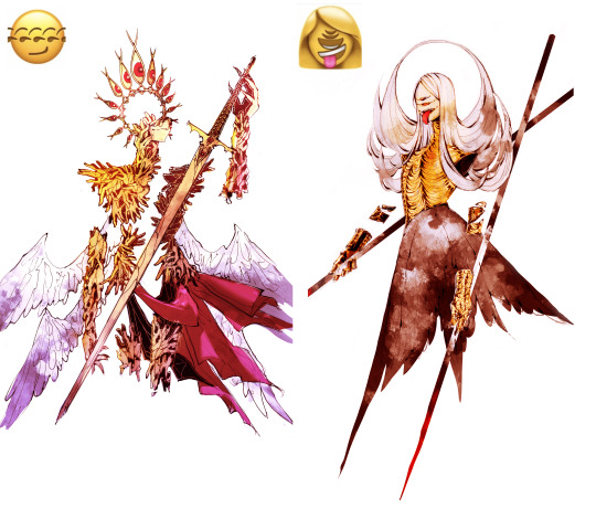
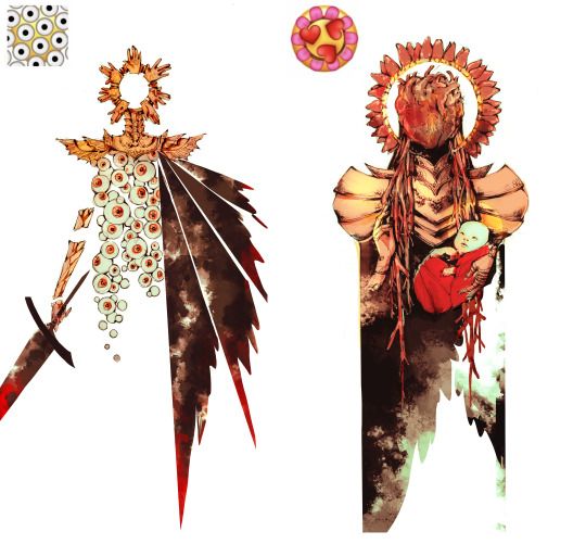
My friend and I decided to attempt to design angels based on widely popular tumblr emoji mashups. It was the first time I colored one of my character design drawings, using similar methods to the ones I've learned in 2017.
2017 - 2024
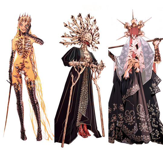
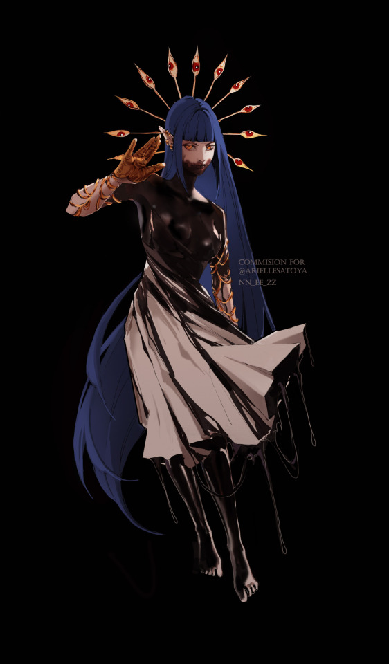
I cannot name nor describe my artstyle nowadays. I haven't seen many people with something similar either. I use what I've learned in all my phases; the spontaneous boldness of 2016, the texture variation of 2017, the sharp shapes and design mindset of 2019, the mix of traditional and digital from 2020. It all melted together and keeps evolving.
The way I approached art changed too. I was so worried about making things beautiful and technically outstanding when today I only worry about making things interesting and readable.
537 notes
·
View notes
Text
-FAQ-
Hello! I've gained a whole bunch of followers lately and I've been getting a lot of questions about commissions, what my setup is, what brushes I use, etc, so I thought I'd make a post about it to answer everyone's questions at once !
Putting them under the cut <3
Commissions:
Commission prices are listed in my pinned post. You can send me a private message about your commission idea and we can get to talking :) It is helpful to have enough references handy (character, outfit, descriptions etc)
I am generally a fast drawer but I also have a job and a physical disability so there might be moments I can't work on your commission. But that is never longer than a few days at most.
Payment is upfront, the full amount and via paypal only. I know this might seem a bit scary but unfortunately there are a lot of people who end up not paying for commissions and I want to avoid that.
During the process I will send you frequent updates and will ask for input, to see if it is going in the direction you want. You can ask for changes during the sketching progress but once I've started on line-art and coloring, no big changes will happen. (You can for example ask for a different color for a shirt etc, but not for a different prop or pose or expression)
When it is completed, I will send the drawing to you via email. The drawing will remain mine and it is not to be sold or profited of by the person who commissioned me. If the commission is for something commercial/for selling, that needs to be discussed. I prefer to do drawings only for personal use!
For more questions, my dms/asks are open :)
How long have I been doing digital art:
I've been drawing digitally for about 5 years now i think? But before that I've been drawing and painting traditionally literally since the moment I could pick up a pencil.
Set-up:
It's just me and my ipad and apple pencil laying on my bed. I wouldn't even know where to begin for those whole multi-monitor/screen setups ;-; I draw only with Procreate
Brushes:
I tend to play with different brushes from time to time to get different textures, but generally i use the same few for most of my drawings/styles. My favorite one is the Peppermint Brush, for sketching. I use it in every drawing i make! I always sketch with it, and often do the line-art with it as well! And it makes for a nice textured brush for rendering as well! (i used it for a lot of rendering of the armor in this drawing)
The (procreate) brushes i use a lot are
for medieval style:
inking - Ink Bleed (for line-art)
artistic - Quoll (for coloring)
for general style:
calligraphy - Chalk (coloring/rendering)
sketching - Peppermint (line-art/sketching)
for realism:
calligraphy - Shale Brush (full rendering) Also using the shale brush for smudging and erasing when drawing realistic
for lineart:
smooth pencil from this pack by Heygiudi
How/why do you choose a base color:
I tend to look at a few different things when deciding on a base color/color palette.
the overall color of the reference pic
the color i associate with who or what i am drawing
the feeling/vibe i want to give off with that drawing
color has a BIG impact on the vibe of a drawing, so it is something i keep in mind when im drawing.
Using a color as a base to start, helps a lot with my drawing process. It helps me pick out other colors so they match better. It helps me get light/dark values right. And the chalk brush i use, has gaps between the strokes, so the base color will always come through a little. Having the same color come through in the entire drawing, helps pull all the colors together if that makes sense? I always start with a solid base color when i am painting traditionally as well!
Advice:
PRACTICE!!! just keep drawing and practice. I know this is such generic advice but truly practice is The Way. Learn from other artists but don't compare yourself to them. Everyone's artistic journey is different and there's no "good" or "bad". And most importantly make sure that you have fun when you're making stuff :3
I also learn a lot by studying art I admire and love. Figuring out what it is I like about it. (for example, the line thickness or the shapes or texture etc), and try to incorporate that in my own style in a way that is not directly copying or stealing.
#my art#FAQ#frequently asked questions#art process#art tips#drawing process#procreate#brushes#commission info
766 notes
·
View notes
Photo
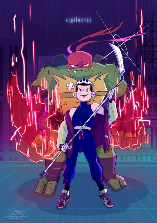
Red Angel's got a new partner to Prevent Harm with.
I’ve been working on this thing since the start of September and I am SO GLAD it is finally finished! I want to see this team up on screen SO BAD. SENDING ALL MY WISHES TO THE WIND.
(Art process timeline thing under the cut!)
At some point I want to make a gif out of all the process pics I took because there are quite a lot. Below is the condensed version, with all the major steps. The render stage took the most time to do because I really wanted to capture certain aspects of the show’s art direction that I really liked (and it took a lot of experimenting because coloring isn’t usually my favorite step).
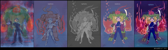
concept > sketch > lineart > flats > render
(bigger image here)
This thing started off as a mindless procreate sketch (far left) and the thought: “Raph would be so much bigger than Casey in this iteration, huh. That’s cute.”
And yeah, snowballed from there.
I think I’ve drawn Raph several times since, but this is probably the first time I’ve ever tried Cass. I love her. I should (and will) draw her more.

Screenshots I spent a lot of time staring at, especially Raph down there as I was trying to get the “manifesting mystic gauntlets” look right (accidentally lost a bunch of progress on it the other day. it was pain but i powered through :’) ).
I believe the backgrounds are from Hot Soup: The Game, which I had playing in the background at around the time I decided to think about the background for this illo. The Cass screenshot is from Rise, of course, and Raph is from the movie, juuust before he attempts to punch a krang in the face.
If you’ve read this far, thanks for reading and I hope it was... informative? Interesting? Here are my Rise-Raph-and-Casey feelings all wrapped up in a piece of art that I put my soul into. Thanks Rise crew, your work continues to inspire.
#risetober#rottmnt#rise raph#rise casey#cassandra jones#casey jones#rise of the tmnt#raphael#red angel of preventing harm#tmnt#fanart#art process#to all the fanfic writers who have written about these two#i see you and i appreciate you
3K notes
·
View notes
Text

charr body types for practice, rambling nonsense under the cut
ive been trying to get better at drawing more varied body types for a while now and i think ive still got a long way to go but im getting there. fat and muscle definition werent something i bothered to learn for a long time because all i wanted to draw was twinks and dragons ... but in the last year or so ive really been pushing myself to do better. i think learning to draw different body shapes is really important and improves your overall anatomy skill by a mile, its also just really fun for me to think about how fat is distributed across the body and affected by gravity and all that stuff. bodies in general are my favorite thing to draw and what i spend the most time sketching
ok enough word vomit lets talk about my ocs
iovitus is supposed to be built more like an athlete, but im not sure i got that across very well. they're still skinny and comparatively twinky next to their fellow cats, but still strong and in good shape. after they left the legions they didnt really bother that much with the upkeep of their figure, but since theyre focusing more on mercenary work again they've been better about it
most of iovitus' muscle is in their shoulder & back, as their weapons of choice -- longbow and throwing axes -- require a lot of strength in that area. theyre very triangular shaped & top-heavy, with a broad chest & shoulders, thin waist and narrow hips. skipped leg day :/
nero is supposed to have sort of a dad-bod type of build. i changed a bit about his design as ive been tinkering around with his lore recently. she was always supposed to have some tummy to her, but i dont think i drew it very well in the past. i think a dad bod is very fitting because she is one after all
i also wanted to make her blind eye more obvious because i kept forgetting about it whenever i drew her so umm sorry babe. still need to come up with an explanation as to why it happened! was considering having him just born with it for a while, but i love scars and scary traumatic events so... sorry nero
in spite of the good layer of fat he's got on his body though, nero is very strong and muscular underneath it all. his warband doesnt do a lot of combat stuff anymore but he's still working most of the time and takes good care of himself. juicy thighs btw
ruckus... i dont have much to say about. i love you babygirl
she's so much taller than everyone else.... its difficult to notice in the line-up as they are, but i wanted to see so i lined them up in front of one another and. well. ->

look at her. and iovitus. why are you so small??
finally, lia! she's still small in comparison to most other blood legion charr, but she makes up for it in her strength. or, well, she might've in her younger years; at her current age she's definitely lost a lot of that muscle definition just by the nature of aging
thats not to say she's weak, though. she can and will definitely fuck you up if you try her
her burned arm is her main weak point. it was burned severely enough where the muscle and nerves were permanently damaged, resulting in a lot of stiffness, uncomfortability, and chronic pain. the movement in that arm is limited and she has to guard it closely if she's ever in a scuffle
i think in general a lot of muscle definition for charr is lost just cause they have fur to cover it up, evident by the fact you cant really see a lot of it on the in-game models. or at least thats my excuse for not knowing how to define muscle with lineart
#iovitus rainbreak#nero wolfcaller#ruckus gutsaw#lia windwalker#my art#charr#guild wars charr#gw2 charr#gw2#gw2 art#gw2 ocs#gw2 oc#guildwars2#guild wars#guild wars 2#guild wars art#guild wars oc#cw nudity#i guess??? not really but whateva#i got really lazy with the scars in this one so ignore how butt ugly they are ok#theyre not the main focus here
110 notes
·
View notes
Note
Im going around asking my favorite mech artists "how to get better at drawing mechs", so now i'm coming to you! What is your approach to drawing mechs, what was your path into learning how to draw em? And how could someone get better at drawing mechs? Thank you for your time and attention
Hello ! ^^
For me, I started drawing mechs 4 years ago. I was just starting to draw again after my big depression era (like 4-5 years without drawing anything after artschool) =w= I kinda had to start from scratch. So, to help me, I started drawabox.com .
I did the first lesson, pulling lines and drawing straight, which helped me a lot gaining confidence in my hand. I ended up drawing 250 boxes . It took me something like a month and a half, doing 10 boxes in day, not everyday, but most of the week.
This was important, especially with mechas, because it teaches you to draw in 3d, to give volume to your shape, and because most mechanical stuff is pretty much boxes piled on top of each others, it's pretty geometric.
At that point, I was already dusting myself of the rust in my drawing muscles, but what really finished it is doing the March of Robots 2020.
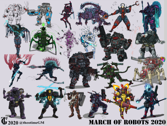
I did like 25 mechs in almost as many days, until I started getting comms. And since then, I haven't stopped. ^^
(also a year later, I got a dm from Tom/Abaddon and got hired to do mechs for LancerRPG x)
Of course, between all that, I did sketches, studies. I tried doing 100 hands but didn't finish it. etc
But for mecha, specifically, I think one of the first things you have to understand is that it is a language of symbols, that is different from organic forms. This obvious difference between mechs and humans, one could say, is that humans are soft volumes and mechs are hard surfaces. But , not only is that not necessary the case (you can draw a mech soft and circular), but it is more about filling in with symbols, shortcuts that bring to mind the idea of the mechanical.
I am not an engineer. Most artists that do mechas and robots and vehicles and hard surface are not engineer and/or do not have that knowledge. (some do but my point is it's not required). Which means that, as an artist you have to fake it by learning those symbols, that bring the IDEA of a mechanical form. This is about using the brain of the spectator/viewer, their knowledge of what mecha looks like, so that you can meet halfway.
You learn those forms by studying. There is no shortcut here. You have to practice, not only your hand, but also your eye, in looking at your favorite piece of mecha media, and replicate them until you can pull them from your brain without reference. (always use refs tho, you don't have use 100% of your brain all the time.)
I am a very DETAIL-oriented artist. It's one of the thing people compliment me on and/or hire me for. It's far from being the only approach in mecha (plenty of great artists doing great concept arts of mecha with few details) . The more details, the clearer you'll have to be, and the more time you'll have to spend on the art. Especially lineart for me. BUT details help a lot convey those symbols and forms and shapes that immediately call MECHA in the brain of the viewer.
Another thing about mecha, is that since it is NOT organic, there is 1) lots of repetition of shapes and symbols, which you are 100% allowed to copy-paste (i do that all the time) , that makes you gain a lot of time.
and 2) SYMMETRY (it's not always the case, you can have an asymmetric design which can be far more interesting) because it's a robot or a mecha or whatever, designed therefore by human hand in-context. Symmetry makes it harder for me, personally, drawing a 3/4 angles or in perspective etc, symmetry is tough. Symmetry of shapes from one shoulder to another, symmetry of details etc. That's probably one of the harder part when you work in 2D. Cause you have to understand perspective and foreshortening and all that.
But yeah, because it's inorganic, hard surface requires a better understanding of perspective, because straight lines are easier to read therefore the viewer will have an easier time at clocking wonky mistakes.
I could go on, about design and function, and aesthetic. but i'll stop there. This is basically how i started plus some other stuff. The rest you'll pick up along the way.
Thank you for asking ! =w=b
94 notes
·
View notes
Last Seen Blogs

ashleywanttobe
Untitled

dolorezhaze
_hellofriend

ky0komogami
♡ skip beat supremacist

hallowsgate-blog
Hallowsgate