#multiple fixed layout sizes
Explore tagged Tumblr posts
Visit Tumblr Blog
Explore Tumblr blogs with no restrictions, modern design and the best experience.
Last Seen Tumblr Blogs


Fun Fact
There were a total of 171.5 billion posts on Tumblr in 2019.
Text
Tim Drake Pride Thoughts Part 2
Link to Part 1 for those interested
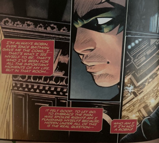
I love Tim’s internal monologue and how it’s visualized on the page. The way he’s in the Robin costume even though he’s not actually and then it fades away.
Gosh his identity issues. His need to save people and self destructive tendencies. I love him.
Then Tim beats the crap out of the unsuspecting cultist and steals their stuff like a boss but it wasn’t shown we just cut to the cult after the reveal of the multiple “chaos gods”
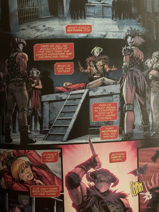
I love that he says what would Batman do like it’s what would Jesus do. He even acronynmed it earlier. I used to have those bracelets.
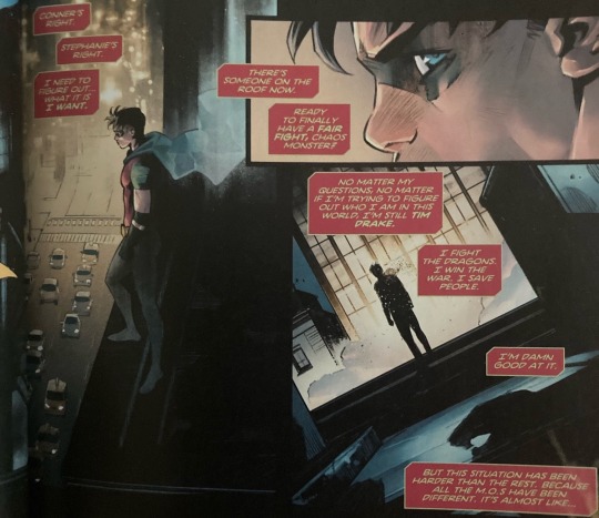
Tim’s always trying to fill a role and that’s so fascinating. Robin was just a role that needed filling that he just happened to be able to do but now that there’s another person in that spot he’s trying to emulate Batman since he’s working alone and Batman’s his idol.
Oh also the fact that it was Bernard who was about to be sacrificed is interesting. Like he’s one of the most recent kidnappings so it’s interesting that they’d choose him
Also the fact that Tim is taking the Tim to judge them when his friend/crush is literally about to be sacrificed. Can’t stop being a hater I guess.
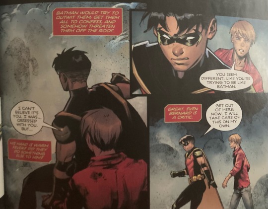
Love that Bernard is a fanboy just like Tim was.
Also Tim’s little gay panic there. He holds a boys hand and is immediately like “Is it supposed to be this warm?”
Love how Bernard immediately notices that Tim’s acting different it could be due to his Robin obsession but I also just think it’s cool how easily he understands him.
Bernard really just almost got sacrificed and pops up ready to fight. He’s probably been waiting to fight alongside Robin for a long time since he is a fanboy
Oh Timmy Batman isn’t alone and you don’t have to be either. You have the Batfam. I find it silly that this idea is coming from Mr. “Batman needs a robin” himself.
Though perhaps he doesn’t mean physically alone. Because the Batfam isn’t keen to share their problems. They tend to try to be islands. Each individually dealing with their issues and hurts rather than opening up and leaning on eachother. They’ve learned their poor emotional communication from the best.
Close enough welcome back Arthur Pendragon!
I have talked to friends and I have confirmed that I’m not the only one who thinks that first panel looks like Arthur (Come to think of it Tim looks kind of like Merlin too. Reincarnation au?)
Anyways I promise I had an actual thought regarding this interaction too. I love how Bernard is telling his crush to tell his crush that he wished they’d finished their date. Tim is just internalizing this and probably with that last word realizing what they could be.
Like I said Tim’s having realizations.
Also I just love this page layout. The different sizes and shapes to represent the chaotic-ness of a fight. Bernard being the focus of the biggest moment to visually show the lightbulb moment and Tim’s fixation of him. Both of them just being flashes of certain moments almost like we’re Tim or Bernard glancing at the other to see what their doing. Ahhh! I love it!
More Tim tech lingo! I love the focus on Tim being Techie and how that can cause him to think differently like he’s also just a computer with simple problems to fix. His realization that he’s different. That sure he didn’t realize he was Bi before but that doesn’t mean he wasn’t
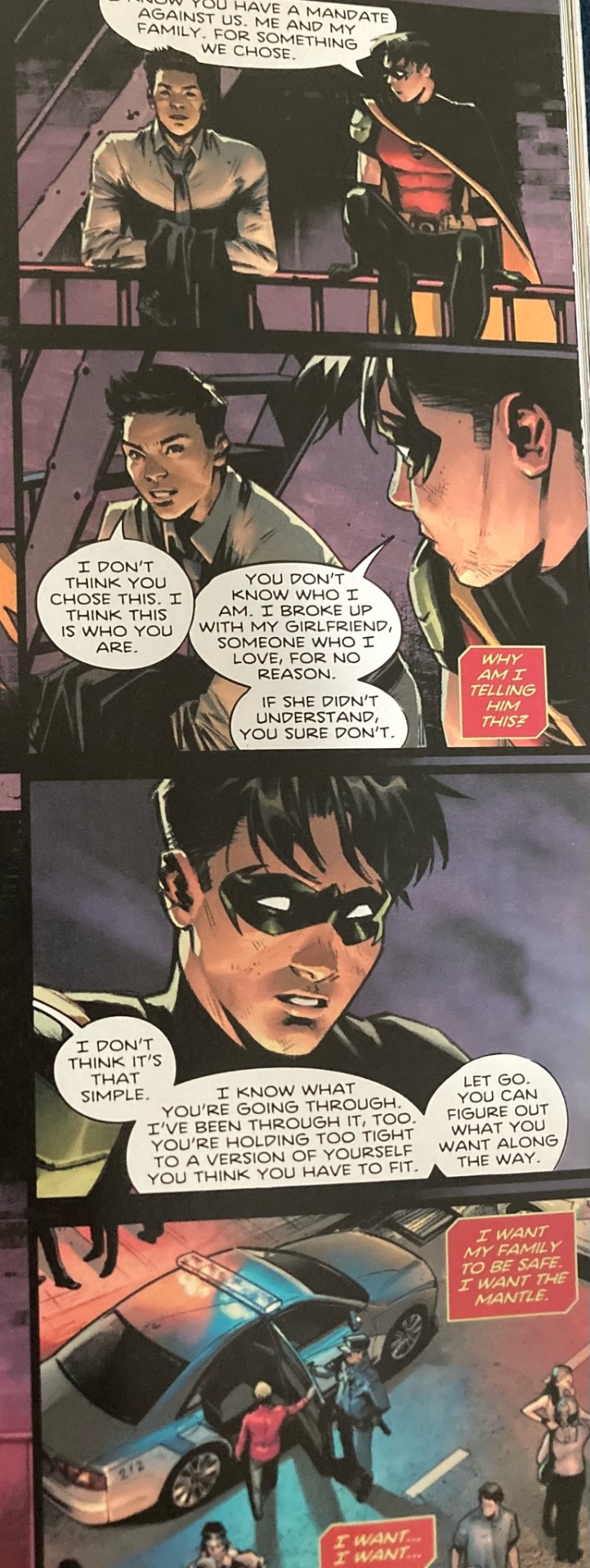
I know that the whole Batfam not choosing being vigilantes is a thinly veiled metaphor for Tim’s being queer (which is kind of funny because I feel like that almost implies that the rest of the Batfam is queer or maybe it’s just the inherent queer subtext of hidden identities), but also I do think that the police has a point in them not really choosing the vigilante life I mean sure they theoretically could have not been vigilantes, but it’s just a fundamental part of who they are so even if the law tells them not to they’re not going to turn back now. I don’t think any of them at the beginning could have seen the pain and problems that they did and not tried to fix it.
Also the I want over Bernard and how the next page is going to be him.
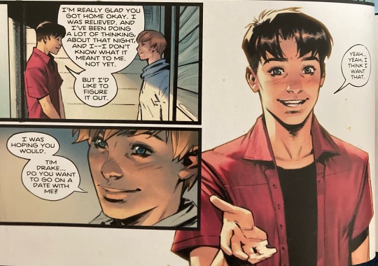
And that’s the adorable conclusion. I love them! The way they’re figuring it out together! They’re both new to this. I love when couples don’t have to have it figured out. There’s no one right way to have a relationship
#dc tim drake#tim drake robin#timbern#timber#bernard dowd#dc comics#robin dc#dc robin#dc red robin#red robin#robin comics#comic analysis#dc pride#this is the old Pride one it came out years ago but I just bought it
299 notes
·
View notes
Text


Hey I just wanted to give you guys a little insight into several projects I'm working on.
So first of all, some of you might remember me mentioning being sick earlier this summer. I was bedridden for like 2 months, and my health has been bad ever since, getting sick again every couple weeks.
Because of that I accumulated a bit of back log of cards to edits that were released since then. I mentioned before, starting with EX5 the english twitter previews started having the "SAMPLE" text pasted on it as well, but since around EX6 the quality of the previews has also declined significantly. Despite being the same pixel size as the japanese previews, the english ones have a lot more jpeg artifacts now.

[Left a cutout of EX6 Lopmon's japanese twitter preview, right the same section from the english preview]
Working with these now increases the amount of time I need to spent on each card, which really adds up with over 100 cards per set.
Besides the current card releases, I'm also slowly working my way through earlier sets trying to enhance the cards as best I can.
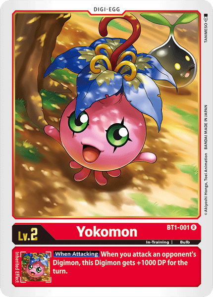
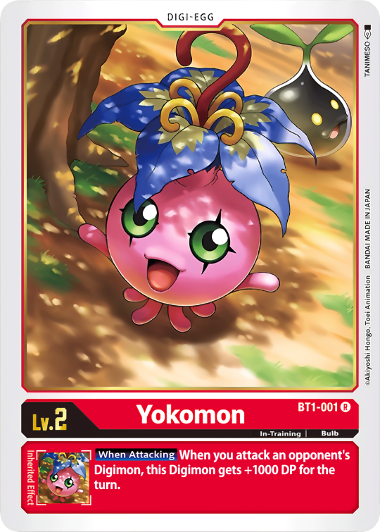
[Left BT1 Yokomon from Bandai's online card list, right my edit]
In the process I use multiple sources, trying to find the highest resolution I can find for the image and do color corrections if necessary. I also decided that instead of favoring "authenticity" I'll favor legibility, meaning I will paste in keywords I sourced from higher resolution cards, and in some cases retype the effect text entirely.
This is a very slow process, and is lower on my priority list so the progress is not very far. My goal is a complete library of all cards.
Another thing I'm working on is the Un-Dub Project, which I had previously introduced to you before.
I plan on assembling my edits in "packs" so people can decide themselves how much change they want. This will include the options from my original poll as respective levels, as well as a Tamer Pack.
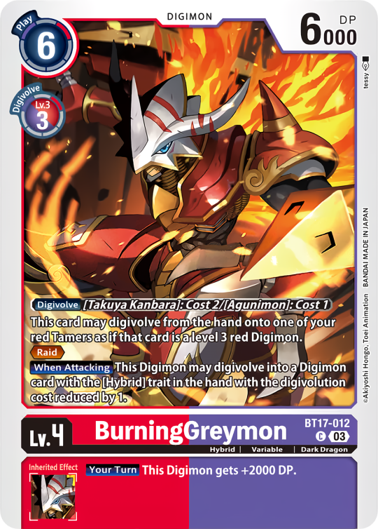
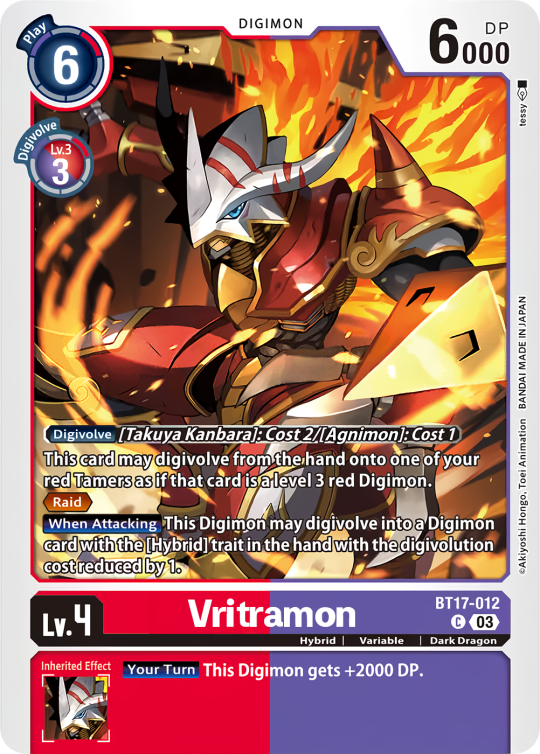
[Left BT17 BurningGreymon, right my edit changing the names to Vritramon + Agnimon]
People will have to mix and match at their in discretion, being aware of card interactions etc.
Next is a bit of a smaller project, the Errata edits. Most cards that got Errata had their already fixed versions released as previews, but are printed incorretcly. Some however got their Errata after the preview releases, in which case I'll edit the card text accordingly.
The official card list will have the correct text, but those have very low resolution.

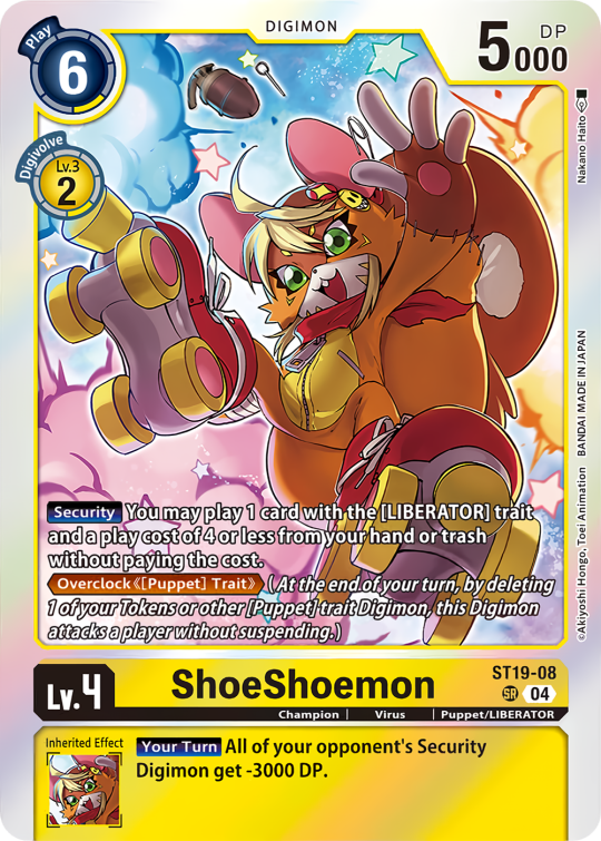
[Left original preview of ST19 ShoeShoemon, right my edit with text errata]
When releasing the Errata pack I'll include Errata cards that I didn't edit as well, in order to represent the full list and not cause confusion.
Finally I have a little passion project of doing edits of all cards with <rule> updates.
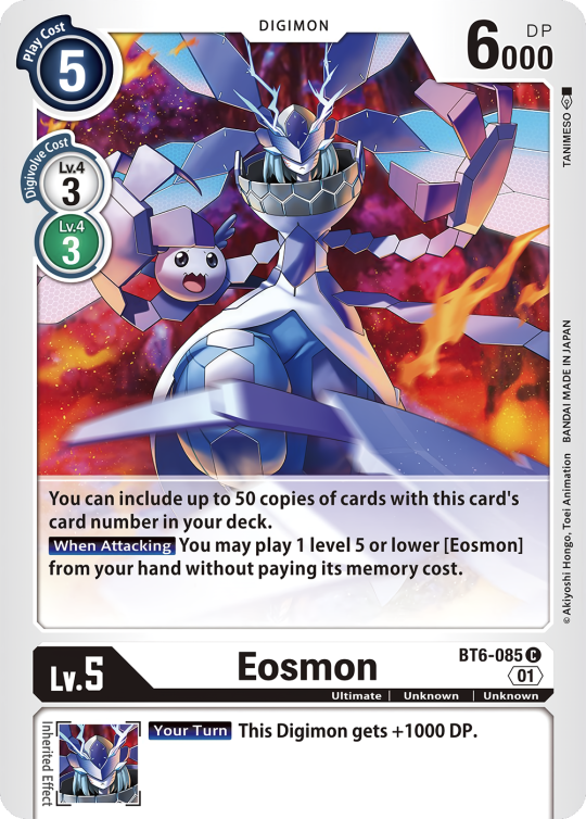
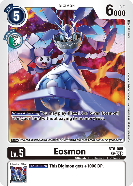
[Left BT6-085 Eosmon, right my updated rulings edit.]
This is gonna get a little technical, so bear with me. As per the rules Effects don't trigger in the breeding area. Before the <03> card layout revision, additional rules were included within the effect text. This resulted in card interactions not working as intended.
For example, BT11-063 Geremon has the effect "The name of this card/Digimon is also treated as [Numemon]."
But going by the rules, this would not be in effect in the breeding area, so for example Numemon X, which can evolve from Numemon, would not be able to evolve from Geremon in the breeding area.
With <03>'s introduction of the <rule> box, this was fixed, and some cards have been revised with this new <rule>. But as always, no reprints.
This is the edit-heaviest of my projects, as I felt inclined to not slap the <rule> box on there, but remeake the entire card in the new layout style to go along with it.
#digimon#digimon tcg#digimon card game#digica#デジカ#digisafe#lov speaks#blog update#personal#digi lov edits
33 notes
·
View notes
Note
hi! i love your gifs and your tutorials, you explain things very well and i was wondering if you could explain how you make a template of gifs that are different sizes but in the same canvas? and then how you make the gifs and put them in each spot to make them all work properly? thank you so much in advance if you're able to do this :)
hey, thank you so much, i appreciate it!!
there are multiple ways to do it, but here's how i make layouts like this from scratch:

a basic knowledge on how to make gifs and layer masks is required, i'll link more resources and tutorials at the end too.
i'm sure there are simpler ways to do it, but it's how i do it lol, unless i'm using someone else's layout. i'm sorry if it's too in-depth! on and i use photoshop cs5 :)
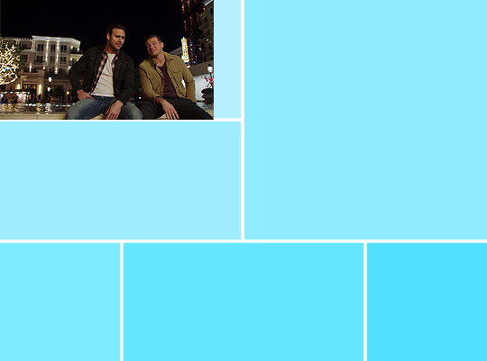
I. FIGURING OUT THE GIF SIZES
first things first, i need to figure out what kind of layout i wanna do. to do so i usually map it out i on paper because i'm super visual and it helps be figure things out. yes, we have to do (simple) match here, but it's nothing bad!
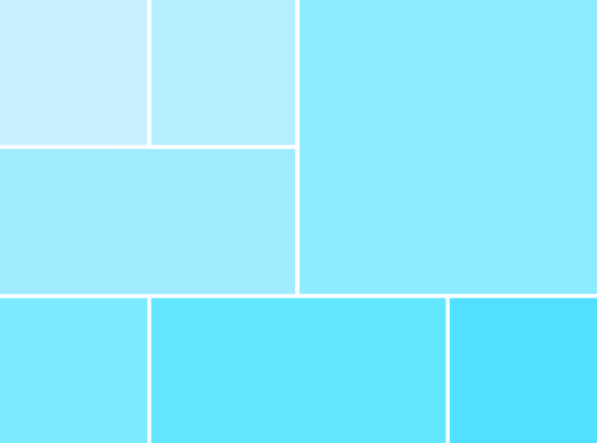
let's take this layout for example:
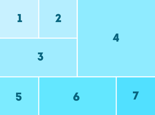
there are 3 different gif sizes to figure out here:
gifs 1, 2, 5, and 7
gifs 3 and 6
gif 4
to do that, you need to figure out which size you want your finished layout gif to have (540 x 540px, 540 x 450px, etc). in this case i chose a size i use all the time: 540px wide by 400px tall.
a very important thing to remember is that tumblr's transparent gutter between gifs is 4px wide, so we need to take that into consideration when we do our little math.
since we know that the gif will be 400px tall, we can right away easily figure out the height of all gifs except gif 4. since there are two 4px lines, let's remove 8 from 400 and we get 392. from there, we just need to divide it by 3: 130.67. we need numbers without decimals, so let's just say gif 1 and 2 will be 130 px tall, and gifs 3, 5, 6, 7 will be 131px tall.
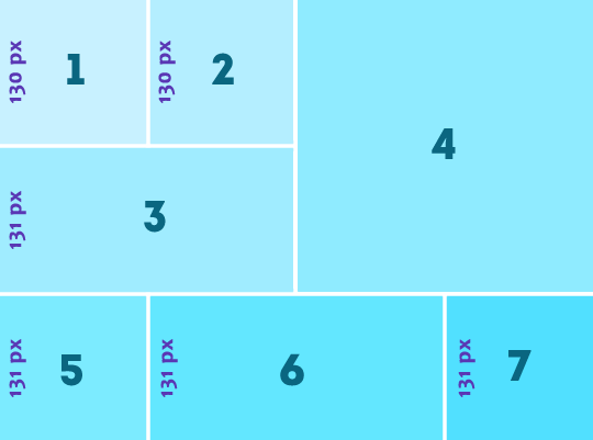
then we can figure out how wide gifs 1, 2, 5, and 7 are because they're square gifs, easy!
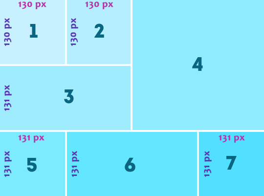
to figure how wide gifs 3 is, we can simply do 130 + 130 + 4 = 264px
for gif 6, let's do: 540 - (131 + 131 + 8) = 270px
then we only have gif 4's size to figure out. just more basic math:
height: 400 - (131 + 4) = 265
width: 540 - (130 + 130 + 8) = 272
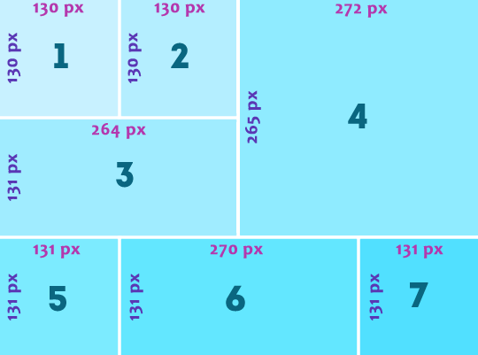
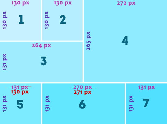
the only issue here is that i want gifs 1, and 5 to line up, so i'm just gonna adjust the sizes so they're the same:
once you have all of your gif's size figured out, you're ready to create the actual layout in photoshop, yay!
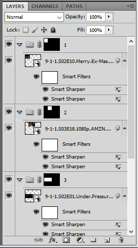
II. CREATING THE LAYOUT
create a new canvas and give it its size (540px width and 400px height), then create one group for each gif you're gonna have (in this case it's 7).

now time to make the shapes. with the marquee tool, change the style to: fixed size and enter gif 1's proportions (130 x 130px)

then click the top corner of the canvas and position the box in the top corner
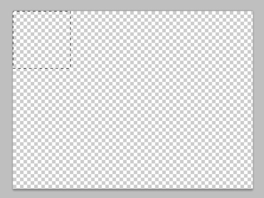
once the box is in the right spot, create a layer mask by selecting the first group and clicking on the layer mask button
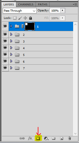
then you can do the same for all the shapes: change the marquee tool's size, position the box, and create a layer mask for each group. you just need to make sure they are all 4px apart.
to do that you can select the group itself and just nudge it a bit with your keyboard's arrow key. to make things easier to see, i like to add a color fill layer in each group. once you've done it all, it should look like that:
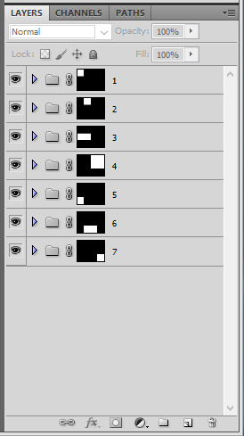
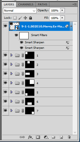
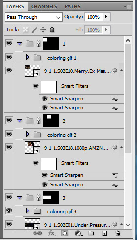
III. MAKING THE GIFS
for the actual giffing part, what i like to do is to make my gifs as usual and sharpen them (i usually color later at this point).
resize this gif to the desired height to fit the layout (for example 130px for gif 1). make sure your gif is a smart object and then right click the layer > duplicate layer... > and choose your layout canvas.
obviously the gif should be in the group, so just slide it in the right group and delete the color fill.
if you don't like the gif's position, you can select this gif layer and move it around inside of the box by either sliding it around, using your keyboard's keys, or using ctrl + T to open the transform tool. if the gif is too big after duplicating it to the layout canvas, you can also resize it here with ctrl + T. it's usually what I do.


then you can do the exact same for all 6 other gifs

IV. COLORING
the last part, when everything is set, is to color! i prefer doing it at the end because it helps to make everything look cohesive. just make sure coloring layers are contained in each according group and voila!
MORE RESSOURCES
this technique with drawing the layout on paper first and then doing basic maths always work for me. you just gotta remember that the gutter size between gifs is always 4px, and choose a final gif dimension first. i hope i was clear enough, i know it's a lot of numbers 😅
here are more great layout tutorials:
fawad-khan's layout tutorial
payidaresque's layout tutorial
yenvergerberg's clipping mask layout tutorial
usergif's clipping and layer mask tutorial
#alie replies#Anonymous#tutorial#photoshop#*ps help#completeresources#resource#resourcemarket#userpjo#userraffa#tuserheidi#userrobin#usertreena#userzaynab#userrainbow#userdean#userelio#usernik#usersalty
237 notes
·
View notes
Text
[Review] Aperture Desk Job (PC)
Talking and fun, testing and fun.
I realised after three weeks of owning a Steam Deck that I should try this free tech demo that Valve made specifically to demonstrate the capabilities of the Steam Deck. So, I did. It's a half-hour little adventure set in the Portal universe, specifically the old days of Aperture when Cave Johnson was running the place.
The whole thing plays out with a fixed perspective as you sit at your "desk" which happens to have all the same buttons and features as a Steam Deck. Grady, a robot on a stick, talks you through the process with a lot of shenanigans along the way. You start by testing toilets, but a mishap results in the invention of the toilet-based gun turret which leads to some brief shooting sections and things escalate from there until a fateful meeting with Cave himself (in the form of a giant head) caps off the experience.
Without much in the way of challenging gameplay, it's a very directed experience where the writing and gags take centre stage, making it a comedy game of sorts. Unsurprisingly it's very much in the Portal 2 school of humour, and there's plenty of ways for the characters to say similar instructions if you dawdle. The silly turns and asides are amusing, including a civilisation of mantises living in the walls, wanton destruction of Aperture assets leading to imprisonment, and a rivalry with the homewares department. JK Simmons is excellent as always in the role of the kooky CEO, while breakout comedian Nate Bargatze holds his own as Grady, your constant companion.
I suppose I should say something about the Steam Deck itself. The construction is high quality, and the screen is large and bright. The touch panels work quite well when required to simulate a mouse, and otherwise the touch screen serves the purpose. The button layout suits my hand size well at least, although L1/R1 are perhaps the hardest to reach aside from the bonus 3 and 4 buttons which are just nice for when a game requires a remapped keyboard press every now and then (the options for remapping are clear and useful). Although it's large, it's relatively light and comfortable to hold, and the interface is nice and snappy. My main problems with the software have been when I have needed to venture into desktop mode and then got confused, or the system got locked up when switching over. But I appreciate that there's lots you can do outside of the main Steam mode, like installing Linux games or emulators; this has quickly become my go-to device for retro games!
Anyway, I don't know if this is even playable without a Steam Deck, but it's a fun little slice of the Portal universe that's free to download. If it is locked to the hardware that would be a shame, but it certainly wouldn't be alone with the multiple bits of Portal and Half-Life content that are locked to VR headsets or motion controllers. Valve and their experiments eh?
6 notes
·
View notes
Text
I figured I should show some quick comm/intro presentation cards, now that the bluebird app is having issues.
I meant to upload this yesterday, but for some reason Tumblr didn't let me.
Please share and reblog around as that helps me far more than just a like. If you're so kind, please recommend me to people.

Sketch style is best suited for silly doodles, quick character studies, comic pages or even character design, which I've done plenty.
This style is quick and dirty, meant to be done rather fast, loose and experimental.
Basic style ranges from outlining to flat coloring and shading, basically a step above sketch in quality, best suited for quick renders or when you're making an asset that does at least need a bit of color.

All-Out means I do everything in my power to make the piece stand out, best suited for major graphical assets (such as stream layouts, live2D pieces, profile pictures and emoticons) or full on posters, thumbnails or character renders.
A brand new style I've been practicing a lot lately, the pixel art tier includes tilesets, single sprites, animations or even whole sprite sheets (as I've done multiple Make a Good MegaMan Level costumes, if you want a reference there).
Making a sprite sheet can be time consuming, but the more is done, the easier and faster it is to put together as it gives me chance to iterate on previous sprites to make new ones.
On the subject of time: all work is timed with software and screenshotted as evidence of work is provided, the final price is decided upon a rounding of how many hours it takes to make the piece multiplied by the tier cost.
Ex: 1 hour to make an All Out Emote, would be 20, 30 minutes would be 10, 1 hour and 30 minutes would be 25.
On the subject of flexible payments: not all of it has to be paid on a single go, if the price is too high, a payment plan can be discussed and adjusted to the needs of the client. Once its paid in full, the piece is provided, if its multiple pieces in one go, the pieces are provided as they are paid.
Other notes:
- The initial pitch sketch is not timed, its on me until the idea is decided upon, at which point the timer begins.
- Error and corrections are also not timed, I'll do the fix ups without adding to the timer.
- Evidence of work will be provided periodically.
- The usual restrictions apply: no political, overtly violent or erotic content will be drawn.
- I'm down for drawing whatever otherwise (stream assets, personal drawings, attempting specific art styles, etc.) but I reserve the right to refuse a work for whatever reason I deem fit (for instance: modifying someone else's work without permission).
- Number of characters, backgrounds or size does not affect pricing, only the time it takes to make them.
- I'll strive to be as transparent and ethical as possible with the process. So bear with me there.
#commission open#independent artist#open commissions#commissions#pixel art#sprite art#art commissions
11 notes
·
View notes
Text
How Do You Choose the Right Skylight Size?
Skylights can transform your space, allowing natural light to flood your home and enhancing aesthetics and atmosphere. But how do you decide on the right skylight size? This guide will walk you through the considerations you must make to ensure your skylights fit perfectly within your space.
Understanding Skylights
Before discussing size specifics, it’s essential to understand the different types of skylights available. Skylights come in various shapes, sizes, and designs, from fixed to ventilated. Knowing how you want to use your skylight will help you narrow down size options. How Do You Choose the Right Skylight Size?
When lighting up your home, skylights are a fantastic option to enhance your living space's overall ambiance and appeal. However, choosing the right skylight size is essential toperfectly balancing light and aesthetics. In this article, you will learn how to choose the right size for your skylights and what factors to consider.
Skylights and Your Space: Understanding the Basics
Before diving into measurements and dimensions, it’s important to grasp the role of skylights in your home. Skylights not only create a dramatic effect by bringing the outdoors inside, but they also significantly impact energy efficiency and ventilation. Understanding how skylights interact with your current space will provide a solid foundation for your decision.
Assessing the Size of Your Room
The first step in determining the right skylight size involves considering the room's dimensions where you want to install it. You must consider the ceiling height, wall space, and overall layout. A larger room can typically accommodate bigger skylights, while a smaller space may benefit from more modest-sized skylights to avoid overwhelming the area.
The Rule of Thumb: 10% Lighting
Many experts recommend that skylight square footage equal approximately 10% of the total floor space in the room. For example, if your living room is 200 square feet, you could aim for about 20 square feet of skylight area. This guideline helps balance the amount of natural light without making the space feel too harsh.
Skylights and Roof Pitch: What to Consider
When selecting the size of your skylight, roof pitch is a factor you cannot overlook. Certain models work better with specific roof angles, which may influence your size options. A steeper roof pitch allows for larger skylights, while a flatter roof may be more restrictive.
Think About Placement
How and where you intend to position your skylights also affects the size you should choose. Skylights facing south will capture the most sunlight, while those that face north will have a softer light. If you're planning multiple skylights, how they complement each other in size can create a unified or contrasting look.
Skylights and Functionality: What Do You Need?
What purpose will your skylight serve? Your size will depend on whether you want it for natural light, ventilation, or both.
Ventilated Skylights vs. Fixed Skylights
Opting for ventilated skylights will improve energy efficiency and air circulation. These typically come in larger sizes than fixed skylights, as they need space for operable openings. In contrast, a fixed skylight may suffice if your goal is purely aesthetic, allowing for smaller measurements.
Skylights and Architectural Style: Finding Harmony
Your home's architecture plays a significant role in determining the right skylight size. A colonial-style home may benefit from smaller, more symmetrically positioned skylights, while a modern home can accommodate larger, more dramatic skylights.
Choosing the Right Style to Match
Consider your home's overall style and finish. The skylight design should harmonize with your existing architecture and contribute to the space's overall flow. Opting for sizes that blend with the lines and shapes around them will create a cohesive look.
Skylights: Energy Efficiency and Materials Matter
Remember to consider materials when selecting your skylight size. Various options—like acrylic, polycarbonate, or glass—have different aesthetic and energy-efficient properties. Higher-energy performance materials may allow for smaller skylights due to improved insulation.
Energy Efficiency Counts
Look for skylights with high Energy Star ratings. They may have features like low-E glass coatings that can impact your choice in size without sacrificing energy efficiency.
Choosing the right skylight size balances aesthetics, functionality, and practicality. You can make an informed decision by evaluating the size of your room, considering the roof pitch, assessing your needs, harmonizing with your architectural style, and factoring in energy efficiency. Skylights are an investment in your home, enhancing its beauty and value.
If you’re ready to brighten your space with the perfect skylights, visit Lastime Exteriors for an expert consultation! Call us at (402) 330-0911 with questions or to schedule an appointment. Feel free to email [email protected] for a free estimate. Let’s bring more natural light into your life!
2 notes
·
View notes
Text
Old Builds!!!
I decided to plop all the old builds I found down in Adventureland so I could make a list of changes I'm planning to make and which lots I will scrap from the project. Needless to say, there will be roof work, LOL! I had forgotten how much work I'd put into a lot of these! And how large all of the houses I used to make were! Even though there will be some terrain finagling to do once I place them in my custom world it is still going to be a LOT quicker process! All I'm missing from my original builds is a super awesome aquarium I'm still pretty bummed to be missing and an okay poolside beach bar.


This is the resort lot I built it is situated on a lake that will actually extend beyond the lot and become a significant element in the nature reserve area of the world. Inspired by a couple of real world resorts here in the US. The pool area is Art Deco style and always makes me think of "The Shining" for some reason, LOL!


The Copa Club, an exclusive lounge with functioning restaurant and performance area! Yes, those ARE palm trees inside the building. Yes, that IS a glass tiled area of the floor. And yes, those ARE shark spawners inside the tank in the middle of the bars :)


More pictures from around the club, as you can see I never put stools at the bubble blower...facepalm.


The main transit station with buried subway rabbit hole, java hut and laundromat. In the old world I had about a million subway objects littered all over the place. It was a total mess, I also thought I needed multiple of every rabbit hole to make it seem like an actual city. No wonder it broke before I could finish it! I've learned a LOT over the years! I was originally going to take the laundromat out of this lot, but I think I'll just leave it and not have a separate designated lot. It'll save me some space and a lot for possibly another house if I feel the need for it. I've gotten to be more about function and streamlining world layout/size over the years than I used to be.


Random screenshots from a couple of the old houses. They seem so huge to me now!


The crowning glory! This house is by far the most elaborate and there was a backstory which I think I will include in Pickerling Cove. Seems only right as I'm using all the old builds from my unfinished world. Ugh! I'd forgotten that this house was 1 tile off on one side! OMG it was such a pain to create, I dread fixing it, but it will drive me crazy! Anyway, I'll definitely have to offset terrain when I place it in Pickerling and hey, I don't have to remake it totally from scratch, so I should stop complaining!
#sims 3#ts3#ts3 world stories#ts3 worlds#sims 3 worlds#sims 3 simblr#pickerling cove#lost builds found#don't mind the background they're just plopped in adventureland for now#pickerling cove_scenery
8 notes
·
View notes
Text
Stardew Valley Mod Recommendations
My guy Coyote is gonna be playing Stardew Valley soon and asked me for mod recommendations. As I have over 100 active mods and that's a lot to send links to, and I love to talk, I decided to just make a post about my favorites.
I will leave links and a small blurb about many under the cut (this is gonna get long) but I'll be separating things into categories like Gameplay, Quality of Life, Visuals, and of course Expansions on the story and such.
Time to be overly thorough
Expansions
Stardew Valley Expanded - I'm sure this is a common recommendation but I find it's solid. The mod covers multiple additions from new characters, a new farm layout, and additional story arcs and realms to explore. It works well and nothing feels far off from the original game, and the integration of new characters with pre-existing is extremely well done.
Ridgeside Village - Another fairly popular expansion. This one is, imo, not quite as solid as SVE in that it has a few bugs and is a touch less complete but considering its size there's bound to be a problem or two. Integration with the vanilla game is also less seamless with the villagers typically being in their own off shoot during events, though given that this is a somewhat separate town that's also not a downside so much as something you might like to know.
DeepWoods - My favorite small expansion. Essentially the mines but a forest. This one is still a work in progress as there is a story being introduced to work alongside the forest's inner workings but its bones are very solid. Has a sword in the stone, a unicorn, and is a wonderful source of hardwood.
Hat Shop Restoration - What it says on the tin, really. Fixes up the hat mouse's shop. I find this one really cute. Hat mouse deserves a nice house :3
Textures and Appearance Overhauls
Less Ugly Spouse Rooms - Pretty straightforward. The same person has a mod for the interiors of the town but I personally prefer this one alone.
Seasonal Outfits - A very nice mod giving characters a new look every season, whose creator has also made one for the characters in SVE. A few of the portraits are overhauled more than others- I personally turn off the Elliot module because I like his original portrait and this mod changes him quite a bit.
Garden Statue Obelisks - Not a texture pack but a full replacement of the obelisks with classical-style statues.
Elle's Cat Replacements, Dog Replacements, New Barn Animals, and New Coop Animals - Recolors for the animals, in a nutshell. With multiple colors for every animal you can set up your ideal look, and even change your barn animals to deer and alpaca. In the same vein:
Truffle Foxes - Replaces the pigs with foxes. I'm a big fan of foxes so this one was just indulgent for me, honestly.
Medieval Buildings - Allows you to change the structures on your farm to a more medieval style. Most have multiple options for style and amount of greenery, and each one can be turned off completely if you'd like to preserve the look of any specific structure. This mod creator has an extensive line of mods to match this one, including one to apply to the whole of Pelican town and another to change the look of craftable items but I'm personally satisfied with the farm buildings alone.
Catcrows - A simple re-texture for the various scarecrows to make them cat themed. Can be toggled between normal cats and themed cats to match the variety of the rarecrows
Dynamic Reflections - Deceptively simple in title but a newfound favorite of mine. Puts your reflection on bodies of water for an added layer of depth but also reflects the night sky on clear days. I didn't think having this mod would make much of a difference for me but it really does make me more keen to walk about at night.
Note: The following furniture texture packs I will be recommending are not applied directly but are customizable through the use of the Alternative Textures mod. With this mod you can choose between any number of texture options these packs provide for individual furniture pieces.
Aster's Big Furniture Pack - A texture pack with a slew of different options. There's a lot of very cute options ranging from basic alternatives for bed appearances to turning furniture into a large bathtub.
Industrial Furniture - Another texture pack, this one providing a more modern/industrial feeling to furniture.
Quality of Life and Gameplay Changes
Almanac - This one is nice to have without being too 'immersion breaking', I like to think. A farmer's almanac, essentially, that lets you know when the last ideal day to plant crops occurs, where and when to find fish, and weather patterns for the coming season. Information like what can be found on each floor of the mines and your luck for each day can be toggled on or off depending on your preference.
Lookup Anything - A little bit like having the wiki in game. This one might seem a little more on the cheat side but if you planned to have the wiki open anyway this saves you a lot of trouble. As far as I know it doesn't have an option to show villager schedules but otherwise provides most of the information you'll need.
UI Info Suite - Puts little icons below the clock menu indicating a variety of things that can be toggled on or off according to preference including but not limited to when the traveling cart is in town, what your luck for the day is, daily birthdays, and if it will rain the next day. Extremely helpful; if I could only have one of the three already mentioned here this would be my first choice.
Timespeed - Another one that can seem a bit like a cheat at first given that you can completely stop time with a single button press, which admittedly can be handy, but this one can be used in a much more fair way. Ten minutes in Stardew Valley only takes 8 seconds to pass and even before expanding the gameplay and story options this can seem like not enough. I personally have it set to give me 20 seconds per ten in-game minutes which is only a little more than double vanilla speed but makes it feel like I actually have time for the things I need to do. This one is customizable down to the way time moves in different areas and time speed can be changed outside of its setup menu temporarily for when you need time to move faster or slower than you have it set briefly.
Bigger Backpack - A third backpack expansion that costs 50,000 gold (though this can be set to a different price if so desired). Another handy one given just how much certain expansions can add.
Friends Forever - Removes relationship decay from the game. Already a solid QoL type addition but even more so if you choose to mod in expansions- The character roster fills up quick.
Free Love - Lets you marry/live with multiple characters.
NPC Map Locations - What it says on the tin, really. Removes a lot of guesswork and need to look up character's schedules. Even works with many expansions.
Sit for Stamina - I find this one to add some realism. It's kinda silly to waste the day when you could just take a break once your stamina is low.
Instant Tool Upgrades - No more wait for upgrades. Feels very gracious when you're in early game, especially.
Auto Animal Doors - Opens and closes the barn and coop doors at designated times. These times can be set according to preference and you can set this mod to only work for a certain level of barn and coop if you'd like to treat it as a perk of upgrading.
Skip Fishing Minigame - I mean... c'mon...
Extended Minecart - I just think it's neat. It's not the most necessary mod but the longer you play the more I feel that that little walk from the bus stop to home is a slog, y'know?
Deluxe Journal - Lets you make custom tasks and take notes. Sooo helpful when you have trouble remembering what you were working at last time you played.
And that's it!
This is a non-exhaustive list, of course. I only included my favorites so there's no accounting for personal aesthetics and varying gameplay styles but if you're not sure what to get this can hopefully give you some ideas.
33 notes
·
View notes
Text
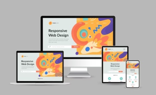
How to Create Mobile-Friendly Websites with Responsive Design
In today’s digital era, where mobile devices dominate web traffic, creating mobile-friendly websites has become more important than ever. As users increasingly access the internet through smartphones and tablets, businesses must ensure their websites are optimized for a seamless mobile experience. This is where responsive design comes into play. At Nividaweb, a leading responsive web design agency in Vadodara, we specialize in crafting websites that look and perform flawlessly on any device.

Here is a comprehensive guide on how to create mobile-friendly websites with responsive design:
What is Responsive Design?
Responsive web design is a design approach that ensures a website's layout and content adapt dynamically to different screen sizes and resolutions. Whether your users are browsing on a desktop, tablet, or smartphone, a responsive website delivers a consistent and user-friendly experience. This adaptability is essential for improving user engagement, reducing bounce rates, and enhancing overall website performance.
Why Responsive Design Matters?
Before diving into the how-to, let us understand why responsive design is crucial:
Improved User Experience: A responsive website ensures that users can navigate and interact with your site effortlessly, regardless of their device.
Higher Search Engine Rankings: Search engines like Google prioritize mobile-friendly websites in their rankings, making responsive design a key factor in SEO.
Increased Conversion Rates: With a user-friendly interface, responsive websites encourage visitors to stay longer and take action, boosting conversions.
Cost-Effective Maintenance: Instead of maintaining separate websites for desktop and mobile users, a responsive design simplifies updates and reduces costs.
Steps to Create a Mobile-Friendly Website with Responsive Design
1. Start with a Mobile-First Approach
The mobile-first approach involves designing the website for smaller screens first and then scaling up for larger devices. This method ensures that the core elements are optimized for mobile users. A responsive web design company in Vadodara like Nividaweb emphasizes this approach to ensure a seamless user experience on all devices.
2. Use a Flexible Grid Layout
A flexible grid layout is the foundation of responsive design. It allows website elements to adjust proportionally based on the screen size. Instead of fixed-width layouts, use percentages and relative units like ems or rems to define dimensions. This ensures that your website adapts smoothly to different screen resolutions.
3. Optimize Images and Media
Large images and media files can slow down your website, especially on mobile devices. To enhance performance:
Use responsive images that scale according to screen size.
Implement modern image formats like WebP for better compression.
Use CSS media queries to serve appropriate image sizes based on the user’s device.
At Nividaweb, a trusted responsive website design company in Gujarat, we leverage advanced tools to optimize images and improve loading times.
4. Implement CSS Media Queries
CSS media queries are essential for responsive design. They enable you to apply specific styles based on the device’s characteristics, such as screen width, height, or resolution.
5. Prioritize Touch-Friendly Navigation
Mobile users interact with websites using touch gestures, so it is essential to design navigation that is easy to use. Key considerations include:
Larger buttons and clickable areas.
Simplified menus with collapsible options for smaller screens.
Avoiding hover-dependent features, as they do not work well on touch devices.
6. Test on Multiple Devices and Browsers
Testing is a critical step in creating a mobile-friendly website. Use tools like Google’s Mobile-Friendly Test and browser developer tools to simulate various devices and screen sizes. Additionally, test your website on physical devices to identify and resolve any usability issues.
7. Ensure Fast Loading Times
Mobile users expect websites to load quickly. A slow-loading site can lead to higher bounce rates and lost opportunities. To optimize loading times:
Minimize HTTP requests by combining CSS and JavaScript files.
Enable browser caching and compression.
Use a Content Delivery Network (CDN) to deliver content faster.
As a responsive web design company in Vadodara, Nividaweb employs performance optimization techniques to ensure your website loads swiftly across all devices.
8. Leverage Responsive Typography
Typography plays a crucial role in readability and user experience. Use scalable fonts that adapt to screen sizes and maintain legibility on smaller devices. Tools like CSS’s viewport units (e.g., vw, vh) can help create fluid typography that adjusts dynamically.
9. Incorporate Mobile-Friendly Features
Enhance your website's usability by integrating features tailored for mobile users:
Click-to-call buttons for quick communication.
Location-based services like maps.
Fast and secure payment options for e-commerce websites.
10. Work with Experts in Responsive Design
Creating a truly responsive and mobile-friendly website requires expertise and experience. Partnering with a reputable responsive web design agency in Vadodara, like Nividaweb, ensures that your website meets the highest standards of design and functionality.
Why Choose Nividaweb for Responsive Website Design
Nividaweb is a leading responsive website design company in Gujarat, dedicated to transforming your online presence. Here is why businesses trust us:
Tailored Solutions: We understand that every business is unique. Our team works closely with clients to deliver customized designs that align with their brand identity and goals.
Cutting-Edge Technologies: We stay ahead of industry trends and utilize the latest tools and techniques to create responsive websites.
Experienced Team: Our skilled designers and developers have extensive experience in crafting mobile-friendly websites across diverse industries.
End-to-End Services: From design and development to testing and optimization, we provide comprehensive solutions for all your web design needs.
The Future of Mobile-Friendly Websites
As technology evolves, so do user expectations. Emerging trends like voice search, augmented reality, and progressive web apps are reshaping the way users interact with websites. At Nividaweb, we are committed to staying at the forefront of these developments, ensuring our clients remain ahead of the curve.
Conclusion
Creating a mobile-friendly website with responsive design is no longer optional; it is a necessity. By following the steps outlined in this guide and partnering with a reliable responsive web design agency in Vadodara, you can create a website that delivers exceptional user experiences, drives engagement, and boosts conversions.
Ready to take your website to the next level? Contact Nividaweb, the trusted responsive website design company in Gujarat, and let us help you create a website that stands out in today’s competitive digital landscape.
#Responsive web design agency in Vadodara#Responsive web design company in Vadodara#Gujarat#Responsive website design company in Gujarat#Vadodara#Website design and development company in Gujarat#India#Web design and development agency in Gujarat#Website design and development company in Vadodara#eCommerce web design in Vadodara#eCommerce website developer in Gujarat#eCommerce website developer in Vadodara#Best web design agencies in Vadodara#Web design company in Vadodara#Best website design company in Vadodara
5 notes
·
View notes
Text
UI Buttons
ok actually making some UI
going with an immediate mode UI (imgui style) mostly cause I haven't played with those yet
not thrilled about the idea of doing rendering logic in the update() method, nor update logic in the render() method, so I'll build and react to the UI inside of update(), then stash the results into some data structure (oh look, a VDOM) and render it later at the appropriate time
started writing code to check if the mouse was inside the button, then realized I'm going to want this all over the place so make it general
then realized I can (ab)use C++ templates to further generalize this to any rect-like objects (anything with position+size), which will save marginal amounts of typing!

And I was going to say more but then it turns out I wrote the whole thing in a single pass. This may not be my first rodeo. I have probably written too many game UIs at this point.

(oops forgot to actually increment _buttonIdx so that causes problems trying to use multiple buttons in one frame, alas)
Of special note for ppl new to is the feedback we give the user on hover and on click; in particular note the half-click, in between mouse down and mouse up. It feels super jank to have a click happen right when the mouse goes down.
There's a UX thing here too, where you might accidentally click on something, or start clicking and then change your mind before you let go of the mouse. By not counting clicks that end with the cursor off the button, we let users cancel the click mid-action.
This also helps in cases where you tried to click button A and missed and hit button B; having a dedicated "button is pressed" state will show what you're about to do before you do it, which is extremely valuable for usable UI. Ditto having the button highlight before you even click down, giving you added feedback.
(Side-note, this is why mobile UI always feels jank to me. You can't hover over parts of the UI to discover what's clickable, so you lose that feedback vector)
Some people go further in terms of cancelable clicks, by canceling any click that doesn't terminate within a certain (e.g. 10 pixel) radius of where it originates, but I much prefer allowing the user to drag off and then back on. It's simpler to implement, allows you to change your mind about whether you want to cancel a click without needing to repress, and eliminates the case of someone with shaky hands being unable to keep still enough to click things. (This is more of a problem on mobile, because fingers are less precise then mice, and the pixel density of modern phones is such that a fixed 10pixel radius is smaller than you'd think)
anyway, let's add code that lets you use a vertical layout,

and test it out with a few buttons,
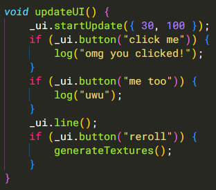
et voila

6 notes
·
View notes
Text
Responsive Web Design and Development: Creating a Seamless User Experience

In today's digital age, where mobile devices dominate the online landscape, responsive web design and development have become paramount for businesses and organizations. With a plethora of different screen sizes and resolutions, it's crucial to ensure that your website provides a seamless user experience across all devices. In this article, we will explore the concept of responsive web design and development and its importance in creating a successful online presence.
Understanding Responsive Web Design
Responsive web design is an approach to web development that focuses on building websites that adapt and respond to various screen sizes, orientations, and platforms. The goal is to create a fluid and flexible layout that adjusts seamlessly to provide optimal user experience, regardless of whether the site is accessed on a desktop, laptop, tablet, or smartphone.
Traditional web design techniques often involved creating separate versions of a website for different devices, leading to higher development and maintenance costs. Responsive design eliminates the need for multiple versions by utilizing a single codebase that intelligently rearranges and resizes content based on the user's device.
The Key Elements of Responsive Web Design
Responsive web design relies on a few key elements to ensure that websites look and function flawlessly across devices:
Flexible Grids and Layouts:
Responsive websites use flexible grids that adapt to different screen sizes. By employing relative units like percentages or ems instead of fixed pixels, elements on the page can resize and reposition fluidly. This allows content to adapt and fit into the available space, providing an optimal viewing experience.
Media Queries:
Media queries are CSS rules that apply different styles based on the characteristics of the user's device, such as screen size, resolution, and orientation. By using media queries, developers can create specific layouts and styles for each device type, ensuring that the website adapts accordingly.
Flexible Images and Media:
Images and media elements, such as videos and audio players, need to be flexible as well. Responsive web design utilizes techniques like CSS max-width property and fluid images to ensure that media content scales proportionally to fit the screen without distorting or overflowing.
Mobile-First Approach:
With the majority of web traffic coming from mobile devices, adopting a mobile-first approach has become a best practice in responsive web design. Starting with the mobile layout and progressively enhancing it for larger screens ensures that the core content and functionality are prioritized for smaller devices, resulting in a more efficient and user-friendly experience.
The Benefits of Responsive Web Design
Implementing responsive web design and development strategies can offer numerous advantages:
Enhanced User Experience:
A responsive website adjusts seamlessly to different devices, providing an optimal browsing experience for users. Content is easy to read, navigation is intuitive, and interactions are smooth, regardless of the screen size or platform used.
Improved SEO Performance:
Search engines like Google highly value responsive design, as it eliminates the need for separate URLs or duplicate content. A single, responsive website consolidates all your site's traffic onto one URL, making it easier for search engines to crawl and index your pages, leading to better search rankings.
Cost and Time Efficiency:
By adopting a responsive approach, you only need to develop and maintain a single website, reducing costs and saving time compared to creating multiple versions for different devices. Changes and updates can be applied universally, simplifying the maintenance process.
Future-Proofing Your Website:
Responsive design ensures that your website is ready for the future, as new devices with varying screen sizes and resolutions continue to emerge. By building a flexible and adaptable website, you can easily accommodate new technologies and ensure your online presence remains relevant and accessible.
Conclusion
Responsive web design and development is no longer optional but essential for creating a successful online presence. By adopting this approach, businesses and organizations can provide a seamless user experience across devices, enhance their SEO performance, and save time and resources. As technology continues to evolve, responsive design ensures that your website remains user-friendly and adaptable, enabling you to stay ahead of the curve in an ever-changing digital landscape.
Source
#AppDevelopment#WebDevelopment#MobileApps#WebApps#SoftwareDevelopment#UIUXDesign#MobileDevelopment#WebDesign#CodeLife#TechSolutions#AppDesign#MobileTech#WebDev#DigitalTransformation#ResponsiveDesign#Innovation#TechIndustry#AppSolutions#WebSolutions#CodeNerds
19 notes
·
View notes
Text
How to Increase Online Sales for Your eCommerce Store
Running an eCommerce store can be highly rewarding, but increasing online sales often requires strategic efforts. Here are ten detailed strategies to help you boost your online sales and grow your business.
1. Optimize Your Website
User-Friendly Design A user-friendly design is crucial for keeping visitors on your site and guiding them towards making a purchase. Simplify navigation with clear menus and categories. Use a clean layout with plenty of white space to avoid overwhelming visitors. Ensure that buttons and calls-to-action (CTAs) are easily noticeable and intuitive.
Mobile Responsiveness Over 50% of online shopping is done on mobile devices. Ensure your website adjusts smoothly on all device sizes. This means using a responsive design that automatically resizes and reorganizes content based on the screen size. Test your site on various devices to ensure a seamless mobile experience.
Fast Loading Times Slow websites frustrate users and can increase bounce rates. Aim for page load times of under three seconds by optimizing images, leveraging browser caching, and using a reliable hosting service. Use tools like Google Page Speed Insights to identify and fix performance issues.

2. Improve Product Descriptions
Highlight Benefits Effective product descriptions do more than list features. They explain how the product solves a problem or enhances the customer’s life. Use storytelling techniques to make descriptions engaging and relatable.
Use High-Quality Visuals Include multiple high-resolution images and videos showing the product from different angles and in use. Visual content can significantly impact purchasing decisions by providing a better understanding of the product.
SEO Optimization Incorporate relevant keywords naturally within the descriptions to improve search engine rankings. This helps potential customers find your products more easily through search engines. Use keyword research tools to find the best keywords for your products.
3. Enhance Your SEO
Keyword Research Identify and use relevant keywords in your product titles, descriptions, and meta tags. Effective keyword usage can improve your search engine rankings and drive more organic traffic to your site.
Content Creation Regularly publish blog posts, guides, and other content that provides value to your customers and improves your SEO. High-quality content can attract and engage visitors, encouraging them to explore your products.
Technical SEO Ensure your website has a clean structure, fast load times, and is indexed correctly by search engines. Technical SEO improvements can enhance your site's visibility and performance in search engine results. Continue Reading... Click the link below. https://www.bharatgo.com/blogs/Boost-Sales-With-Proven-Strategies

3 notes
·
View notes
Text
Navigating Responsive Design: Best Practices for Website Builders
In today's digital landscape, where users access websites on a myriad of devices with varying screen sizes and resolutions, responsive design has become an essential aspect of modern website development. Mastering responsive design involves understanding the principles and strategies that ensure a seamless user experience across devices. From flexible layouts to optimized images, implementing responsive design techniques can significantly enhance a website's usability and accessibility. Let's delve into some essential strategies for mastering responsive design in website development.

First and foremost, creating a responsive layout is fundamental to accommodating different screen sizes. Instead of fixed-width layouts, developers utilize fluid grids and proportional sizing to ensure that content adapts dynamically to the user's device. By employing relative units such as percentages and viewport width (vw), elements on the webpage can scale proportionally, maintaining consistency and readability across various screen sizes.
Moreover, adopting a mobile-first approach is pivotal in responsive web design. This methodology involves designing for mobile devices initially and then progressively enhancing the layout for larger screens. By prioritizing mobile optimization, developers ensure that the website delivers a smooth experience on smartphones and tablets, which are increasingly prevalent among users.
Another crucial aspect of responsive design is media queries. These CSS rules allow developers to apply different styles based on the characteristics of the device, such as screen width, orientation, and pixel density. Media queries enable targeted adjustments to typography, layout, and images, optimizing the presentation for each device category. By leveraging media queries effectively, developers can create adaptive designs that seamlessly adjust to the user's viewport.
Furthermore, optimizing images is imperative for responsive web design. Large, high-resolution images can significantly impact page load times, especially on mobile devices with limited bandwidth. Techniques such as responsive images, where multiple image sizes are served based on the device's screen size and resolution, help minimize bandwidth usage and improve loading performance. Additionally, using image formats like WebP or JPEG 2000 can further reduce file sizes without compromising visual quality.
In addition to layout and media optimization, ensuring touch-friendly navigation is essential for responsive design. On touchscreen devices, traditional mouse-centric interactions may not translate well, leading to a frustrating user experience. Implementing touch-friendly elements such as larger buttons, ample spacing between links, and swipe gestures enhances usability on mobile devices, making navigation intuitive and effortless for users.
Moreover, performance optimization plays a crucial role in responsive design. As users expect fast-loading websites regardless of their device, developers must prioritize performance optimization techniques such as minification, caching, and asynchronous loading of resources. By reducing unnecessary HTTP requests and optimizing code and assets, developers can significantly improve the website's loading speed and overall performance on all devices.
By harnessing the latest technologies and best practices in responsive design, VerloopWeb guaranties your website adapts seamlessly to varying screen sizes and resolutions, delivering an exceptional user experience across desktops, tablets, and smartphones. With VerloopWeb, you can confidently navigate the ever-changing digital landscape, knowing that your website will always remain accessible, engaging, and visually stunning, regardless of the device used to access it. Partner with us today and elevate your online presence to new heights with our expertise in responsive website design.
#website development#web design#responsive web design#website designers#front-end development#website maintenance#dedicated web designer
2 notes
·
View notes
Text
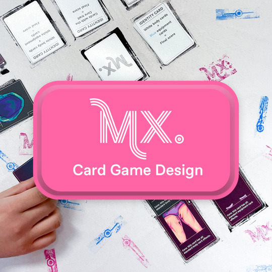
Mx. — Card Game Design
Overview:
“Mx.” is a card game about identity. Players build characters with body and equipment cards to outscore their opponents, but the rules for scoring change with each identity card.
Tasks:
Game Design, Illustration, Player Testing
Tools:
Adobe Illustrator, Clip Studio Paint, InDesign, Paper Prototyping
Team role:
Solo Developer
Project Length:
4 Months
Research & Ideation:
The concept for “Mx.” originated from the tension between queer gender identity and video game character creators, which I concurrently researched for my Capstone paper.
Sources of inspiration:
• Bargain Quest • Bears vs. Babies • Consentacles • Uno
“Mx.," from its initial conception, was a character-building game where players each scored according to different rules, but harmonizing these two aspects required exploration.


Playtesting:
Initial playtests utilized a small group of testers playing 2-player matches, who I assisted throughout gameplay. With early playtests, I wanted to learn:
• Which style of picking up cards created the most player engagement • Explore viability of a graveyard mechanic • The most satisfying overall ruleset • The optimal number of cards in a deck • The best ratio of card types
Later playtests utilized more players and more variations in player count. Throughout tests, I offered no intervention nor assistance to players, instead observing how they interacted with the tools provided. Throughout these playtests, I wanted to learn:
• How easily players understand the rulebook ○ Fix grammatical errors ○ Add instructional visuals to the rulebook • How players interrupt the rules ○ Rework the verbiage of confusing action cards • Opportunities to fine-tune the deck balance ○ Add more action cards that enable player-to-player interaction ○ Add more action cards that allow the player to refresh their hand ○ Add the option for players to discard cards on their turn ○ Add wild cards ○ Add more identity cards
Rulebook Mockup

Mockup template by lcd2020 on Freepik.
Illustrations:
Exploration

Finalized Style

Card Layout Design:
Initial Design

Design Feedback
• Lack of visual clarity ○ Reduce border thickness ○ Scale down the illustration size ○ Increase amount of negative space • Distracting background ○ Darken the background ○ Reduce the contrast and texture of the background ○ Increase the contrast between the illustration and background • Unclear iconography ○ Redesign the icons ○ Utilize simplification • Poor text readability ○ Create a dedicated section for text ○ Change font
Credit to Nancy Nowacek, who helped me pinpoint design flaws and develop methods to overcome them.
Iterated Design Mockup

Mockup template by mockup free.co.
Outcomes:
• Published “Mx.” on drivethrucards.com • Experienced the process of game development from ideation to publication • Utilized multiple softwares towards one unified end goal • Managed a small budget of $200 • Created and maintained a production schedule • Displayed “Mx.” at the 2023 Visual Art & Tech “Outdoor Voices” Exhibition
Post-Mortem
As a capstone project, this card game was the culmination of what I learned and accomplished throughout my undergraduate art studies. Through this project. I experienced the full, unique scope of solo game development.
Credits:
My mentors: Diana Bush and Nancy Nowacek.
My playtesters: Andy Steele, Benjamin Steinwurtzel, Chris Chan, Joshua Jensen, Kyle Forrester, and Savnick Patel.
2 notes
·
View notes
Text
steam blow down silencer
Anpam engineering is a steam blow down silencer that is used to manipulate the noise related to ventilation treatment of gases to the ecosystem. Our Burgess making brand valve and blow down silencer damper can be achieved in a wide range of standard and customized designs used in packages for natural gasoline, steam, air or virtually all different pressurized fuel.
Our vent and blowdown silencer solutions are to be had with non-obligatory designs to growth efficiency and performance, which include single or multiple inlets, multi-level diffusers, and acoustically lined shells or absorbent panels packed with mineral wool packing or fiberglass.. Plus, our designs feature “Advanced Micro-Diffusion,” that may dramatically reduce the silencer length and weight.

For our general valves and steam -blowing silencers, we have SST Silencer dampers. With our considerable revel in designing custom designed Vent Silencers we've applied this understanding to provide you with modern small silencers. With these excessive appearing silencers we will support you with a quick shipping in opposition to a very competitive rate.
Fixed volumes, inclusive of steam drums, air separation gadget, or lengths of pipework which operate at strain can also require their running stress to be decreased by way of a procedure called "Blowing Down".
During this "Blowing Down" technique the fixed volume is depressurised at a fee that is either controlled via a valve, or a calibrated establishment, which limits the price at which the waft is released.
In some instances this blow down is an out of control event because the valve used to block the pressure is thrown extensively open as speedy as feasible so as to achieve the fastest viable stress let down.
This goes with the flow, which is typically, but not usually, from a high strain, will cause excessive noise levels, a good way to be risky to plant employees, and may well be environmentally unacceptable to nearby citizens.
Where it's miles of assistance, we will look at the piping geometry and/or vessel size to determine the premier again strain for the let down timings and noise degrees which you want to gain.
The structural layout of the anpam engineering steam blow down Silencer is given the equal thorough attention as its procedure and acoustic layout, with external forces inclusive of wind, nozzle and seismic masses all being taken into consideration within the design.
0 notes
Text
The Complete Timeline of a Web Development Project, Explained
Building a professional website or web application isn’t a one-week job. From planning and design to development and deployment, a successful project moves through multiple stages—each requiring time, collaboration, and precision.
Working with a Web Development Company helps streamline this timeline, but it’s still important for business owners and marketing teams to understand what happens behind the scenes. Whether you're launching a brand new website or rebuilding an existing one, here’s a complete breakdown of the typical web development project timeline.
1. Discovery & Requirement Gathering (1–2 Weeks)
Every successful project starts with a solid foundation. In this initial phase, the development team learns about your business, audience, goals, and technical needs. It includes:
Stakeholder interviews
Competitor research
Target audience analysis
Site goals and KPIs
Content inventory
You may also receive a project brief or proposal outlining the scope, budget, timeline, and deliverables.
2. Planning & Strategy (1 Week)
Once the goals are set, the agency maps out a strategy for execution. This involves:
Information architecture (sitemap planning)
Feature prioritization
Tech stack decisions (CMS, frameworks, integrations)
Timeline finalization
This is also when timelines are broken down into milestones and dependencies.
3. UX Wireframing & UI Design (2–3 Weeks)
Before development begins, the design team translates ideas into wireframes—basic layouts showing page structure and user flow. Once approved, they create high-fidelity UI designs, which reflect:
Brand identity and colour palette
Typography, buttons, and icon styles
Desktop and mobile responsiveness
You’ll typically review these designs through Figma or Adobe XD.
4. Front-End & Back-End Development (3–6 Weeks)
Once designs are locked, development begins. This is usually the most time-intensive phase and may include:
HTML/CSS/JavaScript coding for the front-end
Framework integration (React, Vue, Next.js, etc.)
Server-side logic, database setup, and CMS configuration
API development and third-party tool integration
Developers often work in sprints, especially for large projects.
5. Content Migration & SEO Optimization (1–2 Weeks)
If you're revamping an old website, content migration is a critical step. Even in new builds, SEO is baked in at this stage:
Migrating blog posts, media, and product pages
Adding meta tags, alt text, canonical URLs
URL mapping and redirection strategy
Page speed improvements and schema markup
Good agencies align this with SEO goals to prevent traffic loss post-launch.
6. Quality Assurance (QA) & Testing (1–2 Weeks)
Before going live, the site is tested across:
Browsers (Chrome, Firefox, Safari, Edge)
Devices (desktop, mobile, tablet)
Screen sizes and resolutions
Functionality (forms, login, search, checkout, etc.)
Agencies also perform performance testing, accessibility audits, and security reviews at this stage.
7. Client Review & Final Revisions (1 Week)
Once QA is complete, the client is invited to review the staging site. This is your opportunity to:
Test the site internally
Flag any issues or edits
Ensure all content is accurate and brand-aligned
A final round of tweaks is made based on feedback before moving to deployment.
8. Deployment & Launch (1–3 Days)
When everything is greenlit, the website goes live. This involves:
DNS updates and domain pointing
Hosting configuration and SSL setup
Backend logins and access control
Real-time analytics and conversion tracking setup
A soft launch or phased rollout may be used to reduce risk.
9. Post-Launch Support & Maintenance (Ongoing)
Your relationship with the development team doesn’t end at launch. Ongoing services include:
Bug fixes and patch updates
CMS training and admin access
Plugin and theme updates
Security monitoring and backups
Performance optimization
Some companies also offer retainers for regular content updates or feature enhancements.
Conclusion
From discovery to deployment, a web development project can take anywhere from 6 to 12 weeks depending on complexity, content readiness, and collaboration speed. When planned properly, each phase builds on the last to deliver a site that performs, converts, and scales with your business.
Partnering with a Web Development Company ensures each stage is handled by experts—reducing delays, avoiding common pitfalls, and launching a product that aligns with your goals from day one.
0 notes