#raster productions
Explore tagged Tumblr posts
Visit Tumblr Blog
Explore Tumblr blogs with no restrictions, modern design and the best experience.
Last Seen Tumblr Blogs


Fun Fact
Tumblr was the first site to host the blog for President Barack Obama in 2011.
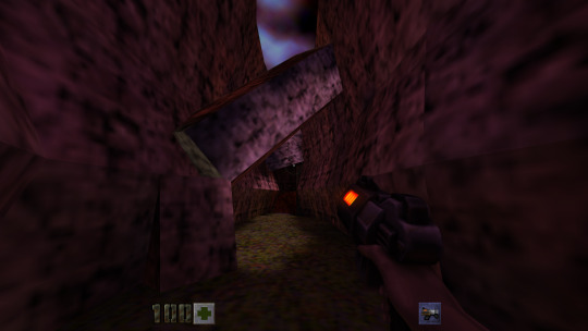
Text

Quake II (id Software, Raster Productions / Activision, 1999) magazine ad for Nintendo 64.
191 notes
·
View notes
Text

" Come one... Come all! "
GamePro Magazine n148 - January, 2001.
94 notes
·
View notes
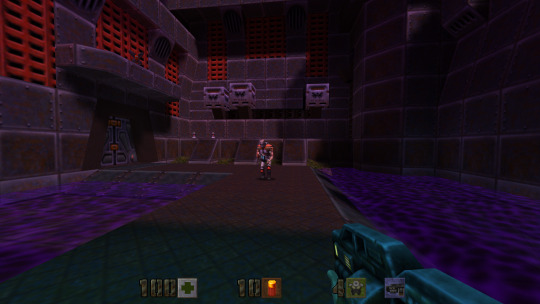
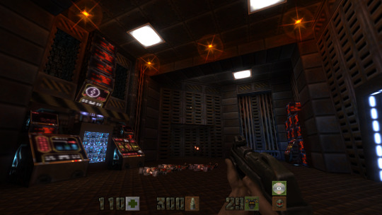
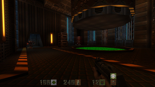
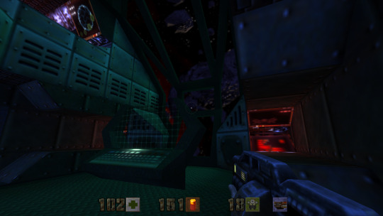
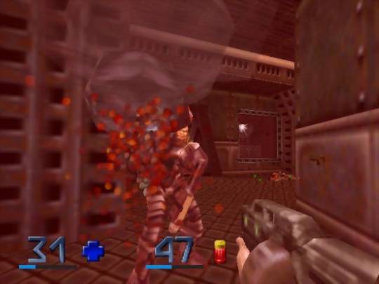
Photo
Experience some frantic classic split-screen multiplayer in Quake II (id Software / Raster Productions, Activision, 1999) for N64.

Grueling dueling during a Deathmatch duet in Quake II, by Raster/id Software.
195 notes
·
View notes
Video
youtube
Quake II 64
Quake II 64, it turns out, not all that great.
Playlist: https://www.youtube.com/playlist?list=PLMOeTsMoezKbXSyIByTXsXlk9_Y-YE0aF
0 notes
Text


Quake II 64 Remastered by Nightdive Studios
#quake#quake ii#nintendo 64#first person shooter#boomer shooter#id software#raster productions#nightdive studios
1 note
·
View note
Text


A L V A N O T O | Carsten Nicolai
raster-noton etc
#alva noto#carsten nicolai#berlin#raster-noton#home studio#studio#audio production#audio#audio equipment#musician#music#music studio#music producers#synthesizer#workspace#creative space#ableton#music producer#black and white photography
102 notes
·
View notes
Text

traced a photograph of mars in Illustrator :P
#not a fan of that program.#SOME colors didnt transfer out of the program correctly >:(#raster > vector because at least WE dont have to buy a color library from pantone#working with adobe products is like trying to force a bucking bronco to obey.#art school#digital art#adobe illustrator#graphic design#mars#artists on tumblr
16 notes
·
View notes
Text
Transform Your Images: Vector Conversion Services

Convert raster images to high-quality vectors with our professional conversion services. Perfect for logos, illustrations, and scalable graphics.
Visit Here:https://www.image2vectorgraphicsindia.com/image-to-vector-conversion-services.html Introduction: In today's digital landscape, high-quality images are essential for making a lasting impression, whether for personal or business use. However, traditional image formats like JPEG or PNG may not always provide the flexibility and scalability needed for various applications. That's where vector conversion services come in. By converting raster images into vector format, individuals and businesses can transform their images, unlock new possibilities, and achieve superior results.
Benefits of Vector Conversion Services:
Scalability: Unlike raster images, which are made up of pixels and can lose quality when scaled up, vector images are resolution-independent. They can be scaled to any size without loss of quality, making them ideal for large-format printing, such as banners, billboards, and signage. Versatility: Vector images are composed of mathematical equations rather than pixels, allowing for precise manipulation and editing. This flexibility enables users to easily modify colors, shapes, and other elements without sacrificing quality, making vector conversion services invaluable for graphic designers, illustrators, and artists. Clarity and Sharpness: Vector images are crisp and sharp, with smooth lines and edges, making them ideal for applications where clarity and precision are paramount. Whether for logos, icons, or illustrations, vector conversion ensures that images maintain their clarity and sharpness across different sizes and resolutions. File Size Efficiency: Vector files are typically much smaller in size compared to raster images, as they only store mathematical data rather than pixel information. This makes vector images more efficient for web use, reducing loading times and bandwidth usage, and improving overall performance. Brand Consistency: Consistency is key to building a strong brand identity. Vector conversion services allow businesses to maintain consistency across all marketing materials, ensuring that logos, graphics, and other visual elements appear uniform and professional across different platforms and media.
Choosing the Right Vector Conversion Service Provider: When considering vector conversion services, it's essential to choose a reputable and experienced provider to ensure the best results. Look for a company with a proven track record of quality and reliability, with expertise in vectorization techniques and software. Consider factors such as turnaround time, pricing, customer support, and any additional services offered, such as file format compatibility or customizations. By selecting the right service provider, individuals and businesses can transform their images with confidence and achieve their desired outcomes.
Conclusion: Vector conversion services offer a powerful solution for transforming raster images into scalable, versatile, and high-quality vector graphics. Whether for personal projects, professional endeavors, or business branding, vector conversion unlocks new possibilities and ensures superior results. By leveraging the expertise of experienced service providers, individuals and businesses can enhance their images, improve brand consistency, and stand out in today's visual-centric world.
#vector conversion services#raster to vector conversion services#image editing services#image editing company india#product image editing services#image background removal service providers#image background removal services#image background removal company#photo retouching service#vector#background#wedding photo editing services#image retouching#image editing
0 notes
Text
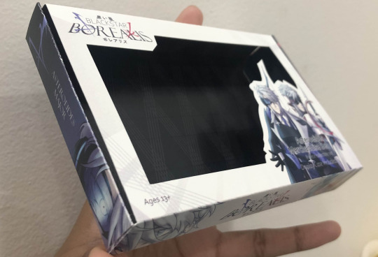
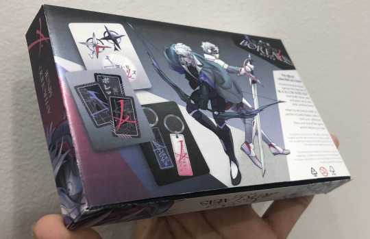
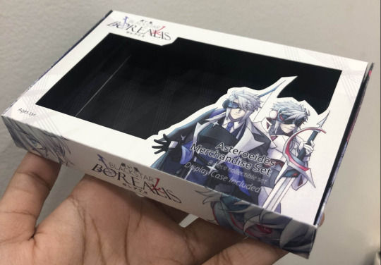
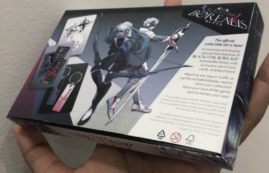
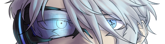
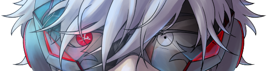
I'm doing product design in school, I loved getting to incorporate these two into project work. They came out surprisingly well in the print, especially considering they were raster and the program I used didn't differentiate CMYK and RGB.
This is an incomplete model case for merchandise of a hypothetical RPG where these two are your main heroes. Gameplay would involve you using both in battle sequences, switching between them to pressure opponents from all ranges.
This is how the illustrations look by the way, I'm really happy with the front cover.
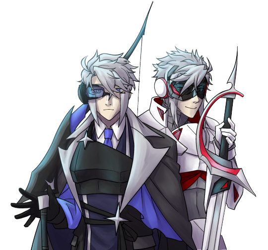
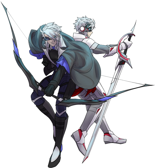
Would you play this?
#submas#submas au#au#ingo#subway master ingo#ingo pokemon#nobori#emmet#subway master emmet#emmet pokemon#kudari#packaging design#character art#character illustration#design mockup#slightly inconvenient timing because the actual submas sygna suit gacha drop just happened‚ but since I can't do personal work right now‚#this is kinda my only way to celebrate them being released#good luck all in getting them‚ I think their designs are very cool!!
159 notes
·
View notes
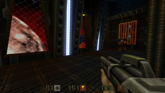
Text
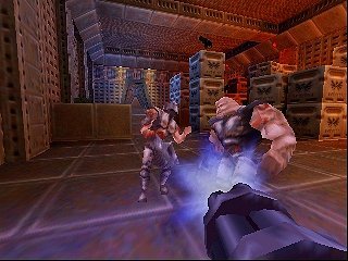
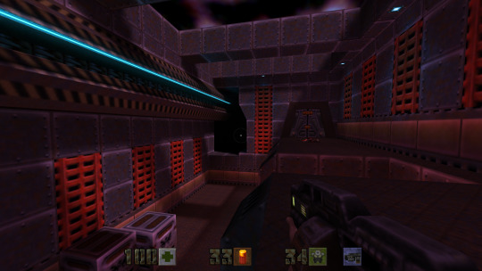
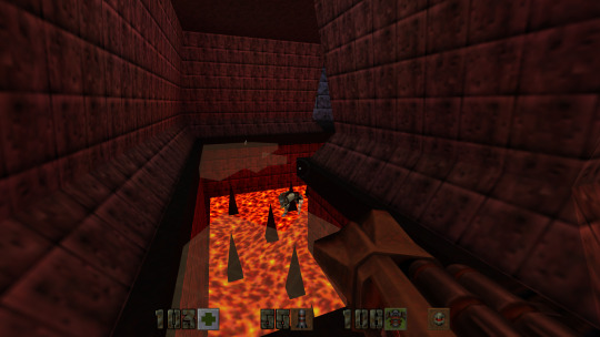
Quake II id Software / Raster Productions / Activision Nintendo 64 1999
213 notes
·
View notes
Text
* ( ❀ ˆ꒳ˆ˵ ) ♡ Ꮺ 𝗧𝗜𝗡𝗬𝗧𝗢𝗪𝗡𝗦 — 𝖯𝖱𝖤𝖳𝖳𝖸𝖴 ੭

— introducing prettyu , the latest template from tinytowns. this can be treated as a banner or pinned graphic &. is an alternate version of my pang! template which can be found here &. is the final product of my super! template series which can again be found here ❀ inspired by manga + comic aesthetics with halftone patterns + playful speech bubbles , though you are absolutely free to take creative liberty &. customize it to your tastes as long as credit to tinytowns is somewhere ❀ experience in photoshop is required to edit this template effectively as it utilizes clipping masks , shapes + rasterizing layer styles to achieve the stroke effect - but help is always available through ask ❀ download link is in the source code + below the read more along with fonts used + icon credits ❀ please consider a like + reblog on this post if you found this resource helpful ( ˘͈ ᵕ ˘͈ ♡) ~
❀ DOWNLOAD.
prettyu! template - here
font used is arista 2.0 alternate - here
❀ EDITING TIPS.
when changing the name make sure to make the first name layer invisible so you can edit the one behind it ( gives it the black stroke effect )
remember to use a mask to crop your model pngs so that they don't spill over the edges ( do this after you've done all the strokes )
to achieve the stroke i did a first white layer stroke of 4 and then right clicked my model png layer + rasterized the layer style , then adding a 1 px stroke of the same grey on the borders .
❀ CREDITS.
sparkle icon - Sparkle icons created by SeyfDesigner - Flaticon
cloud icon - Cloud icons created by Freepik - Flaticon
star icon - Star icons created by Smashicons - Flaticon
folder icon - Folder icons created by Good Ware - Flaticon
flower icon - Flower icons created by Freepik - Flaticon
cursor icon - Click icons created by Freepik - Flaticon
#supportcontentcreators#photoshop#free rpc#free rph#rph#rpc#photoshop templates#muse template#photoshop template#pinned template#ps template#template psd#template#resource#rph resources#rpc resource#free resource#free psd#rph template#rpc template#tinytowns#m: template#m: resources#m: super series
254 notes
·
View notes
Note
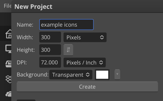
hiii so sorry if this is a stupid question but how do you make icons that aren’t squares? the only canvas i can make Is square 🥲

how to make shaped icons!
no worries anon! things like this can be a little confusing at first, so i get you. let’s get into it!
first thing’s first is creating a new project in photopea. i tend to make my icons 300x300, but it doesn’t really matter the dimensions as long as they match (so you shouldn’t do 750x700, for example.) make sure your background is set to transparent (no worries if you forgot this step—just delete the colored background layer!)
next thing is getting the shape! i tend to use photopea’s shape tool for this, since it’s easiest for me, but you can also just google “circle png” or something. (make sure your image is actually transparent, though. click and drag or click and hold and see if the dotted background lingers or goes away!)
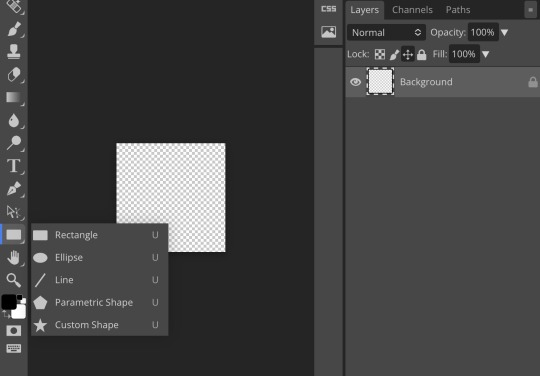
for the first icon, i’m going to use the ellipse tool. feel free to change the color of your shape—i usually set backgrounds later, but that’s up to you. the exact dimensions of this shape don’t matter, but like your canvas, they have to match so the circle is even. click and drag to make your shape
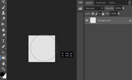
as you can see, my shape isn’t centered just yet—but i corrected that by using the click and drag tool: the one at very top of your sidebar. photopea will center and align your shape for you if you move it towards the middle
now you have your base! time to start adding backgrounds and such things. i used my usual method for the background, but you can do whatever. one thing to make sure for this step is to set all your layers to clipping mask (putting the shape below all your other layers)
to find clipping mask click the button that says layer at the top
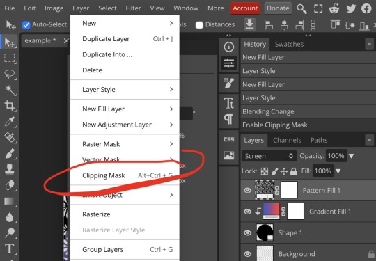
as you can see, my gradient fill is already clipped mask’ed. if for whatever reason you want your layers un-clipping mask’ed later, just go back and click the clipping mask button again. (i’ve said clipping mask too many times. it feels like a fake word.)
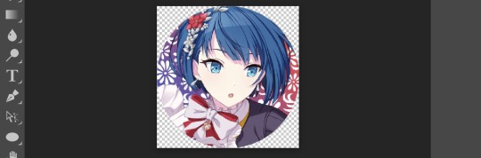
(hello, haruka!) this is how my icon looks so far! everything is clipped mask’ed to my circle. if you’d like, you can stop here, and download your image. i went ahead and added a psd. unless you’re using a color fill later or something similar in your psd, that doesn’t really need to be clipping mask’ed.
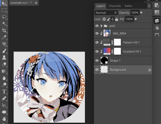
(the psd i used here is really simple and i didn’t save it, but always put your psds in folders, just to make your life easier.)
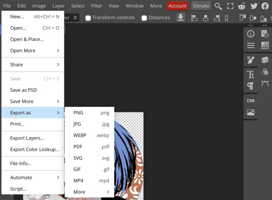
now that we’ve got that done, time to export! make sure that you export as a png. otherwise, your icon will still be square.

the finished product! pretty simple, right? you can use this method for all sorts of shapes. i went ahead and did two other kinds—bordered and faded.
for the border, i copied my original shape (a square in this instance) and switched the fill mode to the icon with an x through it, and switched the stroke mode to a solid color, and set the stroke to seven pixels. i think for bordered icons you can also shift the border so that there’s a space between it and your icon, but i left it where it was this time
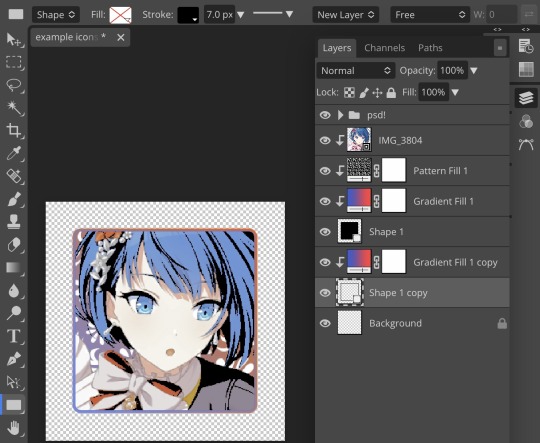
as you can see, i didn’t change any other layers, except that i duplicated my gradient fill! this is the same project i was working on before, just with a different base.

now for the faded icon! i used a heart shape for this, as that’s pretty standard, “but wait! photopea’s shape tool doesn’t have a heart option!” it does, actually! it’s just hidden. click your shape tool and go down to custom shapes. then scroll at the top until you see the little arrow with the star beneath it (which should be as far right as you can scroll.)
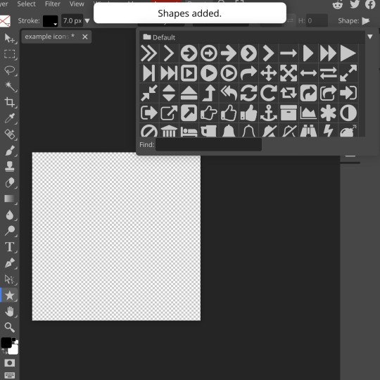
wow! so many shapes!! i scrolled down until i found the heart, and added it. the heart i didn’t worry too much about the numbers—i just adjusted it until it looked nice.
now to make our heart faded! first thing to do is to rasterize your shape layer. make sure you have your dimensions and everything set before you do this, as you won’t be able to correct them after your shape is rasterized.
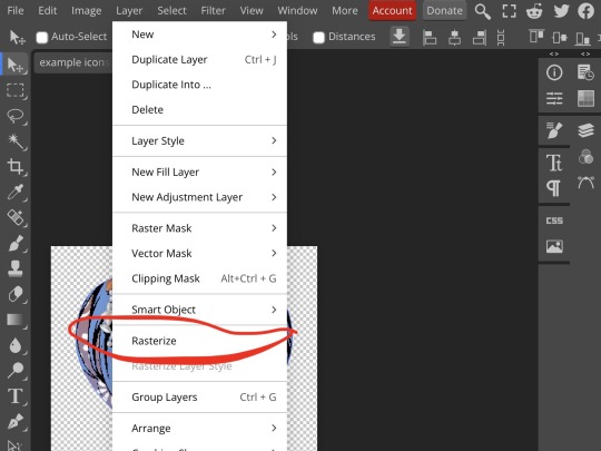
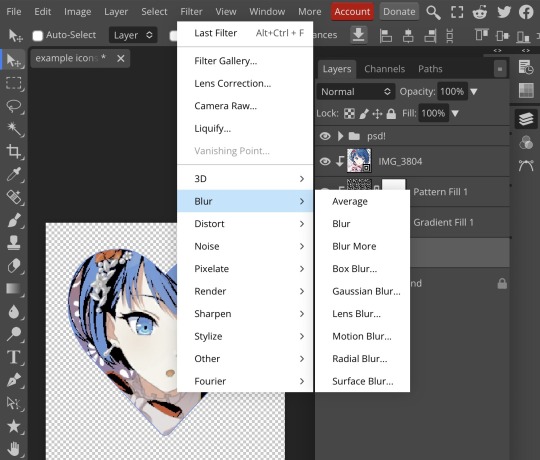
rasterize can be found in the layer drop-down menu, where you found clipping mask. click that, and now you can blur your shape! the blur tool can be found in filter > blur > gaussian blur. you can also use motion blur or radial blur, but i like gaussian blur
clicking gaussian blur will give you one of our old friends the sliders. just mess with that until it looks about right. click “ok” once you’ve got it set how you want it
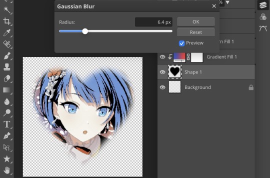
i also adjusted my heart’s sizing a bit by going to edit > free transform and making it bigger. just do what looks good to you!

and there’s your faded icon!
i hope this is helpful!! feel free to ask if you have any questions :3
sincerely, eos
91 notes
·
View notes
Note
Yeah the merch of the R6 kiss is real: https://www.harum.io/products/alien-stage-lineart-badge-set-raster-card-set
honestly this might have not been the best idea... they can do merch of R6 obviously but selling something that focuses solely on the kiss, maybe not...
agreed 🤦
4 notes
·
View notes
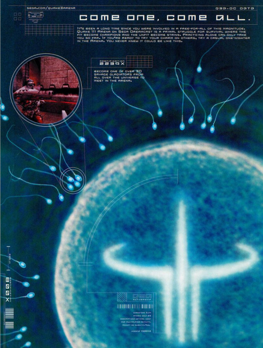
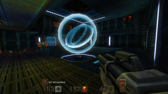
Text
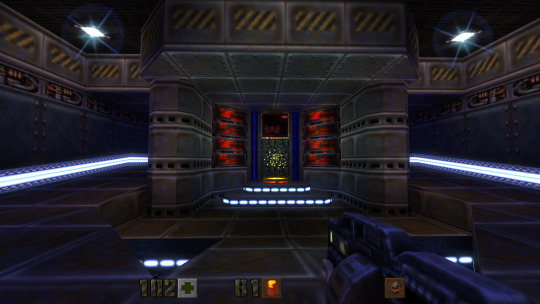
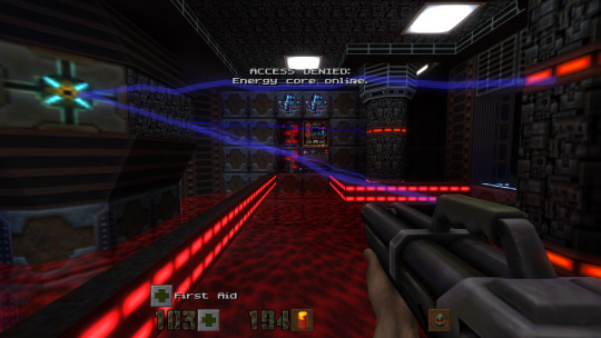
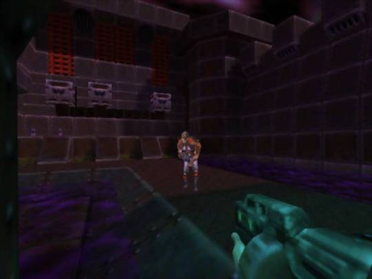
Sega Dreamcast - Quake III Arena (PAL-UK)
Title: Quake III Arena
Developer: id Software / Activision / Raster Productions / No Cliche
Publisher: Sega Europe
Release date: 8 December 2000
Catalogue No.: MK-51061-50
Genre: First Person Shooter


I'm not really into Quake at all. For what it's worth, this game is good, but I really do prefer Half-Life. Oh well, I thought I'd include it here because I found it pretty enjoyable.


youtube
3 notes
·
View notes
Text

#photo manipulation#ghost mannequin#photo retouching#jewelry retouching#shadow making#post production#raster to vector conversion
0 notes
Photo

Sigmar Polke (DE, 1941 - 2010)
Frau mit Butterbrot, 1964
His “dispersion” handmade raster method involved puncturing holes in a screen and pushing paint onto canvas. This rudimentary process seems to poke fun at mass production... -peopleofprint blog
https://www.bloomberg.com/news/features/2017-05-10/sibling-rivalry-erupts-into-160-million-art-auction-showdown
https://www.peopleofprint.com/solo-artist/sigmar-polke-capitalist-realism-dispersion-paint-on-canvas-2/
22 notes
·
View notes