#reading without internet
Explore tagged Tumblr posts
Visit Tumblr Blog
Explore Tumblr blogs with no restrictions, modern design and the best experience.
Last Seen Tumblr Blogs


Fun Fact
Tumblr.com rank in the US is 25.
Text
i miss wattpad
#and with that i mean 2016 wattpad era#pls come back#noads#reading without internet#absolutely banger comments#sometimes i still dream of it#wattpad
2 notes
·
View notes
Note
Do you think being aware of the different elements in art or just ordinary objects can make the process of actually making art difficult? I get that it's about balance and unity of it all, but being introduced to so many concepts early on feels like too much. Almost feels like learning to make art digitally for the first time -> introduced to all these neat gadgets but no idea how to use them or where

This is a crazy good point anon & very important. YES I think it makes it exponentially harder


#Image is random drawing I didn’t really want to post it but posting without images is scary lol#Don’t tell me if I’ve posted it before I don’t know if I have and I don’t want to#PS You probably shouldn’t take any advice from me about this specific thing ever if you value your health#Value your wellbeing please it’s all you have lol. I do not take this advice and it makes me very stupid#Always prefacing my posts with none of this might apply in like a week who cares#no one here even has a clue what my actual ideas about art subject are outside of fanart. They could be terrible you wouldn’t know#Also also if it helps shifting my reading focus to postwar illustrators really helped me stop panicking about meaning#But I know that might not apply to everyone. Illustratory art & fine art discussions are something the internet has kind of lost#when it used to be a very pivotal to the art scene for a long time & still is to an extent in reality#anyways it means something different to everyone I won’t get into it but just in case anyone wants my ubersubjective cents#I just think you’re very very good anon you’re asking me good questions. That’s a very good thing to think about#ask
244 notes
·
View notes
Text
If lois lane has million number of fans i am one of them . if lois lane has ten fans i am one of them. if lois lane has only one fan that is me . if lois lane has no fans, that means i am no more on the earth. if the world is against lois lane, i am against the world. i love lois lane till my last breath.. .. Die Hard fan of lois lane. Hit Like If you Think Lois Lane Best journalist & Smart In the world
#rimi talks#people will just say anything on the internet. without even reading a comic book. get behind me lois (she won't)#(she will fight her haters hand to hand herself)#lois
220 notes
·
View notes
Note
hii! i hope youre having a nice day, and thank you for chapter 125! i was wondering if, by any chance, you have a compilation of all the credit pages you typically put at the end of each chapter? i love reading the extra info or translation notes you sometimes put at the end and i saved a couple of my favourites that i thought were really interesting, but i never thought mangadex would get nuked </3 i was hoping to find your credit pages in the gdrive folder but i couldnt find them :( thank you!
AWWWW IM GLAD SOMEONE ENJOYS THEM 🥹🥹🥹 i do spend a good bit of effort coming up with something interesting for them
also i deleted the ones before 115 off my pc at some point to free up storage space (bc i was saving them as pngs and they were taking up 10mb each LMAO ive since switched to saving as 200kb jpegs lol)
so i had to go to manga sites to scrounge them back up LOL
anyway theyre now uploaded to the gdrive enjoy o7 (ch 90 to 125)
#asks#an extra peek into my brain:#you might notice at some point i stopped directly pointing out connections to past chapters - this was very intentional#i feel like its a lot of fun to have a 'aha!' moment when you realise a connection#and i felt like i might have been robbing people of that by pointing out the connection in the credits page that comes directly after the#chapter without giving readers any time to stew over it#but now i have to see ppl have internet reading comprehension moments and act like connecting plot points that are clearly meant to be-#connected is some kind of crazy wacky theory#so thats the price i had to pay i guess#hey guys this has been a psa. exercise reading comprehension once in a while. it does have applications outside of school and you might fin#its quite fun to think a little harder about the mangas youre reading
49 notes
·
View notes
Text
kudos don't determine worth
#such Opinions on the internet today#you and your writing are so much more than a number!!!#unpopular opinion but I'd like a site without stats at all#I know I know - I'm a writer too I get it#but imagine if you didn't go in with that bias#and could just select something because it sounds neat#I prefer that to people asking when a fic is 'good enough' to read#fandom#oh btw there's a post about this making the rounds#you'll probably see it at some point#just...sigh.#those posts
180 notes
·
View notes
Text
Fellow fans
I have come to make a deduction. And noone may change my mind
Behold my theory: genderbent Anaxa is Hatsuna Miku


I rest my case
Thank you for listening to my Tedtalk (about my wife (/J)
#digitlvoidheart#void rambles#Honkai star rail#Hsr#Hsr anaxa#Anaxa#Anaxagoras#Hsr anaxagoras#Miku#hatsune miku#I'm joking but honestly#Do yall see it??#My wife is hatsne miku if he swapped genders#He can be an idol too#I'm kidding since the evidence is only fr his sleeves and green hair#But I couldn't stop laughing the moment this impulsive thought hit my head#I HAD TO SCOURGE THE INTERNET TO FIND HIM WITHOUT HIS COAT FOR THIS YOU KNOW?#😂 Anyways have a lovely day yall#If u read all my tags
49 notes
·
View notes
Text
I love how whenever I see people discuss wyllstarion, in the context of "justifying" why one ships it, there's always that of why Astarion would love Wyll, extensively; bringing up that Astarion said he used to dream of marrying men like Wyll, or that Astarion said wants to feed off of Wyll, or that Astarion would want someone chivalrous and kind who would put his needs first and who would respect his boundaries and his past. Astarion is the fave white boy and so he's shipped with many different people, and this is how people who ship wyllstarion express why he'd choose Wyll. But I almost never see extensive explanation of why Wyll would love Astarion, because of course he would. Of course he'd love Astarion.
#THIS IS JUST AN OBSERVATION oh strangers on the internet NOT an ANALYSIS. I'm smarter than this.#Also check my reblog for more explanation bc I think ppl are misunderstanding lol#Sorry not to post about gay boys on main but I think about them a lot#Shadowzel are my faves I promise this was just on my mind#More in tags if you'd like to read them#Wyllstarion#wyll ravengard#astarion#Bg3#baldur's gate 3#baldurs gate 3#bg3 wyll#bg3 astarion#astarion x wyll#wyll x astarion#Something something Wyll loves as easy as breathing and Astarion doesn't need to breathe but he still does#The reasons why Astarion clings to what he does and wanting Wyll who would keep fighting to hold onto what he loves#And Wyll holds on like it's second nature. Like he thinks it's his only choice.#The duality of people needing to explain why Astarion would love Wyll#while also acknowledging that Astarion wouldn't accept that Wyll loves him back without enough reasons#In fics Astarion needing Wyll to spell it all out for him while people acknowledge in discussion that Wyll just loves him. Of course he doe#there's obviously more to the appeal of them than just this of course#Wyll being the monster hunter who fell for a monster#Astarion having been soulless under cazador's control and technically heartless because his doesn't beat#but Wyll's does so freely#like of course Wyll would love Astarion. kind gentle gracious too-forgiving-for-his-own-good respectful loving Wyll#but astarion needs convincing that he has anything worth loving#and wyll would do it#he'd want to do it#Wyll finding no fault in anyone but himself and Astarion snapping him out of it with his no-nonsense ways
315 notes
·
View notes
Text
hmm call me an Erik apologist all you want, but after thinking it well, i think the complaints people have about "sexy phantoms" and how "adaptations never adapt POTO well, they romanticize the story too much, it's a horror story not a romance" are kinda...unfounded?
Yeah you can make a potential argument about adaptations missing the mark, removing the deformity from Erik (which shapes Erik's whole character), and that...But also...how much is this true, and how much this has been exaggerated by really one or modern interpretations?
And i wonder...is it really? Phantom has had such a number of different adaptations all over the years, from different creative minds, and each of them presented a different view on Erik. Do most of them not adapt the book? Yes (as in no birth deformity, no Daroga, no scorpion or grasshopper, etc etc). Do they really change the main themes and mood presented in the novel, turning it more erotic? Are really all adaptations with a "sexy Erik and cucked Raoul!", as critics state? Heem, let's take a look.
We'll mostly analyze the big film adaptations, since Phantom has been told over and over again in different books, comics, videogames, tv shows, and it would take us A LOT to go through every one (also let's be realistic...we have to analyze the most "well known" Phantom adaptations so to see if the critics' words hold some water. I don't think it would make much sense to point out a Phantom adaptation that has these elements but like...only four people know of it lol)
Lon Chaney...Nope. Erik was still deformed, and the few sympathetic traits he has were erased to give him a boring clichéd "kill the monster" ending, going against what the book stated, where Erik dies of a broken heart and not lynched (curiously, how the same people that go "we must portray the book accurately, not show him sympathetically" don't mind this change, huh)
Claude Rains...Nope. Still ugly, dies by the end. No sexuality. Even the "love triangle" element is changed so that it focuses on Christine and her being annoyed by the two Raouls.
Herbert Lom...Still ugly and dies. This adaptation even cuts his attraction to Christine yet keeps his obsession with music, even cuts down his biggest crimes to lay it on the hands of his sidekick (imo this is probably the most "sympathetic" Phantom, imo, since he's interpreted as an artist who had his art stolen, only wanting to "get back" at the thieves; but nobody talks of him when discussing sympathetic Phantoms)
Phantom of the Paradise...Still ugly, loses, but like Herbert Lom, redeems himself through death.
Maximillian Schell...Ugly, dies by the end.
Cartoon - Ugly, dies, Christine doesn't go with him. This is the most book accurate novel but in another angle, haha (Daroga is here, death's head, abusive mother...not exactly what the smart ass critics want ;)).
Robert Englund...Ugly, loses, doesn't get Christine...In fact I'd claim this is probably the most villainous version of Erik, turning him into more of a Freddy Krueger clone than the complicated character Erik truly is. Really amps up the horror for all those "IT'S A HORROR STORY" smart-ass critics if they're so desperate for an "accurate" version (Erik didn't flay people in the novel, iirc, so, so much for "being accurate to the novel"!)
ALW-verse / the musical / Gerard Butler film / Love Never Dies / Phantom of Manhattan (i'm placing all of this in the same venue because basically, it's really the same universe / canon, ergo we're really talking about the same intrepretation / the same creator). Ugliness is there, but sorta downplayed...This verse often ends with Erik and Christine getting together...yup, this is the one version where the criticism is legit.
Charles Dance / Yeston Kopit musical / Takarazuka (again, same universe, same creator, same interpretation). Possibly the nicest Erik yet, but he's still deformed, and he still doesn't get Christine. He's sympathetic, a little romantic, but I don't think it's on the same league as the sexuality present in Point of no Return's lyrics or Gerard Butler's open puffy shirts.
Susan Kay's novel - This one is interesting because it takes a lot from the musical (i'd argue even more from that than the novel), and then influenced the musical and future iterations of it (this novel amps up the sexy angle A LOT), so I'm not sure to categorize it as its own thing or added to the musical verse. But, still...it follows the plot points from ALW (and elements we see in future installments of ALW's POTO, like the secret child, first appeared in Kay, i think, based on publication dates), yet Erik is still hideous, but his sexuality is present in the novel...as well as his murderous tendencies. This is the one version that combines elements of both horror and sex, imo.
Dario Argento - for fuck's sakes, nobody likes this version, lol, and even the normies don't know of it. BUT ANYWAY, IF WE'RE GONNA MAKE THE COMPARISON....Not deformed, "gets Christine", in a way, but woof this version also amps up the horror and has the most unlikable Erik of them all imo.
And everything else...Do people really care or know about those versions? Wishbone's or the other musicals, or the ass long number of books? Not really...
So really...the number of Phantom adaptations that have a "sexy, romantic" Erik can be chalked up to 2-3...against all the other adaptations that keep the horror elements or have Erik still looking horrible. And the great majority of them keep it in canon with the original ending- ea Erik dies and Christine goes with Raoul (it's really only Kay's novel and LND that have the "sexy Erik cucks Raoul" interpretation...and LND has always always always been mocked and rejected by the fans)
So it's people really throwing a tantrum over the ALW version being popular, really. (And i'm really curious how they don't mind when Erik is turned more villainous, like in Lon Chaney or Robert Englund's version, even though those are also inaccurate to the novel. (Erik wasn't a sexy doomed hero, no, but he also wasn't this Freddy Krueger bastard.) Funny that).
#poto#phantom of the opera#poto meta#gaston leroux#erik the phantom#erik poto#erik phantom of the opera#erik doesn't work with a one dimensional adaptation- he has to be both wonderful and terrible and heartbreaking#the reason i don't want a phantom adaptaton nowadays is because before you could get away with a simple portrayal#nowadays with righteous cynical buzfeed internet culture a bad interpretation will leads to years long shallow analysis and fandom witch hu#witch hunts- without people ever reading the book but considering themselves 'experts' by analyzing pop psychology into the musical bleh#mine#unless you have a psych degree or criminal psychology don't armchair diagnose fictional characters mmmkay?
32 notes
·
View notes
Text
If you told me in 2012 that College Humor, Smosh, and a brand started by some dudes from Buzzfeed are some of the most diverse and inclusive places on the internet I would not have believed you
#don't come at me I know they're not perfect#but 2012 me couldn't imagine ANY streaming service where representation is abundant and casual#MULTIPLE queer people on a show without it being their whole thing? MULTIPLE POC in a show not based around them?#clips of ACOFAF got me into dropout and then I learned the joys of everything else they have#saw clips of Without A Recipe: The Totally Normal Season and was intrigued by them replacing scandal man with cartoon animals#Vic and Zac were on TNTL on Smosh and now I watch some of their content too#but the idea of 2012 me randomly selecting an episode and having at least one queer person who happens to be there#without it being the only reason they're there#yes I know it's dropout now#I think what gets me specifically is there's a ton of diverse and inclusive content on the internet#but usually it was created with that idea in mind#idk it's just surreal sometimes I remember reading College Humor articles in middle school and now I have a yearly subscription#I remember when Korra held Asami's hand and we all lost our minds#because that didn't happen! you didn't get hints like that unless it was queerbaiting!#by places on the internet I mean mainstream (to a certain definition) video content creators#do not cite fanfic/fandom/LJ/whatever at me I was there when it was written#dropout#smosh#2nd try#yes I said something#thought about this recently and I truly don't think my younger self would have understood
24 notes
·
View notes
Text
Cover Artstyle Ramble
So for @enchantingmirage (and anyone down to watch me unpack all my art school notes in a chaotic pile), here's an art tech ramble about the TS artstyle :3
(For the record I'll be focused on just the covers for this ramble, makes things easier to ramble about tbh)
Okay so I'ma start with color since that's the first thing people peep at when they do something like this. Color theoryyyy yippeeeee
So in color theory there are three values to focus on: hue (the thing people learn about when learning the colors of the rainbow), saturation (how much of the color something has-- the less saturated, the less color it has and the closer it is to being monochrome), and value... is the first thing I'm gonna demonstrate :D
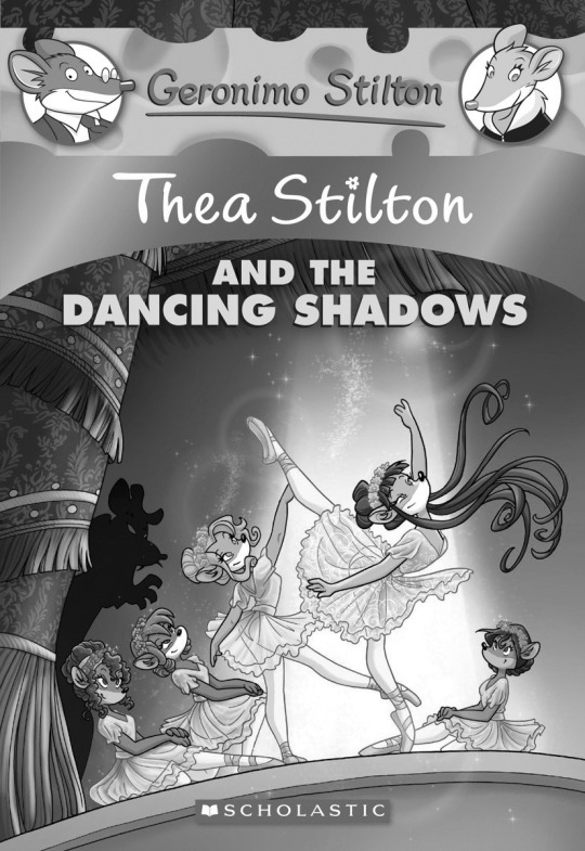
So value is basically where the colors lie on the black-and-white spectrum, and as you can see here with Dancing Shadows, the values are light near the center with the girls, but it's balanced out by the darker values near the edges. I'd even dare say the girls' own bodies and outfits balance out each others' values-- their fur and hair is at least a little darker than their outfits, allowing their outfits to pop more, while also balancing the light values with something darker so it's not overwhelming.
This sense of balance is very much important and is very much key to a good rendered piece and how a new viewer will perceive it. We as humans always base our judgment on something else, even when that something else is in the piece itself; so a skilled artist will know how to use that to their advantage and direct the viewer's gaze through a piece as they may intend it. Which is getting into composition territory but that's a discussion for later. What I'm getting at is that the balance of light and dark help accentuate what the artist wanted to be highlighted in this piece, and helps the darks feel dark and the lights feel light.
For comparison, here is the new Fireflowers cover in monochrome.

And I don't even know where to start talking about this one, which is a problem with the piece :D
All the colors are so vibrant when you look at them on the raw picture, but when seen like this, where the values are the only thing to focus on, they're all more or less the same in terms of value. As the site I used to edit this only offered a little thumbnail preview of the edited version, I was only able to look at it in full when I put it here.
And my first thought was it all looks the same. It's all the same-ish shade of grey, and even the dark hues of Violet and Paulina's hair is either overshadowed by highlights that nerf its darkness, or it's just so small or shoved into the back that it's not even noticeable. I guess the darkness of the sky above does something, but it just leads you to the title text, and it itself isn't enough to balance out just how bright everything beneath it is. It kinda just leads you to the title text, and when you ask it how to process everything beneath the title text, it just says "good luck" and retreats to its cubby hole at the very top of the cover.
EVEN THE VOLCANO LOOKS BRIGHT EVEN THOUGH IT'S IN THE BACKGROUND WHAT IS THIS
The thing this cover is lacking is a sense of contrast. The reason why Dancing Shadows looks fine while the new Fireflowers doesn't is because of the contrast one has and the other doesn't. Dancing Shadows has enough shadows and darker values to make the lights pop more, while new Fireflowers just has grey grey grey grey, making it really hard to pick something to look at without it feeling weird or unnatural. I'm stuck between trying to get Violet's ukulele out of my face, or having to reconcile the fact that the first thing I thought of when I saw that volcano was a nuclear power plant.
The other side effect of it is, all the colors are so bright, that nothing stands out! Even the fire, which is so small it looks like Nicky spent too much time staring at pookie to maintain it, but also it doesn't look bright at all-- it's just about the same shade of grey as Pam next to it or the ocean behind it.
Now that's values, let's move on toooo the main meat of color theory: mushing colors together.
Now the most beginners will probably know is warm and cool colors tend to go well with fellow warm or cool colors, and then occasionally a movie poster will blindside everyone by making two clashing colors mix together perfectly (see the Marvel Infinity War and Endgame's obsession with blue-purple mix with orange, and the Wicked movie posters). Why do they work together? Well, that's a complicated question that can be simplified on a color wheel :D
We are gonna have to go a bit into detail about colors here because it is gonna add an extra layer to this. If you grew up on Barney and heard them sing the song about mixing colors, you're already halfway there-- when you mix red and yellow it makes orange, when you mix blue and yellow it makes green, when you mix the two you'll see a new color magically, when you mix red and blue it makes purple (🎵 nostalgia🎵). Red, yellow, and blue are the three primary colors you mix together to get orange, green and purple (the secondary colors); however, you can go further with this. If you adjust the ratios between the primary colors you're mixing (say, more yellow than red when making orange), you get tertiary colors (and a happy Crayola dandelion girl) :D

Now, that's colors. How does one mix them together without looking like barf? Buckle up because this is where things get technical.
The easiest way to get a color scheme is to just pick a color and go to the colors on either side of it on the wheel. This is an analogous color palette, it's the most common, Hollow Knight is obsessed with them if you need an example to look up; or if you're looking for an in-series example, Violet and Thea's regular outfit palettes involve analogous color schemes.

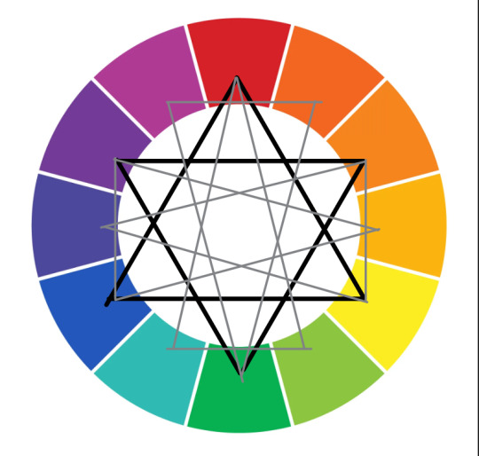
Another way is to grab the color on the opposite end of the color wheel and pair the colors up together. This is called a complementary or contrasting color scheme, and it's more difficult to use, but used right it can look really good. Colette, Nicky, Pam, and Paulina have complementary color schemes in their color palettes and they slay in them, and yes this is the reason why someone thought spamming red and green on Christmas was a good idea.
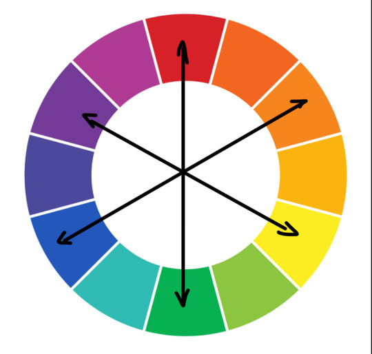
And there's every way you can fuck around with a triangle to make some triadic and even tetradic color schemes, and-- I'm not gonna lie I usually don't fuck with those because they're hard to pull off and they kinda scare me, so the tl;dr is there's a LOT that goes into picking colors and deciding what does and doesn't match, and even this demonstration I have for you isn't even the most complex this can go-- after all, we aren't taking values into account with this example.
ANYWAY, what I'm getting at is, by combining this section of color theory with values, you can make colors that look good together, but also make characters' color schemes portray their personality better through what colors they use (blah blah blah colors having a tendency to represent or invoke certain emotions in the viewer, even more so when put together in certain contexts).
Oh and uh I just realized I forgot to explain saturation a bit, uhhhhh slaps this here
This. The bolder the color is, the more saturated it is, and the paler it is, the less saturated it is.


As you can see here, there's a good chunk of variety with what the girls can do with their hues, values, and saturations to make colors fit together better. Especially with colors more separated on the color wheel, using this knowledge on hues, values, and saturations does help in making things not feel monotonous (figuring it out in a way that works for you does take practice tho).
For example, Paulina's dark teal (?) is less saturated than her orange, allowing the orange to pop and the teal to take a backseat supporting role. In contrast, Colette's colors are all relatively on the same values, but so they don't feel too out of place, the biggest details in blue are separated by a pale pink outline, as a sort of break to help the colors feel like they fit together better, and also give your brain a millisecond or so of break from all the same-y values.
Ooh and this is most prominent in Pam's kimono here, but one way to deal with a triadic is to play with the values and add variations and such. I believe there's a 60-30-10% rule with a character's color scheme in regards to the three colors you want to give them? A big main color, a second color for skin or something or other that doesn't occupy the majority of the palette, and then a third color used exclusively for little trinkets and highlights. Just throwing that one out there.

As for this? .... Eeeehhh?
Once again the girls are too bright, the seafloor's values are so bright they're detracting from the girls, the girls' values are too similar to the background boulders and cliffs and thus they're blending into them, and everything is saturated to high heaven with barely any respite from it, and I haven't even GOTTEN to how the little highlights in the girls' hair keeps jumping at you so aggressively o<-<
Even PAM looks way too saturated, what is this
Now as for this
This one is nice. I didn't really mention it before, but one way the old covers allow you to focus on the girls organically is to paint the background in a more rendered, soft, watercolor-y type of coloring; while the girls have more variations in value and are cel-shaded (think like every cartoon show or anime you've seen-- most of the time they're cel-shaded) that set them apart from the background and allow you to focus on them better. It also helps that the linework on the background is a dark blue (matching the blueness of the background in general), while the girls' lines are black, which allows the background to blend in and the girls' bright and bold colors and values stand out.
Alrighty I think that's enough of color theory, next part: composition and shapes :D
Okay so there are a lotta ways this can be done, but the gist is there are certain ways you can measure/arrange things in a picture to make it look aesthetically pleasing, and even guide the way other people look at the picture. You may not realize it, but looking at a picture is more than just the initial glance: your eyes move from one side of the picture to another, processing parts of the picture at a time to contribute to the first glance where you got to take in the picture as a whole all at once. And this is a subconscious thing most of the time, so there are ways you can gently usher the viewer's eyes to look at the picture a certain way, and to focus on certain focal points.
The most prominent way this effect is noticeable is through comics, where text and pictures have to be processed simultaneously instead of the block-of-text-with-picture-on-the-side in illustrated textbooks. Though it is a different genre of composition altogether, it still is the most obvious way you can see how arranging things can make you see things differently.
Here's a shot from a Marvel comic (Judgment Day), as an example: first one is the raw, and in the second I draw a line denoting the line your eyes trace when taking in the picture. Feel free to let me know if it's accurate, haha.
As you can see, the placement of the narration boxes and how the characters are positioned in the shot do affect how the page is seen by the reader, and there is so much to discuss alone in how you can set this up:
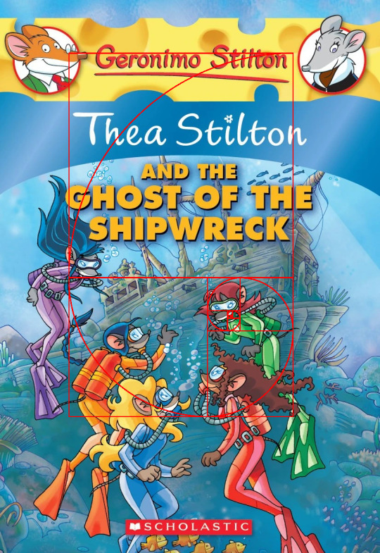
First you need a clear focal point(s), the thing(s) you want the viewer to look at the most. This will be the basis off which you'll base practically everything else in the shot. To use the previous covers I've shown as an example, Violet is the focal point of Dancing Shadows's cover, the volcano (?) is the focal point of Fireflowers's redesigned cover, the shipwreck is the focal point of the original Shipwreck cover)-- you get the picture, if you feel like one of the girls or a certain thing is popping off the most or is the most memorable part of the cover, it's most definitely the focal point.
Now that you have the focal point(s), you need a way to lead the viewer's eye towards it/them. Making it contrast with everything else (i.e. one red pencil in a case full of blue pencils), giving it the negative space to stand out in (one pencil sitting flat on an empty table), drawing attention to it via camera focus (pencil is closest to the camera and is most defined while everything in the background is blurred out), setting up the camera angle (looking up the pencil towards the lead from the butt end to make the pencil point point menacingly), or something to balance it out (putting an eraser next to the pencil so it's not lonely in the pencil case)-- many different ways to bring focus to the focal point :]
Now yes the stuff I said above is used to draw attention to the focal point, but that's the pretty obvious stuff. Time for the subtler stuff to make the aesthetic aesthetic-er :]]]
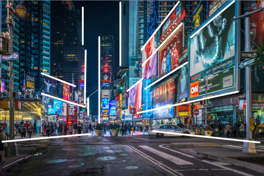
Leading lines is when you set up lines in the background that lead to a focal point. This shines especially in urban shots-- looking down a street lined with houses or cars (or anything, really), you can't help but look forward towards the end of the horizon in your peripherals is pointing-- and it's also the basis of 1, 2, and 3-point perspectives, as you literally draw everything using points in the canvas as a guide for where to draw your lines. Here's a picture of Times Square, and I can almost guarantee you that you were looking to the blank space near the center, or the skyscraper next to it because the posters and buildings on the sides and even the people were inadvertently leading and framing your gaze in that direction.

For a Thea Stilton example, Mystery in Paris's cover has Colette as the focal point, and the cover uses leading lines to draw your eyes towards her. Yes, the stage's 2-point perspective comes to a corner that's sitting right next to her, she is set up in the shot to be the center of attention-- the way she's at the very front and the tallest in the shot, the spotlights shining on her, even the girls' eyelines and waistlines point towards her!

Next up is rule of thirds, which is the one photographers and photography professors are obsessed with (sometimes excessively so), and the reason why every time you edit and crop a picture, there's a 3x3 grid that shows up as a guide. Generally speaking, it's been found that the most aesthetically pleasing/easy on the eyes way to set up a picture that's off-center is to have it such that the subjects are at about 1/3 away from the edge. Prince's Emerald here doesn't fully adhere to it (it's not a super-strict rule), but as you can see, Nicky, the elephant, Paulina and the monkey's emerald, even the building in the background are spaced out to fit the 1/3s lines rather well and Paulina's hand and braid and the elephant's trunk and Colette's eyes and the monkey serve as leading lines towards the emerald

And the most complicated in theory and in execution (and the hyperfixation of mathematicians in particular), the golden ratio or phi (φ).
The story behind phi is that Euclid the father of geometry in ancient Greece managed to figure out that there's a way you can divide a whole such that if you added the halves together, they'd be of the exact same ratio that the larger half is to the sum of both. This resulted in the A paper sizes (A0-A8), and a time-transcending mathematical hyperfixation as people began to supposedly see this ratio everywhere in nature and even in geometric theorems that don't seem related to it at first glance. (see Alan Becker's Animation vs. Geometry video where phi is literally the main character alongside the orange stickman.) Seriously people are claiming that the Mona Lisa has it, the human face has it, flowers have it, butterflies have it, the goddamn Parthenon and Taj Mahal have it, the UNIVERSE ITSELF is it-- some of them are stretching it ngl haha). For a while people were calling it (among a lot of names with the word "gold") "the divine proportion"-- the hyperfixation was VERY strong with this one.
Anyway, with the mathematical hyperfixation with phi going incredibly strong, it was only a matter of time before the artists realized and caught onto it. Because artists are nerds /aff. I found it really hard to find a Thea Stilton cover that does have phi in it, but these are the closest ones I could find? I guess? They're not exact-- like I said everything up here is a guideline not a rule and thus you're not required to follow them to the letter-- but I still feel like I had to really finagle it around just to make it fit. I mean I guess Shipwreck's redesigned cover has the girls in a more explicit golden spiral but eehhh it's les subtle there and it's not that well executed imo. The main gist is cool converging spiral = phi-coded. If you want to see a piece that really follows the golden ratio almost exactly, Great Wave Off Kanagawa is one of them (actually there's a whole Wikipedia article listing down every single artwork that is designed with phi in mind, if you'd believe that)
(Fun fact actually, I've heard that rule of thirds is technically just an oversimplification of phi. Understandable because good lord.)
And that's what I know :D and from what you may have noticed if you've been looking at the covers closely, some of them do have multiple of these concepts mixed together! The original Mystery in Paris cover does have a bit of rule of thirds in it-- Colette and the Eiffel tower are spaced such that they're positioned roughly 1/3 away from the sides of the cover, Prince's Emerald has leading lines directing you to the emerald-- Dancing Shadows has a combination of all three of them! Leading lines throughout the entire picture leading towards Violet the focal point (including the spotlight, which I forgot to mark down haha), Violet falling under rule of thirds, and the girls positioned roughly in a golden spiral formation.
So yes a LOT of technical stuff goes into composition, and it really does a lot to make covers (and illustrations in general) look good, alongside a lot of eyeballing.
So with that, let's roast the newer covers :]

Here's Fireflowers's redesign for example, and well, there's already a handful of issues. For one, it feels too crowded. Because Violet and Colette together take up almost half of the entire page, Nicky, Pam, Paulina, and the background have to lump together into the other half, resulting in this crowded feel. The focal point is the volcano on paper, but because Violet is so close to the camera, it means she's competing for the viewer's attention, especially if you consider the fact that the volcano is too far in the background and has Nicky and Paulina blocking it. Having the girls all looking at the volcano to serve as leading lines doesn't really help much, either, because it means your eyes settle on the volcano in a very uncomfortable way (and all you can think about is how the volcano looks like those big smokestack columns at radioactive processing units.
The new covers in general seem to have this obsession with the girls' lines of sight being the leading lines for focal points, but cranked up to the extreme so literally the only leading lines in the covers is them looking in the direction of the thing, maybe even point if they're feeling adventurous that day. It's not bad on its own, but when it's the only way you make your focal point?
I'm realizing I didn't mention lighting in composition, but lighting has a big part in this, too, in that it's a perfect way to set up a focal point. Dark background, bright light, bam, bright light is focal point. The thing is, though, you need to set up the dark background to make it work-- something the new cover seemingly forgot to do. Because everything is so goddamn bright all the time, it makes it really hard to make sources of light any brighter than everything else. I am genuinely curious just how many renditions of the screen layer the colorist had to do before throwing in the towel and being like "yeah close enough". Someone please tell him overlay layers exist, no night sky lights up the environment like a million lumen flashlight. Let the fire shine, give the girls and the environment a bit of yellow and orange in their highlights please.
Even then, though, they really need to make something that isn't the night sky darker, otherwise literally nothing is gonna stand out besides Violet to the left. Right now, everything is too bright, and no amount of the girls staring and pointing is gonna fix the fact that the volcano looks SO unthreatening and out-of-place.
Here's another example, not a redesigned cover but the cover of Ghost of the Woods. Feel free to try drawing your own conclusions on it before I break it down haha:
Okay so while I do like the setup of the girls biking away from what looks like a haunted house, there's way too little emphasis on the haunted house! It feels like the house should be the focal point since it's the vanishing point the girls lead to (aka are heading away from all in a relatively straight line), but instead you follow the girls' eyes looking off to...
Where are the girls looking? Why is it offscreen? Those are leading lines without a thing to lead to. On top of that, the girls once again feel like they're crowding the camera, making the entire picture look too small for all of them-- it feels like the image was cropped even though it was always this size. You can't even make the argument that the girls are looking behind them and to the house, because it'd mean Pam and Paulina are looking the wrong way!
Lighting is better, but the shadows on the girls could shadow more imo, they can do away with some more highlights-- they have so much of it that I'm surprised their vision isn't just 90% flashes of light from all that light they have on them. Too much highlights in the especially shiny ones, I say.
The old ones have charm because they didn't need too much to stand out. They had a good artist with a good grasp of composition to draw the girls and the environment such that neither are overshadowing or crowding over the other, a good colorist who knew how to balance color and values, and a good director in marketing or something who didn't have to tell them "hey uh we need to make this more eye-catching can you add more glitter". They all knew how to work with the simple artstyle they were told to use, and how to use it in a way that'd age well for the viewer, since the viewers are mostly children that are gonna grow up at some point.
Aka me likey :]

Alrighty I'm done if you stuck through this I'm very much surprised--
#geronimo stilton#thea sisters#thea stilton#ramble#art rambles#art theory#art composition#this took multiple days on and off to write unsurprisingly haha#it's wild#iiii did not in fact run this through my art mentor so for all i know i might've said something super-inaccurate/incorrect without realizin#so the next best thing is letting the internet tell me whether or not i'm right what can go wrong :D /j#(fr tho it's 1AM i dunno how i took this long to make this but at the same time i know and i'm baffled i got this thorough about it haha)#definitely not a read for the faint of heart
23 notes
·
View notes
Text
I witnessed this interaction and all I could see was a bart and mudd moment


#I’m about to be without internet for like 3 days#But I finally figured out how to schedule posts#So that’s nice#Tftsd#tales from the stinky dragon#I almost tagged tales from the marionette#That’s not right#though I was thinking about that earlier#I need to read about the lore for that#stinkydragonpod#Bart finn#bartholomew finn#bart tftsd#mudd bramblecrack#mudd tftsd#my art
39 notes
·
View notes
Text
Does anybody have pages 5-8 or 19-21 of pancaketiffy's Nautical Disaster anywhere? And does anyone know if the comic was ever continued past page 23? I wanna see if I can archive it somehow.
UPDATE: Did some more digging and found pages 19-21 (though two pages are labeled as page 21, which seems like an accident but they are two different pages, I'll have them listed in order,) as well as a 24th page. My guess is that that was the last page that was publicly released, but again, if anyone knows about pages past this point let me know.
So now all I need to find are pages 5-8, and any possible pages after 24.
UPDATE 2: Found page 7, so that leaves pages 5 and 8.
UPDATE 3: Alright, someone has graciously found the rest of the pages for me, I think this is it. Page 8 is under the Read More, couldn't find a specific reblog for it. I'll have another big update regarding some Pancaketiffy stuff later.
Pages I currently have:
Page 1 -- Page 2 -- Page 3 -- Page 4 -- Page 5 -- Page 6 -- Page 7 -- Page 8 (under Read More) -- Page 9 -- Page 10 -- Page 11 -- Page 12 -- Page 13 -- Page 14 -- Page 15 -- Page 16 -- Page 17 -- Page 18 -- Page 19 -- Page 20 -- Page 21 -- Page 21 (b) -- Page 22 -- Page 23 -- Page 24
Concept Art -- Sketches -- Cover Sketch -- Cover WIP

#spongebob squarepants#pancaketiffy#nautical disaster#pancaketiffy's nautical disaster#my post#Something recently reminded me of her spongebob comics#so I found a few of them and have been reading#it's nostagic and the work that went into these comics is admirable to say the least#Squidward's Birthday Gift is easy to find#Somebody uploaded Vacation to the Internet Archive#I actually found Tiki Ceremony on a site that... i think is meant for p/rn art 😅 and it's a site I've never heard of before#but the site seems active and safe and has no ads (with ublock on at least. i never turned off ublock to check lol but whatever)#anyway. the site also has Squidward's Birthday Gift and Vaction archived as well in both spanish and english#also it includes almost all of the n/s/f/w parts of Vacation (some censored some not) which was new to me lol#but as an adult i can appreciate the fact that those parts have been archived (as the internet archive version is without those pages since#-at some point tiffy had removed them herself) and I can read almost the entire thing now#Seriously thank god someone on that site was able to not only get the spanish-translated pages but to also translate them back into english#But anyway#There's also some miscellaneous stuff in a Onedrive folder somewhere (which I plan to read later)#but I've noticed that I can't find a chunk of pages from Nautical Disaster#which is a shame bc the pages I have found are really cool#and I'd like to at least know how far this comic had gotten before tiffy stopped working on it#and try to archive it somewhere so other people can easily read it too#I wanna try to do this with Tiki Ceremony as well (as in try to find all the original english pages and archive them for easy access)#but that's a much much longer comic and has been archived (in albeit low-ish quality and spanish) elsewhere#sorry for the ramble but this has been on my mind lately haha
23 notes
·
View notes
Text
if i had a nickel for every time white trans friends / mutuals suddenly blocked me without a word (usually immediately after i’ve dared to talk abt TPOC issues) id have like so many goddamn nickels lmfaooo
#quasartalks#this used to bother me way more when it happened but at this point it’s just kinda funny#like i notice oh hey i haven’t seen xyz on my dash in a minute oh i wonder why . ah yes i’m blocked lmao#white ppl consistently proving the ‘yt ppl cannot see/read literally any form of criticism (even if not directed at them; even if not about#race; even if not even w them in the conversation) without taking it as an attack and aggression’ lmao#i just think it’s funny that u decide someone ur ostensibly friends w and/or respect deserves to be suddenly ghosted and severed lmao.#no grace or community or kindness for ur alleged friend. bc when a brown person says smthn out of line that’s not what they deserve of#course! that’s not someone u respect enough to give the decency of proper communication & the simplest ‘i don’t want to talk to u anymore’#(obv anyone can block anyone for whatever reason&generally no one owes anyone a notice but i do think there’s a diff btwn a rando on the#internet n someone ur ostensibly friends with; it’s just rude to do that to ppl ur friends w/ without even saying anything at all!#suddenly ghosting someone is a shitty & rude thing to do lmao it shows how little u actually respect the person. even a ‘this isn't working#bye’ or ‘i don’t want to talk to u anymore’ would b fine lol but yt ppl are also allergic to having adult conversations lol)#anywayyyy lmao i need to stop tlaking to white people fr#it’s only yt ppl who have done this lmao.
13 notes
·
View notes
Text
……..
#thinking about that post that examines increased AI use in education as a natural progression of what our education system has cultivated#and I think the use of AI in fandom is because people see fandom as a community (a place to be social and accepted) and are therefore trying#to use AI to create content to receive attention. I think they’re using that attention as a stand in for genuine human connection and#socialization without actually understanding what goes into a community (being authentic and connecting to others)#the biggest proponents of AI in fandom (imo) are people who never bothered to engage in fandom to begin with#(read: reblogging. talking to artists/writers. talking with other fans meaningfully).#thinking about those complaints that ffg received when they were getting established about how it was a popularity contest because that’s#all these people see fandom and these events as—a way to try and attain social capital (HA!) while not understanding it’s not a stand in for#actual connection.#I think a lot of people are really fucking lonely and have been so coddled by the#idea that it’s okay to not talk to people in person#the internet is a lonely place. you need human connection.#x:ix
8 notes
·
View notes
Text
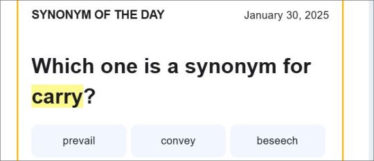
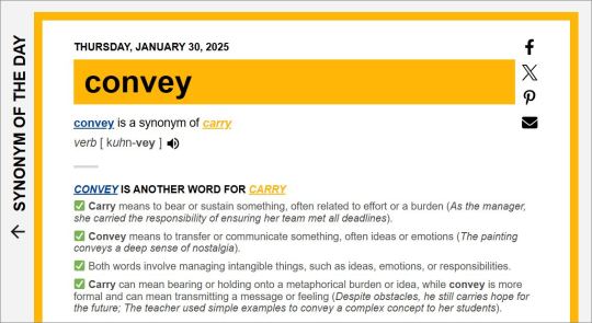
Would most people realistically use 'carry' and 'convey' as synonyms in typical speech?? Seems a slightly reaching comparison to me lol
#Usually thesaurus.com's Synonym Of The Day is fine but every once in a while there areones like this#where looking at the initial email I'm like...?? i don't know?? none of them really????#Like out of the three options given without any additional context#I guess reading further I can kind of see where it comes from if you're using it in a less literal sense#like ''the poem carries sad tones through it's words'' > ''the poem conveys tones of sadness through its wording''#but thinking of the more everyday usage of the word carry and how most often you hear it. it seems initially like an odd comparison#to say Convey would be an actual known/commonly used synonym of it.#Which I do get it. theyve probably had to come up with thousands of these now. so sometimes you're probably stretching things a little#to make more absract connections lol. But it's just kind of funny sometimes when you open the#email and its like "which of these are a synonym of the word Dog? -- Mug. Amulet. or Orange Peel.'' and you're like ?????? none???#and then you click on it and it's like ''the third useage of the word 'dog' means to drink from a fountain. which is kind of like drinking#from a mug. um.. so yeah. :)'' and then I go okay :3 thesaurus dot com you could never make me hate you. sure. a dog is a mug. :3#Anyway... coming out of a full week of no posting on the internet just to reflect on an odd synonym of the day email lol.. I am like an#80 year old man who sits in his study all day ignoring everyone then will randomly come out sometimes to go 'ahhrmm.. take#a gander at this interesting crossword I've just found in the paper. strange right? .... ok. hmhpph. back to my library..'
13 notes
·
View notes
Text
I will be leaving on vacation for a week and if all goes well, I will still be able to access the internet!
but in the case that something goes wrong and I am truly off the grid, pray for me
#Was I willing to pay an extra $100 just so I’d still be able to read cherik fanfic?#Maybe#But I also want to be able to check my email!! I love checking my email!!#And how am I supposed to have fun if I can’t talk to the people on my puter??#Mainly posting this as a warning to friends that if I stop responding to messages without warning it’s just bc I lost internet privileges#personal#not tickling
7 notes
·
View notes