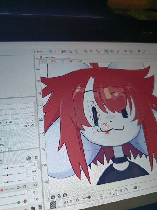
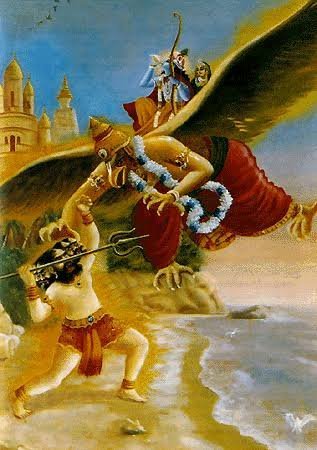
#sai and krita go hand in hand
Text
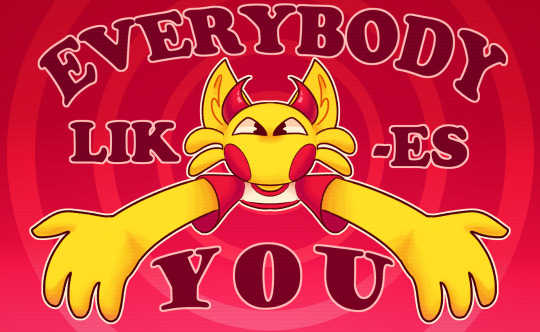
EVERYBODY LIKES YOU!!!
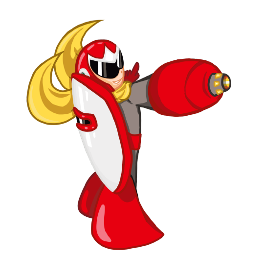
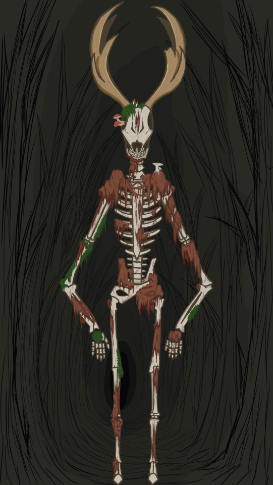
#lemon demon#lemon demon oc#lemmy#guz art#lemon demon fanart#i was suddenly possesed by inspiration and drew this#thank you krita for having a symmetry option and funky editing that let's me round warp stuff lol#and for having a brush that's similar to my sai lineart brush!#sai and krita go hand in hand#kidcore
48 notes
·
View notes
Text
HELLOOO EVERYONE!
✦ · · · · · · · · · · · · ·
HERE
LOOK
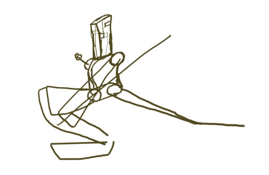
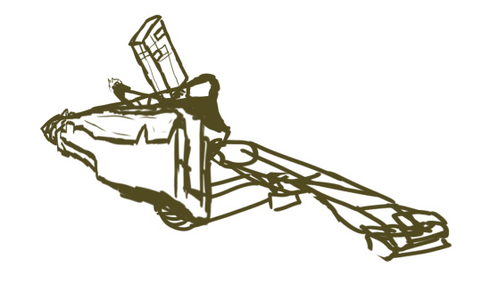
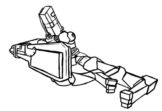
I put off publishing this post for a long time because I was too lazy to write all the information that I want to put here, but here I am, showing you my two models for vitubing, created entirely by myself with my own hands on my laptop!
✦ · · · · · · · · · · · · ·
but before that I think it’s worth starting with an idea! And the idea came mega spontaneously:
This handsome man and I watched a couple of videos with Neuro-Sama and suddenly this dialogue appears:
- How about we become VTubers?
- seriously?
- yeah
- Let's go.
✦ · · · · · · · · · · · · ·
Even though this decision was mega harsh and rather profane, it charged me with motivation and allowed me to get out of the art block a little
After all, I REALLY love learning new programs and things for myself.
✦ · · · · · · · · · · · · ·
Time:
• 5 days to draw both models
• A week to animate them
Programs:
Krita (drawing)
life2D + his brother (animation of models and adding additional emotions)
Vtube Studio (Launch models)
Obs (video filming)
Energy Source:
God knows
✦ · · · · · · · · · · · · ·
So who were my victims of this experiment?
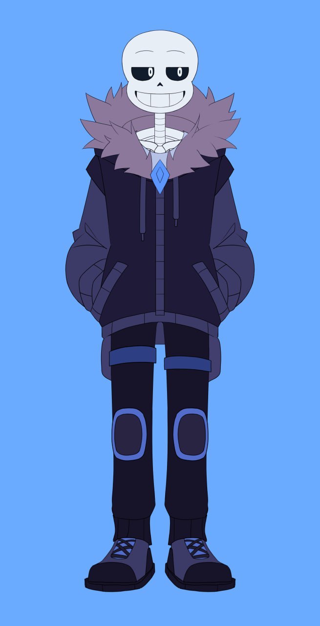
As expected, my avatar was my alter ego Temmie, and for our mega partner/boyfriend we chose his alter ego Sans from Freedomtale!
Since the path is completely new and unfamiliar to me, I desperately searched on YouTube for all kinds of videos and tutorials, as a result of which I found the most understandable and enjoyable series of videos from Lazu-Tan, which I mainly relied on when making avatars
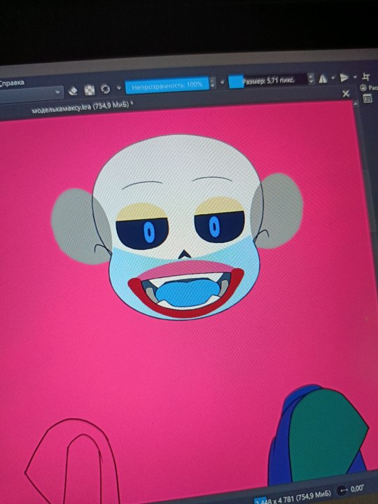
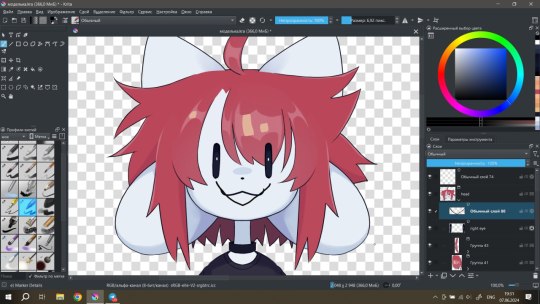
Next, having found it on the Internet and installed the necessary programs on the laptop, I scribbled sketches that would later grow into models:3

after this stage there is a boring process of drawing the models directly, grouping a bunch of layers (a separate layer was needed for each moving object, such as separate layers for each strand of hair and grouping into a common group with hair. This was an unusual thing and made me really strain my brain)
Having saved both files in .psd format, I put them into a new program called Life2D! I needed this program to create animations of the very layers that I had distributed and grouped earlier. head turns, hair physics, eye blinks, additional emotions - this is all the merit of the great Life2D and those 43 days of the trial of the full version, which he so kindly provided me with for creativity... in fact, I thank you for the conditional “deadline”, because without it, God knows when I would have finished this project under other circumstances

When working, there were a lot of problems due to insufficient knowledge about the operation of the application, which is why sometimes I felt like a would-be programmer who couldn’t find an error in his code for several days (I tried to program, I know what I’m talking about)
It would seem hurray, everything is ready! however, here the finishing touches await us.
Those additional emotions (like blush, stars, tears) that should be activated by assigned keys must first be configured through a separate program that is installed with Life2D
in general, the procedure is not complicated, and I even found it somewhat pleasant

After this, the models can be considered ready, they just need to be put into the files of an application such as Vitube Studio, after which you can play your character at the camera or use them for streaming or making videos!
I published videos demonstrating the capabilities of my models on my YouTube
It was an ultra-mega interesting experience, and I will not hesitate to say this, and I am proud of the results:3
for streaming, however, all that remains is to turn my little potato into a more or less tolerable laptop, but I think sooner or later I will be able to solve this issue
@thefreedomskeleton
✦ · · · · · · · · · · · · ·
Thank you if you are reading this and wish you a wonderful time of day!

#art#fanart#vtube model#vtuber#2D models#freedomtale sans#Freedomtale#Sans#oladushek#animation#i like it#so much#give me some new hands pls#undertale
92 notes
·
View notes
Text
thought it'd be cool to dissect one page's coloring method from IRON CROWN since i was not kidding in saying my coloring was on another level compared to now.
(also stress-testing that i can do all of the things in krita vs photoshop cs5. long story short: yes, unequivocally!)
the easiest way to show this is listing out my layers and then doing a timelapse gif of turning off/on the layers one by one, from top to bottom. if you're not familiar with how modern painting software uses layers, think of it as many panes of glass "layered" on top of one another, where you can paint on as big or as small of an area you want.

most of these are self explanatory. adding a few notes below:
* as hinted above, a huge part of IC's style design was inspired by 00's 2-D animated films like atlantis: the lost empire, prince of egypt, and legend of korra.
you can actually see the old animation color-map I used back then as a style guide of sorts below! posting here freely since i've since expanded/revised this color map yesterday in much more detail to hopefully get back on the wagon with coloring.

the idea is when planning out a scene is to use this as a blueprint of what mood the scene should be, what colors accentuate that mood, and how to "shift" into the new scene's color mood without going too zany with too many colors.
for example, the page above is a transition between the cooler turquoise of the dungeon to the wamer red/magenta "danger" scene, so you get a neat red/green play.
* "hue shift" is one final merged-visible layer on top that's kind of a halfassed version of mimicking a CRT TV screen's effects. there is so much more literature out there now than there was in 2016 (though the quality is ... debatable); just google up some stuff about "chromatic aberration". try to keep a screenshot of a real show on hand to compare and contrast since a lot of people don't get it right.
* "fog" layers (lol) are just gradients stacked up on each other since i had a horrible tendency to abuse those and overlay layers. :D
* "light" was your basic overlay layer. generally i tried to keep to only flat colors (with a very slight secondary "shadow" color for skin; but sometimes i cheated by adding a third lighter skin tone on the flats as well as the light on top.
* most of the heavy lifting was done by taking the real raw flats (last part scene), and then lightly throwing some gradients on top of there too until they more or less resembled the animation screens i was referencing off of. you see what i mean by abusing gradients. :)
24 notes
·
View notes
Text

ngl im not like, lineless art specialist, honestly i went lineless fairly recently (like lets say may 2023 when i started drawing art for homestuck), before that i was making art with lineart only, so take my process with a grain of salt lmfao but i hope it clears out some things!
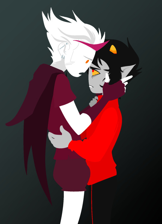
lets dissect the recent dirkkri art ive made:
i start out with sketch, as you usually do. depending on how im feeling or how complex the pose/background is, i make it more or less detailed. for more basic poses i might even stick to a simple gesture drawing and go straight into laying out the colors, it really varies a lot. it might even change in the further process, like how i moved dirks shades from his head to be sticking out slightly from behind his arm, clipped to his shirt, because i didnt like how busy the area around the faces looked
one advice i can give is to not spend too much time on the sketch. its job is to guide the laying out of flat colors and thats it! dont make it too fancy, dont get lost in the details - you can add those later on when youre doing the flats. its fine if the sketch is messy, youll fix it in later stages of the process!
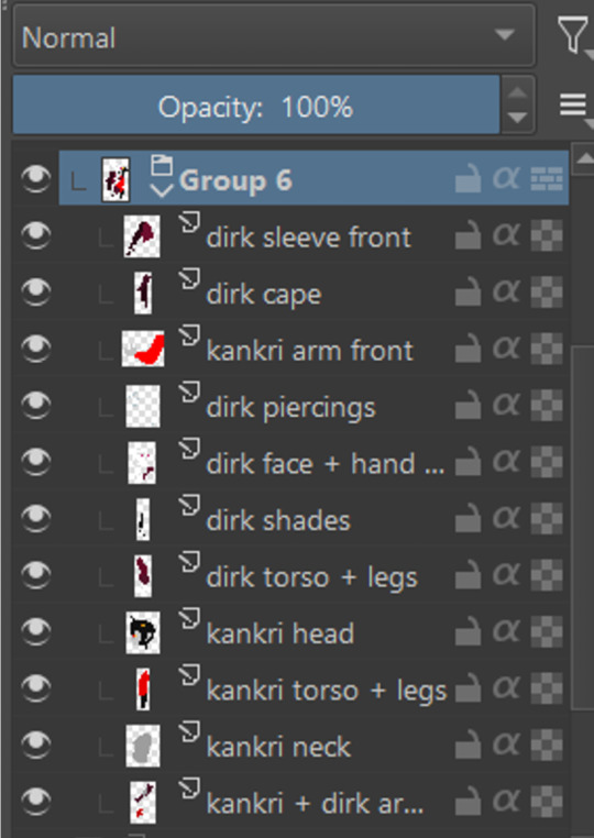
next i do the flat colors! i tackle it one thing at a time - for example with dirks head i started on separate layers with the general shape of his face, then added his facial features, then i drew the hair, then added his neck, the crown, and lastly his piercings. i then merged them all together - you dont need to leave it all separate, best way is to group things together and merge so you dont get lost with all the layers (like how kankris arm on the front is one layer including his sweater sleeve and his hand).
i highly recommend naming your layers - im a little on and off with it myself, but seriously it makes your life easier later on when you spot a mistake and have to shuffle through bazilion layers to find it lmfao, especially when your drawing includes multiple things that overlay on top of each other like in this example. dont be like me and take a second to name them asksks
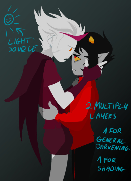
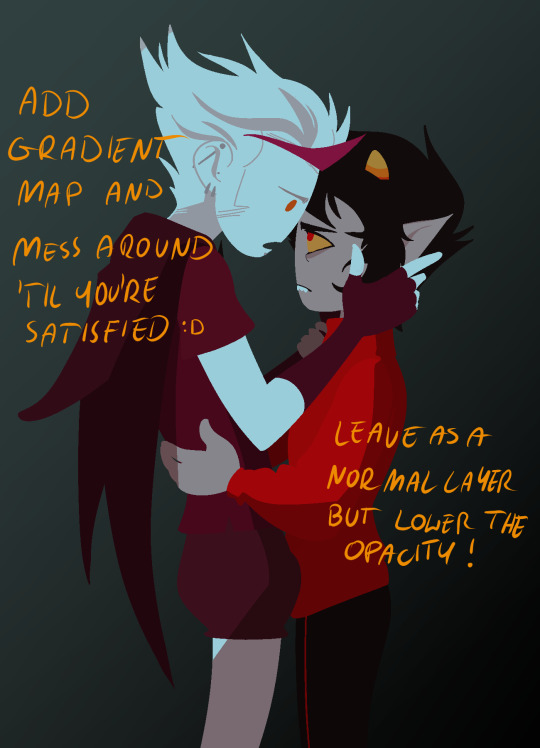
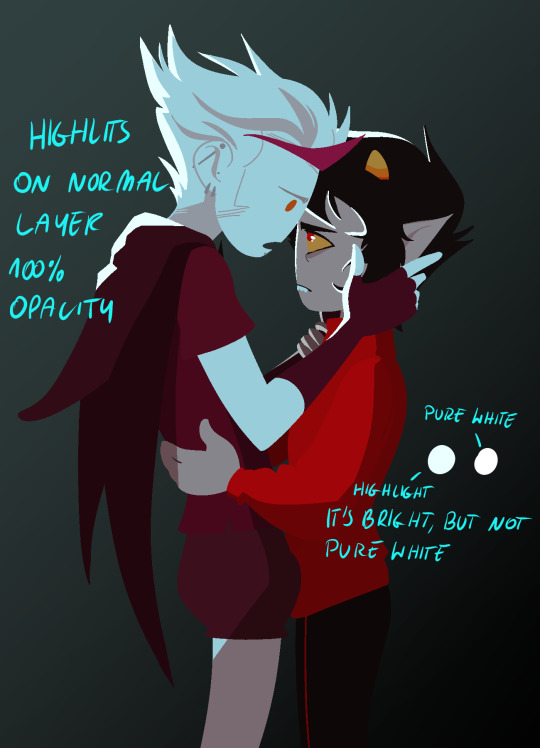
next to the rendering! i sometimes completely ditch this one, just leaving the flats as they are, but when i want a drawing to have more oomph i have some more steps to the process. its pretty simple - shadow, gradient map and highlight layer on clipping masks connected to the flats. in this one i used light gray for shadows (first layer to generally darken the drawing, second for defining shadows). same with highlights - one color.
the real star of the show is the gradient map, seriously, its a goddamn miracle worker. in krita you can add one by clicking on the plus sign to add a new layer and choose "add filter layer", then in the menu open the "map" category and here should be the option of adding gradient map. you can do it on your flats, but its destructive, and on a separate layer you can always change it if you dont like it later on. mess with the colors and tadah! it now looks fancy as shit and makes people think you know color theory!
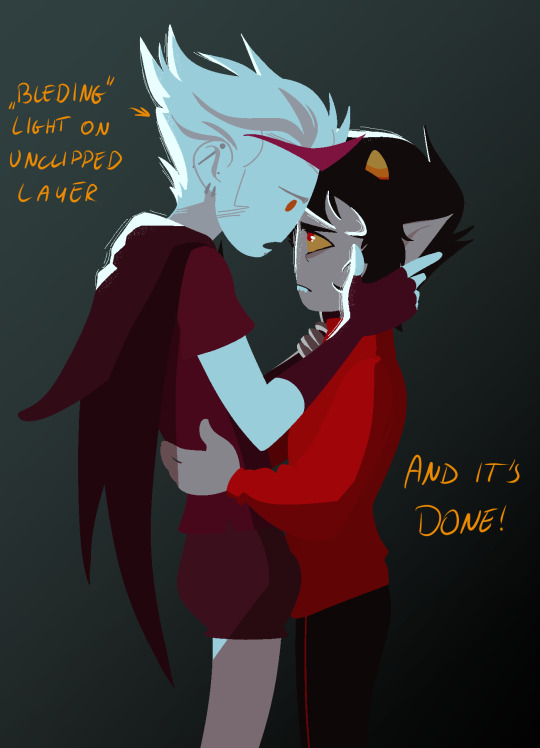

last but not least you can add some bleeding light on a separate layer that isnt clipped to the flats to give it more dreamy appearence! i also added an example of how my layers looked in a group at the end of the drawing process.
and thats it! hope it helps, and have fun drawing!
#ask#drawing process#lineless art#art tips#art process#digital art#hope its at least somehow understandable im really sleepy rn#god i hope i didnt make any spelling mistakes LMFAO#artists on tumblr
63 notes
·
View notes
Note
i wish i could draw anything humanoid so i could draw your iterator designs
A /// I recently gave a handful of drawing tips in my stream! Though it's mostly animation I talked about a few things!
So for some general tips
Don't worry about what everyone is doing
Compare yourself to others (positively). What I mean is don't say "I can't do what they do" but "How do they do this" and try to learn from them, learn what you like from them, the more artist you reference from and compare to the more you'll be able to draw in and create a unique style!
Remember everyone improves at their own rate, we start at different time, have less or more time to practice, different resources- the main thing is that you improve yourself over time- linear improvement or not! You never stop improving, there is no end goal, so enjoy the journey!
Brushes do and don't matter. Try to collect as many, explore them, I've grabbed brushes from some really cool artist and tossed them because I don't understand how they work. The main thing is understanding what brush gives what effect and what brushes fell good to use. Your taste in brushes will always change (mine do always when I find something!)
These are my brushes as of now!
Don't worry about what everyone is doing
Program means nothing- the only reason why I have CSP is for animation and nothing more (bc adobe animate sucks and I came from Fire Alpaca so I was lazy to learn Krita) Legit only get CSP if you want to animate
Finally, don't waste time with anatomy. You learn it as you go and with reference you get better, like yes study it if you want to for fun but you don't need to study it to be able to produce art work, just your ability to observe and be critical of you work is a skill required to improve! Also 100% don't if your character has baggy ass clothes, you'll spend 30 minutes drawing out those boxes and making sure it's perfect only to erase a god 80% of it, just get the rough shape out! If they're nude then different story or skin tight clothes but majority of clothes are slightly loose. Practice it yes but, you will improve in all skill sets together as you continue your journey.
Don't worry about what everyone is doing
I hope any of these somewhat help, good luck on your artist journey man~! <3
#QNA#toxart#timelapse#support#the dont worry... I got from another artist myself XD#like dont stress too much man#have fun#draw for yourself#<3#good luck!
62 notes
·
View notes
Text
Deepavali - Great power comes with great responsibility
Growing up in the southern Indian state of Tamilnadu, where Deepavali is celebrated cause of Narakasura’s Defeat by Krishna. Each year I heard the story of how and when it happened, why Krishna killed Narakasura, and how cruel he was.
As the adult age struck I started to work with people from many parts of India, surprisingly that's when I heard that the story of Deepavali/Diwali which they celebrate is very different from the one I did.
Some specified that it celebrated the cause of Lord Rama and Seetha’s return to Ayodhya
Some Specified that it was celebrated cause of Ravana’s Defeat by Lord Rama.
They were surprised when I said in Tamilnadu it is celebrated for the reason I mentioned above, some were quick to point out how wrong I was and how one should know one's true culture and blah blah blah.
It was hard to explain culture and practices vary throughout our country and that's the beauty of it, there is no right or wrong cause every path and every practice leads to the same destiny. Our paths may vary but the destination is one.
So I wanted to read more about this one-line story I heard about how Krishna defeated Narakasura and the origin of it. And man if I say it made me cry, weep.
To dive into this story we have to travel from Kaliyug to Krita(Sathya) Yug
When the earth was in the hands of destruction by the asura Hrinyaksha and to save the earth and defeat Hrinyaksha, the almighty Vishnu took in the form of Varaha, as both Hrinyaksha and Varaha fought, Varaha overpowered Hiranaksha and at the end defeating him and also restored the earth to its original position in the universe
Varaha defeated Hiranaksha with ease and his only exertion was a drop of sweat, which fell to the ground. From that drop, a young warrior rose, his name was Naraka.
Is that when Bhoodevi and her heartbeat as a mother, her eyes watered at the scene of her son rising from her Swami’s drop of sweat. How could she not love him as he is her son, with love Bhoodevi hugged her son and smiled at how strong and a warrior he was. Bhoodevi turned and asked her Prabhu Varaha that her son should be invincible. Varaaha pulled out one of his tusks and gave it to Naraka saying he could use it as a weapon whenever he was in great danger.
Naraka accepted the weapon provided by his father and felt immensely blessed and ready to go to seek his fortune, as his father provided him advice on how to use the power to do only good.
‘Uphold Dharma’ said Varaha and Bhoodevi blessed her son as happy tears fell from her lotus-like eyes.
Just like any mother, her heart is filled with love and confidence for her son. She does not doubt her son becoming powerful in all three worlds and being just like her Swami. Varaha looked at Bhoodevi and smiled at her nodding his head as if he knew what she was thinking, but his smile didn’t seem to be filled with confidence.
Varaha smiled, his son will be powerful but the question is will he uphold the dharma to do good things, will he use his powers to be righteous, cause great power comes with great responsibilities.
As the yugas rolled one by one from Krita(Sathya) to Treta, to Dwaparyug. Lord Vishnu again came down to earth in the form of Krishna, Yadava. He vanquished his Uncle Kamsa and continued to restore dharma on the earth.
Just like the yugas rolled down, Naraka also grew very powerful, as he conquered everything from heaven and earth, he was drunk with power. That's when he snatched the celestial earrings from Aditi, the mother of Devas.
Amid the chaos, Indra the lord of devas sought Krishna’s help to vanquish Naraka. Upon hearing this Satyabama, one of the wives of Krishna, who is none other than Bhoodevi herself, got devastated and her heart ached along with anger boiled on how her son turned out. Her confidence in her son now made her feel like crying a river but as a Bhoodevi she had a job first that is to accompany her swami and solve this problem.
Both Krishna and Sathyabama left Prag-joyitisha-pura on Garuda. But entering the Prag-joyitisha-pura was not easy as the capital has four layers to its defence, The chief defender of Naraka’s capital was Mura, who was so confident that no one could penetrate the defence he had set and was relaxing deep down at the ring of defence.
But can anything be against Parandhaman himself? Krishna took down each defence layer at ease thus causing violent ripples in the water. Mura woke up from his slumber, enraged rushed out to defend and attack Krishna. Mura fell fighting against Krishna who then earned the name Murrari, the enemy of Mura.
Upon hearing the chaos outside Naraka Narakasura himself came out and started to fight against Krishna. The fight went on day and night causing extreme chaos and it became very difficult to say who was winning. As Naraka still had the weapon provided to him by his father Varaha, he took out the deadly tusk and threw it on Krishna, who got stuck by the tusk into his chest and fell unconscious. Naraka let out a victory cry but an enraged Satyabama picked up the bow and started to fight Naraka with so much anger. Naraka was shocked and continued to fight Sathyabama not knowing her real identity just like he did with Krishna.
Sathyabama’s eyes turned red flashing anger and her love for her son was now completely overshadowed by the monster he had become. Amidst the fighting, Krishna woke up and saw Sathyabama fighting and smiled at her. Naraka is shocked to see how Krishna is now awake, no other being can able to be alive after being struck by the deadly weapon, if Krishna is alive then he must be none other than Lord Varaha himself, his father.

Naraka fell on his knees and his father's words rang into his ears ‘Uphold Dharma’. He realized that he had failed his father's words and surrendered to Krishna, who used Sudarshana chakra at Naraka.
As his life slowly leaves Naraka he subconsciously surrenders himself to Krishna and Sathyabama. Sathyabama who was Bhoodevi born again, rushed to him and held him. The cries of sorrow, hurt, love, anger everything heard in her. As she helplessly held her son whose life slowly leaving him, Krishna silently watched the reunion of mother and son. As the tears fell on his body he found light in his dying moment. The darkness has been lifted as the dawn broke.
That day is celebrated as the festival of lights, Deepavali or Diwali, which signifies that we have to emerge from darkness to light.
@whippersnappersbookworm @harinishivaa @thelekhikawrites @willkatfanfromasia @yehshuhua @arachneofthoughts @vibishalakshman @nspwriteups @thirst4light @hollogramhallucination @celestesinsight @curiousgalacticsoul @themorguepoet @tranquilsightseer
#tamil#deepavali#happydiwali#diwali#deepawali#indian#krishna#dwaparyug#celebration#darkness#light#bhoodevi#sathyabama#radhakrishna#rukmani#love#mother#mother earth#son#hindu mythology#godsiva#festival#festiveseason#tamilnadu
59 notes
·
View notes
Text

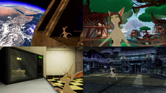
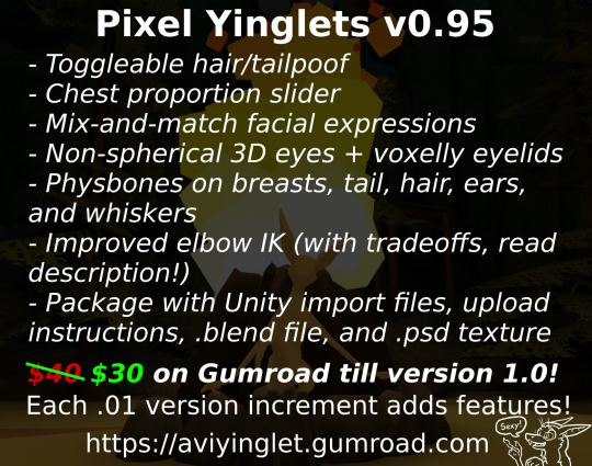
Pixel Yinglets v0.95 for VRChat! Now available!
Hiya, folks! I've been hard at work the last few weeks making my own yinglet base for VRChat from scratch. Details after the jump!
You can buy it if you like, BUT bear these things in mind first!
1. My yinglets' arms are close to the limb proportions you find in the yinglets of Out-of-Placers, meaning forearms are 2x as long as biceps; it was very important to me that I not compromise on this. For rigging this uncommon setup on PC, controller position is mapped to a point halfway down the forearm instead of on the model's hand, and because of that the model's hands are further out than your own. However, there's a tradeoff: grabbed items snap to the forearm controller position instead of to the hand, and hands/fingers do not move on Quest (this is why I do not recommend Quest-only users buy it for themselves). I have not found a way around this that keeps the proportions and improved elbow IK intact, but I've personally used this solution on my main model for over a year and have grown used to it. A public try-out base will be made available in the next few weeks so you can make a more informed decision; if you're on the fence, my advice is to wait until then rather than risk disappointment.
2. I haven't tried this with full-body tracking, so I wouldn't be surprised if this broke under those circumstances, but I aim to use the revenues from this to get a set of trackers and tweak the rig in this into something that works. This is going to be my main avatar as I continue to use VRChat on a weekly basis, any improvements I make to my own base will roll into the paid version.
3. This is my first paid base, and so some things are rough around the edges. I've made it entirely from scratch with free software (aside from a little bit of time in Aseprite), point-to-point modeling in Blender and painting in Krita; I bring all this up to say, if you'd like to support me beyond purchasing the base, five-starring it afterward and sharing this around to any interested parties would mean a lot. -v-
The yinglet species was created and developed in detail by Valsalia; it's fair to say at this point I owe a lot to the concept. Thanks, everyone. <3
I think that's it for now! I want to add a bunch of stuff to it, and enable all sorts of yinglet bases in VR (among other species), but for now, I'm breaking for a week, after which I'll polish what's here beyond "shippable" status before adding new features. With that out of the way, here's the purchase link:
51 notes
·
View notes
Note
Oh it was only 3 actually, counting that one animatic on YouTube (that BTW i had no idea was yours! I was pleasantly surprised <3)
And I found it so funny that you have somewhat an idea of who I might be PFFF you can throw the guess, it would be funny if you get it right (don't have to say my name if you don't remember it, you can just go for something you remember NFKDSJ)
also time for an actual question since i'm already here, what program did you used for the animatic? I've always wanted to get into animating but most softwares cost money or are free but really bad so I could use some recommendations 👀
Good to hear there is no imposter lol. I should probably start using the false pfp so people know it’s me but I’m too lazy to change them all 💀 also my guess was right as to who you were but probably mainly because I put on my Aziraphale detective hat and you were the last notification before the ask inbox notification and your icon had a red beanie. We meet once again.
As for the animatic I used procreate for drawing and capecut for composting. Not the most efficient method but I liked it. I ended up segmenting off each camera angle into a different canvas and making any animation for the shot that way. I love capecut because the free version has every editing function you need for an animatic and the watermark only appears as a black screen at the end so it’s so easy to crop out. It’s probably the best free editing software I’ve found. (I also used a screen recording device to record the audio cause even if you buy a song it sometimes doesn’t allow you to put it in the program.)
I honestly recommend procreate if you have a device that supports it. I think it’s still only a 10 dollar onetime purchase. But if you don’t have a device that supports it, I have used things like flip a clip which is free, and the paid version is pretty cheap. I have also dabbled in an app called rough animate, also free (you don’t have to pay for the onion skins) which was also okay. I got frustrated cause of the lack of brush choice but other than that it’s not bad at all. If you can’t pay anything at all I’d recommend this because, unlike flip a clip, you don’t have to pay to unlock the a lot of the really helpful features. Ibis paint also added an animation feature I think so that’s an option. Idk if you need the paid version for it, but I remember only having to watch ads for a minute to unlock all the brushes so maybe it’s the same for the animation feature lol.
If you have a computer set up, I’ve also heard nice things about Krita for animation. It’s free and from what I remember it had a really good timeline set up. I actually tried to use it, but my computer at the time was old and slow and it lagged to much, and then I had a shitty no screen tablet and my hand eye coordination when it came to drawing and writing is quite bad, so it just wasn’t a good set up for me personally. But I know people make it work. I mean, people make this kinda shit in MS paint, if you’re dedicated enough you can technically do it in almost any program (though you may not be able to make it as polished as you’d like.)
Then there is Clip Studio Paint, which does cost money but is way less expensive than like, harmony or adobe. The EX version which gives you a second of free animation per project is a $5 monthly subscription for once device, PC MaC IOS, and the Pro version (which is more expensive) gives you unlimited animation animation access for I believe around 10 -15 dollars a month (still less than most streaming services lol). There’s also a one time purchase version that is $50 dollars, but it goes on sale A LOT for $25! Although I don’t think it gives you more than a second of animation. CSP also has a very long free trial period, for EX it was legit like 3 months. so if you try it out and like it, I’d definitely suggest finding a way to pay for it. It’s actually used in some professional studios in Japan, so if you have any professional aims for your work it’s a good starting platform to get into industry software. However a lot of the nice things CSP offers for animation are not needed in the story boarding/animatic stage, so if that’s as far as you wanna take your animations it maaaaaaay not be worth it unless you love it.
If anyone else has other cheap or free recommendations feel free to add on. I have attempted to make animatics on procreate, rough animate, and flip a clip; all of which I have uncompleted projects on. It just so happens that procreate is what I was using when I finally made an animatic I liked enough to see until completion. Whatever software you do use, just make sure you learn how to use it before attempting a big project. Do some smaller stuff before you try anything big.
Edit to check the comments! We got other good recommendations for computers!
8 notes
·
View notes
Text
probing colour management - the case of discord grey
background: as described in canmom's guide to fixing the colours, I have gone to the trouble of getting a colorimeter to calibrate my monitor. because I want accurate colours, nya!
it turns out the story is even more of a mess than I thought, as I discovered when I tried profiling my laptop and was shocked, shocked to discover that even with profiling Discord looked different on the two screens side by side.
so let's say we're trying to render this shade of grey.
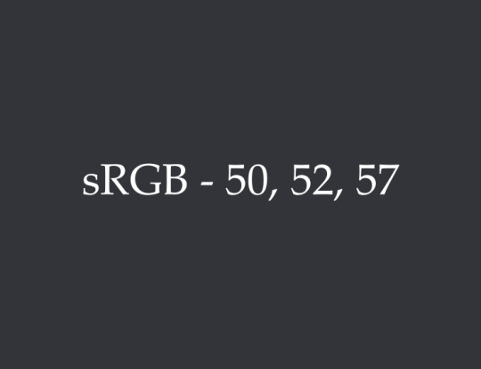
sRGB colour: srgb(50, 52, 57)
it's a slightly cool grey. this is the background colour in Discord, dark mode. (actually Discord specifies this in HSL according to hsl(223, 7%, 21%). I'm going to hope that the HSL-RGB conversion is standardised enough that it won't be different between browsers...)
desktop (Windows 11):
colour calculated in Firefox (monitor colour space): rgb_monitor(52,54,58)
colour calculated in Chrome/desktop Discord (monitor colour space): rgb_monitor(49, 51, 56)
since we're using colour management, we should expect these two sets of values to be different from the original sRGB, but equal to each other since the calculation should be identical in both cases.
so already we see a problem: same inputs, different outputs. not a good start.
ok, but which (if either) is right? we paste the screenshot into Krita (an art program) with the instruction "interpret the paste data as living in our monitor's colour space, not sRGB, and would you kindly please convert it back to sRGB for us". Krita's colour management generally seems to be pretty good, at least insofar the colours of the screenshot inside Krita look much the same as they do on my desktop. (in fact Krita has three different sRGB ICC profiles but they appear to be equivalent as far as this exercise is concerned).
monitor round-trip (sRGB-Firefox-Krita-sRGB): srgb(49, 51, 55)
monitor round-trip (sRGB-Chrome-Krita-sRGB): srgb(45, 48, 53)
going via firefox, it's very slightly darker but that is very likely an accumulating rounding error. going via chrome... it's around 8-10% darker, and I think a bit more saturated.
so we can conclude that the way Krita and Firefox handle this colour are pretty close. Firefox increased the values to convert from sRGB to the monitor space, and Krita decreased them again to convert back to sRGB. chrome on the other hand... honestly, I don't know what Chrome is doing. at first I thought it was just ignoring colour profile information, but the laptop test suggests it's doing something different on different devices.
here are the two shades of grey side by side (a screenshot converted back into sRGB in Krita)...
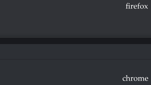
...ok, they're pretty close, i'll admit. I might not have noticed this problem if not for the laptop thing. it is more visible when the windows are bigger and not surrounded by bright white though.
now, all of this is in software that is using the same monitor ICC profile btw - we haven't even gotten to the question as to whether two computers with different screens really can be made to 'look the same' by profiling.
so next up, let's try this exercise on my laptop.
laptop (Windows 10):
my desktop monitor is a wide gamut screen. colours in a narrower gamut must take up a subset of the colours available on the monitor.
my laptop monitor is a narrow gamut screen covering about 70% of sRGB. colours outside of its gamut must be squashed inside. this will have the general effect of making uncorrected colours look less saturated.
so, in the laptop's space we get
Firefox: rgb_laptop(54,56,61)
Chrome/desktop Discord: rgb_laptop(52, 54, 59)
this time both Firefox and Chrome increased the values. Firefox increased them more.
once we ask Krita to convert back into sRGB...
laptop round-trip (sRGB-Firefox-Krita-sRGB): srgb(51, 53, 58)
laptop round-trip (sRGB-Chrome-Krita-sRGB): srgb(49, 51, 56)
this time, Firefox ends up slightly lighter than the target, and chrome slightly darker. but they're both pretty close.
part of what I think is happening here is that we've run up against the limit of bit depth. you can see we're changing values by only a few bits. if a colour lands halfway between two values, it gets rounded off. doing a series of colour space conversions like this causes rounding errors at each step.
so I think we've found two culprits here...
Chrome (and by extension Electron) is doing something wrong. i'm not quite sure how it's coming up with those numbers.
bit depth limits make it harder for software to compensate for hardware when the levels are lower, in general.
what this seems to suggest to me is that the lower the values, the more likely colour corrections are to be affected by rounding issues. it's easier to fix saturated primaries than dark greys. unfortunately, dark colours are also where the eye tends to be most sensitive. it's not that colour management is a sham - there is a logical explanation at the bottom of this!
you could mitigate this by doing the colour computations in 10bits per channel... funnily enough my graphics card is set to output in 10bit, but I guess applications need to be set up to do internal colour calculations in 10bit for that to actually be relevant. this would be a tradeoff against performance.
Krita admittedly has the option of using 16 bits per channel - the above calculations were all done in 8bit. for the sake of argument, let's see what happens if we convert our 8bit screenshot into 16bits before doing the colour space conversion. Firefox starts out as rgb_laptop_16bit(13828,14289,15585) in the laptop space, and after conversion to sRGB we land on srgb_16bit(13120,13634,14897). divide that by 256 and we can get an estimate that the 'correct' deltas in 8bit colour would be 2.76, 2.56, 2.69, which are all about halfway between 2 and 3. it's no surprise we see some rounding errors during the 'round trip'!
in general this all suggests the comparison I'm making is kind of the worst case comparison, where the screens will be most visibly different.
screens side by side
so we can conclude that if I were to put the laptop right by my monitor, there's no reason to expect anything in Chrome/Electron to look consistent, because whatever it's doing it doesn't seem to be properly converting to the monitor's space. but we could at least expect Firefox to look consistent, up to the limits of rounding errors, right?

I did this experiment. I can't meaningfully show you the 'real' difference because the camera adds a whole new layer of complications lmao (exposure, white balance, calibration of the tone response of the camera etc.), and I don't currently have the ability to just press the colorimeter against the screen and say 'what colour is this' - maybe DisplayCAL has that feature.
In any case, using my eyes, what I discovered was... viewing angles are a real issue! Doing a fullscreen colour comparison, the differences between a VA panel (a newer panel type which has good contrast and speed but poor viewing angles) and an IPS panel like on my laptop were very evident. At some angles the colours looked almost the same, at others quite noticeably different. The monitor's curve is supposed to help compensate for this a bit but damn! it's a strong reminder I have to hold my head pretty much dead central or I'll see a slight but definitely visible gradient across the screen. I guess it's one way to fix my posture. The current top dog panel type, plasma screens, should improve on this issue a lot, but they're still very $$$.
Even despite that, the monitor feels subtly 'cooler' in its grey balance than the laptop - perhaps more purple? Though it's hard to see if you don't have them side by side. I am starting to get hypersensitive to desaturated purple tones and thinking like 'is my monitor fucked or is that supposed to be grey' lmao. I think this is something DisplayCAL might be able to address - when the drivers drop I'll look forward to seeing if it will generate a better calibration.
It's crazy, I was getting by making digital art for years on monitors way less capable than this one and tbh those pictures look pretty much fine on a calibrated screen... but now I've become aware of all this shit it's really bugging me. Just gotta live with it for now though!
#canmom vs colour#i really thought i was done but digital colour just keeps finding new ways to get into my head
16 notes
·
View notes
Text
I can't believe I missed it! Yesterday marked 1 full year since I really started dedicating myself to digital art, after I drew this image because I wanted to play bomb rush cyberfunk. Pretty sure I started drawing it because I saw Twistcmyk made her own custom decals for that game and I wanted to make something like that too. So uh. Thanks for that Twist. Still haven't played bomb rush cyberfunk tho
not a bad starting place I'd say. Although maybe that's because it's not really the starting place and I've been drawing off and on again pretty much since I was born
I think this drawing really helped get my feet off the ground when it came to finding a style that works for me, and learning how to make other styles out of it. See, I've always had shaky hands so I've tended to gravitate towards a more scratchy style since smooth lines are often a challenge for me. And in a lot of cases I'd just leave a drawing as a sketch because finalizing it was very difficult.
being able to draw fast and loose like this is really a boon to get the creative juices flowing. It's the easiest way to draw for me, and I still like to leave it at that if I have a day where I want to draw but I don't want to dedicate more than one night to it
But nowadays I'm usually making art that's a lot smoother and takes a few more nights to finish. But that's still using the rough style. Usually I'll get a vague idea in my head and throw it on the screen with minimal care, and I'll zero in on how it's supposed to look draft by draft. Sometimes it takes 3 drafts, sometimes it takes, like 10
shown here a swordsmachine drawing I made a month or so ago, I still have the krita file on hand (because it's not technically finished yet, needs a final draft with color) so here's the drafts leading up to it
This process often involves a lot of cutting and pasting, resizing and the perspective tool to get a thing exactly where it needs to be. As for making lines as smooth as possible, I just have to take it really slow and sometimes go back, erase, draw it back, erase again. I won't lie it can still be a really tedious process
Like that swordsmachine, I've been making a lot of character portraits lately. Which has been a great exercise in posing, perspective and shading. Shading especially was something I've been needing practice with. I used to draw only with pencil of paper so using color in drawings is still somewhat a new thing for me. Having to figure out the lighting for each shot and which surfaces are whatever is very difficult but doing shading right can make a drawing look that much better
This is the thing I've been working on most recently, I think the shading looks pretty good, especially on the scarf. But I'm not really too sure about it.
Ok I've lost the pacing for this longpost. I wish I had a special drawing for the one year but I forgot until today. Maybe I'll make Anti in a birthday hat sometime later. For now here's some of my favorites over the past year
THING IN THE CLOSET
was a pretty early drawing, but I still really like it because of the unique perspective of peeking into a closet. Also the first time I drew Anti with a body!
ENDNE, GOD OF ENTROPY
I remember when I drew this design in my sketchbook and I knew I had a banger design right away, she barely changed from paper to digital. Unlike Solos, who had quite a few changes, and honestly I might still want to change a few things. Still pretty astounded that I managed to render it so well. Might be my overall favorite of the past year
PSYCHADOLIA
I still think it would make a great album name and cover. Hire me psychedelic music artists
MALAZIROT, GOD OF ROT
This one was made because I told my friends I'd make myself a fursona if a poll about me being a furry reached 15 votes. Love stealing valor. This might be the highest layer count piece to date, I think it clocked in at over 60 with so many small details that you have to super zoom in to see. Regardless, I'm really proud with how I got the rotting flesh to look in this one
MASH ME UP
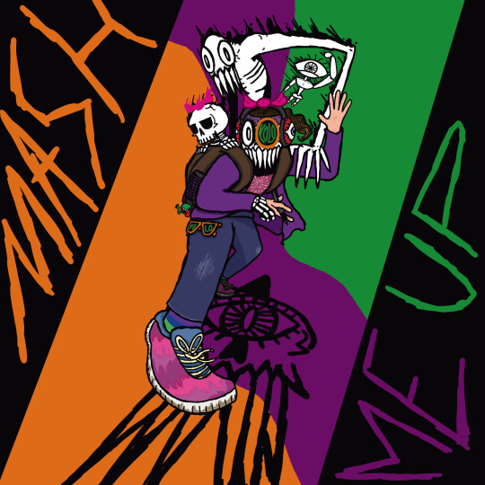
Also a massive undertaking and probably the only one that can rival the layers on malazirot. Idk if I have much to say on it other than, I think it looka pretty neat
SELF-PORTAIT

A real recent one, Probably my most grotesque one to date too. I really think I nailed how disgusting the skin on it is, my only regret is I didn't make any hair follicles poking out of the skin. Oh well, missed opportunities
here's to the next year of art!
6 notes
·
View notes
Note
have you ever done/will you ever do a speedpaint, timelapse, or tutorial on that lovely pixel art style you have there?
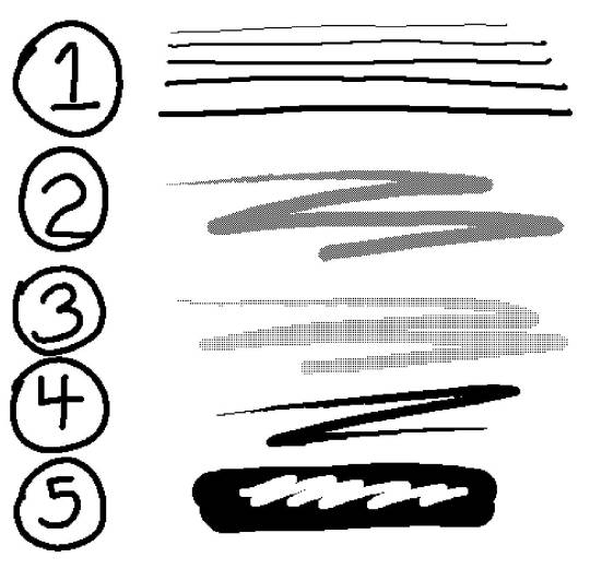
First of all, thank you, but also, I don't really have a process that's too different from pretty basic digital sketching/inking/coloring. I'll usually keep my canvases within a 500px to ~2000px range in either dimension in order to keep the aliasing of the pixels visible and meaningful, and focus on solid blocks of color instead of any gradients or blending. Other than that, I mostly just rely on certain tools to do a pixellated look.
Back when I used Paint Tool SAI, I used the binary brush and fill tool for pretty much everything. In order to make screentones, I would draw a pattern by hand, then copy and paste until I'd filled a whole layer, and then manipulate that with a clipping group.
Nowadays, I use Krita, which provides me with multiple tools that I can use for pixel art:
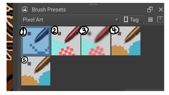
A fixed width brush that I can use for fine details, writing, or certain kinds of lining. I usually keep it anywhere from 1 to 5 px wide. For a short while, I was using it as my primary liner.
A dense dithering brush. Saves me time making those pixel screentones. They don't tend to play nice when people zoom out tho.
A half-as-dense dithering brush.
A pressure sensitive pixel brush. This is what I do a majority of my lining work with. The minimum width is 1px, and I usually keep the max at 8px.
Another fixed width brush that I usually leave on eraser at a super wide weight so I can erase things easily. Alternatively I'll switch off the erase and use it to paint huge areas a solid color.
Honorable mention: The fill tool.
This drawing, I used 4 for all the lining work, and 1 for the rectangle in the background and eyebrow piercing, since that's a really neat and regular shape. I used 2, 3, and the fill tool to create three different value levels.
With my latest drawing, I did basically everything on Panne with 4. I used no screentones for this drawing, opting instead to make things either solid black, or very tightly hatched by hand. Part of this decision was because I knew I was going to be coloring it, so I didn't need the screentones to convey value. The other part was that I wanted this drawing to look good regardless of the zoom level.
Meanwhile, everything in the background was done with the 1 brush, 2px wide so that I was working with a fixed width the entire time in order to help create a contrast: the fixed, fine lines of the background vs the wider, more variable and expressive lines on Panne.
In case it's helpful, here's what the Panne drawing looked like in progress. The point is that the work is pretty simple and straightforward as far as process goes. It's just sketch, ink, and color. It's mostly the tools that get me the distinct look I really like.
#shark rambles#maybe at some point I'll post up a video of my workflow#Aside from that I hope this helps#Thank you for asking#my art#my sketches#panne#amelieverse#pixel art#tutorial
63 notes
·
View notes
Note
This one's a two parter, sorry 😅
Y'all's art is so pretty to look at! I'm really curious on the writing process, what's it like? And if each of you had to recommend an art program for a beginner, what would it be?
Willow:
"Hey! So I do the writing, storyboarding etc. I got a decent picture in my head on what's going on though, so sometimes I don't... write anything. THIS IS A BAD PRACTICE DON'T DO THIS!
For the other comic I am working on I have an actual script. And honestly it starts as images in my head and I write down the dialogue and then fill in the details. I actually love the writing process. As for art programs! I usually something either free or easy to get your hands on. Krita or Paint Tool Sai are both fantastic! If you find that you love working digitally investing in Clip Studio Paint or Procreate are both incredible. You will not regret it."
Huntress:
"With beginner programs I always will recommend Clipstudio Paint. It's a program for drawing and it has great tools. It can be subscription or a one time purchase which is amazing. And it has a little animation in it, you can animate for longer in the EX version but if you are just trying things out to see if you like that type of work it's helpful. To be honest I have only really drawn in Clipstudio. I got experience with Photoshop through school and it always seemed like to much and not for drawing so I never wanted to spend the money to get it. I got Clipstudio, used the regular Clipstudio Paint throughout college and got the EX version after I graduated. I have never not been happy with the program."
6 notes
·
View notes
Note
I read that you used Sai before CSP and I am curious in your opinion is it worth to switch? I ve been using Sai for years now and when I did try CSP it didnt click with me personally but I am not blind to the functions it has that Sai lacks.
Obvi there is no "correct" answer to this I guess, I am just curious about your experience and opinion!
Imo the decision on whether or not it's worth the switch is entirely dependent on what you're looking for in an art program and just bc it was the right decision for me doesn't mean it has to be for you too!
SAI is lightweight, versatile and very easy to use and a great program overall, I often find that its simplicity lowkey betrays how much it is capable of and can't recommend it enough, especially to artists that are new to the digital medium!
CSP meanwhile has more options to customize your tools and workspace very thoroughly to suit your needs, it has more rulers and filter options and more sophisticated tool and layer settings. It also has a tool and material library specific for comic creation and comes with a few really nice ruler presets and stencil brushes for stuff like action lines and background props, something SAI for example lacks completely!
I really like how the brushes and hotkeys feel in CSP, I enjoy the added filtering options and the stencil brushes often come in clutch, as do the extensive transform tool options.
Though I admittedly also am a lazy artist who likes using the easy way out lmao
In my experience, if you have no trouble doing most things by hand and find you work better with SAI's UI and prefer how its tools feel, then the switch is probably not going to feel worth investing time and money in!
If you're looking to leave your comfort zone and make art with a more sophisticated tool that has more detailed options and workflow practicality, then switching to CSP is imo worth a shot <3
Some additional anecdotes about my own experience switching from one to the other:
I really do feel you on being hesitant about switching, I've actually tried fruitlessly to leave my comfort zone with expanding away from SAI and to a program with more options for a long time, along the way I've tried most of the freeware ones, including Krita, FireAlpaca and Medibang, but none of them ever really clicked with me either?
Even CSP took me about a month to really get into once I had the trial period running, but unlike other programs I've tried it didn't give me that immediate "oh no this is confusing and too different I hate everything" kind of recoil...
It was still not comfortable at first ofc, but the good thing about CSP's functions and UI is that they are imo very intuitive and the thing I most struggled with was as minor as simply having certain functions on different hotkeys than SAI did.
It took me about a week of experimenting and active effort to try and get to know CSP as a program before deciding that it was worth investing money in, since I actually kept finding myself going back to it more than the version of SAI 2 that I was using until that point!
But even so, I actually often still go back to SAI 2 for the perspective rulers if nothing else, since I find the SAI 2 ones to work way better than CSP's ^^"
I also love the marker tool in SAI so much that it bothered me greatly to not have anything like it in CSP and ended up finding a downloadable version that's compatible with CSP online :'DD
I'm p sure actually that you could probably find CSP compatible versions of most of the SAI presets online :o So I actually ended up not really missing SAI all that much once I've started using CSP more
Anyways I'm flattered that you value my opinion enough to ask and appreciate that you did, I hope this gave you some insight <3
4 notes
·
View notes
Text
the enigma of (art) blend modes, and how doing brain research taught me how to better utilize them
(DISCLAIMER--I'm not actually going in-depth on different blend modes; there's other resources for that sort of thing! Rather, I'm just planning on talking about how they've been captivating to me in the past.)
I've been working with digital art programs for quite some time now, mostly for my game development pursuits, but also more recently just for fun.
Whatever program I'm using, be it Aseprite, Krita, or Paint.net, there's always this goofy little feature referred to as "blend modes". Really, all it refers to is how new colors should be made when two colors overlap on an image--particularly from different layers.
Back when I was young and naive, those layer blend modes hardly did more than just exist. Maybe I'd pull down that drop-down menu and switch around the modes every once in a while, but this was never used to help me during the creation process.
There's something about starting to use a new art program and getting overwhelmed by all the buttons on the UI. Of course, it takes time to master those menus, but when you do, it's nothing short of rewarding.
Which brings me to one of the most interesting programs I've worked with: Fiji.
Fiji isn't an art program--it's anything but. Instead, it's open source image processing software, designed for life science related analyses.
I've had the (mis)fortune of becoming acquainted with this software through my internship. When it was introduced to me last year, it was... overwhelming, to say the least.
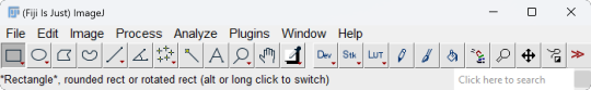
This is what it looks like when you open it:
Not too overwhelming yet, right? Wrong. Here's what the dropdown menu for "Analyze" looks like.
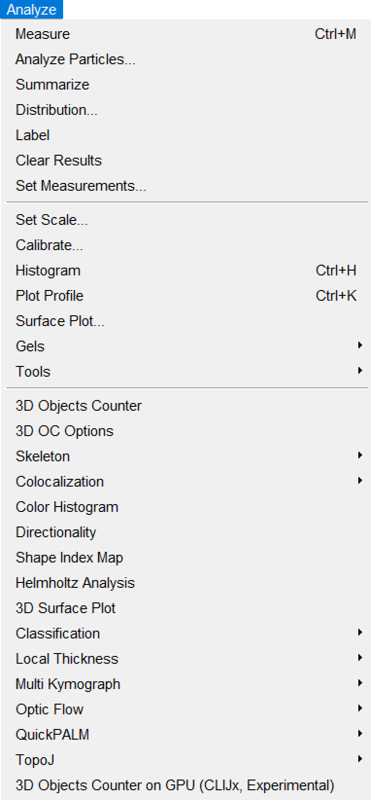
(I like how it starts with normal sounding words, before devolving into things like "Helmholtz Analysis" and "Multi Kymograph".)
If any of you are already super-mega-brain-nerds and know how to utilize all of these options, then good for you, I suppose. For the vast majority of the people who are unacquainted with neuroscience (such as myself), however, this is INCREDIBLY daunting to navigate. Imagine something just as confusing as this for the other menus.
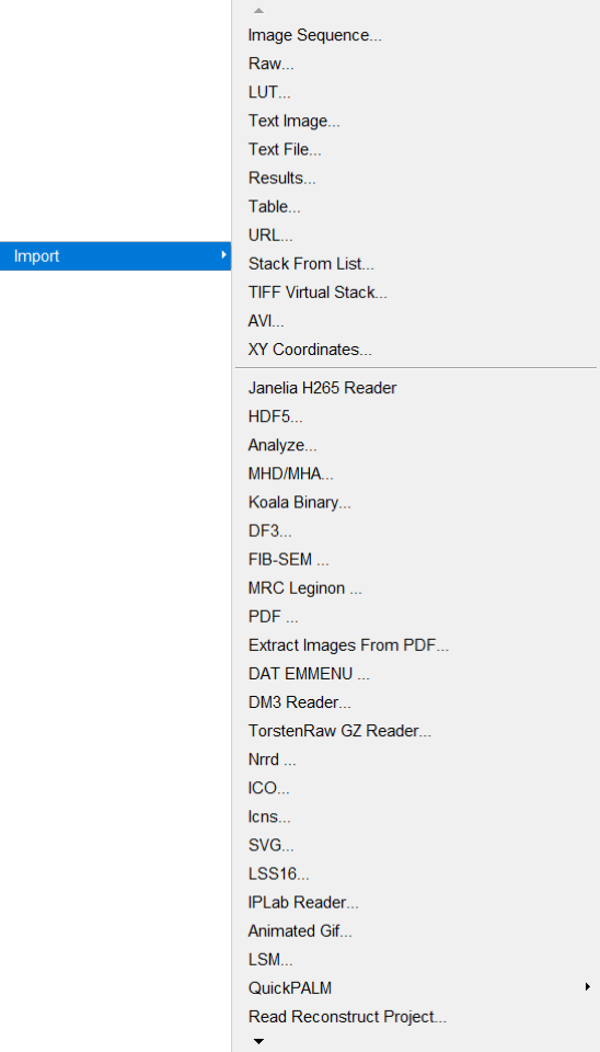
Hell, even just importing imaging data proves labyrinthine:
Okay. I'm done fussing over how convoluted Fiji's menus are.
I've worked with them for long enough to understand them a little better, though I still couldn't tell you what half the buttons do.
...like most of the art programs I use.
Yes, I've used Paint.NET since, like, 2018. No, I still have no idea what the "Clone Stamp" button does.
(by the way, if you're still using Paint.NET yourself for art, 1. what are you doing, and 2. Krita is much better for what I needed from an art program, so I might recommend trying that out if Paint.NET is getting on your nerves!)
Anyway, loading imaging data into Fiji usually gives you a video you can pan through. Most imaging data usually either represents a z-series, t-series, or both.
A z-series is imaging done on several layers of the subject's brain at a single time point, to create a 3D stack of images with time substituting for the depth into the brain.
On the other hand, a t-series is imaging done (usually) on a single layer of the brain throughout several time points. (Data I've worked with has ranged from 15-minute-long t-series to 100-minute-long t-series.) This again creates a 3D stack, though this time, time represents, well, time. (This is how most video is stored--even if the video itself is 2-dimensional, you're still "technically" viewing 2D slices of a 3D stack--though only super-nerds call video 3D.)
A zt-series can also be imaged by making several z-series over time, which can be processed into a 4D video. (Usually, though, the slices have to be processed through software to order them properly.)
Last year, I worked with zt-series a lot. This year, however, I've got easier work--I'm just working with t-series this time, to analyze calcium activity.
They're nicer to work with, to say the least. I've worked on automating the collection of calcium activity data by comparing the minimum and maximum values of each pixel throughout the whole t-series in order to determine where there's potentially calcium activity happening.
...in fact, once you get an image of the minimum and maximum values of each pixel across the whole t-series, you then work with those images as layers and use different functions to extract a mask that shows only potential calcium activity regions.
...
So it's adjacent to blend modes in a way.
Specifically the "Multiply" and "Divide" modes.
...
It's a bit of a stretch, of course, but working with these black-and-white images has helped me better grasp what's going on under the cover when I use those same blend modes for art.
Of course, I'm not using them masterfully yet. Really, I'm just using them to add blocky-ish shading to translucent objects.
...I'd show an example, but I can't find any pictures right now.
...
Sorry about the tangent.
I just feel like somehow this contributes to the intimate interconnectivity of everything.
Art and brain research being related on a software level.
#blog#neuroscience#neuroscientist#brain research#internship#art#art software#interconnectedness#blend modes#paint.net#krita#fiji software#imagej2#i dont know why i bother with the imagej2 tag#i highly doubt there's a vibrant imagej2 community active on tumblr#blogging about imagej2 on their blogs.#what a bunch of nerds
2 notes
·
View notes
Note
Sending the things fully so no annoying and stupid crosschecking :3
🌗 Is night or day better for drawing?
🙌 Draw a doodle with your non-dominant hand
🖍️ When did you start drawing? Do you remember?
✏️ Do you prefer traditional art or digital to relax?
🙊 Share your latest silly doodle with no context
✨ How often do you draw?
🎼 Your favourite music to draw to right now?
🌗 Is night or day better for drawing?
I'd say night time- feels better ig?
🙌 Draw a doodle with your non-dominant hand

i hate this...
🖍️ When did you start drawing? Do you remember?
Technically? 5.
Actually started doing it more? 9.
✏️ Do you prefer traditional art or digital to relax?
Either? I like drawing traditionally while watching videos.... and then doing digital art on my phone when it's night... or i listen to videos while i draw on krita.... idk.
🙊 Share your latest silly doodle with no context
My latest silly doodle was the non-dominant hand one, so... random doodle, go!!!

She's fine, don't worry about her!
:3
✨ How often do you draw?
...shrug? At least once per day? Kinda? Sorta?
🎼 Your favourite music to draw to right now?
i...don't know!! literally whatever is in my playlist- or whatever random music i find-
2 notes
·
View notes
Text
some art progression thing
i wanna look at how my art has changed over the span of about a year (a bit less but close enough) by talking about what i consider key parts of my progress. sooo lets go
also i will only be writing about my human drawings cuz ive been drawing dragons my entire life but only started drawing humans in 2021 i think
(long post sorry)

"kennith simmons"
first time posting art, first posted to reddit. i didnt give this one a title or anything i just called it kennith simmons. this method of toning was continuously used throughout most of my sketchbook drawings. drawn using pc, autodesk sketchbook (now known as just sketchbook), & mouse. not quite sure when i drew it but it was posted to reddit on the 28th of july 2023 so around then i think
(blood/sh warning)

"kennith again"
one of my first times attempting a front view i think?? at least, this is the earliest one i can find. i was pretty proud of it at the time. drawn using pc, sketchbook, mouse. posted september 7th 2023

"tongue"
i included this one because it was when i started to figure out how to do whatever the hell i did with the cup there idk what to call it but yk what i mean. drawn using pc, sketchbook, mouse. posted 27th september 2023

"a smile a day keeps the doctor away"
gave colour theory a try here, its not great but its a start. this one is pretty unlike any other ive done before and it took me a while to figure out how to do the hands and mouth like that (even though it still doesnt look right). the main reason i included this one is because of the background; i chose it because it reminds me alot of my favourite surrealism artworks, and i continued to use backgrounds like this in certain pieces, including a much more recent one!

"hi" (called "something or other" on reddit)
first time using an overlay of any kind- this is just a simple red one. i didnt figure out i could use other things like noise until later. I also tried to tone this one using just. a bunch of black lines rather than colours. drawn using pc, sketchbook, mouse. posted october 21st 2023

"messing with my head"
this was my first one drawn in krita! i really liked the various brush textures and stuff so i decided to go all out with this one. also attempted a bit more colour theory. drawn using pc, krita, mouse. posted october 23rd 2023

"nobody smiles like ray barnett"
i honestly dont have much to say about this one asides from the fact that i really like the toning method i used and i wanna use it again but i keep forgetting. also the lil shiny eye thing i still use that alot. and!! i believe this was my first time using noise overlay. drawn using pc, krita, mouse. posted october 29th 2023

"ponder"
possibly my favourite "old" artwork of mine
crosshatching!! i love crosshatching and i'd like to use that more often too. this one is old but i still really like it, especially the way i drew their teeth. also!! i used the background from the other one again. drawn using pc, krita, mouse. posted november 19th, 2023.

"fool's gold"
this one is special because its the first one i posted that was drawn with a drawing tablet! (it's actually not, but we dont talk about the real first one. i dont like it. at all.)
also, first time using a colour pallete which wasnt just the colours the characters canonically used. other then that i dont really have much to say about this one asides from i used crosshatching again too. drawn using pc, krita, wacom tablet, mouse. posted december 7th, 2023

"Best Friends"
1st posted drawing of 2024
i like this one alot still, it was my first time trying lineless art and i think it turned out alright. i also consider it significant because i still continue to use this eye shape in certain drawings. drawn using pc, krita, wacom tablet, mouse. posted january 2th 2024

"spoilers paper doll"
this was my first time making a paper doll and i think i could have done alot better but tbh this one was more about "finish before 2024" (i started it on the 31st of december) rather than "make this as good as possible". made with pens, pencils, beads, string, scissors. posted january 6th 2024

"creature"
i still like this one, particularly the way i toned it (if you can either consider that toning idk) as well as the way i drew the mouth. i dont think ive ever revealed as much gums as that in any of my drawings but i think its pretty cool.
the most important thing about it is i believe it's the first time i used this particular brush, and good LORD it is still my favourite brush ever. i dont think i will ever stop using it.
drawn using pc, krita, wacom tablet, mouse. posted january 30th, 2024

"unnamed aoapp fanart"
similar to the last one, but more. i also used that eye shape again here as well as a different pupil. and the cake. idk how to draw cake tbh. but i think it looks decent. it was also tough to achieve that body shape with all the other stuff going on. i really like the way i toned this tbh. drawn using pc, krita, wacom tablet, mouse. posted february 9th, 2024

"yes"
okok so this is where shit really started to change. this was my first lord of the flies fanart, and the weirdest thing about it? I DIDNT USE THE FUCKIGN SPAMTON NOSE (excluding my nathan & spoilers drawings). not a fan of how i drew the nose in this one either way but still. wow. i always considered the "spamton nose" a signature part of my style but i decided to just drop it in this one lmao. drawn using pc, krita, wacom tablet, mouse. posted march 3rd, 2024

"jack part 2"
okay nevermind the nose is back lmao. nothing to say about this one other then that tbh, it was just an experimental thing because i was bored and wanted to see how he would look in my usual style. i hate it tbh but it was still kinda fun. drawn using pc, krita, wacom tablet, mouse. posted march 9th 2024

"ralph and jack"
woah fullbody drawings. while im not super fond of the drawings themselves i do really like the pencil and crosshatching, i think it looks nice and would like to do it again at some point. now that im looking at it again i am making a mental note to work on my anatomy. drawn using pc, krita, wacom tablet, mouse. posted march 11th 2024

didnt name this one either. i drew the side view of the face differently to how i usually did it. it now has more of a nose. i also tried a new pupil type, kinda resembling certain older cartoon styles. drawn using pc, krita, wacom tablet, mouse. posted march 20th, 2024

"he got what he deserved"
oh man.. back to gnp again. theres alot of things i like about this one. it was intended to be just perspective practice (even tho its nothing crazy), im really happy with the linework and some of the toning (mostly the teeth tbh) but i also really like the mouth, and i used that weird mouth end thing in my most recent artwork because.. idk its kinda weird but i like it. probably the most "unique" eye i've ever done, same goes for the blood, and i used the same technique for the blood as i did in a later piece. overall i just really like this one ig?? def another one of my favourites. drawn using pc, krita, wacom tablet, mouse. posted march 29th 2024

"delicacy"
this one isnt super important either but i included it mainly because of the way i drew the mouth. its alot more.. realistic?? than how i normally draw mouths, the teeth especially. it was a pretty fun thing to try out and i think it looks pretty good. its also another lineless piece, this version was an unfinished one and sadly i never finished it. i may remake it though, who knows. drawn using pc, krita, wacom tablet, mouse. posted april 1st, 2024

"my jack merridew design"
again, not very important. but im including it because i believe it's my first ref piece, and its a really simple one but its been a helpful guide for drawing this character + knowing what i should include in a ref piece. ive also used it as a guide for colour theory, and by that i mean just slapping what i think fits over the colours and if it works, i use it. it was also helpful for drawing clothing, particularly the folds in the cape. its mostly pretty random but some are deliberate and i think its a good start. drawn using pc, krita, wacom tablet, mouse. posted april 14th, 2024

"i hate this guy"
my first time drawing noses like that in a while, since alot of them before that were front or side view practice. i drew this after finishing my visual arts assignment (not shared anywhere) in which i used colours similarly to this, which inspired me to try it again. the colours are a bit much but i do like it. this was also another unfinished piece that i never got to. it was supposed to involve ralph but i had too much fun colouring jack to actually get to that. drawn using pc, krita, wacom tablet, mouse. posted april 16th 2024.

"yawn"
tried a few new things here. i used a textured background (actually not my first time but oh well), as well as a different brush which i still use on occasion. and i also toned and coloured using a watercolour brush. also i attempted to draw a mouth like this on a more "humanoid" face, and i think i did a pretty good job of that. drawn using pc, krita, wacom tablet, mouse. posted april 21st 2024

this one was never named, despite it being my 2nd most liked lotf post i think..? (next to the fucking mining away video lmao). it was never meant to be that great it was just a random ass doodle i decided to finish because i was bored. i included it here because ofc there's the eye shine thing and shape again, as well as some.. interesting toning choices. but i also used the same kinda blood/gore again, and this time used the eraser tool to create holes rather than drawing in the holes, and i think it looks alot better. i also lined some things with white which i think gives a nice effect. i think my favourite part about this piece is the way i drew the jewellery though, its pretty different to how i did it before and i think it looks nice. drawn using pc, krita, wacom tablet, mouse. posted may 2nd, 2024

"i'll teach you the way"
i mentioned this one before, it has the surrealism inspired background, now featuring trees, clouds and sun. this one took so fucking long mostly because of the war paint on the right dude. to achieve that i made excessive use of the replace tool and it was tedious and painful. anyways i include this one because its similar to the colouring in one of the previous ones i put in here as well as the eye shapes being pretty different to what i usually do (and the background ofc). drawn using pc, krita, wacom tablet, mouse. posted may 5th 2024

"nathan's youtube channel"
this one isnt super special but it was by this point that i decided i would try and vary eye, nose and blush shapes a bit more. and i used that one brush again (can you tell im running out of things to say). drawn using pc, krita, wacom tablet, mouse. posted may 10th, 2024

didn't title this one but from here onwards, i started to try have more variety in how i draw noses. here i was aiming for a hook nose appearance. also, the blush is a bit more wavy, unlike the square blush i used to do. here i also made the shine on the eyelids some shade of blue instead of white and i think it looks alot better. drawn using pc, krita, wacom tablet, mouse. posted may 21st, 2024

"experimental side view"
first attempt drawing a more unique (for me at least) nose at a side view. other then that its not that special and i dont really like it. also i decided to use blue lineart out of nowhere which i also continued using for certain artworks. drawn using pc, krita, wacom tablet, mouse. posted may 25th, 2024

"simon with braces"
here I tried to draw angles of the nose I hadn't tried before in this particular way, and I think it turned out looking decent for a first attempt. I also tried to include a few more 'realistic' features like more prominent lips in the first piece. I also tried to adjust the colours a bit to fit the surrounding blue. drawn using pc, krita, wacom tablet, mouse. posted may 26th, 2024

"ralf"
my most recent "serious" artwork. i mean its just a drawing of ralph but I tried multiple techniques i wasn't very used to before, such as a bit of difference in perspective, as well as another different nose shape, and variation in the lineart colours. i also tried to tone it a bit more realistically (while still keeping it cartoonish if that makes sense. its bright but not as bright as that one jack drawing i also put here). drawn using pc, krita, wacom tablet, mouse. posted may 27th, 2024

"jack, the pig is here"
my most recent piece as of posting this. this one is just a shitpost drawing but I actually really like it. i like the flat colours with the simple black varying lineart. and the style overall kinda reverts back to my older style while also using aspects of my newer one (e.g. i used the new face & nose shape, while also using the weird wonky mouth that I kinda stopped using for a while during my experimenting.) it looks kinda weird but i genuinely like it alot and while theres stuff about it I would still change and try to improve i think it fits what i want my art to look like pretty well. drawn using pc, krita, wacom tablet, mouse. posted 2nd june 2024
sooo thats the post. i do want to continue experimenting and changing and improving over time, but im overall pretty content with the progress i've made in not a huge amount of time tbh. i like my style (most of the time) but im curious to see how it changes in another year or so
also i dont care that i have a tablet now i dont think ill ever be able to give up using a mouse as well
anyways thanks for reading, have a good day
#i feel like theres more I wanted to write but oh well#a couple of these (idk how many) are posted to reddit only so thats why they link to reddit#my art progress#my art#vessel214
5 notes
·
View notes
Last Seen Blogs

deaddictioncenters
Untitled

mtalkzcloud
Mtalkz
emmetofthestars
GOD BREAST AMERICA

suluhwa
wathever just gift me a dinosaur like Bumpy

johnsmith321
Untitled