#shadow map tutorial
Explore tagged Tumblr posts
Visit Tumblr Blog
Explore Tumblr blogs with no restrictions, modern design and the best experience.
Last Seen Tumblr Blogs


Fun Fact
In Q3 of 2020, 31% of US users access the Tumblr app daily.
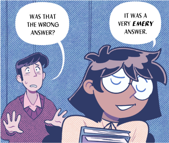
Text
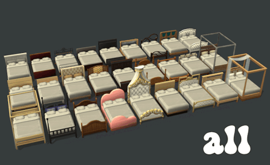
All beds? All beds. All bedding? Most bedding.
All of the beds from Sims 4 now brought to you in the comfort of Sims 2, plus a mega ton of 4t2 bedding. Hope you like them all, please let me know if there are any issues.
This also includes a default bedding file - these bedding are not included in the custom options because I didn't want duplicates 😅
Ultimate Collection (all packs/eps) is required. *Also you'll need LordCrumps' shadow file (you only need 1)*
One thing of note: thanks to @applewatersugar, I updated the uv mapping on the single bed using their beard tutorial so it is now aligned to double bed mapping. This means that some of my bedding won't look great on others' customs or TS2 single beds. There are very few that just look "off" (default replacements are pictured with TS2 bed). pic under the cut
Another thing of note: LordCrumps gave me permission to reupload the Horse Ranch beds + For Rent bed so it's all in one place. The single beds are updated with the new bed UV. If you have his, delete them. I did not convert/include the murphy bed because HugeLunatic did everything I would do here. So...maybe not all the beds lol
Download - LC | MF Updated 21 Aug 2024
credit: @lordcrumps @tvickiesims applewatersugar
@sims4t2bb - thank you for all you do!
There are previews/swatches of the beds and bedding included in the folders so you can get an idea of what you want.

Left: My 4t2 Bed Conversion Right: Others' custom single beds and TS2 single beds

defaults
#4t2#s2cc#ts2cc#sims 2 cc#sims 2 download#ts2 download#4t2cc#4t2 conversion#the sims 2 cc#sims 4t2#sims 2 custom content#4t2 bedding#4t2 beds#dl:buy#dl:obj#download#4t2conversion#4t2 cc
3K notes
·
View notes
Text
Art style breakdown /tutorial(??)

Some friends asked so here we go : disclaimer im bad at explaining (so feel free to send an ask or smth)
Final art (long read so theres a timelapse at the end)


If its not for something important (commissions), i dont usually make a lineart for a drawing but just clean up the sketch , it wont be used anyway

I usually separate them by colors , mostly so i can Alpha lock them and not worry about coloring over parts
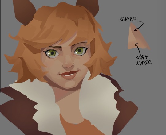
When coloring i use a soft airbrush to have gradients within the shading , so its not one solid color . How i shade is very blocky , lots of triangles lol (if im using CSP i love using the lasso fill tool ) but there are parts especially in the skin where I keep it smooth and blended, usually nose and cheek area . Using an asaro head is usually a good start to learning how to shade faces with planes in mind

Depends on the character, but I like adding shadows on the lashes/brows itself , make it look solid and 3d , it makes the eyes pop more imo

Using multiply layer to make the shadows darker for more contrast
At some point I’d merge everything together so i can just paint in one layer, easier to fix things with liquify too ; if im in CSP i keep the separate layers in one folder just in case i need em later but i cant really do that in Procreate cos of layer limits

This is the part where i make the shading more painterly .,To make the shading look sharper , i like adding lines on the edges .
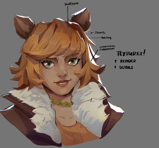
The fun part : adding the ✨
This is the part where I add textures , either from texture images or with screentone/hatching brushes. This is also around the part where i add the character’s accessories and stuff like scars and freckles (its just easier to add smaller things near the end than having them accidentally painted over at the start)
Whenever I feel like the drawing looks too much of a similar shade / temperature , I use a gradient map+layer effects (masked) on parts to give it variety . Technically you can do this by just having a layer effect on and manually adding colors but gradient maps make me go “ooooh didnt think of that color there “
CSP also has a posterization filter that i like using when i feel like some part looks too smooth to me.
I sometimes add in sketchy lines , and seeing how cool it looks in Marvel Rivals art ive been adding it more lol
Artists that influenced me are : Nesskain, Toni Infante , Valorant’s 2d art(their main artist is Suke) ,Arcane , Spiderverse and the most recent one ive been obsessing over is Marvel Rivals ( its got everything i want my art to be when it grows older lmao )
592 notes
·
View notes
Text
okay i'm back from the movies let's talk about screen and multiply layers

you can read part 1 of this series of tutorial posts where i mostly talk about gradient maps here.
now we're going to talk about the other layer effects. i feel like these ones are already pretty commonly known, but i've also been using them for like 15 years so it's very easy to assume everyone knows everything but actually i'm just old. anyway.
the panel up top is where we're starting from. i've got a nice blue color gradient applied, and everything looks a bit more harmonious. but...... those inks are pretty harsh, especially in contrast to the background, where there's no black inks at all. i'd like everything to come together a little more.
you can do this with a gradient map, if the darkest value is set higher than black. but since we're not using the gradient map at 100% (it's just 30%) the black isn't really affected by it. so it just stays black.
what a screen layer will do--and this is in practice, i don't know what it's actually mathematically doing--is turn your darkest value into whatever color is on the screen layer. so this is what a screen layer set to 100% would do to this panel. (NOTE: all the layers applied in this post are clipped to a folder containing just the characters. they are not affecting the backgrounds, they'll just affect the characters. the gradient map does affect everything)
That's Pretty Blue! the color that neeta's hair currently appears is the color of the layer. everything else is lightened up and also made a little more blue. and this doesn't look terrible, but screen layers will pretty much always make your art a bit lighter, because it's trying to make its color the darkest color. tbh it's great for fog effects and making your blacks light enough that a texture can show up in them. but let's turn it down a bit, to 40%.

hey nice. everything is still a bit lighter, but neeta and emery's hair isn't as sharp against the background. still enough that they stand out as the most important things in the panel, but not so much that they feel pasted overtop. it's a bit like putting some atmospheric perspective between you, the reader, and the characters. there's air in the image. (and why it's good for fog!)
but i want it just a little darker to make up for the lightening up that happened. i don't think i actually need to explain multiply layers, because everyone has definitely used those for shading at one point or another. but here i'm using a very very light blue over the entire characters. i'm not using it for shadows, but to make everything a bit blue.
now it really feels like they're in a room. the only pure white is the speech bubble and gutters. their eyes/teeth/glasses will still read as white, but they are not white. everything is at least a Little blue, so everything is unified.
and that panel above is what the final looks like! let's look at it side by side with just the gradient map.

neat! it would be perfectly acceptable to stop with just the gradient map, if you value high contrast black inks and characters popping off the page. i... don't! i like the air that's generated by going a little bit lighter overall. it has a nice matte effect, which is why i'm very glad my book was printed on matte paper.
and that's why hunger's bite looks so good. you should buy it and read it
343 notes
·
View notes
Text
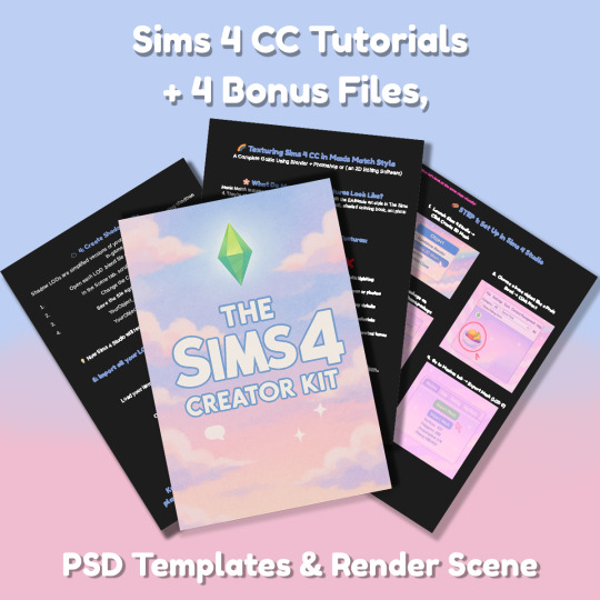
Sims 4 CC Kit — Make Your Own Lights, Decor, Clutter & Textures
Ever wanted to create Sims 4 clutter or decor CC but got stuck?
This kit is for you.
It’s a step-by-step guide that shows you how I make my own Sims 4 decor CC — lights, clutter, textures — in a way that I found works for me. You get guides, cheatsheets, templates, and my personal workflow that I’ve figured out through trial & error.
This probably isn’t the “proper” way of creating CC — but it’s how I learned, and it works and I use it every single time I create something new.
⚠️ Just to be clear:
This is a written tutorial kit, not a video or image course.
BUT — I’ve included some visuals, some screenshots & cheatsheets to help you follow along but its alot of written stuff. It would also be beneficial for you to have some basic knowledge of blender.
✅ What You Get:
Decor, clutter, lights CC Creation Guide
Shadow Mesh Tutorial
Mesh Cleanup Workflow
LOD Creation Steps
Maxis Match Texturing Cheat Sheet
Alpha Textures Basics
Vertex Paint for Lights Guide
Custom Thumbnail Tutorial
Normal & Specular Map Basics
Blender Basics Recap
Sims 4 Studio Quick Fix Cheatsheet
Blender Hotkeys Cheatsheet
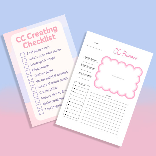
CC Planner to organize your ideas
CC Creating Checklist
PSD Thumbnail Templates (Decor)
Blank Normal & Specular Maps
Blender Render Setup File for Catalog Thumbnails
Texture Tips & Tricks
🎯 Why You’ll Love This:
No fluff — real steps, real help
Written for beginners who know basic Blender but need a hand
Includes a little bit of visual guides, printables & templates
Saves you HOURS of googling random problems
Helps you actually finish your CC & get it in-game
🖤 This is for you if:
You know basic Blender stuff (grab, rotate, edit mode) Got 3D Models you want to put into The Sims 4
You want to make clutter, decor CC and lights (not clothes or CAS yet)
You’re tired of tutorials that make you more confused
PS: Accessories & Clothing Creator Kits are coming soon.
If you get stuck, you can always join my Discord
(link’s on www.simmerkate.com).
Get Here (xx)
181 notes
·
View notes
Text
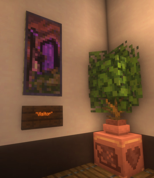
I finally finished a NEW CUSTOM MAP ART!!! "Visitor," a portrait of an enderman, is extra exciting because it's my first full-palette map painting, meaning I used block height to access all the highlight and shadow colours available!! More on the full process under the cut, but the short version of what this means is:
ITS A VERY COMPLICATED CONSTRUCTION. I created the art, then planned and built this manually, without any mods or schematics for construction. Huge props again to everyone else in the server for helping me gather all the materials to make this absurd thing possible!!!
This was the original art I made for it! I'm a huge fan of the "compressed" look of the vanilla paintings, so I've been starting with a large image and shrinking it down, though there were a lot of pixel tweaks to get it to read well. After shrinking it to 16x32 (for an art made of two maps), I convert it to a limited palette that I've set up to match the colours minecraft actually has available:

The map palette is actually tremendously limited, so figuring out a painting that will still look good with that constraint is a challenge in and of itself!
Anyway, the way minecraft maps work, a block that is Taller than the block to the north of it shows up with a slightly lighter colour, and a block that is Lower than the block north of it shows up on the map with a slightly darker colour. So when making a key for this one, I marked all the squares with a little arrow if it's the lighter or darker version:
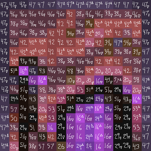
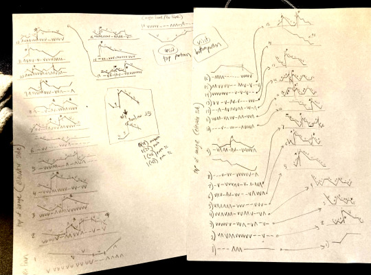
Each "pixel" here is a full stack of blocks on the mapped area: 64 blocks, 8 rows of 8. In order to achieve the affect of every block in a given pixel being taller or shorter than the block to the north of it, dark and light shades need to staircase either up or down. Because staircasing downwards in survival sounds even worse than this madness, I did some planning to make sure each of the "downwards" staircases would touch the ground, so I could simply staircase up from south to north instead. This involved figuring out how many up and down movements were in each individual column and planning out 32 little layouts:
It's worth noting that if you look up minecraft map art on Youtube, most of what you'll find is either, the simple realisation that placing blocks allows you to make custom map art, or an explanation of how to use a generator that will let you plug in any picture and then produce a schematic for you. It's very cool that these exist, but I wanted to do full palette art myself, without an auto-generated schematic, and at the time THERE JUST WEREN'T ANY TUTORIALS FOR HOW TO DO ALL THIS?? Now, having the experience of finagling all this, i think perhaps the reason is that this is a mad undertaking.
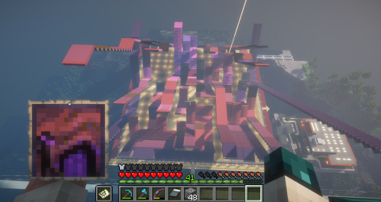
ANYWAY: PROGRESS SHOTS!!
I actually love how the staircases look..... its like some kind of modern sculpture
Fewer shots of the second half since I did it on call with friends; the last screenshot is one Thren took of me activating the new locked map to use for the gallery.
Once these paintings are done, I lock the finished maps, make copies, and stock them in the art gallery so other friends on our server can also put these paintings in their homes! It's a lot of work, but really rewarding to see my art decorating various buildings around the server. ;u;
I have one more custom full-palette painting I've done the art for and gathered all materials for; I still need to do the full key and plan staircasing for it before I can start, but HOPEFULLY if my resolve doesn't waver there'll be at least one more of these!!
#minecraft build#minecraft screenshots#minecraft#block game liveblogging#minecraft map art#GENUINELY SO PROUD OF THIS ONE#bsl shaders#im so tempted to make some sort of tutorial on doing this by hand sometime. you shouldnt do it by hand. but a tutorial should exist!!
485 notes
·
View notes
Text
youtube
NEW VIDEO TUTORIAL 🩷
After almost two years it's time for a new and improved version of my "How to make CAS CC" video. This time I will explain how to create a frankenmesh out of a jumpsuit and a dress for adult Sims! It's VERY beginner friendly so if you weren't successful yet with starting to make CC, maybe this one will give you the help you need!
All the topics I cover in this video below the cut:
00:00 Intro
01:00 Software
01:36 Downloading & Installing Sims 4 Studio
01:56 Downloading & Installing Blender 4.2
02:10 Downloading & Installing GIMP
02:20 Introducing Sims 4 Studio
03:03 S4S | Gathering assets to work with
04:09 S4S | Textures
05:12 Project Folder
05:34 S4S | Gathering assets to work with
07:10 Introducing Blender
10:17 Blender | Edit mode (Select, Delete, Wireframe)
12:38 Blender | Append second mesh (Proportional Editing, UV overlapping)
18:23 Blender | Join two meshes (Material, Merge)
20:03 Blender | Cleaning up the mesh (UV editing, Merge, Rip)
22:14 Blender | Cut number
22:43 GIMP | Making a texture (Select, Delete, Healing, Smudge)
24:52 Photoshop | Making a texture (but make it easy)
25:15 GIMP & Blender | Preview of the texture
25:43 GIMP | Making color swatches (Layers, Lighting, Fill tool)
28:33 S4S | Introducing the CAS area
29:15 S4S | Creating a package file
30:25 S4S | Importing all our assets
31:17 GIMP | Creating a shadow texture
32:24 S4S | The specular map
32:39 GIMP & Browser | Creating a normal map
35:58 S4S | Vertices & Polygons, LODs
37:02 Blender | Creating LODs
38:20 S4S | Categories (Tags, Allow for random, Gender restrictions)
39:36 S4S | Tuning tab (not covered)
39:47 Sims 4 | Results & Outro
434 notes
·
View notes
Text
STICKY POST: ULTIMATE(ISH) GUIDE(S) TO SIMS 4 CC-MAKING; OR, A COMPREHENSIVE COMPENDIUM OF TUTORIALS, INSTRUCTIONAL MATERIALS, & FELLOW COMPILATIONS OF A LIKEWISE NATURE
In which I list a fuckton of tutorials, guides, and lists of such, each written, curated, and crafted by people far more talented than I.
More will be added as I find them.
---
@teanmoon's CC Guides - Includes tutorials on cloning, uv_1, weights, bump and specular maps, bi-color hair, and a Blender Cheat Sheet. High poly 'creators' have little excuse to churn out high poly, non-optimized garbage when they can lean on bump maps. (I know those can only do so much for more complex meshes, but for objects, texture maps can do SO much heavy-lifting).
@vintagesimstress's CC Guides - Includes tutorials on using Blender to create objects and clothing, especially for people who are just getting started.
@eliavah's uv-1 adjustment tutorial. Haven't tried this myself yet, but after glancing through it, it's something I will surely want to keep bookmarked.
@simlaughlove's CC Tutorials List - Includes many tutorials handily laid out by category on everything from object texturing to CAS morphs.
@thefoxburyinstitute's Nav Page - This blog is nonstop Sims 4 resources for e v e r y t h i n g. READ THIS POST FIRST as a guide on how to actually... nav.
@simsresourcehub's Tags List - What it says on the tin.
Transferring Weights in Blender 3.3.1 - Over at Sims4Studio forums.
@trillyke's List of Tutorials - Good ones!
@sims4tutorials - *GRAND GESTURES*
@katverse's Huge List of Tutorials - Tutorials on eeeverything.
@thatsimslady's Massive List of Tutorials - 31 pages????? Damn.
@kouukie's Sims 4 CAS with Marvelous Designer Tutorial - YouTube video!
@rusticottage's Gifmaking Tutorial - I love Sims gifs tbh.
@cowplant-pizza' Boes' Editing Masterlist - Includes stuff for Reshade, PSDs, PS Actions, and how to use them.
@melonsloth's Deco Sim Tutorial - Using SimRipper
@depthofpixels's Deco Sim Tutorial - Using SimRipper
@azuhrasims' Guide to Posing Sims - Includes how to pose sims, and handy workarounds! Super great for beginners and longtime users.
@radioactivedotcom's Guide to Posing - Includes additional posing resources. NOT for beginners.
@madameriasims4's Add a Flame to Your Basegame Candle - Great for mood lighting and historical gameplay!
@syboubou's Making a Lamp Start to Finish - a video tutorial
MORE BELOW:
Adding Lit DST to Fireplace
New image ref for default overrides
Make an RGB Spec for Objects
Bake a shadow onto your object in Blender
Linking all bedding to a single frame
Cutouts for Doors/Windows/Archways
Making objects see-through/glass
Making lamps light correctly
Give an object transparency (add an alpha)
Make a candle w/ multiple flames
Change LOD viewing distance
942 notes
·
View notes
Text

hello and welcome to my tutorial on how to create gifs like this one! full explanation under the cut, but if you wanted to take a little peek at the gifset attached to this tutorial, here ya go!
for the purposes of this tutorial i am assuming you know
how to make a gif
what vhs footage looks like
STEP ONE: MAKING YOUR GIF
choose your footage and plug it into your desired software of choice! i use photoshop for this so i can only attest to the efficacy of these methods in that context
as for shot selection, you could feasibly choose anything. however, i prefer shots without too much movement in them - makes it look more like a home video.
because of the heavy amount of colors and filters, i'd recommend a gif somewhere around the 40-50 frames! but of course you can play around.
oh i also set the frame delay to 0.08 seconds. this is slower than most gifmakers tend to set theirs, but it makes it run buttery smooth imo.
STEP TWO: MAKING THE COLORING
here's where we get vhs specific. if you're unfamiliar with vhs footage, i recommend clicking through this youtube playlist! if you're not interested in the coloring, skip to step three (smart object fuckery + filters)
now while making a set i tend to choose some primary colors for my gifs. in the gifset i linked above, i chose to work with blue and orange-y yellow. in some of the other gifs i'll be using as examples (from an unfinished set) i chose green and yellow.


to create the above coloring i generally use these steps:
1) curves
i'm a maniac so i use the same curves layer to initially edit the luminosity AND colors of my gifs. the purpose of this layer is to edit brightness/contrast like i normally would and already start the process of changing the colors a little bit. this is my curves layer for the blue house gif:

to make the gif go from the left image to the right image:


as you can see i used the brightening curves to make the footage a whole lot lighter. i also increased the reds to get rid of the cyan tint a lot of blue footage has, slightly increased the blues, and once again decreased the greens to get rid of any cyan. this does make the blue hue a bit more purple, which is a nice bonus!
as for the gif of the boy, that one's a little harder to show a before and after for, but i'lls how the curves for good measure:

the original shot was already quite bright so i only edited the brightness a litttle bit. because i knew i wanted the gif to be green and yellow, i increased the greens, decreased the reds (except in the shadows), and decreased the blues (to get yellow)
2) channel mixer
now the channel mixer layer takes a little getting used to so i recommend experimenting. ALWAYS USE THIS LAYER ON THE COLOR BLENDING MODE for a more even result.
i use channel mixers to sort of... unify the colors a bit more. for the house gif, for example, i increased the blue channel to +110% blue, but decreased the blue in the red (-12%) to retain the yellow in the window.
if you want me to explain this more in depth, send an ask! it'll be kinda longwinded though


before / after of the boy gif with curves/channel mixer.
3) levels
this is where it starts looking more vhs-y! vhs footage has light shadows and dark highlights.
first, set your levels layer to luminosity blending mode to retain your beautiful colors.
then, crunch the hell out of your gif to make it very... mid.


this may feel a little wrong at first but i prommy it'll look okay at the end. a before/after for the boy:


now that's starting to look familiar right?
4) color fill/gradient map
because i want to unify my colors/make sure my gif is saturated, i usually add either a color fill or gradient map layer. in the case of the house, i chose to go with a dark blue color fill:


because the coloring of the boy gif was a little more complex, i decided to go with a brown to green gradient map.

this will make the shadows yellow, and the highlights green.


BOTH THESE LAYERS ARE SET TO OVERLAY. i usually fiddle with the opacity of them until i like it, but it's anywhere from 7% - 17% depending on what i feel like that day
5) curves (again)
this layer is probably useless but i do it anyway to make myself feel better. this is just a regular curse layer to up the brightness a tiiiiny bit and amke sure everything's clear. also it helps counteract the darkness your overlay color will add in.
6) color balance
this is my most subtle layer so i won't be able to show before and after but i fiddle with the color distribution a little until i'm satisfied. set this layer to color blending 'cause that's what you wanna affect!
i decided i wanted the house gif shadows to be a little more purple, for example, so i added in red (+3), magenta (-1) and blue (+1). etc etc. do what feels good!
STEP THREE: SMART OBJECT FUCKERY AND FILTERS
OKAY that was a lot. sorry or you're welcome. but good news: now's the fun part. convert your animation to a timeline, then select both your coloring and gif layers, right click, and select convert to smart object.
now that your gif's a smart object, i usually crop it. i tend make vhs aes gifs a 4:3 ratio (so 540 x 405 px) because that's what vhs footage was usually recorded as! crop your gif, resize, and then we can continue.
1) color bleeding
vhs footage usually bleeds its colors - this manifests as a short of... weird subtle halo around any object. the way to recreate this in photoshop is to duplicate your smart object.
set your copied smart object to color blending. now move it to the side a couple of pixels (i usually do around 5px, but you do you!)


as you can see, the tree and chimney (and everything else but less prominently) have a yellow shadow to them. this is exactly what we want!
2) filters
now's the time to add your filters and make it look like shit (but on purpose!) first, select both smart objects and convert to smart object again. this will ensure the filters apply to all layers evenly.
i use the following filters:
unsharp mask (amt 35%, radius 4px) - this will subtly add some sharpening but only on the edges of objects
add noise (amt 7.5%, distr. uniform, not monochromatic) - this will add the signature vhs grain.
box blur (2px) - i edit this to be 75% opacity with the little arrows to the right, just to make sure you can still make SOMETHING out when you're looking at the gif. MAKE SURE THIS FILTER IS ON TOP OF YOUR NOISE FILTER. tumblr will kill your gif otherwise
4) ONE LAST THING
usually at this point i'm not happy with either the saturation or levels. (usually the levels). so on top of your smart object, add another saturation or levels layer and fuck around!
in the case of the house gif, i thought it was too bright still so i set my output levels to 13 and 216. for the boy, i thought the shadows were too dark, so i set my shadow output to 11.
BEFORE & AFTER:


aaaand that's it! thanks for reading! if you have any questions, feel free to come to my askbox, i'm always happy to explain my process. happy giffing 🥰
#gif tutorial#ps tutorial#photoshop#completeresources#allresources#giffing tutorial#vhs gif tutorial#idfk. what do you even tag for tutorials lmao
319 notes
·
View notes
Text
CC Creation Tutorial: Smooth Seams in Blender

In this tutorial, I will show you how to make your mesh seams smooth inside Blender (no Milkshape required!) and walk you through the process step by step. We will make a perfectly smooth mesh and transfer the normal data from that mesh to our main mesh using the Data Transfer modifier.
I am using Blender 3.6 in this tutorial (though you should be able to follow along using other versions as well)
You do not need to have much previous knowledge to follow this tutorial, but I assume you know some basics in Blender like how to select, things, navigate around, etc, and know how to import the meshes and put them into Blender.
For this tutorial, I exported the Sims 3 afbodyEP4DressPromBigBow mesh with TSR Workshop. You can use any clothing mesh you like though, and works on any meshes, not just Sims 3 ones.

This is our mesh. You can already tell that it has the dreaded seams on the neck and the rest of the body.

First, we need to make a copy of the mesh (in Object mode, select the mesh and hit Ctrl+D Shift+D to duplicate it, then hit Esc to stop it from moving around).
Rename the mesh (I added Seamless to the mesh name).
Make sure the original mesh is hidden (click the eye symbol) and select the Seamless mesh.
Press the Tab key to go into Edit Mode.

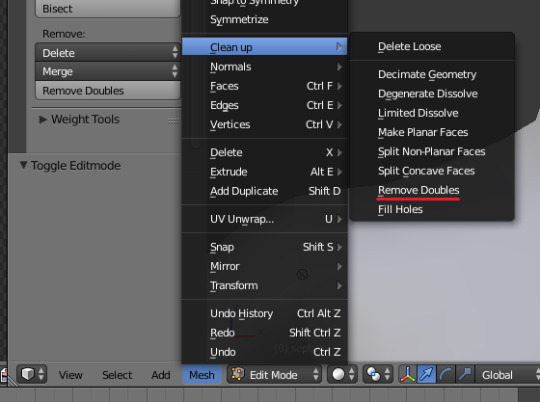
Now we select the parts that we want to have smooth seams. Let's select everything that is skin (you can select a litte piece of the mesh and then press Ctrl+L to select the entire piece)!

Now, press M and in the menu, choose By Distance. (in older versions, this is called Remove Doubles).
This will remove all double vertices at the seams on the selection we made.

It will show you how many vertices it removed. The skin looks nice and smooth!
Let's switch back to our original mesh: Make sure you deactivate the eye on the Seamless mesh and activate the eye again on the main mesh. Then, select the main mesh.

Now, let's add a data modifier to our main mesh. Click the blue wrench icon in the vertical list of the properties panel and then onto Add Modifier, then choose Data Transfer from the list.

As the source, we choose our Seamless mesh.

Also toggle on Face Corner Data and click the Custom Normals button.
Hold on, there is a message saying that we should enable Auto Smooth in Object Data Properties. Let's do that next! (if the message does not appear for you, maybe Auto Smooth is already on).

Click the green inverted triangle button and in the Normals section, toggle on Auto Smooth.

Now we can switch back to the modifier tab by clicking the blue wrench icon again.
But hang on, what happened to our mesh? There are now black spots over the dress and shadows on the legs!

This is due to the Data transfer modifier's Mapping setting. If we change it to Topology, our mesh goes back to normal again. Phew!

Now that the normals look good, we can start the transfer of our new smooth normals from the seamless mesh to our main mesh. To do that, we hit the Generate Data Layers button. This button works destructively, so you cannot undo what it did, just FYI.

Note: On newer versions of Blender, Generate Data Layers may not be enough to transfer the normals and you may need to apply the modifier instead.
You can toggle the modifier's visuals on and off with the little screen icon to see the results after you click Generate Data Layers to see if it stuck. If it did not (and you see the seams of your base mesh when toggling it off), try to apply it instead.

I switched from textured to solid shading because the differences are just more noticeable in this mode. This is how our mesh looks now with the modifier turned off.
Because we clicked the transfer button, the normals have been permanently applied to our mesh. The skin is smooth now, and so is the dress (even though we did not smooth that one, hmm...)

If we toggle the modifier back on, suddenly the dress has seams again! What's going on there? I'm not exactly sure why, but Auto Smooth seems to be doing some smoothing on the dress mesh as well.
I am not sure if this is normal behavior or not, but let's pretend that this did not happen and the modifier in fact did not smooth the dress.
Maybe we just forgot to smooth some areas on the Seamless mesh that we noticed only later on. That's no problem. We simply modify our Seamless mesh again!

So let's swap back to the seamless mesh and select it (remember to click the eye icons so only the Seamless mesh is visible).

Let's select the main dress parts and press M -> merge by distance on them. We cannot smooth the whole dress all at once, because then that would remove some seams that we want (like those for the backfaces and the middle section of the dress where the bow is attached).
If we remove the wrong seams, we ruin our normals and will have black splotches.

Now, let's select the backfaces and areas we left out before and repeat this process: M -> merge by distance.

Look at how perfect our Seamless mesh is looking now! Now, let's transfer those beautiful normals to our main mesh.
Select the main mesh and toggle the eye icons again, to hide our Seamless mesh and reveal our main mesh.

Once again, we will use the Generate Data Layers button in our Data Transfer modifier. If you have previously applied the modifier, just add the modifier again to the main mesh and use the settings shown here.
And that's it, you are done! You have a perfectly smoothed mesh that you can export now.

Final Note: it is best to transfer the normals at the very end of your meshing process because any action that recalculates the normals can reset our custom-made smooth normals again.
Of course, you can simply use the Generate Data Layers button again to re-add them, but it saves you time to only do this step at the end.
I almost forgot to say: You still have to use Mesh Toolkit to fix the seams on the edges of your mesh and do the usual shenanigans.
188 notes
·
View notes
Text
How to convert Sims 4 3D CAS Rooms to Sims 3

Disclaimer: If you’re not familiar with Blender/TSRW/UVs then this tutorial may not be for you. If you don’t have Sims 4 Studio which needs the Sims 4 base game (or don’t know how to extract the meshes without it) this tutorial may not be for you. Honestly it’s pretty straight forward, but there’s a lot of trial and error and going in game and out of game checking placement, etc. I use Blender 4.1 for this, but you should still be able to do the same things in the older versions. I'm trying to make this as easy as possible. I’m here to answer any questions though 💕 Tutorial below
Things you’ll need:
Blender (whatever version you prefer)
Sims 4 Studio
TSRW ( I use version 2.0.86)
My Christmas CAS Room here
My TSRW work file here
Tutorial:
Find a Sims 4 CAS room that you like and open it up in Sims4Studio. This is the one I'll be using for the tutorial.

In the Texture tab, export the textures. The only textures that matter are the first 3 diffuse. Go to the Meshes tab and export the mesh, it will save as a .blend file. After that you can close out of Sims4Studio.


Open my Christmas CAS Room in TSRW. You'll get this message. Hit ignore and don't send. We only need this file as a reference to resize the SIms 4 CAS room. Export the mesh as an obj, name it whatever you like. You can close TSRW for now.

Open Blender and open the .blend file you exported from Sims4Studio. Make sure to delete studio_mesh_0 as it's just the shadow map and we don't need that. This is what mine looks like after fixing the textures.

Then import the wavefront obj you just exported from TSRW. Again we're just using this as a size reference.
This is what it looks like after I added the obj. I scaled, moved, and rotated the room to match up as close as I could with my reference mesh. When you have it lined up to your liking you can delete the reference mesh. I usually import the sims 3 body to see where my sim would be in CAS as well so feel free to do that too.

Now we have to separate the objects that use transparency in the scene to their own group. The transparent objects will always be located on studio_mesh_1. I usually do this in UV mode. Make sure UV Sync Selection is on. Where the red arrow is, that's the UV Selection button. It's blue so that means its on.

Tip: If you're using the same Blender version I am (I'm not sure if the older versions below Blender 3.0 do this) you can disconnect the alpha in shader editor and then you can easily see what uses transparency because it has a black background like the plants. Don't worry about the one outside the window as that's on the backdrop image and doesn't show in CAS.
Important: Also, make sure you delete the back of the mirror frame or it will show through the mirror in game. I usually select it in the UV editor as well and delete it.

After selecting all the objects that use transparency, I go to the 3D viewport window and press P, then selection. Now they're on their own layer as you can see. That's a very important step so please don't miss it.

Sims 4 CAS Rooms don't have a closed room like ts3 and if you don't add walls/ceiling with planes you'll be able to see that it in CAS. You can do this in any way you're comfortable with. If you don't understand how to do it feel free to ask me. For this tutorial I will not be doing this perfectly lol I've done enough rooms and I'm just trying to teach here 😩

Okay now last is renaming groups to import into TSRW. Make sure it's in this exact order and uses the exact group numbers.
Group 0 - Mirror
Group 1 - Windows/Curtains
Group 2 - View outside the window
Group 3 - Walls
Group 4 - Objects with transparency
Depending on the CAS Room you convert, yours may not have a mirror you know. You can delete groups in TSRW, experiment, feel free to ask me questions as well.
After renaming the groups, select only the groups you renamed and export as an obj. Make sure that object groups is checked so that they can stay in groups.

Open TSRW and open the testroom_cas.wrk file.
After opening the file you'll see this exact room in this tutorial lol because I had to test some things first 😅

Import the CAS room you converted from ts4. You'll get these two messages. Click yes on the first and no on the second.
Disclaimer: Make sure you reduce polygon sizes or it won't import and give you an error


Import your textures (yours may be different than mine depends on the converter) but most have been the same that I've seen. Group 0 is the mirror it doesn't require a texture. Group 1 and Group 4 usually have the same texture.
Disclaimer: TSRW an be finnicky with textures sizes, I havent gotten any issues since using the 4GB patch, but just in case. Texture sizes from ts4 can run pretty big 4096x2048 even 8196x4096. I would resize to no bigger than 2048x1024 in my opinion, but whatever works for you.
After export to sims3pack or export as package file. Make sure you compress your files and you should be good to test your CAS room in game.

This is the finished product. Should look something like this or better lol considering this was quick 😅
If you would like to make your own from the original ts3 cas room, I would suggest watching this Youtube video (it's for TS4 but it still applies and is helpful) and the link to the original ts3 cas room is here. Since we can convert ts4 to ours you could probably just build your own and go from there as well.
Thanks to @mookymilksims for testing things for me and converting her own. If you would like to try this tutorial out and experiment with room placements using @boringbones Ultra wide CAS mod which changes the field of view in cas so that you can see the whole cas room, it is here. I didn't use it for mine, but that's only because I found out about it after from Mooky lol and I'm tired of converting them 😅 but feel free to ask me any questions if you need help 😊
#ts3#tutorial#sims3#I hope this helped#been procrastinating finishing this 🙃#cas room tutorial#sorry if it's long#tried to be thorough and make sure everything was correct#my tutorials
172 notes
·
View notes
Text
Self-use Sims 3 CC Tutorials List
Here is a list of tutorials from which I learn to convert/create sims 3 cc in a few months (and as a poor English speaker). I think it might help someone who also wants to try making things for sims 3 but doesn't know where to start, though it's been 15 years from the game release and even Inzoi is coming hahah.
The list covers objects, clothes, hairs and eyes. I know there're lots of tutorials not listed here, that's because I haven't tried them in my projects by hand. But The list will be updated with new things I learn. Most tutorials are in English. Thanks to all these creators for sharing their precious knowledge!
Sorry for the miserable format, cuz I wrote them in Patreon and paste here. You can also read it there, free of course.
Where I find tutorials
sims 3 tutorial hub
ts3 creators cave and its discord
Mod the sims tutorial wiki and the forum
pis3update tutorials tag
General
CC basic concepts by nightosphere (for clothes, most knowledge is shared with objects)
Tools
TSRW guide by apple (for objects, most knowledge is shared with clothes)
Blender
shortcut by Blender Guru
beginner tutorial for version 2.5, 2.8, 3.0, 4.0
3.5入门教程 (youtube / bilibili)
设置切换语言快捷键 change language shortcut settings
图片取色器网站
Mesh ToolKit with Seam Fixer for all ages
Topaz gigapixel AI guide / higher quality texture
Texture
Nicer bake / bake in blender 2.78
Bake in blender 2.93
Make normal map
small size blank texture
Reasons for black blocks on baked image
Adjust texture color without losing quality
Object
clone obejcts with S3OC
4t3
Functional Objects
Functional bed
TSRW setting
Combining Textures for Objects with Multiple Textures
Add normal map to objects
Introduction to slot categories
Add slots in TSRW
Edit in-door shadow or occluders in TSRW / Talks about 3 kinds of in-game shadow by Pocci
Clothes
4t3 by nightosphere
Reduce polycount / fix seams, holes, shadows or normals
Bone reference rule
Avoid milkshape workflow / adjust bone assignment and morphs in blender
Manually fix bone in blender
Convert between ages/body meshes
TSRW check list
Fix long clothes clip with body
Fix holes on morphs (easier in blender)
Extrude collars
Create texture in PS
Avoid TSRW workflow / CTU tutorial
Hairs
Avoid milkshape and TSRW workflow / delete backfaces / handmade morphs / DABOOBS guide
Keys pointing to in-game blank textures to save file size (for DABOOBS not TSRW)
Reduce polycount
4t3
Fix weird seam lines on hairs from s4s
Fix pigtail issue
Eyes
Convert contacts to default eyes
244 notes
·
View notes
Note
hello i love ur art <3 may i ask how you shade/render? or if you can share any helpful tutorials you learned from ^^


Unhinged Art Tutorial
Well, anon and @merlucide! I'm not sure if I'm the best person to learn from (I'll attach some video links at the end to people who I personally look to for art advice) but I happen to have a series of screenshots for how i render with a strawpage drawing I did recently(at the time I drafted most of this a month+ ago), so I'll go over what I do, at least in this case.
Warning: A bit rambly. Not sure if intelligible.
Tutorial..? Explanation? under the cut.
I have a few different shading styles based on ease of program usage and effort level, but in this case i had to individually streak the shadows. I'll be focusing on hair and skin for the most part here.
My sketches are pretty poor, because I'm hasty:


Honestly I find the better the initial sketch, the easier the final profuct will come. So take your time, use layers when sketching to be clean. The airbrush layering shows vaguely how I tend to shade hair.

Backlighting *Applicable mostly when there is a bright background, light behind the subject, or in neutral lighting.
The 'underside'/inside I tend to use a peachier, brighter tone closer to the skin color (for tanned skinned characters I'd use a shade closer to a rosy orange, since that's just a more saturated peach. For darker skinned characters, I'd recommend a slightly redder & brighter version of their skin tone. This works pretty well with dark hair+dark skin, but in the case that your character's hair color is a lot lighter compared to their skin tone [also in the case of a fair skinned character with WHITE hair] it's totally fine to ignore the natural undertone of the character and shade it with a pinkish white.) This works for any hair texture but can be more time consuming for coily hair textures. (2c-4c)

Lineart when I take my time / Old rendering video


It looks more stable if you start off with a solid lineart base because you won't struggle with big-picture placement issues.
"Lineart" when I just try to pump out a drawing

I first did a rough sketch, kept it as an overlay layer and drew over it.

(Chickenscratching is valid though, honestly. I think it has a look to it!) I usually block out base colors, and vaguely where I want the shading to go, unless I need a special type of lighting, which then I'd do the base colors and either choose to wait until I'm finished rendering or do light processing* (*will discuss this later in this post) with different blending modes and layers.
For example if I'm doing the colors mostly FIRST (Choosing a grayed out palette) and then rendering, it'd look a little something like this: Left (Trackpad, on FireAlpaca) / Right (iPad, on Clip Studio & Procreate)


Sometimes, I'll shade with a dark, grayed out tone and then fill it in with something slightly more vibrant. This kind of gives it a bounce-light feel? Also with a lot of pieces I do recently I try to block out entire parts as white because lighting especially on white background pieces looks better if you pretend that it's white behind the character due to an intense sunlight.

Also, I use gradient layers to tweak with the colors. It's pretty useful and looks nice!!!! Gradient maps are available in every software I use: Procreate, FireAlpaca and Clip Studio Paint.

I find that the more intense the light (but not scattered, as in the source is either very bright or it's very close) the darker the shadows usually look? And if there's a brightness coming from behind the figure and the hair is splayed out in some way, it will appear semi translucent because it's just a bunch of strands made of keratin and collagen, something like that....


Anyway this is all very messy but I hope it helped

Here's a process photo for how I shade if that helps too.


More examples..

I broke down my thought process in my lighting so here's a close up of that.
i totally forgot about the video links so here's my idol the one and only:
And I think this guy makes quick but concise tip videos:
Finally I really like the in depth professional explanations from a long time illustrator:
I've personally taken advice from all three's videos and used them to improve my own art, so take a peek!!!!
76 notes
·
View notes
Note
hi goat! do you have any tips/ideas on making 4t2 items look less plasticky? would new textures work or is it maybe something with the shading? or maybe it's the rounded edges on everything....
hi anon! I know you sent this a while ago. Thanks for waiting. I do indeed sometimes retexture TS4 converted objects.
I am no expert! But! Here's what I usually do:

For this tutorial, I will be using @janika31's 4t2 conversion of the Siten-Ze Reclaimed Wood Sofa.
It has the rounded edges you speak of (typical of TS4 objects) and a texture that could be considered 'plasticky' too.

What you will need to do first is open SimPE. We need to be able to look at this mesh nice and close!
When the mesh is opened in SimPE, go to the 1. Geometric Data Container and click on it 2. find the main object in the Models list (sofa) and make sure it's checked 3. Export the object.

You'll need to load said object into a 3D Modeling program in order to look at it.
I like UVMapper, because it's free (well the free version is anyway lol) and it's very easy to use.


While you're in SimPE, extract a texture or two from the original object. You will need them. Light or white recolors will be useful.

With the object loaded into UVMapper, this is what it looks like!
UV map of the object on the left, object (with no texture) on the right.

Add the texture in.
UVMapper is going to be our main working area. Other than an image editing program like Photoshop or Gimp. You'll need that too.


Let's get a good look at this base texture - we can see it has the wood parts of the couch, the main couch texture and some pillows.
If you find UV maps helpful (I do!) you can extract one from your 3D program.
With UVMapper, I needed to make sure that I've specified the size of the image so the UV map will match. This texture is 512 x 1024.

Now for the fun part! You should be able to copy in the base texture as a new layer, and then delete everything that is not the wood part on the UV map.
I've actually missed the foot of the couch here, but I will fix it.

If you're not already working with a white texture, make one. I like to use @pooklet's Primer and Time Bomb for this.
This white texture is very important as it will serve as the shadow and highlight that the new wood texture will be sandwiched in between.

With the new white texture created, when loaded into UVMapper and displayed on our couch, it looks like this. ^

This rounded edge here, this is a problem area!
With retexturing clay hairs, we want a rounded or 'bumped out' part of the mesh to be highlighted, to give the illusion of shine on hair.
But in objects, especially wood ones that we'd prefer to not look like plastic, we want the opposite effect; this shine should be reduced.
This is pretty easy to remedy in your image editor! But first:

Remember how I talked about how the white base texture was going to sandwich the wood texture? Here's what that means (layers):
1 The white base texture, Normal, 100% opacity
2 Our wood texture. This is something lifted from a Maxis endtable?
3 The white base texture, Multiply, 100% opacity
4 The white base texture, Overlay, 22% opacity
5 The white base texture, Soft Light, 22% opacity*
Optional layers: 1) another white base texture, Multiply, 100% opacity if this is a dark recolor, as it will add more depth 2) the base texture, but in an orange or yellowy color Multiply, 100% opacity (when this is added, it will help when a warm recolor looks too ashy)
*these percentages of how opaque the layer is are arbitrary. They work for me, do what works for you.
Okay! Back to the 'problem area'

This highlight here ^ on the rounded arm of the couch; if you don't want it, here is what I would do:


Locate where that highlight is in the texture. Found it!

Here's how to REDUCE that shine:
1 Locate your base white wood texture layer, Normal opacity.
Notice how the whiter part of this texture, when layered as I've described (Multiply 100%, Overlay 22%, Soft Light 22%) translates as shiny when it's laid on an object.
The way to make that appear less shiny is to make it less white. Less white means less of that shine that can read as artificial aka plasticky. When you make that more grey than white, more of the background wood can show through the semi-transparent layers.
2 Take that noticeably white part of the base texture and make it grey! Copy a chunk of the greyer texture, paste it on, blend in or erase the edges to make it look smooth. Merge the layer.
3 Change your Normal white base layer (now edited to be greyer in that one specific spot) and copy that as 3 new layers: Multiply 100%, Overlay 22%, Soft Light 22%. With the wood texture underneath all of them. Base, wood, Multiply, Overlay, Soft Light, in that order.

Before...

...after! it's subtle okay

The same kind of sandwiching method with image layers can apply to the cushions too.

There! A method for retexturing TS4 conversions that helps them not be as plastic looking. 😊
One last tip before you go off and try retexturing conversions yourself: @pforestsims's Easy Shine Removal kit for SimPe. A must if you're looking maintain that matte look.
Let me know if you have any questions!
136 notes
·
View notes
Text

(ts4) cc making testing guide
we've been making cc for a longg time and figured it would be good to share how we test our own cc and make sure it works for as many sims as possible! the guide will be based on a loose understanding already of s4s.

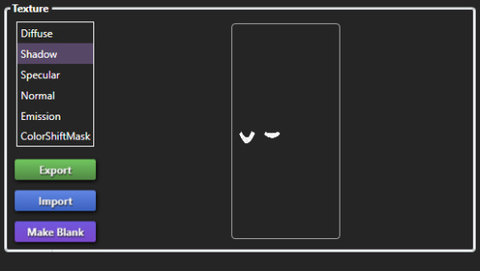
remove the original shadow, specular, and normal maps!!! a lot of the base items you start on do have their own speculars (what makes it shiny), shadow maps (false shadows to make it look better), and normal maps (extra details outside the plain texture). very rarely those will work exactly with what new item you're making, so be sure to REMOVE them! double triple check that they're empty by clicking "Make Blank" in s4s. if your mesh is shiny even after removing the specular and there's already no normal, you need to upload just a blank 1024x2048 png to it to remove the shininess.
having weight transfer issues? try subdivision! sometimes when using "nearest vertex" weight transfers your CC can well.. goof up in CAS and be reallyyy spiky. those are the vertices that have screwed weights and smoothing out the weight transfer by subdividing it will help tremendously. subdividing will just double the amount of poly you have - imagine you're folding a piece of paper. your UV is small if you just fold your paper 4 times thus not much room for morphing wiggle room in your weights. fold that paper 16 times? that's a lot more coverage and wiggle room for morphs!
test on multiple sims - maxis defaults, cc presets, skintones, etc! more the merrier! just remember that everyone's sim is not like the standard female/male sim bases a lot of cc making is done on. you'll want to check how it looks on larger sims, different skintones (not just white to tan!), the opposite body frames, even on CC presets to see how well the weights are working. not everyone uses the same CC, so take it as a bouncing off point on what needs to be adjusted to work as best as possible. not everything is going to work perfectly! there's a lot of different mods that can make extreme changes you just can't account for if you're going for a general audience. it also helps to load different sims to try your CC on. sometimes you get a red herring where it works on the first sim you load up! all of the sudden everyone loads it up and it's not working at all. that's just ts4 for you, so watch out!
update your CC's tags! go through each and every category of your package to make sure it aligns to what it even is! make sure it appears in the right outfit category, not meant for kids, whether it should be on in the shower or not, and TAKE THAT ALLOW FOR RANDOM TICK OFF! not everyone knows how to use s4s and shouldn't be expected to go through all their CC to fix the tags so it works properly for your game
don't just stand there, make them walk! a lot of CC can look perfectly fine on a still model, but you can find a LOT of issues just by loading a walk cycle in CAS to see if there's any weight issues, clipping, or anything really odd that shouldn't be happening. people who use CC in their gameplay will be having their sims walk, talk, sit, and animate, so be sure they're just not gonna flash everybody or got some polygons stuck in their teeth!
exporting a s4s mesh? let's clean it up! for some reason when you export a s4s mesh, there will be extra polygons that can easily be removed in blender. in this tutorial, we'll be using 2.7. this really helps on high poly meshes and remove any conflicting UVs that can make clipping issues.
we hope that helps! this is based on our private guide for people who test our own CC, which you should definitely try to reach out to others to test it out. each computer is unique and something can pop up you wouldn't ever come across - it doesn't hurt to try work out all the kinks before publishing! if you need some more help or starting point, we even have our own resource pack that has great references and items that will make your process go easier. good luck to your CC making journey <3
96 notes
·
View notes
Text
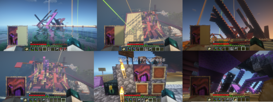
shadow map issue (for cc creators)
i don't sure, if somebody mention it before, but recently i noticed what some cc are causing strange pixels on clothes
it's not big deal, but sometimes i get really confused why my cc clothes get them when they look fine in sims4studio :D
pixels/no pixels (no hq mod)


as it turned out, they are caused by the shadow map
to get rid of them you shoud avoid the situations when your shadow map is full white (you can check it better with dark sims4studio theme)

it shoud be like this (ea's necklace example)
to prevent this i recommend to create your shadows map with this tutorial (it's really helpful!)
hope somebody finds this info useful ~
253 notes
·
View notes
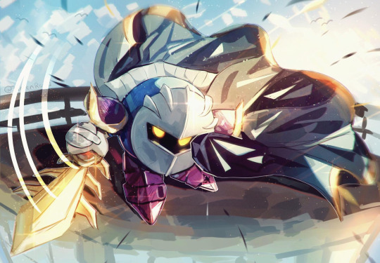
Note
your rendering is so good how do you do it
Thanks, I love your rendering too!! Gonna try and make a tutorial ^^
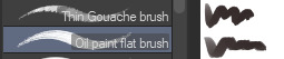
To start off, I'm on Clip Studio Paint and these are the brushes I use! First two for rendering characters (round brushes) and the other two for mostly backgrounds (square brushes)

I used to do lineart, but it takes too long >:( now I just make a sketch and sorta clean it up!

Next I fill it in with a gray color. For simpler pieces I just put in the flat colors, but for more paint-y pieces I do grayscale -> color! I'll be doing that here :)
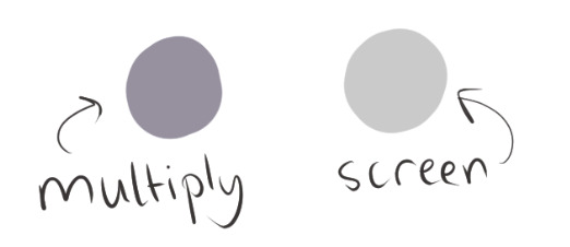
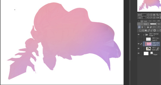
Also, I make 3 clipped layers on top of the gray - two are multiply, and the top one is screen. On the first multiply, I do a soft gradient using an airbrush
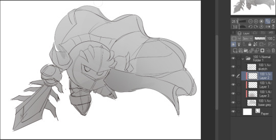
On the next multiply layer, I fill everything in with either a cool-ish or warm-ish gray, depending on the mood ^^
I also determine a light source, and use the lasso tool on the screen layer to block out where (I think) the light hits! Tbh I just do wherever feels right lmao, but I recommend having a reference! I like doing it in triangle patterns
Then adjust the opacity of each layer to whatever feels right, and merge everything (I don't merge the sketch/lineart yet, I do it before adding colors in!)
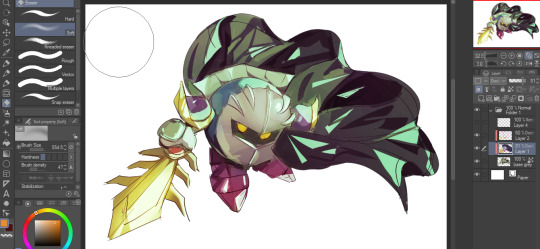
Now... rendering. Some tips I have are color pick (greys) off of the canvas and use them to paint! Clean up the sketch more, erase edges, but I save details (like Galaxia's red gem, his eyes, etc.) for the end, or during coloring.
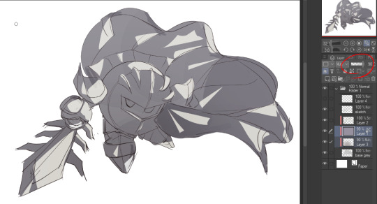
After I'm sorta happy with it, I merge the sketch layer, then duplicate it, and add a gradient map! I did this sunset-y one but changed the hue to yellow-ish, then lowered the layer's opacity ^^
Play around with the hue-saturation-luminosity setting!
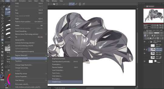
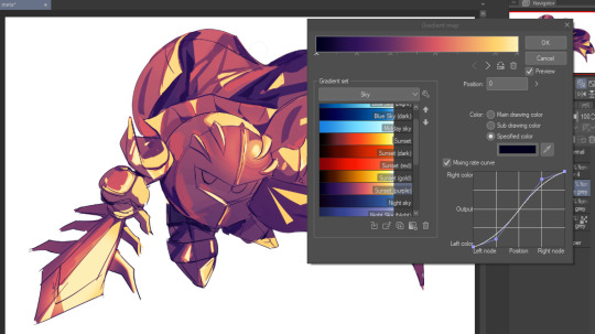

Now go crazy with blending modes! Multiply, overlay, color, glow/color dodge, etc. Feel free to layer them up on top of each other too, and this is to add the character/piece's actual colors in. For example, I used a white-blueish overlay layer for his mask and glove, blue for his cape, blah blah
Now I clean the sketch up/refine it more. Also, to "harmonize" the color palette, you can add a colored gradient on top. Then set it to multiply, and add overlay/glow dodge layers with any colors you see fit! I like using teal and light/warm orange! Here is an example of a colored gradient:
Another tip is to add saturated colors on the edges of both lighting and darker shadows, before blending it:

Also I usually add in a light blue/grey in shadowy areas, and lower the opacity for reflective light:

Also! You can lasso + use an airbush with a light blue to block out parts of the background (his cape here, for example). It helps with more depth!
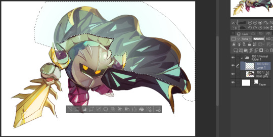
Finally, I like adding sparkles on low opacity :3 And gaussian blur to certain areas! I'm using radial blur on this piece though ^^

For the background, I like doing blocky shapes!! I use my square brush on 90% ish opacity, to color pick different hues from the piece. For lighting I use a glow dodge layer, here's a mini timelapse as well as the finished art!
At the very end, play around with the hue/saturation and contrast tools to change the colors :)
#iiii hope this helped??#first time making a tutorial sorry!!#art tutorial#kirby meta knight#meta knight fanart#meta knight#nintendo kirby#kirby nintendo#kirby fanart#kirby series
589 notes
·
View notes