#so have some typography!
Text

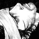
Your ticket to the hottest dance floor in town: Welcome to Elysium.
Black and white version too
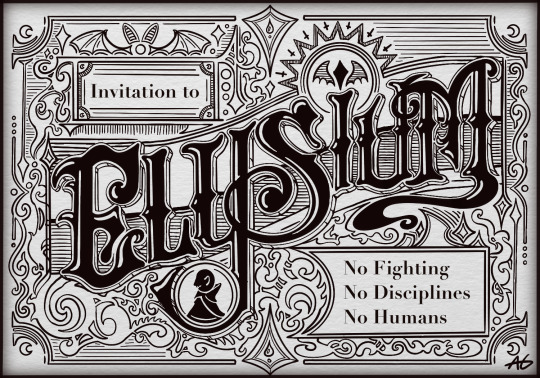
#the suckening#jrwi the suckening#vampire the masquerade#elysium#typography#griff art#working on a larger unofficial poster design for m.c.c#but that’s taking a while#so have some typography!#hopefully I can get it done before next season#it’s using some techniques I haven’t practiced with much before#so hopefully it’s good!
376 notes
·
View notes
Text

exurb1a, from "Inventory" in Poems for the Lost Because I'm Lost Too
#lit#literature#typo#typography#fragments#light academia#dark academia#oops typo!#exurb1a#love#poetry#poem#quotes#aesthetic#i didn't have this one dog-eared for some reason but i still had these two lines underlined#something was pulling on me to look for this poem (bc truthfully i forgot that i even underlined this part lol)#im so glad i went back to look for this poem though#bc now i'm crying at 10:30 am :')#maybe we'll meet again under better circumstances#that's what i hope at least if you're reading this#240304
55 notes
·
View notes
Text

Some fonts I use that I like a lot
✿ Billo ✿ Pixel flag ✿ Bigup ✿ Cute stitch ✿ Hearts ✿ Kawaii ✿ Mamae Que Nos Faz ✿ MilkyWell ✿ School Script Dashed ✿ Scribble ✿ Life lessons ✿ Mastodon ✿ NEON LED light ✿ Retrolight ✿ Rough ✿ Stampwriter-Kit ✿ Stranger things ✿ Through the night ✿ zai Royal Vogue Typewriter 1929 ✿ Lemon Juice ✿ Back to Fishing ✿ Baby doll ✿ Avocado cake ✿ Collection new style ✿ Brittany Signature ✿ Doctor punk ✿ Heavy Rain ✿ Jokerman ✿ Magic Retro ✿ Retro computer ✿ RetroKing ✿ Semi-coder ✿ Surfing Capital ✿ The Owl ✿ Tomatoes ✿ Top Secret Stamp ✿ Typewriter_Condensed ✿ VCR OSD mono ✿ Virtue ✿ WRESTLEMANIA ✿
#fonts#typography#free fonts#cute fonts#typeface#not art related#holy hell it was hard to re-find some of these#hearts and rough were a nightmare#I had to dig through my search history all the way back to September 2022 to find where I got them#Tell me if any of the links break#I have them written out separately so I can fix them if needed
235 notes
·
View notes
Text

fanart inspired by the song “orbit” by circusp — VERY UNDERRATED ENGLISH VOCAL SYNTH SONG YOU SHOULD CHECK OUT
(or just check out his CMYK album i was so hooked on it over the summer and there’s some bangers in there… been wanting to make fanart based on some of those songs as well waaa)
#mayor doidles#fanart#vocaloid#vocal synth#hatsune miku#miku#haiyi#kikyuune aiko#never heard of aiko before hearing this song but i really like her voice#digital art#cell shaded#i like how ive been slapping the textures ive been putting in my sketchier pieces or paintings into my ‘cleaner’ style#has been having some really neat effects#oh and id definitely like to work with type more in my pieces#im learning typography in my current coursework so 👀#art#artists on tumblr#vocaloid fanart
32 notes
·
View notes
Photo

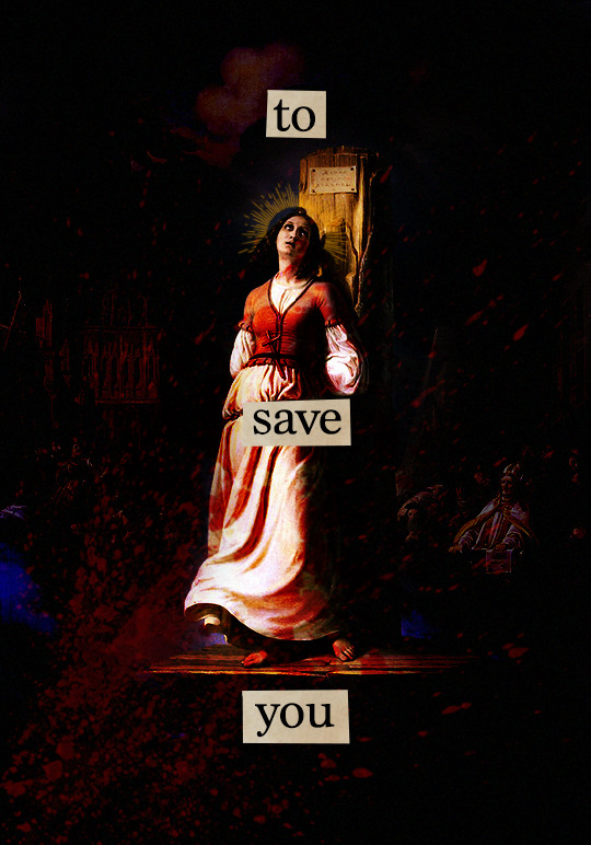
"So, baby girl, good luck taking care of yourself"
- Sun Bleached Flies, Ethel Cain // Sainte Jeanne d'Arc, Paul Antoine de la Boulaye // Joan of Arc's Death at the Stake, Hermann Stilke
#i think i've seen this with joan of arc before but?? i couldn't find it and i found some new blood brushes i wanted to use#so here have me making something is incredibly on brand#joan of arc#ethel cain#lyricsedit#typoedit#sun bleached flies#preachers daughter#**#*graphics#typography#lyrics#lyricedit
122 notes
·
View notes
Text
when at the library today i picked up a book abt typography to pick up some more theoretical skills there and to no one's surprise it pretended that european languages were the only languages in the world which like whatever i'll still learn what principles it has to teach and then try to reverse-engineer applications to cn font design based on what i know.
despite not trusting the english-language resources available online to be as in-depth or technical as i desire, i got curious and googled "chinese typographic design" anyway n scrolling through the introduction to the first result, you can kind of tell it's not written with a chinese-speaking audience in mind, or at the very least an audience with some semblance of chinese cultural sensitivities bc its section headed by the words "navigating the simplified and traditional divide" goes on to basically say it's an Aesthetic Decision which. well. is certainly a way to pretend you're avoiding politics.
#mostly you get the impression bc one of the first sections is like 'so how do chinese words work?'#and goes on to explain the idea of radicals and components n stuff and it's like If You Knew Literally Any Chinese#even as a foreigner starting to learn you'd understand the concept of semantic radicals#the worm speaks#phrasing that heading as 'navigating a divide' feels like it's alluding to An Awareness of the political implications n stuff#which most people in the west are not actually aware of!! so then to go on and be like#'oh yeah simplified is like swiftly efficient and ~modern~ while traditional holds fast to its cultural roots from a bygone era'#like. this is some stares straight into the camera type shit to me. like you really didn't have to call us bygone y'know.#like i'd have been fine if they were like 'simplified is what's used in the mainland china n is thus used much more frequently'#'whereas traditional is used in taiwan hk and with older communities' like that's Fine you did it you Navigated The Divide#but if you frame it in terms of an aesthetic choice based in how ~modern~ or ~bygone~ you want to feel#then you're going to end up with people who are merely curious abt cn typography bc it's a very foreign language to them#who take that at face value. good lord#AND ALSO they have separate encodings in unicode. like just saying. they are also encoded differently and that's an important thing#you do not know how many times i've downloaded allegedly traditional cn fonts only to discover they expect simplified input#in order to display the glyphs which Are still designed as traditional to be fair but anyway. it's a nuisance.
6 notes
·
View notes
Photo

eurovision 2023 poster series [3/37] ● belgium: gustaph, because of you
#eurovision#esc#gustaph#belgium#graphic#*#so it is this song#i wasn't really IN the songs that were part of the nf but i listened to some#and i kind of grew fond of cherine and gala#and i also thought the starlings were nice#i did not expect gustaph#but when i listen back i agree: it is fun!#though i really don't know what this song is trying to tell me if i am honest?#inspiration was hard#because it somehow feels like a song from the 90s or 2000s#but then it also doesn't#so here have some more or less typography#and also me trying to at least show the colors of the flag in the posters#because why not another challenge#but as cherine said#i think gustaph is a good daddy in a hat
26 notes
·
View notes
Text

LIKE I FEEL LIKE THIS WOULD BE REALLY FUN TO SCREEN PRINT YKNOW??
#my art#I'd need to get the print teachers advice on the gradient situation bc I remember theres some kind of dot-grid thing? you have to use for i#it to transfer properly through the screen printing process#but liek ???#if I prep it for print??#yknow??#IGNORE THE AWFUL MESS OF FONT BTW IM BAD AT TYPOGRAPHY#AND POSTER DESIGN SO THIS HAS JUST BEEN IN MY WIPS FOREVER#WHILE I FIGHT OF RMY LIFE WITH THE TYPE LOL
35 notes
·
View notes
Text
I also love when all different characters have their own font and balloon style to express their voice
And font transparency
And bolding
And text spacing
#i don't have many coherent thoughts about this subject (i am very unwell read at this time) but i just... mmmmm#idk if you can (I've been told its very obvious) but i like to type in a very true to life way#thats one of the reasons i include at least some studers into my typography#anything i post on here is the way id actually say the sentence outloud or at least closest without being personally obnoxious#so I absolutely love when a character has very... personable personal textual choices#adam fucking around
4 notes
·
View notes
Text
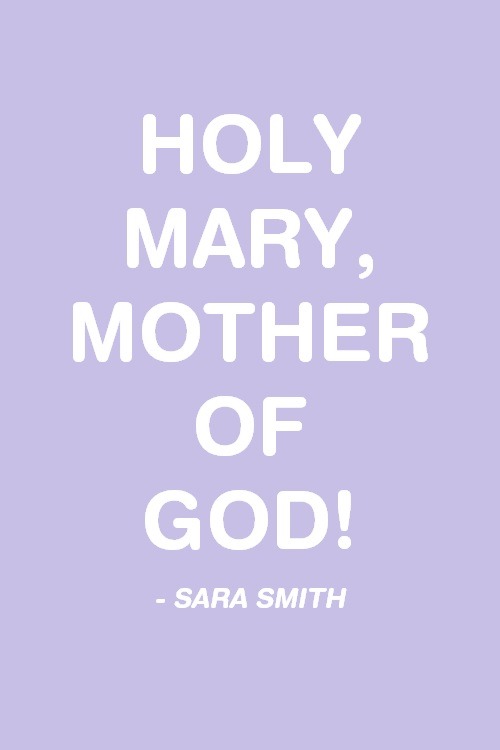

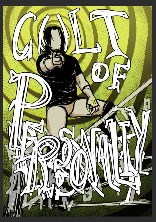
today in "i wanted these, so i made them": some zombies, run! catchphrases
#zombies run!#sara smith#janine de luca#zombies run#zredit#typography#video games#**#i have been playing it again yes#i have also been crying a lot yes#if this looks bad it's bc i'm bad at making things. just so we're clear#i considered including something about sam and curly wurlys in this. but then. i didn't#it would just have been ''*some shit about curly wurlys*''*#*alternatively some shit about marmite - sam yao#which would have made me laugh but idk about anyone else
46 notes
·
View notes
Text


instances of dismal futuristic foresight... or perhaps commentary by the author, hem, hem...
#the witcher#the witcher books#book: baptism of fire#c: dandelion#c: milva#excerpt#hussite trilogy#book: narrenturm#i got flashbacks to typography class when gutenberg showed up LMAO#c: reynevan#c: scharley#idk if using the anglicized spelling is cringe 🥲 ig it's kind of like using philippa vs filippa. anyways his og name is szarlej#c: samson#i'm trying not to comment or spoil anyone since i'm only mid-chapter 16 but this was just basic and easily-accessible enough to share#yes i have a few thoughts already but nothing too intelligent or valuable... although i'm not trying to be intelligent or valuable atm#i'm reading for pleasure at the moment and not necessarily to understand. as imo a first read should be#as one might put it. i only know that i know nothing...#my promise to myself was that if i ended up hating it i wouldn't post anything and just pretend i never touched it in the first place#but i don't hate it and i'm catching some of it so now you have to deal with my posting about it. infrequent posting but posting nonetheles
12 notes
·
View notes
Note
kai can you help me with text gradient maps like in this set? maybe share some of your favorite settings? i feel like i can never make them the color i want :(
https://www.tumblr.com/heroeddiemunson/708432402148737024/lgbtqcreators-event-09-dynamics-love
hiiii miles yes of course!!
i went and double checked what settings i used in that set specifically, and i used the color setting, which is honestly my favorite setting to use for my typography like that. i also like using hard light, vivid light, multiply, and (especially if im using a darker color) screen. playing around with these different modes usually helps me choose one i think looks best! it also helps to make the text ur using to be fairly large so that you can see the colors too, at least in my experience.
i also like to take the color i want the text to be and make it brighter so the blending mode doesn't mess with the color of the text too much. for example, in that set you linked, the yellow i used for the "sun" text is a little closer to the default hex code that things like photopea and photoshop use (just a little more to the orange side of the color wheel). once i used the "color" setting, it darkened that color down and made it match with the set <3
there is also this tutorial by @anya-chalotra that i have used as my sort of basis for this type of typography (and godbless ava because she made this whole type of typography make sense to my tiny pea brain). two other tutorials i can think of are this one by @usermeggy and this one by @hiphiphelly :)
#kai.answer#mytutorials#hopefully this helps!! and makes sense i hope i explained well enough sjdhjsd#i love playing around with typography so these are some of my go-tos to making the typography look the way i want#the tutorials i linked have also come in clutch for me when i was trying to do something with this typography#so thats also why i recommended them <3
3 notes
·
View notes
Text
HEY there's new folks here since I last rambled about Rebelle, and they've got a HUGE sale going on for the preorder of the next version, SO
TL;DR: amazing traditional-paint-emulating drawing program on huge preorder discount, $30 for Pro version GO GET YOU YOURS
I've been using the digital art program Rebelle for a bit over a year, and it is SO GOOD at emulating the feel of working with traditional paints, pencils, and pastels! It's got thick (or thin) impasto texture for oils/acrylics, water physics (!!) for watercolors, and can actually use the texture of your canvas to affect both wet and dry media brushes. It feels SO MUCH better than hooking a texture into a brush and working on a canvas that just...doesn't match it, or applying a texture afterward.
BUT ALSO they're gonna be updating it soon, and adding not just standard digital niceties, but also METALLIC. PAINTS. Plus more texture stuff you can control, and even better texture reactivity, but METALLIC! PAINTS!! USING THE BUILT-IN LIGHTING AND TEXTURE SHENANIGANS, INSTEAD OF HAVING TO MESS AROUND WITH WRANGLING/OUTSOURCING EFFECTS YOURSELF
And the pre-order price from now until November 30th is ONLY $30 for the Pro version (which I absolutely recommend!), when the price is usually $150 (!!). The Pro preorder price will increase to $50 from December 1st to the 13th, then full price when it releases on December 14th. And they don't do subscription! Just free updates (typically good and/or requested features, as well as bugfixes), in between full upgrades like this that have been HUGELY discounted on release.
You can check out further info on Version 7's upgrade features, as well as the link to buy it, via the link at the top of the post. BUT if you wanna test out basic watercolor simulation, and/or test the trial version of Rebelle 6 (I think) to see if you like how it feels? You can check out this link: https://www.escapemotions.com/products/rebelle/try/
(Also they often do this sort of thing with the free bonus papers for spreading the word, as mentioned at the beginning of the Version 7 info link. I think it's happened...at least each time they've done a version upgrade, maybe once or twice in between? And it's been a different set of papers each time. But I already did my shared-post earlier. This post is genuinely just 'cause I think stuff like the feel of brushes reacting to visible texture and water physics (which you can pause!) are SO NICE, and the preorder price is bonkers-cheap. I still need side stuff like Affinity for like...fonts, but Rebelle is my current favorite for actual drawing and painting.)
PERSONAL EXAMPLE TIME
Playing around with watercolor drips, because you can control the "tilt" of the canvas (via either a tablet's features if it can, or a disk in the UI if not): Bakuratober Ghost prompt
Using canvas texture to get a RAD cracked-paint look on a dark canvas (I used the Straw canvas from the "Mulberry Coconut & Straw" purchasable paper set): Bakuratober Vampire prompt
Taking advantage of thick acrylic texture (plus watercolor which flowed into the brush streaks for emphasis), to simulate both muscle and sand texture (body horror warning): Bakuratober bonus prompt (Nightmare)
Combining a mildly textured pencil with a subtly textured canvas to emulate how I use physical colored pencils (plus layer effects for glowy ghosties): Bakuratober Dancer prompt
Combining wet canvas and watercolors to let the pigment feather out to create a "blurry" foreground effect (plus setting lineart as a masking fluid layer to keep colors contained): Disco (Elysium) Harmony
#rebellle#rebelle 7#art programs#get you some fancy digital paint#that uses 3d-type features to make the canvas and thick paint look legit#and feel so much closer to traditional art than any other program I've used#except I can actually work well with watercolors because I can pause the physics or cleanly erase#there's more neato features but I've already rambled so much#I've done some other stuff but most of my experimentation was with Bakuratober prompts okay#and I did those in Rebelle 5 but they would've been easier in 6#because that added clipping masks and suchlike#but otherwise they would've looked the same#I'm kinda glad I've been too burned out to do an upgraded/Rebelle iteration of Dr. Armitage yet#(as is my wont every time I find a new drawing program)#because now I'll be able to use the TYPOGRAPHY PAPER since I can change its color#and NOT HAVE TO SWAP PROGRAMS TO ADD THE GRADIENT#and shiny new unique bonus of LEGIT-SILVER PEN NIB FINGERNAILS
1 note
·
View note
Text
I haven’t been on in a while but I see tumblr changed again lol
#hello#how are you all#I have been very busy#but I have some free time now so maybe I’ll make some typographies ;)
2 notes
·
View notes
Text
recently I've been trying to reprogram my brain into viewing gifmaking as something I just dip into then put down again, instead of feeling like once I start a gifset I've put a clock on myself to finish it, and I have to say it's made it all a more enjoyable experience. like instead of "I am going to make this edit and should be as productive as possible" I'm trying to think "I am going to spend a couple of hours in photoshop and see what progress I can make on this idea"
#idk if this makes sense#but generally i have always made each edit in a single sitting which just puts an extra time pressure on me for no good reason#whereas I'm increasingly making sets across multiple sessions#which is partly out of necessity when i do more complex/time consuming stuff#but also just trying to stop myself from taking the fun out of it lol#it helps me not feel so frustrated if I'm spending ages trying to figure out some typography or something#like it's not wasted time. it's time spent editing which is how i want to be spending this time#talking
13 notes
·
View notes
Text
best part of drawing fantasy map: you will have a cool fantasy map for your fun fantasy project
worst part: labels
#I hate typography#I dunno how the hell I got through my typography class w/ an A#I am SO BAD AT TYPOGRAPHY YOU HAVE NO IDEA IT IS SO HARD#like my text looks Fine if I hand-letter it and actually Try but I refuse to hand-letter an entire map#also hand-lettering is...hmm...only good for some arts#cartography is not one of those arts for me#also I just hmm...hate positioning all the little labels and stuff and making the text tool Actually Work For Me#very tedious but not in a fun way#I'm working with 3.5 or 5 font I won't even be able to read this if I print it RIP#but if I made the map larger than it is the program would crash I know from experience#which is fine I hate large files anyhow BUT THESE STUPID LABELS#I'm only doing this so I have good worldbuilding notes for the future for this particular project#I'm almost done with labels and then I just need to do some other stuff#and this map I've been working on literally all year so far will be complete#and then I can maybe do other arts#I know ''you can work on multiple arts etc. etc.'' but listen I will not finish this map if I start a new art project#I Want To Finish but mmhhmmmm do I hate typography~#I literally hand-drew an entire border filled with swirls no problem but these labels....#I literally hand-drew everything but THESE LABELS#anyhow that's my art vent post for the day#I swear I love art but sometimes I need to scream in frustration y'know#bc typography#oracle of lore
3 notes
·
View notes
Last Seen Blogs
lightblue8
セレステ

begoniasuarez
Begonia Suarez sculpteure

orionbb444
orion 🍯

spikievstheworld
Cos' è questo?

theyoungsiren
🔮Sea🌊Witch🔮