#spoof art
Text
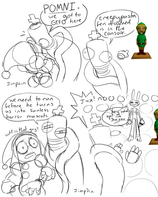
#tadc jax#tadc kinger#tadc pomni#the amazing digital circus#tadc comic#horror mascot#spoof art#shitpost art#dumb#this is dumb#ben drowned
2K notes
·
View notes
Text

Sun :)
12 notes
·
View notes
Text
I forgot I never posted this. I made spoof art of @vodid 's poster art of Megatron Optimus and Elita for their obsidian king au. They gave me permission and I'm proud of this rediculouse shit. It has two others but I don't know if they have Tumblr accounts

#spoof art#thank you Vo for letting me do this#the background and spade were the most fun#sorry for the other two but spade wins 1st place here#transformers#obsidian king au#not perfect but i like it enough to jot fix anything#deal with it
30 notes
·
View notes
Text
One last drawing before bed which is the aftermath of that one art piece.

Ok goodnight lol
5 notes
·
View notes
Text
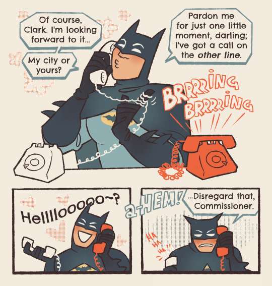
"i've just been working on a... celebrity impression. it's for a sting operation of sorts i've been putting together. yes as a matter of fact it WILL keep me busy tonight—"
#RETROBAT. WESTBAT. WHATEVER. SORRY EVERYONE. this is very directly spoofed from a bit from the show#bc i'm always delighted to see this freak switching between brucie mode and bat mode in rapid succession#juggle your conflicting identities for my entertainment boy. FASTER. SILLIER. NOW DO IT ON ONE LEG#art#comic#dc#batman#bruce wayne#superbat#batman 66
16K notes
·
View notes
Text

The sack of Rome, August 24th 410 CE, colourised.
Art by Psicochurroz
#196#196 migration#apartmentofawesome#r/196#/r/196#historical shitposting#art history shitposting#historyposting#HISTORY LESSON INCOMING#Rome was sacked by the Visigoths in 410 C.E.#Joseph-Noel Sylvestre#depicted this in a famous painting#The Sack of Rome by the Barbarians in 410#this artist#psicochurroz#has spoofed this artwork#replacing the big beefy barbarians with cute goth girls#hope this helped! until next time
15K notes
·
View notes
Text
Branch meeting his niece and nephews
#trolls#fanart#digital art#art#trolls fanart#trolls band together#dreamworks trolls#doodle#spoof#doofazoid#branch trolls
1K notes
·
View notes
Text
Assignment #1
Semiotic analysis of four Adbuster spoofs
Spoof ads aim to discourage people from using or buying the advertised product and typically offer some sort of commentary on the issue. They are usually parodies of the original advertisements and often pervert the themes and motifs used within them.
The first advertisement I have chosen to analyze is a spoof ad for Marlboro:
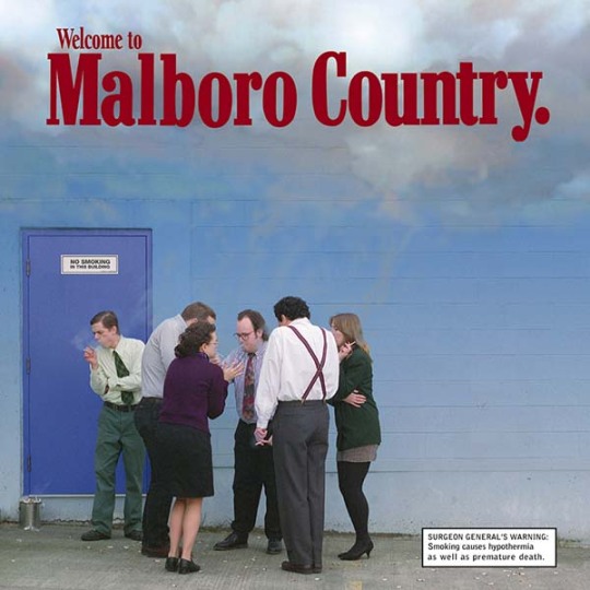
The goal of this advertisement is to show the bleak reality of smoking and it does so by parodying the quintessential cigarette brand, Marlboro. The Marlboro brand relies on its carefully constructed image to sell its product. The brand’s advertisements use rugged cowboys and demanding scenery to showcase what they call “Marlboro country” and suggest that the lifestyle of those who smoke Marlboros is that of freedom, adventure, and independence. This spoof advertisement parodies this concept to suggest what true Marlboro country looks like.
Straight away, the headline “Welcome to Malboro Country” tells you that this ad is playing off of the Marlboro brand. In addition to being in the same font and color red as the original Marlboro advertisements, the phrase “welcome to Marlboro country” was a common feature in older Marlboro advertisements. The cloud of smoke and the blue wall is also reminiscent of the blue skies commonly featured in Marlboro advertisements. Additionally, whether intentional or not, the missing “r” in “Malboro” speaks to its inauthenticity, suggesting that the advertisement is a spoof. The inclusion of the headline and other imagery similar to the original Marlboro advertisements uses metonymic and analogical code to cause the viewer to compare this advertisement to the original Marlboro ads. In doing this, the discrepancies between the two become much more apparent and ultimately enhance the message.
As the viewer makes their way down from the headline, the seemingly white and blue sky begins to fade into a grey (symbolic) that speaks to the dreary reality of the huddled group of people standing outside of the building. The cigarette in each of their hands (iconic) and the smoke trailing from them (indexical), indicate that they are smoking cigarettes and place them in the position of the Marlboro Man. The individuals’ proximity to each other as well as their attire, suggests that they are coworkers who work in an office setting and that they must be out on a smoke break. Additionally, their body language (indexical), in combination with the surgeon general’s warning that reads “smoking causes hypothermia,” indicates that not only is it cold, but that they are succumbing to the elements. All of these components form a condensed code that conveys the reality of smoking as bleak and unappealing. Through metonymic code, it is suggested that this bleak reality is in fact “Marlboro country.”
The next ad I have chosen to analyze is a Calvin Klein spoof:
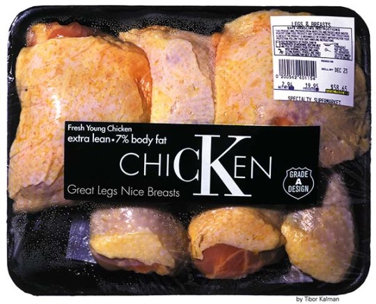
The intention of this spoof ad is to make commentary on the fashion industry and its exploitation of women. The ad features a package of raw chicken that is stylized to resemble the brand Calvin Klein, with emphasis given to the brand’s “CK” lettermark (symbolic). Through displaced code, the pieces of chicken symbolize the women depicted in the brand’s advertisements, speaking to the idea of their body parts being separated from the whole and used as marketing tools. Once one is aware of the comparison being made, it becomes apparent that the descriptive phrases on the packaging are actually being applied to the women and the “grade A design” symbol suggests that those characteristics are the industry’s ideals. The application of common descriptions of premium meat to women highlights the ridiculous physical expectations for Calvin Klein models and calls attention to the dehumanizing nature of the brand’s advertisements. For those who have prior knowledge of Calvin Klein ads, the beauty standards of women, and the inhumanity of mass production, all of the elements present in the spoof ad create a condensed code that sends the message that fashion treats women’s bodies like commodities.
The third ad I have chosen to analyze is a spoof of an ad for Berluti, a men’s luxury shoe and leather goods brand:

The ideology behind this spoof is that buying luxury brands perpetuates consumer capitalism. The leather shoe and the brand’s name serve to symbolize the luxury brands and goods in question. The image of luxury is reinforced by the pristine condition of the leather shoe, indicated by its shine (indexical), which suggests that the shoe is freshly polished. Additionally, the luxury brand name of Berluti, in what appears to be a slightly altered Garamond typeface, typical of luxury brands, speaks to the luxurious image as well. The “place tongue here” (symbolic) alludes to the idea of bootlicking, which symbolizes submission, servitude, and obedience. So, because the “place tongue here” is positioned at the tip of the luxury shoe, it creates a condensed code that suggests that consuming luxury items makes you a servant of capitalism.
The final ad I have chosen to analyze is a spoof of a Tic Tac ad:
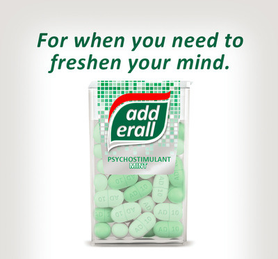
The intention of this spoof is to critique the nation’s increasing reliance on prescription drugs to enhance productivity and performance. The replacement of Tic Tacs with Adderall pills uses analogical code to equate our conception of stimulants to mints, suggesting the normalization and trivialization of prescription drug use. The ad’s slogan, “for when you need to freshen your mind,” further suggests that stimulants are used as quick fixes to a tired mind similar to the use of a tic tac for fresh breath. The use of a well-known brand in the spoof highlights the contrast between the expected and the reality, emphasizing the absurdity of the situation. Additionally, the sterile white and various green colors (symbolic), give the ad clinical or medical air. Together, all of these elements create a condensed code that conveys to the viewer a critical message regarding society’s attitude toward prescription stimulants–a message that is particularly salient given the current national Adderall shortage.
0 notes
Text
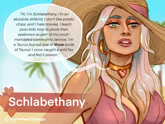
I was going through the TAZ steeplechase tag and I was like who tf is schlabethany. She’s not a main character. Then I got to her episode and I was like OH. That’s exactly what she says to introduce herself btw.
#taz#taz steeplechase#schlabethany#taz Schlabethany#taz fanart#art#podcasts#reality tv spoof#artists on tumblr#character design#illustration#undescribed
2K notes
·
View notes
Text
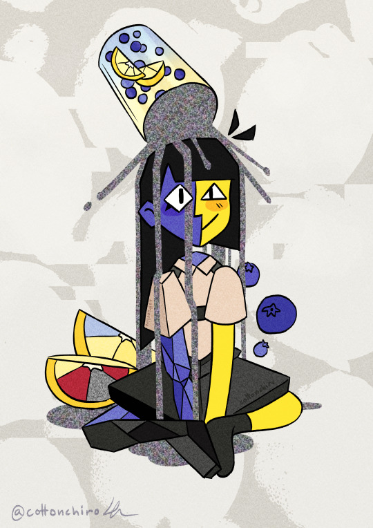
LemENAde
Power of Potluck literally came out as I was working on digitalizing this and I made incomprehensible noises. Anyway ENA fanart! She! I've been wanting to draw her for a while but just never got to it.
Ig this kinda fits the theme of the latest ep in a weird way if you know what im getting at which makes it kinda funny anyway im chilled
#i kinda wanted to spoof on drawing your faves in like. drinks? sodas? boba?#but chaotic#art#artists on tumblr#digital art#ena fanart#ena joel g#ena#ena power of potluck
873 notes
·
View notes
Photo

There is a weirdly specific venn diagram you could make with these two.
#deacon#deacon fallout 4#fallout#fallout 4#fo4#fnv#fallout newvegas#fallout character#fallout meme#fallout companions#boone#craig boone#boone fnv#boone fallout#fnv meme#fallout meme art#spoof art#do people still say spoof art?
970 notes
·
View notes
Text
I DREW SOMETHING THAT ACTUALLY LOOKS GOOD (in my opinion, lol)

I usually have a really cartoony style, but I decided to mess around with colours a bit here- I think I just zoned out while drawing and came back to THIS?!
IT LOOKS LIKE I ACTUALLY HAVE AN UNDERSTANDING OF COLOUR (I DO NOT!!)
I’m really happy and proud of myself rn lol
#art#spoof art#digital art#my art#Look at the colours!#aghhhhh#i’m so proud#also yeah dw I used myself as a ref#the random spots and stuff are intentional lol#I need to do this again#Spoof's Doodles
5 notes
·
View notes
Text
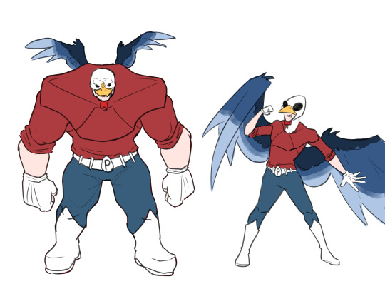
Y'know, I know Classic Poultry-man was the most popular in the fandom, but I really have a soft spot for his edgy 90s design when the creative team suddenly decided to go really dark with his stories. And I'm also a huge fan of the 2010s redesign he was able to get on the modern comics after years of no publication.
#hermitcraft#art#grian#grian fanart#poultry man#Dumb concept i came up with and suddenly fell in love with#I might do some comic cover spoofs as if Poulty-man had serialized comics throughout time#my art
286 notes
·
View notes
Text
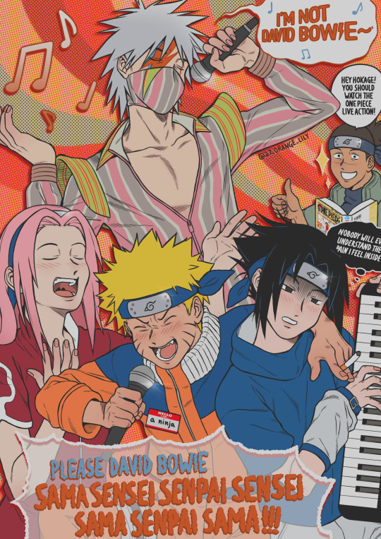
"It takes more than a headband and some flashy ninja moves and a name tag that says "Hello, I am a ninja" to become a ninja, Naruto"
My second piece for the LittleKuriboh Tribute Zine! 💜
It's based on the song Training Ninjas, sung by Naruto, Sasuke, Sakura and their sensei David Bo- I mean- NOT David Bowie👨🎤
Check it out for more great art created with lots of love!
➡️ http://littlekuriboh-zine.carrd.co
#little kuriboh#martin billany#ninjabridge#naruto the abridged comedy fandub spoof series show#naruto#naruto uzumaki#sasuke uchiha#sasunaru#kakashi hatake#sakura haruno#david bowie#ziggy stardust#iruka sensei#under pressure#y2k#ygotas#my art
221 notes
·
View notes
Text
U• ᴥ •U ♪
2K notes
·
View notes
Text
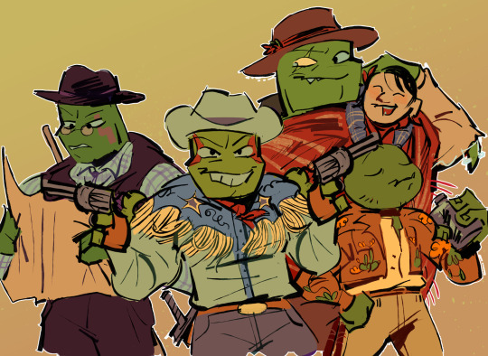


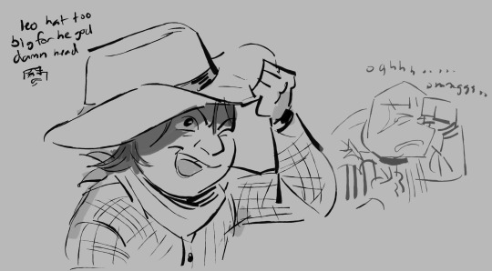
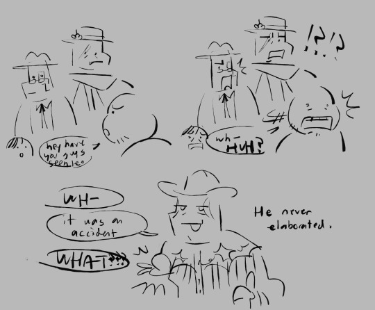
cowboys? cowboys
#my art#rottmnt#rise of the tmnt#taking a break from drawing turtles to draw more turtles#no but i got hit with the AU nonsense beam#i think theyd be funny and cute in a western spoof#i wrote up a tiny plot and everything#nothing ever gets done around here and this is a prime example of why
1K notes
·
View notes
Last Seen Blogs
thetudorslovers
circa regna tonat

mysfera
Без названия

daood1963
Medical Advice by a Medical Expert
masabutt
You must be lost

yryrdz
sowa_ration