#tangled characters color palettes
Note
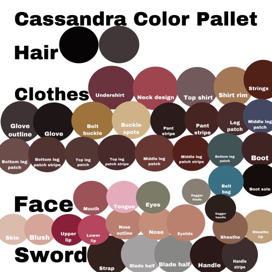
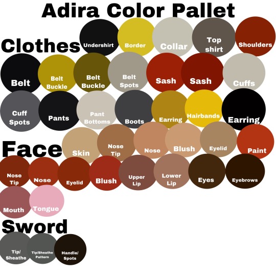
Do you have palettes saved for the tangled characters? If you do, do you mind sharing them? (Especially for varian, I have trouble trying to find his skin tone, since the screencaps/screenshots I have of him have different lighting😂)
I actually do have some! I created these back when I was making art for “Alchemist Out Of Corona,” but I still use them for all of my art of these characters.
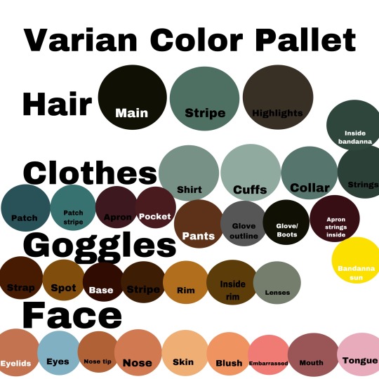
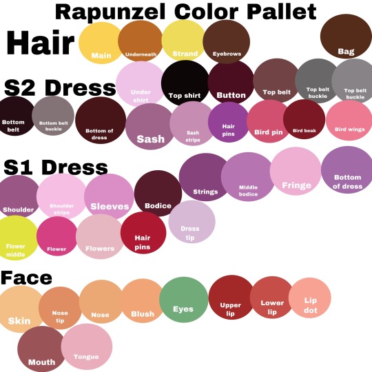


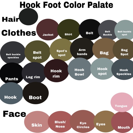
I didn’t create ones for the animals, but these are specific screenshots I use for Pascal, Owl, and Ruddiger since they’re in normal daylight on the show. (Fun fact: Ruddiger’s eye color is the exact same color as the stripe in Varian’s hair! 😜)

As for Maximus and Fidella, I have lost the original screenshots I used to color them. So I just use previous arts of mine for their colors.😅
I hope this helped! 🥰
#q & a#tangled the series#alchemist out of corona#tangled#tts#rapunzels tangled adventure#tangled the series fanart#tangled fanart#tts fandom#tangled the series varian#color palettes#tangled the series character palettes#tangled characters color palettes#princess rapunzel#eugene fitzherbert#lance strongbow#tangled the series cassandra#tangled the series adira#tangled the series hook foot#tangled the series pascal#tangled the series owl#tangled the series ruddiger
27 notes
·
View notes
Text
Disney movies that people should love and recognize more (animated + live action) :
Sleeping Beauty - cottagecore vibe, underrated characters, literal activist prince, gorgeous villain, pleasing color palette and style
Beauty and the Beast - FIRST DISNEY ANTIHERO PRINCE + ENEMIES TO FRIENDS TO LOVERS THATS IT ^^
Atlantis - complex characters, well written twist villain, romance subplot, MAIN ADORABLE CHARACTER, STRONG YET KIND FEMALE HEROINE AND LITERAL PRINCESS
Jungle Cruise - ENEMIES TO LOVERS
Princess and the Frog - ENEMIES TO LOVERS AGAIN, beautiful aesthetic, main friend that isn't actually bad b*tch (I still remember how you not even lend a single coin to Tiana Charlotte but maybe I forgive you ;P)
Ichabod and Mr. Toad - comedy guilty pleasure, the complex characters that are not actually what they seem, genius Non-Disney live-action series additionally ^^
The Nutcracker and the Four Realms - underrated gem, actually good twist villain, beautiful aesthetic, I KINDA SHIP CLARA X PHILIP, MOTHER GINGER IS MY BABY ^^
TANGLED - THATS IT TANGLED IT DESERVES MORE LOVE FOR EVERYTHING TuT
Frozen - JUST FROZEN I HAVE ENOUGH HATE FOR IT IT ISNT PERFECT BUT ITS MY WHOLE LIFE (HANS AND ELSA FOR LIFE, MY COMFORT CHARACTERS FOREVER ^^)
BIG HERO 6 - HOW IT IS SO MUCH UNDERRATED ITS NOT PERFECT BUT ITS LAST ACTUALLY GOOD DISNEY MOVIE I SWEAR
#disney movies#underrated disney movies#sleeping beauty#big hero 6#frozen#tangled#the nutcracker and the four realms#jungle cruise#ichabod and mr toad#atlantis#beauty and the beast#heavy saying on tangled frozen and big hero 6
15 notes
·
View notes
Text
played thru the detective grimoire secret of the swamp game… I think the parallels between the shift in direction between this game + tangle tower and the shift between psychonauts 1 + 2 is very fun.
Original game is just. Coated in green. Absolutely drenched in some sort of swampish energy, everything is tinted like they dipped the game in Nickelodeon slime before releasing it. Also there is a sea beast that may exist or not (it does.) Character designs where the shapes just kind of go insane sometimes if they want.
Second game expands its color palette a lot more… gets a lot more colorful n vibrant, designs are still very shaped but a lot more grounded in reality. Story is a lot more focused on crafting an emotional narrative, a lot more of a focus on the characters you interact with and their current States. Et shetchra
#The psychonauts to tangle tower pipeline is real (me and like 3 other people)#tangle tower#psychonauts#text posts :0]
26 notes
·
View notes
Photo


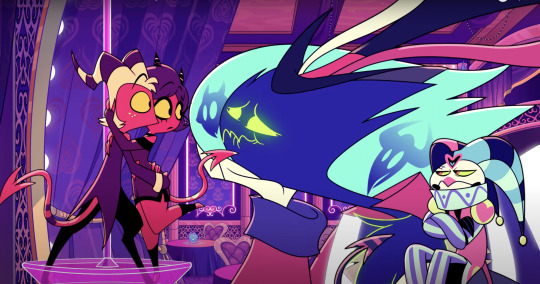
Anyone else concur on the irony? I know lust can apply to any strong desire, but since Asmodeus used it mainly in the sexual way, it’s feeling pretty ironic to me. What can I say? He’s got an amazing singing voice provided by James Monroe Iglehart (Lance Strongbow in the “Tangled” series, Taurus Bulba in the “DuckTales” reboot and Genie in Broadway’s version of “Aladdin”), I love his character design and color palette, he’s got swagger, love his various expressions (which if I’m being honest, gave me some Globby-vibes with the glowing eyes and how exaggerated they could get ;) ), and he clearly has some relationship with Fizzarolli (and they look adorable together ^_^).
I also love Stolas, Blitz and Moxxie (and I’m all for wanting Stolitz to make it :) ), but Asmodeus really got stuck in my head. :) (Also, I love how annoyed/pissed off Fizz looks in the last picture XD).
#helluva boss asmodeus#asmodeus#fizzarolli#helluva boss#stolas#blitz#stolitz#millie#screenshots#meme#bender irony#asexual#house of asmodeus#darn it that song is stuck in my head but I really don't feel like letting it out#ozzie's#fizzmodeus#just look at those shiny green eyes he's clearly worried#^_^#<3#there really is something ironic here even if it is just a show#;)#moxxie#millie and moxxie#helluva boss moxxie#helluva boss millie#vivziepop
358 notes
·
View notes
Text
November 2023 Sapphicblog - Girlbits & Bobs
Wield my armaments, babe!
Welcome to the first of many Sapphicblogs, where I explain monthly updates to Sapphicworld's Playtest Edition! You're currently looking at the Tumblr version of this blog, which lacks in-depth details and thoughts about the development process present in the Patreon version. Subscribe to the Sapphicworld Patreon for more!
November was very focused on sharpening the game, filling in corners and expanding underdeveloped mechanics. I did a lot of things I've been procrastinating on for a while, and gave many characters extra love and 'placeness' in the setting.
What is 'placeness'? Well, when you look at any element of Sapphicworld, I want it to be clear where it fits in the world, and if a place is referred to I want it to be playable. This month's updates were focused on sharpening and enabling this vision of the game. With that, the list of new things!
November Additions
A 256 color palette for Sapphicworld (Duel by Arilyn), split up by Land!
Tons of new Relic and NPC art.
The Chimaeryn Most-Foul and its inhabitants, a coterie of necromancers and their undead army.
The Petrified Tangle, the sculpture garden of our beloved and petrifying Calcium Lady.
Rathold, (you pronounce the th with gusto), the fortress of The Brat Rats.
Operator Iris' Dollhouse, a place where you can shrunk down and glared at by gorgeous women.
Copy Manifold, a tunnel that leads down toward the strange, clone-spitting Heavenhead Engine.
New challenges for almost every Architecture, to make adventures more deep and exciting.
Final touches to The Birth Sore, a hidden land, as well as a secret 'Horror' and a special Relic.
Three new bikers: slimegirl Gug, snakegirl Aughnom, and vulturefreak Burndeep.
The Sea Surgeon, a new Title about recovering from a near-death experience and healing others.
The Northern Anomaly, a Relic exclusive to The Sea Surgeon that bends time itself.
Changespitter, a Relic which allows you to shoot d66 transformations at people.
Champion's Loop, a silly fighting game headband that ties into a coming Campaign.
Reworks to a variety of moves.
16 notes
·
View notes
Text
Dream & Delirium
This ridiculous little scene from a sandman fic I am working on broke my writer’s block, so I decided to share it :P No direct comic spoilers in this part, but it is an interaction between Morpheus and his younger sister Delirium (whom I love dearly but has not yet appeared on the show!!)
>I’m trying some real weird stylistic stuff lmao because I want this fic to read reminiscent of reading the comics format but very much with the show’s iteration of the characters in mind. Delirium speaks in wavy color bubbles, and this is my attempt at making her dialogue equivalently just slightly uncomfortable to look at
>This fic takes place after A Game of You (vol. 5), and involves the very canonically exhausted Dream (and by proxy, the Dreaming) getting infected by a mysterious something-or-other that’s manifesting as a corrosive glitter substance. it’ll make sense in the full fic I promise
>He gets lost trying to navigate the dream waters or whatever they’re called and Delirium finds him.
blah blah Tom Sturridge has my whole heart etc. bye, anyway uh enjoy (??)
*~*~*
And he is stumbling, tripping, falling –
– falling –
Something catches him from behind, under his arms, violently. It's - hot - cold - feels like spiders beneath his skin -
– arms. hands.
He is being touched.
He whirls.
y..you. dare..
Mismatched eyes meet him. One blue, one green with silver flecks that seem to dart away from his bleary gaze like fish from a thrown rock. The eyes widen, delighted.
"You're here !"
The voice is like a million notes of a piano struck at once, like a full palette of color splashed across the air. It snags his headache like a small fist around it.
I. He swallows. There are knives in his throat. From screaming, he thinks, or –
"I'm here . for you !" Triumphant, sibilant, the colors splash over the voice, jangle in his head, mingle with the Dreamers. He struggles not to retch.
It. He takes a breath, ragged and halting. She is, indeed, here for him, and as much as this fills him with rage, he cannot argue. It would seem so.
"I am !!" she crows, and there is so much of her former Self in the colors that he winces. Loath to meet her gaze again just yet, he instead tries to begin to orient himself.
He's a tangle of long limbs on the ground, cloak wreathed around him like a swath of oily smoke. He rearranges the limbs into something closer resembling dignity, squinting as he (finally, reluctantly) tilts his head up.
Delirium stands over him, fists on hips, fishnets frayed and trailing from her arms and legs and shoulders (fishnet frayed and trailing, of course, fish). The whorls of light her hair (splotchy orange-red with purplegreen tips, shaved uneven zigzag down one side) throws fractals into rainbows that make his eyes water.
Her face falls as she looks at him. "That isn't normal , is it ?" She crouches down, peering into his face.
No. He grimaces. It..it is not. Resists the powerful urge to lean away from her, and the even more powerful urge to lie down and not rise again.
She studies him, thoughtfully. The fish float in a ring around her head, turn to frogs with little pops of glitter. She sits beside him, smiling lopsidedly, one sharp incisor poking crookedly over her bright painted lip. "What's the word for when you have an itch you can't scratch and you rub and rub and tear at it until your skin cracks and you scream and y o u crack a little bit but it still itches and itches and won't stop ," she says — reaching out to poke him, with some small reverence, between the eyes. Glitter falls from her wrist and lands on the bridge of his nose, each speck a distinct color that he could have placed if he crossed his eyes, which he refuses on principle to do.
He opens his mouth – to say madness perhaps, or there isn't one – but sneezes instead, harshly and abruptly enough to pitch forward and knock his forehead into hers.
She falls back giggling, and the frogs turn into bubbles, all iridescent with the colors of the glitter and the voice. "That isn't it ," she informs him, gravely.
That…that is not.. funny, my sister. He rubs the heel of his hand up the length of his nose, viciously, pressing it into the spot between his eyes to soothe the ache.
"It is v e r y funny ," she tells him, conspiratorially. She reaches for him again, beaming. "That was fun . Do it again !"
He holds up a hand in warning, cloak billowing around his arm – too vague to be a sleeve, too corporeal to be smoke – and she draws back, fear sparking in her eyes, crackling off of her in little shreds of pink lightning. He tastes it in ozone, in cotton candy, at the very back of his throat.
He relents, or falters, resting the hand over his face. I think not, he says through his fingers, and even he can hear the weariness of whole worlds in his words.
"You're ill ," she says after a moment, wondrous. Fear forgotten, she stares at him unblinking, eyes luminous as multicolored globes of glass. "I was ill once . Death told me to wear a jumper to play in the snow or my fingers would turn blue . I did s o want blue fingers , so I -"
He sneezes again, curling in upon himself like a wounded thing. Coughs wrack him next, brittle and cracked, and when he moves his hand away sand drips from his fingers, flecked with silver shards of the selfsame glitter that seems bent upon wreaking as much havoc in his body as it is within his realm.
He blinks, eyes hot and aching; and when his eyelids crack open again she is there, much too close, cool-warm/sweaty-dry forehead pressed against his own.
Her fingers cup his face, the same raging contradiction of temperature, of temperament, and he shivers.
"Hmmm…" Her breath on his face. It is sour-sweet, like candy that has turned in the sun, like the flavored smoke the mortals have taken to breathing on street corners for recreation. He shivers again, more violently than he ought, but his body has long since ceased to behave in the way it should. He fights not to cough again, knowing dimly that such ailments as this is mimicking are commonly quite contagious, and the waking world needs an ill Delirium even less than an ill Dream.
"You've quite the perfect fever , Dream ," she says softly, the colors reducing by half, and there is joy in the blue eye and sadness in the green.
Yes, Delirium, he says on a sigh, I am aware.
"That is g o o d !" Earnest, she catches up his hands, seeming unconcerned (or unaware) of the clammy, disgusting state of them. Weak, grudging, he allows it. "That means I know the way !"
The way, he answers, nose wrinkling as she hauls him to his feet. The way to..
"Back to your Heart , Dream ," she chides. "You are ." She screws her face up. Stars fall from her hair. Trailing glitter, or stardust, or the taste of rain. "Lost. In me ." For a moment, the colors fade to monochrome, strike his ears as an echo of the Dreaming. Of himself. Her eyes are pinched, real concern in their swirling depths. Then the moment passes. "But I know the path !"
She tugs him forward a step, and he closes his eyes against the vertigo. "It's the path we made together , l o n g ago . Do you remember ?"
The bright twist of notes lingers like syrup in the air, sticky and cloyingly sweet. He swallows against the ache in his throat, pulling his hands from Delirium’s grasp, squinting at the iridescent shimmershore mirage behind her that designates the border of the fever dreams.
Yes, my sister, he says in a voice like desolation, glitter crackling like congestion in his lungs. I remember.
#the sandman#fanfiction#dream of the endless#delirium of the endless#sickfic#the sandman comics#the sandman netflix#kasey writes#I wasn't sure about the bold italic for Dream until I read The Dream Hunters and discovered that that's how the author himself does it lmao#so there you go.#I'm actually pretty proud of this scene sdfjkslf and I'm excited to write this fic#it's gonna be long. oops
53 notes
·
View notes
Text
Fan Reference Project: Masterpost
A masterpost of all the drawings I make for this project!
But what is this project?
This Fan References project is my goal to draw every (or nearly every) character from various fandoms. For some fandoms, I also plan to draw specific species if they're unique enough from irl creatures. The plan is to create a simple reference for each character consisting of at least one fullbody and flatcolor sketch, a color palette, and the character's name and the media they're from. These references will be posted daily. If you'd like to scroll through them all, every drawing will be posted under the tag wip: fan references and I will update this post as I go.
Included Characters
You can find a list of all the characters and creatures on this spreadsheet. Characters in white cells have already been drawn, though it's likely that if they are not linked here, then I have simply not posted them yet.
I'm very willing to take suggestions, however, I make no guarantee of getting to it quickly/there's a chance it could take a long time for me to get to that character.
How will it work? What is the point?
Every day from January 1 (unless I specifically post that I am going on hiatus) I will be posting one of these references. At some point, I might increase the number of characters posted each day. I will be drawing these characters alphabetically, and they will be posted alphabetically. I will also be numbering each character in their post, both for the fun of seeing just how many characters there are and for organizational purposes.
I wanted to do this for two reasons. The first is because I feel it would be good practice in drawing characters that aren't mine. I always feel like when I draw fanart based purely on grabbed images from media, there's always something off. Hopefully with a reference in my own style, it becomes easier to draw these characters. The other is so that I have my own clear reference for these characters, with an established color palette, so that I can draw the characters consistently.
Other Notes
This post could act as a notification post. At this moment (12/21) I'm unsure if people would want that. Just let me know if that would be a good idea, and I can post in the replies with a changelog of sorts once a week with which characters have been posted.
All timelapses of these drawings are posted on my Instagram (@/ambersky0319) - at the moment (01/08) I don't intend to post them here.
Character Links
Below the cut is the actual masterpost portion with all the links. Unlike the posts themselves, which are posted alphabetically regardless of fandom, below the characters are organized by fandom. The fandoms are organized by character count, the fandoms with fewer characters first for the sake of scrolling.
Nimona (10)
[characters]
Buddy Daddies (15)
[characters]
Arcane (26)
[characters]
Danny phantom (34)
[characters]
Soul Eater (40)
[characters]
The Arcana (43)
[characters]
Carmen Sandiego (50)
[characters]
Avatar: The Last Airbender (75)
Aang || Admiral Zhao ||
Minecraft Diaries (82)
Aaron || Abby ||
Tangled the Series/Varian and the 7 Kingdoms (92)
Adira ||
The Owl House (99)
Adegast || Adrian Graye Vernworth ||
Nanatsu no Taizai/The Seven Deadly Sins (100)
[characters]
Stardew Valley (103)
Abigail ||
Voltron (123)
Acxa || Adam ||
How to Train Your Dragon (145)
[characters]
Hilda (161)
Abigail || Abigail's Dad || Adeline ||
My Little Pony (Gen 4) + Equestria Girls (506)
Ace Point || Adagio Dazzle ||
Breath of the Wild/Tears of the Kingdom (588)
BotW characters + enemies, a few TotK characters (NOT npcs like villagers, stable people, etc.), and most TotK enemies (must have differences to BotW counterparts)
[characters]
2 notes
·
View notes
Text
I'm still trying to draw the full line up of the Threnetic Theatre but- gah dayum finding a good palette is hard T.T even though I am using colors that have already been used in Tangle Tower-
I mean I like what I've done so far but still, the struggle
Also I think I may have overdone it a bit- like drawing some kind of character sheet for each character- it's not much, but still takes quite some time to draw
But tis fun in the end. So we'll see when I'm done so I can post everything.
( last thing : I had already said they might but some designs have changed- )
2 notes
·
View notes
Text
I'll put them in order to my liking :) My fave movie is Tangled for sure since I've seen it at least 20 times (seriously) but my fave princess is the one I can relate to the most, and also their color palettes xD? Idk how my brain works, but anyway-- don't hate me pls.
I only considered those characters who are confirmed to be princesses by Disney. I'll do some main girlies later.
8 notes
·
View notes
Note
New player anon again, thank you for your fantastic reply!! I'll admit there were a couple od things that I disagree with but I'm sure that stems more from my lack of enough research to these character's backstories
Someone in your replies had also said that it's better to consider the DD1 and DD2 characters as seperate entities and I can't help but agree. After all, the jump in premise from "exploring the cursed dungeon and driving back nasty monsters" to "literally saving the world from a bigger eldritch horror than last time" is a bit much in terms of upping the stakes. After all, while in DD1 it seemed believeable that warriors would come to the hamlet to be hired and were there for their own selfish reasons...what sort of reason is there for the DD cast to want to take on the apocalypse itself? The way I see it, most of the cast saw the dungeon crawling as a job, but I cannot see them tackling the DD2 big bad from the virtue of their hearts. Perhaps the Protege hired them but ehh...less believable than the Heir hiring them idk
Also DD1's main color palette being red is cooler than DD2's main color palette being blue lol
sorry for the late reply, irl just keeps getting to me and i have just enough energy for silly reports but nothing too serious
i'd love to hear things you disagree with, personally, because discussing characters is my passion, and even if i disagree with someone's take, it's always interesting to see how they justify it - if they justify it, and it's not, well, just a preference
starting with something easy - i would disagree that DD2 is "blue". Sure, the Ingress is blueish-black, but I guess it's more of a continuation of the "cosmic" theme. Blue/cyan/green are usually the colours of the "celestial" in the DD as far as I can see - take The Colour of Madness, for example - it's cyan, blue and grey, mostly, and those are the colours we somewhat see in Tangle and Shroud, locations "infected" by something cosmic/celestial. Meanwhile, red/black/purple are the colours of the Darkest Dungeon, The Heart, Crimson Curse (mixed with white), Cultists and whatever comes "from below", and they can be seen in Foetor and its assumed connection to Flesh and Sluice/Warrens to a lesser degree. besides, new location of Sprawl is definitely not blue, so i'm not sure what are you about here... the infodumps before each run? i'd call them grey. the Altar of Hope? it's always purple it's also grey. could you point what you mean by "being blue" here?
and regarding the other point you bring up... that's the issue i have! those are NOT different characters, this is NOT a different world, and we have quotes, items and characters to prove that. Baldwin says that he used to be religious when he interacts with Holy Beads in an inn. we meet Caretaker as Hoarder and at least some of the characters note that he is familiar to them. the one who teaches your heroes upped skills is none other than Guild Lady. we get Ethereal Dust and Otherwordly Fragment from The Sleeper. we get The Blood and The Wine from Crimson Court. hell, we see fully grown Willbur and Wilbur's Flag, much like we get those in DD1.
Damian is the most obvious and the latest living (?) proof of DD2 being a direct sequel of DD1, if Protege's story wasn't screaming it loud enough, since he and his Professor narrowly escaped (or Professor didn't quite manage to) being turned into the Necromancer from DD1.
frankly, if those were separate bubbles, separate branches of reality, i'd have a lot less gripe with DD2 lore- and character-wise, but (unfortunately?) RH go out of their way to prove how it IS a continuation of DD1, story-wise. that this is the same Dismas, that this Para is the same Para, and that Baldwin still somehow can get double leprosy.
also: the reason why they want to take a fight to an apocalypse can be, quite literally, a desire to survive or die trying; if they don't fight the apocalypse they'll die 100%. if they do fight the apocalypse... well, realistically, they still die 100% but they feel better about themselves. but this is not what happens in the game.
speaking of which.
my biggest gripe with DD2 is that it feels... "hollywood-y", for lack of a better term. a pack of socially undesirable underdogs, stopping the end of the world they have literally no way/no means/not enough understanding to stop by the power of drugs and friendship and maybe a gun they found along the way. let me explain.
in DD1 it was a war of attrition, either you mismanage your town (and yes, you have a whole town bending to your will and serving you, providing for you and implementing whatever you want and can afford), or whittle down cultists and horrors and breach in to... not win, no and this is an extremely important distinction, here! - but to return things to the status quo. the Heir(ess) cannot win against the Heart. they simply cannot. it's not a thing a human, cursed or not, can do. they can only perpetuate the cycle and return things to the start by stockpiling corpses of their mercs high as the sky in an attempt to do so. again, you have a whole town at your disposal and you can't win, you can only win more time which, in the end, is futile since it's a continuation of the cycle. notice you can't do anything about The Heart just as you can't do much about the Sleeper but return them to the start of the sleeping cycle, unlike more "corporeal" beings like Countess, Flesh, etc.
now, in DD2, you canonically have: a guy who nearly became the Necromancer's right shinbone, two horses, a wooden box with wheels and four traumatized people who had already seen some shite. no planning, no whittling, no attrition, no army, self-made as it was in DD1. and you do the biggest sin of the cosmic horror genre - you WIN. not survive. not escape with a few scars, a forever shattered sanity and a grey head. not return things to the feeble status quo by a MacGuffin and a connection to some cosmic entity (or being a larva of one). win. if you count the inn stops, the game is four days long. think about it. you WIN against an apocalyptic calamity which fucks up the entire WORLD (not some province, not even a country or a continent, not some lost backwater estate, the WHOLE WORLD) in four days. twenty if you want to be pedantic and include all five chapters. twenty five in we're being generous and adding sluice. twenty five days to win the unwinnable. i think the quickest i've seen DD1 finished was 16 weeks...? and again, that wasn't a win, narrative-wise even if the player won against the final boss. it was a draw, a reboot because you shouldn't be able to win against the cosmic horror. it's not how cosmic horror works...
please note, i'm not trying to diminish your love for DD2. go for it, enjoy what i have issues with, i'll be happy to see the fandom having new people and new takes. if you can explain or maybe just not care about it all, i genuinely envy you and wish i could, too. alas, here i am, overthinking the rule of cool and why RH does what they do.
#my shoebox of letters#darkest dungeon 2#Grievings of the mountain || discussing DD2#i should come up with a tag for my dd2 takes i swear#there's like a dozen of them by now...#and none is good oh dear ^^'
5 notes
·
View notes
Text
𝖯𝗁𝗒𝗌𝗂𝖼𝖺𝗅 𝖧𝖾𝖺𝖽𝖼𝖺𝗇𝗈𝗇𝗌 𝖿𝗈𝗋 𝖱𝖺𝗒𝗆𝗈𝗇𝖽;
-Raymond's features are a mix of sharp and soft
-plump lips, curving brows, sharp jawline
-his hair is to die for
-dark, soft and continuously falling into his eyes. he combs it on a regular basis and would rather be shot dead than have messy, tangled hair
-he actually takes care of his appearance and knows to how to fix his tie
-his voice is on the deeper side, but child raymond spoke so seriously that it was almost funny
-almost.
-he's very clean, so he never keeps his nails too long and scrubs them with a stiff brush every night so that they're snowy clean. too long nails with grime and dirt under them makes him retch
-he knows his color palette too--dark hair, grey eyes, milky white skin. to suit this he normally wears neutral or darker colors
-he's tall but war has kept his body toned and supple
-he, like his sister, has a very good sense of fashion
-beige silk night shirts
-buckled shoes, sandals when they go to the beach
-almond shaped gray eyes with long, fluttery eyelashes
-his cheekbones and collarbones both are prominent
-it took him some time to find an aesthetic or a theme that he actually liked, since as a child he was often dressed in light or bright color schemes and he found that he didn't like it, he didn't feel like it suited him
-all in all he's quite the looker
-
I might change some things about him in the future, since I'm also discovering and exploring the character, getting to know him
I think whoever has their own characters or ocs should get to know them---
-
𝘛𝘢𝘨𝘨𝘪𝘯𝘨; @writerinthedeepwoods
@iwanttosleepforever1
@mysticmeena (u once said to tag you in everything i write and i shall oblige)
@izumi-astra-123 (can't tag her for some reason)
--
3 notes
·
View notes
Text
How can I create a cohesive and stylish office interior using modern furniture in Los Angeles?
In the bustling and creative city of Los Angeles, the interior design of an office space plays a significant role in shaping the company's culture, productivity, and overall success. Modern office furniture offers a myriad of options to create a cohesive and stylish office interior that reflects the company's brand identity and fosters a positive work environment. In this blog, we will explore practical tips on how to achieve a cohesive and stylish office interior using modern office furniture in Los Angeles.
Define Your Office's Aesthetic: Before diving into furniture selection, determine the overall aesthetic you want to achieve for your office interior. Consider factors such as the company's brand image, values, and the type of work environment you wish to create. Whether it's sleek and minimalistic or vibrant and energetic, having a clear vision will guide your furniture choices.
Choose a Color Palette: Select a cohesive color palette that compliments your office's aesthetic. Consider using the company's brand colors as a starting point and incorporate neutral tones to create a balanced and harmonious look.
Focus on Ergonomics: Employee comfort and well-being are paramount. Opt for ergonomic modern office furniture in Los Angeles that supports good posture and reduces the risk of health issues. Comfortable and adjustable chairs, sit-stand desks, and wrist-friendly keyboard trays are essential elements of a well-designed workspace.
Prioritize Versatility: In a dynamic work environment, versatility is key. Look for modern office furniture in Los Angeles that can adapt to various needs, such as modular workstations, flexible seating options, and mobile storage units. This adaptability ensures that the office space can evolve with the company's changing requirements.
Create Collaborative Spaces: Foster teamwork and creativity by incorporating collaborative spaces. Use modern office furniture in Los Angeles such as communal tables, comfortable seating areas, and writable surfaces for brainstorming and team meetings.
Utilize Natural Light: Los Angeles is blessed with abundant natural light, so make the most of it. Position workstations and seating areas near windows to maximize sunlight, promoting a bright and inviting atmosphere.
Incorporate Greenery: Biophilic design, which incorporates elements of nature into indoor spaces, is gaining popularity in office interiors. Add plants and greenery to bring life and freshness to the office, contributing to a more pleasant and productive environment.
Balance Open and Private Spaces: Strike a balance between open collaborative spaces and private areas for focused work or confidential discussions. Modern office furniture in Los Angeles such as privacy panels, phone booths, and quiet corners provide essential privacy in an open office layout.
Embrace Statement Furniture Pieces: Introduce eye-catching statement furniture pieces to add character and style to the office interior. Unique lighting fixtures, designer chairs, or creative storage solutions can become focal points and conversation starters.
Conceal Cables and Wires: Tangled cables and wires can disrupt the clean and modern aesthetic of an office. Invest in modern office furniture in Los Angeles with built-in cable management solutions to keep cords organized and out of sight.
Optimize Storage: Efficient storage solutions are essential for a clutter-free workspace. Choose modern office furniture in Los Angeles that offers ample storage options, such as filing cabinets, bookshelves, and under-desk storage units.
Layer Lighting: Lighting plays a crucial role in setting the mood and atmosphere of an office interior. Combine ambient, task, and accent lighting to create a layered and inviting lighting scheme.
Showcase Brand Identity: Incorporate the company's brand identity into the office interior through artwork, signage, and customized furniture with the company's logo or colors.
Consider Acoustic Solutions: In a bustling city like Los Angeles, noise can be a challenge. Install acoustic panels or use sound-absorbing materials to minimize distractions and create a more focused work environment.
Stay Organized: Maintain an organized and clutter-free office by regularly decluttering and ensuring that every item has a designated place.
Conclusion
Creating a cohesive and stylish office interior using modern office furniture in Los Angeles requires thoughtful planning and attention to detail. Start by defining your office's aesthetic and selecting a color palette that aligns with your brand image. Prioritize employee well-being with ergonomic furniture and create versatile and collaborative spaces to foster teamwork and creativity.
Make the most of natural light, incorporate greenery, and balance open and private spaces for a comfortable and inviting work environment. Embrace statement furniture pieces to add personality to the space, while also optimizing storage and concealing cables and wires.
By following these practical tips, Los Angeles businesses can create an office interior that reflects their brand identity, enhances productivity, and leaves a lasting impression on clients and employees alike. Modern office furniture offers a wealth of possibilities to design a workspace that not only meets the functional needs of the company but also exudes style, professionalism, and creativity. One can achieve these by getting in touch with the renowned design and build frim such as Flipspaces, who can help you with the same.
0 notes
Text
Taking The Arrow - Process
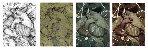
Breakdown of the painting process
“1308AD. France.The Templar Order has fallen. King Philip IV has a price on the heads of its remaining members and associates. Three Knights, Pierre, Jean, and Reynaud are on the run and head for the Order’s last bastion of safety: The island monastery and fortress, Mont-Saint Michel. There they are presented with an opportunity to fight the king using dark methods. Soon, they are met with an untamable evil that turns Mont-Saint Michel from haven to prison. They will discover that not only does evil lurk beyond the walls of the monastery, but the actions of the past torment them within the walls of their own minds.”
Over the last while, I have had the pleasure of illustrating a phenomenal book by Dalton James titled “The Night’s Many.” With his permission, I am going to share some sneak peeks of the finished illustration, as well as some insights into the process of making each one!
Our first image is titled Taking the Arrow. This scene is a flashback of one of the characters to his time during a war in England. During the battle, he is hit with an arrow (surprise) and is lost amid the chaos of bodies and presumed dead.
Now that we have a little background, let’s dig into the process.
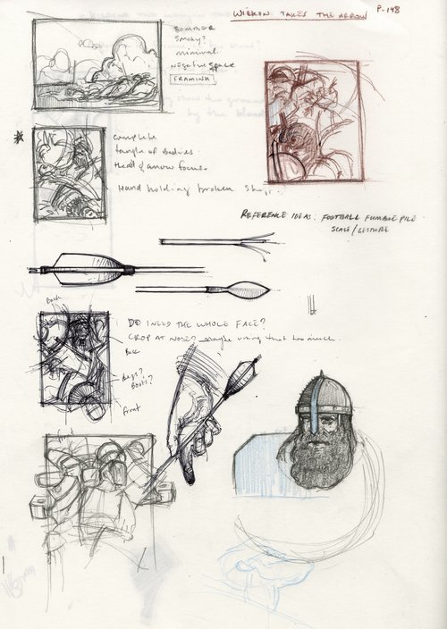
Thumbnails/ideation
Every illustration should start with thumbnails and ideation. Admittedly, I tend to work on loose leaf paper and sometimes misplace them. So this is the only one I could find.
This image provided a unique challenge as I wanted to somehow capture the chaos of the battle, and those few moments of calm that the character had before blacking out. A major theme of this flashback was being lost among the fallen soldiers and I had this image in my head of being tangled up and swallowed by a mass of bodies. This would create a sort of pocket of solitude despite being in the middle of the battle.
I also took this time to research some period style armor and weaponry just to get an idea of what I would be working with in the image. Taking some time do studies helps us better understand the shapes and forms in an object, so when we get to the final piece, we are more comfortable exaggerating or putting them in different positions.
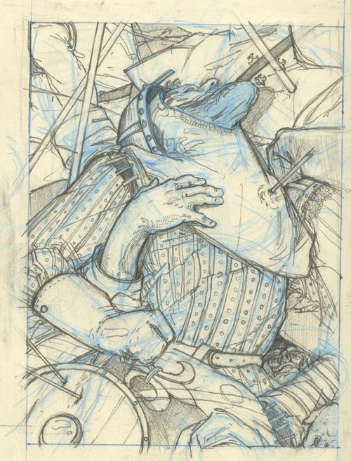
Preliminary Drawing - Blue Pencil and Graphite approx. 5”x8”
Once the concept was nailed down, it was time to move onto the preliminary drawing. This was done in a moleskine notebook using a non photo blue mechanical pencil and graphite.
A lot of my work tends to have a single figure or character in it, so this was really fun to try and fit as many bodies in as I could. Using things like the spears and arrows I created “blocks” for the viewer to keep them in the image. Everything swirls around the central figure and directs the eye back to his face and the arrow in his chest.

Final Drawing - 12”x16” Graphite on Toned Watercolor Board
After the composition was solved, I scanned, enlarged, printed, and transferred my sketch to a toned piece of watercolor board. (The tone was achieved through a wash of acrylic). During the transfer, I refined my drawing to really get the shapes I was after. Sidenote, that is one of my favorite hands I have ever drawn.
Now onto painting.
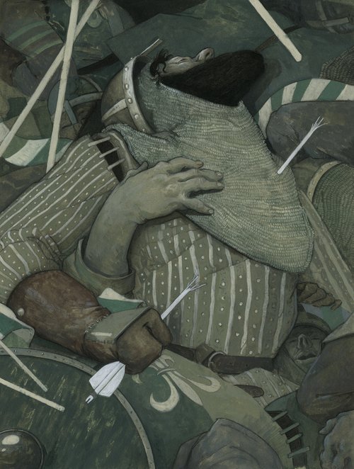
Final Painting - 12”x16” Acrylic and Charcoal on Watercolor Board
My Primary concern in the painting stage was to get the values established and have enough color in there to really manipulate digitally at the end. I used a very limited palette, and had fun figuring out the lighting and creating some texture.
I wanted there to be grit in the image so I was not overly concerned with making things look really neat and clean - it is a battle after all. I also played a lot with simplification, such as his chain mail. It really is just a shape with some tiled brush strokes in there to add texture.
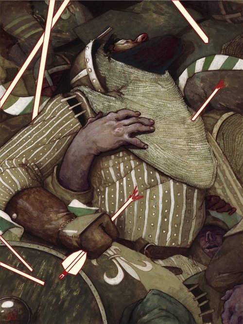
Final Illustration - 12”x16” Mixed Media with Digital
Once the painting was complete, I again scanned it and started my digital edits. This is one of my favorite parts of the process as I am totally free to experiment. Pushing and pulling colors, values, and textures. It is really easy to fall down the digital rabbit hole and end up over editing, so I have to be careful.
As you can see, I added more color to the image, particularly the skin tones. I also warmed everything up.
I have been experimenting with introducing some vector based elements in my work, and brought that in through the arrows and spears. This is a theme throughout the illustrations for the book. It is a way to create emphasis, and kind of tone down a little bit of the violence (I want to help the viewer see past the gory details and focus on the themes and messages in the story).
All in all, I am quite happy with how this turned out, and I am looking forward to sharing more images with you. There are about 24 paintings in total for this book, so it will be awhile before they are all finished, and even longer before we get through all of them!
I would love to hear your thoughts on the piece, and if you have any questions about the process drop them down in the comments!
Until the next time,
B.
#publishing illustration#That looks like it hurt#purple skin#illumax#how its made#process#mixed media#illustration education
1 note
·
View note
Text
(( listen I am under no delusions that they would ever make a cass meet and greet. TV characters at the park are not unheard of (see: elena, launchpad, phineas and ferb), but they have to either have enough recognition to pull in their own audience or be paired with someone that does, and if rapunzel ever gets a dual meet with actual character relevance again there is approximately a 100% chance it will be eugene.
but you know how they could put them in the parks? the parade. swap out that giant bulky ulf and the two generic parade girls that walk in front of the tangled float for cass, lance, and varian. you'd be providing the characters to those who recognize them without too much surrounding baggage like finding them a spot (heck even the acting could be kept fairly shallow since by the nature of a parade the characters don't have much time to converse), and those who didn't recognize them could easily brush them off as just like tangled background characters.
plus they'd look/fit in a lot better. the dresses for the tangled extras are cute and all but their "rainbow puked on me" color palette does not remotely lead into the earthy and almost grungy look of the float they're supposed to be warming up for lmao ))
#(( yes i am still on Disney parks brainrot could you tell ))#(( i have this exact vision of what cass and varian and lance would look like as face characters ))#(( and the ways they would animate and pose for pictures and the like ))#ooc.
0 notes
Text
i bought a very cheap crayola watercolors palette today. and also the tiniest bolts and nuts i was able to find
#wind howls#i want to make a doll with super epic fucked up joints but i was missing the needed bolts but i have them now#i say super fucked up but really i wanna make one of my ocs into a doll.... maybe dexel.... i like them :)#the watercolors palette is mostly bc i dont wanna waste my watercolor pencils when i could just use something else#the colors are silly but i can work with that. easy peasy#on thursday ill look through thrift stores and see if i can find more good dolls for customizing bc the rapunzel i found last time-#is a singing doll and i 1. dont wanna make a completely different character that sings a rapunzel song from tangled and 2. dont wanna break#a perfectly working sound system in a doll so. maybe in her case ill just make her a prettier outfit bc the dress i got was the wrong size#maybe give her a new face. who knows
2 notes
·
View notes
Text
Varian’s “pale” skin:
I’ve been seeing this misconception a lot lately, so I thought I’d throw together a little ref post (using the eyedropper tool) to help out any writers and fanartists out there.
[Note: I’m not a professional animator, I don’t work on the show. But I do spend a lot of time working with digital art and have a fair knowledge of it’s many aspects.]
So let’s lay this rumor to rest; Varian’s skin is not pale.
It actually has a sort of olive tone to it, which becomes clearer in dim lighting (such as his lab or the interior of the castle.)
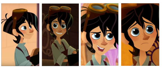
In broad daylight, we can see that the tone of his skin is surprisingly a bit darker and more saturated than Rapunzel’s. Ex:

The biggest difference between them is their hair color:
Rapunzel has golden blonde hair, which brings out the tan color of her skin and gives her a sun-kissed look. Varian, on the other hand, has black hair, which causes his skin to look lighter in contrast (the blue/green hues in his color palette only add to this effect.)
Standing side-by-side, they form an optical illusion of sorts
Granted, Rapunzel can appear darker than Varian in certain lighting. This is due to the varying reactions that different colors have when overlaid with another.
Likewise, certain lighting can also make Varian look paler than he actually is (as pictured below.)
Overcast weather, for instance, desaturates his color palette and reflects the blue/grey tones.
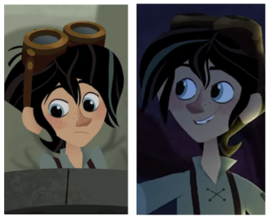
But even then, if we compare the tone of his skin to that of Cass (who actually is pretty pale), we can see that he still has a lot of color to him whereas she appears almost grey.

So, when painting/coloring Varian’s skin, if you’re going for accuracy, I’d advise against using light, desaturated tones if you can help it. Instead, go for something more on the tan/olive-y spectrum.
Same goes for writing- try to avoid using words that imply paleness or pastiness when describing him (unless in comparison to someone else or if the scene’s lighting lends itself to it.)
This has been a brief guide to skin tones and the effects of lighting in digital art/animation. The More You Know 🌠
Hope this was helpful!
#I think someone has made a post about this before but I wanted to make one using visual examples for ref.#He's just one of those characters that are hard to pin down color-wise. But man oh man I love his palette so much#varian#tangled the series#long post#artistnotes
602 notes
·
View notes
Last Seen Blogs

vishalgangji-blog
Untitled

loenbun-blog
Cutaduen.ID
ashketchum25
Come At Me Bro!

blessing122
Untitled
mike-litoris
High Grade or No Grade