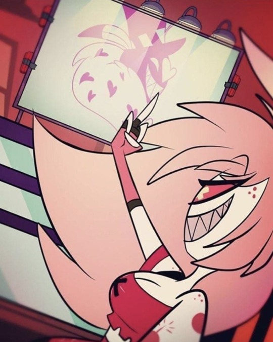
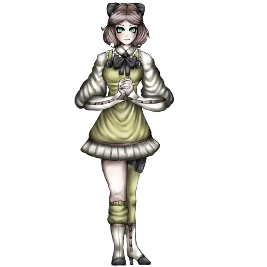
#the asymmetry is so well done i love it
Note
Hello, I hope you don't mind me asking, but I love your art style so much, and the way you draw Ragatha!!!
Would it be okay if I asked you for advice on how to draw Ragatha's hair?
Thank you!
It's perfectly fine to ask me for advice, but just so you know, I'm not the best at explaining my art processes tbh. I've never done an art tutorial or anything similar to that.
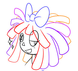
However, I tried making a small guide here on how to draw Ragatha's hair - well, how I draw it at least. It's sort of a rough sketch, but hopefully it'll be useful for you!
First off, I'd like to point out that when I began drawing her character, I used one of her official 2D artworks as reference to draw her hair, not her 3D model!
To be more specific, I used this one:
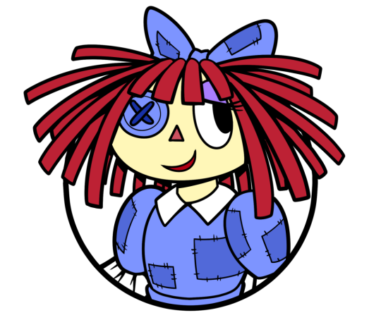
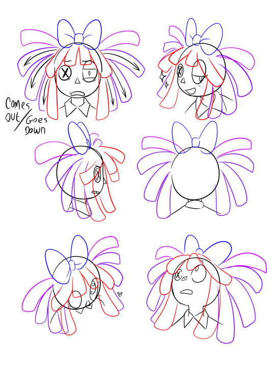
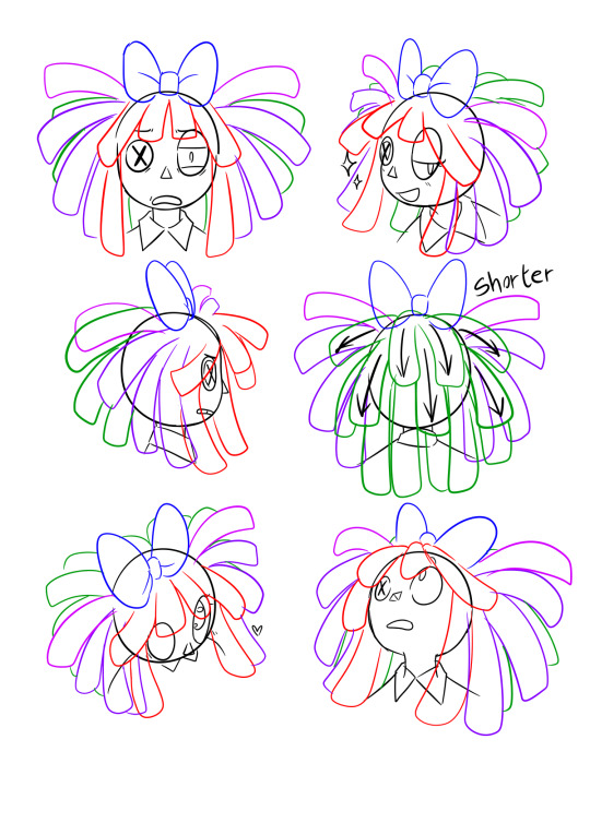
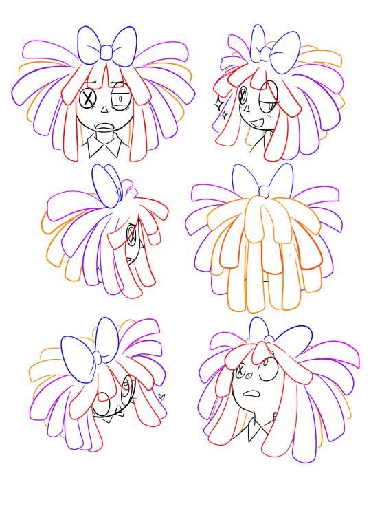
Another important thing to take into consideration is THE VOLUME her hair has.
If you have curly hair and it's long enough, you might know that to make it have that sweet sweet volume, you gotta style it in LAYERS! The same applies to Ragatha here, which you can actually see in the image above! If you wanna make her hair look voluminous, you need to draw it in layers (Assuming you'll be drawing it similarly to how it looks in canon - like dreadlocks)
Anyways, now onto the process!
1st step - Bangs
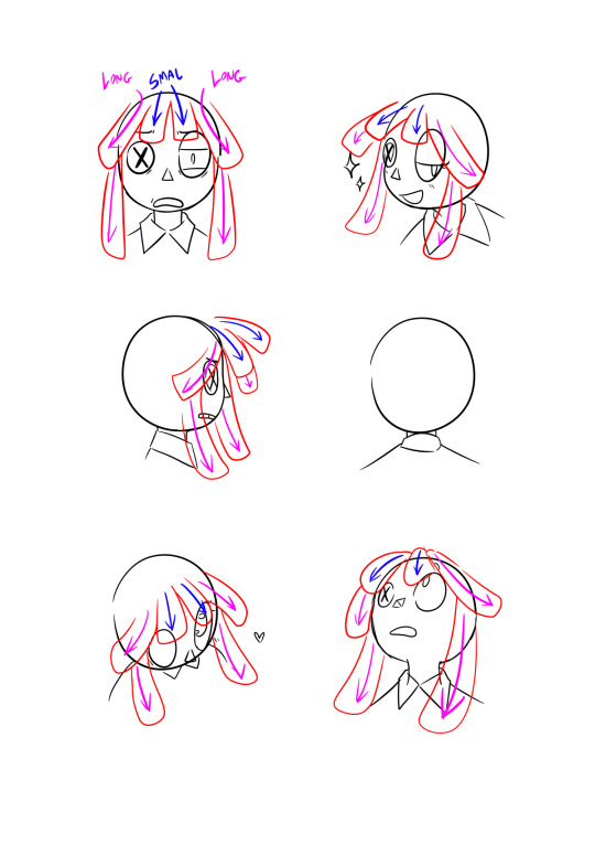
When drawing her hair, I will always start by drawing her bangs first. It helps me sort out where the other locks will be going for the most part.
I will always start by drawing the 4 locks that go on top of her forehead. The two in the middle will always be shorter than the ones on the sides, but that's just my preference.
Once that's done, I do the longer locks that go down along the sides of her face.
2nd step - Locks on top + bow
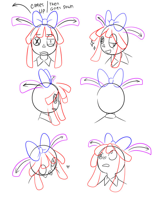
Bow is not mandatory, but I must admit it does make my life easier when i'm drawing her, because then i'll always know where to put the two locks she's got on top of her head - that being right where the bow begins - behind it.
3rd step - Superficial layer!
Once you get the two higher locks and the bangs done, this step becomes way easier. You just gotta fill the gap between them.
I'll normally draw 3 on each side, but of course that will depend on the thickness of the dreadlocks you're drawing. It's overall pretty simple.
I like making these 3 locks more droopy than the other 2 coming from behind the bow, but that's also just my own preference.
4th step - Secondary layer
As you can see in the two examples in the center, the shorter locks on top will sort of flow in the same way as the 2 smaller bangs in her front. They go up, then down.
The longer ones that go behind her neck will just go straight down since they're longer and therefore heavier, just like the two long locks on each side of her face.
Clean up + fixing asymmetry
In the top left example, some of the bangs were asymmetrical, so I fixed that after cleaning up the sketch. Mistakes like these tend to be very noticeable once you clean things up, so try keeping each side as symmetrical as you can to one another, especially if you're drawing her front view.
Anyway, that's pretty much it for my process! I feel like I could've elaborated a bit more and made this more organized, but at the same time I kind of have no idea what to do lol sorry
Still, I hope this helps you out somehow!
#miga answers#art tutorial i guess?#art advice#sounds more fitting ig#also i loved how the one in the top right turned out#i'm saving it for life as a reaction img#my art#tadc#the amazing digital circus#tadc ragatha#ragatha
278 notes
·
View notes
Text

Cherri Bomb Redesign (Bonus!)
Surprise!! It’s her!
I refuse to believe Cherri doesn’t have bunch of scars or injuries from using explosives and fire all the fucking time. There is no goddamn way. Also shes like running and jumping all over the place constantly she’d definitely have a running blade like 90% of the time. (Don’t walk on running blades you will probably trip) Her pant leg is ripped to look cool and also just for easy access to her leg.
I wanted this to be kind of sloppy with the colours; show how a lot of sinners dont have just a select few sins and note how often people participate in almost all of them. Ik it may not be the most pleasing colour palette to look at but that’s kind of the intention. Jumbled colours and asymmetry is really just Cherri’s thing in my head. I wanted it to look like she made or thrifted her clothes as well or like just stole them.
The bomb and cherry in her hair are supposed to kind of look like those hair bobble things that fucking HURT when you snapped them but they were cute so I feel like utilising hair bobbles is something I need to do much more

You could kill a man with these I swear to god.
Her tattoos and stuff are just basic cherries and vines and the little bomb and the bisexual symbol thing. Also bellybutton piercing is some I’ve only ever done once on an OC I have named Angela/Angie which is… kind of ironic?

You even get a little redraw for funsies! This was done for my friend helping me with my rewrite ideas so this is like the least I can do as repayment. You can see heaven up in the corner too :3
I don’t actually have a bunch to say about Cherri’s redesign, I want her to just be this “Oh wow! Thats definitely an outfit!” kind of design cause I love those. Oh and she definitely did the raccoon tail masking bits with craft tape.
I told my friend the dumbass stick figure on her arm is put there because I was thinking of her asking Angel to draw on her and she’d get it tattooed and he cannot draw at all so he just did a stick figure and was like “this is so cool.” and it was not cool at all/j
I wouldve added more stickers to her running blade and stuff but her colour palette is already VERY full so this is the price to pay. Still not sure if I’ll continue doing these but we shall see!! The next design post is likely going to be the lineup and some side by side comparison things ;P 📺
#hazbin hotel#hazbin critical#hazbin hotel criticism#hazbin hotel critical#hazbin cherri bomb#hazbin hotel cherri bomb#cherri bomb hazbin hotel#cherri hazbin hotel#cherri bomb#cherri hazbin#hazbin hotel rework#hazbin hotel redesign#hazbin hotel rewrite#hazbin rewrite#hazbin redesign#hazbin rework#hazbin redraw#hazbin hotel redraw
76 notes
·
View notes
Text
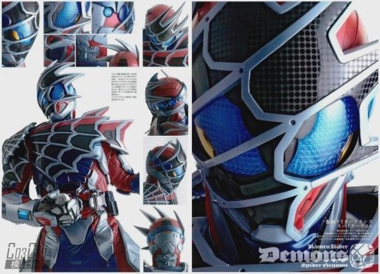
KAMEN RIDER DEMONS FUCKS
But he also reveals the problems with some of Revice's design decisions
Okay, so, cards on the table, Kamen Rider Revice has some of my favorite Kamen Rider designs. When they work, they are these slick, cool, iconic designs. It is a season that does legend rider designs the best, integrating the designs without being too overbearing (or just being the other riders). Jeanne is probably the best rider girl design, it's all so rad.
Kamen Rider Revice also has some of the worst Kamen Rider designs ever. Whether it be Live's highlighter yellow, or Over Demon's bullshit, some of these suits really suck. To be fair, I think the series is more hits than misses, but still.
That brings me to this thread's topic. Kamen Rider Demons. This is an ancillary rider introduced fairly early on into the series, and is a rider system that jumps around a lot, being basically Fenix's main rider system. However, the initial suit is primarily used by our boy Hiromi. And, to be honest, this design is rad as hell.
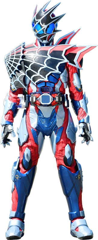
The undersuit initially has this muscly texture, looking like tendons strewn about. This muscly texture is also on the belt, tying it into that design as well. From there, the red muscles are strategically covered by a mixture of blue and bluish silver armor. It plays on the classic Spider-Man color combo to great effect. It all works so well. However, the main Vistamp gives the spider web armor on the torso and head, which is intelligently set up in the neutral black, with the other colors being the same silver and red on the rest of the body. This webbing also has an asymmetry, giving an extra visual appeal to the suit, but has a simple, nearly smooth texture, helping to not leave the suit over detailed. Plus, the whole suit has a sharp, intimidating, militaristic feel, especially exemplified by the permanently angry front eyes, flanked by some extra spider eyes on the side, glowing in a clear blue through the webbing. It's so cool! You think it would be too busy, but it somehow all meshes so well together. I would love to see him in Spider-Verse.
From there, a bit of history is given to the suit design with...
KAMEN RIDER VAIL
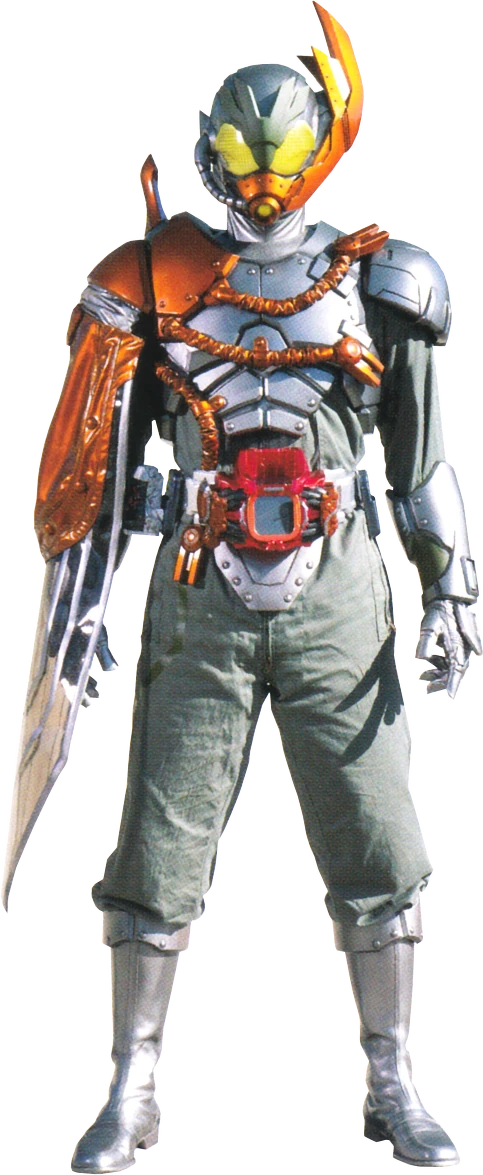
This suit is militaristic, but in a different way. Covered in metallic armor, he wears a baggy undersuit. This both gives the suit a more aged feel (It's meant to be an older precursor to the modern rider systems) and gives the armor the freedom to be more complex. It integrates a darker silver than the main Demons and copper for the Kabuto parts. I do really enjoy this suit. However, it's important to note, because both of these suits are a part of the history of my least favorite suit in the (main) show.
OVER DEMONS
Over Demons basically just slaps the two suits together to poor effect. The undersuit is unchanged from Demons, and the torso armor is nearly unchanged from Vail, and they do not mix. The Vail armor adds 2 new colors, a new silver and bronze, all of which fight for your attention. Plus, the detail goes overboard, the torso armor adding just a bit too much texture that was gone in the main demons suit. What doesn't help is that the helmet, newly designed for the suit, adds 2 NEW COLORS, a light blue and a bluish white. It is too much.
And this is the problem with many of Revice's slapped together suits (even some of the main suits if you dislike Thunder Gale). It slaps two aesthetics together that do not mesh at all. Another great example of this is Evil/Live. The undersuit is really detailed and has a lot of colors, but the smooth black torso armor balances it all out. Then live adds a shiny white and highlighter yellow for some reason.
They use reuse to either over detail the designs, have too many colors or both. That's not to say reuse is bad, it isn't. And I get it, Revice was strapped for budget. However it can be done well. Evility Live uses the Evil undersuit and mixes it with the Holy Live armor to great effect. Destream uses the century suit, which is in a neutral white with some red details, and gives it a cool blue touch.

It can be done, but Revice sometimes just doesn't. However, that doesn't mean that Kamen Rider Demon's suit was cool enough for me to spend too much money on an action figure of it.
#kamen rider#kamen rider revice#suit design#tokusatsu#revice#kamen rider demons#kamen rider over demons#kamen rider live#kamen rider evil#kamen rider destream#kamen rider vail#yes its the sh figuarts#yes I like the figure
7 notes
·
View notes
Note
pspspspsps 4 the infinite asks: 3, 18 n 26 :eyes:
oooo ALRIGHT here goes !!
3. what's your favourite part of his design? why?
honestly a fucking difficult question but i'm reaping what i've sown. it's very close between mask and hair – the mask is so iconic in it's shape, i love the asymmetry and the attention to detail in that the right side is blacked out, likely because he doesn't need to see. it's crisp, it's edgy, it's a moment and a vibe and i love it. sure, if you wanna draw it at funky angles it could be a nuisance, but because it's shapes are so distinct u CAN break it down. and use references baby!
his hair i love because i'm just a sucker for guys – or, in his case, guy who is not a Man but is a boy in a dog way – with long hair. let them have it. please. it suits him so well and you can style it in a lot of different ways even besides the iconic locs !!
18. how do you feel about shadow killing squad jackal? do you headcanon otherwise?
okay this topic is one that i've seen a LOT of differing views on, and i definitely understand the divide on it because shadow's character in general is one that can never really be agreed upon among fans. my own take isn't one i've shared here yet so here it is – i think it depends on circumstance.
i can see it going either way depending on how things actually went down. rather than just asking why would shadow kill squad jackal, i like to ask why wouldn't he? both questions make you think about it from a different angle, i think. i can see him not caring either way; they're willing allies of eggman, but they're not a big deal. they're insignificant, whether that means their lives are unimportant, or not worth the energy to take. i don't think he would do it with outright malicious intent, though he is still an asshole.
i veer more toward he wouldn't, because he doesn't really give a shit and it isn't worth the energy. knocking them unconscious suffices just fine and they don't seem to be as dangerous as villains he's faced in the past. at the same time, i understand how his indifference could go the other way. he's also impulsive, and trained to take out anything in his way – it could be instinctual. my opinion of shadow is that he's neither killing enthusiastic or opposed. he deals with things case by case. he's not a monster, but not against doing what has to be done.
these are incidents from different sources, so take it with a grain of salt, but he extended an offer to metal sonic in archie to turn over a new leaf, though in cases like eggman and tinker, eggman shows much less, if any, promise of potential change, and that's where the line gets drawn.
shadow doesn't know anything about squad jackal and why they're allied with him, but on the basis of just working with eggman, would that be enough? i don't think so personally but, that's just me. again, i see it being more instinctual, a means of completing his mission, if he did. tunnel vision sort of deal, you know?
what happens in my fic, however, is complicated. that's all i'll say on the matter :)
26. what does his self-care look like?
it doesn't. okay jokes aside, i think he's always had a rough time looking after himself, between mental illness and being on the road for years fighting for his survival. he cares about his appearance a lot, but at the same time, it's hard for him to manage it and this really applies after losing his team.
he likes baths over showers, though, and if he had the option he would probably like one with candles, just allowing himself to lay there for a bit. he cares a lot about his hair and it has high priority. comfy clothes on a bad day, music appropriate to his energy levels, cookies and a blanket. he tends to take space and just withdraw to reenergise if he can. i also headcanon him letting his emotions out through art, writing, and being very elaborate and often brutal BUT that's post-war
6 notes
·
View notes
Note
ooooh are you really redesigning gevie :o
short answer: Yesn't
long answer: yes but also no. when i say redesign i dont mean scrapping everything and making a new design wholecloth, i just mean trying a bit harder to make it actually look like a genshin design (with the approximate amount of detail, and also follows some more rules that appear to be in the genshin bible of character design)
allow me to elaborate on the genshin bible of character design. im not very Good at character design so im sure theres many soft rules they have in place that i Dont notice but there are a lot of occurring patterns in their designs (im basing this off of women particularly)
characters ALWAYS have something trailing behind them (hair, clothes, capes, accessories)
there are always hair adornments of some kind (if there isn't, there's sth abt their hair that adds visual interest, like dehya's fake cat ears or ganyu's horns)
there are usually boob windows and/or stockings
asymmetry is common but not necessarily required
clothes are either insane OR have logical base elements that are then made insane
they love metal accents
gevie was following some of these (cape, stockings, asymmetry), but her design didn't really inject enough imagination/detail (insanity) into many of those elements. g!evie has a belt, but it's fairly regular and not much is done to make it interesting. her cape is a weird length and unsatisfying shape. her shirt and shorts are very basic
ive wanted to change gevies design ever since i finished this iteration tbh but its always the "how" that has stumped me because 1) im ass at character design and 2) i feel like gevies outfit represents her well enough to the point that i grow hesitant to change it. gevie is just very much the kind of person to wear shorts and stockings, and my creativity is limited bc i refuse to make gevie wear a skirt.
so the things ive always wanted to reconfigure most are gevies cape and belt. those are the main focus since i do like her shirt and shorts i just need to figure out how to change them to look more interesting. i also need to add a hair adornment and im thinking probably a clip of a fairy wing? but idk im basically never much of a hair decoration/hat guy
ive also wanted to try and make her design more explicitly based off of fairies.

here is where i am at currently (variations of cape) second cape is based off of sorush. im not quite sure which one i like more yet.
i saw a picture of an anime fairy with asymmetrical shoes and i love the idea to shit but id have to see how weird it would look while coloring/figure out what the hell im doing w her stockings in that case.
tldr. im struggling
#asks#sorry this took forever to respond to i wanted to have at least Some kinda picture#but i appreciate the question
10 notes
·
View notes
Note
i dont know ANYTHING about splatoon and dont really care to invest beyond aesthetics because that game is SO GOOD on aesthetics if it wasnt a mainly online game that costs an unreasonable amount of money for me i probably would be all over it hehe HOWEVER IM STARTING TO TANGENT my point is i love your funny guys theyre soo cool i esp love bells design a whole ton its just so good i love how her hair almost mimicks demon horns which paired with her nervous appearance makes me think she might have problems with morality or something.. im always a sucker for spiral eyes and her right (her left our right) tentacle hair thing being mangled is just a real nice shape and balances her out with her scar on the left of her face.. PLUS her colors are so pleasing...
aughh i especially love how you drew her in the umbrealla meme image shes just soooo good there immediately captivated me AUGH i should catch up on ur lore for them or smth bell has CAPTURED ME youve DONE IT youve caught me by putting a strange scared character under a box with a stick + string
you drawing bell: 🪤🪤🪤🪤
me: CHEESE chees for me maybe???? che [[i am trapped under your splatoon themed box]]
erm... ill try to find a way to catch up on ur silly lore.. i <3 bell... your designs are all really nice but bell was the straw on this camels back so to speak hehe anyways... hope youre well :-P i never can find much to send asks over but i think ur cool lol 👍 take care my friend
GAAAH THANK YOUUUFHCHDHGJJFFBVNNFNRJGJFFJ I’m literally abt to cry so muchvhbhfhhghfh THANK YOUHUUUU
Bell is so silly … I spent like 5 minutes on their design each time I drew them before finally settling on this one . I like asymmetry so . Bell has differebt stuff on each side .
I haven’t thought of Bell much so I don’t have a ton of lore for them but I promise you will get to hear more soon . You will . Get ready . You can’t escape Bell . /silly
Yoylechess I adore you . Thank you .
2 notes
·
View notes
Text
LEXIE LIU - "DELULU"
youtube
For Katherine (and many of us), delulu really is the solulu...
[7.53]
Katherine St Asaph: Reviewing "SuperShy," I wrote: "this is not what a crush feels like." This is. The arrangement sounds more like Britney's Blackout than anything I've heard since, in its chilly sequencer, its vocal distortion, and especially in its urgent dispatch from a mental hell of one's own making. (Amazing/unsurprising that despite/because of the album entering canon via ruthless memeification, no one's done a real homage. All that came close were club remixes.) Blackout often felt, as Isabel Cole wrote here, like "a blur around the edges of reality that makes it impossible to discern the intentions of others and even ourselves." So, too, with this. The headspace "Delulu" plumbs is the emotional equivalent of making up a guy. "Clueless" sounds like the wrong word at first -- too Cher, as if. But heard literally, it captures the deadly-stakes ambiguity of a crush when you're alone with only you and it, as well as the asymmetry: the abjection of knowing that the interior of your mind sounds like this, while the interior of theirs might sound fine and also might not; and they might know this about you and also might not. When everything feels like a clue, nothing is one. The situation is Lovecraftian, almost: having your thoughts replaced and your reality fucked by some cosmic horror much stronger than you that no one sees or maybe even knows they've summoned; where you always know it's there but never how close, and the more you acknowledge it or even try not to, the more it pulls you toward escalation and destruction. The song ends quickly -- not even 2:30 -- and abruptly. Crushes often do.
[9]
Michael Hong: Consider those first thirty or so seconds a contextualization of "delulu" within Lexie Liu's career. Her oldest tracks, the ones that caught 88rising's attention, were stylish but anonymous, built around her futuristic aesthetic like trendy clothing for an anonymous model. With 2021's "ALGTR," she let some personality cut through her instrumental, rendering the in-vogue synthwave sound jagged; a year later on her promising full-length, she allows personality to come out of her performances: on "DIABLO," she drags across the verses in Mandarin, howls impassioned screams of desperation in English, and mewls a sultry narration in Spanish. On these first few seconds, "delulu" goes from catwalk synths to heart-palpitating drum 'n' bass, listless croon to bratty snipe. But she still takes it further as she waits for a reply -- zealous and obsessive, it's unlike her previous controlled poise. "delulu" is delightful and messy; the various synths with staticky fuzz and turbulent beeps are like a robot processing emotions, yet Liu delivers her most girlish performance, raging fanatical as she waits for a text. "Nerve-wracking, anxiety-inducing, no reply I scream," she sings, the words mashing together as it all detonates around her. Taken with its outlandish video where she cosplays as various personas, it remains uncompromising of her innovative vision, while still furthering the surprising revelation that beneath it all, Liu is just as human.
[9]
Nortey Dowuona: It's odd that '80s pop drums have survived so long. You'd think that Lexie Liu, a Mandopop artist who composed and produced this song with RadioMars, would have other choices from drum sounds even and especially on the chorus drum breakdown which send a flurry of kicks and wet snares with a dribbling synth line at the next side of the second chorus under the high synth riff that is pushed even father into the back. But since they aren't meant to be too big in the mix, they don't even hit as hard. Lexie's voice is so small it slides right through, unable to be crushed.
[8]
Wayne Weizhen Zhang: As a Chinese American who used to live in Changsha, I desperately want to love this more than I do. "Delulu" is ambitious, breathlessly paced, and brimming with manic sonic ideas. What's missing for me is an element of fun; after two minutes, my biggest emotion is relief.
[6]
Taylor Alatorre: There's this one TikTok-brained co-worker I have who says "delulu" all the time, and I don't know if I've ever encountered a slang term that I love and hate in such equal measure: hate because of how it trivializes, infantilizes, romanticizes this that and the other thing; love because it's just so darn fun to say, or at least to imagine myself saying if I had less shame. It's for that reason that I wish this song made better use of its title (in some way other than its hilarious single art). The word is processed and iterated beyond easy recognizability, a move that's intended to mirror the racing thought processes of an overactive mind, but which ends up turning an evocative neologism into a muddled soup of phonemes. As an illustration of the concept of "delulu" it fares better, though, and maybe it's my fault for going into this expecting a lighthearted meme song instead of a sweetly discordant slice of digital anxiety. In any case, I'd like to thank Liu for convincing me that I should be trying out for the HSK level 4 instead of level 3.
[6]
Hannah Jocelyn: I almost just copied and pasted the lyrics from "Speed Drive" for my blurb, I'm getting sick of motorik new-wave. But!!! This is one of the better new-wave bangers I've heard post "Blinding Lights" and "As It Was." Chopping up the meme word "delulu" is an ingenious hook, and marrying that hook to escalating breakbeats leads to something engaging enough that the song already feels complete at 1:22. I'm happy it keeps going, because I love the synths that suggest Lexie Liu and Zeng Yu definitely heard "Megalovania" at some point (complimentary)
[8]
Alex Clifton: Man, I wish my mental breakdowns sounded this cool.
[7]
Ian Mathers: Songs that make me feel like I'm about to have a panic attack/songs that make me feel better when I feel like I'm about to have a panic attack >>>>>
[10]
Micha Cavaseno: Apparently, there is a market for "One"-era Sky Ferreira delivered at ADULT. tempos for the nervy and neurotic, and of course 88 Rising has scouted and scalped it already. I can imagine this would be super fun for me once upon a time, and it still is in parts. Sadly I just wish it had the slightest bit of fat and girth on it, both in the tone of the bass and maybe just the actual song length.
[5]
Brad Shoup: Outside of that DJ Mustard intro, it's a compact synthpop ball hitting escape velocity. A lot of songs depict the menace of paranoia, a lot fewer can get at the tail-chasing feeling of obsession. The way Liu's breakneck vocal falls into some programming and collapses on itself gets pretty close.
[7]
Joshua Minsoo Kim: Lexie Liu's fractalized vocals make "Delulu" feel fuller and faster than it actually is. It's a potent depiction of spiraling: sometimes, your breakdown is only as overwhelming and unrelentingly maniacal as you let it get.
[7]
Dorian Sinclair: For twenty-two seconds, Lexie Liu lets you think "Delulu" is going to be a sleek, minimal, conventional pop song. Then, you get a full minute of the whole thing chaotically unraveling. It's a very effective rug pull on its own, but the real magic is in the second half, where she pulls exactly the same trick and it still rules. I'm almost disappointed the song is so short, so we can't find out if it would work a third time, but perhaps it's better to be left wanting more.
[7]
Jacob Sujin Kuppermann: Does a lot with a limited set of tricks -- mostly this is just an absolutely thumping bassline, a few increasingly unhinged synth lines, a footwork-leaning drum loop, and Lexie Liu herself, distorted and doubled and delusional in two languages. It all moves with the frantic energy of the people in my life who like to call themselves "delulu" -- Liu jitters and paces through her lines, channelling Debbie Harry at her archest and most paranoid. It's a joke and it's very real, all turning around a genius double-edged use of the word "clueless" so subtly struck that it took me three listens to realize where it had unnerved me.
[9]
Frank Kogan: Perfectly catchy hooks with bouncy beats that announce "playfulness" -- but the rhythm feels pushed fast, though that's by mainstream American pop standards (as opposed to "Eurobeat" not to mention the last 40 years of electronic dance), so the result feels edgy and uneasy, which makes the hooks sound even better.
[8]
Will Adams: Oh, so this is what "Speed Drive" could have been!
[7]
[Read, comment and vote on The Singles Jukebox ]
5 notes
·
View notes
Note
Hey, what's up! I was the one on AO3 earlier asking where to send you fanart. I decided to do my interpretation of Y/n in the splash art style and this is what popped out.
OHHHH HI THIS IS SO SO LOVELY. OKAY. LOSIGN MY MIND A LITTLE !!!!!!!!!
this y/n is SO lovely og my goodness . its so creative. first of all i have to say your handle on the dr artstyle is ASTOUNDING and thats a huge compliment bc i know the way they colour and shade is a pain in the ass, you've done it SO well . ive seriously been looking at this for hours.
I ADORE THEIR OUTFIT!!!!!! love that it keeps the themes and colour of the overalls and boots but you've obviously given it its own spin + personal touch and i think it is so lovely and unique. everything about this is just adorable . i love the asymmetry of the mismatched socks / legwarmers and i think everything goes together so well ... toes the line between cute and chaotic WHICH definitely fits with y/n. i toyed with a lot of outfits like this before deciding to make y/n gender neutral, fun fact . i was rly drawn to shirogane's long skirt and belt and i wanted something kinda like that . but anyways.
this y/n is so skrunkly and so so pretty . wishing them love and light. and YOU !!!! grabs u and shakes u hard. thank u so so much. u are immensely talented and im incredibly thankful thank u used ur talent on my little fic. you are ASTOUNDING thank you so so much for showing this to me!!!! i WILL be thinking about it for the rest of the day :D
16 notes
·
View notes
Text
Open/Closed
Jack's cafe and bookstore closes right when Grant's floral and tea shop opens. They hardly interact with one another, until Joey shows up in town and essentially moves in to their respective businesses.
warnings: none
for @pineappleoracle <3
ao3 link
Everyone knew the best times to go down Mabal St was either at around six in the morning, or six in the evening. The answer for why that would be was simple, it was the time that the Bowler Hat Cafe and Perfect Asymmetry Bouquets swapped hours. Well, not exactly, there was about half an hour overlap right between, but it was the best time to go, regardless. While Mr. Fain ran the best night time cafe in a thousand mile radius, complete with a bookshop and miniature library; Mr. Cohen’s flowers were unbeatable and always fresh, and the communal garden was a wonderful perk, as his business partner Wally would happily tell anyone who was around to listen as he delivered custom blended teas for Grant to sell.
Grant and Jack, despite both being beloved and famed for their lovely spaces, had hardly held any conversations, except for a hello and goodbye as they walked in and out of their stores. There were many times that their patrons would go straight from one store to the other as the hour passed, but the pair of them never seemed to frequent the other’s business. No one was able to understand why that was, considering that the pair seemed genial enough to one another and were generally kind and nice people. Many people worried that they were being taken advantage of by the various folks who would simply mill about the stores without making purchases, but both men would always assure them that their doors were open to all. Grant offered finance help on the side, while Jack gave small music lessons so people could busk.
While many of the vagrants would come and go, there was one whom Jack and Grant both individually began to consider as a fixture to their respective businesses. Joey, a man who showed up in town one day with nothing but a suitcase filled with various oddities- namely things that could sell for quite a bit of cash. At first, Grant had suspected that he had been a thief, but then as he saw him integrate into their neighborhood, he decided that first impressions could be very wrong. Jack worried that the man was in need of assistance, but that too proved to be unfounded. Joey worked odd jobs at all sorts of hours, and in between those times, he spent his freedom on transienting between the two stores, depending on the hour.
Hellos and goodbyes turned into minute long conversations discussing where Joey was, what he was doing, and there was an unspoken consensus between them that they were Joey’s keepers for as long as he needed them to be.
In the meantime, Joey was secretly plotting on how to get his two new friends to also be friends, closer than the short sentences they exchanged about him, which were gradually turning into actual discussions on all sorts of topics.
He had an idea. Both of the establishments had given him small work for them depending on the needs of the day. Grant would have him help with large arrangements while Jack would ask for help during the rush hours of the evening and early morning. So setting up tables and arranging bouquets were usual tasks for him, but rarely did those two tasks intertwine.
One evening, Joey came in with a lovely bunch of flowers to set in the center of each table of the cafe. Jack watched with some bewilderment, coming up to the man and tapping his shoulder to get his attention. Joey turned around with a brilliant smile, still holding two bunches of the table flowers.
“Hey, Jack!” he chirped, giving the man a broad smile. “I asked Grant if he could lend a few arrangements for the tables and seats, I thought it would be a nice spot of color. Not too flashy?”
“Er, no,” Jack answered, forgetting what he was going to say. Well, Joey seemed to be enthusiastic about setting it all up, so there was no harm being done. He would have to go give Grant some gratitude for the gift. “Thanks, Joey.”
“No problem,” Joey beamed, though his smile may have been just a bit too self satisfied. “I think they’re just as pretty as he is, don’t you?”
“Yeah,” Jack replied without thinking. Joey’s grin turned a little wider, but he quickly turned away before Jack could realize his words. “Could you make sure the mugs are all dry?”
“You got it,” he said, and jaunted over. Jack kept pausing in his work and looking at the flowers with a thoughtful expression. Joey tried not to be too obvious with his watching gaze. “Yep, all dry here.”
“Thank you,” Jack remarked, quite absentmindedly. “You should get some rest. That night shift you pulled over at Norman’s was mighty helpful for the man, but you look pretty tired now. Did you get any shut eye during the day?”
“Not really,” joey admitted, but he did not include the fact that he had not gotten any rest due to the fact he was making all of the table placements with Grant. “I’ll take a nap in the back.”
“See you,” Jack waved him off. “Rest well.”
Joey could not help but grin as Jack cupped a flower to take in a deep inhale when he thought he was not looking.
***
Grant was still a little groggy when he unlocked the door to the flower shop. Jack passed him with a yawned good morning, mumbling that the man should have a good day and Joey was on his way. However, even that forewarning could not have prepared Grant for Joey staggering in with a massive spouted urn, smelling strongly of coffee. As he put it up by the entrance stand, Grant was able to read the neat little sign on it (obviously designed by Joey, it was very clear to tell) read ‘Jack’s House Blend’.
“Um, Joey, what’s that?” Grant asked him, though he found himself reaching under the counter for their biodegradable cups. Joey looked at him with confusion and pointed at the sign. “Oh, I can read that, but… why?”
“It's a thank you for the flower arrangements,” Joey replied enthusiastically. “I’ve also got a little basket with creamer, milk, and sugar. You look like you could use a cup yourself!”
“Maybe,” Grant conceded, taking a deep breath and smiling at the aroma. “It would be great for customers who need to clear their sense of smell for picking out flowers. Did Jack like the flowers?”
“He loved them,” Joey proudly informed him. He was glad to see Grant’s smile grow a little more relaxed at the affirmation. “So did all the customers.”
“I’m glad to hear that,” Grant said, his cheeks a little pink. “I’m gonna check on the garden. After getting a cup. That does smell really good.”
If Joey peeked at Grant to see him leaning over the counter and smiling as he stirred his fresh cup of coffee, that was no one’s business but his own.
***
Joey was watering the plants when the front bell rang. Being that it was nearing the final half hour of business and therefore one of their busiest times, he was not surprised at all to hear it.
But he was not expecting to hear Jack’s well trained and pleasant voice greeting Grant. The flower keeper sounded just as perplexed, though there was an interesting little pitch in his tone that indicated that he was quite happy to see him. Jack said something Joey could not catch, and the tall man ducked behind the stand as the two of them walked past to the garden.
Joey stealthily made his way to a point just out of reach that he could stay out of sight and listen in to hear if they were going to discuss the flowers and coffee. When he heard them exchanging polite thank yous, he grinned to himself, though it froze on his face at Jack’s next words.
“I wanted to ask, though,” he said, sounding on the serious side. Joey pressed himself against the beam to listen closer. Grant’s voice, somewhat hesitant and unsure, replied, “Yes…?”
“I wanted to know if you’d like to go on a date sometime,” Jack wondered aloud, the words coming out in a bit of a rush. Joey mentally high fived himself- a better outcome than expected! “I know you’re just as busy as I am, but I’ve always admired you and your dedication to the community and the garden, and your flower arrangements really brightened up the cafe.”
“Oh, it was Joey’s idea,” Grant hastily responded, and Joey could imagine his fluster. “But I’d love to go out with you! I mean, when we both have time.”
“Is that, so, it was Joey?” Jack laughed. Joey felt himself smile at the sound. “Well, I’ll be, the coffee urn was his idea too- hey, Joey, you’re not listening in right now, are you?”
“No,” Joey squeaked, not realizing at first that he gave himself away, and peered out from the doorway he was hiding behind. “Well- maybe a little bit!”
“Oh, Joey,” Grant sighed and shook his head, but he was smiling. “Come on over here. I think you warrant joining the conversation thanks to all your help.”
“Well it’s about time,” Joey defended himself. “You two have been circling around each other even before I came around!”
“We never quite had the time,” Grant remarked, smiling a bit to himself. “But I’m sure we can make some for each other.”
“I can man the stores!” Joey offered helpfully, but Grant and Jack laughed, sharing a look. “What’s that look for?”
“You see, I don’t quite think that would work out too well,” Grant told him. “And there’s another reason, too, if Jack agrees?”
“Hm? Oh!” Jack snapped his fingers as he recognized what Grant was talking about. “Right, right. Yeah, I think that would be a great idea.”
“Wait, what?” Joey asked, finding himself rather lost. “What idea?”
“Would you care to join us?” Grant asked, and Jack finished, “On the date, that is.”
“Yes!” Joey found himself replying on instinct once more. “I mean, uh, I’d love to.”
Grant and Jack both smiled broadly, and Joey felt himself smile too.
The old style of the store owners closed, and something new, something different, opened, a little silver bell ringing between them all.
And Joey was excited to see where it would all go from there.

#joey drew#jack fain#grant cohen#flower shop au#coffee shop au#indigo#gift fic#gift art#batim#control art#control draws#bendy and the ink machine#control writes#jack fain/joey drew/grant cohen#au of an au#ink demonth
18 notes
·
View notes
Text
Overly concerned w the aging of my tattoos. My oldest tat is nearly 2 yrs old, done back in August 2022. What's it gonna look like in 3 more yrs? When it's 10-yr-old? Mind you, my shit looks perfectly fine, exactly how it looked fresh. (Big thanks to the artist who told me to simplify the design!) I worry abt my teddy bears more than anything tbh. Bc, well, they're fugly lmao but thankfully they're not overly detailed. None of the tats have a very detailed design, I always went for smth that could be easily perceived and comprehended by passerbys. It's basically why traditional tats hold up. Simple, bold, breathable designs that survive the passage of time. I get it now.
Unfortunately it will be impossible to cover up the teddies bc they have such a particular shape, but I don't regret them much. I still like them a lot, I just wish she'd done them better! Ah, well. My fault for picking the wrong artist, right? I am thinking abt modifying the chest tat tho, eventually. This time I'll pick an artist who knows what they're doing, whose specialty is asymmetry, someone who loves butterflies ideally. I have a few options already.
Overall though, I love my tats. I love that they're based on my arts and I love that some of them are kooky and fun. I think they improve my looks. I am just so v glad I embarked on this tattoo journey💗
1 note
·
View note
Text
Babies and travel
It's unusual but not unheard of.
We travelled a lot with our daughter. At age 11 she has already been to 67 countries, a few of them more than once.
She actually feels rather embarrassed about it I think as it's so rare. She usually shifts and stays quiet about it.
A nonconformist by birth.
It meant that over the years from starting off with a pram and big suitcases (age 6months to Japan)... we reduced and reduced our stuff back to the old days of just carry on and as few baggage as possible. Lighter and lighter to be unimpeded to adventure.
We certainly need water though for sure. Or baby powder - we ran out so quickly in Japan. But it was kind of fun running around supermarkets look for some.
So over the years she has been on countless jungle walks (usually with just her parents - no guide), slept in the desert more than once, snorkelled and swam of a hell of a lot of Caribbean islands (yes we did the cruises as well as the proper adventures), ordered pasta or burgers or rice in most far flung places as well as gorgeous foodie European cities (to our dismay) but to her credit she loves fish ...
I don't pretend to be a cook & that's why every partner of mine has been a fantastic cook including her dad thankfully. Also I love fabulous food too.
She has been up so many mountains (quite a lot of them in Switzerland), and volcanoes (Central America). She has done so many hikes with so little because we decided to travel far and fast you need to love to travel and discover and enjoy. Some of the places - I can tell you insect sprays have not worked sadly and some places they have.
And most (99%) tourist spots anywhere in the world however remote even on country holidays - there's some guy/ woman selling coke and water, fridge magnets, Tees, sunglasss and probably braid your hair all for $20. In fact they usually see you coming and follow you down the hike a bit.
And we have encouraged her to be a little free. She is a city girl from London and we love her have that too - it's a privilege the school she has, but it's nice to know about nature and the animals (her grandma is a conservationist amongst other things) and from far flung places.
As well as experience lovely hotels (nice for us to) and also shacks and also a little bit of everything. Why not ? It's a been a blank sheet of paper for us.
Wouldn't everybody if they had a blank sheet of paper want to ?
I know horses for courses, we don't expect that from others - otherwise we would be writing on ...erm ... their blank sheet of paper.
What's the point of having that blank sheet of paper then ?
It's a nice rhythm we got into, no need to instruct or even ask ... in fact you ended up leaving the people in different cultures to just be who they are leaving little of yourself but as much as needed for flow
... which is quite appreciated by locals who in many places are still living with other legacies from British/European rule
.. no asymmetry of information (a good mate of mine terms) required.
... a dialogue ... a conversation ... unwritten rules. The pleasure of conversation ... but a different kind / not a language but a flow.
We get it's a tough world out there and yes brown women and women are the ones to be told they are not enough in every way.
We want her to not see that. Not to even see that it is that way. Not even see the nonsense. Not even to know there is a system to fit in.
But just to do her best and be happy as herself.
She has already done more than most (even more than most patriarchy - she doesn't even know it) ... just with seeing the world.
Yes the last 12 months have been terrible for her - any kid.
But she is a sparkly sparkly chip of the old block so I know that no one can take that away from her to negotiate it back to her. No one gets to write or rewrite her story.
She has her own blank sheet, all beit with 67 countries already on there and a slightly punk mum and dad.

0 notes
Text
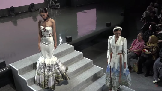
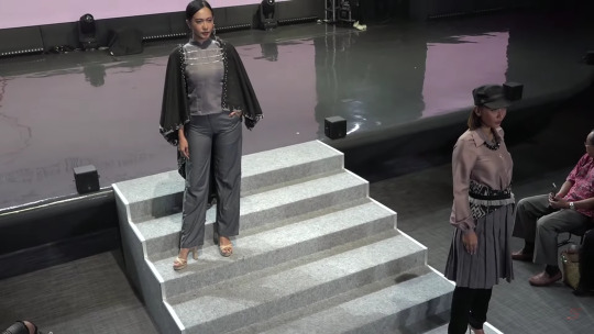
swastamita 2023 part 3
part 3 of swastamita 2023 review
gusti ayu fina puspawati & mega oktaviyanti titled poise. the looks are elegant. both of it done really well but there's no cohesiveness on the 2 design. it feels like its from 2 different theme. it still a great clothes 8/10.
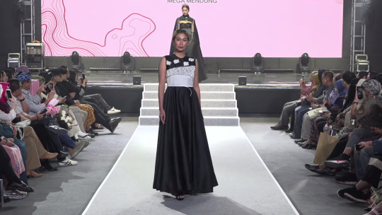
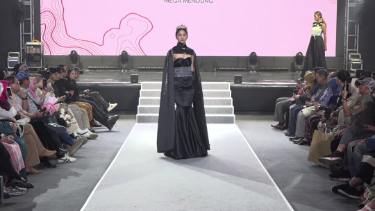
nazhira zahran & anggita tri ayuningtyas titled mega mendung. okay i like the second one and for the first one i found it kinda ugly. the first one looks like slapped together with no care for balance on the design. if for only look 2 i'll give it 8.5/10 but since i be judging it based on the collection i'll give it 6.5/10.
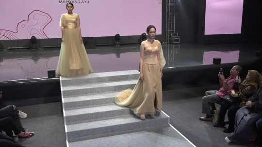
viela sofa hanifah & vina nurhendriyani titled mahyang. this looks is soooo good the design is really muach muach chef kiss. it's clean. the vision is there. 8/10
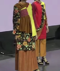
salma haniah & hanna yulianty pratiwi titled suka cita, i like the colour n silhouette but that flower pattern kinda look bad. old people shit i dont like it. it honestly ruin the whole clothes 6.5/10
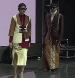
adisha namira & wafa nabila putri titled javan leopard. i dont really like the colour of the left one. it looks messy but its not that bad. the second one i really like its simple n classy. ill give it 7/10.
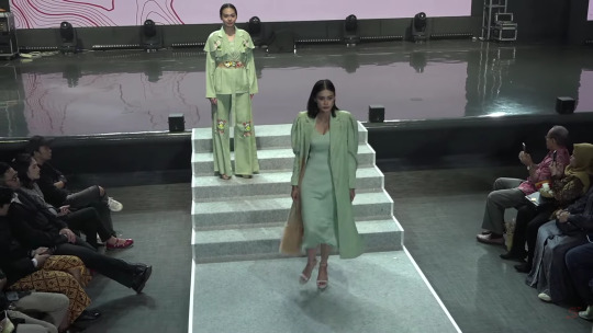
jihan fadilla & amalia rachma attorik titled festive d'tomohon. this one like an old school shit like 1960's shit that only focus with the beauty of it. it looks really good but u know its not rei review without hating on old school shit. 7/10.
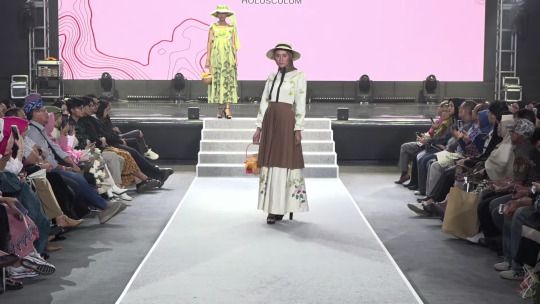
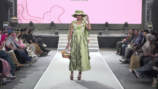
eliene austriani & ghina pramesti titled holusculum. i never really into the cotage core look but this is fit the style n it looks really good especially the second one. its really easy to look at. its soft n flowy. 7/10
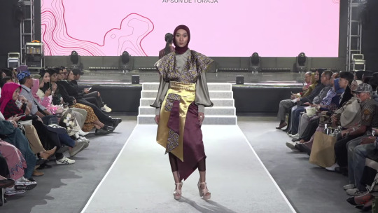

devi selviana tiurina & syarifah niswayul khaira titled afsun de toraja. when everything is the main character no one ended up getting the spotlight. that's how i feel about this looks everything is so loud it ended up become just incoherent noise. 6.5/10.
devi maya oktaviani & mindy nanda nabilah titled mahyang ayu. the asymmetry is fun, it elevate the design but the silhouette still just a simple one. ill give it 6.5/10.
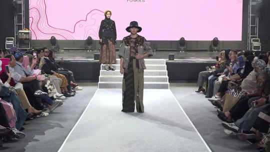
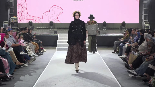
ardea regina ginting & salma halimatus sadiyah titled funkies. now this is what i love. this has a big vibe that punk vibe that jun takahashi vibe that i really love. this collection grab my heart and attention. 9/10
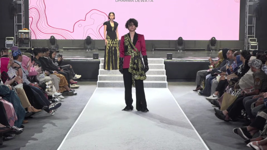
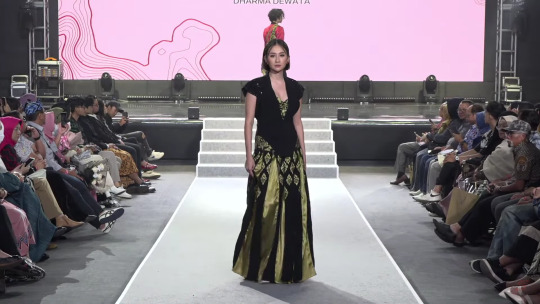
andini pramestisya putri & kiffa cecilia titled dharma dewata. this one is classy the choice of colour make it more intimidating i love it. it kinda remind me of alexander mcqueen. 8/10

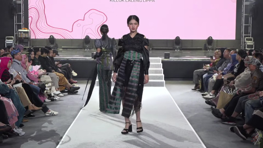
mutiara azahra & raisa zahra titled killok laleng lippa. this one have the same problem with the selviana tiutina & syarifah niswayul khaira collection. incoherent white noise. 6.5/10.
ayu fitriani & nanda aryandita titled cartenz pyramid. this one is beautiful. the asymmetry with the sleeve on the left look is really muach muach chef kiss i really like it 7.5/10.
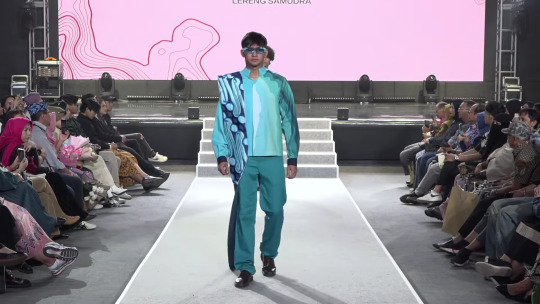
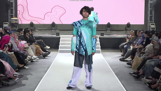
alya najwa rachman & rifa dzahabiyyah titled lereng samudra. this is cool the colour is as themed. but the thing i really love is that depth effect that created by making the colour blue transition from light to dark. 8.5/10.
nadira zahra syihab & syifa sabilla adriana titled surga kecil diujung timur indonesia. this is simple n clean. looks modern. it's giving girl boss. 7/10.
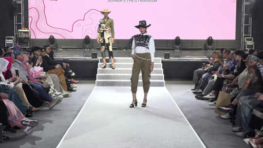
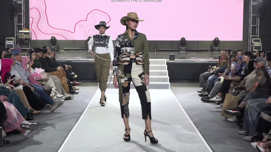
tiara ovelia & queenie salsabila bismutia titled sumba ethestrianism. i dont hate the cow girl look. yeehaaww 6.5/10
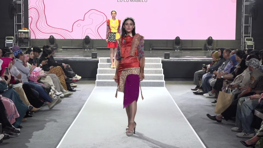
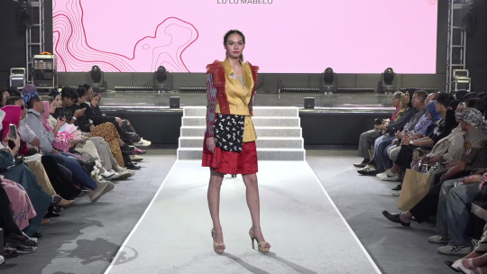
auranisa dyah qonita & jilan harizhah jauza suhendar titled lu'lu mabelo. this is loud in a correct way. it screams "look at me" and when u look at them u werent disappointed. 7.5/10.
olivia & anggun futikatun ni'mah titled lirik loorik. it looks kinda boring even tho its loud. its the annoying kid that want attention. 6.5/10
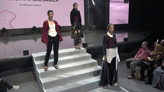
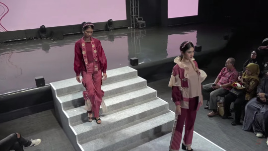
agnes herlynn eka putri, fika aulia putri hamim & putri syifa salsabila titled putri nayanika. this one i like it. the design is playful with that asymmetry that done excellently. ill give it 7/10.
dinar nurdani, zahra ardhya & farah khofifah ilham titled the story of toraja. i see the vision but it isn't done amazingly, it's just okay. its really look bland. 6/10.
0 notes
Text
W9: Poster Drafts


Colour and paint!
A perfect way to collect my objects together and represent my love of colour, printing, and painting. These combinations tie together my digital and traditional sides by representing paint splats, but in a very digital way.
Draft one of my poster is very colourful, very friendly, and very pricey to print.
The text needs to be rewritten to fit better and be more concise. I have copied and pasted my descriptions of the objects from tumblr.
I created this by using my illustrated objects from my Chromebook, and Adobe Illustrator. I drew in the coloured parts and added guides and lines to assist in layout.
Currently the code to deciphering the objects is working really well, and is easy to understand. The object illustration itself needs more work done. Some of the objects blend away and do not have enough contrast. They are also not the main focal point, and wont be very noticeable. The paint splat is overwhelming the poster a bit, ad doesn't have much reason behind it to do so. I am thinking that maybe illustrating the whole thing by hand on my Chromebook can fix this issue, and then feel much more natural and represent me better because it will be in my drawing style.
Asymmetry, Scale, Colour, Hierarchy, overlapping, lines, alignment, grid, off-setting, cropping, composition
0 notes
Text
FINAL IMAGES ANALYSIS


Here are the final 6 images (1 self portrait, 5 portraits of someone else) that I narrowed down from all of this part of semesters work. It was actually really hard at the end since a lot of those images I took with Cat I really enjoyed, I could’ve easily kept it to around 10 or even 15 final images to showcase that I was proud of, so it was a good space to be. I needed to make sure that the images weren’t just images I personally enjoyed but that they showcased a good range of my skills and all photography styles I tried out too.
Starting with my Adrienne Salinger inspired bedroom self portrait done with a self timer and making sure the focus was kept despite how I was moving back into shot. I like this image a lot and the symmetry of how I’m sitting versus the asymmetry of my room and items. From the bedside table on the left to the shelf high up on the right side of colourful collectable items I have displayed a frame is almost being made which surrounds myself as the maid subject. I look awkward in front of the camera, which is true to how I felt as well, since I’m not very good at having my photo taken so this self portrait photo was always going to be a bit of a challenge for me but I pushed through it and I overall like how the image showcases myself and elements of my personality in a quiet, less obvious way.
Moving onto the two daylight images of my friend Cat, I also wanted to make sure I showcased elements of their personality and style through the things they were doing and their room so that was a big factor that was apart of picking the photos I liked. I definitely wanted one photo that showed Cat doing their makeup and another one of Cat’s wall of collected things over the years. I love the one of Cat doing their makeup as it’s taken over Cat’s shoulder in a visually interesting way so it feels like you’re in the scene, watching Cat do their work and their art basically. I also enjoy how Cat’s back is out of focus compared to their face in the mirror being completely in focus and the subject of the photo. Then same with Cat and their wall of posters and papers behind them in the second image. The only thing I’d change about both of these images is fixing the exposure and white balance while shooting by just changing up some settings.
Then I have the two colourful images which were more of an experimentation of what I could do with light and colour in a dark environment. I like these because they are really close up images and they capture Cat’s features very well like their eyes and side profile. These emotions are also quite candid as we were talking and hanging out in-between the shots taken so I think the emotion, especially in the side profile shot is very interesting, this face off gaze where I think Cat was about to answer a question I had asked them. I was very inspired by Petra Collins and Lissy Elle’s work with the colours and emotions in this one and capturing ‘feminine beauty’ because even though Cat doesn’t identify as female they definitely enjoy things typically feminine which is a similar situation to me as a trans man.
Finally I wanted to finish with my favourite picture of all, the one of Cat readjusting their shirt on the couch of their room. I think it showcases Cat’s room and arty personality well having both a Keith Harring couch throw and shirt on. I love the harsh flash lighting which pulls Cat’s body out from the dark of the room and the angle at which I’m standing to make this image. I believe I had my lens zoomed out which creates a slightly fish eyed perspective where you can see a good amount of the environment around the subject which is my friend Cat. I like the aesthetic and feel their is to this image, the look, kind of angry like a glare being a mocking look towards me and something I said before, the image being during the action and capturing it crisply with a quick shutter speed, etc, etc all adds to this almost 2000s grunge teen album cover aesthetic which I enjoy a lot and I think Cat fits into with their own aesthetic, alternative, colourful, artsy and open minded. The aesthetic captured in this image easily showcases and represents Cat’s own.
1 note
·
View note
Text
Virtual Sketchbook #2
Journaling
Unity and Variety - Unity is the appearance of similarity in an object or artwork. Variety is the opposite of unity. Variety has different and diverse elements in an artwork.
Balance - Balance in art is achieved by creating an equilibrium between opposing forces. To create physical and visual balance in art. Symmetry and asymmetry can be used to achieve this balance.
Emphasis & Subordination - Emphasis is used to draw the viewer's attention toward a particular area. This can be done using contrast, color, placement, and sizing. Subordination is used by artists to remove attention from certain areas of their artwork. This can be done by using placement, color or size.
Directional Forces - Directional forces are like pathways that artists use for the eyes of the viewer to follow. These paintings are made by using actual or implied lines.
Repetition & Rhythm - Repetition is the regular reoccurrence of visual elements in an artwork. Similar to a pattern. These repeating elements help with composition, unity, continuity, flow, and emphasis. Rhythm is an orderly repetition of dominant or subordinate aspects in art. This is also used in music, dance, and poetry.
Scale & Proportion - Scale in art refers to the relative size of an element when comparing it to another element. We do this by using our body size. Comparing our body to how big or small it is compared to an element. Proportion is the size relationship of different parts compared to the whole subject, or another subject.


Writing and Looking
6.2 Purposes of Drawing, Fig 6.13, pg 7
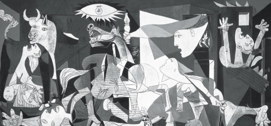
Guernica by Pablo Picasso
Picasso's painting Guernica represents a bombing that took place in Guernica, Spain. Picasso uses directional forces by using implied lines to guide the viewer's eyes. He also uses unity and repetition to create movement in his painting. The monochromatic color scheme in this painting is used to represent a newspaper since newspapers are often used to display and inform about events. The geometric shapes in Guernica create a chaotic and violent scenery. Iconography is also in this painting through Picasso's use of symbolism to convey the message/story he is telling through his artwork.
Connecting Art to My World

I arrive at school early since I take the bus, so I'm always able to see the sky at early dawn. During this time, the sun is just starting to come out and the sky is filled with beautiful hues of colors. The ride on the way to school is when I see the most saturation in the colors of the sky. The sky is filled with bright shades of orange and yellow, making it breathtaking. This scenery makes me feel calm and at peace. Giving me time to just take a minute in the mornings to relax a bit before starting my day. As well as helping me start my day on a good note.
If I had to pick a color scheme for my life it would be filled with similar colors to the morning sky. Different shades of yellow, orange, blue, purple, and pink.
Art Project
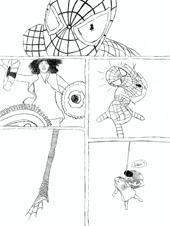
Marvel is one of the many things that I have a personal interest in. I mainly got into Marvel because of my dad. Since I was little I have been very passionate about my love for Marvel. If you asked any of my friends what I am obsessed with they will most likely answer Marvel or the Disney character stitch.
This specific scene I drew is from the movie The Amazing Spider-Man 2. This scene happens towards the end of the film, where Gwen Stacy (aka Peter Parker's girlfriend) dies. It was a very emotional and heartfelt scene for me. Spider-man is one of my favorite Marvel characters, and seeing him in so much pain because he just lost the love of his life made me very emotional. I remember bawling my eyes out in the theaters, as well as in the car. This movie is what made me like spider-man so much. So it definitely has a special place in my heart when it comes to the spider-man movie franchise.
Photo/Design
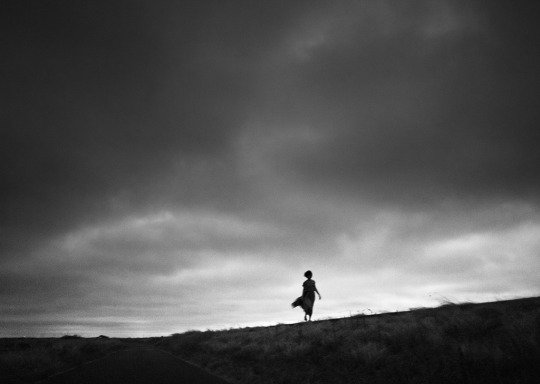
Taken by Noriaki Kimura
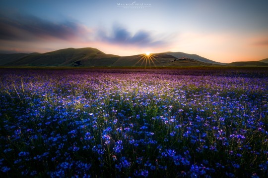
Taken by Sveta Imnadze
The black-and-white photograph I chose was taken by photographer, Noriaki Kimura. Kimura explains that he started only taking his pictures in black-and-white because of economic reasons. During his film days, the only choice he had was to develop his pictures in black and white. But he has chosen since then to primarily use this color scheme because he likes his photos to be unrealistic. He likes that his photos don’t have a sense of reality. Instead, they can catch the in-between of reality and unreality. This color scheme helps represent the mood but also changes the relationship the photo has with reality. This also adds to the idea that black-and-white photos are timeless. Since black-and-white photos have been used since the beginning of photography, it's harder to determine when these types of photos were taken. Adding to the idea of it being unreal.
Colorful photographs are primarily used when the photographer wants the viewer to draw attention to the subject. It also creates a pleasing view for the eye. Color is used to evoke emotion. For example, yellow is used for happiness, blue is used for sadness, and red is used for anger. Colors help evoke and symbolize these emotions. Colorful images can also help with making the photograph feel alive. Colorful photographs aren’t seen as timeless because they can fade over time. Making it easier to tell when the picture was taken
The way a photograph is captured can affect the memory within the photograph. I believe that the choice the photographer makes when it comes to their picture's color scheme can have a strong effect on the viewer's feelings and opinions on it. It affects where the viewers focus is when looking at the photograph, as well as the way they feel. These two color schemes can tell very different stories. It’s up to the photographer to determine what kind of story they’re trying to tell through their photography.
The color of the photograph does influence the way I feel and how I perceive the picture. When I look at the black-and-white photograph I sense a more serious tone. It also allows me to try and think more about the story behind the photo. Rather than focusing on the colors, I can focus more on the texture and the subject. While with the color photo, my focus is more on the colors that are present. It also gives me a sense of calmness. And helps with making the landscape feel more alive and it’s also very breathtaking with all of the colors combined. I don’t think much about the story behind the colorful photo as I do with the black-and-white photo.
1 note
·
View note
Photo

Sunday, November 13 -- Crack!ship AU: Write a crack!ship au. This should be a one shot of any characters in the roleplay, yours or someone else’s! Definition of a crackship: seriously this shit can’t happen but in an alternate universe. Add 10 applicable aO3 tags (enemies to lovers, modern au, etc.) This is a one-shot.
[I am so so sorry. I came up with this as the ‘what is the most unlikely possible crackship involving my characters’ pairing. And then actually the deeper I delved the more I was like “hey it’s not that insane in many ways his exuberant commitment to showing his love in all ways is something Lou does need” so it’s more.. world tilted on its axis than furthest possible alternate universe. Also huge apologies to Clementine for what I’m sure is a gross mischaracterisation of Lou. I throw myself upon your mercy.]
Pairing: Hercules Kouros/Lou Bonfamille
Tags: m/m; slowburn; falling in love;Established relationship; OMG guys can’t believe we finally got there; mutual pining RESOLVED; gratuitous nudity; but despite that I promise it’s just 100% fluff; tooth rotting fluff; it’s what we all deserve.
(Cut for length)
Not One Of Your French Girls - Chapter 12: Adam reaches out.
A/N: So this is the image he’s re-inventing this time guys, just for reference!
The glorious golden sunlight coming through the skylight was warm against his skin, and it was making Hercules sleepy. But still, he knew better than to move a muscle. He knew exactly what would happen if he did that… in a way it was a tempting thought. That little scowl as he would lean out from behind the easel, the sharp instruction to stay still… maybe he’d even come over and touch his arm, positioning it back into the perfect place as both of them pretended they weren’t so close to each other.
But no, Hercules stayed still. He was lying, stretched out on the diagonal ramp, under the skylight letting the perfect sunshine fall down on him. He kept his arm reaching out. Still, this was a better position than some of them; doing Discobolous had been a right pain for his back.
Behind the easel, Lou scowled fiercely at the painting. His brush poised, he made a few quick movements, before cleaning his brush. He stepped back to consider the scene before him, before stepping back behind the easel to add just a few more highlights, just to capture the way the sunlight fell on Hercules’ muscles, the definition of them.
Lips pursed, he lowered his brush and stepped back again to consider the piece.
“‘Ercules? Come here and tell me what you think?” It was perhaps more of an order than a question, but Herc propped himself up, amiably. He paused for a moment, wrapping the sheet around his waist before he padded across the room to stand behind the art, and the artist. Looking over Lou’s shoulder, Hercules beamed.
“It’s perfect, agape mou,” he rested his hands on Lou’s arms and gave them a gentle squeeze of pride.
“Psht-” Toulouse hissed, “What do you know about art.”
“Absolutely nothing, as you well know,” Hercules lowered his face and kissed Lou’s shoulder through his shirt. “But I know you. And you would never ask my opinion if you didn’t already know that it was stunning.”
It was, of course it was - Lou was too great an artist for it to be otherwise. Technically it was a thing of beauty, how he had captured the light, the brushwork, the careful capturing of his muse? But more powerful than all of that was something about the painting that was so full of … anguish. By changing the backdrop to hard stone, dark and cloudy skies, the absence of God on the other side, the deliberate asymmetry of it all? Suddenly the painting spoke of yearning for something that the model simply could not reach. But Hercules had none of the words for that, he just knew what he saw, and he knew what a finished version of a Toulouse Bonfamille original looked like.
He also knew the little tiny lift of the corners of Lou’s lips. And he knew full well that Lou simply would not have asked unless it was done.
“Hey,” Hercules spoke to him, wrapping his arms around Lou’s waist. “What’s wrong?”
Toulouse huffed, and did not answer, but he did not pull away from Hercules’ arms, which he now knew inside and out, he had seen them, painted them from all angles, felt them wrapped around him… they felt like safety.
“Chere,” Hercules hummed softly and insistently. “Are you going to make me guess?” His voice shifted from teasing to something very soft, very caring. “… do you need me to guess?” This was one of their little rituals. Sometimes, Lou just wasn’t able to bring himself to say what was wrong - he was too stuck in his ways, and his ways meant bottling his feelings up and never being allowed to share them when there were other people he had to be strong for. But Hercules could steer them towards it with his soft questions and his patience.
Toulouse nodded stiffly.
“Ok, well then,” Hercules straightened up, relaxing his arms. “Is it something to do with the painting, is it not right? Do you need to do something more to finish it? Because we can always take a break and come back later when you’re feeling fresher?”
Toulouse shook his head with a hum in the back of his throat. “Psht. No. It is perfect, you said it yourself.”
“Well then,” Hercules frowned slightly, thinking hard. “Is it because you’ve finished the painting?”
Toulouse stiffened visibly.
“Is it because you’ve been working on this for a long time now?” Nod. “And you’ve put so much into it to make it really extraordinary?” Nod. “And now you’re worried about what everyone else is going to think and sending them out into the world for people to judge?”
Nod.
“Toulouse,” Hercules sighed softly, and moved so he could take Lou’s hands in his. “Come with me,” he turned, leading him gently to the back of the studio. The rest of the collection sat within a row of slats in a crate. Silently, Hercules pulled first one, and then the rest, from their places, setting them out where Lou could see them, before he stepped back to admire them all, standing alongside his boyfriend.
“Look-” he pointed. “Lou, look at them. They’re beautiful.”
And they were, in every sense of the word. And every single one of them showed a great sense of emotion. There was the Discobolous - which felt like fierce and fiery determination, the coiling power contained in every sinew about to let the discus fly. There was the Pugilist At Rest, world weary, the weight in his shoulders and yet - in Lou’s version, with a steely resolution to go on fighting because he must. There was the Thinker, barely containing his emotions as he turned his face down away from the viewer. David, with anger blazing in his eyes. Van Gogh’s troubled self-portrait, with him a moment away from tears. The Scream turned into a gasp of delight.
“Look at what you’ve done, Lou! This is incredible! These paintings, they’re… they’re unbelievable! People are going to love them.”
Lou stared at his paintings. Of course they were remarkable, he would not have settled for anything less! He was indignant at the very thought of it! He turned sharply to Hercules to tell him that, and then caught sight of his smiling face.
“You know it,” Hercules smiled, taking his hand and kissing the back of it. “You are extraordinary. Your art is extraordinary, and when the world sees it, they will see that. They will see you, and your art will touch people, Lou.” He felt it with such radiant warmth that it was almost infectious. Tricked into looking at it all now, to remembering the feeling of pride in each and every one of their pieces, the warmth in his chest, Lou nodded.
“Thank you, mon amour.”
-
6 months later
-
Hercules was, for a change, wearing clothes. Mind you, enough people were staring at the paintings of himself completely naked, that he wasn’t sure it made all that much difference - he had already had a few people casting looks at him as they struggled to think where they recognised him from. He sipped on champagne, and fiddled with his collar (this suit really was too much but Lou had insisted and he simply couldn’t refuse).
An arm wrapped itself around his waist and pressed an uncharacteristically exuberant kiss to his cheek. Speak of the devil, himself. Hercules turned to his boyfriend and grinned. “How is it going?”
“They love it-” Toulouse whispered excitedly. “They love it!” Now, he mustn’t get ahead of himself, he smoothed his hair and collected himself.
Hercules, however, beamed back at him with a smile radiant as the sun. “I told you! I told you they were going to! You’re amazing-”
But he was cut off, as a couple wandered over, and Toulouse seemed to snap to attention. Whoever they were, they were important, and shook hands with Lou.
“Mr Bonfamille, a triumph, truly. I am most impressed!”
“Merci, merci, you are too kind.”
“Well only because I am hoping to be able to tempt you into exhibiting them at my own gallery after this!”
“Hercules, this is Mr Levantis. Mr Levantis, Hercules Kouros. My model… and partner,” he cast a fond look at Hercules as he said that last word. The last word he would have ever expected when they embarked on this project together.
“Ah, I thought you looked familiar, Mr Kouros,” the old man joked. “And that name is Greek, is it not?” They made polite conversation a little longer, Hercules successfully charming even with his clumsy lack of knowledge of art.
“And now how on earth did you end up on this project together?”
Hercules turned and smiled at Lou, he took his hand and gave it a squeeze. “-Well… it all started this one day in a park…”
0 notes
Last Seen Blogs