#the blockier the character the easier
Note
How do u draw them👀
idrk how to answer this but most of the time I'll find some official references of the character i want to to draw and try to understand their basic outline first.
most refs i use consists of their full body or something like that
something like these:
then I'll just

this applies on any body parts☝🏼
guides depends on body shapes
other example:
butchered these a bit cus i have no idea how else to explain
and faces are just simple shapes. if you have a hard time understanding references from the comics, then suggest you try to find out how others draw the characters you wanna draw and experiment em cus thats what i do sometimes.
thats all, sorry if this doesn't help you much since i only started drawing these guys months ago 😞
#hope this helps#the blockier the character the easier#is this considered rambling#transformers idw#drawing#fanart#maccadam#transformers#transformers fanart#roller mtmte#rodimus mtmte#rodimus#tf idw1
40 notes
·
View notes
Note
Hello ! I am a big fan of your art and was wondering if you could give me some tricks.
How did you come up with your current style ? Was it something you searched to developp or did it come naturaly ? If it's the first option, what made you stylize it like this ? Do you have any idea what I could do to stylize my own art ?
I am a somewhat semi-realistic artist (still learning a lot though) and was searching to also developp a more cartoony style like yours alongside it, so I would appreciate some help to understand what to do.
No need to answer this if you don't want to, for any reasons though ! Just wanted to ask you if you are willing to help me, even just a little bit :)
Thank you !
Hello. ^^ Thank you for the detailed ask and taking your time out to write it 🙇♂️.
I developed my current art style through a combination of both exploration (“naturally”) and it being something I searched to develop. In my head, I always wanted to adopt a sharper, blockier art style with bright colours. I was inspired by a lot of different styles, but most importantly I was pursuing an aesthetic I liked.
[1] Trying to introduce new elements in your art takes time, but it was mostly me staring/spending a lot of time looking at people’s art works that I enjoyed. The more you look at the things you like, the clearer the image you have of it is in your mind, so it would be easier to replicate it. The idea is to study what elements you like exactly in a style and then slowly try to transfer them into your own works. Your current style will eventually merge with it to form something that is unique. 🤔
If you are having trouble keeping the image that you want to recreate in your mental space, you can always put your canvas side by side to the thing you want to replicate, if that makes sense. Observing things you like and then devoting time to it was what helped me a lot, but patience tends to get you far in general.
[2] Stylising your own art requires a lot of trial and error. In addition to observing other people’s works, you need to have somewhat of an idea of how things can look like in your own works. If you like something with bright colours, the bright colours you choose for your own work may feel inappropriate or out of place simply because they haven’t been adjusted to your liking yet. A lot about art style is really adjusting things to your own tastes while keeping the courage to experiment. Since you have a semi-realistic style and want a more cartoony one, the idea is to squash/reduce elements of realism and increase the use of shapes that stand out.
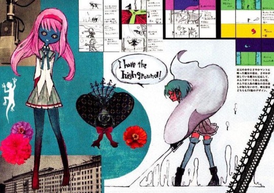
^ For example, you can see from this style that the characters have larger, round and doll-like heads, and the colours used to fill them aren’t at all that realistic or “balanced”, more so abstract and played around with (observe how Homura’s leggings are a mixture of blue that bleed to red). If Homura was drawn “realistically”, she would instead have normal colours and her usual palette scheme that don’t seem to jump everywhere. The characters’ anatomy are also simplified, smaller and easier to shape.
The style I have is mainly reducing details on the character and exaggerating their appearance with shapes or certain features. You can choose to make their eyes look more dramatic and detailed, for example, compared to the rest of their bodies. In fact, one way of making things look detailed in a cartoon style is by grouping large shapes together for them to resemble something. You could draw rectangles for fingers and that would still be understood as long as they’re arranged in a way that gives off that impression, not necessarily being a 1:1 real life replica of it.
[3] Overall, experimenting with colours and shapes are important to the style, but it’s not something you have to simply focus on. You can make something look cartoon even just by making the composition look dramatic, which isn’t limited to colours nor shape, but more on your sense of “space” in a drawing.
In summary: you have to first know what you’re inspired by, and then work towards it at your own pace. Attempt to replicate those elements in things you like by observing them and then transferring them onto your own works. Playing with shapes and colours, exaggerating or minimising proportions and anatomy can give you different results, although it may not seem satisfactory at first. The most important thing to developing your style, ultimately, is still giving yourself time and spending time with the things you like o(^-^)o. You can’t exactly rush out a style, so please enjoy the process of drawing!!
I hope this was helpful, if even a little bit, since I’m not good at explaining things, and I’m not a professional 😭🙏🙏. Thank you for the ask!!
22 notes
·
View notes
Text
okay, so ive decided this is temporarily going to be a plush review blog. ill stop reviewing plushes whenever i feel like it, i might even feel like stopping after this one. who knows. get ready for some plush reviews, incoming.
the second plush im going to be reviewing is one i have. it's the new ENA plush.

for reference, this is the character this is a plush of.

okay, so first off, i am VERY impressed by this plush. it has many unique features, such as poseable limbs, and a zipper behind her hair with a turron plush hidden inside. so it has lots of cool features, and comes with a little something extra. and btw, her arms can be posed to be holding the turron, which i find very amusing.
a few problems with her i do have is that you can kind of feel the skeleton inside her; the stuff that allows you to pose her. this does mean the arms and legs can feel a little hard in some places, but she makes up for this by having her head be the softest thing ive felt in a long time.
her hair is also a bit shorter than typically presented in the show. this might be to allow easier access to the pocket behind her hair, however i am all about accuracy, and i would much rather it be longer than have easier access to the pocket. but it's not too much of a problem to me seeing as the hair length is inconsistent in the show itself.
but on the other side, there's still some really good consistencies, such as her torso being all blue, as is canon. i also love how asymmetrical this plush is. which i'll get into later.
now, something i haven't mentioned is that this isn't actually the first official ena plush to exist, the original looked like this.

this was the plush that joel g originally sold for a limited time. i have also got this plush, although it's not in the greatest shape right now. i unfortunately didn't take the best of care of her.
some differences to note are that her clothes can be taken off, and this one has hair closer to the length typically depicted in the show. however, i still believe the new one is superior in almost every way.
for one, the new one's face has its parts outlined in black, which is not only accurate to canon, but makes her face look generally better imo. also, the new one has both ears. ENA typically has one ear covered, the original plush did not care to give her the covered ear, and her new plush does, which is neat.
something else i disliked about the original is how symmetrical she was. ena is a very asymmetrical character, and although her old plush did show her asymmetry with her blue and yellow sides as well as her socks, other than that, everything is symmetrical. which feels wrong with how asymmetrical her character design is. her old plush's arms are very symmetrical despite her arms being of different shape in the show, with her blue arm being blockier.
her asymmetry is portrayed much better in her new plush. it doesn't replicate the blocky nature of her blue arm, which is understandable, i wouldn't expect a plush to be able to pull that off well. however, it makes up for that by having the poseable positions be asymmetrical. not only can you pose the arms and legs in different positions, but the blue arm and leg both have joints that the yellow ones lack, which helps the asymmetry in her design come through better here. also, i believe her head is slightly tilted, which adds a lot to the asymmetry.
overall, this new official plush is great, and a much needed improvement to the original official plush. it doesn't cut corners, and manages to portray ENA's character very well in plush form, with lots of bonus features to come with her.
9/10 plush, love her. will give her lots of hugs.
10 notes
·
View notes
Text
It's especially interested how bad the Minecraft movie feels when you compare it to other video game movies nowadays.
Like. For example, the Mario movie in concept was simple. Adapt the basic structure of what a Mario platformer is (person gets kidnapped and Mario saves them) with Mario's alternate backstory of being from Brooklyn as an excuse to make him an easier viewpoint character. And Super Mario is THE video game franchise so it's an easy money grab.
Except they didn't make an easy money grab. They made a kid's movie that respected the kids who play the games, they made references to the games and incorporated them into the movie in a way that enhanced the story, and they did this while still understanding the spirit of the franchise.
Mario and DK being rivals but still coming together to fight a greater evil. The Bros.' relationship being the emotional core of the movie. Bowser being portrayed perfectly as a goofy yet still threatening villain. They even incorporated Mario Kart into the story without it feeling tacked on. They took the world of Mario seriously and treated it with respect - they made a world that's goofy and charming but still lived-in, without making it edgy or "realistic" just to "appeal" to adults.
Most people apologising to Minecraft Story Mode are probably doing it as a joke, but like. They already understood this and worked through it. Even in the first game which features a grand adventure, the adventurers are people from the world of Minecraft, and the epic invasion was a horror unleashed by accident, like the Wither it's based on.
Later episodes and seasons play more into the inherent fantastical elements of Minecraft, with the Far Lands and the End as eldritch, alien places. They also reference the community aspects of Minecraft: power-hungry server admins, fan-created games like Spleef, fantastical redstone contraptions, even the Minecraft YouTuber murder mystery.
And even being a movie instead of an episodic game isn't an automatic death sentence - hell, if you really wanted to stick to the base game of Minecraft, you could showcase the joy of exploration that is a much more common and more core experience than big epic boss fights.
That moment in the trailer, where there's a log floating in the broken tree and the boy reaches out for it? The one at the start where they're looking around at the world and the camera lets us see the surroundings? Those are great moments, because that's how it feels to play Minecraft. I've seen and heard kids play the game, I know that's still how they experience it. If you're going to make it into an epic, make it into an epic journey and show off the world. The vistas we've seen do genuinely look gorgeous, like someone transplanted
Even the visual design plays into this. The weirdly realistic mobs Detective Pikachu/Sonic style do not work. Detective Pikachu still looks uncanny to me, but the world of Pokémon is meant to be similar to the human world, and Pokémon are meant to be animals. The world of Sonic is Earth, and the redone design for Sonic and the other animal characters is beautiful; it really does feel like Sonic exists in a world overlaid on ours, more fantastical but still in reach.
The Minecraft movie trying to have its blocky cake and eat it too just feels like a shoddy compromise. The wolf howling at the moon doesn't look epic or awe-inspiring, it looks bad - in fact it's not even on model. They deliberately made it look blockier, for some reason. The invading piglins have realistic armour, and clothes, but their bodies are desperately trying to fit the voxel shapes and it all feels at odds. And of course the pink sheep and llama look god awful.
Combined with the human characters being Regular Humans, it feels more like some random friend group making a home movie than a fucking big budget production - and honestly, it loses some of the fun and appeal of portal fantasy.
I will say, it does look like they will visit the Nether at some point.
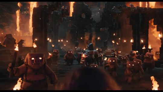
[ID: screenshot from the trailer. The scene is dark and lit by lava waterfalls originating above the frame, but the scenery resembles a Bastion. There are several piglins staring at the young male main character, whose head is peeking into frame. End ID]
Given they're shooting for the "marauding piglin" angle it's probably too much to ask, but the scene cuts away at this point instead of transitioning into that standard shot where all the mobs roar at the main character, so part of me is hoping that maybe this scene won't be at the climax, and we'll get to actually experience the piglins as nuanced mobs.
7 notes
·
View notes
Text

Tips to Improve HD Skins:
1. Use references. These can be helpful no matter what you're making, from OC work to fan work. References make it easier to decide pixel placement and general color selection directions.
2. Start the outline with a slightly darker shade than your base/mid tone. I find it easier and more pleasing to push a palette darker rather than lighter with a high definition skin.
3. Don't make individual strands of hair. The skin might be HD, but compared to other character models, it's still a low resolution. Trying to add as much detail as possible into a single area like hair, causes it to look busy and overwhelming.
4. Avoid making blockier shading. Your regular SD shading you use for Minecraft skins isn't going to work the same here. Instead, seek out areas to add rounded edges and curves. This will instantly make your skin look more detailed and add contrast to the usually blocky shape.
5. Don't make an SD skin dirty. I know it might seem easier to start off with regular resolution and edit into HD. But this usually makes the proportions look very odd. Sketch and shade in full high definition to have a better understanding of the final product before you even finish.
17 notes
·
View notes
Text
#showyourprocess
I was tagged by the wonderful @wangxianbunnydoodles for this gifset. This tag game was started by @lan-xichens (starting post here).
From planning to posting, share your process for making creative content!
To continue supporting content makers, this tag game is meant to show the entire process of making creative content: this can be for any creation.
RULES: When your work is tagged, show the process of its creation from planning to posting, then tag 5 people with a specific link to one of their creative works you’d like to see the process of. Use the tag #showyourprocess so we can find yours!
Process will be underneath the cut!
1. Planning
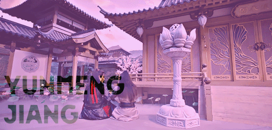
This was the very first post I put a considerable amount of time into, and I’m really proud of it. I wanted to make a set showcasing the Twin Prides, which is my favorite character dynamic of MDZS due to Jiang Cheng. I knew that I wanted to use the scene from CQL episode 14 because that’s where the quote “Yunmeng Jiang will have its Twin Prides” comes from. I also wanted to include the scene from the MDZS donghua episode 10 because it was different visually, and I wanted to incorporate both visual adaptations of MDZS.
I was really happy that the scenes in both the live-action and the donghua are visually captivating. I don’t really know how to explain it very well, but the scenes are just interesting to look at and I’m glad that JC and WWX are in the same frame for every single frame of the gifs.
I took a few notes on paper to organize the layout and decide how I wanted to break up the text.
2. Creation
I choose to gif by using screenshots. I use MPlayer OSX Extended to pull the screenshots and use Adobe Photoshop 2021 to create. I like using screenshots because it allows me to control the exact frames I want to use, so once I open photoshop, I can just load the screenshots and start the actual editing process. I organize the screenshots into folders based on which gif, which makes it easier to load into the stacks.
Step 1: Coloring
I don’t really have a specific process for coloring my gifs. I approach it from the process of “click until it looks good,” but I do like making some colors pop. In the CQL gifs, I wanted to make sure WWX’s red ribbon stood out. I also adjusted the hue/saturation of some of the colors to make the lotus seed pods more green. Here are the hue/saturation levels I used:
Blue: Hue (+24); Saturation (+24)
Red: Hue (+18); Saturation (+18)
Green: Hue (+39); Saturation (+36)
Magenta: Hue (+24); Saturation (+24)
Step 2: Text
Because of the text effect, I knew I needed a blockier type of font. I’m also a fan of simpler fonts, and I didn’t want something that would be too distracting. I tried a couple different fonts until I settled on Forta (downloaded from dafont[dot]com).
Placing the text was a little tricky. If the background was too light, than the text would be too hard to read. I used the setting “soft light” (you can set it to this using the dropdown menu directly to the left of the opacity setting where the layers listed) for the text and moved it around and adjusted the size until I was happy with the placement and I could read the words.
After I was happy with the placement, I used the following steps:
CTRL + click on the text layer to select
Select --> Inverse (or Shift + CTRL + I)
Step 3: Adding more color
This is a continuation of the previous steps, and these steps will get that overall purple/pink color. I chose that color because I thought it matched Yunmeng colors and the color of the scene the most.
Create a new solid fill layer (I chose white first, then adjusted later)
Set opacity to 40%
Play around with the color until you find something you’re happy with! For this set, I used #e67af3.
Done!
This is what my layers look like. Ignore the second Hue/Saturation layer, I don’t know why its there haha.
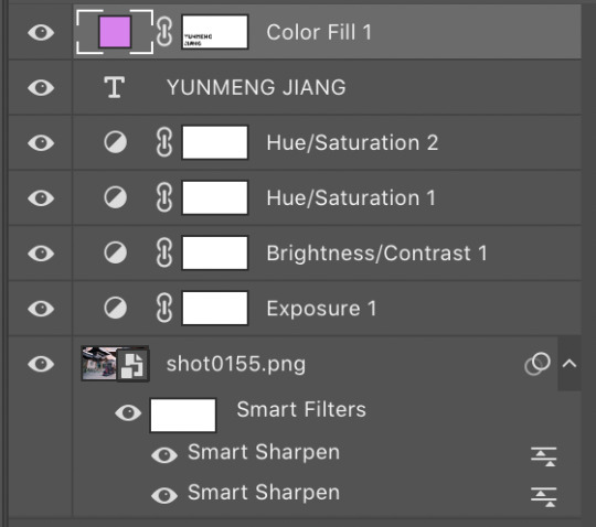
I used the same coloring and font for each of the CQL gifs on my set. As for the donghua gifs, I just played around with the hue/saturation as well as the exposure until I liked how it looked.
3. Posting
For the caption, I used a gradient text generator. I went with the purple gradient text because that is Yunmeng Jiang colors. I chose WWX’s quote as the other part of the caption because I believe that is part of what makes the “Twin Prides” promise so important to Jiang Cheng, and it is also very important when understanding the relationship between Wei Wuxian and the Yunmeng Jiang Clan.
I saved the post as a draft first, so I could see how it would look, then I posted it!
Anyway, I hope that makes sense at least a little bit, and I apologize for this being so text-heavy. I had a really fun time making this set and it was my first time playing around with different elements outside of basic editing.
I am tagging:
@mylastbraincql for this beautiful Lan Wangji color palette edit
@marquisguyun for this awesome WangXian video edit
@perkynurples for this lovely WangXian fanfiction
@blinkplnk for this stunning WangXian waterfall fight edit
@wendashanren for this amazing WangXian lyric edit
Please don’t feel pressured to complete this! Or if you wish to talk about something else, feel free to do so! If anyone else sees this and wants to do it, consider yourself tagged!
Thank you for reading so far. <3
#showyourprocess#tag game#thank you for the tag!#i hope this makes sense#the untamed#cql#mdzs#mylastbraincql#mine*#mymdzsthings#if you have any more questions feel free to send me an ask!#(don't mind me sneaking in commentary on my favorite character)
21 notes
·
View notes
Note
GIVE US THE NEW WARRIORS HEADCANONS UR REDESIGNS ARE AMAZINGJAKMAKWJDKSL💖💖💖
aaaa omG thank you!! :’D I’m actually strangely attached to these characters so I’ll try to do my best to explain the design choices I made and everything
ok so here we go.
SCREENTIME
* first off
* Not an entirely bad name??
* I would prefer Worm tho as a reference to the Morris Worm
* And I did make his design a little more wormy. Kinda Doc Ock-ish.
* So his tragic backstory... Well. Long long ago... when he was just a little kid... his dad fucked his mom.
* Jkjkjkjk. But it would be better than fucking “internet gas.”
* To take this in a darker route, I think it would be cool if his grandad had been experimenting with creating cyborgs and turned his dad into one. And then turned Screentime into one. So Screentime escaped sort of half-finished and is just trying to help others who might mirror his situation of abuse.
* I like to think his first superhero story was he was just like fucking buying bulk ramen and then hears a dude harassing a girl in the next aisle over and is like. huh. word. guess I can intimidate this guy by threatening to take his fucking social security and make it public knowledge.
* Bc he can hook up to the internet and updates his database frequently so he can just Mr. Robot people.
* He’s probably like 18 or 19. Never was schooled and college is kinda pointless when you have the whole internet in your brain.
* So he’s just living in a rundown apartment. Payin bills by doing odd jobs and doin bitcoin stocks.
* On the battlefield, he’d definitely be a mind games kind of guy, but he’d also use his worm limbs for dexterity and could probably discharge bursts of electricity at the cost of losing some information in his database.
* Also it’s probably really hard to tell, but Screentime is my favorite out of the original designs.
TRAILBLAZER
* again! Not a bad name at all!
* Made me think of fire though... and hiking... so
* We really don’t have much information on these characters so they were kinda fun to play around w and I think she was my favorite in terms of concepts.
* Also what the fuck are those red things on her head am I just fucking dumb???
* They look like devil horns. So I’m gonna run with it.
* Ok so she got a backpack from a god.
* Well that god was a god of Hell and also her godfather. Her actual father was another god of Hell. And idk how gods really work in the Marvel universe?? But I think there’s probably at least some high-ranking demons of Hell. I think Hell exists??? If I remember Doctor Strange correctly? (Maybe not Doctor Strange... bro everything is so hard to keep up with)
* Anyway, her dad was killed by some hero traveling through Hell at some point probably. And so she’s been preparing since to go avenge him.
* Then she gets to earth and is kinda like... well, avenging can wait.
* And the reason she can’t just get anything she wants out of the backpacks is because the backpacks are alive. But over time as she gains their trust, they start to become more and more useful. So, like magikarp to gyarados.
* her outfit was so fucking hard to redesign. like,,, I still don’t like it. The backpacks and stuff yes. Everything else no. But it’s better than the Neon Nightmare.
* Her powerset shouldn’t be limited to just her backpacks though. I saw a lot of people complain about that. Bc anyone could steal them from her and use them?
* So I think she should have superhuman strength. Also, her backpacks should only respond to her command. It’d be cute if they were also kinda cheeky about it. Bc yeah she’s a spoiled little brat. But she’s their spoiled little brat so they’re not opening up for anybody but her.
* She’s defo the youngest of the group
* Even if she is an immortal demon kid lol
S
bro I can’t even say it
I’m renaming them Shuriken. Effective immediately.
SHURIKEN
* So Shuriken is non-binary. Which I think is really cool! They’re not the first non-binary character that Marvel has,, bc Loki exists,, but while they’re not a good step forward... they’re a step forward nonetheless and I kinda commend them for at least trying.
* But goddamnit why did they have to go and name them S
* Sn
* please don’t make me say it
* So Shuriken has ice powers that are sort of threatening to take them over. Like if Iceman couldn’t control his powers ig. Their powers sort of came to them mysteriously in the middle of them already having a gender crisis and high school is happening and all that blah and now they’re just like,,, so ,, “superheroing seems to be a good venture right now. Maybe I’ll find myself in heroics and forget about everything else”
* And most of the heroic ideal is on their brother, ,,,, uh,,,, Quarterback,,, who idolizes the “classic” heroes like Cap, Iron Man, and Thor.
* Shuriken prefers reading news stories about Night Slasher and Punisher, Jessica Jones, and just generally, the other edgier heroes.
* But because their brother idolizes heroics so much, it makes it sort of a surprise when Shuriken takes up their mantle before Quarterback realizes anything is going on.
* And how does the ice stuff affect them? They’re sort of on the fence about finding a cure and whatnot. Most people speculate its like later-in-life mutation, but Shuriken isn’t satisfied with this answer.
*they sometimes chop off the spiky ice parts for convenience(they have no feeling in the frozen over parts of their body)
*(I’m toying with the idea of them having a crush on Ms. Marvel ngl)
QUARTERBACK
* not much to say about him? Other than goddamn that neon was terrible.
* Also I’ve seen jocks wear pink, so some youtube dudes complaining about that can fuck off. Maybe not that bright of a shade?
* But I figure with a defensive character, you would definitely want a bulkier frame. At least Power Man levels of a bulky frame? Like I’m not talking Hulk or Thing. Just.. yknow. At least a good Cap size dude.
* Also a blockier costume would make sense. Since he’s supposed to be. Uh. Safe. For people to like,, crowd behind. Like a safe
* Like a safe sp
* Like a
* safespace.
* I also like to think he was sort of a stereotypical jock and then here comes his little sibling (by like,, 7 minutes) who’s finally just like “yo fuck the gender spectrum” and so he finally opens up to his own interests that he’s been burying
* Like the color coral
* Which is definitely not pink my dudiest of dudes ;)
* He’s definitely more
* CHILL
* than Shuriken about the whole ice taking over his body thing. Like, at the end of the day, he’s still a jock even if he did turn out to be a mutant. Like , the world didn’t just end because he’s got some cool ice powers
* Also only being able to create a shield if it’s for others?? What a fucking joke man come on
* He can create platforms of ice and just mainly uses the ice as shields.
B-NEGATIVE
* OK THIS IS MY SON
* not the original he kinda just looked like he took one look at Welcome to the Black Parade and said “I can do that outfit. But crappier.”
* Listen,,,, I constructed a son
* It’s like that thing from that movie
* I was like
* “We can rebuild him...”
* is that fucking robocop
* At any rate, yeah yeah, Morbius stuff is still withstanding
* What if
* And hear me out
* His parents were sort of antivax sort of anti-mutant sort of folk. They get into some sort of car accident when he’s kinda young. He gets a blood transfusion against his parent’s wishes and in the end also gets adopted by this weirdass doctor who probably has some nefarious purpose, considering he used Morbius’ blood in the first place.
* This would explain how he could survive having vampirism since a doctor would probably have easier access to donated blood and stuff.
* Should the blood be going to people who actually need a transfusion? yes, however, this doctor is clearly ,, off his fucking rocker and corrupt as hell,, and what is his purpose?? The world may never know
* I don’t think B-Negative cares about anything. Like he just seems like that kind of character? Totally and inherently aloof and selfish because he’s just been fed blood on a silver spoon his whole life?
* Just does not care
* He does care about music though. Specifically rock(alternative, punk, hard, etc) and the history of it.
* me personally I really like Pink Floyd and I’m not going to,, shove my beliefs onto a character but
* I’m going to shove my beliefs onto a character and say his favorite song of all time is probably Welcome to the Machine
* And he probably will not shut up about how righteous of a song it is and how pertinent the message is
* Bc I think it fits,,, a lot of things about the stuff I’ve wrote with the backstories of these characters
* and yes
* he can perfectly mimic Great Gig in the Sky. the man!! has pipes!!!
* I also think it would be cool if he’s the oldest of them? Like, younger than 21 but he’s out of high school. Just trying to get a bachelors in music history at fuckin uh. NYU probably.
* he unironically likes twilight
26 notes
·
View notes
Text
Learn Log #1 - Pixel Art Basics 1
So this was the first week of learning pixel art! This week I had a look at some very broad concepts such as Size, Style and Lines. I’ll start with the first two topics because I feel like they’ve got quite a strong connection.
Size & Style
So if you’ve ever looked into pixel art you’ve probably heard of terms like 8-bit, 16-bit and 32-bit but you might not be sure what that exactly means. These were various processing architectures involved in old school video games. I’d say an allure of pixel is the recreation of old video game styles so these terms reflect their respective art styles. Basically, these terms explain ‘Oh I’m going to go for the style of the NES’. Here’s a great Reddit post basically explain it better than I ever could. You could also argue that it connects to the size of the sprite be it 8x8, 16x16 or 32x32 - some people use the terms as such and so will we in this post.
So that’s all well and good but how do you pick a size for pixel art? Well, from my learning this week not only does it depend on the style/complexity you’re aiming for but also your skill level and sprite concept. As we just discussed video game styles play a big role but if you’re not aiming for anyone style then concepts such as colour palette and outlines do too. For example, if you have a limited colour palette or need outlines you might need a slightly bigger sprite to fit in the detail you need - which brings us to concept. If your sprite needs to be expressive, for example your game is story-based, you’re going to need enough size to fit the expression. A trick to figuring this out is making the smallest detail or the facial expressions as small as possible while maintaining your preferred style/level of detail and working out the size of the sprite from there. Of course, this all connects back to skill level. If you’re not that comfortable with pixel art don’t start with big 128x128 sprites. Start with 16x16 or 32x32 first. These larger sprites also make things much more difficult to animate and are a lot easier to mess up.
Going further into style, I want to quickly discuss 1-bit pixel art or minimal colour palettes. 1-bit pixel art is a two-tone style meaning it only uses two colours throughout the piece. This is an interesting style to work in because you have that new level of restriction. For example, how do you convey different materials with only two colours? The use of patterns is really useful for this but they can’t be too confusing or complex also. In general, these minimal colour palettes make animation a lot easier but can make readability a little difficult if you have a lot of things going on.
That’s the last thing I want to touch on - readability. Whenever you make pixel art make sure it can be read - especially if it’s for video games. Making interactable objects outlined or enemies a specific colour is a great way to do this. Readability should be the first priority.
Practice #1 - Resizing Logos

These 16x16 logos are based upon the Barbarian and Warlock class symbols in Xanather’s Guide to Everything. I tried using them to follow TutByKai’s tutorial on sizing symbols from 16x16 to 32x32 but they proved to be to difficult for me to size properly. Here they are for you to check out though! In the end I managed to practice sizing in practice #2 and #3.
Lines
When I was studying about line-work this week I found it funny that rather than learning what to do, I learned what not to do. I think this is because we all have a rough idea of what a pixel art line should look like but not what makes a line look wrong or weird. The main culprits for this are called ‘doubles’ and ‘jaggies’. Note that these are not rules you have to follow and if using doubles or jaggies actually helps convey meaning then you can definitely use them
Doubles are when a line doubles up, usually as it curves or turns an angle. This can make the line weird as it begins to look more blocky or the extent/where the doubles are is inconsistent (for example shifting between inside and outside a circle). A good fix for this is anti-aliasing but that will be discussed shortly.
Jaggies are when pixel don’t within an established patter for example if you had a curve going: 2pxX 1pxY, 2pxX 1pxY,2pxX 1pxY, 3pxX 1pxY, 2pxX 1pxY, 2pxX 1pxY. That 3px line is going to look weird (also sorry couldn’t be bothered to make a quick reference picture online). It may work for irregular terrain such as nature but with man-made objects and more spherical/round objects it just looks strange.
Anti-aliasing (AA) is a pretty useful tool. You can think of it has a half-pixel. However half-pixels don’t exist so it’s really just a pixel roughly the colour between that of the line and the colours next to it. This is useful for fixing up those doubles or making more detailed curves/angles. You’ve got to be careful to not to overuse it as otherwise things will just begin to look messy. Also don’t just stick it across the whole outline - remember this is to be used like a half-pixel for curves. Don’t forget, just like more complex colour palettes you have to animate anti-aliasing too which makes things more difficult.
Finally, I have a few tips for outlines. Firstly, outlines must reflect the nature of the contents (point object = pointy outline). Secondly, fill in any voids within the outline as it can be distracting. Outlines can also play a big role in the way your character is seen by others and how they pick up on the nature of the sprite.
Practice #2 - Robert
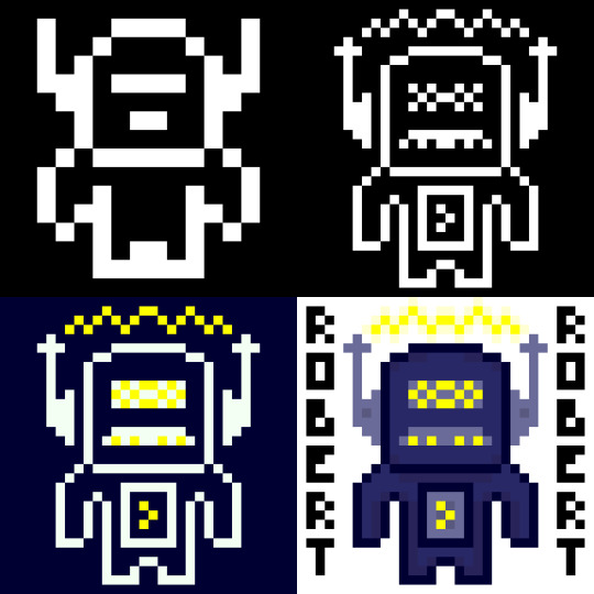
So I made Robert yesterday for my practical this week. I’ve presented him here in stages of the spriting process so I’ll just talk through each stage.
So in this stage I started with a 16x16 canvas. As you can see Robert has very little detail due to the small canvas size and 1-bit colour palette. You can kind of tell he’s a robot from his head, if I were to just have him in 16x16 I might want to make the shoulders or a bit blockier to represent that. I did try to do that on the outer pixel of the hands but they kinda felt like wings. When you do pixel art in this smaller sizes each pixel and colour becomes much more important.
So in this next one, while I had the same colours I resized him digitally to 32x32 and added in a lot more detail which you can clearly see. His antennas are now away from his head to make it clear that his head isn’t just a weird shape. I couldn’t do that in stage 1 because 1px there was about 1/6 (?) of his head width. Now that it’s 1/12 (?) I can separate the objects while making it still feel attached. These antennas had some extra detail thrown in but I really like the details on the face. It starts to portray a personality - I think the mouth looks like a mustache so that with his name makes him feel like some kind of ‘Dad-bot’. Also I was able to make the body feel a little more robotic while still remaining humanoid
This stage I just adjusted the the two colours and chucked yellow into the palette. It definitely gives off a completely different but I feel that maybe I should have used a different yellow colour as it is a bit bright. The addition of yellow does make the waves above Robert’s head look like electricity rather than some sound waves or something else which shows how one colour can change a lot.
Finally, in this stage I dived into the colour palette. This change meant I could directly attach the antennas again and also add some detail with slight colour changes (including some shadows below the head and inside the body). Overall, while I think stage 4 looked nice I am particularly fond of stage 2 and the ‘Dad-bot’ vibe it gives off. Sometimes less is more.
Practice #3 - Joey

So, I loved making Robert so much I wanted to try again with the colours flipped. This time I was inspired by Brandon James Greer’s 1-bit video to make a character portrait.
So since this was going to be a portrait I needed to start with his expression as it was important I had that nailed down. I wanted to go with a confused look with one eyebrow raid and the other furrowed down but when I added the mouth it seemed a little weird. I decided to keep it though because I wanted to see where it’d go. The expression took up quite a bit of space so I didn’t have much room for other stuff in the 16x16 canvas.
When I resized Joey’s expression I didn’t do it digitally like I did Robert’s body. In stage 1 the facial expression took up a large portion of the canvas size and if I resized it then that some issue would exist. Instead I decided to redraw the face slightly sized up. I wanted the mouth to show teeth so it needed to become 5px tall rather than 4px. Based off this I made the eyes 1px higher and wider to a 2x3 size. I decided to keep to keep the eyebrow width but I did lengthen them so they’d retain their expression. I also spread out the elements and added a nose. As I gave Joey a head I realised that his expression gave me a classic ‘Wolfenstein’ or ‘Doom’ portrait feeling so I went off that and gave a similar haircut and armour in the style of the original Doom. It looked pretty good although if I was to leave him in this style I might make the armour less intricate and focus on adding texture to the different components. Additionally, as there it’s 1-bit the teeth did look like giant lips.
The piece really came together when I added colour (I was too excited to do a minimalist palette style). I tried to keep the colour palette down to a minimum so the piece didn’t get too overwhelming. For example, the armour only uses three shades of green - one being the outline which is also used for the eyes and mouth. I actually didn’t choose black for the mouth because it contrasted too heavily with the white which took attention away from the rest of the picture.You’ll also notice I used a double on the left eyebrow. I did this on purpose to make the right eyebrow point seem thinner and more furrowed downwards. I tried a couple of iterations of the eyebrows and I think I liked these the most.
In this stage I just added some more detail including texture, the scars and some shadows. Basically, I chucked out any hope for a minimalist palette. I added the shadows with another layer that had a reduced opacity which worked ok. There’s not much to say about this other than I feel like this stage had a lot more depth and it was definitely my favourite of the four. Sometimes more is more.
Learning Resources
My studying and this blog post wouldn’t have been possible without these amazing resources. Go check them out if you wanna learn some stuff about pixel art!
What makes art 8, 16, 32, 64 bit?
What Size To Make Pixel Art by MortMort
What Size is Pixel Art? by Brandon James Greer
How to Choose Pixel Art Resolutions by TutsByKai
Creating Pixel Art from an Object by Brandon James Greer
Pixel Art 101: ‘Styles’ by Pixel Pete
Pixel Art 101: ‘Game Boy’ by Pixel Pete
1-Bit Pixel Art Techniques by Brandon James Greer
Minimalist Palette in Pixel Art by Luis Zuno
Constructing Lines and Curves in Pixel Art by Brandon James Greer
3 Pixel Art Techniques/Common Mistakes (Doubles, Jaggies & Outlines) by MortMort
Basic Anti-Aliasing for Beginners by MortMort
0 notes
Note
I really liked your Conway edit! I'm curious, do you have any other general suggestions for drawing characters in a style more suited to the OS?
Thank you very much!!
Let’s see! I think the most important part is to watch a lot of episodes from the era you want to reflect and pay extra attention to the characters of the day or even the background characters (if you want to save time, you could also watch just a few episodes that include many background characters, like festivals or competitions). Since back in the day the designs for background characters weren’t too varied, it’s not hard to notice the similar features in shapes, clothing and hairstyles.
The designs in Johto were a little… “blander”, for lack of a better word, compared to the designs used in Kanto, so you’ll notice there’s overall less detail, especially in the clothing. Most background characters would only have a plain colored shirt and plain colored pants, no accessories, and a simple hairstyle. Characters of the day had a bit more work put into them, and some of them had really nice and memorable designs, but overall they were still more simplistic and easier to animate, so you don’t want to add too many details when designing a character in this style.
The shapes were also simpler, although that was also a thing during late Kanto and the Orange Islands arc. Legs were thicker and even blockier, to the point Ash’s pants were drawn using three or four straight lines (depending on the angle) in many shots of him standing. Fingers were rounder and thicker, and in certain poses (like hand on chin poses or when they grab a rope) the hands would look more like a colored silhouette of the hand because of the lack of finger detail, and knuckles were almost never drawn or shaded.
When it comes to hair, you’d pretty much never see a character with rounded hair tips like in late AG onwards. DP had lots of characters with rounded hair tips (Conway, Paul) and the trend continued through BW (Iris, Cilan, Burgundy), XY (Clemont, Bonnie, Sawyer, Shauna)… to the point round tips are pretty much the norm in the Sun and Moon anime! But during the Johto era, characters usually had spiky hair tips unless they were specifically designed to look like they had really soft hair (Wilhomena, Temacu, Dr. Anna). The shapes of the hairstyles were also overall very simple (Wilhomena being an exception with her very detailed design for the era) to make animation easier.
As for face features, there was basically only one nose shape (the “90′s anime nose shape,” so to speak). There were characters like older people who would have different nose shapes, but children to young adult characters would almost always have the same one, only drawn shorter or longer depending on the character. Eyes were also very simplified, with female characters and children being almost the only ones with visible eye colors (again, with a few exceptions like James or the occasional character of the day) and little to no shading. Male characters usually had either the same eye shape as Ash or a very simple eye shape with black irises (the one I used for Conway in the edit). Also, eyebrows would be either one single line (unless it was a closeup) or a long, triangular shape like Ash’s eyebrows for the most part, but characters like older men would have different eyebrow styles, like rectangular eyebrows.
Of course, there are exceptions to these, but those are the details I took into account. c: So, in short: simple lines, blockier shapes and don’t add too many details!
#i probably left some stuff out but feel free to ask if you have any more questions!#gostumpz#answered#my art tips
15 notes
·
View notes
Text
Minor Update 1.191.1

Changes
Added ability to individually unbind keys by right-click in Controls settings
Added textboxes to Color Picker screen to make choice of colors more precise and easier to share with others
Update is live and applied to the server.
Bugs
Crashes
Fixed a crash when trying to open terminal and inventory at the same time due to one key being bound to both actions
Fixed a crash when a server was restarted while the client was using Nvidia Ansel
Solved Issues From Support Site
Fixed an issue where servers couldn't download certain mods while not logged in to Steam
Fixed an issue where the direction of a sorter was effectively switched when used by Build Planner withdrawing items
Fixed an issue where a helmet on the armory locker looked blockier
Fixes
Fixed an issue where players were able to enter spectator mode without it being enabled by utilizing character death
Fixed inability to change the character model to a wolf or a spider
Fixed power switch hotkey being able to shut down power on all connected grids, even through landing gear
Fixed solar panels and wind turbines not updating after shutdown command came from a connected ship
Fixed Skeleton suit not being color-able
Fixed several issues where tool and weapon skins would not apply after leaving customization screen
Fixed mouse cursor disappearing when opening/closing Ansel (Ansel is dependent on Geforce Experience, make sure you have it installed for optimal behavior)
Fixed first-time tutorial screen links appearing misaligned
Fixed rapid movement of a left arm at the end of Assist Come Closer and Assist Stop
Fixed a hole in Armory block geometry
Fixed overzealous shading on the side of the Kitchen block
Fixed certain programmable block scripts not being synchronized to clients due to using too many sprites and not fitting into packets
Fixed certain programmable block scripts not working for clients in Lobby and on DS
Fixed stretched textures on multiple blocks
0 notes
Photo


i kinda miss my brown hair
hey guys!! so i’ve been on testosterone for about a month now and you know what that means? AN UPDATE FOR CHANGES AND WHATNOT
so yea. i started t about a month ago, 12 april 2017, and i’ve been taking weekly shots. i’m still on a very low dosage. BUT. HERE ARE THE CHANGES I’VE NOTICED
i smell. like. teenage boy, smell. just every now and then, i’ll get a whiff of it and ew. nasty. i’m currently trying to combat it with stronger deodorant
my throat muscles tightened, then loosened, then tightened, then loosened and— you get the idea. in the very front, they’ll tighten and i’ll lose my voice a bit. it cracks, basically, but it hasn’t deepened yet. this started the first day of my shot, and usually lasts a day or two afterward
my period disappeared. then came back. holy hell it was hell on earth. now, right as i started, i was just starting my spotting cycle of my period (i spotted before starting). it disappeared after the first shot, then came back after a few weeks, stayed for two weeks, and then disappeared
acne has returned, and with a vengeance. this time, it’s personal. okay but seriously? i’ve always had bad acne, and granted, it’s been hot recently. but holy hell i don’t remember breaking out this badly, and for so long, since i went through my first puberty. now it’s happening again and i’m like why this
i’m... happier? i suffer from severe depression. granted, i still sleep a LOT. and it’s hard to do things. but i find my depression is more manageable, given i’m not left with my thoughts too long. along with this, i find myself more confident
FUZZY FACE. no. like. seriously. the hair is darker and coarser. not quite enouhg for a beard or mustache, though i’ve always had a bit of a mustache, but. it shows up on camera 10x easier now. like srsly just open those pics in a new tab and zoom in on the lips
different body fat distribution. i’ve struggled with my weight for idk how long. as a part of my depression, i kept food from myself. now that i’m aware of that and my depression is more managable, i’m eating a ton. everything in sight, really. i’ve gained 15 pounds, and with that, my fat distribution has changed
i’m blockier now, my waist isn’t as curvy
likewise, my breasts seem to be loosing some of their fat, though the tissue will be there until i get top surgery. so unfortunately, despite how small my breasts are, i can’t say goodbye to my breasts yet...
unfortunatley, with the change in my weight, i don’t fit my pants anymore. i have like. two pairs of pants that still fit me
muscle hasn’t changed much but i also don’t work out? like at all?? i sit on my butt all day??? yeah. BUT MY NECK HAS THICKENED????
i have been emotional af. no. seriously. i cry at e v e r y t h i n g. i haven’t cried this much since i was like. thirteen. but it’s like. you mention a dog and there are legit tears. here’s a list of things i have cried at in the past two weeks
voltron: legendary defender
naked and afraid
a video about a dog made by disney
SO. MANY. SONGS.
my own characters?????????? i’m??????????
httyd soundtrack
JUST TALKING ABOUT HTTYD
overwatch videos
i teared up about my dog and thinking of how her previous parents gave her up
NSFW WARNING. sex drive has increased like woah horomonal teenager levels much? not gonna get into this but i can’t say my fiance is displeased. bc he’s not displeased at all
NSFW WARNING. LIKE BIGGER NSFW THIS TIME. AVERT YOUR EYES KIDDIES. bits down there have changed a bit. before, the clitoral hood would hide inside my lips. now, it peeks out a lil like hello i am here. i... didn’t notice this because i don’t even trim there, but it’s a nice little thing i noticed today
SO YEAH. THAT’S ABOUT IT SO HAVE A TUMMERT

4 notes
·
View notes
Photo


July 1st. I started with A1 from the 4th design on the original sketches. As I got the overall shape and style I wanted I had to build on it. First I tackled this part of the rubric: Does it make sense? If she was going to have a jacket on than the outline of her chest would have to be subtle. No one likes “boob armor”. So that had to be altered. Then I went over the legs again. They were blockier than I wanted them to be for someone who would be running and jumping so I thinned them out slightly. However, I still like the blockyness of it so I’d like to go back to A2 after I finalized A3 to push the style more (more cartoonu and less realistic) but for now I think I can get the right balance with A3 once I work on it further.
So Check point 2 was done. I picked a style. NOw to check point 3:
3. Design must reflect…
- World
- Culture and/or history
- Identity (at least 5 points)
So how do I reflect the world? It’s still based on reality. So the costumes can’t be too outrageous. There’s the style of the boots which seemed like enough to push the boundaries of reality. As far as culture goes, I planned on making her eyes yellow.gold. An impossible color for an actual human. As far as identity. I wanted her shape to read spunky which I think it does with her height. Her costume will have a lot of reds and yellow to reflect that energy. SO what could I do in this stage?
I thought about the costume.
So I took A3 and thought “does this costume make sense?” I’m going to keep the poofy sleeve and shorts for A2.
I thought she needs some form of protection on the chest/abdomen. It’s easy to make a skill shot there. She I thought of a light armored vest-jacket. Because she does a lot of gymnastic moves I wanted her arms to be able to move. Knowing gymnast wear a lot of spandex I thought she would be comfortable with long sleeve under armor. And drew it so that she cut a hole on the sleeve to put her thumb through. It’s a small detail but enough to show that she’s going to be slightly unconventional with how it’s suppose to be worn.
I also tried a few variation of her hair. The long hair while looking didn’t seem to make sense to me. It just seemed like it would get in the way. So I drew it up in a ponytail and it made her look too young. This is a character who is suppose to come off as 20-24. So looking THAT young was off the table. The short, side cut seemed trendy enough and I could see it animated easier than the long hair.
0 notes
Last Seen Blogs
unpensadoranonimo
Un pensador anónimo

amelsosa
amelsosa
binary-bfs
steddie shipper👏🏼

trotzkys
vodka the church and the cinema
isrra-el
Mujeres amputadas