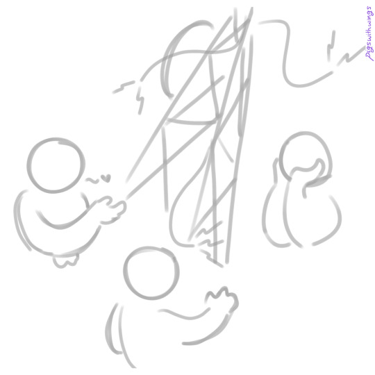
#the lineart is intended to look messy
Note
HEYA sorry if you've answered this before but what layer blend modes do you use to make your lineart this pretty :)?
oh recently i've just been setting a sketch to multiply and using it as line art 😅 nothing fancy or complex!
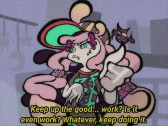
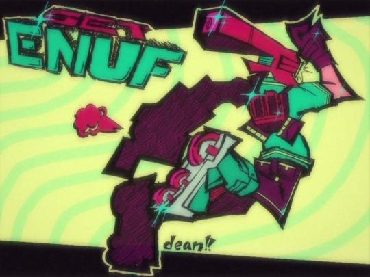
lemme pull up a recent art for you to discombobulate, here's this cute art of Boba, unedited, posted as is;

Here's what it looks like without just the color layer;

The colored parts are edits made either above the color layer or the sketch layer, to clean the sketch and make it look slightly more presentable as line art! You can also notice that most of my shading happens on the same layer as the color, I don't really make separate layers for shadows/highlights any more. I used to though!!
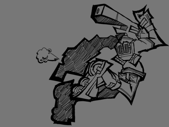
Here's the art without ANYTHING added, this is just the base sketch;

And while this is still a bit messy, it's pretty clean for a sketch! Any sketches I intend to post are cleaned as I work, mostly erasing parts of the limbs under clothes or guidelines around the face. You can actually see in the finished art that was posted that I forgot to erase the lines of their left leg under the pant folds !! :)
So yeah, most of my recent arts have just been sketches on Multiply that I put color underneath <:)
hope this helps yippeeee
91 notes
·
View notes
Text
palulukan warrior
i haven't shared nearly as much on tumblr as i have on toyhouse, but i am a huge avatar fan!
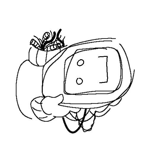
my togruta character sykobe originally started out na'vi before i changed fandoms and took him with me. while playing frontiers of pandora this morning, i had a vision of mr kobe adorned in a thanator headdress but couldn't find any versions that existed so i decided to make my own
inspo, some lore, and other random notes below cut


main inspiration for the mask! it's intended to look like the front of the mouth with the flaps raised up as well as having all of the quills flared as a symbol of power.

bonus of just the sketchy lineart since this was in fact a very quick and messy concept lol
avatar!sykobe was originally a recombinant named isaiah, but i sold his design since i didn't use him all to often. this reiteration is fullblood na'vi, more than likely belonging to the trr'ong clan and having been one of the few survivors after the battle in the hallelujah mountains.
as for being a thanator rider, i've always wanted to make a character for the idea but genuinely had 0 motivation until this afternoon.
i'm 110% debating including him in my star wars universe so i do not entirely sever him from waves (would cry). i've heard a few conversations about a na'vi jedi and would love to join the club lol
#pizza ocs#my art#avatar!sykobe#avatar 2009#avatar the way of water#na'vi#na'vi oc#thanator#palulukan#avatar oc#navi oc#james cameron avatar
94 notes
·
View notes
Text
Interest check!
Would anyone be interested if I opened a ~ $5USD donation raffle (accepts credit/debit and Paypal) for a commission that looks something like this? Fully rendered, 1 character, half body.
This is a sketch (from yesterday) and wasn't intended to be posted so it's a lot less clean than what I'd do for a commission (particularly the coloring. My lineart tends to be a bit messy). However, I wanted to get this started and I don't have much recent art in my portfolio so I included this.

Please be honest, I don't want to open up a raffle and get 0 entries 💀
Thanks!
Tagging random ppl. Want off the 'mailing list'? Please message me!
@jassnahkholin @wellsbering @smilepilled @timogsilangan @sweetbutpsycho61 @niche-bitch @nenehime @s0ur-cr3am @aliensmoothie @fallingbossa @frey-bur @stanuristheman @tankocchi @pezji @pjfree0216 @bloodmagehawke @heir-of-the-chair @jibanyans-chocobar @z0mbies @dudeblade @bonecodoposto-45 @cosmicgamerboy @buddee @shocktrooper262-blog @feliville @actuallygodzilla @c-o-z-m-o
28 notes
·
View notes
Text
[open] nintendo eshop code commissions!
looking for quality, stylized commissions at a relatively cheap price? well, uh... here ya are!! (more info under the cut)
for an nintendo eshop code ranging from 5-20 dollars (usd only), you can get a commission from me!
Rules:
sfw only
no problematic imagery
one character only
can be anywhere between a headshot and a fullbody at no additional cost!
$5 - sketch
a base sketch that i make for full pieces, but less messy.

$10 - lineart
lineart! lineart! lineart! stopping right before the coloring process.
$20 - full piece
the real deal, with all the crazy colors and filters you know and tolerate!
that's about it in terms of what you're getting, but please don't skip out on the info below! it's important -- you can tell because it's in a FAQ format!
so... what's the process?
if interested, dm me either here, on twitter (@deanthebobcat) or on discord (deanthe_) and tell me what ys want! ref sheets are only needed if it's an oc. once you approve the sketch i make, you then send over the eshop code as payment and i work on the rest of the commission!
how do i go about getting a code?
you COULD go to a store that has eshop giftcards and buy one, but my customers usually just grab a code off of amazon and get emailed the code quickly.
why eshop codes?
i live with my parents, and they have a habit of sheltering me too much... they don't trust me with my own bank account. so, since i'm intending on spending the money on videogames anyway, eshop codes are the closest i can get to obtaining real money at the moment.
can i just buy you robux or nitro instead?
sorry... as much as i'd like that, eshop money is my preffered method, so that's what i'm sticking with.
why american codes/usd only?
unfortunately eshop codes are region locked, which makes sense given that, y'know... different countries use different currencies. i can't change my eshop region to get the money, because doing so will wipe the funds i have.
if you're not from america but really want a commission, you could use a vpn and buy an american code! it's a hastle, i know, but that's the best you can really do
wow, you draw fast!
i know, haha... i've been accused of rushing my art and commissions because of that in the past, but nah that's just how i draw! ^^
are you open atm?
i'll edit this post every time my status changes. check the very top!
☆
thank you for reading this. hope to see ya soon! ^^
#splatoon#splatoon 2#splatoon 3#bomb rush cyberfunk#brc#commission#art commisions#digital art#artist#my art#deanthe
81 notes
·
View notes
Note
i hate to be the one telling you this but i feel like lineart and styllisation would improve your art. the soft smudge shading, realism and clear tracing makes it look a tad soulless.
i would consider learning anatomy and studying art styles if i were you.
Hey!! So I understand this was supposed to be a bit of constructive criticism, but it did not hit the way you intended!! It actually came off really rude, whether you meant it or not.
As much as I appreciate the feedback, that is infact my artstyle, and I have streamed in multiple servers while I do my art process and have multiple people that can vouch for me. :]
As for telling me I should learn anatomy and that my art is soul-less due to shading, it's just the brushes (wet watercolor) I use or how rushed I feel to finish a piece that depends on how the coloring turns out!! I LOVE anatomy, but I rarely have time to sit down and draw it/color it how I truly want so I do a simpler version with the shadows and messy sketch lines. (I have attached a video below that shows the process of the way I actually do it.)
Next time be mindful, and please "Don't be the one" to tell someone their art sucks 👍
10 notes
·
View notes
Note
since art has been brought up what is your process and brushes you use?
the gist of it is: i use my phone, my index finger, and the app IbisPaintX to draw! also my brushes are the Digital Pen and the Fade Watercolor (Opaque). my general process is making sketches and focusing on the energy of a piece, then sticking to that
long stuff and more detailed stuff under the cut... i put a bunch of images in there for reference
overall its not very fancy!! mostly i make art when i feel very inspired by something (which is to say, not super often). i usually start with a very rough sketch which helps me figure out how i want the art to feel. so for example this piece

was originally this sketch
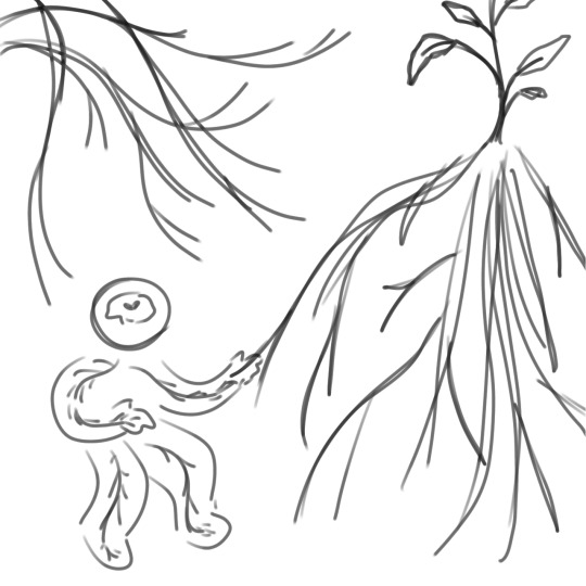
basically the purpose of the super messy sketch is to outline ideas and stuff. i say "i think this would be cool, it looks cool in my head. this is what the finished product should emulate" and then i roll with that. also usually i have multiple sketches based on the same idea, but more often than not there will only be one sketch that i want to work with.
i tend to pick colours based on the feeling of the piece! so for me, the idea of plants gets the colour green, the "i have no mouth and i must scream" art gets a lot of red and orange. it's basically colour associations.
although very simple, my backgrounds tend to be developed around either the concept or the sketch. for the plant one above, i tried to use more flowing shapes in the background to emulate leaves, hills, and vines. for my first few "factory pomo" style pieces i wanted to get a sense of contrast, so i designed the background to be almost split into two colours/two parts, etc.
other examples


you're probably noticing how similar my sketches are to my final pieces. it's basically because i treat sketches like lineart. i pick a sketch and enlarge it so that it takes up most of the frame. then, i set it to a low opacity and draw on the layers underneath it. oftentimes i turn the layers on and off to get a sense of how the whole thing looks, and the finished product will not include the original sketch layer. but a work in progress for me usually looks something like this
it's a whole lot of going back and forth! zooming and out, erasing and redrawing and turning off layers and zooming out again. it can be messy sometimes but i stick to it and enjoy it a lot. i am not always faithful to the sketch, either; i usually add whatever i think looks cool. for the piece above i did Not originally intend to have glitching effects on my sona's body. but then i thought it would be cool to add some!! so i did :]
as for Brushes i work in IbisPaintX and i use this bad boy the Digital Pen (set to various thickness depending on whether i want very small and fine lines or just want to cover a Big Area). its basically just pixels so thats how i usually get very crisp lines!! also you can turn it all the way down to just 1 pixel if you want to be really precise. eraser tool and ruler tool are my best friends. also the Fade Watercolor (Opaque) that is right underneath the Digital Pen is what i use to sketch sometimes.

um hope this helps or satisfies your curiousity!! yeah. not a formal tutorial to my art or anything, this is just how i do it. which is in a silly way
22 notes
·
View notes
Text
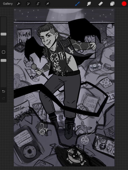
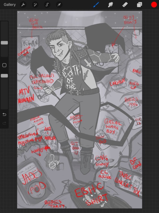
I don't often share messy art WIP's, but this is a bit of an ambitious piece I'm nervous about & could maybe use some input from my DF followers over here.
A couple weeks ago, I started what was supposed to be a simple "Trash Bat" illustration of Davey. Instead of just putting some generic trash can or dumpster in the scene, I got the idea to cover a landfill in a bunch of easter eggs. This ranges from old & new merch, references to music videos, old gig posters and ticket stubs, and more obscure things like a page of "Unearthed: The Unused Lyrics of Davey Havok" from the Under the Rose magazines & Jade's iPod (RIP) with titles of unreleased songs on the screen.
The idea is like...yeah, this stuff will one day end up in a landfill, and maybe some of it is things the band don't relate to anymore or don't see the value in. But from the perspective of a fan lovingly filling this scene with these totems, this pile of "garbage" is more like a shrine. Many of us fans will still see the value in everything they've done, even the things they toss aside or that won't see the light of day. He's our Trash Bat, and his trash is our treasure.
I know it looks like a literal damn mess right now -- I'm going to go in with lineart and mess with the contrast more to make certain things pop and make things as detailed as I reasonably can. I originally intended the piece to be b&w, but I'm considering adding some color to help certain things in the pile be more recognizable. I'm also gonna swap out the Death of the Party shirt for the more general AFI skull shirt Davey has also worn during recent performances & do a bit more work with lighting/shadow.
I'm a very nervous artist who has often intimidated myself out of working on ambitious pieces, but this is a piece that has suddenly become important for me to get right. Words alone cannot capture how much this band means to me & for years I've wanted to do that passion justice through art, but feel like I haven't yet accomplished that. Last year was the first time I shared AFI fan art that I tagged Davey in on Insta, and getting a like from him - multiple times! - was pretty mind-blowing for me. I'm grateful for the support I received on those Havok Doll pieces, but I'm not particularly proud of them. While it was a fun concept for me, I feel like the doll idea was more successfully explored by people who can make actual real custom dolls, like Dolly Havok on Insta. I might still go back to it because I really did want to immortalize more of Davey's range of fashion over the years, but there's also so many other things I want to explore in art & with my love for AFI & related projects.
ANYWAYS, if you see this and have any recommendations for anything else that could be lovingly added to the trash pile or some constructive crit, please let me know! I want this piece to be a real love letter to the band's history, and I'm trying to represent as many eras as I can. I'm going to try taking my time with finishing this & bounce between this and other projects to try to avoid burnout (which I am QUITE prone to), but I'm excited to hopefully see this idea through & I hope others enjoy it.
15 notes
·
View notes
Note
Can i ask how u do lineart so well,, it looks so smooth,,
I've always been very big on keeping my lineart clean and smooth! :) I'm very inspired by comic and graphic novel illustration, so naturally, I try to take notes from that sort of aesthetic in a lot of my art.
The short answer is that I just have a lot of practice, and am very picky about how my lineart looks. So, I'll often spend a long time making sure it looks just how I'd like it, before moving on, even if the lines aren't necessarily going to be the focus of the final drawing.
The longer answer kinda depends on what lineart you're asking about! The style of my lineart tends to change to fit whatever mood I'm going for, so I have a lot of different line styles with varying levels of smooth-ness.

On the super-smooth end of the spectrum, we have these bubbly, cartoony lines! These are a pain to draw, to be honest. But they really contribute to giving that cute look :) For these, I used the Clip Studio Paint G-Pen, with some minor adjustments to the settings, mainly so that there's not too much line width variation. The uniform, thick lines are important for this look! :) Drawing in this style really just a lot of trial and error. Usually when doing lineart, I'll erase away at lines to get them to the right thickness, or even just clean up a sketch and call that lineart, rather than doing lines on a new layer. But, that's a lot harder to do when the line thickness has to stay consistent. So, I end up just drawing the same line 7 times over, un-doing my work and re-doing it until i'm satisfied. Again, it's a pain! I used to draw like this a lot more frequently, but I stopped because I found that other approaches are often a lot more satisfying and rewarding. This is still great, for that cutesy look, though.

Next, we have what I would affectionately call my ref sheet lines. As much as it's probably a bad idea, I have a habit of just kinda skipping the lining stage of art. I'll just take my sketch, and tidy it up until it's clean enough. But for a drawing where there's only going to be flat colors, that sort of roughness can look sloppy, In my opinion. So, particularly when doing ref sheets, or other art which I don't intend to render, I will actually go through the effort of fully sketching out my idea and lining on a separate layer. The result is a lot cleaner and more deliberate, and looks a lot nicer when colored! Especially if I take the time to color the lineart :) I also really like doing small details with thin lines, particularly body/facial hair, elastic cuffs on clothing, and the seams of clothes, too. I like drawing those little details a lot, and I think they shine the most in my cleaner line style :D
For this, and for most of my lineart, I use these brushes which you can find on the Clip Studio Asset Store:

I'll bounce back and fourth between these, and Kozmo's Scratchy Scribbler brush, which you can find on Ko-fi!
Additionally, I have a modified G-Pen with a pencil texture that I think I made myself? I don't remember making it, but I also don't know where it came from! So i guess I did, lol.
A little more messy than my ref-sheet lines, we have the line style which you probably see most often on my page. As mentioned before, I usually kinda skip the sketch step for these? I don't encourage that, it's a bad habit of mine. But I make it work! I feel like the best way to explain my process with this is to just offer you a timelapse of my lineart process:
I just kinda... go. and it works out! most of the time. lots of cleanup and tweaking, and as you can see with Bdubs and Etho here, sometimes I do actually just. do a sketch and then line over it. So maybe I have no idea what my own process even is, LOL.


Now, to completely abandon your original question here's how i don't do smooth lineart! :D In this style, for the most part, I ignore the cleanliness of my lines, only really erasing with the lasso fill tool, when lines get too cluttered to actually read. Usually I'll only go for this when I'm already planning on painting over the lines. Because sometimes an idea doesn't need or want clean lines, and sometimes I just want to paint some values or slap some colors together and call it a day. Love my clean lines, but scratchy, messy lines are fun too! :)
Not sure if any of this really explained how i do smooth lineart, but I sure did talk about lineart for a while. I hope you could find something interesting or insightful in here! :) thanks for the ask, and I hope you have a great day <3
#inbox#digital art#art process#timelapse#lineart#another ~1k words on my art process?#yippee!!!#askeliyips#ask
17 notes
·
View notes
Note
How Do You Draw So Smoothly?
Ty! Erm I didn't know if this was an ask for a tutorial or something but I'm gonna share some tips anyway. This is mainly for digital art but some (later) ideas could be applied to traditional.
To preface I use Paint Tool Sai 2 for art and draw with a Wacom Intuous BT S (it's not a big leagues expensive tablet but I find they work well in my opinion, but you don't have to use a tablet I'm just disclosing what I use lol)
So in your art program, there should be a pen stabiliser setting. This kinda delays the appearance of a line when you draw it (there's probably a more technical description but that's what I see it for) to allow for a smoother line. Here's some examples from SAI:

The range works from 0-15 and then from S-1 to S-7. I personally use S-1 as I'm quite comfortable with it, but if you prefer a quicker line or a very smooth line (which you have to compensate by drawing very slow for) then simply adjust to your liking. It depends on your drawing speed and line confidence.
Now for the actual drawing technique. Look at these three examples on how the same hair is drawn.

A, my technique, uses fast, almost flicky strokes that play around with roundness of a curve and the sharpness between line intersections. B has lines drawn more slower, creating more shaky and messy lines as your hand spends more time deciding where to go rather than just doing it like bam. Then C is just lots of little lines which isn't very smooth at all but alright for a sketch layer (or unless that's what your lineart style intends to go for).
This applies to any type of brush you use at any width and pressure applied. And don't be afraid to hit undo 1 bajillion times before you deem the line perfect. It really does take practice as sometimes doing things fast can lead to mistakes but you start getting used to it with time ^^ 👍
#im not sure if this was very helpful i dont get asked about my art a lot lol#i just really like making things bouncy and fluffy in a way#mainly hair and some clothes#also yes i used miku for the hair example hehe
17 notes
·
View notes
Text
forgot to do the monthly summary thing three months in a row lol
Summary of October:
Downloaded Leechblock. It helped somewhat. Managed to get all of my non-sketch fills done (14) for Huxloween even while dealing with bad life stuff. Posted bust-up FE fanart semi-regularly on my other Twitter account (~2-4 hours of work). Trying to get commissions on dA and Reddit (no bites yet).
Plan from August :/ :
All monthly/weekly goals for the year ✗
Proko: ribcage ✗
Review all Proko notes ✗
DAB Lesson 7 ✗
Ky/lux reunion piece (mechanical studies) ✓
one vehicle from life a week (20min) ✗
November plan:
All monthly/weekly goals for the year
Proko: ribcage
Review all Proko notes
DAB Lesson 7
One FE fanart every 4 days
Draw N7 Day piece before N7 Day
notes and improvements from finished stuff (Oct):
make notes on figure proportions relating to head ✗ but have been looking it up, USE AT LEAST ONE PHOTO REFERENCE PER PIECE ✗, do some studies (at least one session) on head/neck connection and tilt ✗ I forgot this was a thing but have been tryng to pay attention to it with figure drawing
apples - background details too clean/without width and thickness (like decals), proportions and position in space kinda screwy, background figures distractingly bad
eldritch hux: cigarette got flattened out, hat doesn't fit properly on his head, highlights on belt buckle VERY bad, fucked up face, I do like the composition though
haunted locations: composition got kinda sidelined when I was trying to fit everything I'd drawn in, speeder looks kinda wonky because the perspective was very difficult, inconsistent use of spot blacks, do like the colours though
bonfire: hands unreferenced and thus screwed up, fucked up faces (nose tip always looks wrong), clothing thickness/folds abysmal
demons: values too indistinct (needs more contrast), hux's arm looks too short, really bad hands, bits got cut off and I didn't resize the canvas, shading looks awful, scroll is flat even though I tried to make it not so
manuela: face w/ open mouth looks kinda unfocussed, otherwise pretty ok
valter: armour lost its form, otherwise pretty ok for what it is
vampires: very messy & confusing colours, anatomy fucked up (ribcage is flat and too long), bad hands that don't look like they're interacting with the chair properly, props for trying this much detail in perspective though
ghosts: luke doesn't look like he's standing on the floor (looks rotated upwards a little), room feels bare and undetailed, could have used more embellishment on the items, nice composition with leading lines and contrast though
curse: hands look awful because I don't know how to render shiny materials, shading on face kinda weirdly simplified, shading on body and clothing folds makes no sense, lost dynamism of sketch due to having to apply correct anatomy
scrying: extremely messy lineart, values somewhat unclear, bad use of linework to express texture (like in the gas tank), sense of scale a bit smaller than I intended (should have made bg people smaller), I do like the concept and details though
knoll and lyon: proportions ABSOLUTELY FUCKED (lyon's legs are like twice the length they should be), very stiff poses, vacant expressions, too many gaps in lineart (rebelle's fault though), clothing folds all completely wrong, colour too messy
orochimaru: vacant expression, scales on snake look awful and flatten it out, weird pose, you can see where I gave up on drawing the flowers, face is flat, nose tip doesn't extend enough
ritual: kylo's back looks like it's bulging, overall very messy, foreground vine merges with hux in the midground, statue hands suck, figures too simplified compared to background, overall scene easy to understand though
trick/treat: faces look gormless, kylo's chest has no depth to it, hands look squishy, kylo's pose hard to read, the knife is hard to place in space (looks like it's occupying the same space as hux's arm), nice details and lineart though
ACTIONABLES: try to find photo reference for expressions, do Proko ribcage lesson, draw and detail with linework everyday objects
0 notes
Photo

[Image Description: A lineart drawing of Marinette and Adrien from Miraculous Ladybug. Adrien is sitting between Marinette’s legs as she hugs him from behind, her face in his hair. He smiles happily, one hand looped up around her shoulder, and the other holding his legs against his chest. End ID]
Some lovebugs to sedate my cuddle cravings. Marinette ended up looking a lot bigger than I originally intended so.....

[Image Description: a lineart drawing of Ladybug and Chat Noir. Ladybug stands with one hand on her hip, and holding Chat Noir on her other arm. Ladybug has a larger body-type, and her spotted suit now has a layered top like open ladybug wings. Chat Noir is significantly smaller than her. He sits on her shoulder, one hand on her head and the other around her shoulder. He smirks. His hair has a messy short ponytail, and his outfit has claw-mark like slashes on his boots and shoulder pads. End ID]
#miraculous ladybug#ml ladybug#chat noir#marinette dupain cheng#adrien agreste#adrinette#ladynoir#I hope I spelt adrinette right#adrien just needs to be held ok#he has those vibes#fanart's fanart
58 notes
·
View notes
Text
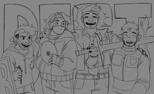
The Ink Demonth 2021 - Day 5. Deep

So we're back to family fishing. You already know what Sammy Jr was up to, giving his mask to his little brother. Yes. This happens right after the Reel entry - just look at the map.

This is the first picture directly adjacent to some other image, and I am seriously considering adding a prev and next button on these two entries. Hmm...
I had a lot of fun with this illustration - although it was also frustrating because I don't like (drawing) trees or fish. Again, a plethora of background layers - and I asked myself the question more often than anywhere else: why did I decide I want to do everything in full colour? Stupid me...
Nevertheless, the effect is nice.
I didn't play with the species of fish and plants, sorry, but in the sky you can find my zodiac constellation and at least 4 others constellations. I am writing "at least", 'cause it is possible that I accidentally made more of them, but the total of five was fully intended :)
And I am proud of tadpoles ^ ^
Fun fact about this picture: I started making it before I did the lineart for Side - then I did the previous entrance so I didn't really have much to finish with it. Mainly background and lighting effects - and good, because I feel bad (because of the new trainer who is fucking narcis and doesn't know how to train a paralytic like me, I'm all sore and have stomach aches and nausea since yesterday's training) and doing anything more complicated is beyond my strength (but I'll try to throw in the Friday strip BONUS soon and complete the outstanding trade for TiElGar - sorry you're waiting so long). This picture is therefore quite messy, I also gave up any deeper chiaroscuro than what I did, although it would probably be more fine then. Well... I'm too sore to care.
This picture is also much larger than the sheet on which I drew it (I moved some elements down and to the sides).
Entry to the Ink Demonth 2021 - Day 5. Deep.
#The Ink Demonth#Bendy and the Ink Machine#Bendy#Ink Bendy#Ink Demon#Sammy#Sammy Jr#Henry Jr#Bendy Jr#Samdy Kids#Bendy's Family#BATIM#SATIM#fishing again!#diving is much more fun than fishing
15 notes
·
View notes
Photo
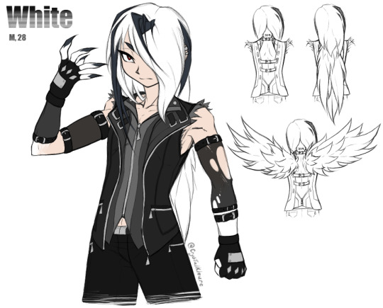
Haha hey remember that post I made awhile back, speculating on what a bad idea it might be to fuse dead things in the godless Frankenstein fossil machine
Meet White. He is a reanimated corpse. Two of them, actually. Or more like 1.5. [And I whipped up this half-assed partial reference sheet in one night instead of sleeping, so don’t look too hard at the chickenscratch lineart and visible guidelines, and kindly ignore the total lack of shading as well as any other messy jankiness.]
White is a product of me wondering not only about what happens if you NecroFuse a human with a Pokemon, but also what happens if you make it even worse and specifically fuse that human with a Pokemon capable of mega evolution. Because canon seems to imply that mega evolving is at best deeply uncomfortable -- and at worst outright agonizing -- for whatever creature is going through it.
Character Lore under the cut. Lots of text:
White is one of actually multiple undead guys who got mashed together with bits of dead Pokemon. They’re science experiments, so they've got the dex numbers of the Pokemon they're spliced with tattooed on the backs of their necks, and those numbers were treated as their names In The Evil Science Lab.
In his Original Life, White [and some of his buddies] got gored to death by some escaped Horrible Fucking Monsters that were accidentally [...and then not-so-accidentally] created via Two Pokemon At Once In A Fossil Resurrection Machine, because hey, it is SUPER easy to think you got Just One Thing's Bones from an excavation dig but then later you realize that Some Of Those Bones were from something TOTALLY different that just died in the same place. It happens. So, some Fossil Scientist People accidentally resurrected an Abomination, realized they fucked up pretty fast...and then started wondering if they REALLY fucked up or if this is Cool, Actually. And then the team of Science People split into two Morality Factions, with one half being like “This is unethical as shit, we need to make sure this doesn't happen again because it's not natural so who knows how this poor fucked up creature is suffering” and the other, cooler half being like “WE NEED TO DO THIS AGAIN RIGHT NOW BECAUSE SCIENCE. IMAGINE THE POSSIBILITIES HOLY SHIT.”
Cooler group splits off from the Horrified Group With Morals, and they promptly use their Science Knowledge to Construct More Machines and Make More Monsters. Doesn't take too long for them to realize, however, that Abomination Pokemon are stupidly hard to control, because not only are they suffering, their masters obviously don't care for their wellbeing, so Revolt Inevitably Occurs and they escape to wreak havoc upon the nearest congregation of townspeople. They promptly maul some people to death at a nearby local rock concert, scientists chase after them to clean up the mess, realize “Oh Shit, Manslaughter Charges Impending”, and then realize...
Science Guy 1: “...Hey, what happens if you put a dead person in the fossil machine?”
Science Guy 2: “Hey, people probably listen better than Pokemon. We can, like, TALK to people.”
Science Guy 3: “Lads, I got a stellar idea just now. And we got plenty of Dead Guys to start with right here! Great way to hide the bodies too, probably.”
This goes approximately as well as you would expect, and precisely as ethically. A smashing success!
However, because they Fucking Died, the reanimated Newly-Monsterized dudes do not remember shit about who they were pre-resurrection. They're not technically even the same people, they’re more like clones. They've been remade. So, all they know now is Science Lab Life, and they have no initial attachment to eachother aside from "that other guy is also a Science Experiment Person just like me, so Same Hat @ Labrat Neighbour ig", in spite of several having been friends or even family prior to death. They also just...don’t know/remember things in general. They are fresh blank slates. And to a morally-bankrupt team of scientists, that’s perfect! They can train these guys to behave however they please!
...However, people might be People Instead Of Animals, meaning they can be Reasoned With And Manipulated And Coerced far better than animals due to their far better communication abilities with the Science People, but...there is Still A Problem in the sense that Holy Shit, A Person Can Only Take So Much. You can only treat someone as "Experiment [number]" for so long, blatantly putting no value on their life outside of The Value Of Scientific Research, in spite of literally basically needing to raise them like a normal child due to the Lack Of Memories issue. Eventually they're not gonna be able to take that anymore and they are gonna Fucking Leave, too. And they’re gonna be much harder to track down than the rampaging Pokemon were. Impossible, actually, once they’ve ripped out their tracking chips.
So then there's just these monster dudes, who don't actually know what they are because they weren't ever told anything more than necessary to get them to cooperate with Tests And Experiments, just Escaped Into Civilization and having NO idea how Anything works. Fun! Especially considering how, at first glance, these just look like Normal Dudes. Their monster bits either aren't apparent or just look like funky body modifications.
They've also got Science Things in them and they Don't Know What The Fuck Those Things Even Are. They've just got these little Devices in/on their chests, and they were never informed of the exact functions of them because there's no reason to explain to the experiment What Is Happening, just that the experiment needs to Hold Still and Cooperate and Now Do This, Now Do This, Now Do That, Good Job That's Enough For Today, etc.
Those devices contain both key stones and mega stones.
If you were a Mad Pokemon Scientist, you would most certainly be interested in the mega evolution phenomenon. What would YOU do if some of your Undead Fusion Experiments happened to be spliced with bits of Pokemon known to be capable of mega evolving? You’d kill two birds with one enigmatic set of stones, that’s what you’d do. Your Frankenstein Experiments can even TALK to you and tell you exactly what they are experiencing when you run tests on them! It’s perfect!
So, if a rock-bearing monster’s heart rate goes too high, part of the little device, which is a barrier between one type of rock and the other, opens up and Exposes One Rock To The Other Rock. Which exposes the monster to the Rock Energy Reaction. The greater the stress, the higher the dose. And I’m sure you can see the snowball effect that’s gonna create, at least the first time or two.
They were INTENDED to eventually be made to Physically Fight With Eachother to gauge the effects of The Rocks™️ when the Guys With The Rocks are under Stress and need to Do Some Self-Defense. The Science Squad was basically trying to suss out the Actual Purpose of mega evolution. Because mega evolution is weird -- it puts ENORMOUS stress on the body of whatever is undergoing it, so the hypothesis was that its true power is probably drawn out best via a perceived life-threatening situation, like it’s a type of hysterical strength, because what else would cause a need for that kind of ability. And aren’t ethics a bit overrated?
So, there’s our premise. White is just wandering around without any particular purpose outside of never ever going back to Science Hell, and he has no clue what the funny little doohickey buried in his chest does until it activates one day and absolutely fucks him up [...as well as everyone around him. Mega Absol radiate an Aura Of Sheer Terror that can literally scare people with weak hearts to death if they’re not careful.]
And now, some Miscellaneous Character Info:
The bit about Lots Of Death happening at a rock concert specifically was important. White was actually the vocalist of the band that was playing. He doesn’t remember that now, but he still loves music and has the same strong vocal cords. And THAT is important because White is partially an Absol now and Absol naturally learns Perish Song. These Fusion Monsters are absolutely capable of using Pokemon moves, though whether they’re aware of this is a different matter entirely. Imagine what happens when they end up tapping into those abilities accidentally.
That band was a relatively-unknown little local band. White was by no means anywhere near famous. Very few people even realized he was gone, and most of the ones who would have noticed also ended up Equally Unalive.
That black stuff between the belts on White’s arms is mesh. Like, stocking mesh. It gets Ripped The Fuck Apart when he goes Mega Mode and his arm fur gets Extra Spiky. Hence one stocking being a bit tattered in that reference pic. He frequently has to replace those things, they are fragile.
“How did White get his name if he doesn’t remember his original name and didn’t have a real name in the lab” I am glad you asked! Post-escape, he eventually encountered a situation where someone asked him what his name was, he bluntly told them “I don’t have one. I am #359.”, they said “Well That Is Not A Name, I need something proper to call you”, and he was just...Super Apathetic. So, the other person picked out the name “White” just based on the fact that White’s hair is white, and he just shrugged and rolled with it.
As you can see in my Incredibly Quick And Rough Sketches, the backs of White’s shirts are open to accommodate that huge amount of fur that bristles out into false wings when he goes Mega Mode. Because his Actual Normal Hair is relatively long and overlaps with that fur, it blends in with his Actual Normal Hair and doesn’t look too odd [when it’s down]. Probably mostly because nobody’s expecting it to be anything OTHER than Perfectly Normal Hair That Just Happens To Be Very Long.
White does not particularly like violence. White does not want to beat you up. He will, though, without a bit of hesitation, if there’s some logical reason he feels like it’s the most practical course of action. Being essentially raised by Cold, Emotionally-Sterile Scientists With No Care For The Wellbeing Other Living Beings uh, tends to affect a guy a little bit. White has a bit of an internal dilemma regarding “It would be efficient for me to just Harm This Other Person to defuse the current situation, because attempting nonviolence will be overall more risky somehow” vs. “Holy shit it feels bad when I hurt people. Why does it feel bad when I hurt people. Is it...SUPPOSED to feel bad when I hurt people?? No one ever felt bad for hurting me.” He Figures Out How Empathy Works Eventually. He is a good guy at heart. He is a Monotone Snarker, but not actually Cold or Malicious at all.
If an Absol can do it, White can probably do it. He has incredibly keen senses and a STRONG ability to Detect Impending Doom. He has exactly the amount of Supernatural Absol Powers you would expect. He is also stupidly physically strong, way more so than he appears to be.
White can’t punch people. Look at the fist he’s making in the pic, he’s doing it wrong. If you punch someone like that, you WILL break your own thumb. That’s not a Revving Up To Sock Someone pose, he’s just tense. He’s using his thumb as a buffer between his long-ass Sharp As Fuck claws and the flesh of his palm. If White tries to punch anybody, or just makes a proper fist at all, he will impale his own hand on his nails. Like, all the way through. He CAN slash straight through things like metal and bone with those claws, though.
White...is unsettling. Completely accidentally, and unknowingly. He just radiates an Aura Of Intimidation [...or Pressure], even when not in Mega Mode, that scales depending on his mood. Just being near him tends to put people and Pokemon on edge. Thus, he’s generally avoided.
The latter point is especially unfortunate, because White’s preferred method of Socializing and Bonding is to just kind of quietly hang out in the same room as whoever he is trying to Socialize and Bond with. He just wants to, like...chill out Near A Buddy and watch a movie and share a bag of chips or something. His social skills are predictably not good.
#DO YOU LIKE MY TOTALLY NORMAL GUY#HE SUFFERS#He's pretty though and that's what actually matters here right#I need to draw the other Totally Normal Guys sometime too. White is Part Of A Set.#Pokemon#CK's art#OCs#I have Long Pointy Fingernails myself can you tell
12 notes
·
View notes
Photo


I felt like doing one of those ‘re-draw your old art’ type things because even if my artistic abilities aren’t quite where I want them to be, at least I can be better than my 14 year old self, right? Right?
Ramble below
Two OCs I’ve been drawing for a hell of a long time - Skye’s pose really gave me hell and I’m still not super happy with it, but I was so done with reworking it :’’ D
I never originally intended a background but I threw one together to make it look a bit more finished - there was no story originally but I guess Skye managed to blackmail Leo into taking her shopping idk ¯\_(ツ)_/¯
Things I’ve improved on: idk proportions I guess? Clothes maybe? Backgrounds for sure
Things I still suck at: shoes. hands. poses that don’t look stiff idk
Things I’ve got worse at: patience for lineart/colouring, everything I do is a barely finished sketch now, it’s super messy close up and the shading is basic af
anyway this was fun aside from Skye’s pose, maybe I’ll do another sometime!
1 note
·
View note
Photo
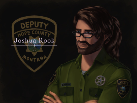
IT IS FINISHED no seriously, this took ages. First couple of days were fine and motoring along with progress, then I was laid out for a week-ish with health problems. Then once I was well enough again I was back to being fixated on finishing this piece of my lad Joshua here for another handful of days, so I’m super glad this is done now.
More talk about the painting, details and process under the cut:
Art Entry 01, Joshua Rook, Junior Deputy of Hope County. Regarding the painting’s execution, stylistic choices, practiced methods, and speculation on further experimentation for skill and stylization.
_____________________________
Honestly I thought that the uniform’s large swatches of green fabric would be more difficult than it actually was. Turns out that was the easier part compared to the shoulder patch and metal badge. x’D The metal badge design is based off of and inspired by a custom-ordered cosplay badge design I found while looking for references, in this post here (link,) from v-i-d-e-n-o-i-r’s blog and Far Cry 5 cosplay. There are some differences in the painting’s rendition above, namely I flattened the middle section and made it all concentric polished metal instead of painted and the great seal rendition in the middle doesn’t have silver lineart either. Those choices are as much for aesthetic reasons of eliminating the blue ring so it was all a fairly simple mono-material-looking surface as it was for simplifying having to forego painting the foreshortening that a spherical dome might entail. Also just because the rest of the metal turned out looking good enough that an additional bit of shiny metal seemed like it’d fit right in for this. That being said, the badge design that inspired this one is rad and awesome looking—and I totally didn’t realize it wasn’t quite like the badges from in-game assets until after I’d painted it. x’D So, I decided to stick with this one since it’s simpler and has cleaner lines, and less engraving to pick out highlights on. Metal is very hit or miss for me to get right, so I’m very pleased with how this one came out! :D I think I did well on that one.
The shoulder patch originally I was looking at real world references and ended up changing the shape once I actually looked at in-game references on Staci and Joey—who I discovered have slightly different details on their uniforms, like the font for their name tags—Staci’s has an old-timey-looking-font with serifs, Joey’s is a non-serif more modern-style font. Some pictures have them having different buttons on their uniforms either in color or shape (the former being exported assets, the latter being in-game gifs/screenies/etc.) This is also how I learned that the little landscape with the shovel, pickaxe and plough/plow are part of the great seal of Montana. I had no flipping idea that was what it was, looking at the patches in-game. The cosplay community does some great work for that, for which I’m grateful. I ended up looking up references of what the state seal’s design was so as to see the smaller details, and to find out what the motto meant ”Oro y Plata,” meant, leading to etymology googling adventures from there, as usual. All important details to paint though I think here, since Joshua’s deputy uniform is symbolically significant to him and will remain so throughout his story as part of his internal conflict for a couple of reasons.
One thing I knew I should’ve done from the start, and reminded myself to do, was the fact that I should paint all skin sections at the same time, so as to ensure they all came out the same shades. I did not do this. x’D I’ll have to actually try to do that next time honestly. Same with the hair sections, while I like how they came out, I do feel the differences between the three major segments in terms of brushwork is not as coherent as I’d like, even if beard hair is not necessarily similar in how it lays to scalp hair, particularly with length and such taken into consideration. Still, not bad. Could’ve used more refs for the backlighting and figuring out how the highlights would fit best on the ponytail, but I think the hair curves turned out nice there in particular. Overall, Joshua’s hair ended up messier than I’d thought with how the locks all end up looping this way and that across his head, but it does actually fit him well as a character for his hairstyle to be messy and loosely held together, but functional. It did end up longer than I’d intended, so we have him likely ending up with a nerdy Jesus hairstyle when it’s down. x’D (Thanks to @undead-gearhead for that mental imagery, I shall take great amusement in that should I get around to drawing Joshua with his hair down.)
Aside from that, I think I’m slowly improving on figuring out how to paint glasses, though I’m thinking in the future I should test more layered reflective light on them or something where the frames are in contact or close to skin, particularly around the glasses’ bridge across the nose and such.
Then there are the other deviation details added—like using dark green instead of the black for the uniform accents. The faded black looks great in-game, but I do think the buttons pop more against dark green instead for this painting. I’m a little bit surprised how well the button-placket section came out, Clip Studio Paint crashed when I painted the first rendition of it, sadly losing all that work. I thought it’d be okay but turns out it didn’t quite get to auto-save that recently enough, but the second go around turned out quite well I think, possibly better. I was originally planning to try to put more textured brushwork across the flat sections of the uniform material, but decided to skip it for speed—I’ll test that elsewhere perhaps, though I think it came out well with the watercolor brushes layered on top of one another like that as is. Among the other smaller details, there’s some tweaks and such for how Joshua’s eye shape, eyebrows, nose shape, hairline etc came out compared to references of Greg Bryk in his role as Joseph Seed. I think Joshua did come out looking like he’s obviously related to the Seeds as I was hoping for, but I’m kind of on the fence that people would look at him and automatically assume it’s Joseph specifically that he’s descended from. I hope so, but either way, that’s how he’s written in-fic. x’D
Overall, I would consider this painting a success, though as usual I do wish it’d been faster to finish. I do think this was good practice for detail work, and metal shading, also: buttons. Still haven’t figured out how to paint lips with more pink or red tones, I don’t like the way they look when painted sadly, unless it’s lipstick. That may end up being a stylistic element perhaps, along with how I paint the lines for fingernails and other such details. Fun fact: I have to leave the shading on the eyes for last, or else my brain goes “The eyes are done! We’re done! Call it a day.” I’m not sure why, but so far, leaving them as flats until the end seems to work a treat for keeping me focused on finishing the rest of the work with less mental dissonance.
Now if only I could figure out why despite knowing I should do all the exposed skin portions at the same time, I don’t follow through on that naturally as far as inclinations go. Maybe it’s a layer organization thing and perception of wanting, say, the cloth to be done first before working “down” to the hands and such in the sense of working from the head down? I’ll have to think on that some more and test things in the next painting. Perhaps color coding the order of layers to paint will help? CSP does have a nice layer-icon-color function that I’ve dabbled with here and there. There are so many brushes, I really do need to test out more of them, I use, what, four or five total, but primarily somewhere around two or three. Hm, but what to do with texture, and how to utilize it so?
Hmmm, as far as personal appeal for methodology goes, I might prefer to use textures in select pieces for more emotional emphasis? If I can figure out how to do that in a messier speed-paint style of things. Rougher textures for conflict, for example. That sounds like an interesting idea to explore, I’ll have to remember that for a later piece. Maybe more heavily textured brushes will also help with the mental itch to refine things to a cleaner-level of refining instead of leaving it in a more organically rough state. Hm, maybe it’s a “mental texture” aversion or something, as far as an interplay between the brush’s texture and the flow of the linework/brushstroke. Perhaps more uneven brushes echo that in a complimentary fashion to better allow less mental discomfort for me personally when trying to paint in a faster, looser fashion?
Honestly, very tempting to go try that out sooner rather than later on some art ideas I have, but I’ve been missing my writing very much of late with two time-demanding paintings back to back. So, ideas for a later time to experiment with.
#Far Cry 5#FC 5#Far Cry 5 AU#FC 5 AU#deputy joshua rook#my art#ofravensandgenesis's art#art talk#chatter#writing about art#writing about fanart#queue
23 notes
·
View notes
Photo
Have a WIP, babes
Haha but yeah, it’s been forever since I touched this blog, and I honestly feel bad for leaving it in the dust after only interacting for a short while. So, I felt the urge to draw my pyro bois and post the sketch to prove I’m still alive B’)
But in the meantime, expect the colored version of the pic and answered asks to arrive soon. I’m back in business, babayy.
#ask-the-pybros#team fortress 2#tf2#pyro#tf2 pyro#red pyro#blu pyro#jelle#drew#//oh look im alive#//im still busy and such but imma try to come back as much as possible#//this blog had so much potential and i intend to fulfill that#//i shALL THRIVE#//but in the meantime enjoy this messy sketch i was too lazy to do the lineart and color for lmao#//im p happy with the results#//especially Jelle's freckles and Drew's smile y esplease
41 notes
·
View notes
Last Seen Blogs

insideoflit
Inside Of Lit

gaegae11
제목 없음

sentimentalfox
You only know a part of me
msredo
Ms Red O

balajitech12
Untitled