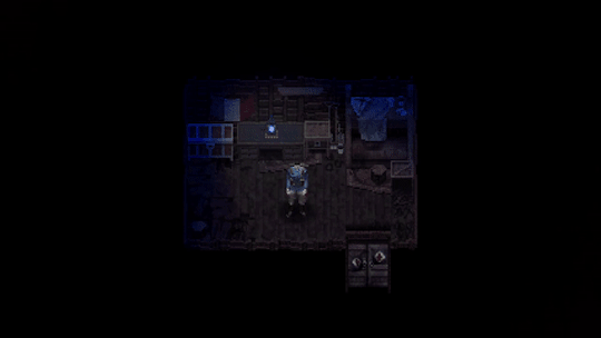
#there's a pixel sized easter egg in this
Text
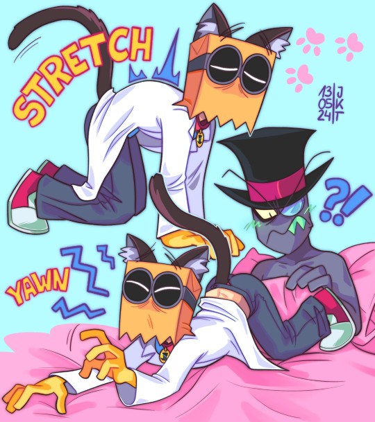
morning cat yoga (yeah those 🏳️⚧️ colors were chosen like this on purpose)
#accidental purpose!#lemme break it down for y'all#so I didn't wanna use stupid boring white or grey as a bg AGAIN so I tried every damn color under the sun#figured only either pink or blue looks good#some misclicks happen and I end up realizing “why not both”#and then it hit me#this is so trans flag coded I'm keeping that#I am suddenly entirely in love with Flug being trans#ever since I drew that silly theory thing 2 months ago that went viral#villainous#villanos#vilanesco#dr flug#flug#kenning flugslys#black hat#paperhat#villainous black hat#villainous flug#catboy#trans#trans flug#my beloved#lgbtq#cartoon#fanart#my art#there's a pixel sized easter egg in this
228 notes
·
View notes
Text
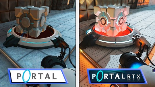
Portal 2 is still the perfect game to me. I hyperfixated on it like crazy in middle school. Would sing Want You Gone out loud cuz I had ADHD and no social awareness. Would make fan animations and pixel art. Would explain the ending spoilers and fan theories to anyone who'd listen. Would keep up with DeviantArt posts of the cores as humans. Would find and play community-made maps (Gelocity is insanely fun).
I still can't believe this game came out 12 years ago and it looks like THIS.

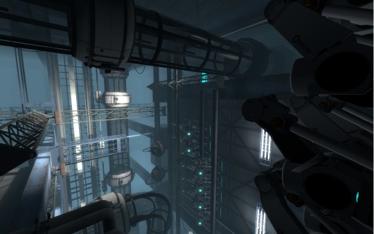
Like Mirror's Edge, the timeless art style and economic yet atmospheric lighting means this game will never age. The decision not to include any visible humans (ideas of Doug Rattmann showing up or a human co-op partner were cut) is doing so much legroom too. And the idea to use geometric tileset-like level designs is so smart! I sincerely believe that, by design, no game with a "realistic art style" has looked better than Portal 2.
Do you guys remember when Nvidia released Portal with RTX at it looked like dogshit? Just the most airbrushed crap I've ever seen; completely erased the cold, dry, clinical feel of Aperture.
So many breathtakingly pit-in-your-stomach moments I still think about too. And it's such a unique feeling; I'd describe at as... architectural existentialism? Experiencing the sublime under the shadow of manmade structures (Look up Giovanni Battista Piranesi's art if you're curious)? That scene where you're running from GLaDOS with Wheatley on a catwalk over a bottomless pit and––out of rage and desperation––GLaDOS silently begins tearing her facility apart and Wheatley cries 'She's bringing the whole place down!' and ENORMOUS apartment building-sized blocks begin groaning towards you on suspended rails and cement pillars crumble and sparks fly and the metal catwalk strains and bends and snaps under your feet. And when you finally make it to the safety of a work lift, you look back and watch the facility close its jaws behind you as it screams.
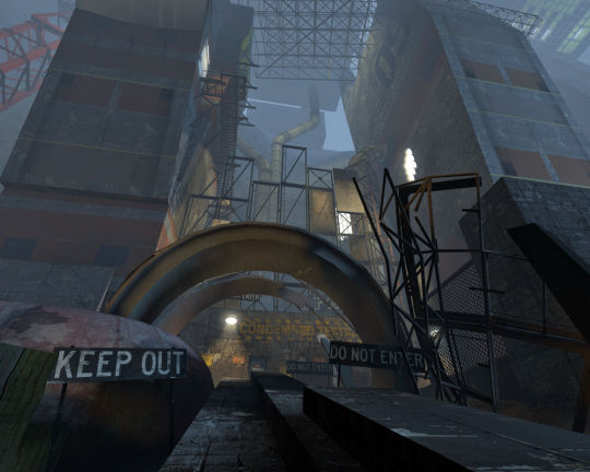
Or the horror of knowing you're already miles underground, and then Wheatley smashes you down an elevator shaft and you realize it goes deeper. That there's a hell under hell, and it's much, much older.
Or how about the moment when you finally claw your way out of Old Aperture, reaching the peak of this underground mountain, only to look up and discover an endless stone ceiling built above you. There's a service door connected to some stairs ahead, but surrounding you is this array of giant, building-sized springs that hold the entire facility up. They stretch on into the fog. You keep climbing.
I love that the facility itself is treated like an android zooid too, a colony of nano-machines and service cores and sentient panel arms and security cameras and more. And now, after thousands of years of neglect, the facility is festering with decomposition and microbes; deer, raccoons, birds. There are ghosts too. You're never alone, even when it's quiet. I wonder what you'd hear if you put your ear up against a test chamber's walls and listened. (I say that all contemplatively, but that's literally an easter egg in the game. You hear a voice.)
Also, a reminder that GLaDOS and Chell are not related and their relationship is meant to be psychosexual. There was a cut bit where GLaDOS would role-play as Chell's jealous housewife and accuse her of seeing other cores in between chambers. And their shared struggle for freedom and control? GLaDOS realizing, after remembering her past life, that she's become the abuser and deciding that she has the power to stop? That even if she can't be free, she can let Chell go because she hates her. And she loves her. Most people interpret GLaDOS "deleting Caroline in her brain" as an ominous sign, that she's forgetting her human roots and becoming "fully robot." But to me, it's a sign of hope for GLaDOS. She's relieving herself of the baggage that has defined her very existence, she's letting Caroline finally rest, and she's allowing herself to grow beyond what Cave and Aperture and the scientists defined her to be. The fact that GLaDOS still lets you go after deleting Caroline proves this. She doesn't double-back or change her mind like Wheatley did, she sticks to her word because she knows who she is. No one and nothing can influence her because she's in control. GLaDOS proves she's capable of empathy and mercy and change, human or not.
That's my retrospective, I love this game to bits. I wish I could experience it for the first time again.
#ramblings#long post#not art#personal#also i know “did glados actually delete caroline” is debated cuz the credits song disputes this#but i like to think she did#it's not sad. caroline died a long time ago#it's a goodbye
2K notes
·
View notes
Text
About Me
Hi, nice to meet you! ^^ I'm Yosos, and I do Pixel art, Art sprites, and Pixel animations. I first learned pixel art from an old friend of mine who works in indie video games. She got me hooked on it back in 2018-2019. But honestly, pixel art wasn’t my passion at the time. My original passion was Rubber Hose style art and animation from the mid-1920s to 1930s, inspired by characters like Koko the Clown, Betty Boop, Felix the Cat, and good ol’ Mickey Mouse.
When I tried drawing them on my phone, it didn’t look so good because my hands were always "broken" because I kept punching the wall :-P lol. For me, pixel art is good because it’s easier to control my hands when drawing on my phone. Anyway, now I'm stuck with pixel art and learned a lot from my friend. Not sure what happened to her, but I kept going. I still use Rubber Hose animation as a base because I love how bouncy and expressive the emotions are and how fast the character movements can be.
I also take inspiration from various pixel art video games from both my childhood and now, like Super Mario Bros, Kirby's Adventure, River City Ransom, and Mother 2/Earthbound, to more recent titles like Scott Pilgrim vs. the World: The Game, Undertale, Deltarune, Yume Nikki, and more. I appreciate the authenticity of their styles and the vibrant colors they use, and I just love how they move too. ^_^
I'm a self-taught artist, and I typically finish my art within a week to two months, depending on the size of the canvas, number of frames, and colors used. And yeah, I watch NSFW animation and art to learn more about animation techniques and anatomy. Sooooooo yeah, that’s me! ^_~
Gallery
Pixel art:

Catman
Description: Just a Guy in a Purple Catsuit.
Date: 02/11/2024
Size: 413x542 px.
Colors Used: Oil 6

Npc BBS Characters
Description: It's just a concept of a few NPC characters, inspired by a thread in general. I think it's a fighting game like Street Fighter, but my idea is more like an RPG game similar to Dragon Quest. The story is that you just moved to Newgrounds City, and suddenly bad things happen. Some of the famous Newgrounds characters disappear, and only you (the player) can save them and Newgrounds City. Idk :-P
Date: 08/18/21
Size: 87x140 px.
Colors Used: Endesga 32

BBS General Fighter Turbo
Description: Hey @Ryanson, here is the animation I promised you! I'm sorry if it's not very polished. I know you like fighting games, I think? So I added other users for you to fight, like @Poopypeter. The others are background characters, such as @Superrobloxbros, @Pumpkinheadude, @Cerealgutz, @Z0i, @Chezmond, @Drsevenseizemd, @Void, and @The-great-one. That's all, I guess. I hope you like it! ^^
Date: 08/29/22
Size: 185x165 px.
Frames: 26 frames
Colors Used: Endesga 32

Happy Easter
Description: Happy Easter Everyone ^^
Date: 04/07/23
Size: 274x274 px.
Frames: 30 frames
Colors Used: AYY4

Choose your users!
Description: Hello! It's been a while. I apologize, Snug-Bug, for taking so long to finish this animation. I had a lot of school and personal problems, which delayed its completion. I'm also sorry that it's not a Snugbug DLC That you want it, but it's finally here. I've combined all the user's art requests into one piece to create this artwork. It consists of 135 frames, each lasting 100 milliseconds. This is the longest animation I've made, excluding the study work and ongoing problems I'm still dealing with. Additionally, keep an eye out for some Easter eggs in the pixel animation. I hope you all enjoy it.
Date: 08/14/23
Size: 516x267px.
Frames: 135 frames
Colors Used: Endesga 32

Waifu San
Description: If you can't beat them join them. Inspired: https://www.newgrounds.com/art/view/whimsical-wife/yosos-chan To hell with you @whimsical-wife To @Thetageist and @Drazah?????????????
Date: 05/02/24
Size: 200x200 px.
Frames: 72 frames
Colors Used: Endesga 32

Mr. Pumpkin Man
Description: Originally I'm trying to make a New Character Sheet for my Oc/Persona Character but idk what I did.
Date: 07/17/24
Size: 216x146 px.
Frames: 452 frames
Colors Used: mulfok32
My Projects
Blam and Protect
Description: THE PORTAL IS UNDER ATTACK! And it's up to you (P-Bot) to destroy the bad guys! You'll use your P-Blaster to eliminate spammers, trolls, and just plain bad submissions.
Role: Background Artist
Year: January 23, 2023
Link: Blam and Protect on Newgrounds
NG Fishing Collab

Description: In early development, this project was almost scrapped. I took over when Demisurgex left. There are a few submissions from the original post (which got deleted) that I still haven't found. [Important] If you had submitted illustrations to the original NG Fishing Collab post, but can't find your submission anywhere in our gallery mode, PM me (CJspellsfish) and send me your fish details.
Role: Additional Artist
Year: November 23, 2023
Link: NG Fishing Collab on Newgrounds
Process
No.01


No.02


Unfinished works:
No. 01

No.02


Contact Information
If you want to contact me here's my Social media Account:
DeviantArt: mryosos
Newgrounds: yosos
X (formerly Twitter): YososOwO
Tumblr: yosos0w0
That's all ^^
#pixel art#aseprite#animation#newgrounds#animated gif#portfolio#art history#digital art#my art#art process#art post
2 notes
·
View notes
Text
Calculations: Agent 47 fishes a giant fortune cat out of the ocean
Feat Source:
youtube
(0:00 - 1:37)
While on the Ambrose Island, Agent 47 can potentially unlock the opportunity to fish a giant golden fortune cat out of the ocean, provided he does some obscure easter egg tasks.
Using this image, we can use 47's canon proportions as a ruler to determine the fortune cat's size:

As 47 is canonically 6'2, we can use pixel scaling (estimating how many pixels 47 makes up and using that as a ruler for the cat) to determine how big the cat's head is.
47 is 105 pixels tall and 39 pixels wide. The car, when accounting for the bit visible under the waves, is 159 pixels tall and 98 wide. Account for the (minor) distance and the size of the cat's head is 19916008.22 cubic centimeters. As the cat is made of gold, it's head would weigh over 384 thousand kilograms.
Now we need to determine how high up the head was lifted. As it was pulled out of the Andaman Sea, it would have travel upwards about 13,773 feet.
Taking mass x gravity x height to get our gravitational potential energy and 47 would have had to have exerted an energy equivalent to 3.8 tons of TNT. (Building Level) to lift as much as he did.
Moreover, he did this in the span of ten seconds, as estimated by the video's timer, meaning he was pulling at Mach 1.22 (Supersonic) or at 420 meters per second, generating a kinetic energy of 8.1 tons of TNT (Large Building Level)
@z0mborb I am so sorry to the mutual who requested I do 47 vs Rake because I wound up discovering that it was a massive stomp before I even posted it. Like, I'll still post it, because it's already written up, (we can just add the clarification that we're ignoring Easter Egg feats) but just know that it and all other 47 matchups are now retroactively stomps in his favor. I'm so sorry.
7 notes
·
View notes
Text
AdventureQuest 8-Bit: Dungeons & DoomKnights Review (Nintendo Switch OLED)

For this AdventureQuest 8-Bit Dungeons & DoomKnights Review, we must try and defeat DoomKnight and his army of the evil undead. Explore a huge world and battle vampires, ghosts, death knights, liches, ancient evils, giant flying eyeballs, chicken cows... and other unspeakable horrors!
AdventureQuest 8-Bit Dungeons & DoomKnights Review Pros:
- Beautiful 8 Bit graphics.
- 195MB download size.
- Chiptune soundtrack.
- The music player is in the extras menu.
- Screen settings - CRT filter, frame/border, aspect (pixel perfect/4:3/widescreen), and color palette (vanilla/game child/game child contrast/virtual child/greyscale).
- A beautifully created game manual that acts as a tutorial, shows off the map, and is housed with many images and tips.
- Chaos mods - play the main game in black and white mode, play the game as the dog, or play a spin on the Pac-Man genre.
- Necronancy is a different game where you play as Nancy the necromancer.
- 2D adventure RPG gameplay.
- Solid tight controls.
- Hack and slash combat.
- Enemies can drop coins and items randomly.
- Save points are found in the world.
- The game plays out on a screen-by-screen basis.
- Respawn enemies by leaving and red entering a screen.
- Many secrets to find.
- The game has excellent Easter eggs and nods to classic games and tropes.
- Main and mini-boss fights.
- Get a bloodthirsty Pomeranian sidekick!
- Meet new memorable characters.
- All character interactions are done via in-game art sequences.
- Instant reloading upon death, you go to your last save point. Enemies can stay dead upon respawning.
- The health system at play is 3 dots and you can pick up health.
- Modern retro adventure game.
- Gets very addictive.
- Over time collect upgrades for more health or skulls.
- Skulls are used to send your dog out through dog doors and get killed.
- Excellent level design.
- With some deaths staying permanent with enemies and doors staying open it does make replaying parts a bit easier or less stressful.
- Does have the cool thing of having a respawn point right next to big boss fights.
- Progression is very satisfying.
AdventureQuest 8-Bit Dungeons & DoomKnights Review Cons:
- Takes some getting used to not pressing the start button to pause.
- Jumping is fine but it's not how modern games are it's a case of pressing jump and then moving rather than both at the same time.
- The manual doesn't mention the controls.
- Is difficult a lot of the time but always fair.
- Movement is not always as smooth as you would like.
- Doorways are very sensitive meaning you can constantly walk in and out of a door by accident.
- A game like this has the get hit by enemies the moment you enter a screen niggle.
- Checkpoints are far apart.
Related Post: Jett Rider Review (PlayStation 5)
AdventureQuest 8-Bit Dungeons & DoomKnights:
Official website.
Developer: Artix Entertainment, LLC
Publisher: Nami Tentou
Store Links -
Nintendo
Read the full article
0 notes
Text
2023's Game-Changing UI Design Trends: Prepare to Be Amazed

The Art of UI: Unveiling the Secrets Behind Engaging User Interfaces
Welcome to the captivating world of user interfaces (UI) and UI designs, where creativity and communication collide to create captivating digital experiences. Imagine a magical realm where pixels dance, colors sing, and interactions come to life!
In this conversational journey, we embark on a quest to discover the secrets behind remarkable UI design in 2023 and how it seamlessly communicates with users. So, fasten your seatbelts as we dive into the depths of this captivating realm!
Chapter 1: Painting with Pixels
In the realm of UI design, pixels are our canvas, and with each brushstroke, we shape an immersive experience. Just like an artist carefully selects their color palette, UI designers choose harmonious combinations to evoke emotions and convey meaning. From warm hues that invite users to explore, to vibrant pops of color that accentuate important elements, the palette is the language that speaks to the user's subconscious.
Chapter 2: Typography Tales
Words have power, and in the world of UI design trends, typography reigns supreme. Fonts, sizes, and styles all play a vital role in enhancing readability and establishing the personality of a user interface. A bold typeface can demand attention, while a delicate script can whisper elegance. Typography is the storyteller that guides users through their digital journey, ensuring they never get lost in the labyrinth of information.
Chapter 3: Motion Magic
In this realm, movement is key. UI design harnesses the power of motion to engage users and bring interfaces to life. From subtle transitions that smooth the path between screens to playful animations that add personality, motion captivates the senses and creates a delightful experience. A well-executed UI design can communicate feedback, guide users' attention, and create a sense of fluidity that leaves them mesmerized.
Chapter 4: Interactive Symphony
UI design isn't a monologue; it's a conversation between the user and the interface. Through interactive elements, UI designs encourage users to engage and explore. Buttons that respond to touch, sliders that slide with a finger's glide, and menus that unveil hidden treasures all invite users to be active participants. The interface listens, responds, and provides a seamless flow of communication that ensures users feel heard and understood.
Chapter 5: Delving into Delight
Delight lies at the heart of extraordinary UI design. It's that element of surprise, that unexpected moment of joy that captures users' hearts. Hidden easter eggs, witty micro-interactions, and whimsical details all contribute to a memorable experience. Delight is the sprinkle of magic that transforms an ordinary interface into an extraordinary one, leaving users with a lasting impression.
As we emerge from this enchanting journey through UI and UX design, we are reminded of the immense power of creativity and communication. The art of UI is a symphony that harmonizes pixels, typography, motion, and interactivity, captivating users and fostering meaningful connections.
So, whether you're a UI designer, an aspiring artist, or simply a curious traveler, remember that the magic of UI design lies in its ability to tell stories, evoke emotions, and create delightful experiences. Now, go forth and craft your own digital masterpiece!
Embracing The Future With 2023'S Game-Changing UI Design Trends
We can help you in UI/UX design with absolute brilliance. Want to know more? Share a coffee with us!
Welcoming you to the dawn of a new era in UI design! The year 2023 has brought forth an array of game-changing trends that are revolutionizing the way we interact with digital interfaces.
In this insightful exploration, we will delve into the cutting-edge trends that are shaping the future of UI design, ensuring seamless experiences and captivating user journeys. So, fasten your seatbelts as we embark on this exhilarating adventure into the world of 2023's game-changing UI design trends!
Dark Mode Dominance
The reign of dark mode continues to captivate users and dominate the UI landscape. Offering a sleek and elegant visual experience, dark backgrounds not only reduce eye strain but also enhance content visibility. With the widespread adoption of OLED displays, dark mode conserves battery life, making it a win-win for both users and device manufacturers. In 2023, expect to see dark mode infiltrate a wide range of applications, from mobile apps to web interfaces, as it becomes the default choice for many users.
Microinteractions and Microanimations
Microinteractions are subtle, purposeful moments of interaction that bring interfaces to life. From a button's gentle bounce to a menu's smooth transition, these micro-interactions add depth and delight to the user experience. In 2023, designers are taking it a step further by incorporating micro animations, small yet impactful animations, to guide users and provide visual cues. These subtle movements not only improve usability but also infuse interfaces with personality, making them more engaging and memorable.
Voice User Interfaces (VUI)
With the rise of virtual assistants like Siri, Alexa, and Google Assistant, voice user interfaces have become an integral part of our daily lives. 2023 VUI will take center stage, enabling users to interact with interfaces using natural language commands. Voice interactions provide a hands-free and intuitive experience, making them ideal for smart home devices, navigation systems, and more. Expect to see VUI seamlessly integrated into a variety of applications, allowing users to effortlessly communicate with their devices.
Immersive Augmented Reality (AR) Experiences
The realm of UI design is expanding into the exciting world of augmented reality. AR interfaces merge the digital and physical realms, allowing users to interact with virtual elements in their real environment. UI Design trends 2023, expect to see AR applications revolutionize industries such as e-commerce, gaming, and education. From trying on virtual clothes to exploring immersive game worlds, AR interfaces will provide users with captivating and interactive experiences like never before.
Minimalistic and Simplified Interfaces
In the pursuit of clarity and ease of use, minimalistic and simplified interfaces are gaining traction in 2023. Clean layouts, ample white space, and focused content allow users to navigate interfaces effortlessly. By stripping away unnecessary elements and reducing visual clutter, designers create interfaces that are visually appealing and user-friendly. Minimalistic interfaces not only enhance usability but also convey a sense of elegance and sophistication.
Dark mode, micro-interactions, voice user interfaces, augmented reality experiences, and minimalistic interfaces are just a glimpse of the exciting innovations transforming the UI landscape. These trends are reshaping the way we engage with digital interfaces, enhancing usability, and fostering unforgettable user experiences.
Whether you're a designer, developer, or simply an enthusiast, embrace the future with open arms and embark on the quest to create remarkable interfaces that redefine the boundaries of possibility. The stage is set for you to be a part of this thrilling UI
Get just the best for your brand. To know more, Contact us here
0 notes
Text
Introducing our Cute Easter Bunny with Eggs Bundle, which comes with 20 high-quality PNG files..
✅ 20 PNG ( high quality ) .
✅ All files in high resolution 300dpi.
✅ PNG files size 4000 x 4000 pixels.
✅ Store link : bit.ly/43Fg92Q

#ashirt#ashirtellaguardin#shirtaddict#interior design#home design#my art#books & libraries#drawing#photography#design
0 notes
Text
The big Conscript accessibility + options update!
Hello everyone, hope you are all doing well. I’ve been hard at work getting a new demo revision ready for mid-October.
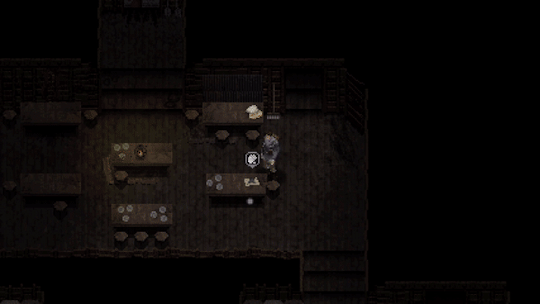
MAIN MENU
Here’s a look at the initial main menu for Conscript. I find it quite atmospheric and have found myself just keeping it on in the background while I work. The last menu for the previous demo was quite rushed so I’m happy with how this one has turned out.
ACCESSIBILITY
Recently, the topic of accessibility has been on my mind. As a developer it’s easy to find yourself resisting against a player’s ability to alter your “vision” of the game. I can understand this sentiment - as I’m somebody who holds my project VERY close to my heart. This topic was inspired by a conversation on the Conscript Discord where I was asked how accessible the game would be. My immediate internal reaction to any questions relating to adding a new unplanned feature is generally “isn’t my damn Trello board already big enough??”
After some reflection and research however, this is a silly way to look at things. Yes, any new feature takes hours or even days to implement - but that doesn’t mean it’s not worth doing. For example, as a developer I end up putting in many extra days and weeks trying to get the game on different online storefronts or even other consoles, all in hopes of trying to expose the game to more people but I would never question this time as anything but time well spent.
Accessibility is the same thing really. There are extra hours of work I can put in to ensure that MORE people can be exposed to the game and enjoy it. So that’s what I’ve been doing, even if it has meant putting extra work hours in every day for the past few weeks.
PAUSE
First, you can now visit the options menu at any time without having to go through the inventory. A tiny change, but it was requested quite a few times.
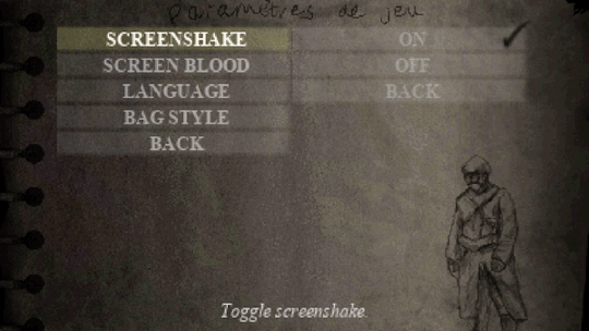
VISUAL OPTIONS
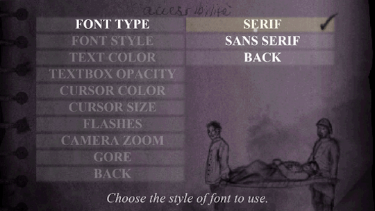
Something I wanted to solve was text readability. There are now a variety of settings to adjust different properties of the text in-game.
You can now choose between HD and pixelated fonts. Even though low-res pixel font is coherent with the general art style, it is not the most legible typeface to read. Now you can have the option to “HD-ify” the font, which makes for greater readability.

For those with dyslexia who may have trouble discerning between serif style characters, you can now opt for a simple sans-serif font style. This can also be toggled between HD or pixelated.
Text colour can also be changed between white, yellow, green, red or blue.

This is applied to all standard text throughout the game!
And finally, the background opacity of the standard textbox can be customised from 0 to 100. If you are struggling to discern between the text and background it may be easier to have this on 100 so the text stands more.
I feel like all these extra little options will solve the text readability issue for the majority of players. Any colour specific elements will also have non-colour related visual indicators. They are small changes but hopefully go a long way for some.
There are also some extra little visual accessibility options for those who may have trouble focusing on certain elements of the game’s artstyle. You can now zoom the camera in up close to our protagonist, and also alter cursor, crosshair and interaction icon properties such as size and colour. HUD opacity can also be lowered, but it is set to 100 by default.

The screen blood that appears when you take damage can also be turned off now, as can any bright flashes in the game for those who are photosensitive or epileptic. For those who don’t enjoy screenshake, that can be turned off too.
It hasn’t been implemented yet, but I am working on having brightness and contrast settings too in the future. Even though the game won’t feature much voice acting, I am going to work on having subtitles available not just for voices but also for any kind of hard-to-read environmental text.
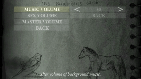
AUDIO OPTIONS
Nothing too fancy, but you can now adjust SFX, music and master volume all independently. This required a rework of the audio system so it was actually quite challenging, but happy to have it completed and working.
BLOOD TOGGLE
Blood and gore effects can now be toned down substantially, although it will be left on by default. The reason I decided to include this is because there may be some who are more interested in exploring the history of Conscript without the intense and bloody combat . In my opinion, Conscript is equal parts a history game and a survival horror game, so there will be cross pollination between those two demographics. Most of you will probably leave this on but it’s nice to have it there anyway.

DIFFICULTY MODES
During the Kickstarter campaign, we reached the stretch goal for two difficulty modes but I am going to include some extra ones in the final game. There will now be six difficulty modes in total.
Training (Assist Mode)
This mode will feature checkpoints, increased health capacity and player damage will be increased.
Recruit / Soldier / Veteran
These three will be the standard easy/normal/hard sort of thing from every other game in existence. Enemy damage and item quantity variables will be the main differences between these modes.
War Hero
This will feature more “realistic” elements from modes like Resident Evil Remake’s “Real Survival” difficulty. Item boxes will be unlinked from each other and limited saves will be mandatory. It will contain the same gameplay modifiers as Veteran mode.
Grognard (French for “old soldier”)
This ultimate challenge will include all the features of War Hero mode but with PERMADEATH. Yep, you heard right.

LIMITED SAVE TOGGLE
Limited saving has always been controversial. The reason I opted for this old-school survival horror mechanic is because it introduces a risk/reward style of gameplay where players generally try and squeeze in one extra “task” before the next save, leading to extra hard decisions being made during gameplay. Understandably, not everyone wants to deal with this though. Despite this being the intended way to play, it will an optional toggle at the start of any Conscript playthrough. Note that on the very hardest difficulties it will be mandatory however.
Here’s a look at the game parameter screen before you start a new save:
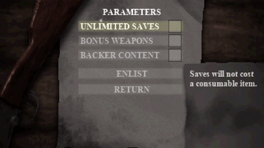
You will also have the ability to toggle off Kickstarter backer easter eggs if you so wish.
CONTROL SETTINGS
Any action that requires you to hold a button - such as aiming and running - can now be toggled with one button press instead.
Also, I’m going to implement both a quick melee and quick heal feature so that you don’t have to go into the inventory just to break some barrels or use a healing item.
You can also turn off mouse support to play the game with a keyboard only.

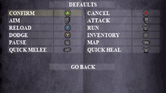
CONTROLLER REMAPPING
Full control remapping is now available for both keyboard and gamepad control schemes. This was a complicated and time consuming thing for me to implement but I’m glad to finally have it available.
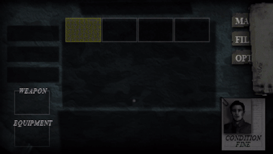
Hang on a second… did the inventory just change?
BAG STYLES
By far the biggest feature in Conscript history....
This was a fun little extra I decided to make when I was testing out the flexibility of the new options menu. Admittedly it has nothing to do with accessibility, but it is related to the options menu! You can now change the colour of the inventory background. You will be spending a lot of time there so I figured it would be cool to give some small level of customization... there may even be some extra unlockable styles in the full game! Any ideas for patterns or designs?
So that’s what I’ve been working on the past two weeks! What do you think? I know menu heavy things aren't exactly the most marketable features, but I felt it was important to share. Are there any other reasonably in-scope accessibility options you all would like to see?
20 notes
·
View notes
Text
Video game based hot takes
-Otto is amazing at tower defence games and factory simulators. He plays Bloons Tower Defence and occasionally leans over to antauri and points at a Ninja monkey hes using saying "that's you". His factory simulator saves are big enough to melt a supercomputer the size of the city.
-Gibson is not good at video games and tends to go weeks without playing ANY. But when he does he plays highly strategic puzzle games until the end. He also enjoys point and click adventures just because monkey brain go "hehe Easter egg" but he keeps it a secret because everybody but Antauri would laugh.
-Antauri plays those shitty tapper/idle games because he likes expressing patience. or games like Animal crossing and tomodachi life that you dont play all at once and take MONTHS to "complete".
-Nova plays a lot of fighting games with Sparx. Sparx plays a lot of racing games with Nova. She tried inviting Antauri to join in one of their matches but he found a game-breaking exploit within his first 30 seconds of playing and destroyed them both. They play with chiro instead.
-Chiro plays a lot of Pokemon type games. and rpgs. anything where the main character ris a magical teenager saving the world and having fun. He loves the plots and all that but he keeps finding parallels to his life that freak him out.
-Otto makes a specialized console just so that all six of them can play together sometimes. he also mods the games that dont support 6 players and forces them to work. He also modded Antauris controller so he cant do frame perfect A presses on a specific pixel to launch his character into the void.
5 notes
·
View notes
Text
I Randomly Made an Undertale-Themed Skin for Windows Media Player 12!?!?! X3

WELL! This was quite a departure for me! >w>
I wanted to make a media player compact, yet visible for when I do art streams (If I EVER end up feeling up to doing that again... heh heh... ^_^()). Anyway, I then had the desire to make it Undertale themed. So I made a micro player with only the basic screen customized, and made it tentatively public. Folks loved it, but wished it was bigger. So I doubled the size, and went all-out with customizing it, including many details, even little easter eggs.
But MAN it was tough! Not only having to learn programming on the fly, but also the fact that Microsoft's own official dev documentation had mistakes in it! And the weird language it uses is a clusterfluff of non-standard syntax, so it was hard to find out how to do what I wanted to do. But I'd say I got it 90% the way I wanted it, which I'm proud of. Especially since it fought me tooth-and-nail with technology BULLCRAP that ALWAYS happens to me (changing a bit of code would break something else completely unrelated, etc)! So much trial-and-error, I think I'll be dreaming about re-opening this player over and over again to see if I got pixels lined up just right or whether or not I broke something with each little code edit I did...
There are a few minor visual bugs, and some things need to be clicked twice the first time you load the player. There's peculiarities with the docking/undocking of sections as well. But there's nothing I can seem to do about those, hopefully it's not enough to ruin the experience (I myself have gotten used to 'em).
Someday I might do a couple more tweaks (and fix things if I can ever figure out how), but for now, I think it's not bad for my first skin edit, and for having to do a lot of coding when I've never done any coding before. Well, enjoy~!
Here’s a .zip file, which includes a README, two necessary fonts, and three sets of Visuals which work best with the special way I arranged the window. https://jmp.sh/56a7s5L
#zc-undertale#undertale#windows media player#wmp#wmp12#wmp 12#music player#media player skin#customization#customized skin#undertale fandom#digital creation#programming#music#sfw#zc ut fanart#zc fanart#zc digital creation
10 notes
·
View notes
Text
Three Spooky Fictional Knockoff Toylines!
That’s right, as the big writing piece for this spooky time of year, it’s three spooky toylines ripping off bigger properties in a way that do not exist.
These are all public domain/CC0, free to use for whatever you see fit, though crediting me and linking to my Patreon or Ko-Fi would be nice.
Shoutout to @genustoys, @phelous and @therobotmonster for heavily inspiring these with their work!
Now, LET US BEGIN!
Monsterlords of the Nether Realms- This line is an odd duck in that it was a knockoff of a toyline that wasn't all that popular. Namely, Inhumanoids.
It was seemingly designed to be cross-compatible with the large monsters of that line, yet in all irony it stuck around seemingly far longer, likely due to the lower price points it was was able to get away with due to being a “non-branded” product and the cross-compatibility of play pattern with the larger figures.
And they were shockingly lavish for what was seemingly a “low rent” property, which has lead to suspicions of it and its related properties being a money-laundering scheme, or at least cover for something unsavory, though others say it could simply be good craftsmanship and the evidence in favor of and against such is perhaps a story for another day.
There were five of them that ended up bumping around store shelves, give or take a few “extras,” which we will cover as they come.
The first piece; likely intended as the “mascot” due to its prescence in promotional artwork is the one known as MOLINTHA, or “ANTHILL EVIL” on certain variants, a large figure encased in a roughly mountain shaped “shell” when curled in a specific position; with an ominous “maw” that turned into a torso when the figure was uncurled.
The mountain pieces themselves (Which were free-standing on their own) provided a large amount of play value with platforms seemingly shaped for various 3&¾-inch figures, but the body itself was a gorgeous design, with the “scaffolding” where the mountain clicked on turning into a series of platforms for figures to climb and clamber over,
The articulation was low, but the sculpting was pleasantly gnarly, resembling some dark ancient castle covered in mystic carving given humanoid form, without an articulated head but instead a snarling “maw” in which figures could be placed inside. Though, there has been some speculation that this head was ripped off a similar design from the front of the classic D&D Dungeon Master's Guide, and I would be lying if I did not see the resemblance.
As expected, it did not come with any figures, but did come with a large assortment of commonly-circulated plastic “bugs” molded in a clear rubbery plastic; along with a few of the notorous “Chinasaurs” that ended up as the basis for D&D monsters bizarrely enough.
The second known most commonly as “LEVIATHOIN” was a piece that had a similar yet wildly different gimmick. The main “body” was actually simply an inanimate idol, which one might say resembles a very specific image of Baphomet, but the smaller figures were of real interest.
Four five-inch ones, bearing an odd resemblance to a scaled-down Molhilintta minus the scaffolding and with a few odd tweaks, with a similar simple articulation scheme, but also a feature in which the arms and legs could “click” together tightly, which leads to the real draw of such.
Each figure attached to a socket in the main “idol” and functioned as a crude combiner., forming a huge “creature”. Each figure could function as n arm or a leg on either side, and the color variants (Including a few alledged remolds of these torsoes) could be their own article in and of themselves.
The third known as MECHA-SHAG was an extremely simple design and yet also one of the most bizarre of them all. It was a hairy “core” akin to the Masters of the Universe Grizzlor, but with a strange robotic face; limbs and at least a dozen missile launchers. They were Micronauts-styled “safety” missiles, but still fascinatingly odd all the same. There is evidence for the pieces origin as a possible Shogun Warriors/Jumbo Machinder knockoff, but again that is a detail for another day.
The fourth one was known as RUCIBEDO, and was unusual even for this line. It was a stylized kaiju-esque “pterodactyl” with a flapping action; its oddly “bio-mechanical” look seemingly giving credence to the idea that the enigmatic company behind the linwas making a Shogun Warriors knockoff-series before they decided to switch gears, but those are not the only notable parts.
The most blatant one is the fact that it is sculpted in a bright red; translucnet plastic, and not only that but had electric lights wired to the flapping mechanism in some bizarrely spacious “alcoves” in the back (Possibly for aborted missile-firing features), creating an immensely striking effect. Albeit one that had a tendency to break; though there are repair guides out there.
And the fifth PLUCHUN is an odd duck, because it should by all accounts be considered kind of a “ripoff” due to using far less material for the same price point as the others, but is often the most fondly remembered.
It is a small torso seemingly made of organic “pipes with a “hatch” on the head and a button slightly below. It also came with a small container of “slime” indicating its function. Namely, put it in the back of the head; press the button repeatedly; and the slime drips out of the holes in the creature, with a pumping rubber “heart” completing the effect. Weirdly; while the rubber on most of these has rotted off, there appears to be a fully sculpted (Albeit much cruder) “heart” that still moved in and out when the button was pressed.
The whole thing was capped off by immensely long rubbery bendy-limbs in the same style as the “main body's” pipes. These tended to be very fragile, and while memorable, this has the fewest surviving specimens out of them all.
As said before, there are other specimens that may be covered at a later date; such as the odd hand-puppet and the bizarrely remolded Imperial Dinosaurs linked to the line and the smaller-range figures, but this is running a bit long, so I'll leave it here for now.
Nightmare Gores- Relating to the preponderance of He-Man knockoff figure lines in the 80s, and the popularity of slasher films, it was only a matter of time that the two would be combined, in ways only possible without mass-fundie-protest at least) in small lines like this.
In striking red-and-black packaging with crude art of a horde of ghoulish monsters rseemingly ripping out of the card back, with the bizarrely memorable phrase of “WE WILL KILL YOU” coming out of a word balloon, there's relatively few things like it.
It used a standard barbarian body whose origins predated the line; but from where they predated was a matter of debate (Though it is known that it most certainly was original to that company and not a He-Man or Galaxy Hole bootleg(), all the same across the line with differing headsculpts.
The headsculpts did have consistent names, and one could tell their inspirations relatively well. Joe was obviously a Freddy Kreuger without the hat, the hockey-masked Rod was obviously Jason Voorhees, Mike was very obviously a riff on Michael Jackson's Thriller Werecat (Corroborated with the usual non-caucasian color of his body sculpt) and Gross was blatantly the Toxic Avenger. Mush was a generalized “melting” face, but could be said to be taken from Cropsey of The Burning; and Hexen's gas mask was likely inspired by My Bloody Valentine's main antagonist; albeit with bizarrely added devil horns.
Then there are the oddballs. Clash is a fan-favorite alongsid Hexen due to his pure black-plastic body and strange hood in striking red with a black void for a front and two piercing red pupils, but I like Frank a lot if only for being a big ridiculous Frankenstein head repurposed for this, as was what I would call the “Baltard” of this line Stall-9 with his slighly crossed eyes and almost comical grin negating whatever intimidation factory they might have. Redd caps off the line with the strange combination of bull and horse head designs obviously repurposed from the barbarian toyline this comes from in a way that still sorta works.
Their pack in accessories vary across production, but there are some commonalities. Mike; Rod; Hexen and Clash almost always came with cool red vinyl “jackets” and Tedd and Frank almost always came with bizzarrely realistic handguns molded in bright orange. And Stal-9; Mush and Clash came with a “chainsaw: very clearly remolded from a gun.
The rest were a mushmash of machetes and hammers, and knives; axes and clubs that were clearly re-utilized from the original line. There are other “relatives” like the Killer Beasts and the Murder Lady, but we'll leave it here for now.
ShineFriendz- One of the many Tamagochi-come-latelies in the 90s, this line tried valiantly to differentiate itself from the usual Tamagochi clones by giving itself a backlite, far more extensive interaction within the limits of its mono-colored pixel art and a link function for “playtimes,” All in a model approximately the size of a modern day smartphone, and to be supported with early web tie-ins in lieu of an expensive animated series.
Of course, the fact that it was its parent company's first venture into such things; a battery company to be exact (Hence why they felt so secure in being battery-eaters), there was very little oversight into the programming. And, due to a series of circumstances too stupid to mention, the devices had far more memory than they anticipated, and far more than they would need for the device's intended functions.
And, what happens when you have bored programmers and lots of time, you get easter eggs. Lots and lots of unsettling easter eggs. To the point where they took up approximately as much space as the “main” games.
So, they were immensely easy to run into during play, but they went unnoticed by corporate during the first three iterations of the pets. The most notorious of them was the possible evolution called only BREATHING which looked like an emaciated and decrepit eyeless version of the brand's canid mascot-species the Buroof that was continually doing what its name implied and had a legion of ominous quirks too long to list here.
Despite rumors, surprisingly none of the glitches involved causing death or injury to any of the pets. Though, that still didn't make them any less fucked up, with such examples as a “pet” known as BRILT that took the form of continual flame graphic that at times would flicker to the outline of another; random pet, to the weird “bird” known as CAUSE whose pleasure meter would go up if you hit the scold button,
There's a full list of “AnomalyFriendz” (the usual fan nickname0 that's too long to list here, but it wasn't limited to them, with such things as a “Game” that involved running from what looked like a crude pair of jaws to a “food” that looked like a wad with what was unmistakably eyes. And the web fiction didn't help, given how the actual text stories were dark , reading more like if Clive Barker wrote Watership Down with it just being barely within what was “appropriate” for kids, with increasingly less subtle allusions to the “AnomalyFriendz”
The minority of parental complaints weren't what got the execs notice however, it was actually the fans of the property, young girls who wrote in asking about those glitches. Not even in disapproving tones either, just asking whether they were intentional, or even asking if playground rumors (Or the rumors circulating across the website's own forums) were true.
This lead to them trying to integrate the macabre bits into the actual marketing for the toys, with the fourth iteration “FreakyFriendz,” with a cleverly altered shell with an ominously warped corner and more integration of the “anomalous” and “regular” Friends. And that is what sunk the line.
Because, parents actually noticed and; since this was the 90s; they bitched up a storm, leading to most of them being removed from shelves. Which is a shame, because enthusiasts say these were the best models yet.
The company left the business shortly thereafter, but there remains a small cult fandom to this day; complete with officially sanctioned web-iterations and even a few (sadly stillborn) attempts at full on revivals. But, maybe someday...
#action figures#toys#fictional toys#public domain#horror#things that need to exist#things that don't exist#macabre#weird#bootlegs#knockoffs
4 notes
·
View notes
Text
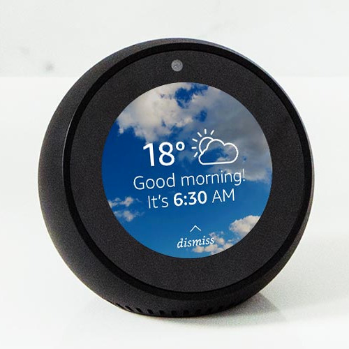
Amazon Spot Perth Reviews
Echo Spot floreat Reviews
Amazon's variety of Echo gadgets are anywhere. In just a few short years audio products like the Dot as well as the Echo have actually gone from appealing uniqueness to house important - also amongst those that typically aren't usually fussed concerning the most recent tech.
The Amazon Echo Spot is one of the later
additions to the line up, adding a brand-new type factor, which is perhaps the best-looking of the bunch.
Amazon Echo Spot at Amazon AU for $179.
We think that the 2017 revamp of the Echo is an excellent suitable for many areas, while the industrial-looking tube of the Echo Plus makes it one to tuck into a gadgety shelf. The Echo Program has a big display, which is excellent for culinary videos for the kitchen area, however the Echo Spot, with its round shape and also built-in display, could rest anywhere.
Certain it's subjective and relies on the design of your residence, but our team believe that it's a natural suitable for a bedside table or desktop computer, but this futuristic-looking window right into the globe of Alexa would certainly excite guests anywhere they locate it in your house and even your office.
But although it could look wonderful, does the performance build up? Is a display that tiny as well as rounded in fact valuable? Can its speaker meet the high quality of the remainder of the variety? Read our complete Echo Spot review to figure out.
Layout of the Echo Spot in Western Australia
Although when it concerns functions and also performance it may be way more than a smart alarm, that's exactly what the Spot appears like. This suggests that for lots of people that might become its default usage, however actually it's method a lot more functional than that.
The Amazon Echo Spot is unlike other Echo tool which's a good thing. Its rounded shell does sufficient making for its sibling's style failings.
Where the big, cumbersome and also bold Amazon Echo Show took control of any location you put it in, no thanks to its brutalist black slab appearance, the Echo Spot is a lot more fine-tuned in its circular design.
Remarkably, it transforms out that the most effective method to do a desk-based video clip device is to discard the TV-lite appearance and just go with something that's compact and also looks excellent. Technology companies, make note.
But if you needed to place the Dot somewhere in the Echo line-up, it's a cross between an Echo Dot and also a smaller sized variation of the Amazon Show.
This is no Echo Dot replacement, though - the price puts it out of opinion for that, as well as it's also a great deal better, so to claim it is would certainly be doing it an alexa amazon echo injustice.
Size-wise, it's the matching of a mango. Mangos typically aren't the most clinical method to measure points, sure, however at the very least it offers you a sign that it's a rather small gadget with a rounded back and also screen that's angled up, makings it easy to view.

It's a great-looking tool, definitely something you won't mind carrying show in your residence unlike the, emergency room, Program.
Attributes and also configuration.
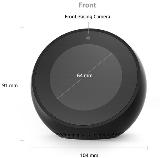
The unit we examined was black but there's also a white one offered. The display is little, at 2.5 inches (480 × 480 pixels).
On the top of the screen there is area for a video camera and on the top of the device in its entirety there are 3 buttons, which all rest flush against the surface for a really streamlined appearance.
Anybody accustomed to the Echo range will recognize what they are: volume up, down and mute for the mic - this will certainly also disable the video camera. There are also 4 small pin-prick openings. These house the four-array mics that listen out for the wake word and for you barking commands at Alexa.
On the back you have Amazon branding, a slot for power as well as a 3.5 mm jack.
The audio speaker grill for the Spot is right at the base of the device, that makes it undetectable when seeing the Spot face-on. Bluetooth capability is additionally offered.
Configuration resembles other Echo gadgets, other than for this you could key in your Wi-Fi information directly on the screen, rather of undergoing the Alexa app.
It's a little fiddly placing in your details in this way (it will certainly request your Amazon account password, too) however the entire procedure will certainly take much less than five mins.
When your Spot is working, you have the alternative to enjoy Amazon's promo video, which informs you what you could do with the device. It's not a work of art but it deserves sitting via so you get a suggestion regarding exactly what you have actually simply gotten.
After that you obtain that warm chime noise, which suggests Alexa is on the internet and prepared to take orders. Once this appears it's a great time to review our ideal Amazon Alexa Abilities post or you can follow the motivates that turned up on the screen. Conversely, you can swipe right on the display which will raise an entire load of Alexa commands you could make use of. It's a truly good means to discover exactly what to do with Alexa. If you're looking for some enjoyable and ridiculous additionals, offer our Alexa Easter Eggs list a try, also.
These triggers could be switched off in the Spot's setups. It's right here in the settings where you can toggle house cards on an off as well. The house cards are information that comes up on the house screen.
2 notes
·
View notes
Text
Closing statements
Hey everyone! I know that I said that Faded Fragments still isn’t over and there’s still an epilogue but I want to get some things out first. The reason that I’m not waiting is because the main story line is done. The Epilogue doesn’t really have to do with the main plot, it’s basically post game content (which is why it’s the epilogue). Again, it’s going to be a long one, sorry but there’s a lot in it.
So the story’s over. This one is at least. I told myself when I finished Till the End that it wouldn’t go past a trilogy and I kept to it. All in all, I’m really happy with the series and I can tell a lot of people have enjoyed it. One of my favorite things to do would be when someone new comes along and goes back all the way to the start, and I could see through my activity as they make their way through the stories. You guys have been a wonderful audience and I’m so happy that I decoded to go with this.
I remember starting my blog and wanting to primarily to write about the Ipiler egos and look at where we are now!
Now the question remains; what’s next?
Well I’ve been thinking about it for a while. Once I figured out what the ending was going to be and when we were starting to get close, I made a straw poll asking what people would want me to write about next. But as I was posting Ch 21 I realized that I wasn’t sure I wanted to write a full length story for a while. Now I’m summer break right now so this should be the perfect time, but I want to try and do more interactive writing. Things where you guys get to talk to the egos, or you can send in scenarios and maybe we can build off that.
Now don’t get me wrong, I love making long stories with easter eggs and seeing people’s reaction to all that, but when I started this series my blog wasn’t as big as it is now. I feel like I have a fairly decent sized audience. I certainly have my regulars ;). And I’m always wanting to try something new as a writer.
So here’s what I’m going to do. I’m gonna take a little break from the longer series and just do one shots, audience interaction and asks. Stuff that’s short sweet and to the point. That being said, what and how much I write depends on you. Here’s what you can do though.
You can send in scene ideas, or questions you may have for the egos, or you can even ask me something. My ears are opened.
I will return to a writing a main story soon, but for now, let’s just relax. I mean, after all the egos have gone through with me and with what ever it is that Jack’s been planning, I think they deserves that at least.
Last thing I want to say is thank you. To everyone who read my story or ever left a comment or an over the top reaction, you guys are absolutely the best. I’ll be honest, I go to a point where I wasn’t sure I wanted to finish out my story. I contemplated at one point just stopping it completely and forgetting about it. But I knew you guys would be disappointed if I had, and I would have been too. So even though I break your hearts and have been a little... inconsistent at times, from the bottom of my heart, Thank you so much for reading my stories. I can’t wait for what is next to come. :)
- Pixel <3
10 notes
·
View notes
Text
Amazon Spot floreat Reviews
Echo Spot floreat Reviews
Amazon's variety of Echo tools are all over. In just a few brief years audio items like the Dot and also the Echo have gone from promising novelty to house crucial - also among those that aren't generally fussed about the most current technology.
The Amazon Echo Spot is among the later
enhancements to the line up, adding a new type factor, which is perhaps the best-looking of the bunch.
Amazon Echo Spot at Amazon AU for $179.
We believe that the 2017 revamp of the Echo is an excellent suitable for a lot of rooms, while the industrial-looking tube of the Echo Plus makes it one to put onto a gadgety shelf. The Echo Program has a big screen, which is fantastic for cookery video clips for the kitchen area, yet the Echo Spot, with its round shape as well as built-in display, might rest anywhere.
Sure it's subjective and amazon depends on the style of your residence, but we believe that it's an all-natural fit for a night table or desktop computer, but this futuristic-looking window into the world of Alexa would excite visitors anywhere they find it in your residence or perhaps your office.
Yet although it may look fantastic, does the efficiency accumulate? Is a display that small and also rounded actually useful? Can its audio speaker meet the top quality of the remainder of the array? Review our complete Echo Spot review to learn.
Design of the Echo Spot in Western Australia
Although when it comes to functions and also performance it could be way greater than a smart alarm clock, that's exactly just what the Spot looks like. This implies that for many individuals that could become its default use, yet in truth it's way much more flexible compared to that.
The Amazon Echo Spot differs from any other Echo device as well as that's an excellent thing. Its rounded shell does sufficient to earn for its brother or sister's layout failings.
Where the big, large and also brash Amazon Echo Show took over any location you place it in, no many thanks to its brutalist black piece look, the Echo Spot is a lot more refined in its round layout.
Remarkably, it ends up that the finest means to do a desk-based video gadget is to give up the TV-lite appearance and just opt for something that's small as well as looks great. Technology firms, bear in mind.
But if you needed to put the Dot somewhere in the Echo line-up, it's a cross between an Echo Dot as well as a smaller sized version of the Amazon Show.
This is no Echo Dot replacement, though - the cost places it out of opinion for that, as well as it's additionally a whole lot much more valuable, so to state it is would certainly be doing it a disservice.
Size-wise, it's the matching of a mango. Mangos aren't one of the most scientific method to gauge things, sure, but at the very least it offers you an indication that it's a rather compact device with a bent back as well as screen that's angled up, that makes it easy to check out.
It's a great-looking tool, certainly something you will not mind having on show in your residence unlike the, emergency room, Program.
Functions and arrangement.
The system we examined was black however there's also a white one offered. The display is small, at 2.5 inches (480 × 480 pixels).
On the top of the screen there is area for a camera and on the top of the tool as a whole there are three switches, which all rest flush against the surface for a truly streamlined look.
Anybody acquainted with the Echo range will certainly know just what they are: volume up, down and also mute for the mic - this will certainly also disable the video camera. There are likewise 4 little pin-prick openings. These home the four-array mics that pay attention out for the wake word and also for you barking commands at Alexa.
On the back you have Amazon branding, a slot for power and also a 3.5 mm jack.
The audio speaker grill for the Spot is right at the base of the device, that makes it unnoticeable when checking out the Spot face-on. Bluetooth performance is additionally offered.
Configuration resembles various other Echo gadgets, other than for this one you can type in your Wi-Fi information directly on the display, rather than experiencing the Alexa application.
It's a bit fiddly placing in your details that way (it will certainly request your Amazon account password, as well) but the entire procedure will certainly take less compared to five mins.
As soon as your Spot is operating, you have the alternative to see Amazon's discount video, which tells you just what you can do with the device. It's not a masterpiece but it deserves resting through so you get an idea about just what you have actually just purchased.
After that you obtain that warm chime audio, which indicates Alexa is on the internet and also prepared to take orders. Once this appears it's an excellent time to review our finest Amazon Alexa Skills article or you could adhere to the triggers that shown up on the display. Additionally, you could swipe right on the display and also that will certainly raise an entire load of Alexa commands you could use. It's a truly great means to learn exactly what to do with Alexa. If you're looking for some fun and silly bonus, offer our Alexa Easter Eggs listing a try, also.
These triggers could be shut off in the Spot's setups. It's here in the settings where you could toggle home cards on an off also. The house cards are information that comes up on the house screen.
1 note
·
View note
Text
Amazon Echo Spot Review
Amazon Spot Reviews
Amazon's variety of Echo tools are all over. In just a few short years audio items like the Dot as well as the Echo have gone from promising novelty to house necessary - also among those that aren't normally fussed about the most up to date tech.
The Amazon Echo Spot is just one of the later enhancements to the line up, including a new kind factor, which is arguably the best-looking of the number.
Amazon Echo Spot at Amazon AU for $179.
We assume that the 2017 overhaul of the Echo is a great fit for a lot of areas, while the industrial-looking tube of the Echo Plus makes it one to tuck onto a gadgety shelf. The Echo Program has a big display, which is terrific for cookery videos for the cooking area, but the Echo Spot, with its round form and built-in display, could sit anywhere.
Certain it's subjective and also depends upon the design of your house, however we think that it's a natural fit for a night table or desktop, yet this futuristic-looking home window right into the world of Alexa would certainly impress visitors anywhere they discover it in your house and even your workplace.
However although it could look fantastic, does the efficiency add up? Is a display that little and also round actually valuable? Can its audio speaker live up to the quality of the rest of amazon echo the range? Review our full Echo Spot review to figure out.
Design.
Although when it concerns features and also efficiency it may be way greater than a wise alarm system clock, that's precisely what the Spot looks like. This implies that for lots of people that could become its default usage, but in truth it's means a lot more versatile compared to that.
The Amazon Echo Spot differs from other Echo device and also that's an advantage. Its curved shell does sufficient to earn up for its brother or sister's design failings.
Where the big, large and bold Amazon Echo Program took over any kind of area you place it in, no thanks to its brutalist black slab look, the Echo Spot is far more refined in its circular design.
Surprisingly, it ends up that the very best means to do a desk-based video tool is to give up the TV-lite appearance and just go with something that's small as well as looks good. Tech business, keep in mind.
However if you needed to position the Dot someplace in the Echo line-up, it's a cross in between an Echo Dot and a smaller variation of the Amazon Program.
This is no Echo Dot replacement, though - the rate puts it from opinion for that, and also it's additionally a lot a lot more helpful, so to claim it is would be doing it a disservice.
Size-wise, it's the matching of a mango. Mangos aren't one of the most clinical way to measure points, sure, however at the very least it provides you a sign that it's a very small gadget with a curved back as well as display that's angled up, which makes it very easy to see.
It's a great-looking gadget, certainly something you won't mind having on program in your house unlike the, emergency room, Program.
Functions and also setup.
The unit we evaluated was black however there's likewise a white one available. The display is tiny, at 2.5 inches (480 × 480 pixels).
On the top of the display there is area for an electronic camera and also on the top of the tool in its entirety there are 3 buttons, which all sit flush against the surface area for a really structured appearance.
Anybody acquainted with the Echo array will certainly understand exactly what they are: quantity up, down as well as silence for the mic - this will additionally disable the camera. There are likewise 4 small pin-prick holes. These house the four-array mics that listen out for the wake word and for you barking commands at Alexa.
On the back you have Amazon branding, a slot for power and a 3.5 mm jack.
The speaker grill for the Spot is right at the base of the tool, that makes it invisible when viewing the Spot face-on. Bluetooth capability is also readily available.
Arrangement resembles other Echo gadgets, with the exception of this one you could key in your Wi-Fi information straight on the screen, as opposed to experiencing the Alexa app.
It's a little bit fiddly placing in your details this way (it will certainly ask for your Amazon account password, as well) yet the whole procedure will certainly take less compared to five minutes.
When your Spot is operating, you have the alternative to view Amazon's coupon video clip, which tells you what you could do with the gadget. It's not a work of art but it deserves resting with so you obtain a suggestion concerning just what you've simply bought.
After that you get that warm chime audio, which means Alexa is on the internet and all set to take orders. Once this appears it's a great time to read our finest Amazon Alexa Abilities write-up or you can comply with the prompts that shown up on the display. Conversely, you can swipe right on the screen and that will raise a whole lots of Alexa commands you can use. It's a really wonderful way to discover just what to do with Alexa. If you're looking for some enjoyable and also foolish extras, provide our Alexa Easter Eggs list a shot, too.
These motivates can be shut off in the Spot's settings. It's right here in the setups where you can toggle house cards on an off too. The house cards are info that comes up on the home display.
Buy today at http://amazonecho.tobeamazon.com
1 note
·
View note
Text
Ready Player Two: The Sequel’s Best Easter Eggs & References
https://ift.tt/eA8V8J
This piece contains spoilers for Ready Player Two.
When Ernest Cline published Ready Player One in 2011, its exhaustive array of Easter eggs were literally built into the worldbuilding—seemingly one pop culture name-drop per pixel that made up the digital OASIS, per the fierce 1980s nostalgia that creator James Donovan Halliday possessed for the most formative decade of his adolescence. And once the billionaire inventor revealed the Easter egg hunt for his fortune, it made perfect sense that the 2040s generation of gunters would immerse themselves in the same references, placing themselves into Halliday’s mindset to inherit his treasure.
Almost a decade later, those ’80s references are more exhausting in Ready Player Two—like when Wade rattles off his vintage morning routine basically cosplaying as Marty McFly, down to getting woken up by Huey Lewis and the News’ “Back in Time” via a Panasonic RC-6015 flip-clock radio. Whereas the Wade of Ready Player One enthusiastically logged onto the OASIS by quoting The Last Starfighter, the sequel’s gunter-turned-billionaire seems burnt out. He takes no joy in playing at a fictional character’s life instead of trying to improve his own.
Similarly, if Twitter reactions are any indication, readers of Ready Player Two are already finding the dense ’80s shout-outs to be more white noise than fun tidbits to be caught and noticed. It’s the same trick, but it loses its efficacy once you’ve seen behind the curtain.
That said, there are a handful of Easter eggs that break through the static. Because what’s the best way to make two familiar things new again? You mash them up.
Seven Shards for the Siren’s Soul
In some ways, it feels as if the sequel is retreading familiar ground, not quite copying Ready Player One’s Easter egg hunt but certainly building a seven-part quest around solving pop culture riddles. What somewhat redeems the narrative choice is a slightly different take on Easter eggs: not an exhaustive ’80s Wikipedia entry, but the personal Easter eggs of one woman’s life.
That woman is Kira Underwood, wife of OASIS co-founder Ogden Morrow, but also the unrequited love of James Donovan Halliday. As young adults, their Dungeons & Dragons campaigns eventually transformed into the creation of Gregarious Games and, ultimately, Gregarious Simulation Systems and the OASIS. But when Kira died young, both men mourned her… but only one tried to bring her back.
This time around, the prize is not Halliday’s fortune, but Kira’s “soul”—or, at least, a digital copy of her consciousness that Halliday copied without her knowledge or permission. Each Shard references a key point in Kira’s life, plenty of which overlap with Halliday’s ’80s obsession, as Kira met the two boys in 1988—in the middle of playing Sega Ninja, in fact. That’s the trial for the Second Shard, but later Shards relate to properties dear to Kira, which makes gunters like Parzival initially disregard treasured texts like J.R.R. Tolkien’s The Silmarillion or the rich discography of a certain iconic purple-themed musician.
And as the Shard search goes on, the clues become more and more specific to Kira’s life, including the learning-is-fun planet that she and Og created together (Halcydonia) to bring free educational games to underserved children when they were unable to have biological children of their own; and Leucosia, her D&D character-turned-AI-persona. Each Shard also includes a “toll,” or a memory that Z must experience as Kira, to better understand how she was a vital person on her own, beyond these two men’s love for her.
While the Seven Shards won’t be immortalized in the best-of lists of fantasy quests, it’s a clear effort to reinterpret the notion of Easter eggs to be more than just however many pop culture references one person can hold over another. They can also be the personal artifacts that others are encouraged to excavate, and experience the world through another set of eyes.
Planet Shermer
Recast the foul, restore his ending.
Andie’s first fate still needs mending.
The Third Shard’s riddle sends Z and Art3mis to Shermer, a planet named after the fictional Illinois town in which John Hughes set the majority of his movies. Inspired by his hometown of Northbrook (which was previously called Shermerville), Shermer was a composite of different aspects of suburbia from both sides of the tracks and everything in-between. A 2010 Vanity Fair article related how in Hughes’ mind, Sixteen Candles’ Samantha (Molly Ringwald) was a “passing acquaintance” of Ferris Bueller’s eponymous hero (Matthew Broderick), and The Breakfast Club’s Bender (Judd Nelson) grew up near Planes, Trains, & Automobiles’ Del Griffith (John Candy).
The OASIS’ Shermer follows Hughes’ thinking, by throwing his iconic teenage characters into a planet-sized Breakfast Club of sorts, with them all attending the same Shermer High School; Z notes that depending on which direction you approach the school, its facade resembles all three aforementioned teen films. That’s amusing enough, but then you remember that actors like Ringwald and Michael Anthony Hall collaborated with Hughes in a number of films—which means all of their alter egos are going to homeroom or the cafeteria together.
This portion of the book is rather delightful in how nonchalantly it plays out every fan’s crossover dreams and how it engages with parallel-universe casting decisions. For instance, Parzival notices Keith Nelson and Amanda Jones (Eric Stoltz and Lea Thompson) from Some Kind of Wonderful, only to realize that that couple is technically the original Marty McFly and his mother. And when it comes to deducing the Shard’s clue, superfan Samantha deduces that they must recast Duckie (the “fowl”) from Pretty in Pink, replacing Jon Cryer with a Weird Science-era Robert Downey, Jr., who had originally been up for the part. (You can already imagine the digital de-aging fun in the inevitable Ready Player Two movie.)
But while their goal is to get RDJ-Duckie and Andie dancing at prom, what’s most important is visiting Hughes himself in his home office to obtain his original Pretty in Pink ending. Perhaps the best Easter egg embedded in this mashup world is that when Art3mis and Z go to the Hughes’ home, they encounter his wife, Nancy Hughes. “I’ve never seen her here before!” Art3mis, who has played through this world’s rhythms countless times before, excitedly tells Parzival. “I didn’t know you even could!” It’s a nice parallel to Wade’s realization that Kira is more than just the wife or love interest, that she and Nancy Hughes are worth squeeing over all on their own.
L0hengrin’s Genderbending Avatar
As Wade relates, Parzival looks almost like him, just a bit thinner, taller, more muscular, and less afflicted by acne. His avatar is an idealized version of himself, as is the case for Samantha with Art3mis—though in Ready Player Two, she has incorporated her IRL facial birthmark into her digital persona, while Wade still sticks with his dream-self. They might also dress as pop culture characters, like Art3mis in her Molly Millions (from William Gibson’s Johnny Mnemonic) phase, yet it only goes so far as typical cosplay.
But in the sequel, Parzival meets YouTuber and gunter L0hengrin, who he identifies as a fan by name alone; in Arthurian legend, Lohengrin was Parzival’s son. When they meet in the OASIS, however, Parzival is struck by Lo’s avatar: She primarily takes the form of pixie-haired teen Helen Slater in The Legend of Billie Jean, but she’s also known for shifting into floppy-haired James Spader in Tuff Turf. While Lo, a trans woman, is not the first OASIS user to find herself in a nostalgic movie avatar, the fluidity of her gender presentation speaks to a deeper identification with various iconic figures depending on her gender in that moment. It also opens up the possibility of other genderqueer or nonbinary users finding their own unique representation via ’80s figures—after all, there are infinite personas to choose from.
The Afterworld
Another mashup world that Parzival, Aech, and Shoto visit on their quest for the Shards is a planet-sized shrine to Prince. And while its name is technically the unpronounceable Love Symbol, those in the know call it the Afterworld. Under ominous skies of “Purple Rain” they drive a “Little Red Corvette” to raid Paisley Park not for weapons, but for musical artifacts with which to challenge the Purple One(s).
Basically, the three gunters have to reenact Scott Pilgrim vs. the World, doing musical battle with seven iterations of Prince as the Evil Exes: Purple Rain Prince, Cloud Suit Prince, Gett Off Prince, Batdance Prince, Microphone Prince, Third Eye Prince, and Mesh-Mask Prince. Not to mention their henchmen, in the form of several past bands and collaborators.
All things considered, the battle goes pretty quickly, especially since Aech is a super-fan coaching Parzival through how to wield the Cloud Guitar, and they have their own backup in the form of Prince’s old band Morris Day and the Time (a.k.a. The Original 7ven). There is a reason that Scott fights seven separate battles, each with its own arc and stakes. It ratchets up the tension in each fight and hints at Scott possibly failing, instead of seeming more like a means to an end, as is the case with Ready Player Two’s big jam session.
This one might be a tad more controversial for readers, depending on how sacred one holds Prince, but I would argue that inspiring a reaction—positive or negative—still counts as an Easter egg that works.
Needle Drops
Both Shermer and the Afterworld include dozens of music cues that can be triggered by passing over a certain spot or into a key moment out of pop culture history, though the needle drops are a consistent Easter egg throughout Ready Player Two. These “soundtrack landmines,” as Z calls them, set the scene, striding into Shermer High School to Killing Joke’s “Eighties”; or add gravitas to a moment, like when Parzival stares at Art3mis, realizing he’s still in love with her, and Boston’s “More Than a Feeling” begins playing.
For the most part, these cues belong to everyone: They’re planted in the same spaces for any user to trigger, regardless of whether or not they’ve ever actually sung or danced to these moments in John Hughes movies. Yet little Easter eggs like the Boston needle drop—which can only be triggered by one avatar staring at another for five seconds, while the ONI records an increase in heart rate—feel like personalized love letters to two lovebirds, caught in a special moment unique to just them. That’s exactly what you want an Easter egg to do.
Ready Player Two is available now from Ballantine Books. Let us know the Easter eggs that worked for you in the comments below…
cnx.cmd.push(function() { cnx({ playerId: "106e33c0-3911-473c-b599-b1426db57530", }).render("0270c398a82f44f49c23c16122516796"); });
The post Ready Player Two: The Sequel’s Best Easter Eggs & References appeared first on Den of Geek.
from Den of Geek https://ift.tt/3pZdsp3
0 notes
Last Seen Blogs

justcassontmblr
JustCassOnTmblr

myths-teria
...

alleyuuh
Countess Yellow

wecopemum
Untitled

creativinn
CreativInn