#there's only so much i can do with stock photography dammit
Text

Day 21: Hugs
@hellcheerxmas
December 1986
Hawkins, Indiana
“Dude, what the fuck?”
Eddie slams his locker shut, nearly clamping Gareth’s nose inside. Which is as much as the little shit deserves for sticking it firmly where it doesn’t belong.
“Don’t know what you’re talking about,” he says as he leans against the metal door, aiming for nonchalance.
“There was a bear.”
“Fuck off, go to class.”
“It had a hat—”
“Go to class,” he hisses, and the Dungeon Master voice doesn’t work on Gareth anymore, but Eddie likes to think he projects a modicum of authority. Sometimes. Maybe.
“Whatever, Eddie.” Gareth snickers and hoists his backpack onto his shoulder. “Good luck with that.”
Eddie watches him go. Waits until the hallway clears out and the bell rings (so he’s skipping English; he knows how to read) before he opens his locker again.
Sitting on the top shelf is, indeed, a bear. And not just any bear. A polar bear. A polar bear wearing a red Santa hat and a green vest with bells all over it, and one of its feet has a sticker that says squeeze me.
He's no fool—he ain’t squeezing shit—but he does pull out the crisp white envelope that’s been neatly placed in the bear’s lap.
Dear Eddie,
This is Mr. Hugs. He loves you. Merry Christmas.
Best wishes,
Mrs. Claus
P.S. This is revenge
He sighs. Grabs the jingling bear and tries to muffle it against his jacket because he can’t leave it in his locker and he can’t throw it in the trash, so his only option is to get it to the van without anyone seeing.
Which might have worked if not for the fact that he runs into Lucas Sinclair holding a hall pass when he’s halfway to the back door.
“Hey, Sinclair,” he says like he’s not holding a giant Christmas teddy bear to his chest.
“Hey, Eddie.” Lucas, a nice kid, is trying not to smirk. “What’s uh… that?”
“Oh, this? This is Mr. Hugs.” Because what else the fuck is he going to say?
“Uh-huh.”
“It’s not what it looks like.”
“It doesn’t look like anything.”
“Right. What are the chances of you not telling Henderson about this?”
Lucas considers his options, then shrugs. “My mouth stays shut if you let my sister start coming to Hellfire next semester.”
Eddie groans. “I told you, man. It’s not a babysitting service.”
A shrug and Lucas folds his arms. Eddie inadvertently squeezes the bear a bit tighter, which is when a tinny, mechanical voice spouts, “Ho-ho-haaaaappy holidays from Mr. Hugs!”
Lucas can’t keep from snorting. Eddie grits his teeth. “Fine. But she’d better come prepared,” he says before sprinting for the exit.
Luckily, he doesn’t run into anyone else between Sinclair and the parking lot, where his van waits like some sacred oasis.
Chrissy’s sitting in the back when he gets there, painting her nails and flipping through a magazine like she’s not an evil little Christmas imp. She has a free period when he has English, and she says being in the van beats study hall, so he gave her his extra key.
“Dude,” he says when he sees her, and she looks up all beatific, batting those big, baby blues. “I have a reputation.”
“I don’t know what you’re talking about.”
He launches Mr. Hugs against the back of the passenger seat. The bear drops to the floor with a squealed “Meeeeeeerry Christmas!”
She lifts her hand to her mouth and blows on her nails, then shrugs. “I think he’s cute.”
“You think he’s—”
“Maybe think twice before insulting Boy George next time, Munson.”
Eddie frowns, because when did he even do that? Except, yeah, last weekend. Rick’s place. Chrissy and Rick wanted to listen to Colour By Numbers, and Eddie’d been… like, maybe more of a dick about that than the situation warranted. But still!
“That’s disproportionate, Cunningham!”
Another shrug, but she’s tamping down a giggle.
“Whatever. You’re such a fucking freak.”
Chrissy doesn’t disagree, and he spends the rest of her free period doing his best not to smudge her nail polish.
#hellcheer#eddie x chrissy#chrissy x eddie#edissy#chrissy cunningham#eddie munson#fanfic#hellcheerxmas#ruining eddie munson's reputation for fun and profit#mr hugs#idk this got crack fic-y#pretend the bear in the pic has a green jingle vest#there's only so much i can do with stock photography dammit#hellcheercountdown
38 notes
·
View notes
Text
I used to write down my feelings a lot and figured I’d do it again. You don’t gotta read, it’s very long haha but just needed to put it somewhere so. Under a read more because it really is super long and stupid
Well I’m here again, mid crisis at the ripe ol’ age of twenty seven. My head is all over the place, I’m feeling all sorts of things, all sorts of just…lost. And I thought to myself, what do I usually do when I’m feeling like this? And the answer to that is I used to write. I used to write a lot. I love writing, always have and always will. The sound of my fingers typing rapidly on my keyboard is music to my ears. I would hand write things, but more often than not my hand can’t keep up with my brain, whereas my average 80wpm typing speed is well efficient when it comes to trying to follow my train of thought. I was tempted to go back and edit what I’d written just now, but no. Not allowed. I just have to keep typing and typing until I feel some sort of…I don’t know, closure?
I feel lost. I feel trapped. I still feel like I’m sixteen and I think that’s what terrifies me the most. I haven’t really had the chance to grow up, to ‘become an adult’. What does that even mean? Who knows. I just know that I am not there. I have no clue how taxes work, haven’t had a stable job in…a long time. Still live at home with my parents, my two dogs, my three guinea pigs and three goldfish. Still in the same room, that’s been purple for a while now. Shelves still filled with plushies, fanart, kid things. So many kid things. Are adults allowed to have kid things? I don’t know, that idea plagues me. Am I allowed to be an adult and still have my corner bed, 500 pillows and soft toys to cuddle?
When I think of adults I think of minimalism, white, boring, the dreaded bed in the CENTRE of the wall (HOW IS THAT EVEN COMFORTABLE? DO PEOPLE NOT FALL OUT OF BED?). I think of business people, married people, people with kids, careers, nice clothes. The only thing I have is nice clothes. Can I still be an adult if the walls of my bedroom are bright purple? Or if most of the books I read are YA fiction and not like…self help books? (though I do have a couple of those lying around).
I’ve been trying to do the career thing for years and to no avail it seems. I’ve done two university degrees and do you think they got me anywhere? Not really. Why did no one tell me that employers care more about experience than they do about degrees? Or maybe people did and my stupid anxiety just made things difficult. Yeah alright lets be real it’s probably the anxiety holding me back in everything.
Anxiety about being good enough. That’s the big one. Do I ever feel good enough? Not really. That kinda sucks haha. I have plenty of useful skills, I am a hard worker, I wear my heart on my sleeve and I want to please to no end. But that hasn’t really gotten me anywhere. I’m always stuck. Stuck in the same spot with no clue of what direction to go in. I know where I want to be in the end. I want to have my own home, I want to be married, I want to have kids (biologically and adopted/fostered). I want to rescue animals and live on a farm of some kind. I want to be a successful business owner. I want to be a successful photographer and artist, maybe even a writer. I want to have enough money so I don’t have to worry about not being able to afford things. And I want more money on top of that to help as many people as I can. That’s all I want to do. I want to help. I want to help, I want to be successful, comfortable, and above all else I want to be happy and loved and to love.
So how do I get there? Well I need money. Money is the big issue with me right now. I’ve relied on government payments since I was old enough to start getting them. And there were a few times where I thought I could finally be independent, and they’ve all backfired on me. All of them. I don’t want to be on government payments for the rest of my life. I don’t want to have to depend on anyone other than myself for money. And it’s not like I’m flat broke right now either, I’ve been smart and saved. But when you don’t have a stable income you and everyone around you start to worry. So what do I do? Get a job? Wish it was that easy. I’ve been looking for work for years, and I’ve gotten maybe…two interviews? Oh and it’s not like I haven’t had a job before I’ve had a couple but that was back when I was in high school and just after. Nothing fancy, pizza shop, maccas, and a shopping centre activity stall.
My brain is starting to get tired now. It’s going quiet.
Hmm. Jobs. Right. The one thing everyone keeps bothering me about. I’ve bloody tried guys. “Just get a job to pay the bills” IT’S NOT THAT EASY. I’VE TRIED. You think I want to be like this? That’s why I studied so much. Because no one would give me a chance and hire me. And then I thought, you know what? Fuck it. I’m going to chase my dream. I’m going to get a degree in photography and have my own business and live my dream. And you know, I got the degree, I started the business. I got a couple of clients, got a bit of interest. My love for drawing came back, and I added that to my repertoire. I got commissions. I got bloody patrons, who support me every month. And I thought, you know maybe this could actually work.
But it’s never enough.
I was so excited to do my first artist alley. I had dreamed about doing it for years and years. And I finally did it. And to be honest, it sucked. I mean it also didn’t because I learnt a lot, but when you spend hundreds of dollars, hundreds of hours, so much bloody hard work to get there and to be ready, and you make $66 dollars overall, you kinda think well that didn’t work. Haha. That didn’t work at all. I thought I was good enough, you know? I really did. And you can see the light leave my eyes in the vlog that I made about the whole thing. I am completely and utterly defeated. I had sacrificed so much, I had put SO MUCH WORK, so much. I worked so hard. And right now it feels like it was all for nothing. I was lucky enough to get into a startup business program, which was my savior. I thought that’d help give me the boost I so desperately needed. And again, learnt a lot, got some financial support, but all in all I feel like I wasted so many peoples time and money.
And now I’m back at square one it feels like. Back to the beginning. Where I have no job, no booming business, and a stubbornness to not want to give up, but also feeling so defeated and so god damn depressed. I CRIED AT HARRY POTTER. I’ve seen those movies a hundred times over and I still bawled my eyes out when Cedric died. I’ve never done that before. I even forced myself to watch ‘A Dog’s Purpose’ so that I would cry, thinking that would help. I bawled. Felt a little better, but now I’m back to feeling like a heap of crap. I always come back to this place at some point or another. But this time feels like I just might not be able to get myself out of it. What a scary thought.
When will my time come? When will all my hard work finally pay off? I want to know, and so does everyone else around me. The constant ‘how is your business going?’ ‘oh something will happen’, WHEN? WHEN WILL IT HAPPEN? That’s another thing. What I make is never good enough for anyone. I myself have learnt that money at the end of the day isn’t the end all and be all. Of course people need money to live, but I don’t need that much right now to be comfortable and people just can’t get that into their heads?
I don’t need money. I don’t. But I do. God capitalism sucks. Capitalism can bite my big fat ass. And anyone who ever doubted me can too. Now I’m just mad. I’m mad that all I’ve done is be kind and work hard and it’s gotten me to feeling like shit. So now what? I booked Brisbane Supanova. Might as well kick the dead horse or whatever the saying is. Might as well try once more, and if that doesn’t work than that’s it. I think I’m done. But that’s not until November, and “I need money” between now and then. Blah blah. I hate money. Money can bite me too.
Come on, try and get your thoughts straight.
I’m tired. Yes I know, I’m sad too.
It’s not time to give up just yet. There’s still a little bit of fire left inside you somewhere. It’s small right now, but it can grow. I’m too stubborn to let it go out completely.
So what do I do now. What do I need to do to make things less shitty?
Find a way to get some sort of stable income. Look for work again (not that I think it’ll work but better try anyway). Work on new art pieces, add new stock to Redbubble, advertise the shit out of your awesome work. Do more free shoots to make a pretty portfolio just in time for Supanova. Sell some personal stuff if needed, we don’t need a lot of the stuff we have. Save those to sell when we really need it.
Go back to the gym. Just move more. I get real sad when I sit at my desk all day. Need to get away from the computer. Go for a walk, go to the beach, whatever it is. Just move. Get those endorphins. Feel good about yourself.
Still fat though.
Probably going to always be fat. That’s fine. Exercise, make healthier food choices. And god dammit stop eating so much sugar. Drink more water. Eat more fruit and not chocolate. Stop bingeing. It ain’t healthy. Alright. I’ll make a list, and I’ll try be healthier again. I do miss going to the gym. It makes me feel strong. I need to feel strong again. I will go back.
Still tying my self worth to what others think of me. Which isn’t ideal. Isn’t great at all. I’m constantly going between ‘ugh I hate everything that I am’, ‘who would ever love me like this’, and FUCK EVERYONE WHO DOESN’T APPRECIATE ME. It’s so constant. It’s so exhausting, knowing that my thoughts are being little bitches and yet I still can’t just…not listen? What is with that.
Oh my god. Can I still be an adult if I have blue hair?!
#long post#feelings#meh if this is annoying anyone just tell me what else to tag it with so ya'll dont have to see it#just needed to get some things out
6 notes
·
View notes
Text
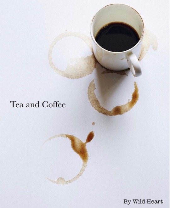
Tea and Coffee
Introduction Part I: Picturesque
Note: Contains fluff, comedy, and angst. May have course language and mature themes but mainly softness.
*The title image was taken from Pinterest and edited with Pic Collage
~
The red string of fate has ways of tying many souls together but sometimes it to can become tangled and make it unclear to who exactly, ones heart is destined to be with.
“No, I’m not putting bubble tea on the menu,” Eliza firmly stated in answer to the suggestion her friend had put forward. It was a quiet afternoon, the two young adults trying to brainstorm new items to serve at the cafe they both ran, The Curious Cat. It was opened a year ago, the twenty-two year old Eliza managing it with help from her friend Jai who was a few years older. Originally Eliza started the store up to help her save up money to continue travelling around the world, though the cafe had begun to make a place in her heart within the year of running it. It was a quiet but simple place, she made various teas while Jai worked on the coffees. They sold some sweets like cookies and muffins but mostly it was a well brewed cup of English Breakfast that brought customers into their small abode. It was beautiful and peaceful home away from home,
“Come on, they taste so good though! I’m sure maybe we could figure out how to make them?” Jai pushed, bringing Eliza back to the present moment of the pair inside the cafe debating over what to add to menu. Jai was seated by the counter opposite to the chocolate haired Eliza, who was in the process of wiping up cups that had been used earlier in the day,
“Jai we can’t. It’s expensive as well as complicates things further, there being so much to making bubble tea. I think as well our customers are happy with the beverages we already have. We need to think up food, not drinks,” Eliza explained to the blue eyed girl, who in turn scratched her head in thought,
“I mean, if we were licensed we could add alcohol to the tea, but then that would bring about more issues needing security in case anyone were to become intoxicated,”
“Jai, foooood,” Eliza sighed grabbing a choc chip cookie that was on display, the older girl’s face lighting up upon seeing the delicious treat,
“Ooh thanks!” She smiled gratefully, taking the cookie and joyfully nibbling on it straight away,
“Seriously how can you be the older one when you act so much younger,” Eliza laughed lightly at her friends’ antics. The two adults had become quick friends after meeting at a music festival, still keeping in contact when Jai went away for a few years doing school in Canada. She was a unique person, standing at 6’1” inches tall and having long brown almost red hair. She was the kind of person that many would think is gentle and sweet though if you wronged her she would literally kick your ass, as Eliza had witnessed many times when someone rubbed Jai the wrong way.
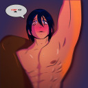
As Jai was snacking away at her cookie a jingle of bells rang out as the door to the cafe was opened, a tall man with dark black hair walking in with a small smile. He held a large professional camera in his hands, his coffee coloured eyes focused on the screen of the device and analysing the images in it,
“Afternoons Johnny,” Jai piped up between bites of her cookie, giving a wave before quickly finishing the biscuit off and leaving her chair to go back to her work station,
“Jai don’t eat with your mouth full ges,” Eliza scolded her before turning to their customer, ”Hi Johnny, looking to have the house blend?”
“Hey guys, and yes please,” Johnny greeted back, taking Jai’s previous seat by the counter and placing his camera down to watch the two go about preparing the coffee,”Oh Liz I got a few good photos today of the river, I was wondering if you wanted to have a look through them and tell me your opinion on them?”
“Of course, still trying to get that perfect shot?” She asked while frothing some milk, Jai already onto tampering the ground coffee beans,
“Heh yeah, can’t blame me when there’s always such beautiful scenery before me,” Johnny replied with a small chuckle, glancing at Eliza momentarily as he spoke.
Johnny was one of their casual regulars who always tried to come in when he could between his adventures of film and photography. He enjoyed the art of capturing sights and scenes through a lens, his photos always breathtaking. But to him there was something that he lacked in each image, so he kept taking practicing, trying to find that ‘perfect shot’ as Eliza and Jai had conned it. He was a gentle and humorous man, seeming to not even hurt a fly. Though some days he had came into cafe covered in scratches and bruises, one evening before closing he once stumbled in with a black eye making both girls worry and fuss over him like mother hens as he would call it. Though he did appreciated the free coffee and biscuits they gave him after bandaging him up, he refused to give up the details to what had happened besides saying,
“Just a small disagreement I had, that’s all,”
Still it gave them a fright and even though he plays it off as mere accidents Eliza and Jai can’t help but worry,
“One house blend sir, hope you enjoy!” Jai cheerfully served Johnny his coffee after Eliza had poured the milk into it and finished it off with some chocolate dusting,
“Thank you very much, hey how is the spicy coffee coming along?” Johnny asked as he rested his camera on the counter and started sipping his drink,
“Still a work in progress, one day maybe we’ll get the recipe right. Or Jai will just keep drinking the duds,” Eliza explained with a laugh, Jai poking
her,
“Hey cinnamon is good to use. There’s no way we’re going to use the spice you added the last time we tested the tea,” She added in with a shake of her head, Johnny looking up at them curiously,
“What kind of ingredient are you talking about?” He inquired, Jai scrunching her face up as Eliza giggled lightly,
“I thought chili would be a fun thing to add. And I didn’t really tell Jai till after she drunk the tea and well, you can guess she didn’t have a great time,” She tried to hide a smile as Jai massaged her forehead with a painful expression,
“Never have I ever experienced such a horrifying moment where my mouth was numb and burning at the same time,” The brunette shivered at the memory before continuing to clean the coffee machine,”Anyways it’s all trial and error, we’ll get something good eventually, oh,” Jai pauses for a moment and turns away,”Give me a minute, I think I heard my phone go off,” She explains before moving away to the staff room,
“Ever the eccentric one isn’t she,” Johnny commented as he sipped at his coffee, Eliza nodding with a smile,
“She is, with a big heart at that to. Oh yeah do you want me to have a look at those photos now?” She remembered and asked, Johnny grinning as he passed his camera to her,
“Yeah, if you have time of course. I know the cafe has been getting more popular recently. There’s a part of me that just wishes it was quiet like it used to be so I could spend more time with yo-“ A buzzing sound cut Johnny off, the normally calm man sighing in frustration as he took his phone out of his pocket,”Dammit seriously, I thought that was taken care of already. I’m sorry Liz, tell Jai I said thanks for the coffee,” He apologised and placed the money for the drink on the counter, standing up and exiting the cafe before Eliza could say bye,
“That was...sudden, hopefully it’s nothing too serious,” Eliza thought out loud to herself before realising she was still holding Johnny’s camera,”Oh crap! Johnny wait!” She rushed around the counter and to the door, opening it and looking around outside only to see no sign of the tall photographer, just the bustling streets of Seoul,
“Well, I’ll have to keep this in a safe place until he comes back for it,” Eliza noted as she headed back inside, almost walking into Jai who was making a dash for the door,
“Sorry Lizzy, I just got a message from our supplier about the blue mountain beans being back in stock as well as a few other new additions, so I just wanted to go and pick them up before they run out again,” Jai explained, already with her bag on and ready to go,
“We’re pretty quiet right now so it should be alright if you head out while you can, if there is any new teas try to get those to please,” Eliza reminded, Jai nodding with a thumbs up,
“No problemo, I’ll be back before you know it,” She replied as she walked out, picking her pace up to get to their supplier as quickly as possible,
“Hopefully she doesn’t get distracted,” Eliza thought out loud, returning to behind the counter and picking up from where Jai left off on cleaning the coffee machine.
~
#writing#au#fanfiction#kpop#kpop fanfiction#kpop au#johnny seo#nct#nct 127#nct u#nct fluff#nct johnny#neo culture technology#tea and coffee#angst#fluff#comedy#tea#coffee#alcohol#water#???#soft#intro#pt 1#introduction#tea and coffee au#choices
4 notes
·
View notes
Text
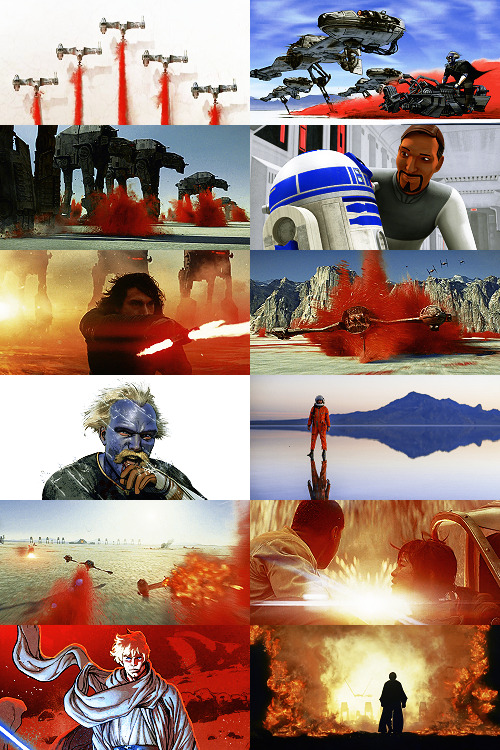
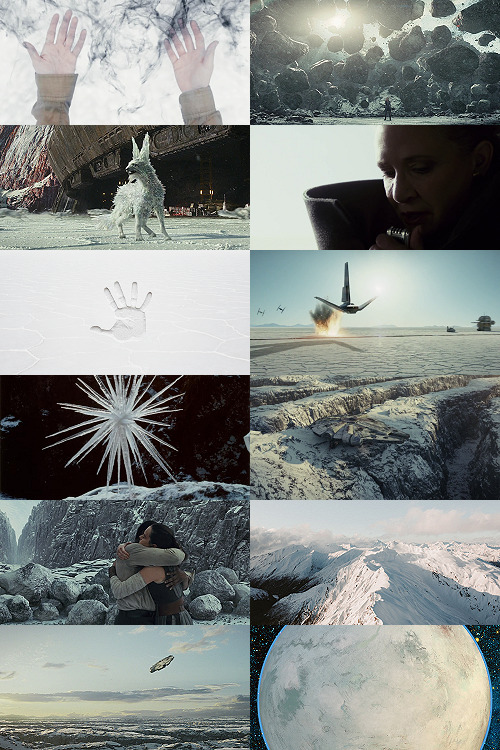
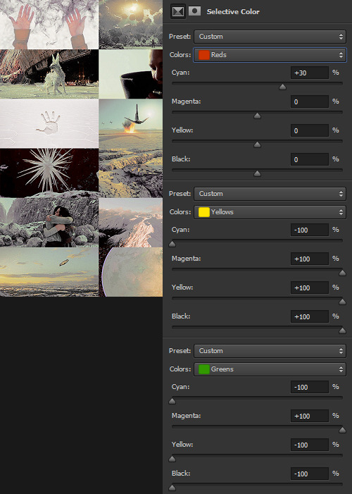
Making A Galaxy Far Far Away: An Aesthetic Photoset Tutorial
Requested by @geleixi (and varying amounts of time ago by @rockett-to-the-purple-moon, @thenameisgreed, @pizzaplanethq, and probably others who sent nice messages that I went “Oh, what a nice message this means so much I LOVE IT SO MUCH I’M TOO ANXIOUS TO ANSWER IT WRONG I’ll just do it later” and then promptly NEVER answered it.)
Brainstorming & Photo Collection
Picking a Color Palette
Choosing Images from Collection
Coloring
Textures & Effects
First off: I am not even going to remotely pretend like graphic design is a Thing I Am Better At Than Anyone Else, because that would be patently false and ridiculous, but I also get a fair number of Asks about making photosets/aesthetic posts, so here we are. I’m planning to do a separate one, maybe, for how I do the Cartoon Girls All Grown Up and Nancy Drew Dream Games series, because the “brainstorming and photo collection” part is so different that it inherently affects the rest of the process.
BUT I also feel like I don’t see a ton of tutorials that go through the brainstorming/finding images part of making aesthetics, and I tend to think of my Graphics Style(TM) as “DEEPLY Uninterested in washed-out faux sepiatone grimdark Tumblr Coloring?? + Not Good Enough At Masks To Do Negative Space Well,” which might be some people’s level of ~graphics design passion(TM)~ too, so. That’s the ride for which this ticket has been bought.

Brainstorming & Photo Collection
Obviously, the specifics of this are totally different for every aesthetic, but all of the GFFA/swworlds start from the same seed: Star Wars Aesthetic.
Star Wars itself has a very particular Lookque, imo: it’s not quite retrofuture, it’s not quite dirtpunk, it’s not quite scifi, even. There are the insanely sumptuous (and hella culturally appropriative) queens of Naboo and the ramshackle toppled AT-AT where Rey lives on Jakku and the not-even-subtle-at-all-jfc Nazi inspiration of the Empire and First Order and the straight-up millennial Tumblr witch Goffik look of the Dathomir Witches and Zabrak siths and the blue, blue water of Scarif. There “isn’t” a unifying aesthetic through Star Wars, and yet, as Gareth Edwards said, there’s a LOOK and FEEL to Star Wars: if you go a little too far to the left or right, it isn’t Star Wars anymore.*
*That said, this tutorial talks about Crait, which was invented by Rilo Jon, who went both too far left and too far right but mostly... too far-right. BA DUM BUM! Anyway.
So part of what makes Star Wars Look Like Star Wars, to me, is that it ISN’T ever Too Scifi. There’s a realism in all of Star Wars’ disparate planets -- their looks, anyway; like, talking about how Crait, in this case, makes NO ecological sense as a planet AT ALL is another post entirely. (IT MAKES NO SENSE.) It’s different from, like, Doctor Who, which I think revels in its “we can make these aliens and planets look like WHATEVER” more? Star Wars tends to be very like... “we want to use practical sets and effects.” Even for planets that only appear thus far in Clone Wars and Rebels? So it’s definitely part of the intention of SW’s Aesthetic.
ALL OF THAT TO SAY, my first step with each planet is to figure out the best way to represent it using as much real-world photography as I can and how best to channel the ~spirit of Star Wars~ in the graphic. Sometimes I fail miserably. CURSE YOU, NAR SHADAA. But most of the time it helps provide a Framework for the rest of the brainstorming and photo collection.
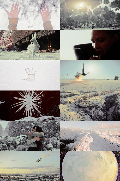
SO. FOR CRAIT. (For another example/totally different look and process, I wrote up a little about Haruun Kal on its post here.)
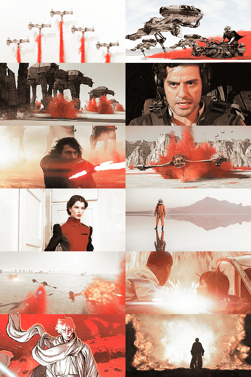
Crait has the definite benefit of appearing in one of the movies, so the first part of photo collection was to screencap TLJ. I took the caps using the 1080p digital release at a 20-frame frequency, so even once I deleted the aps that weren’t of Crait (moving the Canto Bight frames into a folder for Cantonica, of course!), I had like... 1500 images just from TLJ to start the brainstorming and collection with.
First, I trimmed down those ~1500 screencaps to 168 caps that were distinct enough from one another to give me a sense of “what happens” in the scene and, more than that, “What Crait Looks Like.” Then, because there’s additional canon material of Crait besides TLJ, I saved the unlettered images of “Star Wars: The Storms of Crait” from comic penciller Mike Mayhew’s blog @mikemayhew -- if those hadn’t been available, which they’re usually not for planets that appear in the comics (THANX MIKE MAYHEW!!!), I would have taken and cropped panels from the comic at both 100% and screen-fit/60% sizing that had utility for a graphic about planet scenery and not character.
THEN, I looked at Wookieepedia and MSW. Crait was based on the Salar de Uyuni salt flats in Bolivia, so I Google image-searched that. There weren’t actually very many images of the Salar de Uyuni salt flats that I super loved, so I ended up saving images of other salt flats as well, particularly the Bonneville Salt Flats in Utah.
THEN there was the issue of the red minerals, which were entirely fictional and not part of any real-world salt flat. BUT, there IS real red sand... so I saved some images of red-sand dunes (mostly Mui Ne in Vietnam). I also went through my Star Wars Stock Folder to find images of crystal caves and mines that I’d either saved for other planets in the past, but didn’t end up using, OR just saved because there are so fucking many crystal-based planets in SW.
Each of my big graphics series has its own Stock Folder for unorganized images that just strike the right Vibe~ and might be useful someday, in addition to every planet (or cartoon girl, or US state for the Nancy Drews, etc) having its own folder for specific/organized image collection.
My Star Wars Stock Folder:
So there were already a lot of crystals, star destroyers, blasters, and bunkers that were actually in snow but whatever it was white and crystalline, to work with. I added some workable Crait-like images from the stock folder to Crait’s collection, too.
AND THEN, finally, I LOVE the vulptices, so I searched for (and found!) some of the concept art and 3D modeling images from ILM, and I put those in the folder, as well.
I also saved this, hoping I’d be able to make it work because it’s SO CUTE, but I couldn’t, but here LOOK HOW CUTE:
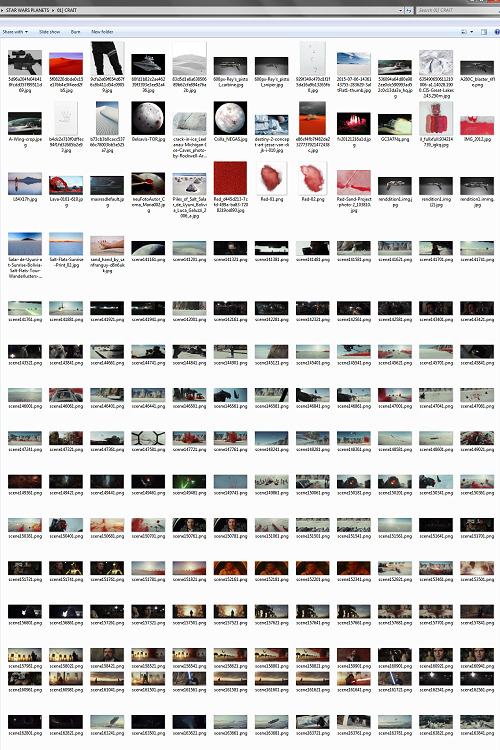
And then, lest I stay in the image-collection rabbithole forever, I said, “OK, that’s enough.” I ended up starting to actually MAKE the Crait graphic from a collection of 272 images:
Picking a Color Palette
Obviously, the dominant colors of Crait are red and white, so the aesthetic had to be based in red and white. My first instinct was to make a duotone aesthetic using only red, white, and black/grayscale. Something like this:
Which... I don’t hate, or even dislike. It’s definitely more in line with popular Tumblr aesthetic, uh, aesthetics. But I usually don’t like landing on that kind of coloring because it ALWAYS, ALWAYS whitewashes people of color (and jeez, it even whitewashes white people -- look at the model in the fourth frame down on the left, or Luke in the bottom-left.) The “vibrance -100 + Selective Color Red>Red + 100″ always ends up doing the above example to, in this case, Poe: turning him into a licorice man.
So then trying to correct THAT either whitewashes the FUCK out of him/people in general:
(Toning down the red)
Or introducing other colors back into the graphic as a whole:
(Upped yellow and cyan.)
So I nixed that coloring before I even started. (These examples were made after the fact purely to serve as examples.)
I went back to the drawing board, AKA the Crait image folder.
But looking at the collected images -- especially the screencaps and the panels from the Storms of Crait comic -- I was struck by how much Crait also incorporates yellow and blue. (Note that I really, really wanted to try to include Trusk Berinato and Bail Organa... but we’ll talk through why that didn’t work out.) I LOVE @droo216‘s bright, almost jewel-tone edits which I 100% know I don’t have either the patience or skill to make, but I liked the idea of trying to make Crait’s aesthetics in a primary colors + black/white scheme.
Which I actually really like! (Again, made post-facto as an example.) But again, red vibrance DiD tHe tHiNG!!! to Poe and ESPECIALLY to Finn and Bail.
So a high-vibrance look emphasizing bright colors was a no-go. Besides, going back to the source material: high-vibrance and high-energy are the opposite of what the planet of Crait is about. It’s a dying husk of a planet, being killed slowly by its own ecology as the salt in its crust dries out everything beneath it, sucking up water until everything either evolves into living crystal-dogs or goes extinct (thank u Rilo for not including dune-worms, this is the one thing you did right). Crait wouldn’t be vibrant.
But... aha! It’s also distinctly layered. I’ve done three-panel swworlds aesthetics before, so I decided to do that for Crait, too: first a mostly-white graphic like the salt crust, then white+red+yellows in the middle, and finally a dark layer of almost entirely red like the mineral mines.
Choosing Images from Collection
With the color palette and “feel” decided (dying at the surface, then growing richer and redder and angrier as the photoset moved downwards), I was able to choose images.
NEKKID PHOTOSETS SANS ANY EDITING! XXX! But for reference to see both cropping and for reference on choosing.
TOP IMAGE, MOSTLY WHITE:
L-R, TOP-BOTTOM:
I saved this image from my dash at some point and have been tossing it into planets’ folders every time there’s a white-based color scheme. It almost got used for Ilum, but at the last second wasn’t. I felt like it fit the coalescence of Rey’s Force strength here, and also the kind of “last wisps” of Luke Skywalker, well.
“Lifting rocks.”
I’m actually still not 100% whether I should have landed on a vulptex here, but dammit they were one of the only good parts of TLJ. This vulpie baby is on the salt surface, looking out at the blinding sun, so she seemed like a good fit compared to the other caps of vulptices -- the ones loping on the canyon surface at the end were all very motion-blurry.
Carrie in that gorgeous coat in homage to Harrison in Blade Runner makes me weepy, and those were some of the most beautiful shots in the movie. This one had a good balance of white and black, so it could be placed around any level “busyness” in the surrounding photos. Especially since I suckkkk at negative space.
I saved this image to the Crait folder like the day it was announced as a planet in the upcoming Episode VIII and given its first peek. I love it!
Hi, salt flats, and also Star Wars spaceships. I actually had a lot of trouble with the level of green in this image, but the ~essence of Star Wars is PEW PEW SPACE BATTLE, so.
This is an ice sculpture in real life! It reminds me of the vulptices and is cool as hell.
The Millennium Falcon! I toyed with different caps that showed it in actual battle, but the blue would have been hardest to work with in this photoset compared to the others below. Plus, now I can save a bunch of Falcon-in-flight pictures for use on planets that only appear in the novels or comics.
NECESSARY, ICONIC, PERFECT, THE MOST IMPORTANT THING THAT HAPPENED ON CRAIT.
Fine, this is a snowy mountain and not a salt flat, but I liked the striations in color and gentle variations in grayscale.
This was the palest/least Bright Blue sky of all of the Falcon screencaps from Crait.
I tried a few screencaps of Crait from TLJ, but I landed on using the full-panel image of Crait from Storms of Crait. It has the cleanest definition of the “planet from space” options we have of Crait.
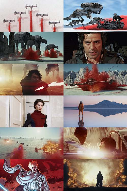
This is a promo image, not a screencap. It’s a much crisper view of the ski-speeders. I love the vivid color difference.
The blue-and-yellow additions to the color scheme didn’t work out, but I did still want to include Storms of Crait. This shot had a little more blue in it than I would have liked, but it has Leia in a ski-speeder back before the salt caused them to rust out, too!
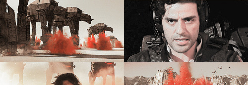
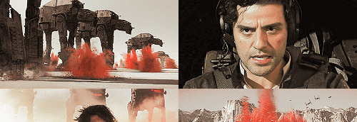
Remember when it seemed like the Crait battle’s new AT-ATs would be super cool and like, do more than stand there menacingly behind Kyle? Me, too.
POE! DAMERON! HAS! NEVER! DONE! ANYTHING! WRONG! IN! HIS! LIFE!
KYLE! HAS! ONLY! EVER! DONE! WRONG! IN! HIS! LIFE!
I tried out like five different tiny-frame-difference screencaps of the ski-speeders kicking up red minerals, and I decided that this one, with a clearly defined spray of red surrounded by white and bluish sky, suited the placement here best: there’s red in the panel to its left as the main color, but minimal red in the above- and below panels.
I wanted to include actual Connix, but she’s wearing yellow and only ever shows up surrounded in brownish-black darkness, so here, have one of my standard Fashion Rebel Officer Stand-Ins instead -- the red and white obviously played a part in picking this shot over the rest of the options from the photoshoot.
I LOVE this slightly mystical shot of a Rebel pilot slash astronaut on a rain-slicked salt flat. How perfect?!
As we get down to the bottom of this middle panel, I wanted to include more destruction and more presence of yellow and orange. This image has a good balance of “negative space” in the sky and salt flat, and then the explosion of Nodin Chavri’s ski-speeder (I think?) ties in well to...
Finn and Rose, post-collision. I wanted to include Rose, and the almost JJ Abrams-esque white starburst in the center of this cap is a good balance to the spray of red around a ski-speeder two panels above.
Luke on Crait in the Rebel Alliance...
And Luke on Crait in the Resistance.
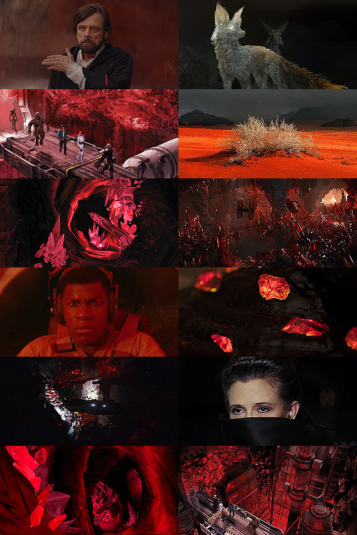
This was a kind of “????” moment of characterization -- and general direction -- in TLJ, but Luke surrounded by red as an old man would fall right below Luke as a young man, on his first mission after the Battle of Yavin, when the three graphics were aligned.
I wanted to use the straight-up concept art of the vulptex, but the black around it was TOO black, if that makes sense? So I layered it over a darkened cap of the vulptex who leads Poe to Rey and freedom. This is one of the very rare shots that I use an edited base image.
Han and Chewie! I had to include Han and Chewie. The unlettered panels from Storms of Crait that show the mineral mines are stunning; I highly recommend heading over to Mike Mayhew’s page and taking a look. The detailing of the crystals is something I wish I could have captured better at this scale.
This is one of the red-sand dunes I saved! Crait doesn’t have any living vegetation, but the drama of the black, stormy sky and the red sand drew me in here.
Some CGI crystal caves... I saved these ages ago for use on Ilum or Dantooine, I think? (Same with what will be #11 below.) I don’t love using CGI, but I think the crags on these crystal growths suited the images from canon!Crait.
A screencap of the TIEs chasing the Falcon through the mines. This was honestly one of the most visually stunning parts of TLJ, and it’s so split-second that most people missed it AND most of the screencaps have a lot of motion-blur. I’m really pleased that this one came out so crisp, and I knew I had to use it as an “anchor image.”
Finn, full-on, in red. I’m realizing belatedly as I write up this tutorial that I showed Poe face-on and Finn face-on, but I stupidly chose to show Rey only from a distance. I AM A FOOL! A FOOL!
Aren’t these resin crystals amazing? The full-size image actually shows them surrounded by snow, by the tree-stump they’re on wouldn’t fit Crait, so I cropped in closer on this image than I did for most of the Crait set.
Another shot of the Falcon in the mines. I like the way the framing of white sunlight here echoes...
Leia’s face, a bright spot in the dark, watching out over the salt flat. :(
(See #5 above!)
And again, the homage of Carrie’s coat looking like Harrison in Blade Runner made me sad, so I THREW IN ANOTHER HAN AND CHEWIE. The mining equipment here shows more detail than in the screencaps above, too.
Coloring
Like I mentioned waaaay above, in the intro: I never use set colorings for photosets. (Except Halloween Spookstravaganza, because jeez so many of those screencaps are like 240p VHS rips and it’s just not worth putting in Effort(TM).)
That said, I think one thing that I do differently than I see in most tutorials is this first step:
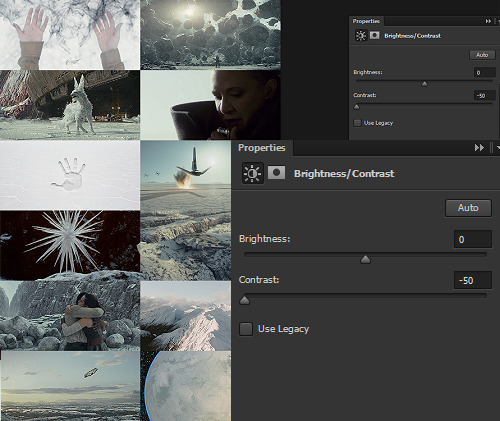
I ALWAYS start Aesthetic photosets by arranging the images and then *BRINGING THE CONTRAST ALL THE WAY DOWN.* This is especially helpful on photosets that include a mix of real photography, CGI screencaps or art, and/or comics panels, but it’s also just useful in general for photosets that use images from a wide variety of places.
The reason I do this is because it helps to “smooth out” the differences in light source, color balance, etc., that are part of the raw base images. For this set, it also helps to define the variations in color between very similar shades: the craters on Crait, the wisps of clouds, etc.
In some cases, I’ll do two layers of Contrast -50. For Crait, I did a later of Contrast -50 and then a layer of Contrast -15.
Then, I Select All > Copy Merged > [Turn Off Contrast Layer View] > Paste As New Layer.
Now, the “smoothed” version is placed as a layer above the raw layer. From there, it depends on the look of the photoset what I do -- sometimes, I leave it as-is, but I almost always lower the opacity on the “smoothed” layer until the level of contrast and balance looks consistent across the whole photoset. For Crait, I ended up with the “smoothed” layer set to Lighten 100%.
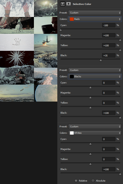
Selective Color time. There are two ways I usually start this: either one color at a time -- especially for Aesthetics like Pheryon that will essentially be monochromatic -- or, in this case, I looked at the balance of the three main colors that would carry through the entire Aesthetic.
REDS
Cyan -100 (This brightens the vivacity of the red.)
Magenta +100
Yellow +100
Black +35
BLACKS
Cyan 0
Magenta 0
Yellow 0
Black +100
WHITES
Cyan 0
Magenta 0
Yellow 0
Black +100 -- This is NOT my usual setting for adjusting white, and since white is one of the main colors in the Crait Aesthetic, it might seem counterintuitive to make the white darker instead of brighter. However, this will help to make next step of color adjustments “take” on the white/whitish surfaces a lot more easily, and it will also help to balance out the bluish sky areas with the white background areas. (I’m not sure this explanation makes sense? But it’s what I did.)
Then, I Select All > Copy Merged > [Turn Off Selective Color Layer View] > Paste As New Layer > Either COLOR or HUE 100%.
“Hue” is more effective for smaller, more incremental color adjustments -- for BIG SWEEPING COLOR CHANGES, “Color” tends to work better. But it totally depends on the photoset! Try both, and see which you like better.
I feel like this is kind of the step where my process of making aesthetics stops being any different from most tutorials -- but this has been HUGELY helpful for me, a non-graphic designer-person, to be able to create a kind of “base image” that has very similar color values, brightness/contrast, and vibrance.
Sometimes this step helps to create really extreme color differences, such as in the Raydonia Aesthetic, and other times, I use it to just adjust one or two color-values so that there’s more consistency in, say, shades of yellow or shades of green, as in the Takodana Aesthetic, for which I just wanted to create a more cohesive palette of green in particular... it started out with a zillion greens, and I wanted to bring it all together into one “aesthetic.”
I think this step, and the reasoning behind it, are why SO MANY PSDs for aesthetics rely on a layer of either gray or sepiatone-ish set to Darken or Multiply as one of their key layers. But I’m just not about the grimdark life, and if I’m making an AESTHETIC OF A THING, I want the aesthetic POST to actually HAVE THAT THING’S AESTHETICS, you know?! I want to use the colors of the thing that I’m saying is meant to evoke the visuals of the thing!
Anyway. Now you have your BASE IMAGE. Often I’ll Merge All here, just for my own sanity.
Then I go in and make any other other adjustments on a “coloring” level that I think will help with the “vibe” I’m going for! For this Crait set, I definitely needed to bring the brightness up so that the white and red popped. However, bringing up the brightness also swallowed a lot of the detail in the white surfaces -- especially the planetary surface of Crait in that bottom-right space -- so I decreased the contrast again.
Brightness +70
Contrast -50
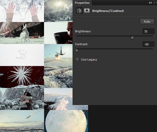
And then I go in for the macro-level adjustments of color using any mix of Selective Color, Hue/Saturation, and Color Balance that works. For Crait, that was more Selective Color, because since I had decided on my color palette, and it sadly did not include blue, I needed to start by taking out as much of the blue, cyan, and green that I could.
And I’m ngl, I told myself the WHOLE FREAKING TIME I was making this photoset that I needed NOT TO DELETE THE PSD RIGHT AWAY LIKE I USUALLY DO so that I could write up all the settings for this step.
But it was a reflex. And I deleted the PSD right away like I always do.
So suffice to say, I just futzed with the levels one at a time until the RED was brought up a little, the YELLOW was brought up a lot, and everything else was brought down and/or hue-adjusted to sliiiide into being yellow, red, or black/white.
Another Select All > Copy Merged > [Turn Off Selective Color Layer View] > Paste As New Layer > Either COLOR or HUE 100%. I think I also DUPLICATED this layer and set it to SOFT LIGHT 50% and then duplicated it again to SCREEN 50%.

I could have left it like this, but I am me and I am nothing if not Extra All The Time, so I opened up my folder of light textures (and other textures) and decided to Go To Town.
Textures & Effects
For your Aesthetic-Making Purposes, here are the three I used on the Crait set:
The first two were set to Screen 100%, and the bottom one was set to Burn 15%. I layered them in this order.
It still looked incomplete, so I decided to use this POWDR Element from Creative Market, which is actually like 5400x5400 pixels and which I’m not going to share here because I paid for it and don’t want CM to revoke my access or whatever, but it looks like this, only HUGE:
I also set this element to Burn 15% and moved it around the image until it looked the way I wanted it.
Textures and effects aren’t In on Tumblr anymore, but I really like using them -- they add, not to be cheesier than usual, texture to an aesthetic post, and I think that they can also help less-skilled graphic-makers like me to hide any myriad of imperfections in coloring, sharpening, whatever. I’m an especially big fan of this noise element (set as a pattern on Screen), so I’m going to share it here even though I didn’t use it on the Crait set:

Most of my textures have been saved over the last literally twenty years since I started making fannish graphics and photosets, largely from defunct old LiveJournals, but there also used to some great sources for them on Tumblr and still are live sources for them on DeviantArt. Just search around and you’ll find what you want! :)

In conclusion, I think it’s infinitely more fun NOT to rely on premade PSDs or standardized Settings, but I also recognize and fully respect that if I made graphics differently, I would probably get easily 5-10x more notes on each post than I do. But I make graphics the way that’s fun for me, and I just try to learn a little something from every set I make. The GFFA Planets/swworlds in particular have been something that I started, originally, because I wanted to catch up and learn about Star Wars planets that I felt like I was missing because I don’t have any fannish history with the Old EU, and I wanted to learn about them in a way that helped me feel like I was engaging with the SW source material AND making the enormity of the canon more accessible to other newish or casualish fans, like I was two years ago when I started this aesthetic series. I like making aesthetics that are genuinely inspired by the aesthetic of the thing that I’m calling it an aesthetic of, so even when it ends up just looking like rainbow barf (CURSE YOU, NAR SHADDAA!!!) I’m having fun.
THAT SAID, here’s how the time breakdown for the Crait set works out:
TOTAL TIME INCLUDING IMAGE COLLECTION AND SCREENCAPPING: Est. 20 hours.
COLORING AND ACTUAL GRAPHIC-MAKING PART: 7 hours.
WRITING UP THIS TUTORIAL: 5 hours.
So, um, if you are so inclined, here is my Ko-Fi link. I post at least two graphic sets every week, sometimes up to 25 (usually during October).
I hope this was helpful at all! I had a good time thinking about my process in-depth like this, and I would love to get tagged in any aesthetics you might try making using a similar method! :)
57 notes
·
View notes
Last Seen Blogs
jujutshoebby
Thee Smut Artist

shiftingconfessions
Shifting confessions
bunnysfurry
Bunny’s Furry

ctown135
Untitled

quadrantmodelquotes
Quadrant Model Quotes from 2013 Lectures