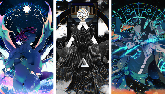
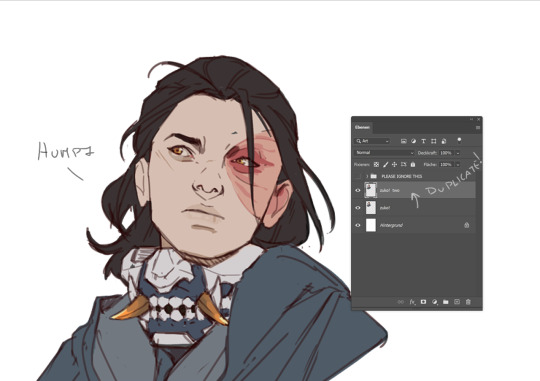
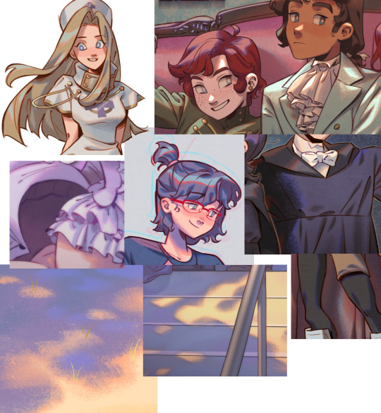
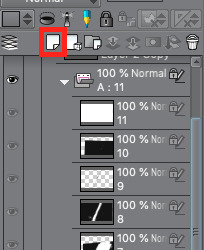
#this appeared on my csp canvas
Text
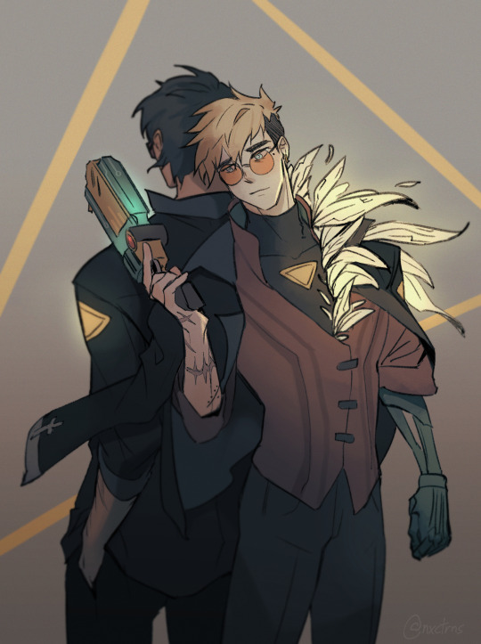
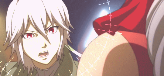
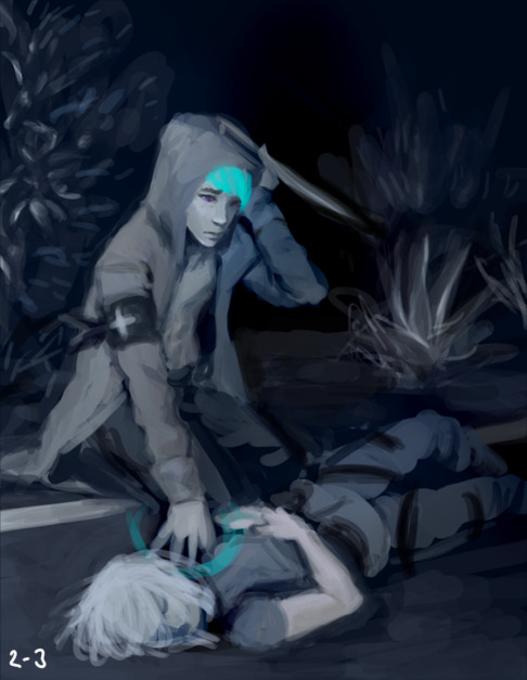
....So uh. Transistor au vashwood anyone?
#trigun#trigun stampede#vash the stampede#nicholas d wolfwood#vashwood#I've had like one thought about this au and how well it would fit these two and then i forgot about it for a few days#until i was watching a video that used transistor's ost#after that it was a blur and before i knew it#this appeared on my csp canvas
2K notes
·
View notes
Text
Skins & Accents: Never be unpleasantly surprised by resizing ever again
I'm making this as a separate post in addition to a reblog reply, in the hopes more people will see it.
So, you've worked on a skin and you've poured your heart into it, worked at a high resolution, and rendered all the nice details... and then you resize to 350 x 350 px and half your details disappear, others look pixellated, and some things that looked great at full size are now way too cluttered.
Wouldn't it be nice to have a way to avoid this pain entirely, all while working at full size and never having to zoom out while you're in the flow to check on the details?
Well, I've got the hottest tip for you.
Start by upscaling your canvas to 2800 x 2800 px. When zoomed out to 12.5%, the canvas will appear as 350 x 350 px. You can also choose other resolutions, the important bit is that one of those resolutions results in an image appearing as 350 x 350 px when zoomed out at one of the default percentages (50%, 33%, 25%, 12.5% etc). We are not going to zoom out on the working file, however.
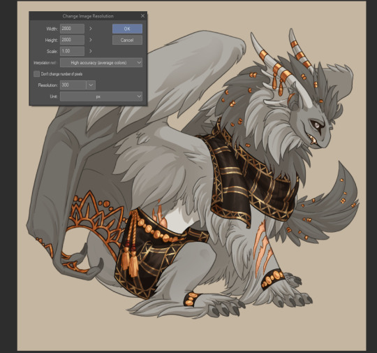
(This is my accent Thought we had a deal, which you can find in my accent shop)
Then it's magic time. This works in Clip Studio Paint and Photoshop, I don't know about other programs.
Window > Canvas > New Window in CSP:

Or Window > Arrange > New Window for [file name] in Photoshop:

This will open the exact same image in a different tab. Click the tab, hold to drag and it will float above your working image. Zoom out to 12.5%, grab the bottom right corner (it will appear where the green arrow is) to scale down the excess frame:
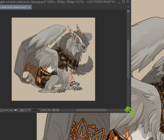
And voila, you will have a live version of your accent at its print size, regardless of how much you zoom in in the larger version:
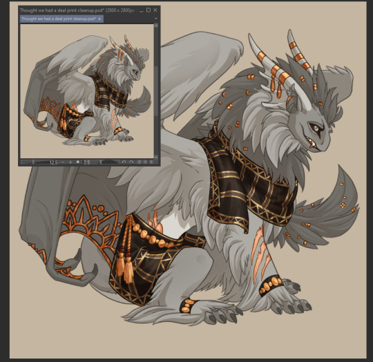

Yes, that's right, live version, it will update as you draw! You can tell right away if a detail you add will show up at print size or not, if it will be readable or not.
Never be surprised by resizing again!
432 notes
·
View notes
Note
Hey Tobias, aside from your incredible artworks themselves, I also absolutely love the detailed abstract backgrounds you sometimes put on portraits and I've been wanting to try my hand at something in the same vain. I was considering trying Illustrator for those, since I normally use CSP and while I love it, it kinda feels pretty horrible at anything geometrical and shape-y, so I was also wondering what software you use for them if you'd like to share!
oH you mean like the geometric shapes in these?
that is 1000% Clip Studio Paint. I use it for, quite literally, all of my work. Pixel art, illustrations, animations - it's all Clip.
The upper backgrounds of those pieces are done using the Symmetrical Ruler and Shape tools, as well as maybe a brush or two for flair.
The Symmetrical Ruler is under the Ruler tool:
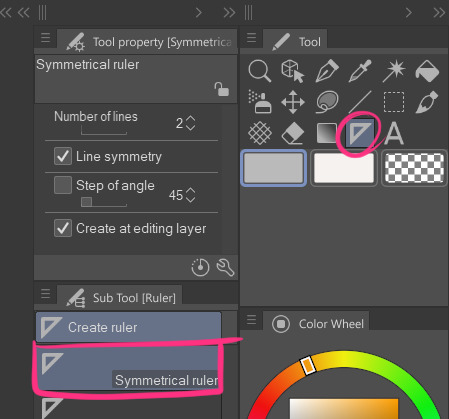
it lets you draw symmetrically on the canvas like this [the purple line appears so you know where your mirrors meet]
note: sometimes your brush needs to have snapping enabled to work with a ruler tool - especially if you're using a fancy custom brush from the assets shop.
you can fix this by going into your brush's settings [clicking the little wrench on your selected brush] and then toggle on Enable Snapping under the Corrections section:

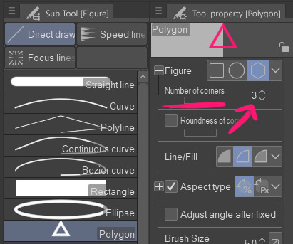
Regarding the Shapes tool,
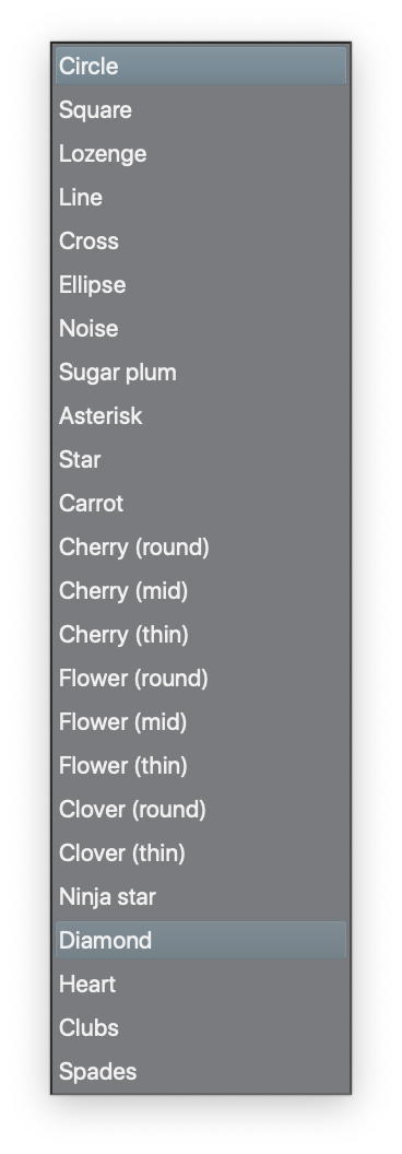
It's technically called the Figure tool but I'm calling it the Shapes tool. For those unfamiliar, Clip doesn't come with preset shapes beyond your standard lines, rectangles, and circles; BUT you can easily create your own triangles and hexagons and whatnot with the Polygon subtool.
Change the number of corners to that of the shape you want and tada! SHAPE. The number of corners can go up to 32 - at which point you're essentially just making a vaguely chunky circle so I mean, have fun.
I'm gonna pause here because this post is already getting a bit long, but if there's somethin specific you want me to elaborate on feel free to ask.
237 notes
·
View notes
Note
How do you get your drawings to be high quality? Whenever I post art the quality is SO bad 💔
uhm... sorry this is got long. for some reason you activated my work mode. i don't have a constumer service voice but i have like an explenation mode for clients so... uhm. here is way more information that you asked for. my apologies...
Resolution is what determines the sharpness of the artwork. The low-resolution illustration will appear pixelated when scaled in large sizes. this is why it is recommended to work on a digital canvas with a resolution of at least 300 dpi when you work. (i prefer 400dpi)
dpi are Dots Per Inch. dots just being a different name for pixels. the more pixels are contained in an inch the smoother lines and gradients are. an indication of higher quality. but, the device you are working on has to use up most of its ram/power to calculate the preview on the screen. so higher quality demands more capacity from your device but also from websites that display your artwork. Soo...
I have two files.
One on 400 dpi is way larger for me for smooth comfortable drawing.
and the second drawing is sized down to 150dpi to accommodate the recommended resolution of the website I want to post the image.
luckily for us, most social media sites have a similar resolution.
Tumblr's Dashboard images have a minimum size of 500 x 750 pixels, a maximum expanded the size of 2048 x 3072 pixels, and a recommended size of 1280 x 1920 pixels for a 2:3 aspect ratio.
I use a with of 1280. the high depends on the drawing
It's way easier and recommended to size images down rather than up.
sizing artwork up would put them through an interlacing process, which means that the graphics program of your choice would calculate the average between two pixes and add it in between them. It adds pixels to make the image larger. easy answer it blurs your image.
it isn't the end of the world if you have to size up the image a tiny bit.
I kind of have to do a bit all the time for work. and most of the time it's fine! it depends on your art style and how forgiving it can be.
It's also a difference if you post images in a JEPG or PNG.
uhm... without going into much detail... take PNG just trust me.
now... a tiny little last trick out of my sleeve.
if you... use photoshop. and you want some extra sharpness.
you can sharpen your images with the high pass filter.
Duplicate your artwork
Filter > other >highpass

As soon you select High Pass, your image will turn grey

It works by filling the entire image with flat, neutral grey. It then looks for edges in the image and highlights them by making the light side of the edge lighter and the dark side darker.
Don't overdo it. keep the contrast low. a radius of 1,5px is enough most of the time!
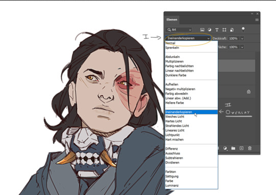
Click okay to exit the menu and set the layer on overlay.
ta-da! it is sharp and crisp!!!
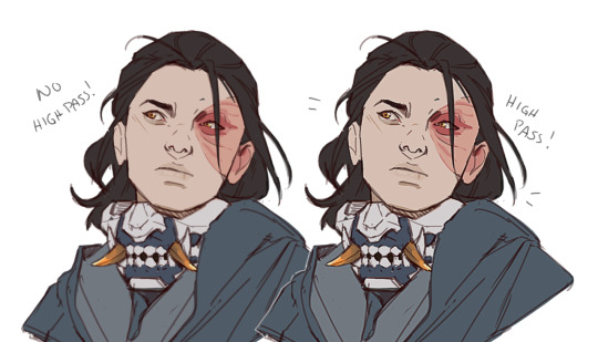
It's all a trick!!! vary subtle... i know but ehh i like it
I am sorry I don't know if other programs also have this option. I know CSP has a sharpening filter. but... you can keep images crisp by keeping resolution and dpi in mind too.
uhm... well so... -hides-
#chip!ask#chip!talks#i maybe overdid it here#but i ended wrtiting it and now i just... eh. i don't want to delate it... sorry!#zuko
1K notes
·
View notes
Note
I think you've gotten a few questions about your process ( apologies! ) But I saw you use CSP to make these gifs - do you cut up the frames from your recordings to do that? Is there a particular way you go about that? I'm interested in making gifs and was a bit curious 🤧♥️ but if you cannot share such secrets I understand!
All right, this finally convinced me to make a guide and I hope this was helpful!! Feel free to send in any questions.
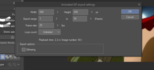
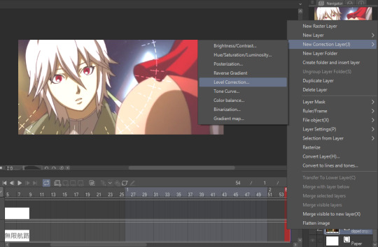
First off, PRO has a frame limit of 24 so your gifs will run very short. EX has no frame limit and right now there's a free trial for users until the 24th.
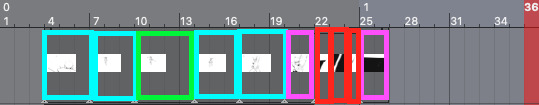
Make a new canvas that's an Animation. For my gifs, I use a 540 width and adjust the height later. Go to Window and turn on the Timeline so you can see all the cells.
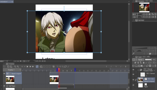
I trim my game recordings into short clips of what I want to gif. Then I insert them like this as MP4 files:

The red line is the current frame you're looking at. The blue lines mark the gif duration at whatever starting and ending frames you choose.
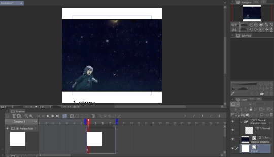
Whatever is inside the blue box will appear as the gif. Personally, I don't like using this and end up fixing the canvas size later. But let's get to actually making our gif first.
I like to make my gifs 30 FPS or less and I'll be changing it to 25 FPS from here:
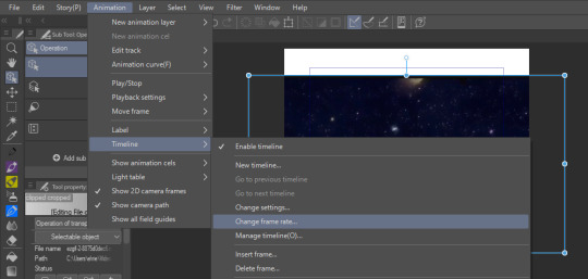
Click on your clip on the Timeline. For this example, I didn't trim my clip exactly where I want it to start so I'll drag it to left where the frame number turns negative and I end up going 4 frames back (or you can just move the first blue line 4 frames ahead):
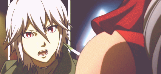
Then I drag the second blue line to where I want my gif to end. Since I want to make the height shorter, I go to Change Canvas Size and fix the dimensions (you can still resize and adjust your clip around too):
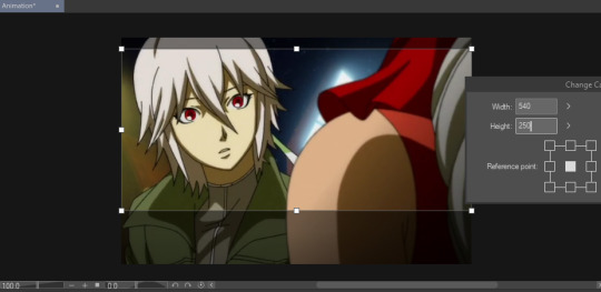
The blue box is gone and we can just use the canvas itself to fit the gif. I ended up adjusting it again and now we just need to save it!
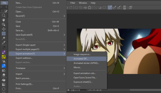
I'm already fine with everything so I won't change the numbers. Make sure the Loop Count is set to Unlimited:
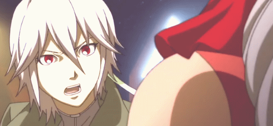
Choose where to save it and wait for it to export. Let's take a look at our finished gif:

Notice how pixelated some of the areas are? That's because we didn't export it with Dithering on so let's redo it:

Look at how much better it looks! Make sure to turn this on or it can make your gifs look way worse.

And that's the basics! If you want to put a color filter, make a new layer and put it above your clip. I use the bucket tool with the color i want and change the opacity and layer type:

And here it is! If your color filter only showed up partway on the gif, that means your layer wasn't present on all your frames so go to the Timeline and drag it to cover the entire length.
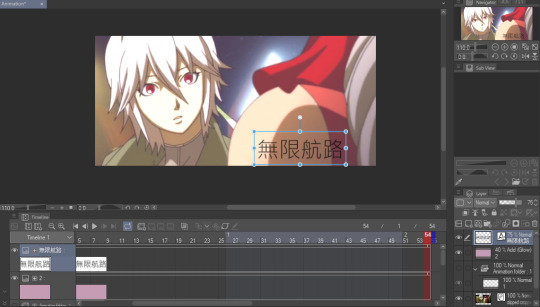
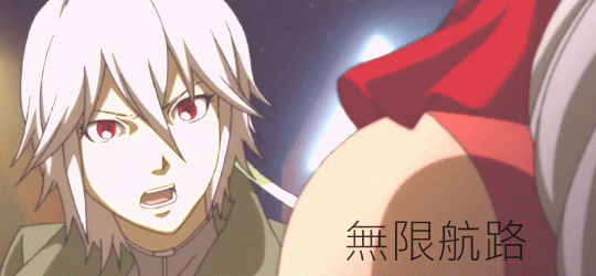
If you want to add a watermark or words, start making a text above your color filter and you can also change the opacity:
You can also add images on the gif with your brushes. Make a new layer above the color filter and apply them:
If you want to fix the colors more, right click your clip layer and it'll make a new layer above with the adjusted colors:

You can also do the 3D white bar effect. I make a new folder above all my layers with a bunch of colored lines. You'll need to erase whatever shows in front of the object and I decrease the opacity to make it easier, then change the color to white. You can adjust which frames each bar will appear by dragging the ends of the Timeline length (arrows will appear). As shown below, I was able to use the same line in frames 1-33 before making a new one at frame 24.
With 2 bars:
And that's all I wanted to cover! There's many editing guides that you can also apply to CSP so don't hesitate to try them out. As I mentioned earlier, you should only use CSP to make gifs if you already have it and don't have better programs to use. I hope this guide helped you out :)
44 notes
·
View notes
Note
Oh it was only 3 actually, counting that one animatic on YouTube (that BTW i had no idea was yours! I was pleasantly surprised <3)
And I found it so funny that you have somewhat an idea of who I might be PFFF you can throw the guess, it would be funny if you get it right (don't have to say my name if you don't remember it, you can just go for something you remember NFKDSJ)
also time for an actual question since i'm already here, what program did you used for the animatic? I've always wanted to get into animating but most softwares cost money or are free but really bad so I could use some recommendations 👀
Good to hear there is no imposter lol. I should probably start using the false pfp so people know it’s me but I’m too lazy to change them all 💀 also my guess was right as to who you were but probably mainly because I put on my Aziraphale detective hat and you were the last notification before the ask inbox notification and your icon had a red beanie. We meet once again.
As for the animatic I used procreate for drawing and capecut for composting. Not the most efficient method but I liked it. I ended up segmenting off each camera angle into a different canvas and making any animation for the shot that way. I love capecut because the free version has every editing function you need for an animatic and the watermark only appears as a black screen at the end so it’s so easy to crop out. It’s probably the best free editing software I’ve found. (I also used a screen recording device to record the audio cause even if you buy a song it sometimes doesn’t allow you to put it in the program.)
I honestly recommend procreate if you have a device that supports it. I think it’s still only a 10 dollar onetime purchase. But if you don’t have a device that supports it, I have used things like flip a clip which is free, and the paid version is pretty cheap. I have also dabbled in an app called rough animate, also free (you don’t have to pay for the onion skins) which was also okay. I got frustrated cause of the lack of brush choice but other than that it’s not bad at all. If you can’t pay anything at all I’d recommend this because, unlike flip a clip, you don’t have to pay to unlock the a lot of the really helpful features. Ibis paint also added an animation feature I think so that’s an option. Idk if you need the paid version for it, but I remember only having to watch ads for a minute to unlock all the brushes so maybe it’s the same for the animation feature lol.
If you have a computer set up, I’ve also heard nice things about Krita for animation. It’s free and from what I remember it had a really good timeline set up. I actually tried to use it, but my computer at the time was old and slow and it lagged to much, and then I had a shitty no screen tablet and my hand eye coordination when it came to drawing and writing is quite bad, so it just wasn’t a good set up for me personally. But I know people make it work. I mean, people make this kinda shit in MS paint, if you’re dedicated enough you can technically do it in almost any program (though you may not be able to make it as polished as you’d like.)
Then there is Clip Studio Paint, which does cost money but is way less expensive than like, harmony or adobe. The EX version which gives you a second of free animation per project is a $5 monthly subscription for once device, PC MaC IOS, and the Pro version (which is more expensive) gives you unlimited animation animation access for I believe around 10 -15 dollars a month (still less than most streaming services lol). There’s also a one time purchase version that is $50 dollars, but it goes on sale A LOT for $25! Although I don’t think it gives you more than a second of animation. CSP also has a very long free trial period, for EX it was legit like 3 months. so if you try it out and like it, I’d definitely suggest finding a way to pay for it. It’s actually used in some professional studios in Japan, so if you have any professional aims for your work it’s a good starting platform to get into industry software. However a lot of the nice things CSP offers for animation are not needed in the story boarding/animatic stage, so if that’s as far as you wanna take your animations it maaaaaaay not be worth it unless you love it.
If anyone else has other cheap or free recommendations feel free to add on. I have attempted to make animatics on procreate, rough animate, and flip a clip; all of which I have uncompleted projects on. It just so happens that procreate is what I was using when I finally made an animatic I liked enough to see until completion. Whatever software you do use, just make sure you learn how to use it before attempting a big project. Do some smaller stuff before you try anything big.
Edit to check the comments! We got other good recommendations for computers!
7 notes
·
View notes
Text
Opening csp with my tablet on the other side of the room and just staring at the blank canvas as if what I'm thinking of drawing will just appear up there
2 notes
·
View notes
Note
Hi Alice! I love your work. I notice you have these lovely reds and blues in all of your pieces kind of outlining shading or lighting areas. They really make your work pop! I was wondering if this was a specific technique and if so, could you let me know what it's called or how/when it's used? Thanks and wishing you an incredible new year!
hello!!
I wrote a portion of this for someone else who asked (privately) a month back - tutorial under the cut!!!
OK so when I was discovering artists on the internet for the first time - I found the artist rei (twitter/pixiv) and her work had such a strong influence on me. She draws influences from anime, renaissance, baroque, etc art movements. What's really mesmerizing is the way she uses colour to portray mood and light, and how colours just seamlessly mix into one another, as if the canvas is still wet or that it looks printed on a sort of holographic material. You can see this colour technique a lot among Chinese speaking artists on weibo.
To really make your light values stand out, you can add what Andrew Loomis calls "brilliance" to the edge of your lighting. That's just what Loomis coined it as - I believe it's related to subsurface scattering. You know like when you put your hand against a strong light and you can see the light filter through your fingertips, showing a warm colour? That's subsurface scattering. According to wikipedia it also appears through marble, wax, leaves, milk. I’m not an expert so you can look into this more on your own!
I think you'd have to read the actual page Andrew Loomis explained it in, since in the tweet it's presented without context. I haven't read it. If you're doing more photo/semi-realistic art you'd have to study the technique a lot more hahaha.

It can also happen in "dappled light" - like when you look at the cast shadow of a tree's leaves on the ground. The shadow has a warm light edge.

Since I'm personally not making realistic art, we can exaggerate it a bit, and the placement of the light edge doesn't have to be realistic. I even do it for shadows because why the hell not. It’s art. art is painful as it is. make it fun whenever u can
let’s just upload this image again so we don’t have to keep scrolling up and down. The colour edge depends on the base colour of the object - if the object is predominantly warm, I may add a cool edge (e.g. the blond hair in the top left - Mint Adenade from Tales of Phantasia). If the object is cool, a warm edge will stand out (e.g. the ruffles in the left middle - Alyss from Pandora Hearts). But really - play around with it! The dark robes and the tights on the right have a cool edge around the shadows, but the lapel on the robe has a red edge to illustrate it’s a different material/object.
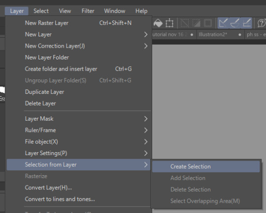
You can do this in a few ways - A. draw it in manually to be selective. This is probably the best way to go about it.
B. Or if you want to save time, you can:
1. select the light/shadow layer (Layer > Selection from layer > Layer selection in CSP, or right click your canvas in PS and hit “Load selection” etc etc).
2. Make a new layer. You can choose to expand the selection by a few pixels or not, it’s a personal preference. (Select > Expand selection in CSP. Select > Modify > Expand or Contract in PS).
3. Colour it your light edge colour.
4. Adjust the opacity if needed. I usually just go around opacity 50% in Normal, I don’t use layer modes, but you can use them if you want.
And that’s that! I find that this technique works well for my personal style because I prefer using more desaturated colours, and it helps bring contrast to the image. The colour edge is cool since I don’t really have to rely on colour adjustments when the artwork is complete nowadays - since the desaturated colours are part of the appeal, but there’s enough contrast with the light edge to give it appeal. depends on your personal workflow though. I don’t think I did this colour light edge a lot in my work until recently. but my 2019 jjba buttons and 2019 ib buttons seem to have some of it too :0

This is a bit different but you can find the colour edge contrast idea a lot in older art. I recommend looking through 1700s-1900s ish art history movements. Florian Aupetit has some free art history resource packs! These are more stylized examples, but you can find it subtly in a lot of other artists’ work. Especially for portraiture like with John Singer Sargent and religious paintings like Alphonse Mucha’s (his painted, non-flat art), or light-focused movements like impressionism. (In case the text isn’t visible: Dean Cornwell on left & middle, Claude Monet on top right, Mead Schaeffer on bottom right)
I’m not the creator of this technique so use it to your heart’s content. Hope this was enjoyable and hopefully a bit educational!
192 notes
·
View notes
Note
Heya Cranberry, Love your Work I've been following your art for quite a while now on DeviantArt and I'm about to start working on comic paneling on an OCT I'm in and im a lil rusty on comic makin, I notice you use CSP as I do but I was curious about the resolution you were using in your SCOCT rounds (im using 600dpi I think and I was unsure if that was an appropriate amount to use at 800x10k) as well as if you were using the G-pen for your line art bc i really like how smooth your linework was!
Hiya! Thank you!
Usually one would use 600dpi for black and white comics for smoother lines and tones (and especially if you later want to print it, bw needs higher than colour for some reason I’ve heard),
but for my SCOCT stuff I have been using 350 or 300 because I want to keep the file size smaller and load/save times fast! It helps me not focus too much on small details when theres no time for that during OCTs, as well.
Another thing to note is that at 600dpi, some of your more textured brushes tend to lose a lot of their textured look!! (And brush sizes become naturally smaller looking on the canvas). It can be weird to get used to compared to other resolutions you may be used to.
To line I have been using this Trisketched ink brush [ https://trisketched.gumroad.com/l/MMuOF ] , and all I’ve changed is just customising the settings a bit to suit the way I hold/move my pen. The lines probably appear smooth because I resize my pages down after they are finished, but close up they are a little rough haha.
As a final note, I did put a lot of effort into my lines, but I cannot recommend always doing that during such short OCT deadlines. I hurt my wrist/shoulders doing that in my last round bc I had a lot of pages. (Luckily the break between rounds, and results to matchups, was long enough for me to recover)
The OCT I’m in doesn’t actually require you to have polished work (i just got carried away), so next time I’m going to try be more sensible and find a balanced way to have readable sketches. Remember to put your health first, even though its easy to get super excited during any projects like this! It isn’t worth inadvertently getting injured!
I hope this answer helped some! Im a little sleepy so hopefully I covered everything haha! And have fun making comics!!!
8 notes
·
View notes
Note
I'm really sorry if this is rude or anything, but I'm curious: you're blind and you do digital art. I'm wondering if you need to set up the program you use in a way that makes it more accessible for you or if you can use it right away. Do you need to change anything in the program's settings or do you need to use a third-party app for accessibility? I'm genuinely curious. Again, I'm really sorry if this is insensitive or rude in any way!
Not a rude question at all! I don't mind answering stuff like this.
What works for me might not work for other blind/visually impaired folks so this isn't necessarily a universal explanation, just what works for me individually with my specific brand of BlindTM.
I use CSP and there honestly wasn't too much I had to adjust with the program to make it more visually accessible. I keep only a few windows open to reduce some visual clutter so that I can focus almost entirely on the canvas, and I have the ones I do keep open laid out in a way similar to medibang, because that's the program I started with and it's what I became used to, but aside from that I mainly just have the UI set to dark mode and that's about it.
The main way I make drawing accessible actually is just having my computer screen zoomed in (you can do this with ZoomText or the built-in zoom capabilities on your computer). When I'm doing the actual drawing I have my screen magnifier toggled off and just zoom in the physical canvas as much or little as needed, but if I'm choosing brushes, adjusting layers, or fiddling with any other sort of settings like that I toggle the magnifier back on so I can actually see what I'm doing.
It really is just a lot of toggling on and off my screen magnifier and zooming in the physical canvas! Plus using high contrast colors/thick lines in my art, especially during lining stages where it matters more that I can see what I'm doing and less that it looks how I want the finished art to appear.
Also I do use the magic wand tool religiously for filling in color. That thing saves my ass so much with staying in my lines and not missing any places where color needs to be filled. Also the clipping tool. Gotta love the clipping tool.
9 notes
·
View notes
Photo


Hey, I was preparing my palette reference files for Iselda and Cornifer, and I realized that maybe some of you would be interested, or at least curious in seeing what I use to keep track of my colors!
So, here’s how they work. I have very small and minimalistic PNG files for every character/element that is bound to appear during more than a few pages, and thanks to CSP, I can open these small files in a secondary window in CSP specially meant for references. That way, I can keep working on my file, and just have my small palettes open on the side, with the eyedropper tool ready to transfer the colors from the reference to the new canvas!
50 notes
·
View notes
Text
My Comic Process!
@dimonds456 wondered how I make my comic, so I decided to make a quick post! This comic is my most recent page of @taffyandstevenuniverse . Enjoy! (I didn’t expect to put in so much detail, sorry!)
1. I start with a white base and decide the panels. Atm, I go 1500 px wide, then however long it needs to be, lengthening and shortening as I want. I add the panel gutters (I like to use black at 30 px, just straight lines. This can be done, at least in CSP, by tapping a point, holding Shift, and tapping the other point. I use turnip Pen, but it works with brushes and more.) Recently, I’ve added “poses”. These just help me figure out panels and quickly determine POV of the panels, like profile, wide view, etc. They’re done in less than 5 seconds each and are mostly for me (and my friends to guess what the page is like, haha!)

2. I sketch. I kinda uhhhh do this differently than people. the only basic shape I usually do is a circle for the head ummm then I do the rest by sight. It just feels more natural for me, especially if I know the character well enough. For more people I’d reccommend more detailed shapes for volume. (I do that for more detailed humans usually.) My brush varies between either Colored Pencil, Rough Pencil for details, or even a pen if I just want to doodle. (Also, yes I use ctrl-Z a lot. I gotta get out of the habit for faster sketching...)

3. I line! The next stages I usually think less and just become productive and listen to music or think. My hands do most of the work. Adfghjkl. I currently use Turnip Pen at 8 to 10 px.

4. During the coloring stage, I make a layer underneath the actual color layer to turn off and on. Usually a bright contrasting color. I do this to see if there’s any holes especially in white areas, which can’t be seen with the white bg. I make the color on a layer underneath the lines using bucket tool with “refer other layers”. Then I fill in holes and details with the pen. I’m sure there’s better ways to do it, but it works for now. (For this page, I actually put Steven and taffy’s colors on different layers, because Steven’s going to be shaded, but not Taffy.)
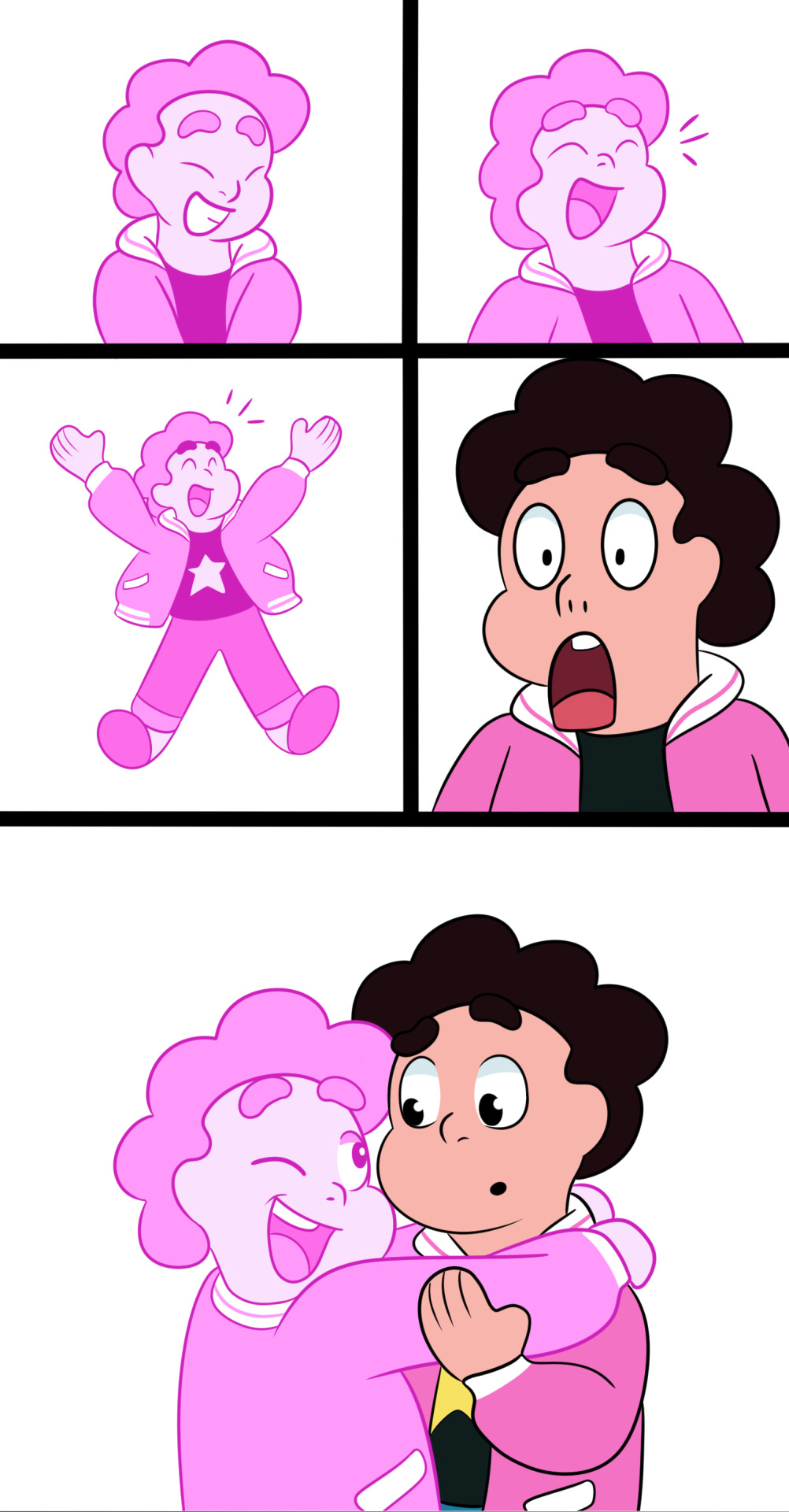
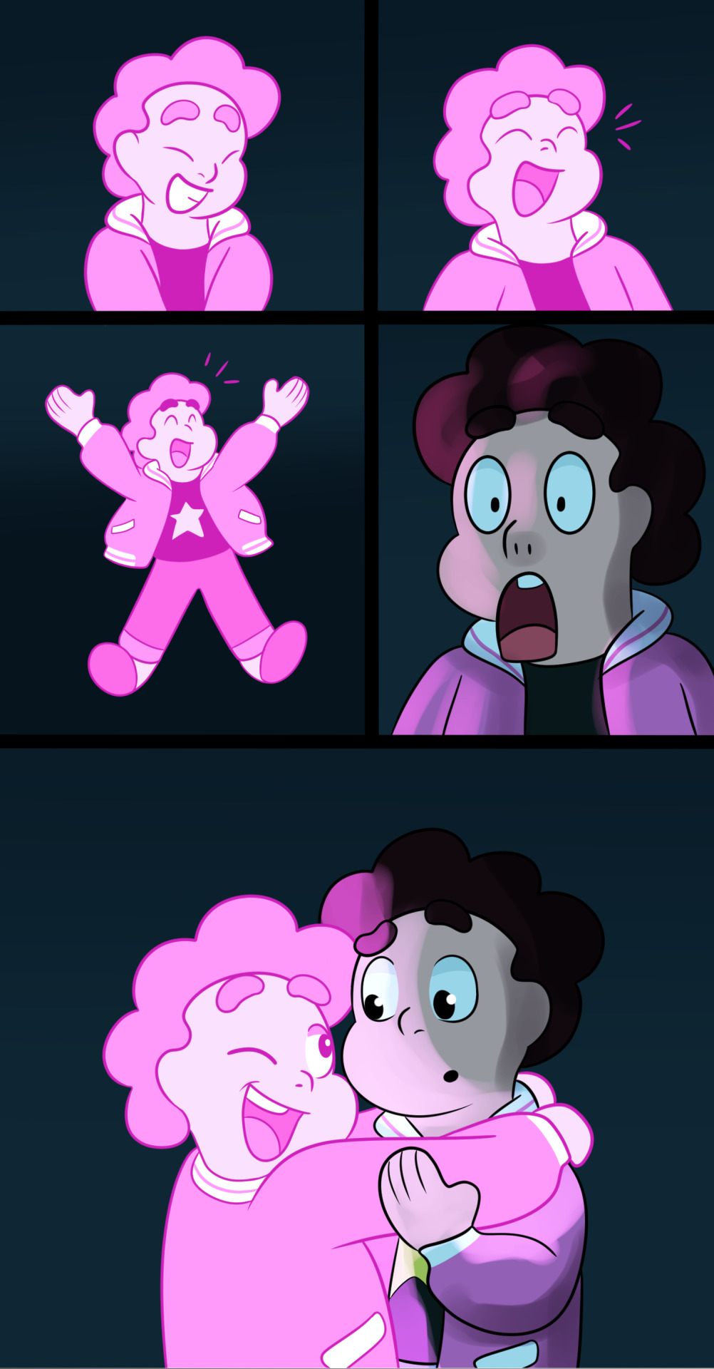
5. Next, I do the background. (I messed up screenshots, so the details of the background appear later, even though I usually do them now.) And since they’re in a cave, I put a multiply layer of a desaturated blue over Steven (40% opacity).

6. Next, I shaded Steven. My shading usually varies, but in this cave I used 100% Overlay/40% Add Glow for lighting (the same pink as Taffy’s hair), and 40% Color Burn/40% Multiply for shading (a blue similar to the cave). Atm, I use Opaque Watercolor. I do it on one layer for shading and lighting before adjusting settings and opacity. Oh, and I do them on layers clipped to the color layer.
7. I then add extra effects and Taffy’s glow. (Again, doesn’t include the background details. I did those earlier, but forgot to make the layer visible when taking screenshots.)

8. Lastly, I add text, a border, signature, and title/extra info. The border is made by making a new layer, selecting all, increasing the canvas size by 150 px on each side (Edit<Change Canvas Size), inverting selection, and filling it with black. I just use the text tool for text. My go-to is usually Segoe UI Semibold. Text size varies from 8 to 15. I also usually have speech bubbles or text boxes, but this time I thought it fit well with the simple background. (Oh right, I decided that the background details made it look cluttered in this scene, so I removed them. Oops.)
I hope this helps and thank you!
#tutorial#comic making#steven universe#myownart#myown#taffyandstevenuniverse#helpful#myowntutorial#HarmonyTRE#steven universe au#pink steven#tall post
10 notes
·
View notes
Note
can you explain how to do animations on csp? or do you know any good tutorials on how it works? im a bit confused
Animation in CSP can be a bit confusing (and daunting) since it’s nothing like Animate CC, Photoshop or ToonBoom. It’s pretty much has it’s own interface and quirks so it’s gonna take a while before you get use to it and start customizing it to your liking.
I don’t really know much about tutorials since I’ve learned everything on my own as well as finding very few books explaining CSP animation. Unfortunately, those books are only in Japanese and my skills aren’t at a level where I could fully translate everything. Though, I’m sure you can easily find some tutorials by a simple Google search.
Since you asked, I’ll just show you how I go about animating in CSP and set up my files such (if that’s okay and helps you).
Document Setup
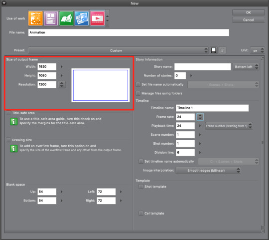
So, when you open CSP you go to the Animation section and plug-in what dimensions and resolution you want. I normally use 1920x1080 (that’s standard for most video and TV) with 1200dpi. You don’t have these specific numbers though.

Once the document is set and ready you have your canvas and all that jazz. This is my workspace setup for both illustration and animation.
Red - Canvas
Pink - Timeline
Blue - Color Set
Green - Auto Actions
Orange - Layers
Color sets and auto actions are great to cut down on time for coloring and clean-up. However, I’m still learning Auto Actions myself so I can’t give a full explanation on how to use them. But really, you don’t really need Auto Actions unless you’re doing some serious clean-up and color work. Color Sets can be downloaded ) for free through CLIP Assets. If you search animation on Assets, it should pop up with no issue.

CSP actually updated today, so, the timeline tool bar has changed quite a bit.
Red (from left to right) - New Animation Folder, New Animation Cel, Specify Cel, Delete Specified Cel
Blue - Onion Skin (allows you to see previous and next frame simultaneously while animating)
Green (from left to right) - Edit Timeline, New Timeline
Pink - Brand new Camera feature (I’m learning this one too)
Making Cels in Layers Window
When you create an animation folder (through the Timeline tool bar), you can also add cels by pressing the new layer icon (highlighted in red above). Make sure you’ve selected the animation folder beforehand or else it won’t some up on the timeline.
Animating on the Timeline
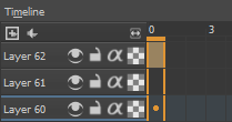
One long rectangular box on the timeline represents 1 frame of animation. So, 2 boxes equals 2 frames of animation, 3 boxes equal 3 frames, etc, etc. Personally, I always make my key animation frames on 4s (4 frames) since it just has a steady movement. Once I finish the key frame animation, that’s when I start messing around with the timing like above.
Blue - 3s
Green - 4s
Pink - 2s
Red - 1s
This part comes with a lot of tests, meaning I export a ton of gifs to see which timing I like best. Once you get the hang of it, it’ll start to feel like secondhand nature.
Layering Key Frame Animation
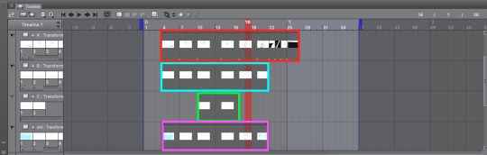
I love layers. I love to abuse layers so much. It’s just much easier to organize everything when using layers. In fact, the technique is regularly used in anime to cut production cost and time. You ever wonder how anime characters can talk but only their jaw moves while everything stays? Layers. There’s one layer where they only animate the jaw moving while there’s a secondary layer that’s essentially a still image. For this section, we’ll use my She-Ra animation as reference.

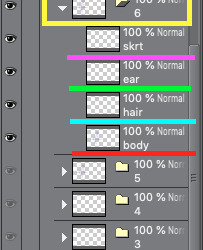
If you look at the upper left corner, you’ll see a bunch a circles with scribbles like A1, A2, B5, C3, etc written. These are different layers I made for the animation. A is drawn in black for She-Ra’s body, B is drawn in yellow for her hair and C is drawn in red for the lighting effect of her sword (another Japanese animation technique). By working in layers, I can make edits faster and easier. Also, this method is really helpful for overlapping action (i.e. She-Ra’s hair). It would be such a pain to have it all on one layer and trying to avoid finished line work (or worse having to redo it all). Below is how this animation is layer:
Red - A (Body)
Blue - B (Hair)
Green - C (Lighting Effect)
Pink - Blue shadow (this is a guide for if I ever wanted to bring this piece into color)
Another application of this layered animation is my recent Owl House piece below.
Within the animation folder, you can create a sub folder that can contain multiple layers at once. The cool thing about this is that the sub folder ends up acting like an animation key frame. Take note below how the sub folder has layers that break up the characters into its essential parts (C folder was Eda so it was one for her body, one for hair, one for earrings and one for her skirt). Again, super helpful when you have stationary animation (like a lip sync or eye blink). Or, for looped animations like this where you can reuse frames.
Camera
So as I’ve stated before, this camera feature is new so I don’t have much information or notes on it yet. To create a camera in CSP you go to the Animation tab > New Animation Folder > 2D Camera Layer.

To enable the camera function, you need to select the animation folders that you’re going to use and press this icon (highlighted in red) on the Timeline toolbar.

Once that’s done, those animation folders will have a lock icon appear next to them (highlighted in blue). Make sure to put the desired animation folders into the Camera folder (highlighted in red) or else the effect won’t show up. Here’s the same She-Ra animation but with the camera effect applied:

There’s so much I still need to learn about this function but overall it’s pretty cool so far. Maybe in the future I’ll do a more in depth tutorial about CSP animation since the program is up and coming in the animation industry. But until then, I hope you found this helpful!
5K notes
·
View notes
Text
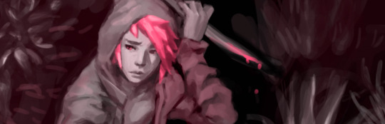
Devlog #39 - Teal's Art Pt.1 - A Dark Place
Okay lovely people, this blog had a little summer break but we’re back with content! (ノ゚▽゚)ノ Actually with a little back log of content. In this post Pectin shows how he worked on a painting!
Our last devlog on tumblr was #36. We’re jumping over #37 and #38 and get right to #39 ‘cause #37 & #38 were announcements that aren’t relevant anymore. (They are on our homepage tho. We always cry about them on twitter first!).
This devlog has been written by @pekuchin on one specific artwork that appears in //TODO: today. More from him now:
“Now that introductions are made, a few notes: First, the artwork I'm discussing has been created in July 2017. So there're minor details I'm not sure of anymore - like brush settings. Second, I used Clip Studio Paint and Photoshop (only the default round brushes). And third, I hope you can take something away from this and enjoy the read. <3
What for?
Like every asset I make for any project I have to be sure of the context in which it'll be used or appear. I've revealed before that this piece was supposed to be shown in the game as "Teal's art"
It appears to represent Teal's artistic style
and the player will see four stages of the picture as they're involved in the making of it.
In the story, Teal would make this piece for a competition hosted by the fictional games company "Naughty Cat". The competition asked artists to draw anything related to "Titan Watch Online", a MMORPG Teal loves to play:
The setting is a dystopian future
and characters have classes and skills reminiscent of popular fantasy MMORPGs.
Teal plays as a character that combines elements of a rogue and a healer.
All of these points are on my checklist of what we needed of the artwork in the game.
Expressing Teal's Mind
Based on my assumption that experience, personality and mood shape the artstyle, I thought about what kind of artstyle Teal would have. Because Teal already has been an artist in their past, I thought it sensible that they had a good grasp of basics like colours/light, composition and contrasts, etc.. So I focused on the workflow and visual expressions they would use. Here I browsed for artists and their work online to find inspiration too. While I had the checklist I also came up with new ideas as I tried things out on the canvas.
Stage One
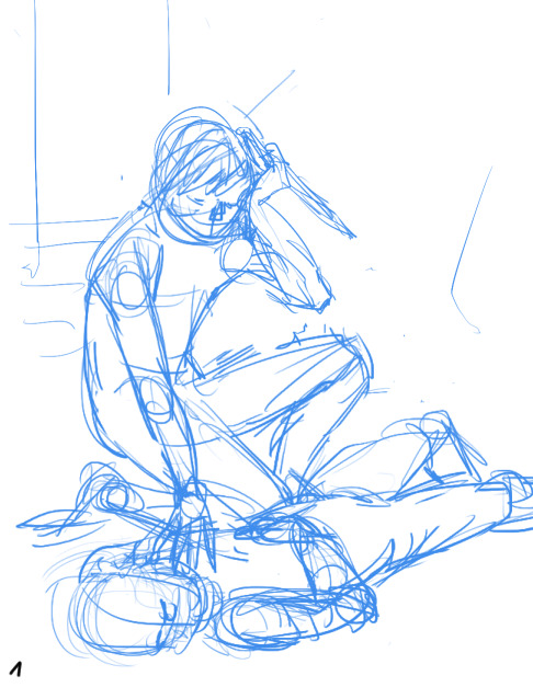
Teal wasn't at peace with themself back then. So the motif of inner conflict came to me. We also concluded that Teal would most likely paint their own avatar. Like I mentioned before the character was kind of a healer and rogue hybrid.
I struggled to find a cool pose and ended up having the main character of the illustration sit as if to heal a wounded ally. To make it more interesting I gave him a dagger. Like this, it's unclear if the character hurt the other or helps them. I liked this ambiguity in relation to Teal's situation. This sketch was done in Clip Studio Paint because I like making anything line-related in CSP best.
Stage Two
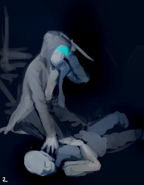
Here I switched to Photoshop and began putting colours on top a black canvas. I got a feeling of how I wanted the lighting to be at this stage as well.
Although Joyce helped Teal pick up the pen again, Teal was basically depressed at that point in the story so they likely felt more comfortable using darker colours and motifs. I chose this for the symbolical meanings of darkness and the related emotions as well. Also I don't want to generalize and believe that depression comes in all kinds of colours. (ノ~o~)ノ
To keep myself from getting lost in details I decided to paint everything on one layer and only duplicated the layer to document the progress.
Stage Three
The ugly phase. Every painting I do has an ugly phase which immediately occurs after I seriously start messing around. ( ・ิ,_ゝ・ิ) This one isn't in the game as an asset and I'm glad for it. The number of pieces that appeared in the game depended on the instances in //TODO: today when Teal actually sat down to paint. And back then we considered having 5 instances but settled on 4 in the end.
I was pretty proud of the background, which was intended to be a dark back alley but accidentally turned into a roadside at night. :'3 Because everything was on one layer, I finished the background first before I began painting the character "on top".
Stage Four

From stage three I really got into "the zone" while shaping out the characters. Because I mostly work with lines and flat colours, I noticed how "3 dimensional" painting feels to me. It's quite fun! (ノ゜▽゜)
Back when I did the character concept designs for Teal I also imagined them to be kind of sloppy. Hence an artstyle without immaculately drawn lines, but blocky shapes where you can still see the paint strokes would fit. (I was also under time-pressure and didn't want to over-complicate things.)
At this point one could declare the painting as finished. So after the player bothered to sit down with Teal and Joyce to work on the Naughty Cat competition artwork they would be rewarded with this illustration (which was hopefully satisfying for your eyes).
Stage Five

And for the really motivated artists who went a step further this one was the glammed up version of the preliminary stage. The last 10-5% that make the illustration a bit more eye-catching. Here I played around with "Overlay" layers to balance the composition, shift the focus on the readability of painting (character > long arm > healing hand > unconscious person), added some magenta blood and added Teal's official artist signature.
I thought it would be interesting for the avatar to have some kind of resemblance to Teal. Did you spot the similarities? (^0^)
Altogether I did the painting on two evenings. And I believe in three sessions, which is my usual way to go when I don't have time for more breaks.
1st Session: OKAY imma do the art!! And I only need to make 3 sketches this time...promise!
2nd Session: OH GODS it so ugly. I have to stand up and walk away to give my eyes a break from this thing I created.
3rd Session: I've returned to my ugly child with new insights into live and fresh eyes that actually spot mistakes! Time to fix things up!
And that's all of it today. I hope you liked the extra info on my work and have a nice [week]! (๑ ́ᄇ`๑)”
This devlog was originally posted on the 13th June 2019 :3
#indie#game#development#Indiegame#otome game#todo today#todotoday#visual novel#devlog#indiedev#gameart#art#tutorial
6 notes
·
View notes
Note
hi! i really like your most recent post, especially the effects! how exactly were you able to apply the color screentones? i haven't been able to figure it out and i'd love to know 😅
ah, hello!!! sorry for the late reply!! if you’re wondering about the colored screentones, they’re quite easy to apply!!
first I assume that you have CSP, since the program has a HUGE arsenal of free materials that you can use, if not uhh there are other methods...
1) first, we’re gonna open up a drawing

here, I have my drawing with no screentones
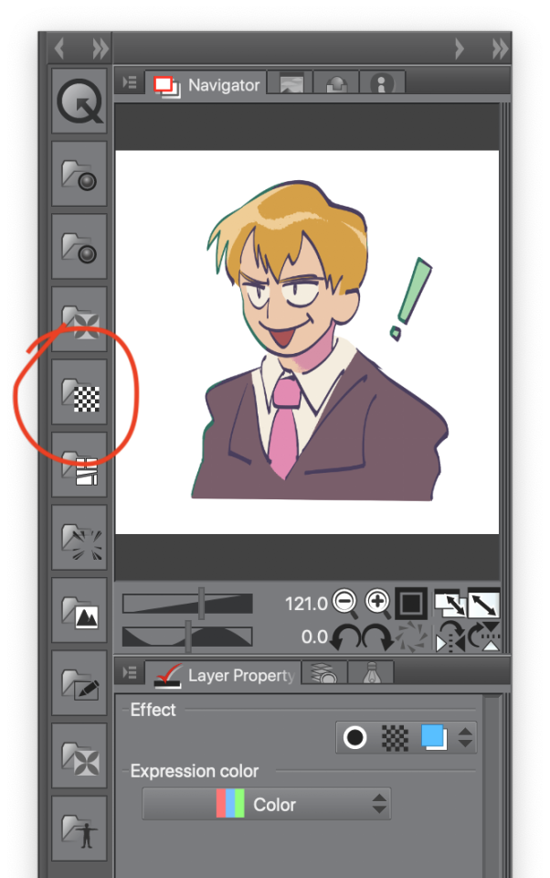
2) next, we’re gonna go near our navigator panel and to the left is a column of icons (materials), you wanna click on the one that has a checkered block

by clicking the icon, it opens up an additional window full of different screentones. there’s a whole bunch so choose any white or black pattern!! you will be able to edit the appearance later
3) to insert the pattern of your choice onto your drawing, you will want to click on the icon that looks like a clipboard
now the pattern is added to your canvas

it’ll appear different after the screentone is applied
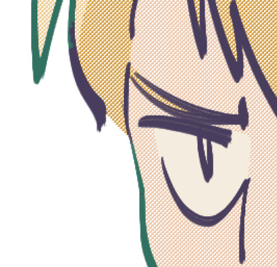
now we want to change the appearance of the screentone! right now it looks to grainy and that’s not what we want

underneath the navigation panel is the layer properties tab, that’s where we’ll be editing the appearance of the screentone dots
4) next, we’re gonna want to change the size of our dots. change the screen frequency to a small number such as 5, after that keep scrolling through the tab and soon enough you’ll come across this:
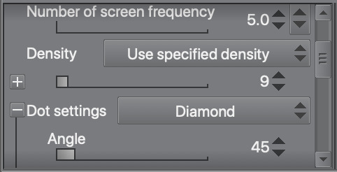
the density and dot settings
like the screen frequency, choose a low number for the density OR just play with the slider until you find an appearance that you like
for dot settings, that’s how we determine the shape of our dots! the default shape is circle but I chose diamond
there are a lot more patterns to choose from when you open the drop down menu for dot settings:
depending on the value of your density, the shape of the dots will appear different
this what the dots may look like if you choose a density value lower than 7

and this what they looked like when I chose a density value of 9
feel free to experiment with other shapes and densities!
now for the color...
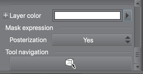
5) in the same layer properties panel, scroll to the very bottom. we’ll be changing the layer color in order to change the color of our screentone
click the arrow next to the long rectangle and a color settings window will appear
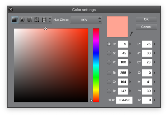
choose any color that you like! I chose a reddish pink color
after this step, you may want to clip your screentone layer over any layer you want the desired effect on
like so...
now we have a drawing with a colored screentone!
I didn’t like how all the dots were all the same color so I gave my screentone layer a blend mode (extra step)

before and after I applied the blend mode

6) and now we’re done! I hope this helps!!!
15 notes
·
View notes
Text
me trying to make a gif part 2 (thrilling finale, buildup ver.)
ok good news and bad news: good news being withheld for Spoilers (not that it’s that hard to guess anyway lol), bad news explained first bc, chronologically, it is first
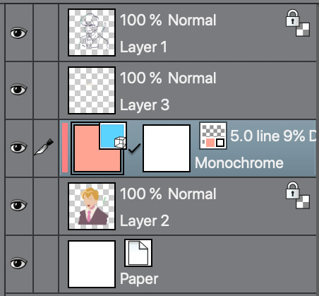
so yesterday i mentioned in the tags of that post that i had seen that krita has an animation feature so i was gonna try importing the frames into that and then exporting it as a gif. easier said than done, as it turns out
i started by opening the file i made yesterday with 62 layers as the frames and importing that into krita, which worked fine (i didn’t know you could actually open .psd files in clip stuido ((this typo is so fucking stupid it made me laugh so im leaving it)) and krita, so that’s pretty neat, i wonder if it works the other way around too) but i ran into problems when i tried to convert those layers into frames in an animation. because, like, the layout of the program has the layers displayed in one tab, and the animation timeline in another, like so:
(do u like how im using pictures now, i thought of that yesterday after i published the other post and realized hey, visual reference would probably make my plight a lot easier to understand!! so enjoy these educational diagrams from now on)
so my goal was to get the frames from the layers into the timeline, and i still don’t know if i did it right bc lbr krita is not very intuitive at all,,.,, i mean i watched a video tutorial abt how to animate in krita which was v helpful (it’s the one by jesse j james on yt fuckin SHout out) but it was about animating from scratch, not importing an animation you’ve already done elsewhere
so like, the way krita’s animation thing works, from what i could piece together as i bumbled my way around w/ it, is that each layer in the layers tab is a separate timeline in the,,, timeline tab
i want them all to be in the same timeline, not separate ones, and there’s no way to combine them in the timeline tab bc doing that just overwrites whatever layer you’re pasting it down onto, and also if you define the number of frames for that timeline (62 for this project) it just puts the single image of that layer for all of the frames instead of just one of them, so you’d have to go through and delete all the other frames you don’t want it to be, which would be such a fuckin pain
so i found a workaround, which is so tedious that it can’t be the right way to do it, but basically i started w/ layer 1 and defined 62 frames & then emptied frames 2-62, like this

(that blue box is the frame, btw, even tho it says 0, which actually kind of annoys me like why doesn’t it start the first frame on 1????)
from there i went up to layer two and selected that in the timeline, but for some reason the frame doesn’t show up automatically?

& i couldnt fuckin figure out how to make it into like, an Official Timeline Layer or whatever tf bc like, u see on layer 1 how theres that little lightbulb-looking icon on the right? that’s for turning on onion skin which only applies when you actually have frames with things drawn on them, so basically layer 2 in the layers tab has a drawing but in the timeline it doesn’t?
i didn’t find out what the actual reason for this is or how you’re /supposed/ to make the frame appear in the timeline, but what i did was right click on layer 2′s timeline & select “create blank frame” which magically made the frame i want appear
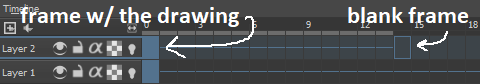
but it’s on top of the layer 1 frame, and i want it to be the frame after. also it’s still in a different timeline. this is the only easy fix in this whole damn process, u can literally just click & drag the frame from layer 2 to layer 1 and put it wherever u want on the timeline

and then u just delete layer 2 and that’s it, frame transferred!! then i just had to do that for 60 more layers and after [unspecified amount of time but it was a fuckin while ok] my timeline looked like this!

(the gaps near the end are held frames, to save me time so i didn’t have to copy a bunch of frames that were exactly the same)
krita is great because as far as i know ur animation can have an unlimited number of frames, at the risk of your own pc’s processing power, which is a definite upside to SOME expensive art programs i know (clip studio, i’m talking abt csp) and u can pick the frame rate too (cough photoshop elements 5.0 even tho u dont technically have an animation feature & it’s a miracle u can even make gifs at all) so once i finally got all the frames situated all nice and in order like on the same timeline, playing it was great! played at the right speed, looped perfectly, it was a dream come true right
well, time to export it as a gif
ha
haha
hoooo oo o
so u got 2 options for exporting ur animation, u can either hit “export,” which lets u save it as different file types, one of which being gif, or you can hit “render,” which gives you gif and video options
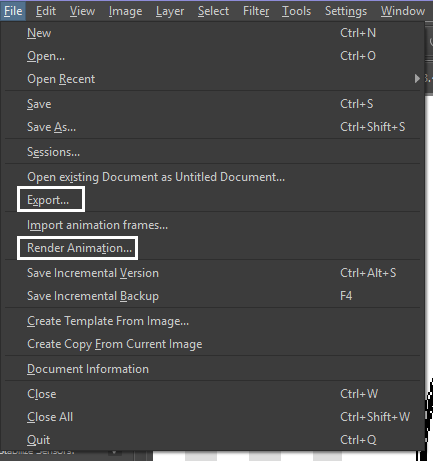
well
i tried export first, bc that seemed like a good idea, but the “””gif””” it made was distinctly not a gif, despite its claim to be one?? this is what i got:

notice: 1. it is not moving, and 2. the black bars to the sides?? those are supposed to be transparent. they’re transparent in the file i made so why didn’t they register as transparent in the export, when gifs have transparency capabilities??

so That was some real live bullshit but i still had the “render” option, right? export was wrong, so rrender must be the correct option to go to that will produce the results i am wanting to see produced in front of me like a silver dinner platter with a correctly functioning gif under the lid, that’s what i want to see and “Render Animation...” is gonna Give me that silver platter righWRONG ok look at this shit rn ok Look
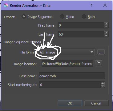
it says GIF it says it RIGHT THERE right??? right?????? then WHY

?????????????
and it also gave me all This bullshit
like did i ask?? did i fucking ask???? i already have all the individual frames why do i need even M o re i mfjgjgk
((rationally ok yea thats v useful for if ur making the animation in krita and want to export the frames to use elsewhere, but like uhhh 1. again, they’re not transparent & 2. i should have the option of saying i don’t want these??? bc *meme voice* i don’t want these)
so in the end i could find NO correct method of exporting animations as a gif in krita bc every ooption that says gif is fuckign LYING to ur face there are NO gifs in krita, aliens made the progam who looked at gifs and went “hmm i thikng this is how a gif works “ and just made jpegs instead but somehow got on the computers good side and got it to lie for them about it being a gif so thats why it says gif on the file still even tho its not a gif illimati confinr
so what is the conclusion to this? well i said there was good news too, and this is the portion where i divulge that sweet nectar (i type dthis 2 seconds ago and @ me what the fuck)
so after wasting a good 2 hours trying to figure out krita i gave up and watched some good old [youtuber name redacted bc what if it shows up in search & ppl see this dumbass post in there but it rhymes with fjackfsepticfeye] to relax into accepting my fate that i’ll never be able to upload my animations to tungle except in poor quality loopless video form, making me into a laughing stock on my own art blog, but THEN i had a stroke of genius, in my Brain
so if u read yesterday’s post u might remember that flipnote studio, the animation program i use on my ds, to animate, has the option to export files as gifs, both animated and sequential (meaning either as one fully animated gif or each individual frame separately), which is super convenient, but as i mentioned yesterday, any time i tried to open the folder with those files on my laptop, it crashed immediately
WELL today i thought “hey, how about instead of opening the folder in the sd card when it’s plugged in, how about i copy that folder from the sd card to my flash drive, and try to open it there, in case it’s the card’s hardware that’s causing the problem, not corrupted files”
so i tried that and it FUCKING WORKED THANK GOD GLORY HALLELUJAH
so now instead of spedning A THOUSAND YEARS trying and failing to force art programs to bend to my will i can just export the animations straight from my ds and drag them onto my computer Just As God Intended oh GOD im so fucking happy
here’s the gif in the end, i’m gonna post it to my art blog too but this is the Green Version bc i animate in green bc of some default settings in flipnote that i got used to, plus it makes me feel like i’m just sketching so nothing really has to be finalized so i’m comfortable while i work, and also it’s just nice ok it’s a Nice Green
(there’s a few frames at the end that are like the extra scraps from while i was working dw i got rid of those in the final version that i’m posting to my art blog later. also i added my blog url to that one too it’s aaaaaall good)
the only downside to this method is that i can’t change the canvas size to be 540px wide to fit with tumbrl s image dimensions but whatever i can just post them in a text post and fix the html to display it at its original size instead of the resizing bullshit tmurbl pulls constantly ugh. anyway it works great on desktop but it’s inevitably gonna look like shit on mobile no matter what i do *Big Ass Shrug*
anyway thats the end of my success story uhh i can’t make the like comment & subscribe joke again bc i already did that in the last post so like bye i guess thanks 4 watchign & have a great day i’ll see u in my next fvideo
https://www.youtube.com/watch?v=YYob4uDjEKI&t=0s
(^that’s my outro music)
#this started out so boring like a tutorial (but made by someone who doesn't know what the fuck theyre talking abt)#& then things derail Real Quick#that's why this is the ''buildup ver.''#retag later#talkin bout stuff#today posts#rieley's wips#(me: i can't mention this youtuber by name in case my post shows up in search#me: *adds a link to the post rendering that effort for naught*#me: *leaves it anyway bc it's funny*)#pls listen to the outro musi c it's rly good & tunmgmldnr wouldnt let me embed the video & idk how to do it thru html & too lazy to look it#up :(
2 notes
·
View notes
Last Seen Blogs

quadrantmodelquotes
Quadrant Model Quotes from 2013 Lectures
sutimetravelau
Time Travel!

craigdaitch
Craig.