#this is somewhat stylized like a One Piece color page
Text
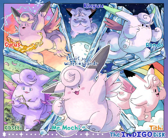
[fanart 💙] A little tribute to my Indigo Disk team 🌕
#clefairy#clefable#pokemon#this is somewhat stylized like a One Piece color page#I'm a big fan of those#also they're named after Octopath characters except for Mr. Mochi#he's just been my pal for years haha
22 notes
·
View notes
Text
Random Ramblings about Battler’s clothing style, and then clothing for Fem Battler:
Spoilers Below!!!
This is just me think on ideas for character designs that 1) I found interesting and 2) I’m not actually skilled enough to draw yet. Lack of practice kills, folks.
Inspired by @peachducy’s recent art depicting designs for fem! battler (and Battler missing her wife is i c o n i c, I like your designs very much. Please find their art here, and check out the rest of their work!).
This is also inspired by the artwork done by artist Yoshino Kaoru (pixiv), as well as several others such as Serico, Yoshida (RAN)/Shidacoo, Still/Still (Just) and OnoyaAko/Onoo Eiko. There's a lot more, but you probably didn't come here for a face full of links, and Tumblr posts have image caps.
The art can be found on either e-shuushuu.net (the first links, for all names after Kaoru) or Danbooru (second links), as far as I'm aware.
DO NOTE: Danbooru hosts a lot of NSFW (18+) pieces of art, so please be careful looking for artwork on the website if you don't want to get an eyeful.
This is me looking primarily at the Manga, since throughout the VN, there are essentially no other Battler sprites outside of the clothes he wore to the family conference (the exception being his cape/cloak).
Buckle in, because this is about to get real long.
I’m about 90% sure that the first time we see Battler depicted in ‘non-conference’ clothing is in Alliance.
Example 1 of Battler's Wardrobe (The Amusement Park):


Example #2 of Battler's Wardrobe (Ange's Birthday):


There are a few other images of Battler, such as that single panel depicting his and Kyrie’s backs together in Alliance (?), as well as the few panels where we actually get to see Asumu, he is also depicted wearing baggy hoodies.


For reference, I’m also looking at Baby Battler’s conference clothing from six years prior to 1986, in order to compare the stylization.

Rough Clothing Analysis:
As a young child, while Asumu was alive, Battler is commonly shown as to wearing hoodies, and trousers and shorts (plaid, camo, etc). If I remember right, there's another panel when Rudolf, Natsuhi, and Krauss are talking on the former's infidelity, and Battler's depicted in an open-overshirt or jacket with a pair of jeans on (think flannel shirts, except its a plain and solid white on the page).
This choice of clothing seems loose, baggy enough to allow for a range of movements (We can presume Asumu was the one who primarily picked out his clothes, and helped him get dressed, at least when he was younger), but still well-fitting.
Even in the more formal clothes he wore to the family conference, including the former vest over top, where the cuffs of his dress-shirt sleeves were fitted around his wrists, the main fabric of the sleeves 'puffed' out rather than lay flat on the skin.
In other words, they're clothes that you would expect a young and energetic child to wear. On account of the manga pages primarily being in black, white, and gray, it's difficult to discern the actual coloring of the fabric other than - this is either white, or a softer color, while this is black or a darker color.
Also, and I'll go into this more later, but the general 'looseness' of Battler's shirts, hoodies, and pants have a resemblance to Asumu's own style of dress, the rough shape of her blouses and skirts.
This changes slowly as he gets older, slightly, from the references we have in the manga - some examples being the images I put in above. Battler progresses from loose shorts and pants to more fitting jeans (I think), and his hoodies - at least somewhat - give up their place to short and fitted jackets.
I call the jackets short, because they end somewhere around his waist area, and fitted because they lack the poof of the sleeves he wore when younger, and likely a difference of material possibly made them more 'rigid' compared to the fabric of a hoodie.
It's very tempting for me to think that the first jacket Battler wears is made of denim, as it reminds me of the jean jackets a few family members of mine own - and also, in Japan at the time, denim material was very popular (though I need to do more research on that).
The second jacket, on account of the belt buckles wrapped around each wrist, as well as hanging from loops around his waist, and the zippered pocket, I think I'd call it a bomber jacket? Those, at least in my experience, are usually made of some sort of leather. Interesting motif that, again, I'll bring up later (COUGH*kyrie*COUGH).
In comparison, I think hoodies are more commonly made of cotton? Anyway, I'm getting side-tracked.
Battler's jackets, on top of the pockets and zippers and belts, have chains attached to their hems (or, alternatively, his jeans). I find it interesting, since chains hanging from jackets or belts is something I personally have often read depicted as something representing a character seeming cool, or something that represents delinquency (which changes depending on the placement, the types of chain).
Battler tends to wear long-sleeved shirts, and solidly-colored ones at that, below his hoodies or jackets. Apart from the clothes he'd worn to the family conferences prior to the start of the VN (around 1979 or 1980, whichever you prefer depending on how you count his absence), Battler is always depicted with a dark-hued shirt in the manga, and the darker tones are indicated by the fact that his shirt is rendered in black ink. (Other option is that his shirt is actually black).
Additionally, he wears thick belts - and, such as on Ange's birthday, Battler seems to at least occasionally wear that at a slanted angle. Like I mentioned earlier, Battler also has chains attached - either to the belt itself, or the belt loops on his pants.
In the two instances of 'non-conference' Battler that I put at the top of the post, Battler also wears a necklace - both of which have hanging pendants. For Ange's birthday in particular, we see him wearing a necklace with a cross on it - a motif that his clothes in 1986 shares, as the zipper of his suit jacket is shaped like a cross.
Summary of Battler's Clothing.
As far as I can tell, Battler's color palette essentially follows this pattern. Darker, solid-colored shirts, with the pants and occasional jackets over top made of presumably lighter colors. His clothes are very simple, you could say. Real ornamentation is brought about the accessories he pairs them with, or the jackets he wears.
I wouldn't go so far as to call his accessories 'punk', but Battler favors simplistic chains attached to his jackets and so on - a sort of look that seems 'cool', similar to the occasional way his belt seems lopsided. This extends to jewelry he wears - simple chain necklaces, with small pendants hanging from them, and the thick belts.
He isn't flashy, doesn't wear particularly chunky chains or other large accessories to draw a lot of attention. Simple, sleek, stylish.
This coincides with popular styles in the 1980's, such as influences brought about by rising pop culture.
Similarities to other characters' clothing:
In my eyes, Battler's clothing choices - when he is a teenager, predominantly resembles two characters more than anyone else - Asumu and Kyrie.
I mentioned, earlier, that as a child the 'bagginess' of his clothes was reminiscent of Asumu's own silhouette. The simplicity of the accessories he wears, too, could also be taken from Asumu. However, he follows a 'darker' color like Kyrie, and trends towards styling what he wears in a similar.
These are all very small things I noticed, so this is just my opinion. I'll start with younger Battler's similarities to Asumu, who we never see in the VN, and only sparingly in the manga.
Asumu & Battler's Clothing:


Note: The two pictures labeled as Ep4 Asumu and Ep8 Asumu, I found on this post from @ramblingsofthegoldenwitch. There are immense spoilers in their post, which is about Asumu, so if you just want to see more pictures of Asumu, you’ll probably want to scroll to the bottom of the page.
Asumu favored blouses and skirts, if she wasn't wearing a dress. In other words, she had a traditionally feminine silhouette. Looking at the sleeves, you can match the puffy shape and the cuffs fitted to the wrists with the same sort of shirt that Battler wore six years ago, to the family conference.
Similarly her skirts, which roughly reached around the knee, were not fitted. They had flow to them, movement (I am not a fashion buff, despite nitpicking the tiny details in character design, forgive me for not knowing the shapes too well!).
In the panel where she's holding omurice with Battler's name on it (and he's so small and cute, I want to pinch his cheeks), Asumu's also wearing a sort of plaid-checkerboard apron. Matches with the plaid trousers Battler wore at the conference too, six years ago, and the looseness of the fit (as most children shorts are, I think?).
Her jewelry, too, is very simple. A necklace, with a single hanging pendant. In the full manga panel where Asumu’s image is depicted as though beneath cracked glass, we also see that she wore simple bracelets - the sort of plain bands without any other noticeable ornamentation.
This is something Battler also does, well after his mother has passed away - he has at least two plain necklaces that have simple pendants hanging from them.
Kyrie & Battler’s Clothing:


In a sharp contrast to Asumu, Kyrie is more commonly seen in blouses and pants (or, in the case of her sprite, a dress and pants). Rather than following ‘traditional’ portrayals of femininity as Asumu did, Kyrie’s style is noticeably more ‘modern’, you could say.
Unlike Asumu’s clothing, which was looser and fell straight or puffed around her body, and how her skirts flared out, shirt collars hemmed with frill or what I think might be lace (?) - Kyrie’s clothing is almost fitted to her body, from her sleeves and jackets, to dresses and pants. For the most part, she also wears long sleeves.
Additionally, Kyrie's clothing is often rendered in grays and blacks, compared to Asumu's seemingly lighter-colored clothes (only so much you can tell from the manga pages, though). Predominantly, though not always, she wears darker colors.
Outside of formal events (such as the image where she's with Rudolf at a party), Kyrie doesn't seem to wear much jewelry. However, she does tend to wear her belts slanted to one side, such as in her VN sprite and a few of the images I put above.
When comparing Kyrie's style to Battler's, they share the selection of dark colors, the wide belts, and the habit of wearing them slanted. In both her VN sprite, and the image of her walking away from Battler, we can also see that Kyrie also has a similar sort of cross motif.
Her tie has a crimson cross on it, and on her blouse or jacket in the next photo over, the buttons are also shaped like crosses (this is probably a coincidence, but I thought it was cool at least, haha!).
Other lines of thoughts - Battler & Kinzo's clothing:


I was going to mention similarities to Battler and Kinzo's style of dress, such as the fact that Kinzo and Battler actually wear the same shirt color, looking at their sprites - also, all the Battler and Kinzo parallels in regard to personality and appearance. However, in contrast to the images we have of Battler's clothes vs Kinzo's (the depictions of when he was younger, at least), they seem more opposed in my head?
Younger Kinzo, prior to the Kanto earthquake, is depicted often wearing a white (or lightly colored) button down, often with the collar also unbuttoned and left rising upwards, rather than being folded down around the throat. In childhood, he wears shorts, and this progresses to pants as he gets older.
In comparison, Battler wears shirts with low necklines rather than high collars, and there's an intervening period of 60 years between Kinzo and Battler's birth - the fashion trends change, and even when Battler wears high collars (ex: conference clothes), they are folded down around his throat.
Following the Kanto earthquake, Kinzo's style changes - he gets layers. His shirt and pants are added to, such as a vest, a coat, a necktie. Later still, circa the 1950's, Kinzo also seems to be wearing a cravat or jabot of some kind - further divorcing him from Battler's more modern formal suit, worn at the conference. The style he wears, as well as his difference in age to Battler, adds bulk that we don't see on our eighteen year old protagonist.
The closest similarities I find in Kinzo, his VN Sprite, happens to be the tie between their shared shirt colors, and the fact that Kinzo - like Battler - wears a suit of lighter color than his shirt. Battler's is a cream sort of color, whereas Kinzo is wearing white. There’s probably more, but my brain is fried.
Fem! Battler's Clothing: In General and For the Family Conference:


(Artists names are in the ALT text!)
I don't see being born as a woman (or presenting as one) as drastically effecting Battler's canon personality or personal preferred aesthetic - she'd behave very much like Jessica does in canon, standing outside of 'traditional' portrayals of femininity. In other words, a tomboy.
Being a tomboy doesn't necessarily mean that Battler doesn't wear or like to wear 'feminine' things, though. Case in point: Jessica. You can still wear skirts and be a tomboy, since I think the matter is that you are otherwise behaving in a ‘boyish’ and unladylike manner. Sure, the way you dress can have a hand in being perceived that way, but it’s not the entirety of what makes someone a tomboy.
Outside of the Ushiromiya Family, away from Rokkenjima, I don't think there'd be much of a difference in her clothing compared to what we get to see in canon? Battler would just also be able to wear skirts, leggings, and so on. It would be the same dark shirts or blouses, jeans or skirts, wide belts, chain motif, cross motif, short jackets and hoodies, and simple necklaces (for example...)
Her upbringing as 'a lady of the Ushiromiya Family', would have an effect on the type of clothing she'd have worn when in relation to childhood prior to Asumu's death, and the Ushiromiya Family as a whole, though.
It's known that the Ushiromiya family very strictly follows the roles assigned to a person's gender, even clothing-wise. (It’s what makes Eva design in particular so interesting - she’s the only woman in the family wearing pants, traditionally men’s wear, and non-western style clothing). I also noted earlier that Asumu dressed in a 'traditionally' feminine style.
Even being from a branch family, Battler would very much be brought up with that ideology in mind, even tangentially.
In regards to visiting Rokkenjima, due to her social standing, Battler would likely be expected to dress as a proper young lady, and this means dresses - blouses, or skirts, styled in lady's suits. I don't think she'd be forced into it if she didn't want to as she got older, but Battler was still raised in dresses and skirts.
It should also be noticed that, at least starting from Banquet, Battler displays levels of toxic masculinity and levels of misogyny, albeit unintentionally and not trying to cause harm (referring to woman as never directly answering question, getting upset unreasonably, etc), so even if Fem! Battler doesn’t care for the social norms of the time, especially regarding how she looks and behaves (and I really think she wouldn’t, for the most part), on some level it would still effect her, when coming from loved one’s at least.
The expectation of being feminine, though it might not bug her as much as it bugs, say, Jessica - who worries that her brashness is what keeps boys from asking her out, and so on - If Battler were really concerned about seeming feminine, I don’t think she’d do it out of concern for seeming unappealing to others.
She’d do it for herself (Battler, however, is someone very soft and squishy like a marshmallow on the inside. So, if it’s someone she cares about or likes who makes that comment…ouch).
Considering how fondly Canon Battler remembers his mother, I think that Battler - born or presenting as a woman later in her life - would in some manner attempt to mimic Asumu's style, as well as Kyrie's - the two women that she respects very much, and - because she is a woman - would be most likely to view as role models on some level.
As a very young child, I think Battler would very much be styled similarly to Asumu (and also Ange). Blouses with the puffy sleeves, and a pinafore worn over it (and probably several petticoats or some sort of crinoline, because no skirt holds shape like that on its own). Blouses and so on have the small ruffle or frill (see OnoyaAko's images above).
As she gets older, the silhouette of the skirts she wears doesn’t ‘balloon’ out as much, so to speak. They start falling down in a straighter line, and possibly more fitted around the waist in hips? Though not to same extent as Kyrie, where the fit is as snug as a glove - it’s still looser than that. Think pirate-shirt and slacks.
She probably starts wearing pants more often as well, after leaving Rudolf’s house to live with her grandparents (We don’t know much about Asumu’s parents, how traditional their views were. Whose to say whether they would have been concerned or not about Battler potentially dressing ‘like a man’? I like to picture they didn’t/wouldn’t mind much at all, though).
Personally, I've always sort of envisioned Battler (conference), wearing a blouse - or dress - with similar 'puffy' sleeves as Asumu wore, fitted at the wrists, same dark red fabric below the cream suit jacket that Canon Battler is known for. It’s just…her look, just as in canon.
I’ve think I've seen artwork where she’s wearing pants(?), but considering the social expectations of women in the Ushiromiya Family, to be feminine, proper ladies - as well as Battler’s prolonged absence where she literally left the family register, I feel like some level of stricter ‘code’ for dress would be followed for her - at the conference, she will eventually have to face Kinzo, after all (one of the misogynists to end all misogynists).
It would be best to try to stay on her ‘best behavior’. In other words, it would be best to avoid poking a sleeping beast (Kinzo) in an old wound (herself, dressing ‘inappropriately’ for a woman after having literally left the family for six years).
Therefore, for at least the conference alone, she’d maybe choose to wear a skirt over wearing a pair of pants, and maybe pack the pants instead as extra clothing.
The skirt maybe sits around the knees or mid-thighs in length. I'm not sure if it would share similar 'layers' or not, like Jessica, VIP Beatrice, or Natsuhi, though.
I made it longer than Jessica's and VIP Beatrice simply because, for the 1980's, their skirts seem to be short. Roughly the length of the miniskirt. They seem really short of the time period in Japan, and especially so for the family itself, considering it is the hyper-conservative and traditional Ushiromiya Family they are related to (literally).
Also, Kyrie or Asumu do/did not have 'layers' to their skirts, and considering Battler would likely emulate them on some level, maybe it would be edged with minor frill or some other minor embellishment, like lace, at the hem - instead of layers? If Battler were to have layered anything, it would be a really formal event...
For hair, I’ve always thought that Battler would have long hair. Majority of the fanart I’ve seen Battler depicted as a girl, she’s had long hair. I like to imagine it as long as Beato’s when loose, if not longer. It’s all that trauma from my childhood, I guess.
Though, considering both Kyrie and Asumu wore their hair short, taking the idea of her emulating them both and the sharing of parts of the character designs, it’s just as likely that she could have it cut short.
Also, I always see tomboys presented as having short hair and clothing deliberately selected to emphasis how their personality, favored past times, etc, is more like a boy’s than a girl’s.
However, Battler is a girl - and why would she have to act and look like a guy to do the things she wants, hang out with the people she want? What does her appearance have to do with that? (which, ironically, is exactly what makes her seem like ‘one of the boys’ majority of the time, she doesn’t care or really notice, and this leads to a series of misunderstandings where hearts of boys and girls alike are unintentionally broken).
It’s just something I always find interesting, the appearance of seeming traditionally feminine and almost demure on the outside, but being decidedly just another person - capable of being loud, of being brash, of being crude, sporty, etc - alongside it.
Formal Dress / Golden Witch Battler


This section is more self indulgence than anything else, so feel free to just skip it.
I’m fairly certain that, in both VN and Manga, there’s no depiction of the family changing to get dressed for dinner, but considering the high stakes and formality of the family conference, it’s always just been a sort of headcanon that sticks in my head and doesn’t leave.
A lot of Fem! Battler fanart depicts her in a dress, so naturally - I wanted to put her in a dress. Battler is hot enough in any world, that to see him or her (etc) in a dress would be fatal to most people’s hearts (Ladies everywhere hate him - haha).
But I always see her, in my head, as typically wearing the same suit - or an outfit I similar enough - to the family conference. Smooshing the idea of her in a dress with my headcanon of dinner was the perfect excuse for having both, essentially.
I think it’s mentioned somewhere in Turn that Battler’s family (and likely the others) brought several changes of clothes. So it’s possible!
I may also be a tiny bit salty that Battler, unlike the other witches in the series, didn’t get his own special ‘witch’ sprite (the cape is the bare minimum, and possibly counts as theft from Kinzo), so the fancy dress also gets to be her witch dress, once she solves Beato’s game.
Formal Ballgown Battler-wear is absolutely 110% inspired by Yoshino Kaoru’s art of fem! Battler (and I mourn the fact that there is no fem beabato art, though there are two pieces of masc beabato art 😏), as well as Yoshida (RAN)'s, and @peachducy’s witch Fem! Battler. Also, Still's artwork.
I ran out of space to add all those images because of the image limit, but know they're there in heart and spirit. Let me tell you, there’s no need for Kinzo’s absinthe in this household, because the characters and artwork in the fandom alone is enough to melt my heart and soul.
As I mentioned earlier, Battler probably wouldn't wear layers unless going to formal event - like the family conference, to her grandfather's western mansion on a secluded island. If you've got to dress up, you dress up to kill (bad joke was bad).
I don't have an exact idea that comes to mind for the sort of dress Battler wears, but the images I put above are along the lines of what inspires the thought of it. Part of me would want to put her in a victorian-inspired dress, with a sort of heart-neckline that rises up to her throat - hard to explain, really. Similar to the Shidacoo artwork, but the collar would rise encircle her throat? Also, the baggy sleeves, I really like the sleeves. Something like this, most likely (neckline-wise, at least).
Or maybe a sort of capelet, which would parallel Kinzo's cloak-cape...sort of like the small shrug jackets, except the back elongates and the collar's tall, and it's worn over her dress sleeves if she has them...ideas, ideas, ideas...
Anyway, that 'stricter' victorian would probably be an aesthetic more fitting for the adults - or a female version of Kinzo, whom I've already gone on a rant about (though that would invoke interesting further parallel between the two...?).
@peachducy's design of fem! Battler is really really really cute. I ran out of space in the block above, so I'll ramble about it here. So, they used reference from Beato and Jessica's sprites, and provided Battler with a similarly layered skirt - whereas Battler is still wearing the jacket, and vest as in canon.
Battler gets leggings with eagle on them, and has cross-shaped earrings (the ever iconic motif), and I can say without a doubt that she is hot. She even has a cravat/jabot with a cross pin! It's cool! Witch Battler gets a massive ballgown skirt, similar to Beato's own dress except...simpler, with the one-winged eagle up the length of it, as well as a cape similar to Kinzo's.
I am not visible, but know I am valiantly attempting to evade keyboard smashing.
On the other hand, the reason I like Kaoru's art so much, is because it shares motifs with Beato - such as the low back, and the shape of the sleeves and the just-off the shoulder design which makes it just a half-step different, and what it drops in mimicking the scalloped folds of her overskirt and golden embroidery (Beatrice's, I mean, tying her to Kinzo's cape), the design is replaced by simple layers hemmed in lace (and I'm always weak for lace-hemmed anything, sorry). Also, the fabric roses - because that's a tie to Beato, and throughout umineko, roses are Important.
Such as a golden rose laying to rest upon a catbox at the bottom of the sea. That scene broke me, and was what got me to regain interest in the VN after spoilers-
Still's depiction of Fem! Battler is also really good, because the lines of the dress of sleek and formfitting - reminiscent of the modern period, over historical-leaning gows (or that's how my brain interprets it), and it also brings back Battler's cross-motif. Still's dress reminds me a lot of Kyrie, actually. Sleek, straightforward, and mostly to the point - though it's still embellished with ribbons.
(Also, look at her hand on her hip!! The confident smirk!!! 10/10).
There's also another image attributed to OnoyaAko, where Battler is again wearing a dress, similar to Still's where she is sleeveless and wearing gloves, and with Beato - who is laughing. At her, and calling her cute (I think?). Meanwhile, Battler is trying to shove him away with a loo of utter disgust. The art piece cute, and just look at her face!
Dress-design wise, again, it's very simple. I like the black frontpiece, and how the skirt is tucked together before fanning out. Just..so many designs, so pretty.
The Opera Stella Iplehouse doll is another dress design I liked, and also and these two dresses ...
I have saved so many images from pinterest running through ideas, its not even funny. I have like five separate boards. Help.
Anyway, here ends my rambling on Battler's clothes, and the types of clothes he may wear as a girl.
#umineko spoilers#spoilers#I wanted to add more images but the cap stopped me#This entire post is me ranting about clothing and then capping the word limit per block and of images#umineko no naku koro ni#ushiromiya battler#rule 63#genderbend
2 notes
·
View notes
Text
Touhou Fanwork Spotlight #27
Murder in Pseudo Paradise by donjuan
A series of deaths start occurring in Gensokyo, after Kosuzu finds a mysterious book with nothing written on its pages. Loosely based on the official music CD Dolls in Pseudo Paradise.
This is a sequel to Wheelchair Detective Satori

Title: Murder in Pseudo Paradise (蓬莱人形殺人事件)
Author: donjuan
Upload date: 2014-08-01
Translation: Moriya Salesman
SDM Level: 3
Kosuzu finds a strange book in Suzunaan and she immediately seeks to find out more about it. When it leads to her being witness to various deaths around Gensokyo she slowly begins to realize her role in this play, and sets off to get to the bottom of this mystery and expose the culprit behind the cases.
youtube
(flashing lights warning)
Been waiting for this one.
The continuation of the fanwork that inspired this blog. The first series left a lasting impression on me, mostly due to its bizarre nature and art style, so I was looking forward to see what else could be done in this version of Gensokyo donjuan created. Especially since I’m also a big fan of DiPP. And it was great.
Instead of having various cases that may be somewhat related to each other this time around there’s one big convoluted riddle to solve, involving a bunch of different actors and motivations clashing with each other. Which I think works better for playing along and making up your own theories about what’s gonna happen next. The bigger cast of characters also leads to more unexpected and interesting interactions.
While there is obviously parallels to DiPP (which I recommend reading) it also brings its own new stuff and twists to the table, plus the fact that it actually makes the story work within the current world of Gensokyo.
It takes the time it needs to construct an elaborate story and flesh out the details, and while it gives just enough hints to point you in the right direction things can still get very cryptic at times. You can’t take anything for granted here. Anything. There’s a lot of pieces and it’s all a matter of finding the right ones.
The comedy aspect is more subsided this time around though, putting more focus on the overarching mystery along with all its drama and twists. Oh but the bits are still here and they’re as amazing and clashing as ever. You could still even say the whole thing is a bit.
Again art is Very Good, I love it. Full of color and expression, almost psychedelic at times, with very stylized designs. The choice of music is also great, outside of the picks from DiPP of course. This series also gets one main opening to tie everything together but certain episodes still get unique animations, and they’re all once again very stylish. Really does make the whole thing seem like an anime of sorts. Also Kosuzu gets some good cardio during them.
I think it far surpasses the previous work in both scale and presentation and I really hope to see more of this world in the future.
Good Fuck!
Content warning: mild gore, suicide
Some episodes contain flashing lights (mainly during the openings)
English translation on Youtube
Original on Niconico || donjuan’s niconico
39 notes
·
View notes
Text
Pieces of April [12/?]
AO3 Link: https://archiveofourown.org/works/21099044/chapters/50202530
Summary: On the anniversary of his death, Jason’s second life takes an abrupt new turn and he’s faced with a challenge that neither Batman nor the All-Caste prepared him for.
Rating: PG-13 (rating may change later)
Warning(s): Past Jason/Isabel, kidfic, minor canon character death (pretty sure you can guess who), I’ll add more warnings/tags as I think of them.
Canon-Compliance: Takes place in between the two RHATO series, so after Roy and Kori and before Artemis and Bizarro. Jason and Isabel Ardila were in a brief relationship.
First Chapter
________________________________________________________________
Isabel’s place has a lived-in feel that Jason is not very familiar with.
Willis and Catherine’s tiny apartment is a distant memory for him, and the handful of foster homes that followed don’t even rate. Wayne Manor, while once home, was never exactly what one might call “homey”; and the less said about his time in the League, the better.
As for his network of safe-houses, these are meant more for function and convenience than to encourage long-term comfortable living.
Very different from the room illuminated when Jason flicks on the lights.
Warm, inviting colors grace the walls, somehow blending well with living room furniture meant more for comfort than to match. In the kitchen, dishes dry on the rack because there’s no dishwasher, while a vacuum cleaner lies forgotten in the hallway. There’s no evidence of a maid or English butler the way Tim’s place has; like Jason, Isabel was uncomfortable with being waited on.
Half of her kitchen table is buried beneath a sea of papers, piles of junk mail, receipts and a newspaper or two.
It’s second nature for Jason to go through the detritus, though he’s not entirely sure what he’s looking for. When he doesn’t find it, he slips into the kitchen, rifling through cupboards and drawers. Lots of people will stash small, important property in their kitchen, banking on would-be-intruders focusing on the obvious takes like televisions and computers. Since Jason isn’t in a hurry, he has the luxury of searching through everything himself.
Apparently Isabel wasn’t worried about theft since he finds nothing; frowning, he glances over to the fridge for potential clues. Magnets from what appears to be every country she’s ever visited hold up notes against the chrome façade, along with pictures and business cards and—
Jason reaches out before he’s aware of it, tracing his finger across the edge of the black and white printout that holds the prominent place of center. The sonogram picture is different from the one’s he saw on cases before he died, or even the kind he sees on television. It’s not simply a grainy outline of a vaguely baby shape, but a 3D image that details the features of the infant he held in his arms just last night.
He reaches out to take it off the fridge, then thinks better of it and backs away.
Not like I need to keep anything like that, I’ve seen the actual baby already.
He wanders over to the kitchen counter, sifts through more paper. There’s an actual physical day planner there that’s seen better days, pages ripped and bent and some stuck together. He pockets that, intending to go through it later; it might hold information about her friends and contacts.
Speaking of…
He studies the walls and surfaces of the unit, noting the sea of personal trinkets and photos of Isabel. Most of them are of her and a bunch of other, usually against the backdrop of a beach or bar lounge. Some of them include herself and Safiya—he recognizes one of the photos as having been taken on the edge of Robinson Park, in the area that’s still safe and Poison Ivy free.
In all of them, she looks happy, which calms that lingering part of him that’s worried his presence in her life had any kind of lasting trauma. Either she is—was—the most well-adjusted person ever, or she had a Wayne level of ability to pretend.
Studying the rest of her belongings along the bookshelves and coffee tables, something strikes him; in addition to the usual paperback bestsellers and gossip rags he would expect from someone of Isabel’s age and interests, there are baby books tucked everywhere.
From parenting How-To guides, to early readers that are still in pristine, sometimes packaged condition. There are fairy tales and Spanish alphabet books and board books with various textures cut in the pages.
Like someone was gearing up to become Supermom.
Which she was, wasn’t she?
Numbly, he wanders down the hall, glancing briefly into the master bedroom before his eyes are drawn to the second room. It feels like the bottom of his stomach has dropped out as he looks at the door, and the pretty, swirling pink script stenciled across it. Letters set between colorful flowers and balloons.
Luisa.
Tentative, he nudges the door fully open and wanders into what is clearly a nursery. There’s a crib set up, with a mobile of stars and planets, a changing table, rocking chair—quite a few of the mysterious objects he spied sitting in a pile on Tim’s living room floor.
All of which speaks of a woman who very much wanted the baby currently residing in the Gotham General neonatal wing.
Jason sits down heavily on the rocking chair, barely hearing it creak beneath him as his thoughts play on repeat.
She wanted this.
But she didn’t tell him.
Obviously she didn’t want him involved.
But then why list him as the father?
Why make him her emergency contact, instead of her friend? It seems like an awfully calculated, purposeful move for someone that didn’t want him in her child’s life.
He gazes blearily around the nursery, eyes flitting past the typical soft and fuzzy and mostly pink stuffed animals and blankets. Everything in here was chosen with care as if picked directly from a catalog, and with intent.
Except for one thing.
Jason stands, reaches for something on top of a chest of drawers just beside a baby monitor.
The Red Hood plush toy is a ridiculous caricature, with a bulbous head and stubby arms. Toy companies have been making merchandise off the world’s heroes since time immemorial, but he didn’t realize that plushies were a thing.
Let alone that there’d be a version of me included in the line.
His thumbs slide across the tiny stylized red bat on its chest; there are fabric holsters but no guns, of course.
It’s the only item that seems out of place in the entire room.
Obviously placed here on purpose.
But wouldn’t that mean…?
Mind reeling, Jason returns to the living room, more determined now to figure out Isabel’s frame of mind. To know the thoughts behind her decisions. There’s a folder among the medical stuff, with information relevant to her pregnancy—medical history, prescriptions—but nothing written in her hand.
Which isn’t surprising. Who keeps a journal these days when everything’s online?
That has him searching out her computer, which is set up in the corner of the living room on a tiny desk. He boots it up and studies the keyboard to see which keys are more faded than others.
Before he can make much headway guessing her lock-password, there’s a bang that has Jason whirling around. His instinct is to reach for his gun, but being mindful of his location thinks better of it.
Just as well, considering who the intruder is.
“What do you think you’re doing here?!” Safiya demands from the doorway of the apartment. She’s holding an aluminum baseball bat and wearing a fierce expression. “This is not your apartment! I will call the police if you don’t—” She cuts off when she recognizes Jason. “You.”
“Hi,” he says, somewhat bemused.
She doesn’t relax, narrowing her eyes at him; they are puffy and bloodshot, and he suspects she’s been crying since leaving him and Tim at the hospital.
“How did you get in here?” she demands at last, suspicious but somehow bypassing the usual questions he'd expect. “I have only set of keys.”
She brandishes the keychain in hand as though to make a point.
The utter lack of surprise or fear catches him off-guard; Jason falters for a minute thinking of a plausible lie to tell. And then he decides he doesn’t have the energy.
“I picked the lock on the window,” he tells her.
Safiya’s eyes narrow. “They teach you that sort of thing in bodyguard school?”
Nice lie, Drake. Obviously she didn’t buy it.
“Can’t all be taking bullets for the president.”
“Right…” Safiya lowers the bat, but only incrementally. “What are you doing here?”
“I needed to…see for myself,” he finishes lamely, still not entirely sure how to answer the question.
“I understand.” This time the fight goes completely out of her. She steps into the apartment, glancing around furtively, and then closes the door behind her as she comes inside. “You might have mentioned earlier you wanted to come. I could have given you the keys.”
“Wasn’t really thinking about it back then,” he tells her, watching her set down the bat. “You’re pretty intimidating for someone so small.”
“This is Gotham,” she retorts. “It would be stupid to be anything less than vigilant whether you have cause to fear or not.”
“And you don’t have cause to fear?”
“When one has a guaranteed death hanging over one’s head, there is very little to fear.”
Jason thinks of his time as Robin, of the danger and the close calls, and of his life now; the certainty of it ending in blood and fire and another goddamn plaque in the Cave.
He gets it. More than she knows.
“Fair,” he acknowledges. He pauses, a bit awkward, and asks, “How are you holding up?”
“As well as can be expected,” she sighs, looking around the room. “It does not seem real.”
“You’re telling me,” Jason says, though it comes out as more of a sigh. He feels the tension in his shoulders, which have been pulled tight since Safiya first made her appearance, ease. “Have you had a chance to reach out to anyone?”
“Not yet. I’ve been…processing.”
“If you need help…” he begins, uncertain about what exactly he’s offering to do here.
“You have other things to worry about,” she replies with a shake of her head.
No kidding.
He recalls his conversation with Tim about the fate of the baby, and before he can think better of it, blurts out, “Do you know anything about her last boyfriend?”
Safiya gives him a sharp look. “Why? Are you going to try to convince him the baby is his?”
There’s judgment there, not entirely unwarranted maybe.
“No. But maybe he and Isabel have—had mutual friends. People who might…”
Take the baby.
He doesn’t need to say it out loud, she clearly follows his thought process. This time there’s no judgment, surprisingly.
“His name was Jonathan,” she recalls. “Sutter, I think.” Jason makes a note of that. “He’s an accountant for one of the big firms downtown.”
“Accountant, huh?”
Guess she wanted someone the exact opposite of me the next time around…
“Yes. They met at the hospital the last time the Joker escaped,” Safiya explains. “He was being treated for that horrible gas, and Isabel was…”
She trails off, considering him carefully.
“Recovering from the bastard shooting her up with heroin,” Jason says darkly. “Yeah, I was caught up in that myself. Not a night I want to revisit.”
“I can’t imagine why,” Safiya says dryly. “Anyhow, they went on a few casual lunch dates and she said it might be getting serious, and then I didn’t hear from her for a week. I’m guessing that’s when she was with you. And then two weeks after that, they were together.”
“How serious was it?”
“Serious enough, I think. She was happy.” She pauses here, lower lip trembling and inhales deeply through her nose. Jason recognizes the look of someone trying to stave off tears. “Then it was over and she was alone. Shortly after she told me about the baby, and…well, you. Sort of.”
Jason swallows, not even able to imagine what Isabel might have said about him. There’s a long silence between them, both of their thoughts clearly on the woman whose presence is so pervasive in this room.
Safiya sniffs.
“Listen,” she says at last. “I can see you want to do right by Luisa. I don’t know what Isabel’s reasons were for not telling you. But I don’t think it’s because you would harm a child. As long as you’re acting as guardian to Luisa, I will make you the same offer I made her mother: I will help you as much as I am able. Just call me and I’ll do my best to be there.” She offers Jason a wan smile. “You are not alone in this.”
“So I’ve been hearing,” he replies heavily. “Still working on the believing.”
There’s a trilling noise and Safiya reaches for her pocket for her phone, sliding her thumb across the screen to silence it.
“Speaking of believing,” she says. “I have to leave for prayers now. If you were anyone else, I’d worry you intended to steal and sell her belongings but given who your partner is…I doubt you’re hurting for money.”
Jason snorts. “That’s one way of putting it.”
“I’m also assuming you can let yourself out of here the same way you got in,” she continues. “So I won’t offer you my keys. Unless you intend to take over plant-watering duties?”
“Uh, no. I’m the opposite of a green thumb.”
He doesn’t mention that he’s never taken care of a plant on his own, let alone a child. Probably she won’t appreciate that kind of gallows humor.
“Alright then. I will see you around, I guess.” She pauses in the doorway. “Although, the next time you come by, at least send a text message or something so I don’t accidentally knock you out.”
And with that, she’s gone.
Jason shakes his head, mouth quirked upward in grim amusement. Knowing his luck, and his frame of mind, she’d actually manage it.
He doesn’t move immediately upon finding himself alone again, feeling rather like the interlude with Safiya has broken through some of the mounting, breathless panic he had been feeling before.
His eyes catch upon the fridge again, and the sonogram picture there, and he physically shakes himself.
Get back to work.
The computer in the corner is open on the login screen, and he goes to sit down, setting to work decrypting her password.
It doesn’t take very long—she’s not the kind of person to use something obvious like ‘password’, but a lot of civilians don’t bother with the randomly generated string of numbers, letters and symbols. It takes about fifteen minutes for him to happen upon the word based on faded keys—a mashup of her parent’s names and some numbers he supposes holds significance to her—and he’s into her system.
It’s a job he’s had to do uncountable times in his life, scanning through private files and documents of murder victims or suspects. It’s always had a kind of morbid quality to it before, but he’s feeling that even more now.
He knew this person.
He knows if she was here—if she was still alive—she would not be happy with such an invasion of her privacy.
But she’s not here, is she. That’s the whole problem.
He swallows, flipping through the digital folders; when nothing jumps out at him immediately, he decides to come back to it and instead opens her email program.
It’s mostly a list of weekly work schedules and the requisite spam from subscriber lists, but then he notices there’s a single file in the Drafts folder that curiosity has him clicking a moment later.
[Draft] [email protected] (no subject)
The last date it was modified is the day she died. He clicks on it, eyes immediately flying to the first word—Jason—before stopping, breath catching. Because while this is exactly what he’s been trying to find since he got here, it’s also exactly what he didn’t want to find.
Dreading what he’s about to discover, he takes a breath and braces himself to read the whole thing.
Jason—
I don’t know if you even use email or not, but I saw this on that ridiculous Rent-a-Bat sign the last time I was in California and figured I’d try. I’d call your cell, but I might screw up saying what I need to over the phone. Assuming you even pick up for me.
At least this way, I might work up the nerve to press send.
I’m pregnant. About seven months now—
He pauses, glancing again at the time of the email, because Isabel had been nine months pregnant when she died, which means she started this email months ago but never got around to sending it.
Never got around to, or never worked up the courage.
Just like Safiya said.
He goes back to reading.
—About seven months now.
It’s a girl, and she’s yours based on the dates the doctors gave me. I wasn’t with anyone but you, unless Kori’s people can get a person pregnant by just touching them.
(The baby’s perfectly human by the way, according to the tests.)
I didn’t find out until weeks after we ended things, or I would have told you when we last spoke on the phone. After that, I didn’t know how to tell you. About the baby or the fact, I’ve decided to keep her.
I was scared. For a lot of reasons that I’m sure you understand. I was worried you’d try to talk me out of this, and then I worried if anyone were to find out, they might try to use us against you. It’s already happened once; it can happen again.
There are rumors all over Gotham that the Joker’s dead, but they’ve said that before. It’s dangerous here, so much so that I’ve thought about leaving the city with her and starting over. Except, it’s hard enough to do this Mom thing by yourself in the only place that’s ever been home, let alone up and move somewhere you’ve got absolutely nothing.
And to be honest, I’ve never been the type to run away from something.
Which is why I’m embarrassed it’s taken me so long to get in touch with you.
I’m not sure if I’ve been more worried that you’d want nothing to do with me or her, or the opposite. That you’ll do the decent thing and give up everything you do—all the important stuff, saving innocent people and fighting aliens and taking out the worst criminals—just to be here. Because that’s the type of person you are. You’re hard because you have to be but inside, you’re a good man and you’ve got a code. On that front, I can’t think of a better man to have a child with.
But I also get that you might not want to or be able to be that person. And I understand all of that. I would never ask you to change your entire life because of this. You have a purpose and resources and plans I can barely imagine, but I think in some ways I’m a lot freer than you are.
I’m lucky here, I have a friend to help me out in the first weeks, and my job has an excellent daycare program for when I’m off maternity leave. I have a support system and we will be alright on our own if you decide you can’t or don’t want to be a part of this.
But I hope you’ll want to.
I want her to meet you, whether it’s now or years from now. A kid has a right to know her family. I lost mine too young, and you said you did too. I don’t want that for our daughter.
I’ve decided to call her Luisa, after my mother. I haven’t chosen a middle name yet, in case you want some input on that, but otherwise I’ll
The email cuts off abruptly there, and he finds himself wondering what interrupted her, even though he can guess the reason. His brain is still struggling to compute her final words to him.
There’s a lot to unpack, but the most startling thing is that Isabel wanted him to know.
She not only wanted this baby, but she wanted Jason to be in her life.
In their lives, more to the point.
Stunned, he leans back in the chair and stares unseeing at the computer screen as he tries to sort out how he feels about all this.
He doesn’t notice that hours have passed until the hospital contacts him hours later.
⁂⁂⁂
Your feedback matters! I want to know what you think of my story, so feel free to leave kudos, a comment or as many of these emojis as you want and let me know how you feel!
❤️️ = I love this story!
😳 = this was hot!
💐 = thank you for sharing this
🍵 = tea spilled
🍬 = so sweet and fluffy!
🚔 = you’re under arrest! the writing’s too good!
😲 = I NEED THE NEXT CHAPTER
😢 = you got me right in the feels
🤯mind blown
🤬god damn cliffhanger
😫 whyyyyyyy?!?!?
________________________________________________________________
Next Chapter
#jaytim#fanfiction#jaytim fanfiction#babyfic#jason todd#original character#original character: safiya amin#accidental baby acquisition#slow build#slow burn#coping with big news#having to adult
3 notes
·
View notes
Text
Video Games as Textual, Audiovisual, Spatial Storytelling
Video games are worth your while and are a unique form of storytelling. Games combine the best aspects of books, movies, and comics, while offering one other element, which we’ll get to later. First, let’s talk about games’ use of textual, audiovisual, and spatial storytelling.
Text and Subtext
Like a book, many games use text to tell their story. Older games rarely had voice acting, instead having each character’s words written or typed out on the screen. Games that now have voice acting still usually reserve it for cutscenes and use text for the majority of encounters in the game. This is somewhat equivalent to a comic’s use of speech balloons.
Some games, however, use text in a way unique from comics or books, and that is by using it in the descriptions of creatures and items. Okami is but one example of this; each time you fight an enemy, a description of it is added to your bestiary. These descriptions reveal new information that the player wouldn’t know simply from fighting each creature: that’s not just a flying fish, but the soul of a drowned woman; that electric mirror was struck by lightning, became a tsukumogami, and holds some of the theatrical feelings of it’s former owner; that scarecrow monster is the physical embodiment of loneliness felt in wintery lands. Although these descriptions don’t affect the main storyline, they add to the player's understanding of the world of the game. Similar encyclopedic items are found in other games, such as Pokemon’s Pokédex or Breath of the Wild's Sheikah Slate camera.
Certain games rely more heavily, if not entirely, on such descriptions to tell their story. Dark Souls is a hands-off game that gives players only the barest minimum information: in order to light the First Flame and stop everyone from going undead, ring two bells, fight four guys, get their souls and dump them into the Flame. That’s it. Not a lot to go on, and if that were it, I can’t see Darks Souls ever having become as popular as it is (especially considering how punishingly difficult it is). But beneath the surface lies a trail of breadcrumbs to follow; in the descriptions of each article of clothing, piece of armor, or weapon lie an intricate story and world building. If the player takes the time to pay attention to what is said, what items look like, and how they are described and then connects the dots, they are rewarded with a totally fleshed out story. Before I watched my brother play Dark Souls (It’s way too hard for me to play myself), I thought I hated dark fantasy, but Dark Souls sold me on it, and it did that with its subtle yet complex storytelling technique.
Art Style and Sound Effects
Games utilize visuals and sound in a way similar to movies, in that they present their story with specific camera angles and blocking (in cutscenes, at least) and use recurring theme music and sound effects. Games do, however, tend to be more stylized than movies. In terms of visuals, this was originally due to technological limitations; that is, graphics had to be simple because arcade machines and game cartridges didn’t have the capacity to handle more complicated data. Nowadays, the visual style of a game is a deliberate choice on the part of the developers.
As an aside, more realistic or better graphics do not necessarily equate to a better art style, in that “real” is not actually a style. There’s nothing wrong with games that choose realism, but I personally prefer those that present something more intentional: the painted scroll look of Okami, whose story is based on folklore; the lanky griminess of Dark Souls, which has themes of death and a world passing away; or the neon, middle-school-skater aesthetic of Splatoon, a paint-ball/skatepark simulator. Choosing a particular style and color scheme for a game can affect the way the player feels about it. Should they be scared, or amped up? Should it seem serious, or goofy and silly? Should the game feel artificial or realistic? Maybe it should be even more real than real, as in the detailed sci-fi sets of Halo and Destiny? These are things that good game developers ask and answer in the form of visual storytelling.
As far as the use of sound, the most stylized aspect of it is non-diegetic sound effects and the use of theme music. For non-diegetic sounds, I mean sounds that are meant to alert the player to something, but that are not part of the world of the game: the sound in the Metal Gear games that happens when someone notices Snake sneaking around, the beeping in Zelda games, and so on. Though such sounds function as alerts to the players, but I wouldn’t necessarily call them part of storytelling.
Music, on the other hand, absolutely serves the story. Games use recurring musical themes for specific characters and situations. Ace Attorney, for example, uses the “Turnabout Sisters” theme for Mia and Maya, while other themes specify which phase of a trial you're in: cross-examination, a dangerous situation or new revelation, or the final confrontation with the guilty party. Many game series have music that span all games such as the Halo Theme, The Legend of Zelda Theme, and Zelda’s Lullaby. When these play, not only does the player get a sense of the import of whatever’s happening in that particular scene, but also feels connected to something larger, something that spans decades (in the real world) or even centuries (in the story setting). Music like this creates cohesion and immersion, and is a huge part of the emotional impact of games.
Two- and Three-Dimensional Space
While comics use two-dimensional space, in the form of panels and pages, games can use two- or use three-dimensional space. Side-scrollers (those games that feature the characters in profile, moving more or less left and right), top-down games (where the players views all action as if they were seeing it from above) and other such games generally use space either to simply let the character more from one location to another (whether that is from one event to another, to different random encounters or battle scenes, or even just the beginning of the level to its end), or as a way to introduce puzzles.
While oftentimes games include puzzles to make the games more challenging, certain games incorporate them into the story. Ghost Trick’s gameplay consists of building Rube Goldberg machines in order to save people from being killed, but that's because the main character is a ghost who can only possess and manipulate objects. A three-dimensional version of this is Portal, where the premise of the game is that you find yourself in a rather shady laboratory that is running tests using a gun that can shoot portals, allowing you to teleport around the test chambers. The gameplay involves strategy and puzzle-solving skills, and the in-game setting literally involves the same thing (incidentally, while Portal would be a fun puzzle game on it’s own, the audio from GlaDos, the AI who runs the test, is what makes that game an unforgettable classic!). While comics require that the artist use space to tell their story, games like Ghost Trick and Portal require the player to utilize and interact with the space in order to become a part of the world and advance the plot.
Since we’re talking about three-dimensional games, which obviously include puzzles and getting from point A to B, I’ll mention that games have the addition of a sense of distance. That is, you might be able to see a volcano on the horizon, or know on your map where the next town lies, but you actually have to take the time to journey there. Thus, many a game includes a quest element. You, the player, take a journey and spend time in the space—the world—of the game. Not only do many games require you to complete a quest, many allow you to go off the beaten path, in the form of side quests, exploration, and choices.
But this post is getting long, and I have a lot to say regarding how that exploration and choice factors into what makes games truly unique. For now, I think I have shown that video games are worthwhile. Next time, dear readers—and gamers—I’ll share more thoughts on video games and why they are a totally unique form of storytelling.
#video games#videogames#gamer#gamers#video games as storytelling#video games are valid#textual storytelling#visual storytelling#auditory storytelling#spatial storytelling#gamer girl#gamer girls#video games as a medium#gaming#videogaming#video gaming#storytelling#graphic storytelling#temporal storytelling#writing analysis
4 notes
·
View notes
Photo

I Wanna See Your Shine Spark!!
Today marks the JP release of VA-11 HALL-A on Switch and PS4! I’m so excited to celebrate, and plan to over the course of today, tomorrow, Saturday, and Sunday with some special illustrations.
To kick things off, I’ve decided to go with my favorite girls –and Glitch City’s best idol singer Lilim- *Kira*Miki!
Miki instantly because one of my favorite characters during my first play-through of VA-11 HALL-A. I really loved her design and liked her character arc. I won’t give away any spoilers other than saying that I hope a lot of people who are new to the games come to love her too: she’s a very deep character and quite interesting!
That being said, I’d actually like to go into detail about this picture, largely because this was a multi-day sketch and color illustration as opposed to my typical in-a-day process. I really had to dig deep and think about how I wanted to pose her, how I wanted to depict her, and ultimately, the vibe I wanted to come from the picture.
I have to admit that this is my most ambitious piece to date, and what a wonderful undertaking it was! This is a bit of a page stretch, so apologies in advance, but I really just want to gush.
So here goes!
In General
So overall, I went with a much more saturated palette than I usually do, playing largely off of Miki’s pink-red eyes and her blue hair and character elements.
There’s a lot of work with gradients in this picture: no specifically as the sole element of the background, but the accent and highlight Miki in different ways. Speaking of highlights, I used a simple white highlight set to Overlay: I felt that it was best not to have too many colors on her because of the very active background and the element of her holding a drink.
(Fun Fact: The bisexual flag colors in the background are a complete accident, but like… what a happy accident for me, a bi/pan person!)
*Kira*Miki
I really wanted Miki to have a fun pose, and I haven’t done much with sitting recently, so I decided that her sitting a bit elegantly would be fun. I also wanted her to hold a drink, primarily since VA-11 HALL-A is a game centered around bartending and drinking, whether alcoholic or non-alcoholic. The Blue Fairy –as you can see by the name– is an alcohol-optional drink, but more on that later. Right now, I wanna focus on Miki herself.
At first, her hair was closer to her body to have more volume rather than flow. This was because I imagined her shoulders being high until I tried to mimic that pose and found it immensely uncomfortable, and decided to drop her shoulders and have her drink clutched in the arm that would be slung across her stomach. To better flow with her new position, I decided that having her hair flowing behind her balanced the picture and centered her a bit better: as a bonus, it ate up more empty space, and didn’t make the right side feel too bare. Unfortunately, I had to counteract that with the left-side being awfully empty until I struck on the idea to add text behind her.
Most interesting are her legs: I have no clue what Miki’s legs look like, and in game, we only see a bust and half-sprite. So, I went with something simple and decided that purple-pink ballet flats would be fine.
(I’m still not good at drawing shoes, which is why so many of my pieces are either girls with socks or from the knees up. Or maxi skirts/dresses.)
Her hair is one of my favorite parts: not only did I do shadow, I did midtones and highlights when I typically only do highlights and some shadow work. I really wanted her to have this very stylish, playful look to her hair. I really like how much more depth it added, and think that in future pictures, I’ll have a lot more tones involved in how I color hair and even skin.
Additionally, Miki has interior coloring on her lines. I left to outside black so there would be some contrast between her and the background, but I used a lot of purples and blues to soften elements. I’ve actually been doing this bit by bit in my art, and this was the first piece where I let that extend to some of the exterior lines too.
Background Work
Making Miki was actually the easy thing to do: making the background was much, much harder. Usually, I do one of two things for backgrounds: a flat color or a gradient. Sometimes, I mix it up, specifically if it’s fanart. Most times… I don’t. A lot of that is because I haven’t really focused much on background work, though I plan to this year.
For this piece, I really wanted to do something a bit more stylized and because Miki is essentially an android, I decided a glitch background would be cool. Problem was I wasn’t sure how to do something with that as the idea.
So I improvised.
What I ended up doing was overlaying a bunch of white squares on top of each other with some smaller squares to give the effect of pixels. I then put that through a mosaic filter, then flipped everything to Overlay. I did end up using a gradient, but I think that’s okay because laying the pixelated squares let different colors bleed through.
Over everything is a blend of a Static (TV Static, more specifically) Brush and a Gradient done in reverse so it added a bit of color to the highlights and everything in general.
A Blue Fairy for a Blue Fairy
This is actually a really good time to talk about the Blue Fairy drink I drew, which works really well with the pinky-purple of the background. I wanted it to be really saturated and pop, and it certainly does!
I drew the lineart for the drink separately because of how I wanted to blend everything. I wanted the drink to have a somewhat sci-fi feel, and to me, that meant it needed to glow and have a bit of sparkle inside it. So I overlayed some of the same blue color with an airbrush, and shaped it so it had a nice, sharp glow.
I also added more liquid than would have been able to fit because I wanted it to look really dynamic. A lot of this image wasn’t about having realistic boundaries: it was about creating something really fun.
I chose a Blue Fairy specifically because it’s a drink that can change Miki’s actions at a point in VA-11 HALL-A: as an alcohol-optional drink, it can be served virgin or... laden with as much Karmotrine as you wanna put in. Spoilers: this can quickly make Miki drunk, and can lead to some rather candid statements about her personality and her role as an idol. It’s a really deep moment, and has stuck with me since my first play-through.
(I also chose a Blue Fairy because it fit the blue-purple-pink motif I was going for. It let me play off of Miki’s hair and give her a bit more color up top to make her further pop against the pink.)
The Blue Fairies –completely inspired by Zelda, naturally- were just a cute little addition I decided on last minute. I thought they were cute, and though they have nothing to do with the actual game or Miki, they fit and kind of ate up some space that I didn’t want to be empty.
All in All
This was a really long project for me: I think I spent about 20 hours on everything, coloring and recoloring and adjusting until I had something I really, really love. Honestly, I’ll probably be turning this into a print for myself because I’d love to have it on my wall. I know my art will look different next year –heck, next month even– but this… I’ll always be proud of this piece.
This is only the first of two or three more images over the course of the end of the work week and the weekend. I’m glad I showed this one off first: the others are gonna be pretty great, but this… just had a really special place in my heart.
Thanks for your support, and hey: if you haven’t played VA-11 HALL-A yet, it’s available on multiple platforms, ranging from Steam to PS Vita to Switch. I highly suggest picking up a copy and sinking yourself into the world of Glitch City and a really powerful branching story that can easily find a place in everyone’s lives.
Originally created 5.25 and completed 5.29.2019 in celebration of Sukeban Game’s Japanese physical release of VA-11 HALL-A on Switch and PS4; made in Mediband Paint for iOS
#*Kira*Miki#kira miki#va-11 ha11-a#vallhalla#sukeban games#fanart#digital art#digital illustration#ipad pro art#medibang#medibang paint
17 notes
·
View notes
Text
doing some research on art styles and pieces that i would want to try and mimic in the future with my own style, and the qualities that i like the best about them
in regards to inking, the qualities i enjoy the most are clean and detailed yet somewhat loose lines.
example 1, example 2, example 3 & example 4
the line weight is fairly consistent in them - with thinner lines used for fine details and slightly thicker lines used to outline them.
the inking is very clean and easy to read. it’s not scribbly or sketchy, and the subject matter, focal point, etc. is very easy to comprehend despite the very slight changes in line weight variation.
i also like pretty limited, but eye-catching, spot blacks used to provide emphasis and direct your eye around the page. (example - this is also a good example of the hatching that i enjoy! not very over-the-top, somewhat delicate i guess? pretty simple, but illustrates the values of the environment in a way that doesn’t distract from the focal point of the page and each panel.)
--
when it comes to art styles for drawing people that i like styles that are really visually compelling and expressive. (example 1 & example 2 - NOTE: example 2 is a video) i also like somewhat chunky, jagged proportions if that makes any sense?
--
BUT. the most important thing i realized was that the things that stand out most to me and stick out the most in my mind are silhouette and nice contrast in a composition.
example 1, example 2, example 3 (they’re all by sara kipin bc i loooove her work a lot)
i love sara kipin’s work, particularly her sword suite illustration set, because of the contrast in it, and the way she uses colors to emphasize her compositions. her lineless pieces are a huge inspiration for me with my own artwork!
example 4 (by nabi - i just wanted to isolate that one drawing in particular because i absolutely loooooove the way nabi uses silhouette in his character designs!!)
--
basically, the things i took away from this were:
work on pushing art style, facial features, body types, proportions, etc. to make my art more striking and recognizable
work on emphasizing strong silhouettes and contrasting values (my silhouettes get a bit lost and confusing at the moment. this goal goes hand-in-hand with my first one regarding pushing my art style, its diversity, and its animation)
perhaps use more muted or stylized color schemes that are less true to reality to really push the contrast and provide a sense of unity and atmosphere in my work (you can see this in sara kipin’s artwork a lot of the time)
my poses should be move lively and animated! they should say something about the character, and their personality!
focus less on anatomical perfection and more on emphasis, contrast, silhouette!
1 note
·
View note
Text
Sonichu 9 Page 35

Caption: Meanwhile, at Sonichu and Rosechu’s house, in their garage…
SONICHU: Rosie?... Ah!
SONICHU {thought}: Ohh…
SONICHU: Hey, sweetest honey bolt.
ROSECHU {thought}: I love being appreciated and fully understood for my being as well as my bod.
ROSECHU: Hubby-bolt! I was just doin’ some laundry.
Let’s get a good look at those two cars over there. One is yellow and says Sonichu on the side; I’m guessing this is Sonichu’s personal buggy of some sort. I can swear I see a handful of circles drawn on the seat that remind me of those pegs in Lego cars that you use to attach minifigures to the car because the pegs in the car attach to holes in the back of their legs. I can tell Chris used a Lego car for the model of this car (look at the front, several Lego cars have a similar front-piece, such as this one), but I don’t think Chris thought through the idea of those pegs being in Sonichu’s real life car - either that’d be incredibly uncomfortable or it would give the ensuing rant a bit of a subtext that perhaps Sonichu as well as Chris is attempting to push down some homoerotic urges. The other is white, blue, and red (a bit like the Classic Shirt, but the color ratio is wrong), has the number 33 on it, and a stylized letter “V” on the door, I think (I’m guessing this was directly copied from some real Lego car).
Rosechu’s doing laundry in the garage when Sonichu comes in and gets a nice little panty shot (I believe this is the first time since Rage Against the Garbage). I don’t know what kind of laundry that Rosechu would be doing, given that she only seems to have one set of clothes, as do her daughters, and her husband and son wear naught but their shoes… wait, why is the laundry all red? Why is the back of Rosechu’s glove red in the bottom right corner… Rosie, are you, uh, are you doing something you don’t want us knowing about? Have you been helping Mayor Chandler out with the “legal proceedings”? Hey, I haven’t seen Kel in a while. Rosechu, do you know what happened to Kel? Rosie? Rosie…
The juxtaposition of Rosechu noting that she would prefer being appreciated both body and soul with Sonichu peeping at her panties almost makes me think that Rosechu is somewhat fed up with how her and Sonichu’s relationship is predominantly sexual at this point (the only things that Sonichu and Rosechu have actually done on page together since Sonichu 1 was that brief date at the end of Sonichu 7 that segued into that massive sex scene at the start of Sonichu 8, accompanying each other to the 4-Cent-Garbage building, and then taking him out for dinner on his birthday). A better writer would have perhaps expanded on the idea a bit more, suggest that all is not perfect in the home of Sonichu and Rosechu, that the lovehogs do in fact have gripes with one another and maybe Rosechu is feeling a little confined by her role as the perfect housewife and mother. It wouldn’t even necessarily have to end with the two splitting up, if Chris didn’t want it, it could end with the two apologizing for their faults and their misdeeds and making a concerted effort to become better people. Yet Chris insists there is no trouble in paradise, so fanworks often include some flavor of bitterness between the two.
3 notes
·
View notes
Note
How hard it is to host the event? I *would* like to help, but Idk what hosting the event involves and if I'm capable/responsible enough to do that
(hope you don’t mind me answering this publicly ^^;)
so basically, as the event runner, you would be:
making and maintaining the blog (or livejournal/dreamwidth page, but i’m afraid i don’t know much about the mechanics of that platform ^^;)
opening and keeping an eye on the event email account
writing up the rules/faq/requirements/schedule
answering questions (especially about the finer points of the rules and how certain aspects work for certain roles)
keeping track of sign-ups
collecting summaries/sketches for claim and organizing them into a viewable document
collecting claims and assigning partners and sending each the others’ contact info
keeping people on track, usually via periodic check-ins
organizing check-ins (that is, making sure that everyone gets a check-in, keeping track of who checked in, deciding how to deal with the people who did not check in, etc)
keeping track of those who drop or ghost (miss an important date) or are notably behind on their projects
finding and assigning pinch-hitters to those whose partners dropped
mediating solutions for those having trouble with their partners (e.g. nudging either party into communicating more or communicating less)
making posts (/entries?) to remind participants of important dates and important updates (usually schedule changes, though it’s a good idea to make a post or two when you need pinch-hitters, too)
telling people how to post/compile their collaborations
linking to those collaborations... somehow (either by your own posts, in a larger list of links, by reblogging all the individual pieces, etcetcetc)
it’s... a lot. ^^; it can be done alone, but i wouldn’t advise it, especially not for one as big as the MBB got. i (mod hallie) am currently running the @uravitybang on my own, but it’s much smaller—and designed so that i won’t be managing more than 20~30 people at a time.
managing events is kind of like... herding puppies. you have a bunch of wonderful, enthusiastic participants with varying levels of discipline and dedication that are compensated by fun alone. keep that in mind :’D
if you (or anyone else) does plan to organize one of these, here’s what i’ve learned that i reeeeally wish i’d known at the start.
1. use google docs and google forms for everything you can.
we did email check-ins for the MBB last year, and at the peak of it, i was maintaining email conversations with a good 110 people. don’t do that to yourself. use google forms to collect all the mass information you need from people.
another nice thing about google forms is that there’s an option to send the responders a copy of their answers, which is hella useful on their side, so it’s dead easy for them to check whether they checked in/signed up/submitted claims/etc.
get the sign-ups through google forms. get the check-ins through google forms. get claims through google forms. compile the info through google sheets—which is useful in many ways, including but not limited to: ease of access, gforms has the option to directly compile in gsheets, and in gsheets, there are mail merge extensions.
2. USE A MAIL MERGE.
they’re google sheets add-ons intended for ad campaigns, but basically they’re customizable form emails. i like “G Merge: Mail & Doc Merge with Attachments.” it’s got a decently easy-to-use interface and doesn’t tack on a ‘this email was sent by mailmerge!’ watermark on the end.
so if you type up a form that goes “hey {{name}}! welcome to the miraculous big bang!” G Merge would send out an email to everyone in the “email” column with the name in the “name” column replacing {{name}}. this is useful for many things, especially like emailing collaborators each others’ contact info.
3. the free gmail account can only send 100 emails per day.
if you’ve got more than 100 participants, you’re going to have to stagger them out. if addressed to more than 100 people, your emails will get bounced.
4. pinch-hitter sign-ups
keep them separate from the normal sign-ups. open them as early as possible. advertise them. make posts when you might need more. do this, and you will thank me.
5. the more work you let people take on, the likelier they are to drop.
somewhat common sense, but i’ve seen events that let artists sign up for 5 separate projects. know that out of the 10 well-intentioned participants that sign up for every possible thing, one or two very terrifying people will make it to the end having completed all they said they would do.
my advice would be to cap the number of things people can sign up for at 2 or 3 total, in any combination of roles.
6. google sheets can be used to make exceptionally pretty claims sheets.
you’re going to need to display the summaries/sketches for the responders (artists oin a traditional big bang and writers in a reverse big bang) to look over and choose. playing around with google sheets, especially the font customization/cell merging/text and background colors, shows you all the neat #aesthetic things you can do with them—plus it’s super easy to transfer the data you got from google forms into a fresh sheet and just start stylizing it.
be sure to emphasize readability! i’ve seen too many claims sheets that were a pain to view.
7. learn from example
i had no idea where to find any notable collection of current big bang events, so for you i’ll link the big bang tag of quiznakchronicle. they’re all voltron events, but the vld fandom has kind of gotten into a rhythm with their array of big bangs, and you can learn a lot from just looking through their pages.
THAT’S ALL I GOT FOR NOW. good luck, and if you do decide to open another miraculous ladybug big bang, let us know!
5 notes
·
View notes
Text
Lettering in Webcomics - a Reference Post
Imagine you have finished the perfect artwork for the latest update for your webcomic. You feel so proud about it you want to hang it on your wall. You want to post it immediately! You want everyone to see it! But before you can do that, you need to add dialogue between your characters.
And that’s where you get stuck. No matter where you place the speech balloons, you’re covering too much of your drawing. It all looks badly placed. You accidentally make a speech balloon that goes from side to side of the frame. It’s a major disaster! What did just happen and how can you avoid it? Let’s answer those questions now.
The charm about comics and webcomics is that they’re a combination of text and images. It’s true its main strength is the fact the reader can look at the art depicted, but a webcomic is never complete without dialogue or text.
However, filling your webcomic to the brim with text and dialogue is not how webcomics work. It’s rare to find the exception to these rules, such as Homestuck, and even then it’s only because of the difference in format. It’d be tedious to read a webcomic that has paragraph after paragraph crammed in a single frame!
As if all that wasn’t enough, you also have to remember that if you place the text badly, it’ll make the reader overlook the art you worked so hard on or even get confused, cardinal sins in this type of work. If you strive to be a webcomic author, you must understand how to place dialogue and text properly. That’s what this post is here for! Here are some handy tips that will allow your webcomic’s text shine without sacrificing anything in the process!
GREAT! WHERE DO I START?
Not so fast, enthusiastic creator! Lettering isn’t something you add in the end. You need to plan this carefully from the beginning. Webcomics are a visual medium, and that’s a double-edged sword. You can communicate a lot through art, but there’s not much space for dialogue unless you plan carefully from the very start. You can’t clutter the page with line after line after line!
That’s why, before starting to draw the page, you need to be aware how much dialogue you’ll have this time. Write it somewhere, analyze how much space you will need. Keep in mind the text is a piece of a larger picture, so to say. You can’t let it overshadow the rest of the page.
I’M DONE PLANNING.
Congratulations on completing the first step! Now you may start drawing. Whether you sketch on paper or digitally doesn’t matter, what matters is that you sketch. Why? Because this way you can plan where you’ll place the speech balloons. It’d be a shame if at the end your dialogue covered too much of the art, this can be easily prevented if you sketch. While you draw, imagine where you may be placing the speech balloon, and avoid drawing too much inside that small area. You also may adjust the size of the frames, leaving enough space for the speech balloons without having to sacrifice part of the art.
So you got your art done! Well done, now place the speech balloon. There are many speech balloons you may use, depending on what you want to communicate.
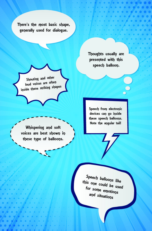
These are more like guidelines, the most used meanings for these type of speech balloons. You as the author of the webcomic have the liberty to adjust speech balloons according to your style and needs. You could modify speech balloons to make them fit a character. Color, shape, font, all that are qualities you can change according to situations. You’re the one who has the last word on the matter!
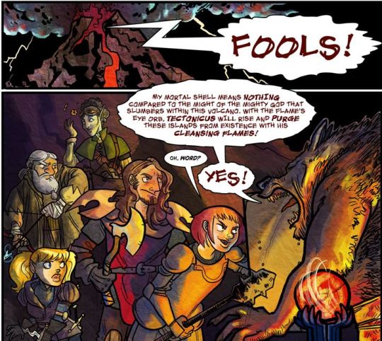
---Guilded Age
To keep your speech balloons orderly, try to accommodate the words in the shape of a square. Avoid long lines, occupy as little space as possible with the speech balloon. Make sure the tails are pointing at the character who is speaking. It doesn’t have to touch the character; all it needs to do is point in the general direction the character is at.
Angelica Maria, the author of Solstoria, mentioned this as her usual technique on how to accommodate text inside a speech bubble:
I try to keep the text in a speech bubble looking like a "Square", so for example
"Oh no, I'm being
held accountable
for my actions!"
The middle line can be extended slightly depending on the shape of the bubble. This is just something I keep in mind, it's not something you have to follow to a T or anything. I just want to make the lettering look somewhat good.
Wait, but how to position the speech balloons? Generally, it’ll be better to position them in a way that’ll guide the reader’s eyes in a natural direction – left to right, in other words. Take this for example:
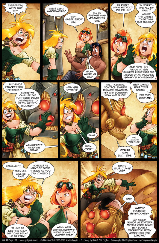
---Girl Genius
See? The speech balloons are positioned in a way it’d be easy for the reader’s eyes to move towards the right. The dialogue always starts on the top left corner and moves either in an arch towards the bottom right corner or in the top and bottom parts of each frame. It’s not a requirement to set your speech balloons this way, but it’ll certainly make it easier for the reader to read!
To put it in a nutshell: as a rule of thumb, remember to direct the balloons placement in a way that leads from left to right or from top to bottom.
Another thing you have to remember and keep in mind if what font you’ll use for your lettering. What kind of font would be the best for your dialogue? Any font that’s legible at small sizes will be good. Maybe Comic Sans would be your first thought because, just as its name says, it was created for comics, and that is because Comic Sans is meant to be readable at small sizes. That doesn’t mean you have to limit yourself to using Comic Sans. There are many other fonts that could be useful to you!
I recommend you take a look at this website. It has many fonts that can be used in the comic book industry, and most of them would be good for your webcomic, no matter the genre. Some are paid fonts, but there are many fonts that are free to use and can be useful to you.
Here, take a look at some fonts you could use! Compare and decide!
Personally, I like how the Back Issues font and the Kid Kosmic font look!
Generally, it’s recommended you use all-caps in the webcomic, as it’ll be easier to read. Most of the fonts you’ll find for comics often only have capital letters, so most of the time you just will have to type without worrying about activating the all-caps function.
I HAVE THE FONT AND THE IMAGE. NOW WHAT?
Open your sketch or finished image in your software of choice. For the purpose of this post, I’ll suppose you have Photoshop. Most software you can use for these purposes have the same basic functions, so it doesn’t really matter.
Create a new layer above your image. This layer will hold the speech bubble itself – the writing will go in a different layer. Don’t start drawing ellipses or circles yet! Instead, write the text you want to use, and place it where you want it to be, and the size you want it to be. If the text tool didn’t automatically create a layer when you used it, manually make a new layer and place the text there. It’s a good idea to have one layer for each speech bubble, don’t lump all speech bubbles in the same layer.
Once you have the text written, you can make the speech bubbles themselves! The quick option would be to use the ellipsis tool and fill it with white color, but the result will end being rather generic. How about you try to draw the speech balloon by yourself? Use a tablet or, if you don’t have one, use the pen tool. It may take some practice, but this should give your webcomic a more professional look.
You don’t have to make the balloons perfectly round. As long as it’s decently round and doesn’t look like something splattered all over your image, you’ll be okay.
Remember to leave some space around your text, though! Constricting your dialogue into a speech balloon smaller than it is not a good idea.
See?
Also, there’s a technique that could make this easier for you. In Photoshop, there’s a special layer effect called ‘stroke’. If you configure it correctly, everything you draw on that layer will be surrounded by an outline. Make sure to configure it so there’s a black border, of two or three pixels wide, and that it’ll be placed externally. Use a brush with a white color to make the speech bubbles, it’ll immediately be outlined, with no additional effort on your part! If you want to recreate these characteristics in new layers without having to open the window again, all you have to do is duplicate the layer while it’s empty. That’ll give the same characteristics to the copied layers!
Those are the basics of speech balloons.
Dialogue isn’t the only text you may use in a webcomic, though. There’s also expository dialogue, like a monologue, thoughts or notes you’re adding to the page, for one reason or another. What to do, then?
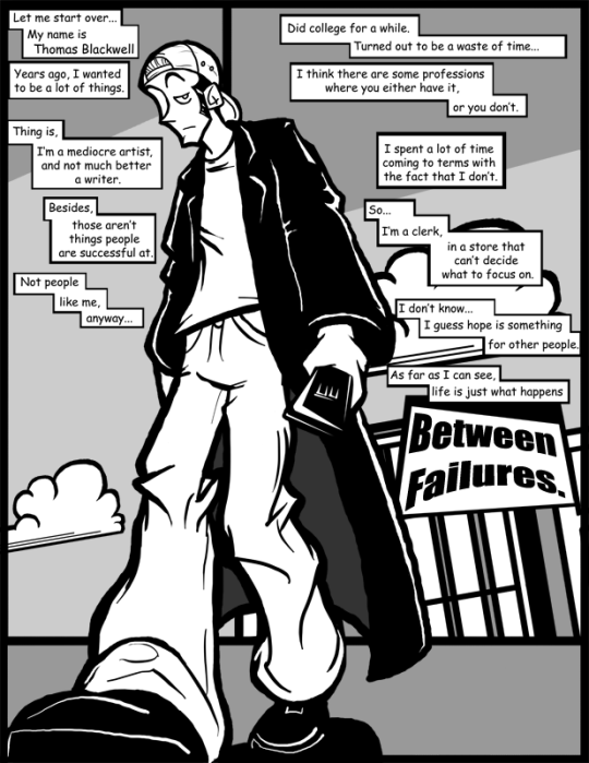
---Between Failures
Usually, these are done in these rectangular boxes. These could be considered similar to speech balloons in many ways, and follow many of the tips and rules speech balloons have. When asked, the author of Between Failures said this:
I've only done this two or three times in the entire run of the comic. It's not talking because it would make the character look insane if he monologued out loud to himself for a couple of pages. This is basically just expository narration to set up the premise of the comic in a single page.
How much expository narration is necessary for a webcomic? It’s not like there’s a definite answer to such question or a guideline you need to follow, but it may be worth remembering that webcomics are a visual medium. Sticking to the ‘show, don’t tell’ may be a good choice, since illustrating some of the exposition may help get it across better than text would, with the risk of breaking the pacing a bit. It all depends on the situation, so trust your intuition, ask yourself what you’d like to see!
I UNDERSTAND!
Excellent, I’m glad to hear that.
Oh, right, there’s one thing more you may want to hear about: can you stylize your speech balloons? Give them your own touch? By all means, go ahead! If you feel it’s appropriate for your webcomic and you think it looks good, then experiment all you want. Gauge how the speech balloons look in your webcomic, maybe ask for a few opinions...do everything you can so the end result is something you’re happy with.
It doesn’t have to be anything complicated. Simple measures such as a shadow or a border around your speech balloon can be quite effective to make your webcomic have a distinctive mark to make it stand out from the many, many webcomics available on the Internet.
---Solstoria
I started adding them because I removed the black outline on the bubbles and felt they looked better with a drop shadow and now concrete outline. I also removed the outline of the comic panels of Solstoria in general around that time too! I just did it because I wanted to try something different and I liked how it looked. I know Solstoria isn't highly structured, but I enjoy experimenting with it.
As you can see, speech balloons aren’t something done spontaneously if you want professional results, but the effort will be worth it!
---
I hope everything discussed in this post is of some use to you. Good luck to all your endeavors in the field of webcomics!
9 notes
·
View notes
Text
7 Principles of Kick-Ass Logo Design
5) Make it Proportional and Well Balanced The best logos are designed using principles of proportion and symmetry. Illustrated below, you can see how both the Apple logo and the Twitter logo utilize circles of proportionate values as well as symmetry to create a pleasing, balanced aesthetic quality.4) Make it Modern Yet Timeless “Modern” is “today,” but not so “today” that in five years your logo will look silly.And, modern is different than trendy. A trend is “hot today” and will naturally (sometimes thankfully) run out of steam – probably sooner than later. Modern, on the other hand, is less stylized and more restrained; it captures the relevant characteristics of the times without losing itself in detail.A logo should be modern in that it should be contemporary, yet not so nuanced with “hot” components that when that trend has run its course you’ll be left with something that feels outdated. Because then your company feels outdated to your prospects.Your overall approach should be modern as should specific elements, colors and typefaces.Some logos have changed little over time, only tweaked to make them more modern but keeping essential elements intact, like UPS, Starbucks and Burger King.Remember that logos are used in a variety of ways, on different platforms and in various formats and sizes, so fine details will be lost. A strong logo will have few elements, each of which can be identified easily and integral to what you’re hoping to communicate. If you have elements that don’t contribute to the whole, get rid of them.The logos below are trying to stuff a whole lot into their logos. No one has the time to spend trying to figure them out:Apple’s logo reflects how the company thinks and how its products perform: simplicity, artistry, and user-friendliness.That’s a whole lot of power for such a singular piece of graphic design to hold all on its own. Knowing the goal is to create something intended to carry this massive responsibility, graphic designers approach these projects with a mix of thrill, dread, anxiety, fear and pride.
Fortunately, there are principles (how many and what they are depend on who you’re talking to) that guide the development of effective logos, seven of which we’ll cover in this post.
The Thinking That Leads To Effective Logos
If all you’re hoping to do with your logo is stand out, your designer’s job is blissfully simple. Doing something outrageous graphically will make you stand out; creating something painfully minimalist will make you stand out, too. But “standoutability” is just one element of good logo design. There’s much more to consider before you get a designer working on your brand’s logo.
For a logo to function effectively it has to make a strong statement – and the right statement – the first thing you must do is figure out what you’re trying to say.
What Do You Want to Stand For?
Logos are symbols, and as such should tell people what you mean to them (or what you hope to mean to them – logos should be somewhat aspirational).
Understanding your meaning and value to customers and prospects will help you pinpoint what you stand for (or should stand for). If you’re not sure, ask yourself what makes your company better than competitors; better yet, ask your customers.
Depending on your product or service, your competitive advantage might be speed, authentic old-world craftsmanship, precision, attention to detail, reach, intelligence, variety, coolness, good health, power, innovation, elegance, efficiency or one of a thousand other characteristics. What you choose should be important to your prospects and customers, not exclusively to you. Having been in business for 57 years might be a point of pride for you, for example, but probably means very little to prospects looking for solution.

Apple’s logo reflects how the company thinks and how its products perform: simplicity, artistry, and user-friendliness.

Evernote, a popular notetaking app, uses an elephant with a dog-earred ear as its logo. The app is used to gather and remember lists, images, ideas, etc.
Once you’ve established the attributes that make your company valuable to customers and prospects, use them as communication goals for your logo.
Understand your audience
A logo should not only reflect the company for which it stands; it should reflect its target audience, too. If your audience is middle-aged male gun owners who take part in the annual deer hunting season, your logo should be designed to appeal to them, with elements that suggest things like ruggedness, nature/outdoors, camaraderie, strength, etc.
7 Principles of Kick-Ass Logo Design
Once you’ve taken the time to understand what you need your logo to “say” and to whom it should mean the most, you can start directing a designer. As you review the options presented to you, evaluate them with these 7 principles in mind:
1) Keep it Simple
The best logos – the ones that give the viewer an immediate and clear sense of “you” – are clean and uncluttered. In general, less is more and simplicity is more impactful. Like these:

Remember that logos are used in a variety of ways, on different platforms and in various formats and sizes, so fine details will be lost. A strong logo will have few elements, each of which can be identified easily and integral to what you’re hoping to communicate. If you have elements that don’t contribute to the whole, get rid of them.
The logos below are trying to stuff a whole lot into their logos. No one has the time to spend trying to figure them out:

2) Make it Memorable
A logo should be easily recalled after just a glance. A glance, after all, is typically all your logo is going to get from most people.
Like any symbol, it should stand for something singular, and it should be easily recalled if, after a person looks at it, he or she can immediately describe its basic elements (“It’s three interlocking circles” or “It’s a dog with a bone”). A logo that’s complex, fussy, has multiple parts and pieces or is overly stylized will be difficult for the viewer to “get” and, as a consequence, easily dismissed.

3) Make it Fresh
Don’t settle for a me-too logo. Do a quick search of logos in your industry and look for patterns and avoid mimicking them. Telecomm is filled with logos featuring globes, technology and electronics with logos that involve swooshes, and dentistry with logos of teeth or smiles (or both – see below).
These all make sense and communicate what the companies want them to, but if you do the same you lose all hope of getting noticed.

4) Make it Modern Yet Timeless
“Modern” is “today,” but not so “today” that in five years your logo will look silly.
And, modern is different than trendy. A trend is “hot today” and will naturally (sometimes thankfully) run out of steam – probably sooner than later. Modern, on the other hand, is less stylized and more restrained; it captures the relevant characteristics of the times without losing itself in detail.
A logo should be modern in that it should be contemporary, yet not so nuanced with “hot” components that when that trend has run its course you’ll be left with something that feels outdated. Because then your company feels outdated to your prospects.
Your overall approach should be modern as should specific elements, colors and typefaces.
Some logos have changed little over time, only tweaked to make them more modern but keeping essential elements intact, like UPS, Starbucks and Burger King.
5) Make it Proportional and Well Balanced
The best logos are designed using principles of proportion and symmetry. Illustrated below, you can see how both the Apple logo and the Twitter logo utilize circles of proportionate values as well as symmetry to create a pleasing, balanced aesthetic quality.

6) Make Sure all The Pieces Work Together
Your logo’s graphic device and your typeface work together (in what’s typically called a lockup) and enhance one another. Or they should. If your graphic device is clean and linear, don’t select a typeface that’s complex and playful (Fajita comes to mind). The two elements are really one, even if you determine times they can be used separately, and they must be complementary.

7) Make it Versatile
Your logo will be used in a number of ways and in multiple contexts. Here are just a few:
On t-shirts, baseball caps and, alas, fanny packs
On pens, keychains and water bottles
On very horizontal and extremely vertical banners
On both black and white backgrounds (make sure your designer creates your logo in black and in white to satisfy these needs if necessary)
Very large and very, very small
Alongside other company logos, like those for specific products and services
Imagine how these logo would look on pens:

Your logo has to maintain its integrity and serve its purpose no matter what the use. A good designer will understand all this and create a logo that works in all situations. He or she will also take into consideration any other branding elements, like textures or patterns, that are part of your brand and create a logo that complements them.
So, how do you know if it “works”?
Here are two quick tricks that tell you if the logo design you’re considering fulfills the “make it memorable” and “keep it simple” principles:
Trick #1
Print your logo on an 8.5 x 11 sheet of paper (don’t fill up the page – make it about 1 inch high)
Hand that paper to people who haven’t seen the logo or been a part of conversations about the design project (in other words, pull a guy off the street)
Ask these people to look at the logo – for just 3 seconds!
Now ask each to describe it to you
If your logo’s intended meaning was immediately clear to them, you’re onto something!
Trick #2
Put your logo and 8 others on a piece of paper (arranged in 3 rows of 3); make sure they’re about the same size
Show this to as many people as will participate; let them view it briefly – no more than 30 seconds but at least 15
Take the paper away and ask viewers to recall and describe as many as they can – is yours among them?
This is a poor-man’s research that replicates (somewhat) what your customers and prospects go through every day: they have just seconds to consider a logo and it’s often at a time when other logos are competing for attention.
The Takeaway
For your logo to do what it’s expected to, you first must understand what your value and meaning is to your customers and best prospects. Then, by following design principles that are the foundation of some of the world’s best logos, you’ll have a symbol that stands for something. A logo can never represent everything a company is, offers or wants to be, but a good one will say something distinct that your target will naturally respond to.
0 notes
Text
Week 5 Journal Entry
"Design History and Your World"
Pull at least two examples of design from Chapters 2 (pages 95-102) and 3 (all) from your textbook or from this week's lectures. Write a paragraph that compares your chosen works with at least two examples of design you see around you on a daily basis. Take photographs of these with your phone. In your journal post, provide images of all works (both the famous works and objects from your daily life). Label each image. Your analysis should include some in-text citations from the textbook to prove you have engaged with Chapters 2 (pages 95-102) and 3 (all).
From chapters 2 and 3 I choose Peter Behrens, Darmstadt, 1901 poster, and Tristan Tzara’s Bulletin Dada, no.6. 1920, periodical -- two graphic poster styled works. I am comparing these with my Make Art Not War sticker by Obey and my Collectivo collectible poster (free from Collectivo).
Peter Behrens, a German architect, was a well-known member of the Darmstadt art colony established in 1899, which sought to “promote high standards for crafts made in the region,” Eskilson 102. Being one of the more accomplished designers at the colony, Behrens career focused on the fine and applied arts, and he was invaluable in the spread of new, non-academics styles in the fine arts. His 1901 Darmstadt Poster is as if Early Art deco had a baby with Art Novvouue. Typical of Scottish and Viennese work, Behrens poster is in a vertical format, with a much more subdued stylization of the female figure, and a relatively plain text. There are not many frills decorating the poster aside from the symmetrical crowns and the vertical lines emulating the rectangular format of the entire poster surrounding either side of the female figure, and the text is very plain, condensed, capital letters that reverses the color scheme of the image, Eskilson 102. Like art nouveau, I catch very Alphonse-Mucha-esque vibes front these pieces as well. The thin graceful vertical position of the poster is very an art nouveau portrait style that Behrens utilizes, as well as the lithe, elegantly clothed female figurine in the center of the poster. The female figure in the middle is reminiscent of a goddess holding and standing upon to glowing white orbs, and on either side of her raised hands are the aforementioned crowns, the duke’s coat of arms, representing the notion that the Darmstadt Art Colony is one of the elite artists with a higher understanding of art and the ability to create art in a unified style.
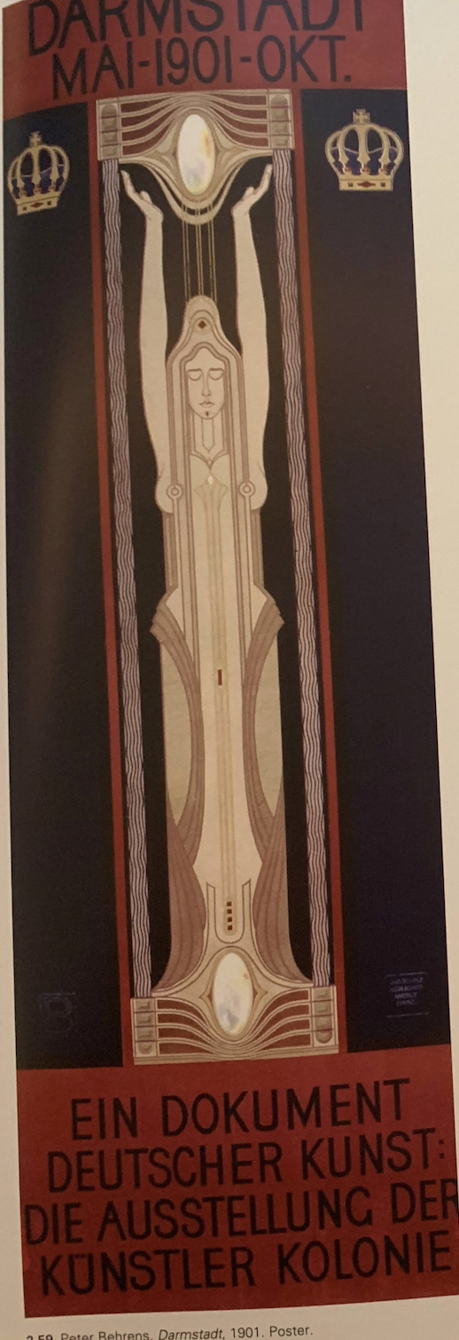

I compare this piece to the Make Art, Not War (MANW) poster by Shepard Fairey. I see this poster in the form of a sticker on my laptop every time I use it. The MANW poster is a very symmetrical piece of art with the same color scheme as THe Darmstadt poster -- red, white, and black. They are also both fairly symmetrical and have a female figure represented in the middle of the work, although on my MANW sticker (which is normally a poster, or sweatshirt decal) is only the head of the woman. They also both have very plan, sans serif fonts even though the font on the MANW is curved to fit around the head of the female centerpiece. I think I would consider both works to be extremely similar, and kind of meant to spark inspiration and aspiration in those who look at them -- join Darmstadt, save the human race from itself, the same thing.

(I could not find a picture of the Colectivo poster! I'm currently at. home and will not be able to get a picture from my dorm room until Sunday -- I will email the photo.)
20 years later…
I'm looking at the Bulletin Dada Periodical by Tristan Tzara. Tzara gained influence from the journal he founded, Dada, and a “new generation” of French writers who some went on to begin the surrealist movement after Dada. Issue no. 6, Bulletin Dada, of his journal, Dada, features a wide range of eclectic typeface, in an array of different ways and forms. Red and black letters stand out against the white of the paper, although ith can be hard to read some text because it has been overlaid on top of other text. Tzara purposefully overpriced blocks of text and used random typefaces to boost a sense of delicate improvisation. Even though the Bulletin Dada is quite a baffling and crazy piece of art for its times, there is enough clarity in the pieces to introduce a new slew of Dadaists, “a whole new roster of Dadaists who were scheduling several new public performances.” Eskilon 133.
I compare this piece to one of the collectible Colectivo posters that I got for free. I’d go as far as to say that the two pieces of art are almost opposites. The Colectivo post at a soft mustard yellow is a tangle of black and white text and a black and white skull, somewhat blending until its hard to make out what it says. The collectible poster was made for a completely different purpose than the Dada Bulletin. It is a piece of art meant to be pretty and admired by customers who frequent Colectivo, the Bulletin Dada was meant to introduce new dadaists and serve as a form of satirical work, that plays with the boundaries of art.
Thank you,
Lamyra Adams
0 notes
Text
Brother MFC-6490CW Printer Driver
New Post has been published on http://brotherdrivers.xyz/brother-mfc-6490cw-printer-driver/
Brother MFC-6490CW Printer Driver
Brother MFC-6490CW Printer Driver – Considering the price, possibly the most impressive factor concerning the MFC-6490CW is that it doesn’t skimp on capabilities. It images, tests, and faxes spanning a network; it works as being a stand-alone fax equipment and copier; also it can connect an examined file to an e-snail mail information either utilizing the e-snail mail software on a PC, or by emailing the content directly by using an in-home e-snail mail hosting server or an ISP.
Other significant business office-centric functions include a 50-web page intelligent papers feeder (ADF), that may manage as much as tabloid-sizing paperwork; a tabloid-dimension flatbed; and both an Ethernet connector and Wi-Fi assist. Two paper storage, one particular for 150 bedding and the other for 250, provide ample capacity plus the flexibility to maintain two different kinds of styles of paper packed simultaneously.
For home offices, the location where the AIO may need to do dual purpose like a house printer, furthermore, it delivers photometric characteristics. It can print out right from PictBridge video cameras, memory space credit cards, and USB keys, and it allows you to review photographs on the color LCD or print a directory page if you like.
That Brother has been able to shoehorn tabloid-size stamping and checking into an AIO that’s not a whole lot more significant than its notice- and authorized-dimensions competition is a fantastic job. The MFC-6490CW’s situation is a surprisingly compact 12.7 by 21.3 by 19.2 ins (HWD). It’s not the tiniest AIO in whatever way, but it’s likely the littlest that printing and tests at the tabloid dimension. It’s also reasonably light, at 34.4 pounds, which makes it among the couple of-or else the only real-tabloid-dimensions AIOs which can be transferred about easily by just a single person.
Little concerned than launching paper, snapping from the 4 inkjet cartridges, and working the programmed installation system in disc. jogged my checks making use of Windows XP as well as an Ethernet interconnection.
If there’s a capture to look with all the MFC-6490CW’s features, it’s the pace. On our organization software suite, the AIO got an absolute of 19 moments 10 seconds. I would personally call that nicely throughout the bearable range, but it’s gradual for your price by today’s criteria. Being a point of reference, the Editors’ Selection HP Officejet Pro L7590 All-in-1 Printer, a similarly costed note- and authorized-size AIO, had taken just 9:14. The somewhat-far more-pricey Canon Pixma MX7600 All-in-One particular Printer got 12:58. When publishing images, the MFC-6490CW’s rate was once again gradual, averaging 3:49 for every single 4-by-6 and 8:50 for each and every 8-b-10.
The MFC-6490CW’s result high quality is deceased-on normal for an inkjet. On our textual content tests, over half the fonts approved the dual thresholds of effortless legibility and effectively-shaped character types at 6 factors, with a bit of passing at smaller sizes. One intensely stylized typeface with massive cerebral vascular accidents necessary 20 details, nonetheless, and fonts with thick strokes had been a bit grayish somewhat that darker dark. Take into account the written text high quality sufficient for many companies needs but lacking the top high quality you’d probably want for making the best possible impact in something such as a résumé or most personal computer-publishing output.
Images on ordinary pieces of paper were suitable for virtually any business to consume and which includes products like PowerPoint handouts. I found some banding in one check page published in default mode, but no banding in any way in the substantial-top quality setting. The shades had been yet another tiny dulled down, somewhat less eyesight-catching, compared with the productivity from other printers. Depending on how a good deal of perfectionist you are, you may or may not consider the images suitable for paperwork likely to a significant customer or buyer.
Photo top quality was about what you would expect from your community drugstore: correct photograph high quality, but in the shallow conclusion in the array. I noticed a small tint inside a monochrome image, as an example, plus a little shade in doing what should be white colored clouds in a color photograph. The result is unquestionably suited to snapshots, and, typically, for images headed on a recording or perhaps a structure.
Compatible Operating Systems
Windows XP
Windows XP x64
Windows Vista (32/64 bit)
Windows 7 (32/64 bit)
Windows 8 (32/64 bit)
Windows 8.1 (32/64 bit)
Windows 10 (32/64 bit)
Mac OS
Mac OS X 10.4 Tiger
Mac OS X 10.5 Leopard
Mac OS X 10.6 Snow Leopard
Mac OS X 10.7 Lion
Mac OS X 10.8 Mountain Lion
Mac OS X 10.9 Mavericks
Mac OS X 10.10 Yosemite
Mac OS X 10.11 El Capitan
Mac OS X 10.12 Sierra
Mac OS X 10.13 High Sierra
How To Install Brother MFC-6490CW Driver
Here is the Brother MFC-6490CW Driver Troubleshooting, Download Here
Brother MFC-6490CW Driver Download
The Mac Driver For Brother MFC-6490CW Download Link
The Windows Driver For Brother MFC-6490CW Download Link
#Brother Mfc 6490cw#Brother Mfc 6490cw Cartridge#Brother Mfc 6490cw Driver#Brother Mfc 6490cw Ink#Brother Mfc 6490cw Manual#Brother Mfc 6490cw Manual Pdf#Brother Mfc 6490cw Offline Problem#Brother Mfc 6490cw Price#Brother Mfc 6490cw Print Head Replacement#Brother Mfc 6490cw Printer#Brother Mfc 6490cw Printer Offline#Brother Mfc 6490cw Scan To Pdf#Brother Mfc 6490cw Software#Brother Mfc 6490cw Support#Brother Mfc 6490cw Toner#Brother Mfc 6490cw Treiber#Brother Mfc 6490cw Troubleshooting#Brother Mfc 6490cw Web Interface#Brother Mfc 6490cw Wireless Setup#Driver For Brother Mfc 6490cw
0 notes
Text
20 Best New Portfolio Sites, June 2017
Welcome readers, it’s June, and the Brutalism bug is back. No, really. After disappearing into the phenomenon I called “post-minimalism”, plain old Brutalism seems to be making a comeback.
Oh, it’s had a few refinements; good designers would never let their brutalist sites actually look bad. But the underpinnings of the style are definitely there, and present in more than a few of this month’s entries. Beyond that, it’s a fairly varied assortment of portfolios for you all to dig into. Enjoy.
UI Viking
Our first entry this month is actually from a designer we’ve featured before, only he’s gone and redesigned his portfolio. The inimitable UI Viking brings us a star-studded design that’s just plain loaded with color, personality, and illustrations of a badass viking. In space. In true commitment to the joke, things like “continue reading” buttons on the blog say “Kill This Post” instead. The contact form says, “ODIN OWNS YOU ALL! I’ll respond you ASAP… between robberies and lootings.”
Overall, it’s a great-looking site that—despite the inherent simplicity of the layout—is just overflowing with personality. You’ll never mistake it for being anyone else’s work.
Nick Jones
This is the first time I’ve ever seen a website designed around a golden spiral. Nick Jones’ portfolio is exactly that, and it feels ingenious. Hit the down arrow on your keyboard (or click any of the content cards), and you’ll spiral right on into his site, giving the experience a weird feeling of depth.
It’s playful too. Go to the site and hold the up arrow. Just try it out. The whole site is pretty, though the text might be a bit small. It also loses points for not letting me use my scroll wheel to move into the site. I mean, it’s the one kind of site where I might forgive scroll wheel hijacking.
On the other hand, it gets massive points for having a more accessible version that is linked to right at the start.
Senthil
Senthil’s portfolio just about makes me nostalgic for the days when everyone wanted their site to look like Apple’s. Oh, this is by no means a rip-off, but the influences are certainly there. It actually reminded me of the beautiful things inherent in this kind of minimalism: the perfectly distributed white space, the type, the focused use of imagery…it’s all there, and it all still works.
Rick Waalders
Longtime readers of this series will know how I feel about the over-use of animation, and how that can affect accessibility. On the other hand, there’s something to be said for just going all in like Rick Waalders.
The site looks good, with solid type, plenty of contrast for the dark layout, nice color palette… oh, and the huge spinning 3D thing that stays with you throughout the whole site. Every element is pretty much animated out the wazoo. In a weird way, it works. I guess if you’re going to create an experience like this, you may as well commit.
Doberman
Doberman is a design firm that likes to mix things up, apparently. Their use of collage-style layout, color, and typography combined leave me feeling like the site is a mix of post-minimalism and brutalism. It’s not often you see a designer successfully tie two bandwagons together and charge ahead at full speed, but that seems to be what happened here. The clash of styles is surprisingly effective.
Leszek Juraszczyk
Leszek Juraszczyk’s portfolio is almost aggressively post-minimalist. From the monospaced type to the bare-bones layout, to the near monochrome palette, it hits all the right notes. It also looks refined, and elegant even, with some of the imagery overlapping other elements to give a sense of depth. This is everything ’90s print designers dreamed of when they started designing websites too.
Roger Burkhard
Roger Burkhard has opted for a horizontal layout to showcase his projects in a somewhat brutalist—but still good-looking—design. As this style permeates the rest of his work, it seems appropriate.
Mario Hugo
People involved in the arts seem to adore masonry layouts and serif-laden type. Mario Hugo is no exception. It’s a fairly simple site whose only concession to flashiness is the fact that the gallery thumbnails rotate when you hover over them. For all that, it’s well-made and just plain pleasant to look at. Part of that is the organization. Part of it is the focus on putting the art front and center.
Chris Biron
Chris Biron’s portfolio believes in keeping it simple. no really, it says that on the home page. The rest of the design lives up to the promise, with a simple, minimalist layout. The site is stylistically separated from others by skewed text, and slight ripple effect when you hover over images. All in all, it’s well done, if occasionally reminiscent of WordArt.
dn&co.
dn&co. puts the work front-and center, with just the slightest hint of brutalism hiding around the literal edges of the design. And between the images in the case study. Well, it’s either brutalism or post-minimalism, and I’m having a hard time telling the difference at this point.
Cole Townsend
Cole Townsend’s portfolio reads a lot more like a resume, and studiously avoids using images. Always a bold choice, as you have to rely on the user’s willingness to click through links. That said, the text is very beautifully laid out, so I enjoyed this one nonetheless.
Kennard Lilly
This is certainly one of the more colorful portfolio entries this month. The use of a painting as the background gives the site an unforgettable style, even if it sometimes makes the text hard to read. This is toned down when you click on a portfolio piece, but you still get the sense that “vibrant artsy stuff is going down” all throughout the site.
Julia Chistiakova
Julia Chistiakova’s site is every bit as colorful as her illustration and web design work. It also uses simple gallery that makes use of modal windows to present each case study. Despite its simplicity, it’s highly stylized, and just plain oozing with personality.
Jack Morgan
Jack Morgan has definitely worked for Google.You can tell the moment you land on his site, because if I didn’t know better, it could be a Google product. It has the same minimalism. It feels a bit like Material design. All the text is set in Roboto. Every div has about ten classes.
Yeah, this guy works for Google. His site is a master class in Google-branded design.
viget
viget marries the familiar portfolio trends we’ve come to know with a distinctly corporate feel. With clients like ESPN, the World Wildlife Foundation, NBC, and more, that makes sense. Corporate is what you want. It never fails to impress me when I find designers who can take designs that seem fairly traditional—and all-purpose and tailor—them to their audience through attention to detail.
Clement Simon
Want a break from all of the flashy new trends? Have a look at Clement Simon’s portfolio. It’s a simple site with a masonry layout, solid imagery, and elegant typography. And by “elegant typography” I mean the text is a bit too small. That said, scrolling through this site is almost like Zen meditation in comparison to others.
Nik Papic
Nick Papic clearly wants to stick with clients who like reading. Aside from the logos of client’s he’s worked with, there’s nary an image to be found. That said, you probably don’t need an image gallery when you have a resume that reads as well as Nik’s. And I mean that both in terms of typography and content.
Bukwild
Bukwild uses a lot, and I do mean a lot of background video. However, instead of letting the background video and imagery do all the talking, each has been carefully chosen and edited to fit the theme of the site, which is no surprise, as Bukwild bill themselves as experts in branding.
The branding is really what stands out about this site. Every element feels like it was very carefully made to fit together, beyond the normal efforts of designers. It takes a fairly normal site (for professional designers), and turns it into something recognizably theirs, even if it’s a bit hipster-ish.
Nicole Saidy
In a world of minimalist sites that are so often monochrome, and super-colorful sites that blind the eyes, it’s nice to see a compromise. Nicole Saidy accomplishes this through using a rainbow of accent colors in very small decorative elements, combined with a sort of pastel gradient for buttons and other larger UI elements. Combined with a design that’s just plain solid overall, and you get a minimalist site that still stands out.
Andrej Cibík
Andrej Cibík’s portfolio is minimalist, and does that thing where a designer forgets to turn off his grid view when he launches the site. I kid. The grid is there for style reasons. Beyond that, the typography on this site stands out as excellent, as do the eye-catching-yet-understated animations, which I love.
He also stands out for having a section in his “About” Page that details all of the thing’s he’s bad at. That certainly helps set realistic expectations for the client.
Beauty Mockup Scene Generator (500+ Items) – only $24!
Source
from Webdesigner Depot http://ift.tt/2rRz22T
from Blogger http://ift.tt/2rmmLjk
0 notes
Last Seen Blogs

daddy4pawg
Untitled
voltareal
Voltareal
punzwastaken
sigh

bandmanagementuniversal
Band Management Universal
bandmanagementuniversal
Band Management Universal