#this specific color pallet i like lol
Text
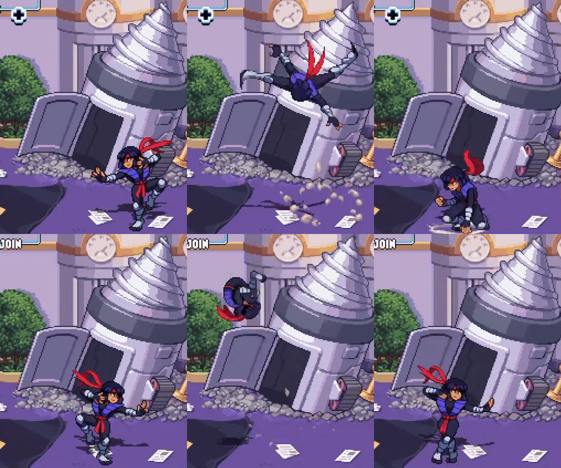
Grav experimental piece (PHIGHTING!)
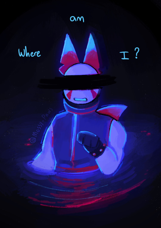
“This place looks so familiar, doesn’t it? But it’s just like i can’t put my finger on it…”
(alt versions as well)
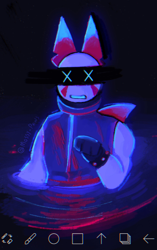
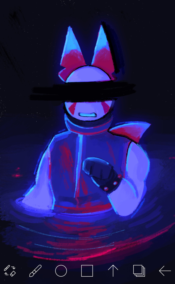
#WOOHOOOOO#i love doing experimental pieces like this :3#I got really really bored lmao and wanted to draw Grav so I decided that. Why not turn it into an experimental piece#The colors were originally a lot duller and were meant to stick to a pallet (specifically to mimic subspaces and medkits)#But I suck at sticking to pallets so instead we have this LOL#I cooked this thing up in about the span of ~4 hours!#… And I also did it all in one sitting (this is a cry for help)#ANYWAYS#I honestly really like how it came out and I really wanna do some more of these in the future!#But for now I’m sticking to smaller stuff since I have some bigger projects I gotta do#Anyways enjoy :3#Gravity disrupter#art#artists on tumblr#phighting fanart#phighting!#phighting#roblox phighting#digital art#phighting art#phighting roblox#roblox#phighting! roblox#phighting! art#Grav phighting#Grav#Roblox character#Artists on tumblr#Digital artist#My art
71 notes
·
View notes
Photo
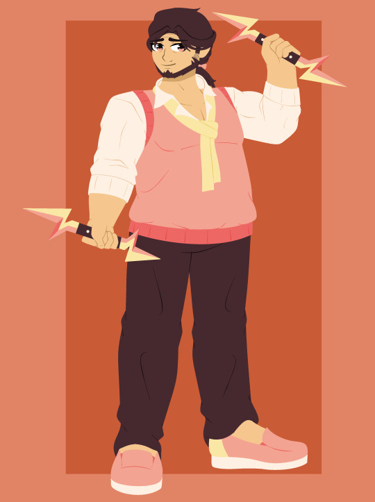

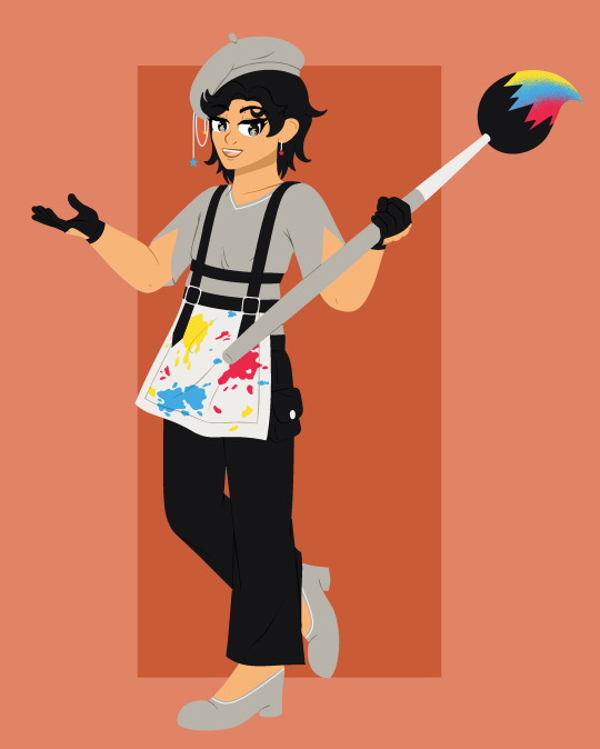
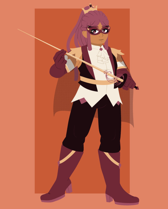

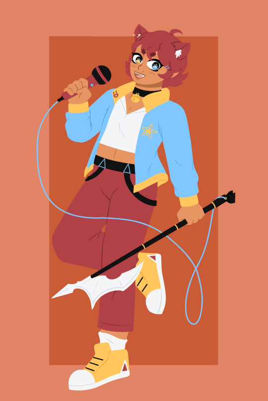
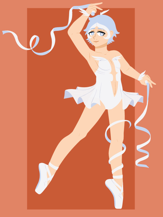

new oc batch ready! 8 more of these guys lol. the whole deal with this set is they’re from the artisan guild- lunar flair! intentionally spelled like “flair” as in “style” or “a flare for ____” rather than “flare”
basically all the members of the guild are different kinds of artists with different niches (and varying degrees of diva-ness). it’s pretty easy to tell who does what based on the everything about them, but if you want more info their bios are still under the cut!
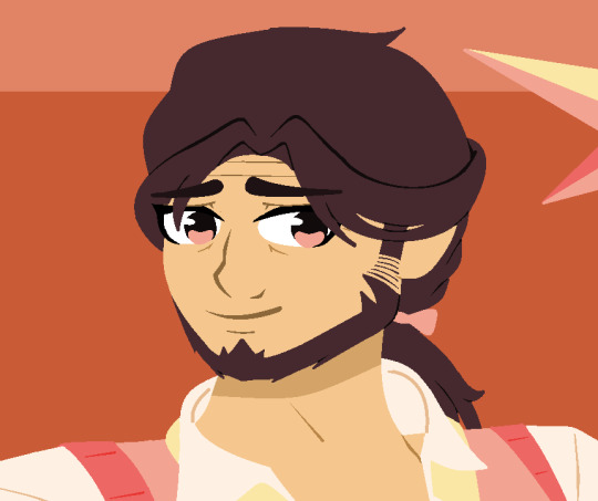
Name: Jupiter
Name Origin: The planet of course
Pronouns: He/him
Age: 52
Guild rank: Guildmaster
Weapon: Lightning rods
Ethos (Power): Gigantomachy. He can make himself (even more) giant
Flaw power is based on: His overly protective nature, especially where the guild is concerned.
Notes: Literally the nicest guy ever until you provoke him though
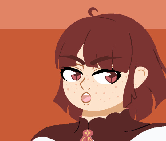
Name: Erinome (Erin)
Name Origin: A moon of jupiter, the exact meaning of it’s name is murky but it can refer to grace or purity
Pronouns: She/her
Age: 13
Guild rank: 2 star
Weapon: A Book.
Ethos (Power): Poetic Imagery. Illusions cast forth by his her poems that change the appearance of the physical environment
Flaw power is based on: Her escapist indulgence in fantasy
Notes: You know, like, the pen is mightier than the sword and all that.
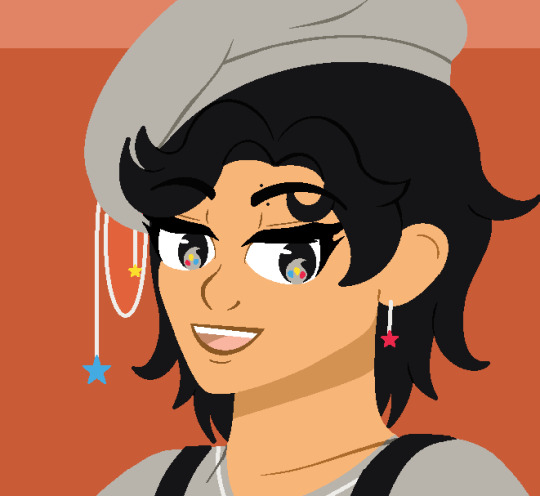
Name: Pictor
Name Origin: The constellation meaning “painter”
Pronouns: He/him
Age: 23
Guild rank: 3 star
Weapon: Giant paintbrush
Ethos (Power): Ardor. He can create three-dimensional things with his paintbrush. However they are not animate or alive.
Flaw power is based on: His conceited nature in regards to his own work.
Notes: Goes to museums to talk about how he could probably do it better anyway
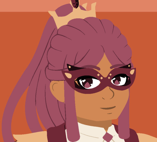
Name: Oberon
Name Origin: A moon of the planet Uranus, it gets it’s name from the king of the fairies in Renaissance literature. Notably in Shakespeare’s A Midsummer Night's Dream
Pronouns: He/him
Age: 29
Guild rank: 5 star
Weapon: Rapier
Ethos (Power): Fantasia. An illusion of changing his own appearance.
Flaw power is based on: His theatrical nature, of course
Notes: Why is he ourple?
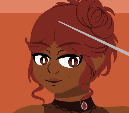
Name: Syrma
Name Origin: A star in virgo, it’s name refers to the train of a garment (Typically worn by actors in tragedies)
Pronouns: She/her
Age: 25
Guild rank: 4 star
Weapon: Giant needle
Ethos (Power): Binding threads. She can create stitches on any solid objects and bind them to each other. Including people- The stitches are manifested energy and do not hurt.
Flaw power is based on: The dependency she often has on bonds- i.e. threads that bind people.
Notes: She makes and models all her own clothes.

Name: Parumleo
Name Origin: A star in Pisces, it’s name means “small lion”
Pronouns: They/he
Age: 19
Guild rank: 3 star
Weapon: Microphone bardiche
Ethos (Power): Persuasion. If they can make you laugh you’ll temporarily have to follow his orders. Though it’s too weak to call full-blown mind control, and fairly easy to snap out of.
Flaw power is based on: His desire to be liked by others.
Notes: They’re like a lolcat. They can haz cheezburger.
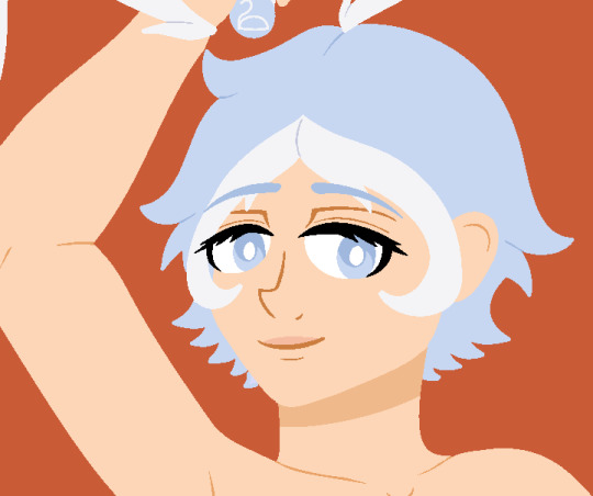
Name: Leda
Name Origin: A moon of jupiter, the name means swan.
Pronouns: She/her
Age: 28
Guild rank: 4 star
Weapon: Duel ribbons
Ethos (Power): Poise. Complete and utter weightlessness.
Flaw power is based on: Her carefree and utterly absent-minded nature.
Notes: You guys know swan lake right? Well, there ya go.
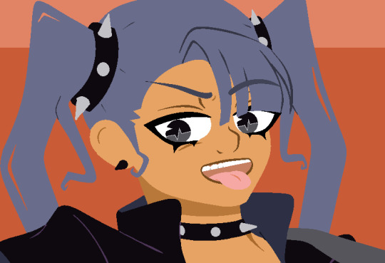
Name: Styx
Name Origin: A moon of pluto that gets it’s name from the river of the underworld. Yeah it’s also a rock band.
Pronouns: She/they
Age: 20
Guild rank: 3 star
Weapon: Axe-guitar.
Ethos (Power): Vibrato. Powerful soundwaves cast by her axe-guitar
Flaw power is based on: Her brash and blasé attitude
Notes: Calls everyone “baby” or “babe” because they’re a cool rockstar.
#finn's ocs#oc references#finn's art#YAY i finally get to post my funny little artist guys#i feel like its fairly obvious what each persons gimmick is but just for the sake of brevity (for anyone who doesnt wanna read the readmore)#in order#jupiter doesnt have a Specific art bc hes the guildmaster and you can think of him as more of a teacher of sorts#erin is a poet/writer. pictor is obvs a painter. oberon is a thespian. syrma is a seamstress#parumleo is a comedian. leda is a ballerina. and styx is a musician (or straight up rockstar)#since these characters are all like.. trinary characters they dont go all Too much deeper than their gimmicks#but thats why theyre fun to design bc its like. what if [thing] was a guy LOL#also i wanted to try some new stuff out w their designs (like syrmas dimples for example) so i hope they look okay? i hope so...#also leda and how shes literally the least clothed character ive ever made. shes going to catch a cold for sure yeah#parumleo i worry about bc i had a fairly similar color pallet for asterope (but no red) so i hope he still stands out. the lolcat....#oh also if erin and oberon's powers sound similar that's on purpose too. shes like his protege#i feel like out of all of them though pictor is like the prime example of guy who should be in an artist guild LOL#like the most archetypal. most ppl think of painters when they think of artists#but i wanted different types in there too.#painters writers actors even funnymen and rockstars. they all belong. theyre all weird about creating#anyway im glad i can finally post them now ^_^
99 notes
·
View notes
Note
WAAA i love ur art style! specially the head shape u use for sans heheh, i want to eat it :3, do u like swapfell gold? (specifically Wine) ah- and what do u think about papcest¿ I LOVE THE COLORS U USE FOR UR ART, U HAVE A REALLY GOOD COLOR PALLETE! (´ ∀ ` *)
thanks! :-DD! i don't really now much about the gold variant, but i like wine, undyne and alphys designs! but i do prefer paps uhhh regular swapfell??
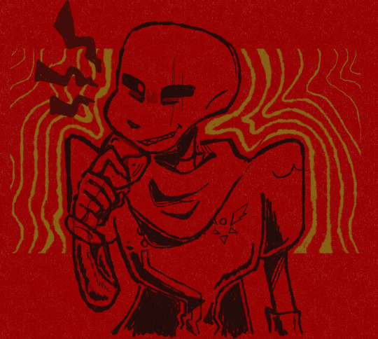
papcest is fine, i like edgepuff, although i haven't read many fics with that pairing,,
i really enjoy any take if it's an au, but i do prefer when the original stay as close to canon as possible lol (because it's impossible for me to do it myself, it's the main reason as to why i haven't written any fics in a long time :,,,-D)
that and i don't really see papyrus in a usual relationship, he's aro in my eyes but i like different takes on exactly what that means for him <3
thanks! i do struggle a lot with my color palettes, since i do prefer "ugly colors" (whatever that means, but a lot of people have said that to me so) basically very little saturation and no contrast, like,,, shades of slightly colorful grey. but i'm trying to make it more saturated.
#thanks for the ask!#asks#:-D#i love papyrus so much#if you have any fic recs i would appreciate it!#corbell art
50 notes
·
View notes
Note
Asking you about your ska troll concept! They look so cool and I would love to learn more about them
@shadow-ray4 thank you for asking, genuinely was positive that no one would ask 😅😣 but I am HAPPY to share! To start here are the full refs I've done so far and explain as much of the concept as I've developed in my brain lmaooo (ALL MAJOR DEETS undercut cause its gonna be LONG)
@goldendaydna also helped with this and lowkey a concept we are semi working out since her sona Golden Tempo is an Urbano Troll (a recently named concept lol)

Ska Trolls are Big, Bright, and BOLD. Together, these elements create an energetic, highly danceable, highly vibe-able troll genre. They also explode into confetti and confections when excited or surprised. Dont worry they pop back up as if nothing even happened leaving a pile of candy and crepe paper on the ground. (Ska trolls are super popular with the kids.) They practically live for the music, known for dancing for several days straight with hardly a rhyme or reason to stop.
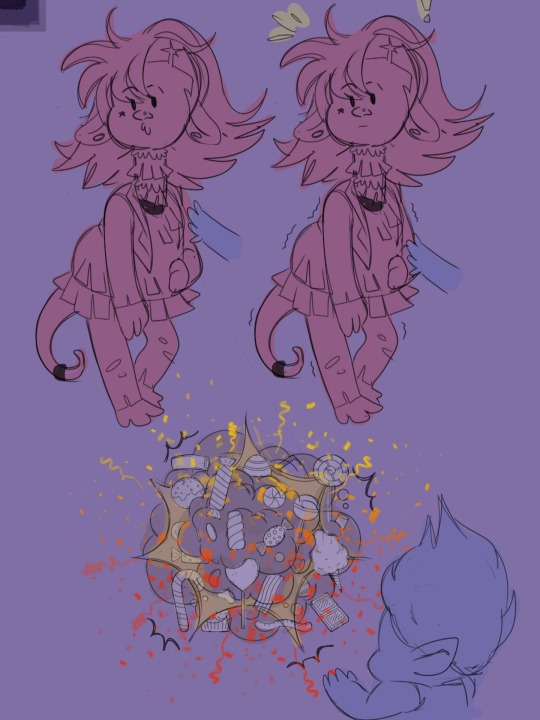
*Like even the smallest of surprises just make em POP! (Bonus Branch doodle cause why not??)
Adara, my sona, is a 4th Generation Ska Troll (her father being a 3rd Gen while her mama is a punk rock troll) so TECHNICALLY shes Ska-punk, but she still has the appearance of your standard Ska Troll so it's more a music specific.
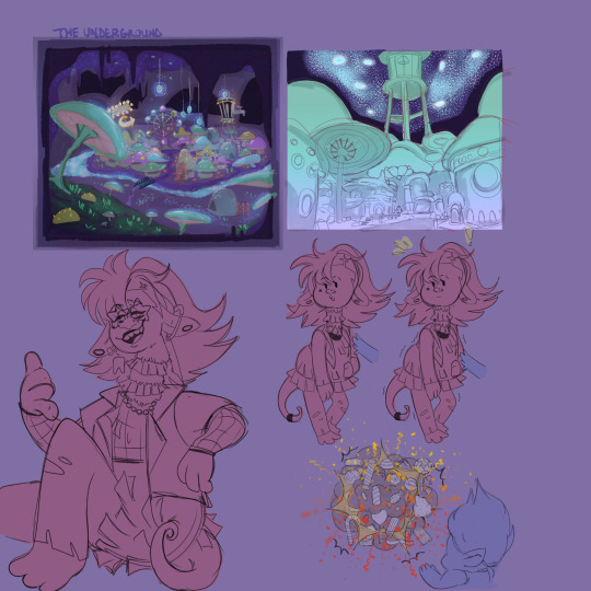
Her great great grandparents being a reggae leaning funk troll and a rocksteady leaning funk troll who formed The Underground after being seemingly left behind along with other alt/subgenres of the main 6 kingdoms when they split. A place for alternative trolls like herself and her friends could live and PARTY HARD without micro judgments against their music. It's a haven for other trolls who feel they dont quite fit a specific genre or even one at all, but also HELLA secluded from the rest of the Trolls so they look different and SOUND different. (Cave acoustics and all) The surface likely gets trimmers and even earthquakes from their raging parties. (I'm still fleshing this out but I have this piece of "concept art")
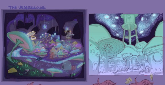
*Its literally a bioluminescent shroom town. Like glowing mushroom homes, food, ect- glow worms on the cave ceiling like stars in a night sky. All the various alternative genre of trolls have like a glowy eye thing that allows them to just see naturally in the dark too-
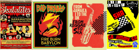
*these were some posters I took heavy color influence from for Adara's pallet (I know they arent all ska, but punk, reggae, and rocksteady aesthetics were an addition)
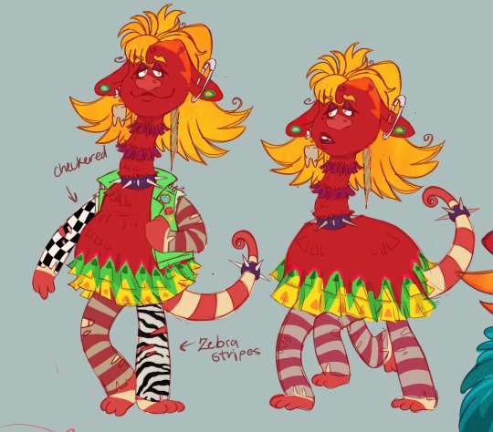
Obviously I took most inspo from pinatas, party/confetti poppers, and the sorts mainly because the funk trolls poop...well. baked goods and I wanted to play off that but lean into the crazy evolution the trolls have canonically in the universe that foam at the mouth for 👀 🤲 But I wanted to make sure her colors and patterns gave off not just Funk influence, but also micro subculture influences that are within The Underground. (This including but not not limited to, how closely Ska Trolls were to the Urbano Trolls communities within The Underground)
*Exchanged tassels and stringy fur textures for more paper textures. Like literally walking, talking, breathing pinatas fr
*Queen Essence I love yuuuu
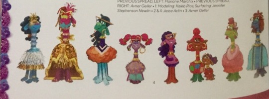
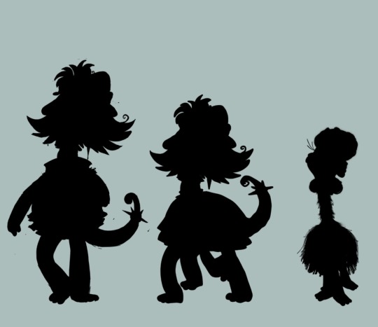
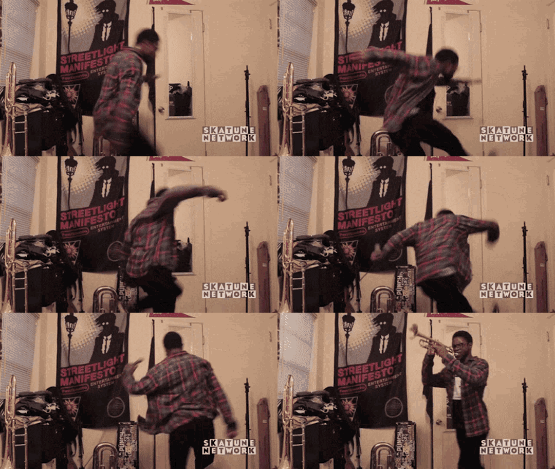
They are bigger than the average Funk troll and have very similar features to them, but texture and color wise are very different. They much more vibrant and staturated. Giving a mix of felt and crepe paper. They have tails as sortve as an evolutionary trait but also it gives maximum party mode as it can hold objects and act as an extra hand. Their ears are also longer and slimmer, making it harder for them to lift or perk up so they stay droopy unlike their funk counterparts. They are all naturals at brass instruments (mainly trumpet) and ALWAYS have a hop in their step.
*edit if the pics keep messing up... imma have to just remake the post 😭
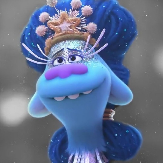
#dreamworks trolls#trolls fan concept#trolls#trolls world tour#funk trolls#ska troll concept#trolls branch#trollsona#trolls oc#trolls ocs#fan concept#veggie tells#my art#art#veggie art#veggie arts#my ocs#my oc art#my oc stuff
51 notes
·
View notes
Text
The Life Series and Eyes (A Headcanon Rambling)
hello traffiblr! Y'all voted to have me rant about the life series and my personal headcanons regarding eyes, so. Here we go!
Overview
So let me hit you guys with a quick overview.
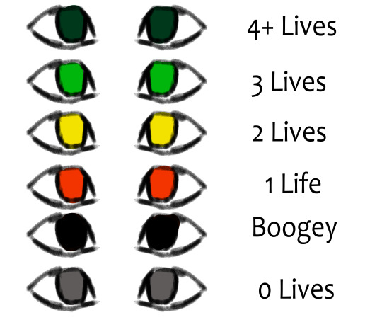
here's a quick reference. While these all depend on the individual, and the series, I'll explain what each general eye color means.
4+ Lives
People with 4+ lives fall into this category. Their eyes are a dark green, bordering on teal. I think it would be interesting if A. eyes act as a sort of weak gradient in terms of 4-1 lives. So, there's a bit more blue. 2. Personal headcanons regarding speakers, and their colors. 3. A sort of parallel to the Boogey eyes. both are very dark. So its harder to tell if they have 4+ lives somehow, or if they're boogey.
3 Lives
A classic. A nice, simple green. While the exact hue varies depending on the person (because of either violent or peaceful behavior/simply what looks good with them), greens have generally bright green eyes.
2 Lives
Similarly to 3, the exact hue depends on behavior of the individual. Someone who's more violent would be closer to an amber, while peace loving players lean towards more of a yellow-green. The eyes are always clearly yellow, though.
1 Life
While the others would go towards a color dependent on behavior, all bets are called off for reds. The hue is purely aesthetic. It is no longer a clue towards general behavior. There's rarely any allowance for personal preferences in reds. All they can see is violence and conquest.
Boogey
Basically, I reject the idea of boogies having purple eyes or glints for symbolism with watchers. It's far more threatening to me if their normally bright colored eyes are chips of the void. Obviously, characters still have pupils, I just don't include them in my style. I can't decide if Boogies have pure black eyes, or if their eyes are a dried-blood color so dark it only seems reddish in light.
0 Lives / Dead
And finally, we have grey eyes. When it comes to deaths before the final death, the bodies disappear quickly, as soon as the person respawns, I'd wager. But after that final death, their body remains. Their eyes quickly lose all color, and end up as grey. This was chosen just out of design choice, the lifeless look, and also, by incident, Scar's red-life skin. It makes him completely greyscale, so a similar logic applies here.
Character Specific Colors
Here's a quick guide to character specific colors. Again, everyone has a unique one. Do note that most of these are simply what looks good, as I've only had the time to watch Grian's pov, and not anyone elses.
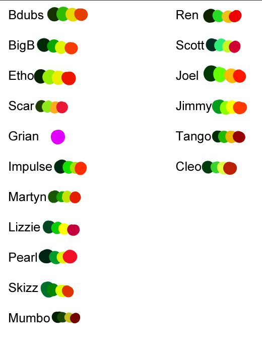
Ik they don't really... look good and may not fit, but hey, I'm here to rant about design ideas, not actual colors lol. And you will not believe how hard it is to make 16 different palletes unique and at least kinda match the character while having the same main 4 colors. I will address Grian, dw. Boogey and dead eyes are the same color, regardless of character.
3rd Life
Alright, so, from the base rules, nothing changes. It uses the same logic mentioned up above. Green, yellow, red, and grey. There's no real special mentions here that are exclusive to 3L.
Last Life
Similarly to 3L, LL lacks any specific changes to eyes. The only addition are the new eye colors for boogey and 4+.
Double Life
Here, characters share eye colors. What do I mean by this? I mean, their signature eye colors are at a gradient with their soulmate's. So, for example, Pearl and Scott's Green eyes are mixed as a gradient with both are on green. This applies for every life, and every soulbond. It gives people slight clues as to who exactly their soulmate is, but its hard to tell. When scar showed up boasting purple eyes, everyone was confused, to say the least lmao.
Limited Life
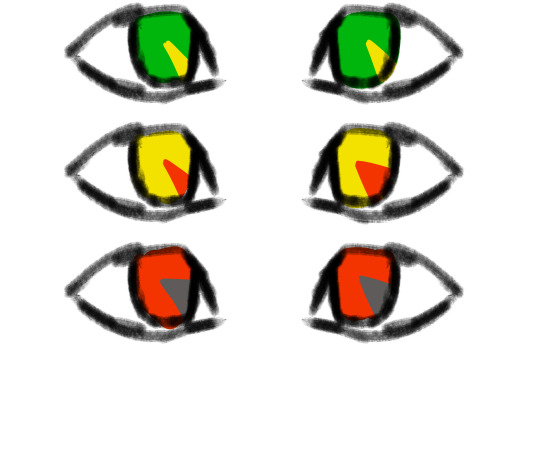
ok i'm definitely the happiest with this one. The idea is that everyone's eyes are functionally, like a clock. I illustrated it really badly, but the idea is cool ok. The idea is that like, idk, every 1/8 of someone's eye represents an hour. Every hour lost from the 'benchmark' turns to the next color. For example, if someone has 24 hours, their eyes are pure green. If they have, say, 18, they only have 1/4 (2/8) of green left, the rest of their eye being green. If they have only an hour left, they only have an 1/8 of an eye red, the rest being grey. The color of their current life slowly recedes in an almost spiral pattern as time goes on. If someone somehow had 24+ hours, same rule would apply to their 4+ life, so to speak. they'd only have a sliver of the dark green, with most of their eye being their 'normal' green.
Grian
okay, I know for sure people are questioning why Grian's eyes are neon purple. The reason why is on the simpler side. Watcher. He's the only one out of the players to be an actual watcher. Some people (like Pearl and BigB) definitely have some ties to them, but Grian's the only full blown watcher. (Martyn is tied to the listeners, who are green to me, so his colors are greener despite being prone to violence lmao. And Scott is tied more to the Speakers, who are blueish/cyan to me. Pearl, as Scott's soulmate in DL, has that bluish tint to a degree. )
But, you might ask, how do people not notice??? Well, its because of my Grian design.
This is old and it doesn't quite show my idea well, but alas.
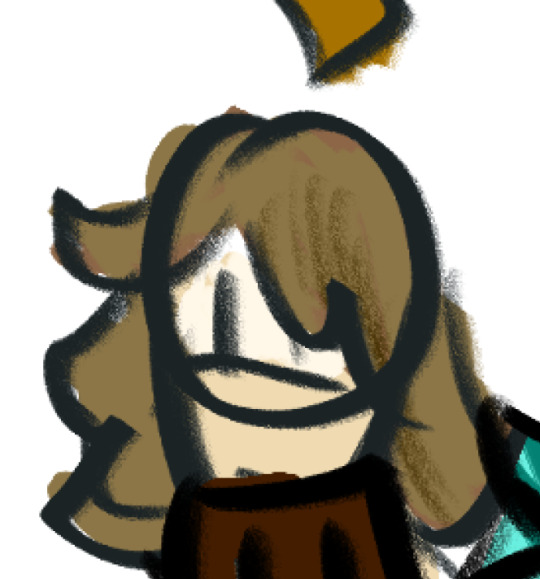
I've already made reference images for this and I can't find the motive to draw a Grian headshot lmao. The idea is taking the Watcher's face plate. You know the one. The mask. And taking that, and instead of having the Evo symbol, no, it has, guess what. Grian's weird freaking eyes. Yep. Whether this was his attempt at camouflaging himself among non-watchers, or if it was his basically middle finger towards them, refusing to show obvious alliance with them, idk. All I know is he basically vandalized his Watcher mask. Still, you might say, that doesn't explain why is eye color is purple. Well, if you take away his mask, it's either basically a void with purple eyes inside, or probably some sort of void looking crack through his face, as if it isn't actually flesh. He can choose to have 'normal' eyes, but they always remain that Alexandria's Genesis purple, and it messes with his sight. Basically he sees too much. (I'd elaborate in my Watcher/Listener/Speaker post if people wanted 👀)
#mcyt#trafficblr#traffic smp#traffic series#god this took a while. enjoy it y'all#enjoy it#also#people are free to use these headcanons if they want! I'd just like some acknowledgment/credit at some point lol#but yeah if people want my other traffic series hcs i /will/ share#3rd life smp#double life smp#last life#life series#limited life#3rd life#double life
139 notes
·
View notes
Note
Hello!
Weird question each of the characters has a specific color to them, like Hazel is green, Bella is red, Milo is orange and Gabe is blue. Do these colors have meaning or it just matched?
And do you have one for Mal?
I just honestly really like color theme for characters. It's one of the first things I think of when designing a character in fact.
Mal's is very much earth tones. He has a soft pallet. But, I think the color I tend to associate with him is this almost teal color? At least that what the gate he came through is colored. I honestly considered changing it when I went back to edit book 1 and the character yelled no at me so I'm not sure what that means yet. LOL
56 notes
·
View notes
Note
i unfortunately don’t have any questions i just want to hear you talk about art supplies 😔
oh well. thats not particuarly hard to do.
im real hyped because in the ‘my child is autistic and i have zero idea how to shop for him’ manner my mother let me pick my own gifts this year for xmas so i will be in possession of some sennelier oil pastels shortly. ive used them several times before, but theres really no competition. i say this about almost no media because i believe theres something for everyone- but there is one oil pastel brand and its sennelier. working with them will make you feel like you are working with a completly unfamillar medium even if you’ve only ever drawn in oil pastel before. They’re just incredible. incredibly pricy too.. oh well. I’m also planning on picking up a box of Carandache neocolor I. they’re wax pastels, basically crayons but actually good. my mother lives by the Neocolor II, their watersoluable cousin, but i enjoy water resistance as much as i do soluablity. and as someone who works in so much wet media, its nice to work with a sketching media that provides resist as i do not lose or smudge the sketch as heavily. Plus, i love sketching with crayons and other chunky media. Also on my mind is a new lightboard -_- only had my old one for a year and a half before it died.. sigh. I want a bigger, heavy duty one sometime but i do not have the studio space for that.. one day.
In terms of pens, my special interest within a special interest, my kaweco sport is still my baby in terms of writing pens. Used to think i was more of a lamy guy.. but whew! im a convert. Kaweco pens are so well designed it makes my jaw drop sometimes. I just adore them. Love their lead holders too! And no, my brush pen rotation has not changed. I use my kuretake no.40 and kuretake no.13 interchangably.. i do not know better brush pens on the market, they’re just perfect in every way possible. made the switch fully to platimum carbon cartridges about a year ago and i do not regret it one bit, they’re the only ones i’ll use from this point forward. The ink darkness, permenance and waterproofing is just perfect, and it’s given me much less feathering than i had with kuretake, Akashiya (as much as i love akashiya in every other regard) and pentel cartridges. I tell people this all the time, but the ink you put in your pen is as crucial as the pen itself. Akashiya Sai Thinline, of course, is my preferred colored disposable brush pen. just wish the color range was wider! They’re truly special tho, the muted pallete, the fact they’re waterproof, the long thin shape of the bristles.. gorgeous. because of the recent trend of ‘watercolor brush markers’ (big fan, dont get me wrong) its pretty difficult to find colored brush pens that aren’t waterbased. I’ve had a scheme to make my own brush pens someday using my personal ink collection, but that depends on my ability to find a bristle tip body that is leakproof, cheap enough to get several of, and actually retains a point. People rave about just filling aquash style brushes with ink, but those leak.. a LOT. and keeping their tips consistantly wet has a habit of making their sharpness go away, which is fine if you’re painting, not so much for lineart. So. while i do get real autistic trying to find the best brush pens for lineart.. at the end of the day, i always end up just hand lining with a paintbrush and ink lol. it’s still the best way. (if you’re curious i normally do my colored lineart in liqutex acrylic ink, specifically the muted colors series because they’re perfect in every way shape and form.)
like i said. not hard to do. it’s like asking me to talk about music. i will, just can’t promise it will be understandable to anyone but me.
#im hyping myself up to focus my efforts on one or two sustained peices rather than a million little peices like usual#i have a potential commission i hope my client is serious about this time because they’ve asked a few times#but if not or even if its small im hoping to start a lifesize nude self portrait in mixed media with a focus on oil pastel lol#ive been having a really strong image of mounting kitchsy tacky patterned fabric on wood panel and then painting totally over it nearly#obscuring it.. kinda like how artists tone their canvas but pattern
20 notes
·
View notes
Note
How do you draw up your comics so quickly? I've been wanting to get into making comics myself, but it seems so daunting lol
Was hoping to get some tips on how you draw them so well and so quickly /pos /nf
Omf that's a tough one. My honest first response is "All I do is draw all day" so please don't hold yourself to my standards I don't have anything better to be doing.
Basically it's a mix of stuff:
My art style is simple/character designs are simple.
Backgrounds are simple, overall.
STUFF BE SIMPLE.
"Gets the point across" tends to be the idea.

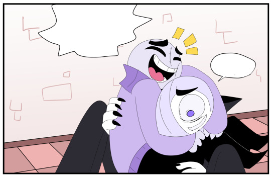
Anatomy isn't perfect, gradients are used a lot, shading isn't always present, I try to limit my color pallets to be pretty small.
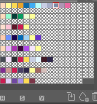
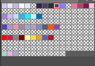
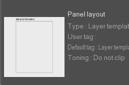
I have a bunch saved onto the side bar in Clip Studio. And I have presets like the borders of the panels as a pre-set so I don't gotta make a new one over and over again.
Short cuts are NOICE.
Art wise:
I start with a thumbnail. Just getting the idea/facial expressions of the character down.
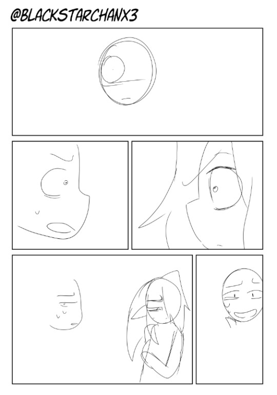
Sketching is 2nd step but I have no examples because I delete those pretty quickly.
More similar to this so line art is WAY easier.
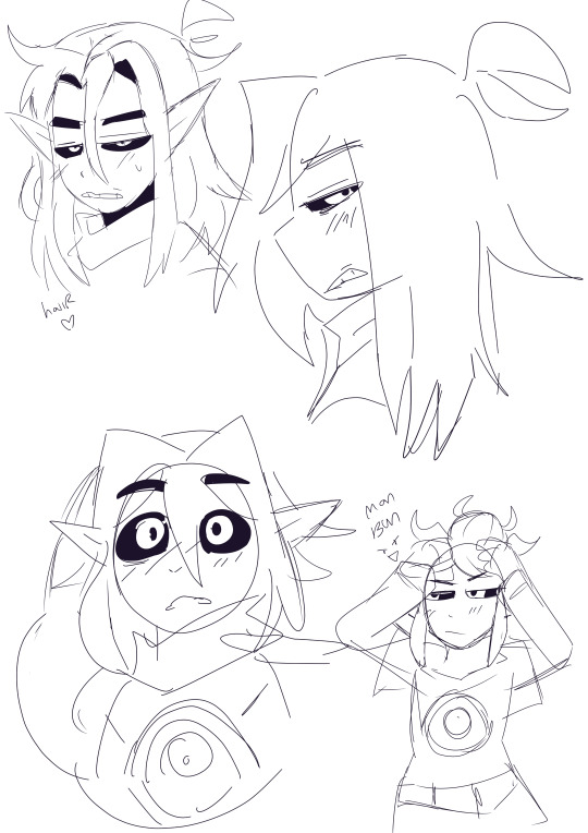
I change the sketch's opacity to like 20 ish and a light blue to see it better.
Then I do line art and add a neutral color under it to make coloring easy. I change this to black after ward to fill any gaps.

Add color and ba-bam
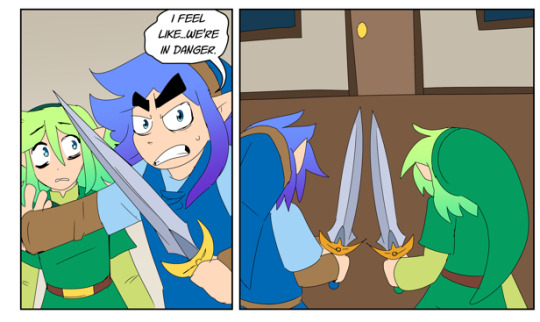
I use "Color burn" "linear burn" and Multiply in the layer settings for shading. Just depends on the circumstance.

I guess smth else I do is go by "Chapter" or scenes.
Smth that's helpful for some is writing a script and then drawing your stuff based on that.
Often what I end up doing is writing a script but using it as a guide rather than a beat by beat thing.
Referencing manga for inspiration is smth I do a lot.
Smth I'd recommend doing is making a one shot or a comic you purposely make to be short.
Longer comics are daunting but the best way to deal with that is to complete parts of em. XD It's like going through a video game. Beating each mini boss gets you closer to the final. Like instead of one big project, see it as a bunch of smaller ones.
Smth I do to let off steam from bigger projects is making stupid shit like this:
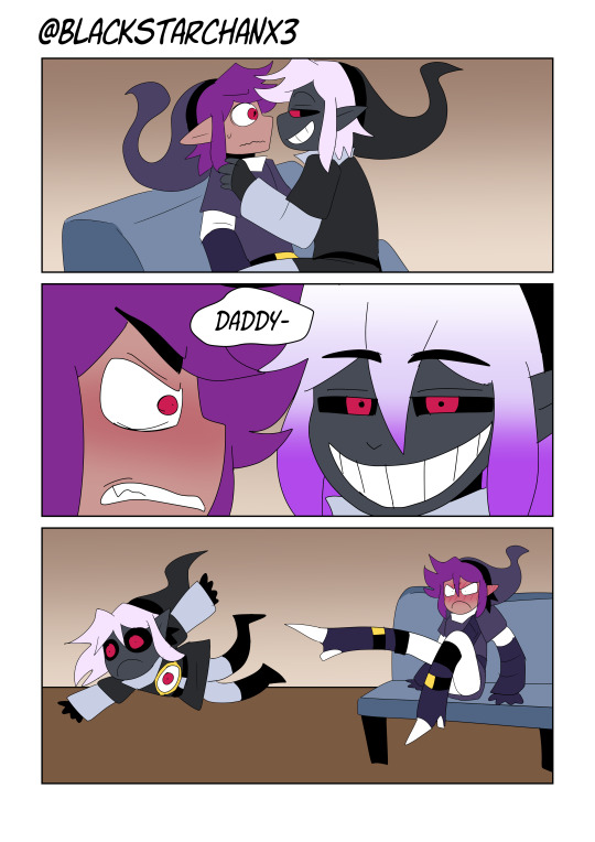

Like there's no point to it other than to be dumb and funny.
Keeping the story entertaining or fun even while doing a part you don't want too.
Sometimes you will just have to chug through a portion you dislike but is necessary. But staying strong really helps.
Pop on a freakin' YT video and zone the hell out is what I do.
Your art doesn't have to be perfect every single time, my comics at least, are free so anyone who complains is a little bitch.

Just do what makes you happy.
Huge thing to consider: Your art doesn't have to be held to any specific standard.
You don't even have to COLOR that shit if you don't want too lmao. There's no rules. You can color a sketch and post it. It literally doesn't matter.
A specific standard of what every webcomic should be held to is a lie. It doesn't exist. Go feral.

Draw backgrounds. Even if you suck at em. It helps give the world dimension hah.
That's what I've been trying to do.
Use your comics as a way to experiment.
Ghost Soulmate I wanted to try out this weird painter style for the shading/lighting.
In FSR it was trying out a more anime style
Falling Cards is weird character designs + A FAR too ambitious story hah.
Bunny and Kitty was to see if I could do a shorter form story.
Biggest advice would be: Just try smth. You got no obligation to finish smth either. Just try it and see how it goes.
I'd recommend having an idea where your story is going before you start, but just starting ANYWHERE helps.
I tend to doodle my characters before I jump into their comic. Doodle them doing fun stuff before I go into the meat and potatoes of what I want them to do. I often have an ending in mind too before I start. You can fill in the gaps later.
Anyways that's all I got Idk if this was useful or helpful. X'D
22 notes
·
View notes
Note
ur art is so, so amazing, is there anyway u could do a tutorial bc I wanna draw like u so badly
i can try but idrk how to explain myself or make tutorials lol
i think my style is just a product of my brush and what im trying to get out of my art, which is trying to portray the characters as accurately as possible. i rly just want it to look like it could be a stylized redraw of a deleted scene or something
my process is kinda everywhere bc i just move on to whatever step will probably make me hate the piece less when im done with it. i draw with a more square brush (blurring marker 1 on ibis) which i def recommend. its great for focusing on shapes in ur art and it helps me not overblend/forces me to think of more interesting lines/shapes. my sketch is a thicker size of the same pen, focusing on the major shapes and proportions and i just make as many additional layers overtop of it, lowering the size of the pen and adding details as i go
once im at the lineart i usually use a site that creates color palettes based off images (usually just steal some from old catholic art) and i steal my base colors from that. it doesnt matter how terrible ur base colors look as long as they make sense and r what ur generally going for.
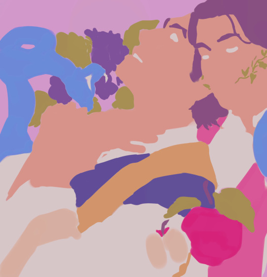
these were my original base, i use colored line art and shade the basic shadows using the line art mixed with the base color, highlights r whatever is the lightest color in the palette. after that i duplicate and throw it through this filter
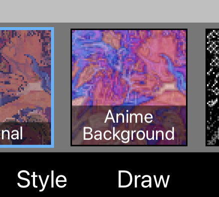
i play w the colors and use it as a color/hue/luminosity layer on top of the original version, lower opacity and render now that theres more colors on the canvas (the filter creates more contrast between the lame base colors i mix, then i can add bounce shadows and shit).
i use a shit ton of digital cheats. single color overlay layers at the end of a piece, pizza face overlay glow, using vignettes around the border to draw the eye towards the subjects at the center, filters, color palette generators, etc. they make things sm easier so u can worry abt experimenting with other things.
i dont rly know how to explain how i do clothes or hair other than focusing on the shadows and worrying abt lights later. this is honestly the best tutorial i can think of bc in my head im just drawing what i see as best as i can with the pen i use. use a fuck ton of reference, do actor face studies, and try to experiment with ur style everytime u draw. ur never gonna learn how to use ur programs or expand if ur bogged down by trying to achieve a specific look. sometimes that thing u were nervous abt bc thats not how ur style usually works is the best thing on the piece at the end.
actually draw only what u want to draw in that very moment and use that as an opportunity to experiment however u can. i just draw chainshipping and find ways to trick myself into learning 👍🏻 sorry this is so bad if u have any specific questions i can try to answer those better
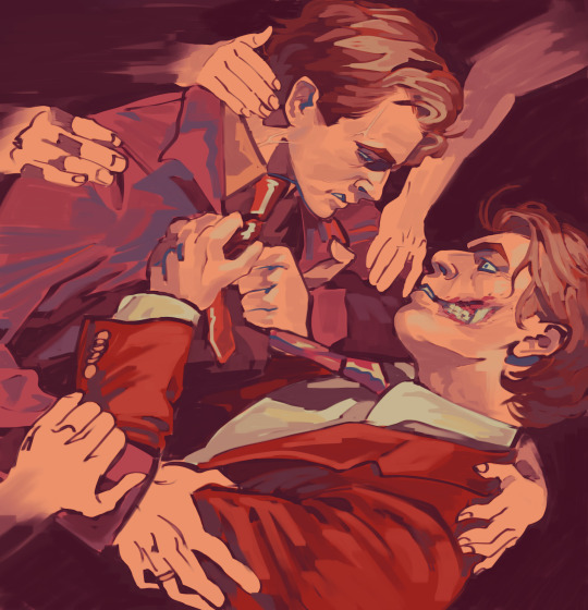
edit: this is what i mean when i say just draw with whatever base colors and use the lineart to add value. i thoroughly hated this piece at this stage but once i adjusted the pallet it felt much more cohesive and i could continue on with the drawing. the best thing i can say is to have absolutely no process past the same few first steps and resign urself to a cycle of self hatred and throwing random bs at the wall to see what sticks
#sorry this is so bad these dubious ass shroom carts beating my god damn ass HOURS later#i deadass woke up saw this and said Fuck bc i knew id want to answer it but i deadass cant think#sorry this didnt make sense. my style id just however i personally fail at achieving complete realism#also merge ur colors and lineart after the base idk makes it less stiff#ive always thought painting is much more forgiving than lineart and cell shading#theyre scary#most of my art is just how i compensate for being unable to rly fully stylize#i havent been able to since high school so i just stick w realism while i unlearn my old bad habits from having an exaggerated style#GOD ANYWAYS#rambling#larry.txt
20 notes
·
View notes
Note
why do you headcanon tails as venezuelan?
no clue if this is a genuine question or not but <3 ty for giving me the chance anon
im venezuelan so it can be a easy "why not" is not like our existence in media much less representation is a thing so i can believe anything i want
but !!!! if u want more specific stuff let's go then
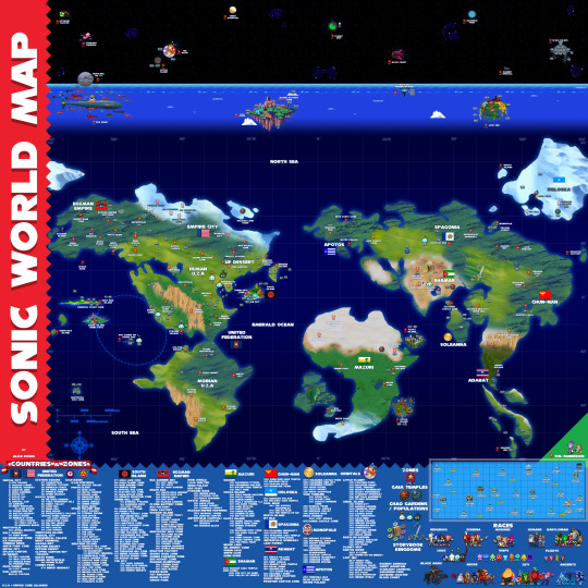
1) Mobius is basically latin america. they're all latinos your honor
not just that sonic in general is basically The Franchise in latam ever but also that a lot of other characters are coded as latinos (ex. Sonic as brazilian or argentinian depending on who you ask, knuckles jamaican/peruvian, silver chilean etc are popular hcs) for mannerisms and story and funzies.
Oh and let's not forget The World Map where Mobians live basically in latin america no i will not let it alone
mobian uza is literally just latin america i cannot. point at it enough
2) color pallete!!!!!! is real easy since his whole colors are yellow blue white and red in similar tones to the flag so. another win for the venecos (imma put this old image i made some time ago)

3) his tendency to use even the most "useless" objects and make crazy inventions with it (yes i will acknowledge the paperclips in this one because it's been in different shows and games)can be interpreted in many ways, but is a very huge value for us to just have to go on and fight for better or for worse, we don't let ourselves give up so easy and our working culture has shown that really what's stopping us is the state of our country
there's a really common stereotype for venezuela that we're criminals or lazy or don't work, and that's far from it. idk i feel like tails' story connects with that sentiment of fighting for more no matter what you have ANYWAYS
4) SCIENCE AND HISTORY BABEY!!! Venezuela has been really important historically not just for promote independence in South American nations, but also our scientists and petroleum industry have been contributed a lot to the world.
examples like the diamond scalpel, citgo being an originally venezuelan company, the vaccine against leprosy, the corner clamp and i could go On. but tails being a science enjoyer AND being venezuelan is also a cute detail :)))
that's really it. put projection alongside cute clues ive found and details from venezuelan history (as i am a huge nerd of it) and you get little venezuelan tails!! thanks for the ask anon lol
viva la patria

#minipisi.txt#minipisi.asks#vzla tag#miles tails prower#tails#viva venezuela mi patria querida#minipisi.hcs#sth
50 notes
·
View notes
Text

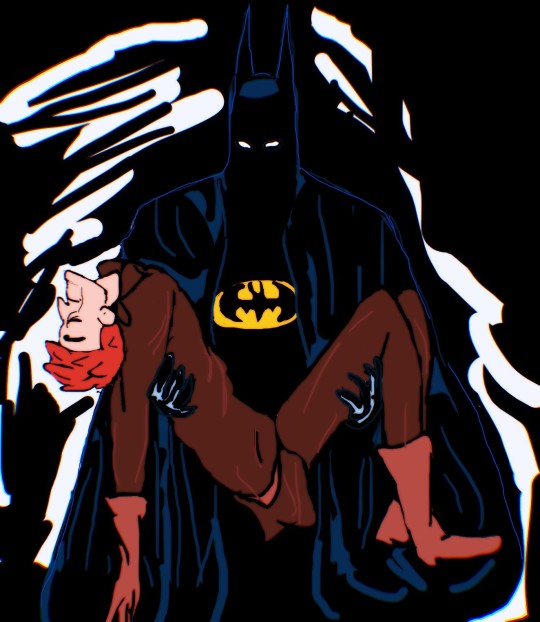


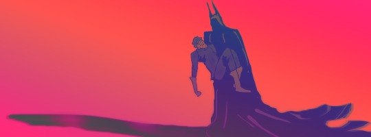

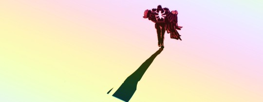
𝕐𝕠𝕦'𝕝𝕝 𝕓𝕖 𝕒 𝕗𝕣𝕖𝕒𝕜
𝔸𝕟𝕕 𝕀'𝕝𝕝 𝕜𝕖𝕖𝕡 𝕪𝕠𝕦 𝕔𝕠𝕞𝕡𝕒𝕟𝕪…
⋭
…
(so, where to begin? i guess from the simple fact, that i wanted to do smth fun with this clean-cut parallel. at first, i wanted to make some quick edits, but then, i decided what the heck. i might just re-draw it! *or sort of re-draw it anyways*
the shippy stuff is shippy, but really it was hard not to be all like *insert dicaprio pointing meme* when i was reading the venom comic, and flash just pulled a batman on me. beat jack up, n’ then instead of killing him, like he wanted to, he spared him. took him in his arms all gently-like n’ carried his sorry ass into the dawn. like man, it just hit the cords within me! i was all like oohhh, it's like in one of my most fav scarecrow issues! i wasn't expecting this from the comic, even less so from flash, who always had a bit of bipolar resolute, when it came to jack. 'he wanna kill him, he wanna kill him not'. that sort of thing. yet, this moment kind of shown, that he prob will always find a reason to talk himself out of putting him down.
that's aside, another part of why i love those stories, is that both issues felt personal. both, jon n’ jack had personal grudges, both batman and flash were struggling with personal darkness within them. both overcame it, n' literally had to beat up their personal walking-talking nightmare *flash even refers to jack as that later on*. like, it was pretty great, honestly. all that emotional baggage, uncanny kinships with their own twisted mirror, which resulted in them actually feeling sympathy for scarecrow n' jack. giving them a small speech, that they couldn’t hear *bc unconscious*, sort of implying that maybe ‘they’re not beyond help’. it's almost bitter-sweet. even if most people would argue, that both jon n’ jack are way-way too far gone at that point. even if 'solution' sounds too unrealistic to be true. still, if someone like batman believes in you, then maybe, just maybe there is a chance. n’ if someone like flash spares your life, even though, he’s nothing like bruce *he actually killed people before*, then perhaps, there is smth beyond projection, which made him do it.
all 4 characters are very different, n’ thb the context in everyone’s motivations n’ struggles are very different too, but i love how bruce n’ flash came to the same conclusion. took the same route with their respective twinky ghoul. showing mercy is noble, n’ it’s pretty sweet tbh. one of my fav tropes in fiction is when the hero/protagonist shows kindness/empathy toward their villain *who in most cases doesn’t ‘deserve it*. that whole cop out thing about 'evil should be punished by death' in fiction really takes away the romantism n' bendiness of fiction as whole tbh. esp with heroes. they supposed to be able to do 'impossible', including 'forgive the unforgiving'. this is why i prob will always advocate for the ‘no kill’ rule for super-heroes. i mean, it makes you have moments like those. smth that is actually emotional n’ also shows the cracks in heroes themselves, bc usually they can only truly relate to their rogues, someone who is usually designed to be a warped up reflection of hero’s own weaknesses, struggles or traumas. n’ while i always see jack o’lantern as spiderman’s villain *he’s one of oldies, a classic villain after all*, i suppose, that this version of jack was tailored for flash’s venom specifically, n’ i *unexpectedly* i loved it. daddy's issues run deep in this one for both of them. meanwhile, bruce be out there lecturing jon's school bullies, after he nearly killed them. what a man lol.
now, the comic panels themselves. just for better visualisation.

i didn’t include the first bit in my lil art thingy above, but i love how not only the venom mirrors batman in actions, but also how they’re even facing opposite sides, playing around with nearly opposite color pallets in each fight too. caters to the mood, but also it just looks nice side by side tbh. the blue/black/grey for batman, and orange/dark brown/yellow for venom. a dark knight / soldier n' maskless halloween villain. this prob the only point, where they connect narratively n' thematically, but it's a major one.
anyho', i didn't had a hardcore goal to re-draw those scenes to a t, just make it recognizable for the most part. but it was fun! also gave me an execuse to stare at those comic panels some more.
as for the song, it popped out inside my head kinda randomly. but it fits them, i think. even the tune itself adds to it. somewhat sad n’ slow. but the meaning of it, not fully hopeless. at least, they will always have someone there for them. after all, guys like jon n’ jack will always come back, seeking ‘their hero’, hungry for punishment or other things. n’ for someone as crippled as bruce or flash, it might not be the worst thing, really. usually, the hero is stuck in the same miserable 'unchanging', unwinnable situation as their villains are. be it outside forces, fate or sickness, that keeps them bond. it's still better to try and make the best of it, right?)
#batman comic#venom comics#bruce wayne#jonathan crane#flash thompson#jack o' lantern#dc & marvel#scarebat#flashjack#brew draws
38 notes
·
View notes
Note
would u ever do a tutorial 4 how u color...im obsessed w ur linework and colors and shading i wanna eat it its like candy !!!!
my main technique for coloring is basically just winging it lol,,, id say pick three 'main' colors and base the rest of the pallete off that ! here are some examples:
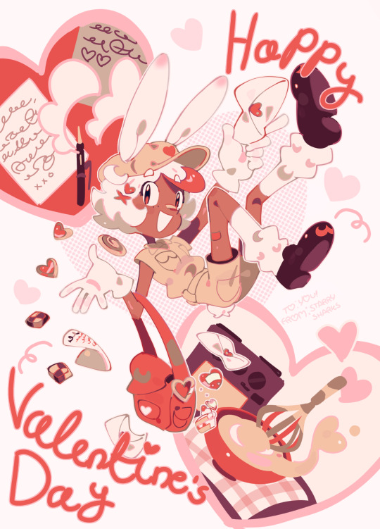
for this art, the main colors are red, tan and brown - all the other colors are basically just different hues/tones of those colors ! (skin tone is a lighter brown, pink accents, etc)
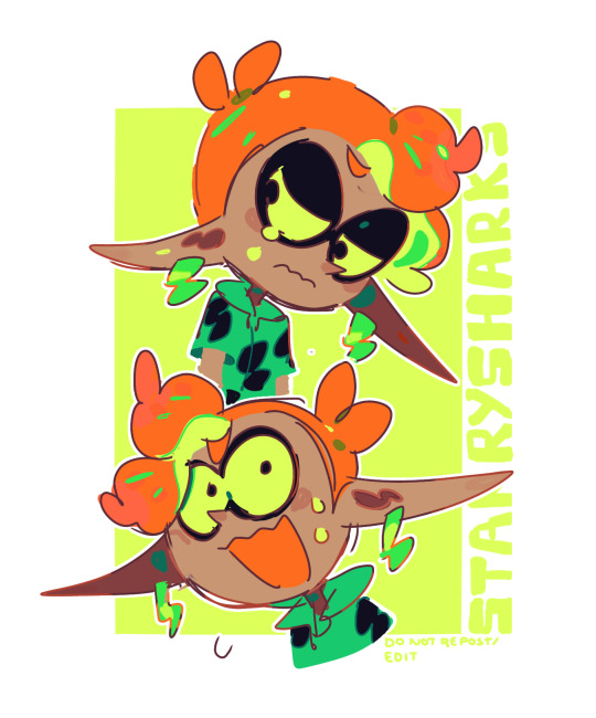
for this art, the main colors are green, orange and yellow ! the brown skin tone makes the colors pop more i guess, idk how to explain it @_@
for art with a more varied pallete, i use a few overlays n stuff to harmonise everything ! usually only a 5-10% layer with a very specific blue-purple color (#A16EFF) and/or use a few filters (mainly brightness and contrast)
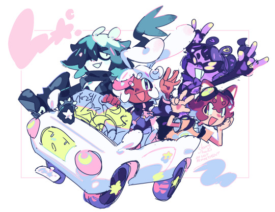

also use colorful shading :D im not very good at explaining it but that's basically it for color n stuff ! i hope that helps a bit
62 notes
·
View notes
Text
Get to know you questions!! Tag whoever you like :D
Writing my answers in orange!
1) top 5 or top 10 favorite animals (depending on how many animals you like)
Hermit Crabs, Pigeons, Otters, Anglerfish, Shrimp, Cats, Manned Wolves, Salamander, Sheep, Axolotls :D
2) top 3 Minecraft mobs
Mooshroom, chicken, and parrot!!!
3) favorite vocaloid song or My Singing Monsters island theme and why! (If you don’t like/know Vocaloid/MSM, just name a song or genre you like and why :D)
Fav Vocaloid song is Brain Explosion girl recently, and fav MSM theme HAS to be cold island. Or maybe earth???? Hm
4) favorite and least favorite textures, no why needed :333
Fav is squishy soft things, least favorite is ice in a freezer
5) not your favorite color, but your favorite color palette (bonus points if you have a pic of the specific palette or a photo/artwork of the pallet you like!!)
Purple, Green, Orange, Pink, and Black! Total Halloween vibes!!
6) fav book you had to read for school (fiction or non fiction work lol, and if you don’t like/have any then just name a book or fanfic you like!)
Of Mice and Men was surprisingly amazing! Thought I’d hate it tbh
7) how do you think of the months of the year in your head? Left to right, top to bottom, in specific numbered rows and columns? Tell me :D
I think of it like this:
January, February, March, April
May, June, July, August
September, October, November, December
8) assigned harry potter/ilvermorny house or Percy Jackson cabin or Warrior cats clan something like that lol (if you don’t have anything like that, star sign works too!)
I’ll do em all lol: Slytherin/Hufflepuff, Pukwudgie, Dionysus’s, RiverClan, I’m an Aries sun/gemini rising/pisces moon :D
9) MBTI???? Love those things :33 (If you haven’t taken the test yet or u just don’t wanna cuz it’s too long, are you a solider poet or king?)
I’m an ENFP-T! I thought I’d get king but I got poet lol
10) something “cringe” you actually rly like, no shame here :D
Gacha Life/Club, the styles just so cutesy! Ohhh also K-Pop, I’m a TOTAL stay :33 and DSMP, it’s just rly cool to me
11) characters from shows/movies/games you kin/stan/just adore!! NOT ACCEPTING IRL PPL PLZ AND THANK U :D (unless it’s urself, we like self love in these parts)
For me I currently kin Dazai, Edward Elric, c!TommyInnit, and I completely STAN any Project Sekai character. I mean any of them.
12) 5 people you’d wanna be at a party with and why! (Can be alive or dead, real or fake, celebrities or randos, humans or otherwise :D)
My grandpa to see him again, Roy mustang to see if he’s a bastard irl, Hachi/Kenshi Yonezu just to see how he’s doing, Kanye West to just ask him why, and BeastChild (the YouTuber) just cause I really like his stuff and would wanna meet him!
13) favorite hobby/fandom specific term and its meaning :333
I’m a writer (well, aspiring anyway, I’m not rly that good) and I love the idea of the sexy lamp. Basically if you’re writing a female character that could be replaced with a sexy lampshade and nothing about the story changes then you’re writing a BAD FEMALE CHARACTER XD
Cause it’s spooky season il leave it at 13 ;)
Happy answering!!!
No pressure tags :3 @touratoura @theancientwonder @kneecoal-mooma @citrushomie @skytheamazing @mitski-slope @a-trench-coat-of-confused-worms @dicklesswonder-blog @vicaridoo
#tumblr chain#hopefully lol#animals#Minecraft#Minecraft mobs#vocaloid#my singing monsters#textures#colors#color palette#books#fiction books#nonfiction books#school books#fanfiction#months of the year#harry potter#ilvermorny#percy jackson#warrior cats#mbti personality types#myers briggs#star signs#soldier poet king#cringe culture is dead#kin stuff#hobbies#fandoms#happy spooky season#:D
28 notes
·
View notes
Text
Here’s a bunch of cool Easter eggs/potential references I’ve noticed with Karai’s sprites in Shredder’s Revenge. I’ve already done a color reference post for Karai though (which you can read here), so I won’t go over that very much in this post.
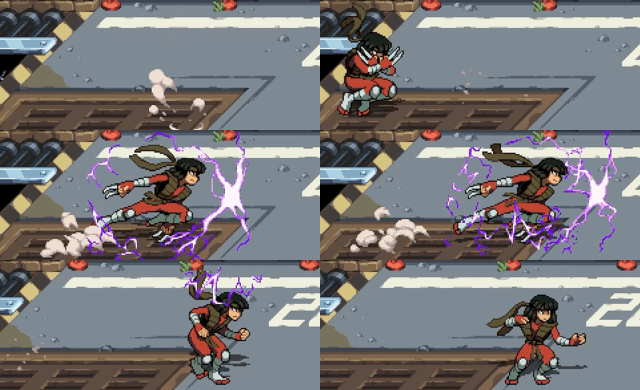
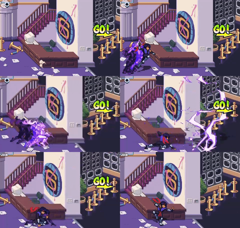
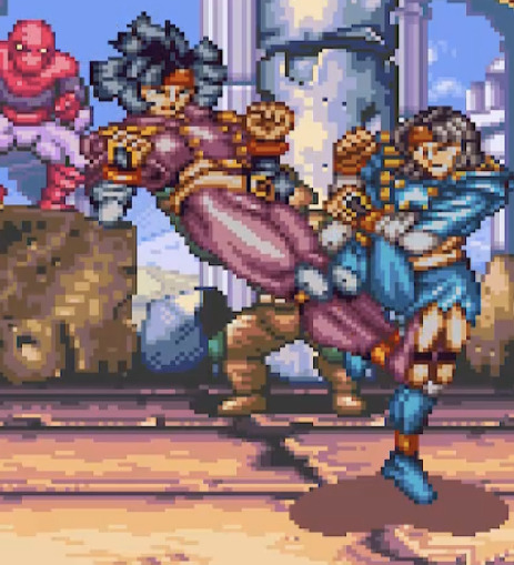
Firstly, her electrocution animation, 2nd pallet option and “flying attack” animations all seem like references to her time as Shredder in various media. As seen below, she displays a Shredder helmet and Foot Clan symbol when her bones light up. Then as I mentioned in my “Karai color references” post, her 2nd pallet is similar to colored Mirage depictions of the Shredder.

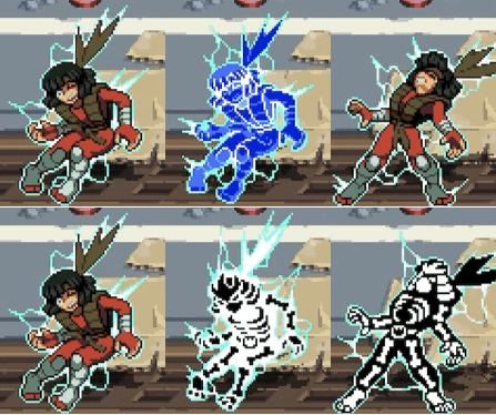
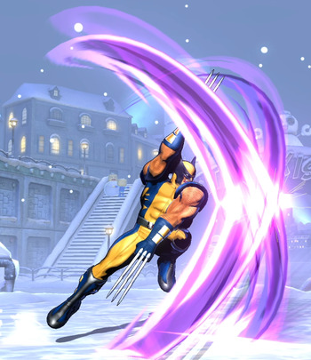
For her flying attack, she uses claws which I think she’s generally only seen with when wearing Shredder’s armor. Additionally, I think it might be a reference to X-Men’s Wolverine, most likely in one of the Marvel Vs Capcom games. I couldn’t find a specific move he has though quite like this though.
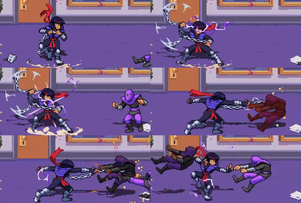
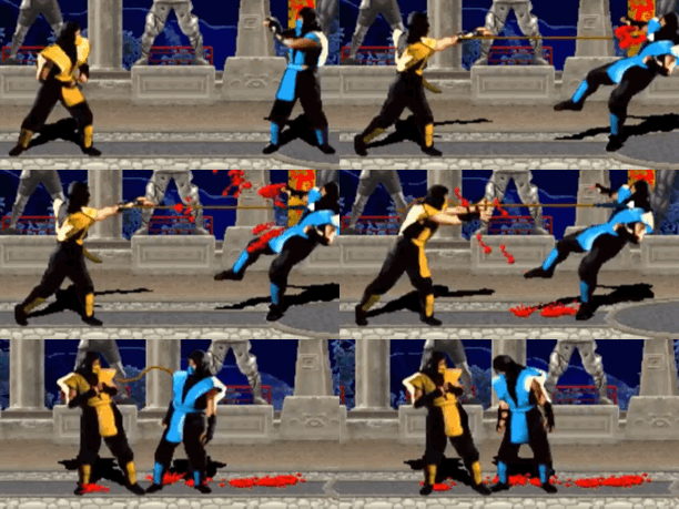
Like her flying attack, I think this is 2 references. 1st is that I’m pretty sure she did specifically fight with a chain in the 2003 show quite a bit and I’m not sure she did much (if at all in other versions). 2nd, it reminds me a lot of Scorpion’s “Get Over Here” from various Mortal Kombat games. It’s also the only Charged Attack that pulls in opponents.
While I’m not sure about any Karai-specific references for her “Super Flying Attack,” it does seem similar to Magneto’s Magnetic Shockwave in Marvel vs Capcpm 3.

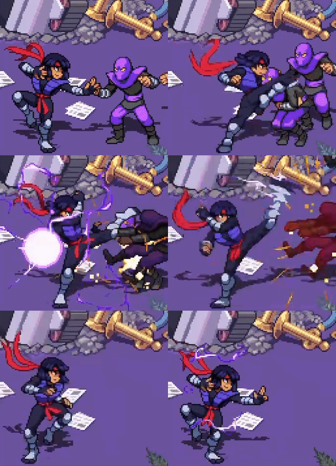
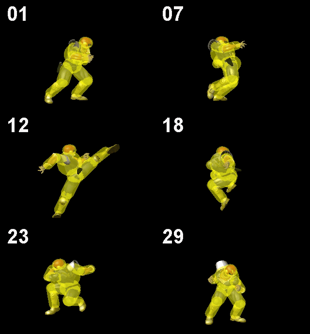
Her standard attack string (“combo attack”) does look similar to moves both Ryu and Ken have done, although I’m not sure if either of them have all the attacks in one game (feeling like it may be MvC3 Ryu, but idk). Captain Falcon does seem like he has practically all the attack, even though realistically I don’t think you’d ever combo them all the way Karai does. Also, the string seems generic enough to probably look closely to multiple other fighting game characters.



Next are all the TMNT Tournament Fighters references. As mentioned in my Color References post, Karai has 3 (maybe 4) colors from the Genesis and SNES. In terms of her animations however, I think most (if not all), of them are for her SNES appearance.
As to what references there are, firstly I do want to mention her “neutral” stance is practically the same in this game and SNES TF. I can’t put anymore pictures in the post since I’m already at 30 pictures/gifs for the post and don’t think I can put anymore in, but you can see it in a lot of my gifs for both games.
Second is her dash attack which resemble her godly walk animation. It doesn’t have a hitbox in TF, but it’s also incredibly fast.

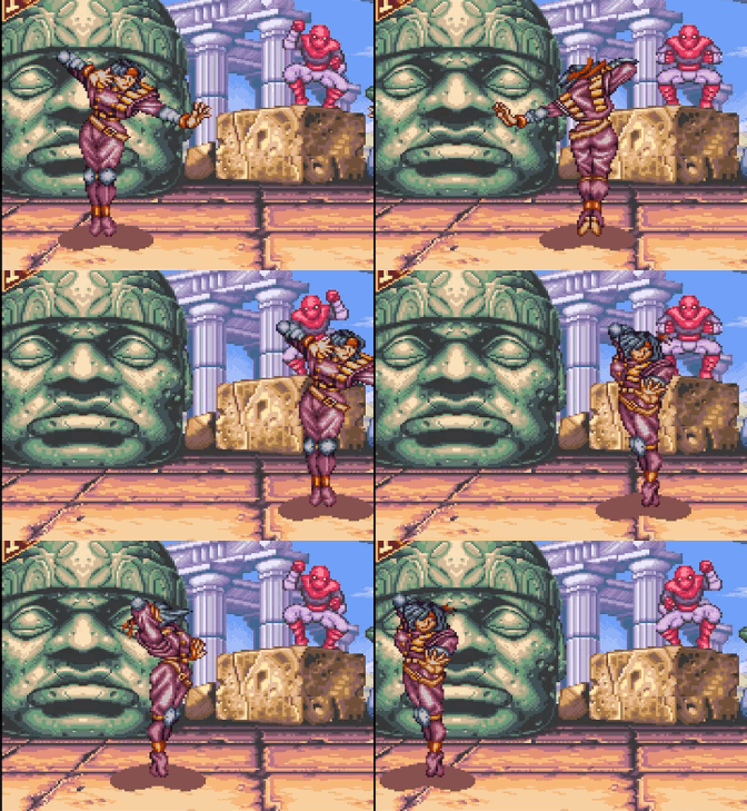
Third is her “Fling Slam” which ends off similar to her “Air Breaker” attack in TF. There may be a different command grab it’s specifically referencing, but I’m not sure, especially when there’s a plethora of command grabs in fighting games (off the top of my head though, it does end similar to a Tager grab from BlazBlue).
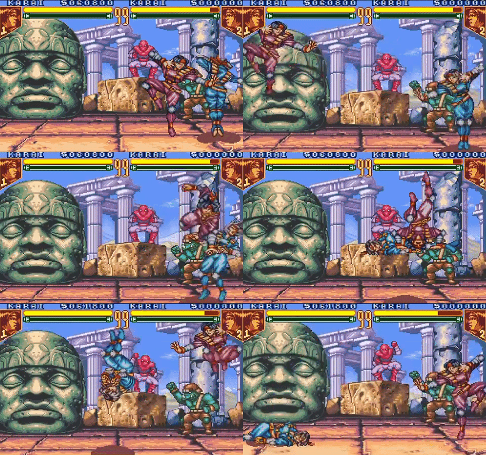
Fourth is her Dive Attack which looks similar to a dive kick she has in TF. It may not send her full screen, be as insanely fast nor cover up so much of the screen, but it’s still cool.

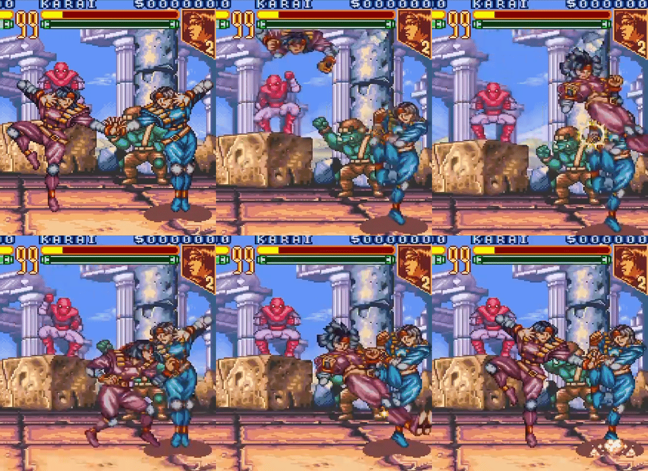
Fifth is TF’s Dark Thunder. Both her taunt and standard super remind me of Dark Thunder, the ladder especially since she can literally say “Dark Thunder” sometimes when she does it.

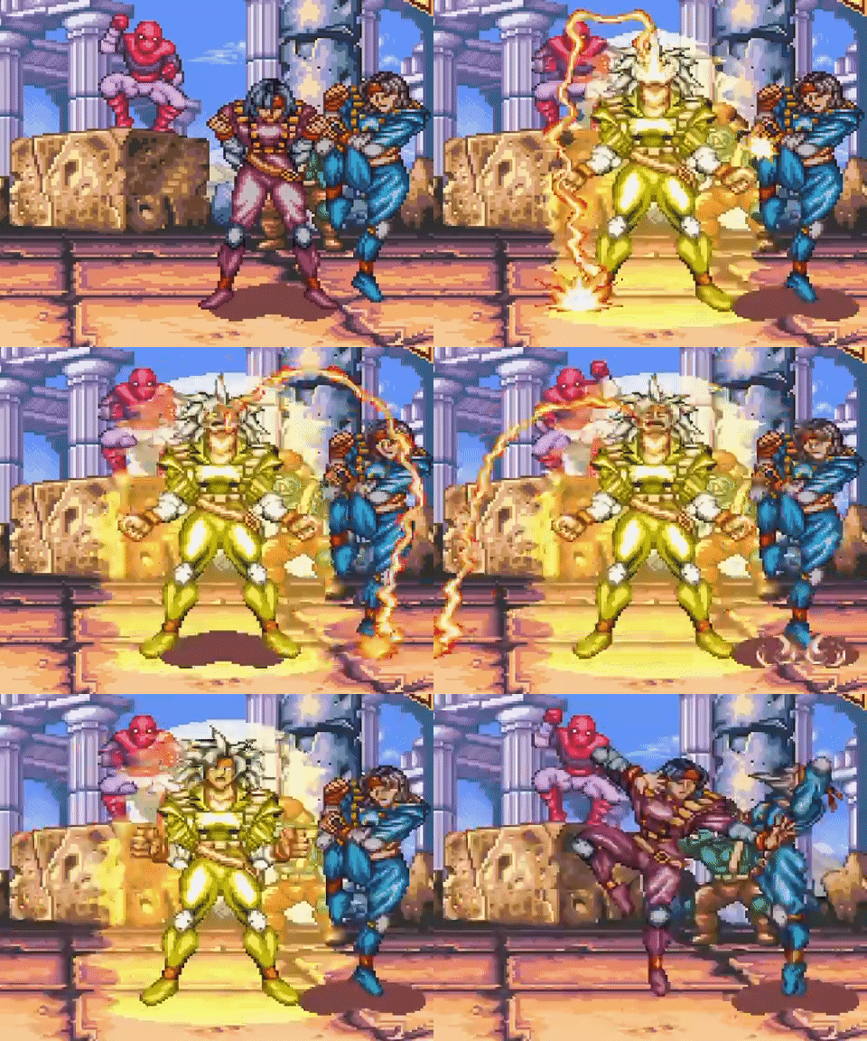

Last of the TF references for now is her “Super Flying Attack” which is similar to both Lightning Fists and one of her air normals.
As a side note, the TF air normal specifically is so incredibly good lol. She is a boss character in that game and her moveset in general is nuts so I get why it’s like that, but I love it. I do the air normal 3 times in the gif and I think it literally true string-ed into itself for the last 2.
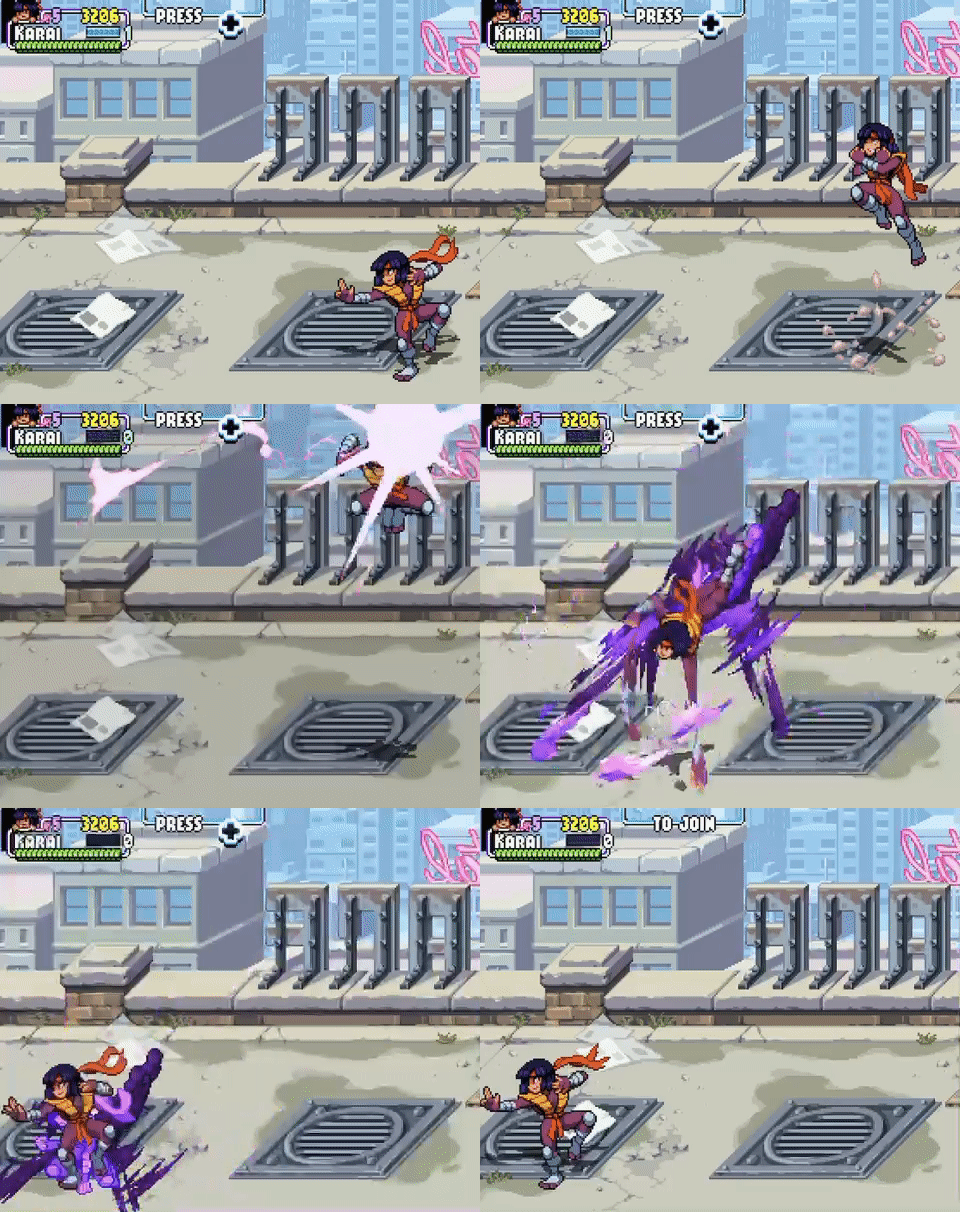
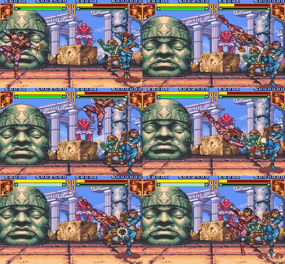
This isn’t the rest of her animations, but I feel like they’re probably references as well. I do want to acknowledge Karai has used a sword multiple times before in multiple versions, but I don’t know more specifics than that.


Anyways, I hope you enjoyed the post. Feel free to mention any extra info you might pick up on in the comments or reblogs and I could try to add it to my main post. I probably won’t do this for other characters since there’s so many references I wouldn��t pick up on, but who knows~. If you wanna see some other references, here’s a link to all of my color references posts.
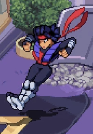
(Also added this picture here cuz she looks so cool).

Shredder’s Revenge Color References:
1. Karai
2. Leonardo
3. Michelangelo
4. Raphael
5. Donatello
6. April O’Neil
7. Master Splinter
8. Casey Jones
9. Usagi
21 notes
·
View notes
Note
Hello! :D I know it’s a silly question..but i was playing sims(as one does) and I wondered if you had any hcs of the paladins interior style? Like what colors (not only their signature I guess)and type of furniture? What type of home/apartment?I’d appreciate the help! Have a nice day!
okay absolutely have not had mental capability for like anything creative but I’ve also started a job in real estate so interior design make me go brrrrrrrr lately-
Shiro I feel like is either really plain and like necessities only or really homely. Like he either has the most basic cheap couches and tables and chairs and like, the plain white plates you can by at Walmart for like 10 bucks (you know the ones) and all the walls are just whatever color the previous owners/renters had them as so he has a random light pink room, a green room, etc. OR OR OR you walk in and get smacked in the face by comfort, like he has knick knacks and pictures and random antiques littering every surface, he has a china cabinet with the fancy dishes, he has a cabinet dedicated to coffee mugs and like only two of them match cause the rest of that set broke ages ago, all the other Paladins have their own designated mug, like it’s never specified but like, you KNOW the teal one with the cow that god knows where came from is Kieths, and that’s just how it works. I don’t think he has a specific color pallet bc it’d depend on like what the house looks like, and it’s either minimalistic or the vibe of the house.
Kieth has an apartment, his bed is on the floor, the only reason he has a couch is because Lance and Hunk just showed up with it one day and left it there. His cabinets are boxed Mac and cheese and canned beans, he uses paper plates/bowls and plastic cups/silverware, and there’s only like two pictures in the whole place, one of him and the other Paladins (and Allura and Coran) and one of him, his mom, and Kosmo. He’s not much of a stay in one place type so he doesn’t have a lot BUT if he were to decide to settle and make a home it’d have a garage, a huge backyard, and enough space for any and all of the Paladins to visit, and let’s face it, Lance probs did most of the decorating, as long as Keith has a place to sleep he doesn’t really care much what it looks like.
Lance is Aesthetic™️ and you can’t change my mind. He’s full on redecorating his house for every single holiday, his attic is a maze of shit only he knows how to navigate. His kitchen is probs black and white with a pretty accent color and his dishes all match the kitchen color scheme, like the fancy ones with the swooshy designs, ya know? So. Many. Throw pillows. Lol. Has pictures of his family and the paladins everywhere, along with various pieces of art. Walking in is like stepping in a magazine but at the same time feels so comforting.
Hunk plants everywhere. I don’t know how to explain it, but he’s a total plant dad. His kitchen is immaculate, the kind of place you love to hang out in, also has mismatched mugs bc he likes to collect them from places he’s gone and it’s a go to gift for him. I think he has a bunch of books on everything from How To guides to the entire Riordanverse. Tools scattered everywhere and various projects littering almost every surface. Has a blanket his grandmother knitted him draped over his couch. Random Voltron merch everywhere bc he can’t help himself when he sees it.
Pidge is either a clean freak with a perfectly put together house (as long as you don’t open those drawers) or it’s a fuckin mess and a half with a walking trail from one room to the next but otherwise there’s no way in hell. Also has projects literally everywhere, collections of random space tech, we’re not gonna question it. Probs a fairly monotonous place, lots of whites and greys, has an entire bookshelf for family pictures and sentimental things but aside from that, it’s the house of a scientist. Has a plush green lion on her couch. Has two perfectly cleared out mostly untouched guest bedrooms in case her family or any of the paladins visit.
~Admin Rori💜
#voltron imagines#voltron headcanons#voltron legendary defender#takashi shirogane#keith kogane#lance mcclain#hunk garrett#pidge gunderson#katie holt#shiro headcanons#kieth headcanon#lance headcanons#hunk headcanons#pidge headcanons#voltron preferences#voltron x reader#admin rori💜
96 notes
·
View notes
Note
HI I LOVE THE COLORS YOU USE DO YOU HAVE ANY TIPS!!! (?)
HONESTLY NO IDEA😭 mostly bc I reuse the same colors a lot in my art
example this is my ibis saved colors

Very messy/all over the place to outsiders looking in but you can see the colors from mj at the top, HMSs specific main color right in the middle, and most of the others are from old ocs palletes that I just reuse on other characters/art like these aren’t even color palettes for me it’s just “oh there’s the gold yellow, and the hair yellow, and the bronze yellow :)” idk I’m just insane ok I have no real tips outside of just find a balance between light/pastel colors and bright colors ? That’s what I do at least :3👍 so likeeee uh example with the WRTS characters colors is they all have one pastel color and one dark color and the rest are just general saturated/middle colors (so for the light colors Asha has the pale blue/periwinkle, aster has his hair, mag has the light blue, for the dark Asha has her hair, aster has stars cloak, and mag has his cape)(tho they have these colors in other places as accents as well but you get it) idk I’m not good at explaining lol😭
7 notes
·
View notes