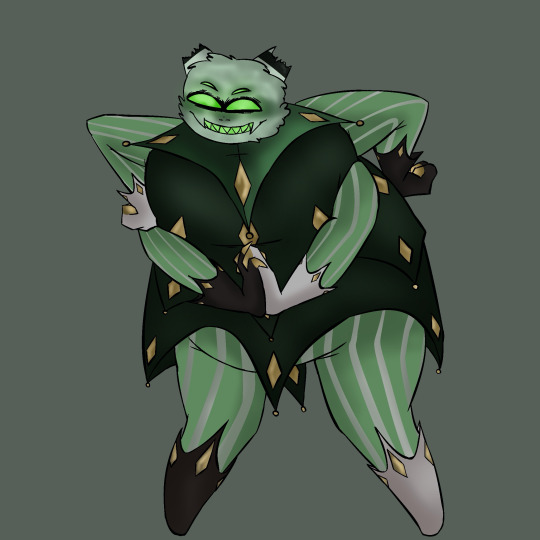
#took some liberties with the color palette
Text
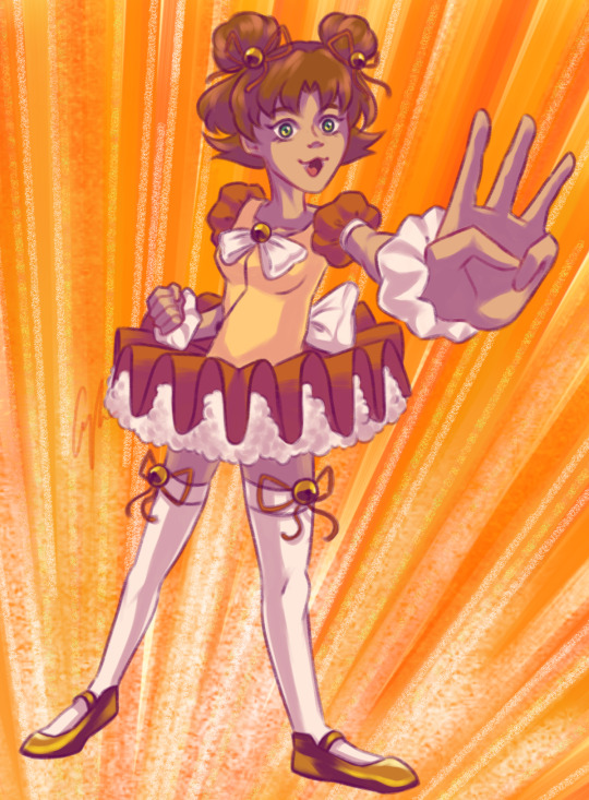
She’s counting down!!
—
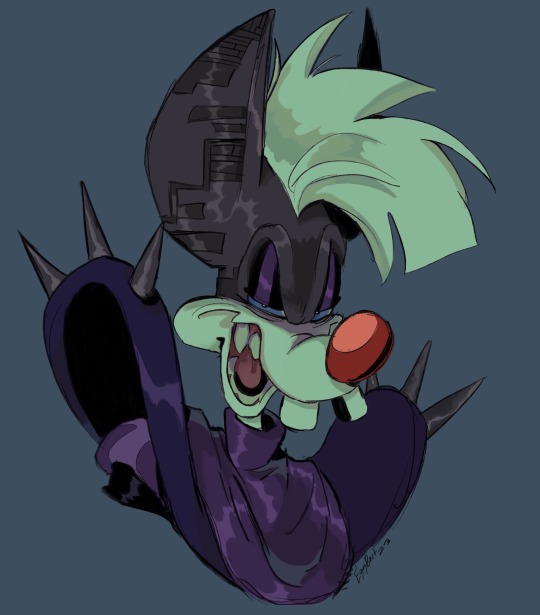
DJ Motti design by @starfishes-and-watercolors:

—
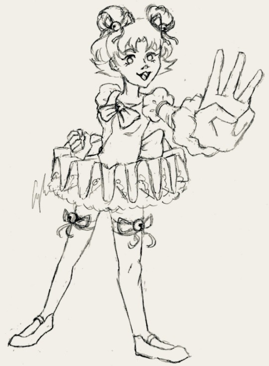
Sketch and lineart below cut:
—

#mfb#metal fight beyblade#beyblade metal saga#motti beyblade#craftys_art#took some liberties with the color palette#hope it fits lmao
25 notes
·
View notes
Text

Lil art for the spooky husbands
Borax crashing @truffula-screams and @candysellingdoll 's date
Halloween onceler belongs to @that-goth-idiot-jaaake
And Ragdoll Scott belongs to @heyy-dont-mind-me
#this is a direct reference to that one pic of a guy being way too into a snowball fight#just fyi i took some creative liberties with their color Palette#the lorax#onceler#ragdoll scott#the Halloween onceler#lorax#Borax#spooky husbands#i swear borax doesn't want to kill Halloween
48 notes
·
View notes
Photo
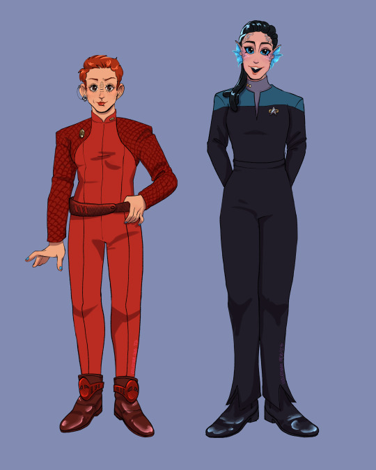
quick art of some ds9 ladies >:)
*Click image for higher resolution! Reblogs appreciated*
#implied kiradax bc.... blue nailpolish :3c....#took some color palette liberties but ehhhh its fine#kira nerys#major kira#jadzia dax#dax#ds9#deep space 9#star trek#star trek fanart#digital art#digital fanart#art#artists on tumblr#violet-ram art
420 notes
·
View notes
Text
Here’s an update: rough colors! :)

I still need to render it and then clean up the sketch before I finish. (I was originally gonna do new lineart, but I really like this sketch.)

As shown by this thing, I tried my best to separate the values of the colors. I realize now that Lou’s hands may be blending into the ground. Whoops
Also, fun fact! I have the robe that Rodney’s wearing.
I wish I had that cup, though.
@esteebarnes94 @doyoureallyneedme @thatotherman001 @sharkyy599 @geuretea @c00kietin @rogdona hi again :]
#art#wip#robosleuths#robotdetectivesseries#digital art#flat color#I took some creative liberties with DOE’s (I hope that’s their name) color palette… hope that’s fine too!
35 notes
·
View notes
Note
Perverted orange, kinn with a cat! Please and thank you 😊

#kinnporsche#kinnporsche fanart#kinn theerapanyakul#cats#kinn would have a prissy cat#color palette challenge#took some liberty with the palette#drlemurr art#Interrupting the purple takeover to post this
72 notes
·
View notes
Text
Hi I’m back with a Dark Pinky panel redraw :))
#this was fun!#although I haven’t really drawn him too much in a hot sec so it was challenging#i definitely took an artistic liberty with the color palette#I sort of like it?? I dunno just experimenting#but yeah this was fun!!#hopefully I’ll have some more patb stuff out soon#just wanted to take a small break#bartart#pinky and the brain#dark pinky
103 notes
·
View notes
Text
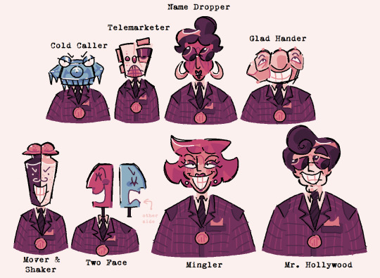
sellbot cog redesigns!!!! :D thought process + extra design deets under the cut! (waning: its very long LOL)

cold caller: loosely based off of their tto trading card! rotary phone because uhhh. duh they call people, big pointy nose resembles icicle, elongated eyes / eye scopes? idk lol resemble allan. the shape of the receiver is supposed to resemble earmuffs almost? + little teefies
telemarketer: this is probably the most. vague design LOL but they're an auto-dialing machine! specifically based off of the one from the simpsons coz it.. felt fitting idk. i definitely took some liberties but they have a speaker mouth, an indicator bulb for a nose, and the cassette portion is their eye ^_^
name dropper: this was one of the harder names to translate into a design since it doesnt have any ties to any physical items / ideas? so i ended up just building upon their base design. the glasses and bun give them an uptight secretary vibe + gave them more droopy features such as a longer nose and hoop earrings to replace the old ones
glad hander: not much to say about this one. HAND!!!!! my original redesign for this had their eyes on their palm while the fingers sat on top but. idk. it felt more fitting for their hand to be in a fist while the eyes were on the fingers. it makes their middle finger look like a nose
mover & shaker: shaker -> salt & pepper shakers. ez pz. the lids look like little hats too
two face: this was a little tricky coz i like the double face look they originally had. but double talker already has that model and i think it fits them much more than it does two face. i cycled through a few different ideas but eventually ended up with this, inspired by the mayor from the nightmare before christmas & the way his head operates :P
mingler: nothing changed. literally perfect. mingler is peak cog design. just tweaked their colors and gave them a stronger head + hair shape that stands out against the others
mr. hollywood: same with name dropper & mingler, they have a vague name thats hard to interpret BUT the og design was already so good there wasn't much to change Anyways. i was subconsciously inspired by Something while designing them but i dont know what, i guess 50s celebrities? also inspired by ernesto de la cruz from coco!
as a general rule of thumb: i stuck to the same color palette for all of these designs (except for the blue in cold caller & two face. obviously) in order to communicate the fact that they're from the same department. for the more human cogs i tried to separate different parts of the head using color & lines (forehead, cheekbones, chin, nose, etc) in order to give them a subtle robotic look but you can't really see it lol... i tried to keep their GENERAL head shapes but some of them wandered a little far
+ i actually made palettes for all of the cog departments to work on if i ever want to make more redesigns! i'll stick them here since they're on topic

#toontown#toontown cold caller#toontown telemarketer#toontown name dropper#toontown glad hander#toontown mover & shaker#toontown two face#toontown mingler#toontown mr hollywood#art#artings#ttcc#toontown corporate clash#<- not specific to ttcc but they're based on the design conventions of ttcc so#the sellbot department is my fav ever <3#its always been my fav. even when i was still playing ttr#so this was very fun for me i love these fellas
80 notes
·
View notes
Text
Finished first draft designs of the hazbin cast- Alastor., Charlie, Angeldust, Nifty , and Vaggie.
Some of them got minor redesigns while others got revamped, so I’ll be going down the line and discussing my reasoning for each one (please note, these are not perfect, and probably are not animator friendly, I did this for fun, and a lot of the decisions I made were because I felt like it. Do not throw a fit if you don’t like them)
Alastor- when redesigning alastor I focused on 3 major details: that he was from the 1920s-1930s, he was from the south, and that he was a “radio demon”. I took away the voodoo stuff cause that felt like a really weird way to associate him with Louisiana culture, and instead went for the more “southern gentleman” feel using the slicked back hair and simple clothes. I also replaced his monocle with a full pair of glasses, because I think not being able to see his eyes makes him more menacing, same thing with the straight teeth. I made his color palette into warm browns to kind of give the vibe of an old timey radio- with a highlight of gold as well. Side note: I like to imagine he doesn’t open his mouth, and instead it just lights up like an actual radio- cause I think that’s cool character flavor. I also kept his deer motif cause ,apparently, it was supposed to connect with how he died- plus I’m always a sucker for the kind of evil character that has an innocent animal theme, super fun. (Also his microphone is sentient and does change the text depending on the situation)
Charlie Morningstar- I think Charlie is a lovely character, she’s one of favorites, but she felt pretty plain in some aspects. I learned that she was kind of inspired by porcelain dolls, which gave me an interesting idea of making into kind of a “devils Pinocchio”- because what’s more innocent than a doll imbued with the power of her father’s dreams? So I really leaned into the soft friendly doll look, giving her ball joints and large eyes that stare into your soul. I softened a lot of her colors and gave her rounder shapes as well as leaning into the goat aspects of her character, because i thought it could be fun to have her play off the deer motif that alastor has.
Angel Dust- My boy , my good lad. He is also pretty solid when it comes to design , however- HE DID NOT LOOK LIKE A SPIDER. I had no idea that his freckles were supposed to be eyes until I rewatched it. Soooo I definitely tried to make him more spider like by making his eyes more prominent and giving him pointy side burns that act as mandibles. I also gave him him his spider butt and some weird ass legs. Oh and , unrelated, I like to imagine he does burlesque.
Nifty- MY FAVORITEE , I love nifty guys, she’s my POOKIE bear. When going into her design I knew I wanted to make her look older since I thought it was weird how much she was infantilized so I gave her lipstick and pearl earrings to make her look more like a refine 1950s housewife, as well as give her an apron and cleaning gloves to make her feel more like a maid. I also leaned into her subtle bug theme by giving her antennae, and giving polka dots on her dress for a very subtle lady bug theme (cause she’s my little lady). Some more small things I gave her a little swirl in her bangs to call back to victory rolls, as well as some subtle hints of green to call back to the uranium craze of that time.
Vaggie- she was difficult. Initially, I had no idea what I wanted to do with her, but I think that’s also because she’s not a very fleshed out character? Her whole story is kind of , Support Charlie and be a fallen angel.(still love chaggie tho) So I took some creative liberties, and gave her a more mature look- with some periwinkle to act as a subtle hint to her angelic nature. I also gave her the monocle from alastor design cause I thought it made more sense for her? Like, if anyone is gonna have the one eyed visual aid it’s gonna be the bitch with one eye. It also makes her look more matured? And I gave her a moth broach to call back to her moth inspo.
Annnd that’s it! I’ll be working on the next batch soon, which will likely have husk and sir pentious, if you have any other people you wanna see lmk!

#hazbin hotel#hazbin#hazbin art#hazbin hotel oc#hazbin hotel redesign#fypシ#helluva fanart#helluva boss#angel dust#hazbin hotel alastor#hazbin hotel charlie#hazbin hotel vaggie#hazbin hotel nifty#fyp
85 notes
·
View notes
Text

TLG: Final 10 Episodes Sketch Dump
September 2nd once again fell on a Labor Day, like it once did when the final 10 episodes of TLG dropped on WatchTLG (due to its early release on the old DisneyNOW app). The alignment of the exact day, month, and holiday five years later put me in the spirit to sketch away as I rewatched these episodes.
I was there when the countdown on the WatchTLG site had about an hour left. I hadn't seen a full episode of TLG until that point because I at the time thought I wouldn't be into it. I saw the synopses for these episodes leaked somewhere online and was doubtful yet VERY hopeful that the one with Vitani's Lion Guard was going to be a real episode simply because I wanted to see her in new content, regardless of my familiarity with the show.
When I binge-watched these final episodes with a friend, my relationship with the show improved as I went to watch the rest of the show over the next few months. I was so grateful to see so much content and worldbuilding for the TLK universe
Sketch descriptions under the cut:
1. Friends to the End
I've said this before in a review of this episode, but whether or not the writers intended this, their portrayal of irritability brought on by an anxiety attack is astounding. Kion's anxiety is piled up more and more when he's in a hurry to find a cure at the Tree of Life, Bunga repeatedly tells him he's becoming like Scar, and the rest of the group just "blind leading the blind"-in their journey SO badly because they're a bunch of unsupervised freshman-aged kids who are in their "Well I wouldn't go THAT far" or "Can I be the devil's advocate" phase.
This situation of fearing becoming like a shitty family member and being told you are by people when you're already in a vulnerable state is just SO vile and unfortunately so real. I found myself relating hard to this episode due to Kion's valid af anger in this episode, which is why I had to draw Kion claiming his "Don't you just wanna go apeshit??" era.
Kion is basically me throughout this episode and the entire first half of Season 3. It is SO HARD to get through this season sometimes when these same couple of lines keep coming at least once per episode. As soon as I hear Fuli saying "Uhh... Kion?" or "KION!!" I know exactly what's coming.
2. The Tree of Life:
Since we never get to see Sahasi and Ananda's color palettes they had in life, I took what I could make out from their spirit forms as well as some creative liberties, and came up with what they may have looked like on Earth.
Ananda is where Baliyo gets his freckles and dull, dark pelt, and where Rani gets her purple pupils, red nose, and dark tail. Sahasi is where Rani gets her richer pelt and where Baliyo gets his nose gradient, multicolored mane, and lighter tail color.
Fun Fact: According to some email responses from a member of the team who worked on TLG, they said that Sahasi was meant to be Janna's son, which for me, puts an end to a debate I had in my head where I was stuck between either him or Ananda being Janna's child: On one hand, I liked the idea of Sahasi and Surak being the foils of Mufasa and Scar, but also liked the idea of Ananda as Janna's daughter and heir since they looked so alike, as well as it solidifying the martriarchy headcanon I have for the Night Pride. Though the team member didn't straight-up provide Sahasi's relation to Janna and Surak as an absolute fact, rather it was simply the gist they got from the creation of Sahasi's character, it's an answer from a team member at all, which I can absolutely settle with. I decided to give him a similar fur color to Surak because of that.
3. The River of Patience:
I just HAD to doodle eepy Kion. It's like the one part of this episode that sticks with me outside the wholesome therapy dynamics and Kion heroically holding the flower between his teeth. This is basically him but if he fully succumbed to falling asleep waiting for the log.
4. Little Old Ginterbong:
Can I just say that I fucking LOVE Mama Binturong's character?? She's absolutely insane and constantly looks like an addict that needs her fix. She makes me nostalgic for some reason, and I think it's gotta do with her Mama Gunda vibes (which is odd because I wasn't even that young when I saw Tarzan II). I had to draw her doing the thing lol
5. Poa the Destroyer:
All I could think about throughout this episode besides the rare Evil Beshte is how insufferable Pinguino is. I mean it in kind of a good way, his personality is so ridiculous that he's made me laugh a few times.
6. Long Live the Queen:
Surprisingly, the sketch regarding this episode is probably the least expected subject matter out of anything I could've put here: An idea that's been forming in my head for a bit now was the idea of Bunga and Binga continuing the fostering/babysitting business of Bunga's "uncles". Bunga is shown to be a natural with young animals in a few episodes, and it continues in the subplot of this episode where he watches over Varya's cubs.
7. The Lake of Reflection:
The one thing that viscerally stuck with me in this episode was the unbelievably cute design they gave bby Cheezi. Had to sketch him.
8. Triumph of the Roar:
Obligatory Askari sketch because I actually love drawing him and making headcanons of his era. Looking back... he kinda looks like he's looking down at the events of the bottom drawing in slight disappointment.
9. Journey to the Pride Lands:
Drew Azaad (for what I think might be the first time) with the only thing he seemed to be doing throughout this episode -- taking any opportunity he can to comment about how much better cheetahs are at basically everything. He's fun to draw and I'd like to do more art of him one day.
10. Return to the Pride Lands
This is a sketch of what I deadass thought was gonna happen during this scene the first time I saw this episode lmao. At the time, the previous two episodes were fresh on my mind so I thought Kion was once again going to spam his tornado ability, but with Vitani as his subject for his demonstration. She already knew so little of the Roar as it was, given her absence throughout most of TLG's storyline, but could you imagine what she must've been thinking seeing how much Kion's Roar evolved?
#The Lion King#The Lion Guard#TLK#TLG#Kion#Sahasi#Ananda#Mama Binturong#Pinguino#Bunga#Binga#Pasha#Polina#Feliks#Azaad#Cheezi#Askari#Vitani#My Art
42 notes
·
View notes
Text

These are not my characters!
Okay, so.. guess who got subjected to color practice?? I wasn’t gonna post this, but since I’m not gonna be able to post consistently for a bit, I figured I might as well. But, anywho, the most recent chapter is so :(( I felt so bad for the fishy friends. I took some creative liberties with Eclipse, mostly with his color palette, it just felt right here 🫡 Well, I went off of what Sinclair’s mentioned in her posts about this fic, mostly for Ruin. They’re so <3 <3
These characters belong to @sinclairmaxwellao3 ‘s The Abyss Stares Back! Please go check out her work here (if you’re an adult!) :)
26 notes
·
View notes
Text


"Come closer. Fear not, for though you are already dead, I still have need of you."
Sorry, had some technical difficulties with this post, so I'm going to keep this a bit more succinct. Finished the digital art in Procreate of The Lamb from Cult of the Lamb. The second image is a closeup for details, though I think some of the lightest lines got a bit lost in the texture.
I had fun with this and took some slight liberties with the palette for the scene where The Lamb meets The One Who Waits. Technically, The Lamb's color should be shifted over to red, but I liked the idea to stick closer to his typical color with a purple that pops from the muted warm tone around them, you know? Anyway, I had fun trying out new brushes and textures. I hope you guys like it, too.
57 notes
·
View notes
Text
Frida Color Concept
And I’m back with a little more rottmnt Frida (not too much tho bc digital art is soooo hard for some reason)

She’s a painted terrapin, but I exercised creative liberty with her colors and markings. @griffinclaw7 made a post about a room in the Grand Nexus Hotel belonging to Frida which I full heartedly believe so her colors are based on the palette of the room (Please check out that post bc it’s so good and idk how to link things but I did reblog it at some point).
Anyways I hope you enjoy bc this took me the whole week.
(Also she and Leo look so similar for some reason lol I figured it was chill since they’re siblings)
(Edit: Guys why did I literally put the shadow in the same direction as the light source-)
#rottmnt#rise of the teenage mutant ninja turtles#rise of the tmnt#tmnt#rise leo#rottmnt leo#teenage mutant ninja turtles#rottmnt frida#rise frida#rottmnt big mamas assistant#tmnt fanart#riseofthetmnt#rise of tmnt#save rise of the turtles#save rise of the teenage mutant ninja turtles#save rise of the tmnt#save rottmnt#jadetheblueposts#spider’s web widens
42 notes
·
View notes
Text
I have something for you guys ….
here are my redesigns of the four known 7 deadly sins from the hellaverse! I’ll go in order explaining.

Here’s Lucifer — the adjustments I made were primarily to his hair and smaller features, such as giving him goat eyes, a snake themed cane, and pulling more classical and biblical inspiration forward. I love a lot of the artistic liberties in the Hellaverse designs but I do think that him being a curly-redhead is a pretty important thing that I hated to see left out of his design. I also gave him hooves and claws because I felt like he was a bit too human compared to the other sins, and wanted to make him stand out a bit more!
Next is Asmodeus! My main focus was to make it more evident which sin he represented — while I love Ozzie’s design, I felt like his color palette could be slightly more representing of the sin of lust, so I shifted toward warmer toned colors such as red and purple, while sacrificing the green and blue. I wanted to bring across more gender-fluidity since lust is something I think it is important to represent through various gendered lenses and so I went for the whole upper-half masculine lower-half feminine thing that you see here with a vest+button up and a long slit skirt! I also wanted to show more heart motifs that appear to be evident in ironically all of lust and its inhabitants besides Ozzie most of the time, and so I curved his tail and head feathers in a way that made heart shapes, and I placed Bull and Ram in a way where they’re more visible and stand out more so as their own little entities since it’s implied they’re separately sentient.

My girl Beelzebub! I LOVE her design, but I do feel like it leans heavier toward hellhound (and fox somewhat) and not enough toward her insect features, so I gave her Bee stripes as well as putting more emphasis and effort into her wings. I kept the multicolored lava lamp hair and belly but made an extra effort to highlight the gold in it to emphasize the honey/bee theme, while also placing this texture in other places such as her paws and inner-ears. I also gave her a honeycomb crown, and more loose-fitting flowy clothing to display her fun and laid-back nature, while referencing her bee themes again by adding a yellow gradient meant to mimic pollen that gets stuck on bees during their pollination process. I also gave her the funky bug eyes :) anddd sorry but I took away the mohawk, it just felt too cluttered for me to draw among other things.
Here’s Mammon! I may be biased but I love his design so much already that it was difficult to change a whole lot. However, I did find things that I wanted to change. For one, you may notice there are hat and no-hat versions of Mammon here, and that’s because I wanted to display the broken imp-like horns I gave him. In biblical mythology, Mammon often disguised himself as someone who was poor or in need so that he would be able to garner profit from pity, and I think that there is no better way to represent that than ripping off his favorite little brand-baby. I edited a lot of the black in his color palette to be gold instead, as well as adding gold to the fingertips of his gloves as a reference to Midas’ touch. I gave him more of a spider-like appearance since according to a lot of the fandom his species is fairly ambiguous, and I made his shirt (or whatever you call that lol) a bit shorter and less cluttered because I often struggled with drawing it. I also attempted to adjust his proportions a bit as I feel like the designs for the fat characters in Helluva and Hazbin often struggle a bit with proportions and it feels important to me to better represent them.
That’s all I got, but I also created my own takes on the sins that haven’t been revealed yet, which may end up being one of my next posts! I’m doing my best to stay active in the art community and this media has given me some motivation and fuel. Any input is welcome as long as we stay positive ❤️
Reminder as well that my commissions are very open!
#bunneclair art#wlw artist#queer art#queer artist#art#commissions open#helluva boss#hazbin hotel#helluva boss fanart#hazbin hotel fanart#helluva boss redesign#hazbin hotel redesign#lucifer morningstar#hazbin lucifer#helluva boss mammon#helluva boss asmodeus#helluva boss beelzebub#hellaverse art#hellaverse fanart#hellaverse#helluvaboss sins#looking for commissions#character design#character redesign
36 notes
·
View notes
Note
hey Cheese
Cheese
Cheese
Cheese
I’m done :D


It’s your boys.
I was kinda struggling to figure out the background but I kinda like this. Oh, and I took some liberties with the color palette, from the reference I wasn’t really able to see the twin’s shirts nor could I see Harvest Moon’s heels, so I did what I thought looked good
Aaaaaaaaand because it has taken me so long to draw this (and because his design is just—[key smash goes here]), you get a second drawing!

:3
PLS I FUCKING LOVE THESE AAAAAAAAAUUUUUUUUGHHHHHHHHOQRHVBOEAJIF 😭😭😭 TYSM!!!!
Yes I am challenging the fuck out of the Bloodmoon twins :)
20 notes
·
View notes
Text


@tamberwoof girl pls know you're a genius I love this color palette on her so much 😭
Took some creative liberties on her fit and I don't regret it cause LOOK
#i gotta go to sleep LOL#Oopsie#art#digital art#doodle#berenice nevermore#nevermore webtoon#yall send more requests this is going great lol
92 notes
·
View notes
Text
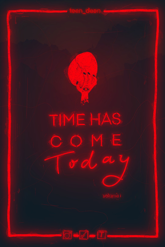


so the most recent fics I’ve read on my kindle are the first two parts of the time has come today series by teen_dean (@urne-buriall on tumblr I think). and these are so good. I’ll elaborate more in my fic review but I am excited to share the cover I developed for my kindle collection because I really enjoyed going through different iterations of this cover. I’m just posting the cover I landed on for now, but I think I will share some of the other iterations which include design choices that I cut and edited at length(in another post or reblog later).
Fic review, cover design notes and a small disclaimer under the page break:)
fic review: I’m not always one to love casefics, watching cases passively on screen is one thing, but I can’t always immerse myself in a case to keep interest. I’m more one for character dynamics and the dynamics here are so interesting and introspective and funny I can’t get enough.
When it comes to the characterizations the author really nails it too. They are so close to canon that when I inevitably dissociate from atmospheric chemistry seminars and start thinking about supernatural, I can’t remember if something happened in their fic or on screen. I love these characters and teen_dean obviously does too because they treat their characterization so carefully. The cover I designed references scenery and plot points related to the case part of the fic, but I wish I could have incorporated the deep and thoughtful character analysis that is part of this fic.
And the imagery, particularly the west coast imagery, is. so. good. Very rarely am ever I struck with the desire to draw imagery described in writing, but it struck me at multiple times throughout this. most noteably the cas in the orchard paragraph highlighted in one of my pics towards the end of young hearts (will it be my first castiel fan art??? I certainly hope so.) chef’s kiss.
I really thought I would take a break after finishing young hearts, but I wasn’t ready to not know what happened to teen dean and past-cas in the next fic so I’m reading the rules of have changed today now and I have no regrets.
some notes on the cover design: I’m not sure this translates to the end result, but the glowing text of the title/author/everything-else was meant to represent the flickering lights of neon signage you might see in a dive bar. The description of Schaffer’s bar at the beginning and end of the first part is rich and another example of really capturing the feeling of canon (which I should mention is something the author does really well through scenery too). I don’t think I necessarily got the colors right (I initially imagined a larger color palette), but I’m feeling pretty good about the glowing aspect of it. In a print book format, I’d like all of the red to be metallic embossed.
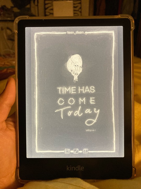
Its very faint, but I included the silhouette of a mountainscape with silhouettes of dark watchers watching in the background. I think you have to zoom in to see them though. So I included a zoomed in image of two of the dark watchers. See if you can spot the other two!!
The last thing I wanted to mention is that I know arimaspians are typically one-eyed (on their heads). I took a creative liberty and put an eye on the hand.
lastly, a disclaimer: I know that teen_dean already has a cover and print typeset for their fic on their page. I just wanted to add my creative twist on it for my kindle collection and wanted to share it with you all :’). I should say explicitly that this was not designed in communication with the fic author. I do not take any credit for the fic (credit to the story goes to the author and characters to the cw). if teen_dean comes across this I especially hope they enjoy it<3, but if for any reason you (teen_dean/urne-buriall) don’t want to be associated with this cover, please contact me and I will take this down.
#time has come today#teen_dean#destiel fic#destiel#fanfic cover art#cover art#fic reviews#fic review#deancas#kindle#reading fanfiction on a kindle
31 notes
·
View notes
Last Seen Blogs
radiantbutterfly
輝く蝶々

adogbyte
𝗶𝗡𝗗𝗶𝗚𝗶𝗧𝗔𝗟

missamericamn
Miss Minnesota

puppyoclock
its puppy time!

binden
DRACHEN BINDEN