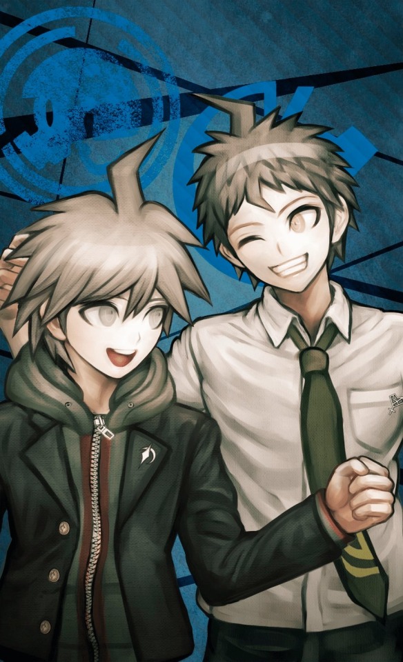
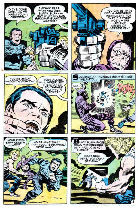
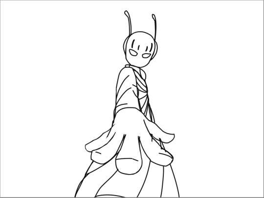
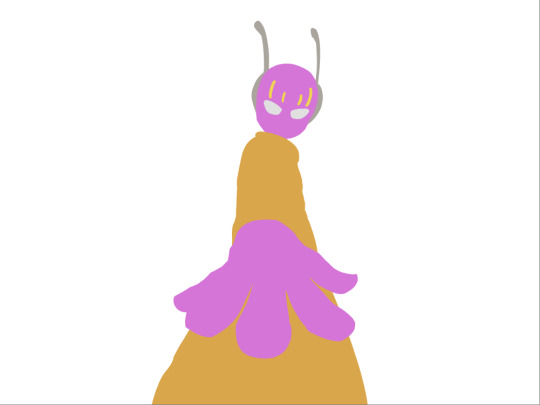
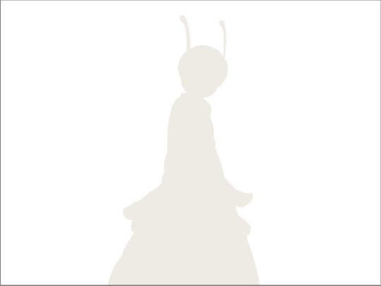
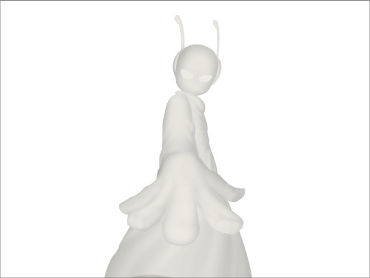
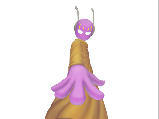
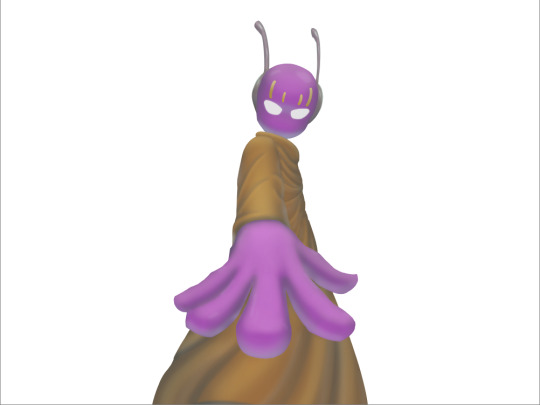
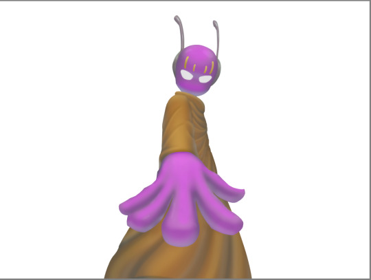
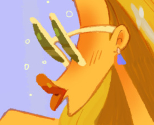
#trying out some slightly different rendering styles
Explore tagged Tumblr posts
Visit Tumblr Blog
Explore Tumblr blogs with no restrictions, modern design and the best experience.
Last Seen Tumblr Blogs


Fun Fact
Tumblr Inc. has $15.1M in annual revenue.
Text


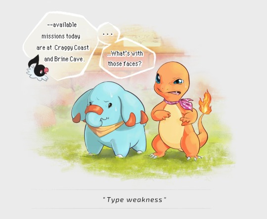

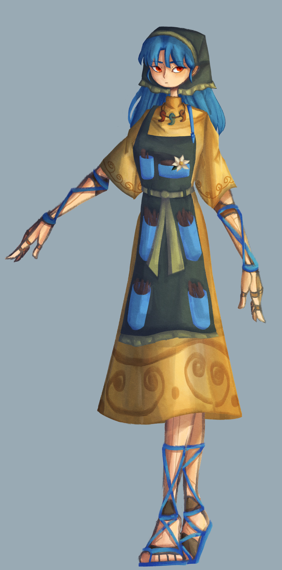
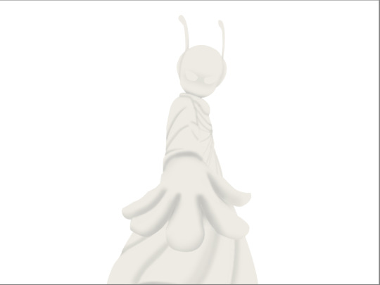
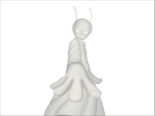
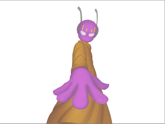
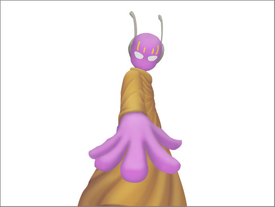
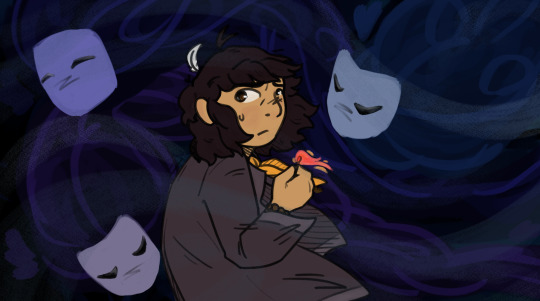
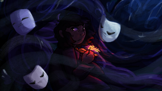
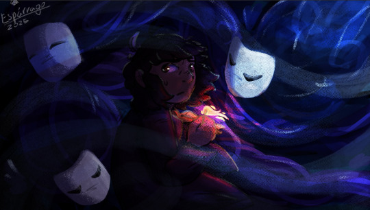
I played Pokémon Mystery Dungeon: Explorers of Sky for the first time a little while ago and was reminded of how very wholesome the PMD series is. So here are some completely self-indulgent drawings of my rescue team. Shout-out to anyone else that has played the game with this specific combo!
edit: and here is my Red Rescue Team
#varggarn#pmd#pokémon mystery dungeon#pokémon mystery dungeon: explorers of sky#pmd:eos#charmander#phanpy#pokémon#pokemon#pokémon fanart#trying out some slightly different rendering styles#games#fanart#me? posting art?#well it happens every once in a blue moon#if I can keep this enthusiasm for art a while longer#I might actually render the drawings I made of my PMD: Red Rescue Team duo many years ago#or even make some fanart of other characters in the games
4K notes
·
View notes
Note
Hiii I really love your art and was wondering if you wouldnt mind showing what kind of brushes you use for your recent drawings thank you so much and i look forward to your future arts!
Of course! I've answered this a few times before but have never really tagged it properly, and I also realised that I've never actually explained what I use each brush for so I'll do that now!:
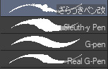
I'm gonna go through each of these brushes in order (and if i remember correctly, I'll link the top two since they arent default CSP brushes). (NOTE: almost all of these brushes have anti-aliasing turned off so that it can look more crispy and pixely!!! there is one exception to this that I will get into)
For this brush, I exclusively use it for sketching, it's advertised for inking digital manga panels, but with how the pen pressure is I feel like it adds form to my sketches

This brush, Sleuth-y Pen, is what I use mostly for MSPFA panels, mostly for lining, but sometimes for sketching too if I'm having a hard time with my usual sketching pen. It's really good if you want to replicate the homestuck style, and good for broad strokes on smaller canvases. The only issue is that the brush isn't great for that style if you use it on a larger canvas (ideally you would want 650 x 450) and can be especially messy if you're trying to get smaller details, such as open mouths, and certain facial details. I use another brush for that, which I will get into soon.
My second use for the sleuthy pen is for lineart on larger canvases in my usual artstyle! It has a texture to it that I like, as I like having my art appear a little rough around the edges, and the issue regarding small details isn't nearly as prominent of a problem
Almost done! Now we have the G-pen, a default CSP brush! This used to be one of my top 2 pens, along with its counterpart "Real G-pen" but nowadays I use it for two things: clean-up during rendering (usually getting those smaller details done that the sleuthy pen has difficulty with) and for doing SOME MSPFA panels (Vast Error, for example)
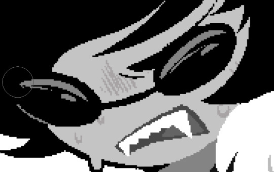
As you can see here, Liaaam's face is a little smoother than the rest of him, that's because I use the G-pen for those details, to keep things a lot cleaner! As for my other use, Vast Error's style from my understanding is a lot more "smooth" and "clean" which is why I exclusively use the G-pen for it, you can also make a lot of thick, juicy brush strokes with it which I feel works really well for the hair and folds in the clothes!
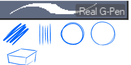
Finally, the Real G-pen, another default. This one is very similar to the last, its only differences are that it's slightly sharper and ever so slightly more messy. It's almost like a medium between the sleuth-y pen, and the g-pen.
I'll be honest, I don't use this pen much anymore, BUT, I still consistently use it for one thing and one thing only: Friendsim sprites. If you want to make friendsim sprites I highly suggest this pen, and making sure it's set to "weak" antialiasing. If you want to go the extra mile, I like to use a lasso-fill tool to block out shadows in all of my art, although if I'm using a rougher brush I'll usually do that manually. There's also other brushes I've been using more for rendering full pieces, such as a "rake brush" and a "design pencil" with low pressure to get details like blush down without making it too intense. That's basically it! I'll link the brushes below if I can find them: sleuth-y pen textured pen rake brush
198 notes
·
View notes
Text

Hello! I think today I want to share something I do sometimes, which is studying artstyles, character designs, colors and etc, usually because I wanna draw a character a certain way and I need at least a bit of practice to get it. A good while back, I sat down and studied Rayman’s design in the Sparks of Hope DLC, all so I could possibly render Ales in a similar style one day.

Aside from the studies (and picking up the one reference to the Magician in the game itself), I also gathered some references, both old and new, to make a sort of moodboard. While the final work would ultimately be my interpretation of the character, I also wanted to try and tweak his design so it COULD, in theory, show up in a game like the Mario + Rabbids series.
That means toning down some aspects that could be read as too scandalous for a Mario spin-off game, but at the same time try to justify other elements as “whimsical” or “classy”. He has high heels because louis heels were worn by men originally, he has an open shirt because that’s how men wore their shirts in the 70s. You know, tie it to his inspirations. I also added The Mad Hatter, not just because of the wonderland inspirations, but also because I like to imagine Ales does the head waggle thing. Even if I have no intentions of animating something like this, I think having in mind the character’s use in animation helps in the design process, like what’s needed from a hypothetical model.

As for actually drawing Ales, I got. Intimidated. So I decided to break it down into pieces first, which is VERY easy with thingamajigs because they’re already broken down into pieces. Some aspects were done deals first try, like how I’d shape the eyes to mimic my own style while still using the base Rayman eyes. However, a lot of other aspects I had to sit back and consider them, like the shape of his torso. Some ideas I’m also still not completely married to, like the shape of his earrings. At this point I also wasn’t sure if I wanted to give him his bell bottoms or not, because I’d figure the devs would want the floating limbs to be front and center for the thingamajig’s designs, not just Rayman. On the other hand, Rayman HAD worn pants in some games (coincidentally the Rabbid games), so it’s not a far off concept.
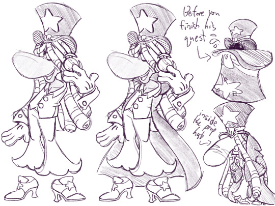
Then I finally sketched out Ales! It’s not a perfect one to one of the SOH artstyle, but that’s ok, since it’s a first pass :))) I figured out how to keep his pants AND show off his floating limbs at the same time, which I’m very proud of. I do think next pass, I’d want to use a different shape for the earrings, since they’re kind of cluttered, as well as a slightly different half-up hairdo, just to give it a more interesting shape. But overall I’m happy how Ales looks!
I also drew him as a teensy for fun, just to shove him inside that bigass prop hat, and you have to get his glamour or he refuses to come out. I didn’t use my usual design for teensies because Giacomo Boni’s glade character designs are soooo funky and weird (positive, go look at his Murfy art I <333), so I made him hunched and made his nose bulbous while pointing down. Makes him look like the old man Teensies are supposed to be :)))
All in all, I’m happy with this study session! I can’t promise I’ll actually render Ales in this style, but if I ever do I have something to come to for reference!
#cici yaps#rayman#rayman fanart#rayman the magician#rayman ales mansay#ales mansay#sparks of hope#artstyle study#sorry for yapping so much I just really liked thinking about this
81 notes
·
View notes
Note
hello i love ur art <3 may i ask how you shade/render? or if you can share any helpful tutorials you learned from ^^


Unhinged Art Tutorial
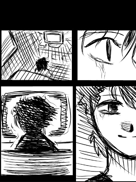
Well, anon and @merlucide! I'm not sure if I'm the best person to learn from (I'll attach some video links at the end to people who I personally look to for art advice) but I happen to have a series of screenshots for how i render with a strawpage drawing I did recently(at the time I drafted most of this a month+ ago), so I'll go over what I do, at least in this case.
Warning: A bit rambly. Not sure if intelligible.
Tutorial..? Explanation? under the cut.
I have a few different shading styles based on ease of program usage and effort level, but in this case i had to individually streak the shadows. I'll be focusing on hair and skin for the most part here.
My sketches are pretty poor, because I'm hasty:


Honestly I find the better the initial sketch, the easier the final profuct will come. So take your time, use layers when sketching to be clean. The airbrush layering shows vaguely how I tend to shade hair.

Backlighting *Applicable mostly when there is a bright background, light behind the subject, or in neutral lighting.
The 'underside'/inside I tend to use a peachier, brighter tone closer to the skin color (for tanned skinned characters I'd use a shade closer to a rosy orange, since that's just a more saturated peach. For darker skinned characters, I'd recommend a slightly redder & brighter version of their skin tone. This works pretty well with dark hair+dark skin, but in the case that your character's hair color is a lot lighter compared to their skin tone [also in the case of a fair skinned character with WHITE hair] it's totally fine to ignore the natural undertone of the character and shade it with a pinkish white.) This works for any hair texture but can be more time consuming for coily hair textures. (2c-4c)

Lineart when I take my time / Old rendering video


It looks more stable if you start off with a solid lineart base because you won't struggle with big-picture placement issues.
"Lineart" when I just try to pump out a drawing

I first did a rough sketch, kept it as an overlay layer and drew over it.

(Chickenscratching is valid though, honestly. I think it has a look to it!) I usually block out base colors, and vaguely where I want the shading to go, unless I need a special type of lighting, which then I'd do the base colors and either choose to wait until I'm finished rendering or do light processing* (*will discuss this later in this post) with different blending modes and layers.
For example if I'm doing the colors mostly FIRST (Choosing a grayed out palette) and then rendering, it'd look a little something like this: Left (Trackpad, on FireAlpaca) / Right (iPad, on Clip Studio & Procreate)


Sometimes, I'll shade with a dark, grayed out tone and then fill it in with something slightly more vibrant. This kind of gives it a bounce-light feel? Also with a lot of pieces I do recently I try to block out entire parts as white because lighting especially on white background pieces looks better if you pretend that it's white behind the character due to an intense sunlight.

Also, I use gradient layers to tweak with the colors. It's pretty useful and looks nice!!!! Gradient maps are available in every software I use: Procreate, FireAlpaca and Clip Studio Paint.

I find that the more intense the light (but not scattered, as in the source is either very bright or it's very close) the darker the shadows usually look? And if there's a brightness coming from behind the figure and the hair is splayed out in some way, it will appear semi translucent because it's just a bunch of strands made of keratin and collagen, something like that....


Anyway this is all very messy but I hope it helped

Here's a process photo for how I shade if that helps too.


More examples..

I broke down my thought process in my lighting so here's a close up of that.
i totally forgot about the video links so here's my idol the one and only:
And I think this guy makes quick but concise tip videos:
Finally I really like the in depth professional explanations from a long time illustrator:
I've personally taken advice from all three's videos and used them to improve my own art, so take a peek!!!!
77 notes
·
View notes
Text
slightly different entry subject, still UTDR related.
Art dump of kris as well as a small shitpost doodle
Armor rendering attempt/how I currently draw Kris

sketches I made while trying to figure out how to draw kris.
Kris sketch/initial armor rendering attempt
Deltarune off memory
And now for the end of entry personal-ish diary style yap session (doodle near the end)
First thing, dumb little obscure fact about myself: oddly enough I played Deltarune chapter 1 before I was able to play Undertale.
young me didn't have a working computer or enough money to purchase a copy of Undertale for myself, albeit I was very VERY spoiled on it at the time, so unfortunately I didn't get to have a blind playthrough of Undertale by the time I actually got the game at around 13(?) years old however I good decent year or 2 before, I was still able to have a blind experience playing Deltarune.
I actually still remember that day surprisingly. At the time I since I didn't have a computer still I often played on my PS4 (still have it to this day) and for fun use to browse the demo section of the PlayStation store, because I didn't have money to buy games on there yet ngl.
One day i was doing this and saw Deltarune listed and was just completely surprised for some reason I can't really remember off the top of my head.
I downloaded the game but didn't play it until a few days later when a friend of mine was over for a sleepover.
second dumb obscure fact about myself: deltarune is one of like 3 singleplayer games where my first playthrough of it was a shared experience with someone else.
we played the game to completion that night, although by the time the game was done, I was the only one still awake, sitting on the bench in front of my old room, my friend was in basically a cacoon with how many blankets they had on, it was completely dark both outside and in my room. I had finished the game and was listening to Chapter 1 credits theme "Don't Forget" for the first time.
maybe this sounds a little dumb or cringe or whatever, maybe 11 (?) year old me could probably pin down a reason as to why I felt the way I did or better explain what exactly that feeling was, but I remember tears forming on my face listening to that song, It wasn't sad tears or anything, I was smiling lightly I think.
as far as I can remember it was probably one of the first times beating a game that I could say I distinctly felt something.
that feeling is something I still remember even now, years older, states away from where I used to live, but this memory is still in my with me as clear as day, despite this happening at night.
I have nothing else left to say in regards to that, a memory I will probably cherish forever.
To whoever reads this, I hope your day is well, and continues to be
P.S. just need to get this off my chest real quick, ahem-
I WILL BEAT THAT DAMN JESTER ONE DAY I CAN BET ON THAT!!! 6 YEARS AND I STILL HAVENT BEAT JEVIL, I SWEAR THAT JESTERS ASS IS GRASS NEXT TIME I OPEN THE GAME.
also beat Spamton Neo recently, that was fun.
#utdr fanart#deltarune#kris dreemurr#kris deltarune#deltarune fanart#journal entry#sketch#doodles#art
26 notes
·
View notes
Text

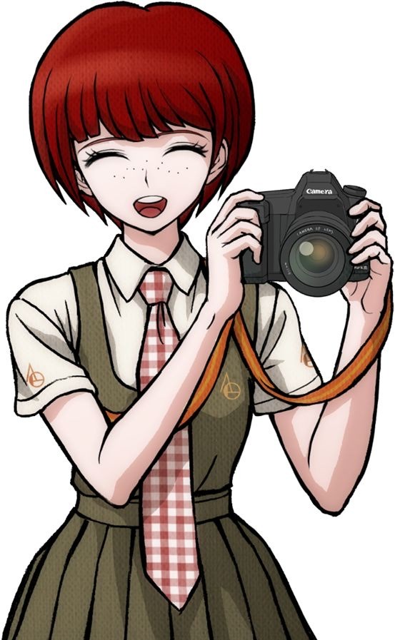
A little preview of the piece I did for @destinationunownzine!! I went a bit crazy rendering this one, but it was also incredibly rewarding.
If you'd like to get the zine you can find it on Big Cartel (for US shipping and digital bundles) or on Etsy (for international shipping).
I wonder what (or who) Ingo is looking at (and why) 👀
((a few notes and thumbnails under the cut))
The crossover I was going to work on for the zine was with Animal Crossing (of course) and I had a couple different ideas for the illustration.
I ended up making 5 thumbnails that explored those ideas (the page format ended up slightly taller than the one used here):
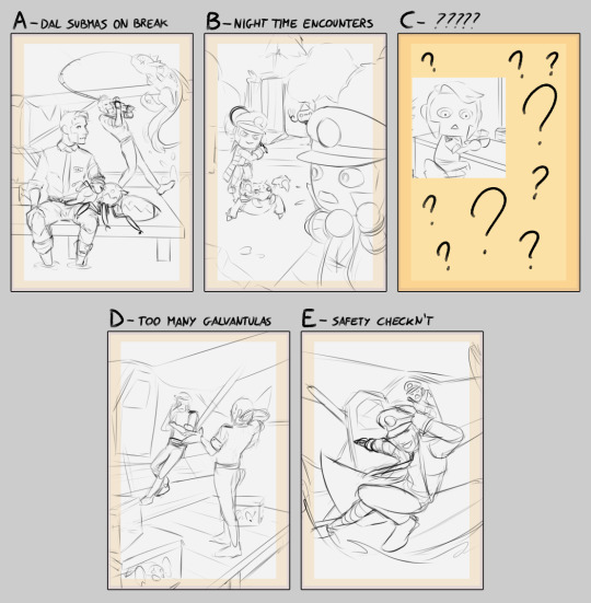
I had some options where the guys are in the DAL roles (like in the comics and sketches I made for my AU), and a couple where they are in their original uniform.
Option B in particular was more about applying the style of Animal Crossing to them as well as to some of their pokémon (chandelure was going to be referencing Wisp), while option E was very much just vibes and me trying out something a bit more dynamic (which ended up not showing the AC setting enough).
In the end C is what I ended up working on. It was really fun to work with the Animal Crossing proportions and style, and I even got to squeeze in my favorite AC character (that would normally be substituted with a pokémon character in my AU) and a little bit of humor.
#submas#subway boss ingo#subway boss emmet#saersketches#I am also working on turning one of the other thumbs in an illustration#here's to hoping it doesn't take me months
463 notes
·
View notes
Note
how do you imitate the danganronpa style so well?? it's always so good!!
Great Question!
First, having a somewhat decent grasp on anatomy (which is something I still need to practice lol) or “the basics” of character art is always a must imo. Having a good understanding of forms is our starting grounds for further stylization. Think of it as the “skeleton” of any style. Moreover, the Danganronpa style comes in various forms, all with different characteristics/visual characteristics.
However, and I think this is a very important distinction, I try to study Rui Komatsuzaki’s overall style as opposed to just Danganronpa. In other words, Rui Komatsuzaki, like any other creative, has his own personal stylization and artistic evolution throughout his career as an illustrator.
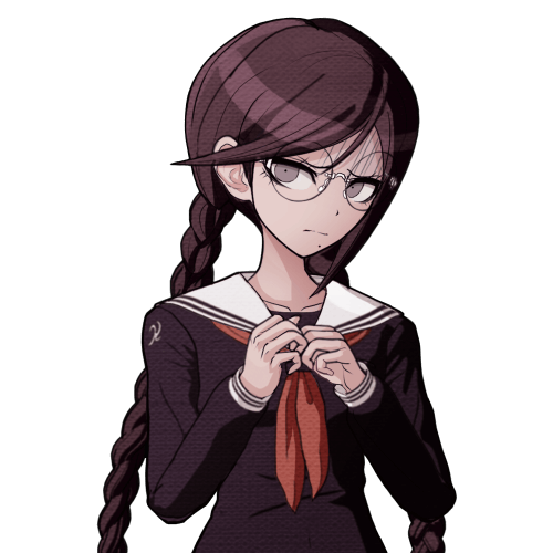
In DR1, Komatsuzaki’s style included much thinner lineart, bigger heads, and more gradients with the softer shading. The vibe is very much more “grounded” compared to later titles. (Example: Toko!)
In contrast, DR2 has slightly modified proportions (like bigger hands), simplified shading, and much more vibrant color palettes. The line art during this time was also streamlined with less lines and thicker pen pressure. It makes the sprites pop out a bunch! (Example: Mahiru!)
Of course, with UDG, we see these two styles somewhat overlap, resembling his later stylization. Here we see the modified proportions and color preferences from DR2 with the thinner linework and detail of DR1. (See Toko Again!)
Finally, we see this similar style philosophy continued in V3, only with even more contrasting colors, reflecting the hyper bright/attention grabbing palettes of serialized work. The shading is much darker than previous titles, and somewhat colder too. (See Miu this time.)
Of course, with all of this in mind, taking notes is imperative! Especially if you want to replicated a specific entry’s stylization. You can draw over some of the dr sprites just to get a general feel of the proportions. I can probably post more latter down the line, but this was the most recent thing I’ve done. See below! (I was trying to get a sense of how “high” the hair sits on top of dr)
Now, for his splash art work, Komatsuzaki’s began his process by blocking out his pieces in bluish hues before the polishing phase. he most likely applied a mix of “color”, “multiply”, or “color dodge” once we finishes rendering for finalizing colors. (As depicted below.)
You can also see how Komatsuzaki simplifies clothing and the like. He very much uses thicker brush work for these types of illustrations as opposed to the lines of his 2D work during this point in his career. Future points show how he plans his stuff with more thin line work. From here he most likely did the same thing. Focusing on the forms before getting to the hues and values
Sorry for going on a bit of a tangent, I have A LOT of thoughts on DR and Komatsuzaki’s artwork in general. I really love seeing his process, so I hope this brief overview can provide as a decent introduction! If more people want me to go over specific aspects of the style, I’d be more than happy to share my own thoughts! Thank you for reading!
#Danganronpa#danganronpa 2#danganronpa v3#Rui Komatsuzaki#danganronpa sprite#r0sie rambles#r0sie asks
43 notes
·
View notes
Text
Notes on Comic Art #2: To Hatch or Not to Hatch, also some coloring stuff
One of the most influential things I've ever read on the subject of comic art is a piece Jesse Hamm wrote on Alex Toth where he talks about flatpacking.
[I discovered while writing this that Jesse Hamm passed away in 2021. He was a brilliant educator, one of the best in the history of the comics medium, and will be sorely missed.]
In the piece Hamm basically discusses how over-rendering objects usually makes them function worse as comic art. Many other people have discussed how using thicker lines for objects closer to the "camera" is good practice, how colors can seperate shapes and create depth, etc.
The question is, where does cross hatching fit into all of this? Or rather, various methods of adding more detailed rendering to artwork? I'm trying to figure this stuff out as I'm doing layouts for my comic, because I want to know the answers before I start inking the final artwork.
I try/want to have an uncluttered, clean, easily readable art style. I occasionally add hatching to my drawings, because hatching is fun, but I often feel like I've slightly ruined my artwork when I'm finished.
I've decided to look at some of the art that I feel like my own work is trying the hardest to emulate, at least philosophically, to see how other artists "weigh in" on this debate. It's important to remember that inkers embellish artwork [hence the alternate title "embellisher"], and so I'm going to try and find inkers most representative of a given penciller's intentions when applicable.
As I was working on this piece, I read Hamm Tips vol 1.1, and I discovered this diagram, which seems to relate with what I'm going to discuss later:

I think it's accurate to say that my desired approach is Uninflected/Deliberate; I think most people going for a clean and cartoonish look fall into that quadrant. Some people might describe Toth's work as being "clean", and so I should clarify that I'm talking about clean in the spirit of "lines meet neatly".
Some of the artists I'll discuss have lines that fall somewhere between being Inflected and Uninflected, and I think a lot of this comes down to inker approach. I feel like, in spirit, all of these pencillers are Uninflected, but some of the inkers use brushes, which creates a sort of middle ground. Brushes add different weights to a line, whereas crow quill nibs and pens have a uniform width. [The technical term for unweighted inked lines is "dumb line"; I believe this was coined by David Mazzucchelli.]
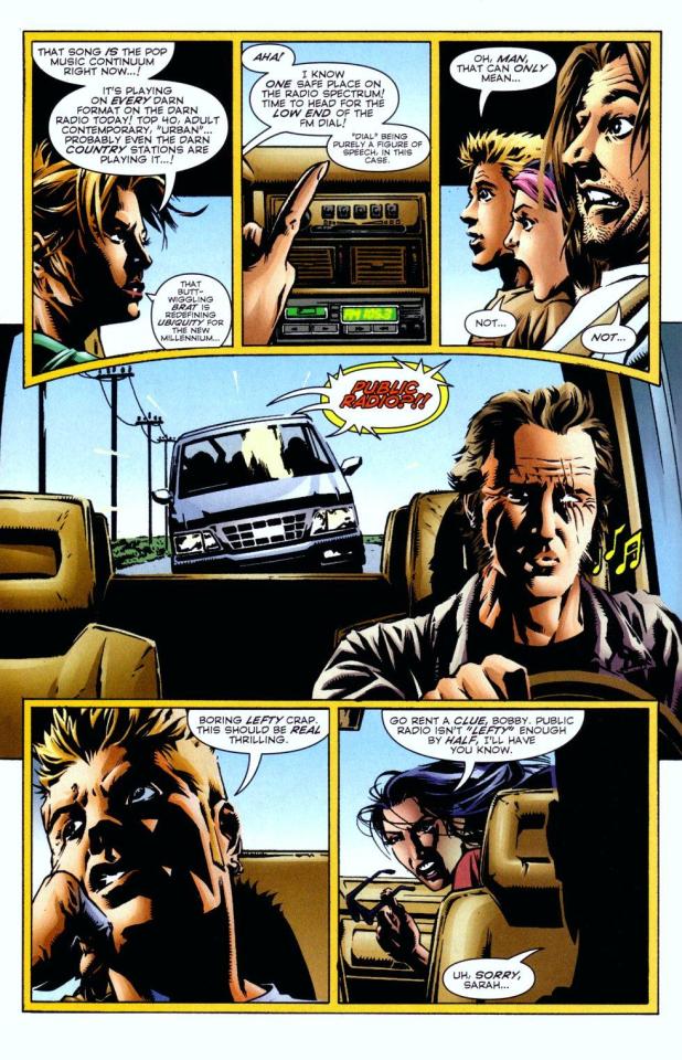
Let's first look at Adam Warren's work in the Dirty Pair volume Fatal But Not Serious. I'm a huge fan of how this comic looks; the flat, cel animation-style colors are very clean and easy to read. It's a very pleasant look, and I'm surprised more comics don't do this.

There is some hatching here, but it's not "serious" hatching. Just a few lines on cheeks, hands, etc. 98% of the artwork is shapes delinated entirely by a clean line and color. The convention floor panel is able to have a ton of detail without really changing the visual "rules" of the comic. An artist who does things in a more highly rendered way may've, for instance, reduced the crowd to a series of heavily shadowed figures, or colored in a single expressionistic wash to paper over things, etc.
Warren's Magical Drama Queen Roxy used a very similar approach to Fatal But Not Serious:

Let's now look at Rick Mays. I'm not a huge fan of Rick Mays, I've only actual read a single issue of a comic by him, but as I was reading Gen 13 he immediately stood out as being the best artist on that series, aside from Adam Warren himself [speaking only about issues Warren wrote]. It feels very telling that Rick Mays later did the final art for a graphic novel Warren laid out called Livewires.
These are from Gen 13 vol 2 #70:
The biggest difference between this piece has nothing to do with Warren or Mays, and everything to do with the coloring approach. I don't think the coloring here is bad, but the gradient-y colors do create a vastly different visual effect than the cel look I highlighted earlier.
The inking approach feels quite similar between the two artists; while Mays's art takes one or two steps towards realism relative to the Fatal But Not Serious stuff, texture is largely used to the same degree [with the grass and tornado being understandable exceptions]. What's interesting is that this issue has three different credited inkers; Karl Story, Rick Mays, and Jason Martin. I'm assuming this happened for deadline reasons.
I feel like I'm maybe starting to sound a little repetitive, and so I feel like I should share an issue of Gen 13 that I disliked, and then we can move to things that aren't Adam Warren-adjacent. These are from #43 and #44, with pencils by Lee Bermejo and inks by John Nyberg:
I'm not a big fan of this. The borderline chiaroscuro inking makes everything look heavily referenced, labored, and weird, and the "acting" in the comic suffers because of the over-rendered faces. It's a real shame the artwork is like this, because this two-part story is actually quite solid and would be a minor classic with better artwork.
I notice that many newer comic artists [which is to say, people who began their careers during the 90s onwards] put a lot of heavy shadows on figures in a way that feels too slavishly devoted to a certain kind of realism. I say a "certain kind" because the high contrast look of black spots being put onto a figure make the shadows way darker than they'd actually look in real life, so it almost makes the figures look dirty.
Look at comic art from the olden days and figures are largely defined by outlines/color. If a figure in an old comic has a lot of shadow on them, it's for reasons that are obvious and motivated; noir-y venetian blinds stuff, a mysterious villain being obscured, someone being underlit, or having half their face obscured, etc. There's a clear reason shadows are being used in these cases, rather than it being done to add usually unnecessary detail.
Anyways, let's look at Amanda Conner's work. Image on the left is from a Vampirella story called Fantasy Feast, and the image on the right is from Power Girl #12. Texture is used, like on the walls of the bathroom, but sparingly.
Looking at Conner's work in this context makes me realize, I don't think I've ever seen Amanda Conner's stuff colored flat [at least after she fully matured as an artist]. I don't think the more three-dimensional rendering used in any of these panels is bad, but I'm not going to be doing that kind of coloring in my book, and so it's not quite as instructive to me.
That being said, I really love Conner's style. I've noticed that Marvel and DC are increasingly using artists with styles that are broadly similar to Conner's; I've included an example below. Maybe it's because the artist below is too lazy to draw a proper background, but their work feels so much more flavorless than Conner's in comparison. I think it's because the "acting" is not as impressive, and Conner brings a fun-factor that feels completely absent in the page below.
I realize "fun" isn't always the order of the day, but this page doesn't really reflect . . . anything. It's completely bland.
Here's Kirby, who couldn't be bland if he tried. The left image is from the Young Romance collection Fantagraphics put out, and the right is from OMAC. The former is from the 40s, latter is from the 70s. [By the way, the Young Romance image is photographed from my own collection; there's no warping visible because Fantagraphics knows how to design a book].

Looking at these pieces side-by-side really challenges a lot of my assumptions about Kirby's artwork, because in some ways his artwork changed less than I previously thought it did without direct comparisons. There are some things that are more abstract about the OMAC page, like the wiggly shadows. Someone unfamiliar with Kirby might assume these were drawn by two different people, but only because 30-odd years of growth seperate these two pages.
Kirby's style, in my mind, is highly geometric and defined more so by abstract shorthand squiggles than hatching or other forms of rendering, but there actually is a fair amount of hatching on the OMAC page.
However, that OMAC page I believe was inked by Mike Royer, or at least someone using a brush. I noticed that, by sheer coincidence, almost all of the Kirby art from my first post in this series was inked by D. Bruce Barry, who didn't use a brush and also followed Kirby's pencils perhaps more literally than any other inker he ever had. In those images, it's clear that most of the hatching in Kirby's work was added by his inkers.
When Kirby did ink himself [using a brush], his style was oddly clean. He did add in hatching, but it was never particularly dense.
Anyways, I want to close this by including some Jesse Hamm quotes from his instructional PDFs:
-Simplicity is great, but often you need extra texture to seel weirdness.
-Another sign of experience is texture. The pro-level artist has learned to give different textures to grass, hair, tree bark, bushes, etc. Meanwhile, the amateur uses the same one or two shading techniques on EVERYTHING, giving it all a samey feel.
-Open spaces of black or white may be "activated" with a bit of texture. A few pebbles/ripples/etc will spur the mind to fill what's missing.
-We talk often about spotting blacks, but spotting greys (i.e., details/texture) is also crucial to clear compositions.
The lesson in the bit of Hamm writing I most often revisited, the flatpacking post, was that too much texture and rendering can make a comic exhausting to read. But reading more of his work, it turns out he had a more nuanced, texture-inclusive view of things.
What's the lesson here? Discretion.
56 notes
·
View notes
Text

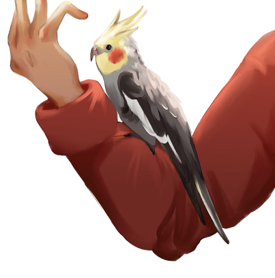
✨ Not rendered vs. Rendered Art! ✨
One of my friends asked me, what's rendering? Since we're both in the art sphere, I made these two pictures to show what rendering is :)
In digital art, and in traditional art, "rendering" means "refining" something. You draw over things, blend things, correct things, introduce new shapes/colors to correct something, smooth stuff, and go deep into detail, all to make your piece look 3D, realistic, or simply better 😂
( Some artists prefer not to render! Depending on the style, it can be completely unnecessary :3 )
Rendering in illustration is often overlooked, especially if you didn't see the drawing beforehand. The initial stage of a drawing is rough & basic. You can see my lines, the shapes I was using, and the colors are not quite right. Many speedpaints may also not start redering until they have a value drawing, with varying grey unrefined shapes.
During rendering (one of the most lengthy art processes out there) you can smooth things, erase lines, correct shadows, correct lights, adjust colors, etc. The options are limitless, but basically, you're trying to get your bare-bones drawing to look finalized while correcting mistakes. My parrot looks more 3D and smooth because I rendered it (slightly). It's mostly line-less, adjusted, and shaped slightly different in some places. To do this, I had to go over every piece of the drawing ^^;
I hope this explanation makes sense! 💖
( Honorable mention for 3D animators: "rendering" is the stage of exporting the finished animation with models, added effects, calculated light + shadows into a final .mp4 file by the program. It can take hours! 🥰 the output is usually very polished tho, so... it's worth it? )
#art advice#art definition#tutorial#guide#art tips#art help#rendering#art study#lineart#art process#drawing#digitalart#art tutorial#illustration#digital illustration#rooklobby#2024#darkrooklobby#parrot#cockatiel#ornitologia#bird#bird art#nimfa#art talk#art problems#lol that tag XD
21 notes
·
View notes
Text
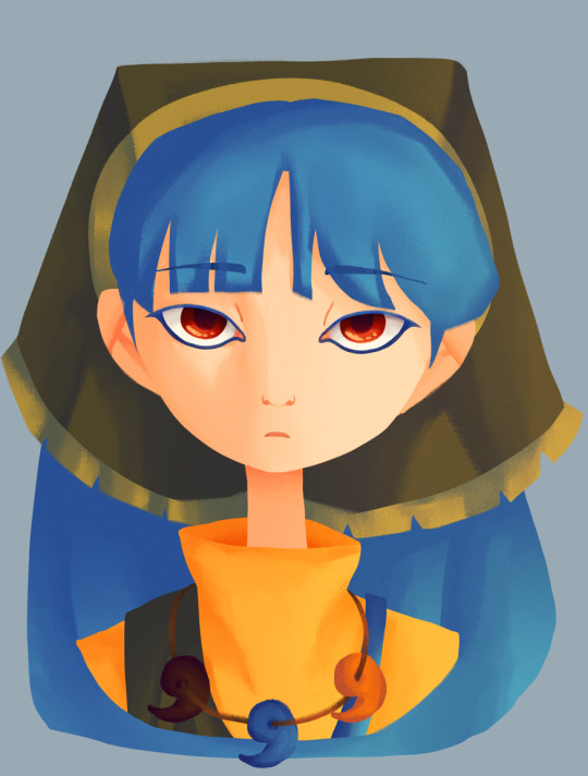
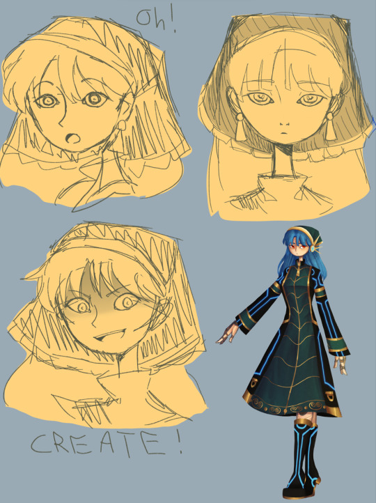
I RETURN BEARING DOODLES OF ZE KEIK!
Hello again! :D I felt like drawing Keiki because I had nothing else to do and I also wanted to draw Keiki again because C R E A T E !
{Artists Note}:
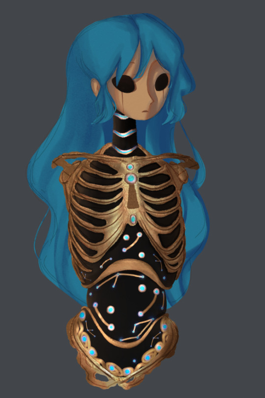
So I had some ideas bouncing around for how I wanted to draw Keiki, and the first time I went with a more robotic look that was inspired by BoTW. I also wanted an excuse to try out some stuff with collages, and so I used an 1800s drawing of a skeleton to put this together. I added a face and a head just for fun, but tbh I wasn't 100% happy with it even though I did like how it looked. I might wanna save the BoTW inspired parts for a future Okina design as I think the constellation motiffe some BoTW Sheikah stuff has fits her more (and I have adopted the headcanon that she has prosthetics, I love it so much).
Like ok, context for this is headcanons. So as I mentioned in my post about Eirin, I wanted to play around with the visual idea of gods in Touhou being very much related to what they're gods of.
So at first with Keiki I tried just making her look like a haniwa herself, but I ended up not going with that as I like the idea of her being distinguishable from the Haniwa she creates. So instead, I ended up going with a more cyberpunk aesthetic for her, inspired in part by Cyberpunk Edgerunners (no spoilers plz, I haven't finished it yet). It's also the reason why I did an alternative cyberpunk outfit for her (inspired by a dress I found on Pinterest).
I feel like the hardest things about drawing Keiki are her dress and hair bandanna. In the image above with her normal outfit, I had a lot of struggle with the sleeves, and I couldn't really get her hair bandanna right. In the faces I drew of her I had a slightly easier time, but still, it's hard to get it to look right. However in the alt design I gave her I somehow managed to make it look right??? Don't know what I did there but I actually like how it looks, so I'll keep what I did there in mind for the next time I draw her.
Speaking of her alt design, it was actually a lot of fun for me to do. I imagine that's her more "official" outfit, don't know what she'd where it for but I mainly drew it on her because i had a cool idea ok?
Also, on the day I drew her initial face render, I had watched Serial Experiments Lain and I think those vibes bled into the sketch version. Upon further inspection of the rendered and coloured version it kinda lost that but it's more to try out a different brush for my style.
Also also, I experimented with giving her earrings! Which didn't make it to the final cut, but still wanted to try it out! This also came as a learning experience on what makes Keiki look like Keiki... it's the hair bandanna, every time she doesn't have it, she doesn't look like herself.
To end it off, I think the unhinged Keiki face I drew for her expressions (since everyone I've been drawing recently has kinda all been lookin like varitations of this face -> (o _ o) gonna need to draw more expressions period actually, need practice on that) is now my favourite unhinged Keiki face I've ever drawn LOL. Expect more Keiki sketches in the future because I do love drawing my beloved blue haired blorbo.
#touhou project#art#fanart#touhou fanart#touhou 17#keiki haniyasushin#doodles#art dump#long post#concept art#alt design
100 notes
·
View notes
Note
hi! first of all thank you so much for keeping my chemical dependency (cough silco cough) always watered and fertilized and properly sunlit and pollinized <3<3<3
but anyway, can I ask you about your art journey? Like how long you've been drawing, if you have a set routine or learning methods? books or videos or whatever you'd recommend?
I'm looking at the journeys of artists I love to see if I there's anything I can apply to my own learning process!
Waaa thank you anon, appreciate that! Silco has reawakened my muse and I’m always so grateful that there seems to be a little community who feels the same way. Very interesting question, glad to share! Sorry if this is long and convoluted, I’m a professional yapper:
I’ve been drawing forever but I started taking it seriously maybe 5 or 6 years ago. I went to an arts college for two years which helped me brush up on my fundamentals (figure drawing, observational sketching, traditional painting techniques with acrylic and oils etc.) and then I took a year out of full time education and employment to work on building up a portfolio of artwork, and now I tattoo full time for a living. Tattooing is obviously a very VERY different medium and style to what I post on here, however it does mean I’m drawing for at LEAST 3-4 hours quite literally every single day of the week; and all practice is good practice.
I will say, starting out at college, the figure drawing was probably what helped me progress the most in a short amount of time. If you can master the human form then you can master anything. (To be clear, I don’t think I’ve mastered the human form AT ALL, lol, but I certainly try my best). Live drawing is the absolute best and there are usually classes you can sign up to join in most cities, but if that’s not a possibility then the website line of action is the next best thing. I like to try and do a couple of gestural sketches a day just to keep myself sharp. This YouTube video is a good start guide on how to approach gesture drawing.
General observation sketches are great too: buy a little sketchbook and a mechanical pencil and take them everywhere, and draw everything you see. Don’t be afraid to draw badly, or to draw things that don’t seem “artistic.” I have genuinely hundreds of pages of the most awful, shitty, unintelligible sketches you’ve ever seen but it’s alllll part of learning. Every morning on my commute I’ll sit at the train station and sketch the people on the platform, or the pigeons, or the trains. Just draw, draw, draw, draw, draw as much as you can.
Arcane has actually improved my art a lot, too. I really recommend either buying the art book or finding the pdf online (it’s pretty easy to find, but drop me a dm if you want the direct link) because there’s loads of great concept art in there and it’s genuinely a fantastic resource for anyone wanting to learn how to illustrate in a slightly more cartoonish, stylised timbre. REALLY sit down and analyse every single little frame- take note of the way the animators and artists at fortiche render and use colour, perspective and form. It’s super unique and has massively changed the way I render!
That’s pretty much all I’ve got, I think? Gonna link some more resources here but hopefully you find something useful buried in here lolol.
• A MASSIVE Reddit post with a fuck ton of resources
• A really great YouTube channel with a bunch of art tutorials / starting points / resources
• Subreddit with daily drawing prompts to get the creative juices flowing
• An excellent tutorial blog post that covers painting and concept art.
12 notes
·
View notes
Note
do you have any tips on how you color? your coloring style is similar to what i’m trying to achieve but i have no idea how you actually pull it off
Hi!
I'm gonna separate this question into rendering vs. coloring. I'm not sure which you mean so hopefully tackling both covers your question, although I'm not really the best at explaining things.
For rendering, I usually paint using some square/textured brush (kind of like the one pictured below and a low opacity circle brush (the standard in photoshop, and most painting software). Lately I like using brushsets from the digitalbrushes account here on tumblr.
I sketch, and then paint underneath the sketch. after i paint for long enough I either delete the sketch layer or I merge the two. I like to add texture where the midtones are. I think a lot of my "rendering style" is probably owed to that.
I like adding texture around midtones. I also like adding limited random variation of color and value to large areas. Like below, you can see that I added a slightly different shade of red to the lit part of the apple in step 3. If you add variation or slight gradation to the large light shapes or shadow shapes you can create the impression of depth. At the very least it looks more fun.
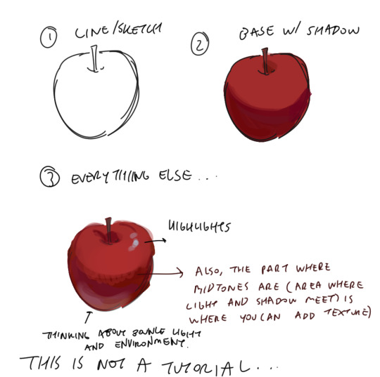
Also a disclaimer, but for the last two drawings I did I've kind of went off kilter. The process is the same but I used some oil paint brushes I downloaded and I pretty much added as much variation to every shape possible, which I would not recommend unless you're sure of what you're doing. But you can see here that even though I added variation (in color, brush stroke, etc) that the shapes are pretty readable and the light is very clearly separated from the shadow.


In terms of choosing color, I had a long stretch of time where nothing would look right to me. Things were colored really literally, with no regard for lighting or ambient color (background/environment surrounding characters). I would often fix things up using a gradient map and using color burn or multiply on 14%. Honestly, this is still a great way to make things look coherent, I really like these gradient maps on the CSP asset store if you want to look into them.
My colors improved a lot after I developed an eye for color/figured out what colors I like to put next to each other. I did this by saving and making a folder of any piece I saw that I liked specifically for color. By doing this I got a clearer sense of what kind of color schemes I tend to like. I suggest doing this as well so that you can figure out what kinds of color schemes and pairings you tend to enjoy most.
Hopefully this answers your question <: ] Apologies if this doesn't make sense, it's a bit of a long post.
#ask#I wish I could help out more anon ... I often feel like I have no style consistency so seeing this ask surprised me#i think unfortunately i do work partially intuitively so its a little hard putting this into words
108 notes
·
View notes
Note
I just found this blog and I noticed that a lot of your stuff seems, well, oddly 3D. I don't mean like in a bad way but it feels like rendered but untextured 3D models? I kinda want to ask what your art process is (sorry for mini-rant)
thanks for checking out my blog! and no need to apologize for anything.
hmm, my art process. honestly i have no idea what to say, i dont know how people normally answer this question so i cant base it off anything either. i'm still kinda new to this whole art thing but i'll try and answer, super sorry if i get this completely wrong and this was all a waste of time.
i guess i'll just talk about how i draw things step by step? for the high effort pieces at least.
ok, so for starters like step 0. when it's a high effort piece, i can already see the image in my mind. i see the pose, i see the general lighting, the layout of stuff, but it's a bit blurry. if i cant see this mental image, the drawing usually comes out extremely poorly.
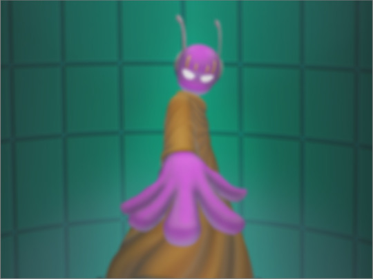
this is kind of an example of what i see in my head? this might be all useless info idk, but this is i guess where i start.
well step 1 is just the sketch and line. i start with just sketching the general shapes, then slowly refining it until it fits close enough to the image in my head. then in the line layer i'll fix any mistakes the sketch had and add more details to it. oh and for brush, it's just a round brush, like default. i dont know how much of a difference using a drawing tablet does, but i dont use one so... yeah.
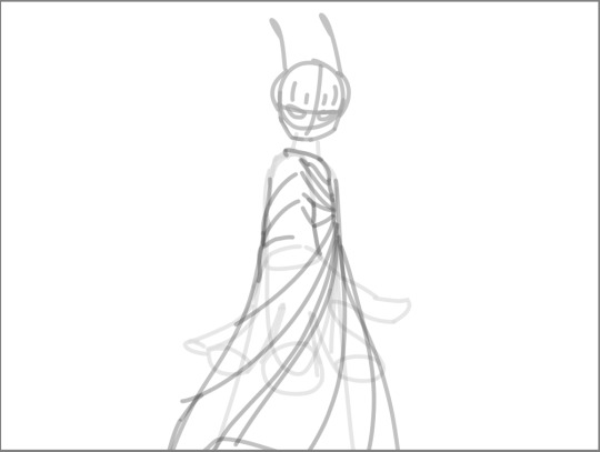
i should've put more effort into the sketch for this drawing, but i did not.
next i do flat colors. pretty simple, i just select the smart select the outside of the line layer, invert the selection and now i can't paint outside the lines. i dont really think about what colors i use, i just use whatever the characters normal colors are.
next i do the shading, but first. i duplicate flat layer and recolor it to like a cream color
like so. for high effort pieces, i was told online to shade in pretty much black and white. now actually onto shading. there's 2 kinda shading i do, 1 from the proper light source, and 1 that's kinda just a shadow because things are close together (like corners and stuff). and i'll shade them on separate layers so i can adjust them individually however i want. oh right, i'll either use a very dark color, pretty much black and the the layer blending mode set to multiply. or i'll use a light kind of gray, tinted slightly yellow or something and set the layer blend mode to difference. then i just use a soft air brush and shade in the ways i described above. shading from regular light source, and the corner stuff thing.
normal lightsource - - - - - corner thing
then toggle both layers on and mess with the opacity of each layer until you get what you want.
then you can toggle the normal flats layer, the one that has color and it should apply the shading decently. you can mess with the opacity again on the shadows.
next i do lighting. i just grab a very light color, usually pretty close to white and set the layer blend mode to overlay. then i use a soft airbrush and "light" it? idk i just do like the opposite of the normal shadows, lighter the closer it is to the light source
mess around with the opacity as usual. then i do pretty much the same thing if there's another light source. in this case there was a blue light kinda coming from underneath, so i did that.
now from here i would go back to the flats layer, make a copy, and mess around with different layer styles and properties and settings. sometimes just messing around is useful. in this case, i felt it was too bright and colorful, so i decreased the brightness and saturation of it.

i think it helped a little bit but who knows.
now i do some kinda highlights and details. i grabbed the colors that were in the background and used those. it was a weird pale blue. i had 2 layers for this, 1 of them was specifically for his antenna things at the top, and one was just for his "skin". anyway, the antenna layer was normal, just kinda gave it an outline with the random reflective circles you see normally in pictures, no thoughts behind them. the skin tho had the layer blend mode set to soft light, i thought it looked best this way. it was just more random things to imply it was slightly reflective.
together the layers looked like this. i think it makes him look glossier which is what i was aiming for.
next, and it pretty much the end for pebbles, i got someone to look at it and let me know if they think anything was missing. they said it looked a little unsaturated. which it does. so i made a new layer, set the blend mode to saturation, grabbed the airbrush and made it pretty inline with the lighting layer.
that's kinda it. the background i didnt really care about, just drew and colored it. blurred it a bunch and added a bunch of shadows. i did add some like, "overshadows" is what i call it, i just draw some big shadows down the screen as the top layer.

but yeah thats literally everything i did to draw this. i would like to apologize if this was not at all what you wanted to know, i'm certain i've screwed this up bigtime. super sorry for wasting your time. if there's anything i can do to help, please ask. i owe you a proper answer to your question, i'm just really dumb. sorry for rambling. sorry. and sorry if the drawing i used for example didnt showcase what you wanted to know.
also, i really like your art! please keep up the great work!
#i think i did this all wrong#i'm so sorry#i feel incredibly stupid#:I#rambling :I#now everyone get's to see how little i know about drawing
26 notes
·
View notes
Note
I saw your Minthara drawings and just wanted to say WOW, you're talented! Do you have any tips for digital drawing, and especially getting facial features so accurate?
Hello there, MischievousSeagull.
Thank you for the ask and for the compliment. I really appreciate it. Minthara is just too gorgeous not to draw her (every day, for the rest of my life).
To answer your question, I must say I am very much an amateur and self-taught as well so my advice my not be what professional artists would always agree with. I personally regret not studying art and doing character and object studies when I was younger because I believed 'drawing from references was cheating' so I never did. Now I know that in order to draw a character and make it look like themselves you will need:
1. Start with high quality references:
I aim for a few different ones from different angles, with good light but not flat light as this washes out facial features. I usually find something I like and then wing the rest of it. I recommend checking out and supporting Baldurs Gate 3 community in game photographers, they are amazing! The bigger the resolution, the better, so you can see the the details clearly and avoid ending guessing 'is this a shadow or a dimple or a smudge?'. Also, studying the references will help you recognise the characters features. And Minthara has a few!
It helps me to keep the reference in grey scale for and even with slightly more contrast to better understand the structure of the face, especially if I am just learning to draw a new character.
2. Make the features match:
There are so many different ways of approaching the form here and I ended up trying out a few ones. I personally need to have some kind of guide for the relative position of eyes, mouth and middle of the face as it can save from making massive errors. But I am becoming more and more impatient and mostly just wing it and spend hours correcting it later.
Doesn't matter how you do it: using the Loomis method, Asaro Head/planes of the head model (I love it, it helps a lot, especially if you are planning to have more detailed shading in your art!), Reilly method or the thirds method, colour blocking shapes method that they teach in art schools (I do that chaotically sometimes) or just mark the positions of features from references or just trace it, this is 50% of success. It doesn't matter how you get there, especially if you are a beginner.
What I have been doing with Minthara is trying different faces, sometimes just the reference, with my chosen body position and choosing the one that looks 'least off' and then sketching it. I remember to mark the features of the face as it's crucial at this stage, whether you stylise your art a lot or just stick to the character proportions: thin lips, deep/almost hooded eyes, the way her buccal pads are shaped, the more pronounced nasal dorsum and the adorable angry look of concern with furrowed brows. And obviously the ears. However, I will make the ears longer and the eyes slightly bigger as it looks better for my style.
The structure is very important because and you gave to trust the process. The ugly phase can be torture and if the drawing has no redeemable features, I will never come back to it. However, the next step can lift it all up.
3. Shape it with darknesss and light:
Choosing the way you render can make a big difference in how the drawing turns out. What helps me at this stage, after I have my base colour established and filled my shapes with it, is to have a layer with shadows (copy the base colour and just change layer properties to multiply and time it dial it down to 50%) and a layer with light (the same but use a different mode like Add or Screen) and that's the base for shading on which I build my colours. But to be fair, I am not great at this and I still refuse to aim for a higher contrast in my drawings. This is something I'd like to improve in this srea. I learned to avoid airbrush and work with blending brushes.
I usually play with these light and dark layers until it looks okayish, then proceed with adding extra light and some details. If I keep forgetting where they light is coming from, I draw a little sun to remind me.
4. Ok, now crisis control:
Sometimes, even if I have the most perfect reference the more I render, the less it looks like the person I intended for it to look like. This is why I keep doing these things throughout the process:
A) Mirroring: canvas>flip horizontal every now and then. Our brains lie to us and if you look at your art long enough,you will not be able to see mistakes. Sometimes, when I want to finish something quickly, I end up not checking for errors (wrong eye position, nonsensical anatomy, etc), and seeing the final version after sometime, it can make me feel like a rubbish artist. Having breaks and coming back to unfinished art is a good way to keeping it a little bit more objective as well.
B) Levels in grey scale: Rendering is hard and with little understanding how colours work it can ruin the best lineart more sketch. It helps to have a grey layer set to Colour on top of your art to check if the dark and light balance is there and if shapes look the way you wanted them to look. My brain likes bright colours and sometimes they don't go well with the rest of the composition, this is where grey scale helps with planning it all.
C) Check what went wrong with the reference: If I mess up badly and nothing is improving my drawing, I will go back to the original reference. Mirroring both helps to look at the structure with fresh eyes but if that fails, I will try to redo the base form or marked features in the reference. If it's hopeless, I'll trace the features until the drawing looks right to me.
I used to draw by looking at reference on a (in)famous okeaki platforms and I learned many things from just going back to the form over and over using guidelines on both the drawing and the reference as one couldn't import a picture in that software like we can do in Procreate. I recommend just studying forms and shapes and simplifying complex structures. I'd be a much better artist if I wasn't feeling like it was cheating back them. Going to various exhibitions and learning that my favourite artists traced their own photos and built the composition around them blew my mind and encouraged me to explore more ways of creating art.
I hope this answers your questions and I hope to see your work in the near future and the planned animatics! I'm learning Procreate Dreams and hoping to create a few short animations, once I get the hang of it.
This was a bit long but it was a really good question and one that I often ask myself in the process. Thanks for asking! I almost ended up doing a tutorial on Minthara's features but that'd be overdoing it, haha!
Cheers to creativity!
Izzy
8 notes
·
View notes
Note
Esparragoooo what's your coloring/rendering process? I've been trying to learn and I'm hoping asking other people what they do will help something click
oof i don't even know what the rendering process is exactly lmao. even if i did i couldn't probably descibe it at gun point. so i'm going to describe the color + shading process haha
Okay so what I usually do when I color is first do all the base colors and then add little complements
(look at all those little details, for example! i like adding details for clothes so they look a little scratchier and the blush on the face.)

Something that I also like to do is use brushes that can mix colors together a little, and aren't completely solid colors. It's easier to add details that way, and the colors don't turn out as flat as they would with the usual paint brush (though the pen brush can be cool too, just harder to use).
Then, on the shading part, I like to experiment with the layer types, but most of the time I just stick with the usual multiply/overlay.
This takes longer than the rest of the stages because it's when I usually add the most detail. This is a layered process because you need to do it over and over again for different effects. In simpler art I usually only do it once, but in the detailed ones I like to add many, MANY shading layers.
The first one is the basic shadows and lights, which are lighter but cover more space. Then I add a second shadow/light to accentuate spots I think should be darker. You can do this as many times as you wish. Then I add accents or details mostly for stylization purpose.
You should also consider the background to be the same as the character. I usually use separate layers for them, but you should probably use the same colors in the same way. After you can do the environmental details. I do that by adding some light/shadow over everything.
For example, this is how this artwork looked like without shading:
That's all flat colors except on Eurydice's face with the slight blush. The Fates are also not completely solid colors. They're blended together with a couple different tones (besides the lines) to give them a slightly more 3d look, and so they don't look as flat.
Here is the fist shading layer:

Eurydice has an extra layer that is just multiply over her whole body, but she has the basic shadow and light too, and so do the Fates. The basic shadow/light covers everything that should be in shadow. In this stage, it could be either diffuminated and not very detailed, or you could outline exactly where each shadow and light goes. Or you can do both at once too by doing each of those in a separate layer.
And here is the finished lighting for the characters:
(Here also goes the match aka the second light source. half of the lighting from it is what i consider the little details, though, especially the little red streaks on the Fates.)
And the environmental details (and what brings it all together imo:)
That way it looks a lot brighter and a lot more connected. The last details are the colors on top of the lineart and the watermark. (you can also change the color of the lineart to be closer and contrast less with the character and that looks good, but i'd say it can also be more of a style thing. A single color works perfectly well too).
I'm really bad at explaining my process and in general, so I hope this helps!! <3
5 notes
·
View notes
Text
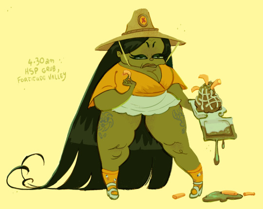
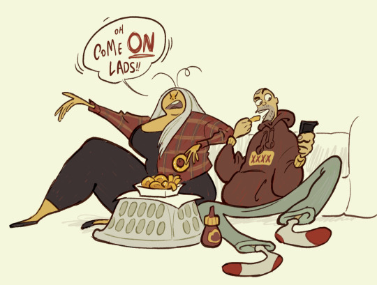
Catriona Drummond (aka goodsniff)

one of my favourite cartoonists working right now is Catriona Drummond (@goodsniff)

the 2 things that really stand out to me in her work are her character designs and backgrounds

catriona's one of the only artists i've found that captures the inherent goofiness of modern day fashion and people in a fun, cartoony style.


we've all seen people like this in real life

so many drawing principles done well in one picture. line of action, clear silhouettes, contrasts, colour choices, shading & rendering etc. to me, this paints a picture of how utterly ridiculous superficial, try-hard people attempt to appear 'cool'
the work is titled "Lip Fillers & Frosé pt.1 // Beautiful creatures seen at Burleigh Pavilion on the Gold Coast". even the choice of words are very intentional. for anyone familiar with Australian culture, the Gold Coast is essentially the Miami of Australia. they share similar stereotypes, and the Burleigh Pavilion is the epicenter of these types of people
I like the dr. bunsen honeydew approach to just having the glasses as the eyes. it's very funny.
some of the drawings you'll see a date and location. i'd love to know what the process is for making these. was it all from memory? was there photo reference?
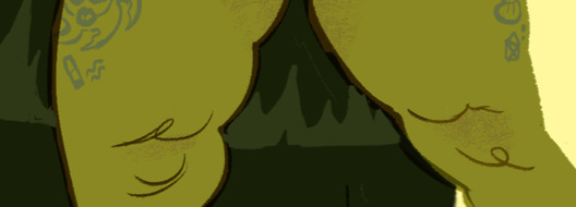
look at how a couple of lines can represent cottage cheese thighs!!! catriona really has a knack for drawing short, chubby women
as an australian, another thing i adore is the australian caricatures and references. this is the first time i've seen a cartoon depiction of state of origin fans (if you're outside Australia: state of origin's one of the biggest sporting events in the country)
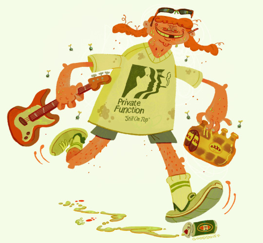
here's a caricature of eamon sandwith, lead singer of the chats. one of the most aggressively australian sounding bands right now
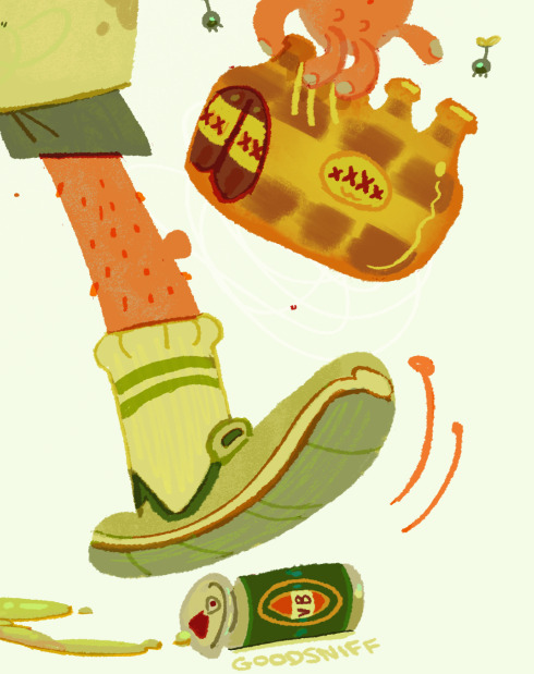
look at the attention to detail. i love how the brown is rendered on the beer pack to make it look like plastic. the lines on the inside of the sock is in a slightly different colour to show stitching. there's over a dozen colours on the VB can. you keep discovering more and more details. (note: every australian state has a beer brand that's uniquely theirs and XXXX is the beer of queensland. VB is the beer of victoria. if you drink it, you'll quickly understand why australians call beer 'piss')
the other aspect of catriona's art that really stands out to me are the backgrounds
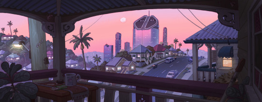
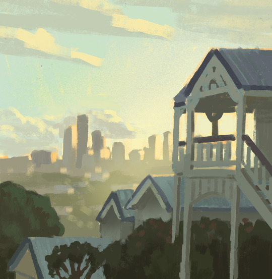
she achieves something i thought was nearly impossible, make Brisbane look like a nice place to live
she's also worked on animated tv shows like bluey and smiling friends
all of this careful study of colour and light is reflected in how she renders her drawings of people
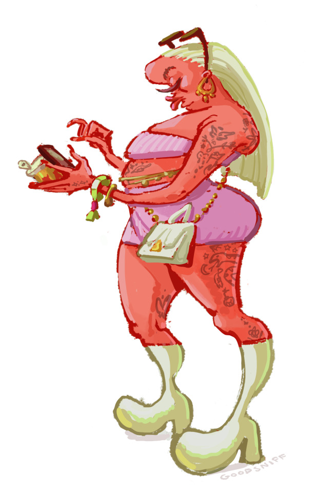
as someone who's trying to develop my digital art skills more, i tried recreating the thighs in Procreate to try and reverse-engineer how she did it, and i still can't quite figure it out. with the left thigh i tried using the eyedropper, picking out the exact colour and painting with a hard brush, but the colour looks wrong if you do it that way.

i tried a different approach on the right thigh. my guess is you have the base red colour, create another layer, use the clipping mask, lower the transparency a bit, and use a lighter colour. the difficulty is what type of brush to use. i went for the flat brush because you get that pressure sensitivity. who knows? i could be totally wrong with this. it's hard to see, but there's also a slightly darker scribbly line that goes down the middle of the thigh.
anyway i highly recommend you check out her work on tumblr, and she's also made a substack detailing her time working at bluey
5 notes
·
View notes