#typography lettering tutorial font
Explore tagged Tumblr posts
Visit Tumblr Blog
Explore Tumblr blogs with no restrictions, modern design and the best experience.
Last Seen Tumblr Blogs


Fun Fact
China blocked Tumblr because of pornography and censorship problems in 2013.
Note
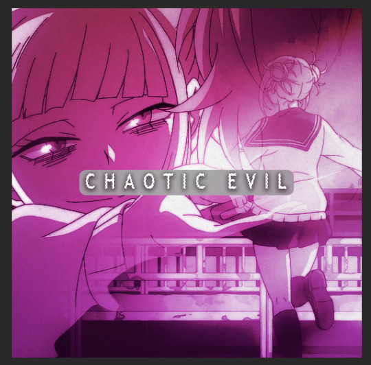
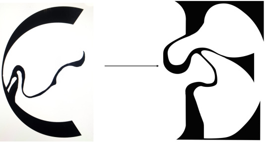
Hi, I love your gifs for Himiko!!!
https://www.tumblr.com/biblical-love/781849514019536896/lgbtqcreators-event-27-doomed-by-the?source=share
Please tell me how you made the shape and its color in the third gif

thank you for your kind words anon, and of course, i'd be happy to show you how i did this effect!
(note: i did my best to make this tutorial as beginner friendly as possible, but absolutely do let me know if there's anything i need to elaborate on!)
STEP ONE: TYPE OUT YOUR TEXT
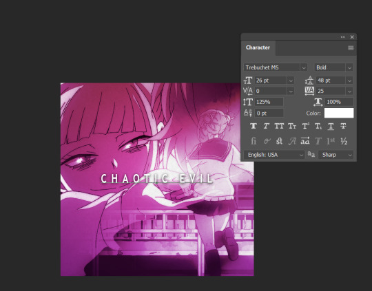
These are the text settings I used (in case you were curious).
STEP TWO: ADD A ROUNDED RECTANGLE

it doesn't actually matter if your rectangle is in front of or behind your text. the hex code for the shade of gray i used i #a9a2a7, but you can also go lighter or darker if you want to, so long as it's a shade of white / black / gray.
STEP THREE: SELECT YOUR TEXT
To do this, hold down your "ctrl" key, and click on the icon for the text layer under your "layers window". it's somewhat difficult to see in this screenshot, but you should see a dashed line outlining your text after you've done this
STEP FOUR: INVERT THE SELECTION

Use your Marquee tool (which you can access by clicking the "m" key), and right click on the selected typography
STEP FIVE: ADD A LAYER MASK TO THE RECTANGLE
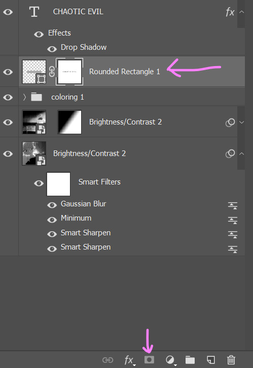
MAKE SURE YOUR INVERTED SELECTION IS STILL OUTLINED. click on the layer for your rounded rectangle in the layers window. then, find the icon at the bottom of the window that looks like a rectangle with a circle missing from the middle.
STEP SIX: DELETE YOUR TEXT

this will leave you with just the rectangle, which has had the text cut out by the layer mask.
STEP SEVEN: CHANGE THE RECTANGLE'S BLEND MODE TO "DIFFERENCE" OR EXCLUSION

honestly, there isn't really much of a difference between the settings and what they do, so just pick whichever one you like more. if you don't like the colors, don't sweat it. we're going to be changing them in the next step.
STEP EIGHT: ADD A GRADIENT OR COLOR OVERLAY

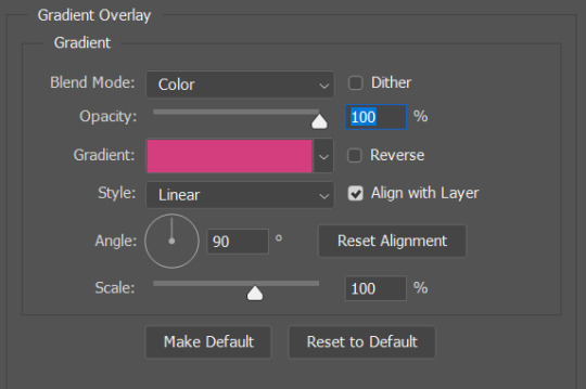
to add the overlay, click on your rounded rectangle layer, and then find the button that looks like the letters "fx" (it should be right next to the layer mask button from earlier).
and that's it! you now have a custom block font!

if you use this tutorial to create any gifs, make sure to tag me (by using the #tuserecho tag) - i'd love to see them!
#behind the gifs#userbaz#userrobin#userishh#usersadie2#rosedavid#tuserheidi#carolook#tuserhol#userahri#phillycheesesteph#uservivaldi#usercats#tsusermels#usernolan#userbunneis#userrsun#usergif#dailyresources
50 notes
·
View notes
Text
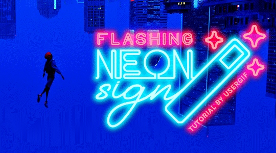
HOW TO: Make Animated Neon Text
Hi! No one asked for this tutorial, but this is one of my favorite typography effects as of late — so I thought I'd share how I do it. You can see this effect in the first gif of this *NSYNC Celebrity set and the last gif of this Anthony Bridgerton set. Disclaimer: This tutorial assumes you have a basic understanding of gif-making in Photoshop. It's also exclusively in Timeline and uses keyframes for the fading effect seen on the blue text.

PHASE 1: PREP YOUR BASE GIF
1.1 – Choose a dark scene. This effect looks best contrasted against a dark background. You can definitely do it with a bright background, but just like a neon sign irl, you only turn it on in the dark/at night — so keep that in mind!
1.2 – Determine the length of your clip. Depending on how much you want your text to flash or fade in, you'll want to make sure you have a scene long enough to also allow the text not to flash — reducing the strain it takes to actually read the text. For reference, my gif is 48 frames.
1.3 – Crop, color, etc. as you would. New to gif-making? Check out my basic tutorial here!
PHASE 2: FORMAT YOUR TEXT
Before we animate anything, get your text and any vectors laid out and formatted exactly as you want them!
2.1 – Finding neon sign fonts. It's easy as going to dafont.com and typing "neon" into the search bar!
2.2 – Fonts I used. Neon Glow by weknow | Neon by Fenotype | Neon Bines by Eknoji Studio
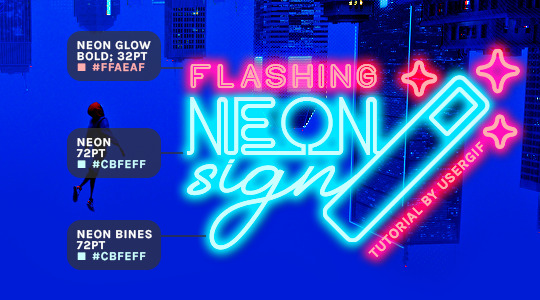
And to not leave my fellow font hoarders hanging, the font for "tutorial by usergif" is Karla (it's a Google font) 🥰
2.3 – Group your text layers. (Conditional) If you plan on having multiple text layers like I did and you want them to appear connected (like how the last letters of "NEON" and "sign" intersect with the wand icon), I suggest putting the layers into groups according to color (the shortcut to group layers is Command+G). If you don't group your text and just apply the outer glow settings to each individual layer, you'll end up with something like this:
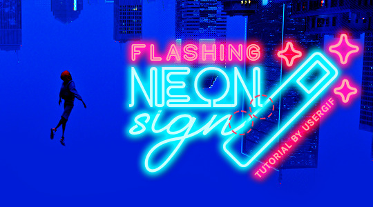
—where you can see the glow overlap with the line, instead of the smooth connection you see in my final example gif. I'm using 2 colors for my text, so I made a group for red and a group for blue.
2.4 – Apply Outer Glow. Right-click your text layer (or your group if you have several layers) and select "Blending Options" to open the Layer Style menu. Check "Outer Glow" and feel free to play around with the settings until you like the way your text looks!
Your outer glow color should be darker and more vibrant than the color of the text itself. The text should be within the same color family but much brighter and, sometimes, almost white (see Step 2.2 again for my text colors).
Here are the settings for the Red Glow (the glow color is #FF3966) and Blue Glow (#00F0FF):
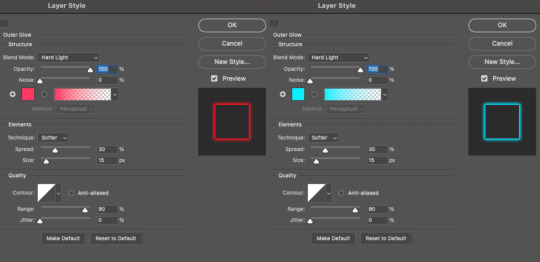
These aren't always my exact settings but they're pretty close to my standard. I always set the blend mode to Hard Light and usually have the opacity at 100%.
For every gif I use this effect on, I like to play around with Spread and Size. Spread will make the glow look denser and "expand the boundaries" (source: Adobe) and Size will diffuse the glow and blow it out so it covers a larger area (Adobe says it "Specifies the radius and size of blur").
2.5 – Duplicate your text layer/groups and remove glow. We're only going to be animating the glow on our text, and since doing this affects its opacity/visibility, we want to preserve the base text by creating a duplicate.
I just hit the Command+J shortcut to duplicate my groups and delete the Outer Glow effects, making sure that the "No Glow" version is above the "Glow" version:
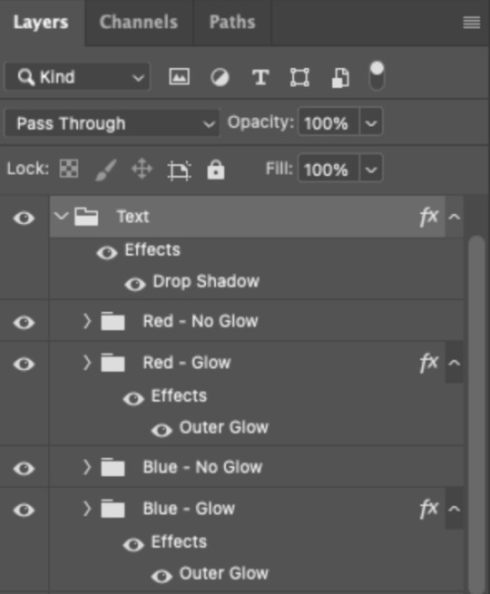
I also put all these groups into one group called "Text" for organization and so I could apply a drop shadow to all the elements for better visibility.
PHASE 3: CREATE THE FLASHING EFFECT
This is for the effect you see on the RED text in my gif!
3.1 – The 0.03-Second Rule If you've read any of my animation tutorials before, you're probably already familiar with this rule. In my experience (and for reasons I can't explain), Video Timeline pauses every 0.03 seconds (try clicking the forward button a few times, you'll probably find a "duplicate" or paused frame). So, keep all your layers a duration of 0.03-second increments (e.g. 0.06 or 0.09 seconds can also work) and align them on the Timeline at 0.03-second intervals. If you don't follow this rule, you'll get duplicate frames when you export, resulting in a choppy final gif.
3.2 – Trim and arrange your text layers. Only on the layers/groups WITH the Outer Glow effect, trim them into several segments of varying lengths where the glow will be "on" (visible) and leaving spaces where the glow should be "off."
Typically, I'll have a mixture of 0.06 and 0.03-second text. That's when the glow will be visible. Between each "flash" of visibility, I've got a 0.03-second blank space, baby *pen clicks* and I'll write your name:
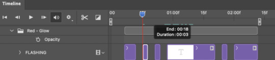
The layers shown above are arranged with a few flashes and two long segments of no flashing. This is the order and duration of each segment shown above (purple = visible segments):
0.06 blank, 0.06 visible, 0.03 blank, 0.03 visible, 0.03 blank, 0.03 visible, 0.03 blank, 0.24 visible (the long bit where "FLASHING" doesn't flash at all), 0.03 blank, 0.03 visible, 0.03 blank, 0.12 visible
(I only did this for the text that says "FLASHING" to give it a glitching effect. The other red text keeps the glow visible starting at the first long segment.)
PHASE 4: CREATE THE FADE-IN EFFECT
This is for the effect you see on the BLUE text in my gif!
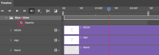
4.1 – Animate using the Opacity Keyframe. Again, we're only touching the layers/groups WITH the glow effect. If you only have one layer of text, you'll find the Opacity Keyframe by clicking the film reel icon:
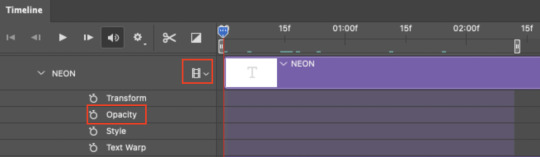
If you're working with groups like me, you'll find it in the Timeline panel under the group when it's expanded:
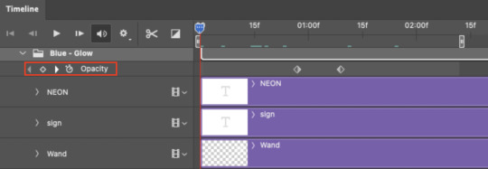
As you can see, I already added my keyframes (lil diamond babies). And luckily, it's super easy to do!
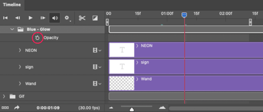
4.2 – Add the ending Keyframe first. We're starting at the end because our layers/groups are already at 100% opacity. Drag the playhead (the blue arrow attached to the red vertical line) to a spot where you want the glow to be 100% opaque — this is where the glow will be fully "on" or visible. [Again, follow the 0.03-Second Rule. You will get duplicate frames regardless when using keyframes (this will be explained in the note in Phase 5), but abiding to the rule will mitigate the amount of dupes you get.]
Then, click the clock icon by "Opacity" to place a keyframe:
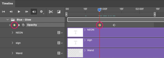
4.3 – Add the starting Keyframe. Go backward from the ending Keyframe you just placed (I went back 0.12 seconds — but you can play around with the duration of the fade, just keep it a multiple of 0.03):
And drop another keyframe, this time by clicking the diamond icon by "Opacity":
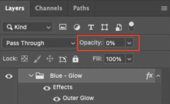
4.4 – Reduce the opacity on the starting Keyframe. Keeping that keyframe you just placed selected, go to the layers panel and reduce your layer's/group's opacity to 0%:
Now, this Outer Glow will slowly fade from 0% to 100% opacity.
And just for a visual aid, here's where my fade-in keyframes are in relation to my flashing segments:
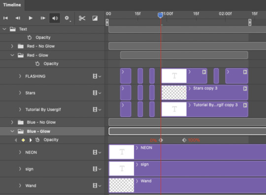
To refresh your mind, the 0% Opacity Keyframe starts when "FLASHING" is visible for 0.24 seconds (the first long segment of visibility).
With these keyframes, you'll get a smooth fade-in à la ✨light switch with a dimmer✨
PHASE 5: EXPORT
Yay, we're finished! Convert from Timeline back to Frames and export your gif!
NOTE: If you only did the flashing effect and followed my 0.03-Second Rule, you shouldn't have any duplicate gifs. BUT if you included the fade-in effect using keyframes, you WILL have duplicate frames. 'Tis the nature of keyframes. 🤷♀️ I had 4 extra frames where the fade-in starts, which I deleted. So, as always, I recommend checking your frames when you convert from Video Timeline back to Frame Animation — and manually delete any duplicate frames.
Sorry this tutorial is so long 🙈 I over-explain so you're not just mechanically copying steps, but understanding the WHY behind each step! Thanks for bearing with me
If you have specific questions about this tutorial, feel free to send a message to usergif and I'll try my best to help! :)
More USERGIF tutorials • More resources by Nik • USERGIF Resource Directory
#typography#gif tutorial#completeresources#usershreyu#useryoshi#userelio#userzaynab#userives#usertreena#usercim#userrobin#userkosmos#usersalty#userhella#alielook#uservalentina#uservivaldi#*usergif#*tutorial#by nik#flashing gif
830 notes
·
View notes
Text
did u know the affinity suite has a six month free trial, no card needed? stumbled* into it and have been slowly teaching myself how to vector in designer
(*this is not hashtag sponsored, i legit did stumble into it and have been having fun, a+ marketing affinity)
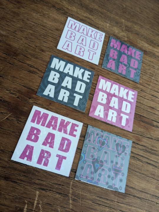
these bad boys are STICKERS and involved a lot of trial and error
> MAKE BAD ART stickers measure apx 2"x2" and are home printed, laminated with holo film, and hand cut
the og black with white text was perhaps not ideal to start with, i definitely chewed through a lot of ink troubleshooting, but the end result makes me very happy. they're a lil janky but full of love, and truly fit the goal of making bad art
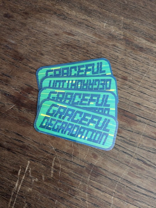
> GRACEFUL DEGRADATION stickers measure 3"x2" and are a love letter (love sticker?) to several of my favorite people, because i have a type and that is type includes chronically ill techno wizards
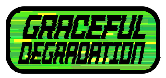
@craftsbyrom helped me a ton with some explanation on how to create the glitch effects i desired via a bespoke text based tutorial (why do those not exist anymore), which i then layered with this streaky holo film following the direction of the glitches. the end result is super cool!!
font was made by the typography artist yutaONE (insta: @/yuta_ptv_jp )
you can find these guys listed on my ko-fi shop for a couple bucks each, along with a bunch of other fun goodies
#cybercore#punk art#queer artist#graceful degradation#handmade stickers#diy#mochi rambles#mochi crafts#mochi makes stickers#mochi makes graphics#graphic design
43 notes
·
View notes
Note
heyy, is there a tutorial on how to make a font for the sims???
it's the same as um, making a font but some tips
what's easy is to find a block sans serif and stylize each letter then follow these steps to make it a font.
it's um, very time consuming (i've made regular fonts before) and i don't think many of us thank franzi for making all those fonts.
ifontmaker is another quick option if you want to use an app but i've done it the old and hard way lol.
21 notes
·
View notes
Text
"Old is Cool" by Alex Trochut, 2009

Alex Trochut is a name most haven't heard before, however he is one of the most important designers alive today. He has quite the professional portfolio and has his hands of a lot of people's favorite things in a way, shape, or form. He focuses primarily on typography as an artform, which is part of why I picked him and his piece of art. Another is that he uses many of the principles that were found in many of the logo tutorial assignments. The illusion of 3d typography to create a more striking piece of text that holds the viewers attention. This piece uses that idea, while also taking it to a new level with a more script like font.
This design is the cover of a french magazine, so it has to be able to draw customers in just by the cover and nothing else. This design accomplishes this with its illusion of 3d script lettering that is emphasized to the fullest. The lines along the inside of the 3d lettering take that illusion of 3d to the next level of typography and definitely pulls the viewer in to get them interested in the book. The lettering also emphasizes the message of the typography, which is old is cool with the text evoking a less modernistic feel because of the script typeface. These visual methods and practices all come together to push typography further like Trochut is trying to do. The work pulls you and entraps you in that illusion of the 3d typeface just like the tutorials in the assignment did. These works are truly innovative pieces of typography.
Sources:
https://alextrochut.com/project/old-is-cool
0 notes
Text
REFLECTION #10 3/28/25
This week I watched a Canva tutorial and The tutorial focuses on using Canva Pro for photo manipulation and creating typography art. It likely demonstrates how to combine text and photos to produce visually dynamic designs, using Canva’s tools to manipulate and adjust the elements for a polished, artistic look. The video goes through the process of blending photo editing techniques with typography to create eye-catching, creative visuals.
this week we began a new project which just so happens to be our final project for this semester and that is our process journals. I began by putting my table of content together which was pretty much on of the easiest things to do for the journal, I then put my letter of intent in the journal for the GD & I program which I am really hoping I get into. I think that so far my process journal is looking great I still need to go in and fix some of my fonts and also the sizes of the fonts but, other than things seem to be going pretty good.


0 notes
Text
youtube
Serif fonts
Serif fonts have little strokes called serifs attached to the main part of the letter. Print publications, like magazines and newspapers.

Sans serif fonts
Sans serif fonts don't have that extra stroke—hence the name, which is French for without serif. Easier to read on computer screens, including smartphones and tablets.

Display fonts
Display fonts come in many different styles, like script, blackletter, all caps, and just plain fancy. Titles and headers and more graphic-heavy designs.

Fonts to avoid

Combining fonts
When deciding which fonts to use, less is more. It's best to limit yourself to one or two per project. If you need more contrast, try repeating one of your fonts in a different size, weight, or style. This trick is practically foolproof for creating interesting combinations that work.You've probably heard that opposites attract. The same is true for fonts. Don't be afraid to combine font styles that are different but complementary, like sans serif with serif, short with tall, or decorative with simple. This can be challenging at first, but don't despair. Look to other designs for inspiration, and soon you'll get the hang of it.
Terms


character spacing.

0 notes
Text
Identify Fonts Instantly, Effortlessly, Free

Identifying an unknown font can be frustratingly difficult for designers and typography enthusiasts. This in-depth guide provides techniques to help accurately recognize fonts like a pro. Studying Typeface Anatomy and Characteristics The first step to identifying fonts is studying typeface anatomy. - Note the subtle curves, thick and thin strokes, and spaces within letters. - Pay attention to unique characteristics like the tail shape of lowercase "a" or flourishes on numerals. - Serifs, stems, bowls, counters - learn the terminology. Build a mental catalogue by observing fonts in logos, books, product packaging, signs, and other designs. - Categorize fonts into families like serifs, sans serifs, scripts, display, decorative, etc. - Immerse yourself in font diversity through typography blogs and websites. - Refer to printed style guides that group fonts by similarity. With regular observation, you'll develop an eye for distinguishing fonts from one another. Cross-reference unknown samples with your mental catalogue. Look for identifying quirks and stylistic details. The more fonts you see, the quicker your font recognition skills will improve. Using Online Tools to Identify Fonts Online font identifier tools provide quick answers to mystery fonts through advanced image recognition. - Upload a clear image of the unknown font or a website link containing it. - Algorithms analyze the font's curves, weight, serifs, and other attributes. - This is cross-referenced against a database of fonts to find the closest match. Within seconds, you get the likely font name, family, and style details like weight and italics. Services like WhatFontIs and Fontspring Matcherator make font identification fast and hassle-free. - For best results, strategically crop character samples like lowercase "g" before uploading. - Pay attention to image quality and avoid filters - algorithms rely on seeing clean typography. With their immense font databases and powerful recognition engines, these tools can accurately identify a wide variety of fonts in minutes. Snapping Mobile Font Recognition Apps Mobile apps enable on-the-go font identification by leveraging your smartphone camera. - When you spot an intriguing font on a poster, packaging or apparel - snap some clear photos of it. - Focus on capturing clean images of letterforms or numerals. - Apps like WhatTheFont then provide instant visual matches. - Adobe Capture allows extracting fonts from photos to reuse later. For optimal recognition, hold your camera steadily at close range with good lighting. Avoid blurry pics or angled skewed perspectives. With practice, you can quickly grab great font samples one-handed. Mobile font apps mean you can satisfy font curiosity anytime, anywhere without having to manually identify typefaces. Using Design Software for Font Identification Graphics programs like Adobe Photoshop and Illustrator contain built-in tools to inspect and identify fonts used in existing documents or templates. - Open the document containing the unknown font. - View font information via glyph panels or selection info boxes. - The font name, family, and style details are surfaced. https://youtube.com/shorts/3FsFdS1lKn8?feature=share Easy to follow tutorial to find a font using photoshop For tricky fonts, cross-check any matches across other programs like Figma, Sketch or GIMP. Use their glyph search tools to isolate unique characters and fonts. By leveraging multiple design apps, you can validate discoveries and zero in on the right font. Getting Help from Typography Experts For particularly challenging identifications, employ advanced techniques and tap into the knowledge of typography experts. - Browser developer tools allow inspecting font stacks on live websites - this reveals which fonts are implemented on the front-end code. - Online forums like r/identifythisfont provide crowdsourced font identifications from experienced designers. - Building your own typography knowledge also helps connect the dots through resources like Google Fonts, Skillshare classes and typography blogs. By consulting experienced identifiers, you can get to the bottom of even the rarest font mysteries. Developing an Intuitive Eye for Font Recognition With regular practice analyzing typefaces, using online tools, mobile apps and community help, identifying mystery fonts becomes second nature. Some tips to hone your font ID skills: - Observe and catalog font anatomy details wherever you see typography. - Follow typography blogs and diversify font exposure. - Strategically use identifier tools by providing optimal image samples. - Validate results across multiple tools and software. - Consult typography experts on tricky identifications. Soon, you'll start intuitively recognizing fonts like a master sommelier identifies wine vintages. Use these techniques to become a font identifier par excellence! The comprehensive resources mentioned in this guide will help you unlock the secrets to identifying any font you come across in the digital wild. Read the full article
0 notes
Text
Exploring Alternative Platforms for Graphic Design Learning
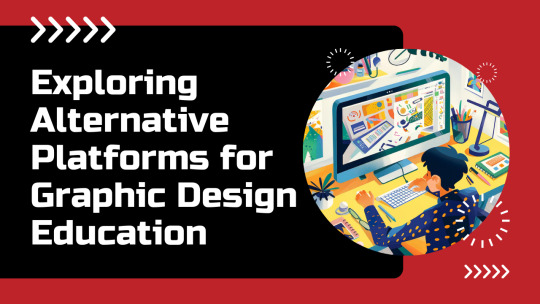
Graphic design, an ever-evolving field, has always thrived on innovation. While traditional education methods come with their own merits, there is a perceived shift towards alternate learning modes that combine digital learning experiences to familiarize with graphic design techniques. This transition to digital learning methods in graphic design is gaining traction owing to its unique ability to blend foundational skills with modern techniques, fostering a comprehensive understanding of design principles. This blog helps beginners understand the alternative platforms or means to master the technicalities of a graphic design course. It covers the available resources and applications that have paved alternate ways of learning the design principles and techniques.
Understanding the need for transitioning to alternative learning platforms
The rise of alternative learning platforms for graphic design can be attributed to several factors. The most prominent reason is the changing landscape of the design industry itself. With the rapid advancement of technology and the increasing importance of digital presence, designers need to adapt quickly to new tools and methods.
Additionally, the democratization of design through online tools and platforms has made graphic design more accessible. People no longer need to attend expensive schools to learn the basics of design. Instead, they can turn to online resources, communities, and alternative learning platforms that offer a wide array of courses and tutorials.
Alternate Channels to foster learning of graphic design concepts
Gamified Learning:
Making graphic design fun learning through interactive tools
One of the most exciting developments in alternative learning methods is the gamification of graphic design education. Gamified learning platforms make the process of learning design concepts engaging and interactive. They transform mundane topics into fun, challenging games that encourage active participation and retention. This includes design topics like typography, colour schema, and space optimization. This approach to learning not only keeps users engaged but builds a strong foundation of the design principles through repetition.
For instance, Gamified typography apps such as Kern Type or Type are perfect examples of how gamification can make learning design principles more pleasurable. These apps teach users about letter spacing, alignment, and font styles through interactive games. By scoring points or completing levels, learners get immediate feedback, which reinforces their understanding of typography and its impact on design. Much akin to this, in the subsequent section let’s explore other methods for making the learning process more seamless.
Live Critique Portals:
Real-time feedback for visual hierarchy and design layout
Live critique portals are invaluable for learning about visual hierarchy and layout. They allow designers to understand how their work is perceived by others and what improvements can be made to enhance readability, flow, and aesthetic appeal among end-users. This kind of feedback is essential for mastering design principles, as it prepares designers to accommodate different perspectives and refine their skills based on real-world insights.
This is where live-critique portals like Behance come into play. Behance, a popular platform for professionals in creative media, offers a space where designers can showcase their work and receive feedback from a global community of professionals and peers. Not only so, this exposure to diverse feedback helps in shaping a well-rounded design sensibility among budding designers.
Simulation Platforms:
Infusing Accessibility and Compliance in Designs
As design continues to play a crucial role in our daily lives, it's important to ensure it is accessible to everyone, including people with disabilities. In this league, Simulator platforms act as a dependable asset in creating ADA-compliant designs, which are relatively popular practices among graphic designers. Tools like 'Stark' and 'Wave' are two commonly used simulator platforms that allow designers to test their work for accessibility issues and ensure they adhere to the compliance standards of staying accessible to everyone. Platforms like these play a significant role in educating beginners about the relevance of creating accessible designs.
Learning the impact of 3D product designs in the real world through Virtual Simulators
Another innovative approach in alternative learning methods is the use of virtual simulators to teach the impact of 3D designs on real-world products, especially in packaging design. These simulators provide a virtual environment where designers can create, test, and visualize their packaging designs in 3D before they go into production. Platforms like Esko and Studio offer virtual packaging simulators that allow designers to experiment with varied packaging materials, shapes, and prototypes. Also, they provide an eco-friendly alternative to traditional design prototyping which causes waste of design materials.
Final words!
As the field of graphic design continues to evolve even as we talk, so do the methods of learning them. This blog discussed the notion of integrating alternative learning methods with the conventional ways of acquiring skills required within a graphic design career. Although the above methods alone are sufficient to kickstart a career in graphic design for a more comprehensive learning journey seeking professional know-how is equally important. MAAC Animation is one such institute in Ghaziabad, offering demos for Graphic Design course in Ghaziabad.
1 note
·
View note
Text
Sad typeface promotional material

To match the visual aesthetic of the inflated typeface I explored the inflated effect on illustrator. Although I like how its starting to look it just doesn't look sad. The premise is that it would have started as inflated and then lost the air so having this sort of effect wouldn't be wrong, I just need to make it look like it's actually deflating.
Looking at imagery online of deflating type this is what came up. I love the texture however I couldn't do this with my type as it is deflating with the type standing up. To do this effect I think I would have to put the type back through blender and render everything which is going to be very time consuming.
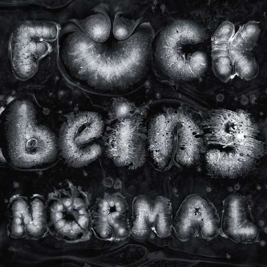
I have been looking at other textures within typography that could work. I think all of these would work with sadness but obviously the actual shape of my text is deflating so it would be best to recreate that texture to keep my visuals consistent.

When looking online I'm finding it difficult to find imagery of deflating balloon type. From what I can find it looks like I need to add some more crease to the type, I don't think I can do this in illustrator so I think I would have to go back into blender. Before doing this I am going creating a similar effect with the pen tool.
youtube
After going back to this tutorial I tried adding the textures to my type. However, as my deflated text doesn't have the ballon like texture it doesn't work.
0 notes
Text
drawing embroidery design

From Sketch to Stitch: A Comprehensive Guide to Drawing Embroidery Designs
Embroidery transforms simple fabric into stunning works of art. But before you thread your needle, it all starts with a design. This comprehensive guide delves into the world of drawing embroidery designs, equipping you to translate your vision onto fabric. Finding Inspiration: Spark Your Creativity The possibilities in embroidery design are endless! To get started, ignite your creativity with these inspiring sources: Nature: Flowers, leaves, insects, and animals are popular embroidery motifs. Explore botanical illustrations or nature photographs for inspiration. Art & Culture: Folk art, traditional embroidery patterns, and historical textiles offer a wealth of design inspiration. Geometric Patterns: Simple shapes and lines can be combined to create striking geometric embroidery designs. Typography & Lettering: Elevate your project with embroidered lettering, initials, or quotes. Explore calligraphy styles and fonts for unique designs. Personalize: Incorporate meaningful symbols, dates, or names to make your embroidery truly special. Embrace the Web: Websites like Pinterest and Instagram are treasure troves of embroidery design inspiration. Search keywords related to your interests or browse popular embroidery hashtags. Understanding Embroidery Stitches: The Building Blocks of Design Before sketching, familiarize yourself with basic embroidery stitches. These stitches are the building blocks that bring your design to life. Here are some fundamental stitches to consider: Backstitch: A secure stitch for outlines and lettering. Satin Stitch: Creates a smooth, solid-filled appearance. Stem Stitch: Ideal for creating lines and stems. French Knot: Adds a dimensional element to your design. Lazy Daisy Stitch: Creates a delicate floral motif. Chain Stitch: Creates a decorative looping effect. Many additional stitches exist, each with its own unique application. Explore embroidery stitch tutorials online or consult a beginner's embroidery book for further guidance. Developing Your Design: From Sketchbook to Fabric Now that you're brimming with inspiration and equipped with basic stitch knowledge, it's time to translate your vision into a drawing: 1. Start with Rough Sketches: Use a pencil and paper to explore different design compositions. Don't worry about perfection at this stage; focus on capturing your ideas freely. Consider the size and shape of the item you'll embroider on. 2. Refine Your Design: Choose your final design from your rough sketches. Trace it onto tracing paper or redraw it on a fresh sheet of paper. Refine details and ensure lines are clean and crisp. 3. Transferring Your Design: There are several ways to transfer your embroidery design onto fabric: Tracing: Tape your design over your chosen fabric and trace the lines with a fabric pen that disappears with heat. Iron-on Transfer Paper: Purchase special transfer paper, print your design onto it, and iron it onto your fabric following the manufacturer's instructions. Lightbox Method: Place your design on a lightbox (or a window with light shining through) and trace the design onto your fabric with a fabric marker. 4. Simplifying for Embroidery: Solid Fill Areas: Break down large areas of solid color into smaller sections filled with different stitches. This adds texture and visual interest. Simplifying Lines: Curved lines can be broken down into smaller straight lines using satin stitch or back stitch. Minimal Detail: Highly detailed elements may not translate well to embroidery. Opt for simpler representations or focus on key details. Essential Tools: Here are some key tools for drawing and transferring your embroidery design: Pencil and Eraser: For initial sketches and refining details. Tracing Paper: Allows for multiple design iterations. Fabric Pen: Choose a pen that disappears with heat or washes out easily. Lightbox (optional): Aids in transferring designs through light. Iron (optional): For using iron-on transfer paper. Software Solutions: Embracing Technology For a more tech-savvy approach, consider using design software: Vector Drawing Programs: Software like Adobe Illustrator allows you to create and edit embroidery designs with precise control. Digitizing Software: This specialized software converts images or drawings into embroidery stitch files that your embroidery machine can read. While software offers greater precision and flexibility, it requires a learning curve and may not be accessible to all budget levels. Practice Makes Perfect: Honing Your Embroidery Design Skills The best way to refine your embroidery design skills is through practice: Start with Simple Designs: Begin with small, uncomplicated designs to hone your technique. Experiment with Stitches: Practice different stitches on scrap fabric to get a feel for how they work and their visual effects. Sample Different Fabrics: Different fabrics impact the look and feel of your embroidery. Experiment with cotton, linen, denim, or other materials to discover their unique possibilities. Embrace Mistakes: Embroidery is a journey, not a destination. Mistakes are inevitable and learning opportunities. Learn from them and keep exploring. Beyond the Basics: Advanced Design Techniques Once you've mastered the fundamentals, explore these advanced design techniques to elevate your embroidery: Shading & Color Blending: Combine stitches of varying densities or colors to create shading and depth. Appliqué: Incorporate fabric cutouts to your design for a dimensional effect. Metallics & Beads: Add a touch of glamour with metallic threads or decorative beads. Watercolor Embroidery: Use a variety of colored threads and loose, blended stitches to create a painterly effect. Free Motion Embroidery: Embroider freehand without following a pre-drawn design, allowing for greater creative expression. Resources for Exploration: Embroidery Books & Magazines: Offer in-depth tutorials, design inspiration, and advanced techniques. Online Embroidery Courses: Find a plethora of online courses catering to all levels, providing guided instruction and expert tips. Embroidery Communities: Join online forums or groups to connect with other embroidery enthusiasts, share your work, and learn from others. Conclusion: Embark on Your Embroidery Design Journey Embroidery design is a rewarding skill that allows you to personalize garments, create home décor, or express your artistic vision. Whether you're a beginner or an experienced embroiderer, there's always something new to learn and explore. So grab your pencil, pick up some fabric, and embark on your embroidery design adventure! Bonus Tip: Consider creating a dedicated embroidery portfolio to document your design journey. This allows you to track your progress, showcase your skills, and inspire yourself and others with your creativity. With dedication and practice, you'll be stitching stunning embroidery designs in no time! Read the full article
0 notes
Text

This week's textbook chapter talked about typography on screen and how with more and more advances in technology more designs are being made for many different types of screen sizes and resolutions that designers must adapt and think about when creating their designs. All of the same rules for designing for print carry over when designing for screen however the text talks about some additional challenges and how to effectively structure type on digital platforms. One of the most important things talked about in this chapter I think is the difference between raster and vector type and graphics. This was a difference I didn't notice up until last semester when I went to hand letter something in Procreate but found when I brought it into Illustrator and expanded its size it became pixelated. Since then I have learned that some programs such as Procreate are raster based meaning depending on the resolution and size of the artwork it will become pixelated when it is enlarged versus vector-based graphics made on programs like Illustrator that won't pixelate and will maintain their smooth edges when enlarged. This makes using a vector program like Illustrator or InDesign better when working with type, especially for the web. Another important thing mentioned in the chapter was the importance of scale, weight, and typefaces on the legibility of on-screen typography. The book recommends that we use sans-serif fonts as they appear clearer and simpler on a digital screen. This week in class we finished and critiqued our UCDA Design Initiative Poster exploring the prompt Immerse. Learning to use AR and Adobe Aero for this project was really daunting but through a lot of trial and error and watching lots of YouTube tutorials I was able to get a decent enough grasp on the software to build a very simple animation in which my 3D inflated shapes came down and bounced up at different times as if they were balloons. I mimicked the same effect with my type made from spray foam I scanned in as a texture put into 3D shapes as well. I wanted to make the entire message of the poster very lighthearted, playful, and just inspiring people to create and experience the fun and imaginative world of art. I also added some smaller text that adds some more context to my poster because of the feedback I got. I changed the wording of this text multiple times to find something I felt fit, as I wanted to have the word immerse in there somewhere but not make it too straightforward and on the nail.
1 note
·
View note
Text
Ch. 2: The Anatomy of Typography & Project #1 Logo Design

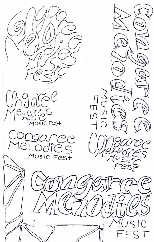
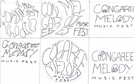


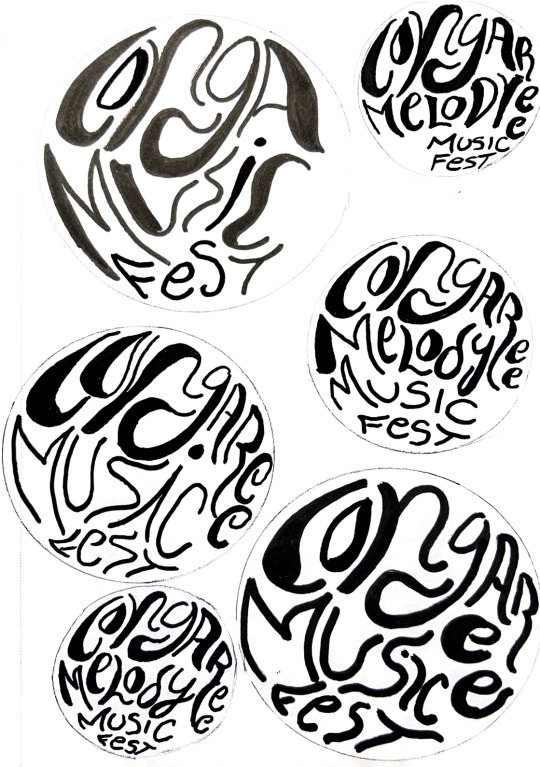

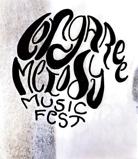
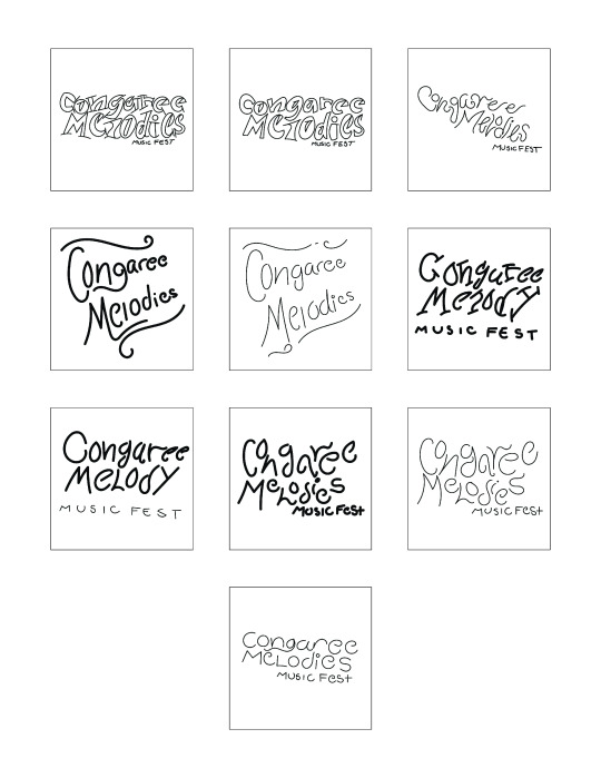
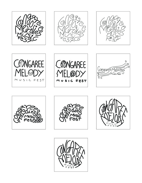
I spent this week finalizing the logo for the music festival design systems project. My main focus was on the concept and design of the logo. To start the process, I was given the task of creating 40 sketches of hand-drawn and digital logos. In our previous class, we were shown various videos that provided tips on creating logos. Out of those Squarespace tutorials, I picked three tips that stood out to me. The first one was to use a shape and work within its boundaries to experiment with letter form, style, and width. The second tip was to use tracing paper to figure out which components of the initial sketch stood out and to rework those elements for a more solid design. The third tip was to use traditional tools like paint brushes, ink, and markers, as these materials tend to be unpredictable and can help create unique, organic, and unpredictable marks and lines.
During our first meeting, the professor applied these tips and instructed me to push my logo design in a more circular direction that encouraged more free-flowing, bold shapes to make up the words. Out of the 40 sketches, I chose to pursue the more circular design that fit the overall vibe of Conagree National Park. To experiment with the circular design, I traced various circular objects like the bottom of a water bottle, a case of mints, and a circular tape measure using a pencil or pen. Then, I used my Posca paint pens to play around with different strokes, line widths, and marks. This exercise encouraged me to view the letters in my logo as shapes rather than lines.
During our second meeting, the professor advised me to alter the spacing between the letters and break away from the confined circular space to enhance the clarity and legibility of the logo. This direction also fits the vibe of Congaree, as the national park is a fluid, swamp land that is not stuck or confined to space.
My favorite component of this process was having the opportunity to break away from my normal pen and paper and experiment with various markers and paint pens. By next week, I plan to have 90% of my logo complete, vectorized, and ready to incorporate into the poster design portion of the project. I am still exploring different typefaces and font families to find the best fit for my logo, but I find the san serif bold and cursive type to be the most eye-catching and suitable for the overall vibe and feelings I am trying to convey through the design system.
After reviewing the readings for this week, I reviewed the basics of the anatomy of typography. Chapter 2 has a detailed explanation of the parts of a letterform with helpful diagrams that I will refer to in the future, as I tend to forget these elements sometimes. I found the transition from handwritten lettering to the letterpress and then to technology such as typewriters and digital computers fascinating. Although these machines help keep written elements consistent and professional, handwritten letters have a unique charm that a computer cannot replicate. In typography, I prefer handwritten projects or digital projects that have a vectorized handwritten component. I strive to capture the same feeling and style in my logo work. Handwritten type has a uniqueness that attracts the spectator to gaze at a design, whether that is print or digital. I will follow my professor's advice and complete his revisions to create a vectorized logo that fits the look and feel of Congaree Melody Music Fest. It may take some time, practice, and many tutorials, but I am willing to work with the design until I achieve my goal.
0 notes
Text
Step-by-Step: Learning 3D Designing Using Illustrator's Tools

Embarking on the exhilarating journey of delving into 3D design may initially seem like a formidable task for newcomers. Yet, armed with the right tools and proper guidance, mastering the intricacies of three-dimensional design becomes not only attainable but also an immensely rewarding experience. In this comprehensive step-by-step tutorial, we will unravel the essentials of 3D design, utilizing the powerful array of tools provided by Adobe Illustrator.
Grasping the Fundamentals:
Understanding 3D Design:
Before immersing ourselves in the beginner's guide intricacies of Illustrator's tools, let's first grasp the basics of 3D design. At its core, three-dimensional design involves the creation of objects that exude depth, height, and width, imbuing your creations with a heightened sense of realism.
Getting Started with Adobe Illustrator:
Now equipped with a foundational understanding of 3D design, let's transition to the practical side. Launch Adobe Illustrator and initiate a new document. Familiarize yourself with the workspace, tools, and menus, creating a conducive environment for your design exploration.
Essential Illustrator Tools for 3D Design:
1. Extrude & Bevel:
Illustrator's Extrude & Bevel tool serves as the entry point for infusing depth into 2D shapes. Experiment with diverse settings to witness how this tool can elevate a flat object into a visually captivating three-dimensional masterpiece.
Pro Tip: Utilize the Extrude & Bevel tool strategically to impart a sense of dimensionality to your designs.
2. Revolve:
The Revolve tool empowers you to fashion objects by revolving a shape around an axis. This proves especially handy for crafting cylindrical or spherical elements within your 3D designs.
Pro Tip: Combine the Revolve tool with others for the creation of intricate and dynamic design elements.
Applying 3D Effects to Text:
Illustrator's versatility extends seamlessly to text, allowing you to metamorphose ordinary letters into enthralling 3D typography.
1. Text Extrusion:
Dive into the Text Extrusion feature to lend your text depth and make it command attention. Tweak the settings to exert control over extrusion depth and angles.
Pro Tip: Experiment with a variety of fonts to discover the perfect match for your 3D text.
2. Text Beveling:
Elevate the realism of your 3D text by incorporating bevels. This feature introduces subtle angles and edges, contributing to a polished and professionally finished look.
Pro Tip: Explore different bevel styles to achieve the desired visual impact.
Bringing It All Together:
Armed with a profound understanding of Illustrator's essential 3D tools, it's time to amalgamate your skills into a harmonious design. Construct a simple 3D scene, integrating shapes, text, and diverse effects to showcase your newfound proficiency.
Conclusion:
Kudos on completing this novice-friendly guide to mastering 3D design using Illustrator's tools. By diligently following these step-by-step instructions, you've erected a robust foundation for your expedition into the dynamic universe of three-dimensional creativity. Keep practicing, experiment with varied features, and above all, relish the process of breathing life into your ideas within the dynamic realm of learning 3D designing. Happy designing!
#learning 3D designing#beginner's guide#attitude academy#enrollnow#learnwithattitudeacademy#bestcourse#attitude tally academy
0 notes
Text
ARTIST RESEARCH: Matt W. Moore
Matt W. Moore is a visual artist and founder of MWM Graphics studio. Influenced from his early engagement with graffiti, Moore has developed a graphic visual style which he calls ‘Vectorfunk’. He has shown his work in many solo and group exhibitions around the world.
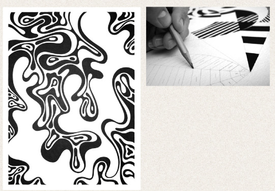
I really loved his piece in series 8 (first photo) as it looks a lot like an oil spill would in water. This reminds me a lot of the first experiment i did with ink and water. I would really like to create my own black and white wave design as i believe it would suit my font really well and i could take elements of the waves and add them into my letters to make them look like flowing in/ an oil spill.
TYPOGRAPHY DEVELOPEMNT
HOW I CREATED MY LETTERS:
Inspired by Matt W. Moore, I then started to draw out my own swirly, oil design using black pen.


I took parts of these drawings and digitalised them.
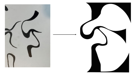
This then allowed me to transfer some of the swirls onto my letters, trying to match edges and lines in the text with some of the swirly shapes.
MAKING THEM DIGITAL


Below, is what i ended up with of how i wanted my font to look, however this was still a rough idea.

FEEDBACK GIVEN FROM TUTORIAL:
make the top swirl on D thicker to match the rest
add more detail to the swirl on the N
completely change the E
Make O thinner to match the rest
add more swirls to H
I improved these letters with the swirls by using illustrator to change some of the curves and some of the thicknesses to make all the letters work in unison as a set.
below are my improvements:
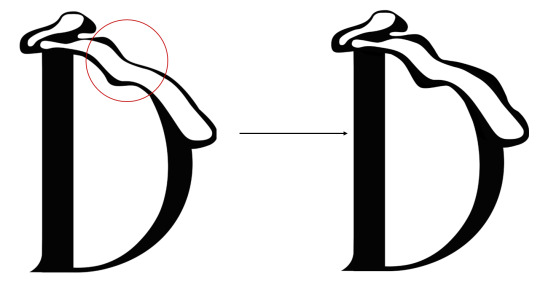
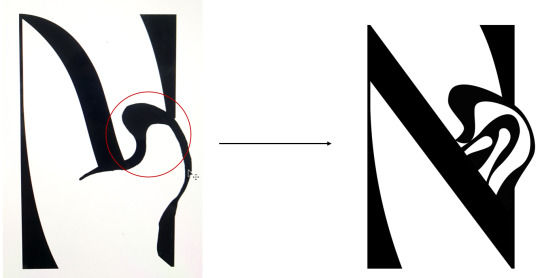
FINAL FONT
I am really happy with how this font came out overall, the swirls all have a similar thickness and they all fit together when the letters are shown side by side to make a word.
Name of font: Ink twist

EXTRA DEVLOPMENT
I decided i also wanted to create an extra word to go better with my font. I chose the word ‘Ink’ as this links to the name of my font and the inspiration behind it. Here, i created the letter K firstly in the ‘Roman Ink’ font, to make up the word as i already had the letters I and N.

This is the word Ink with the K letter added on. I believe this goes much better with my font rather than the word 'Adhesion'. I would like to include this somehow on my poster or Instagram carousel.
MY FINAL FONTS


0 notes
Text
REFLECTION #9 3/21/25
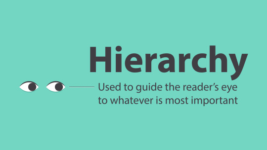
I watched an online tutorial by will Patterson about logo design techniques. The tutorial dives deep into advanced typography techniques, focusing on font pairing, alignment, and using typography to create balance in designs. I now have a better understanding of how to make my logos not only stand out but also be functional and aesthetically pleasing. The tips on adjusting letter spacing, using contrast, and applying hierarchy helped me see how small changes can have a huge impact. The tutorial gave me the tools to make my logos more professional and polished, with typography that truly enhances the brand's identity.
This week continued to work on our mindful design posters, I have finally found what I wanted to do for it. I came to the decision to make it have a vintage look to it but I wasn’t sure if I wanted to make it look like a vintage book or an old map so I just put the poster together and whatever it looked like that is what is going to be. When I finished the poster to me it looked like a vintage book but I think that is because that’s what I wanted it to look like but, we had a critique on Monday with a special guest and she said that it looked like a map when discussing it. When I got my critique which was to fix the spacing on some the type and change some things that I had on my illustration. I think that the poster came out well the only thing that I would change about it is to just go back and fix some of my line work because it does look it a little bit off.


0 notes