#ugly shiny pokemon
Text
Today I'm doing a list on shiny Pokemon! But this time they're on shinies that are either ridiculous or just make no sense in any matter of the word sense.
-------------
No 1. Garchomp/and it's catastrophic mega form


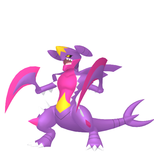
(Normal is far left while shiny normal is middle and mega shiny is right)
Whoever designed normal shiny Garchomp deserves a slap in the face and whoever designed this monstrosity of a mega Pokemon's color scheme deserves a real whack in the face. I love Garchomp to bits but why did they have to almost make it look so pale it puts me and my naturally pasty skin to shame? And or make it look like it's possibly unwell?
And to make matters worse and rub salt into the open wound it gets even worse with its mega, who designed these? I figured they'd want to make Garchomp's shiny memorable considering many struggled with Cynthia's, but it turns out they really couldn't care less about such a badass of a pokemon.
Pure disaster and I HATE IT

-----------
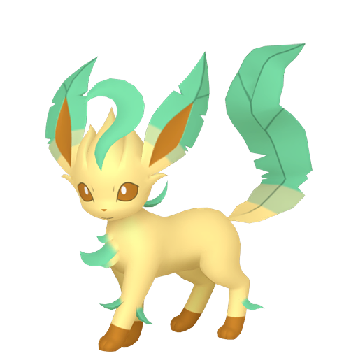
No 2. Glaceon


(shiny is right while normal is left)
I love all of the Eeveelutions, but Glaceon and Leafeon's shinies almost are indistinguishable from their normal counterparts if you don't know, or even if you do know you might miss them... Like Garchomp who is no 1 on here.
Why are the designers so bored with designing shiny pokemon?! Don't do the job if you don't put in enough effort for it to shine at least. (no pun intended)
Needs more shine

-----------------
No 3. Leafeon
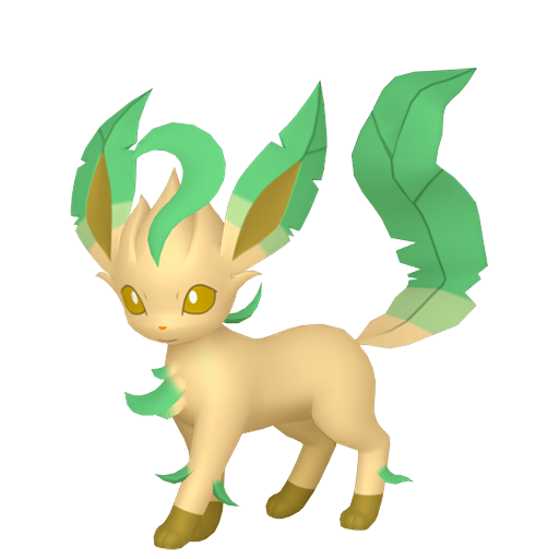
(Normal is left while shiny is right)
Even in editing of this post I'm struggling to see a real difference on my laptop screen, it only looks like the Leafeon got a slight tan and that is really it. Besides the more verdant green going on which I get but the tan doesn't, even if it is a grass type.
Pure lazy and stop tanning

-----------------
No 4. Pikachu


(Normal is on the left while shiny is on the right)
Pikachu is, and has always been the mascot of Nintendo and Pokemon since it's debut and everyone would assume and expect they'd treat the cute but annoying mouse with respect? Nope.
Just give it the Leafeon treatment and give it a tan. Expect here Pikachu look's like he got covered in cheeto or twistie dust and now looks like a living, breathing, and electrifying cheeto who you cannot eat.
I will eat pikachu if i'm not careful and caught on a bad day

-------------------
No 5. Dragonite


(Normal is on the left while shiny is on the right)
Everyone knows Barney the dinosaur, and Dragonite from Pokemon. And Gamefreak and Nintendo decided to combine them when doing Dragonite's shiny. It almost look's like Barney expect replace the green body with purple and the purple on his wings with green and that'd literally be Barney down to a capital T.
Dragonite is cute and cuddly while Barney isn't. At least to me, and is more scary than anything and I can think of more cooler color schemes for him.
Someone beat up the shiny pokemon designers

--------------------
No 6. Lucario/his disgusting shiny mega form

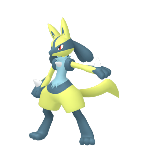
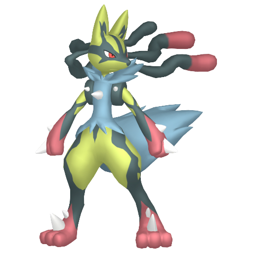
(Normal is on the left while normal shiny is in the middle and mega is on the right)
I love Lucario- so much so I have a statue of it which is still sitting in its box due to the fact i don't have a place for it currently. But regardless; Did they really have to treat such a beloved pokemon such as Lucario with such disrespect? Am I really seeing these shinies right? Normal is a very unflattering yellow which makes my eyes hurt and his mega form gets more worse although is very close to shiny mega garchomp on awfulness and unflattering colors which hurt my eyes.
His middle part which is usually beige goes to... BLUE? WHY BLUE? and it get worse in his mega form. If his whole shiny was blue it would've looks fine but with the eye-watering yellow it looks... eugh.

------------------
No 7. Gengar (not the mega or gigantamax)


(Normal on the left while shiny is on the right)
Gengar is one of the many favourite ghost types of mine, it fluctuates how much I like it at times. The difference between a shiny gengar is the blue in its mouth???
Not sure if that is still the case as I don't have one, at least, as of writing this (25/06/23) But doesn't change the fact shiny Gengar normally is the living embodiment of disappointment. Like Garchomp from earlier.
Rest in peace the pokemon whose shinies make them either indistinguishable or sick.

--------------
No 8. Mamoswine

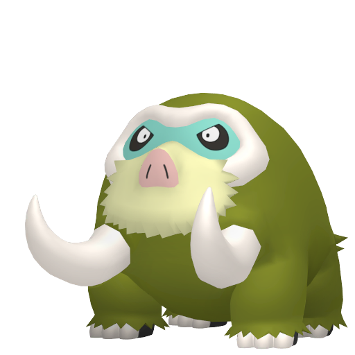
(Normal is on left while shiny's on right)
Mamoswine is a good pokemon, it's shiny though? No. I have one too if you wanted any reason to feel bad, or laugh at me, I caught it as a Piloswine with yellow hair (?) in PLA and decided to catch it as it's a shiny and anyone would kill for one. But this???? NO.
It's color scheme is a disgusting almost sewer green which is almost like Lucario's eye-watering yellow illness/plague that I really wish to never come into contact with.

-------------
No 8. Espeon

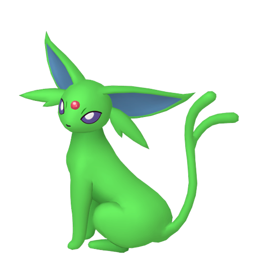
(Normal on left and shiny on right)
I love cats, there's no way I'm going to deny it as I have been brought up around them but... This one makes me want to try and spend as little time with it as possible due to the fact it is the color of toxicity and i don't want my character to get ill and die.
I still love Espeon, but... Why? Umbreon got the better end of the stick, but why did Espeon get the short end of it? Why are most of the eevee's considered poor color-wise on the scale of shininess??? Did they seriously give up on everything else besides Umbreon, Sylveon, Eevee, alongside Vaporeon who all stick out for the better reason then the rest?
Long story short I want it sent back to Chernobyl before I catch something

-------------
Image post limit is the reason this is not any longer, but yep. More to come of me shaming Nintendo and Gamefreak for their shitty color schemes
I was inspired to do this due to some youtube videos. But it's me on tumblr and my smart-ass
#ashestoshadows#long post#list#pokemon#shiny pokemon#nintendo#random post#lol#hate them#ugly shiny pokemon#wtf#shinies that make no sense
2 notes
·
View notes
Text
Saw some discussion about this on Reddit, and now I'm curious:
Option 1:


Option 2:


#pokemon#pkmn#shiny pokemon#pokemon polls#polls#outdesign posts things#I'm on team ugly. at least you can tell those ones are shiny#greatest hits
385 notes
·
View notes
Text


T'is the season! For some Masters Holiday alts, of course. I think Archie would have some strong opinions about the ethics behind arctovish but like if it already exists it deserves a good life nonetheless

#this isnt the usual pokemas holiday alt style at all but i am NOT drawing santa fits#aqua leader archie#magma leader maxie#pokemon masters#pokemas#hardenshipping#thats enough tags of that#i could not be fucked to do a proper drawing after i just wanted to design some silly outfits#also actovishes shiny is so ugly IM SORRY ABT UR EX COLORS ARCHIE#i did my best w what i had. but it was not a lot#oras#i guess it balances out. Archies base palette is better. Max has a better EX palette.#i’ll be skipping new years alts for em i wanna do neo champion ones though#probably palentines too
189 notes
·
View notes
Text
shiny espeon is not ugly, you are just jealous
#rain world#no significant harassment#seven red suns#nsh is a shiny hunter who collects only the “ugly” green shinies#pokemon
263 notes
·
View notes
Text

riolu might have one of my favorite shinies tbh
#pokemon#pixel art#pixel#riolu#shiny#lucario is nice too#but mega lucario gets an ugly shade of yellow so it kinda ruins it for me
27 notes
·
View notes
Note
What are your favorite pokemon? Show me in a picture please
Definitely not what you were asking for but it’s baby Toxel 💜💕 Toxel is adorable and Toxtricity is so cool! I like them so much I made a little original trainer designed around their appearances……….
She doesn’t have a name and I was never going to show her to anyone because it’s embarrassing jfhfhjd but that’s how much I like this pokemon!!

I also LOVE Sudowoodo irrationally, and Piplup and Scorbunny and Sobble in a more rational way. From memory:

#i know you wanted to see some cute pokemon……… but heres my oc instead im so sorry#my first shiny ever was a pidgey so I like them too!!#pokemon#toxel#oc#pokemon fan character#pokemon fanart#doodles#my art#asks#please dont make fun of her ugly jacket i#i will cry
134 notes
·
View notes
Text
The Pokemon HOME app limiting random features and information to either the mobile or console versions is SO clunky and annoying.
My goal: to check which of my favorite Pokemon and shinies stored in HOME don't have the Paldea Champion Ribbon yet, so I can bring those into Scarlet and get it for them. But! You can only view what ribbons a Pokemon has on the mobile version of the software! And you can't move Pokemon to your switch games from mobile!!! So you have to:
quit out of the console app, if you opened it already because you thought this would be a relatively simple task
open the app on mobile
manually document which Pokemon don't have the ribbon- like, on a piece of paper or something
close the mobile app (you can't have both versions of the app open simultaneously)
open the app on console
move them from HOME into Scarlet, referring to aforementioned list
Now you might say "There is a custom tag feature in Pokemon HOME! You could apply a tag to the Pokemon you plan to move instead of making a physical note on a piece of paper!" But unfortunately, the only aspect of the tag you can see on the console version is the color- the name of the tag isn't visible. and I'm already using every color of tag available
(also: you can only make and apply tags on mobile. other mobile exclusive things: wonder trade and gts, viewing 90% of achievements, viewing models, switching between a pokemon's stats for different games it can go in without switching what game you're planning on moving things between)
#pokemon home#pokemon#i need a text post tag#i have more complaints too. i should make a comprehensive list. just for me#like: shinies don't have any symbol marking them as such on the GTS. so for the really subtle shinies? you just have to look REAL careful#whenever you import pokemon from Bank they automatically get tagged with a new tag with the name of the Box that they were imported from#which is maybe useful to somebody but its just super annoying for me to have to keep deleting the 'Kanto 1' tag from all of my Bank imports#the lighting in the model viewer is really fucking bad and makes the pokemon look flat and undefined#overlapping areas that are the same color blend together visually#for that matter; the HOME renders are really fucking ugly. compare them to the sugi art they're posed after sometime. terrakion. its WILD#the lag when moving between pages of boxes on the console version when you have a lot of pokemon stored in HOME is MISERABLE#the mobile app and console app have different sets of achievements that are only viewable on their respective apps???? its weird#can't reorder pokemon's box positions on mobile; you just get a big list that you can sort different ways#this doesn't affect their box placement at all#the tags seem really useful at first but if you're moving pokemon between HOME and games a lot?#you have to reapply the tags to those pokemon every time you put them back in HOME because that data is lost once they leave the app#they never fixed the Spinda problem with BDSP; they just made it so that you can't bring Spinda in or out of those games
25 notes
·
View notes
Text
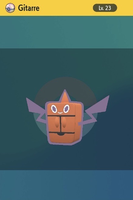
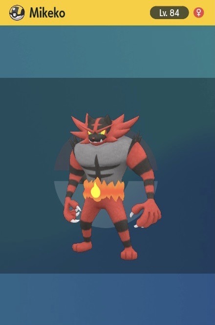
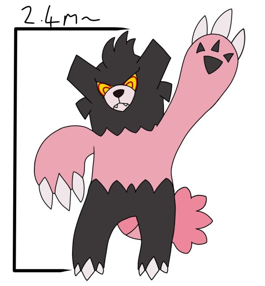
finally..... my klapollo pokemon are in my hands
also mikeko's base stats bc i thought it'd be ultra funny if she could kill klavier when she hits him with the darkest lariat
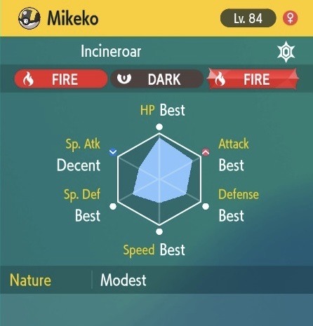
#.docx#ik mikeko being a boy is important in the context of the case he's in#BUT for pokemon. that means it'd be more fitting for him to be a girl considering starters only have a 12.5% chance of being female#i also wanted her to be shiny but i don't like shiny hunting. and nick says he thinks shiny incineroar is ugly#this is the compromise#actually i should hypertrain her sp attack. so it would be funnier#it's not her most utilized since she's more of a physical girlie but imagine
10 notes
·
View notes
Text
AGAIN???? WHAT THE FUCK, DID PALDEA HAVE SOLE KIND OF NUCLEAR REACTOR NEXT TI THE ELECTRIC GYM OR SOMETHING????

#Chernobill's husband apparently#Can't believe I found two shinies of the same UGLY species and opposite sex in the same damn zone#Tho now they are kinda ugly in a cute way#pokemon violet#shiny marill#pokemon scarlet and violet#pokemon sv#shiny pokemon
85 notes
·
View notes
Text
also i wanted to say, solgaleos shiny shouldve been green to better reflect this idea

#pokemon sm#and no idc about the actual reasons they may have had for making the shiny an obnoxious ugly red#thank you and goodnight<3
36 notes
·
View notes
Text
I love slugma ❤️


I love him 😍
I stand a goofy king 🙏🙏🙏
But who cumma on my slugma 🤨

#slugma#slugma appreciation post#i love slugma ❤️#he's so ugly#I wanna give it a kiss#but the shiny tho 😭#pokemon#pokémon#pokeblr#pokeblogging#shiny#shiny pokemon#shiny slugma
8 notes
·
View notes
Text

#pokemon#vaporeon#vaporeon = perfection#I'd take an ugly shiny any day over a shiny that barely changes#The meganium one has a double meaning#applies to both the Pokemon and the movie it's referencing#totally didn't draw Lockheed from Finding Your Roots#Carracosta's blush expression from PSMD is gold#manaposter#I actually like the bug type a lot#something had to be picked#this was so fun to make#about me#shinytrumbeak#landorus#shinyflorges#carracosta#phione#manectric#megagarchomp#meganium#latias#shinyelekid#hisuiangoodra#megasceptile
5 notes
·
View notes
Text
OK so this past weekend, I went to brunch with a group of Pokemon Go pals, and my friend Laura and I realized we were about to hit best friends. She suggested we swap shiny Galarian Stunfisk, as she knew I’d been hunting them for ages in search of a good one. We popped lucky eggs and made our trade… let’s just say I had the whole restaurant’s attention within seconds!
(Hers sucked, by the way… still, she seemed happy enough for me that she asked me to name it after her!)

#pokemon#pokémon go#shiny pokemon#Pokémon#stunfisk#hundo#shundo#oh and it’s hilarious this was my first shundo because my wife thinks it’s ugly and I always tell her it’s the most beautiful thing ever
6 notes
·
View notes
Text

ahhhhhh
gosh 1011 for a hit, i'll take it!
4 notes
·
View notes
Text
i hope wallace gets a shiny luvdisc
#not even my favorite shiny but it’s a cool concept#or like#idk whatever shiny you think he would like i’ll probably agree#NO UGLY SHINIES#wallace might disagree with the idea of ugly pokemon but i sure don’t
4 notes
·
View notes
Text
Paradox Bewear or Unrelenting Grasp. I was going to call it like Iron Grip as a joke as well it hold to be like Iron and playing on/stealing the Violet paradox naming system but I decided to change it ultimately.

Unrelenting Grasp has aspects of all the bear type pokemon, with Pangoros pants and hair, Ursarings rectangular features and less noticeable/the weakest connection but claws like Beartic (tho they had the least inspiration in this design ultimately as its just a bear with an ice bear and crotch fluff)
I imagine they're like an ancient feral cave bear equivalent a theorised common ancestor perhaps or something.
They were gonna have a violet future paradox form which was the absolute most neutered form of any kind of bear a robotic bear companion thing meant to be cute with everything they disliked about the others taken out of it. It had floating hands like Iron Hands so it couldn't crush kids in its arms, stumpy legs so it couldn't run at speeds ect
Ultimately I didn't have the energy to finish it and it was too among us shaped and I knew it'd get memed to hell and I just couldn't work out now to make it look robotic futuristic or a nice color scheme so you get past form only lmao
#my art#pokemon#fakemon#Paradox pokemon#Paradox Bewear#Paradox Unrelenting Grasp#My fakemon#I personally really like the shiny he's like a honey bear pot or something#And also looks kinda old and ugly but in an endearing way
3 notes
·
View notes
Last Seen Blogs

ketotok
KetoTok

sslow-dancer
Slow Dancer~

ossielv
Ossiel V

deardarlingthings
It's Come to This; Hey Y'All

micwawa
Look at the Time...