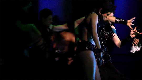
#very pretty scene & gifset
Text
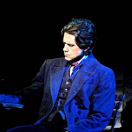
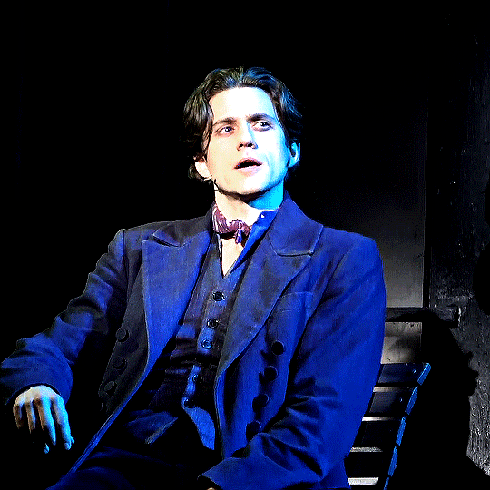


#moulin rouge! the musical#moulin rouge broadway#aaron tveit#broadwayedit#musicaltheatreedit#musicaledit#theatreedit#aarontveitedit#moulinrougeedit#usernoah#moulin rouge#moulin rogue broadway#*#can't a girl make a gifset solely bc she thinks someone looks very pretty in said scene?#yes she can and she does it a lot actually
407 notes
·
View notes
Text
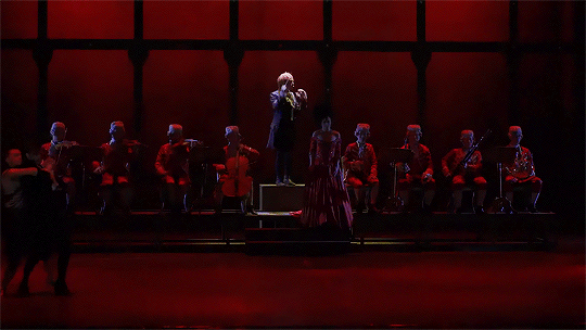
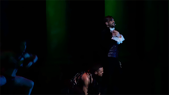
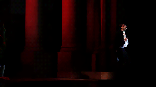

Le Bien Qui Fait Mal
Or,
Salieri's descent into bisexual crisis and BDSM madness
#mozalieri#mozart l'opera rock#mozart l'opéra rock#musicals#musicaledit#antonio salieri#wolfgang amadeus mozart#florent mothe#mikelangelo loconte#my gifs#gaaahhh this gifset was a nightmare to do#not least because this is only my second time making gifs in the first place#and the last time was over two years ago#but also because the source material this time wasn't very good quality#BUT! i managed and even if the quality of the gifs isn't superb i'm still pretty satisfied with this#and let's not forget the main thing here: i just had to gif this scene!#apparently MOR got even more suggestive~ on their 2018 shanghai tour#didn't think that was possible but here we are#i hope y'all lovely mozalieri fans out there enjoy this gifset 😘#and everyone else too of course#i might make some more gifs later#there are far too few of them in this fandom#or then i just haven't found them which is also very possible lol#but first i need to recover from this herculean task~ 🤣
268 notes
·
View notes
Text

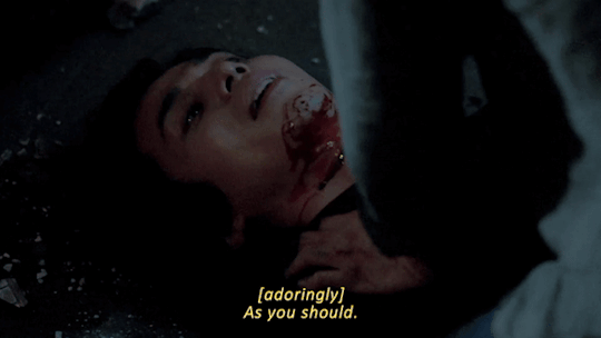
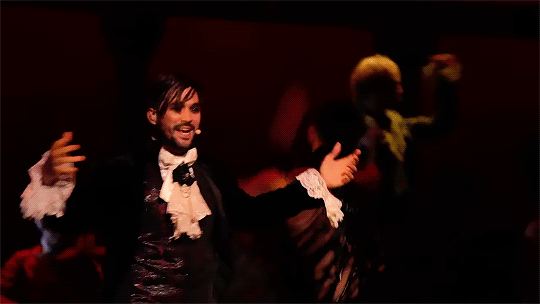
Strangers From Hell Incorrect Quotes [13/?]
insp.
#strangers from hell#seo moonjo#yoon jongwoo#gifset#*#incorrect quotes#//#ok so technically the quote is from IWTV#but what inspired me was this one fic I read yesterday#where Jongwoo tells Moonjo he hates him while they're making out#and the Moonjo there enjoyed that so much. So much you'd think that's dirty talk to him#and. hm. yeah. to me that tracks.#the idea of being able to get under Jongwoo's skin deeper than anyone else#to provoke burning and disorienting reactions with your existence alone#in such a way you just CANNOT be ignored#that sounds. uh. pretty good. very satisfying. from a Moonjo point of view.#but. why did I match this dialogue with this scene you may ask-#well for one I really like the acknowledgement that comes with ''as you should''#no denial. no begging. no bargaining.#if that person hates you that's because you gave them a reason to and you know it#you know you deserve it#you deserve the consequences of your actions. your punishment.#this time. from this one person.#the one person you hold in higher regard than yourself. the only one whose feelings matter more than your own.#if you're in the receiving end of their rage and disgust you should cherish it#that might be all you are ever gonna get from them. all of them that is ever gonna be yours.#their hatred might be the most personal‚ most intimate feeling they will share with you.#... and that's why I picked this scene: the closeness. the intimacy.#Moonjo's surrender. the way he just lays there and wait. watch. the look of reverence in his eyes.#reverence tinted with fondness and pride. with bliss.
90 notes
·
View notes
Photo


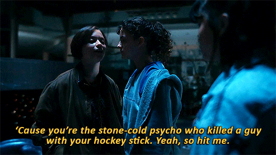
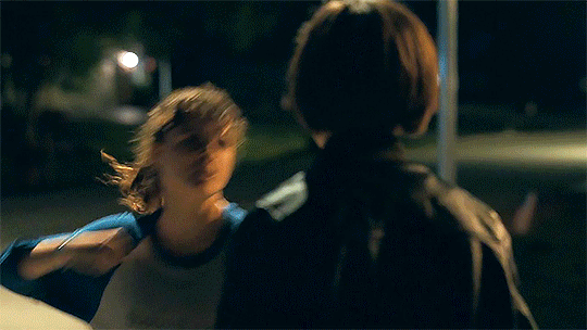
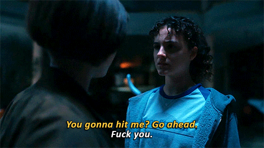

KJ being confrontational with Mac - 1x02 // 1x05
#paper girls#papergirlsedit#someone asked for a 'kj touches mac' gifset#and someone else for a 'kj and mac bickering' one#and one of these is coming but#while looking for these i found these two scenes very interesting#because kj and mac do bicker a lot#but it's almost never seriously confrontational#mainly because kj is so obviously fond of mac#even when mac is being an asshole or parroting her father's bigoted beliefs#kj is gentle with her#but there are two instances where kj becomes physically confrontational with mac#the second instance is very obviously and textually a result of gay panic#but i believe the first one is also!#kj is not antagonizing mac because mac wants to leave#i think she's doing so because just before that she has talked about remembering seeing mac for the first time#and mac called her a stalker for it#which i'm pretty sure hit a chord with kj#because a baby kj who feels so completely trapped by her parents' expectations#would have no doubt looked at someone as seemingly carefree as mac with admiration#like even beyond the crush aspect of it#i do believe kj has probably been very aware of mac's existence for a long time#and being called a stalker for it would for sure bring on some gay panic regardless of kj's level of awareness#anyway#kj's 'fight or flight' response is very firmly set on fight#and i love her#*mine
721 notes
·
View notes
Text
puss in boots: the last wish was... hmm... i dont know. i think it has some cool ideas and fun scenes, but it all feels too disjointed for me. like a movie written by animators who just wanted to throw a bunch of ideas at a wall.
also, it felt predictably pandering to the very specific kind of animation fan who thinks every found family story is revolutionary. someone who was on tumblr in 2016 and reblogged every post about how its really brave when a villain is just generically evil and was always just a privileged douche. how movies that explicitly call attention to this in a meta way are really smart and cool. that makes it a clever commentary on. idk. privilege or something. sure.
they even have an uber emotionally self-aware moment where someone straight up tells puss in boots he needs therapy and im like. sighhh. ok. sure.
can we make other animated movies? please? i dont hate it. its a good-looking flick. it has some cool moments. i liked the death dog - i wish he was in more than 3 scenes.
i'm just... blegh. im tired. i've seen this exact writing style too often. can we go home?
#tl:dr its just a very generic movie that doesnt have an identity of its own. i guess thats fine if you just want some pretty scenes.#not su /#puss in boots: the last wish#ask to tag /#there were just so many moments that felt like they existed to be put in a tumblr gifset and im just. i cant. im so over it lol
31 notes
·
View notes
Photo


maggie/isobel + colors of the rainbow
#myedits#magbel#for the three other shippers out there#has to be a tumblr post bc twitter is so gifset unfriendly asdfghj#anyway i really wanted to remake my ron/ance gifset with these two and#pretty happy with how it turned out tbh#even though green's scene is SO dark#like jesus christ post could've thrown some light on that thing#fbi#fbi cbs#whichever one is the right tag#doesn't really matter it's very m/f on here
10 notes
·
View notes
Text

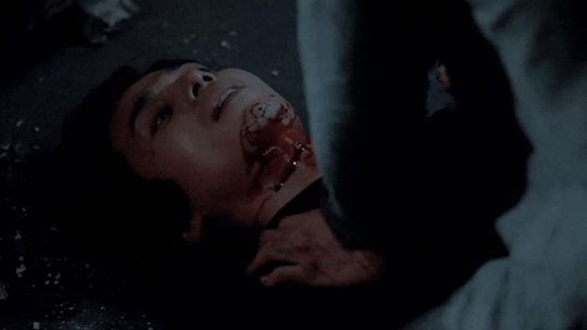
He is like an angel to me <3
#akira nishikiyama#every time i see a gifset of this scene and it's THIS quick moment JUST before he slicks his hair back THIS to me is his pinnacle of beauty#look at my beautiful bloodstained koi. succumbing to the darkness but honestly he held out longer than i would so we gotta respect that#also Matsushige. my guy. my dude. why did you think talking shit to a guy JUST after his sister died was a good idea. ya shoulda run#but also thank fuck ya didnt cause i fucking hated ya and im glad pretty koi her fucking gutted ya. absolutely eviscerated. like goddamn#this rewired something in my brain lads#cw blood#almost forgot that bit lol. also the other day i posted this pic and caption in a Discord server im in#yknow with the intention of basically swooning over him because yeah im in love with him right. and one person responded to me#and props to her she was reacting like. properly i suppose? like 'oh it's so sad what happened to him#when it all came crashing down </3' but im here like 'yes the scene is VERY tragic and rips my heart out but thats NOT what im doing here#today lmaooo' i am happy to focus on the tragedy of his character and often do#but right NOW i am trying to sexualize a man covered in the blood of his enemy as his psyche shatters so like <3#theres probably nicer pics of this bit but i dont have them on hand. i might start a 'pretty Nishiki pics' folder on my phone too
9 notes
·
View notes
Text

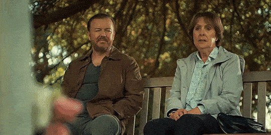


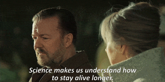
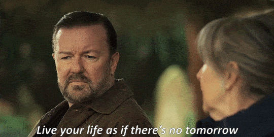
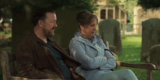
AFTER LIFE (2019 - 2022)
#this series both left me both very confused and broken#but mostly broken#these scenes pretty much sum it up#afterlife#afterlife series#tony johnson#ricky gervais#penelope wilton#gif#gifset#mine
14 notes
·
View notes
Text
the one time i have the urge to look away from something disturbing happening on screen: what is wrong with me. that's not normal. why would the intentionally disturbing disturb me
#im SO mad that i keep just scrolling past the gifsets with the burned jackie ok like#i joyfully reblog ear eating gifs and frankly if shauna ate jackie's corpse 'bones and all' style id probs be completely unbothered#but everytime i see This im like. lets look away#and like with no context its normal reaction probably fhsjsjsjs#but the context is i am pretty much never distributed enough to look away#and i am very much thrilled abt the cannibalism#and - now That is a totally normal thing to share im sure - id actually love it if i was eaten after death BFBSBSJ#THATS how pro cannibalism i am!#so why. exactly. do i look away from this specific scene#this is ruining my gore and disturbing media enjoyer rep#when you finally see gifs of that on my blog i have moved past this issue. maybe#yellowjackets spoilers
4 notes
·
View notes
Text

HOW TO: Make an iPhone Layout
+ Downloadable Template
Hi! I've gotten a few messages asking for a tutorial on my iPhone gifsets — but instead of only doing a tutorial (that would probably be triple the length this one already is), I decided to turn my layout into a template with all the bits and bobs! In the "tutorial" under the cut, I'll share everything you'll need, a free template download, and quickly go over how to use this template. :)
Disclaimer: This template uses Video Timeline and this tutorial assumes you have a basic to intermediate understanding of Photoshop.

PHASE 1: THE ASSETS
1.1 – Download fonts. These are the fonts used for all assets I've included in my template:
– SF Pro or SF Pro Display (Regular, Medium, Bold): Either version works, they look nearly identical. You can download directly from https://developer.apple.com/fonts/ or easily find it via Google
– Bebas Neue: Free on Google Fonts, Adobe Fonts, and dafont
– Times New Roman (Bold): Should be a default font in Photoshop

Make sure to download and install any of the fonts you don't already have before opening my template. That way, once you open the template file, all the settings (font size, weight, spacing, color, opacity, etc.) are as intended.
1.2 – Download my template.
Before you use my template, all I ask is that you don't claim or redistribute it as your own and that you give me proper credit in the caption of your post. Making these iPhone gifsets takes me a longgg time and turning this layout into a template took several hours too.
DOWNLOAD TEMPLATE VIA KO-FI ← This template is completely free to download (just enter $0), but if you feel inclined to tip me, I appreciate you! 💖
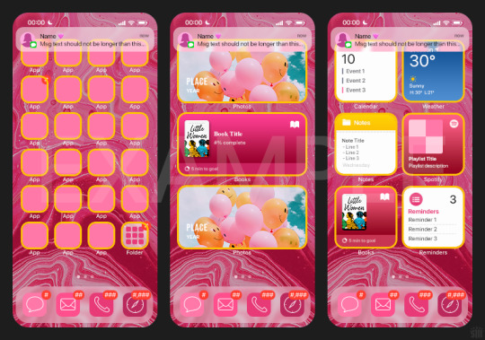

BTW this template also includes some of my frequently used icons!
NOTE: If, for some reason, you open the template and see the pop-up shown below, click "NO" — otherwise, the fonts will be all messed up:
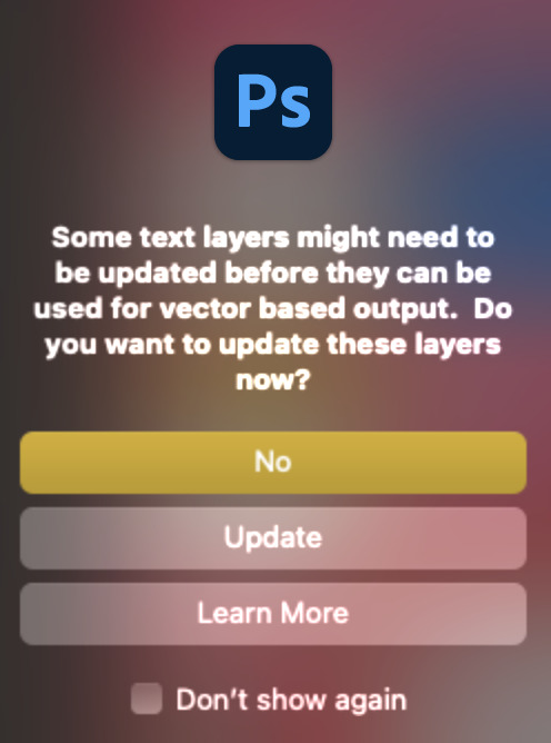
And if you see this triangle with an exclamation point by a text layer, don't double-click it — it'll mess up the font as well:

PHASE 2: THE GIFS
I'm just going to briefly go over gif sizes and my recommendations. Also, keep in mind when grabbing your scenes, you'll want all of these gifs to be the same amount of frames.
2.1 – Background Gif: 540 x 540 px.
I recommend this size so you have a good amount of visibility for the gif behind the iPhone wallpaper. I also recommend making this black and white (or in my case, black and white with a slight blue tint — idk I just like the way it looks) so the wallpaper coloring can stand out.
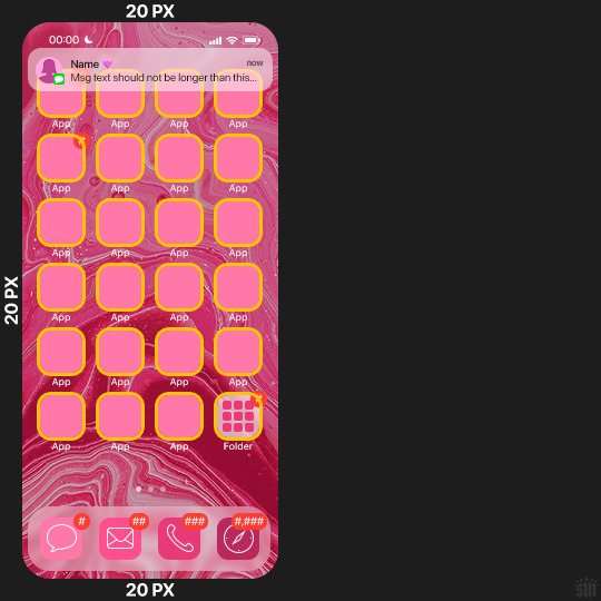
2.2 – Wallpaper Gif: 230 (w) x 500 (h) px.
Keep in mind the very narrow dimensions of the wallpaper! And also keep in mind that you'll have a bunch of apps and widgets covering the image. I try to use wide shots (or layer my clips into looking like wide shots). Also, keep in mind your color scheme for your set and your character's aesthetic! I tend to focus on one or two colors for the wallpaper.
I usually position the wallpaper to the side with 20px bumpers, so there's lots of space to see the background:
2.3 – Large Photo Widget Gif: 201 (w) x 96 (h) px.
2.4 – Small Photo Widget Gif: 94 x 94 px.
PHASE 3: THE TEMPLATE – "IPHONE" FOLDER
In this section, I'll try to quickly walk you through how to use this template and some bits that may require extra instructions. I'll be going through each folder from top to bottom.
3.1 – Status Bar.
Time, Service, and WiFi are pretty self-explanatory. In the Battery folder, you can use the shape tool to adjust the shape layers labeled "Fill (Adjustable Shape!)" to customize the battery level.
3.2 – Message Notification.
Again, these are pretty self-explanatory. I've already masked the circle for the contact photo, so you can simply import any photo and use the transform tool to shrink it down. The circle is 24x24 px. If you don't want to use a photo, there's another folder called Default Initials.
If your message text can't fit the text box, the message should end with ellipses which is how iOS caps off long texts.
3.3 – Blurred Banner (IMPORTANT)
This folder is easy to miss because there's only one placeholder layer in there. On iPhones, the area behind a banner notification and the dock get blurred (including the wallpaper and any apps).
What to do: Make a duplicate of the apps in Row 1 and/or widgets that intersect the message banner, convert them all into one smart object, apply a Gaussian Blur filter (Radius: 3.0 pixels) on the smart object, and move the smart object into this masked folder!
(There's another masked folder in the Wallpaper folder for the dock which I'll go over in that section.)
3.4 – Apps
Turn off the yellow guide if you don't need it to keep things aligned and turn off layers you don't need by clicking the eye icon. Replace the "App" placeholder text with your app name, change the color or gradient of the square to compliment your color scheme, and add your custom app icon overlay!
If you can't find an app icon you need from the ones I provided, flaticon.com is a great resource. Also, if you can only find the filled version of an icon, check out this tutorial for how to make any text or shape into an outline.
Also, each app folder has 4 notification bubble options (1-4 digits). Again, you can toggle these on and off as you need!
3.5 – Big Widgets
I like using these when my wallpaper has A LOT of negative space to fill. I included the Photos and Books widgets in my template, but there are lots of widgets available on iPhones. You can check some of the other ones I've done here, or if you have an iPhone, simply try adding some widgets to your phone!
There are also widgets bigger than these, but they would take up half of the phone screen which is why I don't use them for these edits.
3.6 – Small Widgets
The only thing I'll say about these — because they're pretty straight forward — is there are a lot more weather themes than I included in my template. Also, if you set your character's phone to evening, the weather widget will show a dark background (sometimes with stars), so keep that in mind.
Speaking of, I've included Light Modes and Dark Modes for, I think, every applicable widget.
3.7 – Page Dots
These barely perceptible dots indicate that your character has more pages of apps than shown in your gifset (so if an anon tries to come at you, you can just say "it's on the next page of apps" /j /lh)
3.8 – Dock
Again, the dock has notification bubble options and I've included the default app designs, custom filled designs, and custom outlined designs for iMessage, Phone, Email, and Safari (there's also a FaceTime alternative if that's how your character rolls). These are usually the apps people keep in their Dock, but this is fully customizable too. So, if your character is, like, super obsessed with Candy Crush or something and needs it in thumb's reach — you can put it in the dock.
3.9 – Wallpaper
This whole folder is masked already to a 230x500 px rounded rectangle.
Inside, you'll find another "Blurred Portion" folder for the area behind the message banner notification and the dock.
What to do: Duplicate your gif layer and place it in this folder, remove any sharpening filters, and apply a Gaussian Blur filter (Radius: 3.0 px). Be sure to add any coloring/adjustment layers ABOVE this folder and your original sharpened gif layer.
PHASE 4: EXPORT
We made it!
I hope this template makes it super easy for you to recreate this layout! If you decide to try it out, feel free to tag me with #usernik.
If you notice anything wonky about the template, kindly let me know so I can fix it! And if you have any questions about how to use this template, please don't hesitate to send me a message! I just ask that you try to be specific in your question so I'm able to answer you the best I can!
#gif tutorial#completeresources#userpickles#usersmia#userabs#usertreena#alielook#userkosmos#usershreyu#userzaynab#tuserabbie#useryoshi#usersalty#tuserlucie#usernanda#userelio#userhella#usercats#gfx*#resource*
753 notes
·
View notes
Text
OFMD S2 Meta - Stede's Garbage Self-Worth with regards to Ed is still unresolved
(And I'm so hyped for this plotline)
H'ok! So of all the scenes in episodes 1-3 of OFMD S2, this is the one I've been most hyped to discuss but I've been putting it off a few days so people had at least a little time to watch the new eps.
Gifs are courtesy of @ratchet from this gifset:
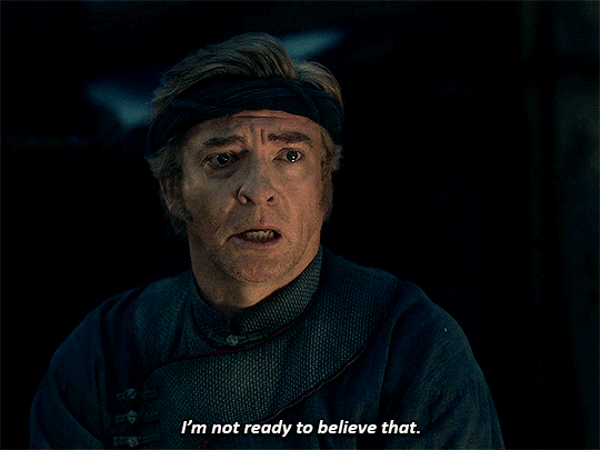
Hoooo BOY this is such an interesting scene to unpack! Because to me there's at least 3 levels going on here.
What Lucius hears
What the audience "hears"
What Stede literally said
Thing is, I believe when Stede says, "I'm not ready to believe that," the tone that Lucius hears and that the audience is at least 50/50 expected to hear based on the sort of cadence of the scene is, "I'm not ready to believe that Ed's best days are behind him. I'm going to change that."
But I'm not convinced that's what Stede is saying, what Rhys Darby is portraying, or what is literally on the page.
Literally, on the page, Stede says he's not ready to believe that. And given that Stede is very neurodivergent coded, Rhys is self-confessed autistic, and I believe Rhys is bringing that to his portrayal of Stede, I think we really should look at literal words as written and not just run with they're implied to say. This could be read as a declaration that Stede refuses to accept a reality where Ed's best days are behind him or the literal reading: he still can't process that Ed Teach's time with Stede Bonnet was the best Ed's life is ever going to get.
I believe this is for multiple reasons:
Stede isn't going to throw off a lifetime of low self-esteem and bullying overnight just because he's realized he's in love. Especially when the manner of realizing it (end of S1) was hurting the person he loves pretty badly by abandoning him without a word. He's determined to fix his mistakes but each step of the journey is revealing just how big of a mistake it actually was. Not exactly the stuff of sudden self-confidence and positive self-image change.
It requires a full re-write in Stede's brain of every single assumption he had about his relationship with Ed before their separation. Stede in S1, to my eyes, very much saw himself as the junior partner in the relationship. He saw Ed as taking pity on him, to some extent. He felt blessed to have Ed there. It informed so much of their relationship and it especially informed him taking off when he thought his presence was an active burden on Ed. Basically, what Lucius is saying here attacks the very foundations of Stede's understanding of the happiest part of his life so far. To learn that Ed wasn't just the happiest part of his life, but that he, Stede Bonnet, was the happiest part of Ed's life? Whew. Fuck. Not good. Very not good.
Because it's really not good if he was the happiest part of Ed's life, that he so fundamentally misunderstood their dynamic because of his low self-esteem, that he ended the happiest period of Ed's life without warning, without a note, prematurely, and left Ed with the inescapable conclusion that Stede doesn't care about him.
I think worse, even worse, is that Stede has evidence that Lucius is right that he was the best part of Ed's life. But in S1, we're heavily in Stede's POV and Stede's POV of himself is that he's a joke, pathetic, garbage, lucky to have someone like Ed in his life. But Ed's literal actions, louder than words, are that he chose Stede. He gave up piracy for him. He stayed by him. He offered his life for Stede's. Stede wasn't ready to hear that then, he couldn't hear it over the sound of his own low self-esteem whispering poison in his ear, externalized by the Badmintons (both real and imagined). He took their words as fact, rather than Ed's actions as fact. Reexamining Ed's actions shows just how wrong they were. Just how wrong Stede was. And just how badly he hurt Ed because he didn't listen to Ed, the person he loves, over the voices of his own trauma, self-doubt, or of the Badmintons, people who literally hated Stede.
It's a lot. It's a lot for Stede to take in. He's not there yet. But I love that we've had it said aloud: this is a major plot point still. Stede's end-of-S1 glow-up didn't signal that he's self-confident now enough to realize he might be as good for Ed as Ed is for him. He's still grappling with that. It shatters him to even begin to realize this. They have to work through that still. Stede is ready to start listening but he still doesn't, can't literally can't, believe it just yet. It's just too big.
And I am absolutely salivating to see how the rest of the season deals with this thread.
370 notes
·
View notes
Text
okey dokey! i just finished the fallout show! some Thoughts under the read more
tl:dr, the (bethesda) fallout vibes were definitely there. i liked it as a show on its own merits but as a part of the series canon... i'm mad, and that anger is kind of overriding the little i liked about it. overall maybe 2.5/5 stars and im being generous
things i liked:
visually, it's stunning - i could see scenes already being made into gifsets - the color grading is pretty good; even in dark scenes i could see and understand what was happening
the sets are soooo good!! costume design was alright too
title cards were fun and cute
they did some interesting stuff with the cultures of both vault 33 and the brotherhood of steel
they used the sound effects from the games :)
i liked the wastelanders!!! big npc and random encounter energy. i kind of want a whole show of just them. for example i love the marketplace and settlement in filly; it feels very lived in
the background characters weren't just young thin able-bodied conventionally attractive white people :) there's so many elders, which i loved!! ma june and barv were cool. i love gruff old lesbians
lucy!!! she was already kind of weird and a little off-putting even in vault 33 ("what's your sperm count" as an opener to the husband she was just arranged married to is WILD) and i like that. she's sweet and bullheaded and surprisingly competent :)
maximus is kind of an ass, but is also a pathetic nerd and brotherhood dickrider who actually doesn't really know anything. kind of a girlfailure
the ghoul was pretty cool too!! i liked him, though more for his prewar story than the one he has post-apocalypse
lucy's brother norman kinda grew on me. "i lack enthusiasm for every job that i do here" so relateable. also short king <3
THE DENTIST THAT BUYS TEETH. never thought that would be a Thing but now that i think about it, it makes sense
the monsters that we have were cool!! wish there had been more of them
MATT BERRY IS IN THIS!! i just really like him so i got excited :))
maximus and lucy's "wanna have sex?" talk LMAO
vault 4's various mutations!!
those giant unwieldy fuckass duffel bags that brotherhood squires lug around hahahhahahaaha
vault 4 and its genetic experiments because its main conceit is that it was ruled by scientists who hybridized humans. it's exactly the right amount of fucked up i want in a vault
i like that the protagonists regularly get captured and eat shit
FRED ARMISEN IS ALSO HERE
haha hacking minigame :) also chatting via terminals (and im assuming pipboys?) is canon now
they're growing crops in the wasteland + bustling trade + livestock + pets yay
robobrain was cute
things i was just ok with:
dane, the they/them brotherhood of steel aspirant who was fucked over so maximus can get their spot as a squire LMAO what a waste of a potentially cool character
IT'S SO FUNNY that there's yodelling whenever the ghoul comes into the scene ????? WHY
fight scenes.... pretty good but someone definitely had the bloody mess perk (i don't do well with gore so ew yucky). also lots of [VATS NOISE]
pipboy was not used as much as i thought it would be
cousin stuff... i get it, i guess in a vault you'd have a lot of cousins and not a lot of choice, so some incest would probably happen
the ghoul being vault boy's inspiration?? not sure what to feel about that tbh
the casual dismemberments... and equally casual attaching of limbs... not even prosthetic limbs.....
the vaulties eating good healthy well-balanced meals. giving out caviar in the welcome basket. kinda 50/50 on it
the vault 31 - 32 - 33 subplot couldve been more fucked up
have brotherhood knights always been celibate or did i miss the memo
there are regular chickens and... deer? for some reason?
the ghoul's design. it's fine in action but mostly it's meh
the vault 4 cult for moldaver
vault 4 as a refuge for shady sands survivors. im mad about it but like. i get it
that guys "elixir" (some altered jet??) fixing everything about thaddeus' foot instantenously AND GIVING HIM HEALING POWERS???
things i did not like:
lucy's plot premise is very much fallout 3 redux
lucy and maximus as a ship is very meh and kind of forced and not compelling. go give us nothing!!!
wilzig's head as a macguffin that everyone is after... ehh kind of just okay as a plot device
also the ghoul randomly eating that other ghoul???
the squire who bullied maximus calls himself fat but he isn't fat?? not even chubby??? hello????? just got a soft face
water chip being fucked feels very fallout 3 also but they kind of dropped it?
they definitely named cooper howard after todd. as tribute probably, which he doesn't deserve
fiend = cannibal now?????
maximus recognizing vault 4 as a cult but not recognizing the brotherhood as one lol
vault tec evil capitalism vs hollywood communists storyline was kind of basic. and bland. and weak
the enclave could've been established + explored better
no geckos or any other west coast-specific monsters
showing me ncr ranger armor when the ncr is gone
ghouls have healing powers?? WITHOUT RADIATION??
things i hated hated hated:
the ghoul needing drugs to combat the Disease That Turns Ghouls Feral
feral ghouls being basically zombies :/
IN EPISODE FIVE. THEY REVEAL. THAT SHADY SANDS. WAS BOMBED. THE ENTIRE NCR. WAS BOMBED. IN 2277. THE YEAR OF THE FIRST BATTLE OF HOOVER DAM
BASICALLY RETCONNED FNV?? IM PUTTING MY EARS IN MY FINGERS AND GOING LA LA LAAAAA
VAULT-TEC DROPPED THE BOMBS ???? BIG MT + MR HOUSE BEING IN ON IT????
THE BIG STUPID FUCKING REVEAL IN EPISODE EIGHT?? THAT THE OVERSEER BOMBED SHADY SANDS BECAUSE HIS WIFE DIDN'T WANT TO GO HOME WITH HIM??? FUCK THAT???
the brotherhood being the main faction of the west coast now. booo!! booo!!!!
the fucking last shot of new vegas being a burnt out husk. probably foreshadowing that hank is going to house's body but. UGH I HATE IT
to summarize: it came out strong! and stumbled hard falling face fucking first at the finish line. i would have liked it a lot more if it did not shit on the west coast as much as it did. because what the FUCK. if it was set literally anywhere else and left the ncr alone i would have liked it more, because on its own, as a self-contained story, divorced from the rest of the fallout series canon, it's not bad!!! it's fun, there's some good bits, it has the ~vibes~ but - and this is a big but - i don't know what it's trying to say. it's all very surface level and the very vague themes i picked up on are not really reiterated in the plot
it's like... the bits that make it fallout are there. vaults. the brotherhood. ghouls. a dog named dogmeat. but there's something lacking. it's like your usual sci-fi post-apocalypse show with a fallout veneer. idk. i like it for what it is but also i hate it for what it's emblematic of. that's all
#fallout show#spoilers#fallout show spoilers#shh peri shhh#i liked it but also i didn't#hope that helps!#watch it but probably pirate it i think#anyway it's 5am im going to bed#im trying to be positive. it's not all bad. but it sucks
129 notes
·
View notes
Text


Propaganda
Michèle Morgan (Le Quai des Brumes)—Michèle Morgan never broke into Hollywood, but she had an intensity and subtlety (and sexiness!) that she brought to a decades-long career in French films. I think she is never less than mesmerizing. She did fascinating work in film noir, but I've mentioned two of her early films here. In Joan of Paris, she's adorable opposite Paul Henreid; in Quai des Brumes (Port of Shadows) she's heartbreaking opposite Jean Gabin. I think she's also magnificent as Marguerite in the '54 Faust retelling. She has a frank sensuality and a beautiful range of expression that I think need more appreciation.
Jean Hagen (The Asphalt Jungle, Singin' in the Rain)—a shimmering star in the cinema firmament! Absolutely iconic as the villainess Lina in singin’ in the rain and makes the picture, to be honest. Nobody played funny-evil-gorgeous the way she does. and that voice!
This is round 1 of the tournament. All other polls in this bracket can be found here. Please reblog with further support of your beloved hot sexy vintage woman.
[additional propaganda submitted under the cut]
Michèle Morgan:
Here's the iconic "T'as d'beaux yeux, tu sais" scene ("You got pretty eyes, y'know?" "Kiss me." "Nelly..." Kiss me again." She goes from 'Vous' to 'Tu'. AAAAA)
youtube
Need more? A career on both sides of the Atlantic; mesmerizing eyes, classy AF, AND she was a painter as well :D She also died at 24 despite living 96 years, due to being born on February 29 !
Jean Hagen:

Riddle and you shall receive! How could we forget about Jean Hagen! I love a woman who can play really delightfully evil, and it's very fun seeing her other roles after you've seen her as Lina Lamont. Also, she's got an adorable smile and a gorgeous chin.
Her Oscar-nominated performance as Lina Lamont is a wonderful example of being talented enough to make an unsympathetic character difficult to hate. Admittedly her looks also help a lot - in so many films she would have been the romantic lead and it's a shame Lina didn't get a redemption arc.

Had a sexy sexy alto register so when she was being dubbed as Lina Lamont by Debbie Reynolds she was dubbing Debbie Reynolds dubbing her. Shoutout to Betty Noyes also.
Linked gifset
did. is anyone. can we please bring attention to her in drag. please god and thank you
If we bring a little joy into your humdrum lives, it makes us feel as though our hard work ain't been in vain for nothin!

#jean hagen#michèle morgan#hotvintagepoll#fuck that old woman#ladies 1#personally i would like to be in bed between the two of them#Youtube
118 notes
·
View notes
Note
Any personal headcanons on Rick and Michonne as a couple? Like their favorite things about the other, what they argue about, love languages ect. lol they’ve set up camp in my brain and I just want more of them 🙇🏻♀️
this is so funny because i've been thinking about their love languages ever since danai did that interview with YNB after 1x04! yvette said rick's is words of affirmation and michonne's is acts of services, and I definitely agree but I also think they display pretty much all of them, and quite a bit? rick is obviously into giving gifts and loves quality time (family fun day, begging her to spend just a few more days on the road in 7x12) and to say they both love physical touch is an understatement. this gorgeous gifset highlights it all beautifully.
anyway, some headcanons~
I really don't think they argue about much? they are very in sync most of the time. historically their big arguments are about how to handle major threats (negan, the crm, rick's PTSD) and since nothing bad is ever happening to them ever again because I said so there's no need to fight about those things anymore
michonne's favorite things about rick are how affectionate he is with his family, his strength, his accent, and his hair
rick's favorite thing about michonne is everything
i actually think they talk about books a lot. they're both nerdy as hell in different ways and love that about each other
michonne likes to cook and is very experimental while rick likes to bake (mostly secret family pie recipes) and they love feeding each other and their kids
michonne absentmindedly sings and does little dances when she's doing things around the house and rick stops whatever he's doing to lean against the wall and watch her and smile
that scene we saw in 9x01 where they cuddle up in bed and unpack their day was a ritual they started way back at the prison, even though back then it was obviously platonic (we do actually see them talking when everyone else is asleep several times throughout twd). they would linger and chat before heading to their respective cells at night. in the six years michonne spent without rick, she continued the tradition herself, talking to him out loud alone in their bedroom
rick DEFINITELY teases michonne about being oblivious to his feelings for her before The Couch
michonne hits back by teasing him about Whatever the Fuck He Was Doing With Jessie 💀
you didn't ask for grimes family headcanons but:
after they got home, michonne has a moment like that scene at the end of kill bill vol 2 and has a near silent hysterical laugh-cry of relief by herself in the bathroom before calmly walking back out to join her family. only rick notices
rick on the other hand is afraid to let any of them out of his sight. he spends the first six months he's back home being a total insomniac watching the three of them sleep because he's afraid if he closes his eyes he'll wake up alone back at the CRM
antony azor who plays rj is apparently very shy and reserved but opened up unexpectedly with andrew lincoln and so obviously this is also exactly what happened with rick and rj. father and son bonded INSTANTLY
his first night back, judith asks rick to finish reading the wizard of oz to her because he never got a chance to. it takes a good five minutes for him to compose himself but she does finally get the full story from her dad
rick and michonne do have an actual wedding ceremony, but it's just for them, judith and rj.
#richonne#the ones who live#people should definitely reblog this and add their own headcanons btw!#oh i also have this very specific scene in my head but idk how plausible it is because i didn't watch enough of late seasons twd#so i didn't include it but it goes like this:#rick and michonne are just kinda wandering around alexandria and michonne has just stepped away for a quick second#and some random alexandrian (or whoever) who has never met him but knew michonne had a significant other who was presumed dead#and who also thought michonne was nuts for believing otherwise#sidles up to rick like oh HI are you new here??#only for michonne to suddenly appear and. with MUCH delight. be like oh HELLO KAREN have you met my dead husband?#rick is tickled. he has no idea what's going on but gets snarky in solidarity#i just REALLY want michonne to have many opportunities to be smug about being right that rick was alive AND for bringing him home lol
133 notes
·
View notes
Text
I've been meaning to talk about the change in Tankhun's wardrobe over the course of the series for a while, and this gifset crossing my dash again ended up being the motivation I needed. So here we go!
As highlighted by at gifset, green lighting and backdrops are often used to indicate danger in the show. It is also a color heavily associated with the Minor Family and some great meta has been written about the use and significance of the color on the show and especially about Porsche's final green suit. Green is the color of greed, of danger, of corruption. But green can have more positive associations with it as well: it can represent hope, growth, renewal, rebirth...
But what does this have to do with Tankhun? Well it's all in the wardrobe.
When we are first introduced to Tankhun on the show, he’s hard to miss in his fuchsia robe. It's a color we see a lot of when it comes to Tankhun. For the first half of the season he’s awash in pink and color, wearing fuchsias, reds, golds, and the occasional blue-tinted metallic or sky blue. And his character is much like the colors he wears—loud and attention-seeking and distracting.

But then as we approach mid-season, we start to see a switch occur in the colors he chooses to wear. The bright reds and fuchsias fade and we start to see more subdued colors—solid whites, greens, and blacks (all fabulously and loudly styled of course because he’s still Tankhun). In fact, Tankhun’s primary wardrobe color across SIX different outfits in the last two episodes is black. For Tankhun, it’s a flashing neon sign of his state of mind as the dangerous and perilousness of the events happening around him increases. Now is not the time for bright colors, now is the time to be serious.
But I’m not here to talk about the black, I’m here to talk about the green.
While green is not entirely absent from Tankhun's wardrobe in the first half of the season (very few colors are), the first time it takes a dominant role is in episode 10 when Gun presents Ken’s head to the Main Family. As noted up top, green is a color associated with both danger and with the Minor Family, so it's not a surprise to see green appear in this scene. Both Korn and Gun actually have hints of green in their wardrobe (Korn in his tie; Gun in his cravat). But it is notable that Tankhun is not only wearing it, his entire outfit is green.

On a character level, it's a tantalizing choice. While Tankhun isn't in any more danger here than anyone else, but he's dressed as if he is. And while we do see him respond to guns being drawn with more fear and distress than any other point on the show, there's something bigger going on here as well—Tankhun is playing a role.
Let's look at the dynamic of the scene.

Korn is at the head of the table, with Gun at his left and Kinn and Tankhun on his right. Tankhun, specifically, is sitting on Kinn's right—he's performing the role of Kinn's right hand man. And he's wearing green, a color predominantly associated with the Minor Family. Sitting opposite Korn and Gun, Kinn and Tankhun reflect their dynamic in a way that foreshadows the changes to come. That foreshadowing is pretty blatant when you note the blue suit Kinn is wearing. After all where else do we see this same blue/green color dynamic?
And from this point on, Tankhun continues to wearing green in moments specifically connected to his relationship with Kinn (and Porsche). When Kinn confessed his love for Porsche and Tankhun voices his support, he's again wearing green. When Arm and Tankhun save KinnPorsche in the finale, the collar of his jacket is teal-green. And for his last appearance on the show, the green hue of his jacket exactly matches the green of Porsche’s suit.

It's again notable that when the day is won and the danger has supposedly passed that Tankhun does not return to his brightly colored clothing of the beginning of the season, but remains in his darker clothing. The choice works on multiple levels: it indicates the danger has not, in fact, passed; it points to a more permanent shift in Tankhun; and with the presence of the matching green, it links both the danger and that shift with Porsche.
There's definitely been a lot of meta about Porsche's green suit already, and I'm not going to rehash it because we're mostly talking about Tankhun here, but I am going to point out the similarities between Tankhun and Porsche at the end of the series. Both of them are eldest sons—both failed to be what their parents wanted of them, both failed to truly protect their younger siblings from this world, and both of them have found themselves prisoners in a gilded cage of Korn's making. And neither of them are truly safe there.
But speaking of eldest sons wearing green, it's interesting that despite green representing the Minor Family, the only one who actually wears it is Macau. Vegas is awash in green lighting and green decor, but black and red are his personal colors. He never wears green. Until, of course, he does—when he and Porsche genuinely cooperate for a common cause.

Just some food for thought.
107 notes
·
View notes
Note
do you have a coloring tutorial? your gifs are so nice and vibrant, how do you do it? :)
hi, here's a simple basic coloring tutorial that I use pretty much for all of my gifsets:

I won't get into the basics of making a gif as this is just a coloring tutorial, but here is my gif after I just crop and resize it:
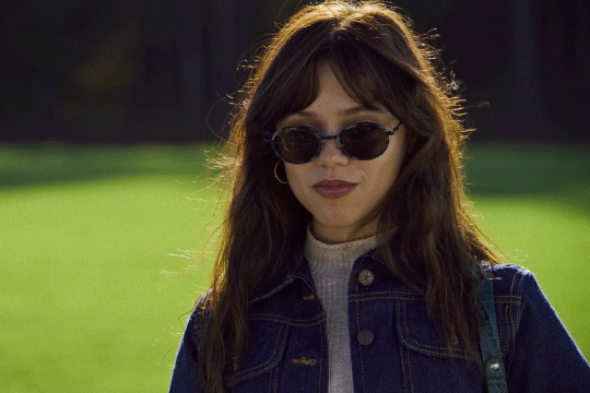
and here it is after I sharpen it:
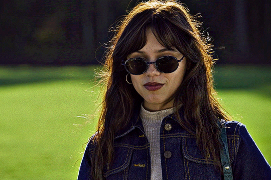
sharpen can affect the depth of shadows in a gif, so I do this before I add any coloring, but I know some people color first and only then sharpen, so both ways work!
alright, ready for some fun coloring? let's go!
before adding any adjustment layers, I suggest creating a new group, so all of your coloring changes can neatly sit in one place.
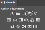
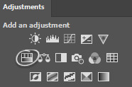
I always start with levels and curves, they often help to make the overall gif more natural if the lighting is too yellow, too dark, etc., it's a very useful guide, especially if you're new to gifmaking. so, let's start by clicking on the levels icon, a new adjustment layer should appear over your gif layers:
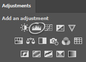
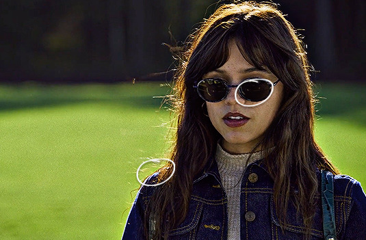
the next step is to click on each of these little icons (I usually only use the top and bottom ones) and to select the lightest and the darkest parts of your gif. pick the top one, select the darkest part and then pick bottom one and pick the lightest part, you should see some changes on your gif, sometimes they're subtle, sometimes they're very obvious:
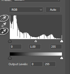
in my gif the lightest part is somewhere near her shoulder where the light hits, the darkest part is her sunglasses (if there are a lot of dark/light parts, I just click around and see whichever looks more subtle. for example, I tried the part on top of her head where the light hit, but it made the gifset too blue because the lighting is yellowish, but since the whole scene is not very yellow, it looked weird so I'm sticking with her shoulder, it just simply looks better overall):
and then I do the same thing with the curve adjustment layer, selecting the darkest and lightest part of my gif just like I did with the levels layer:
while this is a good guide for beginners, it doesn't always fix all the problems. it can be quite harsh, so I recommend setting the opacity to a lower percentage and if it looks a little weird, sliding the arrows to one side and another with each color until it looks better to you:
like I said, it's a good guide but manual work is often needed, don't be afraid to mess around with the settings. for this gif I set levels layer opacity to 60% and curves to 37%.
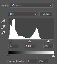
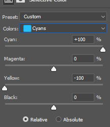
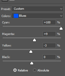
moving on, I'm adding a selective color adjustment layer to fix how the skintone looks with red and yellow colors. it differs with each scene, sometimes the skin is too yellow and orange, so I add more cyan and less yellow but in this case I chose these settings and I set the opacity of this layer to 35%:
I want to mention that with poc it's very important not to mess around too much with their skin tone and not to white-wash and orange-wash them, there are quite a lot of tutorials on how to avoid doing that.
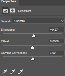
the next layer I add is exposure, I want to brighten my gif a little bit. you can do that by selecting either brightness or exposure layer like I did:
the scene I'm working with is pretty bright, so I'm not adding too much of exposure, here are my settings:
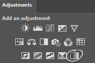
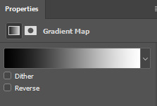
next up, I want to deepen the shadows a little bit, so I use a gradient map for that:
I use black and white gradient and set the opacity to 10%:
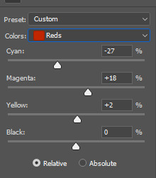
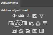
moving on, color balance is another great trick to make the gif look more smooth with one consistent color overall:
if I'm working with scenes that have a lot of green/yellow in them and I want to get rid of that, this is a quick way to slide the arrow to the opposite color and soften it a little bit by adding another color. I usually like to add more magenta to midtones and make the gif have a little bit of a pink look. here are my settings for this specific gif and the opacity of this layer is set to 30%:
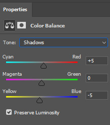
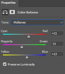
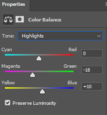
and here's what difference it made to the gif:
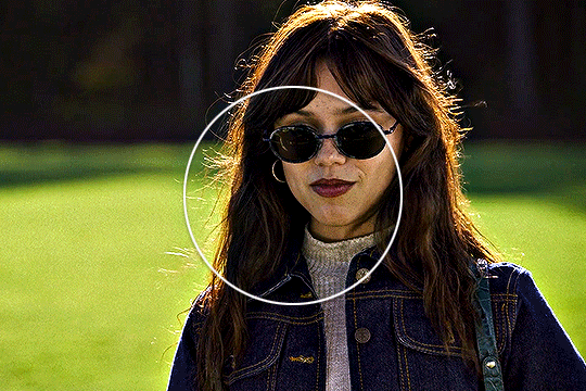
as you can see, the colors outside the circle are less green on her skin and hair. it's all coming together nicely!
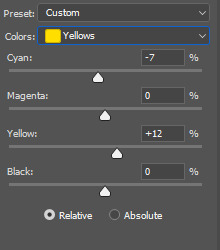
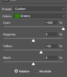
let's move on to the background colors. I add another selective color layer and I'm gonna play with the colors I want to enhance the most. in this case it's green grass and her blue clothes. here are my settings for these colors:
and finally, to enhance the vibrant coloring even more, I like to add one final hue/saturation layer:
here I like to add more saturation to the colors we're focusing on in the background and add around +20 of saturation. I did this to green, cyan and blue colors:
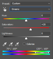
and that's it! here is the finished gif compared to the completely raw one:
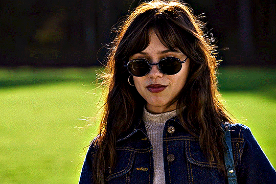
this coloring tutorial is very basic, but it works for most scenes I work with, I just sometimes focus on other colors, add more or less layers but the overall process is very similar.
I encourage to mess around with all the settings and see which ones look the most pleasing to your eye. let me know if you have any questions :)
56 notes
·
View notes
Last Seen Blogs
rememberme15blog
Done

thoughtsofaddiction
Untitled

leilaum
leila_ulm

production-each
Untitled

fluid-alter-ego
Triptych - GROUP 4