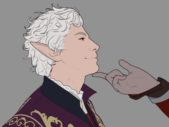
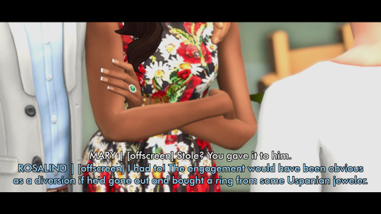
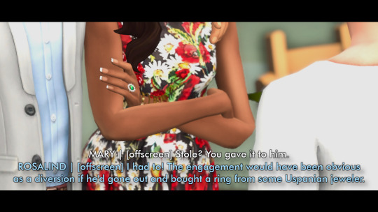
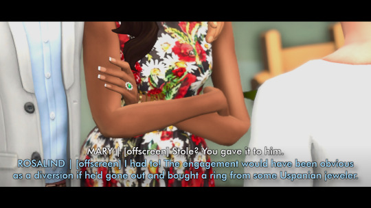
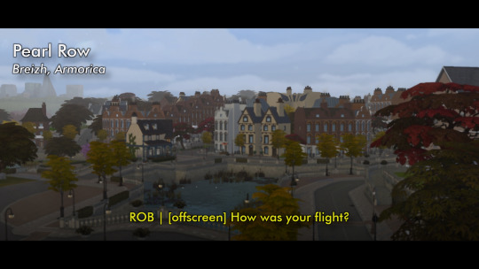
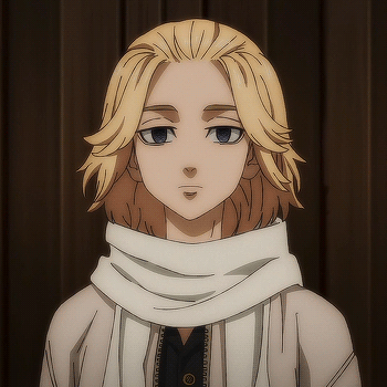
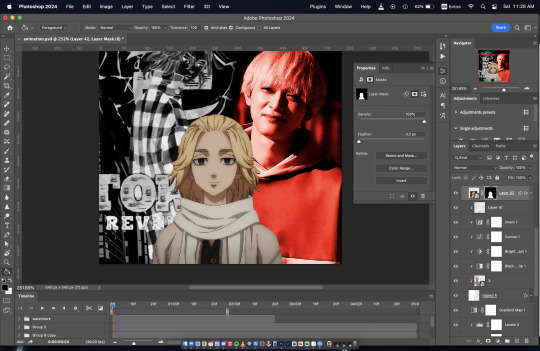
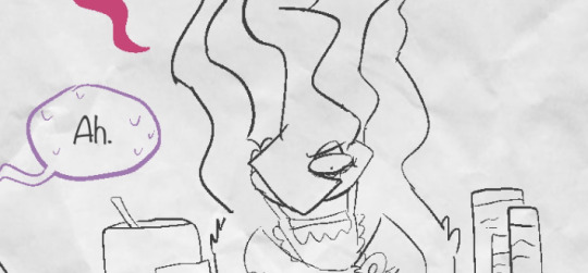
#was using a selection tool and the fill bucket to make this
Explore tagged Tumblr posts
Visit Tumblr Blog
Explore Tumblr blogs with no restrictions, modern design and the best experience.
Last Seen Tumblr Blogs


Fun Fact
Users from the US are the majority of Tumblr visitors.
Text
makes your creaturified fan angular
#wheucto#art#inanimate insanity#ii#ii fan#was using a selection tool and the fill bucket to make this#wanted to try that out#but i didnt have many ideas so i just took creaturified fan and anglularized him#creaturification designs
83 notes
·
View notes
Text
Okay finally
Small lighting tutorial (very long post, lots of images)

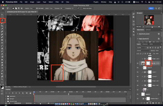
First of all I work on PS but if you have basic knowledge of your program of choice this will be easy to follow.
Second I use a different layer for everything. So assume that each screenshot is a new layer.
Third I've seen people not knowing how to choose colors for light and shadow and for me it comes out naturally so I don't put that much thought in it, but picking the neighboring color in the color wheel never fails, so lets say you use a red for the lighting, then pick either orange or pink for the shadow. The shadow should be fairly desaturated. However if the lighting is the desaturated you can go wild with the shadow saturation. But this is subjective and it's very dependent on your goals and art style.
Okay let's start:
Line art
Base color
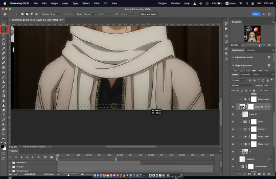
Now for the shadow layer. The layer blending mode is in hard light mode

I use the quick selection tool on the previous base color layer, and in the new shadow layer with the hard light mode set I fill the selection with the paint bucket tool.
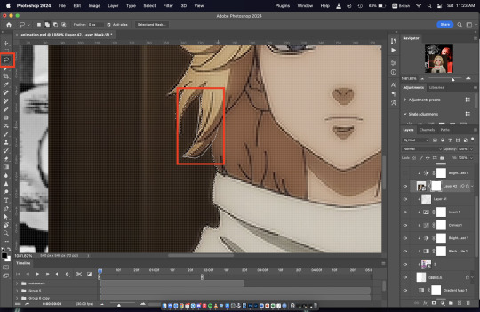
The lighting layer is on the linear dodge (add) mode.

I use the lasso tool to select the lighting parts, then I fill it with paint bucket tool.
Then once I have everything, I use the quick selection tool on this lighting layer, and in a new layer also on linear dodge mode I use a radial gradient, drag it from the direction of the light source, you have to try it out on it's own but it usual takes me a couple of tries to get the desired intensity.
Also tbh you can just leave it like that no gradient, if pure cel shading is your goal.
I add all the extra shadows, this layer is also on hard light mode, I use the lasso tool and a normal round soft brush.

This next part is something that I sometimes do and sometimes it's not necessary, in this case since the light source is moonlight the light on the clothes should bounce off on the face so I do an extra gradient. (or just do this if you want to make it lighter lmao)
With the quick selection tool, I select either the base color or the shadow layer, and in a new layer with the linear dodge mode, I use a gradient, it has to be either a fairly dark color or a very soft gradient.

And lastly in a new layer, with linear dodge mode I use a soft edge brush on top of the lighting areas, to give it that glow.
Sometimes, like in this case, I have to use some color balance adjustments, more contrast or brightness.
And that's it. Good luck and hope this helped you, if you have any questions my inbox is open 😊
#tutorial#my christmas present to all of you 😘#actually this is a present for myself because when the inevitable question about lighting comes up I can just point to this
803 notes
·
View notes
Note
hey!! Those gifset for scrubs looks amazing!!
https://www.tumblr.com/billysjoel/776944203704975360/scrubs-jd-elliot-turk-pscentral-event-36?source=share
would you mind doing a tutorial on how you made the colouring and colour isolation and text effects on the second gif?
hi, thank you so much!! this is the post and i'd be more than happy to make a tutorial for you!

so, i'll start with the coloring:

step 1: as with almost every single coloring/psd i make, i start with a blank brightness/contrast layer set to screen. this is especially helpful with really dark scenes! in this case, i left it at 100% opacity, but sometimes i'll decrease it if it blows out the scene.
step 2: curves. i rarely, if ever, manually adjust this layer and instead use the eyedropper tools. click the black eyedropper (1) and then click on the blackest part of the scene and then use the white eyedropper (2) to select the whitest part. in this case, it didn't make a huge difference, but this is a big help with heavily tinted scenes.

step 3: selective color. my next step is always adjusting the blacks and neutrals (and sometimes whites) in selective color. how much i adjust these totally depends on the scene and messing around with the neutrals can definitely affect the skin tone of people of color, so keep that in mind!


step 4: color balance. this step is usually optional for me, but i found the scene was leaning kind of yellow. again, this will vary dependent on the media you're coloring, so my best advice is to play around with the sliders and see what works!


step 5: gradient map. after this, i added a black & white gradient map set to soft light and reduced the opacity to 25% just to add a bit more contrast and depth to the blacks.
step 6: brightness/contrast. another blank layer set to screen and set the opacity to 15% to brighten things up just a little.
step 7: vibrance +50.
step 8: selective color. adjusting the blacks and neutrals again.


step 9: selective color. my favorite part is just cranking the blues and cyans the FUCK up lmao


step 10: selective color (again) on cyan and blue (again).


step 11: selective color under the reds because elliot's face was looking pretty red.

step 12: selective color under the yellows. again, i recommend just playing around to see what slider does what. a little can go a long way!

and that's it for the general coloring that i used for all the gifs in this set. for the next part, you'll either want to be proficient with keyframes or pick a scene where your main character doesn't move much (this will make life so much easier).
step 13: create a new layer (ctrl+shift+n or layer > new > layer). choose the color you want to use and either fill the layer using the paint bucket tool (g) or use a brush (b) to color it all in. you should have something like this now:

step 14: set the layer to color (or another blending mode of your choosing) and apply a layer mask (the 3rd icon across the very bottom).

step 15: with the layer mask selected (as you see above), not the color thumbnail, use a soft black brush and color over your character. this will remove the blue from from whatever areas you color. if you need to "undo" what you've colored, switch to white (x) and that will bring back whatever you color over.
step 16: typography. i've actually done a few tutorials showing how i do my text like this, so check out this one, this one, or this one!
if you have any other questions, please let me know! i'm happy to help however i can!
#answered#Anonymous#my tutorials#gif tutorial#gifmakerresource#completeresources#dailyresources#chaoticresources#coloring tutorial
46 notes
·
View notes
Note
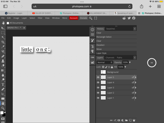
HOW DO YOU MAKE THESE THIS IS GONNA TAKW FOREVER
omg 😂
it doesn’t actually take me too long. tutorial under the cut for anyone who wants to know how to make cut-up style poems like this one:

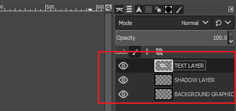
so i take a screenshot and put it into ms paint, where i make myself a working space by setting the background to some colour other than black or white. in the example below, i use purple.
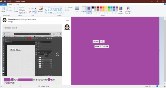
⬆ as you can see above, the left side is a screenshot, and beside it is a working space made of purple. i use the ms paint "select" tool to drag words where i want them.
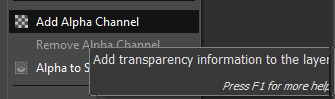
after i have the text looking how i want it, i once again use the "select" tool to copy + paste my text into GIMP (which is free to download).

once the image is in GIMP, i make sure that it has an "alpha layer" which basically means that the negative space will be transparent rather than a solid colour.
then i use the "select by colour" tool to erase all the purple, and leave me with floating text strips.

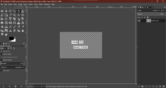
new layer time! i create two: one for the shadow, and one for whatever background graphic i want. sometimes, i rename the text layer.
⬆ arranged like so: text layer on top, shadow layer under that, background graphic in the background.
now, using the "fuzzy select tool" (the one that looks like a magic wand in GIMP), i navigate to "TEXT LAYER" and select everything that is not text. then, i invert the selection using the "select" drop-down menu.
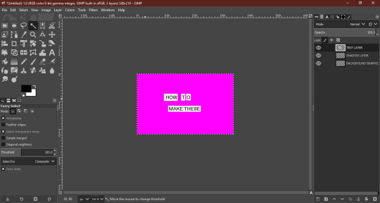
(the hot pink here indicates what i have selected)

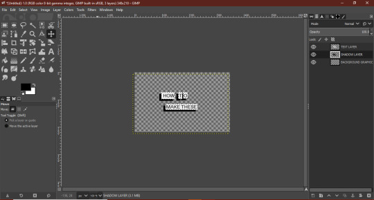
now that you have your selection inverted, navigate to "SHADOW LAYER" and use the "bucket fill tool" to colour in this inverted selection (which should be an exact shape-match for your text). usually, i will set my "TEXT LAYER" as invisible while i do this, so i can see what i'm doing.

then i drag the shadow into place, wherever i want it, using the "move tool"
finally, navigate to "BACKGROUND LAYER" and copy + paste any picture or graphic you want as the background. i'm using a picture of merlin, because i love him and he makes me happy.
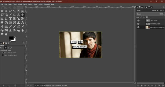
you may have to fiddle around with image size, and remember to anchor it to the background layer once you're happy with where it sits.
merge all the layers, select all, and paste it into tumblr:

voilà! hope this helped lol—let me know if you have any questions <3
296 notes
·
View notes
Note
ohh my goodness can you pls pls pls do a brush tour?? i love ur art so so much its so cruncy >:]
Yes I can, I appreciate your interest!! I use paint tool sai 2 which is kind of archaic, but I've been drawing on a wacom pen and touch small + using paint tool sai since 2012 and I'm too stubborn to move onto something better. I actually only use three brushes so I've made a little drawing where I only use one brush per character to show the differences:
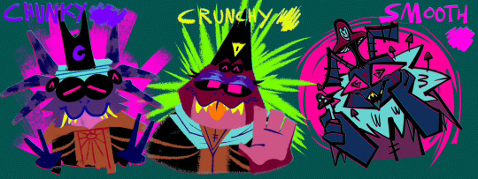
Gonna put the screenshots of the brush settings below the cut cause it got longer than I expected:
I drew my three big faves cause frankly I am sick of looking at kallamar and narinder's smug faces lmaoooo ANYWAY. GOING FROM LEFT TO RIGHT, WE HAVE THE CHUNKY BRUSH. I use that brush for messily coloring things in, doing big blocky background shapes, or just adding texture to a drawing. It's my favorite brush to paint with but I have not....finished a painting for this blog yet...

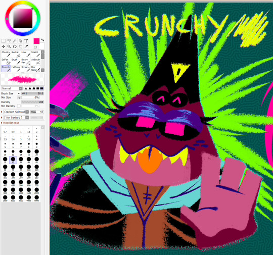
Then for the crunchy brush, it's a tool I use half for lineart and half for coloring. I use it for stuff like changes in fur color/markings, drawing all the lines in the backgrounds I do, and finer details the chunky brush can't handle. It's also the lineart tool I use for my drawings where the lines are all on the inside of the chararacters but not the outside!
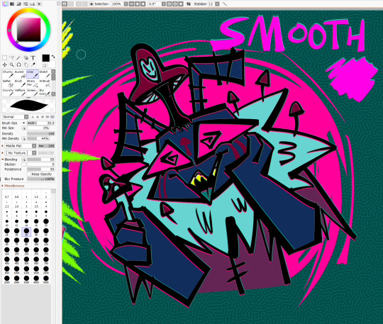
As for the smooth brush, this one only ever gets used for lines but it was created when I was so bored of my lineart tool I stopped drawing for a while. I wanted a calligraphy pen and had to work around SAI's limitations, so while it doesn't have that thin-thick angular effect that calligraphy pens have....I manually apply the pressure and it looks passable enough. I hope.
The brush settings are visible in the pics but uNFORTUNATELY I DO *NOT* remember where I got my stupid brush pack from. I literally downloaded the files before I was even a teenager but I *do* remember they're from deviantart. If anyone is for some reason kicking and screaming to acquire this ancient, crusty brush pack I'm sure I could throw it in a google drive
I have other useless information about my process if any of this is remotely helpful: for the anaglyph effect on my lines, I literally take a full 120 seconds to copy+paste two copies of my lineart, color it red and cyan, and then slightly move them up+down beneath the black lineart to get that 3dish effect. My flat backgrounds are just another sai preset texture, usually the checkerboard one cause it's swag. The rest of my brushes are just for utility or to fill in the gaps, that scroll bar leads to a bunch of empty space. They're not worth showing off just because they don't ever get used, or it's just like. The bucket tool. The select tool. A binary pen I never use. And lastly, for my usual lines, I actually go back and mess them up myself to get them to look more chaotic...my lines are usually smooth + even but it's so boring to look at and time consuming that I'm trying to unlearn that.
here's a wip of what my lines USUALLY look like with the smooth brush. You can see for the background I mostly used the chunky brush for shapes and then the crunchy brush for the finer lines! But yeah it takes forever to do smooth lines because I have nerve damage in my arm (it's why my stabilizer is maxed out...) and I refuse to use the line tool. In a professional setting I definitely make sure my lines are polished but this is just my goofy fanart blog and I want everything to look like it's been laced with crack.
I HOPE ANY OF THIS HELPS?? OR JUST SATES YOUR CURIOSITY, I try to not gatekeep the way I do my art so I have literally no secrets tbh
109 notes
·
View notes
Note
LAV may i ask how the flip you make these . im like ....... going insane :[


i do it on ibis paint so it might be diff on photopea idk
step 1
i grab my divider and move it to the top, then i select copy

step 2
i paste the divider then flip it vertically then merge that down

step 3
then i fill the middle with a bucket tool (on a seperate layer under the dividers)

step 4
i use that layer with the bucket tool as a mask and clip an image ontop of it

and there you have it!

hope that helps :D


96 notes
·
View notes
Note
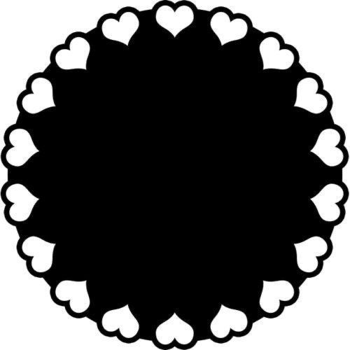
Anon here!! How did you make the heart graphic for the power rentry?

hi!! i’ll put it under the cut since there’s quite a few steps. lmk if you need a more specific tutorial or images for any of the steps!!

1) finding the base
find the shaping mask you wanna use. you can look up “shaping mask png” or “mask png” on pinterest to find some. this is the one i used:
2) removing the background
to remove the background, use the selection layer in ibis paint x. to find this layer, go to the layers panel and it should be the one all the way at the top. it is titled “selection layer.” to remove the white background, select the bucket tool and select the white background. it should turn blue. then switch from the selection layer to the layer you’re removing the background from. look at the top middle of the screen. there should be a square composed of dotted lines that looks like this:
click on it and select “cut.” this will remove the white background. click on it again and select “remove selection area.” now you’re ready to continue!
3) creating a cleaner base layer
you might want to do this if you plan to add a stroke, as once the background is removed from the mask, it tends to leave some remnants behind. this makes the stroke look choppy and pixelated. to do this, take the paint bucket tool on a new, blank layer, and fill in the black part of the base with black. then, delete the base layer underneath the new layer. the hearts will become transparent (to see this better, change the canvas from white to transparent in the layer menu) and the base will hold its shape. you can also remove the hearts in the previous step, but this tackles two birds with one stone and (in my opinion) looks cleaner.
4) filtering manga panels
to make the manga panels pink, i looked up “pink manga polarr code.” pretty much any one will do, but this is the one i used:
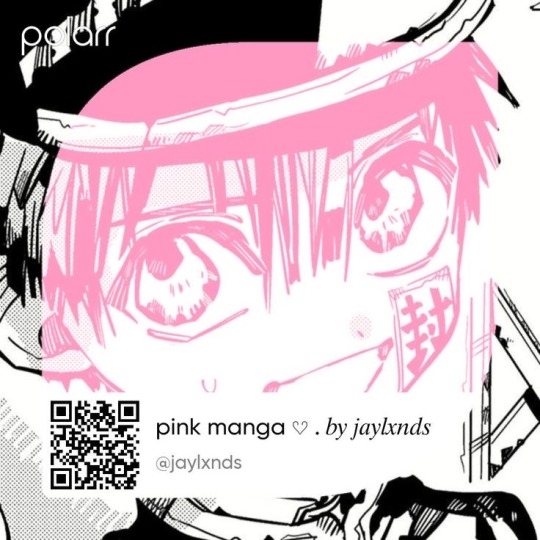
for the rest of this step, you’ll need the app polarr. once you get the app, go to the edit section of the menu on the bottom. click “open photos” and insert the manga panels you wish to change the colors of. then, click “filters” and “import filter.” from there, click “import qr code” and click on the filter in your gallery. the filter will go into polarr, and you can just click instant export or you can save it and then export it. it’s up to you.
5) masking the panels
import the images you just filtered into your canvas. now we’ll use a clipping layer to have them take the shape of the base. click on the image layer you want to do this with, and then hit the clipping option in the layer menu. this will have it take the shape of the base.
6) coloring the hearts
now we’ll add a new blank layer atop the clipping layers. i color picked the pink color from the image, and then used the bucket tool to fill in each of the hearts.
7) adding the extra pngs
for this step i used the sticker option in picsart and a transparent canvas to collect the pngs. i believe i looked up “pink png” in the search bar, but i’m not sure. then i imported them into the ibis paint x project and positioned them where i wanted them to go. download transparent pngs of the project (one of each image you added). toggle the eyes on and off so that you can save the different versions (not individual layers. i just mean if you added two manga panels, make sure you get one with one manga panel and one with the other).
8) creating the gif
search up ezgif animated gif maker. it should be the first option that comes up. for this, i typically switch to “manually ordered upload” opposed to “alphabetically ordered opload” (the default) so i have more control over the order of the images in the gif. once you upload them into the site and you get to the editing menu, set the delay time to 100 and click the box that says crossfade frames.
andddd you’re done!!! i hope this was somewhat comprehensible and i didn’t miss any steps xD
209 notes
·
View notes
Text
how i (try to) make my text readable
so as a lifelong glasses wearer north of 25, i cannot see shit! I love the look of text on screenshots, but also i have spent a nonzero amount of time squinting at pale text on a busy background and thought "i cannot fucking read that."
there are lots of ways to do this. my method is not perfect. I am constantly tweaking things to try and make the text more readable. if you have suggestions about making the text more readable, please share!
Step One: Open the screenshot in your photo editor
I start with a screenshot and a script. I use Gimp, a free and open-source photo editor, and I pretty much only use it to put captions on my screenshots, so please do not ask me how to actually edit pictures, I do not know. also, please do not ask me how to do this in any photo editor, i prefer to use this one because it is free, ad-free one that I can own legally and download safely.
open-source software RULES, btw.
Step One: Add a text layer with your dialogue

I use the text tool to add the dialogue to the image, copying and pasting from my script. This is not legible. My eyes hurt. I cannot read that, so I can't tell if I've made any typos.
Step Two: Add a black background to the text.
In, Gimp: Right click text layer > "Alpha to Selection." In the top menu, Selection > Grow > 3 pixels. Top menu: Layer > New Layer. (I name the new layer "Text BG ##") Use the bucket tool to fill the selection on the new later.
There's probably a shortcut to doing this in other photo editors (hell, might be a shortcut in Gimp.)
Step Three: Blur the background

In Gimp: Top Menu > Effect > Blur > Gaussian Blur. This may be a step backward in terms of readability, but I like how it looks. Let's try a few other things to help the reader, shall we?
Step Four: Drop Shadow
In Gimp: Top Menu > Light & Shadow > Drop Shadow. Makes the text stand out a bit more. Still not particularly readable, especially the blue on blue on the left side of the image.
Step Five: Gradient layer
Create a new layer underneath the Text BG, and then add a transparent gradient over the entire image.
This is step is slightly more involved, so I'll just link you to a guide instead of explaining myself: "How to create a gradient transparency in GIMP."
Step Six: Further Tweaks

I still wasn't satisfied with the readability of the text. I duplicated the gradient layer to create a darker background underneath the text. I also repeated the drop shadow step on the Text BG layer. You could also make the text larger or bolder, change font colors, grow the selection by 4 or 5 pixels instead of 3, or skip the blurring step. I change my method frequently to try to get the best look for each individual image, and I don't always do a perfect job.
This is an area where I constantly innovate. I want people to be able to actually read my text, so I try not to let myself be satisfied with "good enough." When I take screenshots, I try to do it with an eye for compositions that give me a nice, blank space on the bottom for text, ex.


132 notes
·
View notes
Note
Could u show how ur process of ur making comics? Its so stylized and charming im amazed at them 🥺
thank you so much, this is so sweet!! and sure! I'm happy to give you a lil peak behind the curtain at my process
under a cut cause I'm a rambler ✨
every comic of mine starts with a script first! it's not anything too fancy, mostly just the dialogue jotted down in a very inconsistent fashion, like so

and once the fun of writing some sassy stolitz banter is over, next comes the most difficult part imo... thumbnailing the layout
the thumbnail is just a messy ass sketch of basic bitch shapes to work out where I think everything is gonna fit. it's probably not very legible to anyone but me. I mean just look at this shit
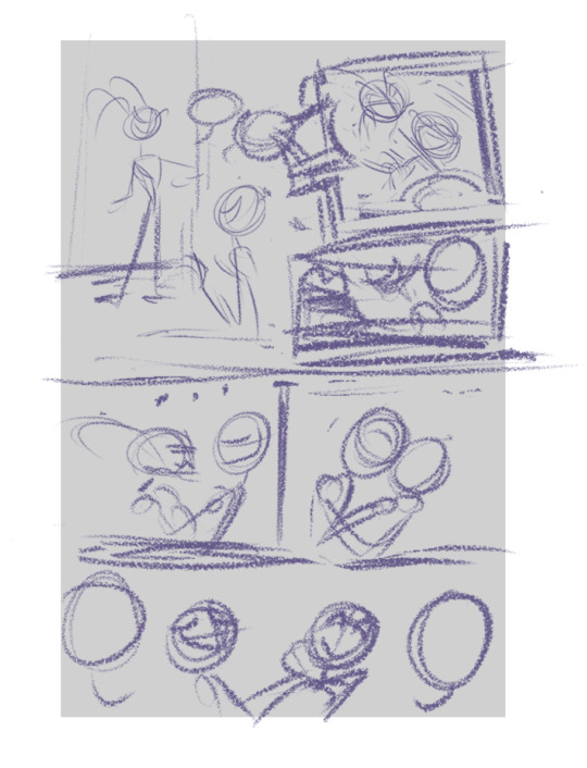
once I got that down, I scale it up to fit the page and lower the opacity. then before I do any proper sketching, I get that text in there. oooooh yeah! do those text and speech bubbles and panel borders first babes, TRUST ME. that shit's a time saver
then you can sketch AROUND the speech bubbles, instead of having to sketch -> add text -> oh shit the text is bigger than I thought, now I have to alter the sketch -> rinse repeat on multiple panels and cry
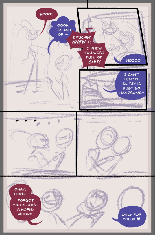
so after that, I'll do a first pass sketch but like yikes I got so damn lazy with one?? wow. it's not always like this I promise
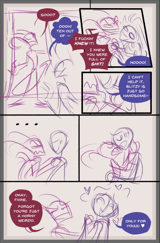
here's an example of another first pass sketch as PROOF, sometimes there's more detail
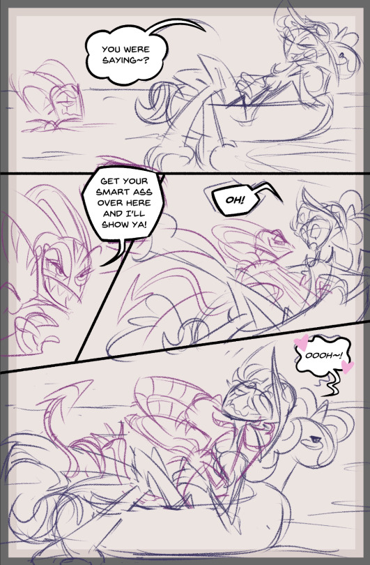
aaaaanyway if I'm in a real rush, I'll skip to inking, but USUALLY I like to do a cleaner second sketch first like so. it makes inking waaaaaay easier
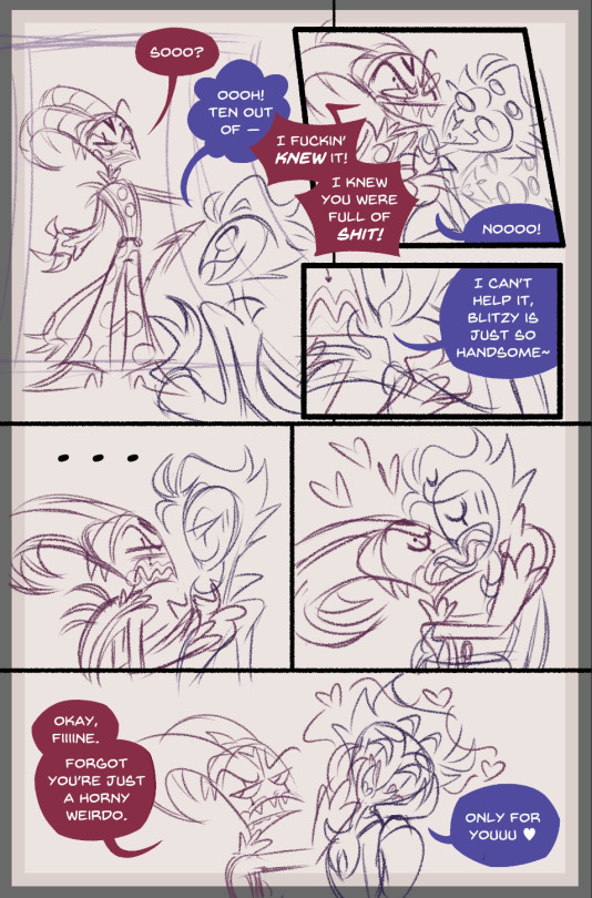
so yeah after THAT comes the inking. it's usually all in black (I color the lines at the very end, typically) but I did not feel like undoing all my hard work for this screenshot sowwy
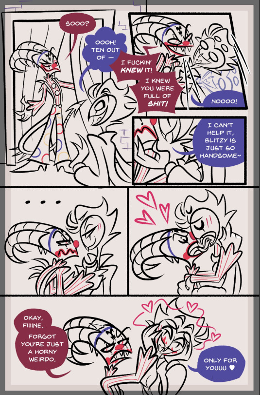
after it's all nice and inked, I color using the typical comic book flatting method. flatting is easily the most boring part, but alas, it must be done
I use the fill bucket tool in Clip Studio Paint all on the same layer and yeah the colors look wonky as shit right? that's cause it doesn't matter what colors you use, you just have to be able to grab the areas you want later using the magic wand tool (so you can see all the backgrounds on each panel are a different color to keep them separated, for example)
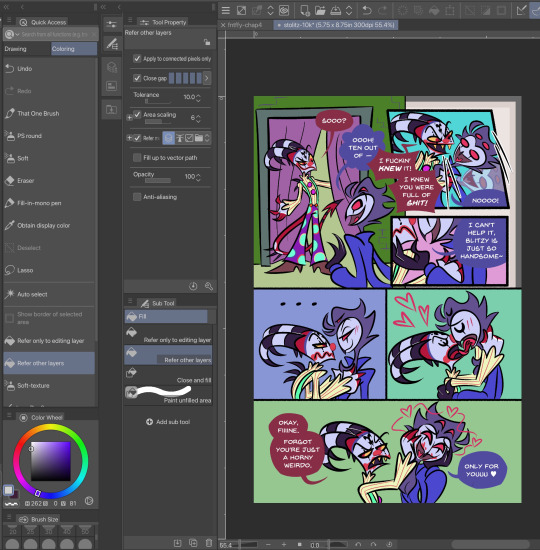
and that's what I do! after the flats are done, I create a new layer and use the magic wand tool to select and color each area properly. minimal shading, because I hate rendering most of all, so I keep the colors pretty flat! I color in some lines after that and call it good!
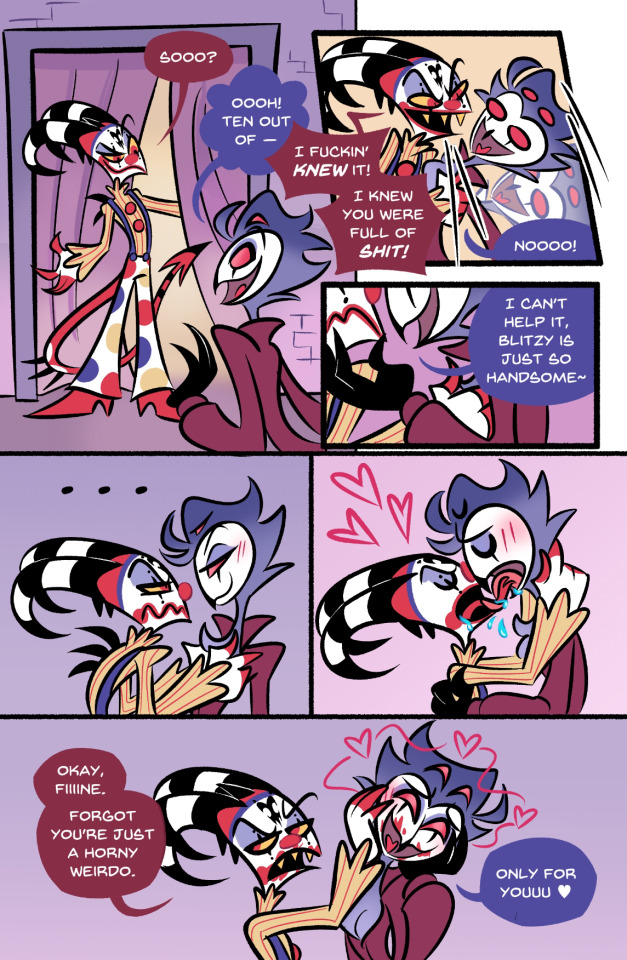
I hope this was insightful in some way and made sense! I don't know if I'm any good at explaining things, so if you'd like more clarity on anything, feel free to ask and I'll try again! 💖
#hooooopefully this was clear and answers what you were looking for!#but if not let me know#comic process#art process#glitz babbles#glitz replies#anon ask#usually I delete my scripts after the comic is done but thankfully this one was still sitting in my notes!#wooooo!
53 notes
·
View notes
Text
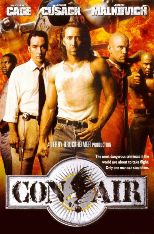
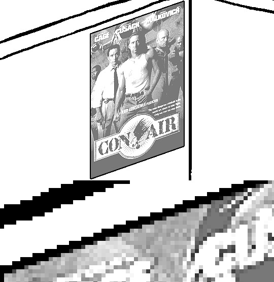
Tidbit: Persnickety About Posters
If you want to avoid overly dark or blurry posters in your fan adventures, then follow my lead:
1) Download JPEG off of Google Images.
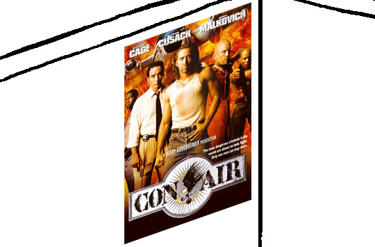
2) Import, scale down, and skew/shear it. Use an interpolation method such as Bilinear or Bicubic Sharper. Doing both transformations at once is better than repeatedly transforming the image (i.e. resizing it, applying the transform, and then skewing it), as it helps prevent the image and edges from becoming too blurry. This will be important later.
You can hold down Ctrl + Shift to constrain the Move tool along a single axis so it won't go out of alignment as you're skewing it. If you don't see the Transform Controls by default, enable it in the tool options bar at the top, or go to Edit>Free Transform.
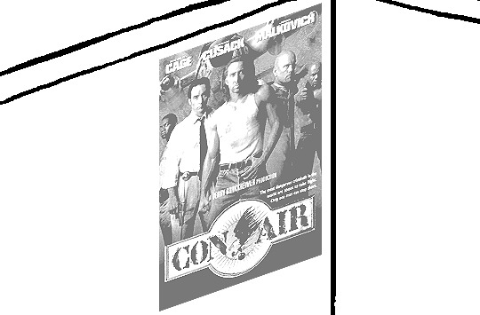
3) Desaturate it. Desaturate means to turn color grayer, until it becomes black and white.

4) Adjust the brightness and contrast using the Levels adjustment tool. It's much too dark as it is! In Photoshop, it is located under Image>Adjustments>Levels..., but I recommend creating an adjustment layer from the bottom of the layers tab instead. Doing so will allow you to make edits non-destructively, meaning you can go back and change any parameters until it looks right.

You could use a Brightness/Contrast adjustment with "Use Legacy" enabled instead to achieve a similar effect, but it won't clip the shadows and highlights as easily. You would have to create an additional duplicate adjustment and turn the brightness and contrast way down on the first one to do so. It's somewhat easier to use but less efficient than Levels in this case.
5) Apply a simple sharpen to the image as it is still too blurry for our purposes. In Photoshop, it is located under Filter>Sharpen>Sharpen... Do not use any other filter, such as Unsharp Mask, unless you absolutely have to in lieu of a basic one. If you must, turn down the radius a bit and the threshold all the way to 0.
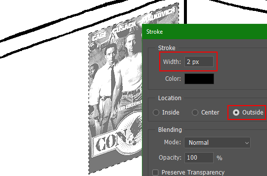
6) Make a selection around the image. Ctrl + left click on the layer's thumbnail to make a selection around it. Doing it this way makes it inherit the level of transparency any pixels have. If you can't, use the Magic Wand tool with "Anti-alias" enabled to select the transparent area outside, then invert it using Shift + Ctrl + I, or go to Select>Inverse.
Create a new layer above the image, then go to Edit>Stroke... and add a black stroke with a width of 2px located Outside. Leave everything else at the default. Doing it this way will create a stroke with anti-aliasing based on the selection you made. This should generally turn out pretty sharp if you follow my advice from Step 2. If you had used the Stroke Effect available from the Blending Options' layer styles, it will always result in a very smooth outline instead. You do not want this.
Voila, and Bob's your uncle, you're done!

The instructions above are Photoshop specific, but it should still be pretty software-agnostic. Here is the recreation PSD, and below the read-more link are additional notes, such as transferring the steps to something like GIMP.
ADDENDUM
You may be questioning why I deliberately made the stroke anti-aliased. "Isn't that an MSPArt cardinal sin??", I hear you clamoring. Well, my dear readers, let me briefly elucidate you on why your ass is wrong. Exhibit A:
The clearly semi-opaque pixels that can be found in every poster outline, which is especially pronounced here in the Little Monsters poster. I can also see that Hussie actually created a stroke on the same layer as the poster and merged it down into the white background like a dumbass. I omitted this in step 6 for the sake of convenience (and also the fact that you can't add a stroke to a smart object in Photoshop without rasterizing it first).
He had to use the magic wand tool in order to extract it from the layer for this panel, and then fill it in with the paint bucket tool. I can even tell he had the color tolerance set up very high on the magic wand to grab all those near-black and very light gray pixels, AND he had anti-alias enabled and the tolerance on the bucket tool set to be at least higher than 0 to tint similar colors. Exhibit B:

I also didn't address exactly how to desaturate something in Photoshop. Honestly it was because I was feeling pretty lazy. I would have had to rewrite step 4 to not include redundant information about adjustment layers. You can add either a Black & White adjustment layer or a Hue/Saturation one and turn the saturation all the way down to 0. The resulting tones will be slightly different from each other but I'll explain why that is in another tutorial.
Speaking of another tutorial, read this one if you believe this post is missing the step of using a posterize filter.
Now onto applying some steps to GIMP.
RE: step 2) In GIMP, there is a dedicated Unified Transform tool separate from the Move tool, unlike in Photoshop where both features are combined into one. This is how you scale and skew (AKA shear in GIMP) both at the same time, among other things such as rotating.
You'll also find that instead of any interpolation methods labeled "Bilinear" or "Bicubic", there are only ones named "Linear", "Cubic", "NoHalo", and "LoHalo". Basically, Linear and Bilinear are the same, so are Cubic and Bicubic, naturally. I guess NoHalo would be similar to Bicubic Smoother and LoHalo would be kind of similar to Bicubic Sharper as well. It's not an exact 1:1, though.
Honestly it doesn't really matter what you use to reduce the size as long as it isn't None/Nearest-Neighbor. You're going to have to sharpen it no matter what. This applies to Photoshop as well.
RE: step 3) Go to Colors>Hue-Saturation... and repeat turning the saturation down to 0, or go to Colors>Desaturate>Desaturate... and select the Lightness (HSL) method.
RE: step 4) Go to Colors>Levels... or Colors>Brightness-Contrast... The Brightness-Contrast adjustment tool already functions almost exactly like in Photoshop with "Use Legacy" enabled.
RE: step 5) In GIMP 2.10, the developers squirreled away the basic Sharpen filter, making it inaccessible from the Filters menu. To use it, hit the forward-slash (/) key or go to Help>Search and Run a Command... to bring up the Search Actions window and type in "sharpen". Select the option that just reads "Sharpen..." and has a description of "Make image sharper (less powerful than Unsharp Mask)". I find that using a sharpness value of around 40 to be similar to Photoshop's sharpen filter.
RE: step 6) Instead of holding down Ctrl, you hold down Alt and click on the layer thumbnail to make a selection around it. Make a layer underneath the image this time since there isn't an option to place the stroke outside the selection rather than the middle. Go to Edit>Stroke Selection... and create a stroke using these settings:

I recommend keeping anti-aliasing disabled however, as GIMP produces lines that are a little too smooth for my taste.

With "Antialiasing" enabled
Without
If you're using a program that doesn't have a stroke feature available, you could draw a straight 1px thick line across the top of your poster, duplicate it, and move it down 1px. Merge them together, duplicate it again, and move it all the way down to the bottom of the poster. Then repeat the exact same process for the sides. I used to do this before I even knew of the stroke feature, haha.
Another reason I had to do it this way was because my dumb ass did the thing I said not to in step 2, scaling down the image with the scale tool, and then shearing it separately with the shear tool. This caused the edges to become too blurry to be used for a stroke automatically. Oh well, live and learn.
148 notes
·
View notes
Note
hi can i ask you how you did the typography effect in this edit? it's so cool! post/713510625377189888/happy-birthday-to-the-king-of-tv-pedro-pascal-2
hi! thank you! here's a (hopefully) quick tutorial for this animated text effect under the cut:
(btw I'm using timeline and keyframes, but this could easily be done frame by frame)
STEP 1: Arrange all your text
here's another ask I answered on usergif for how to turn any font into its outline which is what I did here!
STEP 2: Put all the outlined text (or whatever text you want to disappear and reappear) in a group by selecting all the layers and using the shortcut Command+G
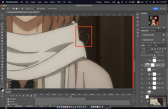
STEP 3: Put a layer mask on the group and use the rectangular marquee tool to make a box over the text you want to disappear:
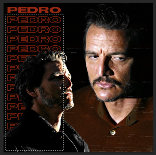
use the paint bucket tool to fill that area on the layer mask with black:

the outlined text should be hidden now
p.s. be sure to UNLINK the layer mask so you can move it with the keyframes (click the chain so it disappears):
STEP 4: put down 4 keyframes on the "layer mask position" line
(1) text group isn't visible (2) text appears (3) text still visible (4) text disappears:
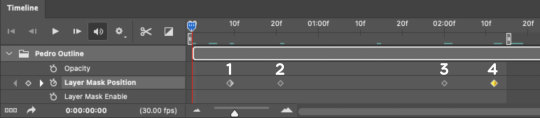
I placed my keyframes with some buffer space at the beginning and end so the animation wouldn't start right away:
if you're wondering, you need the 3rd keyframe so the text doesn't start disappearing at keyframe 2
STEP 5: select keyframe 2 (it'll be yellow) and move the playhead (red vertical line) over that spot. select your layer mask and move it down until your text is revealed


STEP 6: right-click keyframe 2 and select copy. then select keyframe 3, right-click it, and select paste. keyframe 3 should now have the same layer mask position as 2!

STEP 7: double-check that keyframe 4 has the same position as keyframe 1 (if something went wonky, just copy-paste 1's position onto 4)

and that's it! hope this helps :)
194 notes
·
View notes
Note
Hey, quick question (that I'm sending before I go to sleep) how do you draw those pool rooms /liminal spaces (poll edition) I can't figure it out and I saw that you did them and they looked really good!
Yo, you caught me at the perfect time!!! I haven't been active on Tumblr in a while due to mental health stuff, but here I am! Thank you so much for the kind words :]
I draw these as studies based on photos most of the time! Some of them are very closely referenced while others take a lot of artistic liberty
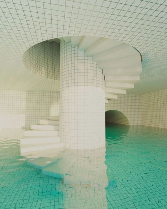

(The original poolrooms renders are by Jared Pike btw!)
I start by blocking out the background colors very simply. I don't use the straight line tool most of the time; imperfect lines are part of the charm. Just using your eye to lay out roughly where the shapes go, use edges & estimated perspective to create depth, and bucket fill in areas of color as you go
I slowly move toward the foreground and add the character at the very end- this usually makes them look out of place in the scene, which works great as an effect for a liminal space. Sometimes you don't need a character at all
The idea is to suggest detail without having to paint complex lighting! It also works for non-pool liminal spaces


I draw textured water by doing something like this:


It's deceptively simple! Sometimes I'll go back and add really thin white rings inside the bigger white circles for extra detail. I'm trying to minmax art to get impactful effects with the least amount of time spent. Some people might argue that makes it low effort or less meaningful, but some people might argue anything at all! Ultimately the value of art is what it means to you
My liminal series is based on really sporadic intense bouts of emotion which can't be refined over long hours without losing their original meaning. I work until I feel in my gut that it's done, no matter how "finished" it actually looks in the end. It might be 20 minutes or 4 hours


One instance where I recommend using the straight line tool is for making grid patterns!
For the glowing lights, I use a 'shine' or 'glow' or 'screen' effect layer (it might have a different name depending on your drawing program). Having everything be solid colorblocks except for a few glowing lights makes for some fun jarring contrast!
Pinterest has a really good selection of liminal space photography to study from, unfortunately a lot of it goes uncredited, but you can usually find the source with Google image search. I seek out liminal spaces that speak to me for some reason. The suburb ones represent the bloody paranoid failure of individualist imperialist America. Dark hotel hallways invite you into an unknown and uncertain future. The pool ones are both isolation and wholeness, comfort and discomfort, the pain on your skin when the water is a bit too cold despite the calm vibes of summer. Find what motifs speak to you, they'll mean something different to everyone

35 notes
·
View notes
Note
hihi!! im askin here bcz i dont wanna clog the nuzlight inbox n this seems like the best place to go-
i really LOVE the pixely artstyle you do for the blog and ive been wanting to try something like it, so ive been curious- how do you go about doing that? it looks a lot like your typical style but is there anything special you do? what program do u use for it? :Oc
heya!! i don't mind OOC asks on her blog !! do note i don't check this acc as often so u can also try @mspeevee since that one's logged in on mobile if u were looking fer a faster response~
as fer the pixel style, i use the binary tool on Paint Tool SAI!
here's a few other tools that make it a lot faster to do~


the first is my bucket tool/fill tool. normally i always use the shortcut Ctrl F to fill large sections with selection tool tho but this one helps with small areas and functions like how it would on Ms Paint~. Make sure to keep anti aliasing off! fer anyone who may not know, anti-aliasing is what makes a brushes edges softer, the pixels will have varying levels of opacity.
I also edit my magic wand tool for pixel work also. Working Layer means when you use the tool it will only take the layer it's on into account, where-as All Image means it treats the entire drawing as one layer even if separated. Transparency means the tool will select or fill based on the transparency of the drawing around it, but Colour Difference will look at the colours around it instead as its border. (if that's confusing you can always test it out~)
for the most part i also change my stabiliser to the maximum when doing lines with the pixel tool as it makes it very smooth, and the tips will be tapered well if i am using the pixel brush with pen pressure active. (S1 is my default cuz i have shaky hands sometimes)

as a tip for how i do Mia's images when they're actually so tiny, since resizing the image loses quality i actually zoom into the canvas 3x and take a screenshot. here's how it'd look in comparison: (og size, scaled up, screenshot)


if u have any specific questions or anything lmk too tho~ i love to share now!!
(and ofc there's also the binary colour layer mode! but i rarely use that)
#ask#my art#tut#still feel weird tagging anything as tutorial cuz i dont feel qualified but hey if u learn something thats cool !!#sorry i p much only use PTS ever since the dawn of time#i even refuse to upgrade it cuz last time i did that my tools worked SLIIIGHTLYY differently#ive been mad since#also because of that i dont have the text option on sai so i use this website for the text#if u wanted it lmk !#long post
9 notes
·
View notes
Note
Heloooo, I’m here for an request I hope you don’t mind - Do you have any tutorials on how to remove the background of a gif in photoshop??
(P.s- I love all all your works- they are the best)^^
hello! nope idm at all! and tysm~ (´。• ᵕ •。`)
i'm gonna assume that you're referring to something like these below (the main b&w scene of the gif on the left and the anime crop of the gif on the right) and not sth like recolouring backgrounds!


scene selection: i would usually go with static or more or less still scenes for these, just because it's much easier to mask. if you really wanna do a moving scene, it's not technically impossible it's just really tedious because you'll have to mask the scenes frame by frame which is... not fun _(:3 」∠)_
there are two main ways i go about doing these, depending on whether i'm removing the background of a live action show or an animation. the logic is pretty much similar, they differ in how you get rid of the stuff you don't want!
live action: BRUSH TOOL
this is how the scene looks like as it is - there's minimal movement here and it appears more or less static, but even so when i was doing this the movement of the gun was already problematic enough

with your gif layer selected, add a layer mask using this button here at the bottom

once your layer mask has been added, make sure you have your layer mask selected, then use the brush tool (B) and select a soft brush

brush over on the layer mask. you can use a larger size first to get rid of the easier and larger areas first, but as you go to tighter/ smaller areas, you can switch over to a smaller size

what it looks like in the end, before i've done by colouring and added in the other elements!
animation: (MAGNETIC) LASSO + MARQUEE TOOLS
the original scene with the background - absolutely no movement at all besides his mouth ✨ PERFECT ✨
again, add a layer mask, and with the layer mask selected, select the magnetic lasso tool. you might have to right click on the original lasso tool (L) and select magnetic lasso from the drop down, or if you're lazy and want to use shortcuts you can keep clicking shift+L to scroll through the lasso tool variations until you reach the magnetic lasso
then, start tracing out the area you want to crop out. with the magnetic lasso, you don't have to click anything; it will automatically lay down points that adhere to the lines based on the difference in colours like a magnet (hence, magnetic)
in some areas that are too tight or where the difference between colours is not large enough, you can still click to lay down a point so before the magnet does

trace out the whole area and close the loop. the magnetic lasso is not perfect; as you trace along, the magnet might lay down points at parts you don't want it to, but don't fret about that it can still be fixed!
TO ADD AREAS THAT ARE STRAIGHT (e.g. the base or top or sides): with your original selection still active, select the marquee tool (M), hold down shift, and mark out the area you want to be added to your selection. when you hold down shift, there will be a + sign on your cursor. remember to hold down shift!!! if you don't your original selection will disappear
TO ADD AREAS THAT ARE MORE ORGANIC (e.g. everything else basically): same logic as the marquee tool, but now you'll use the lasso tool (L) instead to draw out the area you want to add. again, as you make your selection, remember to hold down shift! in this screenshot here, the dotted lines indicate the original selection and the solid line shows the new selection to be added
TO REMOVE AREAS: similarly, with either the marquee or lasso tool, draw out the area you want to remove. this time, instead of holding down shift, hold down option (mac) / alt (windows) - not too sure for windows, i think it's this. this time, your cursor will have a - sign
once you're happy with your selection, use the paint bucket (G) to fill in the selected area on the layer mask
right click and invert the mask if you have to so that it shows the area you want

alternative to the above step, right click your selection and select inverse so that the selection goes from the area you want to keep to the area you want to remove

and similarly, fill in the area you want to remove with the paint bucket
OR if you had done your selection before adding a layer mask (this is what i usually do actually), just add the layer mask with your selection active and the layer mask will automatically remove the unselected area
LIVE ACTION VS. ANIMATION
just as an ending note, i usually use these different approaches bc live actions tend to have ~softer~ edges and outlines vs the background (like irl) so if i were to use the lasso/ marquee way of doing it, it's technically possible by adjusting the feathering, but it's a lot more tedious than just using a brush to block out the areas you don't want
you also very rarely have scenes that are absolutely still in live action shows unless you're giffing a non-animate object; living things tend to move around after all. so it won't look that good and clean if you have a very solid crop in a live action show (which is what you'll get if you use the lasso/ marquee method without any feathering)
meanwhile, animations tend to have very defined outlines and there are some scenes where your subject is absolutely still - just like the example i've used here. while it's definitely possible to use a brush with solid edges, imo it doesn't look as clean and nice and might end up being more tedious because you'll have to keep varying the size of the brush whenever you go from big to small areas, and it's much easier to accidentally eat into areas you don't want because the brush is round. (also, when you get to hair tips... it's a nightmare)
hope that answered your question!
76 notes
·
View notes
Note
how clean are you colors before you merge them into the lines for painting? because i cant seem to find a balance between "my god i need to do this whole thing from scratch (too sloppy)" and "well whats the point of painting here (nothing left to paint if i merged the lineart)". sorry if this doesnt make any sense idk how to word myself better sometimes
I think I get you! Honestly I have a kind of threshold I reach where I know that I’ve done all that I can on separate layers and if I were to keep them separate, I’d just be creating more hassle for myself/forced to select layers and keep everything properly organised and it becomes a drag when I’d just rather be painting. And this is usually because I want to take advantage of the mixing effect of Sai’s paintbrush tool to start blending stuff. Also all my colours are on one layer anyway from the beginning (if I need especially ‘clean’ colours I might have a layer for them but I always merge them to the main colour layer before continuing). (also sorry I am away from my pc for a bit so I can’t show you actual Sai screenshots.. you will have to imagine). I ended up writing out the whole process in a way which is probably unhelpful
So for a painting like that one in the last post, I do my lines. Then I close the lines with a separate layer in the same folder (because the lineart looks better with gaps, but i fill colour by selecting outside the lineart while the folder is active, inverting selection, and paint bucket tool. Then delete the layer that closes the lineart). Base colour is usually the most common one in the palette. When I plan to merge the lines I usually make them solid/normal layer mode and colour the lines exactly to match the colours beneath, which is tedious but helps avoid the kind of translucent look lines on multiply layer give. But for that one the lines are on multiply. I lock the colour layer and paint in the other colours - different markings, materials, etc. It can be pretty rough because I know I can just paint over a wonky looking edge, but not so rough that I will have to go over it excessively later. Then with the lines and colours still on 2 separate layers, I put them both in a folder and clip a multiply layer onto that for cast shadows. Paint in cast shadows (again, it’s pretty rough, I know I will be merging & touching up everything at the end so it doesn’t have to be perfect. I hate multiply as a way to shade but I wanted shadows fast, again like I said it was a sketch I over-rendered I didn’t plan to polish it up so much. Normally I choose shadow colours and paint them like normal in the colour layer).
Then I merged the folder and the multiply layer into one layer (i usually make a copy of the lineart to keep it intact, just in case, and keep it hidden in the psd file). I make a new layer and paint in details that need to be sharp - usually around the eyes and face, where there is a focal point. This is because the default paintbrush in Sai has a slight mixing effect, and if I went in on the same layer it would not be as sharp. I use this new layer to paint in areas that need this sharp contrast and clean, tapered lines - like the stray hair and fluffy bits. Then merge all. Now I paint over the main layer all the things that don’t need that sharp treatment, this time taking advantage of the slight mixing effect of Sai’s paintbrush - I like this effect a lot and it’s what I use to blend the lineart into the colours, you can kind of ‘pull’ the lines out a little into the surrounding colour to make them less stark. Then I clip a new multiply layer to it, all one shade, to dim the entire painting so that the stark white highlights stand out more, clip a new layer on that, do the white highlights, merge all and bam it’s done
79 notes
·
View notes
Text
It took me a minute to finally get my notes straight so I could answer this— I hope it was worth the wait! I’ll give some bullet points of tips I use to help boost my production speed in addition to the strategies I use to try to keep characters consistent. Let’s get into it!

First up: How I draw faster!
Note that these mostly apply to digital art, as that’s my preferred medium.
If your art program has them, experiment with brush stabilization levels. My hands shake really bad, especially while I’m drawing, so I put a lot of effort into finding a stabilizer level that works with my need to control lines while also smoothing out the tremors in my hands. It’s made it so much easier to draw lines like I want to, and therefore lets me move on instead of redrawing the same line over and over again.
Creating templates for your art helps so much— setting up things like canvas size, color profile, DPI, background colors and images like the paper texture PNGs that I love to use ahead of time helps me get drawing faster, while I’m excited and inspired! Similarly, having a naming system for your art files is useful for speed as well as finding and organizing old pieces easier.
Having premade color palettes of local colors for characters is also super helpful for speed, as well as keeping characters on model :>
Personally, I use a single brush for lineart and rely on the selection tool and bucket fill for coloring when I actually bother to color things in. My lines are pretty loose nowadays, and the same goes for when I color things— I don't abide exactly by the lineart I draw, and get pretty messy with the selection tool and bucket fill!
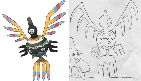
I simplify character designs as much as possible— the standard design of a sigilyph, for example, is pretty complex. But I made Sen a lot simpler (and also forgot the spikes on her torso in this panel. Oops)
As for keeping characters on-model…
I’m very flattered that you feel otherwise, but I actually don't keep characters very on-model between different drawings— just look at the different ways I've drawn Ark below— however, I'm improving over time as I become more familiar with how I want to draw the characters! A big part of my process of keeping characters on model is drawing characters over and over to familiarize myself with how they should look through trial and error.

Learning common angles and poses I will draw characters in is very helpful for making sure they look consistent. As a bit of a downside, though, it makes wonkier angles stick out like a sore thumb! Drawing Ark with his head slightly angled downward was really hard, and I don't think I communicated it that well here:
I try to have the characters broken down into as many simple shapes that fit into each other as I possibly can, like Twig’s head (circle + rectangle snout + angled rectangle horn) Ark's hair (that weird bangs shape) and Dusknoir's upper body (beanbag shape / slightly elongated circle torso, arms coming out of his frill that comes in a very particular arcing line). This makes it way easier to draw characters quickly and consistently, because I can learn those lines and shapes and get the motion of drawing them into muscle memory.

Also, knowing the ways characters emote is like knowing cheat codes. Giving characters things like a signature comedic expression of shock or grin that they make when they're happy are very helpful!
The biggest tip I can give on the topic of keeping characters on-model (at least without model sheets— model sheets are THE way to go. Don’t be like Sofie and neglect those pieces of gold) is really just to practice. Build up familiarity with the shapes and proportions of characters, get a feel for how your hand and wrist moves to get the lines right.

#creativity tips with sofie#art tips#drawing tips#drawing advice#art advice#stuff by sofie#sofie answers asks#(kinda)
21 notes
·
View notes