#what is css grid
Explore tagged Tumblr posts
Visit Tumblr Blog
Explore Tumblr blogs with no restrictions, modern design and the best experience.
Last Seen Tumblr Blogs


Fun Fact
The most popular pages on Tumblr are about Minecraft, GIFs, and David J. Peterson.
Text
Hello audience. Unfortunately, I am still on my break. However, I am happy to announce that I am still alive and kicking. In fact, I decided to make use of my unemployment and revisit HTML, CSS, and JavaScript to create... A visual novel.
Good News: code is 100% reusable because I used a JSON (i do not know how that works, someone can kindly explain to me...)
Bad News: this code sucks ass, and NOTHING works except playing the story. Transitions? Doesn't work. UI/UX? Ass. Effects? Hell no... Also, 70% of the features aren't present yet I'm gonna do it later.
Oh, this is CrossDust, if you can't tell.
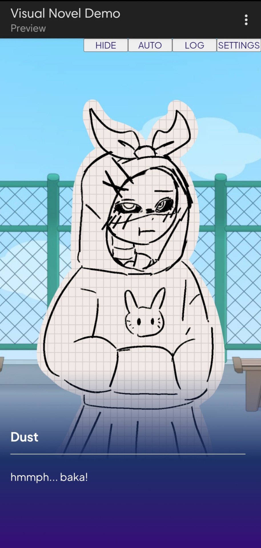
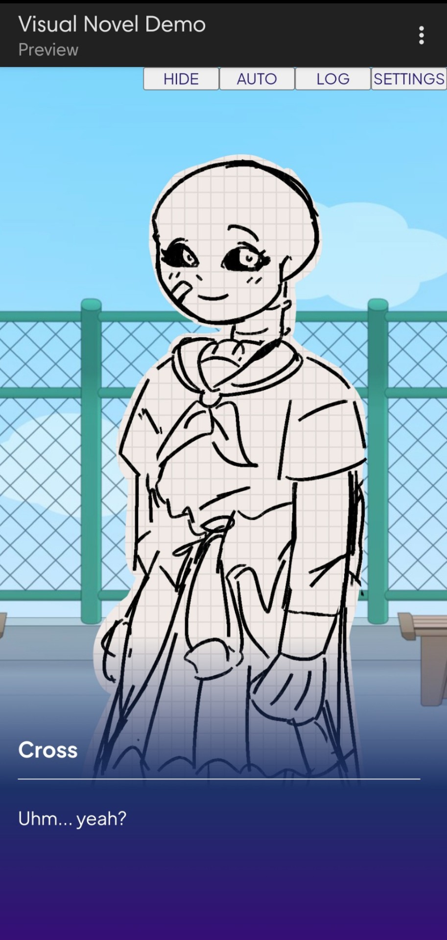
Dust Sans by Ask-Dusttale, Cross Sans by Jakei
I'm gonna respond to asks and do requests later (After my break is over). This is just a small update teehee.
#dsevalyappuccino#TIME TO GO INSANE IN THE TAGS!!#i hate css#i still hate css#css hell no#guys why is css so hard. ive literally been doing this for months and css is still hard#i was about to use css spritesheets for the sprites and emotions#but my ass gave up and instead i just use seperate images#GUYS!!! DISPLAY: FLEX 💪. DISPLAY: GRID?!?!#javascript i hate you tooq#i hate java script naurrrr#what do you mean DOM objects#what do YOU MEAN#also i do not understand error handling and JSON integrations#papaGPT doesn't explain anything#i don't know what I just wrote#coding???????????#kids don't be unemployed#actually maybe if you're unemployed but still making money that's great#also the sprites are just for testing purposes im probably gonna make new better ones if i chose to expand this into#a full blown anime high school visual novel project#i don't wanna think of all that story crap but then again i can just write the cringiest thing on earth
23 notes
·
View notes
Text
the flexbox isnt doing what i want....!!!

#css#grid would be better but i need the space to the side to be able to disappear if nothing is in it omggg#i feel like what im doing should be feesible#flex works but only if i dont define the width of the container i need to be able to collapse when empty#omg omg#im done#it looks fine enough for now#but ill try again later#my god#codeblr#webdev#i just wanna make the container to the left slightly smaller when the screen is small orz#i cant do that apparently#it might be a tailwind issue too#like its too complicated for it#or i need to read 500 things to figure it out
2 notes
·
View notes
Text
Hello fellow FFIV lovers!
In just about a month, on July 19th, we will celebrate the 34th anniversary of that wonderful game. To celebrate, I would like to offer you a little help to get the creative mind running ~
This website will generate for you a Bingo sheet, customized based on selected elements and prompts. With this, you can create a grid of bits of inspiration to use for writing, drawing, anything you can think of! There are characters, places, elements specific to the game, themed prompt, writing or painting challenges...

I offered a few way to play but to celebrate this coming anniversary there's one I particularly have in mind. Creating a 6x6 grid gives you 18 pairs of prompts... Enough to cover from July 1st to the special day ! One day, two square checked, one piece of fanwork, until the grid is filled.
Of course, you don't have to use that. No matter what you make of this website, I would love to see the kind of grid you create and the fanwork that comes out of it!
To hype ourselves for the incoming anniversary, you can tag all your grids and works with #FFIVbirthday2025 !
And watch out for @wordlesslyjenneh's blog as july comes for more FFIV love and hype ~
(Finally: I'm all open to improvement suggestions, additional prompts, ideas... unless it's on the visual end. Don't make me touch more CSS.)
27 notes
·
View notes
Text
learning to code!
When I was 9 years old, I learned enough html to code neopets pages, my own geocities websites, and I even made forums on my own sites so my friends could all roleplay together or rant together lol. And then? I forgot so much. I no longer no how to make a forum, or even a 'next page' button - so even the dream of just making a simple blog or webnovel site feels like a huge hurdle now. (9 year old me could probably figure it out in 2 hours).
So I'm relearning! I figured this would be a fun post to place resources I find for coding, since there's coding languages, and I figure maybe if you like running you're blog then you also might be interested in tools for making blogs!
First, for those of you who miss the old geocities and angelfire type of sites to make your own free site on: neocities.org
You can make free sites you can code yourself, the way 9 year old me did. A lot of people have made SUCH amazing sites, it's baffling my mind trying to figure out how they did, I definitely wish I could make an art portfolio site even a fourth as cool as some of the sites people have made on here.
And for those pressed for time, who aren't about to learn coding right now: wix.com is the place I recommend for building a site, it requires no coding skill and is fairly straightforward about adding pages or features by clicking buttons. I used it to make my art portfolio site, I am testing out using it for my webnovel - the alternative is Wordpress, but wix.com is letting me basically make a wordpress blog Inside my own site. It's very beginner friendly in terms of "how the fuck do I set up a 'sign up for updates' message and have my site actually email these people my novel updates?" and "I need a 4x20 grid of my art down the page, that lets people click the art to see it's information and make it bigger."
I did neocities.org's little html tutorial today, it's the part of html I DID remember (links, paragraphs, headers).
My next step is to go through htmldog.com's tutorials. They go from beginner, to intermediate, to CSS. Unlike many a coding tutorial I've seen, they explain what program on your computer you need to WRITE the code in and then how to save it and how to open it. (You'd think this isn't a big deal but I've been looking into how to learn Python for months and I can't find a tutorial explaining what fucking program to write my python in... notepad? do I need something else? I don't fucking know!! My dad finally gave me a printed textbook which supposedly tells you what to download to start... I learned C++ in college and for that you needed Visual Basic to code C++, so I figured I needed Something to Write the fucking python IN.)
#coding#rant#wooh my new CODING TAG#learning to code#i feel very. odd if im honest?#i genuinely knew how to build full fucking forum websites as a child including user sign ups#and i studied Computer Science Engineering in college so i did everything with C++ we were asked to and got As#and then i promptly BLOCKED IT OUT because i#HATED studying c++ SO fucking much. i hated my whole major. i did not like Engineering. i hated it. i was so mentally destroyed#by my college major that when i graduated i got a DIFFERENT job#and do NOTHING related to my major#i want to get into a more tech focused career eventually...since that is what my fucking degree is in#but i've been looking into something with less coding OR trying to teach myself#to like coding as long as its not fucking c++ again... i cant do it. too many bad memories#i think cybersecurity sounds like a fun job.#but u know me. im a person who likes knowing the BASICS#so i feel like i need to Relearn to code and learn python decently#before i try to study cybersecurity specific shit
36 notes
·
View notes
Note
it seems like my ask from a few days ago didn’t get sent 😭 argh stupid tumblr
i was basically asking there what resources you would recommend for everything that could be useful for neocities,, like html, css,,(and you mentioned java script i think?) especially beginner-beginner stuff and then maybe for intermediate 👉👈 i know you probably have all those on your blog already but you know me in a bit 😵💫
also yes i’d love to work on ours together, even if we didn’t make them match! cause you know you have millions of brilliant ideas :33 🌻🌻💛
Hiya,
These are the stuff I used / still use, hope it's useful:
W3Schools
Mozilla Developer Network (MDN)
Codecademy
freeCodeCamp
Khan Academy HTML/CSS Course
Shay Howe's HTML and CSS tutorial
HTML Dog
CSS-Tricks
CSS Layout
Flexbox Froggy
Grid Garden
CSS Zen Garden
CSS Animation
Try them out and see what works best for you! 👍🏾
#my asks#resources#coding#codeblr#progblr#programming#studyblr#studying#comp sci#computer science#programmer#html css#html#css
357 notes
·
View notes
Note
sorry if you’ve answered something similar before but how do you format things for your website? in the collections you have for poems
i love how it looks. the book kind of format it has
and i want to do similar/the same formatting for my own works but im really struggling…
i've been asked stuff like this a lot and i don't mind explaining it often because i want people to make websites more. i made a tutorial video at some point but it's kind of hard to make a curriculum or tutorial or whatever around this kind of thing because it's really just a self expression thing. i'll try to break down as much of my thought process as makes sense.
i design my pages in photoshop with either double/single page display in mind and then i use html to set them next to each other. most of the choice here comes down to how overwhelming i want my designs to feel. in the case of the lonely leaver page, the entire book was designed to be something that could be a physical book, and so from the getgo i made the pages in that kind of format. i previewed things in acrobat which has a booklet view mode (which singles out the front and back cover around the contents of the file) & allows you to process double page view as well. as for the actual process in photoshop before that point, i typically will open a canvas that is the size of the full 2 page spread (i.e. 8 inches wide for 2 pages which are both 4 inches wide) and i set grid lines for bleed margins and to mark the center of the page so that i can make the composition something that im comfortable with having a gap in the middle from the book folding. with lonely leaver i had to reformat about half the book at some point because i wanted to make it a larger resolution which was annoying but i just keep my guidelines for a print size in mind while im working. often if im a certain amount of time into a project that i feel like i will be spending a lot more time with i'll create a dummy psd file at this point which is devoid of content but which has all of the margins/resolution stuff set up already so i can just open that up and save a different version of it when i'm done.
my actual writing process and my design process is generally extremely intertwined, that's why things tend to be varying degrees stream of conscious in my work i think. i'll for instance, have a thought im stuck on for several days, and then open photoshop without having a poem or comic in mind, but i'll fill the canvas with some kind of color like red or yellow or a photo or whatever, and then open a text box or start drawing. telling a story through composition (i.e. page layout itself) is generally my favorite aspect of art and design because i enjoy how violent and dramatic framing angles can make the content of a piece feel so i'll try to move stuff around as much as possible in order to get my desired effect, often times using place holder shapes in lieu of finished design elements in order to get a rough blocking. as i do this i tend to react to what i'm writing/making as i'm doing it, and i do a lot of selective self editing during this part. for instance, i'll start manipulating rasterized text or cutting around images or whatever. i'll reread and look at whatever im doing for a couple of hours and then when i'm done with a spread or whatever i will save the document as a psd with a combined full spread and then each page separately as pngs or whatever (split at the middle grid line, back to the example, i'll save 2 different 4 inch wide images by changing the canvas size).
when it's time for me to put stuff on my website i then batch convert whatever pngs i exported into webp's because they load faster and take up less space on the server/my computer. you can look at my direct html/css files in your internet browser's explorer mode to see exactly what i do but essentially i just have either 1 or 2 images in a block and then a series of repeating vertical blocks containing images. i don't have an extremely efficient way of uploading pages and i'll typically just copy the same
"<p><img src="01.png"> <p><img src="02.png">"
like, 30 or 40 times or whatever into a html document. i use visual studio code for this stuff because it lets me do a bunch of stuff like having several files open at once & the navigation pane is nice & there's a live server extension that automatically refereshes the html file in my web browser on file save which is really awesome. i have a css page that i made like, 5 years ago, and i usually just link new projects to that because it has a bunch of different settings in it which i'll toggle on or off depending on the needs of whatever page or i'll add new div id's to it. it's kind of messy at this point, but it gets the job done. i use filezilla and something like bluehost or something for webhosting/file management.
i arrange and organize all of my art extremely methodically so usually in my like "<root catch all poetry folder>" inside of my "<root catch all art folder>" there will be a "<name of specific poem book>" folder which just contains the poems named by their actual name e.g. "dedication to saint eulalia 4.png" and then another folder inside of that is called "paginated" where i, using the acrobat document i arrange stuff in as reference, rename copies of my pages which i have placed in that folder to be named things like "01.png" so that i can then manually flip through it sequentially in the windows photo viewer and also just so that i don't have to go through the arduous process of renaming and tracking stuff inside of the root folder i'm containing that project's files in.
i'm 26 now and i made my first website when i was like 18, and my first zine project and i'm tired of feeling feeling around that same time, so i've got like, coming up on a decade of trial and error behind this and this is generally what has worked for me. my website isn't super complicated and mostly just gets the job done but because i try to think about style and presentation up front with whatever projects i'm doing i tend to just make plans based around that as early as it makes sense. to me having a website for art presentation has always been the Primary Method and intended landing zone for my art so it's genuinely always been a consideration in my process to try to plan around how i will put it on my website. i do this because i believe having my own curated space for containing my art allows it to exist in a context which best heightens whatever message i'm trying to convey. if there's an issues with my website right now they are that i'm very bad at mobile browser formatting & i havent updated the main look of the website in something like 4 years barely at all.
anyway, at the end of the day i think really as long as you can identify whatever your intentions are and do some planning/problem solving around that you should probably be able to find your own method which works for you better than mine might but if you do just want to copy my website the tools to do so are within your brain and internet searches and i believe in you. i think the biggest strength of my website is that it shows how easy it is to just put art big as fuck on a webpage and how effective that kind of minimalism can be. i just want my website to be like a museum's walls. and it's not super complicated to get to that level of html knowledge.
11 notes
·
View notes
Text
There is something very weird about the relatively short nature of the culture surrounding website creation. As in, like, internet-user-created websites have been around for like 30-31 years at this point, and the culture surrounding them has changed so very much.
People used to create websites left and right for their own needs, their little shops and their little blogs about what they liked. Some websites of course housing horrible content since their dawn, and some being as mundane but as unique as the person behind its code. I have seen older sites, archived, that promoted creating your own site, and that was interesting to see. That culture of creating your own website and of sharing that knowledge on a still-growing facet of communication.
And then at some point social media appeared, and that was interesting, because now everyone was able to quickly present themselves without the need of a website, but that didn't mean people stopped making websites. I mean, hell, Geocities died in 2009, so a lot of people were creating their own websites for free before that time, no need to pay for domain names or hosting. And even without Geocities, there were other website hosting things that yes, while not as customizable, were still a resource for people to work with them. There's still a website floating around that I made when I was a kid using one of these services. Cool stuff.
All this to say that I do feel a weird sense of dread looking back and cross-referencing with the present and seeing things like "website creator powered by AI" and shit like that, because just ?? How did it go plummeting so quickly. There is a weird feeling of having lost a developing culture to corporations making quick access to posting things that, as corporations' nature dictates, are used to sell data or to train models or what have you. Similarly, we get pretty same-y looking pages because of the need to be slick or whatever with designs that just leaves everything looking the same. ALSO, the loss of spaces for kids, or just the gradual lowering of them in favor of cocomelons and whatever else the devil's machine has spawned is like watching an apple decay before having ripened. I do feel like there is this phenomenon in which how to make a site has been lost in the notion of "making a website falls into the realm of evil and scary coding and I could never be a programmer, plus who would look at it, plus we have tools to make them," etc etc etc. Here is a little secret: website creation is not exactly hard to pick up at all. You might say it's very similar to using a rich text editor like Word or a notes app or whatever you use. Similarly, have you used markdown for things like messages or D iscord messages, you know, with the asterisks for bold text and the likes? Markdown is based on html's structures. And truly, you do not have to even learn to code using Javascript if you don't want to, you can just go full html + css and structure your things as you go, adding your little images and your updates. Because guess what !! Html and css are not programming languages, they're a markup language and a stylesheet language respectively, which is a fancy way to say "you make the structure of your page with the first one and make it pretty with the second one". This includes cool stuff like tables, lists, grids, colors, transitions, etc. All of that without any programming. (That being said, if you are interested in programming, Javascript isn't too bad to pick up. The language itself *is* kind of evil, but using it in conjunction with html is not too difficult). I do have to say though, I am glad that there is a push to making your own websites and things, especially with Neocities sprawling a huge community of avid website creators, as well as the huge amount of tutorials and stuff making the push forward with making sites and online spaces and experiences more widely available. Hopefully this becomes a trend that keeps going up, considering the state of seemingly every single social media that has existed since the 2000s- 2010s.
#web#website#old web#dog discourse#ramblings#internet#computer#tech#but for real what the fuck#it's very bizarre to see this just pop in and out
7 notes
·
View notes
Text
webdev log 2
implemented a gallery. I originally wanted it to be more grid-like but I decided I didn't want to mess too much with that, and I like the simple look anyways. forces you to really take in every shitty drawing.

it features a search function that only works for tags. its purpose is mostly just to search multiple tags, because I couldn't be fucked to add a feature where you could click on multiple tags there at the tags list at the top. it lists out all used tags in the table that stores art so you have an idea of what there all is.

at the bottom there's pagination. it's INSANELY easy to do with this framework I'm using. I was gushing about it to my partner on call!! they made fun of me but that's okay!!!!

anyways, clicking on the date underneath the drawing takes you to a view with the image itself (a kind of "post", if I can call it that) here you can view comments and leave one yourself if you so desire. guests are NOT allowed to reply to existing comments because I'd rather things not get too clogged up. I can't stop anyone if they did an "@{name} {message}" type comment, but I don't think anyone is gonna be chatting it up on my site, so idc. I just want it very minimal, and no nesting beyond one single reply.

of course, you can comment on story chapters too so here's what it looks like for a user (me). of course, if a user (me) posts then it gets automatically approved.
the table that stores comments differentiates story comments and art comments with foreign keys to the primary keys of the the chapter and art tables. it's a little convoluted and I kind of wish I didn't do it this way but it's too damn late isn't it. but honestly it might've been the only way to do it. the problem is just repeating code for both chapter and art views.. making a change to one means I gotta manually make the same change to the other. huge pain..

added user authentication and a really shitty bare bones dashboard for myself to approve/reject comments directly on the site in case someone comes along and wants to be mean to me :( rejecting a comment deletes it OFF my site forever. though I kind of want to be able to keep hate mail so I dunno.. oh, and also a big fat logout button because I have nowhere else to put it.
I'll spare everyone the more technical ramblings.
anyways, I'm hoping to add more things later. these are my plans:
allow users (me) to post stories/art through the site itself instead of doing it manually in the vscode terminal for every. single. story. and drawing. (probably took me 6+ hours total just doing this. I don't know why I did it.) (btw this consists of writing commands to store information via the terminal. also, sql and similar databases don't store things like markup or even line breaks. I had to alter all my stories and put \n every time there was a line break... and you have to escape apostrophes (or quotes, depending on which you use) so every "it's" had to be made into "it\'s" HUGE. PAIN. I didn't do this manually obviously but sifting and plugging my stories into character replacers was so time consuming)
delete comments button.... For my eyes and fingers only
make an About page. I've been avoiding all the fun things and doing just the scary stff
figure out SSH stuff...
clean up the shitty css. I refuse to use tailwind even tho it's trying to force me.. I don't want some sleek polished site I want it look like it's in shambles, because it is
but yeah thanks for reading about my webdev and coding journey. even though using the laravel framework made things a thousand times easier it's still a crazy amount of work. let's say building a site completely from scratch means buying every material and designing the house yourself, and using a website builder like wix is just like buying a pre built home and you're just decorating it. using this framework is like putting together a build-your-own-house kit. you're still building a fucking house.
I feel crazy. it felt like the site was close to breaking several times. been sleep deprived for several days working on this nonstop I think I'm getting a little sick 😵💫
going to bed now. it's 9 am.
6 notes
·
View notes
Note
Hiya! I found your blog through your neocities website! I was wondering if there’s any tips or things you read/watched that help you make your site. (Im heavily considering making one of my own neocities site it just seems fun)
hihi welcome !! i have quite a few pieces of advice, but the tldr is you should come up with an idea for what you want to make beforehand, and look up how to do each piece! your knowledge will start to fill in along the way :]
(this is probably gonna be long as hell so under the cut is all of the fun stuff /silly)
the way i personally started off was by sketching out what i wanted my site to look like! if you know what you want before you begin, you'll know where to look to figure out what you need to do. html+ css are extremely easy languages to read/write once you know what to look for!
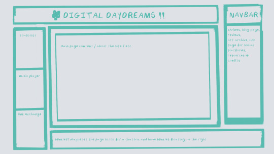
^ this was the original sketch for my site, where i planned out everything i wanted to include. it's a bit different from what actually ended up on the site, but that's alright! it's just about having an outline to work from. i think of it like outlining before you write, it feels like such a pain in the ass because u just wanna start working NOW but u will thank yourself later for taking the time to plan.
once you know what you want to make, start looking for tutorials and resources to make it easier! the grid for my homepage and some of my other subpages was made using a css grid generator, since its one of the more confusing bits of css. you can make grids without it, but its a very easy way to make a more asymmetrical design if ur using the generator!
thats linked here, it gives you some css to put in your head or css sheet, and then the html for the different boxes to slap in your main document. it can be easier to understand what itll look like if you give each one a border while you work, even if its just temporary!
when looking for information about css and html, w3schools is your best friend. its a pretty comprehensive database of every little piece of html + css you could ever need, with examples you can play with yourself to understand what each variable does! it's been a lifesaver for me, ive watched basically zero video tutorials because everything on there is explained so well and you can find basically Anything.
they even have code snippets for things that take more than one or two lines of code, which you can use and adapt yourself! (the tooltips on the official art + my art sections on the hinata shrine were adapted from a tutorial on there!)
in general, having a plan and working from there will make ur life so much easier. the pages that ive sketched out beforehand or ive had a very clear vision for have been WAYY easier to code than the ones i tried to come up with on the fly, and ive been much happier with how they've turned out as well. though i do also have some smaller, rapidfire tips as well that ill go thru now!!
— inline css (the style="" tag) seems so so useful but really should only be used when you're resizing images like buttons. when u keep all of your css in the head or in a seperate document, its way easier to debug and read later. i cleaned up my homepage recently by removing all of the inline css and looking at the code stresses me out WAY less because i can actually read it LOLOL ... plus cutting the css out and putting it in its own document made me realize that id accidentally wrote some really weird code in some places
— this is very much 'do as i say, not as i do,' but use an external editor (like visual studio code) instead of editing live on neocities! you can set up a live preview, and generally wont be pushing out 100 updates every single time you change or add something. i tend to code directly on neocities but its a bad habit and i want to break it eventually v_v
— if you really like an effect someone else has on their site, you can peek using inspect element i promise the coding police won't get you !! dont steal code line for line, but you can figure out what theyre doing and put your own spin on it. things like border images can be really cool, and i only figured out about them because i looked at what someone else was doing and figured out how to adapt it for my own site! check linkbooks and credit sections as well, a lot of people will include links to any effect they didnt make themself or got help with. (including me! the credits section of the linkbook has a ton of little things i got from other places, including a really neat little music player, the rss feed for my status cafe, and the wobbly text on the homepage!)
— most stuff in html and css basically just... says what it does in the tag. so looking stuff up for it is extremely easy! if you've used carrd before you honestly probably already know more abt html than u'd think just intuitively. when ur adjusting the margins or padding in carrd, you're adjusting the margin: and padding: properties in the css of the website it's outputting!
this is getting way too long but!! my best advice is to just get started. you'll never be able to learn without trying, and it genuinely is so fun to have something that's truly your own!
(if u have any specific questions im happy to answer anytime as well! i love talking abt neocities, its a super fun hobby and way easier to pick up than u would think!)
#originals.txt#inbox.txt#neocities.zip#god im so sorry abt how long this is i havent had time to work on the site for a while and its getting to my head /silly
6 notes
·
View notes
Text
CSS: Flexboxes
I am working on the 'Tea Cozy' project that is part of CodeCademy's 'CSS: Flexboxes and Grids' course.
I just have to be really honest and say...
Learning flexboxes is kicking my butt!
There, I said it. I spent hours working on this project while getting a whole lot of nowhere. Everything I did seemed to somehow make my code worse, and it made me want to scream *just a little anyways*.
This morning, after spending some more time on it, I decided that I needed to look at this project as a way to learn instead of as a way to test my existing knowledge.
Bearing this in mind, I decided to do something no web developer wants to do... I opened up Visual Studio Code, selected each and every last line of my code, and deleted it. Hours of work gone in an instant *cries*.
While it sucked to do that, I can genuinely say that I have learned way more by changing up my goal with this project. I've done way more research into how flexboxes work and learned how to do things I couldn't do before. Though I've been following along with a tutorial as well, there were quite a few things that I wanted to set up differently which has forced me to experiment with different HTML and CSS code.
My project isn't done yet; there's still some sections I need to add as well as some styling changes I need to make to the existing code. But if you'd like to check out my code and what the web page looks like at the moment, you can check out my GitHub repository here!
2 notes
·
View notes
Text
Yet Another Anchor Positioning Quirk
New Post has been published on https://thedigitalinsider.com/yet-another-anchor-positioning-quirk/
Yet Another Anchor Positioning Quirk
I strongly believe Anchor Positioning will go down as one of the greatest additions to CSS. It may not be as game-changing as Flexbox or Grid, but it does fill a positioning gap that has been missing for decades. As awesome as I think it is, CSS Anchor Positioning has a lot of quirks, some of which are the product of its novelty and others due to its unique way of working. Today, I want to bring you yet another Anchor Positioning quirk that has bugged me since I first saw it.
The inception
It all started a month ago when I was reading about what other people have made using Anchor Positioning, specifically this post by Temani Afif about “Anchor Positioning & Scroll-Driven Animations.” I strongly encourage you to read it and find out what caught my eye there. Combining Anchor Positioning and Scroll-Driven Animation, he makes a range slider that changes colors while it progresses.
Amazing by itself, but it’s interesting that he is using two target elements with the same anchor name, each attached to its corresponding anchor, just like magic. If this doesn’t seem as interesting as it looks, we should then briefly recap how Anchor Positioning works.
CSS Anchor Positioning and the anchor-scope property
See our complete CSS Anchor Positioning Guide for a comprehensive deep dive.
Anchor Positioning brings two new concepts to CSS, an anchor element and a target element. The anchor is the element used as a reference for positioning other elements, hence the anchor name. While the target is an absolutely-positioned element placed relative to one or more anchors.
An anchor and a target can be almost every element, so you can think of them as just two div sitting next to each other:
<div class="anchor">anchor</div> <div class="target">target</div>
To start, we first have to register the anchor element in CSS using the anchor-name property:
.anchor anchor-name: --my-anchor;
And the position-anchor property on an absolutely-positioned element attaches it to an anchor of the same name. However, to move the target around the anchor we need the position-area property.
.target position: absolute; position-anchor: --my-anchor; position-area: top right;
This works great, but things get complicated if we change our markup to include more anchors and targets:
<ul> <li> <div class="anchor">anchor 1</div> <div class="target">target 1</div> </li> <li> <div class="anchor">anchor 2</div> <div class="target">target 2</div> </li> <li> <div class="anchor">anchor 3</div> <div class="target">target 3</div> </li> </ul>
Instead of each target attaching to its closest anchor, they all pile up at the last registered anchor in the DOM.
The anchor-scope property was introduced in Chrome 131 as an answer to this issue. It limits the scope of anchors to a subtree so that each target attaches correctly. However, I don’t want to focus on this property, because what initially caught my attention was that Temani didn’t use it. For some reason, they all attached correctly, again, like magic.
What’s happening?
Targets usually attach to the last anchor on the DOM instead of their closest anchor, but in our first example, we saw two anchors with the same anchor-name and their corresponding targets attached. All this without the anchor-scope property. What’s happening?
Two words: Containing Block.
Something to know about Anchor Positioning is that it relies a lot on how an element’s containing block is built. This isn’t something inherently from Anchor Positioning but from absolute positioning. Absolute elements are positioned relative to their containing block, and inset properties like top: 0px, left: 30px or inset: 1rem are just moving an element around its containing block boundaries, creating what’s called the inset-modified containing block.
A target attached to an anchor isn’t any different, and what the position-area property does under the table is change the target’s inset-modified containing block so it is right next to the anchor.
Usually, the containing block of an absolutely-positioned element is the whole viewport, but it can be changed by any ancestor with a position other than static (usually relative). Temani takes advantage of this fact and creates a new containing block for each slider, so they can only be attached to their corresponding anchors. If you snoop around the code, you can find it at the beginning:
label position: relative; /* No, It's not useless so don't remove it (or remove it and see what happens) */
If we use this tactic on our previous examples, suddenly they are all correctly attached!
Yet another quirk
We didn’t need to use the anchor-scope property to attach each anchor to its respective target, but instead took advantage of how the containing block of absolute elements is computed. However, there is yet another approach, one that doesn’t need any extra bits of code.
This occurred to me when I was also experimenting with Scroll-Driven Animations and Anchor Positioning and trying to attach text-bubble footnotes on the side of a post, like the following:
Logically, each footnote would be a target, but the choice of an anchor is a little more tricky. I initially thought that each paragraph would work as an anchor, but that would mean having more than one anchor with the same anchor-name. The result: all the targets would pile up at the last anchor:
This could be solved using our prior approach of creating a new containing block for each note. However, there is another route we can take, what I call the reductionist method. The problem comes when there is more than one anchor with the same anchor-name, so we will reduce the number of anchors to one, using an element that could work as the common anchor for all targets.
In this case, we just want to position each target on the sides of the post so we can use the entire body of the post as an anchor, and since each target is naturally aligned on the vertical axis, what’s left is to move them along the horizontal axis:
You can better check how it was done on the original post!
Conclusion
The anchor-scope may be the most recent CSS property to be shipped to a browser (so far, just in Chrome 131+), so we can’t expect its support to be something out of this world. And while I would love to use it every now and there, it will remain bound to short demos for a while. This isn’t a reason to limit the use of other Anchor Positioning properties, which are supported in Chrome 125 onwards (and let’s hope in other browsers in the near future), so I hope these little quirks can help you to keep using Anchor Positioning without any fear.
#amazing#amp#anchor positioning#animation#animations#approach#Articles#attention#browser#change#chrome#code#colors#comprehensive#CSS#eye#fear#focus#Future#game#gap#grid#how#inset#it#Method#One#Other#positioning#Read
3 notes
·
View notes
Text
How to Create Mobile-Friendly Websites with Responsive Design
In today’s digital era, where mobile devices dominate web traffic, creating mobile-friendly websites has become more important than ever. As users increasingly access the internet through smartphones and tablets, businesses must ensure their websites are optimized for a seamless mobile experience. This is where responsive design comes into play. At Nividaweb, a leading responsive web design agency in Vadodara, we specialize in crafting websites that look and perform flawlessly on any device.

Here is a comprehensive guide on how to create mobile-friendly websites with responsive design:
What is Responsive Design?
Responsive web design is a design approach that ensures a website's layout and content adapt dynamically to different screen sizes and resolutions. Whether your users are browsing on a desktop, tablet, or smartphone, a responsive website delivers a consistent and user-friendly experience. This adaptability is essential for improving user engagement, reducing bounce rates, and enhancing overall website performance.
Why Responsive Design Matters?
Before diving into the how-to, let us understand why responsive design is crucial:
Improved User Experience: A responsive website ensures that users can navigate and interact with your site effortlessly, regardless of their device.
Higher Search Engine Rankings: Search engines like Google prioritize mobile-friendly websites in their rankings, making responsive design a key factor in SEO.
Increased Conversion Rates: With a user-friendly interface, responsive websites encourage visitors to stay longer and take action, boosting conversions.
Cost-Effective Maintenance: Instead of maintaining separate websites for desktop and mobile users, a responsive design simplifies updates and reduces costs.
Steps to Create a Mobile-Friendly Website with Responsive Design
1. Start with a Mobile-First Approach
The mobile-first approach involves designing the website for smaller screens first and then scaling up for larger devices. This method ensures that the core elements are optimized for mobile users. A responsive web design company in Vadodara like Nividaweb emphasizes this approach to ensure a seamless user experience on all devices.
2. Use a Flexible Grid Layout
A flexible grid layout is the foundation of responsive design. It allows website elements to adjust proportionally based on the screen size. Instead of fixed-width layouts, use percentages and relative units like ems or rems to define dimensions. This ensures that your website adapts smoothly to different screen resolutions.
3. Optimize Images and Media
Large images and media files can slow down your website, especially on mobile devices. To enhance performance:
Use responsive images that scale according to screen size.
Implement modern image formats like WebP for better compression.
Use CSS media queries to serve appropriate image sizes based on the user’s device.
At Nividaweb, a trusted responsive website design company in Gujarat, we leverage advanced tools to optimize images and improve loading times.
4. Implement CSS Media Queries
CSS media queries are essential for responsive design. They enable you to apply specific styles based on the device’s characteristics, such as screen width, height, or resolution.
5. Prioritize Touch-Friendly Navigation
Mobile users interact with websites using touch gestures, so it is essential to design navigation that is easy to use. Key considerations include:
Larger buttons and clickable areas.
Simplified menus with collapsible options for smaller screens.
Avoiding hover-dependent features, as they do not work well on touch devices.
6. Test on Multiple Devices and Browsers
Testing is a critical step in creating a mobile-friendly website. Use tools like Google’s Mobile-Friendly Test and browser developer tools to simulate various devices and screen sizes. Additionally, test your website on physical devices to identify and resolve any usability issues.
7. Ensure Fast Loading Times
Mobile users expect websites to load quickly. A slow-loading site can lead to higher bounce rates and lost opportunities. To optimize loading times:
Minimize HTTP requests by combining CSS and JavaScript files.
Enable browser caching and compression.
Use a Content Delivery Network (CDN) to deliver content faster.
As a responsive web design company in Vadodara, Nividaweb employs performance optimization techniques to ensure your website loads swiftly across all devices.
8. Leverage Responsive Typography
Typography plays a crucial role in readability and user experience. Use scalable fonts that adapt to screen sizes and maintain legibility on smaller devices. Tools like CSS’s viewport units (e.g., vw, vh) can help create fluid typography that adjusts dynamically.
9. Incorporate Mobile-Friendly Features
Enhance your website's usability by integrating features tailored for mobile users:
Click-to-call buttons for quick communication.
Location-based services like maps.
Fast and secure payment options for e-commerce websites.
10. Work with Experts in Responsive Design
Creating a truly responsive and mobile-friendly website requires expertise and experience. Partnering with a reputable responsive web design agency in Vadodara, like Nividaweb, ensures that your website meets the highest standards of design and functionality.
Why Choose Nividaweb for Responsive Website Design
Nividaweb is a leading responsive website design company in Gujarat, dedicated to transforming your online presence. Here is why businesses trust us:
Tailored Solutions: We understand that every business is unique. Our team works closely with clients to deliver customized designs that align with their brand identity and goals.
Cutting-Edge Technologies: We stay ahead of industry trends and utilize the latest tools and techniques to create responsive websites.
Experienced Team: Our skilled designers and developers have extensive experience in crafting mobile-friendly websites across diverse industries.
End-to-End Services: From design and development to testing and optimization, we provide comprehensive solutions for all your web design needs.
The Future of Mobile-Friendly Websites
As technology evolves, so do user expectations. Emerging trends like voice search, augmented reality, and progressive web apps are reshaping the way users interact with websites. At Nividaweb, we are committed to staying at the forefront of these developments, ensuring our clients remain ahead of the curve.
Conclusion
Creating a mobile-friendly website with responsive design is no longer optional; it is a necessity. By following the steps outlined in this guide and partnering with a reliable responsive web design agency in Vadodara, you can create a website that delivers exceptional user experiences, drives engagement, and boosts conversions.
Ready to take your website to the next level? Contact Nividaweb, the trusted responsive website design company in Gujarat, and let us help you create a website that stands out in today’s competitive digital landscape.
#Responsive web design agency in Vadodara#Responsive web design company in Vadodara#Gujarat#Responsive website design company in Gujarat#Vadodara#Website design and development company in Gujarat#India#Web design and development agency in Gujarat#Website design and development company in Vadodara#eCommerce web design in Vadodara#eCommerce website developer in Gujarat#eCommerce website developer in Vadodara#Best web design agencies in Vadodara#Web design company in Vadodara#Best website design company in Vadodara
5 notes
·
View notes
Text
am i dumb
today i feel defeated because i didn't know you could put a css grid within a grid during this exercise i was doing. it wasn't shown in the tutorial and i only knew because i compared my code with the model code. so when i found out i was ike ???#%#$?^$&
i was so stuck on why this text was below a photo instead of sitting next to it and i feel like i should've known??
i'm just beating myself up at this point but i really couldn't put the pieces together and i'm sad that i'm DUM.
i mean i understand it now but AT WHAT COSTTT it felt like i was blatantly copying what the instructor put in their code even though it kinda wasn't so i feel like a fraud but a dummy at the same time bc i couldn't figure that out :(((((((((((((
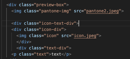
this is an example of the problem i was facing:

#real #true
context: the lesson was introducing css grid and explaining how display inline blocks don't automatically apply vertical alignment so grids are better.
here is my html and css for these example i made and whatnot:
(these contain div elements using the nested layouts technique)
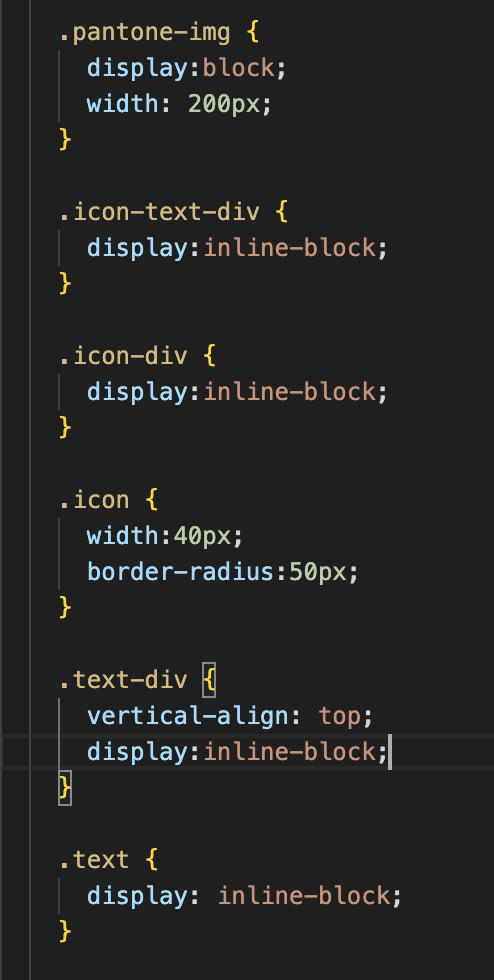
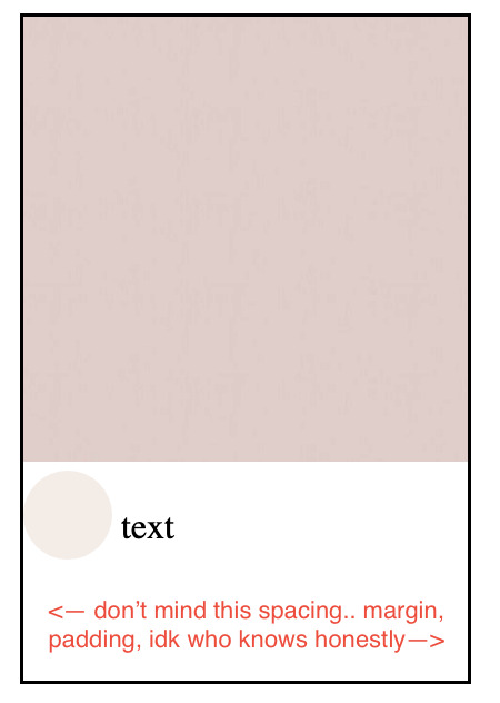
2. i put them in a grid and removed the inline blocks as told by the tutorial (photo is at 100% width) and the text ended up like this:
the text is below the icon now (rounded photo)

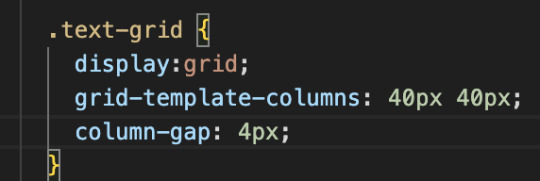
3. found out that the instructor put a grid within the text and icon and so i did the same thing and
this is the html and css + the final outcome:

skjdnwesfh;kjrbgjbfjbgkjrdngkdjtfgnjdfbgrehb
tjgnrjgnregjbr
if i couldn't figure this simple thing out on my own
how will i figure anything out on my own
rip #aminotcutoutforthis #lordsend helpkwe;l;fwef
19 notes
·
View notes
Text
All about fundamentals of website design and development – A beginner’s handbook

As we all know in today’s world everyone is using websites, apps, social media platforms etc. regularly. Knowing and understanding the fundamentals of website design and development is the first step towards your website journey. We need to understand the basic things behind all these website designs, apps and platforms. There are multiple aspects to be considered in creating a website.
Have you ever came across any website and felt its very user friendly, looks great.
Have you ever thought how these websites will be designed and developed. What kind of design software they use in website designing process?
As a business owner, knowledge on website design and development is a must nowadays. This knowledge give you idea how to market your products or services in a better way.
If you are looking to learn basic of website design or confused with different concepts , this blog is one stop solution for all your learning needs.
In this beginner’s handbook we will cover all the crucial components of web design and development and also highlights key aspects to be considered when looking for the best website design and development agency in India. You can reach out to us as we are the well known website design and development company in Bangalore.
In this article we can cover all about web design and its role in business growth.
What is web design?
It is a part of website design and development includes website layout, colors , typography, user interface and other visual aspects. Web design is crucial as it makes website looks visually appealing, engaging and user friendly.
Web designer is a professional who has a skill of designing websites. Web designer must understand the website’s purpose, visual elements and the target audience.
Web designing is a creative process in which graphic designer creates a visual elements to integrate in the website.
What is website development?
Website development involves technical side of building a Website. It includes coding, server configuration, database management, and make sure the website functions as needed.
Several programming languages are used to convert a web design to a functioning website during the website development process. HTML and CSS are the most popular languages used to design a web pages.
Web developer is a professional who has the skills to develop websites.
Importance of a website in business:
A well designed website assist in multiple purposes such as
First impressions: First impression always create a long lasting impact so as the first impression of any visitors is crucial. A great web design builds trust and encourages users to explore more.
User experience(UX): Good design increases usability which helps to navigate the site and find information.
Search Engine Optimization: Web design integrates SEO best practices, by making sure that the website ranks well in search engines and improving visibility.
Conversion rates: A visually appealing and navigational website increases the rate of conversion, by transforming visitors into customers.
Key elements of Website Design
Layout:
Layout represents how a content is organized in webpage. A good layout gets user attention and will be easier to process information. Most used layout styles are:
Grid layout: This layout style uses grid system to structure content, offering a well organized look.
F-shape layout: This layout helps in enhancing usability as in this design elements align with the reading behavior. Some studies shows that users read in F- pattern.
Color scheme:
Colors evoke emotions by influencing user behavior. Factors to be considered while choosing color:
Brand identity: Select colors that reflects your brand identity
Contrast: Make sure there is contrast variation between text and background to make it readable.
Typography :
Typography has a huge impact on readability and user experience. Consider factors like:
Fonts: Use fonts that are easy to read and to maintain a cohesive look.
Hierarchy: Create a visual hierarchy by using proper size and weight making users to find the important information.
Images and graphics:
Visual elements such as images, videos , graphics and icons helps in improving website appeal. Make sure you work on factors like:
Quality: Use relevant high resolution images that matches with your content.
Loading speed: Optimize images for fast loading speed , as speed plays a major role in improving user experience and SEO
Navigation:
Having a well structured navigation is vital for better usability. Consider the following to achieve it:
Simplicity: Make sure navigation is simple
Accessibility: Ensure your website is accessible on all devices including mobile
Fundamentals of web development:
Front end development:
It refers to everything a user see and interact with website. It includes:
HTML(Hypertext Markup Language) : HTML helps in structuring the content as It is a pillar of webpages.
CSS (Cascading Style Sheets) : It adds styles to HTML, layout , colors and fonts.
Java script : This is a programming language which make web pages interactive, making user experience better.
Back end development:
It focuses on server side functionality. It includes:
Server: It is a place where website’s files and data is stored. Server process requests and serves the web pages to users.
Database: Helps to store and manage data. One of the popular database is MySQL
Server-side languages: We can use languages such as PHP or python for communication between server and database.
Content Management Systems (CMS):
CMS allows users to create the digital content and manage it effortlessly. Most used CMS platform by beginners include WordPress as it is highly user friendly and customizable
Factors to consider when choosing web design and development agency:
When looking for the web design and development agency in India , follow these tips:
Review the agency’s portfolio to understand their work style and capability. Check for their various projects or clients handled which matches with your business style and vision
Check for previous clients reviews , ratings and testimonials . If there is a positive feedback then you can consider that agency.
Go through the list of services the agency offers such as web design , development , SEO , Digital Marketing and Branding.
Consider a agency which maintains transparent communication by being open to any kind of feedback and ready to collaborate and support regularly throughout the project.
We should always choose an agency that fits your budget. Get quotes, compare their services and pricing and finalize the agency that suits you best.
Why choose Synwolf as a web design and development agency?
When it comes to the best agency for web design and development , Synwolf stands high in competition as a premier choice for businesses who are looking for designing a website to take their business next level. We have a team who are creative as well as having technical expertise to design a website as per your business goals. We mainly focus on understanding your business, goals to make sure every aspect of your website from layout to functionality aligns with your vision. By prioritizing user experience we integrate eye catchy visuals that helps in getting engagement and more conversions. We maintain transparent communication over a period of designing website which allows you to collaborate with us and assist us on getting your dream website designed without any flaws and meets your expectations. Contact us today to start your journey of business growth in this online world.
Conclusion:
Understanding the basics and fundamentals included in website design and development is very essential in this digital age. Focusing on key elements like layout, color, typography and navigation you can enhance user experience. Building knowledge on these aspects helps you to navigate the world of web design and development with confidence. Whether you are creating a personal blog, e-commerce site, corporate platform or looking for a professional assistance this handbook will help in laying a foundation for your business success. If you are looking for a professional help from website design and development company make an informed decisions based on your requirements and their expertise.
Today the entire world is becoming digitalized. Most of the people spends time online for all kind of activities. Websites has become common and takes center stage in this time. We can access any kind of information at our fingertips with a website. If a company does not have a user friendly website then it going to losing most of its customers. As a business its mandatory to you to have a well designed and user friendly website. For that you need a very good and well known web design and development services in India for your business growth. Contact our team today.
#website design and development#website#web design#web development#website design#wordpress#digital marketing services#web desgin company#web developing company
2 notes
·
View notes
Text
Look, you don't have to do everything in code from scratch. It's fine to use generators to make your grid layout, or use scss to css converters to keep your stylesheets neater. As long as people have put a tool out there for the public to use, take free and full advantage. Most of the ethos in actual coding circles is in favor of open source- we none of us are doing anything truly original, unless we're writing a new language or framework from the ground up, which VERY few do. Even then, people want their tools to be used, and that's why they include examples, working sites, documentation, sometimes whole startup tools that will get you running a page in two commands. What matters on all sites it the actual CONTENT you put on a webpage, which is why all the most successful companies in the internet age rest on the foundation of what other people populate their sites with. netflix is nothing without creative film and television output, youtube is nothing without content creators, twitter, tiktok, facebook. even amazon doesn't mean anything if manufacturers don't sell their products there. All these sites are just wireframes for what YOU put on there. Do not shake in your boots about using freely disseminated code on the internet- stack overflow, open source repositories, design frameworks like bootstrap, material ui, free font packs, tutorials on code education websites, etc. Go, use it. People share these things with the intent of it all acting as a shortcut, usually without expectation of credit. They know that other people can figure this stuff out on their own eventually, their intent is to HELP. If a resource is open source, if a tool is available to the public, if a stranger answers a question on a coding help forum, I promise you. You can use it. There is no glory in making coding harder for yourself. Stand on the shoulders of coders who came before you. They wouldn't have put themselves there if they didn't want you to.
9 notes
·
View notes
Text
ok that post has 7 reblogs which is kind of exciting but also very embarrassing cuz the game doesnt do anything yet.
i am an aspiring [front-end] web developer and HTML, CSS, and javascript are foundational parts of that job, so i have a solid basis for making an HTML5 game using javascript.
ive probably got around 2-3 dozen hours of crying over javascript under my belt and ive been doing it semi-regularly for a few months (just kind of building random bullshit-- the first independent project i made was a number guesser, and more recently i made a wordle clone that i based a little more than loosely on this tutorial) so thats a beginner project but i am by no means like. just dipping my toes into javascript.
ive been adapting from this specific youtube tutorial. the main changes ive made are the player moving instead of the map. it requires knowledge of objects, nesting, and object/constructor methods, which is something i didnt have a strong basis in before i started the tutorial, but its really straight-forward and the guy does a great job explaining it.
if youre having trouble with the tutorial cuz your foundational javascript isnt up to par, freecodecamp just updated their javascript algorithms and data structures tutorial and it fucks SOOOOO HARD. the first project is building a simple text-based RPG which is what inspired me to try and build a simple 2d game. i dont recommend making this jump unless youre actually at least semi-comfortable in javascript but it is VERY doable.
i drew the sprites in paint.net which is free and it has a grid tool and allows transparency. no tutorial for that i just like pixel art even if im really bad at it lol.
7 notes
·
View notes