#will have to sort out a different coloring for some of the other darker scenes because the light is weird af
Text
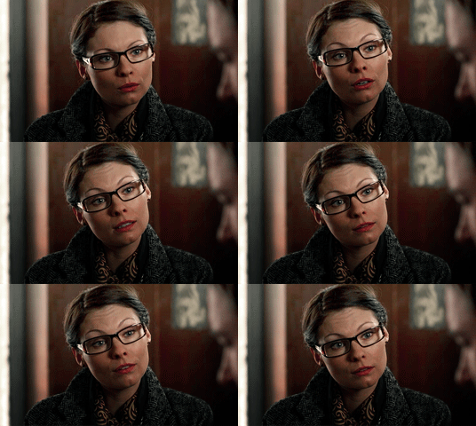


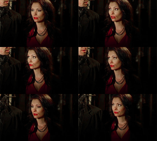
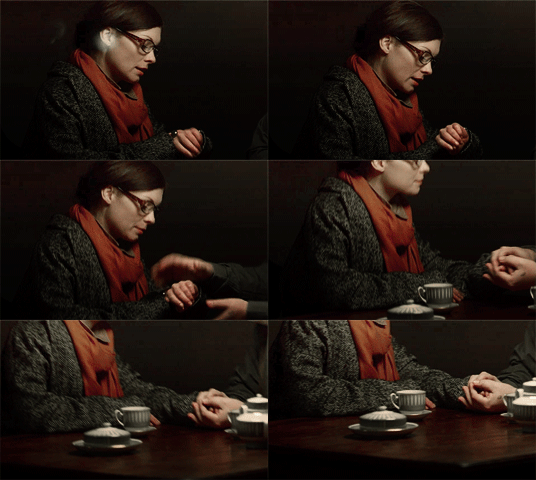
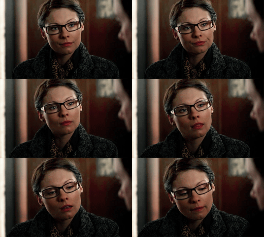
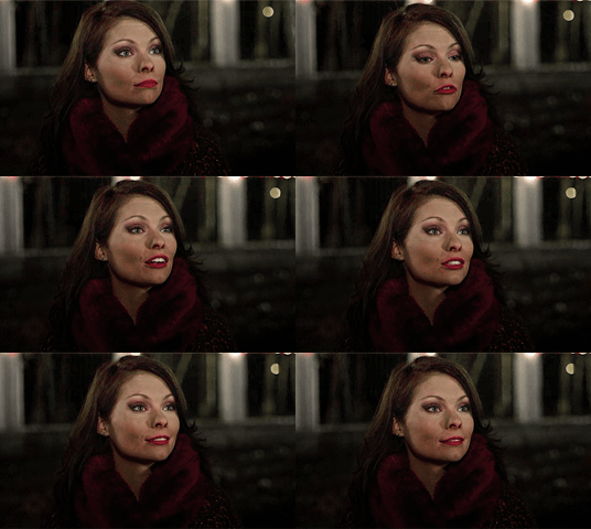
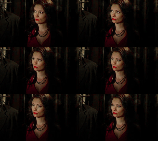
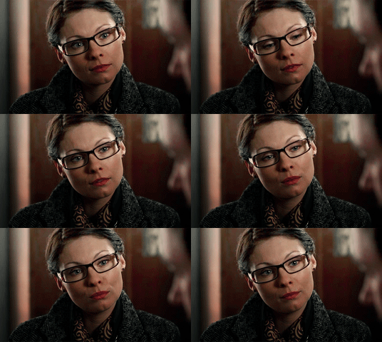
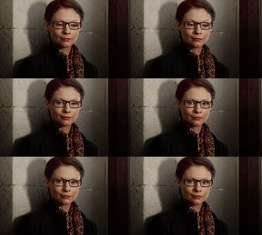
Myanna Buring as Chulpan (Lost in Karastan, 2014)
#HERE WE GO#some nice matchy gifs from the first half of the movie#will have to sort out a different coloring for some of the other darker scenes because the light is weird af#and i couldn't get them to look right here#myanna buring#lost in karastan#arwen makes gifs#chulpan
57 notes
·
View notes
Note
If you don’t mind me asking, what’s your comic making process? I find it hard to make comics that look eye-pleasing to read and yours are like candy.
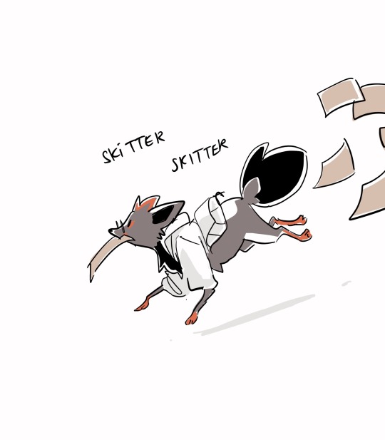
Ah, comics! Dig under cut to see some old wips as I attempt to explain my nightmare thought process to you.
For making a comic AESTHETIC and APPROACHABLE:
I've noticed that it's easier for people to be pulled into a comic if I set the environment first and foremost, so people have some vague context for the scene. Of COURSE that's not always necessary ( there are a lot of comics that start out without environmental story telling and it works perfectly) but I've always liked having a lil illustration before digging my rat claws into the meat of the story.
For example! “Emmet and Elesa have a clandestine meeting in the library at 4 am.”
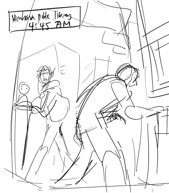
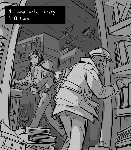
The sketch was sort of the jumping point to where I wanted to go with the comic. I wanted to a. explain wtf is happening and b. draw a nice conclusion about what the f is happening.
You don't need to make the environment available in every panel too! I'd suggest making your first panel tell all the environment detail you need and then like... slowly removing irrelevant detail from there. And then hit folks with the background again at the end. (So basically, you don't see the library in this comic until the beginning and a bit towards the end. I have tricked you! aha!)
So that's one tip i have.
For Readability:
Anyways, to make a comic easy to read, spacing is super important. Dialogue tends to cramp a shot by a WHOLE lot. For example!
Remember the "Lamp is told she's beloved (and has a tsundere moment over it"? That used to be TWO panels. Man. Nightmare fuel. Lemme find it.
(This is the rough. I Lined It, realized the pacing is off, and then withered. Please don't look at it too hard.)
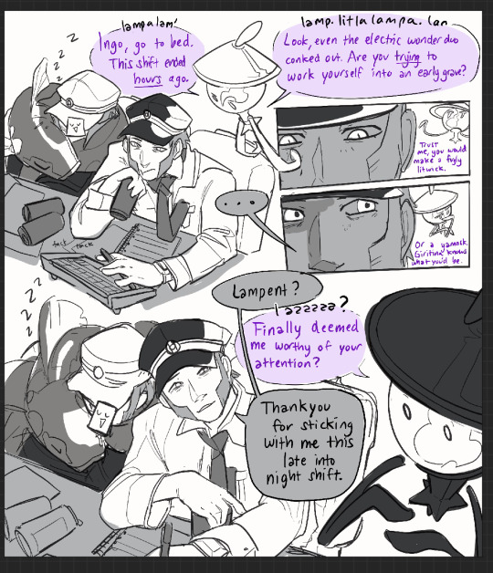
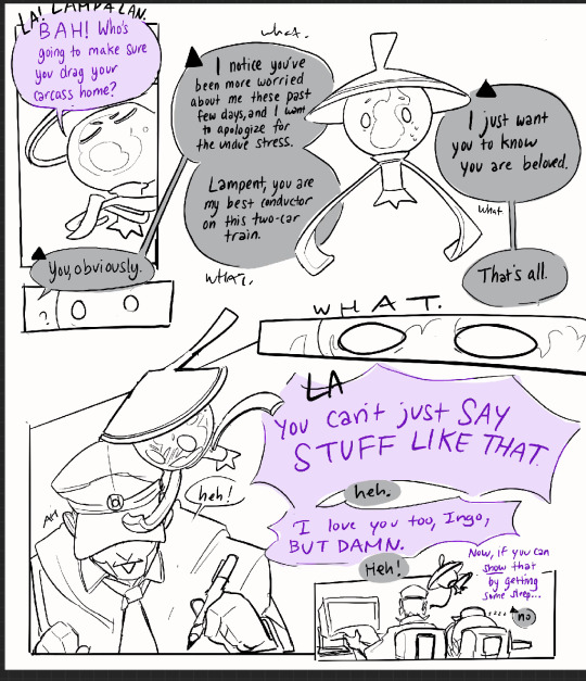
So here's the thing. This READS. But the sheer amount of dialogue in the beginning is fatiguing for me and the "you are beloved, Lampent" NEEDS that oomph of both characters realizing that over the span of years, their relationship stopped being antagonistic and started being family instead. Some folks are fine with blocks of dialogue, but I have the attention span of a patrat on candy. I will not make it.
SO! To match the almost moody atmosphere, I stretched the comic out. I stretched that bad boy out a LOT.
And I got this out of it.
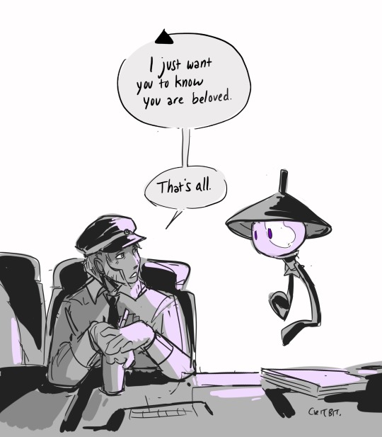
Something to keep in mind in comics is there's always going to be one or two iconic lines. Lines that make people FEEL things.
Those lines deserve their own panel, their own shot, their whatever. A good story has lulls in its conversation. If you can replicate it, you're winning.
Character Blocking:
So basically no, it's not all witchcraft. It's only a bit of witchcraft.
Another thing that helps is differentiating characters if they're on the same panel is by solid blocks of color. I have, for the longest time when working on storyboards, blocked characters different tones in order to help differentiate them. Don't be shy! Do that if it helps your comics read! Ingo will always be darker shaded then emmet. The angry nightlight will always have some hint of purple on her (unless I forget). The first goal in a story is to convey information, hehe.
Here's an example of color blocking! (This is from a VERY old botw comic I did for linktober in 2021.)
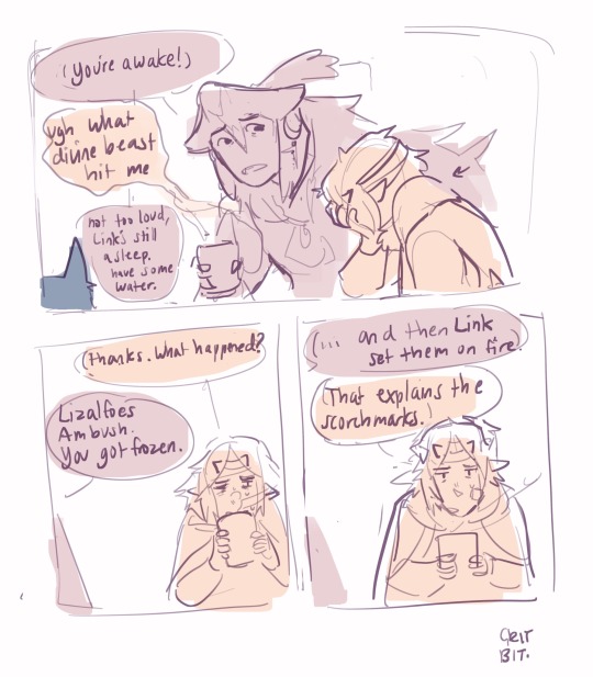
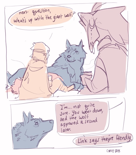
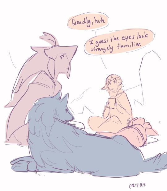
It's, ah, rather rustic compared to what I do. usually. I know!
BUT the primary goal here is to convey where the characters are in relation to each other. And the fact they're color coded makes life easier for both reader and artist.
Alright! That's all the tips I can think of off the top of my head. Time to get off that soap box, haha.
Overall:
Basically, my work process is-- draw a story telling image/ write a funny piece of dialogue. Build the comic around that. Pace it so the important lines stand out. Color code the characters for max visibility.
And then four to twelve hours of lineart, but that's neither here or there.
Thanks for coming to my unregulated rambling!
#tutorial#but hideous and mostly cobbled from limestone and willpower#ask#mailbox#critterbitter#wip#botw#just some comic stuff!#submas wip#critterbitter screams into the void
307 notes
·
View notes
Note
yo, hi,
please rant about the use of colours/shots in dead boy detectives (if you want to), that would be amazing to read!
omg hell yeah i would love to. <3 buckle up everybody!
(there were some other people in the comments who wanted to hear more as well. for convenience's sake i'm going to keep it all in one post.)
I'm not going to talk about every single frame in the last post, because there are a lot, but I'll be sure to touch on all of the ones that have a good amount of depth beyond the dramatic lighting. (sorry, Angie shot.)
...this is going to get long.
so first, this one:
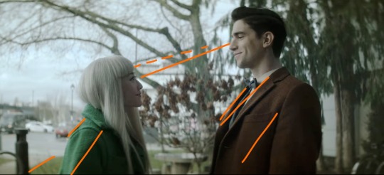
With Edwin's brown coat, Niko's green coat, the brown bushes in between them, and the trees behind Edwin, this shot is cohesive and satisfying. I drew the orange lines to sort of illustrate how your eye moves across the frame; the line of eye contact, the tree branch (dashed lines) almost parallel to that, the sidewalk/grass line, and the lapels/shadows/folds of their jackets all form a general diagonal streamlined snapshot. Then the black post behind Niko, the tree between them, and the tree trunk behind Edwin continue to divide the frame vertically and add to the additional invisible "line" created by their height difference. Finally, the sky behind Niko, as well as her hair, contrast heavily and very well with the darker colors of the tree behind Edwin, though there is still white on his side (the building) and brown on hers (tree branches). If you were to take a single diagonal line from the bottom left corner to the top right, you would get two incredibly distinctly colored sections, but they complement each other so well.
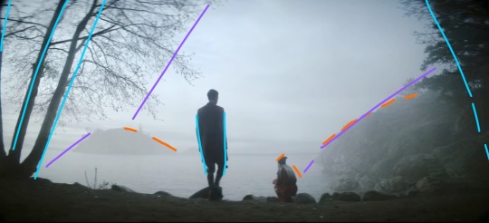
This whole scene is gorgeous because of the pale sky and water up against Niko's hair and the brown tree trunks with Edwin's jacket, but I also love it because it's so simply colored. We have the classic blue+orange color dynamic, but diluted down to very pale blue and very dark brown. This shot specifically features Edwin focused at the center (the blue lines show that he is standing mostly straight up, while the trees on the borders of the frame are all leaning inwards), with Niko crouched down to fit with the shape of the hillside (orange) AND the silhouetted rocks in the foreground. Then the hillside, the shadow on the water, the general cutoff of the tree branches, and the island in the distance (purple) frame the two of them in the middle without making a Point of it. It looks very natural, especially with the dark shadows around the border of the frame. (personally sort of brings to mind Wanderer Above The Sea of Fog).
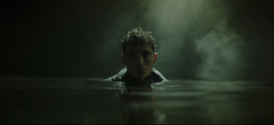
I don't think I need to add any annotations to this one. The lighting is sharp and so are the shadows. The fog and the shine on the water, his hair, and the collar of his coat are starkly lit, while everything else, including his face, is deeply shadowed. Plus it's all an ominous, murky green. It's almost the opposite of Lilith coming out of her blood-red ocean. 10/10 frame, I have no words.
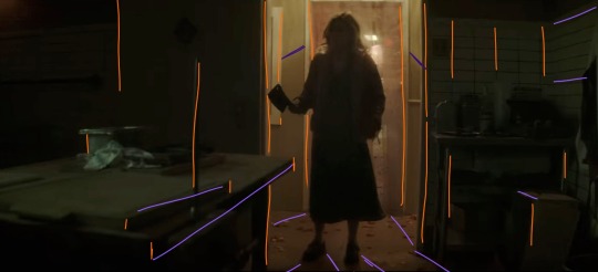
I gasped the first time I saw this shot. There are so many vertical lines (orange), which make the space feel thinner: the spike, the bulletin board(?) on the far left, both doorframes, the edges of the table and boxes, the tile on the wall on the right, Maxine herself... and then there are the diagonal lines, all sort of spreading out from Maxine, which includes the table edge, the shadows, and the wall tiles again. Then there's the fact that it's all so dark, but not quite pitch black. Once again we have a green/orange combo, and the light behind Maxine being so small in the whole frame makes it very effectively claustrophobic. We also never saw her enter this room from behind, which elevates her as threatening, because the camera work makes it seem as though we, the audience, are backing away from her as she enters, and then hiding from her as well. While I am devastated by the lack of a sapphic romance arc, I have to say I was blown away by the production of this scene.
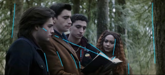
I love this one because they're arranged so neatly around the book. I didn't draw a curve over their heads, but it's easy to visualize by following Monty's hairline up to Edwin's, and then Edwin's down to Charles' down to Crystal's. The height order is perfect. Then there's the black-brown-black-brown of Monty's jacket, Edwin's jacket, Charles' jacket, and Crystal's hair. The book itself helps frame their faces (diagonal blue lines), and their clothes fall into uniform with the vertical trees behind them, creating a satisfying, natural, unobtrusive background. This is definitely more visually appealing than a shot of them leaning over and looking down at the book/camera. It's also broken up very nicely by the greenery. Plus, none of their faces are shown from the same angle! Refreshing!
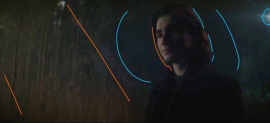
Poor Monty :( but hey, he gets a really awesome shot here! We're back to orange+blue, and the angle of this shot makes it look like the vertical trees behind him are positioned diagonally (orange) to follow the dark blue shadow behind his head. We also get two light sources: one of them is the moon, and the other one comes from the same place as the music. The moonlight (blue) sort of encircles his head and cuts off at the line of trees about halfway across the frame. Both the back of his hair and the far side of his face are illuminated, which is very effective in terms of bringing him into the foreground and making him the focus of the shot even though he's not in the middle of the frame. It's also balanced nicely by having background detail on the left, with the orange trees, but not on the right, where there's nothing but dark blue behind Monty. This is also a great shot when it comes to his hair and jacket, because the jacket is used to add to the framing of his face with the dark blue background, and his dark brown hair is lit sparingly, which ties in the left side of the frame.
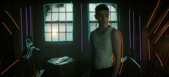
Like the frame with Maxine, this one has a lot of shadow and a little bit of light, and again works with an orange/blue (or teal, really) color scheme, but this one is much friendlier. The windows are larger than the doorframe and Charles isn't actually blocking the light the way Maxine did. Instead, he's illuminated from the right by Edwin's orange lantern, and the shot is balanced by highlights (blue) that stop it from becoming cramped and stressful. There are stable vertical lines (purple) and rafters and shadows spreading out from the center (orange). Charles, though he is blocking the window, is wearing a white tank top, and his skin takes on the warmth from the lantern, so he's not in silhouette and he blends very nicely with the scene. I love that he's not at the center of the shot, but instead framed almost perfectly in the right window. (Another thing I love about this show is that the characters almost always interrupt the continuity of the background even when they're positioned to be framed by it. It makes the scenes feel much more natural even while they continue to be gorgeously directed from an artistic/stylistic point of view.)
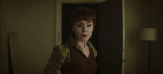
This is one of the simpler ones, but it's perfect. The Night Nurse's hair and vest are the same brownish orange, and her shirt is the same as the walls, sticking with our tried and true brown/green (easy variation on orange/blue) color scheme. She is framed in the blackness of the doorway, but once again interrupts the white doorframe on the left side. Even the lamp and the board (?) on either side of the frame fill the negative space in a natural way. Also, the vertical lines of the board, doorframe, door, and lamp aren't perfectly spaced apart, which makes the whole shot feel more down-to-earth.
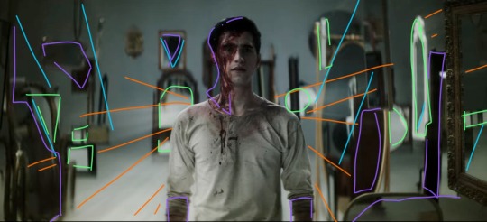
There is so much going on in this shot. The beams of light (orange) are emanating from behind Edwin in a shape sort of reminiscent of wings. The angles of light/shadow and the immediately obvious position of some of the mirrors (blue) also spreads out from behind him, reinforcing the wing imagery and focus. The background is lighter than the floor, and Edwin's clothes blend in with the floor and the reflecting highlights (green) in the mirrors. It's all balanced by shadows (purple), which aren't so much shadows as they are dark-colored mirrors and the blood on Edwin's face. This shot is an unsettling combination of chaos and order, increased by the strange phenomena of mirrors endlessly reflecting into each other, especially since Edwin doesn't show up in any of them. You'd expect him to look out of place, and he mostly does, but there's just enough immediate immersion with the color scheme and light angles to make him fit perfectly. And he wouldn't fit in this shot nearly as well if he were wearing his usual clothes. It's such a good way to introduce Despair. I love this scene.
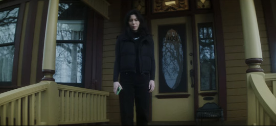
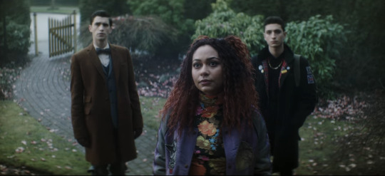
Now I needed to include these two next to each other, because they're. They're the same scene. Maren is on the porch looking down at Crystal and the boys, but the color schemes and blocking are so starkly different. Maren is wearing black, and the house is washed-out yellow and maroon, both unfriendly colors in this scene. The windows all show the gray reflections of the dead tree instead of even a glimpse inside the house, immediately showing that Maren is hiding something. Then in the shot with Crystal and the boys, they're positioned behind her on the path. Edwin is next to the brown gate and gray stones, and Charles is sort of shadowing Crystal and framed by the green bushes. Crystal's shirt is flower-patterned to match the pink petals on the ground, and her red hair and purple jacket make the whole shot more vibrant and friendly-looking than Maren's, even though Maren is supposedly the one being helpful/friendly/hospitable. The first time I watched this episode I knew I couldn't trust Maren as soon as I saw her standing on her front porch. This scene is, as Charles would say, brills.
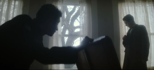
Okay, last one, I have to stop somewhere. (I have so many more. I have. SO many more. that i could talk about. but this post is so long already). There are three windows, evenly spaced, white light and curtains framed in them. Charles is in nearly full silhouette as he opens that chest; his head and the lid of the chest intersect with the vertical window frame, and his arm runs parallel to the middle bar. He also blocks a good portion of the leftmost window, while Edwin stands in front of the one on the right. He's fully framed by the window and standing farther back than Charles, not quite silhouetted but still very dark compared to the background. When he ducks down to inspect the cabinet, his head ends up in front of the wall between the two windows. This whole scene is an excellent display of blocking/framing/lighting, just in terms of where they end up holding any given position while they talk. Once again, there's nothing artificial or manufactured about their blocking. These aren't statement shots (all film projects have a few Really Good Shots, but they're often at extremely important, pivotal, or emotional times, instead of spread out through the storyline.), which makes them even better.
I might have to make another post and include shots with Jenny, the sprites, the Cat King, Esther, and more landscape shots. There is no shortage of stunning frames and scenes, and there's no reason not to dive into the production and hidden meanings.
TL;DR: this show is an ARTISTIC MASTERPIECE. Please watch it. :)
#dead boy detectives#edwin payne#charles rowland#crystal palace#niko sasaki#monty finch#monty the crow#film stills#cinematography#this. got away from me.#appreciation post#color schemes#film techniques#analysis#symbolism
79 notes
·
View notes
Text
Quickshadow is amazing the essay
This is for @cayennesugar and cayennesugar only
Quickshadow is a Rescuebots character that appears in the show’s fourth season. She prefers to work solo and is absolutely perfect.
She’s obviously skilled in her craft and she knows it. She is confident and snarky but she’s also not a villain which I like. She’s not a braggart, but she doesn’t pretend that others are better at a job then her. The first thing she says to Heatwave when they first formally meet is that he is short. I didn’t really get why people shipped them together but some of what she does could be read as flirting (theirs an episode where she appears and when Heatwave asks why she’s back on Griffin Rock she says something along the lines of ‘I thought you missed me’ in a sarcastic tone). I don’t personally ship them but I see the appeal. Heatwave and Quickshadow have a very interesting relationship to me. I want to see them interact more because it’s fun.
When she was assigned to work with the rescue bots she seemed sort of upset when Blades said Heatwave didn’t like her (looking at her face she seems a bit more surprised) which I think is interesting. She doesn’t intend to offend Heatwave and probably wanted to be on good terms with him. She doesn’t do teamwork and seems to be introverted but that doesn’t mean she would be opposed to the idea of ✨friendship✨ and I do think that they would work well together, especially after the episode where she was put in charge. Teamwork is something that she did need to learn, but she still chooses to work on her own because that’s what she is good at and how she best works. She has her own system and I respect that. I also like that she wasn’t really an antagonistic force or rival to the rescue team. She was actively helping before she revealed herself and was teaching the team a lesson that they would need to learn eventually. Chase was prepared for the issue that arose when the plan went wrong and she was able to learn.
I absolutely love her transformation. It’s probably my favorite in the show because it does a good job of conveying her personality. She is quick witted and has a tendency to show off. She has a strong skill set and is well coordinated. I just really love the way it looks, it’s one of the smoothest bits of animation in the show. And her design is fantastic! She isn’t given boobs that would be out of place amongst the others and doesn’t have eye lashes or lipstick like other female transformers have had in the past. The main way you’d tell the difference in gender is her voice and the fact that the others use she/her pronouns when referring to her. Her head piece is also quite unique, the darker color contrasts nicely with her mostly white color scheme. I like the blue used for her as well, and I really like that she has her wheel on the right side of her car in vehicle mode because she’s British. She has a small amount of kibble that looks nice with the rest of her robot mode.
I like that she can manipulate her body to be able to gain speed, travel faster underwater, and even fly for short periods of time/slow her fall. She could 100% fight in a war and kick some ass. Not that the rescue bots are actually physically weaker from the other Cybertrionians, they handle environments much better than a lot of the autobots in prime. But that’s off topic. Quickshadow has one of like three fight scenes in the show. She takes on a temporary mentor roll to Blurr and Salvage but doesn’t like it because they are special. When she races Blurr she wins not because she’s faster but because she was smarter (which is a lesson that Blurr would utilize in a later episode) and the way she talks to Optimus makes me think that she is known for this. Also her message to Optimus is one of the best ways to do a ‘last time on…’ it made me actually listen to it instead of just skipping over and it’s very engaging in my personal opinion.
Also she’s British
I like her a lot. She should be used in more stories as she has a unique perspective and skill set. I also just really really like her. Hasbro please make better toys for the rescuebots I will buy all your overpriced legacy figures if you just make more rescue bots.
#transformers#medium length post#or I guess it’s long#not technically the length of a proper essay#or organized#long post#rescue bots#maccadam#fandom#tf rescue bots#tfrb quickshadow#rescue bots quickshadow#I love her#so much#duck screams about things#character analysis#?
34 notes
·
View notes
Text
The Ancient Magus' Bride Season 2 Episode 14: Nothing Venture, Nothing Have II
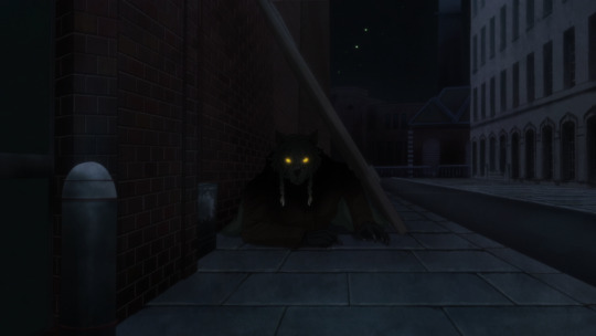
Kafka and MahoYome are settling in to this second cour of its second season, as we refocus on the missing book. While the episode stays pretty well in line with expectations for viewers, there's quite a few ambitious and well executed moments within.
The first thing that springs to mind is the use of CGI. Kafka's shown themselves to rely on it to a decent degree for some moments, so I was expecting to see it in this episode regardless.
Two moments stand out though, as rather well done examples: the werewolf opening scene, and Mariel's Harry Potter style brick-removal trick. I think both look surprisingly good, and that they owe it to the darker compositions of the scenes. CGI in bright light can look bad if your detail or compositing isn't really good, but those are both things that can be better hidden with darker and more bleak lighting and colors.
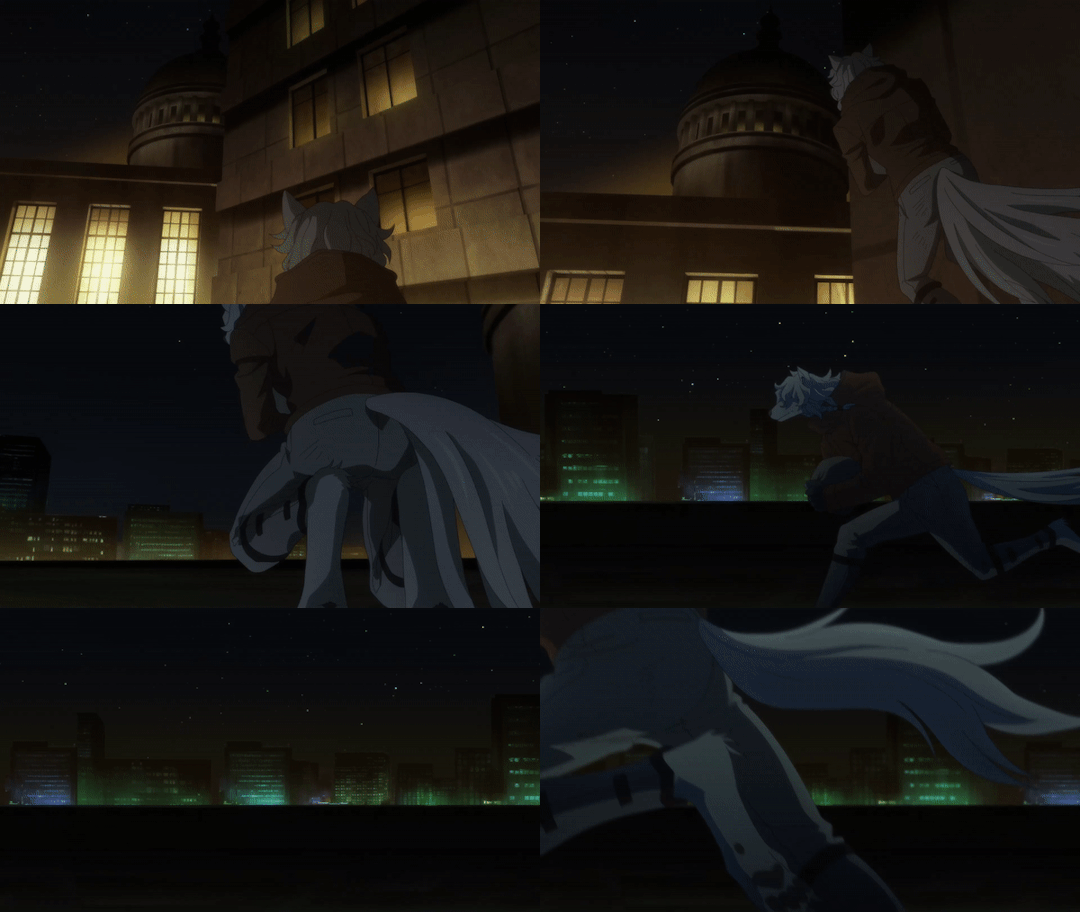

Let's get into the episode at hand though, mostly because I noticed a mistake (that was pointed out by a comment) with my previous post. That is, that Isaac has a crush (or something of the sort) on Philomela.
That's not the case, those feelings certainly still lie with Rian in some capacity, and we come to understand Isaac's actions through the lens of Rian's past. Here, it's Philomela that he remembers rather than Isaac, which is really interesting. It implies that Philomela and Rian's families were closer before his and Isaac's were, where Philomela originally played the role of Rian's friend/right hand man.
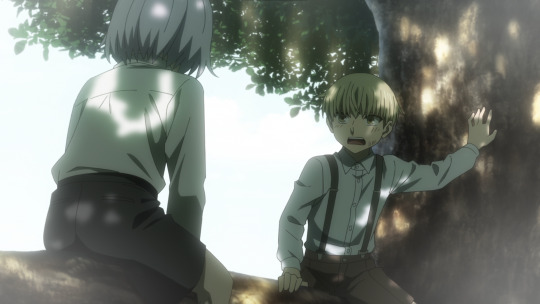
Isaac doesn't seem to understand or know of the past between Philomela and Rian, but he grasps the feel of their emotions. He discerns that there's a type of bond between her and Rian, and he doesn't like that so he ends up pressuring Rian on Philomela in this episode which I thought was very interesting.
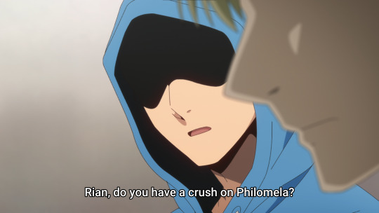
For reference, it becomes clearer in hindsight now that Isaac's self-deprecation to Philomela was him comparison himself as a match to Rian. Though I'm unsure if it's meant to be in the romantic sense and that that's why we had that shot of Philomela's chest.
Cruising from character to character, I want to visit Alcyone next because this second cour seems to be doing something very curious with them.
Yes, they're continually aware of Alcyone's height in how they frame layouts, but that's not it.
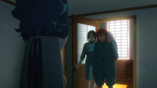
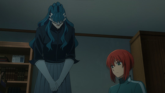
What I'm more interested in is the piece said by Chise later on in the episode about Alcyone.
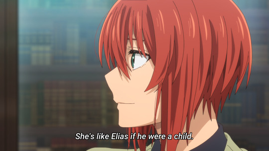
It's a really interesting idea that she brings forward, because Alcyone sort of fits the bill for being a replacement/parallel Elias for Philomela. I'm sure that Alcyone will play a critical role in Philomela breaking free of her cage, similar to how Elias impacted Chise. It does make me wonder though if Elias will appear much alongside Chise through this stretch. I think leaving them separate is a good thing as of right now though, and that in doing so they're able to allow Chise to grow as an individual and use her past experiences with Elias to involve herself with Alcyone and Philomela.
Speaking about Philomela so much though, she absolutely has the scene of the episode. I love it so much for so many different reasons.
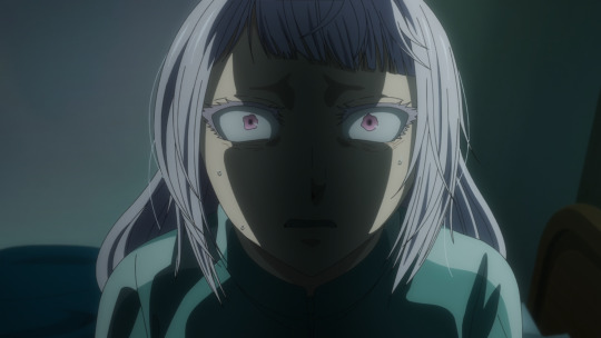
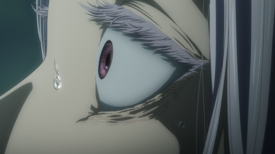
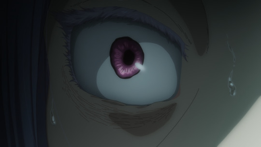
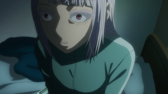
The narrative behind it is just so great. Philomela thinks she's free from her grandmother at the college, that she has a chance to be a normal student thanks to Chise, that having Alcyone by her side she'll be okay.
But then then her old habits kick in and she can't drink the water. She begins to spiral in her isolation, and the iron grip of her grandmother returns in the worst way possible. She uses Alcyone as a vessel for a pre-recorded message to disparage Philomela, to drag her even deeper into the abyss of her own mind. It's an incredibly well put together sequence that shows just how little a thread Philomela has been holding onto as her grandmother threatens to let go of the other end.
And just re-winding a little to the last bit I really want to talk about: the hole in the wall vendor.
One of my favorite things about MahoYome is how consistently it terrifies with the world of magic. How often things are unsightly and uncomfortable, dangerous or menacing. This specific vendor is a great example of that with two things during their interaction with Mariel.
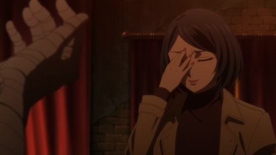
The first is how they search Mariel's mind for the book. In contrast to her way of touching lips, the vendor sticks his hand directly into Mariel's head, which given the physical reaction Mariel has, was not a pleasant experience.
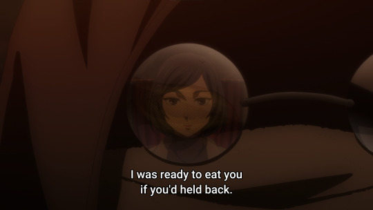
Following that up is the casual explanation that the vendor would have eaten Mariel had she not paid a reasonable price to them for the information that she's searching for.
The world of magic and monsters is such on that the name implies. It is certainly not the realm of humans, and I love that distinction so much. It presents such a unique, but at the same time very classic approach to magic, and I really can't get enough of it.
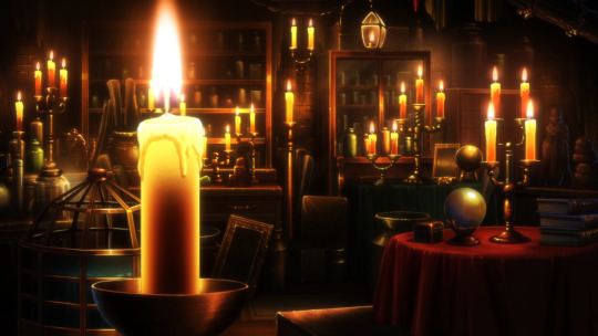
I also can't get enough of these detailed environments. I wish Kafka had more to play with in regards to the design of the college, because the vendor's space looks incredibly good.
All in all, it's an episode that has a lot of strong points, but can struggle with getting stuck in lulls. Kafka remains a little too ambitious in some scenes as they rely on still images to fill the space. In others though, like the Philomela sequence, they have some really great work being done. I don't think that MahoYome has to be animated perfectly 100% of the time, but I think that the direction and boarding can use some work to promote animation in sequences.
The story remains rock solid though, and I love how much detail and subtle progression there is with the characters here. So so much to love that I essentially forgot about the book that remains lurking on campus. But I suppose there'll be more about that in the next episode.
#ancient magus' bride#ancient magus bride#mahoyome#mahou tsukai no yome#mahoutsukai no yome#magus bride#魔法使いの嫁#chise hatori#elias ainsworth#studio kafka#wit studio#anime recommendation#anime review#anime and manga#anime
15 notes
·
View notes
Note
Hey there!
I love how you draw backgrounds, and I was wondering what your process for that is?
ahh i'm almost not sure how to answer, i feel like i haven't done a proper background in a while!
i think the most important part is to go into drawing a background with its purpose already in mind. even if you're not drawing a dedicated background, and it's just a backdrop for your characters, there should still be a reason why it's there. like, maybe the character(s) are interacting with it (leaning against a door frame, sitting in a chair, having their hair swept by the wind), maybe it provides a certain dramatic lighting that you want the character(s) to be cast in, maybe it adds a physical barrier between two characters who really need to talk something out, etc.
i feel like this is much easier in a comic because 9 times out of 10, the background is already woven into the setting and movement of the scene so you already know what you need from it, but you can also do the same for a single illustration. if i know i want a character to be shelving a book in a bookstore, and to have a ray of morning sunlight come in from the right that just catches the edge of her face and her neck, then I know that I need to draw a bookshelf near an implied window, and then maybe a few more books that she hasn't shelved yet, another bookshelf or two to imply there's an abundance of them, and then a few things i think a bookstore would need to have: a checkout counter, the counter is by the entrance/exit, the entrance/exit has large glass windows, additional light is coming in by the counter.
after i decide what elements i need in the environment, i sort out how i'm going to separate those elements out into layers--foreground, midground, background--and then i start working on composition. i value composition right after context because even if you can draw an environment with technically correct perspective, if it lacks a pleasing composition that completes the piece, it just feels dissatisfying. of course it's nice to have both a pleasing composition and correct perspective, but if i had to sacrifice one i would always sacrifice perspective. composition is hard to give tips on, because all i can really say is rule of thirds, feel it out, trust your gut, do your best, and remember that color and lighting affects composition too so try to plan with those in mind as well. at this point i usually try to start a color sketch and add in all the lighting effects i had in my head in order to get a full picture of the environment so far, so that i can judge if the composition & the colors work well together or not.
for coloring, i start by coloring everything its base color, which means the background starts out looking very flat. you can add depth into this base--and i sometimes do by just adding a few washes of darker color using normal mode layers--but for my comic backgrounds i actually prefer to add depth by relying on the lighting that i apply through layer modes, to keep my layer count down. for lighting, i like to stick with one main source of light that i can use to justify glowy highlights, and then i'll use a soft brush to airbrush some ambient light in the background. i'll mess around with my favorite layer modes, like multiply, linear light, and add glow, and i'll also try to have different gradients of light going in the foreground, midground, and background to maintain some contrast and depth between them. sometimes, if you're pushing something further into the background, and you're tempted to add more shadow and make it darker because you think that'll push it back, the right move is actually to focus on reducing contrast. like, if you look at a landscape, the hills in the far distance almost just blend into the sky; it's objects that are close to you that have the most distinct shadows and high contrast.
as for perspective, you can always fudge perspective, and should feel free to mush and squish it around if it benefits other aspects of the piece (composition, eliminating tangents, symbolism, whatever). messing around with it too much can break the illusion (unless your style completely supports that), but a little bit is healthy. everyone has an innate sense of perspective, and as long as that sense says "yeah feels good to me," then you don't necessarily need to pull out the formal perspective tools for every single background. a huge part of faking perspective without many tools is just to get so familiar with different angles that you can just toss them out on demand, and for that you can study a bunch of photo refs of different angles from real life, or you can do what i did and get a freecam mod for your favorite game and fly around taking screenshots of environments of interest from different angles.
23 notes
·
View notes
Text
Between Darkness and Light
We all noticed the change in lighting in the 4-minute snippet but I didn't connect it with Edvin's repetitive statement about the season being darker until now. Or better, I didn't realize that this change in lighting goes in the exact opposite direction to the change in tone that S2 is supposed to display.
S1 gave us a lot of scenes in a very dim light, usually in a warm yellow-ish tone, and yet many of them didn't feel 'dark' at all. They rather felt cozy, intimate and warm (thinking of some happy domestic scenes at the Eriksson's, the intimate Wilmon scenes, and many others) in a sort of reversed parallel between the lighting and the general mood.
What I'm wondering now is: what if in S2 they're doing the same, but the other way round?
After the dream sequence, the first thing we see is an evidently depressed Wilhelm. What colors would you instinctively associate with depression? Dark ones, right? He's alone, sorrowful, disappointed and angry. He's lost everything. We might expect a shadowy room and a gloomy and suffocating atmosphere. But what do we get instead? The sun. Brilliant colors. A very bright room, flooded with daylight. And that's what I love in YR: they never make the obvious choice, they always go for something different. The Eriksson's house is shown ina bright diffused light too, suggesting that this might be a theme of the season, or at least not something only related to Wilhelm.
The thing is, by the end of S1 everyone showed their true colors, either in a good or in a bad sense.
All the five main characters have been somehow exposed - to us the audience and to the other characters. It's not just about Wilmon and the leaked video, despite this being the main focus.
Felice, contrary to the first impression, turned out to be a good friend and a kind-hearted person. August confirmed to be an unreliable douchebag full of personal unresolved issues. Simon demonstrated that he can and will stand for himself and set boundaries. We witness Sara making a deal with the devil to obtain what she wants. And then there's Wille. His intimacy, his body, his love exposed to the world. But also his essence, who he really is, what he really wants, what he's ready to do, finally revealed to himself in a newly-found awareness.
In S2 there's no more hiding. No matter how much betrayal, pain, revenge plans and shit are going to happen. No matter the darkness of it all. None of them can hide their true selves from the others anymore and, more important, from themselves. They have to face their own flaws, their own needs, their own choices. Their own actions. It's about knowing - and showing - where they stand.
No more hiding. Dark times are ahead, but all the cards have been laid on the table. In plain sight. In plain light.
Before it gets better it's going to get worse. Things are going to go down. Badly. Especially for Wilhelm who's not even trying to hide his intentions. And when he - and maybe also someone else? - will be going through his darkest moments, this new, bright, merciless light will do nothing but emphasize it by contrast in a piercing, almost painful way.
.
(reality check: I have no fucking idea. i'm just speculating because it's fun. but I guess I got carried away a bit? sorry. please don't mind me)
#not sure if it makes sense#I'm just taking wild guesses#now watch them use this lighing only in those 2 initial scenes and never again in the whole 6 episodes LOL#can't wait to see the actual use of light and colors in S2#young royals#yr#young royals analysis#young royals s2
54 notes
·
View notes
Text
[ID: multiple digital, colored drawings of the same, pale girl with various hair colors and outfits, all of them including a white surgical mask pulled over her mouth and nose. The first drawing is of the girl, named Buffy, with black, curly hair, dyed a dark green at the ends. She’s wearing a black sweatshirt tucked into a long, flowy black skirt with a studded belt, two chains clipped to the belt, and she has a pair of black boots on. She’s accessorized with a black choker, which displays a vintage cameo charm. The second drawing is of the same girl with dark, blood red hair, the same boots and skirt from the first drawing, a t-shirt with two people kissing on it and the words “Yayx3 Rvnge” (meant to be a parody of the album cover of My Chemical Romance’s album “Three Cheers for Sweet Revenge”), with a long, red and black striped cardigan overtop. The third drawing is of Buffy with black rooted hair that’s been dyed dark red for the most part, with blue streaks at the ends, all tied up in a half-up half-down hairstyle. She’s wearing a grey-blue turtleneck sweater with sleeves that almost cover her hands, and a darker grey-blue velvet dress (with a skirt ending at her knees) overtop, along with black tights and black boots. The fourth image is of Buffy with her hair the same colors as last time, but this time in a ponytail. She’s wearing a dark red t-shirt with a grey tank top over it, and an unzipped, sleeveless, black hoodie over that. She also has a black pleated skirt (ending above her knees), black fishnet stockings, black and dark red-striped knee-high socks, and black high-top converse. She’s accessorized with black and red striped elbow-length fingerless gloves, a few leather cord necklaces and bracelets, some red, black, and white wooden beaded bracelets, and a belt with two chains clipped onto it. The fifth image is of Buffy with black and silver-streaked hair, tucked into a navy blue beanie hat, with just the bangs and some strands sitting out in the front. She’s wearing a light grey t-shirt that has some black stick figures on it (one of whom seems to have an American flag draped over their shoulders), and the text “USA: pretty, crazy” (meant to be a parody of the cover of Fall Out Boy’s album “American Beauty, American Psycho”), which she wears with a light blue plaid jacket, black jeans, black converse high tops, and a studded belt with two chains clipped on. End ID]
Hello, y’all!
I’ve had this one character for about four years now, and just like me, she’s dressed like Adam Sandler since her creation. Unfortunately, out of my cast of characters, this one is far from the only poor sweet creation of mine subjected to my tragic lack of style. So, I figured it was about time I at least attempt to fix that.
I figured I should start off this series(??) of Character Closet Makeovers with some rather casual outfits for my dear child Buffy Whinsnap.
Most of these outfits are meant to be relatively comfortable, warm (with the option to be less so), and easy enough to maneuver in while still looking cute and being something Buffy would enjoy. She takes a liking to many different clothing styles, but seems to like outfits from alternative-inspired styles, like goth, scene, and cottage/forestcore. Here we mostly see outfits inspired by gothic and scene-esq ideas, but Buffy likes to keep her number of clothing pieces relatively low, and also loves being able to show off the band tees and trinkets she’s collected. I hope to add more forest/cottagecore outfits in the more formal addition to her closet makeover.
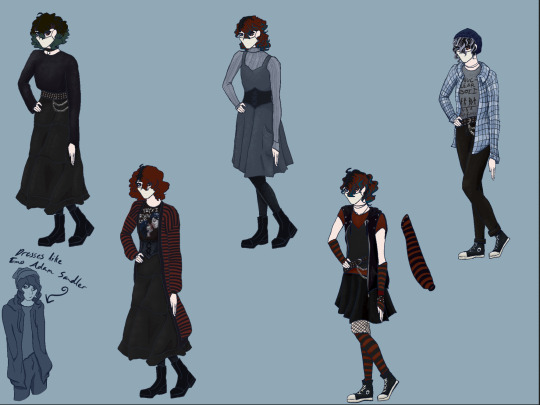
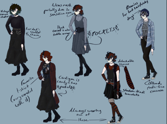
I like adding little tags describing or giving insight on some objects/clothing pieces! Apologies if my handwriting is illegible :’)
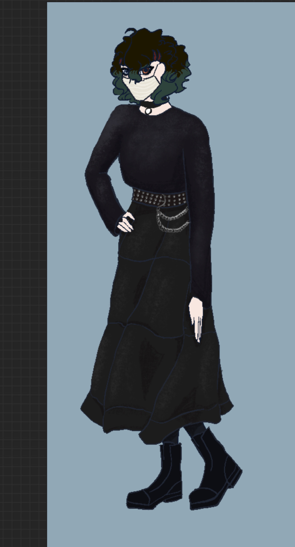
I know this outfit isn’t technically true or traditional goth, but it’s as best as Buffy can really do right now with her income and allergy to plastics. Most of her clothes are cotton or some other natural fiber. The only time she can really afford to wear any sort of plastic is if it’s not going to touch her skin. Because of her having allergic reactions to coming into contact with plastic, she often wears long sleeves and sometimes even gloves in crowded public areas to avoid being hurt. Also yeah I was thinking of Winona Ryder in Beetlejuice whilst drawing this what of it sue me I can’t help the fact that she’s pretty and iconic and that I’m definitely attracted to women admit it you think she’s pretty too
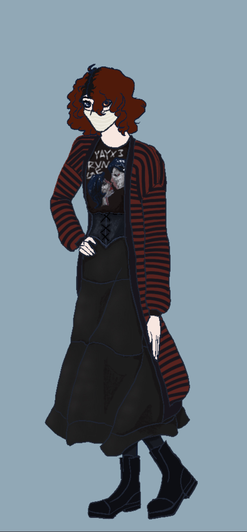
Buffy loves her Our Chemistry’s Affair “Yayx3 Revenge” shirt almost as much as she loves not having to look people in the eye by just ✨having her hair cover her eyes✨ My girl’s like five feet tall, the only ones capable of looking her in the eye are toddlers, hyper elementary schoolers, and anxious insecure middle schoolers who are too busy or anxious to look her in the eyes anyway. The perks of Not Talking and having fluffy hair ig.
Her cardigan is cozy, but also slips off easily. This may sound annoying, but she actually appreciates it. If someone’s chasing her and grabs the tail of her cardigan, or it gets caught on something, she can just keep running and it won’t hold her back. Then she can go back later because who would let a good cardigan go to waste like that
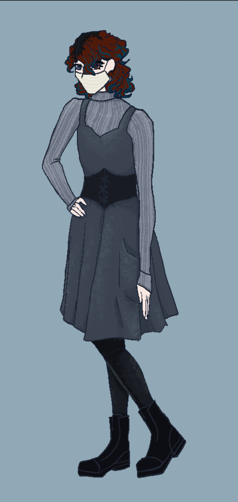
This is one of her more generic outfits, yes, but there are several perks to it!
The long sleeves help keep her warm, which is good already (temperature regulation who?), but the sleeves are really long and can be unfolded to be used as grips or mitts to handle hot or rough things. Her corset may not seem super conventional, but it’s actually helpful in many ways. It can be used to hide thinner things (paper money, cards, small pouches of medicines, etc), and is made of quality leather and reinforced with interlocking wooden plates which can help protect against blunt force and stabbing attacks.
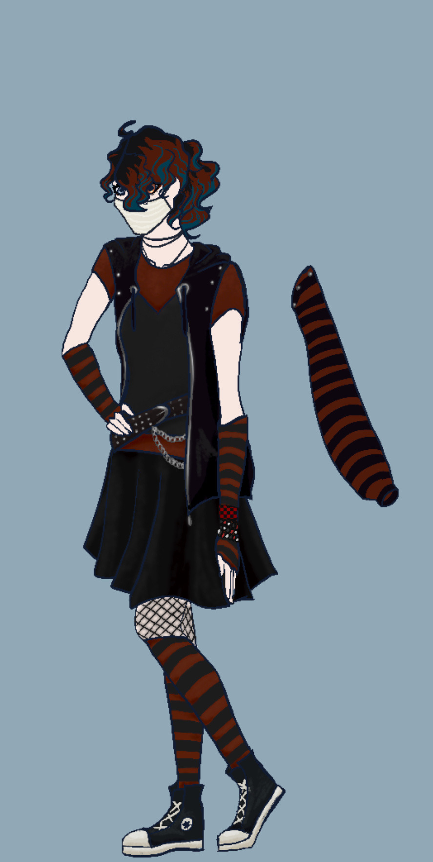
This outfit was really fun to design! I wanted to give her a brighter, more energetic, scene-inspired outfit. I would’ve given her the early 2000s knee-high Converse, or platform Converse, but let’s be honest: she’s not going to spend that long lacing up shoes, and there’s no way she’d be able to run and fight in five-inch platforms atm.
Buffy never goes anywhere without a long-sleeved shirt or jacket, and I’m well aware of this. Problem is, I REALLY wanted to give her those elbow-length, striped fingerless gloves. So I decided to commit a “fashion atrocity” (or so I’ve been told) and give her a sleeve-optional hoodie. To be honest, I think it looks okay. Something popular in the scene fashion is LAYERS. So many layers. Everywhere. So I figured a third and obvious layer could work with this outfit. What do you think? Buffy thinks it’s a good idea despite the potential judgement, because detachable sleeves have many uses. Hot? Take the sleeves off. Cold? Put the sleeves back on. In need of an emergency rope? Take a sleeve off and use it for that. Also in need of a makeshift tourniquet? Sleeve. Maybe we should all just start wearing detachable sleeves in case someone grabs/stabs at us?
I feel like Buffy would’ve loved wearing khandi jewelry, with all of their fun colors and patterns, and ability to easily cover scarring and stains, but khandi in the scene fashion is almost always made of plastic, and Buffy’s not going to subject herself to allergic reactions just for fashion and some nice clinking noises. So, she got some khandi bracelets made out of wooden beads! And the good news is that they can be used to start a fire in an emergency, so she feels carrying these random bracelets around is justified. I would’ve given her some coon tail hair extensions too, but I didn’t really know how to work those into her hair, since she tries to avoid using heat on her hair and therefore wouldn’t be straightening it, so the coon tails might look out of place.
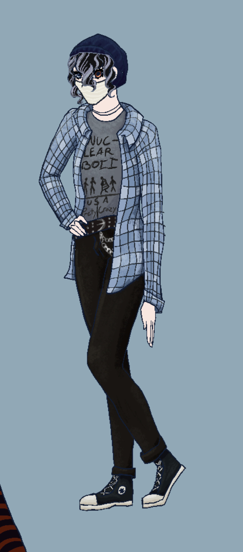
Buffy usually tries to avoid wearing lighter colors due to stain risks (pasta sauce, dirt from falling off her horse, stab wounds, ink tears, etc.), but one of her few exceptions (“you are the only exception”) is her gray Nuclear Boii t-shirt (yes I will be drawing off-brand band tees until the day my soul passes on), and the light blue flannel she likes pairing with it. The good news is that this flannel is vintage and made of quality materials, which means that (despite the slashes and holes Buffy’s had to sew and patch up) it’s more durable and easier to use in situations that call for bindings and blankets. Her only real problem with this flannel though, is that it’s hard to add hidden pockets to it because you’d see the bulging. Good news is that bobby pins exist for the sake of her beanie. She can’t hide too much inside of the beanie itself, but her hair is thick and abundant, and could easily hypothetically stash money, meds, needles, thread, and/or a knife or two. Who knows what’s in there? Just don’t touch the hat. Or the hair. Or her, in general. She’s low-key germaphobic. There’s a reason she almost never leaves her house without a mask on.
Anyway, thank you for glancing in the direction of this post! And if you’ve gotten this far, then.. what are you doing? Go get some rest. You’ve come a long way through the seas of my endless rambling.
TL;DR: I like designing outfits every now and then, and apparently I like to rant?
Stay tuned for more, assuming the art block doesn’t prevail!
#original art#original character#my art#character design#character art#emo scene#scenecore#scenemo#winona ryder#digital art#My Boyfriend Is the Jersey Devil?!#Buffy Whinsnap#mcr#fall out boy
3 notes
·
View notes
Text
I’m feeling very happy after a super positive review from my niece who beta read book 2 of my series-in-progress, and also I wrote a funny scene for book 3 last night, so I’m gonna roll like a proper Writeblr person and share a snippet. Please enjoy!
———
(Context: Barrenger is from another dimension where everyone is interesting colors and have glowing energy powers and patterns, and Mercury is driving.)
“And on that note, it’s my turn!” Mercury’s mouth scrunched in thought as she reviewed what he had explained. “So the Hawaii—”
“Haweyh.”
“Right, the Ha-way are brown. Sort of like Brock?”
“Sort of. The tone is a little different, though. More…earthy, maybe?”
A snore from the back let the driver and front passenger know that Brock, much like Lyra and Shannon, was sound asleep and would not be contributing to the conversation. They moved on.
“And they have white hair. And yellow-gold glowing skin in kind of…splotchy patterns?”
“That’s not…the exact way we describe it.”
“How did you describe it?”
“They’re just called selah patterns. And they’re…kind of random and irregular and…”
“Splotchy?”
Barrenger sighed. “Sure. Splotchy.” He could imagine certain Haweyh priests clutching their chests at such a crass description, but whatever. And the widely varied patterns could be kind of…well, splotchy.
Mercury nodded once in satisfaction, although she didn’t take her eyes off the road. Her fingers tapped the steering wheel thoughtfully. “So that’s your mom’s people. And your dad’s, the Rukilef—“
“Rukilef,” he corrected automatically, then grimaced repentantly as he realized she’d said it right.
Mercury had the grace to not do more than grin at him before continuing. “They’re all dark green, like you, and black or really dark green hair, and the neon-green stripes. Hey, do the skin tones vary a lot?”
That was a good question. He closed his eyes and thought back to the Rukilef he’d seen in Salein’s encampment—it was the only time he had actually seen large groups of his father’s people. “Some. I’ve seen a few who were even darker than me, almost black, but others were closer to…” He looked out the window at the landscape rolling past, and pointed. “Like those leaves.”
Mercury glanced out the window to where he was pointing. “Oh, oak leaves! Great reference point.” She gave him a quick, critical study before looking back at the road. “I think I’d call you forest green. I always liked that color,” she added offhandedly.
Barrenger opened his mouth to respond, but paused. He…couldn’t think of the last time someone had said they liked his color. Aside from his mum, of course. He glanced over to see Mercury casting him concerned looks. “Oh crap, did I say something weird? You’re going to have to let me know these things, I don’t want to be offensive or accidentally propose marriage or something.“
A laugh burst out of him before he could stop it, and he spent the next minute or two turned toward the window and struggling to get himself under control.
#barrenger#mercury#my wips#writeblr#outcasts and runaways#humor#btw for those of you who remember my poll about books that are largely platonic#this is the book#or book series anyway#they are just friends no shipping XD#story snippets#river writes
9 notes
·
View notes
Note
Hi, this is Dani (aka @5racha) and I just saw your "event 12: loss" gif set (which is a spoiler for me but i don't care) and I absolutely love the fact you can do black and white with the gold showing. Is there a tutorial out there how to gif black and white with a colour? I mean, an easier way than to just colour each frame individually. Do you have one or is there one? I've been wondering about that for a while now and your gif set is looking absolutely incredible.
ah hello!! thank you for liking my set ;u; <3 fair warning, i notably love talking about this kind of thing and i am incredibly longwinded so i'll get the direct answers out of the way first and then i'll ramble at you about my own gif process for a bit
here is a color isolation tutorial (found via @usergif, who have many such good things). i havent specifically used this one but it's good and im basically about to rephrase it for many words
and basically.... there are ways to do it and sometimes it can be genuinely quite easy (hue/saturation is your friend!) but if your scene is problematic (lots of movement, the color youre trying to isolate is a skintone, low contrast between colors etc) it's still going to be really hard, and in the end some things Will be an every-frame or close to it kind of deal if youre still determined to do it
my eclipse prefects set basically demonstrates -- the blue ones were really really easy, since you just have to desaturate all colors except blue. the reds, because some of the backgrounds also contained red and because it's a skintone you then need to readjust, is much harder. you can kind of tell by the curtains in the first gif how this might cause a problem
and now im going to talk your ear off trying to explain applying that to the gaipa set in. far too many words. sorry
this set, being that the color is "yellow", is one of these problem children, some more than others -- for example, i tried to do the first one like this but gave up (check out the cool gray spots near his temple and his collarbone :'D)

the middle two were problematic using keyframes too, but a bit easier because they have less movement and the backgrounds are also darker, so ill try and show you, in case it helps??
here is the base coloring (ignore the orange skin, i knew i wasnt keeping this and also moonlight chicken is kind of like that)
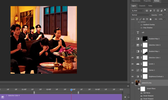
then, the bw layer is added (i use gradient maps for grayscale usually), and then i crop out the section i wanted to stay colored using the ps pen tool -> path -> selection and then use that to apply a layer mask. you can also kind of handpaint this sort of thing if that's easier for you
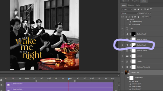
the next couple layers up are color adjustments for this section, to make the yellow that already exists at base brighter & tone down the red. i have four more layers at the very top to do this and adjust the colors golder & more vibrant.
now then the actual trick is in keeping the layer mask on the correct part of the gif. so if i just did the layer mask on the b/w layer like that and didnt keyframe, because this gif moves itd stop working - it isnt Super movement, so it's not actually that big of a difference, but you can see (no keyframes on the right:)

the gray creeps onto the vase, the table, and the upper part of the flowers. if you overcorrect in the other direction, the skin of the woman right behind the flowers will become visible. so ! problem solving: keyframes

that's how it looks like - you start at the beginning of the gif with your layer mask selected, then click the stopwatch next to 'layer mask position'. then i usually use the move tool and arrow keys just to shift it along with movement of the object, and you press the yellow diamond at each point you do so
this is not foolproof and im still sort of new at it, so it can sometimes look odd. case in point if youve spent as long staring at this gif as i have you probably noticed the keyframe movement (it kind of jumps.....) but i decided i could live with that. sometimes you just have to figure out where your standards for 'looks bad' are, too OTL
gif 3 is like this too -- the only notable difference is that, instead of just desaturating the colors i didnt want i covered over them with a gold gradient map layer


so, basically, all of these gifs do originally have yellow in them, but i bass boosted the shit out of it and also colored over it in some places, and i used keyframes to fix movement
i hope this is at least interesting & that you can get use out of the tutorial, hehe. thank you for asking! enjoy finishing moonlight chicken, my belovedest of series
#ro's ps adventures#rowan asks#long post#this is too much. i know. you can basically just take the link hehe#i enjoyed talking about it though !
2 notes
·
View notes
Text
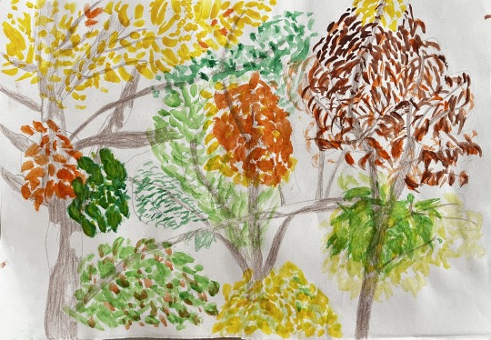
Claude Monet’s works were painfully criticized in the first impressionist exhibition as Tucker notes in his article The First Impressionist Exhibition and Monet’s Impression, Sunrise: a Tale of Timing, Commerce and Patriotism, but at least Monet challenged the academy and gave a piece of himself to the world with his works. Now his art is largely appreciated, there is even a museum in Paris dedicated entirely to his art – The Marmottan. His daring endeavors inspired me to create a painting. Even though it might seem unfinished or even childish, this is my most authentic try to capture nature as it is.
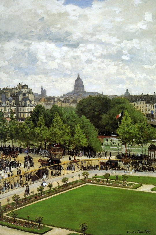
Claude Monet, The Garden of the Infante, 1867. Oil on canvas, 91,8 x
61,9 cm. Ohio, Oberlin College.
While I was drawing it, I was looking out of my window which is exactly what Monet did with his ‘Garden of the infante’ or ‘The Louvre Quay’. Even though his paintings are very detailed and almost look like a photograph, mine is rather, well, cannot even be compared to his!
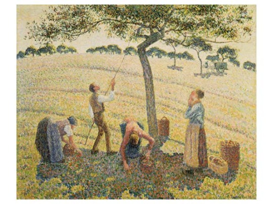
Camille Pissarro, Apple Picking at Eragny-sur-Epte, 1888. Oil on canvas, 61 x 74 cm. Dallas, Museum of Art.
I would rather compare it to Pissarro’s ‘Apple picking at Eragny-sur-Epte’ because of the almost unreal looking tree. I notice that the people are drawn with a lot more attention to detail than the tree, which is a bit alien looking. Even though it looks like mine is lacking any detail, I tried to capture the character of almost every single leaf cluster, and even of the tree trunks and branches. I started with the trunks; they were the toughest to draw. A tree without leaves looks like a nervous system. There are countless divisions, I couldn’t draw all of them. Some tree trunks were darker than others, more narrow or wide, some had patches of lighter bark, some were bigger, some smaller, some closer, some farther away. Each of them was an individual. A live model. William Bartram writes in his excerpts about a hunting scene between a spider and a bumble bee. He describes in detail the appearance of the spider: ‘his body was about the size of a pigeon’s egg, of a buff color, which with his legs were covered with short silky hair, on the top of the abdomen was a round red spot or ocelle encircled with black’. Isn’t it peculiar how he pays such attention to such a small creature? And most importantly, why does he pay so much attention to observation? In the beginning of his excerpts he uses all sorts of scientific names for the most usual flowers and plants. ‘Cactus grandiflora, Gloriosa superba, Theobroma, Adansonia digitata, Nyctanthes’… Why? I think because they are special, although they might be the most usual. Detail makes everything special and unique. And while drawing I established a connection with the trees, I got to know them, I know their character. One is a bit pompous and proud (far right), one is wise and old (far left), one is rather young and careless (middle). Now, their leaves had character too. The far-left tree had to have more mellow-shaped leaves because it is wisest. Even its colors are softest. The far-right tree has its leaves like spikes like it is going to prick someone. The middle one has the most different shapes and colors of leaves – a sign of youth’s colorfulness. It certainly felt difficult to draw. I constantly asked myself questions, doubted myself and didn’t like my work throughout the process: ‘But how exactly do I draw this shape?’, ‘No, it shouldn’t look like that’, ‘I should use a bigger brush’. At a certain point I thought ‘There is no way I will be able to finish that’, because I had no idea what I was doing. But then I just let my hand paint. It felt like I had gone back to my children’s years, my hands, and clothes all dirty with paint, brushes were falling everywhere, a certain chaos had settled in. But I felt like a true artist, free and completely engulfed in my work. Isn’t that exactly what artistry is? Freedom and chaos? Well, if so, I know I did well.
-Neda
5 notes
·
View notes
Note
Hi! Your “who howls my name” fic is literally my favorite fic on a03 right now. Im really fucking enjoying it and am so excited for everything you’ve got planned. Absolutely loved the “from gerard to gerry” in the last chapter.
I’ve got two questions. One, is there any particular fan art you have that shows how you imagine jon and Gerry in the fic? I know a lot of people imagine them different ways, and even though I usually go for majority fanon jon (dark hair, darker skin, short) I’ve noticed you describe him a little differently so I was just curious.
Second question, are we ever gonna get Georgie and Melanie? This one’s just out of personal curiosity bc they are my favorites and I would love to see them meet Gerry! (Not even entertaining a possibility where they AREN’T girlfriends) (Jkjk)
Thanks for all your work and time going into this fic! You are very talented and I can’t wait to read the rest 🥰😍
!!! This is so sweet to hear, thank you anon for letting me know you like it so much :) I am also loving working on it - it's one of my faves - but my self-confidence that others will like my output is a fickle thing, so this is so kind of you to reach out and let me know you're enjoying it. Gerard-to-Gerry reveals are some of my favorite things to read haha so I was super excited to do my own take on it, I'm thrilled you enjoyed.
So it's funny, you're the second person to ask about my headcanons for this fic for their appearances! Which isn't bad at all, but my choice to make Jon blond was a genuinely random one and based on wanting him to feel sort of washed-out and homely with his white-plagued hair LMAO but I'd say I typically imagine him in my head differently! But here is someone who draws blond Jon who I ADORE the art of, and they just came to tumblr from twt too. I don't quite imagine him with an undercut, though... (Also I'll say that I actually usually imagine Jon like how this person draws him, I just had to pick a hair color in chapter 3 or 4 of the fic and blond won, lol.)
As for Gerry, I imagine him looking on the more masc and plain end of goth - with piercings but little to no makeup, heavy boots & leather jacket, etc. Here are some great fanarts that are mostly how I imagine Gerry (and the first art of blond Jon has a Gerry design I enjoy as well, for hair/facial structure). (There is another artist who's nearly 100% it but I cannot find them, they're only on twt and someone recently reposted their art here tho...hm.) I don't personally imagine Gerry has lip rings or gauges or even wears eyeliner (he seems both too practical and too tired for shit that can get caught on things, or that would cause extra pain, or that would require constant re-application) but I do tend to think of him as having multiple ear piercings & probably a bridge as his facial piercing. There is actually an entire future conversation in my doc for this fic where he and Jon discuss his piercings! :D
And ooh, Georgie & Melanie! Georgie will likely remain as mentions only, but Melanie actually has an entire pre-written scene (which I may need to rewrite to keep the flow), so she will almost definitely appear :) And yes they are always girlfriends LOL. In order to keep a tighter grip on the length & plot we will probably only meet Archives cast, and not all of those, either.
Thanks so much for messaging me! It's very sweet of you to say so ksdjfksdf and nice to hear <3 I hope you keep reading and enjoying :D
#ghoul speaks#this made my night to see in my inbox yesterday anon thank you#i spent a while gathering fanart links and its hardly all of them but its a good portion of what i envision them to look like#someone else draws gerry very masc and broad and i basically imagine their art but skinnier#if i find it i'll link it as well later
4 notes
·
View notes
Note
My main grape about the designs (and really, the animation itself) is how bland and unexpressive it is.
you wanna flat 2d lineless art? Okay! Sure, but have some sort of shading or fun details. People made cool ass drawings of plants with only shading to help them.
No? You just want little to no shading with only the most prominent detail so you can differentiate everyone? I'll let it side for now........
Oh, you wanna use basic shapes? Sure, people had cool character design while only using triangle before. Mosiac art is really fucking cool, I would love to see it in more often outside out religion settings.
You're.... using basic shapes to.... draw a person? With no... you know... actual anatomy? Like no shapes that are thicker but get slimmer out to make an arm? Um. I guess you can be minimalist. Not that I like it.
Having only like, five colors to use at a time? It'll be a fun experiment to see how to use them. Wait. Are you only using colors on the pre-made color palettes? And only the first row of colors. You know you could scroll down to see more, and there’s a color wheel right? There’s a slider to choose lighter and darker colors as well.
Really? Only the most basic of all colors without the fun sliders? Fine fine, have fun.
Oh... you want to use the same character model? Uhhhhh, maybe you could use different colors and details to add more favor? You really want all of these people to look like an infinitely large family with only different haircuts and genders? If you’re doing like a horror animation where everyone is the same with only one very slightly different looking character, then go for it. The uncanny valley affect is interesting when the protagonist is the uncanny thing.
No? Then what the hell are you making? Scp Foundation content? Isn't that basically a horror archives with a weird mix of dangerous monsters to a sentimental soup bowl in addition to doctors with interesting characteristics trying to contain them? That’s like, the greatest way to explore character designs and you're wasting it on one simple model with 4 colors max and no shading?! For everything?!
And why are you doing this? What's preventing you from simply going all out?
Quick and simple artwork that can be made easily......? That can be made efficiently to make videos in order to make profits?
...
And Don't Get me Started On the Fucking Animation.
Having your characters move via motion graphics? I could see how that could work, if you mess around with how fast each character or setting move with their animations. That's another layer of detail! But there other ways to animate with better quality.
2d animation is much more interesting for a lot of reasons.
Pieces with slight jitters and fast animations to show how energetic and active they are; Like small animals running away, character who has fast reflexes and is constantly on the move, waterfalls. All of these move fast and look like a blur unless they slow down which they often don't do.
More smooth animation for most movement, add or decrease the amount of stutters depending on what's in motion. Slow on into near stop motion for well, slower things. Either have an extra frame to have them linger.
Y'know how things are sometimes faster than each other? That's what I'm saying.
Steam moves faster than smoke which means slightly faster animation. People move in their own ways. Elderly that are slow and careful with their steps. Teenagers range in the why they walk, popular students with confident strides, average kids just dodging and weaving their way through the crowd, maybe some kids wayy into anime naruto running around. Whoever they are, their animations should be able to highlight who they are.
3d would also work, just need to a model a character and start moving them around and adding little touches. No need to draw a new scene.
Meanwhile, McFuckingLazyAssMf known as Scp expla*ned decided to forgo all these possibilities to churn out truly brain dead content which is very bad for new up and coming Scp fans.
I also wanted to add, WhatInTheWorldAreThoseExpressions? Those are just sad. Actually scratch that! I can't even tell what "emotions" these little breadsticks are making. There's like a 3 second animation where the eyebrows move up or a painfully stupid attempt make a glare with two grey lines and scooching them like, half a centimeter to the left. They don't even bother to add gestures or body language.
These doctors have two different body gestures. Arms up for surrendering and panic which is wayyy to obvious, and the shrimp curl.
Where the hell are my doctors with hunched back? These fuckers can be bothered to sit up straight when there's a breach every 3 days or someone pissed off the senior doctors and now they might be in the cross fire of some revenge plan. Why the hell is everyone the same height? Clef is a manlet and isnt close to Kondraki's height. No, slenderman, siren head, long horse, and the cartoon cat aren't and will not be part of the scp foundation. Even then, it wouldn't be that hard to like, I dunno, block off the areas they live, stamp out amnestics, then start scrubbing through anything mentioning where you can find these spoopy fucks.
Not mention whitewhashing, gender swapping, or the fact LGBT characters are suddenly, well, not LGBT anymore.
-soap
^ All very fucking good points
9 notes
·
View notes
Photo
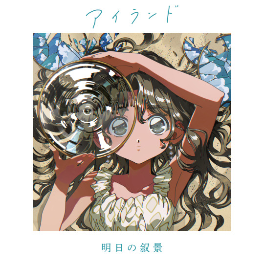
明日の叙景 [Asunojokei] - アイランド (Island)
Blackgaze, J-Rock, Post-Hardcore
The Taito quartet's sophomore album takes their spunky, passionate blend of jumpy J-rock and soaring black metal and expands it even further, melodic riffing and danceable drum grooves coated in distortion and Daiki Nuno's hellacious shrieks. Island's delightful genre blend is just one part of Asunojokei's mastery of their sound.
☆☆☆☆☆
Black metal has long been a place for albums with a singular and solid sound, but Asunojokei has no interest in being like anything else out there. The Taito, Tokyo quartet are unique in that their influences are quite different from most other metal bands, the rich history of Tokyo's math rock and J-rock scene deeply embedded into the way they write progressions, how they employ upbeat grooves and bright melodic riffs into their music alongside the darker sides of post-hardcore and shoegaze. Because of these myriad influences, their fantastic 2018 debut Awakening felt a tad bit unsure of itself at times, Asunojokei steeped in post-metal atmospherics and noisy effect pedals that took some of the bite away from their colorful guitar leads and vocalist Daiki Nuno's versatile performances. Now, with those early years behind them and an even balance of all the different things that makes their music click, Island takes Asunojokei to new heights, an hour of some of the best indie rock in recent years where nothing feels out of their reach and every song is a new opportunity for them to wow you once more. Rarely is a band able to cultivate a sound so expansive and one-of-a-kind that's still a ton of fun to listen to, but here Asunojokei do exactly that with endless confidence and allure.
Eschewing the usual turmoil of blackgaze for a sound more luminous and hopeful, Island thrives off its ability to harness the feistiness and fortitude of hardcore without succumbing to its traditional bitterness and pure aggression. There's all sorts of fun riffing between Kei Toriki's guitar and Takuya Seki's basslines, while Seiya Saito's groovy drum work weaves between bouncy rock rhythms and furious blast beats, Asunojokei able to place songs like the soaring Footprints right next to a lovely J-rock tune like Diva Under the Blue Sky without it feeling like an abrupt change in tone, all eleven of Island's tracks delivered with the same excitement even when they're working off different foundations. Surprising as it may be, the marrying of throat-splitting wails and guttural shrieks with lush guitars and refined instrumentation on the fantastically galvanized Chimera as they switch between rumbling J-rock and black metal bliss, or the short but electrifying Tidal Lullaby that erupts from its mellow starting point into shattered, searing shoegaze, works incredibly well, the cleaner mixes and pristine mastering from Lewis Johns supporting the heavier side of their music without taking away any of the clarity and warmth from Island's sweeter sections. Balance usually isn't something blackgaze like this accounts for so thoughtfully, but Asunojokei have to in order for all the different parts of Island's sound - the math rock, the metal, the post-hardcore, even a bit of plain old dream pop - to fit together in just the right way. Above all else, the songs here sound great and are always a pleasure to listen to, and it's that comfort they provide while still providing the intensity needed to keep Island from ever growing stagnant.
And Island's sun-drenched sound doesn't just affect the music - more than ever, Nuno's writing speaks of self-determination and hopefulness in the wake of sorrow, far removed from the depressive and uneasy songwriting on Awakening while keeping in mind how those past emotions affect him today. Oddly, I'm reminded of the way Parannoul took advantage of noise pop in a similar way on his 2021 breakout album To See the Next Part of the Dream, utilizing a genre oft revered for its dissonance and unease to explore feelings of desire and hope, Asunojokei doing something similar throughout Island as Nuno wants nothing more than to figure out how to help somebody through a mental spiral they can't come out of on Beautiful Name ("How can I tell you? / You see things differently"), or to come to terms with duality and the conflicting emotions he feels throughout Chimera ("The windows reflect the same blue sky as in the morning"). Never does it become an optimistic album - Island is still quite the bleak listen - but it's those glimmers of sunlight in Heavenward's switch from jetting, distorted guitars to warm jangly ones as he looks for a path forward ("'You’re never too old to start something new' / ...But if you want to believe those words just a little more, it’s time for you to go find it") that keeps the album so magical all the way through. You might never get the answers you want here, but it's the feeling of grasping at them and striving for that stability Asunojokei nails perfectly here.
It's out of the norm for blackgaze, but Asunojokei's highly creative and ambitious take on the genre with Island is a roaring success. They never fail to leave you in absolute awe of what they're able to achieve, their pristine production and slick guitar work managing to weave perfectly into hardcore madness in a way few have done before them. Where they were beginning to figure out what their music was on Awakening, they now know everything they can do and how to perfect it with Island, every song tightly controlled with the bolts loosened just enough for the music to keep spinning at a breakneck speed. Asunojokei don't rest for a moment here, making every song another triumphant moment within their discography and cementing Island as one of the best rock albums this year, a glorious step forward for a band like no other. They have a skillset that allows them to be both meticulous and devastating at once, Island the blossoming of the heavenly flower they've been feeding all these years. There's not going to be any other album like this the rest of the year, and I wouldn't want there to be - Asunojokei's world is entirely their own, a precious bubble constantly on the verge of a glorious collapse. Island couldn't be any more marvelous.
#明日の叙景#asunojokei#アイランド#island#self-released#blackgaze#black metal#experimental#indie rock#j-rock#math rock#metal#noise rock#post-hardcore#rock#screamo#shoegaze#2022#10/10#album review#2022 albums
3 notes
·
View notes
Note
Beer cheese soup, bouillabaisse, and bread soup :)
thanks!
Beer Cheese Soup | A scene from your wip that made you laugh
hmm this is hard, because the laughs have been few and far between for this wip lol there are some funny moments but I've been working on some of the darker moments lately so I can't really remember when I last laughed while writing a scene? but I may have during this snippet, because this is my dog's cameo in this book lol
An enthusiastic black and white farm dog greeted us not with barks, but the wag of an overly swishy tail, as we turned off the lane to the last farm on the outskirts of Grokolis. He lapped at our hands as we bent to pet him, his fur sun-warmed and soft. Solera hurried off, leaving the pair of us to follow her, when she noticed the farmer’s wife peeking out of the house. The dog bounded inside without a care, but I stopped beside Solera to listen to our instructions for the day.
We were to tend to the farm animals and the garden, as she had more than enough on her hands with a gaggle of young children and a sick husband to care for to add farm work to her list of things to do. So, we set off, gathering eggs and milking goats. The dog joined us, scattering the chickens and stressing the goats out enough that they refused to stand still long enough to be milked. So, I offered to take him with me to the gardens while Solera finished up with the animals.
He kept very close, nagging me for the occasional belly rub as he lounged beside me in the dirt, his head lolling in my lap, no matter how often I had to move. I picked the weeds, gathered the ripe tomatoes and peppers, and when Solera joined me, she started picking some of the citrus from the trees casting precious little shade over us in the increasingly warm day.
Bouillabaisse | Which character was hardest to name?
probably Solera and her younger brother, Aziri (who will be coming up later)
their father is a native to Scinra, the nation/island she grew up on, and her mother is the daughter of immigrants from Betii, so she has a mixed culture home, so I wanted her (and Aziri’s) name to represent that. Scinra is inspired by Spain, and Betii by Ethiopia, so I was looking at the different languages to make a combination of words into their names.
Sol is taking from the Spanish side, which means “sun” and -era is taken from the Amharic (romanicized) word yaberali, which means “shine” so Solera means “sunshine”
Aziri has a similar name construction. In Dracrie, there are two moons. One is silver in color, and the other a sort of turquoise-y blue. So Az is taken from the Spanish word azul--”blue”--and -iri is taken from the Amharic (again, romanicized) word biri--”silver”
it was fun figuring this all out but it took me a while to decide exactly what I wanted and what would fit them both alsdkjfalj
(also, the family’s last name is Aurado which is a combo of the Latin word aureum and the Spanish word dorado, both of which means “golden”)
((also, just for the record: Thala is taken from the (romanicized) Greek word thalassa which means “sea” and Galanis is a Greek surname that means “blue”))
Bread Soup | A character that developed into way more than intended
I’d probably say Cilia Rimal. I don’t think I’ve posted much about her, as she does have a smaller role (currently), but she’ll definitely be showing up again in the second half of the book. She is the Elder Sorma, aka the woman who is in charge of looking after the Stoli of Katania. She’s a lot more...lenient with the Stoli than the Diamo (Geros) is aware of, especially given that she makes a potion to protect them before they’re taken away on merchant ships for months at a time. Which is....highly illegal so to be doing something like that under Geros’ nose is quite brave and telling for her character, and this aspect of her will be developed further in the second half when she gets posed with the question of “who will you choose: the Stoli? or Geros?”
send me soup asks?
2 notes
·
View notes
Text
Update Post 3
I am back again, with an update. I have been busy, but I have had to change slight priority of when things get done. For example; some accessory items will need to be pushed back so I can deliver my vision of the Judgement Hall scene.
Setting The Scene:
First off, I have found a reference image that gives a feel for what I am going for the renders of the scene. This reference image is this:
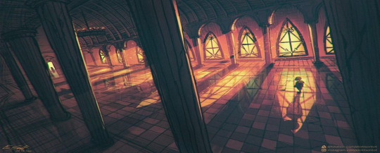
I want to add a roof of some kind and connect the pillar with an arch. This takes priority. I want to deliver this big, grand, ominous judgement hall. This has made me change priorities of the order of things. A future update has also help with this as well, but I will explain what that is at the end of the post, with other future update plans.
What Have I Done Between Updates?
I have made the floor checkered, a table, a cloth,and fiddled around with the color wheel, of Maya, to get certain color to apply, as basic textures, to make the scene look more like what I pictured it to look like. This will be shown in the renders of the hallway section.
I have also made two different versions of Undyne's spear, as the first item, a gold version, and a blue version, both with glowing textures. I started with a mood board for the spear, and even some bones , that represent Papyrus and Sans.
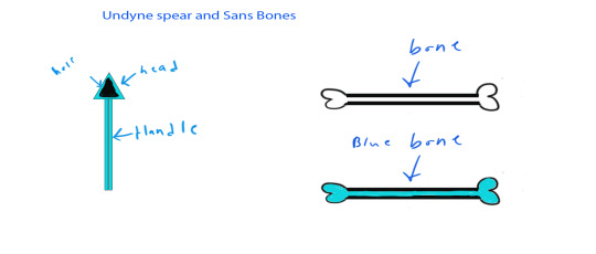
After I went to make the models of the different versions of the spear and rendered images. Here are the renders of them:

As you all can see I went with this design as a base for the spears.
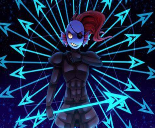
I just really liked the look and shape of this take of spears, so I took inspiration for my models.
Working On The Hall Scene:
I also made a sort of basic reference, mood board, for the hallway layout as well.
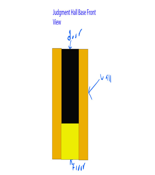
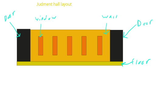
Render Tests:
I had managed to take some test renders of my current hallway piece. I did run into some issues, like floating pillars, but I did fix those issue and took more renders. Here are all the test renders I took. First one is an overhead view:
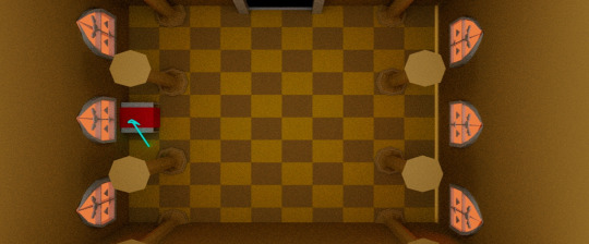
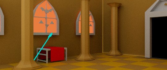
This is an angled view, next is a side view(Keep this because it is a good shot even though pillars are floating):
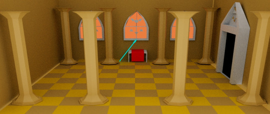
And here is the final test render.
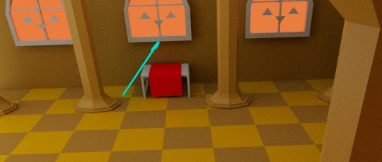
Getting Darker:
When I was taking shots, to render, to test what it would look like, what lighting could be used, etcetera, I decided to try a render or 2 without the sky dome lighting and the results were actually pretty good/cool looking. I decided to take some renders and honestly, by messing with lighting a little more, I can have myself some more ominous looking renders that fight the mood I am going for conveying. It is interesting how a simple shift in lighting can change a whole mood of a scene. Here are the 2 renders:
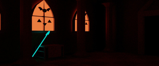

Now a little bit of lighting is diffidently needed to make things a little more seeable.
Going Forward:
The next thing I will focus on is making the hallway bigger and laying out the direction it will go, lighting and building the ceiling. This reasoning is to help me see hall's shape more, and to have a more to scale hall to do a fly through play blast for my upcoming draft Demo Reel. I will update this if I get more stuff done before the end of the day. I am excited to work on getting more renders, a play blast, etc., for my draft of a demo reel for this project.
0 notes