#change opacity on scroll
Explore tagged Tumblr posts
Visit Tumblr Blog
Explore Tumblr blogs with no restrictions, modern design and the best experience.
Last Seen Tumblr Blogs


Fun Fact
Tumblr.com rank in the US is 25.
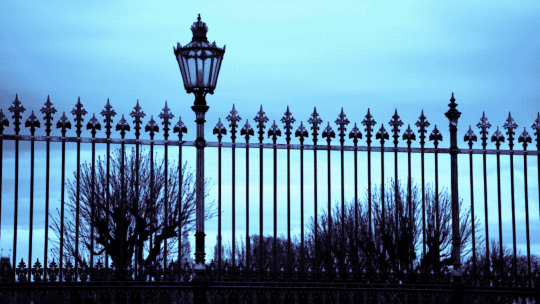
Text

Change Opacity On Scroll
#change opacity on scroll#javascript animation#javascript#html css#html5#css3#learn to code#code#divinector#frontenddevelopment#css#html#javascript for beginners#javascript tutorial
1 note
·
View note
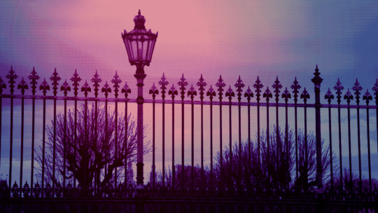
Text
Change Opacity on Scroll
#change opacity on page scroll#codenewbies#html css#frontenddevelopment#html5 css3#css#plugins#jquery#javascript#page scroll animation#html5#css3
5 notes
·
View notes
Text
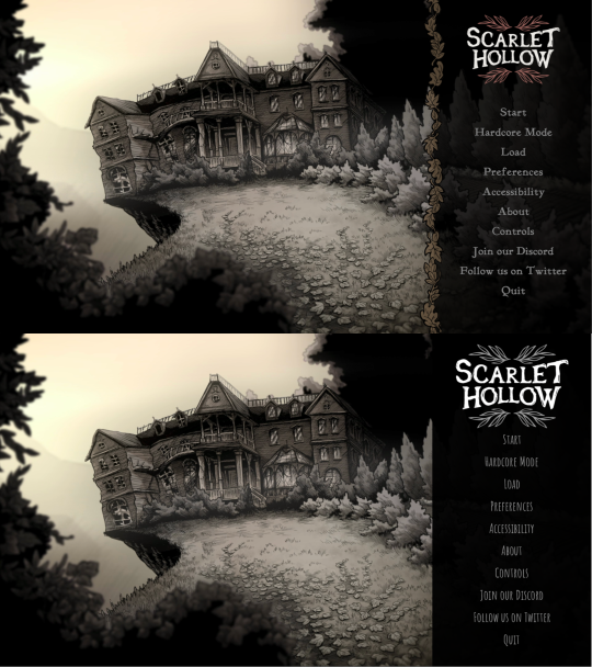
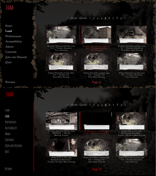
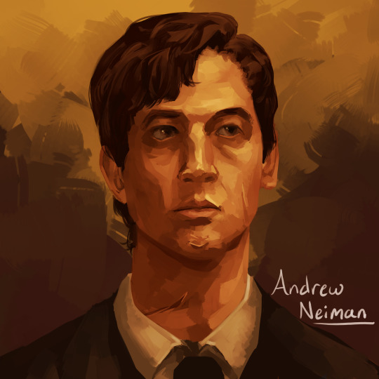
Scarlet Hollow UI Redesign Work In Progress
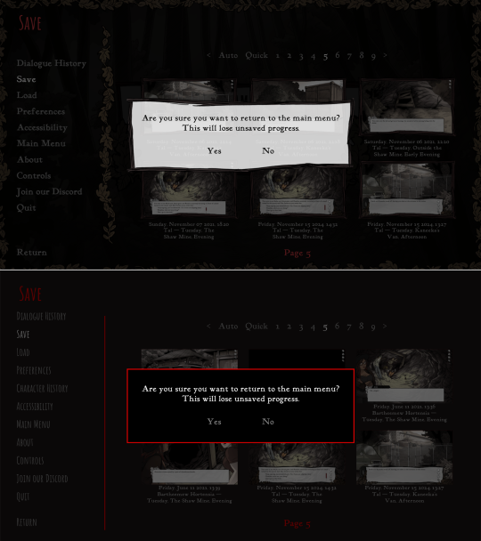
HELLO! As some of you may know we've been hard at work on a large overhaul patch for the first four episodes of Scarlet Hollow to bring the game closer to our ever-higher standards. While there are a lot of content changes and additions coming with the update, here's spoiler-free look at how the UI side of it is coming along. New UI on top, old UI on bottom. First, and most importantly is the updated textbox. We've been adding a lot of detail to small UI elements, and this is no exception — there are more leaves, and those leaves have some color in them now, which we feel makes the in-game art feel a lot richer. On the usability side, you'll notice that this new box is both taller, meaning that we can fit more options before you need to scroll, and that the scrollbar is located further to the right, meaning options can be longer before flowing onto the next line. (Again, meaning there will be less scrolling.) We've also moved the quick menu into the textbox so it no longer overlaps with any background art.
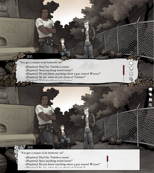
Next up, we've got the main menu. Not a ton to say here. Logo is smaller and has some color so it feels less stark. The font choice is tighter, and we added a border where the text options start to improve the feel of things. In general we're trying to make options that make the interface feel warmer, more organic, and less sterile.
Next we've got the in-game menu. Again, framing things with organic shapes to provide better flow and separation. We've also added a wooden "frame" around each save game thumbnail give them a more natural feeling.
Similar notes for the new confirmation screen. We're probably going to increase the opacity a little bit. At the moment is a little too transparent.
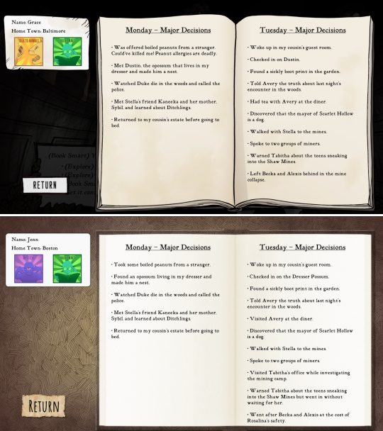
The journal has new assets, and instead of a generic cross-hatched background, we add a semi-transparent black layer so you can still see the game world behind it.
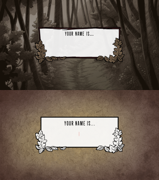
And speaking of generic cross-hatching, we've also removed it from character creation, instead replacing it with backgrounds from inside the game. Overall this should feel a lot more welcoming.
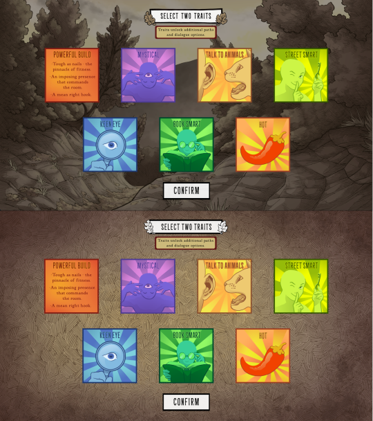
These backgrounds change with each new slide, too. Here's how trait selection works.
Anyways that's it for now! Happy new year :)
744 notes
·
View notes
Text


Theme - Allfire; [preview] [code] [magnusthemes] [buy me a coffee?]
A compact, versatile and responsive header theme.
Features:
Full support for NPF posts
Theme is responsive!
Like/reblog buttons
1, 2 or 3 columns of posts
Custom post size from 250px to 540px
Pagination options: Infinite scroll, manual load or pagination
Background image options: Full-size, repeated, none
Header image options: Full-size, compact, none
Change content opacity from 0 to 1
Optional rainbow accents
Notes:
Built with JSON - thanks to @eggdesign's base code!
To insert links into the menu, simply create a page and check “show a link to this page”.
Please turn off the default mobile theme in Advanced Options if you want to use the mobile version!
Subtitle is optional, and you can add icons if you want!
Updates tab is also optional, and you can also add icons if you want!
Icons cheatsheet: here
Full list of credits: here
Please like and/or reblog this post if you use or plan or using this theme, and consider buying a coffee to support me! Thank you c:
#themes#mythemes#tumblr theme#codingcabin#theme hunter#magnusthemes#html#css#fueled by coldplay bts and 2010s anime osts
263 notes
·
View notes
Text

Create Your Own Main Menu for The Sims 4 - Tutorial
Hey folks!
This tutorial will walk you through creating your own main menu override for The Sims 4 based on my custom repository.
_________
What is required:
JPEXS Free Flash Decompiler
Sims 4 Studio
Raster graphics editor (e.g. Photoshop, Gimp, Photopea)
Your Own Main Menu repository
_________
Step 1: Download and unzip the Your Own Main Menu repository
It's available on my Patreon page for free.
_________
Step 2: Prepare your custom images
There are two images that you need to customize:
SimMattically_YourOwnMainMenu_MainBG.pngThis is the main background image, where you want to put the desired graphic.Size: 1440px x 1200px
SimMattically_YourOwnMainMenu_BarBG.pngThis is the second background for the navigation bar on the right.Size: 480px x 1200px
Prepare your own images based on these templates. Do not change the size of the images.
Tips: If you're using a more complex background, such as a screenshot from your game, I recommend blurring the Bar_BG with a Gaussian Blur (~60px). Additionally, I suggest adding a white overlay with ~50% opacity and a 5-pixel wide white bar on the left edge with ~10% opacity. This helps improve the readability of the navigation bar buttons and adds an extra layer of detail to your menu design.

The repository also contains the optional file "SimMattically_RefreshedMainMenu_ScenarioButton.package" from my other mod, which replaces the Scenario button icon with a semi-transparent white version. It's up to you whether you want to use it.
_________
Step 3: Import the images to the .GFX file
Firstly, open JPEXS Free Flash Decompiler and then open my SimMattically_YourOwnMainMenu_Template.gfx with it.


Select "No to all" when prompted.

On the left, choose "images" and scroll to the bottom where you will see the images you just edited in their original form. Right-click on each and select "Replace." Select the custom images you prepared in step 2.


Save the file.
_________
Step 4: Import the .GFX file into the .package file.
Open Sims 4 Studio, then click on "My Projects" and open SimMattically_YourOwnMainMenu.package. Select "Scale Form GFX" (the one with the "gameentrylauncher" description) and click on "Import." Select the modified .GFX file and import it. On Windows OS, you need to switch from .binary to all file types to see the file.


Save the .package file via File -> Save As... Give it a custom name and place it in The Sims 4/Mods folder.
That's it! Enjoy!
_________
IMPORTANT INFORMATION/TERMS OF USE:
Main menu overrides can become outdated with some game updates, causing them to break the game. You will have to remake your custom main menu with a new, updated template in this case. Always make sure you are using the latest available template and that it's not outdated.
Since these mods can break the game, I do not advise sharing your custom main menus with other players. You are free to do so, but be aware that since you're relying on this repository to create your own version, you most likely won't be able to update the mod and resolve issues for other players on your own, so you take responsibility for breaking their game.
If you decide to share your version with other players, please credit my repository and link to my Patreon post.
Do not put your custom main menu based on this repository behind any paywall or early access. I made this repository and tutorial free for everyone, so keep it fair.
I do not take responsibility for people misusing this repository or breaking your game with incorrectly modified files. I do not provide support for custom main menu overrides created by other creators using this repository.
_________
#sims#thesims#thesims4#sims4#sims 4 mods#sims 4 custom content#simblr#s4cc#ts4#main menu override#sims tutorial
317 notes
·
View notes
Text
how i do my visual novel filtered photo backgrouds
ive had some questions about this so i figured i'd put together a quick post on my process and what goes into it.
this isnt really a tutorial and instead is just a ramble of how i do stuff with a ton of examples and pictures lol
read more below. this is a long post and you probably want to be looking at these images on your computer instead of your phone
step one is that i find CC0 photos or otherwise easy licenses to use because I'm lazy and don't want to have a list of credits of random photographers caue i used one of their images but also i don't want to use stuff without crediting
because they have a general lincese that just wants you to mention the site i prefer unsplash or pixabay but there's other public domain type photo sites too obviously
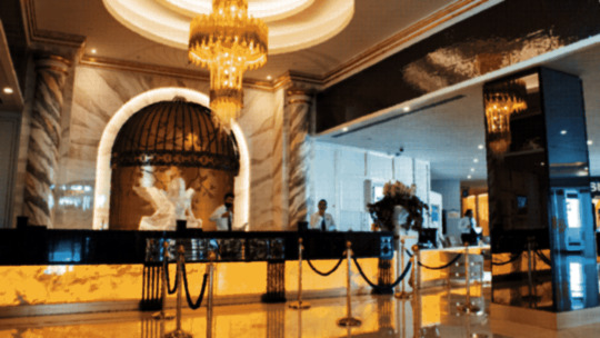
so like okay heres a random picture

i have a photoshop CS5 from 10 years ago. but these can be done with gimp or krita and whatever. theres even photopea that has photoshop in the browser
basic stuff is that i start by cropping my bg into my renpy resolution (i use 1920x1080) this is also the part where sometimes i might rotate a bg. it is a good way to add some chaos vibes to a scene
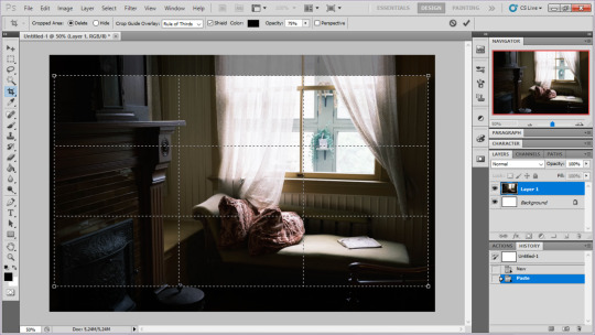
i tend to add some mild blur effect since i find that having too sharp photos as backgrounds clashes with the artstyle of my sprites. like just a couple pixels worth of blur tends to do it
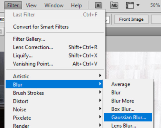
the next part is called fuck around and find out

i like to play with the values to just get random results. hue/saturation for tinting the picture, messing with the curves to get some really sharp effects, or channel mixer to add more of a color
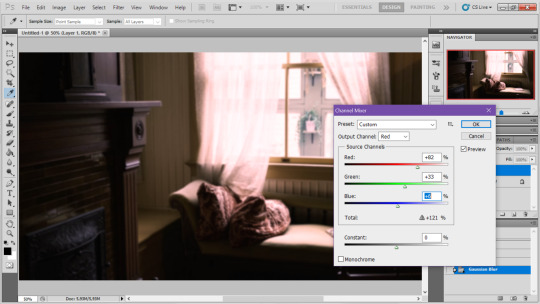
this part is just purely vibes based but i personally think reducing the colors of the background is the simplest way to create something that feels coherent. especially if you make backgrounds based on moods. like having a blue tinted bedroom vs a red tinted one really changes the atmosphere
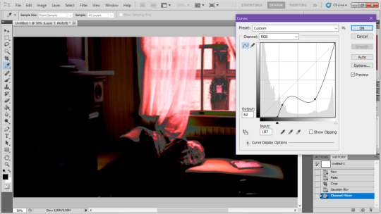
you can get some pretty intense effects but its always important to remember that its meant to be a background and there's a risk it distracts from the sprites
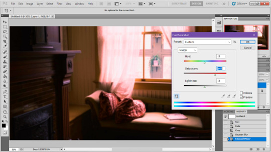
in this case im not including the effect for the curves. after the colours look fine the final step i tend to have is apply some sort of effect.
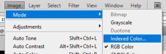
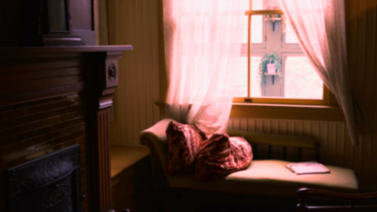
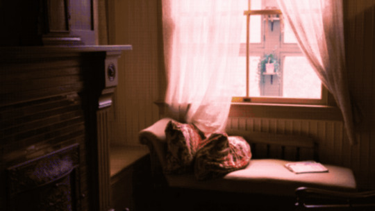
i really like changing the colour mode to indexed colour since i like crunchy pixels. (had to zoom in to 100% to show the actual effect) downside of indexed is that it doesn't look ideal unless its displayed in the exact resolution it was made in but i like it
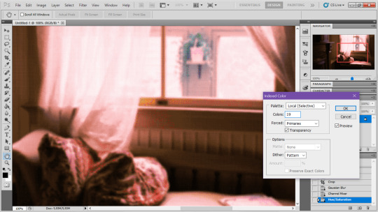
here is the images before indexed mode:
after indexed mode(i think you have to click the image and open it in full to see the actual effect):
another thing ive been playing with recently has been grain+chromatic aberration combo. it makes things feel surprisingly lively with just this simple thing so you'll probably see me overusing this effect in the future

you have to mess with the numbers to get the effect you want but for me these were the parameters I've been using
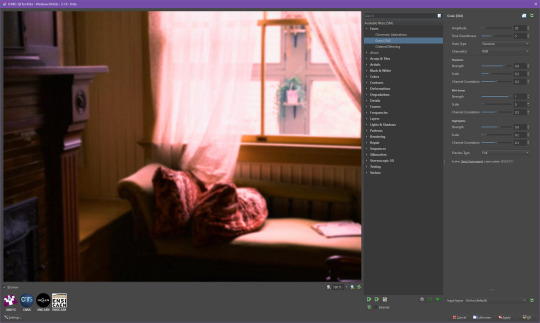

ignore the preview missing idk why it does that.
heres the image (the non indexed version) after these krita effects
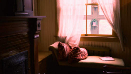
one random special mention i have is that playing with layer blend modes is great
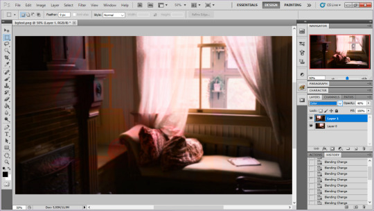
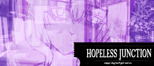
in this example i just copied the same background, mirrored it horizontally and set the layer blend mode to color and it lowered the layer opacity slightly. it just adds some.... idk what to call it visual noise? itj just fucks it up a bit. i used overlapping images and screen modes in some of the hopeless junction images i did for some pretty nice effects
i dont really know waht the blend modes do i just scroll until something looks good lmao
theres a ton you can do with these. like for example just adding a single air brush dot of a bright color on a separate layer and setting it to some blend mode to add a tint to a background
i used these both in malmaid and in the second one i just brushed on some color on a separate layer to give it a moodier vibe
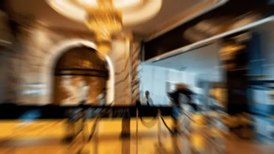
i think having variations of the same background is an extremely easy way to add some life to the bgs without having to do new stuff. like here was the hotel lobby when entering, and here is the hotel lobby when they ran away from the place. i added a radial blur with photoshop
i think theres some beaty in artifacts that come from low resolution images too. sometimes i intentionally use images that have clear compression artifacts cause i think it looks neat. i don't really worry about the details too much as the vibe is the most important thing
its honestly just a matter of knowing these tools exist and just fidgeting around with combinations to find what you want. it also helps to look at other backgrounds or images in general that you come across and just be curious. how was this done? how could i recreate it? that's the type of experimenting that has led me to these.
idk thats all i have to say. ty for reading and play malmaid on steam like and subscribe for more gay puppies
160 notes
·
View notes
Text
TUT: CONVERTING SKINS INTO OVERLAYS
for my precious mootie @thesimselfsworld
I was asked on this post for a tutorial on how to turn custom skins into overlays, so here it is! this is sloppily put together, so I APOLOGIZE. All you'll need is Sims 4 Studio and a photo editing software (I used photopea, but photoshop/krita will work the same)
1. Pick your skin and open it in Sims 4 Studio through the 'My Projects' button (I used one by RemusSirion as an example)
note I would recommend choosing a skin that doesn't come with eyebrows or any facial hair as they will make the end product look weird
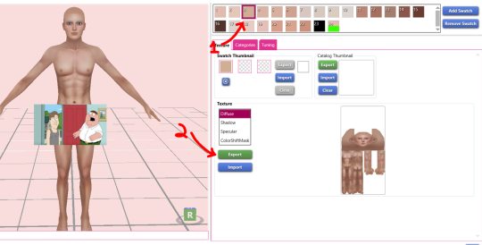
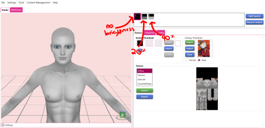
2. Choose a medium - light toned swatch and export the texture
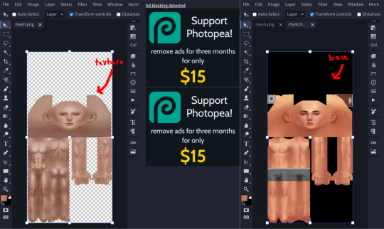
3. Download this skin detail base and choose either the female or male frame, depending on the skin. Then, open both the exported texture and the base in your photo editing software
4. Copy the exported texture into the base and align them. Do NOT change the blend setting even though it looks kinda weird right now!
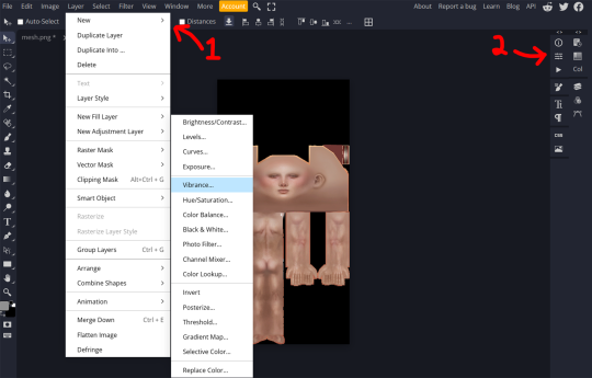
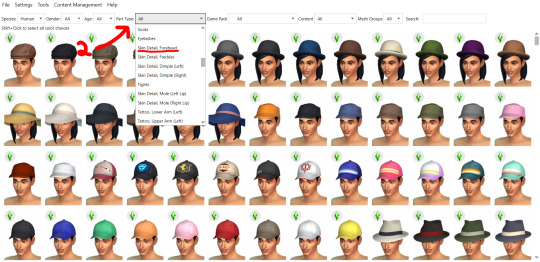
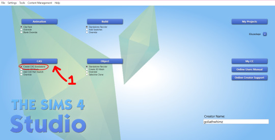
6. Back in Sims 4 Studio, close your current project and create a blank one. Go back to the main menu, then click 'Cas' (make sure its on the 'create CAS stand-alone'). In the 'part type' drop down, scroll until you see 'skin detail, forehead'. Choose that and pick a the first one. Name it whatever and save it to your mod folder, this is the file that will show up in your game
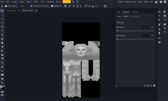
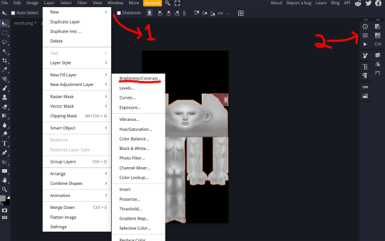
5. In the 'layer' tab in the upper left corner, find the 'new adjustment layer' tab and choose 'vibrance'. Lower the vibrancy to -100% and the saturation to -100%. Then, looking at the layers tab again. left-click on the vibrance layer and create a clipping mask so only the texture is affected. Export this as a PNG
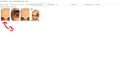
note the preview sim may show the female frame even though you're converting a male skin (or vice versa). To fix this, go into the 'categories' tab and unselect the frame you don't want, then select teen. This should fix that
7. Import the PNG and hit save.
9. In small amounts, adjust the brightness so that the texture. Export the file whenever you're satisfied with the brightness and import it into s4s as another swatch. I like to get 2 additional swatches and increase the brightness by 20
8. Now, you could be done here, but I like to add different opacity levels. So, go back into photopea (or whatever you used) and add a brightness/contrast adjustment layer (you can find this in the same place where you got the vibrance adjustment layer). Create another clipping mask for this layer.
AND TAADAA!!! You're done :D Save your package one more time and enjoy. I wouldn't recommend sharing this anywhere, as it might go against the OG creator's TOS. Keep this for your personal use!
Feel free to ask me any questions :3
#my tutorials#ts4 tutorial#the sims 4 tut#ts4 tut#sims 4 tutorial#the sims 4#ts4 simblr#my cc#the sims community#sims 4#ts4
34 notes
·
View notes
Text
I haven't seen any posts about this yet but l've seen some fan art that makes me feel this needs to be said:
Don't forget Leah Sava Jeffries has darker skin when making Annabeth Chase fan art!
She is much closer to Lupita Nyong'o than Zoe Kravitz when it comes to shading, reflection, and complementary color usage :).
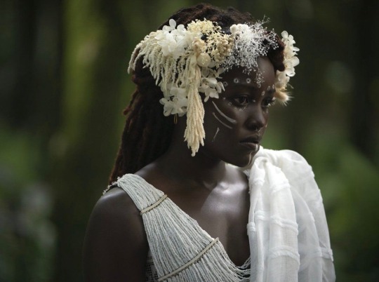
Lighting for dark skin is different on light skin. Light skin gets changed by lighting, and dark skin reflects the lighting. Below is a lovely shot of Nyong'o's character from Wakanda Forever in mourning. The filmmakers emphasize the umber qualities of her skin in contrast to the funereal white and (arguably harsh) light across her shoulder below.
Try to pick spots that aren't directly in or near the light, and try mixing 3 or more! You can put it into a color mixer online, or even color pick, lower the opacity, and lay the shades over each other until you find one that fits. And of course, the more 'realistic' you want to go with shading and lighting, the more shades you're going to want to be able to explore vivaciously :D.
Let's take a look at the same 3 beautiful actresses I mentioned at the beginning, with a bad color picked area and a better-ish color picked area. (Please keep in mind, these are not perfect comparisons, as I was not able to find pictures of all 3 actresses under the same kind of lighting.)
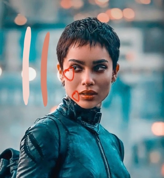
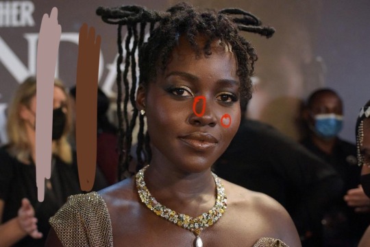
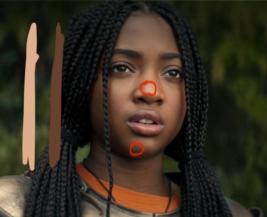
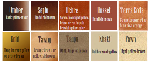
Kravitz's has a clear difference between the two, but they aren't too far apart, in comparison to Nyong’o’s and Jeffries’s. Note the dullness in the poorly picked shades as opposed to the better ones. Also keep in mind that while Kravitz has a rosy undertone (at least in that picture - it’s from The Batman, which has stylized coloring) Nyong’o has a slight cool undertone (I can’t pin down quite what, but the picture is definitely not stylized like Kravitz’s).
Jeffries runs more ochre or russet, but neither of those are pink. They are more red than terracotta or umber, but to call Jeffries’s face rosy would be wrong. Err more towards the golden when drawing her.
^^saved an image from a writing tutorial long ago, but can’t seem to find it. If someone recognizes it, I’ll link it. EDIT: it’s from this post. Thanks @autumnrowancollector ! <3
And also, the darker skin gets, the less likely warm undertones are going to appear. Don't be afraid to use blue or purple or even green on occasion!
Additionally, cool lighting on dark skin is always a win imo.
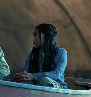
(I was going to use that picture of Jeffries as Annabeth by the lightning bolt, but then I realized the lighting on her face doesn’t quite match up with where it should hit from that angle, and I realized they kind of just turned everything bluer, so screenshot time!)
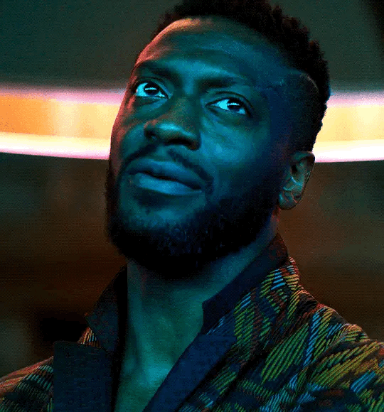
(Also if you want another really great live action example, check out anything Aldis Hodge is in, like Leverage and Black Adam)(and of course there’s Spiderverse <3 but I want to post pictures of Hodge)
Now, to here’s a list of more experienced people’s advice:
Black facial features & hair
Shading digitally for a (somewhat) monotone Black character
Stylistic choices and places to start looking for inspiration (besides a search engine).
Coloring Black people’s lips
A better coloration tutorial
Also a nice tutorial for Indigenous skin tones, just in case yall want to draw Piper or use this information for other dark skinned characters :).
EDIT: Some actresses who are closer in skintone to use for Annabeth, provided by the lovely @blackfemmecharacterdependency ! If you can’t find a reference for Jeffries in a specific lighting, maybe check out these ladies’ pictures! It’s a reblog, so scroll down.
TLDR: Don’t make Annabeth pink and pale, make her dark and golden.
#Annabeth chase#Percy Jackson#percabeth#leah sava jeffries#pjo#leah jeffries#art tutorial#percy jackon and the olympians#I love superheroes and so of course all of the actors I thought of were from superhero movies lmao#also for the record my advice is mostly from reading others’ tutorials and observation#and I don’t really use it a lot because I stick to lineart a lot lol#like down to mentioning Hodge (love himmmm) as a reference for good lighting on dark skin#there’s another post floating around here that specifically mentions him and Leverage for that#I’m tagging this as an art tutorial but really i want it to be more of a master post#master post so yall can see the tutorials I usually use#but then I ended up writing about Jeffries specifically because I’m dumb#I wanted to go to sleep four hours ago I’m dumb#I really want to draw her and ginger Percy but#irl it’s starting to get busy at school again :/
380 notes
·
View notes
Text

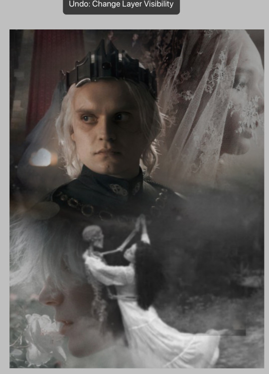
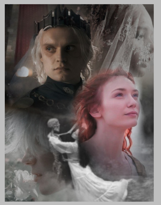
(Click the image for better quality)
Yipeeee that Keiki and Mayumi fanart I posted the WIP of is finally done woooo- This piece was a very experimental one that I'm kind of OK on. Maybe because I've just gone insane looking at it for so long and I'm my own worst critic lol.
Artist's Notes;
So I've once again been playing around with my rendering style, mainly because I have been wanting to improve my lighting for a while now and as I was just scrolling through Tumblr, I saw some of the official art for that one webcomic-turned-animated-TV-Show Lackadaisy and was immediately inspired. I also have seen a technique a few times in the past where the lineart and shading are merged together, so I've been meaning to try that for a little while.

I did some experimentation on this one sketch of Keiki I posted in my sketch dump and I really liked the results of it, so I carried those over to this piece.
I ended up scaling up Keiki and Mayumi from the original WIP because I felt like they were both getting lost in the composition, and I'm glad for that because I think it works a lot better. I'm not a fan of how Mayumi's sword turned out at all, but it's not really meant to be the focus of the piece so eh. Overall, I think I could do better with my colours, probably because with Keiki and Mayumi's colours, I did them flat in greyscale and then used a brush on the overlay blend mode to colour all of them over, after which I changed the base layer for their colours from white to yellow and then lowered the opacity so it all went together better. I also decided to use gradient maps for a lot of the background elements, mainly to experiment with getting in my values first to make them pop out more. I ended up finding a really nice sky gradient on Clip Studio Paint that I really liked, and that kinda helped to establish the colour scheme of the background a lot. I think the whole "start in greyscale then colour" thing really works better with painterly styles rather than more illustrative ones, and while it is good at making sure your values are more readable, I honestly don't think I have the skill level to pull that off yet. Honestly, I think I've been looking at this drawing too long or maybe I added too much to it, but I wish I could've made the colours less monochromatic, but I'll just save that for the next piece I do.
I do love how the flame (...well it's more of a weird space rift than anything in this piece) and the lighting turned out, those were fun to do. I was initially struggling with the flame and how Mayumi is positioned in front of it before realizing "Oh wait! This is a weird abstraction of a weird creature! I don't have to follow the laws of anatomy!" and just dislocated it's flamey bottom jaw from the main body. I also changed the colours of it since I was really not liking how incredibly bright it was when it had lighter colours. Again, the gradient maps served the more painterly style of the flames well.
I also love how Mayumi turned out. I could do her sleeves better but that's more of just me needing to study how those types of sleeves fold in that position more. I'm also very happy with the posing, the technique I used for that was taking photos of myself in the positions I wanted, blocking in the silhouette and then modifying that by adjusting it to my lines of action that I drew on top of the original photos, and then sketching over the silhouettes and drawing in the shapes of the hands overtop of the photo if I needed to get the fine details right. As for what I do to take the pictures myself, I use a tall chair I have, prop up my phone with a phone stand, put on a ten second timer and scramble to get in position. Yes, I did have to use a bunch of thin markers I had to try and get the hand positioning on Keiki's pose right, yes I do have a fake sword that I used to get the positioning of Mayumi's arms and hand right, the sword was for an old Halloween costume from several years ago. I really like how both Keiki and Mayumi turned out in this drawing, I'll have to play around with these designs for them more in future drawings.
Also, if you wanna know why I draw buildings like that, when I watched Fantasia 2000 as a kid (One of the Disney movies where they make really beautiful animations to classical music) the way they drew the buildings in the first few sections Rhapsody in Blue segment (the jazz one with the cities) changed my brain chemistry and now whenever I need to draw buildings really quickly, I refer back to that. Since the buildings aren't really the main subject, I didn't put much thought into them.
As you can tell I am very tired of this piece, mainly because I made things harder for myself by overcomplicating the process compared to what I usually do, mainly with the whole "starting in grayscale then adding colour." I'd honestly just prefer having a black layer set to colour that I can just toggle on and off when I need to see the values, but it was good to experiment. And that was mainly the point of this whole drawing, to experiment. I'm definitely going to have to play around with this new style I'm going for, mainly because I liked how it turned out a lot in the augmented Keiki sketch, and also because I want to find ways of making it suit my style more. I also really want to keep experimenting with my lighting like this, it's very fun. Last but not least I am never starting in greyscale again because dear god I do not like the workflow it forced me into. I don't have a problem with the method itself it's mainly just a skill issue lol.
If you wanna read my headcanons for these two, I put them in my WIP post, so you can read them there if you want to. The more I look at this the more I prefer the simplicity of my WIP. I might go back to this and just take away the fancy colours and effects to see what it looks like without all of that stuff and reblog this post with that drawing, but for now, I don't think I can look at this drawing again for a while.
#touhou project#art#fanart#touhou fanart#touhou 17#wily beast and weakest creature#keiki haniyasushin#mayumi joutougu#haniyasushin keiki
118 notes
·
View notes
Note
how do you make your colours so scrumptious... that's a vague ask but it's like, how do you make the colours mash together well and make sure they don't clash against eachother. And when you do designs, what inspires you to make your agent ocs outfits or do you just make them because they look silly.
hmmm... no.1 i stay away from pure black and pure white. i always use an off-white and a dark desaturated color of whatever i'm using, as well as for when i use grays. here's an example vv
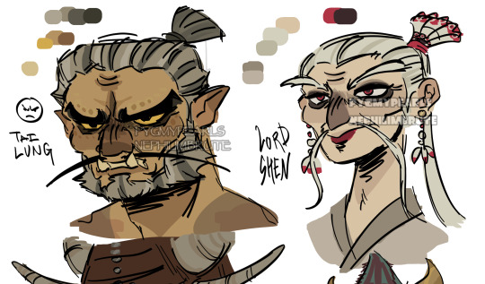
^^ all of the colors on my tai lung come from yellow hues in various shades (if that makes sense). same with my lord shen. the red is a reddish-pink, and the black is, of course, a desaturated and darker shade of the red

i tend to stay in the middle area here, i don't really like to use bright or very saturated colors. another example is when i choose an ink color for marina, i don't use something that's TOO bright, but going for something a little darker to pair with the primary color of her tentacles and her skin
now, here's my chameleon vv
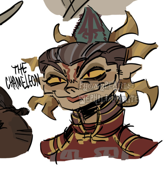
her colors were a little difficult to figure out, but i'd say they work together somewhat...they all fall into the category of being desaturated and such. mainly warm colors with the exception of the green, but i made the red a little pinkish/purpleish so it wouldn't contrast as much
it REALLY depends on the character but most of the time my lighter colors will be less saturated, and for darker colors they'll be saturated. this obviously varies, like with undead characters all of their colors would be a little more muted
i also have a theme i keep in mind for my colors. like with my fantasy marina, i think of olive or yellow-green. the only colors that i don't change (often) in the palette are the skin tones. another example is my young craig design, i think of the sepia filter and...old looking colors? like grayish browns and yellows and stuff like tha.t...i dunno
the main way i learned how to color is actually by coloring...normally? the colors all looked weird and had such contrast, but i'd overlay another layer on top with a solid color, set the blending mode to multiply, and lower the opacity. sometimes i'd do this with the mono color filter instead of a solid color
i also take inspiration from other artists! wolfythewitch is one of my biggest inspos for art in general, great coloring and anatomy. if you're looking for an artist with saturated colors that pop, check out bigskycastle!
now onto the second question...if you mean their uniforms..yeah i just went with whatever looked silly. (OLD ART ALERT ERR ERRR) cap3's uniform is intended to be a few sizes larger since it was most likely supposed to be for val before she got fired. and she wears pants instead of shorts since she wants to cover up a lot
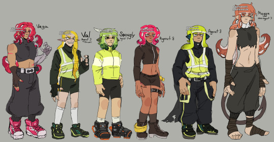
not much is different with maggie. other than the fact that she's wearing a uniform too small for him and it ended up looking weird
but if it's for outfits in general i just scroll through the lists of gear on inkipedia and pick whatever i think the character would wear
107 notes
·
View notes
Note
How did you find/make your aesthetic profiles of the gods in your book?
i was gonna link you to my guide that i posted a long time ago, but i realized how old it was and that it was lacking some details...... 💀
so i'm gonna do a new one that hopefully helps a bit more!!!!
websites used: pinterest, tumblr, canva, deviantart, & photopea!
first off, i find the pictures from sites like pinterest and tumblr. the color schemes of each pic need to be somewhat close to each other (but it doesn't always have to be like that depending on the psd you'll be using later on)
i'm gonna use hades for example. this is the first pic i find of him lol:
the most dominant color here is purple, with some tinted ivory from his skin, and brown in the background, so the next few pics i find should have somewhat similar colors too, or they should at least be purple cuz it's the most frequent color here
here are the next few photos i found:
they don't look perfect, but we can always individually tweak the colors and shades later
i download the photos and then i go to canva. the site provides you with templates that you can use but since i only got three pics, i chose the "email header" option.
(for those wondering which template i used for the bigger ones you see in the first chapter with percy and the yans, i don't use a template. i just use "custom size" and type in "800 x 800 px")
go to the sidebar, click "elements" then scroll down for "grids" and then find the one with 3 parts. i reduced the spacing between the photos to zero.
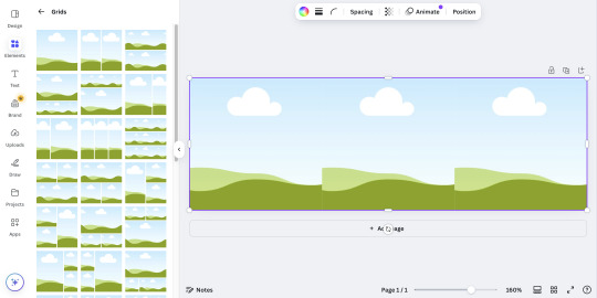
then i upload all 3 photos and put them in the squares. because they're not exactly the closest in color schemes, i individually edit them until i'm satisfied.
canva provides filters that you can use, but i always find it best to toggle with the adjustments like brightness, contrast, saturation, etc.
here's what i ended up with so far:
again, not exactly perfect, but whatever
now that i'm done, i go up to "share", select "download", and increase the size by 1.5 (that's 900 x 300 px). idk why, but for some reason, the quality looks better when you enlarge the size before download.
once that's done, i download the whole thing.
(keep the file type as "png" btw)
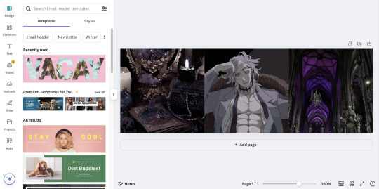
then i go over to photopea and upload my graphic. it'll look like this:
in another tab (not the photopea tab, but like... the actual tab of whatever browser ur using), i can find a bunch of psd colorings in deviantart. since i want one that's specifically purple, i just search up "psd coloring purple"
and i get all this:
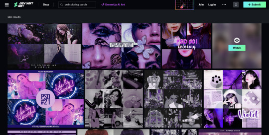
i pick whichever one i think might look best and download it.
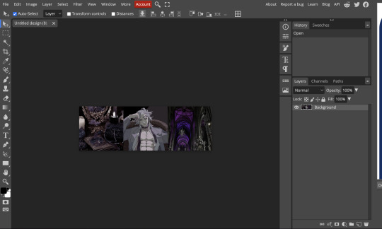
then i head back to photopea.
at the top, click on "file" and the new psd you just downloaded, and it'll show up in a new tab.
stay on that tab, go up to "layer" -> "layer into" and select the first tab where the graphic's at. this applies the psd coloring onto ur graphic.
over at the side, there's something called "opacity: ___%" you can toggle with that if the psd is too overwhelming, so you can lessen it by dragging it down if you need to.
once you're satisfied, click "file" -> "export as" -> "png" and it'll be downloaded.
and that's pretty much it!
THIS CAN BE A LONG PROCESS THOUGH! literally in every step, you might end up going back and changing stuff.
for example, i do not like the right photo that i selected. the purple is too bold compared to the purple shades in the left and center photo. i'd probably go aaaalll the way back to the earlier steps by returning to pinterest to find a better photo
or maybe you don't like the psd you picked. if that's the case, delete the photopea tabs and redo the above steps with a different psd.
it can be a bit annoying if ur the perfectionist type and have to go back again and again 😅
but anyway, psd coloring's are great. i'm looking back at the og versions of all the graphics i made (og as in, before i applied the psd colorings) and they're soooo different from the finished pieces
24 notes
·
View notes
Text
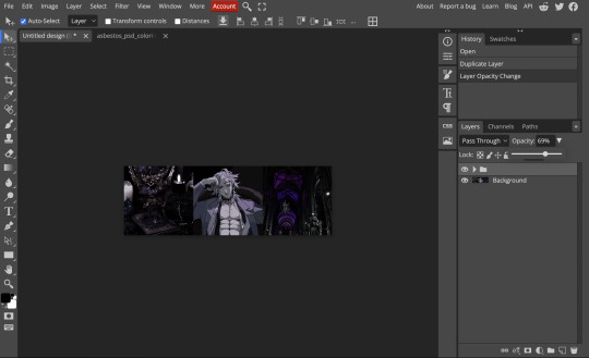
Fixing Sharp Edges
(or a tutorial on how to edit the AlphaMaskThreshold)
This problem most commonly applies to textures on a flat mesh like rugs and wall decals. You make this wonderfully detailed texture, but when you open the object in-game the edges are pixelated and don't look how you intended.
This little guide assumes that your object already allows for transparency, if you need help with that this tutorial on the S4S forum is a good place to start. If you are editing a rug then it should be good to go. I'll be using @kirsicca's paint splashes as an example here since 1. I wrote this primarily for her (😘) and 2. it shows changes in threshold well.
1.) The first few steps depend on the type of mesh/object you are working with. Click on the Warehouse tab, then click either Model LOD 00000000 or Model 00000000 if you don't have that option.
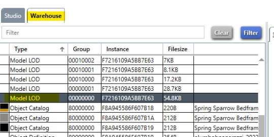

2.) (Skip to step 5 if you have Model LOD 00000000) If you had to click Model 00000000 instead of the LOD, click the Data tab then click the Edit Items... button under Key -> Lods
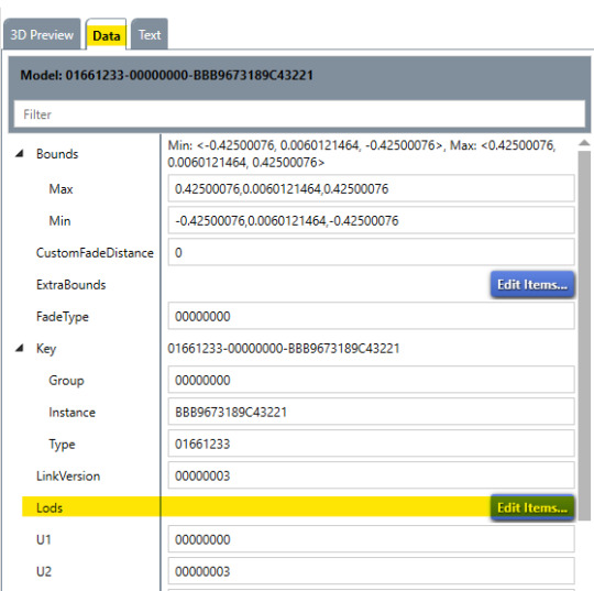
3.) A new window will pop up. Make sure HighDetail Flags is the option selected on the left panel (it will be by default) then click Edit Items... under Model -> Resource -> Key -> Meshes

4.) Another new window will pop up. Scroll around halfway down until you see Material -> Resource -> Entries. Click the Edit Items... button next to Entries. Another new window will pop up, which is when the beginning steps dovetail. Go to step 7.
5.) (Start here if you have Model LOD 00000000) Click the Data tab, then click Edit Items... under Key -> Meshes

6.) (Only if you have Model LOD 00000000) Select either Phong or PhongAlpha on the left panel. Scroll around halfway down until you see Material -> Resource -> Entries. Click the Edit Items... button next to Entries and a new window will pop up.
7.) Now we're in the same place! Each VariantId you see is a different swatch. If you know you want to adjust transparency it is best to do this process before adding new swatches to save time. Let's start with the first swatch - Click on VariantId: set1-materialvariant, StateId: Default in the left panel. On the right side, click Edit Items... under Material -> Resource -> Material

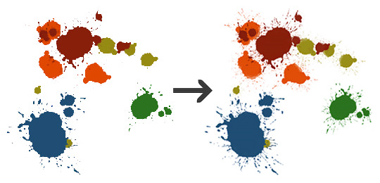
8.) A new window will pop up. We're looking for AlphaMaskThreshold. This value tells The Sims which pixels in a texture should be shown and which ones should be transparent.

What does this number mean? The value can range from 1 to 255. The default is 128, which means anything less than 50% opacity will not be shown. Here is an example of what this looks like in practice using @kirsicca's texture. White are visible pixels, black are hidden.
1 and 255 are only there for reference; you generally don't want to select 1 because your texture can appear black where it thinks pixels should be, and 255 will hide most of your texture.
Once you change the value in Sims4Studio, click save on the window that popped up. From there, edit the value for each swatch (VariantId) and save everything then test it in game. If you are editing a rug, they don't get "burnt" because they turn to ash so you can skip those states.
I hope you found this helpful! Let me know if you have any questions or if something was unclear. :)
21 notes
·
View notes
Text
youtube
Urasawa MEP intro
Thanks @marshmallowgoop for all your hard work in hosting this MEP! It was so fun seeing the final video put together, everyone should be proud of their work c:
Here's a little breakdown of my part below-


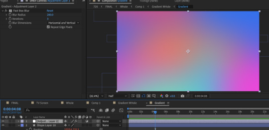
The base of the gradient consists of ten circles all moving in wacky ways thanks to wiggle expressions. Putting the wiggle expressions to extreme values means the circles will occasionally disappear entirely from view or massively take over the screen, leaving the gradient with a lot of evolving variety.
To add expressions: Alt click the stop watch and type wiggle( , ) The first number is how many times per second it will move and the second is the extreme to which it will move. (Frequency, Amplitude)
To quickly view your written expressions: click the layer and double click E on your keyboard
1st gradient comp: Masked into a circle. Double click the shape for it to be centered and fill the whole comp. Animate the scale so it disappears and covers the whole comp. And because I don't want to copy paste the keyframes a million times: Alt click the stop watch, click the arrow, scroll to properties, and click the loopOut cycle expression. The animation will repeat immediately from the beginning.
Duplicate gradient comp: Scaled up to the max size of the last keyframe in the masked gradient layer
Adjustment layer: A displacement map
Okay, so what's informing the displacement map?
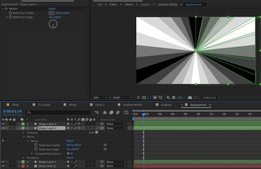
It's another comp layer that's the same ray pattern made out of shape layers. (Quick tip, use the mirror effect so it's less work). Displacement maps work by using areas of black and white to inform how an image is moved. Middle gray is neutral, black pushes in one direction, white pulls in the opposite.


The displacement is pushed to such an extreme that clicking 'stretch map to fit' isn't resolving the areas of black. I couldn't figure out why, so I resorted to scaling up the comp to hide it. It's also doing a fun thing were the circles fall to the center first before expanding outwards. I didn't intend for that to happen, but it's a very nice flow of motion.
Okay, but how do you keep the pattern precise when making the rays?
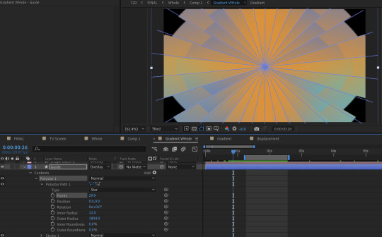
I played with the polystar shape to make a guide.
But this still looks pretty flat, right?
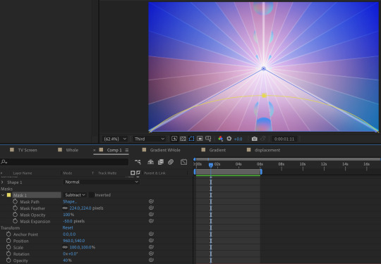
Some additional adjustments:
A white shape layer (blue) to fit the bottom triangle with a feathered mask (yellow) to form a luster across the shape. This is on an overlay blend mode and the opacity is turned down.
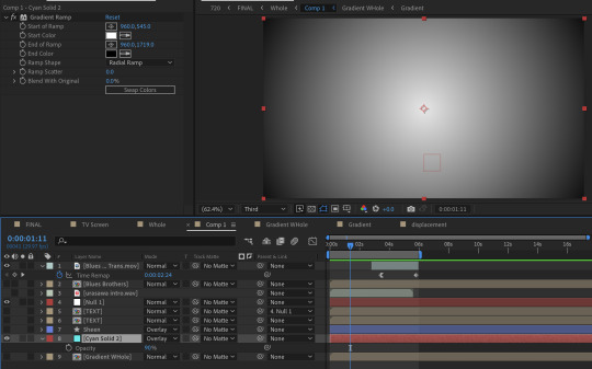
And a radial gradient ramp that is also on an overlay blend mode with the opacity turned down.
What about the reflections?

They're the same comps but duplicated, flipped vertically, with some added blurs (including vertical only) and the opacity turned down.
You may notice that the car's reflection doesn't move in a way a flipped layer should.
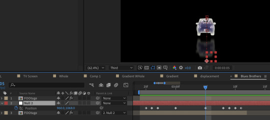
That's because I have it following a null where I animated the position to match how I think a reflection going down a road works. (Additionally I exported this whole comp with a transparent background because I wanted to make some time adjustments without screwing up the mask animation)
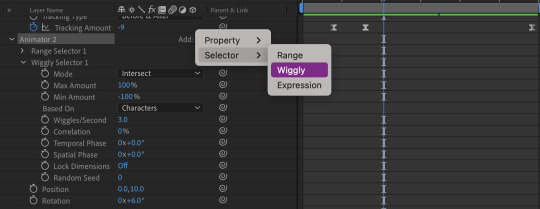
About the text:
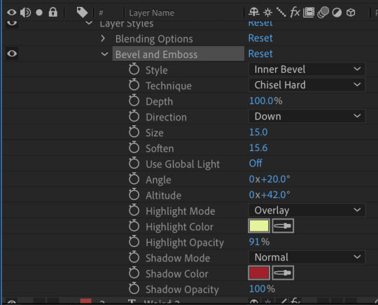
The title is using a bevel and emboss layer style, that's why the text appears to melt together when I squish the tracking inward. (Side note about tracking, add a line anchor and type 50% if it stubbornly refuses to be centered by default) Text animators also have a wiggly setting! A little bit hidden, but fun. I only added this for the main title.
I also added posterize time to change the fps to 12, which gives it a little bit of a choppy animated look.
The "TV opening" look consists of an animated white shape layer with some blurs, grain and noise across the whole comp. And since it's already black and white I can use it as a track matte for the final, whole comp of the title opening. I use the offset effect to create the 'rolling footage' of the title with scale wipe to create that bit of warping.
I like making sure there's always an easy to follow direction of motion, so after a lot of downward fast movement, everything is timed to burst outward, from the title to the gradient.
#dcmk#my animation#motion graphics#my video#curse tumblr for not letting me upload more than one video#I had the itch to write some type of breakdown but I really don't know how thorough I should be#I don't expect most people to do more than glance at it so I went on until I lost steam#but if anyone really does have questions I'm happy to answer!
7 notes
·
View notes
Text
HOW TO MAKE A COVER PART 1
PART 2
We all the saying “never judge a book by its cover”, but be honest without yourself. There has at least been one time when you did pick or didn’t pick a book because of its cover. Anne many people make fanfics these days, but sometimes when you scrolling on Wattpad, it isn’t a stories name or summary that usually stops you from scrolling down a list of fics, it’s the cover that makes it stand out.
“But how do I make my cover stand out? I don’t know how to make one?” Simple trick: make it look good. It is natural for humans to take a liking to looking at good things.
WARNING: I am no master at making covers, this is something simple I decided to do to help a few people. But today, I will tech you make covers like these (both covers are made by me for a friend, do not steal or edit my work):
INTSTRUCTIONS:
Find a website obviously. Since I’m a broke bitch, I don’t spend my money on Photoshop or anything fancy. So lemme give you a free and easy app: IbisPaintX (it works on laptops, iPads, phones. But for this purpose, I recommend choosing an iPad).
2. Find some pictures. In order to make a cover, you obviously need pictures. I recommend adding 2~ faces in the cover so you have space for adding additional photos for fun that fit the theme. Also make sure to have at least one background photo so when you add your pictures on top, they’re istn too much white space showing. I recommend going on Pinterest to find photos. Also, remember to pick a theme. Are you going for something romantic? Something tragic? Or thriller? For this tutorial, I’ll be making a romantic cover, but my theme is more grayish (always try to plan on an image mentally before actually making anything). These will be my images for this tutorial:
(Keep in mind, you probably won’t be using all of your images. It is simply better to have lots of photos, in case a certain one might not workout. Throughout the process of making the actual cover, you might go around and change photos up or even add new ones as I do).
3. Once you get your photos, go to IbisPaintX and click on the plus sign.
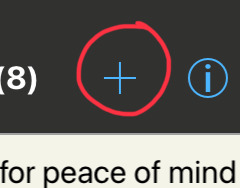
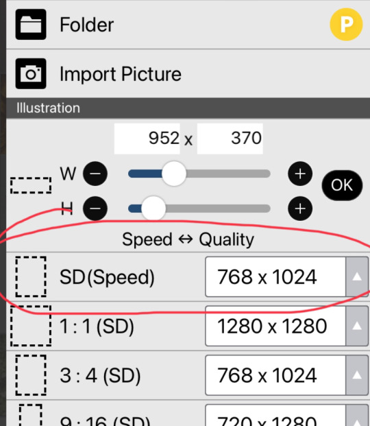
This should open a chart (the image on the right) for you, that allows you to pick the size of your cavas. You can either make your own size, or choose one of the premade ones. I recommend the 768 x 1024 size.
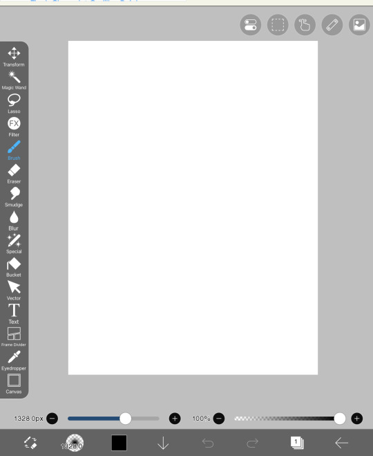
4. Now we have our canvas! Currently it should be blank, but see that little number 1 at the bottom? That is used for layers. When you press thag, you should open to the setting in the second image. Click on the little camera circled.
It should open to this and you should pick 1-2 photos. These photos should add as our backgrounds. Every time you open a photo, It will pop up something that asks if you want to extract or remove any backgrounds, press cancel for every image until I say so.
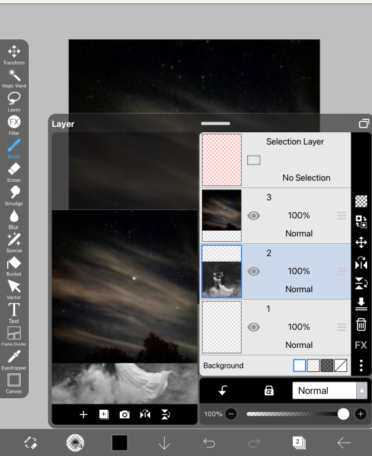
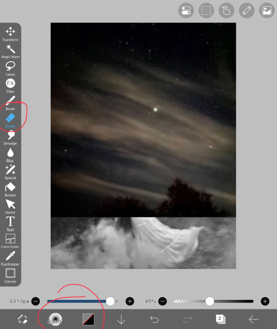
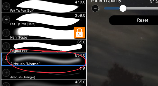
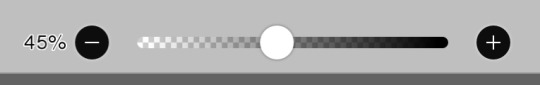
Currently, the two photos look stiffer than my back. Let’s try to blend them together! In order to do that, you should head over to the erasers. When you go there, press on airbrush and lower the opacity (I normally use 45% to blend most photos)
Softly blend the two images and try to prevent any sort of white spots from forming. This should be our finished results:
5. The next step is quite similar. Now that you know how to add on images, continue to add more images on top and blend them into one another. DO NOT OVERDO THIS
BOOM! Jusr have fun in this process, add on images and remove, blend around. If the colors don’t fit that well together, it’s ok, we will work on that in future steps. But now, it’s time to add our main characters on the cover. I usually add them in the middle, since that is where the attention is most drawn. Simply add them on and erase the edges of the sides to make it proper. Do not erase too much in this step. We are not trying to make the picture blend in, but rather soften the edges of remove the background. Here, this is what I mean:
If there is any more photos at this point that you want to add, go ahead. The next step is merge all the layers. When you opened the layers, you would see how there are many. We are trying to merge them into one. When you open the layers button, there will be a merging button that I circled and simply press on it continuously until you have only one layer.
Our product should be this as of now:

OK YOU MUSF BE SAYING “THIS LOOKS PLAIN AND UGLY!”
I know it does. But because tumblr is a bitch and only allows a certain amount of photos, this will be split into part 1 and part 2. In this part, you learned how to ensemble a cover. In the next part, we will learn how to make it look good. This is PART 2
Thank you for staying this long! If you have any questions so far, please do ask me.
#sazh rambles#sazh covers#sazh writes#sazh helps#covers#book cover#fanfic#fanfic help#tips#art tips#art tutorial#guide
11 notes
·
View notes
Text
My Paint Tool Sai Brushes/Painting Process Tutorial!
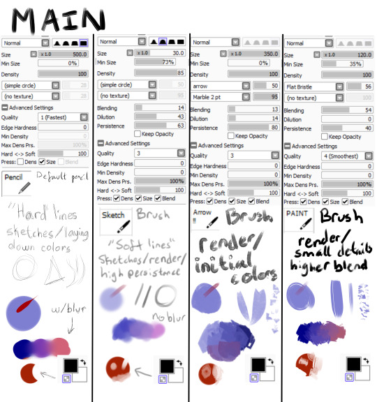
Explanations and Examples down below
Disclaimer: long post
Hello! I wanted to first thank everyone for liking/reblogging my most recent art piece (the Darkiplier one) It has become my first post with over 1000 notes which is just insane for me. I just wanted to do something to thank you guys for that.
Anyway, this post will be divided like this, so scroll to the title if you want specific things
Introduction
Brush textures/shapes for download
Overall process -> Terms and Definitions
How I use each brush (+ examples) -> Sketch -> Lineart (only do this sometimes) -> Rendering -> Textures + Post Processing
Conclusion
Introduction
This post is mainly for me in the future to look back on how my painting process was. My process changes ALL the time, sometimes I use lineart, sometimes I paint, sometimes I don't use textures, sometimes I have 100 layers, sometimes I have 1. It just changes depending on the piece. There is no "correct" way to do art. Do what you want!
Second of all, I feel I should point out you don't need fancy brushes or many brushes to make good art. I painted this piece with 1 brush.
That's right, 1 brush (it was the P A I N T brush shown in main). I didn't have a sketch, I didn't have any lines, I started with big shapes and went from there.
Third of all, I use Paint Tool SAI (the first one). So this will be specific to that program. I'm sorry, it's just what I know how to use.
Brush Textures/Shapes
You may see in my brushes that there are textures/shapes that don't come with the standard SAI program. I tried to find the links for you to download them yourself.
Arrow: https://www.deviantart.com/digikat04/art/Custom-SAI-Brush-I-265506547
All texture brushes: https://painttoolsaibrushes.splstc.com/painttool-sai-textures/
For some reason I can't find where I got marble pt. 2 or chalk so here's the png files. (You can convert them to .bmp files) (Hopefully that works!)
Chalk : Marble pt. 2

Overall Process
Before I go over my process I'm going to define some terms I'll be using and what I mean by them:
Flats - base colors
Rendering - Includes shading, lighting, small details, and texturing to define a form
Blending - mixing two separate colors together
Reduction - Once you've made a line/shape, reduction is the act of erasing part of it -> At the bottom of my brushes (in the images up above) you can see a checkered box which makes your brush transparent. I use the erasing brush to Reduce the red circle.
Persistence - How well the brush can create a new shape/color on top of pre-existing colors (If the brush blends a lot on top of other colors it has low persistence)
"Hard" vs "Soft" brushes - How well defined an edge is on a brush
Stabilizer - Turns trembly lines into smooth lines
So, I draw a different way each time. My canvas size is normally between 2500 pixels and 4000. I usually do around 3000 though. In general for my paintings I usually do
A sketch
Flats
Hue Shifts
Lighting/Shadows
Brighter Light/Deeper Shadows (Highlights/Ambient Occlusion)
Smaller Details
Texturing
Post Processing
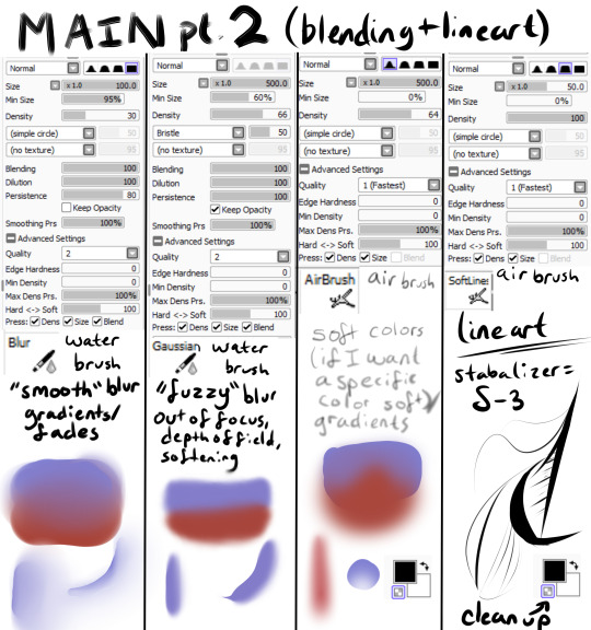
For my bigger compositions, I make thumbnails. And for my "comic book" style I use lineart and layer modes (like multiply, luminosity)
How I Use Each Brush (+ Examples!)
Sketch
I have 2 sketch brushes. "pencil" and "sketch" For most of my life I have been using the default pencil brush on size 1. But recently I have been using this softer "sketch" brush on size ~20 or so. Either way works, but I find that the "pencil" brush is easier for linework and the "sketch" brush is easier to blend into paintings
"Pencil" : "Sketch" examples
Lineart (opt.)
Nowadays I don't use lineart that often, but if I do it's with my "Softlines" brush. It's great for both very thick and very thin lines. I lower the opacity of my sketch and put lineart on a new layer on top of it
"Softlines" brush examples

Flats
With lineart I seperate each new color with a new layer. For painting I'm now using one color as an underpainting color and working on top of that layer. So I render one thing at a time while working on the same layer.
I lower the opacity of the sketch and create a new layer under my sketch. I use my "pencil" brush to lay out the underpainting color and "blur" for hue shifts. And then I reduce it to the silhouette using my "sketch" brush (This gives a softer outline)

Rendering
This would take way too long to explain every step of how I do it. So I'll explain how I use my brushes in this step.
"Arrow!!!" - I use this brush for laying out intial shapes, big areas of color, shading, lighting. The arrow shape has a point on the end that's really great for triangular shapes. It's not very good at small details because of the texture applied to it.
"Sketch" - I use this brush during the rendering as well. It's great for small details that you want a softer look of. It has a high persistence so it's great for working on the same layer.
"P A I N T" - This is a brush that's good at very many things. It has higher blending than "sketch" or "Arrow!!!" and it's shape is square. Great for blending, general painting, small details, reduction, etc.
"blur" - great for gradients or to smooth something out a lot
"Gaussian" - is a gaussian blur. Great for making things out of focus or fuzzy
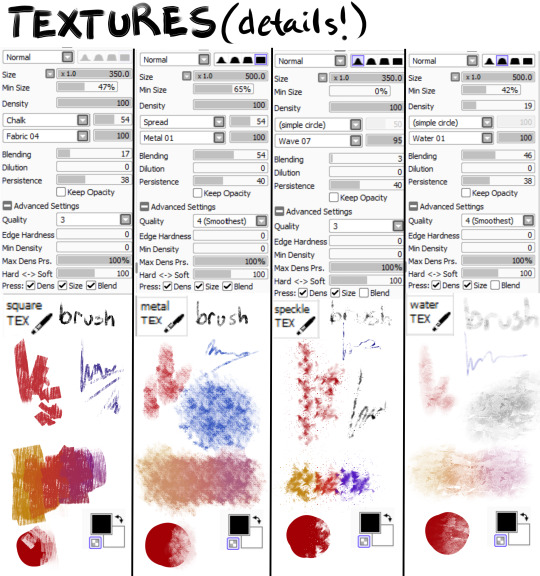
"square TEX" - texture brush that has high persistence with some blending
"metal TEX" - texture brush with high blending and a spread shape.
"speckle TEX" - texture brush for kind of a sparkly look. High persistence
"water TEX" - texture brush that works kind of like a glaze. You can use for flair/fun
example

Post-Processing
Typically I use more filters for this. Paint Tool Sai has sliders to change hue, saturation, brightness, contrast, luminosity, and color deepen. So I tend to mess with those. I also add effects like chromatic aberration
The tutorial I follow for chromatic aberration in Paint Tool Sai: https://www.youtube.com/watch?v=thmaephD9Ec&t=169s
I also add particles like dust and other objects.
Finally I use my Gaussian blur to make things out of focus/motion blur
Conclusion
I hope this helps! I feel like I'm at a point in my art journey where I'm good enough to give advice. So hopefully this helps someone out there with their art journey! Obviously I have a long way to go, but I'm pretty proud of where I've come. I remember watching speedpaints and tutorials trying to become better at art. So I kind of want to add to that cycle for artists. :D Have a great day!
39 notes
·
View notes
Note
Would you ever share your blending process? It looks amazing!
Of course!!! I'm always happy to help!!! (Also, thank you for saying so 💖💖💖💖)
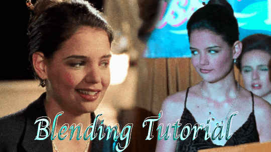
The tutorial below will show you how to make this gif!
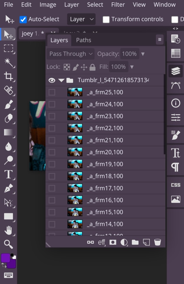
So first you have to open your gifs in photopea and make sure they're the same number of frames.

Once both of your gifs are made and have the same number of frames, you'll go into the second gif and right click on it and pick the 'duplicate into' option, where you'll choose to duplicate it into your first gif.
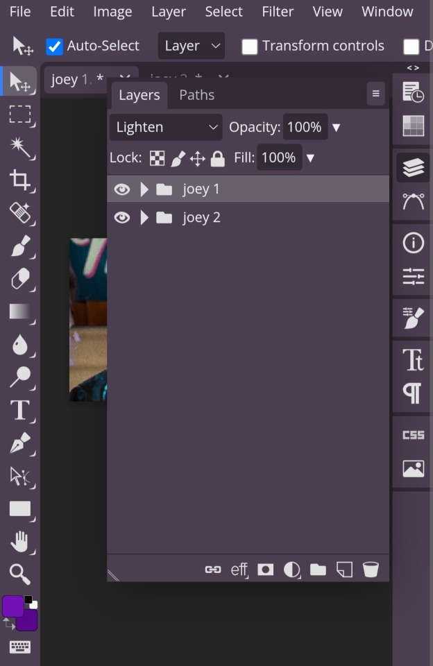
Once you have them together in the same place, you'll change the blending style (which is the dropdown menu next to opacity) from 'pass through' to 'lighten' for both gifs. This step isn't technically required, but it helps you visualize how you want to place your gifs easier.
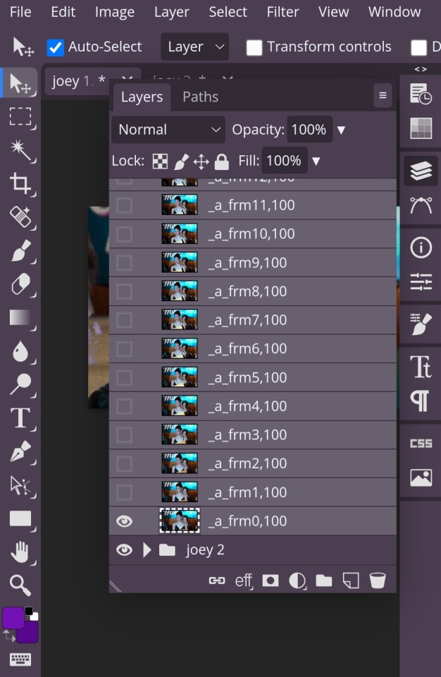
In order to move your gifs to where you want them to be, you have to select all the frames of your gif (otherwise you'll only end up moving one frame). You can do this by clicking on the first frame, then hold down the shift key while you select the last frame. Then you're free to move both gifs to where you want them!
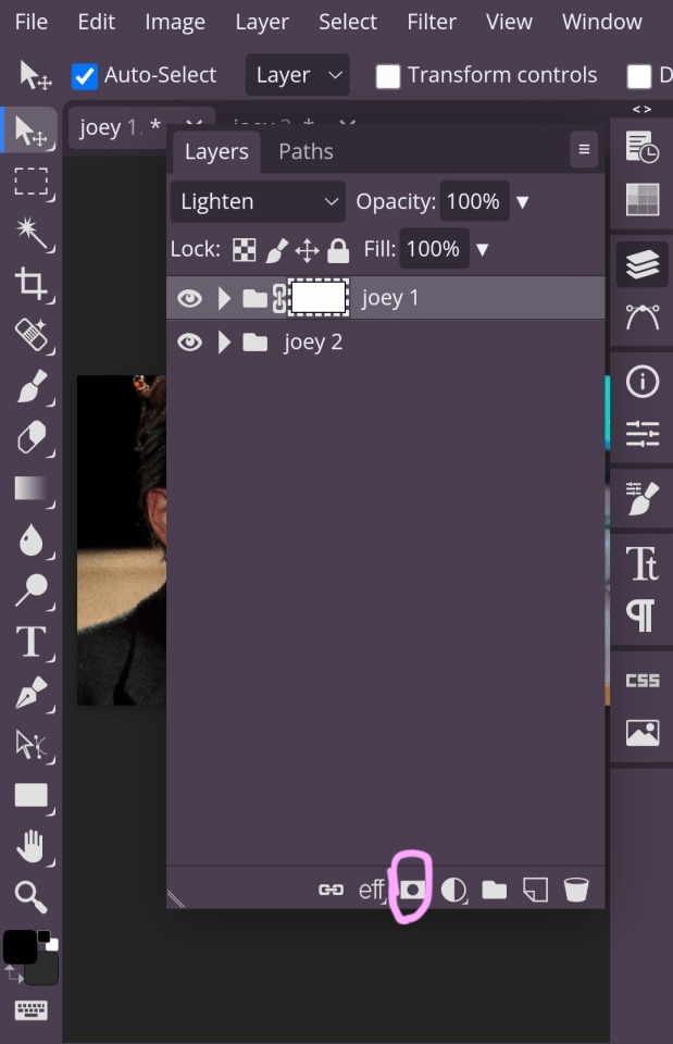
Once you have your gifs where you want them, now comes the blending! Click on the raster mask option, which I've circled.
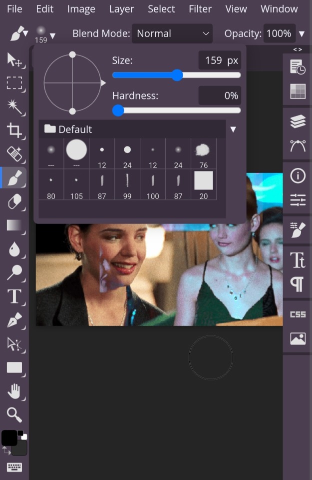
Next, you're going to get a brush. It's best to turn the hardness down, because then you're won't be as, well, hard lol. With a soft brush, it's easier to blend more naturally. And use whatever size you want.
With the raster mask, to erase what you don't want in your gif, like the harsh lines and things blocking parts of your other gif or whatever, you want to turn the color to black. Then, if you erase too much, you can change the color to white in order to add it back in!
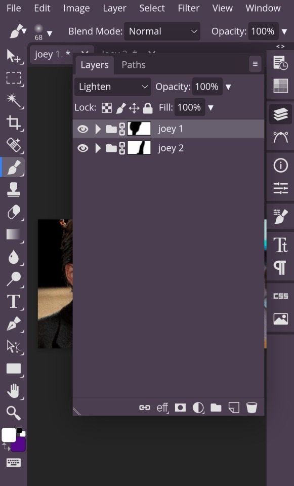
One more thing about the raster mask, since you'll be adding it both gifs. Whatever part of the gif you want to erase make sure you're erasing the part from the gif that mask is applied to.
If that's confusing, what I mean is: I have my gifs labelled 'joey 1' & 'joey 2'. Joey 1 is the gif on the right and Joey 2 is the gif on the left. So, if I want to have more of the Joey 2 gif in my blended gif, I have to erase the parts of Joey 1 from the mask applied to Joey 1. (Hopefully that makes sense!)
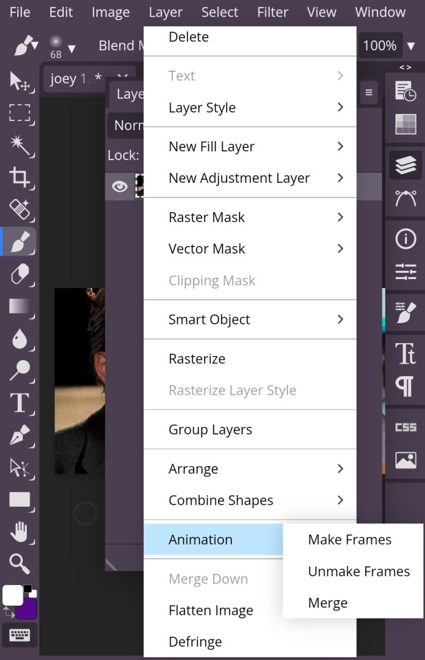
Once you're satisfied with your blending, you're going to select both folders the same way you selected frames when moving your gifs. Then, you're going to click the layer dropdown menu up on the top and scroll until you get to the animation tab which has 'make frames' 'unmake frames' & 'merge' in it. You're going to select merge and you're done!
Just save it as a gif with whatever dimensions you want! And congratulations, you've made your blended gif !!!!!!
#photopea tutorials#photopea#gif tutorials#gif tutorial#photopea tutorial#cloud's tutorials#this was a very quick gif so i hope it looks okay!!!#replies
40 notes
·
View notes