#+ i layer multiple drawings in one canvas so ....
Text

I give you … them
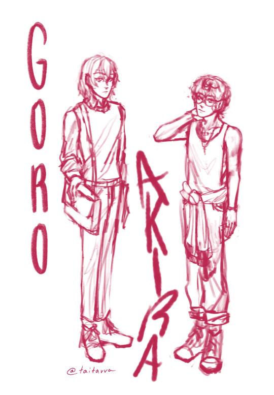
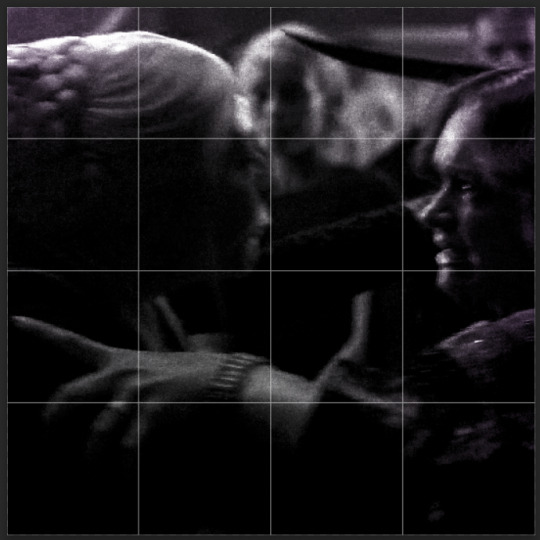
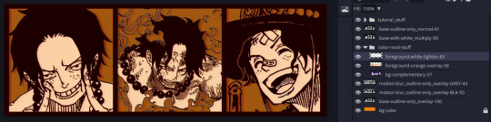
#I’ve been drawing on one canvas within multiple layers so though the file is untitled#—their layer title is ‘bros b4 hoes’… just thought I’d put that out there#anyways before I even knew akechi was a thing (because believe it or not I managed to go into this game completely blind) I thought these—#two were a cute pair#and I still think they are… criminal I haven’t even drawn them until now#anyways if you read all that sorry#persona 5#faerie art#p5r#atlus persona#ren amamiya#p5 protagonist#akira kurusu#ryuji sakamoto#pegoryu#akiryu
297 notes
·
View notes
Text

when ur girlfriend is some eldritch horror, or vast unknowable being vs. just two guys in college
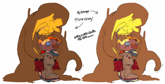
#its 2021 time !!!!#the shihoann sketch has ann kind of rendered but shiho is not that filled in so#base sketch#btw why did none of u tell me wisdom teeth surgery sucks#the first week was inhumane#i was very tempted to draw akechi suffering but#i need to do work orz#persona 5#p5#persona 5 royal#p5r#procreate#2021#persona 5 protagonist#ren amamiya#akira kurusu#goro akechi#shiho suzui#ann takamaki#shihoann#annshiho#taitavva sketches#3 hours#i have no idea it was 2021#+ i layer multiple drawings in one canvas so ....#i can only estimate 😔
46 notes
·
View notes
Text

ms paint. you know her. u used her age 8 to make loads of rainbow ovals all over the canvas and then scramble it with selection tool. now u will know her true powers with my handyrandy tips under the readmore. some will be pretty basic and others are very special.
this post has 8 cool trix to learn for you. enjoy and i may do another in the future if i remember/learn more stuff
some of it might be common knowledge. but its got some deep cuts. all tips have gifs to show process easily.
🙂 enjoy and i hope this encourages you to fuck around in mspaint more
soundtrack for this post (loop it while you learn for advanced learning experience)
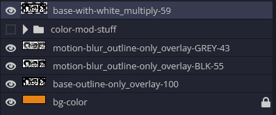
TIP 1) the right click trick
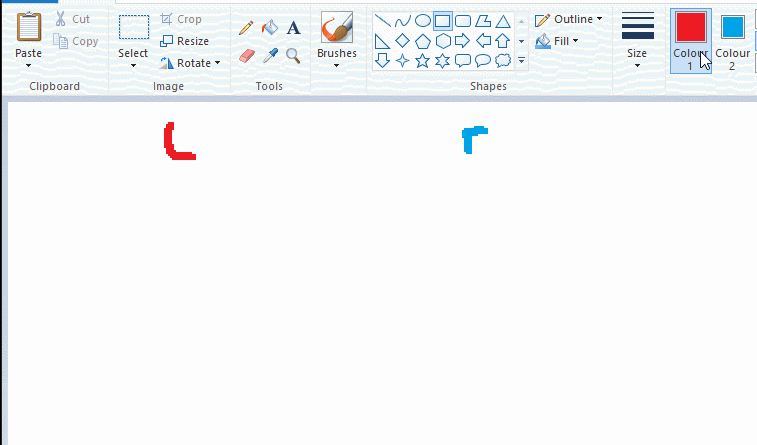
left and right mouse click correspond to col1 and col2 respectively, which u can see in the top bar. this applies to all brushes and the fill tool like above. when using shapes col2 will be the fill colour (if you have solid fill selected). right clicking with shape maker will reverse the colours use on the shape.
TIP 2) right click eraser
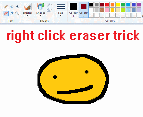
this one is extremely helpful for lineart or add shading. the eraser always uses col2. so your eraser can technically be any colour. but here's where you get powers: right clicking with eraser will only erase onto col1, with col2.
TIP 3) transparent selection change a guy destination
the beloved transparent selection tool works based on what is selected as col2. so long as you have the correct colour as col2 you can make any image transparent and put it on top of anything else. and yes this works with photo bg as you can see.
TIP 4) the gradience
this one is a little more complex. you want to start off with any canvas size, and make as many diagonal coloured bands as you want. (protip: holding down shift makes a perfectly diagonal line with line tool)
then you need to resize the canvas to a width of 1px (make sure you resize by pixels, and do not maintain aspect ratio). then resize again back to its original width (or a different width i cant stop you). you will have your lovely gradience.
TIP 5) superimposter

so. you got a cool gradient and wanna put a guy on it. heres what i do:
i open a 2nd mspaint with same canvas size and draw whatever i want on there. i then pick a completely unrelated colour to my entire piece, and set that as the bg. you could use white, pink, geen, whatever you want as long as it doesnt appear somewhere else in ur drawing. copy the guy.
go back to your gradient tab. ensure that col2 is set as that bg colour you picked (lilac for me). have "transparent selection" enabled. paste your guy in. cue fanfare
TIP 6) advanced superimposter
the great thing about this method is u can put multiple gradients in multiple areas of the image. this is where it gets all japanese printmaking type of shit. ukiyo-esque
all you need to do is make another canvas with a new gradient, ensure col2 is set as the colour you want to replace, then paste your original piece onto the new gradient. now my guy has a soft fade. you can do this as much as you want. (you could even make a canvas with a texture or photo and paste your drawing onto there)
TIP 7) "sketch layer"
so as you now know, col2 is what is removed when you click "transparent selection". which means you can also remove any instance of a colour from ur drawing. which means you can have a unique colour for sketch layer and remove it from the drawing later. i admittedly dont do this but it is a great trick to have.
now combine this with lowering your dpi for smoother lines. may seem obvious but it helps. its like a free stabiliser whenever u want.
TIP 8) rainbow art
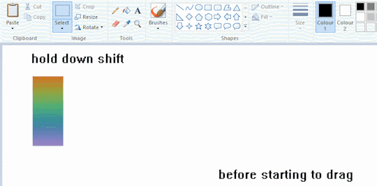
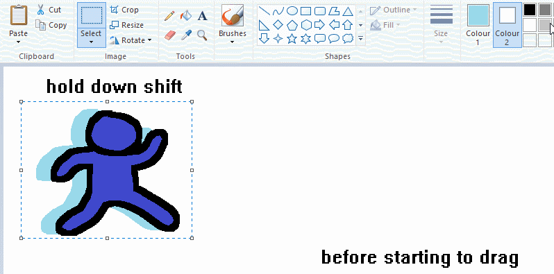
now this is where you can get dizzee rascal "bonkers". check out my small and shitty rainbow trick. you can select anything and hold down shift, then drag with left mouse, to turn that selection into its own brush. i even did it with a guy. and you can of course do this with a photo as well.
🙂well that it for now. hope you liked it thanks for reading now back to your regularly scheduled tgcg programming
2K notes
·
View notes
Text
TILE TRANSITION TUTORIAL
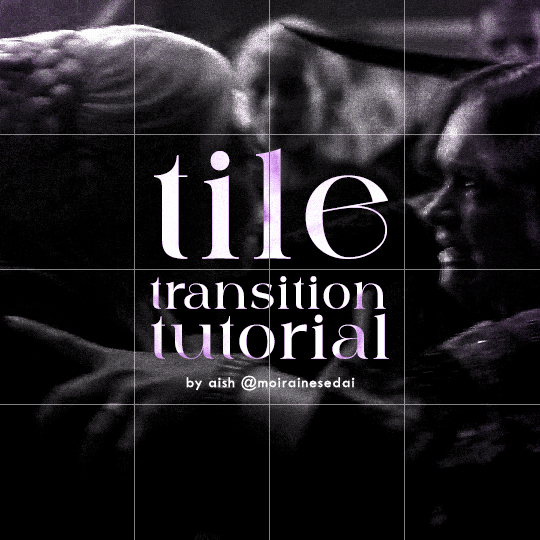
a couple of people have asked me for a tutorial on how I did the penultimate gif in this set, so here goes! this is my first tutorial, so please feel free to reach out with further questions if anything's unclear.
note: this tutorial assumes you know the basics of gifmaking, can create the base gifs, and are familiar with timeline mode.
STEP ONE: create the base gifs! I'd recommend staying between 25-40 frames for each gif, since the transitions we'll use later tend to increase gif sizes. these are the ones I'll be using for this tutorial:


STEP TWO: create the guide layouts for both base gifs. for this panel, I chose a 4x4 grid — I would recommend keeping the number of "tiles" low because it can get tedious, but have a minimum of 9 (3x3 grid).

now your canvas should look like this:
STEP THREE: create the tiles. this is where the going gets rough; there might be easier ways to do this that I couldn't think of 😭 if there are any please send me an ask!
essentially, in this step we'll cut up the base gifs into smaller squares so that each tile can be manipulated separately when we put both gifs together. to do this, first create a square using the rectangle tool and the guides. then duplicate the base gif, move it above the square, apply a clipping mask, and then convert the clipped gif and square (selected in the image below) into one smart object.

ALTERNATELY: you could duplicate the original base gif and use layer masks to isolate tiles. create a layer mask for the duplicated gif layer and, with the layer mask selected, drag your mouse over a square (using the guide layout) and press delete. then press ctrl/cmd + i to invert the layer mask so that the gif only shows in the square of your choosing.
now repeat until you've got the entire gif in tiles, and do the same for the other gif!
since the transition effect is achieved by staggering the crossfades for each tile of the final gif, you can cheat by having multiple tiles "flip" at a time, ideally no more than four. this means you need to cut the base gif up into fewer pieces. to do this, simply draw multiple squares instead of one and then merge the shapes, before duplicating and clipping the gif onto them.
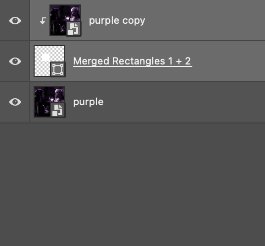
if you do this, it's essential to remember that you have to divide both gifs up in the exact same way. each piece of the b/w gif has to correspond to a piece of the purple gif!
this is what the layers look like for each gif once I'm done:

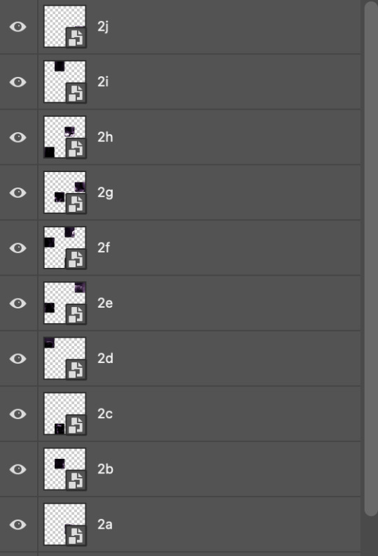
I have them lettered so that it'll be easier to match them up in the next step.
STEP FOUR: this is the complicated bit that took me two days to figure out. I'll do my best to explain but don't hesitate to reach out if something isn't clear!
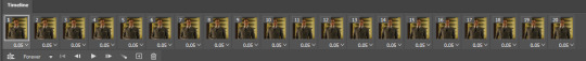
to begin, open up a new psd and import both base gifs into it. (remember to click "create video timeline" and ensure that your gifs are all in order before proceeding.)
now, the trickiest part about this transition is ensuring that all the little tiles sync up so that the larger gif is coherent. so first we'll create some markers (just empty layers) to ensure that everything lines up as it should.
— marker 1: at about halfway through the first gif (b/w in this case)
— marker 2: at about a quarter of the gif length
— marker 3: close to the end of the gifs
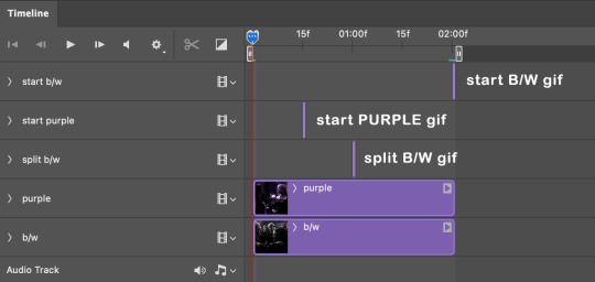
at this point we're ready to start bringing in the tiles. I'm going to delete the base gifs from this new psd just to keep things cleaner!
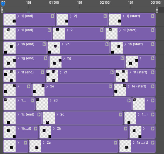
first thing to do is import my b/w tile. move the timeline slider over to marker 1 and split the first gif. (if it helps, rename the split gifs and add (start) and (end) to the two halves.) then, move the (end) half to the beginning of the timeline, and the (start) half to line up with marker 3.
the purple tile is easier to manage. simply import it into the psd and line it up with marker 2.
your timeline should now look like this:
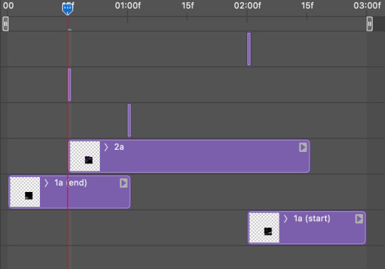
notice the overlap between the gifs at their beginnings and ends — this is where you'll be able to cascade the tiles flipping, so it helps to have a significant amount of overlap.
crop the three gifs for this tile as you see fit! since this is the first tile I want to flip from b/w to purple, I'll crop gif 1a (end) all the way to the current position of the timeline slider (red line with blue tip) and leave the beginning of gif 2a uncropped. for the flip from purple to b/w, I'll crop both gifs a bit.
once that's done, drag all three gifs onto the same level in timeline so they form a video group. your timeline should look something like this:

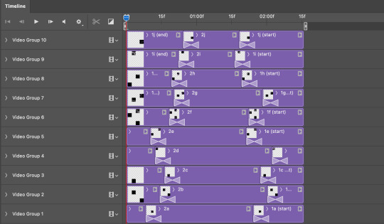
now you just repeat the process for all the other tiles! as long as you made sure that all the tiles in one gif correspond with tiles in the other gif in step three, this should be a fairly painless process. make sure to crop the starts/ends of the gifs separately so that they don't all flip together.
this is what my layers look once I've done all the tiles:
and the gif!
STEP FIVE: transitions! click on the half-white square (top right of the left column in the timeline, beside the scissors) and select the crossfade transition, then drag it between two gifs in a video group. it should create a two-triangle symbol and shorten the overall length of the video group.

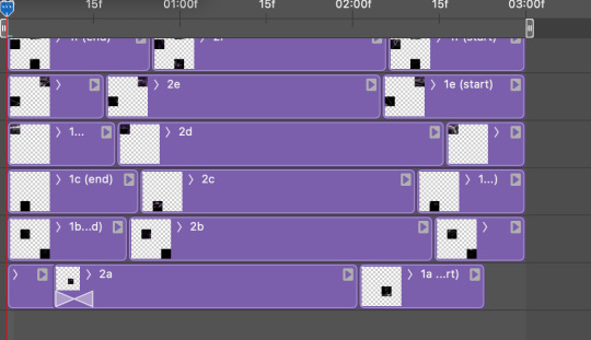
apply the transition to all the tile flips, ensuring that the duration of all transitions is constant. this can sometimes be tricky because ps likes to change the duration of each transition, so right click on the transition symbol and manually change all your transition durations to be the same.
your layers should now look something like this:
STEP SIX: draw the grid. bring back the guide layout from step two and using the line tool (I like 2px thickness), trace the grid. adjust opacity as you see fit (50-80% is usually a good idea), so that the canvas looks like this:
STEP SEVEN: export and celebrate! you're done!
I hope this tutorial made sense and was easy to follow, and happy giffing! my inbox is always open for any questions <3
#tutorial#ps help#ps tutorial#userace#alielook#userabs#usercats#userhella#userfaiths#tuserabbie#usershreyu#usertreena#tuserlucie#uservivaldi#usertj#usergiu#userroza
614 notes
·
View notes
Note
I was wondering how achieve such a wonderful textured finish on your pieces? They are wonderful and I love their resemblance to aged photographs and the speckles of colors in the backgrounds. Your art is mesmerizing :)
you can see some of the texture brush sets i use in my #info_asks tag but i have some more (procreate) tips aside from just brushes
also hi i made this whole thing and then stupidly hit ctrl z to erase ONE word and i lost the entire bottom half of the post and all my image descriptions so fuck you tumblr i had to make this twice
to get a faded photo or old digital screen look, consider duplicating the canvas (once all the layers are merged) and using a gaussian blur tool on the new duplicated layer. then set that to low opacity to add a misty sort of look. looks nice in combination with some chromatic abberation and a small bloom effect. then a subtle noise filter on top:
for faded print effects, it's really worthwhile to learn how to use layer masks. you can use a layer mask to non-destructively 'weather' blocks of colour or lineart, without erasing the layer itself. the weathered ink/block print effect here was made using layer masks which means that if i just hide the mask, the lineart becomes solid black again and easy to alter or colour in:

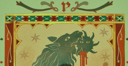
for old paper effects you can just set a paper texture on multiply over the art sure, but you can also combine it with the blur & bloom thing, a really subtle drop shadow and canvas tilt, and highlights to make it look like an aged photograph of a card. this originally had a transparent bg but i'll post it here with a white bg so that the drop shadow is more obvious. the scuffed edges of the card (left) were hand drawn, simple white stucco brush. the bigger patch of scuffed ink (top right) was a texture stamp.

for block print looks you can move the colour layer out of alignment by a few pixels - but only after you're absolutely sure you're done with it, otherwise you'll get something like this -

i forgot to erase out her eye before i moved the red layer so now her eye defeats the 'look' of a misaligned print. the black lineart and red layer were also given the same layer mask treatment as described above to make them look faded or like the ink didn't stick down right to the paper
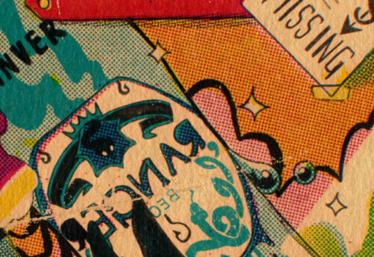
you can do this with multiple colour layers too. if the colour layers are separated and set to multiply (as in this cmyk example), it'll leave halos and edges around each shape which mimic old comic book print
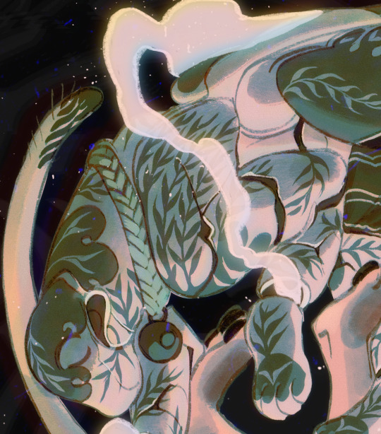
just to show what you can do WITHOUT any special brushes, here's a piece of one of my mez tarot cards from before i got any extra brushsets at all. for this one, i added a green tint over everything to mimic a sun-bleached or faded print (my actual goal wasn't 'medieval illustration' but actually 'trading card from the 60s that got left on someone's windowsill for decades'). the background texture is the procreate noise brush. the texture under the green lion drawing is the procreate concrete brush (to make it look painted onto a wall). the lettering and lineart is procreate's 6B pencil. but to properly aim for The Look of it being a printed physical object, i also used a perspective blur so that the edges are out of focus, and metallic gold highlights which don't match the lighting of the actual illustration and appear to be catching some other external light. that texture was made from the procreate noise brush
it's pretty simple compared to my later stuff but i still really like the effect
in terms of colours, you need to keep them unified so that they all appear to be acting under the same external light source, like if someone is holding up a torch to a painting then the painting colours will be glazed with firelight even if there's no painted fire. a really easy way to do this is to slap a multiply layer over everything in one shade - grey-yellow for a weathered paper look, or greenish blue for sunbleached photos. this unifies all the colours of the drawing. or you can apply a gradient map at a low opacity so that there's only a subtle change. or just do it by hand - if you want everything to be slightly tinted yellow, just pick the colours you normally would, but move the colour wheel towards yellow to get a yellowfied version of the base colour. easy
it's really important to consider how fading and weathering can affect printed colour. white paper yellows, black fades. you will rarely see pure black or pure white. which means you can use pure black or pure white to add external effects like the white scuff marks on the hierophant card. if the whole drawing is yellowed from age but there's some white somewhere, it's an easy shorthand to show that the scuff mark or whatever was not originally part of the drawing (great way to add some nasty stains lol)
#info asks#i don't have like a specific set of steps i follow i kind of freestyle it every time#obviously i have favourites i like to use but like that sphinx drawing? don't ask me how i did it because i don't remember#i just played with it until it looked nice. the blue dots are ... some sort of effect layer i don't remember which
637 notes
·
View notes
Note
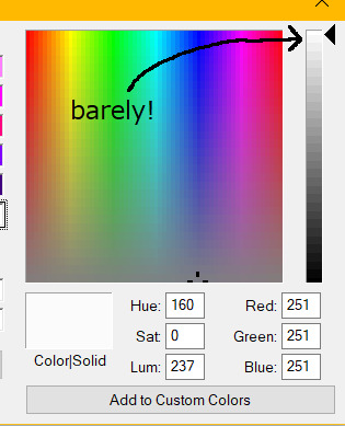
HOW DO YOU DO GRADIENTS IN PAINT LIKE THAT???
okay first off thank you for reminding me i was going to make a tutorial
So what you do is take your canvas (any size) and draw a diagonal line across it like so (can be any colors)
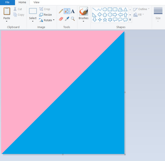
(Protip- hold shift while dragging the line tool to get a perfect diagonal)
Then go to the resize panel, resize by pixels, and change the horizontal size to 1 (TURN OFF ASPECT RATIO or it will make your entire canvas super small)
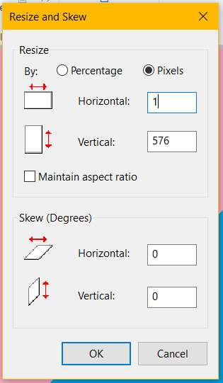

it will make your canvas the skinniest thing on planet earth but now what you do is go back to the resize panel and change the horizontal size back to what it was originally (in my case 576 but it works with everything)

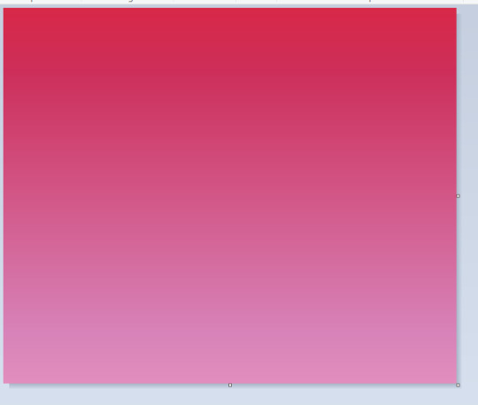
and now you have a gradient made entirely in paint! super clean too
on the right is an example of one made with 3 lines (red, purple, pink) as an example of one with more than 2 colors if you want a smoother gradient. experiment! get wacky with it!
Now obviously with the gradient it gets hard to draw on (especially if you're going to be fillbucketing stuff) so under the cut is a bonus tutorial on how to transfer a drawing to a background (yippie!)
Start by drawing up your whatever on a seperate canvas but one that's the same size as your background
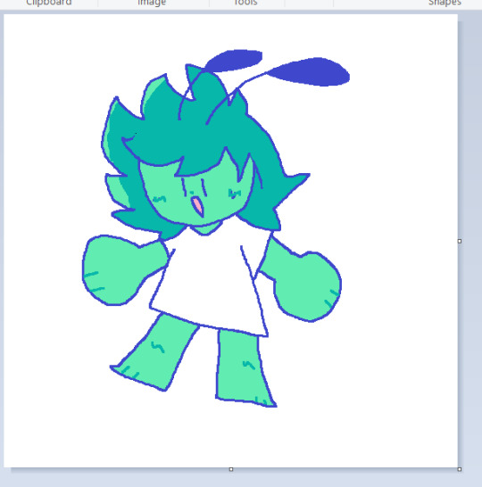
Do note that the way this works you have to make your color 2 on both canvases the same color and one that's NOT used in your drawing, else it becomes transparent- if you want to keep the color 2 white on both, make sure to color all white parts on your drawing with a very very slightly off-white to prevent this
Ctrl + A to select everything on your drawing canvas, then go back to your gradient and (making sure transparent selection is on) paste it in
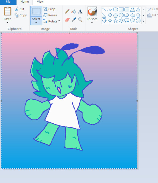
Move the drawing however you want if it's not perfectly centered, add whatever else you want, and bam you're done

paint has a lot of cool tricks like this and when used it becomes as easy as any other program (save for, well, multiple layers)
#ask#tutorial#art tutorial#ms paint#should note that i did not find this myself i just watched copious amounts of ms paint trick videos at the age of 11#but i enjoy sharing my knowledge regardless :)
2K notes
·
View notes
Note
What program do you use for your art? I’m using Procreate on an iPad but I’m not sure I’m liking it? It seems like all my drawings come out sort of pixeley.
I use procreate as well! Okay, so I might do things a little bit crazy, but hey it works for me lol.
My trick is that I draw on a huuuge canvas. Like no less than 2000x2000 pixels . I don’t wanna say resolution isn’t important, but to be honest, unless you are printing your works out, you can put it at any number, it doesn’t have to be at 300. This way if you have a big canvas, and lower resolution you can keep your layer count higher.
Just a few examples. This canvas on the right was something like 9000x12000, but I have multiple works on the canvas, and I’ll export as a png and crop it. For my comics, I’ll do the same idea just on a longer, narrower canvas.
The one last thing that might be causing pixelation—your transform tool may be blurring your art if you use it to make a lot of adjustments. I have mine set to bicubic, cause I’ve heard it’s the best option, but I still try to resize stuff as little as possible. All in all, a big canvas should help that be less noticeable.

183 notes
·
View notes
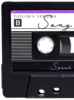
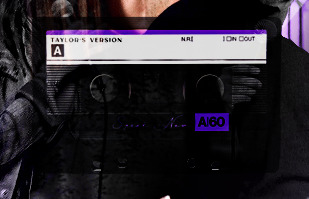
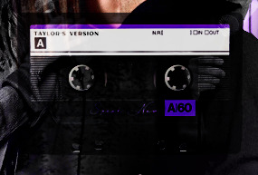
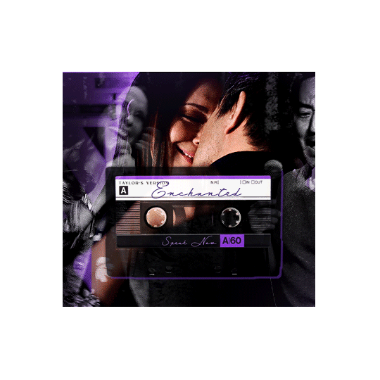
Note
Hey!! I just wanted to say that your recent speak now gif set is sooo stunning. I was wondering how you managed to create that cassette tape effect if it isn’t any trouble? It’s really so pretty.
Have a great day! ✨
ahhh thank you so so much! first of all, i cannot take any credit for this effect, as it was greatly inspired by this amazing yellowjacket gifset by @thewintersoldier!!
but here's how i recreated the effect, from a cassette png (found on pngwing here), to this animated cassette effect (as seen in my speak now set):
psst: i usually always create in photoshop cs5, but for this effect you need a recent version of photoshop because it's using transform keyframes (i think cs5 doesn't let you do that, or i just don't know how to lol). i used cc 2019 for this.
sorry if this is lengthy or has too much or too little details haha, but i hope it's comprehensible! english is not my first language so i also apologize in advance for any mistakes!
I. PREPARING THE CASSETTE
so, starting with the png here:
i removing everything i didn't want on the cassette png with the brush tool by just drawing the right color over the unwanted text. for the color, i then went to image > adjustments > hue/saturation and in the red tab, i played with the hue slider to get that purple color. finally, i added some text to my liking, and this is what i ended up with:
(not necessary but: i also selected the white lines on each side with the magic wand tool because i wanted these lines to be transparent. once your selection is done, go right click > layer via cut. it will create a new layer of the cutout you just made. you just need to disable or delete the layer to make the selection (lines) transparent.)
at this point you want to have only 2 layers: the revamped cassette and the text layer. you can remove the text layer actually, and just add the title back at the end, as it is not necessary for this effect. i just like to have the visual.
if you have multiple layers, you need to select all of them (except the song title layer), right click on the png layer and click on merge layers. this will create one layer with all the editing you made on the cassette. if you think you will need to edit this later though, i would save the file as a psd before merging the layers.
II. THE EFFECT
okay, so now that you have your cassette, make sure your video timeline is activated, not frame animation, and you are ready to go.
first, you want to create a perfect circle shape around one of the reel with the elliptical marquee tool (hold shift while dragging the circle). make sure it covers the entire area that will later be rotated. make sure this circle is perfectly centered around the reel or otherwise the animation will be a bit lopsided.
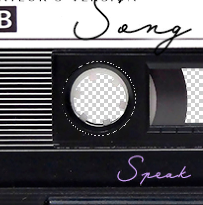
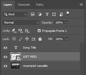
then right click on this selection and go "layer via copy". this will create a layer of only that circle selection. important step: right click on that new layer and go "convert to smart object". the layer should look like that, i've renamed mine:
now if you go to your timeline and open that new smart object layer, you will see that you have 3 keyframe options. we only need the transform one.
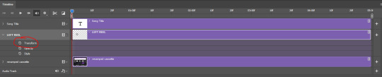
go to the start of the timeline and activate the transform animation by clicking on the stopwatch button. a keyframe will be created automatically.
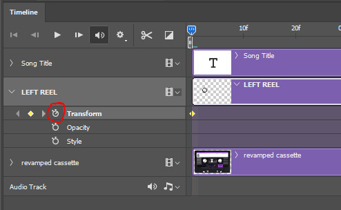
to create the actual animation, move the position of the cursor on the timeline further, i put mine at the 01:00f mark so it's easier to create the right timing.
then what you want to do is select the reel smart object layer and hit ctrl + T. a box will appear and this is how you will make the reel rotate.
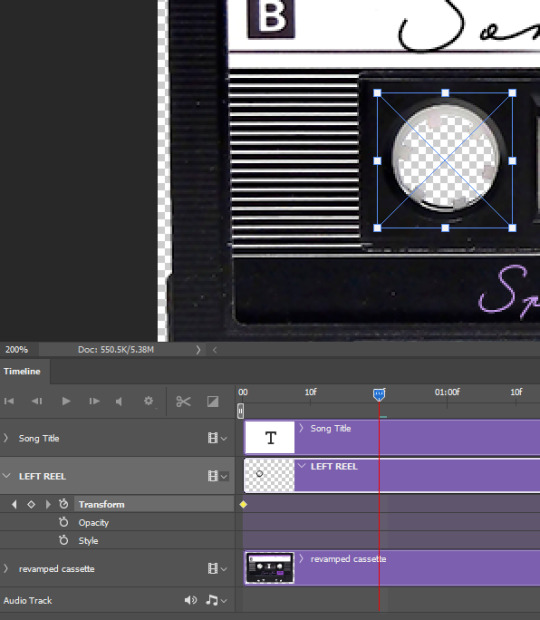
to rotate the reel shape, move your cursor near the blue box on your canvas and drag it until you have rotated the shape halfway through and hit enter. another keyframe will be created and if you play your animation, the reel should rotate on itself for half a turn

move your position on the timeline to 02:00f and do the same thing: select the left reel smart object, hit ctrl + T, rotate for another half turn, and hit enter. this third keyframe should be the last one needed for the animation and you should have a full animated rotation of the reel.
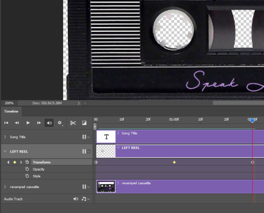
play your animation, and adjust the speed to your liking by dragging the keyframes on the timeline (but make sure they stay within the same distance from each other). the closer the keyframes are, the faster the animation are, and the further they are, the slower it'll be.
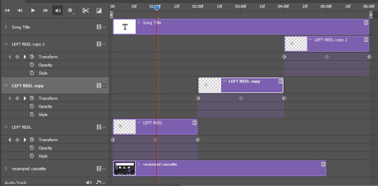
then you can just trim the smart object to your animation's length, and duplicate (right click the smart object > duplicate layer) this layer the amount of times needed (i find this less finicky than duplicating keyframes), and placing them one after the other. three full turns should be enough. this is what my timeline looks like right now:
and my animation for the left side looks like this:
as you can see, we can see the little "dents" peeking through behind the animation. we don't want that! to remove it, select the revamped cassette layer (that should be under the reel smart object), and create another perfect circle around it with the marquee tool. this time make sure it's smaller than the previous one, it just needs to cover these dents.
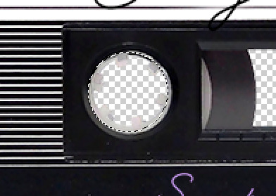
then right click on this selection on your canvas and go "layer via cut". this will create a new layer with that selection, and all you need to do is to disable it. this is removing the information in that circle.
once you are happy and the animation works, you can just delete that cut layer. now the animation is done and looks like this:

III. SECOND ANIMATION
one you have done it on the left side, you just gotta do the same thing on the right side. you can also try duplicating it, but i found it finicky for some reason (or maybe i'm just not used to the controls of this 2019 photoshop version?).
this is what i have once i've done the same thing on the right reel:
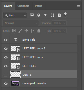
once i am happy with the speed and everything, i want to have only one layer so it's easier to use on gifs. first, i will save this animation as a psd file, in case i want to reuse it. then i am removing the song title layer and will be flattening everything and creating frames from this animation. to do so i am using the "save" action from here.
i'm not sure why it does that, but it's creating a couple of frames where the reels are a bit offset from their position everytime there's a full circle done, so i just delete these 5-6 frames. you can also change the speed here, but by default it should be 0.05.
once you are happy with it, just turn these frames into a smart object with the video timeline again (convert frame animation to video timeline and select all the frame layers > right click > convert to smart object)
now you have a smart object that is ready to be used anywhere!
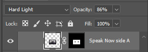
IV. FINAL TOUCHES
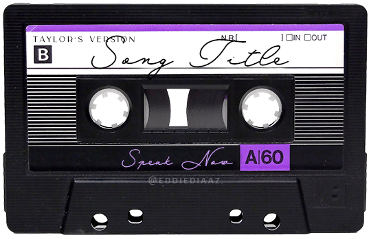
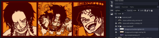
for my particular speak now gifset, i have multiple layers of the animated cassette on each gif:
1, bottom one - cassette layer set to the blending mode "hard light" and set to opacity 86%:
2, middle - this same cassette layer set to hard light, but with the opacity at 100%, AND with a layer mask so it's only applied to the animated reels (i wanted them to show up more):
3, top one - and finally a third layer with another layer mask because i wanted the white label and speak now area to be less see through. it's set to the normal blending mode and the opacity is at 75%

and then i just added the song title on top at 100% opacity and normal blending mode, and added some drop shadows, and tada!
there we have it, i hope this was helpful <3
#alie replies#Anonymous#photoshop#tutorial#*ps help#completeresources#allresources#resourcemarket#userrobin#userraffa#userpjo#usertreena#tuservaleria#tuserheidi#userdean#userrainbow#usersalty#userzaynab#usernik#swearphil
360 notes
·
View notes
Note
ive been a follower of yours for a while and it looks like you make a lot of things on ms paint! if thats true, how do you find the patience to do all of that layering and editing and make a finished piece in the end? its gotta be some of the most impressive art ive seen on that program
Yes I do draw on ms paint, if not then it's not tagged on the drawing. Sometimes if i ever try to practice krita program ill often do the sketch on paint first cause im more comfortable there
It's not hard!! When you're used to draw on 1 layer you just learn to become fast, it's just natural now. people love to talk about how you have to be insane to work on there (to a certain degree yes) but if you just try and do it again and again you just learn your way through that's it.
I feel like I should record myself doing it one day to prove its not dark magic, I actually now find it annoying to use multiple layers on other programs. One layer is just simple, you mess up then fix it by painting over until it's right, I feel like the 1 layer thing helped me improve in some aspects compared to when I used to draw on FA before. Also canvas too small? Thats fine you can make it bigger so easily it's so good
I also really like the crayon texture there it's what I use for everything, I think it's visible in this sketches from yesterday (2 are altuyur gijinkas of younger versions of ocs, morang ,tamtam, then just young maanul morang doodle)


I also really prefer the simple UI, to be honest other art programs are a little overwhelming with all their buttons, especially since I'll just use 2 of them. I like just like having a few tools and colors
88 notes
·
View notes
Note
Hi, I love your blog and your edits. I was wondering if you could do a tutorial on how you combine multiple gifs into one in the first gif of yours MIKELOGAN’s 5K FOLLOWER CELEBRATION || GET TO KNOW ME MEMEFAVORITE ACTORS [2/10]Colin Firth (September 10, 1960) set? Thank you for reading this and helping me.
thank you so much, that's so kind!! this is the post in question (which was inspired by this gorgeous set) and i'll break down how to do it step by step below the cut!
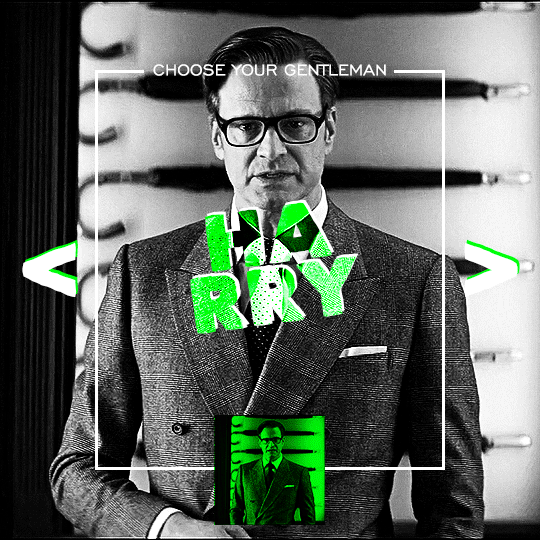
i ended up saving this gif as a psd because i remember it taking me so long and being really frustrating, i just wasn't sure why. for reference, i posted that set back in september, just over four months ago. looking at the psd, i can see just how far i've grown as a gifmaker bc that thing is a hot mess. i made it about 3x more complicated than it needed to be, so let's do this the right way lol
note: i was still using 0.07 frame rate at this point. i have since switched to 0.05 for smoother, quicker gifs.
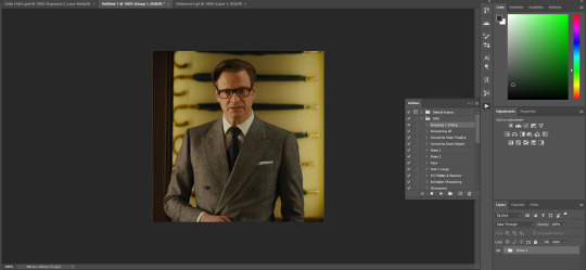
what we're going to do is create all of these gifs separately and put them together at the end. in total, there are 6 individual gifs. let's start with harry.
i gif by importing video frames to layers, but if you prefer to screencap, load those in instead. because this ends up being a pretty large gif, both in size and length, i kept it to 20 frames per clip.
once you're satisfied with the frames you've chosen, crop your canvas to 540px x 540px. this is what i'm left with
this is when i sharpen my gifs. everyone's process is a little different. i created my own sharpening action, which converts my frames to video timeline and then sharpens.
the next step is to color your gif. if you're going for the overall look in mine, here were my layers:
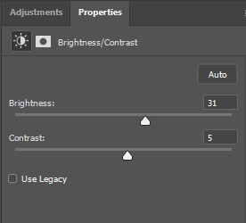
a brightness/contrast layer with brightness set to 31 and contrast to 5. this will depend on the scene you're working with

a levels layer using the black and white eyedroppers. the top one is your black eyedropper. to use it, click it and select the blackest part of your gif. do the same with the white eyedropper and select the lightest part of your gif. you may need to play around with selecting different points depending on your scene and the original coloring
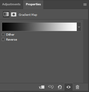
finally, a simple black & white gradient map layer on top
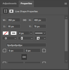
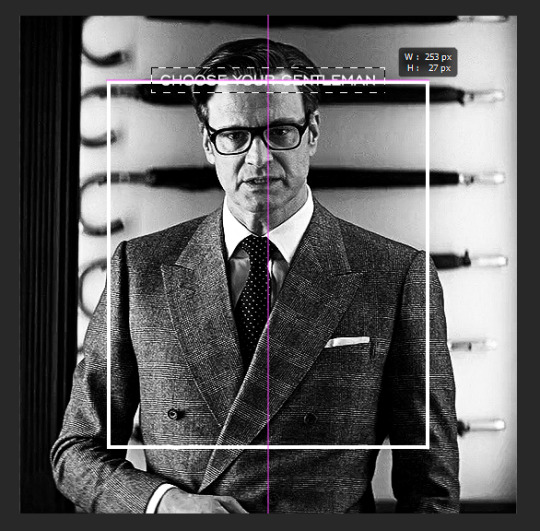
now we're going to add the thin rectangular border in the middle of the gif. i use the rectangle shape tool for this (press U on your keyboard) and these are my settings (x and y coordinates don't matter):

to center it perfectly, i use ctrl+T and drag it until it snaps into place with both the vertical and horizontal guides.
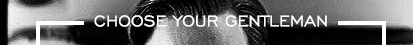
next, let's add the "choose your gentleman" text that goes at the top of the border. here is the font i chose and its settings:

once again, press ctrl+t and drag this to the vertical center of your gif and to the center of the top of the border. you should feel and see it snap into place. this is what we have now:
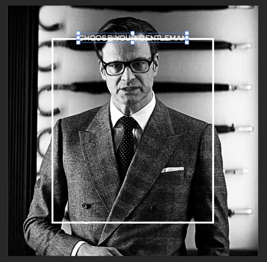
now, we're going to use a layer mask on the border so we can read the text. select the rectangle layer and click the layer mask button
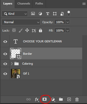
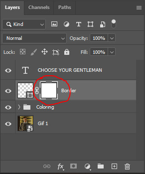
with the layer mask selected (as shown in the second image), use the rectangular marquee tool (M on your keyboard) to draw a rectangle around your text, taking care to keep it just a little larger
as you can see, you'll know when you're perfectly centered through your text layer and vertically on the entire canvas. select your brush tool without deselecting this rectangle (B on your keyboard) and paint the selection with a black brush. this masks that part of the border!

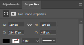
let's add the small square gif that goes at the bottom of the border now. i think the easiest way of doing this is to use the rectangular shape tool (U) again. the size of this gif is 110x110, so create a black square of that size with no stroke. Use ctrl+T to drag it to the center of the bottom of the border (the x and y coordinates don't matter):
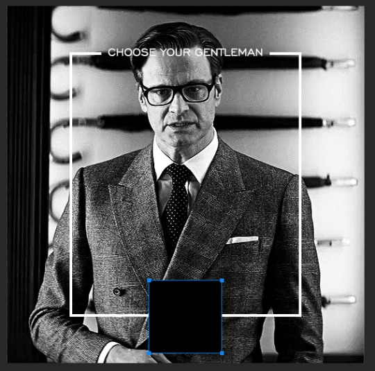
now duplicate your original gif layer (ctrl+J) and drag it to the top of the layer panel. right click on it and create clipping mask. this will make it so the gif only appears within the confines of the square we just created. resize your gif by using ctrl+T and, making sure the proportions are locked, drag the corners to the edges of the square.
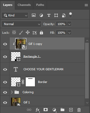
this gif is not colored at all as we only duplicated the gif itself and not the coloring layers. i duplicated those as well and dragged them on top of our small gif, but it's important to make sure those are using the clipping mask as well. you can click this on the properties layer of each adjustment layer to make sure they do.
you'll know you've been successful when you see the small arrow next to each of your coloring layers. this keeps them from affecting the coloring of the larger, main gif.
we're going to change the gradient map adjustment layer from black & white to black & lime green (or the color of your choosing). click on that layer and then on the map. this will bring up the gradient editor. click on the small white color stop at the far right end of the gradient and then on the color picker, choose a new color.

the hex code i used for the lime green is #00ff0c
our last steps are the angle brackets on either side of the gif and harry's name in the center. here are the settings i used for those (angle brackets on the left and harry on the right):
the layer styles for harry's name (double click on the text layer to call up this menu OR right click > blending options):
and for the angle brackets:
by now, you know how to utilize ctrl+T to move these layers where you'd like them. harry's name is centered horizontally and vertically and rotated at a bit of an angle and the angle brackets are centered horizontally and i just eyeballed where to put them in relation to the space between the border and the edge of the gif.
this is the complete first gif. what i would do for your own sanity since you have two more of these two create is 1) save it as a psd just in case something crashes and 2) don't convert it to a smart object until you have all 3 gifs completed and are ready to put them together.
the nice part about having the first one done is you've ultimately done the hard part. create your two other gifs, but you'll be using at least roughly the same coloring and all the same text, just with the colors adjusted, so you can drag those layers from your completed first gif to your others as you work on them.
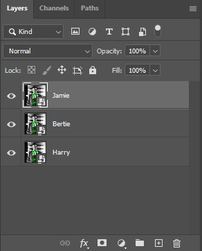
once you have all 3 gifs completed and still on 3 separate canvases (and saved as psds bc this is adobe friggin photoshop and shit breaks all the time), convert all layers on all the gifs to smart objects. this will simplify the final gif and make things much easier.
then, bring gif #2 and gif #3 both onto gif #1's canvas. this is what it will look like at first on the timeline and in your layer panel:
(full disclosure, i'm not making the other two lmao, i'm lazy and i already did it once in a way harder way 😂)
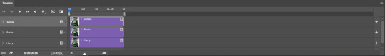
to get the gifs to play after one another rather than simultaneously, you just have to drag them after one another on the timeline!
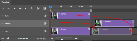
a little bit hard to show the actual process, but you're just clicking the bertie layer and dragging it down to harry's line after the harry layer. then do the same with the jamie layer, dragging it down to the harry layer after bertie. when you're done, it should look like this:
btw, the little slider i circled is what enlarges or shrinks the timeline view, so if you need to see something broken down a bit more/slower, drag it to the right. if you need to zoom out, drag it to the left.
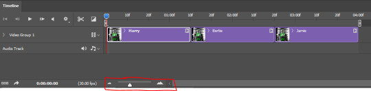
and that's it! export and save your gif!
if you have any questions or anything is at all unclear about this, please let me know! i'm happy to help!
#answered#Anonymous#gif tutorial#my tutorials#gifmakerresource#completeresources#dailyresources#LISTEN. the way i did this 4 months ago was SO FUCKED#i made it SO SO much harder than it needed to be#you know what that is? growth.
89 notes
·
View notes
Note
would you be willing to share how you do your lineart / coloring / rendering with the specific brushes?? i have a learning disability, and have trouble finding any art tutorials that give in depth explanations to what brushes they use for a specific outcome. anything can help, thank you! - 🥬
Long post time. 🍴
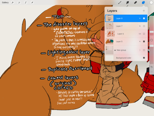
okay so most, if not ALL, of the tricks are hidden in the way i color and organize myself (more like lack of as you will see in the image above)
the brush i have been using currently is called the flat brush, and is not a custom brush, just add like 50 percent stabilization to it and 0% jitter and its the same as mine ! promise !!
after you do your flat colors you might think "huh my colors look a bit too dull but i wanted them to give a warmer tone" WELL I HAVE THE MOST AMAZING TOOL THAT PROCREATE HAS TO OFFER. The little wand at the top next to the wrench, click that and go to curves. make sure you are on the layer where all your duplicate flat colors + lineart are and mess around it. I always do this to make my colors fit what im trying to go for. super super useful !!
as for the brushes, i only tend to stick to 1 for an entire drawing but here is a list in the ways i find them more useful in just in case
The brushes (all are default with only stabilization changes)
- Mercury brush: quick easy way to color pick and render, texture of pastel sticks
- Syrup brush: crisp lineart super clean and high sensitivity to pen pressure, texture of pixels very digital
- Dry Ink: sketch and loose drawings, texture of a crayon
- Flat Brush: lineart and color blending and an all around multiple use brush
- Soft Brush: i only really use this to get gradients occasionally
OKAY LAST THING !! Make your canvas BIG. I make mine very very big, here are a few of the examples of the kinds of canvas sizes I use, trust me it DOES make a difference on the brushes and just in general. (Ignore the paper + face paint one I never use those lol)

OKAY SUPER LONG POST BUT I HOPE THIS HELPS SORRY IF THIS IS STILL CONFUSING
34 notes
·
View notes
Text
2023 Art Roundup


JAN - FEB - MAR - APR - MAY - JUN - JUL - AUG - SEP - OCT - NOV - DEC
(These aren’t entirely indicative of when I posted them, but when I actually finished them.)
These are some of my biggest/favorite projects through each month!
Piece details + Mod-posting below!
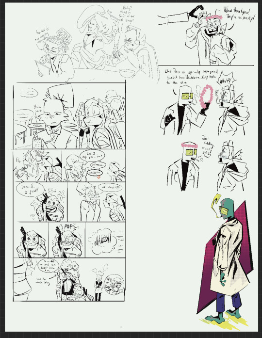
JAN - Asteía ; This was one of my first projects of the year that dealt with lighting, and additionally light from multiple sources! I also remember experimenting with backgrounds and how to make a character pop against a semi-detailed background without making them get lost in the piece.
FEB - Mora and Ego ; This was a good project on figuring out how to fill empty space while still keeping the atmosphere of a piece. It was also good perspective practice!
MAR - Sanguine and Ego ; Though I’m no longer too happy with the proportions or lighting of this piece, I still remember having a blast with it. Hearing feedback about them holding hands and Sanguine’s ear getting squished are very fun memories for me.
APR - Miraak and Ego ; This might be my favorite project of the whole year! Though I know I can do backgrounds better now, I remember being pretty confident and happy during the whole process! I think the motion/lighting/effects all came out very well :] ALSO it was the first piece I did with expressive masks for Miraak and Ego! Wahoo!
MAY - Mora and Ego (again) ; Though the last one was my personal favorite, I heard from a couple of friends that THIS was their favorite. Though a pain in the ASS to do, I’m especially happy with all the texture effects. This was also me experimenting with Mora’s design!
JUN - Erandur ; Not a particularly complicated/difficult piece, but one that was simply pure fun. Had a blast with lighting effects and atmosphere. It was also a good break from the family trip I was taking at the same time ,:]
JUL - Dagon ; Specifically his revamp! This was my first successful attempt at a (very) muscular body type that I liked! In fact, over the course of the year I’ve been pretty proud of my progress of expanding on body types. This one especially, though, was just very fun!
AUG - Iren and Rakell ; My first dive into a colored + shaded animatic (animation? It’s awful choppy lol)! FAR from perfect, but I was (and still am) so happy with the outcome. I particularly remember enjoying figuring out lines of movement and sound effects for the video.
SEP - Sanguine ; My first (and still only, though hopefully not for long) attempt at making Sanguine intimidating. I think this one is going in the right direction! As far as effects go, I actually had a very tough time with things because of a few layer-merging mishaps, but the final product was well-received!
OCT - The Warden ; After many-a night on Minecraft with friends, I realized just how much I loved the warden, and HAD to draw them. Redesigning characters is one of my absolute favorite things to do, especially when taking minimal details and expanding on them! They were super fun all around.
NOV - Miraak, Serana, Ego, and Ancano ; I’d been meaning to draw the siblings being siblings for a while now, but putting them all on one canvas was more than a little intimidating. I was so happy to have it done, though, and I kinda love seeing their colors clash together.
DEC - Sanguine (again) ; After not drawing him for so long, it was a blast doing so. The moment I was back home for winter break, I was ECSTATIC to get to work on this piece. #1 blorbo
~
This year has been an absolute ride.
I became a mod and then co-owner of the TES server that got me into making TDI and have made some really tight friendships over there (genuinely, anyone reading this who is/was in the cult server, I’m so damn happy to know you).
I’ve done some intense progress on TDI, and even though I didn’t QUITE accomplish my New Years Resolution of posting Ch. 1 this year, hopefully you can understand the drawbacks considering I am… //checks notes/// 70+ chapters in and still going.
I’m in college! Have been for a hot second now, but I’ve been working towards a ministry degree, and have future plans of getting a PhD after my bachelor’s so I can teach at a college level! I don’t think I talk a lot about my irl happenings, but hopefully that gives you an idea of why I might be a liiittle busy when it comes to writing. Ministry is an unforgiving degree when it comes to papers and meetings.
As earlier mentioned, I’ve learned how to do different body types, and am trying to find a good balance between shape language and inclusivity when it comes to bodies! I am… still struggling with feminine anatomy! Admittedly! But I’m willing to keep trying ,:]
And, overall, I (certainly hope I have) improved on my art. I have a much better sense of face shapes, line weights, and consistent details than I did at the beginning of the year. Always learning, but always improving, too!
I hope your year has gone well! Thank you so very much for checking out my blog. Tumblr has been a wonderful thing to get into and has led me to a lot of wonderful people. See you in the new year!
#2023 art roundup#art roundup#my art#misc#tes#Minecraft#D&D#god do I dare tag everyone here#i think i do#Asteía#Hermaeus mora#Ego#sanguine#miraak#erandur#Mehrunes Dagon#Rakell#warden#Serana#ancano#art meme
42 notes
·
View notes
Note
Hi i'm sorry if this question already has been answered or if it's annoying, but could you tell/show how you render? I absolutely love your textures/rendering.
I've limited posting speedpaints and process pics to patreon so I won't post any high def, multiple pictures out of respect to my patrons but my basic process follows a lot of tenants of traditional painting, especially oil painting because that's what I had the most experience with. A lot of merging of layers to mimic a physical canvas and if I mess up I paint over it instead of erasing. I would recommend watching oil painting process videos if you're interested, especially if you (understandably) can't afford getting into traditional painting.
sorry for the shitty screenshot but this is from a drawing that I'm working on and I make the backghround colour of the canvas a colour that I then fill in by hand on top of the same layer as the rest of the drawing. In this case it was purple so you can see the purple come through under the black. This is what you do with paintings where you colour the canvas one colour first (underpainting) before building values and adding colours.
41 notes
·
View notes
Text
My “HOW TO MAKE YOUR DRAWINGS LOOK SHINY AND POLISHED WITHOUT A LOT OF EFFORT GUIDE”


These steps are by no means necessary! And your drawing will look amazing and completely finished without them. But I’ll occasionally get people asking how I get the effects I get on my final renders and this is the method I use almost every time.
1) Have a fininished drawing
2) I like to throw a colored OVERLAY or SOFT LIGHT layer at a low opacity over the entire drawing. I feel like it can help unify the colors a bit. Here I used a blue soft light layer at 39% opacity.
3) with a big soft brush, add a soft light from the direction of your light source. This really brightens up the drawing and further emphasizes your directional lighting. I usually use ADD or COLOR DODGE at a low opacity. Here I have useda warm orangy-yellow color at 44% opacity.
4) Slap some RIM LIGHTING on that bay-beeee. I usually use a textured brush and on a layer ABOVE the lineart layer go over the edges or “rim” of the forms of your drawing where the most light would catch. This usually works best with drawings that are not lit directly from the front, but dont let that limit you if you really wanna use it. Have fun with it! Here I have used the ELDER 2.0 brush from THIS brush set and Ive used an orange color for the hair, skin, and clothes, and a yellow for the crown.
5) If you are working in multiple layers, now is the time to merge them all. Make sure all your effects layers are cleaned up and don’t extend past the borders of your drawing or they’ll be visible when you flatten it. So go in and erase or otherwise remove any overhang. Then, put all your visible layers in a single folder and DUPLICATE it. Then MERGE or FLATTEN your duplicated folder so your drawing now exists on a single layer. Your original folder should still have all of your layers preserved so you can go back and edit them as needed.
6) ALPHA LOCK your flattened layer. This function has different names across different programs. In PHOTOSHOP it is indicated by a small lock symbol next to the layer. Once your layer is locked, duplicate it again. On your new duplicate layer add a GAUSSIAN BLUR. I usually add a 4 to 5% blur. The reason we have alpha locked the layers in this step are to keep the edges or the drawing sharp.
If you want to soften the edges, or find the process of alpha locking tedious or confusing, skip it and duplicate and gaussian blur your layers without alpha locking them.
Alpha locking is also unnecessary if your drawing encompasses the entire canvas.
This is all up to personal preference.
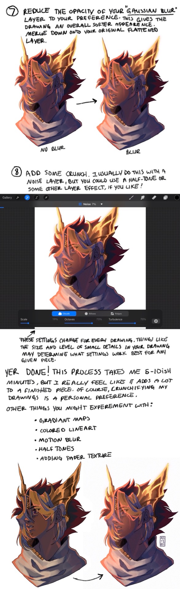
7) Reduce the opacity of your gaussian blur layer to your preference. This gives the drawing an overall softer appearance. MERGE DOWN onto your original flattened layer.
8) Add some CRUNCH. I usually do this with a NOISE layer but you could use a HALFTONE or other layer effect if you like! The specific settings I use change for every drawing, and different drawing programs might have different settings. Things like size and level of small details in your drawing may determine what settings work best for any given piece.
AND YER DONE! This process takes me between 5-10 minutes, sometimes a bit longer depending on how fussy I’m being. But overall it’s super quick and I feel like it adds a lot to my finished pieces. Crunchifying my drawings is a personal preference, which you may not like for your particular style. Thats okay! Here are some other things you might experiment with:
Halftone
Colored lineart
Motion blur
Gradient maps
Adding paper texture
Chromatic aberration
Hope yall find this in any way helpful!! sorry if this one isnt as straightforward as the GOLD GUIDE. Hopefully some of yall still get some use out of it. The sample drawing in this tutorial was a donation thank-you commission for @sigridhawke if youd like to find out how to snag a discounted (only 10$ !! Woah!!) commission of your own, check out THIS POST for details!!
176 notes
·
View notes
Note
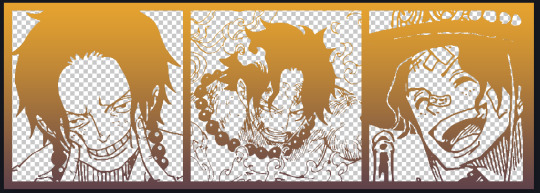
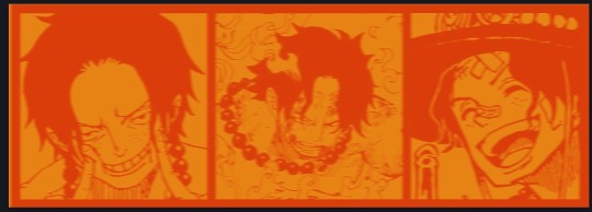
Heyy, I’ve been reading your wonderful one piece works for a while — and I couldn’t stop wondering how are you actually doing those magnificent headers?
Like… hello? The great quality, with additional 3D-alike details I could catch by my eyes? I got only Ibis Paint X on mobile, since I’m only a young man that literally two months ago went on a life-time ‘adventure’ of living alone in a small apartment.
In short — I got no money to pay for additional graphics/drawing programs, not yet at least
Hello!
Thank you! I'm glad you enjoy my writing - I'm curious to know what's your favorite piece / part? Also I'm so happy you like my headers? Makes it feel worth it to spend time on them! :D
I have excellent news for you, I used a mix of Canva and Photopea. They're both FREE!
I'll be explaining the process for making these two kinda? The full tutorial is below the cut, to be courteous to the other folks, hope you don't mind?
Though I am hearing that Canva has given people some grief. But Photopea is just *chefs kiss*
If you've ever used photoshop, Photopea is essentially a free photoshop, and it even has the automation tools! An absolute lifesaver when you have multiple layers you want to export (but that's for larger projects not this)
I'm going to assume you have basic knowledge of layers in digital drawing programs for this. If anything isn't clear: ask me, I'll clarify!
//-------------------------------------------------
My General Process is:
Search for official art / images
bring it into canva / photopea
crop / arrange images to match the dimensions
select a thematic color that is associated with the character
separate the foreground from the background
mess around and test things until they work
//--------------------------------------------------
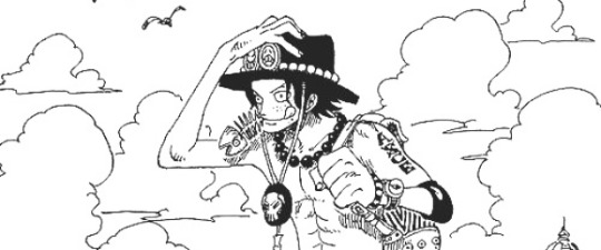
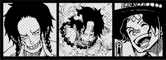
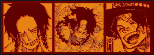
Given "Louder than Words" is the latest one I've made, I'll start with the process for it.
Dimensions: 3000 x 1055 px
dpi: 96
//-------------------------------------------
Let's Get Crackin'
Alright let's grab some official art so we're not using any fanart without the artist's permission
I try to pick images that feel relevant enough to what I'm trying to make.
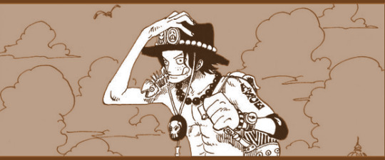
For example: the image for the Matching banner shows the ASCE tattoo which is super important in that fic
2. Let's arrange them onto a banner where each individual image has the same/similar dimensions to the rest
That's probably part of why you like these. To a certain extent they have similar dimensions, so they have a uniformity that's pleasing to the eye! (It's not perfect because I threw perfectionism to the wind because this is tumblr not my portfolio)
Tip: if you have 3 images and only 2 that have similar dimensions, and the 3rd one can't be cropped logically: but the one that's a different aspect ratio in the middle!
3. lets arrange them in such a way that the borders all feel like they're the same/equal width/thickness
you might find that you have to shrink some images for this, that's fine.
ALTERNATIVELY: if you're going with one image crop it so it's just the relevant info and it matches the dimensions (3000 x 1055 px)
We have our base! Now let's add some color, and direct the viewer's eye together!
4. pick out a color that you think matches your character / vibe - that color is going to be your background
Given I'm making an Ace banner: orange is the color I'm going with
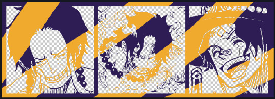
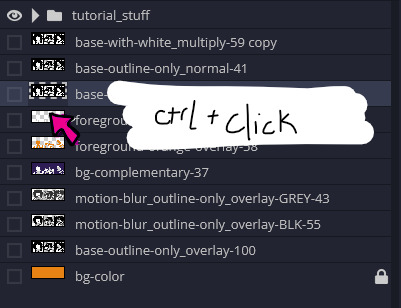
I went and named my layers for this lol. The numbers represent the opacity, and they aren't important. I just kept changing the opacity until I liked the way things looks. But here's the secret to the 3D feel:
Motionblur (+ moving it about)
Separating the foreground and background and dulling out the background.
I'm going to show you my process so you can see the effects, but first let's give you some quick skills:
//------------------------------------
SKILLS / THINGS I THINK ARE HELPFUL
//------- Select Similar
magic wand -> select something -> right-click -> select similar
This works best when you have high contrast images (like manga panels that are black and white). You can select the black or the white areas. Depending on what works better for you.
TIP!
Invert selections with ctrl + i
Say you know that you want to select everything but Ace's face in the second panel. Select his face with the magic wand then ctrl + i, and that's the only thing NOT selected

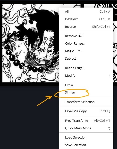

TIP!!!!!!!!!!!!!!!
Please, please, please, duplicate your original image and work on the duplicate layer. This helps you SO much. !!!!!!!!!!!!!!!!!
TIP!
Check your selection tolerance! This could be why too little, or too much is being selected.

//------- The Move Tool
Shortcut key: v
While the move tool is active, you can nudge the stuff on whatever layer with your arrow keys
Shift + arrow key = 10 px move (generally)
//------- Layer Locking
1- Layer Blending Mode (see Overlay vs Multiply vs Normal) for how this can affect results)
2- Opacity: how see through it is / isn't
3- Lock Transparency (it's the little checker board)
4- Lock Layer (looks like a lock)
5- Lock icon that appears when anything on the layer has been locked
More on 3 Lock Transparency: You can only paint on / modify what's on that layer. You CANNOT add anything to any area that is already transparent
Here's a demo of what you can do with this power:
Here's the original Image - notice how it's just the lineart with a transparent background.
It's powerful: abuse it
//------- Overlay vs Multiply vs Normal
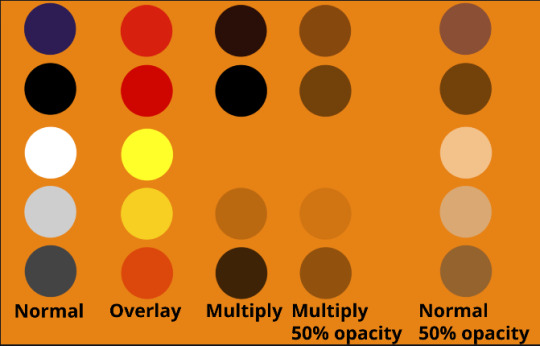
I think seeing this is the best way to visualize how different modes can affect the color.
//--------------------------------
Back to the Tutorial
!!I IMPORTANT NOTE !!
Please play around with the opacity slider to figure out what opacity works best for you on the multiple different layers we're about to make / work with. It's up to your own style to figure this out.
Next: please feel free to not follow all of it. Add more layers, add less layers, take the base principles and go wild! :D
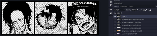
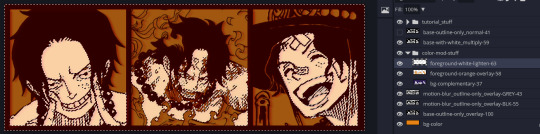
5. Separate the lineart from the background and save it as a new layer
6. Duplicate it and set it to overlay, or set it to overlay immediately
7. Duplicate that lineart layer twice and set the blending mode to overlay
8. lock transparency on the top one and change it to be a dark grey
9. Apply motion blur to both:
Main menu bar -> Filter -> Motion Blur
I made it so that the grey layer was blurrier than the black layer
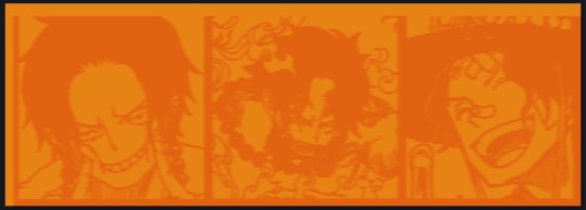
10. More them around a little to give it a "3D effect" as you called it.
It creates shadows under the lines - I was aiming for an effect similar to chromatic aberration (chromatic aberration is a valid way to add punch to your stuff too!)
So this is what things look like now - painful, but let's keep going
11. Duplicate the ORIGINAL / BASE lineart layer, that you DID not apply motion blur to -> set the blend mode to multiply (reduce opacity for it to actually take effect)
okay that's less painful
here's what the layers look like right now:
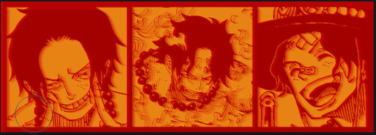
let's bring more focus to Ace's face, and push the background farther away:
12. Use the magic wand tool to quickly select large areas of the faces / focal area / foreground and the lasso tool to refine things
TIP!
Hold shift + click -> add to selection
Hold Alt + click -> subtract from selection
13. On a new layer with blending mode -> lighten, fill that selection to be white
If you look at it, you'll notice that it is ALREADY starting to draw our attention to his face, but the background is kinda aggressive, so let's dim that down
TIP!
Right-click on the gradient tool to find the paint-bucket tool

TIP!
Sample All Layers:
Turning this option off makes it so that you only work with the content on THAT specific layer. Turning it on makes it so that it is working while taking all other layers into consideration.
14. ctrl + click on the "white foreground" layer to select the contents of that specific layer (pink thing is your mouse)
15. ctrl + i to invert selection and ON A NEW LAYER (layer mode -> multiply) fill that with a complementary color
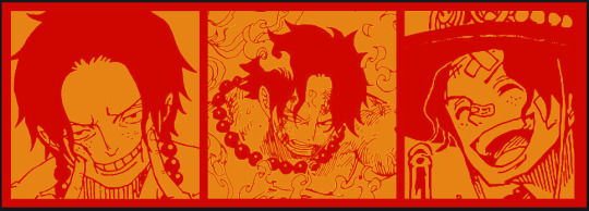
16. I did one last thing where I took the original base (before we separated the lineart) and added it to the very top and played with the opacity to get something less in your face (layer blend mode was set to NORMAL)
And that's it!
More considerations that I take:
I want the banner to be "thin" or not square, so it doesn't take up too much screen real estate on people's devices
I don't want readers having to scroll too much to get to my writing (which is the whole point of the post, let's not waste their time making them look for things)
I want the banner content to be relevant enough?
ie: with Matching: I wanted the ASCE tattoo to be visible. With matching I wanted Ace to not look too happy in some of them.
I'm also trying to avoid spoilers, I hated getting things spoiled, so I'm trying to be careful that the images I pick don't spoil anything really.
Congrats on starting life on your own! I did that whole living by myself thing too! Tip: keep the pantry stocked with lentils, beans, pastas, baking essentials, rice. They really come in a clutch when you're hungry.
#photopea resources#photopea psd#tutorial#tutorials#tumblr banner#photoshop#photoshop tutorial#digital art#fuck adobe#adobe photoshop
9 notes
·
View notes
Note
Not an ask for your AU but your drawing process. I have a few questions on how you do art and I would like to take notes as I would like to improve my art.
-how do you make your art so soft? I feel like every time I attempt it, it looks blurry.
-usually what dimensions are your images? I feel like, again, some of my art is blurry and I know part of the reason why is some of my art is blurry.
-usually what color background do you draw with? In your WIP of the Grimm art it seemed like you drew with a grey background while with some of the other arts you drew with a warmer background. Is it simply based on the mood.
That's all of the drawing questions I can think off the top of my mind now.
i'll be more than glad to talk about this! though forgive me if the explanation is a bit over the place, i'm not the best at describing my process since to me it kind of just happens haha
to answer the first question, i think it's a combination of the right kinds of shapes (rounder shapes tend to look more soft, even if the linework itself isn't) and the brush i use for my lines. it's the default mechanical pencil brush in clip studio paint, one that has a pretty low density and requires me to draw over a line multiple times if i want it to be thick. that definitely helps with making the overall picture softer, since the less "important" or inner lines aren't as pronounced. i also color the inner parts of the lineart to make it blend in a bit nicer (which also gives the whole thing a paper cutout kind of vibe, i think)
since you mentioned that your art often ends up being blurry, i'll touch up on the canvas dimensions since from my experience it impacts this aspect quite a lot. i draw on very big canvases, the default one is often 4000px in either dimension. it's definitely a bit overkill, but i'm used to drawing with a large brush size. i often end up downscaling it later to save up on storage (and whenever tumblr cries about the file size being too big), and i always make sure to use the "hard edges" interpolation method, as it keeps the lineart crispy and pencil like
as for the background, i start with a gray one since i find it to be very easy on the eyes. sometimes i leave it as it is, especially if it fits the overall color palette, but recently i started changing the tone to a warmer one, most often a muted brown. plus it adds a little bit of color to the whole piece
lastly, it's not part of the question, but a big part of the final piece is the paper texture i overlay on top. to get the best result, i put it on a linear burn layer mode with low opacity. it gives the whole drawing a more pencil or canvas like appearance, and it adds some texture to help it appear less flat. another thing i started doing recently, which i think is the most noticeable on the tone of color i use for grimm's neck fluff, is that i color it with a modified mechanical pencil brush with randomized color hues per stroke. i quite like the effect even if it's very subtle most of the time
18 notes
·
View notes
Last Seen Blogs
ellenwiltshire
Ellen Wiltshire
tuliomiguels
into the unknown

aro-langblr
I really like languages
incubatorworld
I Am Him
thebohohobo
Hobo Doodles